Last updated on
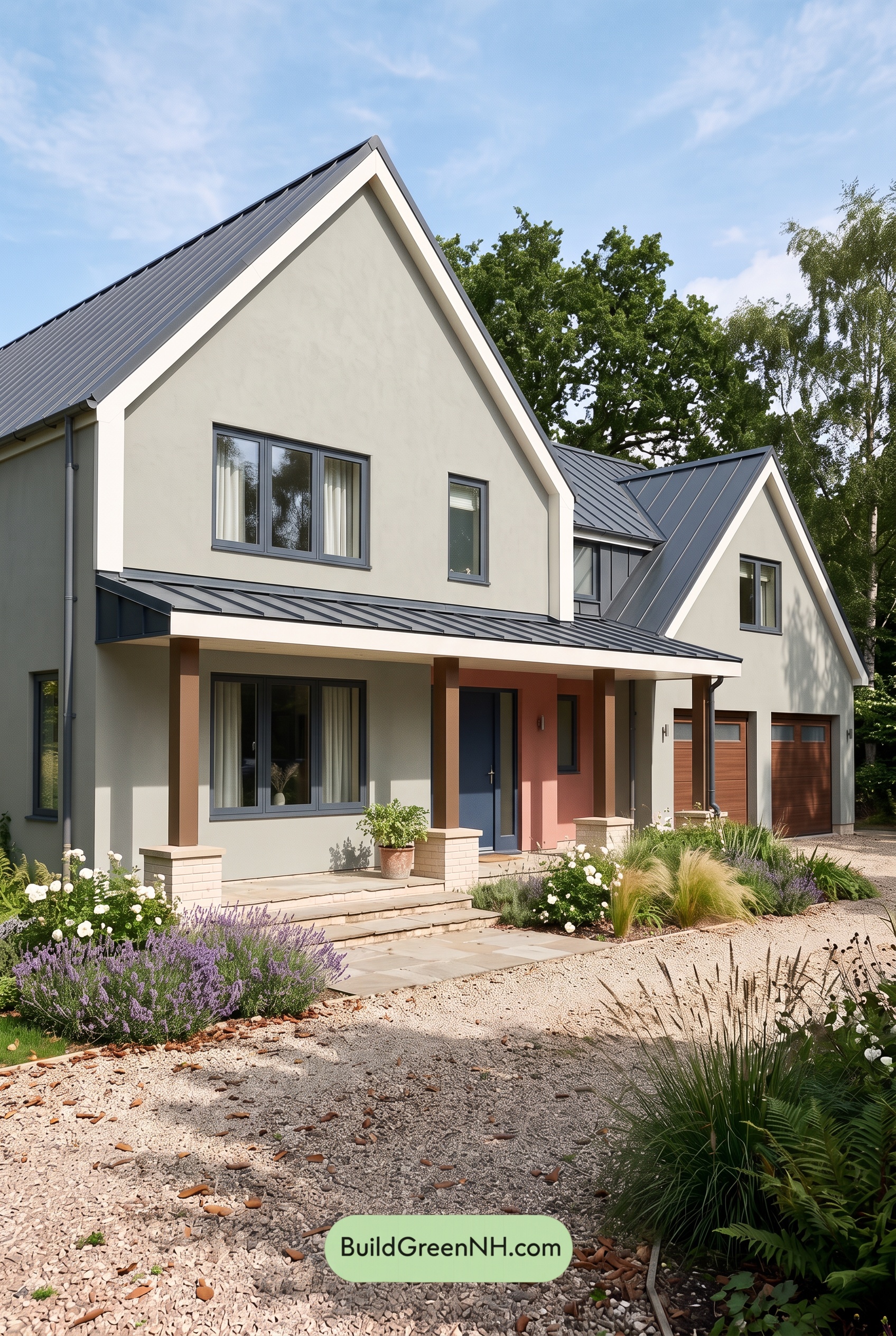

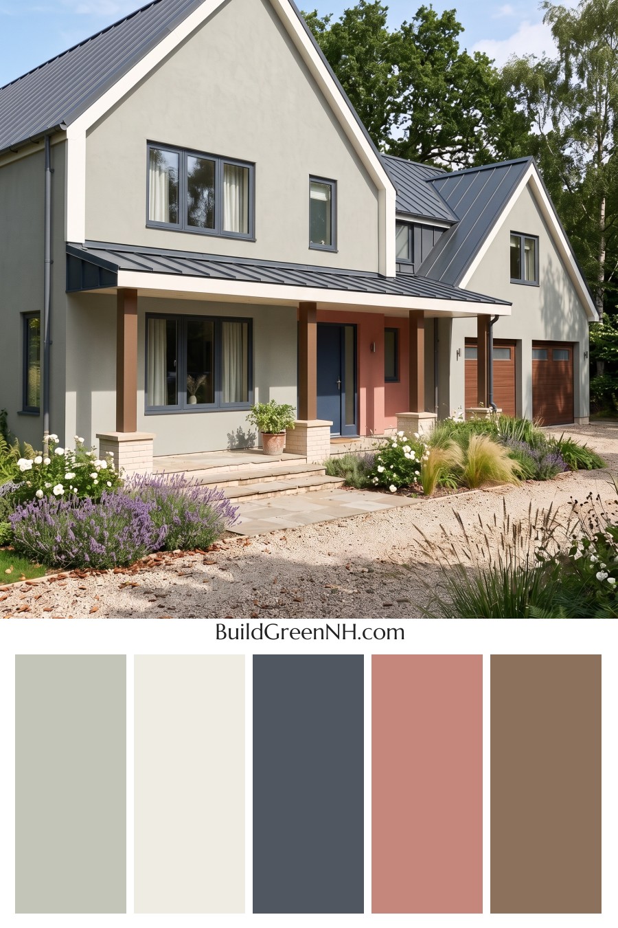
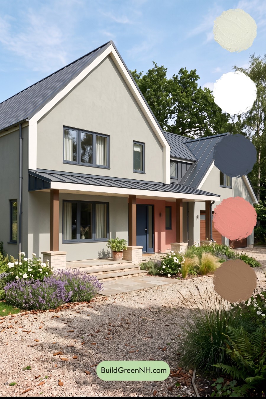
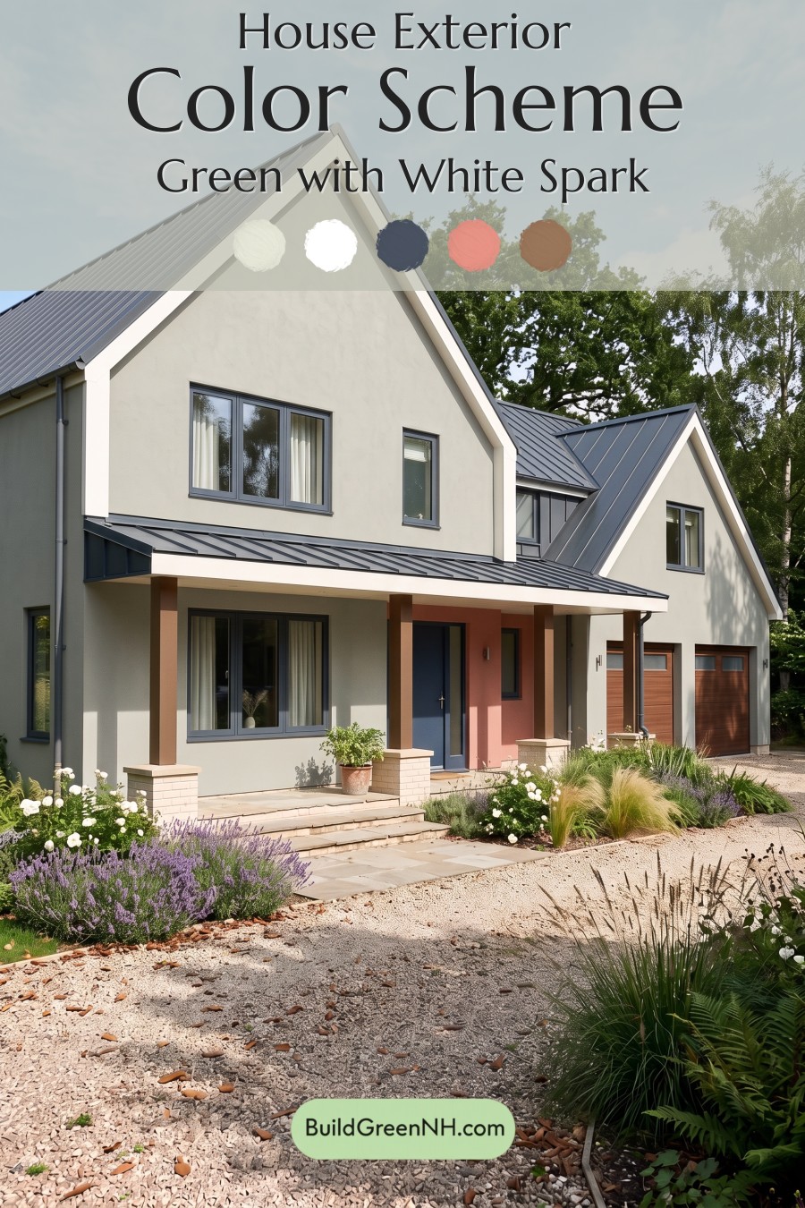
Soft gray walls, crisp white trim, and a muted pink entry give this home a beautiful balance of modern simplicity and welcoming warmth.
A Soft Gray Foundation with Clean White Edges
A light, warm shade of gray covers the main exterior walls, creating a calm backdrop for the home’s dramatic gables. Its subtle warmth keeps the broad surfaces from feeling stark, while its softness allows the architectural details to stand out.
White trim traces the steep rooflines and stretches across the porch fascia. These bright edges sharpen the silhouette without overpowering the gentle wall color. Against the gray, the white feels fresh rather than flashy.
Deeper Grays Bring Everything into Focus
The metal roof introduces a deeper, cooler gray that gives the exterior definition. Repeating that shade across the main roof, smaller gable, and porch canopy helps the different sections feel connected.
Dark gray window frames echo the roof, adding crisp outlines to the glazing. The front door continues this deeper gray family, with a subtly blue undertone that looks especially striking against the warmer entry wall. These darker details give the pale exterior just enough contrast.
A Pink Entry and Warm Brown Accents
The recessed entrance offers the scheme’s most unexpected touch: a soft, earthy pink. Concentrated around the front door, it draws the eye toward the porch without competing with the larger gray walls. It is a gentle accent, but it makes the entrance memorable.
Warm, medium-brown porch columns add another layer of warmth. Their slightly reddish undertones relate naturally to the pink, while the richer brown garage doors carry that warmth across the right side of the house. The shades coordinate without looking identical.
Pale cream brick bases beneath the columns provide a quiet transition to the light beige steps and paving, keeping the porch grounded and inviting.
Modern Contrast with a Softer Side
This palette succeeds because each color has a clear role. Light gray establishes calm, white emphasizes the architecture, and deeper gray provides structure. Pink and brown soften the composition where warmth matters most: around the entrance and porch.
The result feels polished but approachable. There is enough contrast to celebrate the strong rooflines, yet enough warmth to make the house feel comfortably at home among the surrounding greens.
Next, see how this color scheme looks under different lighting simulations throughout the day.
Overcast
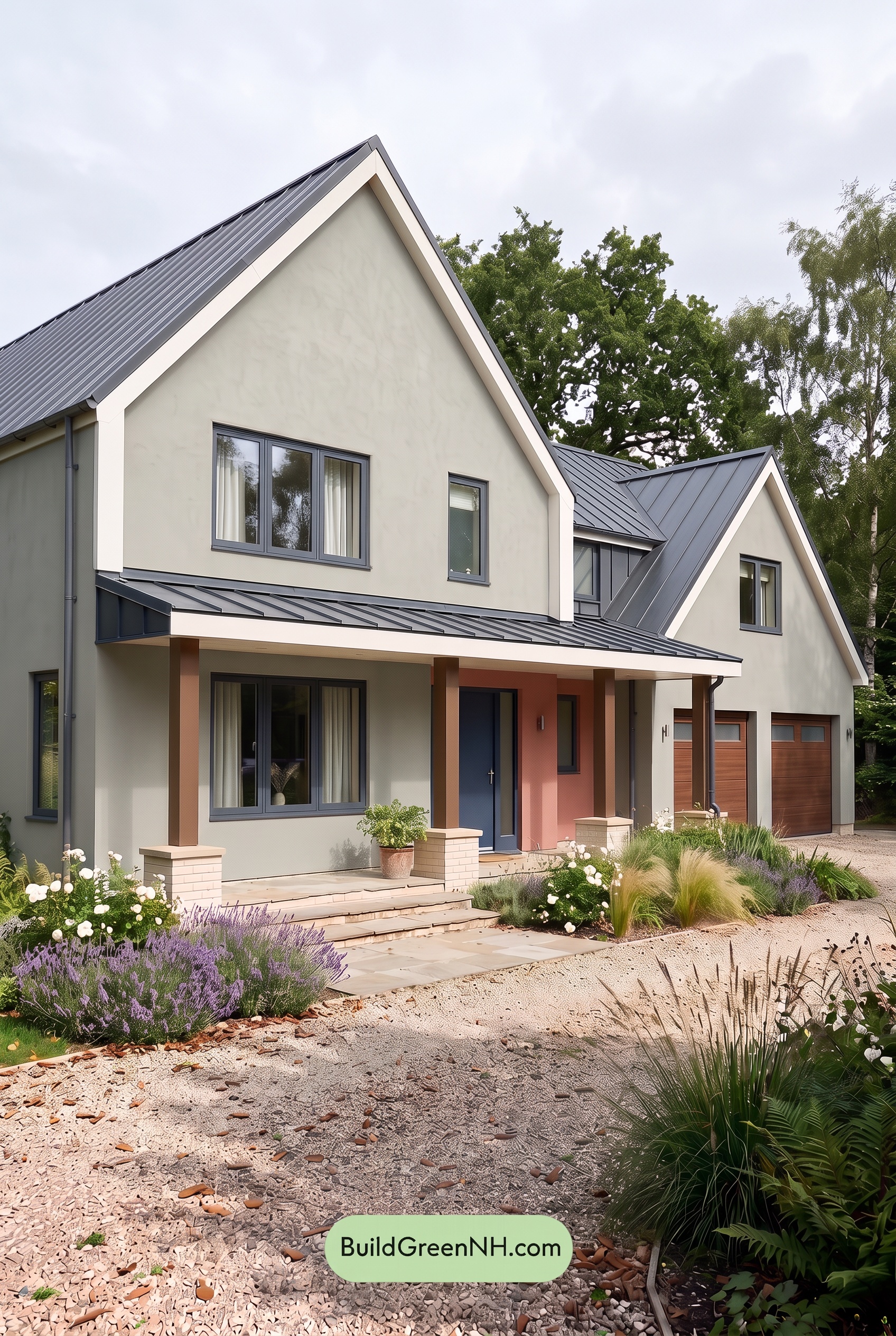
Under overcast skies, the light gray walls would appear cooler and more even than in neutral daylight, with their subtle warmth less noticeable. The pink accent would feel dustier and less saturated, while the warm browns would look more subdued. White trim would lose some of its bright glow, giving the palette a softer, quieter character.
Diffused light would soften shadows beneath the porch and along the gables, reducing sharp light-to-dark contrasts. The deeper gray frames and door would still stand out against the pale walls, but without such dramatic edges. Compared with neutral daylight, the overall mood would feel calmer and more understated, with the warmer shades offering a gentle counterpoint to the cool grays.
Golden Hour
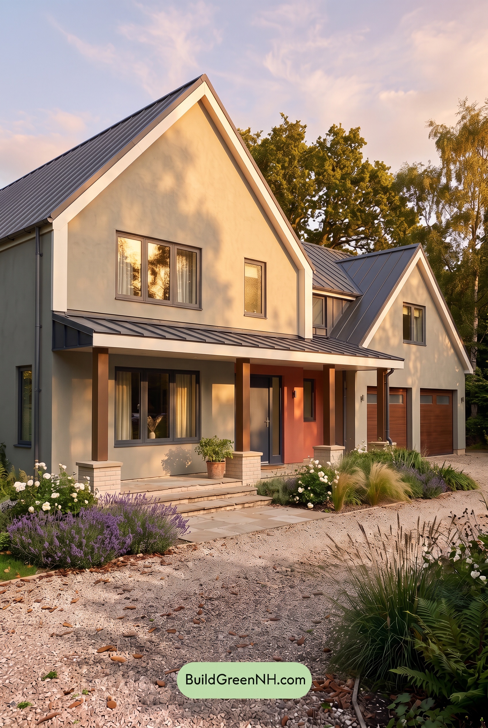
Golden Hour gives the light grays a soft beige cast, making them feel warmer and gentler than they would in neutral daylight. The whites take on creamy warmth, while the muted pink appears richer and leans toward peach. Brown shades gain a reddish glow, bringing out a fuller sense of saturation without overwhelming the quiet neutrals.
Long, leafy shadows sweep across the pale shades, creating stronger light-and-dark contrast while leaving shaded grays looking cooler and deeper. Compared with the clearer, more even color balance of neutral daylight, the sunlit shades feel more closely blended. That mix of glowing warmth and cool shadow gives the house a relaxed, welcoming mood with a little extra drama.
Shade
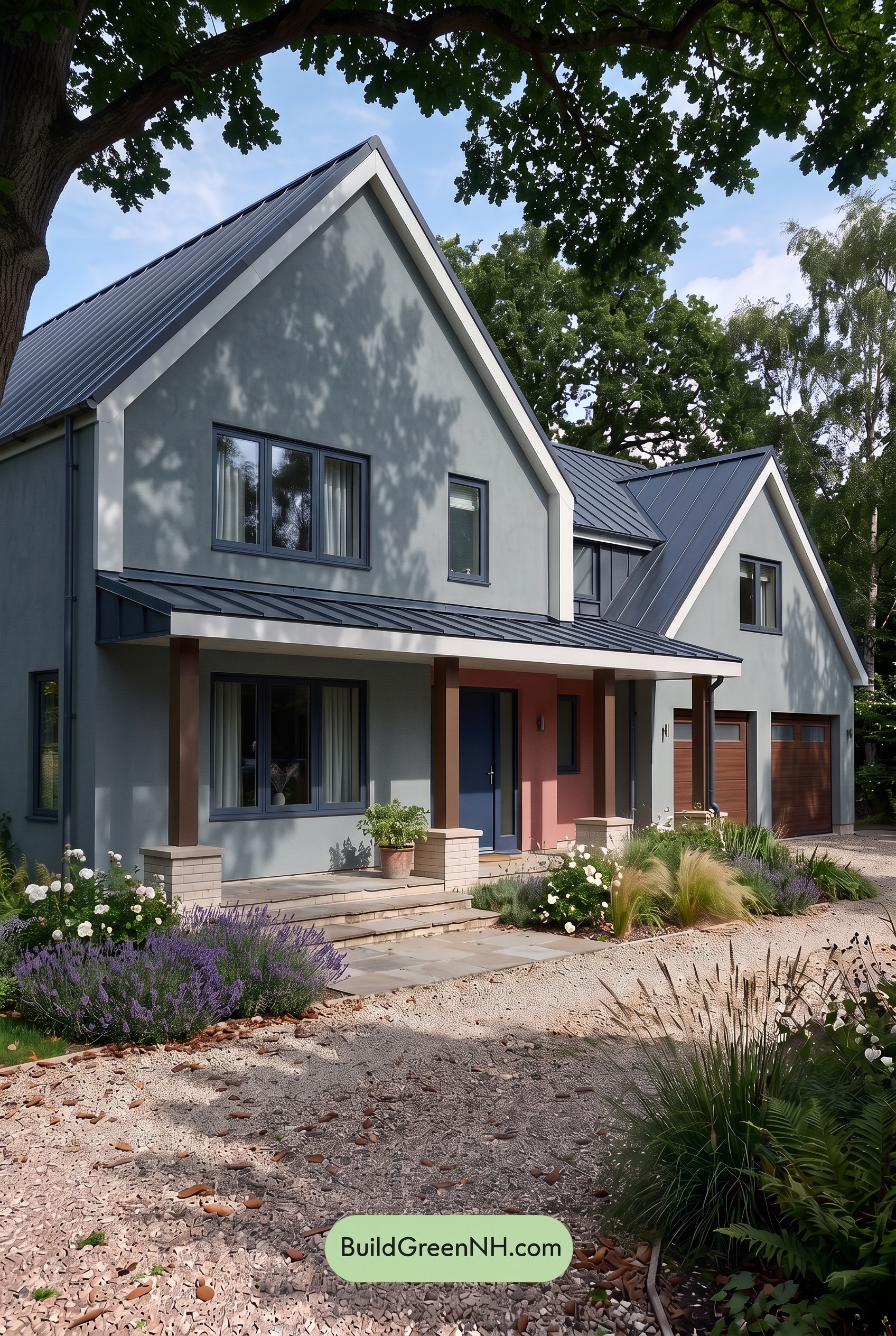
In shade, the gray walls look deeper and cooler than they would in neutral daylight, with subtle blue undertones becoming more noticeable. Their color feels quieter and less saturated, while the white trim takes on a softer, slightly gray cast. Dappled leaf shadows add darker layers across the walls, and the deeper gray window frames blend more closely with the shaded surfaces.
The pink accent feels more muted beneath the porch, while the browns deepen and lose some of their golden warmth. These warmer shades still offer a gentle counterpoint to the cool grays. Although shade softens much of the palette, the white trim remains a clear contrast against the darker areas, giving the house a calm, sheltered mood rather than the brighter, more open feeling of neutral daylight.
Nighttime
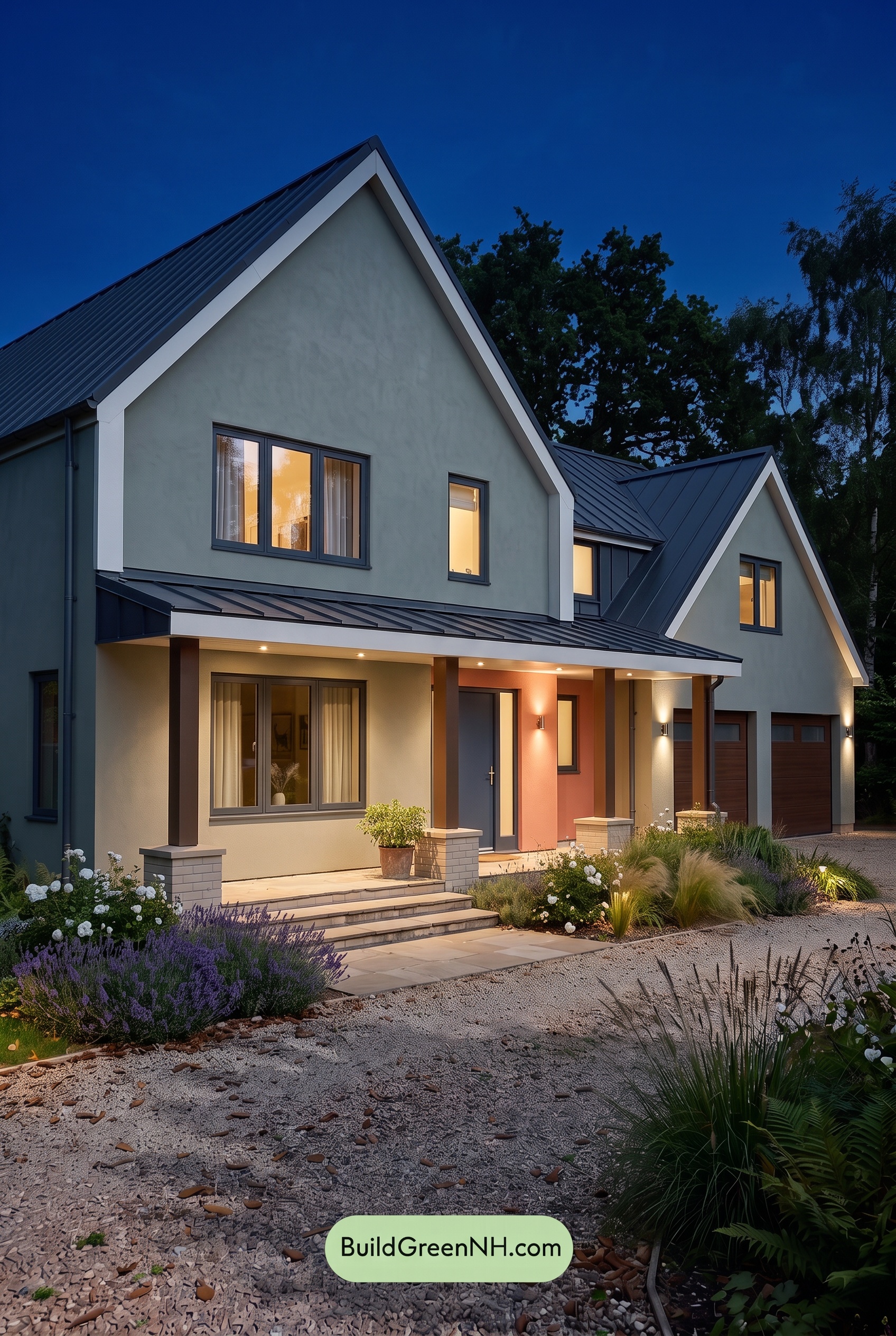
At night, the gray walls look deeper and cooler than they would in neutral daylight, with a subtle blue cast across the unlit upper sections. Beneath the porch lights, those same grays take on a softer, warmer appearance. The white trim stays bright against the darkened surfaces, sharpening the rooflines while shifting toward creamy white near the warm glow.
The pink accent feels warmer and more saturated under the entry lighting, while the brown columns and garage doors deepen into richer, shadowy shades. Away from the lights, color becomes more subdued and details recede. Compared with daylight’s more even appearance, this mix of warm highlights and deep shadows creates a mood that feels both dramatic and welcoming.
Pin these for later:
Want More?
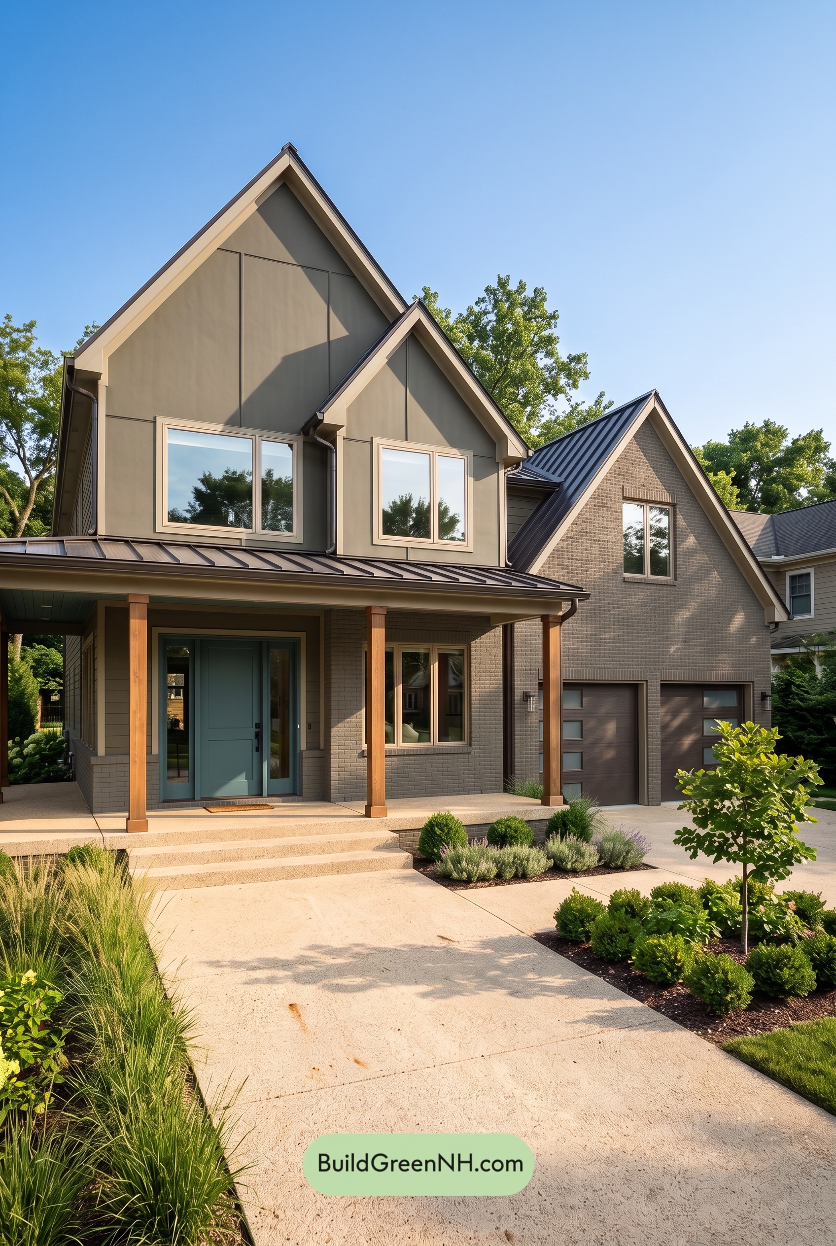 Earthy Green House Exterior Color Scheme: Brown Green Signature
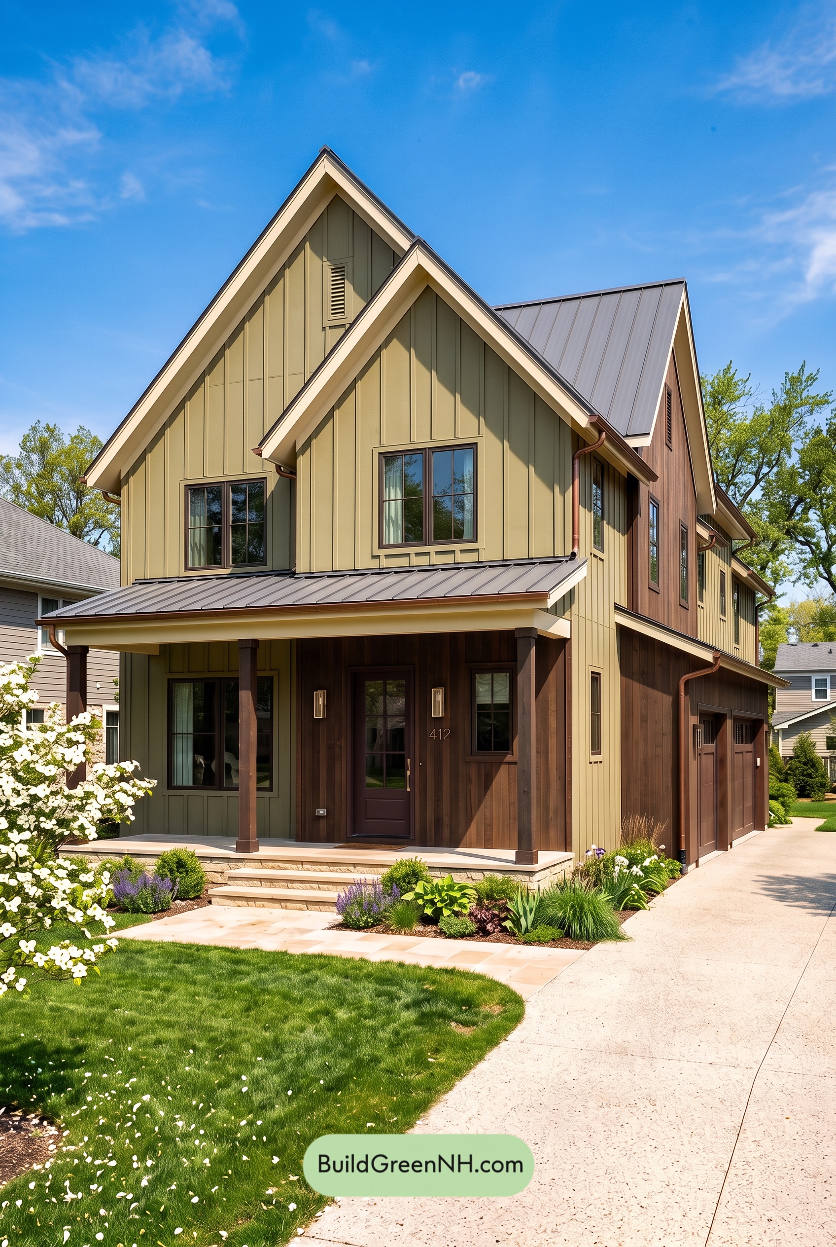 Earthy Green House Exterior Color Scheme: Green and Cream Keepsake
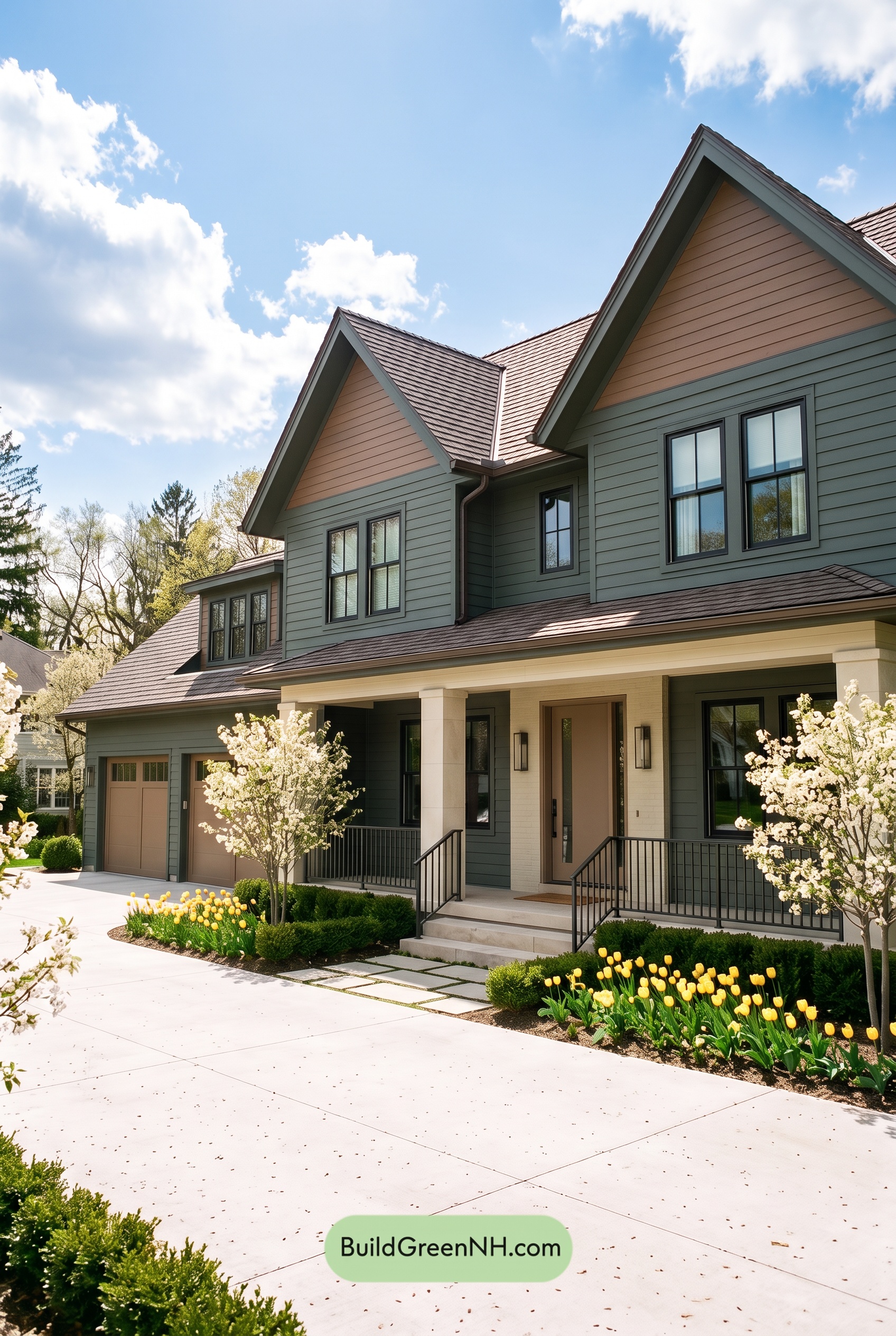 Earthy Green House Exterior Color Scheme: Brown Green Comfort
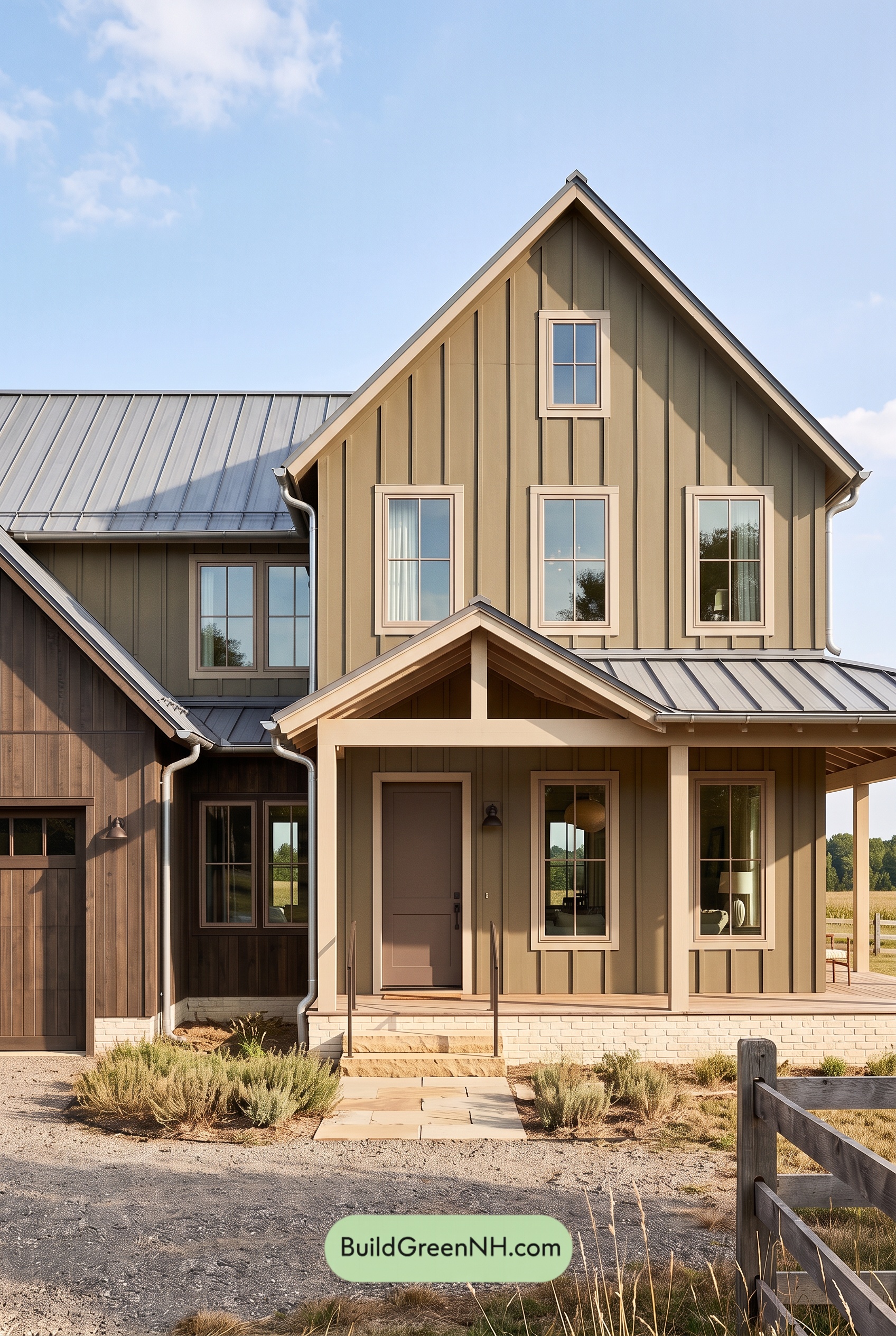 Earthy Green House Exterior Color Scheme: Green and Beige Sanctuary
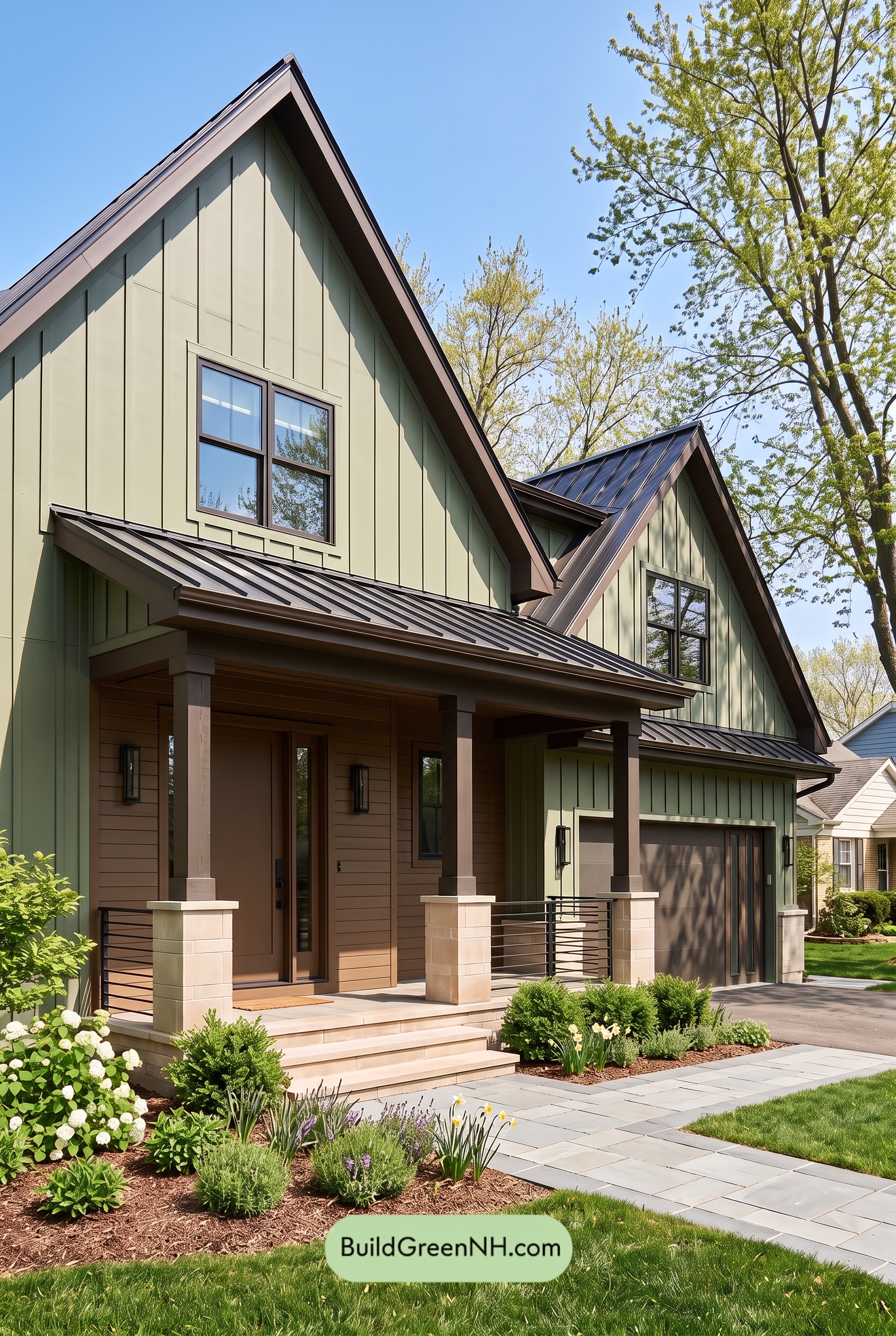 Earthy Green House Exterior Color Scheme: Green Velvet Assurance
Table of Contents