Last updated on
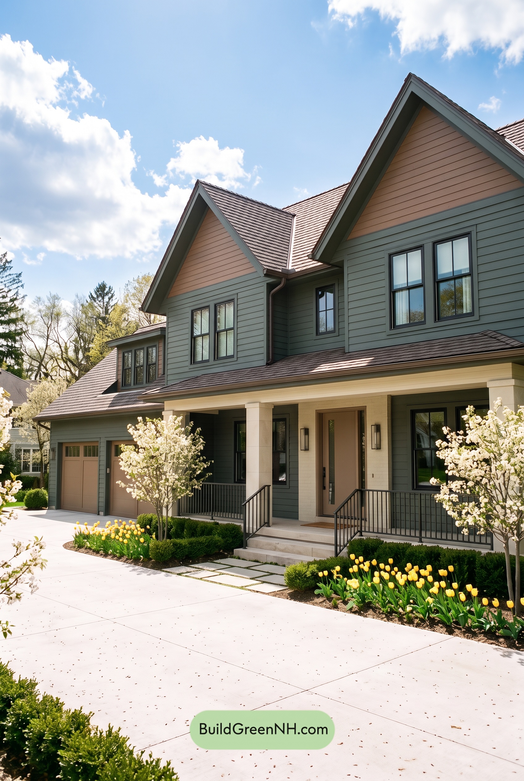

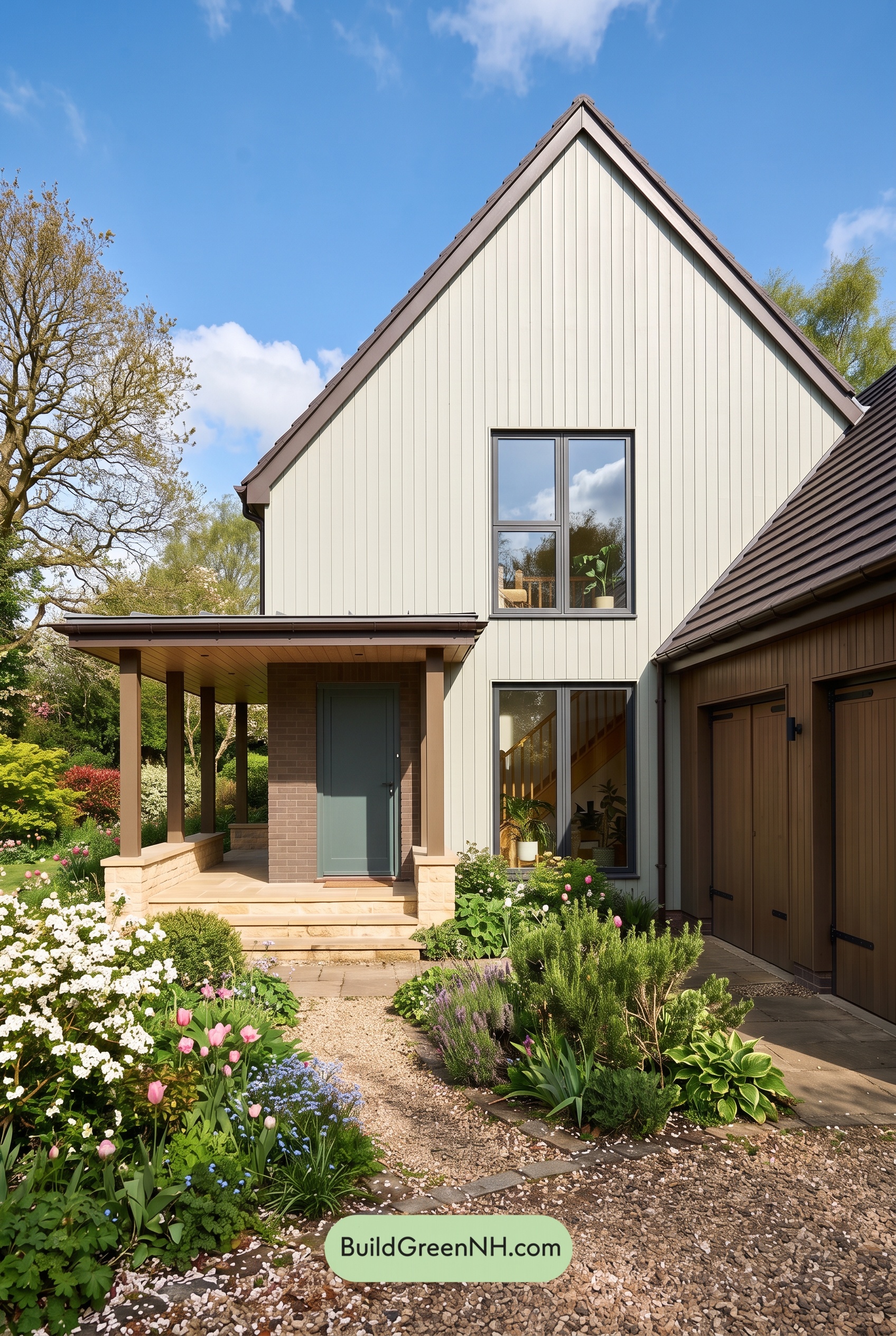
Muted sage green, warm beige, and deep gray give this home a beautifully balanced exterior that feels welcoming, grounded, and full of character.
A Soft Green Foundation
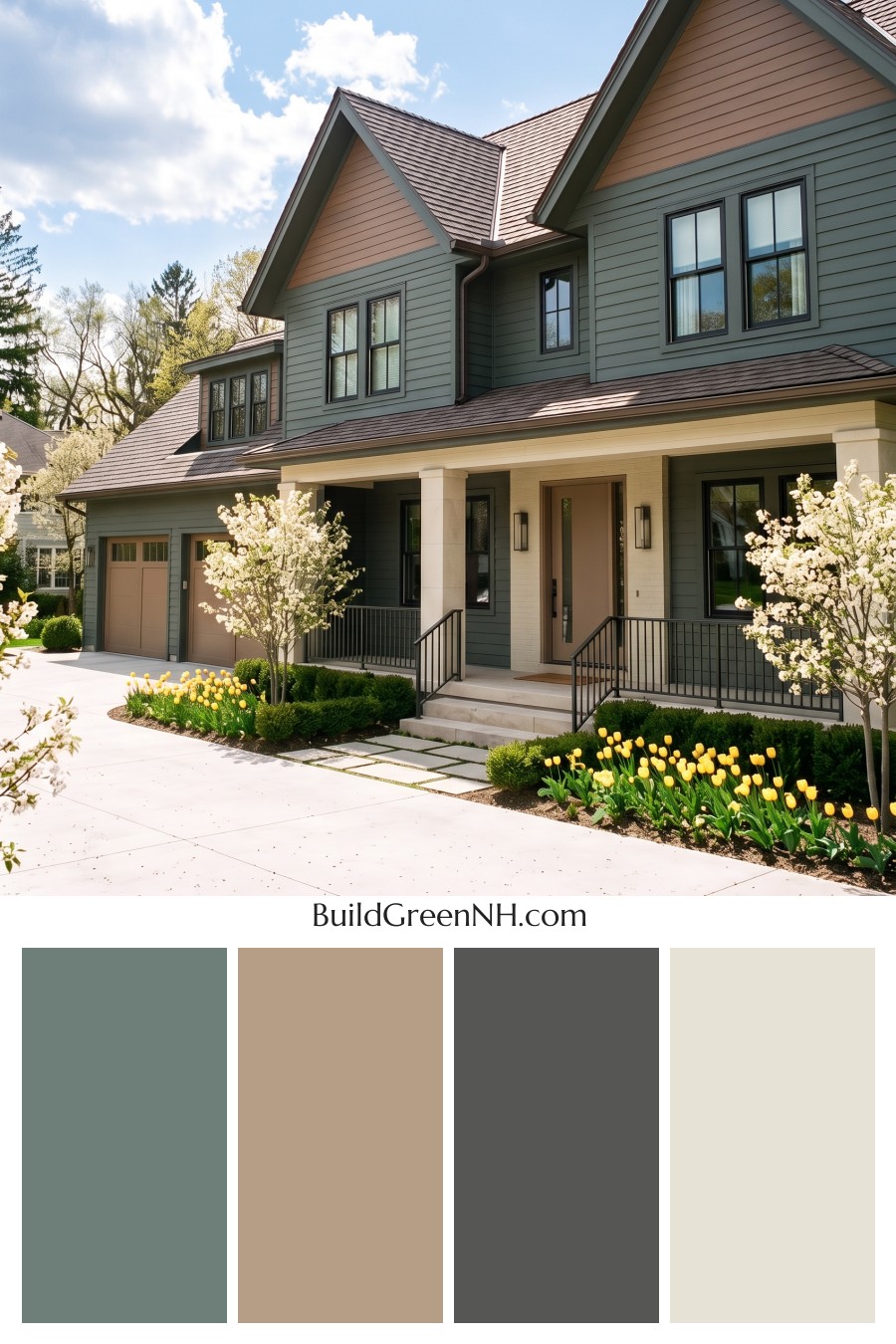
A muted, gray-leaning sage green covers most of the horizontal siding, giving the house a calm presence without hiding its architectural details. It is substantial enough to anchor the broad facade, yet soft enough to sit comfortably beside the surrounding greenery.
Related green trim outlines the gables, windows, and siding transitions. Keeping these elements close in color creates gentle definition rather than sharp contrast, allowing the roof peaks and horizontal lines to stand out naturally.
Warm Beige Brings Balance
The upper gable walls introduce a warm, medium beige that offers a pleasing counterpoint to the cooler green siding. Beige also appears on the smaller dormer, repeating the warmth across the roofline so that no single section feels disconnected.
At the porch, pale creamy beige columns and a matching entry surround brighten the sheltered space. This lighter shade draws attention toward the front door and gives the entrance an inviting softness. Against the deeper siding, the columns feel crisp without the stronger contrast of bright white.
Doors and Dark Accents Add Definition
The front door wears a deeper, taupe-leaning beige, adding warmth while staying within the restrained palette. Similar beige garage doors connect the garage visually to the entrance and upper gables. That repetition helps the wide exterior read as one cohesive composition.
Deep charcoal-gray window frames and railings provide the sharper accents. Their slim outlines define the glazing and porch edges without competing with the larger areas of green and beige. The effect is polished, but not severe.
A Roof That Ties Everything Together
The roof’s muted brown-gray tones bridge the warm beige and cool green beautifully. Its darker shade gives the house a clear outline, while the subtle variation across the shingles adds texture without introducing a distracting new color.
What makes this scheme work is its measured contrast: soft green supplies depth, beige brings warmth and light, and charcoal gray adds precision. Together, they create an exterior that feels quietly elegant and especially at home among trees, flowering shrubs, and garden beds.
Next, see how this color scheme looks under different lighting simulations throughout the day.
Overcast
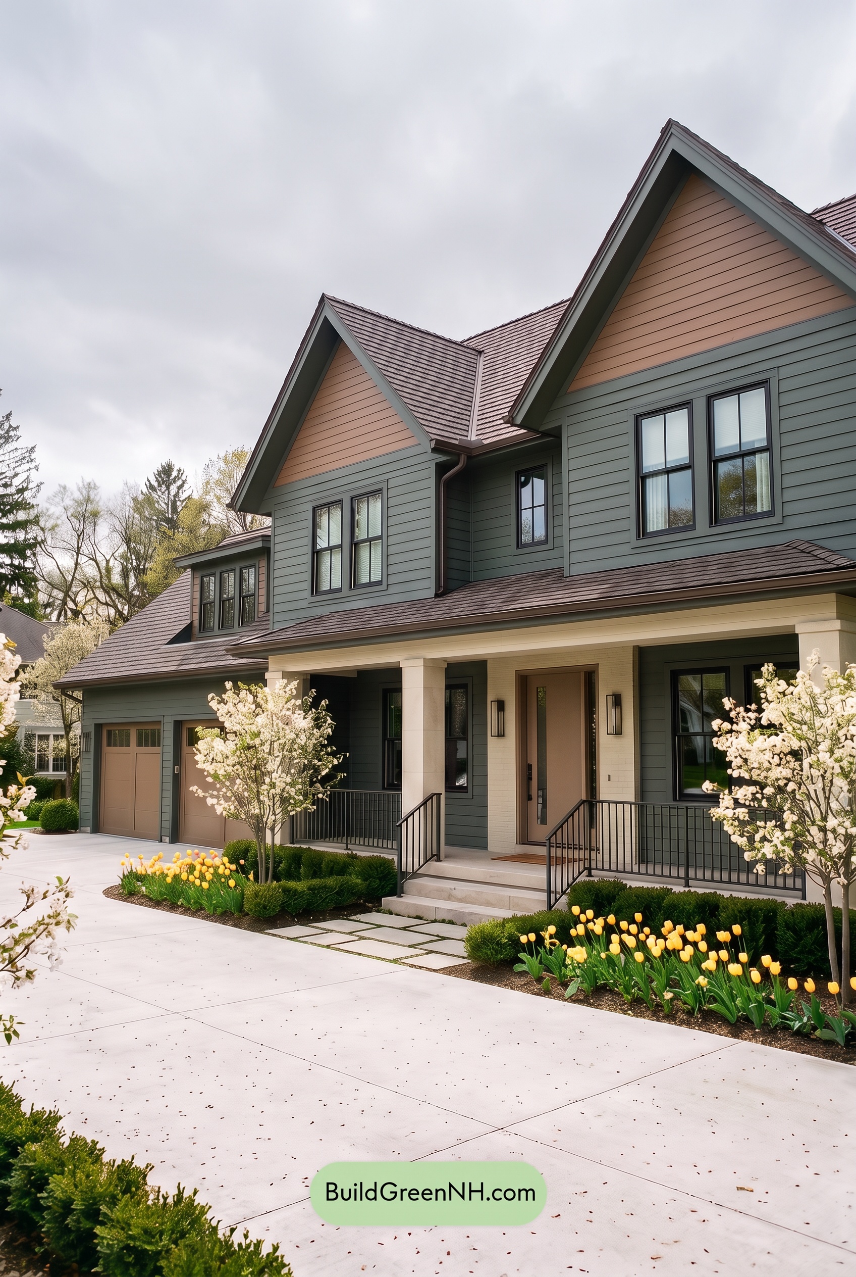
Under overcast skies, this muted green siding reads cooler and grayer than it would in neutral daylight, with its saturation appearing more subdued. The beige gables and doors feel less golden, while the pale beige columns retain enough warmth to keep the exterior inviting. Dark gray window frames and railings provide definition without overwhelming the softer palette.
Diffused light softens shadows along the siding and beneath the rooflines, easing the contrast between exposed and sheltered surfaces. The recessed porch still gives the green a deeper appearance, but the transitions feel gentler. Compared with neutral daylight, the overall mood is quieter and more restful, with warm beige and cool green settling into a mellow balance.
Golden Hour
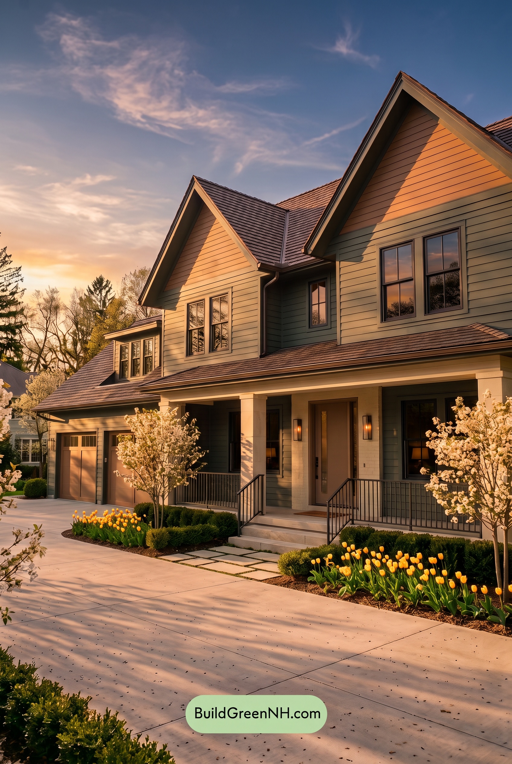
Golden Hour gives the muted greens a warmer, more yellow-leaning cast, while shaded areas deepen into cooler, richer greens. The light beiges pick up soft peach and golden undertones, appearing more saturated than they would in neutral daylight. Together, these shifts make the palette feel warmer and more enveloping without losing its earthy softness.
Long shadows beneath the gables and across the porch strengthen the contrast between glowing light neutrals and deep greens. The grays look warmer where sunlight catches them and darker in shadow, adding definition. Compared with the more balanced color relationships of neutral daylight, this mix of luminous highlights and cool recesses creates a cozy, quietly dramatic mood.
Shade
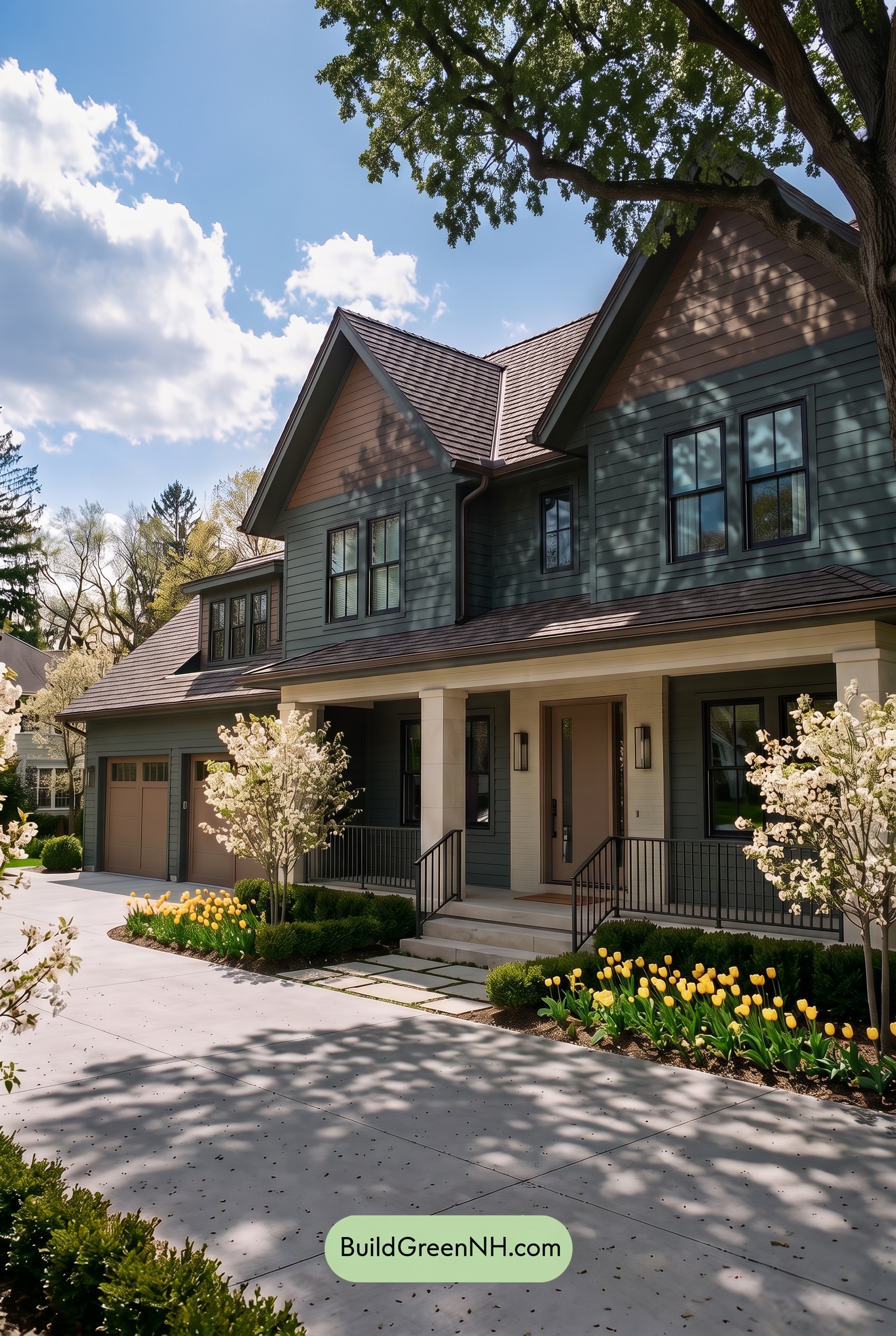
In shade, the muted greens deepen and lean cooler, appearing more subdued in saturation than they would in neutral daylight. The beige shades lose some of their golden warmth, taking on a softer, earthier character. Across the gables, patches of leafy shadow make these warm neutrals appear to shift between lighter beige and deeper brown-beige.
The pale beige around the porch stands out against the shaded greens, while the dark grays blend more closely with the deepest shadows. Contrast stays noticeable between light and dark shades, but subtle differences within the greens become harder to distinguish. Compared with neutral daylight’s clearer color separation, the shaded palette feels quieter, more sheltered, and gently moody.
Nighttime
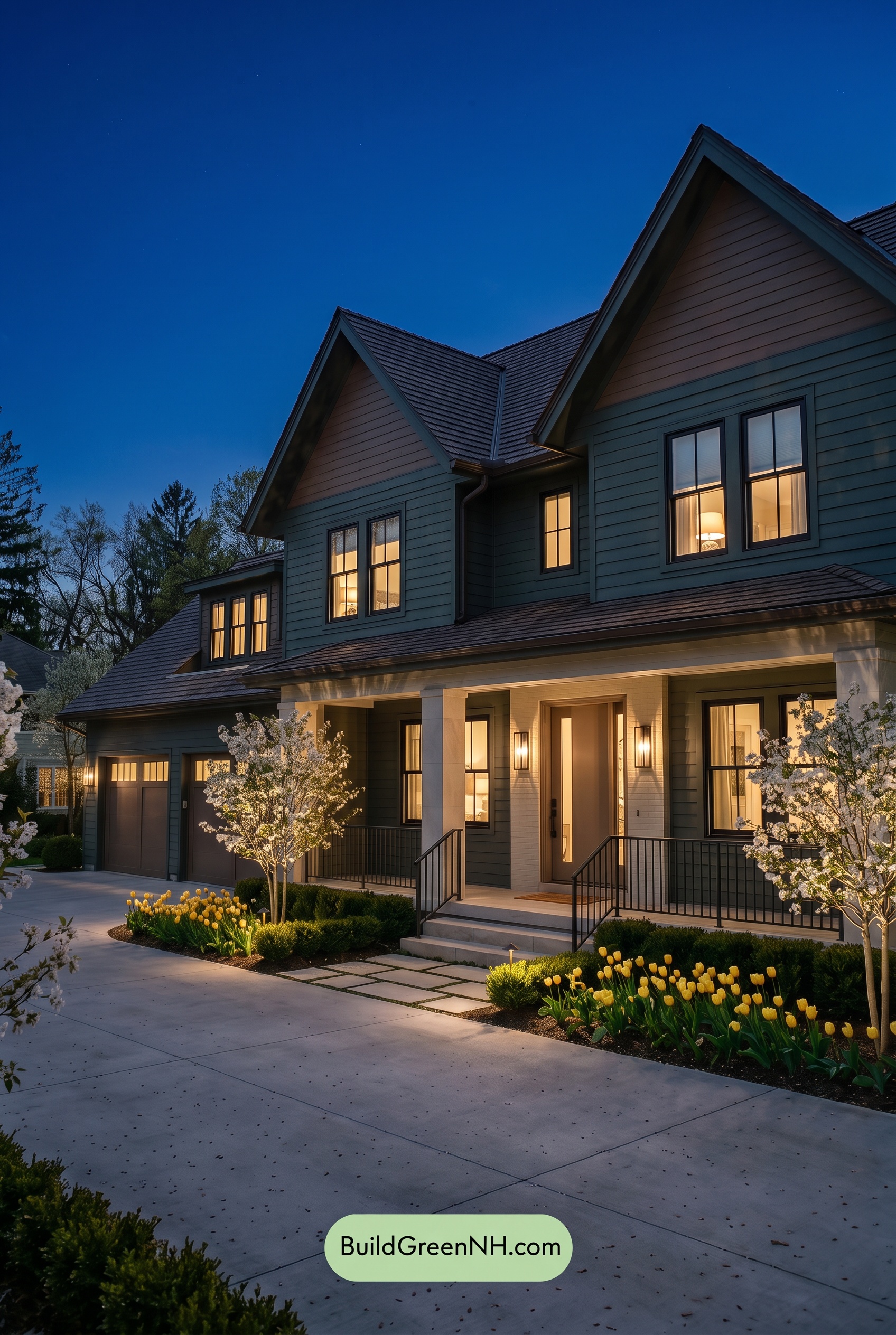
At night, the green siding and trim deepen into cooler, more muted shades, with a subtle blue cast where they catch the remaining sky light. Compared with neutral daylight, their saturation feels subdued, while shadows beneath the gables soften the distinction between green and beige. The upper beige sections read darker and slightly browner, giving the house a quieter, more dramatic presence.
Around the porch, warm lighting brings out golden undertones in the pale beige columns and entry, making these neutrals feel softer and more inviting. Gray window frames and railings appear closer to charcoal, sharpening their contrast with illuminated surfaces. Instead of daylight’s more even color balance, nighttime creates a cozy focal point at the entrance against the cooler, shadowed exterior.
Pin these for later:
Want More?
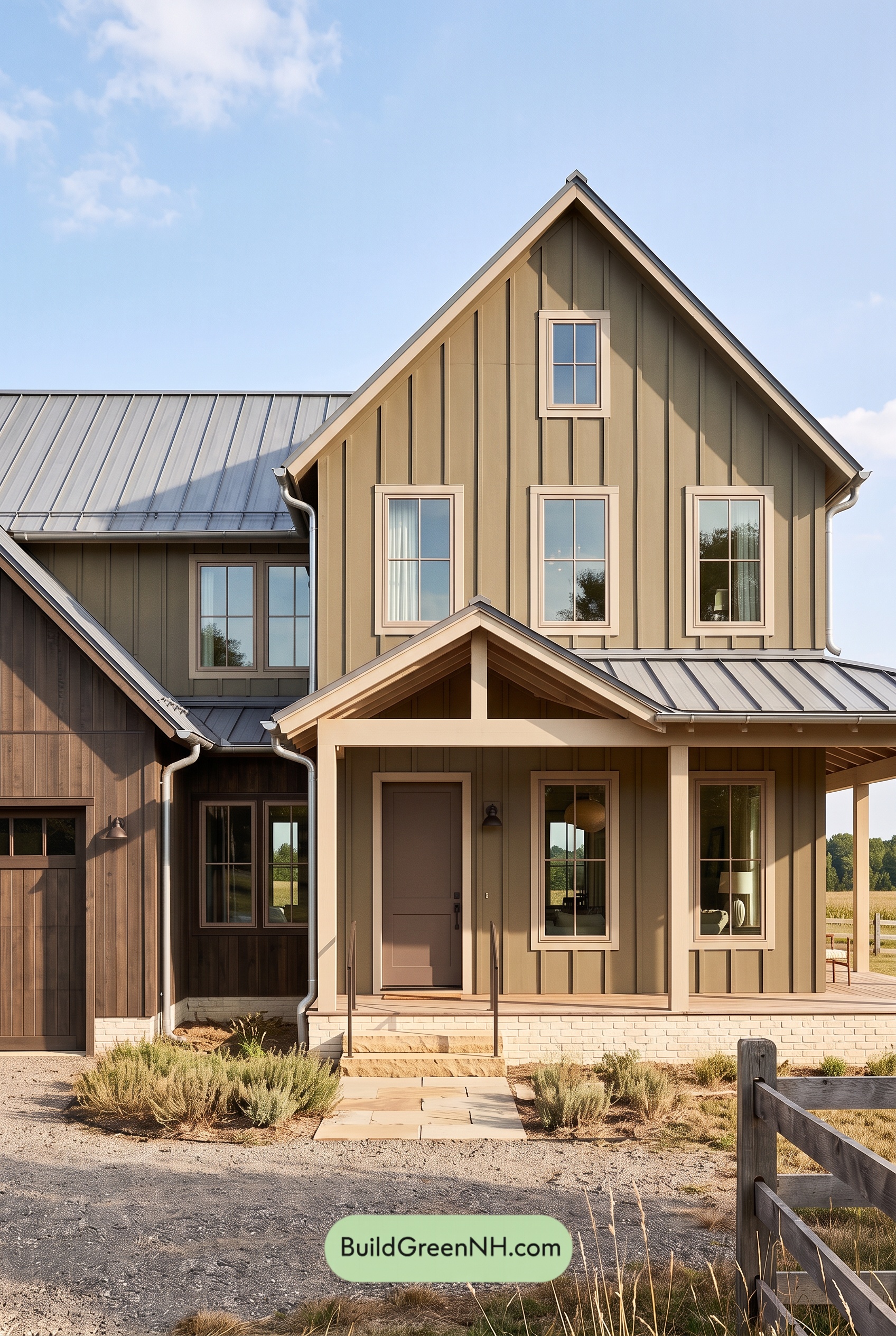 Earthy Green House Exterior Color Scheme: Green and Beige Sanctuary
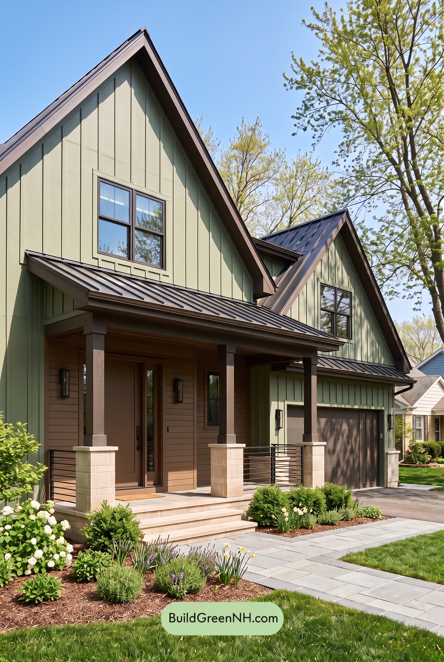 Earthy Green House Exterior Color Scheme: Green Velvet Assurance
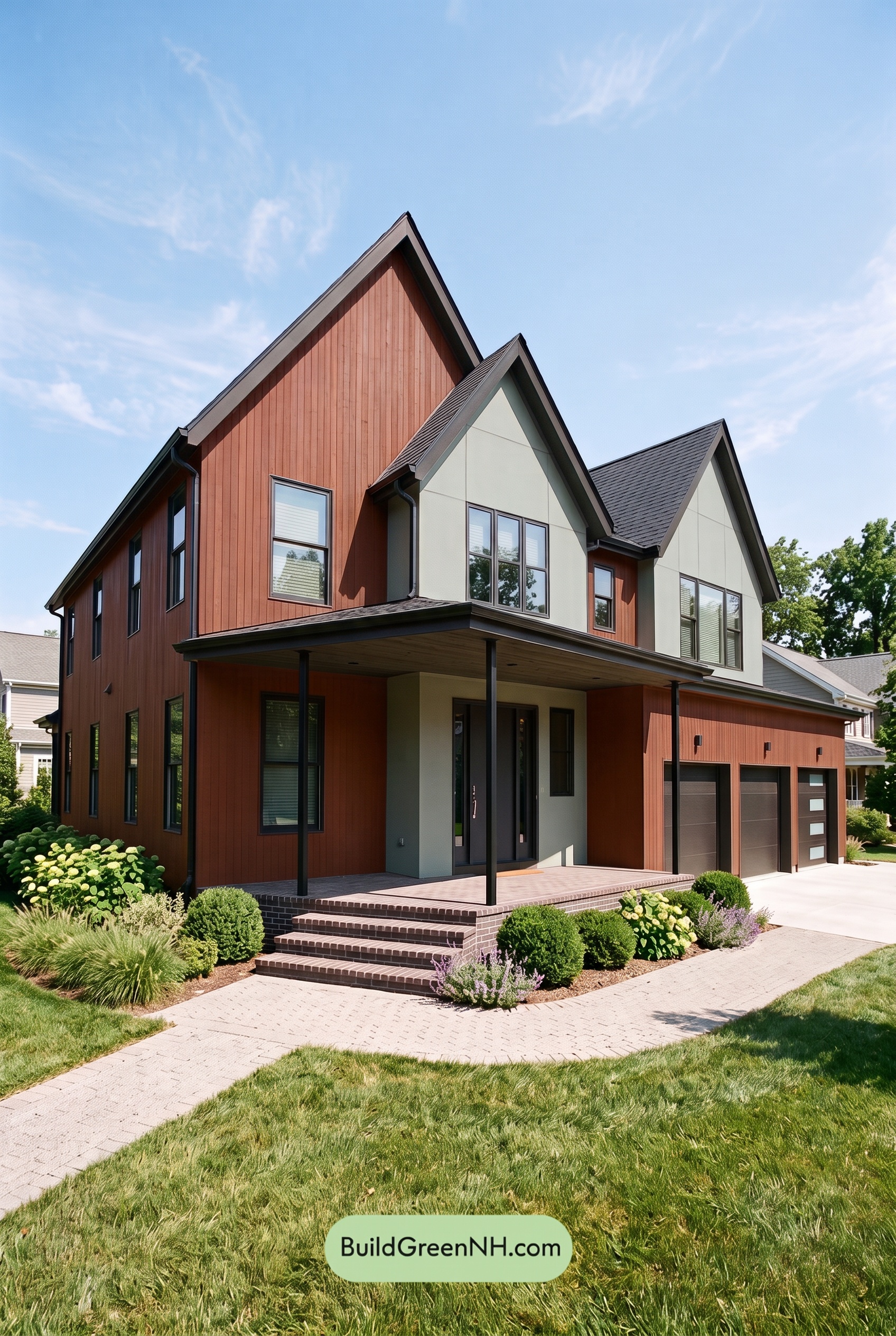 Earthy Green House Exterior Color Scheme: Brown Silken Calm
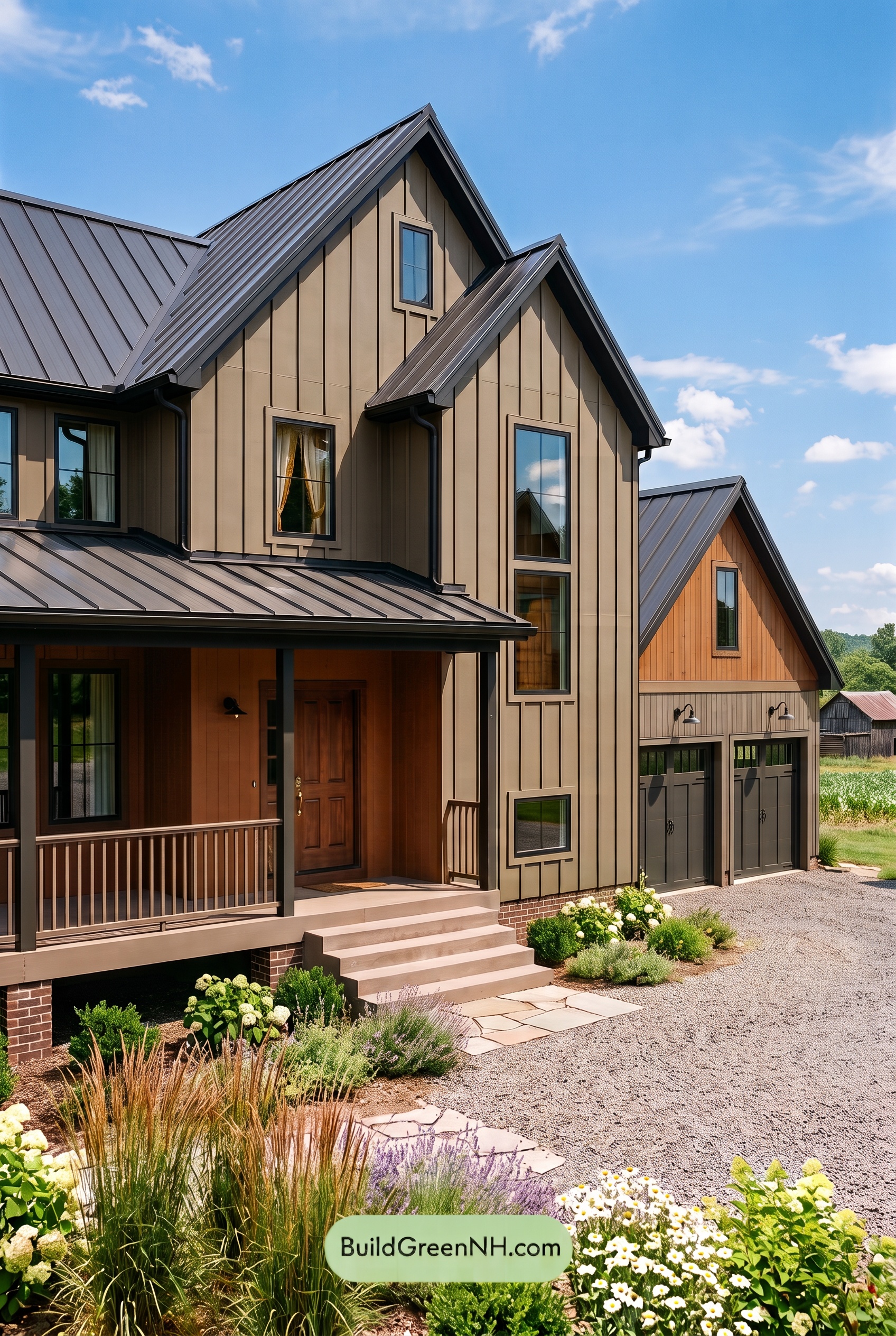 Earthy Green House Exterior Color Scheme: Green Amber Contentment
 Earthy Green House Exterior Color Scheme: Green Quiet Delight
Table of Contents