Last updated on
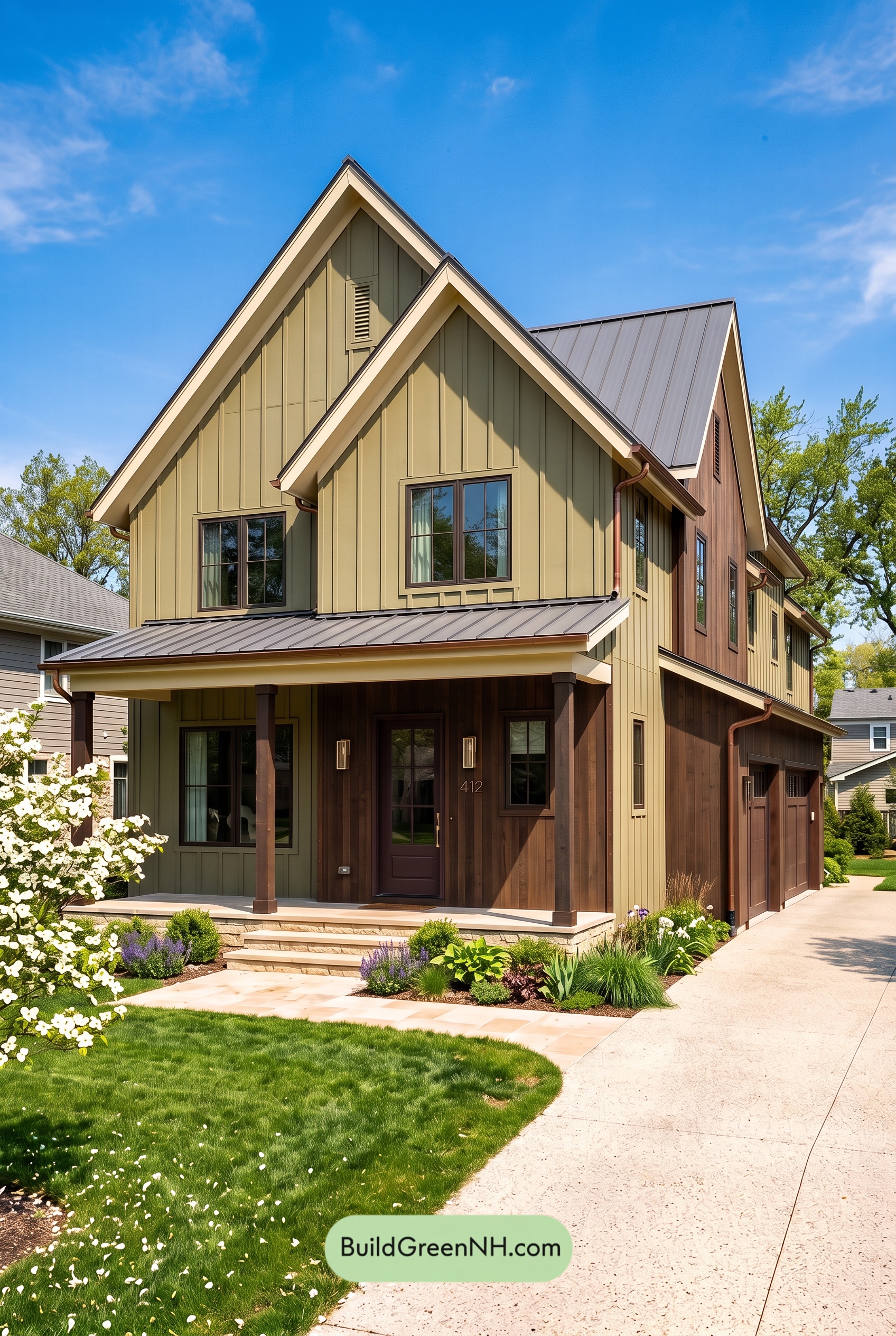

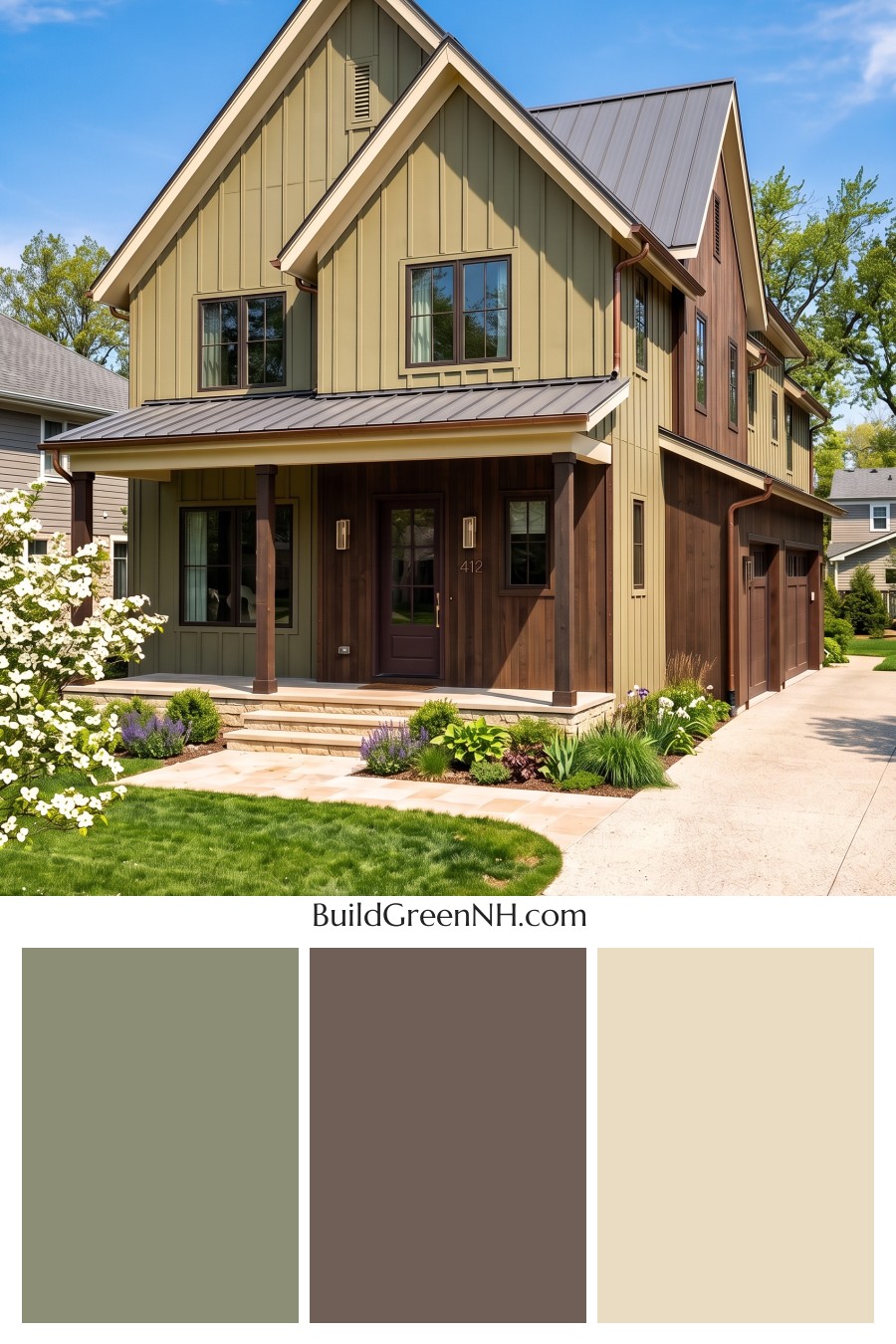
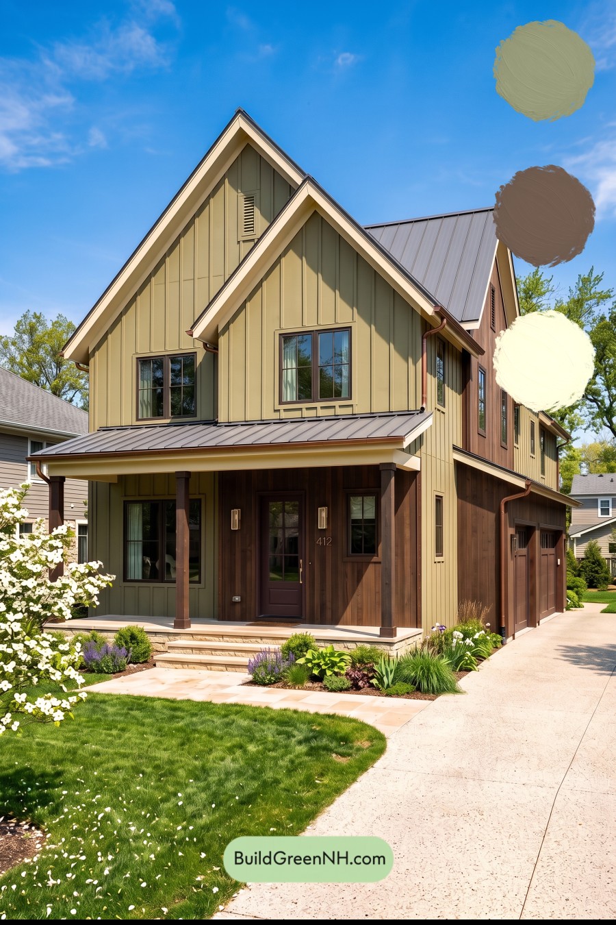
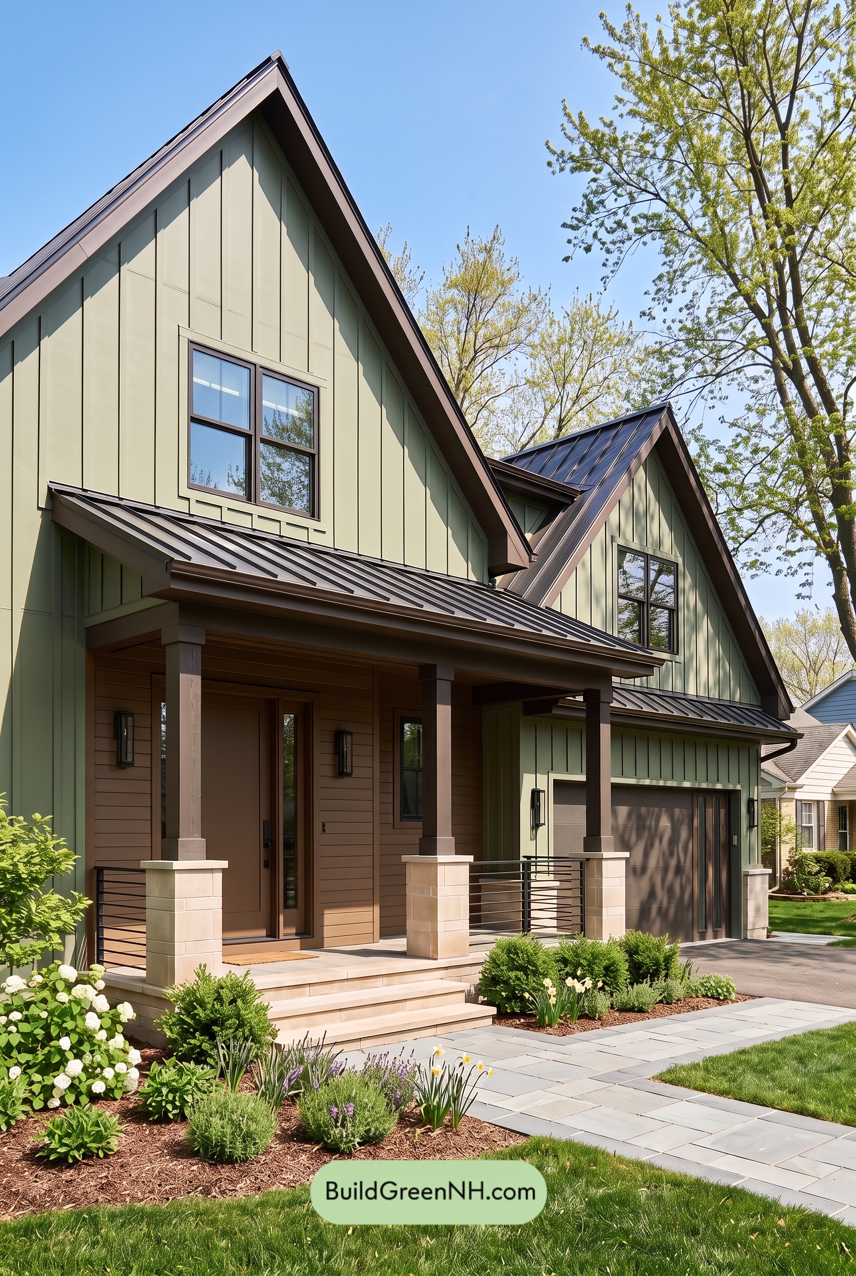
Muted olive green, rich brown, and soft beige give this home an inviting warmth while making its striking rooflines and layered facade shine.
Olive Green Sets a Calm, Earthy Foundation
A warm, muted olive green covers much of the vertical siding, including the prominent front-facing gables. Its subtle yellow-brown undertone connects beautifully with the surrounding landscape without disappearing into it. This is a green with presence, but not one that demands attention.
The board-and-batten detailing adds another layer of interest. Sunlight catches the raised edges while shadows deepen the recessed areas, giving the restrained shade plenty of dimension across the tall walls.
Rich Browns Bring Warmth and Depth
Warm medium-brown siding around the entrance and along sections of the side elevation creates a welcoming counterpoint to the green. The variation within these brown surfaces adds texture and keeps the large exterior from feeling flat.
Deeper brown porch columns frame the entry with a little more visual weight. Brown window frames repeat that darker note across the facade, connecting the upper windows to the sheltered porch below.
The front door takes on a particularly deep brown shade, with a subtle reddish cast that feels right at home among the warmer siding. Along the driveway, the brown garage doors blend with the surrounding walls rather than becoming competing focal points. That repetition makes the whole exterior feel considered.
Soft Beige Defines the Architecture
Light, creamy beige trim traces the steep gables and porch fascia, bringing clarity to the rooflines. It offers enough contrast to highlight the architecture without the sharper effect of bright white.
Similar pale beige tones in the porch steps and foundation carry that lightness down to ground level. The result feels balanced: darker browns anchor the house, while the lighter edges keep it from looking heavy.
A Gray Roof Completes the Palette
The standing-seam roof introduces a medium gray with a slightly warm cast. Its quieter tone complements both the olive siding and brown accents, while reddish-brown gutters provide another subtle connection to the warmer details below.
Together, these shades create a home that feels grounded, comfortable, and neatly defined. The appeal comes from contrast used thoughtfully—light against dark, green against brown, and soft neutral trim outlining it all.
Next, see how this color scheme looks under different lighting simulations throughout the day.
Overcast
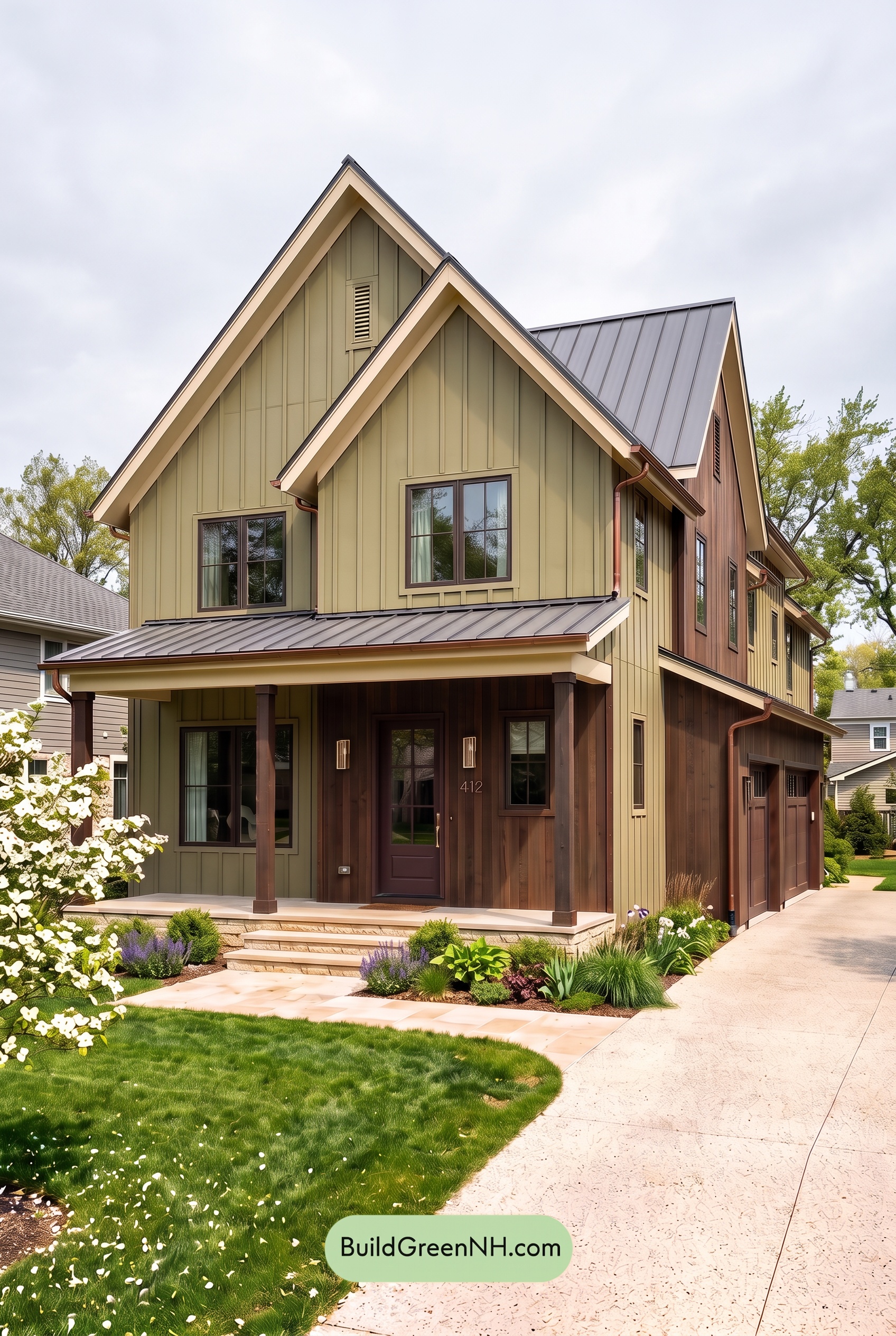
Under overcast skies, the muted green siding would read cooler and slightly grayer than in neutral daylight, with its yellow warmth less noticeable. The brown accents would feel more subdued, their reddish undertones quieter, while the pale beige trim would lose some of its golden glow. Together, these shades would appear softer and less saturated.
Diffused light would soften shadows beneath the gables and across the porch, making the darker browns look more even rather than sharply shaded. The pale trim would still outline the rooflines, but gentler light-to-dark contrast would give the whole exterior a calm, earthy mood instead of the crisper definition seen in neutral daylight.
Golden Hour
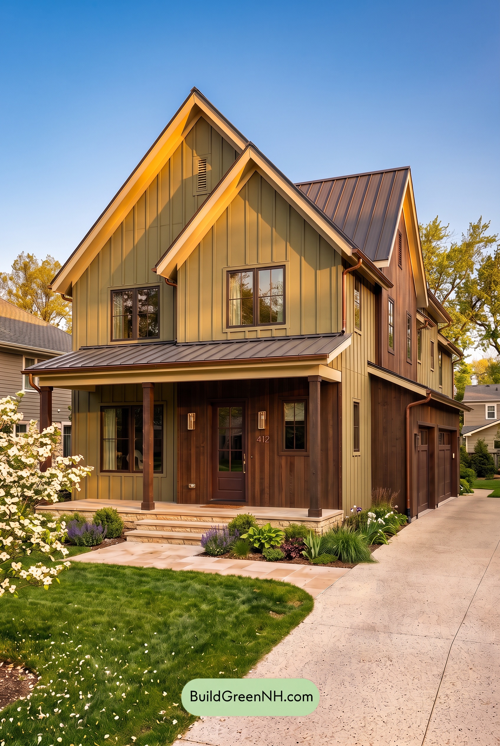
Golden Hour gives this muted green a warmer, more yellow-leaning cast than it would have in neutral daylight. Sunlit areas appear richer and more saturated, while shaded sections deepen into cooler, subdued greens. The brown shades gain a reddish warmth, and the pale beige takes on a soft, creamy glow, bringing the earthy palette closer together.
Long shadows beneath the gables and porch create stronger contrast between glowing light shades and deep browns. Although the colors feel warmer and more harmonious overall, those pockets of darkness add depth and definition. Compared with the clearer, more even appearance of neutral daylight, the house feels cozier, more dramatic, and especially inviting.
Shade
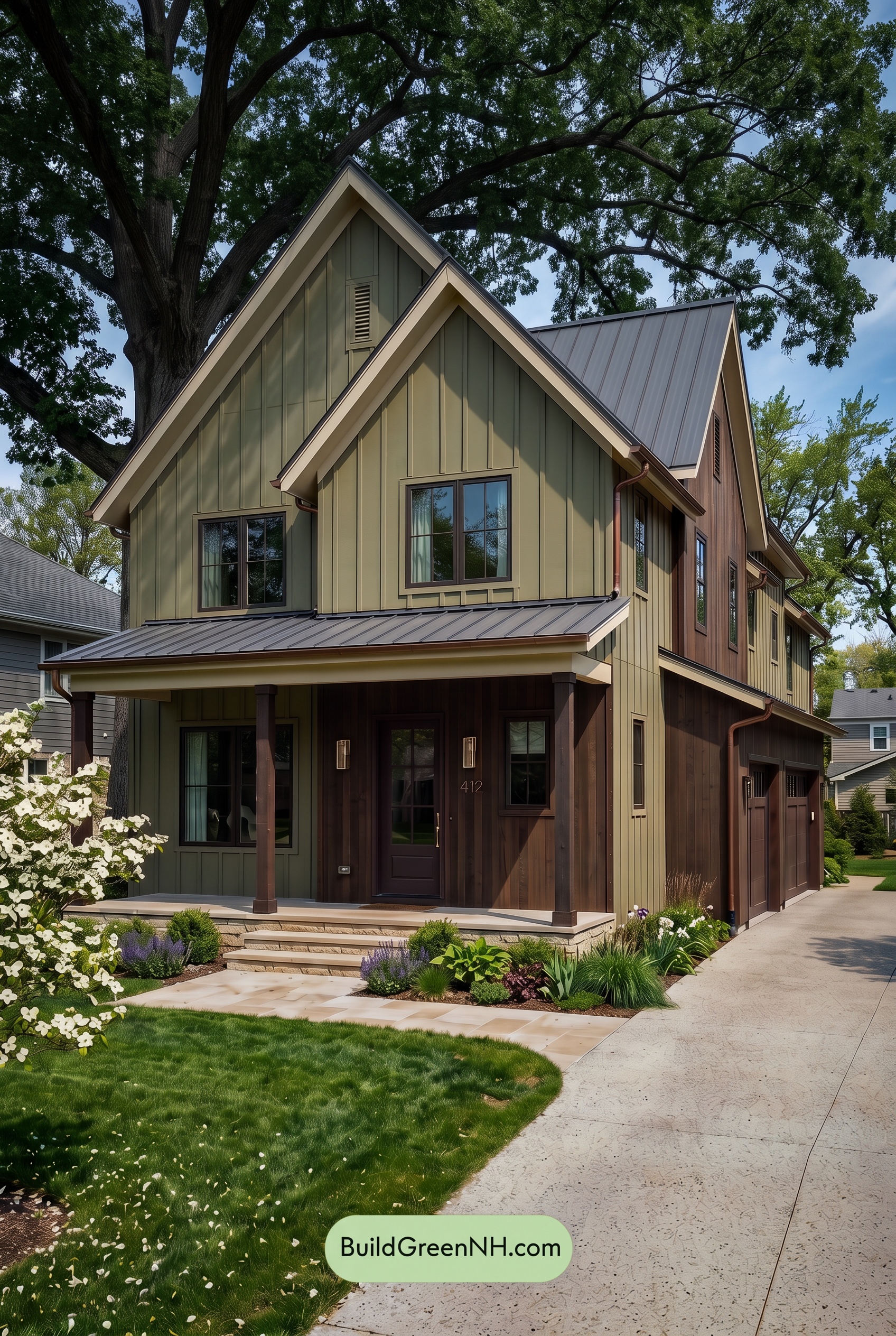
In shade, the muted green siding appears deeper, cooler, and slightly grayer than it would in neutral daylight, with its yellow warmth and saturation gently dialed back. The brown shades also darken, revealing less of their reddish warmth, while the light beige trim feels softer and less golden.
Beneath the porch roof and eaves, deeper shadows draw the darkest browns closer together, making individual details less distinct. The pale beige still stands out against those shaded surfaces, outlining the gables without a bright, sunlit edge. Compared with neutral daylight’s clearer color separation, the shaded palette feels quieter, more sheltered, and closely connected to the surrounding greenery.
Nighttime
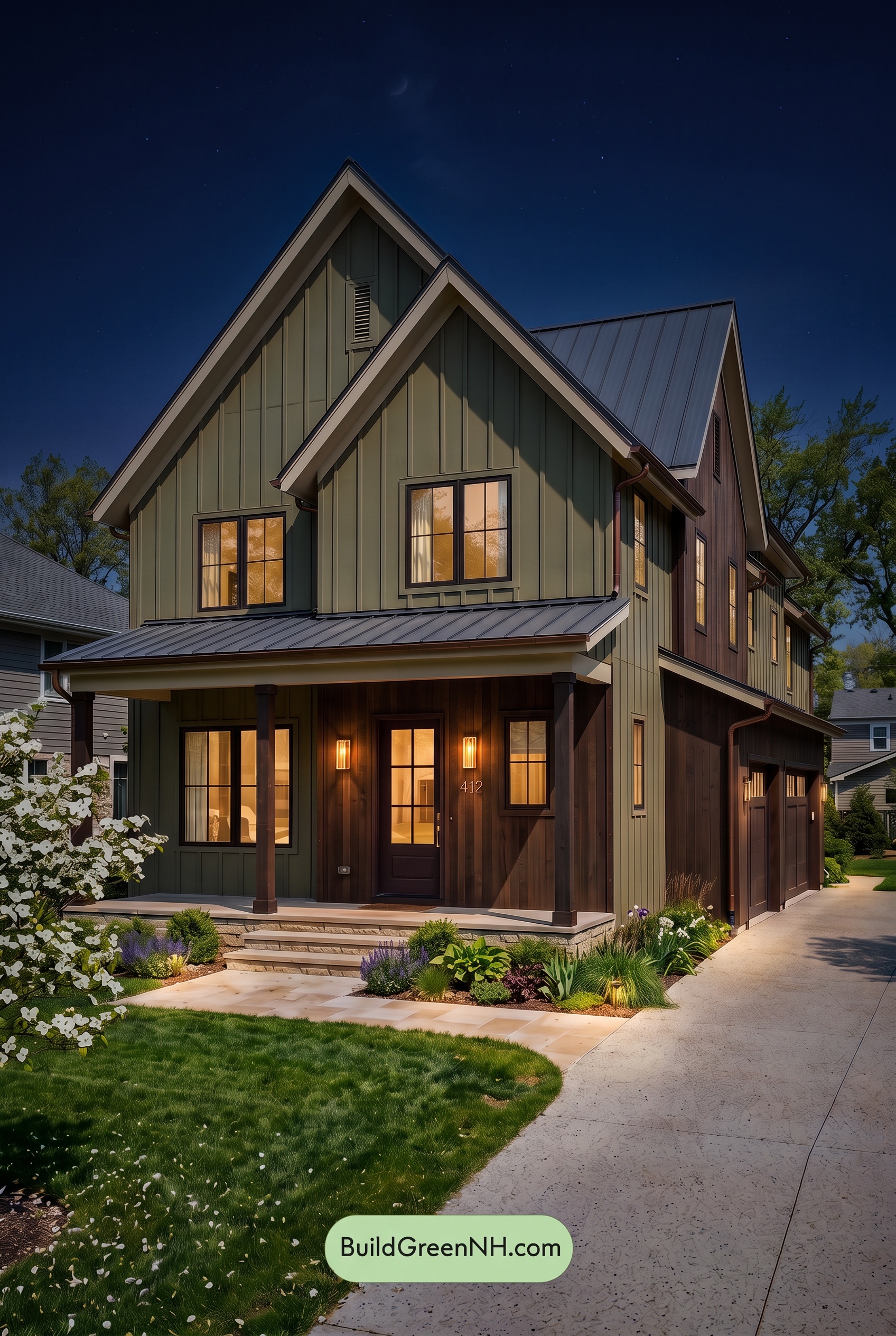
At night, this muted shade of green deepens and loses some of the saturation it would show in neutral daylight, turning grayer in the shadows. Warm light around the entry draws out reddish undertones in the browns, while the beige trim takes on a softer, creamier appearance where illuminated.
Shadows beneath the gables and porch make the darker browns feel almost black, softening distinctions that daylight would reveal. Meanwhile, the pale trim stands out against the deepened green, keeping the rooflines crisp. The result is a shift from an earthy, balanced daytime palette to a moodier exterior with a warm, welcoming heart.
Pin these for later:
Want More?
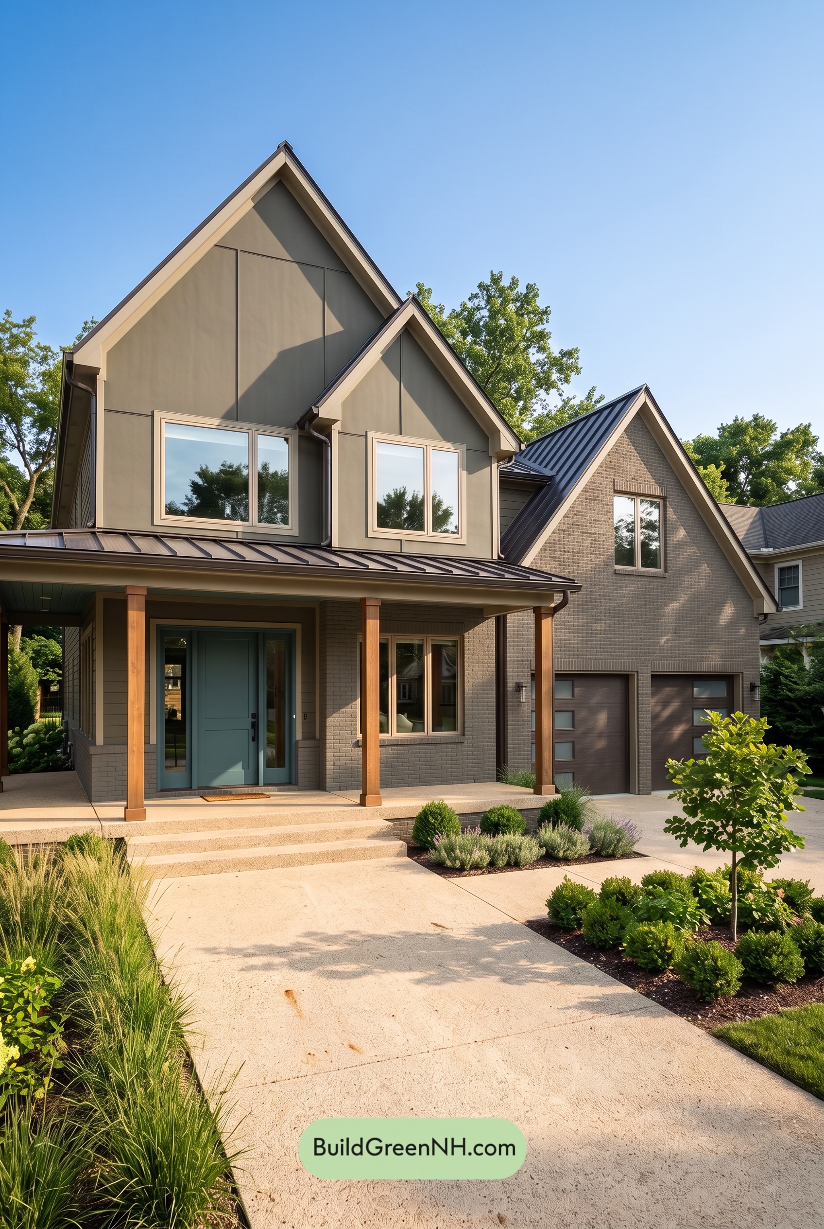 Earthy Green House Exterior Color Scheme: Brown Green Signature
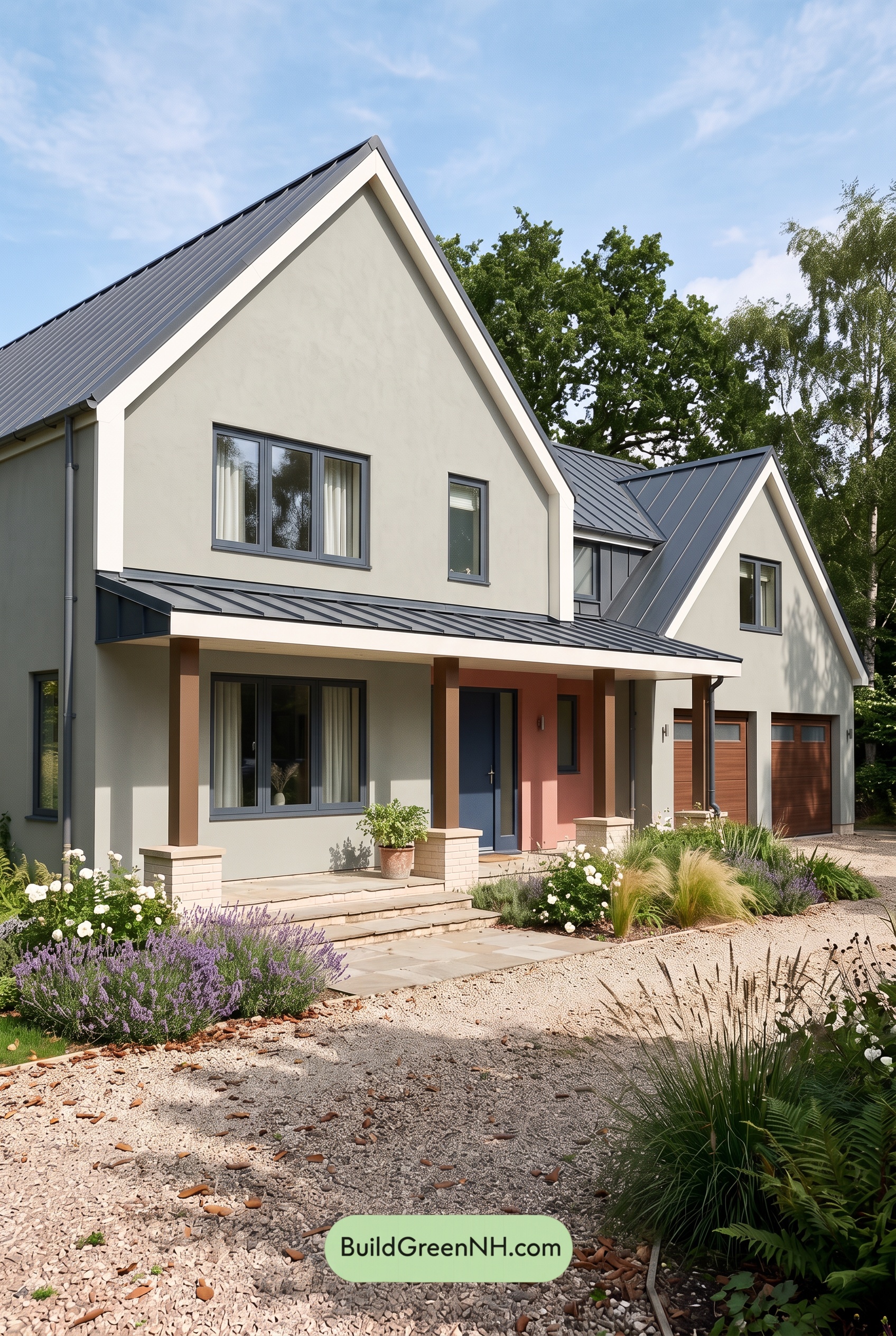 Earthy Green House Exterior Color Scheme: Green with White Spark
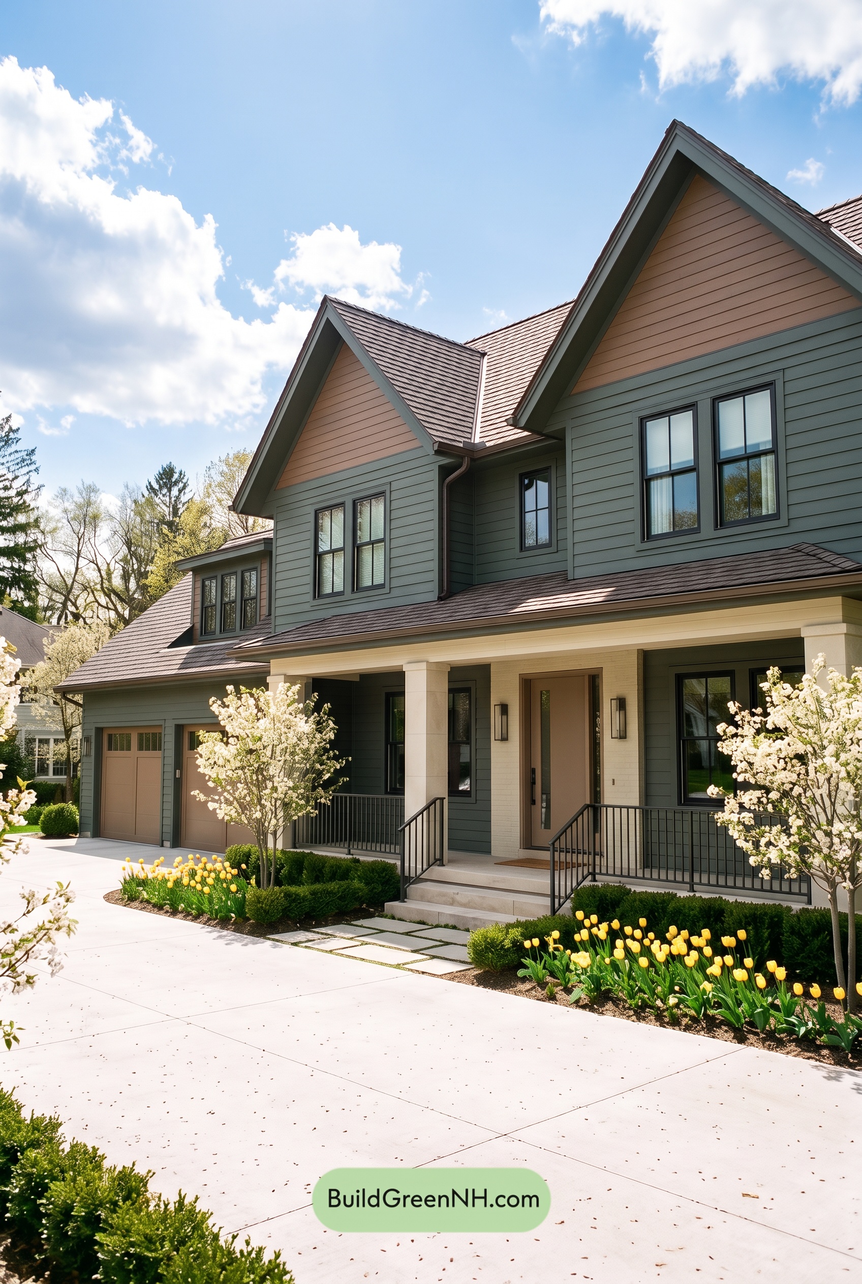 Earthy Green House Exterior Color Scheme: Brown Green Comfort
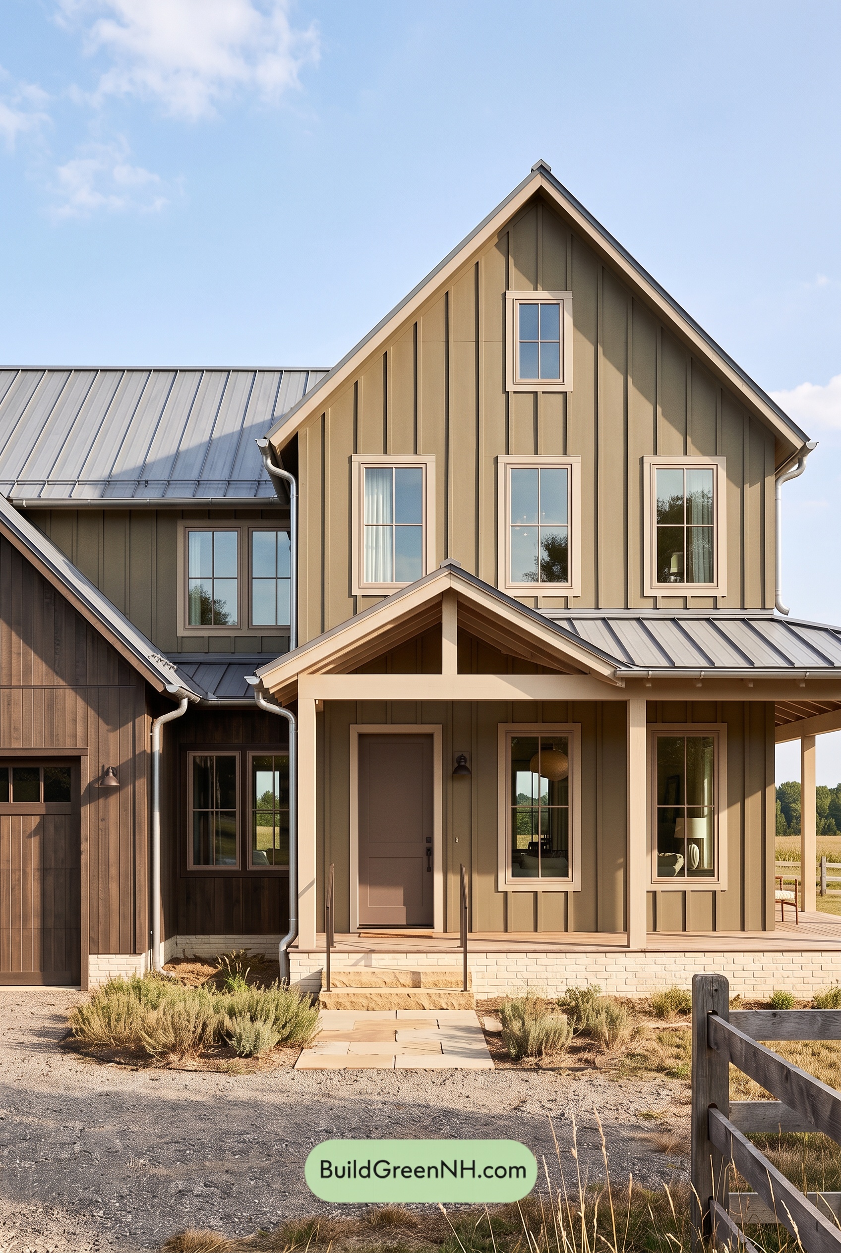 Earthy Green House Exterior Color Scheme: Green and Beige Sanctuary
 Earthy Green House Exterior Color Scheme: Green Velvet Assurance
Table of Contents