Last updated on
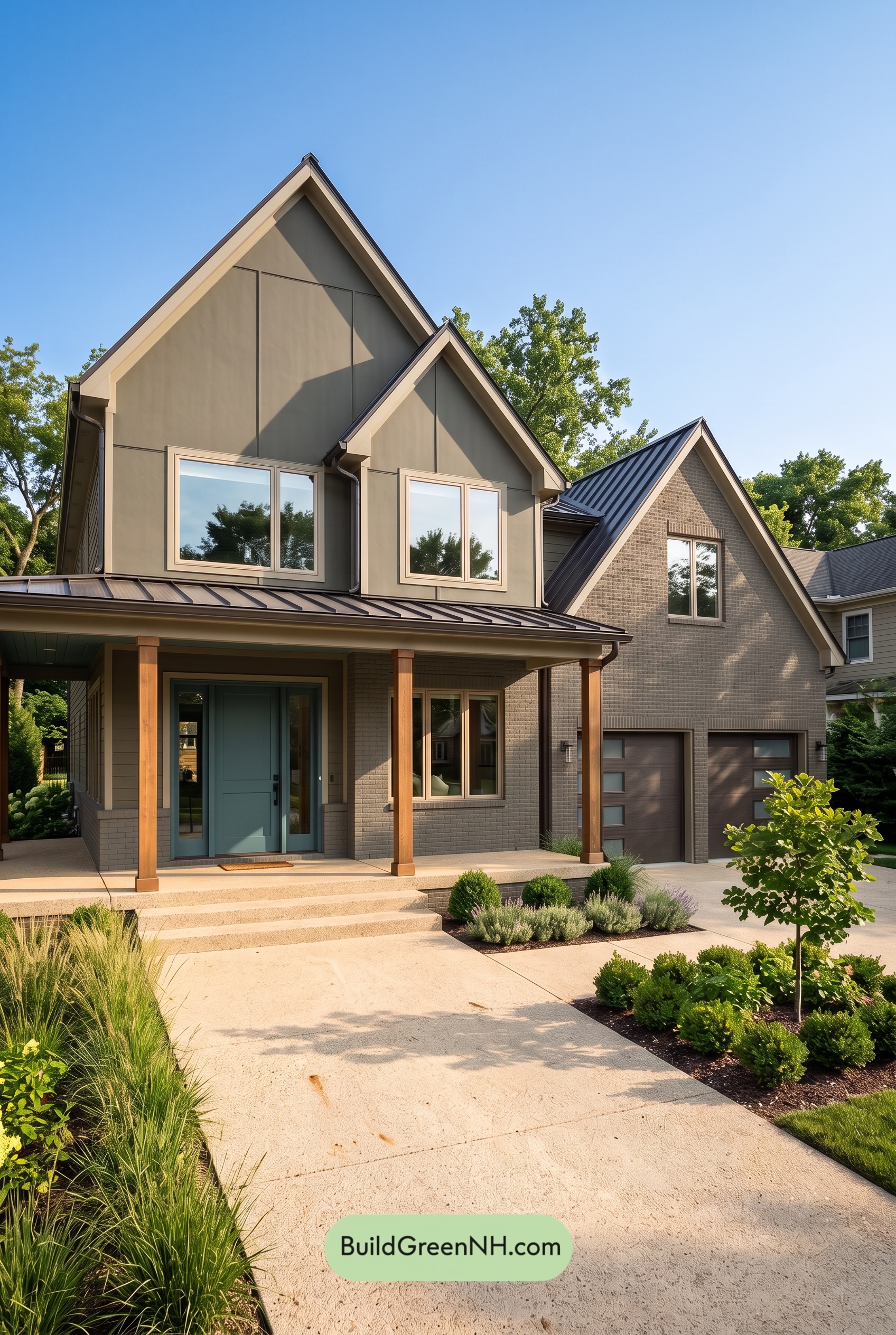

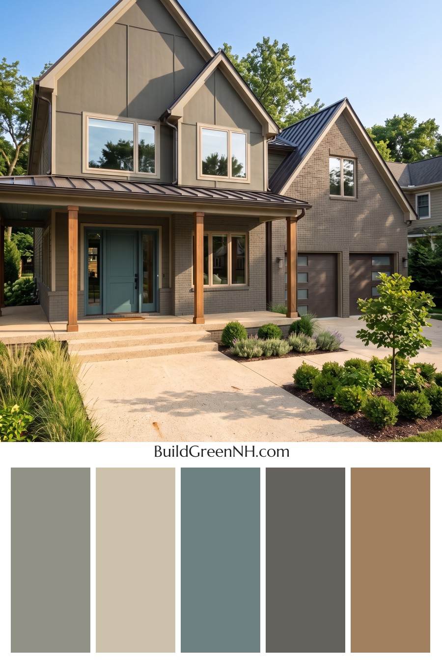
Warm gray, soft beige, and a muted blue entry give this exterior a beautiful balance of architectural definition and welcoming warmth.
Warm Gray Gives the House a Cohesive Foundation
The siding wears a medium shade of warm gray that feels substantial without becoming heavy. Across the tall gables, this understated color allows the panel detailing and steep rooflines to stand out. Sunlight brings forward its earthy undertones, while shaded areas reveal a deeper, quieter gray.
The gray brickwork continues that neutral foundation across the lower facade and garage wing. Its texture adds interest without introducing a competing color, helping the different exterior materials feel connected.
Soft Beige Highlights the Architecture
Light beige trim traces the gables, porch roof, and window openings, giving the house clear definition. It is noticeably lighter than the siding but gentler than a stark white would be. That softer contrast suits the warmth running through the entire scheme.
The beige window frames repeat this detail at eye level. Together, the trim and frames draw attention to the home’s shapes without making every edge feel overly sharp.
A Muted Blue Door Creates a Welcoming Focal Point
The front door introduces a subdued blue with a slight green undertone. It brings just enough color to distinguish the entrance from the surrounding neutrals, yet its softened shade keeps the effect calm rather than attention-grabbing.
Extending the blue around the sidelights gives the entry more presence beneath the shaded porch. Against the beige surround and gray walls, it feels like a deliberate invitation to come closer.
Brown Columns Add Warmth, While Darker Grays Add Depth
The porch columns provide the strongest warmth through their rich, golden-brown shade. Their contrast with the gray facade makes the covered entry feel comfortable and grounded, while their warm undertones relate naturally to the beige trim.
Above, deep charcoal-gray roofing outlines the gables and porch. The garage doors settle into a darker, brown-tinged gray, keeping their broad surfaces visually quiet. These deeper shades give the lighter trim something to stand against without competing with the blue entrance.
A Calm Palette with Plenty of Character
What makes this combination work is its restraint: gray unifies the exterior, beige defines it, brown warms it, and blue supplies personality. The result feels polished but approachable—a neutral house with enough contrast and color to be memorable.
Next, see how this color scheme looks under different lighting simulations throughout the day.
Overcast
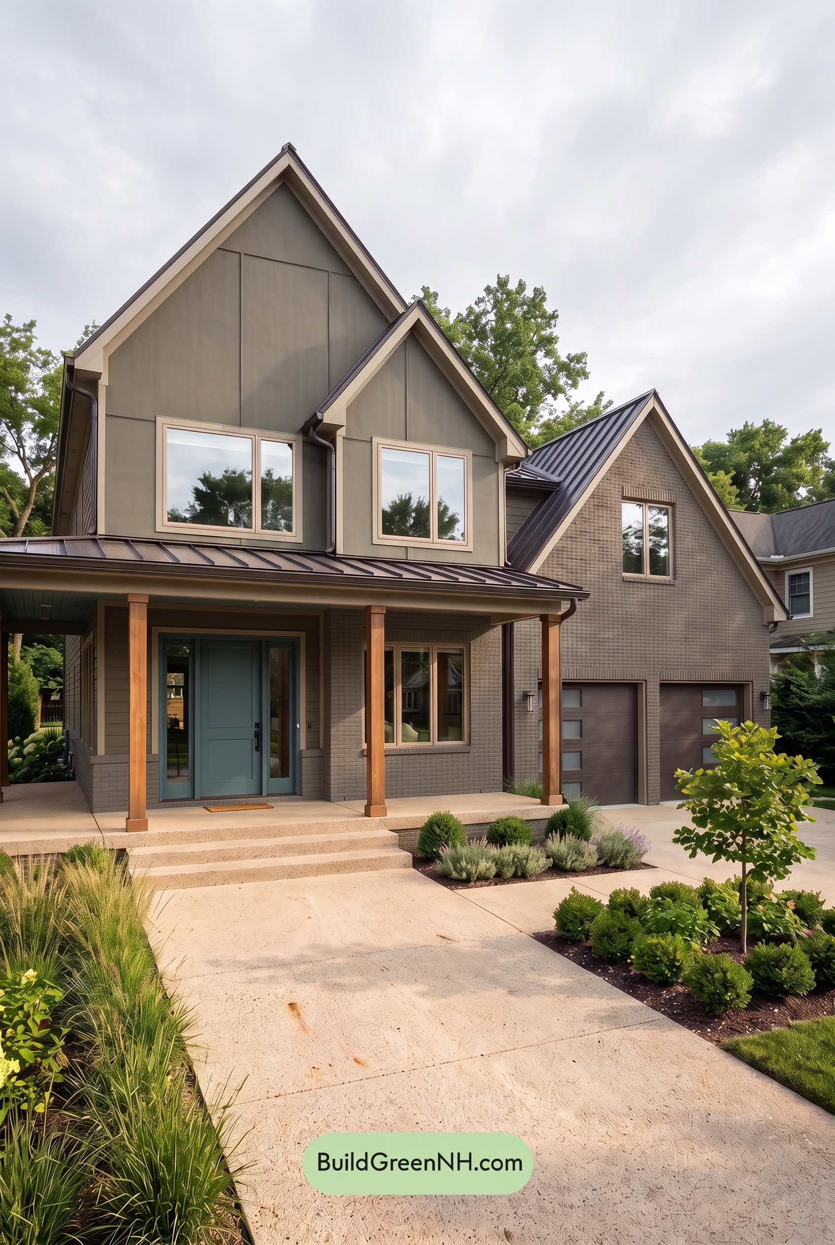
Under overcast skies, this home’s midtone grays can appear cooler and more subdued than in neutral daylight, with their warmer undertones less noticeable. The light beige shades feel softer and less creamy, while the warm browns lose some of their golden glow. The muted blue at the entrance may read slightly deeper and grayer, offering a quiet accent rather than a bright splash of color.
Diffused light softens shadows beneath the gables and porch, making the gray shades look more even across the exterior. Contrast between light trim and darker surfaces remains, but feels gentler without strong highlights and crisp shadow edges. Compared with neutral daylight, the palette takes on a calmer, more restrained mood, with softer warmth and less apparent saturation.
Golden Hour
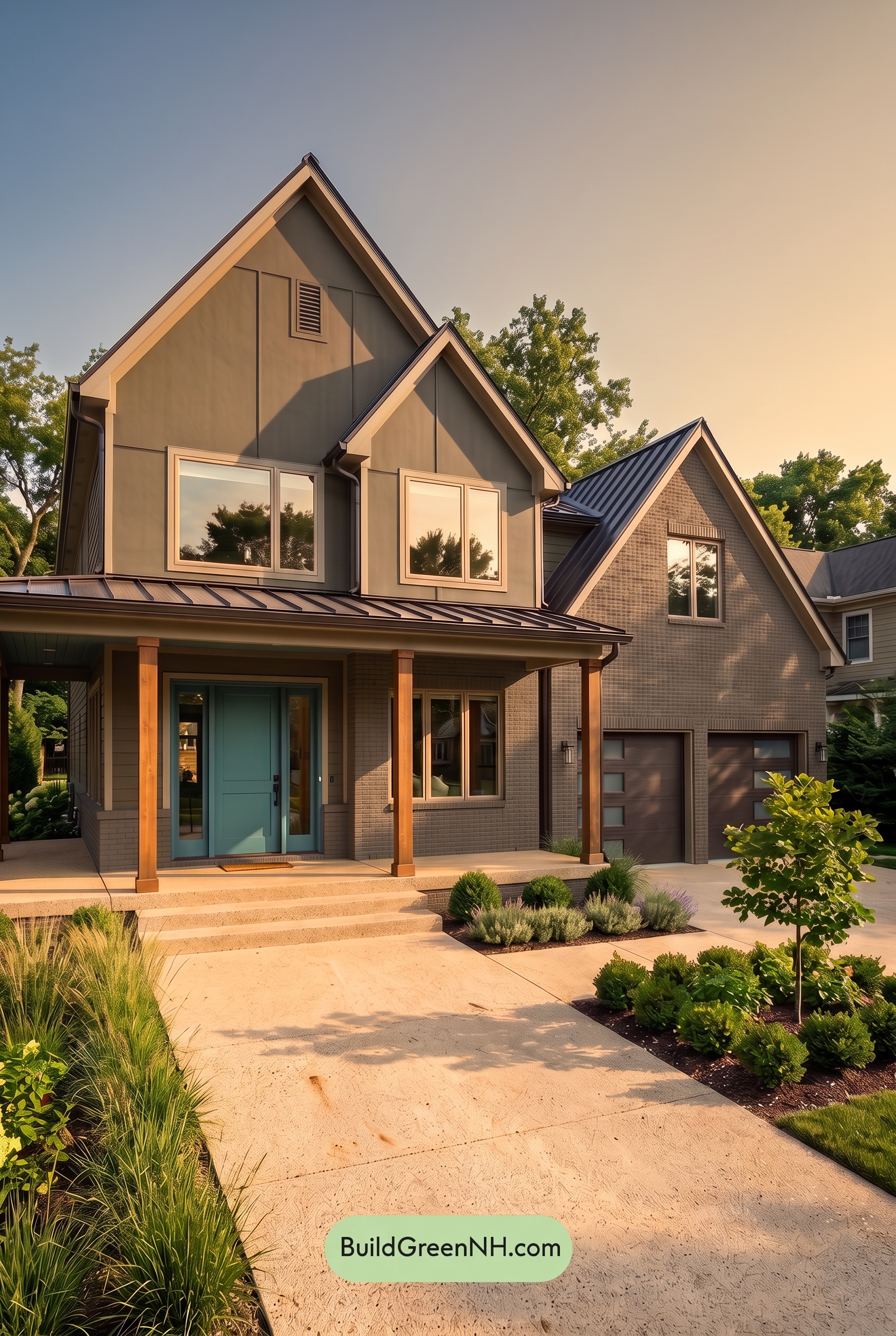
Golden Hour gives the gray exterior a warmer, softer character than neutral daylight, drawing out subtle brown undertones across the sunlit walls. The pale beige trim takes on a creamy warmth, while the brown columns look richer, with more pronounced orange undertones. Rather than making every shade more saturated, the low sunlight enriches the warm accents and gives the quieter neutrals a gentle glow.
Under the porch, the blue entry appears deeper and more muted, yet its coolness stands out against the warmly lit surroundings. Long shadows beneath the gables and across the garage deepen the grays, creating stronger light-to-dark contrast even as the sunlit shades feel more harmonious. Compared with the clearer, more balanced palette of neutral daylight, the overall mood becomes cozy, calm, and inviting.
Shade
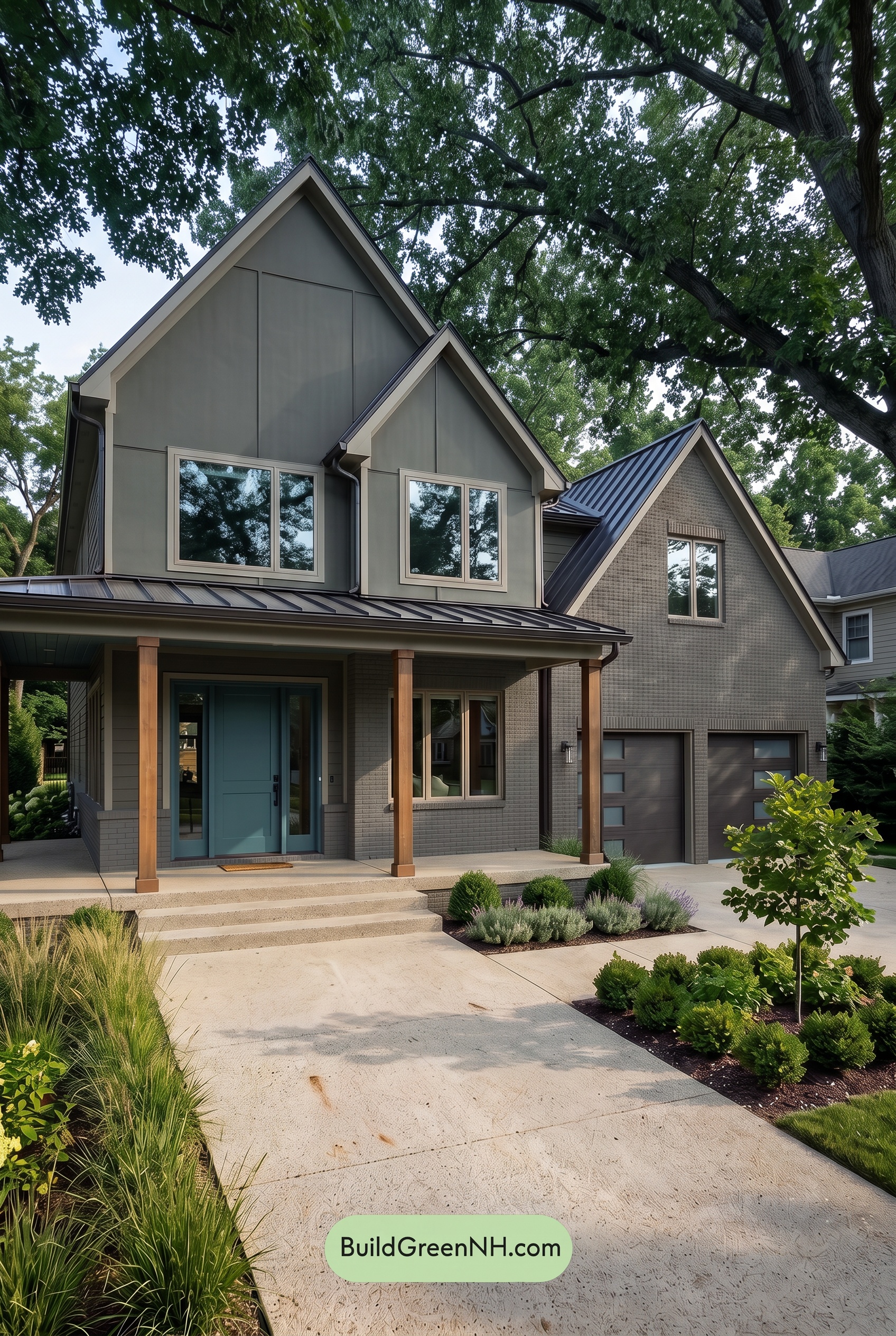
Under the tree canopy’s shade, the gray exterior appears deeper and cooler than it would in neutral daylight, with subtle undertones becoming more noticeable. The beige trim feels less golden and more softly neutral, while the blue entry takes on a duskier, quieter character—richer in depth, but less vivid in saturation.
Deeper shadows beneath the porch and gables bring the darker shades closer together, allowing the pale beige outlines to stand out. The brown columns retain a gentle warmth, though their brighter tones become subdued. Compared with neutral daylight’s clearer color separation, this shaded palette feels calmer and more cocooning, with soft transitions across the walls and stronger contrast around the recessed entry.
Nighttime
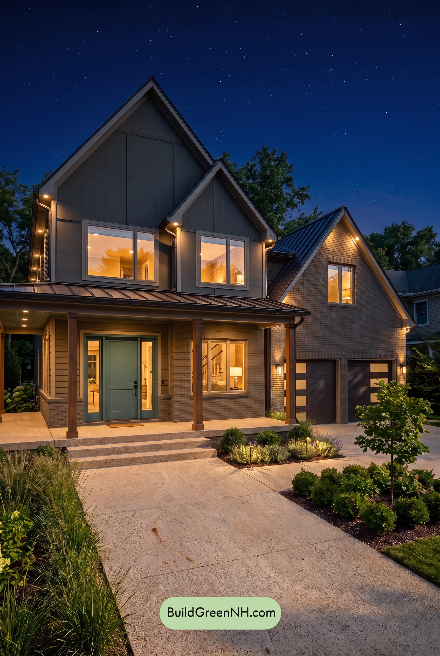
At night, the gray shades deepen and feel cooler in the unlit upper sections, while warm exterior lighting gives the lower walls a softer, warmer cast. Compared with neutral daylight, color saturation feels more subdued: the blue shade near the entry appears duskier, and the beige accents take on a gentle golden warmth rather than reading as evenly neutral.
Deep shadows beneath the rooflines and across the darker gray surfaces create stronger contrasts with the illuminated beige edges. The brown shades look richer where the porch lights reach them, adding warmth against the cooler grays above. Instead of daylight’s clear, balanced palette, the nighttime effect feels intimate and quietly dramatic, with pools of warm light drawing attention toward the entrance.
Pin these for later:
Want More?
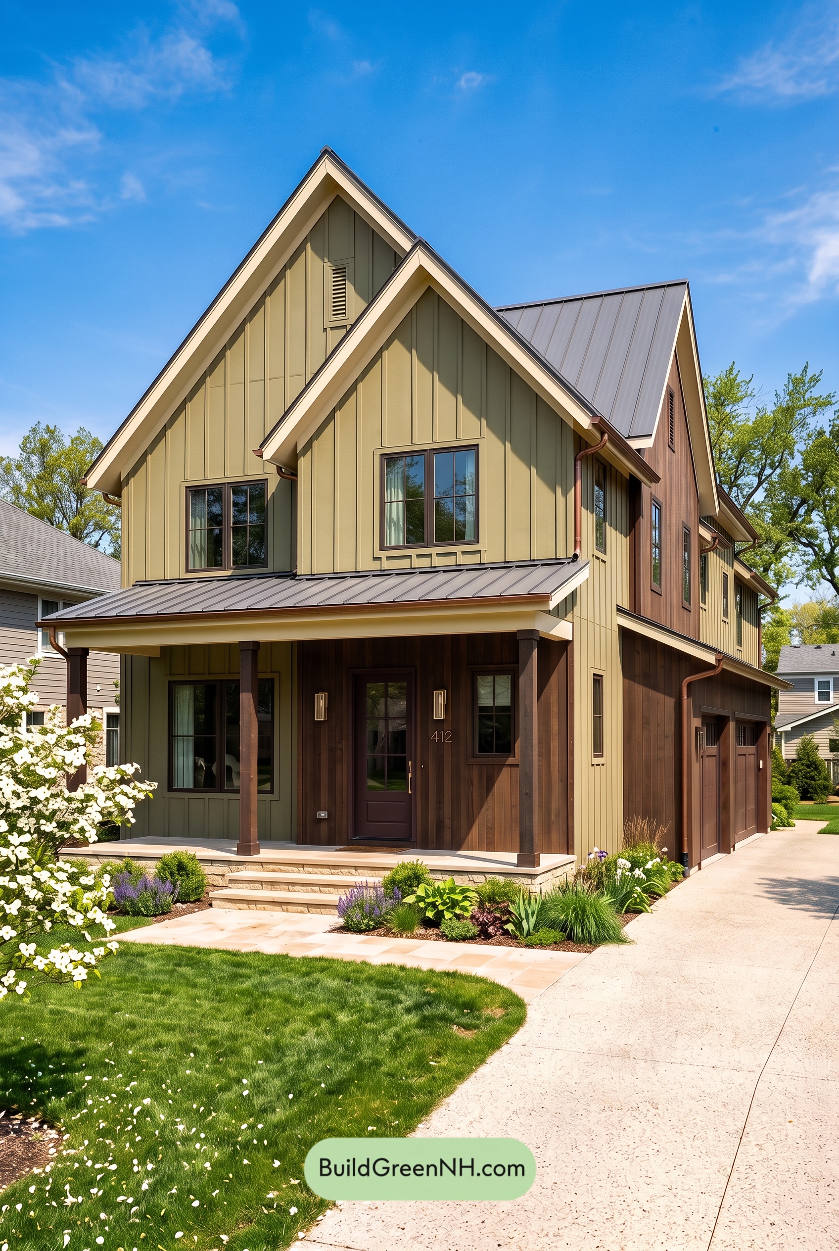 Earthy Green House Exterior Color Scheme: Green and Cream Keepsake
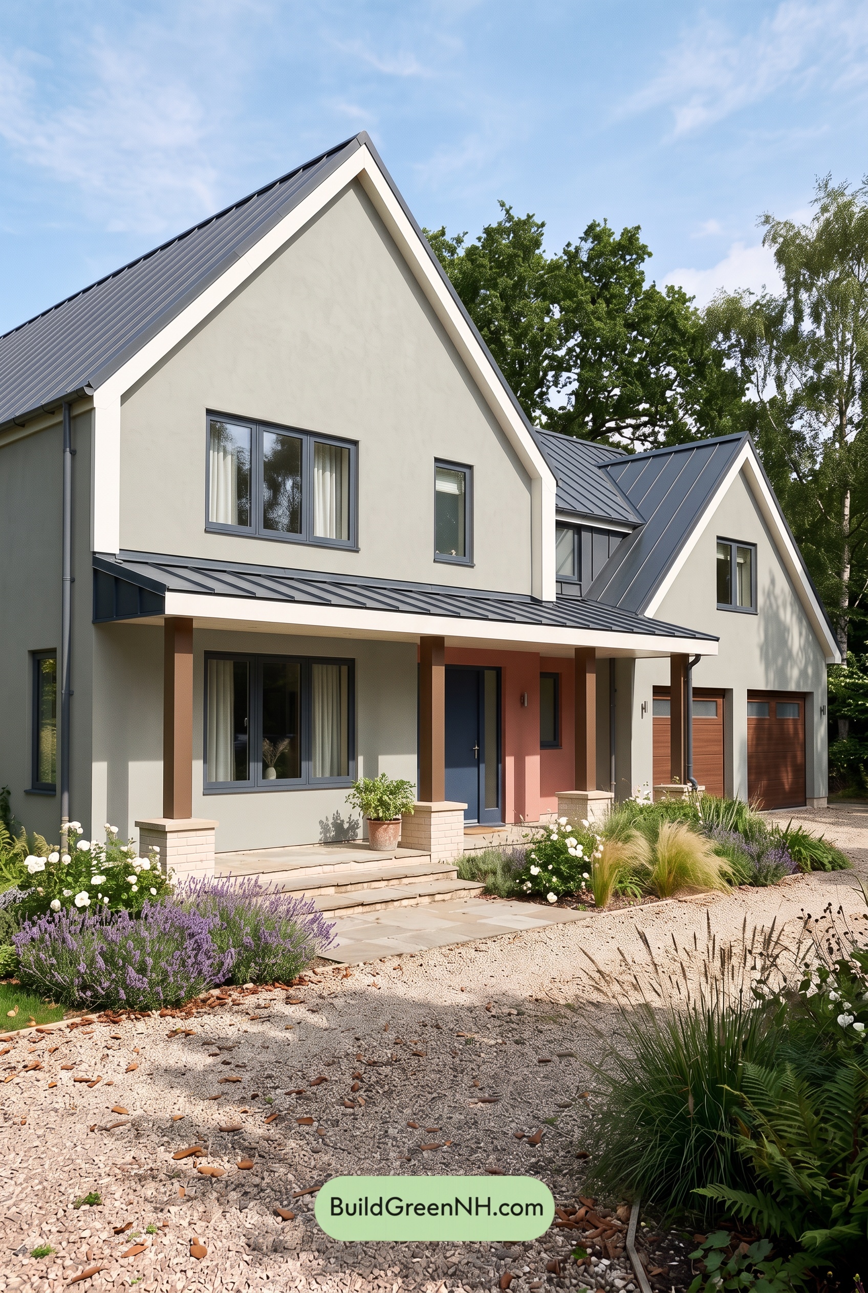 Earthy Green House Exterior Color Scheme: Green with White Spark
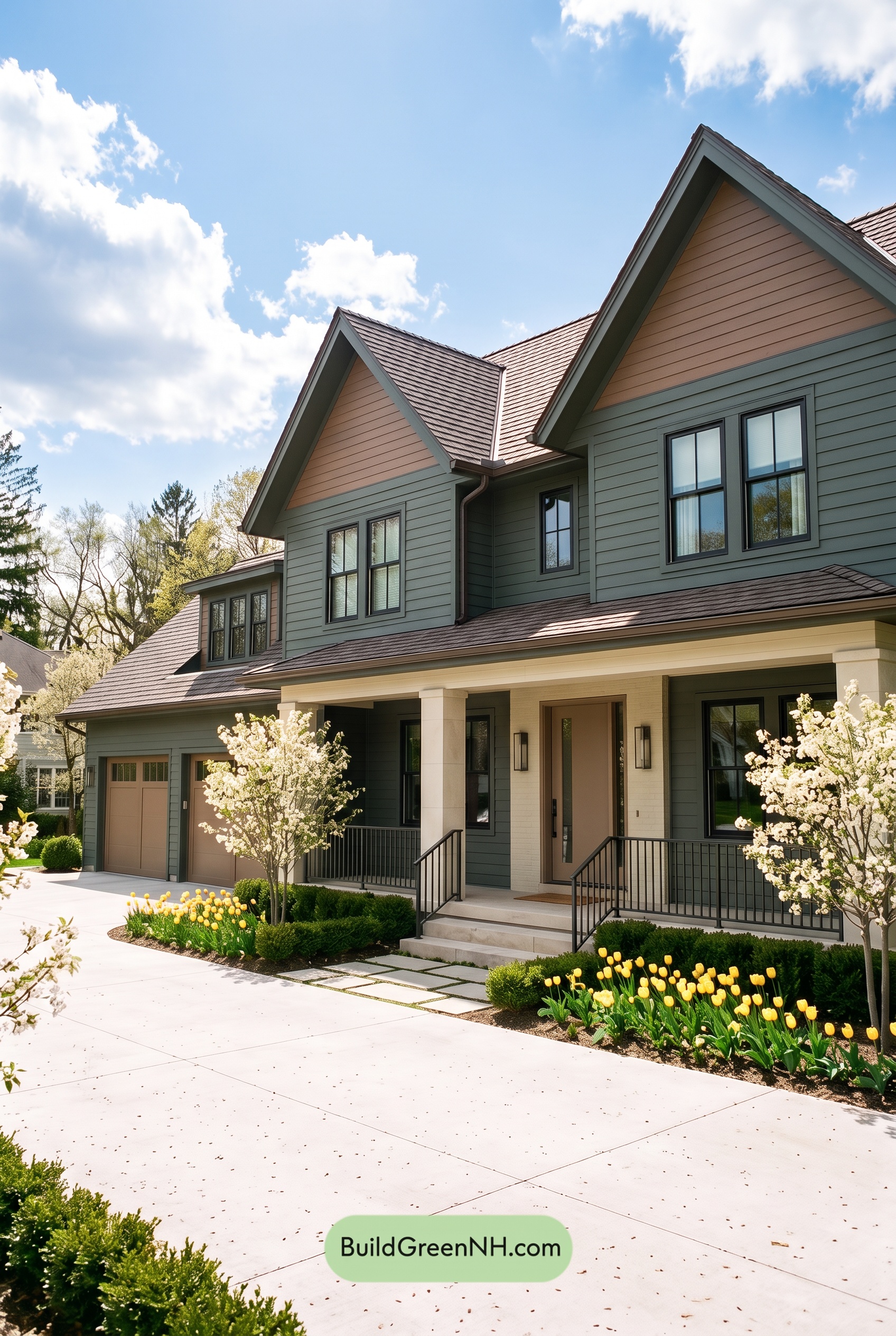 Earthy Green House Exterior Color Scheme: Brown Green Comfort
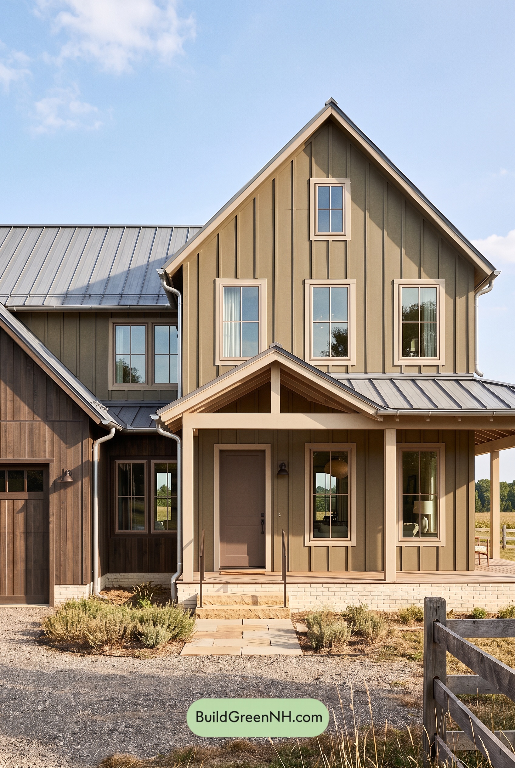 Earthy Green House Exterior Color Scheme: Green and Beige Sanctuary
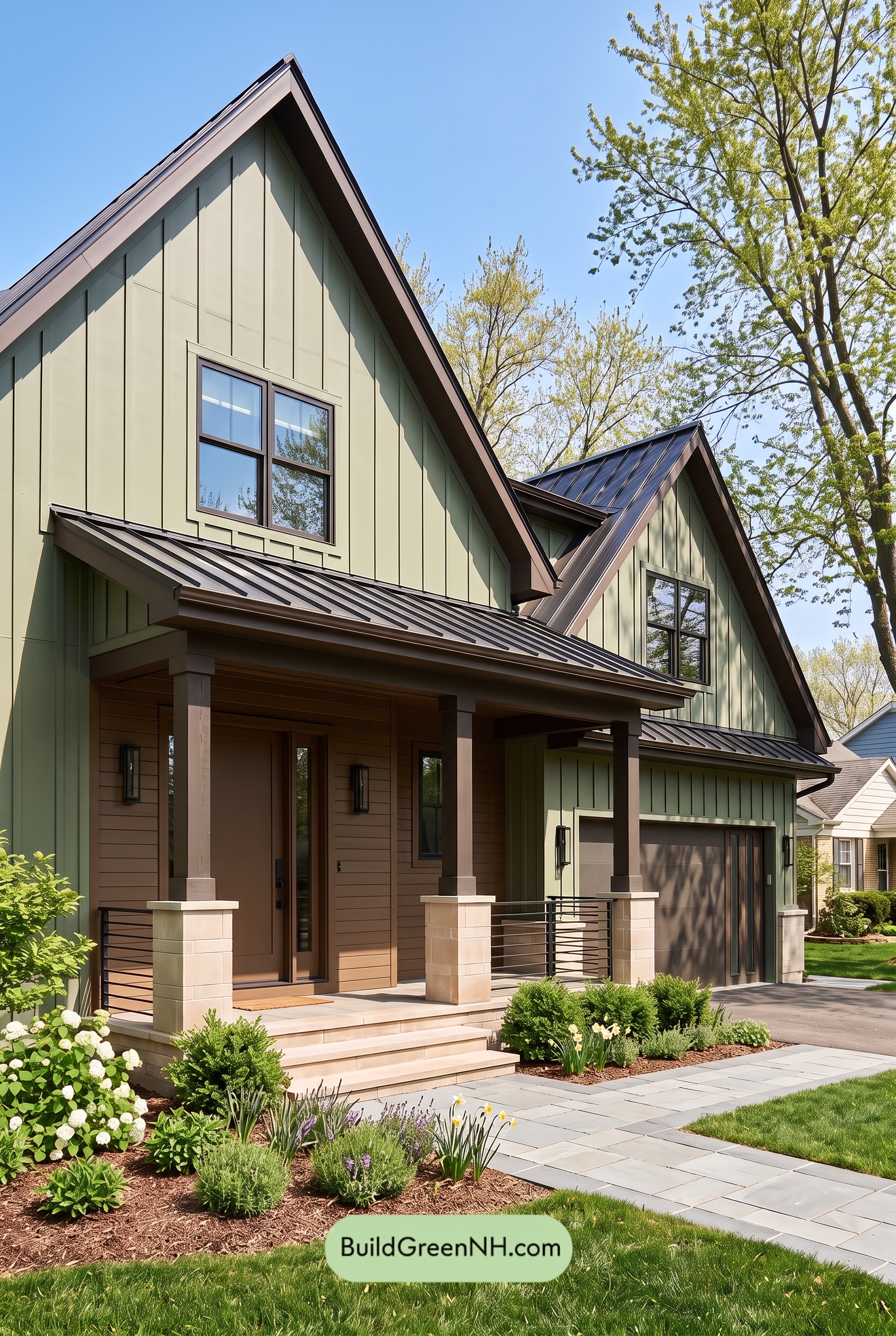 Earthy Green House Exterior Color Scheme: Green Velvet Assurance
Table of Contents