Last updated on
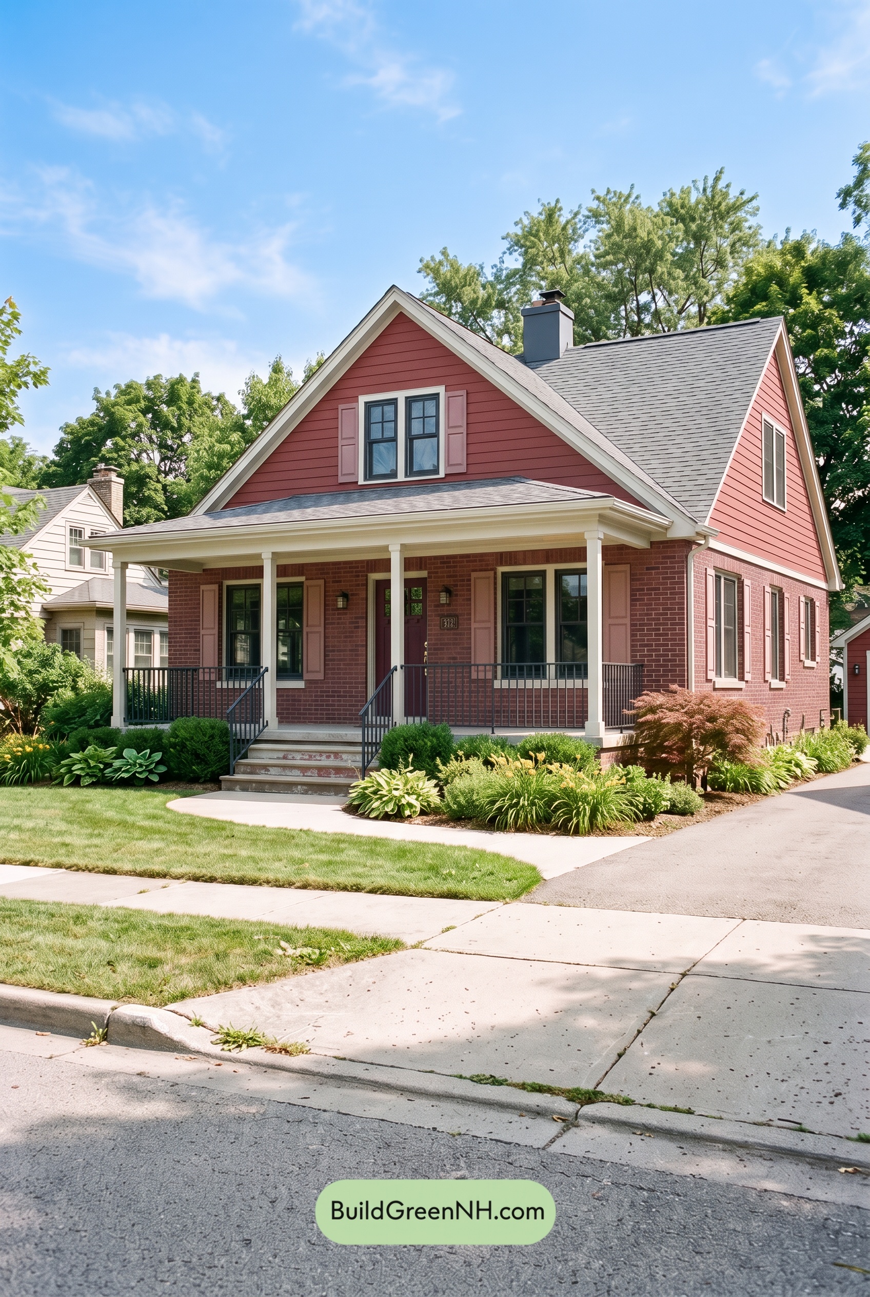

This layered rosy exterior palette feels welcoming and distinctive while its crisp light trim and grounded charcoal details keep the whole home polished.
A Warm, Character-Rich Main Color
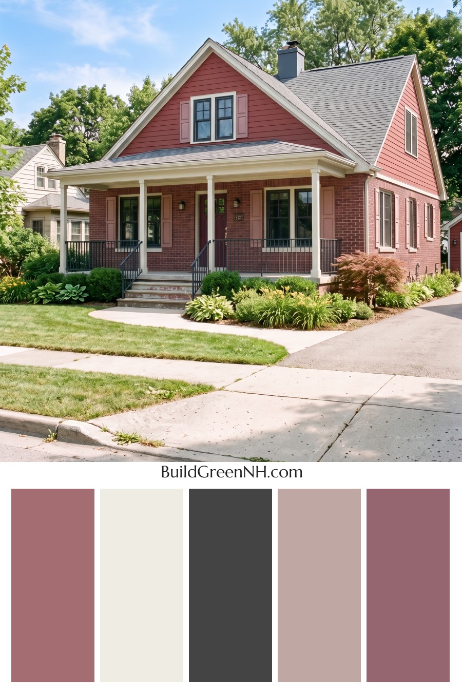
The upper siding is finished in a muted rosy pink with a gentle, earthy depth that gives the home instant curb appeal. Rather than reading overly sweet, this mid-tone shade feels mature and architectural, especially across the broad gable and side elevation. It brings softness to the traditional silhouette while still standing out beautifully against the surrounding greenery.
The lower brick façade continues the warm color story in a deeper, richer red-pink shade. This tonal shift adds weight near the foundation and makes the home feel especially well anchored. Together, the painted siding and masonry create dimension without losing the unified look.
Light Trim That Defines Every Detail
Soft white trim frames the rooflines, windows, porch columns, and fascia with clean definition. This bright contrast draws attention to the home’s peaked roof, generous front porch, and tidy window arrangement. It also gives the warm exterior shades room to breathe, preventing the façade from feeling too dense.
On the porch, the light trim has an especially important role. The columns and overhead detailing create a fresh, airy transition between the deep brick base and the rosy upper siding, making the entry feel open and inviting.
Pink Accents with a Refined Touch
The shutters introduce a paler, dustier pink that complements the siding without disappearing into it. Their subtle contrast adds a charming layer of detail around the windows and gives the traditional architecture a tailored finish.
At the center of the porch, the front door steps into a deeper wine-toned pink. This darker shade creates a natural focal point and adds a little drama to the entrance. Because it stays within the same warm color family, the door feels intentional rather than separate from the rest of the scheme.
Charcoal Contrast for Balance
Dark charcoal gray window frames, railings, and roof shingles bring needed structure to this otherwise warm palette. These crisp, cool-toned elements sharpen the home’s lines and lend a slightly modern edge to the classic exterior.
The charcoal roof is particularly effective because it visually settles the tall gables and connects with the dark window framing below. Matching railings continue that rhythm along the porch steps, creating a graceful link from roofline to entry.
The Overall Mood
This exterior feels friendly, timeless, and quietly confident. The rosy pink family creates warmth, the soft white details provide brightness, and the charcoal gray accents introduce enough contrast to keep every feature defined. It is a wonderful example of how tonal color layering can make a traditional home feel memorable, balanced, and beautifully at home in a leafy neighborhood.
Next, see how this color scheme looks under different lighting simulations throughout the day.
Overcast
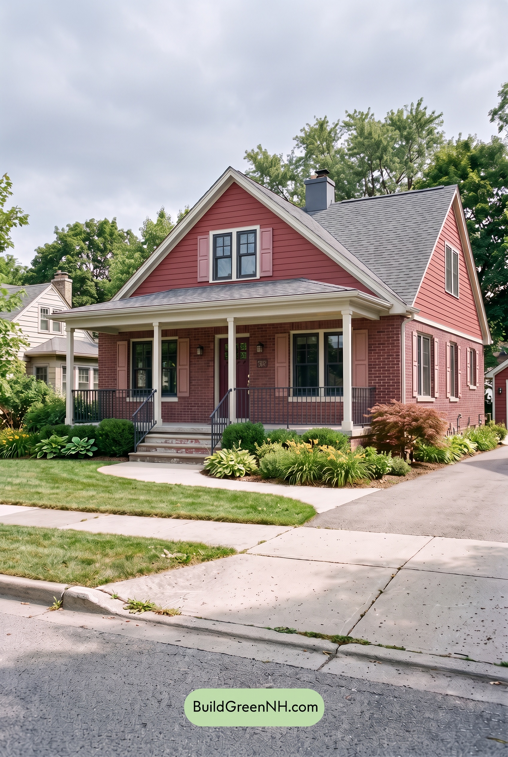
Under overcast skies, the pink exterior reads softer and slightly less saturated than it does in neutral daylight, with its warmth appearing more muted and refined. The pale pink shutters and front door settle into a gentler relationship with the siding, creating a calm, tonal look rather than a crisp burst of contrast.
With direct sun removed, shadows become broad and subtle, so the white trim looks quieter while the gray window frames and railings gain a deeper, steadier presence. Overall contrast is reduced but more even across the façade, giving the home an inviting, composed mood with a touch of cozy coolness.
Golden Hour
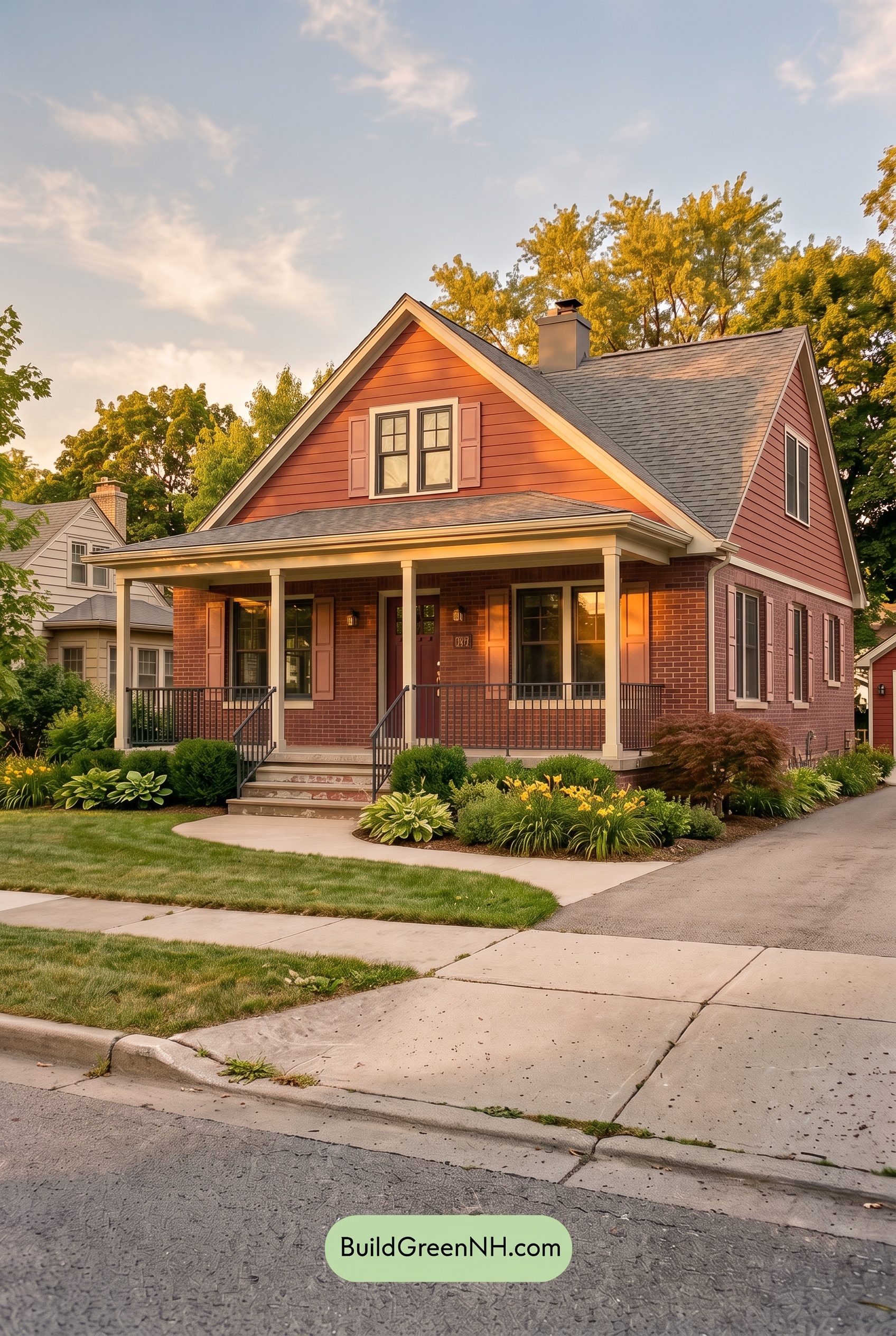
Under neutral daylight, the pink siding reads balanced and clear, while the white trim and gray accents create crisp, steady contrast. At Golden Hour, the low, amber light enriches the pink shades, making them appear warmer and slightly more saturated, while the white trim takes on a softer, creamy cast.
Longer shadows deepen the gray window frames and railings, sharpening the home’s architectural lines against the glowing facade. The result is a more layered, welcoming mood: bright surfaces feel sun-kissed, shaded areas gain depth, and the overall palette becomes warmer and more intimate than it appears in even daylight.
Shade
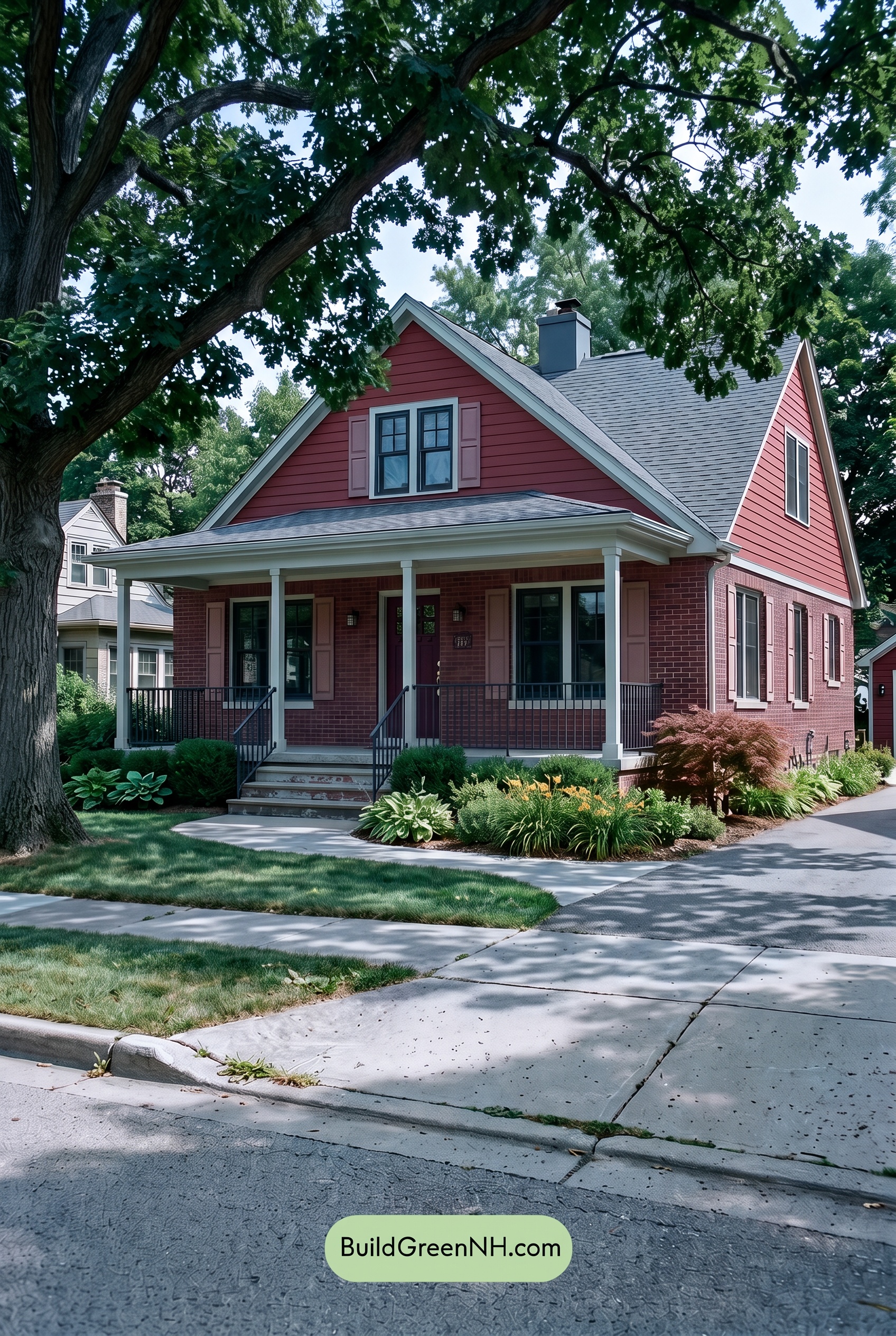
Under shade, the pink exterior shifts away from the lively warmth it shows in neutral daylight, taking on a deeper, more muted character. Its saturation appears softened beneath the tree canopy, while shadowed areas read richer and slightly cooler, giving the siding, shutters, and entry a calm, grounded presence.
The light trim remains a crisp outline, though it looks less bright than it would in open daylight, creating gentler contrast against the shaded pink. Gray window frames and railings deepen noticeably in the low light, sharpening the architectural lines and lending the porch a quiet, tailored mood.
Nighttime
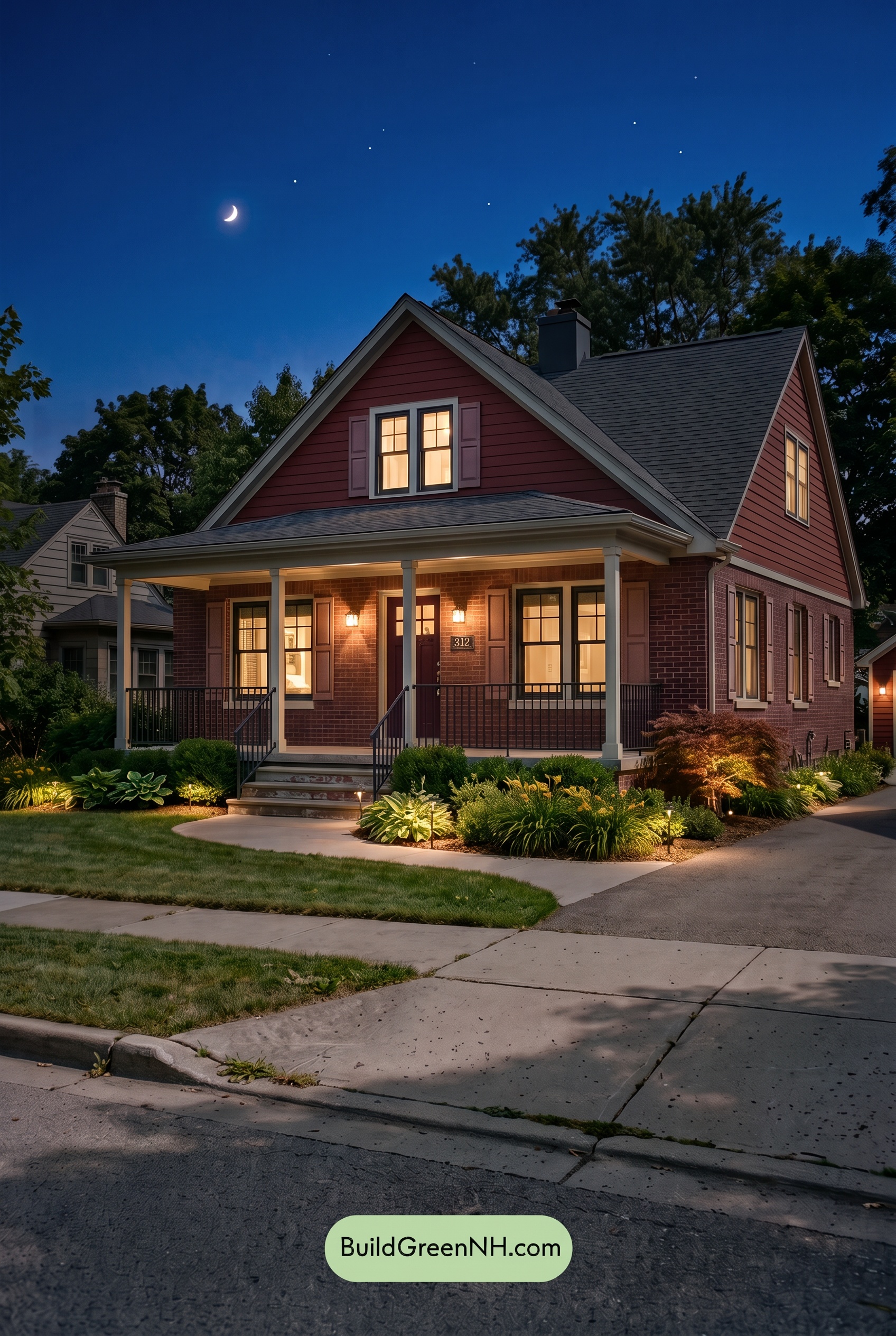
At night, the pink exterior deepens into a richer, more subdued shade, with its saturation softened by the cool ambient sky. Warm porch and window light brings a gentle glow back to the lower facade, making the pink tones feel more welcoming and layered than they do in neutral daylight.
The white trim appears softer and slightly warmer near the lighting, while the gray window frames and railings recede into crisp, shadowy outlines. This heightened contrast between illuminated details and darkened planes gives the home a cozy, dramatic mood, with the front entry becoming the natural focal point.
Pin these for later:
Want More?
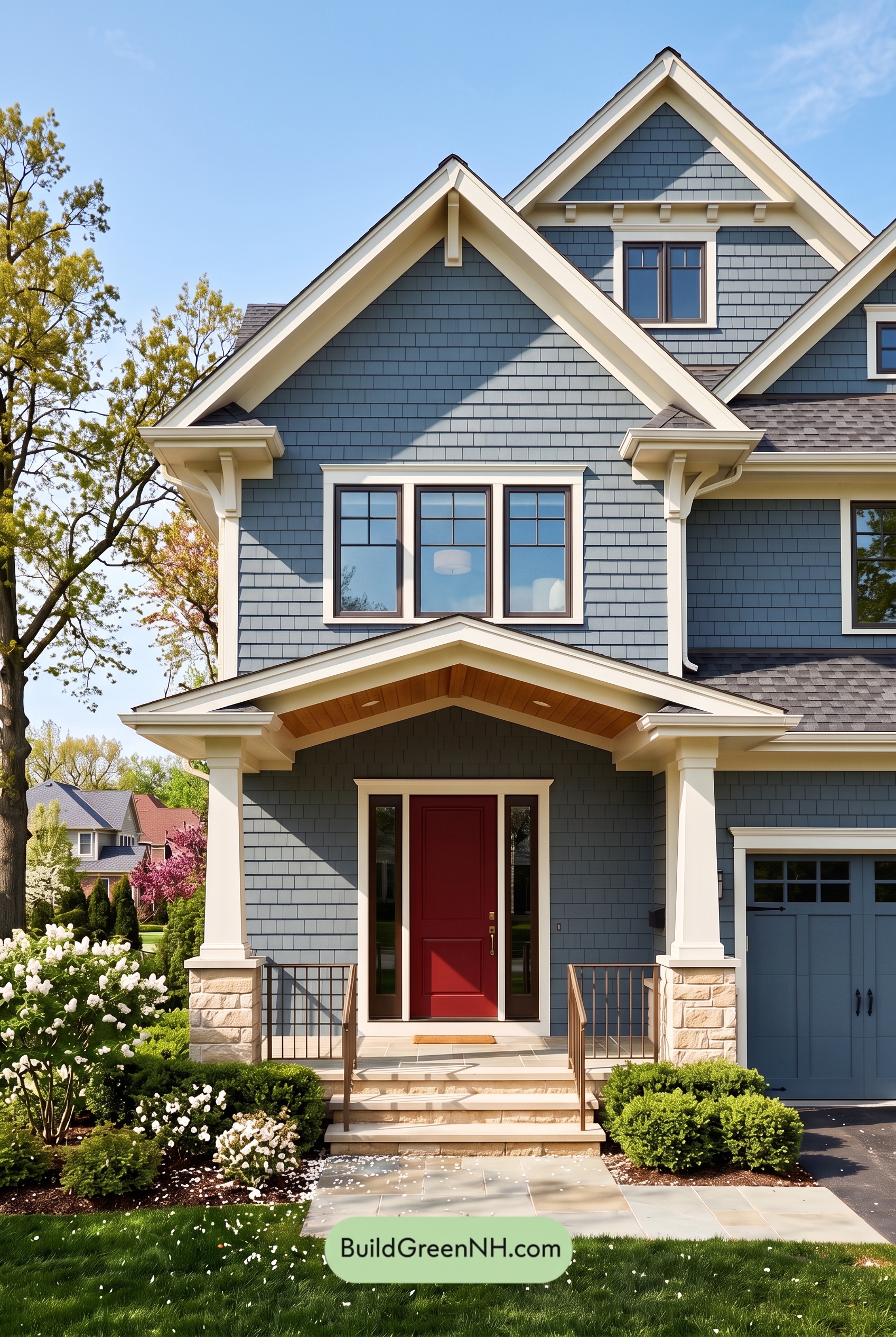 Red Front Door House Paint Color Scheme: Denim Blue Homecoming
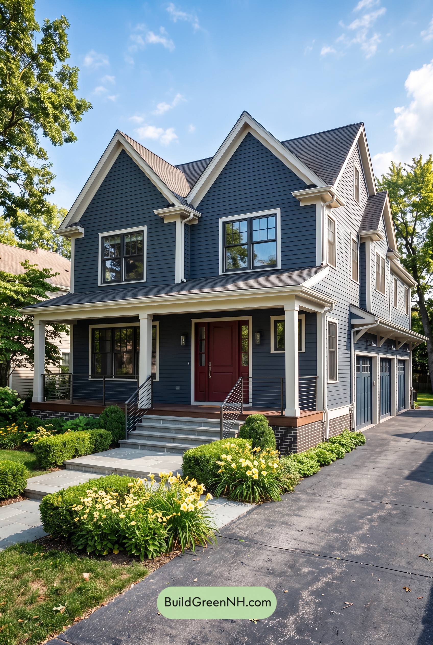 Red Front Door House Paint Color Scheme: Midnight Blue Assurance
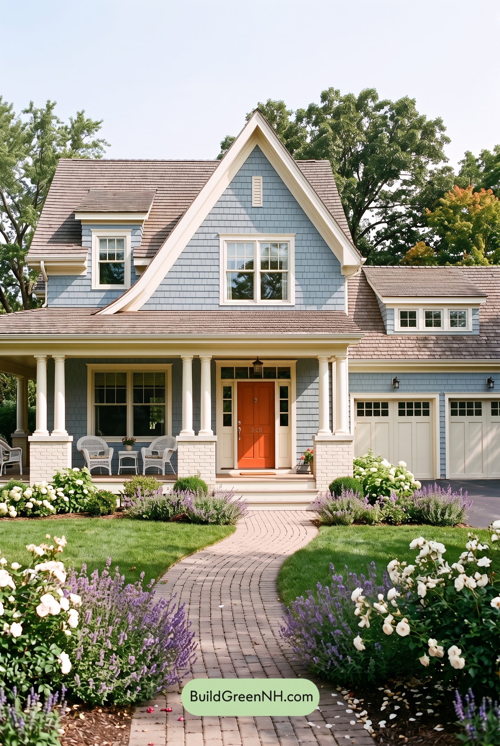 Red Front Door House Paint Color Scheme: Pale Blue Joy
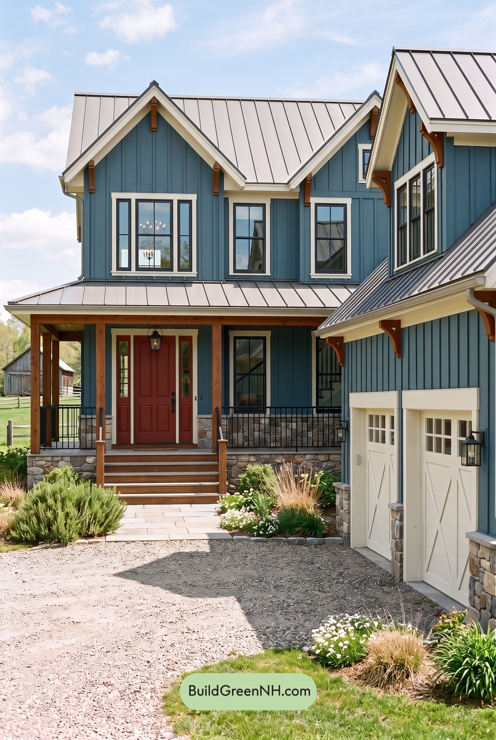 Red Front Door House Paint Color Scheme: Teal Blue Kinship
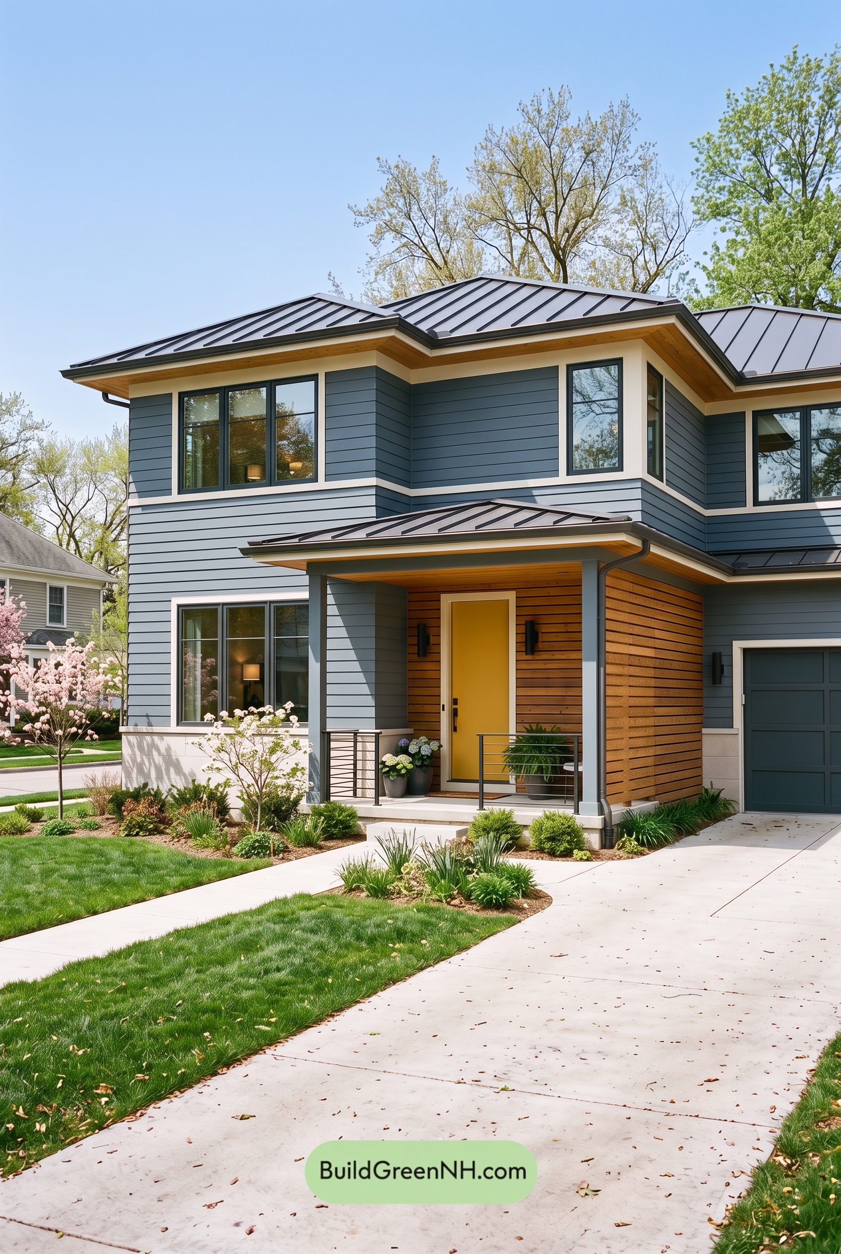 Blue House Front Door Color Scheme: Harbor Saffron
Table of Contents