Last updated on
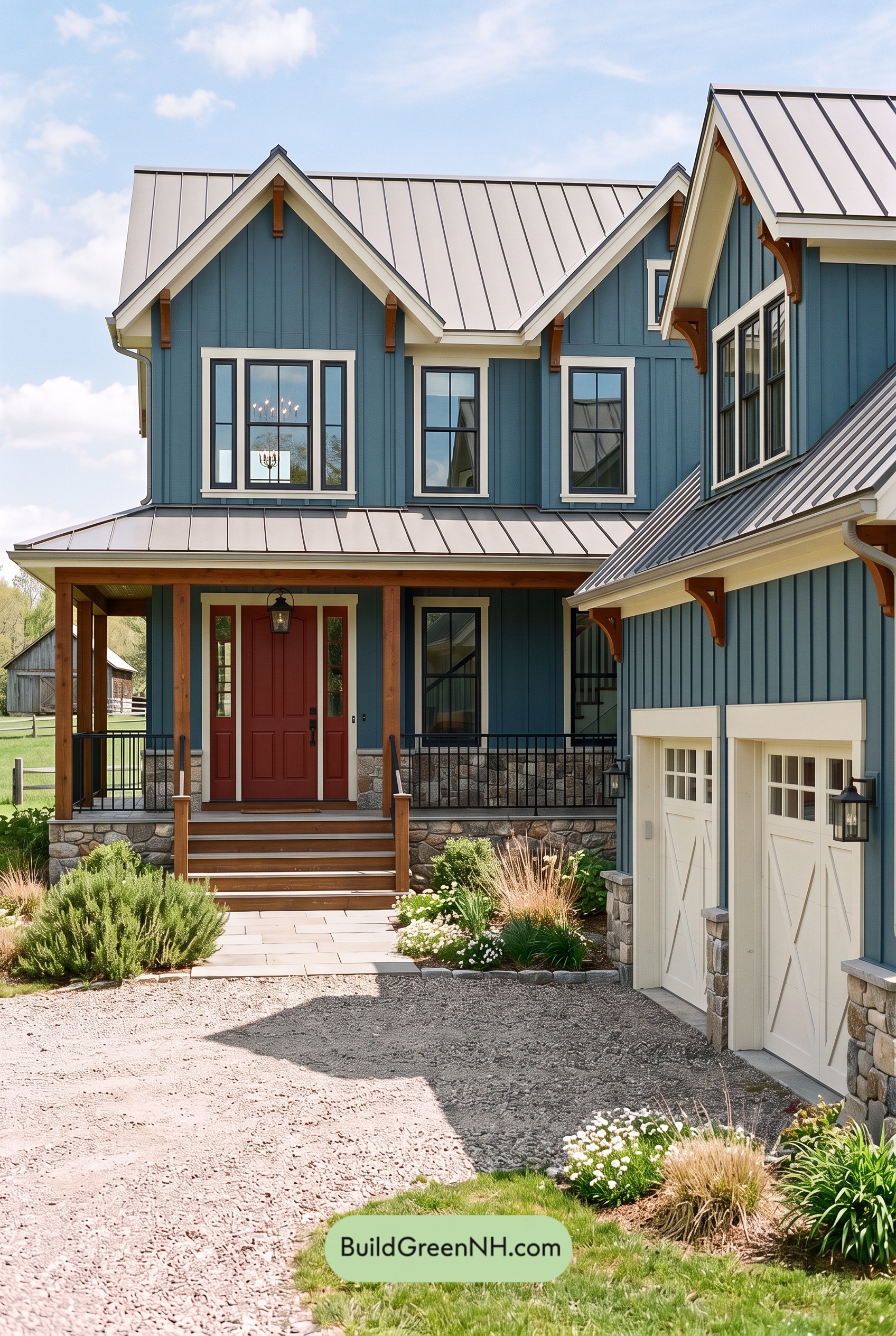

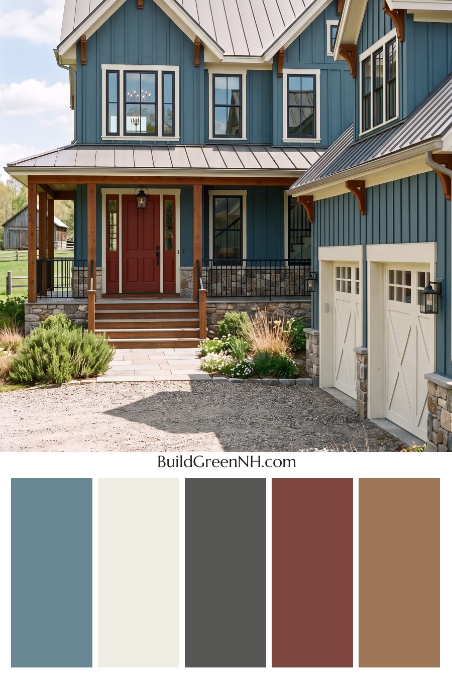
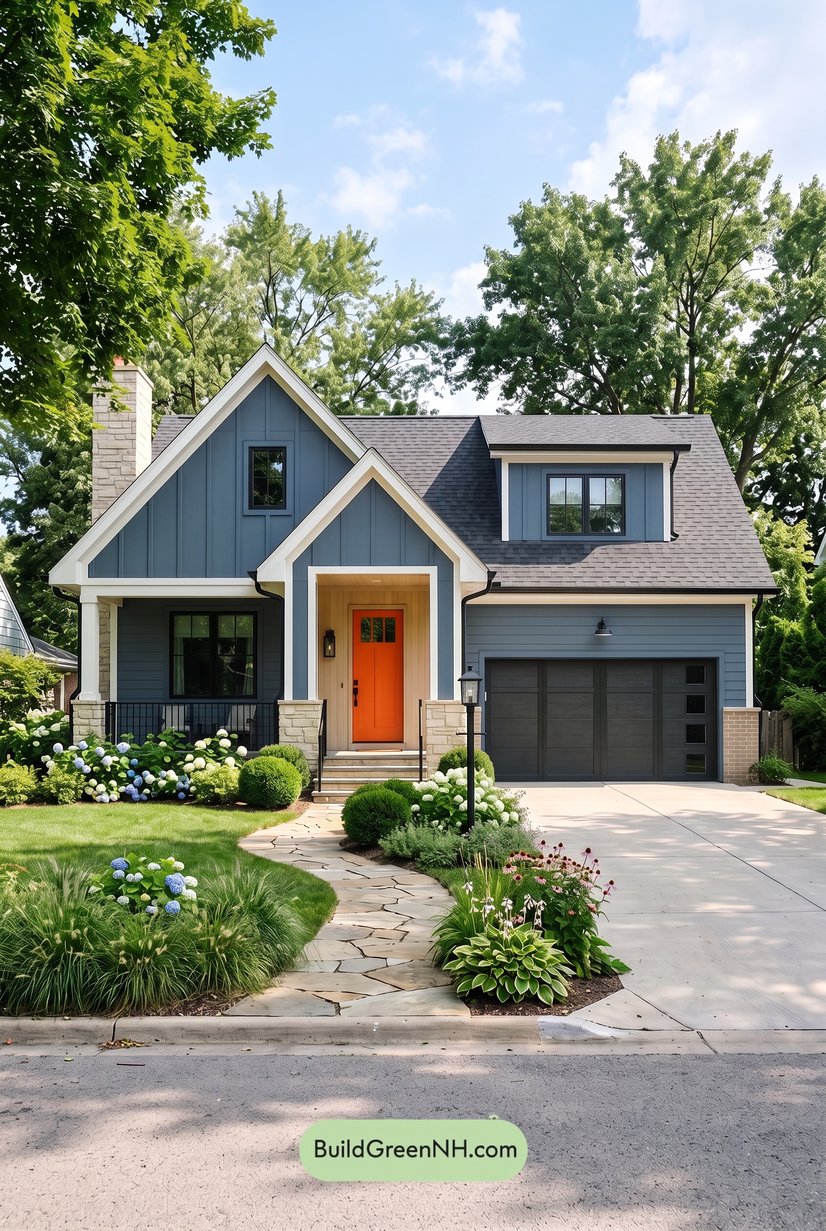
Muted blue siding, creamy white trim, and warm brown accents give this home a beautifully balanced exterior that feels fresh, welcoming, and full of character.
A Calming Blue Foundation
The siding’s medium blue shade gives the house its distinctive personality. Soft gray undertones keep the color understated, allowing it to cover the broad walls and tall gables without overwhelming the architecture. Across the vertical siding, changing light creates subtle variations that add depth to the blue.
It’s a lovely balance: colorful enough to stand out, yet quiet enough to sit comfortably beside the surrounding greenery and natural stone.
Creamy White Keeps the Details Crisp
A soft, creamy white outlines the windows, follows the roof edges, and highlights the steep gables. Against the blue, these lighter borders make the architectural details easy to appreciate. Their gentle warmth also keeps the contrast from feeling too stark.
The garage doors repeat that warm white on a larger scale. This repetition connects the garage to the rest of the house, while the blue siding between and around the doors maintains continuity across the exterior.
Warm Browns Make the Entrance Inviting
The porch columns, overhead beams, and decorative brackets introduce rich, golden-brown shades. These warm accents provide a natural counterpoint to the cooler siding, bringing particular emphasis to the sheltered entrance.
The front door takes that warmth a little deeper with a reddish-brown shade. Framed by creamy white and flanked by brown columns, it becomes a welcoming focal point without competing with the blue. Brown stair surfaces carry the same warmth down toward the walkway.
Gray Accents Bring Everything Together
Deep charcoal-gray window frames and railings add definition throughout the scheme. Their slender lines provide contrast within the white window surrounds and across the porch, giving the softer colors a more structured edge.
Above, the metal roof shifts from pale silvery gray in sunlight to deeper gray on shaded slopes. It complements the siding’s gray undertones without adding another strong color. At ground level, the stonework mixes gray, taupe, and brown, echoing both the cool walls and warm porch details.
The result feels relaxed but carefully coordinated. Blue supplies the character, creamy white brings brightness, brown adds warmth, and gray connects the details—a thoughtful combination that lets the home’s architecture shine.
Next, see how this color scheme looks under different lighting simulations throughout the day.
Overcast
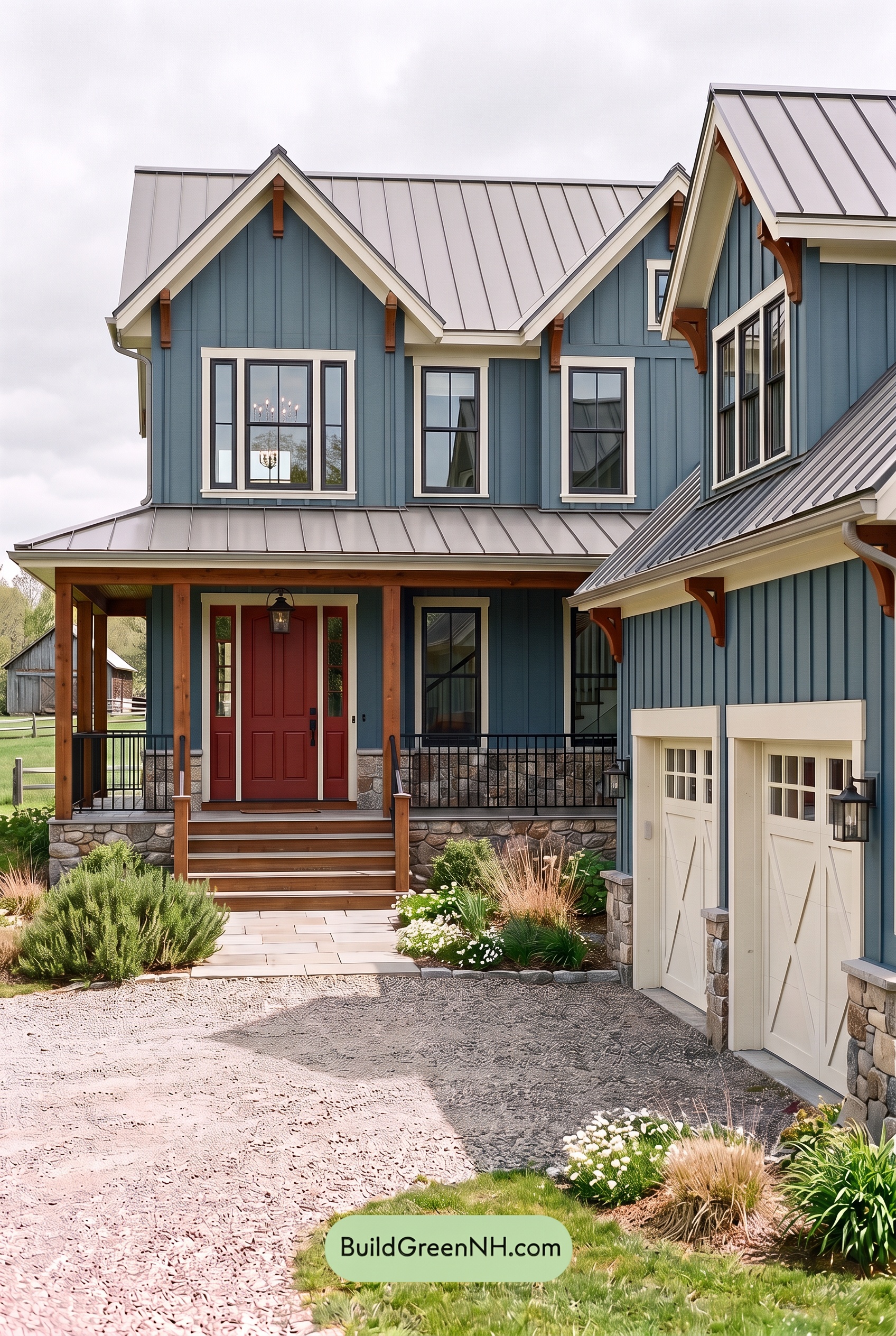
Under overcast skies, this shade of blue tends to look more muted and gray-leaning than it does in neutral daylight, giving the exterior a cooler, quieter presence. The whites lose some brightness and appear softer, while the warm browns feel less golden, offering a gentle warmth against the blue.
Diffused light softens shadows beneath the eaves and across the siding, making the colors appear more even. The deep grays still provide definition against the pale whites, but with less glare and fewer sharp shadow edges, the overall contrast feels gentler. Compared with neutral daylight, the palette takes on a calm, understated mood.
Golden Hour
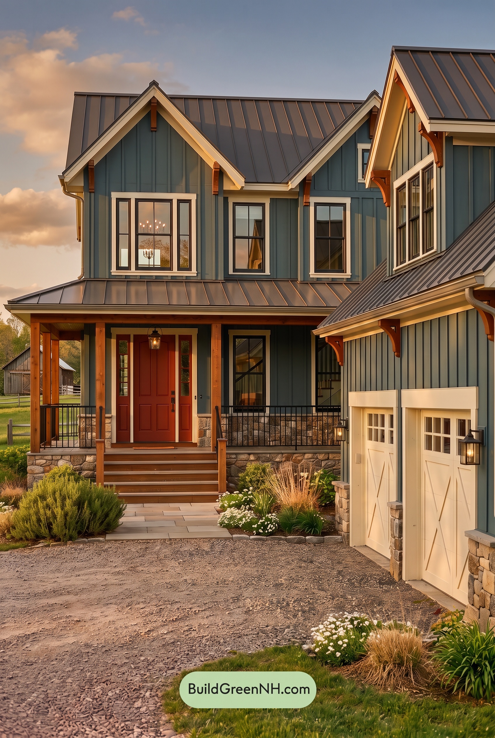
Golden Hour gives this muted shade of blue a softer, warmer cast than it would have in neutral daylight. Sunlit areas look slightly less saturated, while shaded sections deepen into richer blue-gray. The whites take on a creamy warmth, and the browns appear more saturated, with reddish undertones becoming especially noticeable in the low sunlight.
Long shadows beneath the eaves and across the porch create stronger light-to-dark contrast, even as the warm glow softens the contrast between color families. Dark grays become more pronounced beside the illuminated whites, adding definition. Compared with the cooler, more evenly balanced appearance of neutral daylight, the overall palette feels cozier, richer, and more inviting.
Shade
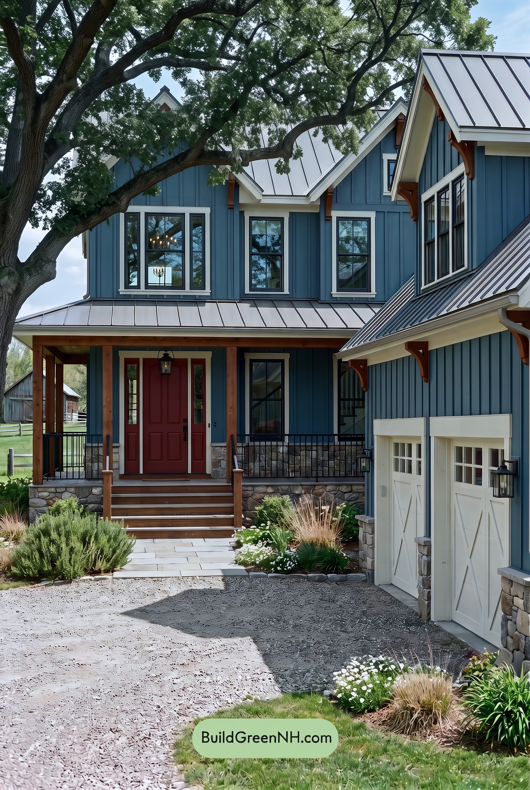
In the tree-filtered shade, this shade of blue looks deeper and cooler than it would in neutral daylight, with its saturation feeling more restrained. The whites lose some brightness and take on a soft gray cast, yet still stand out against the darker blue. Shadows beneath the eaves and across the porch add depth, giving the exterior a quieter, more sheltered mood.
The warm browns appear richer but less golden in shade, offering a gentle counterpoint to the cooler walls. Dark grays become less distinct in the deepest shadows, softening smaller details while the broad light-and-dark contrast remains clear. Compared with neutral daylight’s more balanced color, the shaded palette feels subdued, cohesive, and calm.
Nighttime
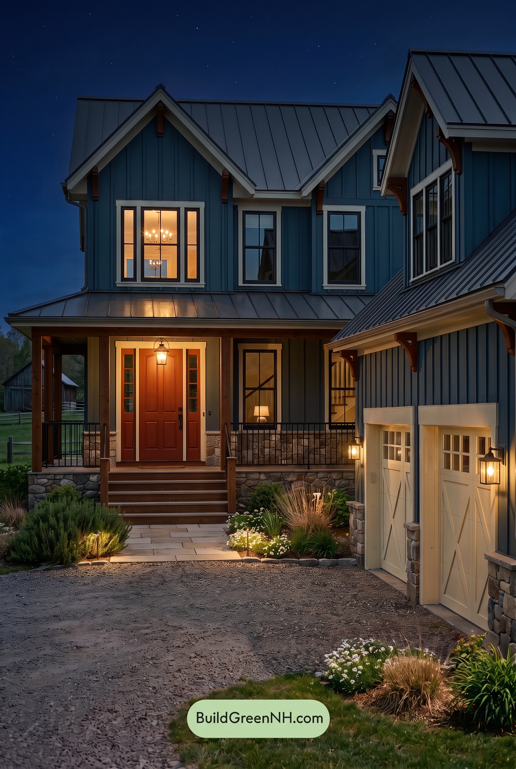
At night, this shade of blue deepens and feels more subdued than it would in neutral daylight, with saturation less apparent beneath the eaves and across the shadowed upper walls. The white trim takes on a softer, creamier cast near the lanterns, while unlit sections look cooler and grayer. These shifts make the illuminated edges stand out against the darker siding.
Warm lighting brings out reddish undertones in the brown door and columns, giving the entrance a welcoming glow. Meanwhile, gray window frames and railings darken toward charcoal, blending into the shadows. Compared with daylight’s more even color balance, the contrast between warm highlights and cool, deep blues creates a mood that feels intimate and quietly dramatic.
Pin these for later:
Want More?
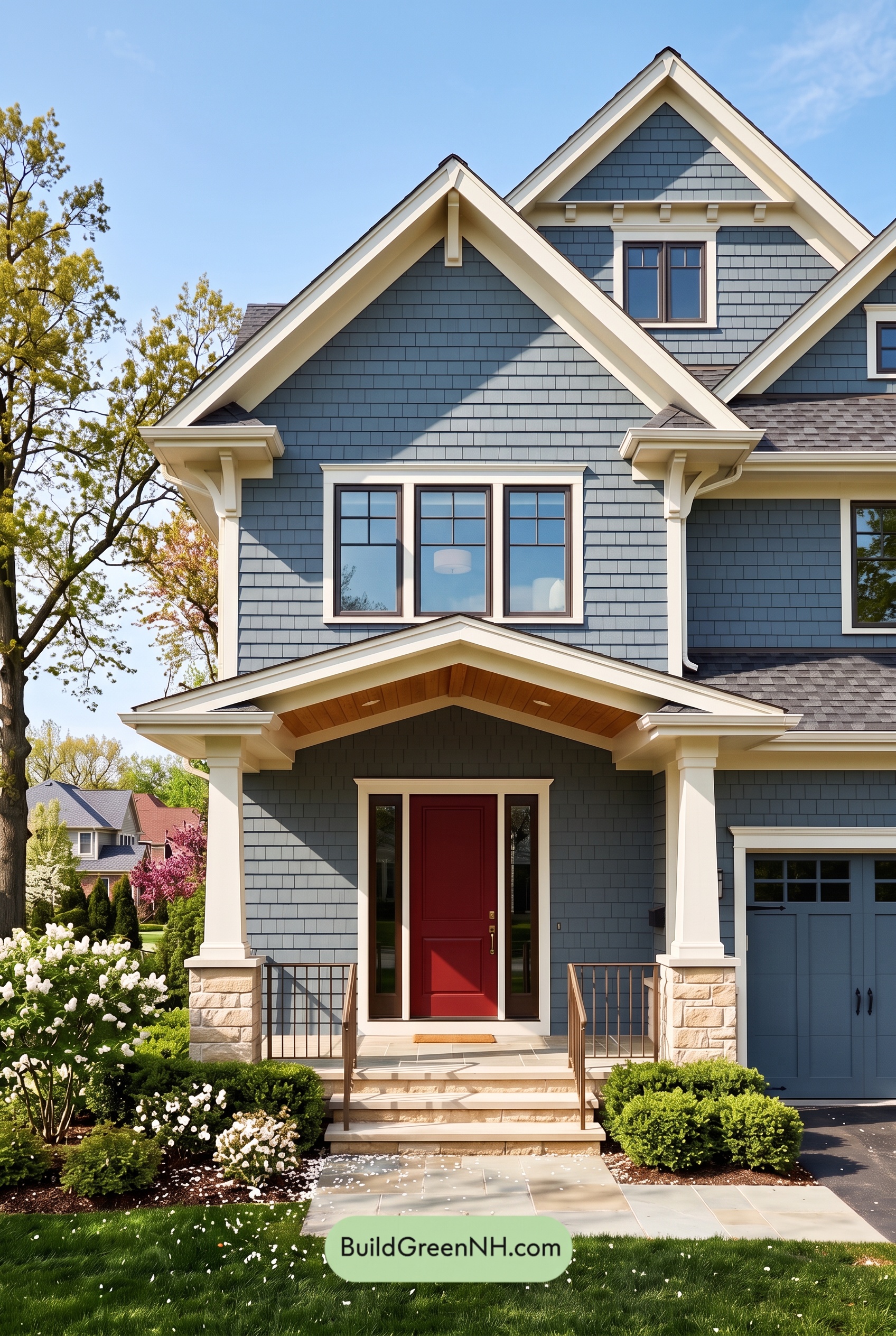 Red Front Door House Paint Color Scheme: Denim Blue Homecoming
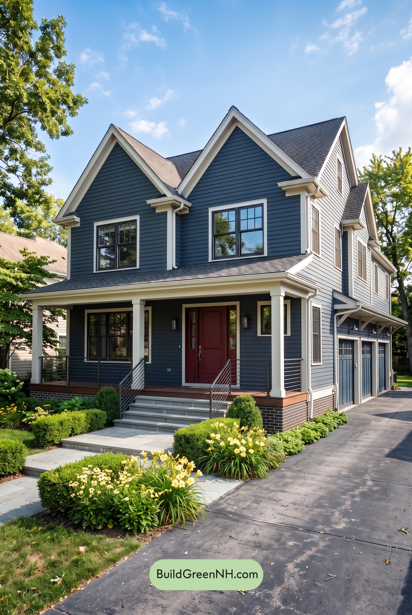 Red Front Door House Paint Color Scheme: Midnight Blue Assurance
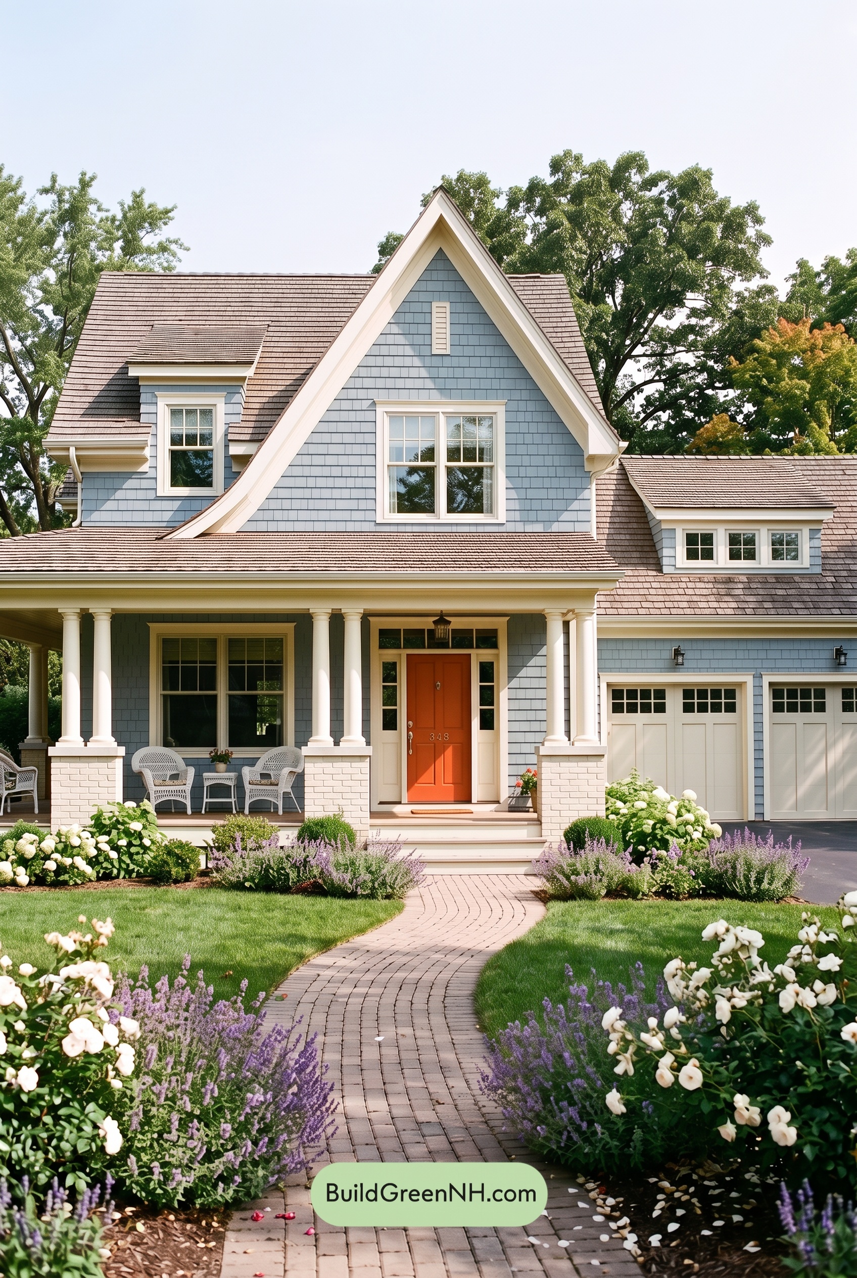 Red Front Door House Paint Color Scheme: Pale Blue Joy
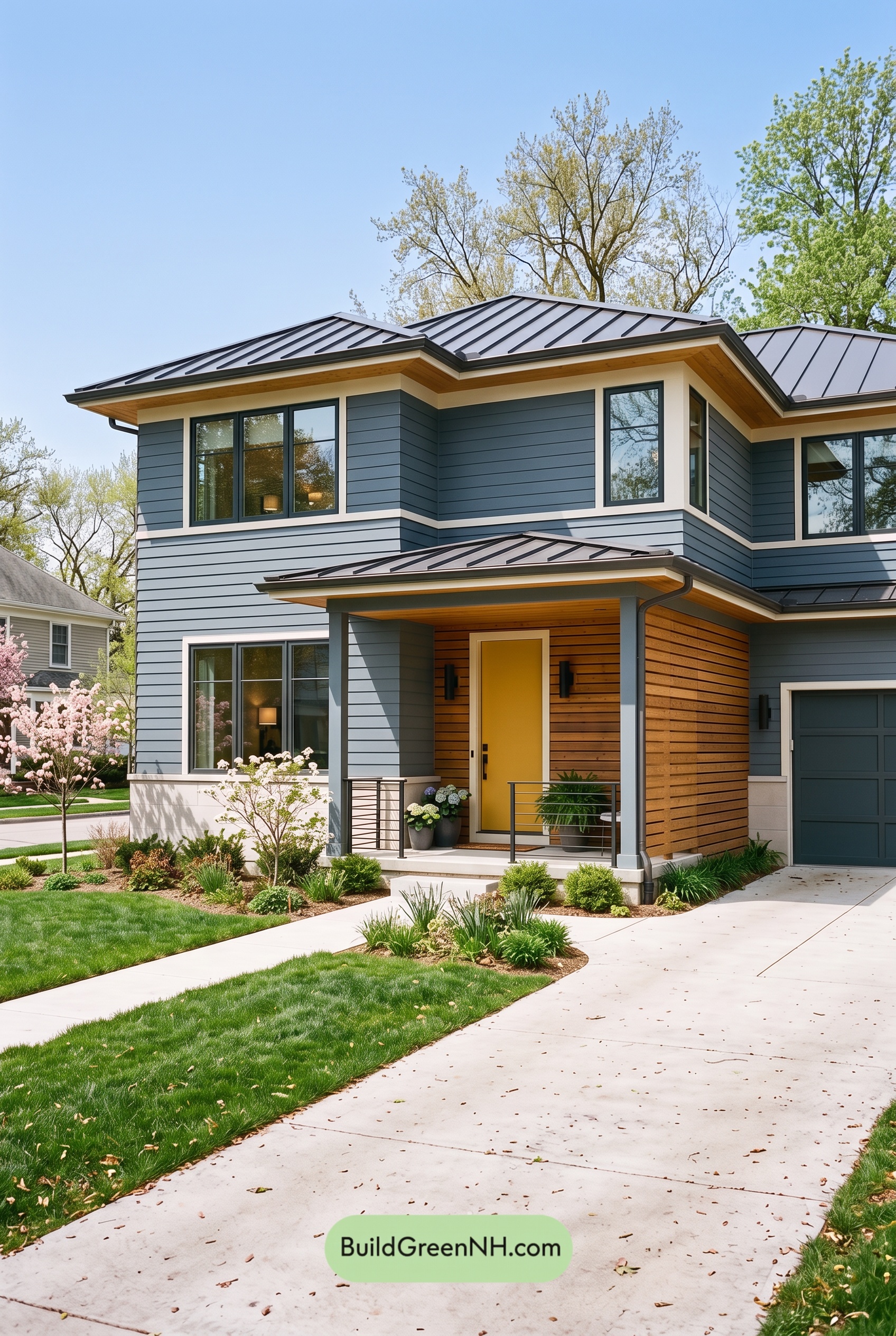 Blue House Front Door Color Scheme: Harbor Saffron
 Blue House Front Door Color Scheme: Cobalt Persimmon
Table of Contents