Last updated on
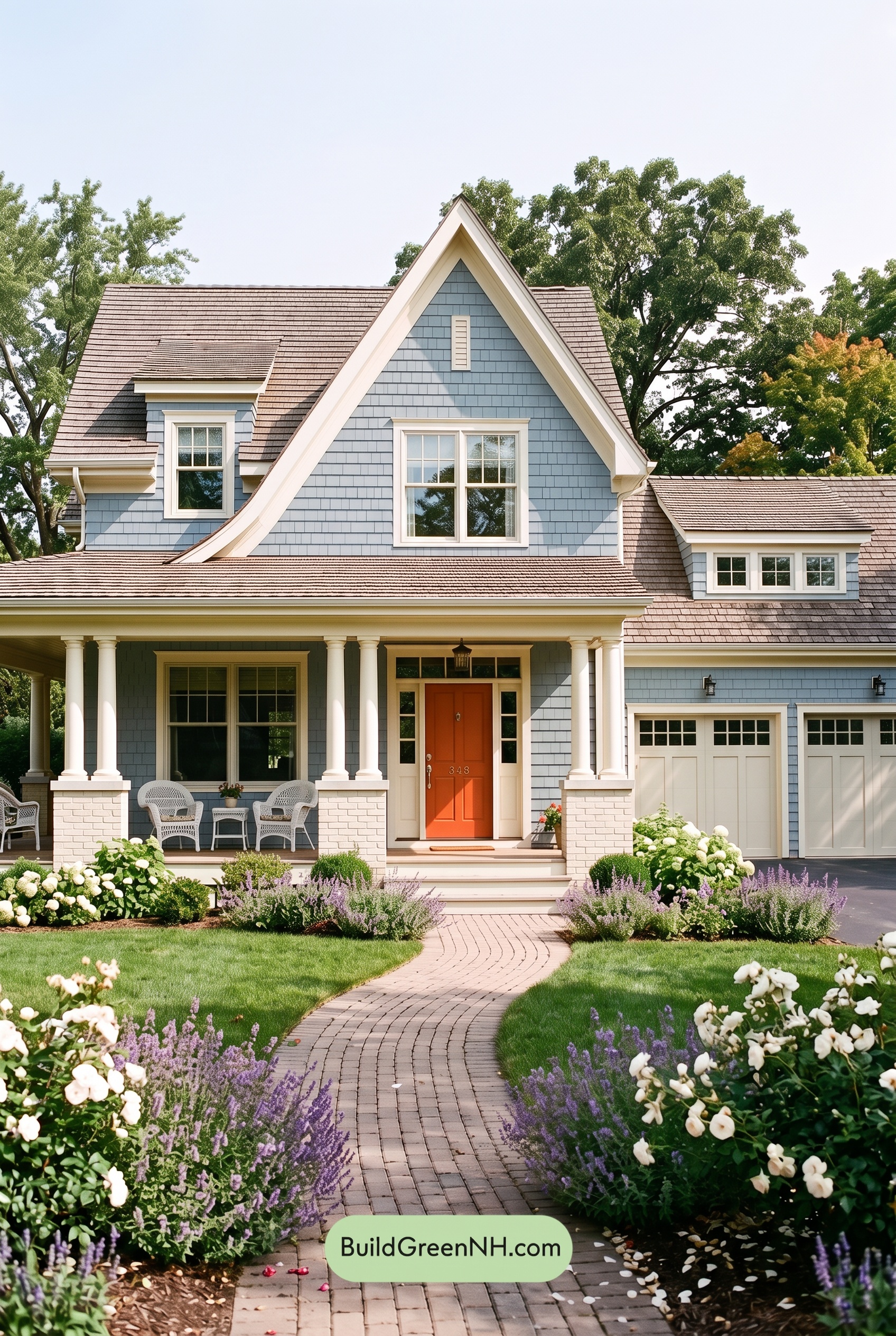

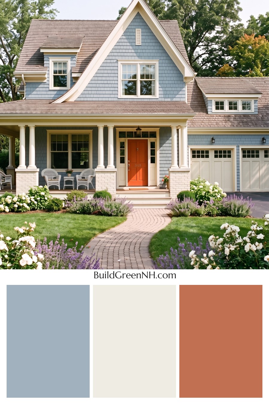
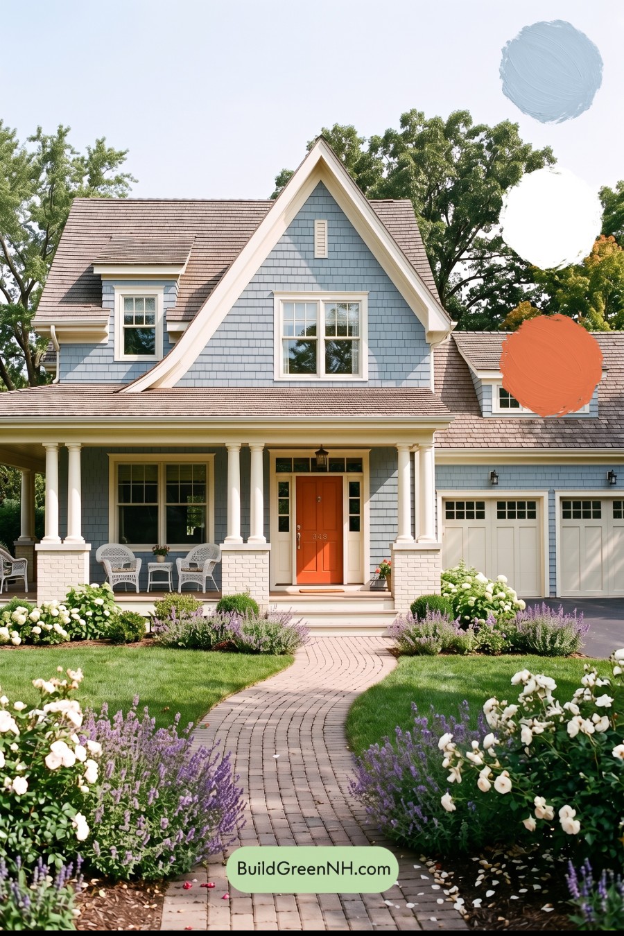
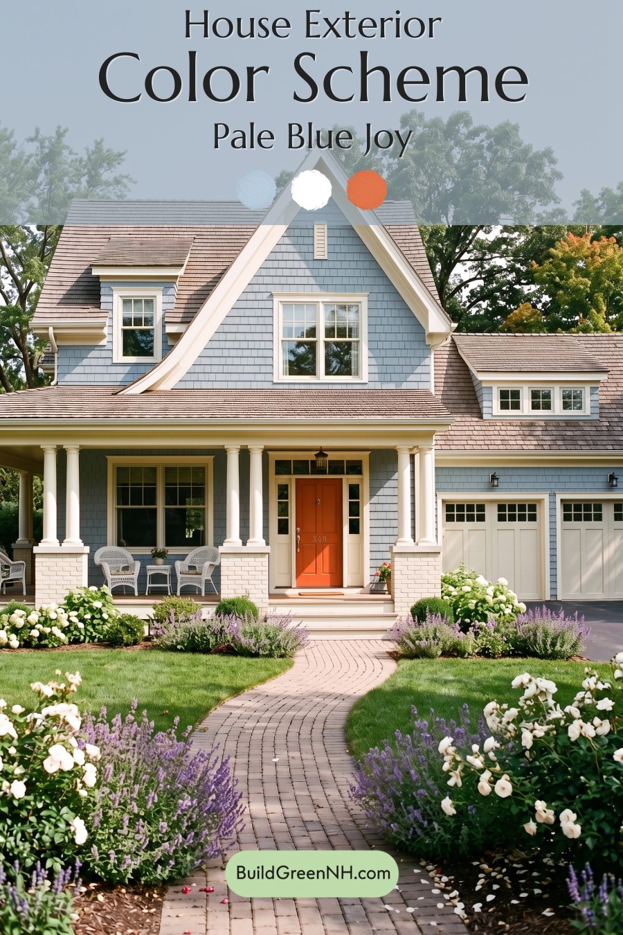
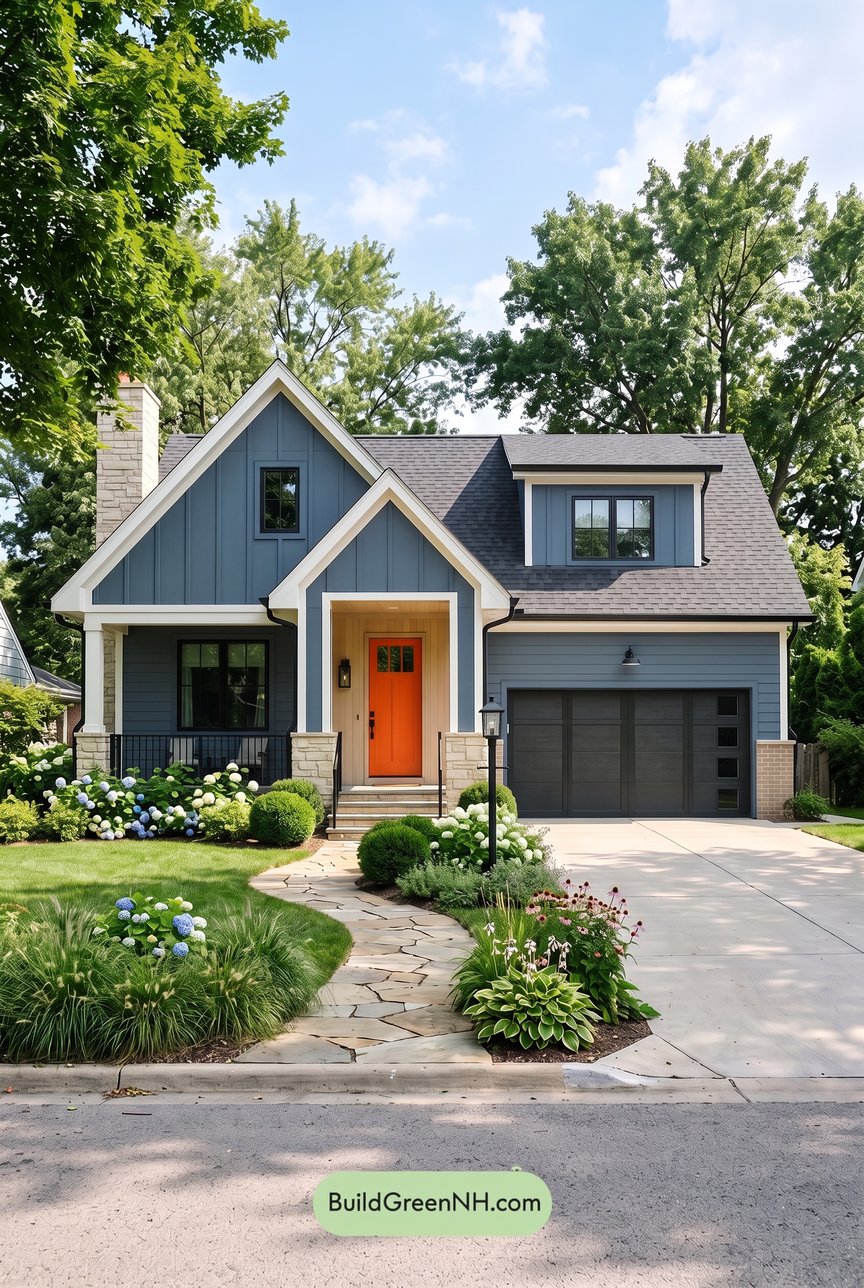
Soft blue siding, warm white details, and a lively orange front door give this home a delightful balance of calm elegance and cheerful personality.
A Soft Blue Backdrop with Plenty of Character
A muted, medium-light blue covers the shingle siding, bringing a gentle wash of color to the broad facade, steep front gable, and smaller dormers. Its subtle gray undertone keeps the blue feeling relaxed rather than overly bright. Across the textured shingles, sunlight and shadow create natural variations that give the exterior depth without adding more colors.
This generous use of blue also connects the main house to the garage. Despite the varied rooflines and architectural details, the exterior reads as one cohesive design.
Warm White Details That Define the Architecture
Warm white trim traces the sweeping gable edges, rooflines, and windows, making the home’s distinctive shape stand out against the blue. The window frames repeat that light shade, creating a crisp, consistent rhythm across both stories.
On the porch, warm white columns and pale painted brick bases bring brightness to the shaded seating area. The garage doors carry the same light color family, tying the right side of the house back to the entry. Because the white feels gently warm rather than stark, the contrast stays welcoming and suits the home’s traditional detailing.
An Orange Door That Draws You In
The front door supplies the scheme’s most spirited moment: a rich, warm orange with a slightly earthy depth. Surrounded by warm white sidelights and trim, it becomes an unmistakable focal point without overwhelming the softer facade.
Blue and orange sit opposite each other on the color wheel, so their contrast feels especially lively. Here, the restrained blue allows the stronger orange to shine. It is a small area of bold color with a big effect.
A Grounded, Inviting Finish
The roof’s muted brown-gray tones add an earthy counterpoint to the cool siding. They also soften the transition between the blue walls and warm white roof trim. Small black lighting fixtures provide darker punctuation without competing with the entrance.
Together, these shades feel fresh, comfortable, and thoughtfully balanced. The blue establishes calm, the white highlights the craftsmanship, and the orange gives the house its memorable spark.
Next, see how this color scheme looks under different lighting simulations throughout the day.
Overcast
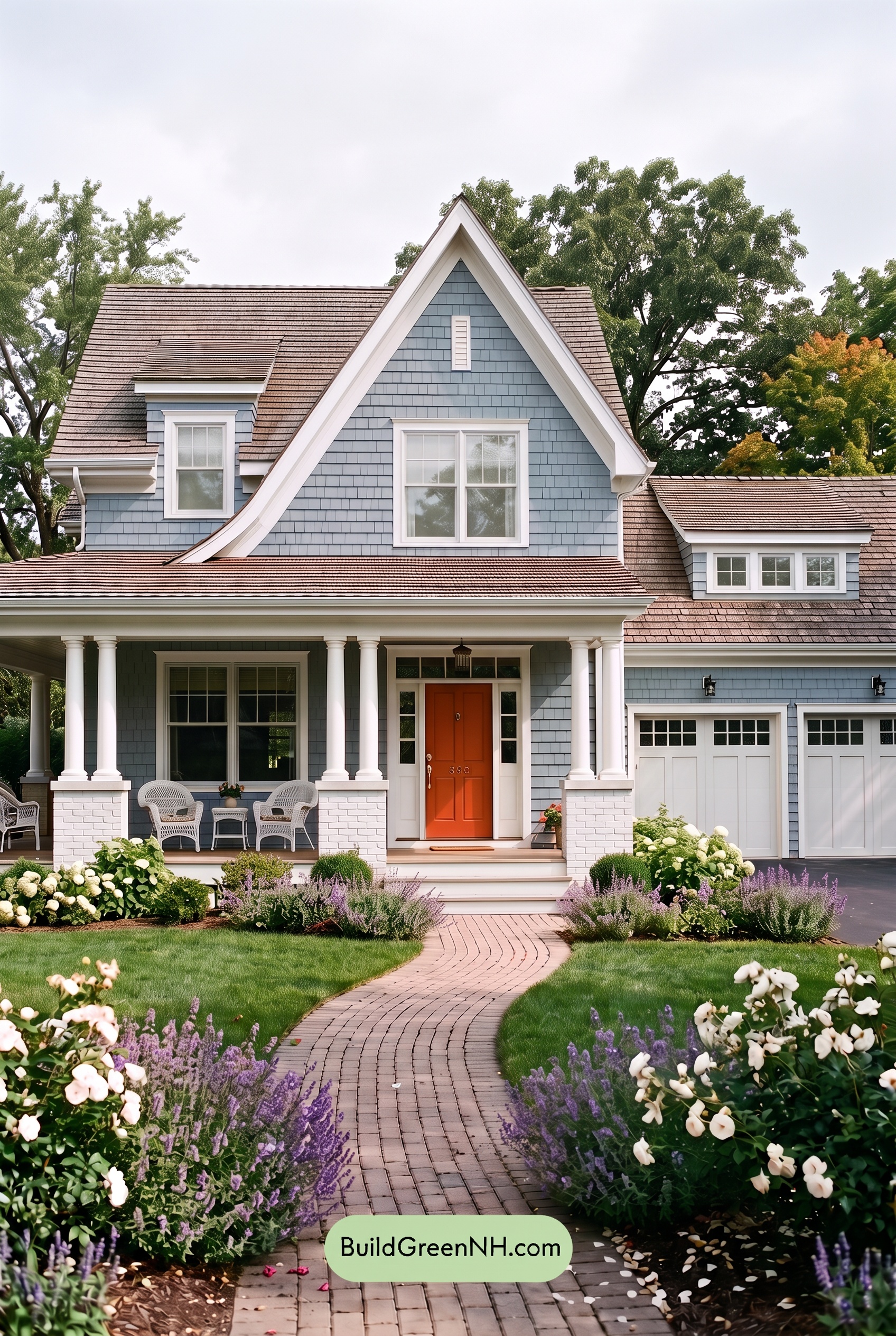
Under overcast skies, this shade of blue would lean cooler and grayer, appearing more subdued than in neutral daylight. The white trim, columns, and garage doors would lose some brightness and feel softer, with a faint gray cast. Diffused light would soften shadows beneath the eaves and across the siding, making the contrast between light and dark areas less dramatic.
The orange front door would look a little less saturated, its warmth quieter but still inviting against the cool blue. With fewer bright highlights and gentler shadow transitions, the overall palette would feel calmer and more understated—while the warm entrance remains a welcoming focal point.
Golden Hour
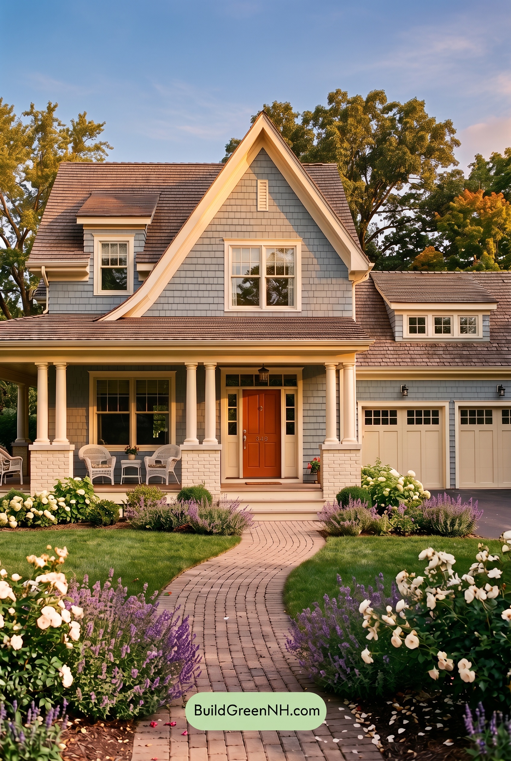
Golden Hour gives the blue siding a softer, more muted cast where sunlight falls, while shaded sections deepen into cooler blue-gray. Compared with neutral daylight’s clearer, more even color, this warm light brings out subtle variations across the shingles. The white trim, columns, and garage doors take on creamy warmth, making their contrast with the siding feel gentler in sunlit areas.
The orange front door looks richer and more saturated, creating a welcoming focal point against the cooler blue around it. Longer shadows beneath the porch and eaves add depth and stronger light-dark contrast, even as the warm highlights soften the overall palette. The mood shifts from crisp and fresh to cozy and quietly dramatic.
Shade
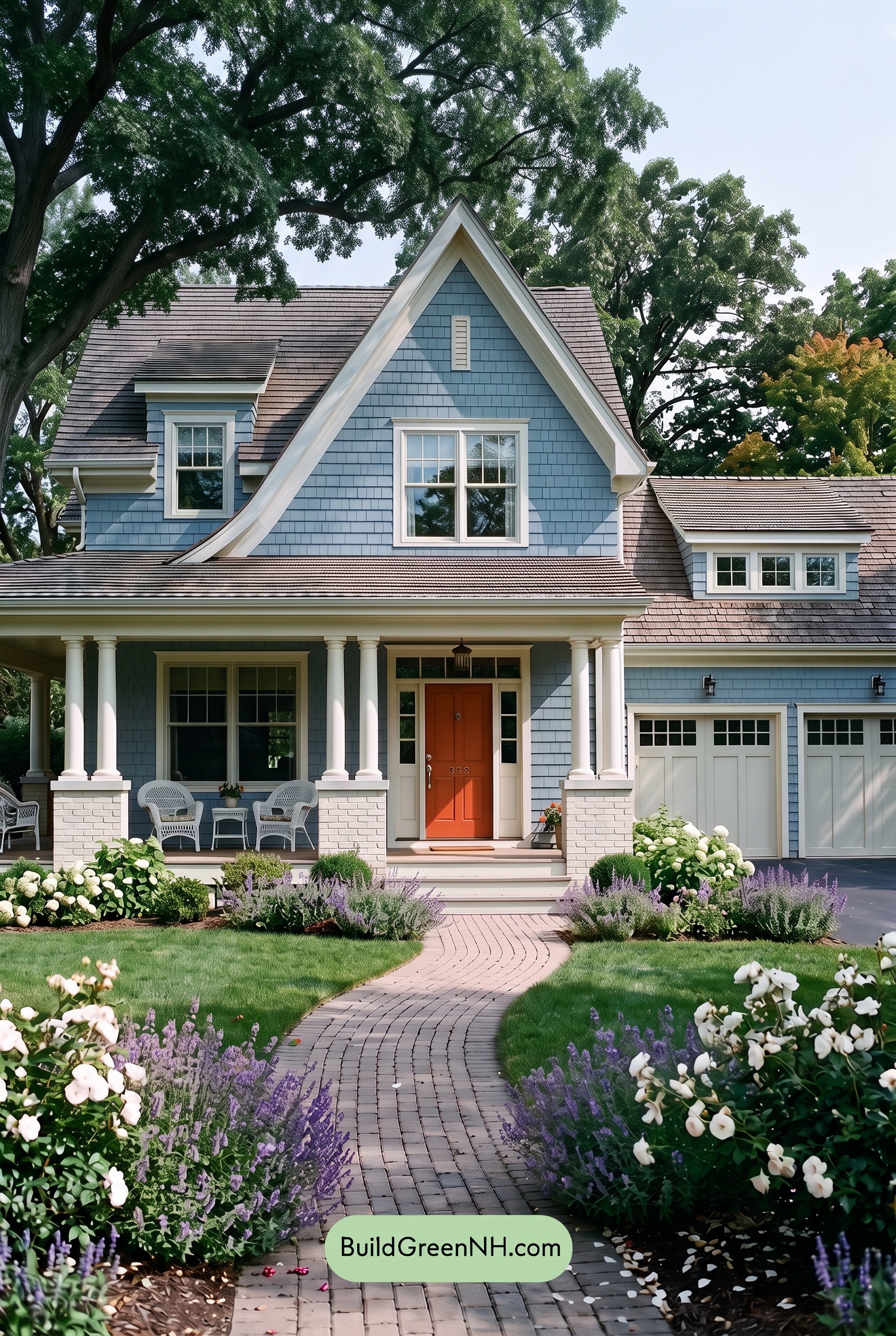
Compared with neutral daylight, shade gives this blue exterior a deeper, cooler appearance, with a gray cast that softens its saturation. Beneath the porch and eaves, shadows pull the blue toward a darker, more subdued shade. The whites lose some brightness and take on cool gray undertones, easing the contrast while still clearly outlining the windows and steep gables.
The orange at the entrance feels less vivid in shade, but its warmth remains a welcoming counterpoint to the cooler blue and white. Where neutral daylight makes the palette feel fresh and lively, shade brings a quieter, more sheltered mood, with softer highlights and deeper recesses adding a sense of depth.
Nighttime
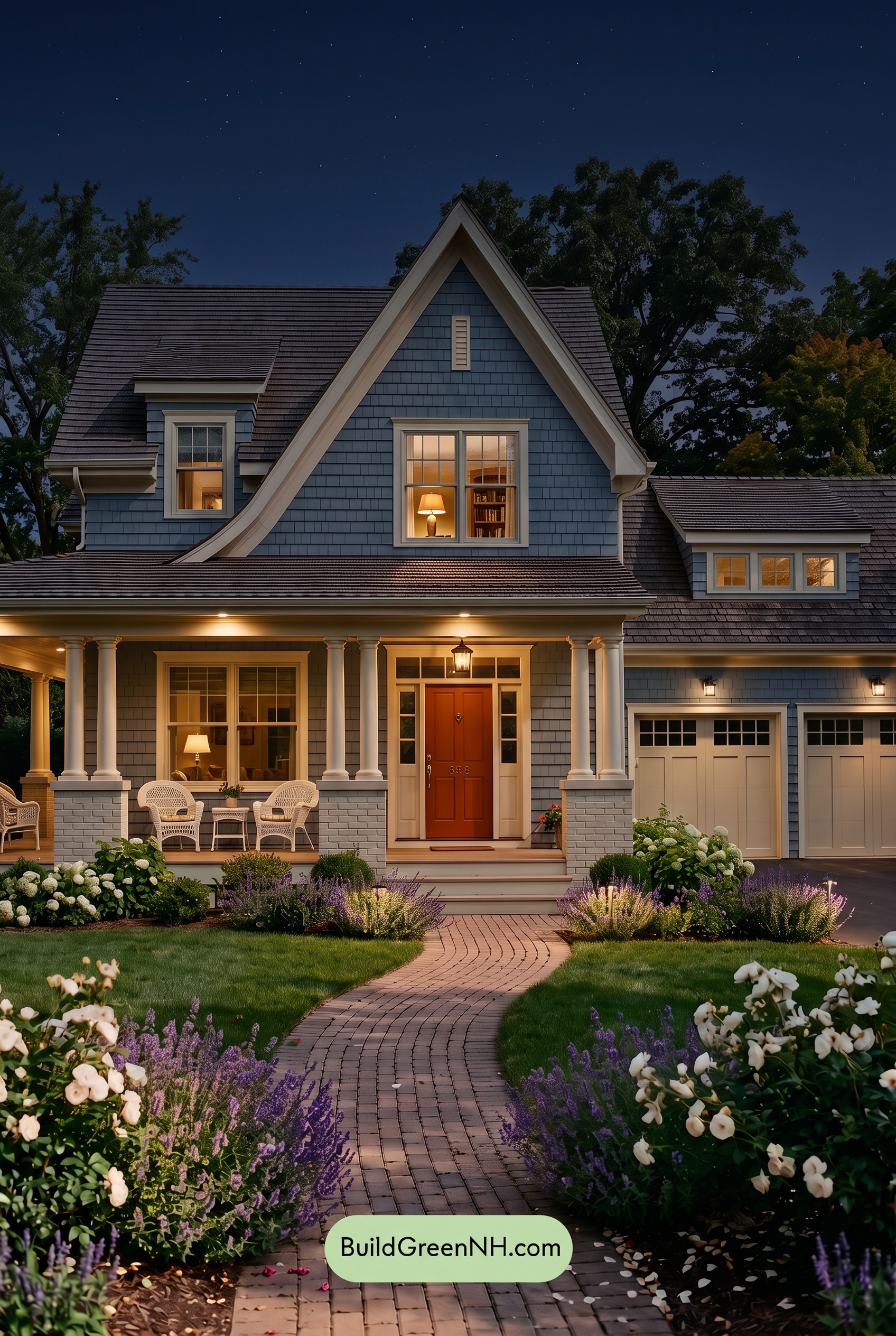
At night, this shade of blue deepens and looks less saturated in shadow than it would under neutral daylight. Warm porch lighting softens the blue near the entrance, while the upper walls retain a cooler cast. Shadows beneath the eaves and along the siding add depth, making the exterior feel quieter and more dramatic.
The whites take on a creamy warmth beneath the lights, shifting toward cool gray in unlit areas rather than appearing uniformly crisp. These glowing pale details stand out against the darkened blue, while the orange front door reads richer and warmer under the entry light. Compared with daylight’s more even color balance, the nighttime palette feels intimate and welcoming.
Pin these for later:
Want More?
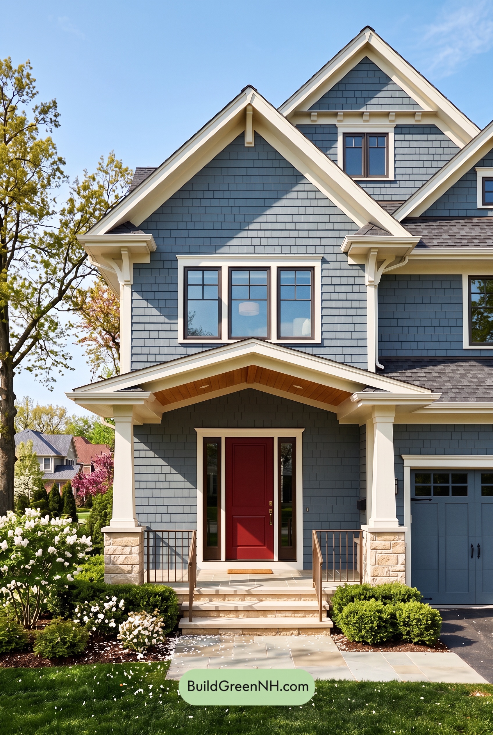 Red Front Door House Paint Color Scheme: Denim Blue Homecoming
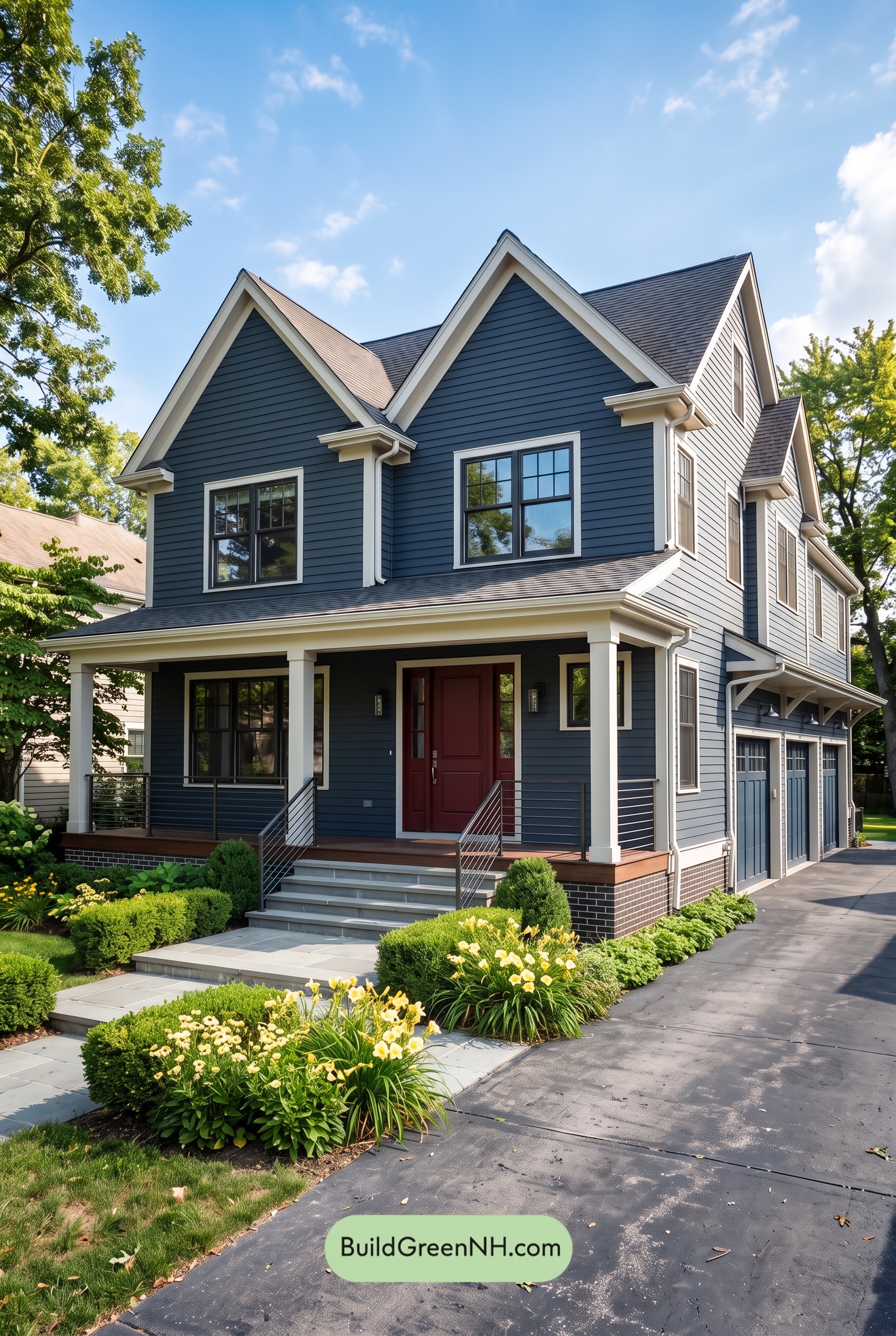 Red Front Door House Paint Color Scheme: Midnight Blue Assurance
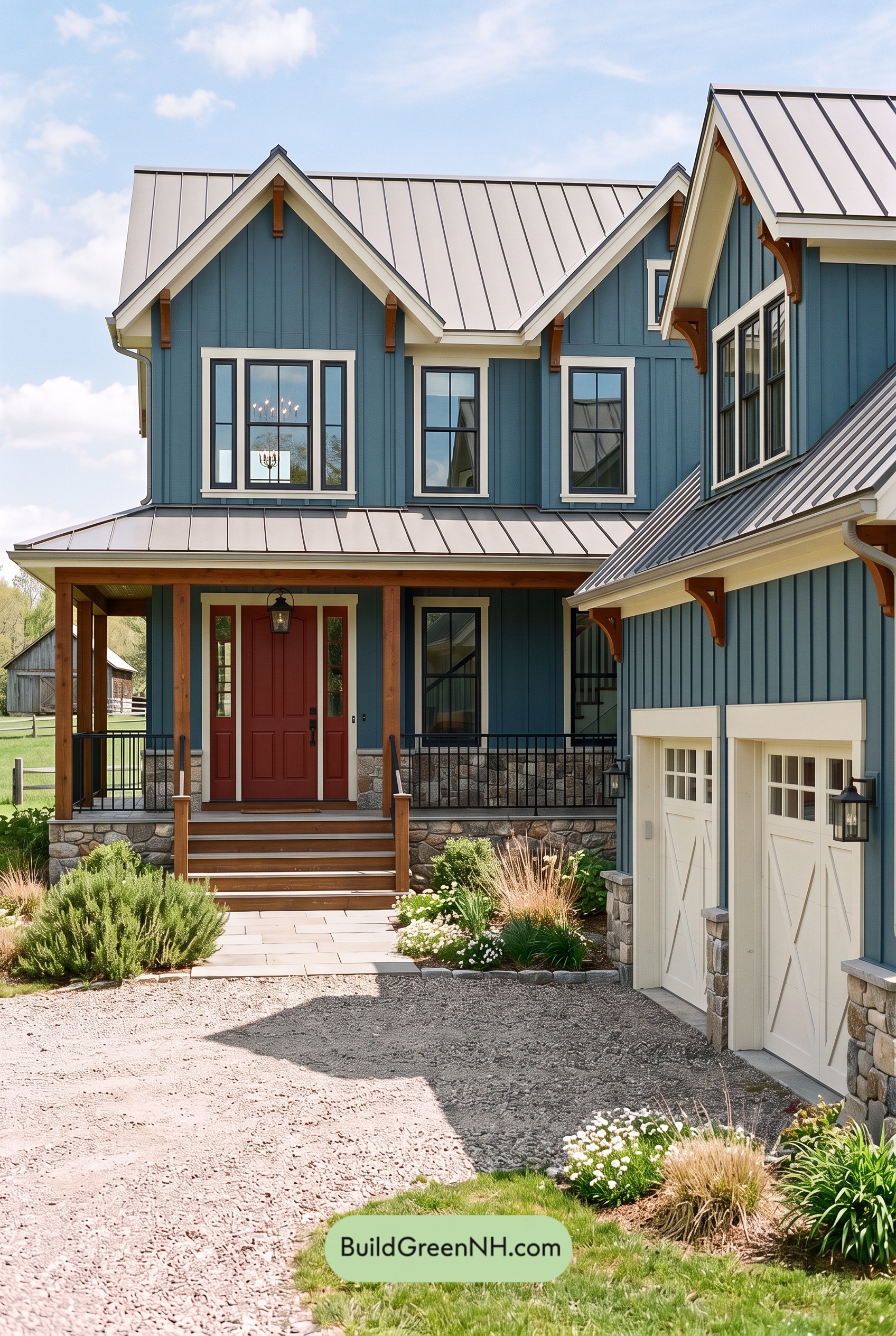 Red Front Door House Paint Color Scheme: Teal Blue Kinship
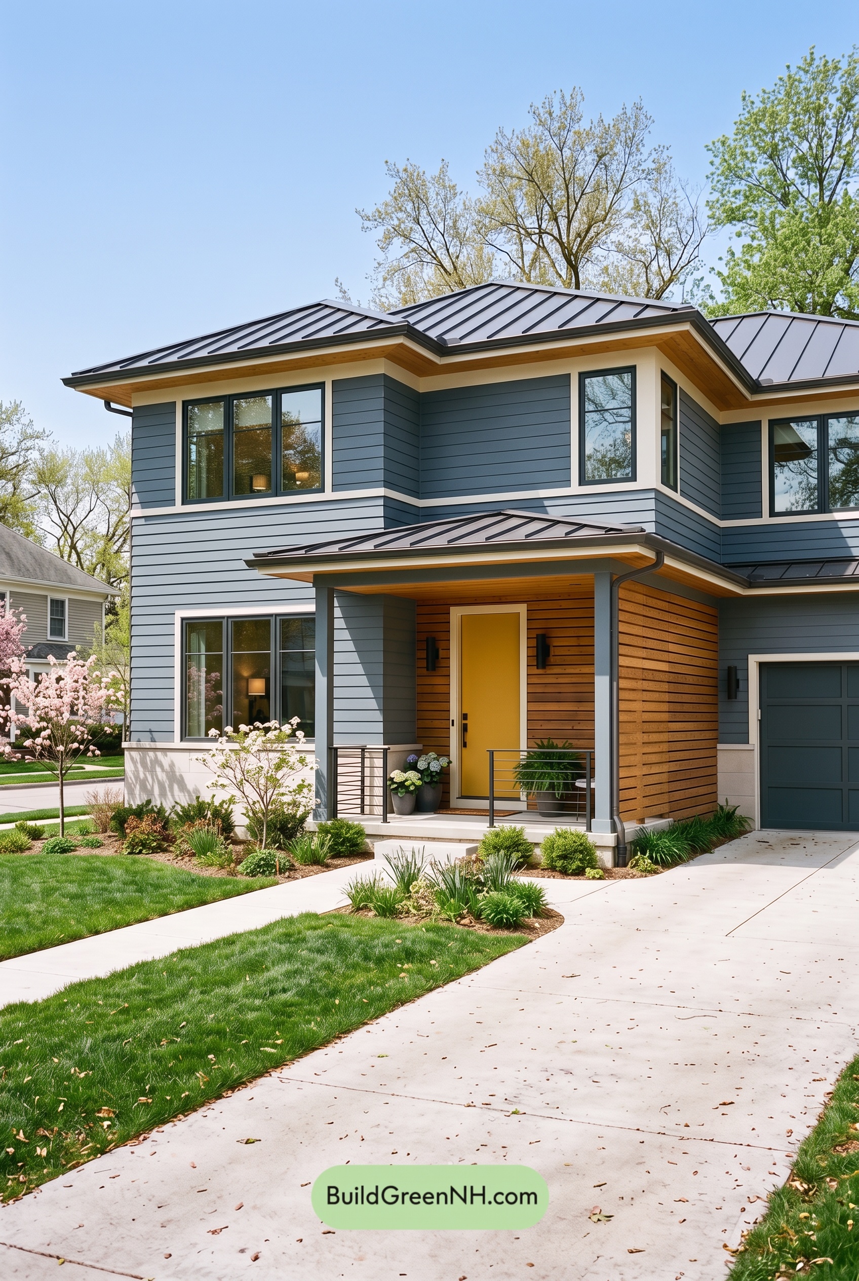 Blue House Front Door Color Scheme: Harbor Saffron
 Blue House Front Door Color Scheme: Cobalt Persimmon
Table of Contents