Last updated on
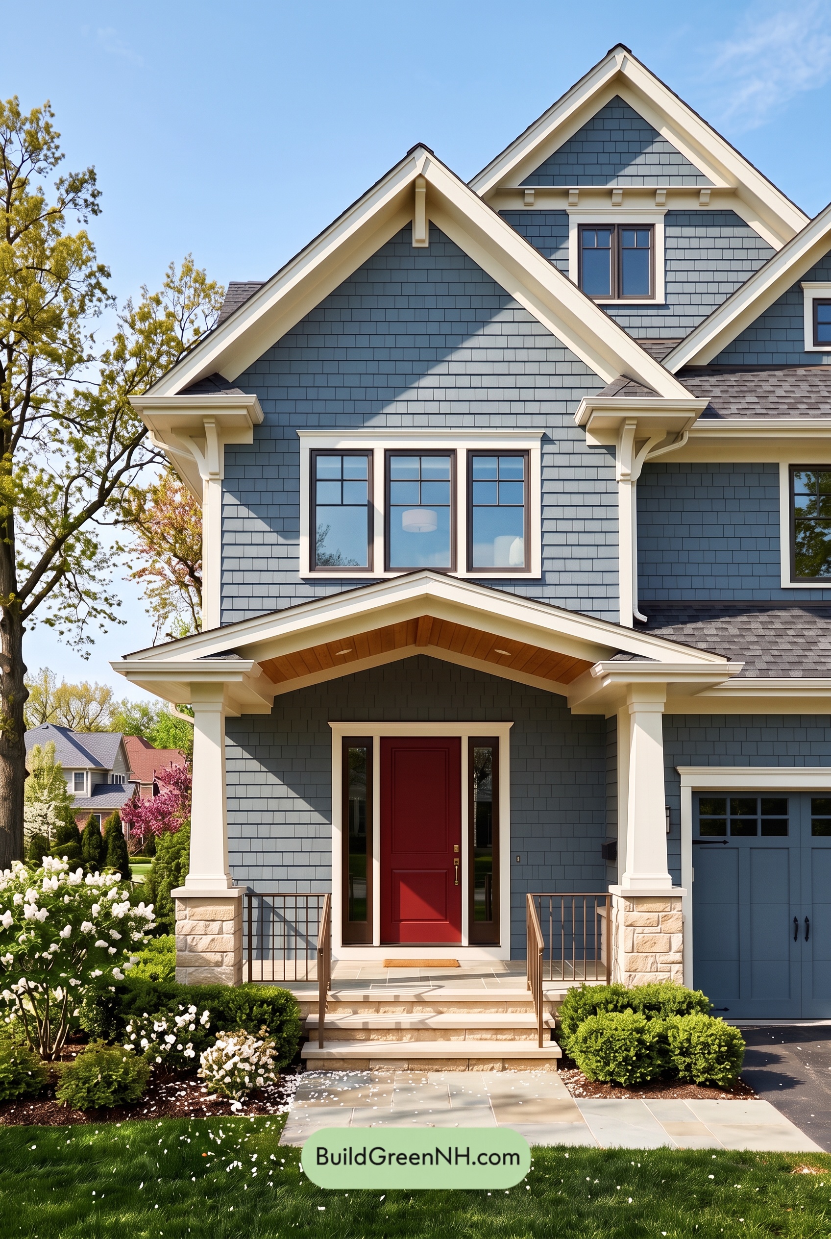

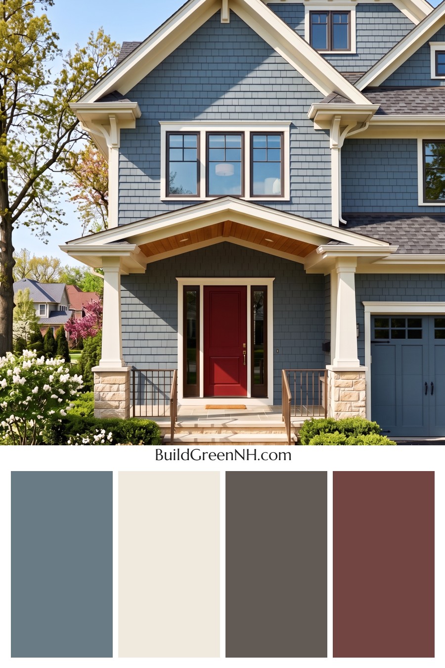
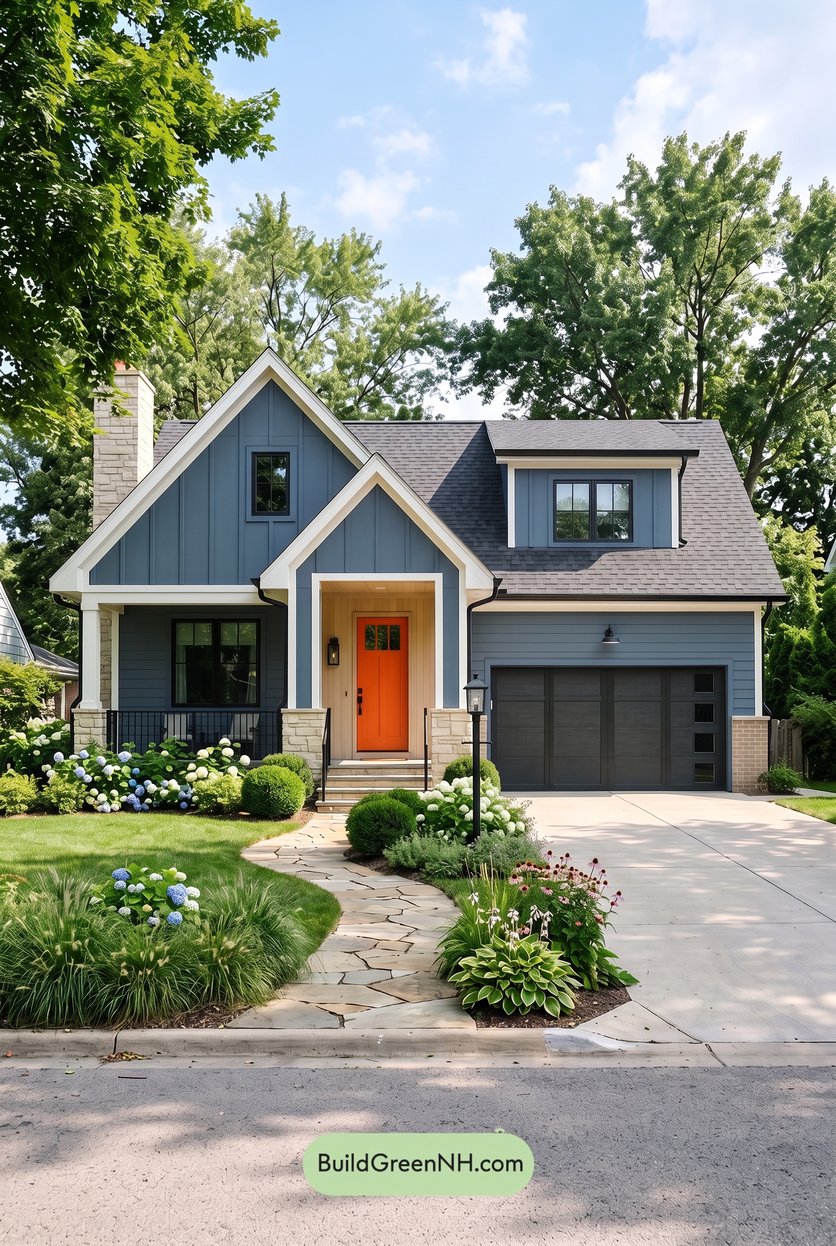
Muted blue siding, creamy beige trim, and rich brown accents give this home a beautiful balance of crisp architectural detail and welcoming warmth.
A Calm Blue Backdrop
A medium, gray-softened blue covers the shingle siding, extending across the main walls and into the steeply pitched gables. It has enough depth to give the house presence without overwhelming its intricate exterior. Sunlight brings out the lighter blue-gray tones, while shaded areas appear deeper and more subdued.
The garage door repeats this muted blue family, helping a large, practical feature blend into the facade. That repetition keeps the exterior cohesive and lets the porch and layered rooflines draw more attention.
Creamy Beige Trim That Defines the Details
Light, creamy beige outlines the gables, eaves, and window surrounds, creating a gentle but clear contrast with the cooler siding. Rather than looking stark, this warm shade highlights the decorative brackets and broad trim boards with a softer touch.
The porch columns carry the same pale beige downward, visually connecting the upper architecture to the entrance. Their light beige stone bases introduce subtle variations in shade and texture, giving the porch a grounded, substantial feel.
Warm Accents Around the Entrance
Deep brown window frames add definition within the lighter surrounds. Their slim, dark outlines bring depth to the windows without competing with the strong shapes of the gables.
At the entrance, the front door’s rich, red-leaning brown provides the warmest focal point. It stands apart from the blue siding while remaining connected to the surrounding brown accents. Medium brown railings frame the steps, and the golden-brown porch ceiling adds another welcoming layer overhead.
A Balanced Finish from Roof to Porch
The roof’s charcoal-gray and muted gray-brown shades anchor the palette without introducing a distracting contrast. These subdued tones work comfortably with both the cool blue walls and the warmer beige detailing.
What makes this scheme especially appealing is its balance: blue supplies calm, beige brings light, and brown adds warmth and definition. The result feels polished but approachable—a detailed exterior that still makes the front porch feel like a place to pause and settle in.
Next, see how this color scheme looks under different lighting simulations throughout the day.
Overcast
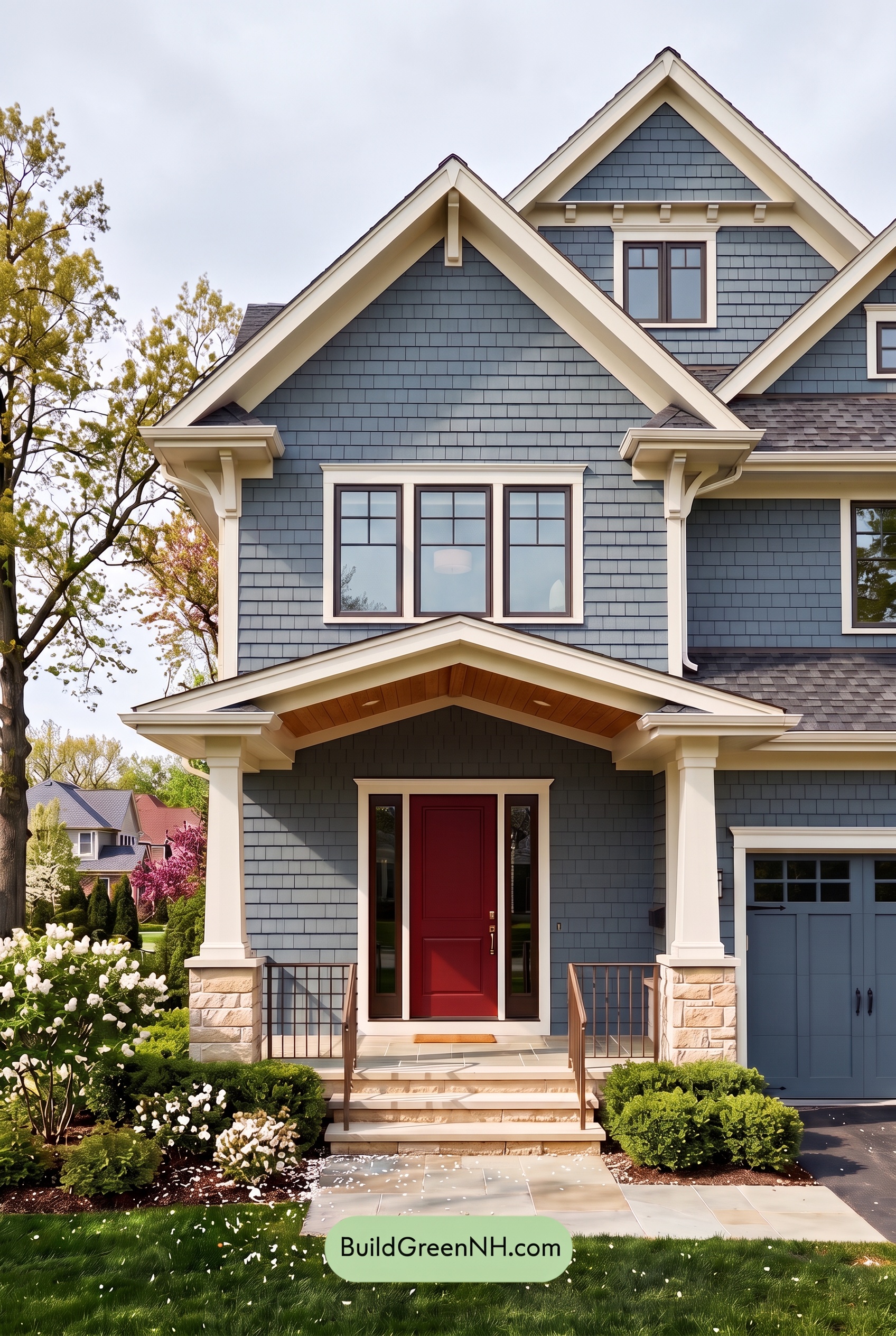
Under overcast skies, this shade of blue can appear deeper and grayer than in neutral daylight, with its saturation gently subdued. The beige trim and columns lose some golden warmth, reading as softer, quieter neutrals against the cool blue. Dark brown accents feel more restrained, their warm undertones less pronounced.
Diffused light softens shadows beneath the gables and porch, making the painted surfaces look more even. The contrast between pale beige and deeper blue remains clear, but the transitions feel gentler, with fewer bright highlights and dark pockets. Compared with neutral daylight, the overall mood becomes cooler, calmer, and more understated.
Golden Hour
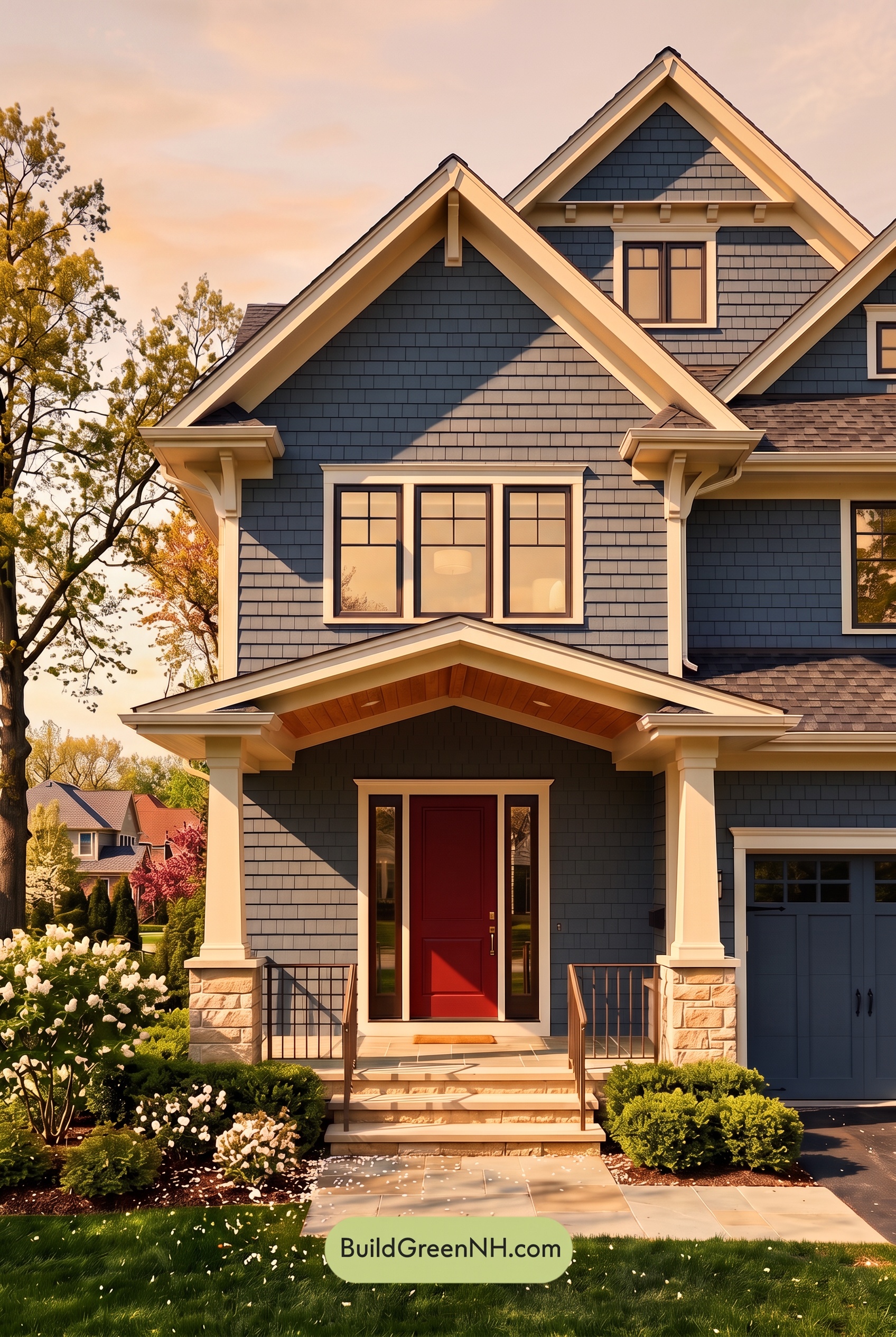
Golden Hour gives this blue exterior a softer, more layered character than neutral daylight. Sunlit areas appear warmer and slightly grayer, tempering the blue’s saturation, while shaded sections deepen into richer, cooler shades. The pale beige trim and columns take on a warm yellow cast, making their edges glow against the darker siding.
Long, angled shadows beneath the gables and porch strengthen the contrast between light and dark, bringing extra depth to the façade. Brown accents reveal warmer undertones where sunlight reaches them and look deeper in sheltered areas. Compared with the crisp, balanced appearance of neutral daylight, the palette feels more intimate and welcoming, with luminous warm neutrals balancing the moody blues.
Shade
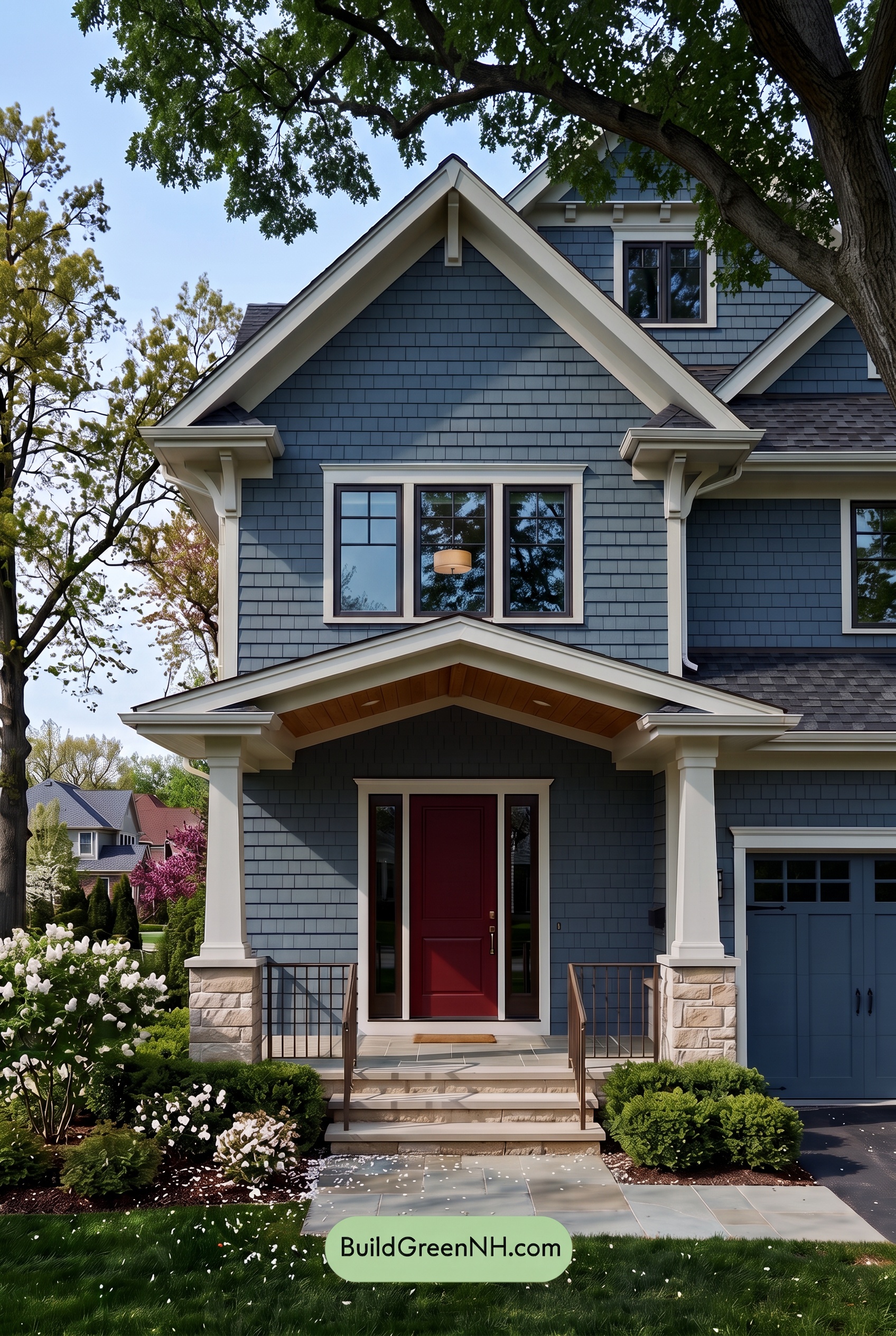
Under the tree canopy, the blue shades appear deeper, cooler, and less vividly saturated than they would in neutral daylight. Shadows beneath the gables and porch push them toward darker, grayer blues, while areas receiving more sky light retain a softer blue character. This variation gives the exterior a layered, quietly dramatic feel.
The light beige shades lose some of their golden warmth in shade, feeling softer and more restrained. They still stand out against the deepened blues, keeping the rooflines and columns clearly defined. Dark brown accents become less distinct in the deepest shadows, lending the palette a calm, sheltered mood rather than the brighter, more open feeling of neutral daylight.
Nighttime
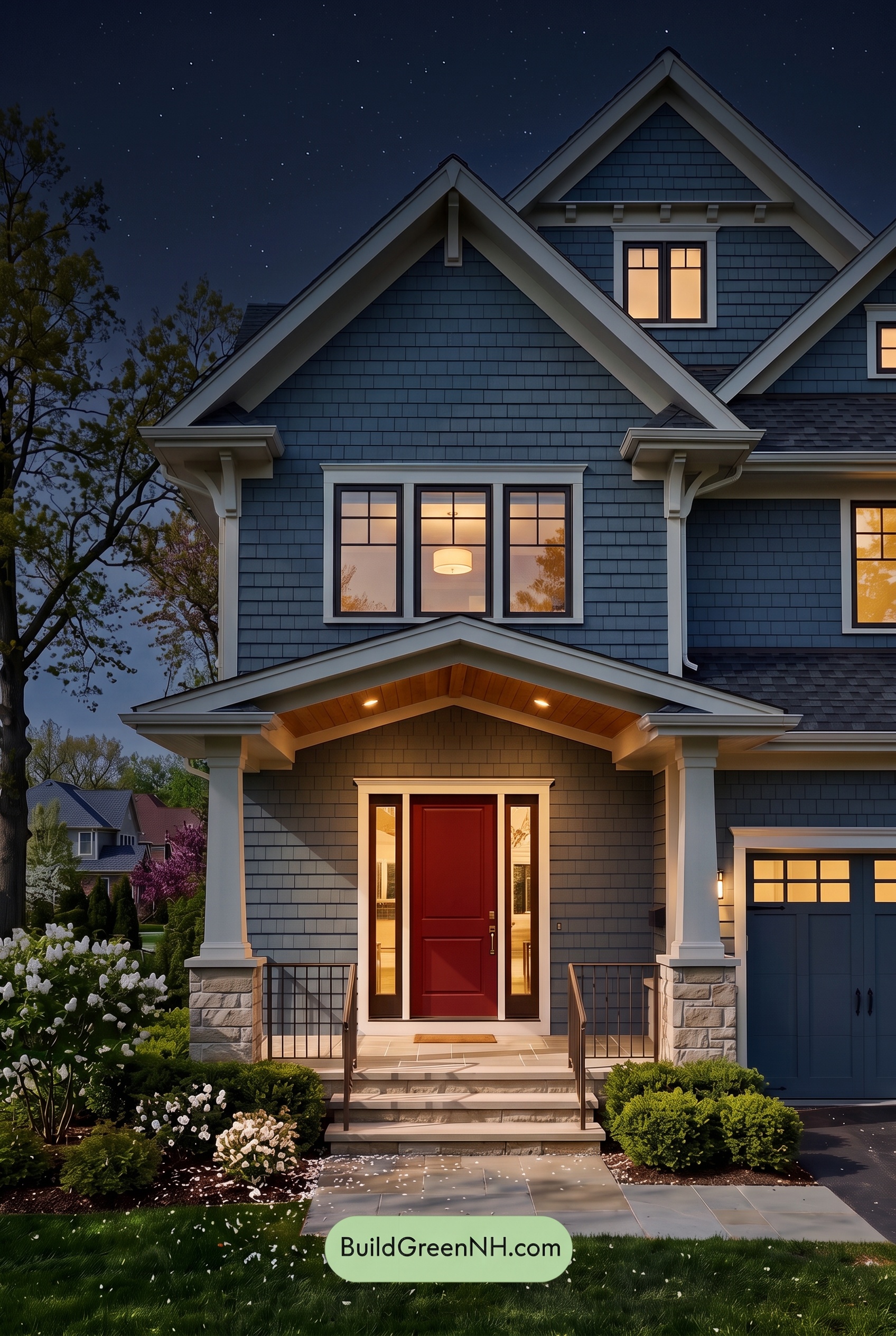
At night, the blue shades deepen toward navy, appearing more muted in shadow than they would under neutral daylight. Shadows beneath the gables make the upper walls feel richer and more dramatic, while the lighter beige shades trace the rooflines against the darkened siding. Near the porch lights, those warm neutrals take on a softer, golden cast.
The brown accents appear darker away from the lights, with warmer undertones emerging around the illuminated entry. Compared with daylight’s more even color definition, nighttime creates stronger contrasts between glowing highlights and deep recesses. The overall mood shifts from crisp and airy to cozy and quietly dramatic, drawing attention toward the welcoming porch.
Pin these for later:
Want More?
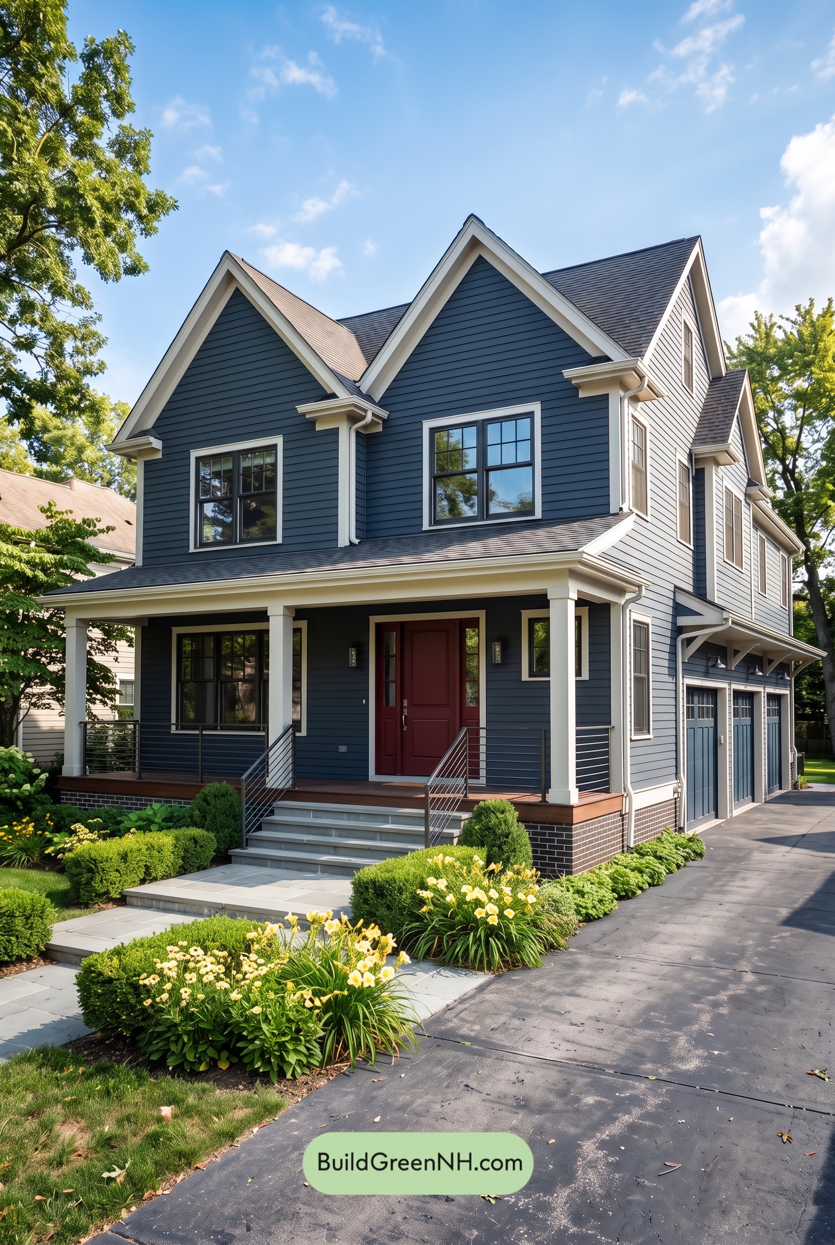 Red Front Door House Paint Color Scheme: Midnight Blue Assurance
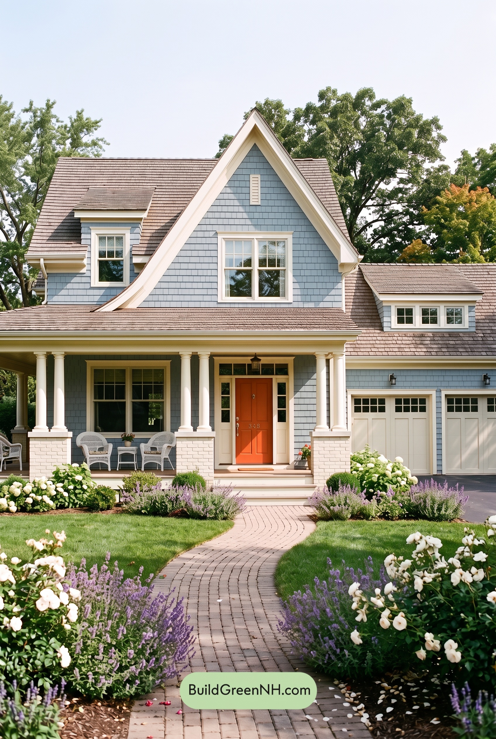 Red Front Door House Paint Color Scheme: Pale Blue Joy
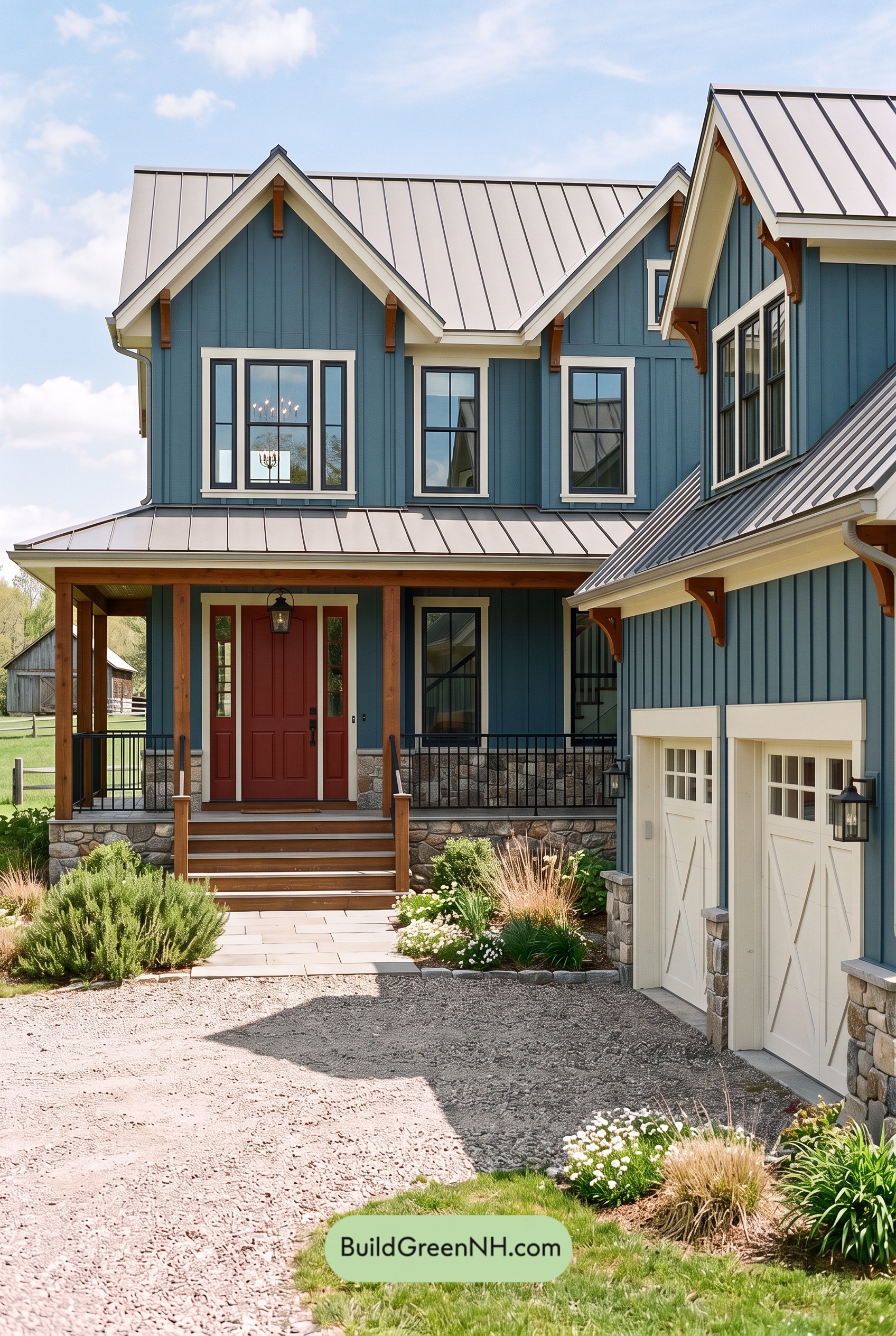 Red Front Door House Paint Color Scheme: Teal Blue Kinship
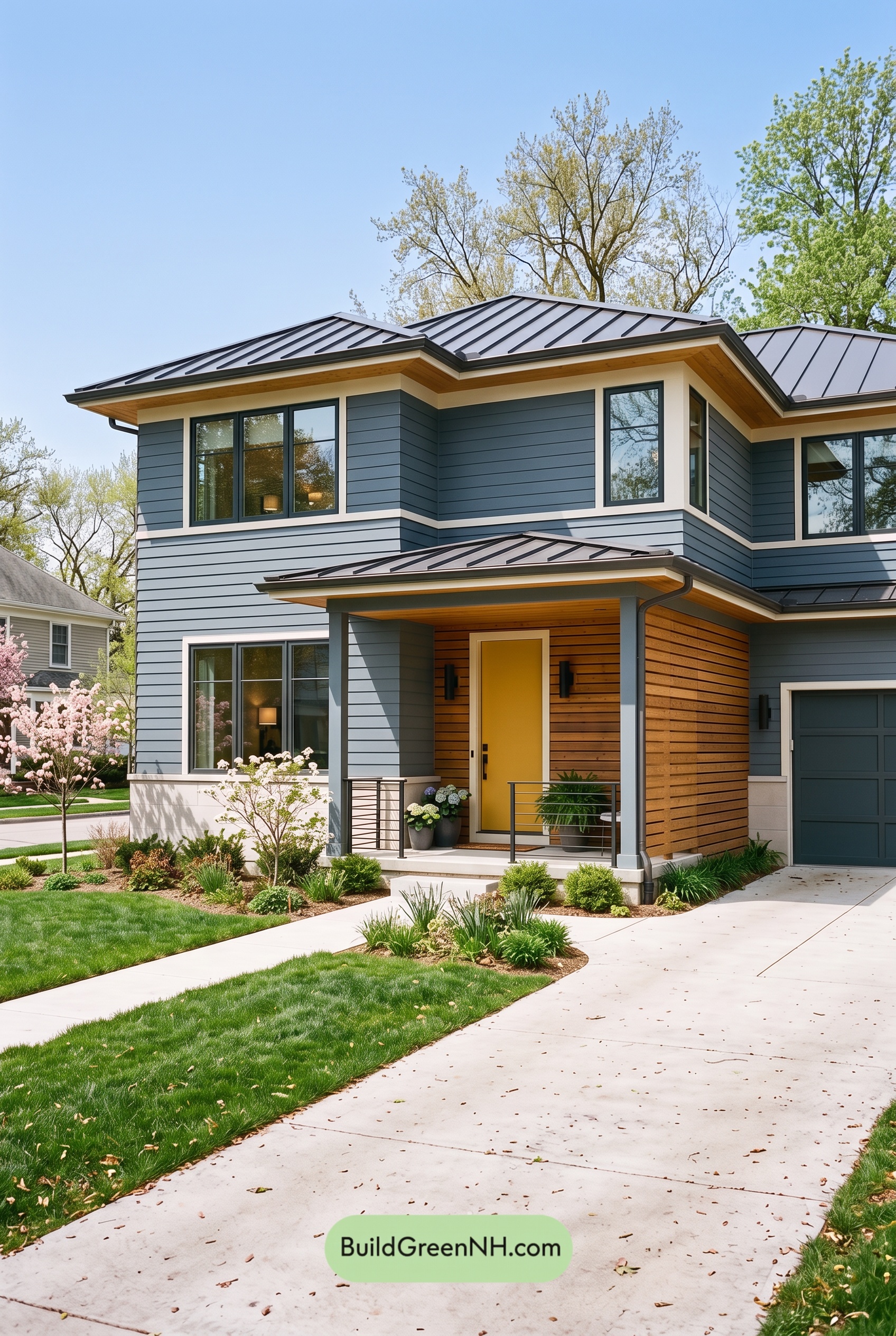 Blue House Front Door Color Scheme: Harbor Saffron
 Blue House Front Door Color Scheme: Cobalt Persimmon
Table of Contents