Last updated on
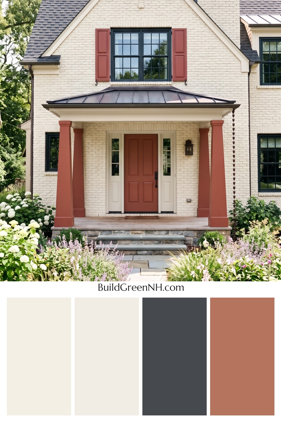
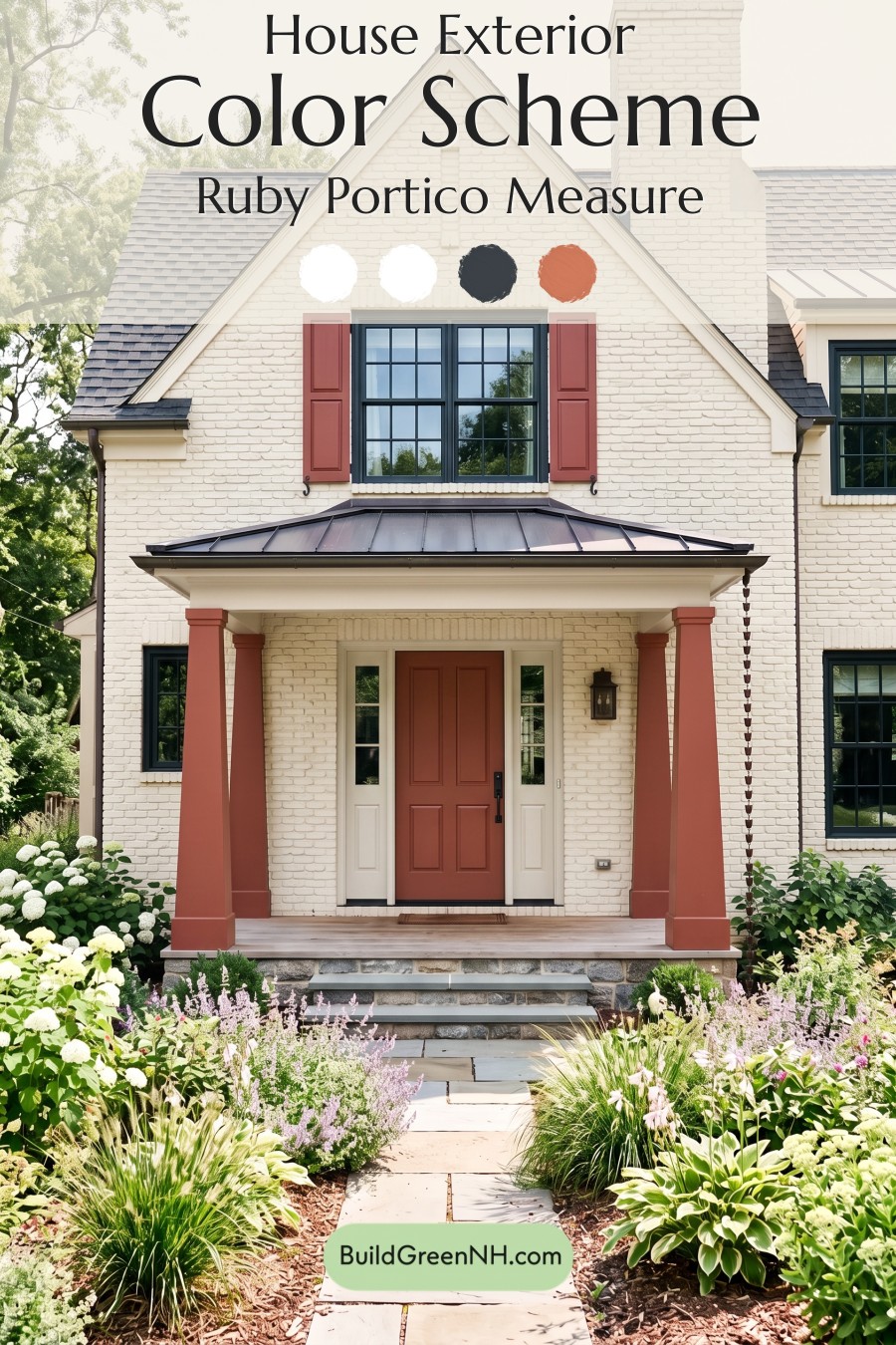
This inviting exterior succeeds because its warm neutrals, earthy red accents, and deep charcoal details create a polished look that feels both timeless and full of personality.
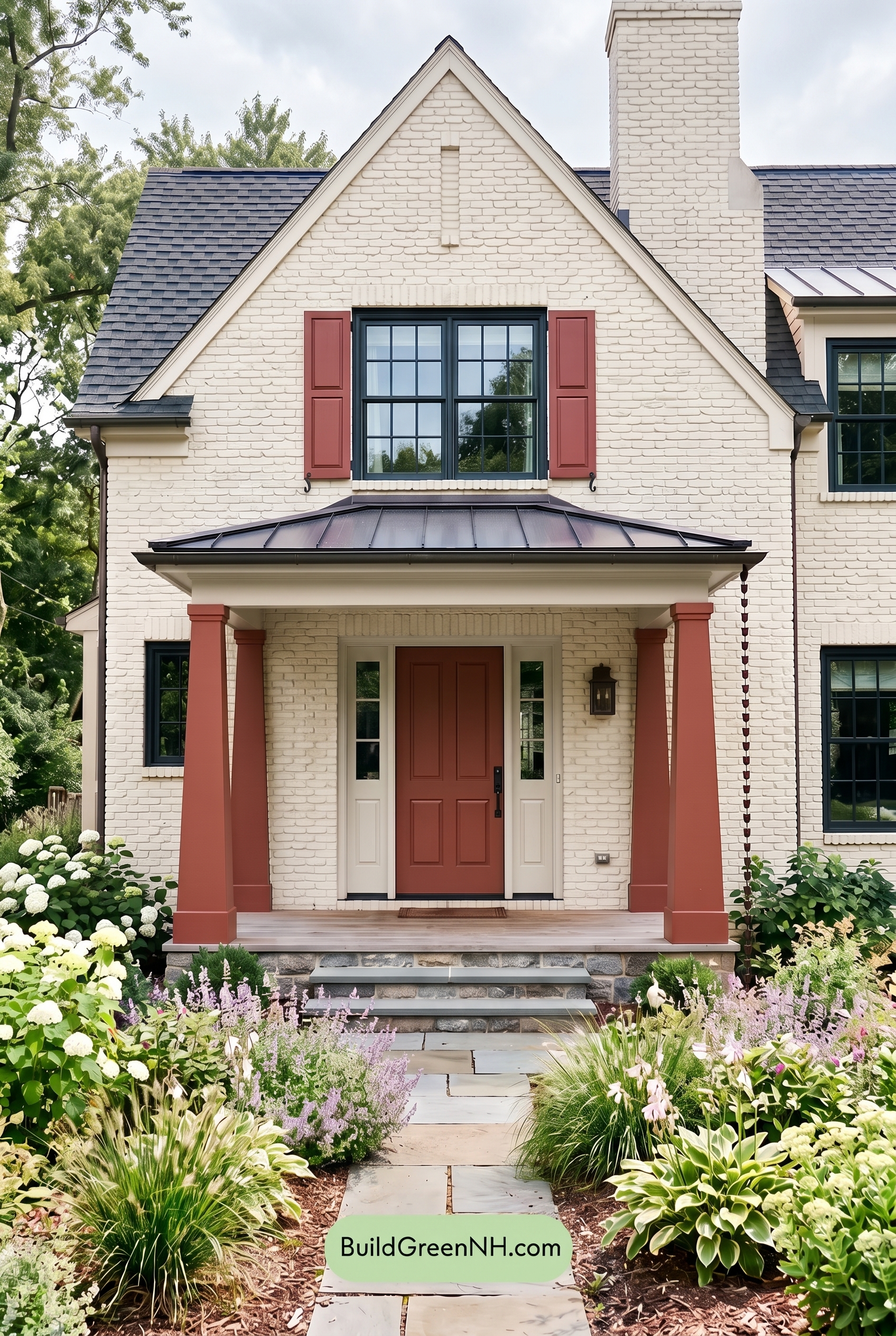
A Soft, Light Foundation
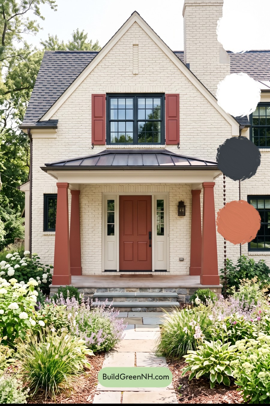
The home’s light beige brick exterior sets a calm, welcoming tone from the start. Its softly warm cast keeps the facade from feeling stark, while the textured brickwork adds depth and traditional character across the tall front elevation and chimney.
Creamy beige trim follows the rooflines, frames the porch, and outlines the entry surround. This gentle tonal shift creates definition without interrupting the peaceful, cohesive look of the main exterior.
Earthy Accents That Warm the Entry
A muted red-brown shade gives the shutters, porch columns, and front door a wonderfully grounded presence. Repeating this earthy accent across multiple architectural details ties the upper and lower portions of the house together beautifully.
The front door becomes a natural focal point in its deeper red-brown shade, while the matching columns make the covered porch feel substantial and inviting. Above, the coordinating shutters add a touch of classic charm around the large window.
Deep Gray for Crisp Definition
Deep charcoal-gray window frames introduce just the right amount of contrast against the light beige brick. Their dark tone sharpens the window grids and gives the traditional architecture a slightly more tailored, updated edge.
The roof continues this darker gray family, creating a strong visual cap for the home. The rich roof shade anchors the light facade and connects naturally with the dark window frames, gutters, and porch roof details.
A Balanced, Welcoming Mood
Altogether, the palette feels refined, warm, and quietly confident. The light beige backdrop keeps the exterior airy, the creamy trim softens every transition, and the red-brown accents bring a welcoming sense of warmth at the entry.
Dark gray elements prevent the scheme from becoming overly sweet, giving it contrast and architectural definition. Surrounded by lush planting, these earthy shades feel especially at home—classic enough for lasting curb appeal, yet distinctive enough to be memorable.
Next, see how this color scheme looks under different lighting simulations throughout the day.
Overcast
Under overcast skies, the light beige brick and matching trim appear softer and a touch cooler than they do in neutral daylight, with less glare across the textured surface. The muted light flattens sharp sunlit highlights, allowing the subtle variation in the masonry and the warm neutral porch details to read more evenly.
The deeper gray window frames retain their definition but feel less stark, while the muted reddish-beige shutters, columns, and front door lose a little saturation and take on a calmer, earthier cast. With gentler shadows and reduced contrast, the whole exterior feels quieter, more cohesive, and inviting.
Golden Hour
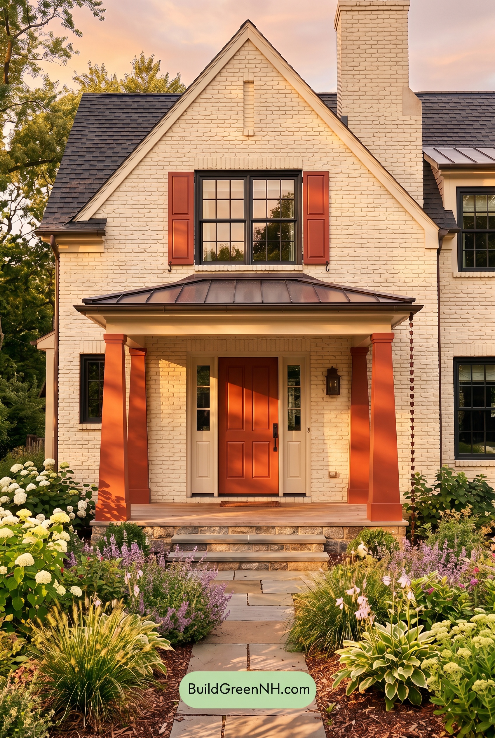
Under Golden Hour, the light beige exterior takes on a richer, more honeyed warmth than it shows in neutral daylight, making the brick texture feel softer and more dimensional. The warm beige trim and columns seem gently amplified, while the deeper beige shutters and front door gain a fuller, more saturated presence.
Gray window frames appear darker and crisper against the glowing facade, creating stronger contrast as low-angle light casts elongated shadows beneath the rooflines and porch. Compared with the balanced clarity of neutral daylight, this evening light gives the whole palette a welcoming, relaxed mood with warmer highlights and more dramatic depth.
Shade
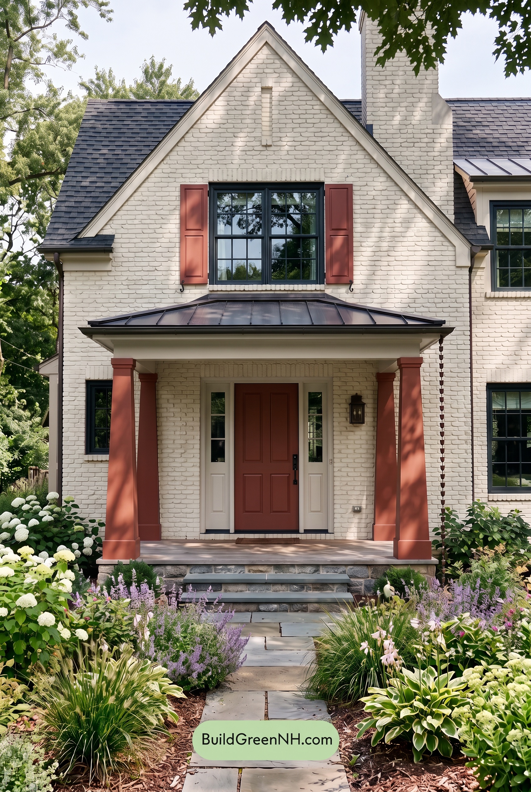
In shade, the beige exterior takes on a quieter, more muted character than it would in neutral daylight. Its warmth softens and the light beige areas can appear slightly cooler, while the textured surfaces gain depth as shadows settle into the joints and details. The overall effect feels calm, refined, and gently sheltered.
The deeper beige accents hold more visual weight in shaded areas, appearing richer and less saturated, while the gray window frames look darker and crisper by comparison. This shift increases contrast around the openings and porch, giving the facade a more tailored, intimate mood without making the palette feel harsh.
Nighttime
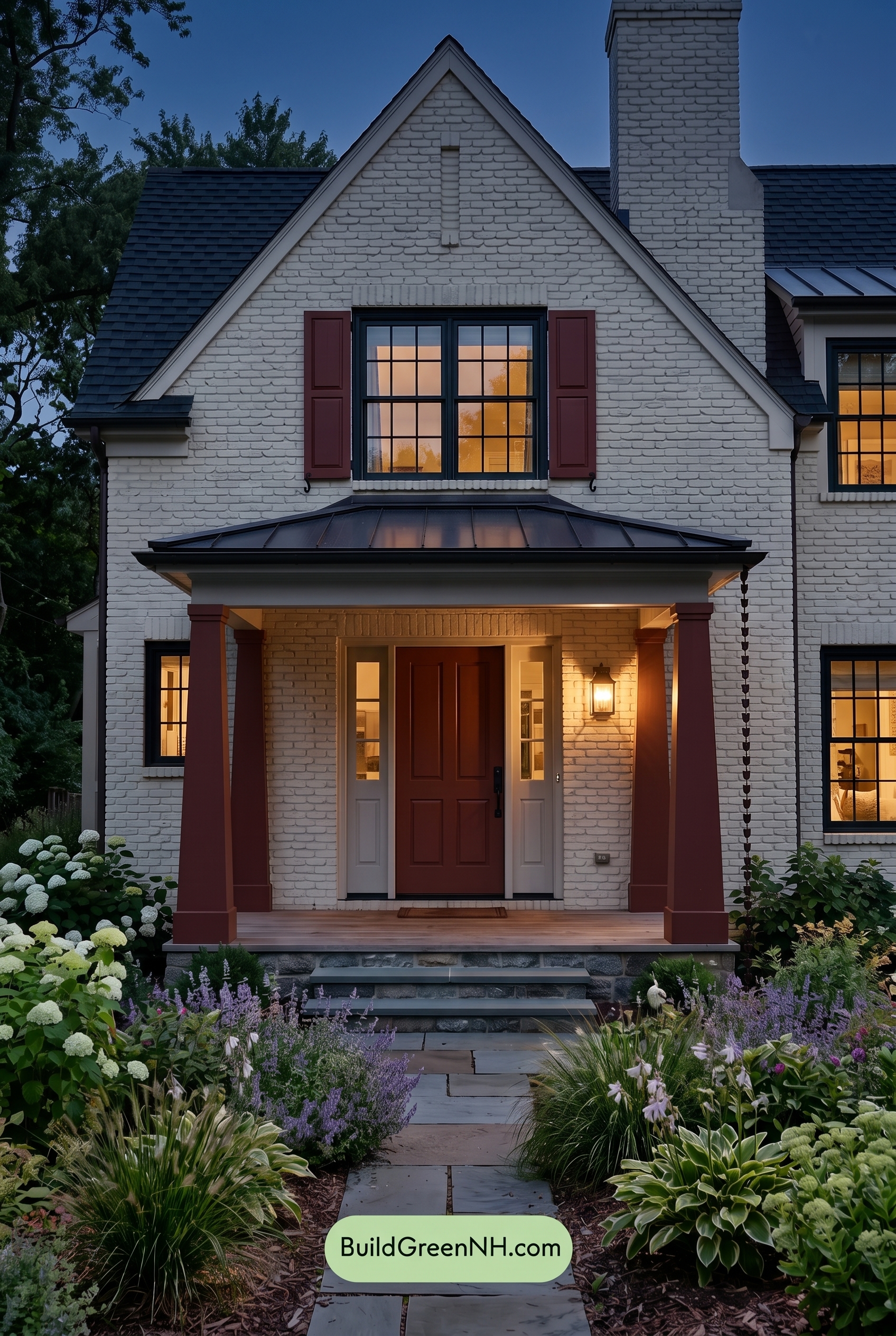
At nighttime, the beige exterior takes on a softer, more muted character than it has in neutral daylight, with the cooler ambient sky lending shaded areas a gentle gray cast. The gray window frames appear deeper and more defined, while the darker beige shutters and front door gain richness as their saturation becomes more concentrated against the pale walls.
Warm porch and interior light changes the mood completely near the entry, drawing creamy beige trim and columns into a welcoming glow. Shadows sharpen beneath the roofline and around the brick texture, increasing contrast between illuminated surfaces and cool recesses for a layered, intimate nighttime presence.
Pin these for later:
Want More?
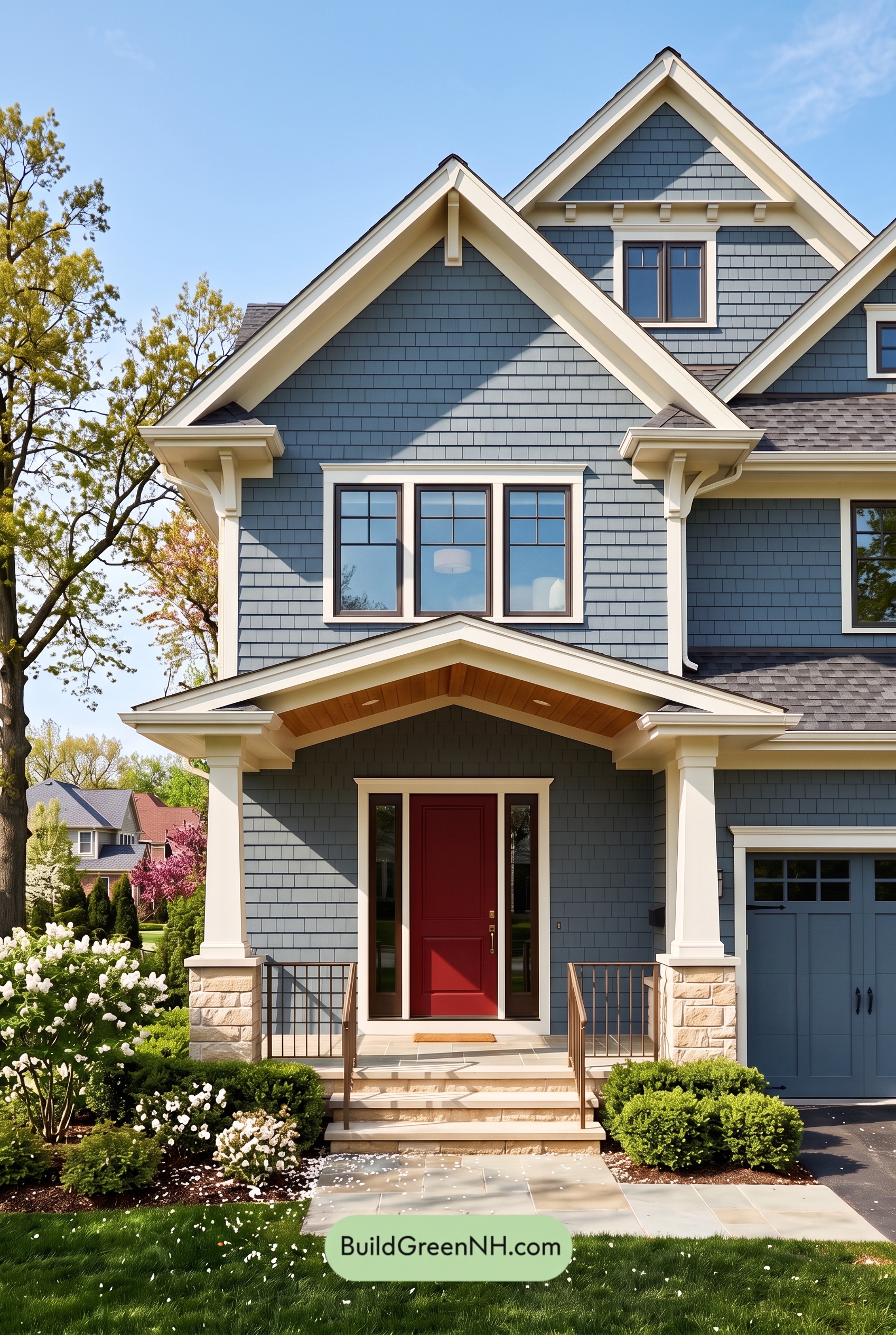 Red Front Door House Paint Color Scheme: Denim Blue Homecoming
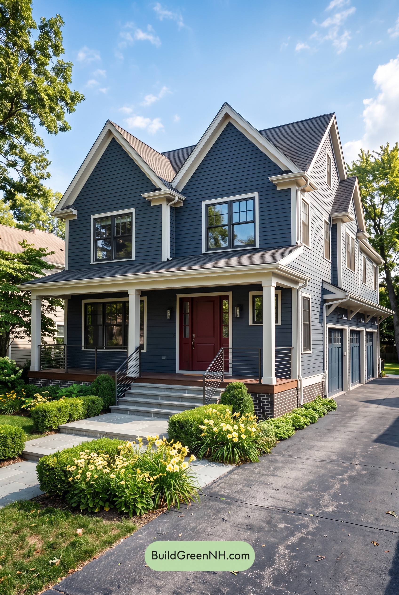 Red Front Door House Paint Color Scheme: Midnight Blue Assurance
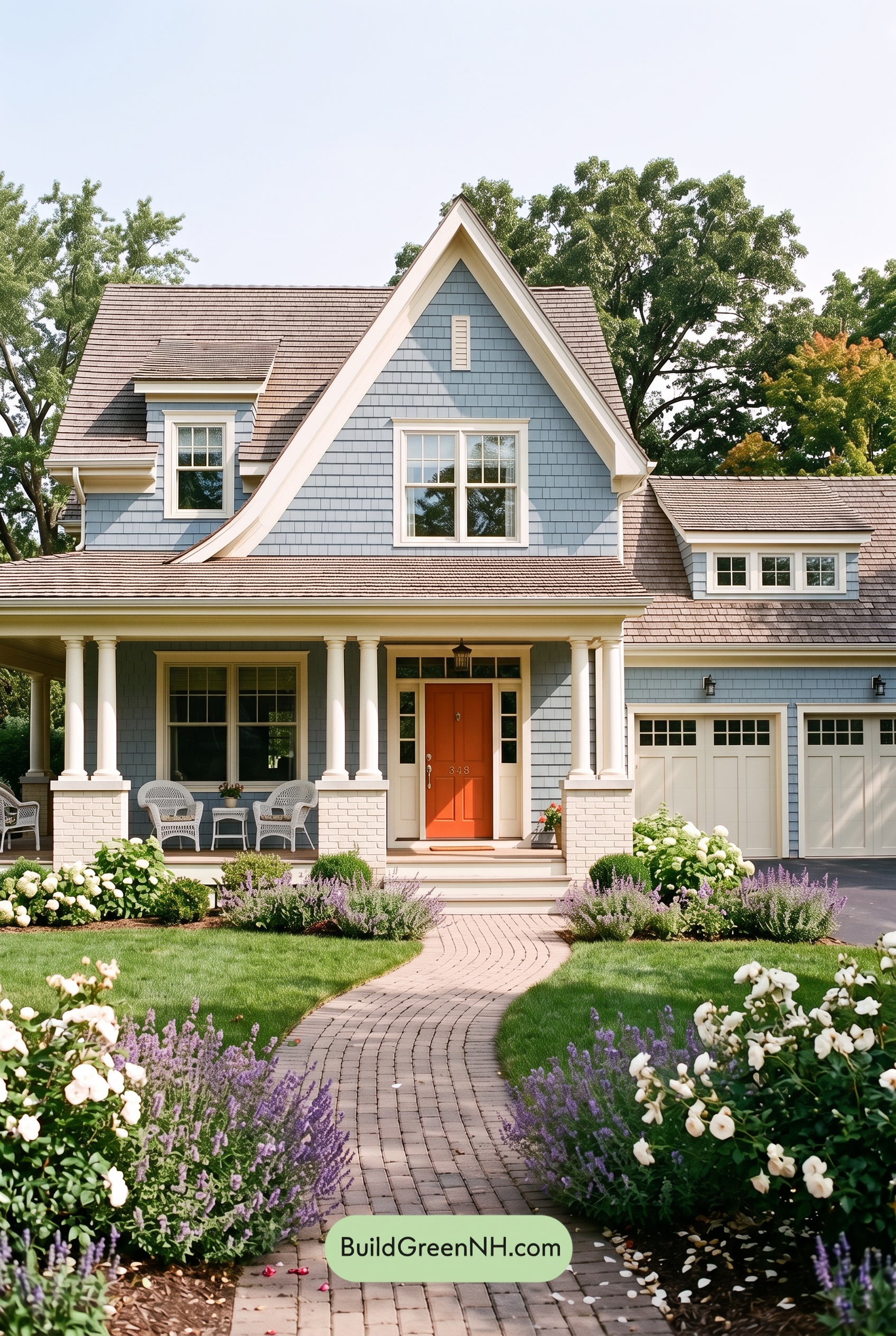 Red Front Door House Paint Color Scheme: Pale Blue Joy
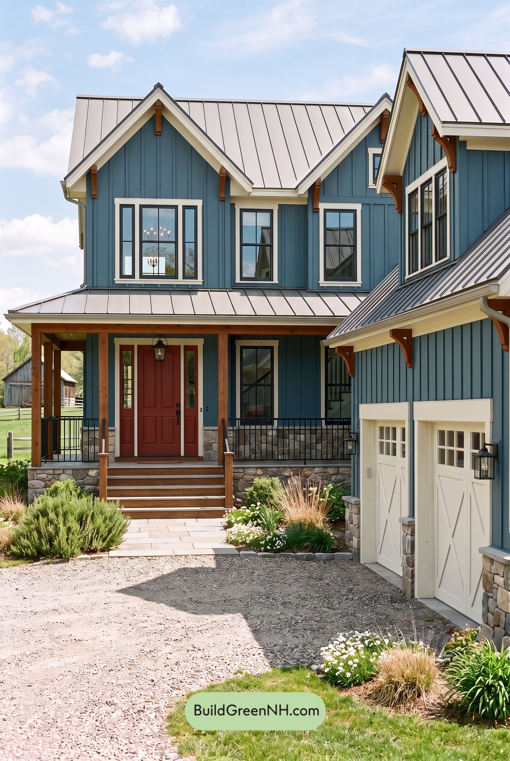 Red Front Door House Paint Color Scheme: Teal Blue Kinship
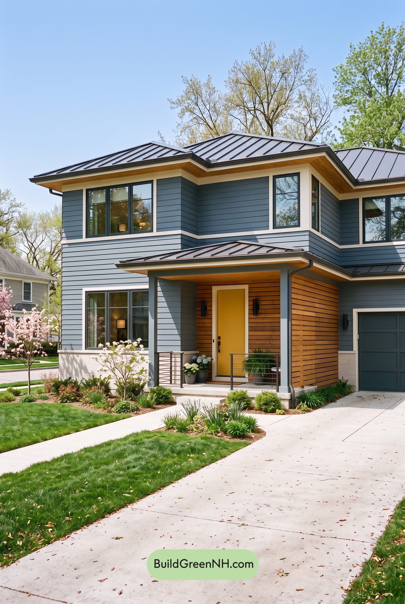 Blue House Front Door Color Scheme: Harbor Saffron
Table of Contents