Last updated on
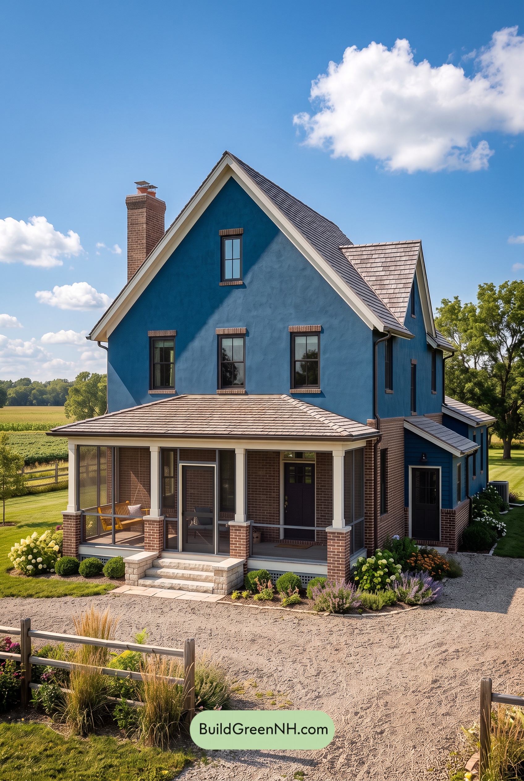

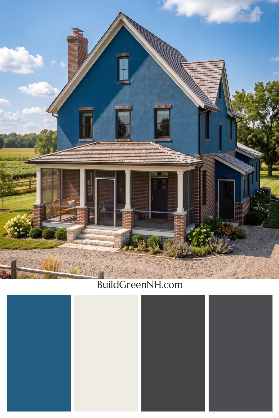
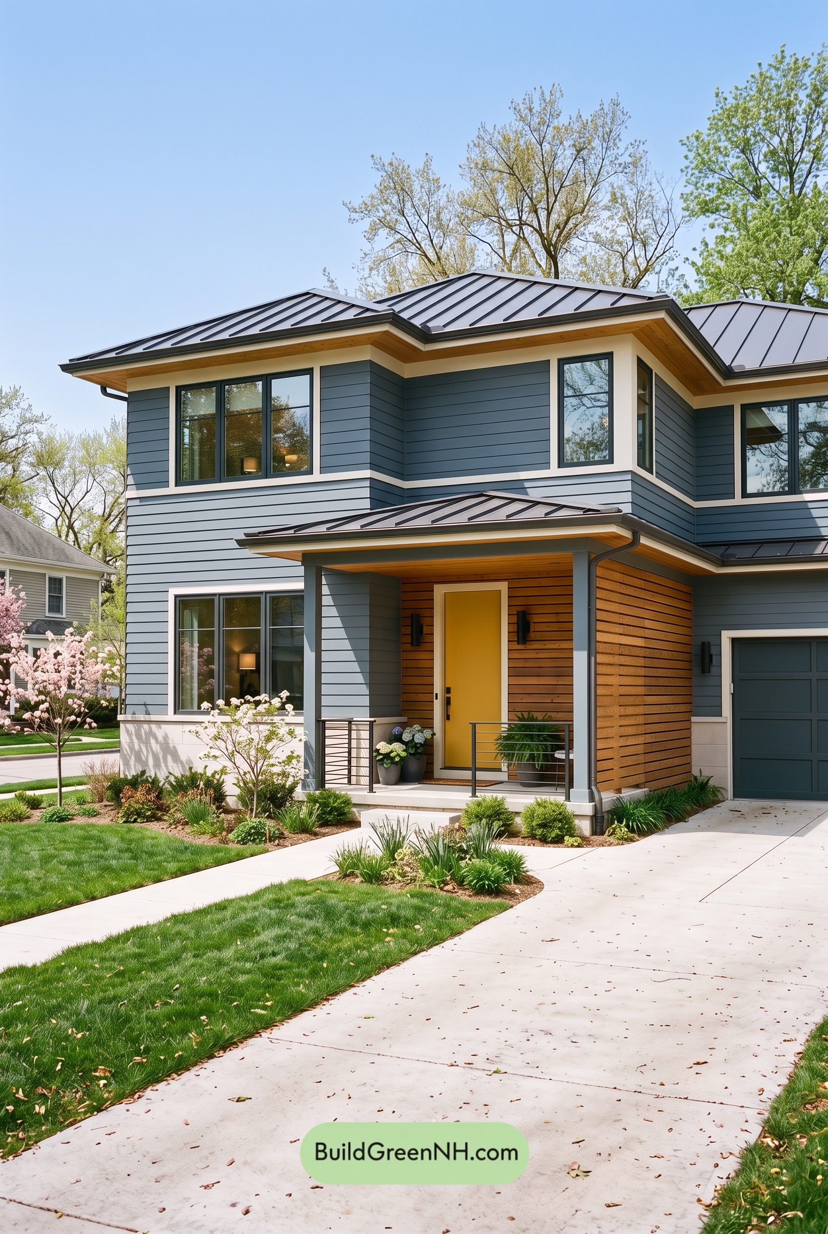
The deep blue, crisp white, and grounded gray palette gives this home a polished presence that feels both timeless and wonderfully inviting.
A Confident Blue Exterior
A rich, saturated blue covers the main exterior walls, creating a strong and memorable backdrop for the home’s steep gables and generous proportions. This cool shade feels refined rather than flashy, bringing depth to the façade while sitting beautifully against the surrounding greenery and open sky.
The blue continues across the side addition, which helps the multiple rooflines read as one cohesive design. Its darker character also gives the home a welcoming sense of permanence, especially where sunlight reveals subtle shifts in tone across the textured exterior surface.
Bright White Architectural Definition
Crisp white trim frames the dramatic roof peaks and cleanly outlines the eaves. This bright contrast sharpens the home’s traditional silhouette, drawing attention to the gables without competing with the blue siding.
White also carries through the porch columns, fascia, and lower porch details. These lighter elements bring an airy lift to the front elevation, preventing the deep blue walls and dark brickwork from feeling too heavy. The result is a front porch that looks open, balanced, and ready to welcome guests.
Gray Accents for Depth and Balance
Dark charcoal-gray window frames add a tailored, almost graphic finish against the blue walls. Their strong outline gives each window a clear presence and repeats the darker notes found throughout the exterior.
The front door follows the same deep gray direction, creating a quiet but confident focal point beneath the porch. Gray railings continue that connection, adding definition to the screened porch without interrupting its light, open feel. Together, these details give the palette a modern edge while keeping it grounded.
Roof and Brickwork Bring Warmth
The roof is finished in a muted medium gray-brown shade that bridges the cool blue siding and the warmer masonry accents. Its understated tone lets the striking gables remain the star while adding useful visual texture across the roof planes.
Warm brown brick around the chimney, porch base, and window details introduces an earthy counterpoint to the cooler exterior colors. This combination keeps the scheme from feeling overly formal or coastal. Instead, it feels comfortably rooted in its landscape.
The Overall Mood
This exterior color scheme is classic with a fresh, updated twist. Deep blue offers drama, white brings clarity, gray adds sophistication, and the warm brown accents supply just enough softness to make the home feel lived-in and welcoming.
It is a thoughtful balance of cool and warm shades, bold surfaces and bright highlights. From the curb, the house feels substantial and elegant; up close, the layered colors make every porch column, window, and roofline feel intentionally composed.
Next, see how this color scheme looks under different lighting simulations throughout the day.
Overcast
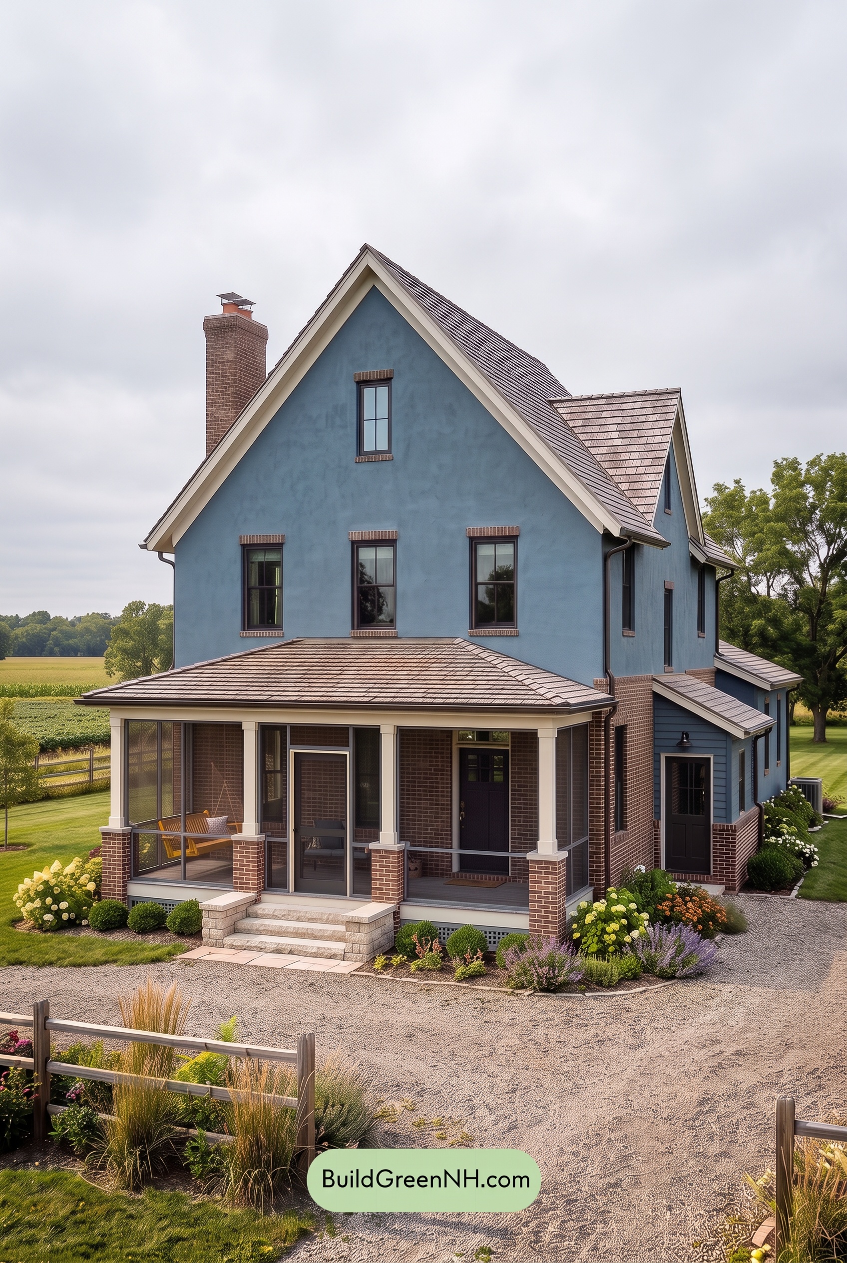
Under overcast skies, the blue exterior reads cooler and slightly more muted than it does in neutral daylight, with its depth becoming more noticeable across the broad wall surfaces. The soft, even light reduces glare and saturation, giving the home a calm, tailored presence rather than a crisp sunlit pop.
The white trim and columns feel gentler and less bright, while the gray window frames, railings, and front door settle into richer, more unified shades. With sharp sun shadows replaced by soft transitions, contrast becomes more subtle, lending the facade a quiet, welcoming mood.
Golden Hour
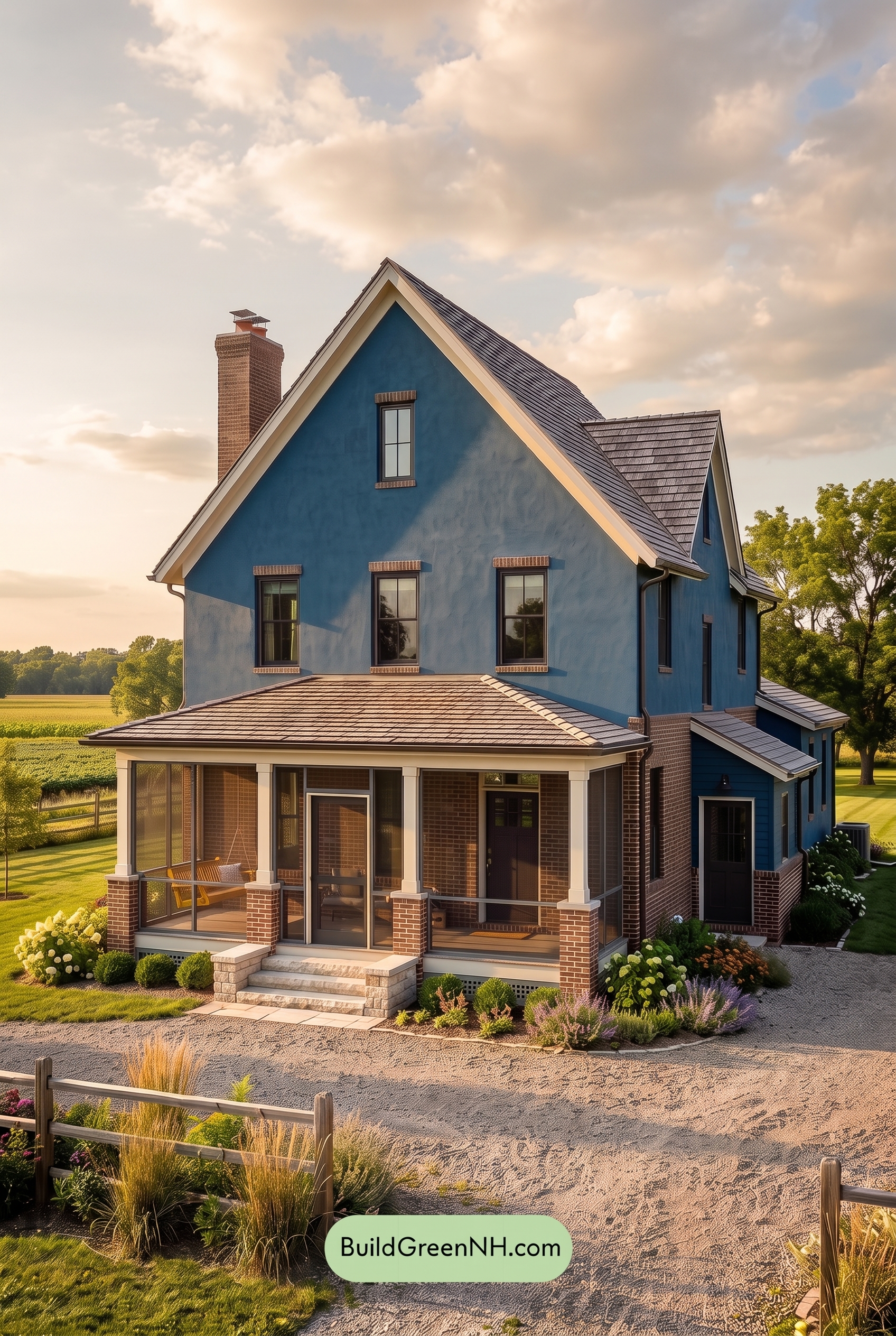
Under Golden Hour, the blue exterior takes on a richer, slightly deeper character than it shows in neutral daylight, with its saturation feeling more velvety in the long, low-angle light. Warm highlights soften the white trim and columns into a creamy, welcoming neutral, while the gray frames, railings, and door read darker and more defined.
Lengthened shadows sharpen the contrast around the porch, rooflines, and window details, giving the façade added depth. Compared with the cleaner, more balanced look of neutral daylight, the warm glow creates a calmer, more inviting mood—where cool blue surfaces and warm-lit accents feel especially harmonious.
Shade
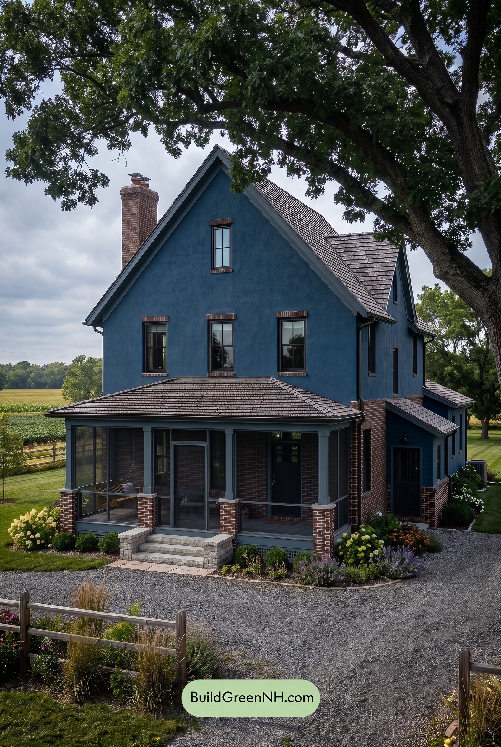
In shade, the blue exterior takes on a deeper, more muted character than it would in neutral daylight, with its saturation feeling refined rather than bright. The canopy of shadows cools the overall façade and reveals subtle shifts across the siding, creating a calm, slightly dramatic mood.
The white trim and columns read softer and less crisp in the reduced light, while the gray window frames, door, and railings settle into richer charcoal-like shades. This lowers the contrast between architectural details, giving the home a cohesive, grounded appearance with depth concentrated around the porch and recessed areas.
Nighttime
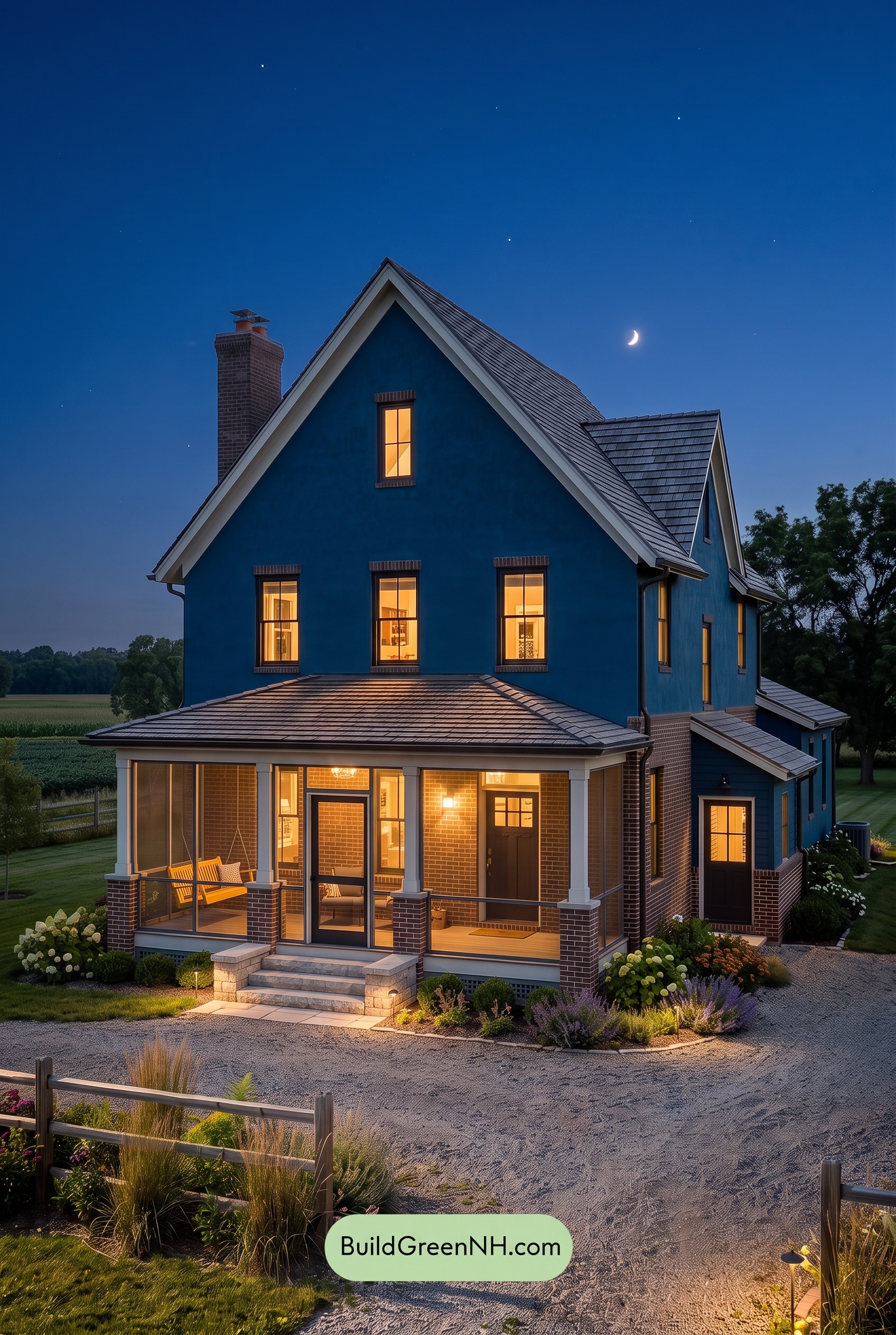
At nighttime, the blue exterior deepens and appears more saturated than it does in neutral daylight, giving the facade a richer, more dramatic presence. Shadows settle into the siding, rooflines, and recesses, while the gray details become quieter and more streamlined against the darker surfaces.
Warm interior and entry lighting softens the white trim and columns, shifting them from crisp daylight accents to inviting highlights. This warm-and-cool contrast makes the windows and porch feel especially welcoming, creating a calm, polished mood with greater depth and nighttime character.
Pin these for later:
Want More?
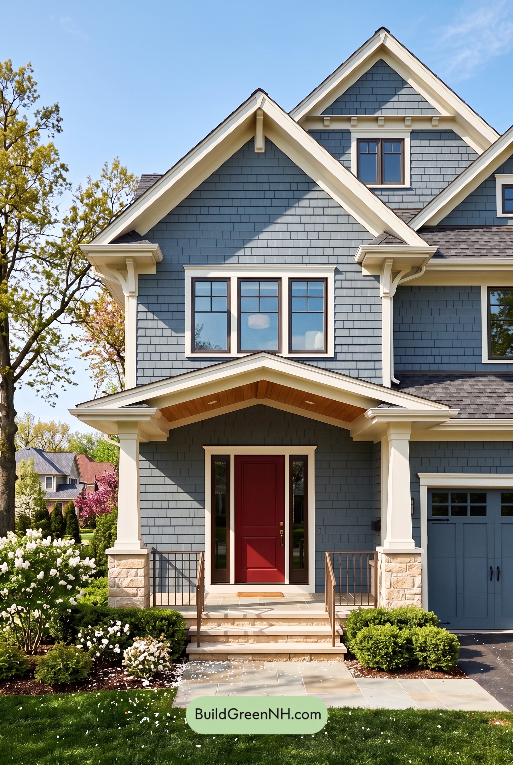 Red Front Door House Paint Color Scheme: Denim Blue Homecoming
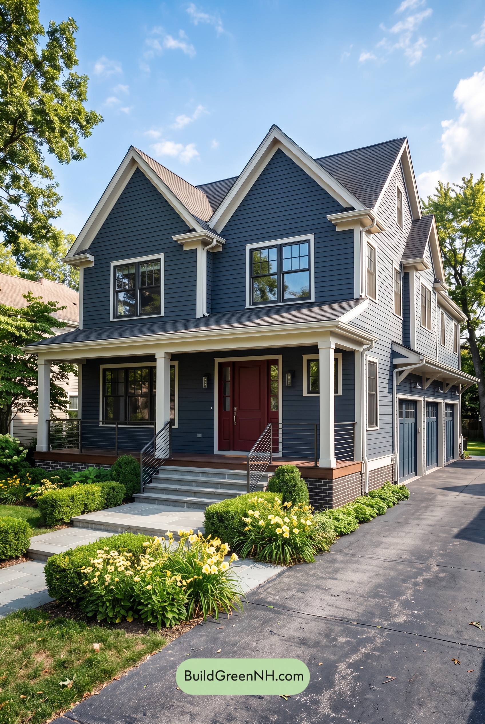 Red Front Door House Paint Color Scheme: Midnight Blue Assurance
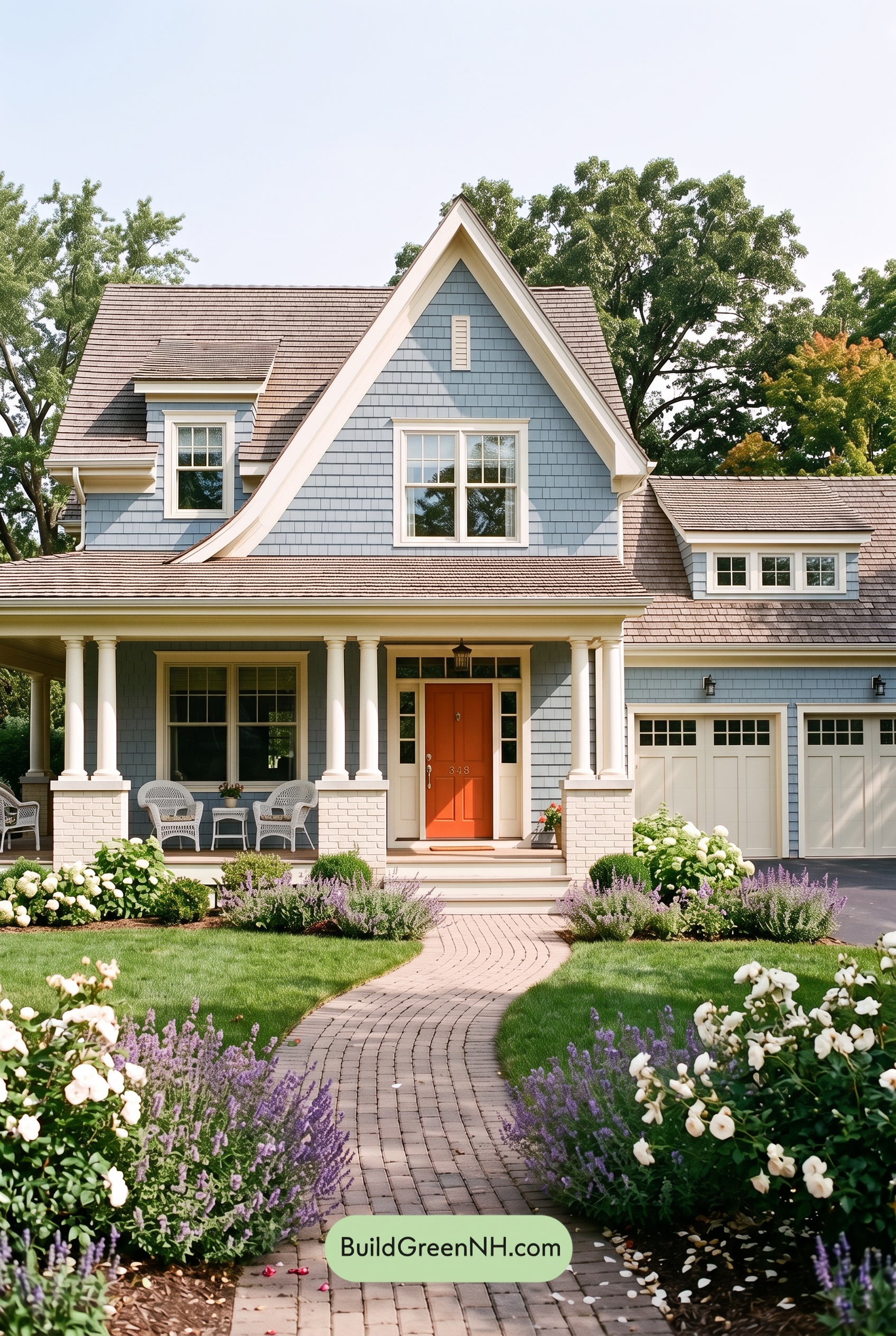 Red Front Door House Paint Color Scheme: Pale Blue Joy
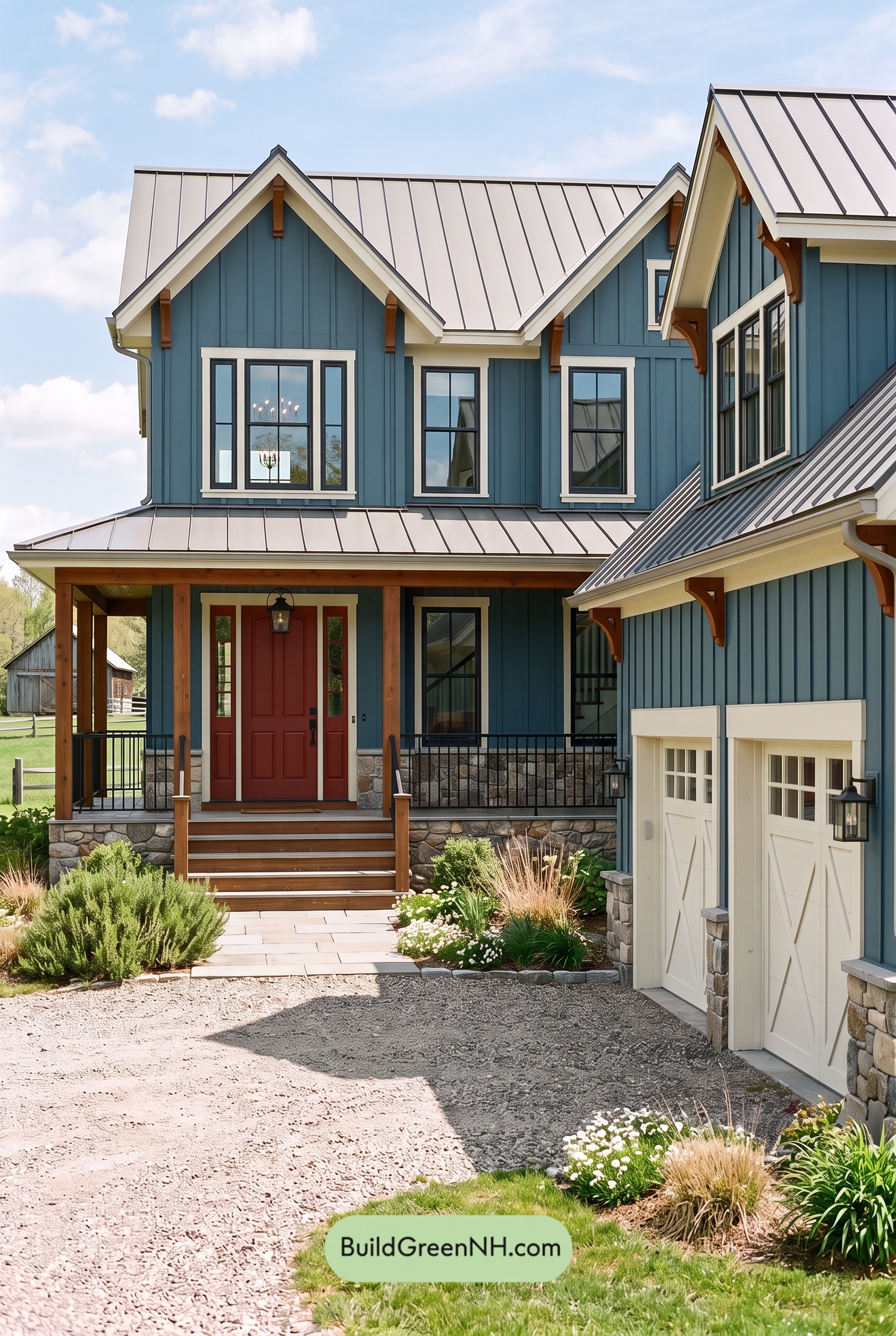 Red Front Door House Paint Color Scheme: Teal Blue Kinship
 Blue House Front Door Color Scheme: Harbor Saffron
Table of Contents