Last updated on
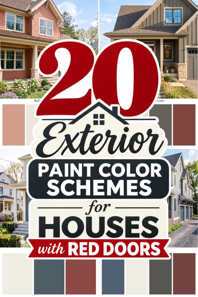
A red front door can make even a familiar exterior feel worth a second look, especially with the right colors beside it. Creamy white siding and charcoal trim give a clear cherry red a crisp backdrop without turning the whole house into a holiday decoration.
For a softer combination, we paired warm gray siding with a muted brick red door, taking our cue from clay pots and weathered stone. The brown undertones in that red matter, they keep the entrance feeling connected to the quieter colors around it.
Then there’s deep plum siding with a cranberry red door, a pairing inspired by late autumn berries. Soft ivory trim separates the two rich colors, giving each a little breathing room without losing that wonderfully unexpected combination.
Midnight Blue Assurance
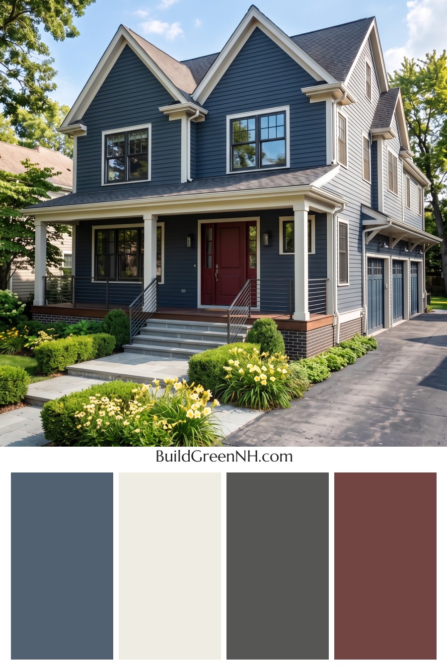
The deep blue siding has a smoky gray undertone, taking its cue from slate and giving this palette a softer feel than straight navy. Creamy white trim traces the gables, windows, and porch columns, keeping all that blue from feeling too buttoned up.
The cranberry red front door is our little departure from the cool colors, adding a rich, welcoming accent without going full fire engine. Charcoal roofing, near black window frames, and blue garage doors keep the larger surfaces coordinated, while the warm brown porch adds just enough earthiness to make the whole combination feel settled.
Teal Blue Kinship
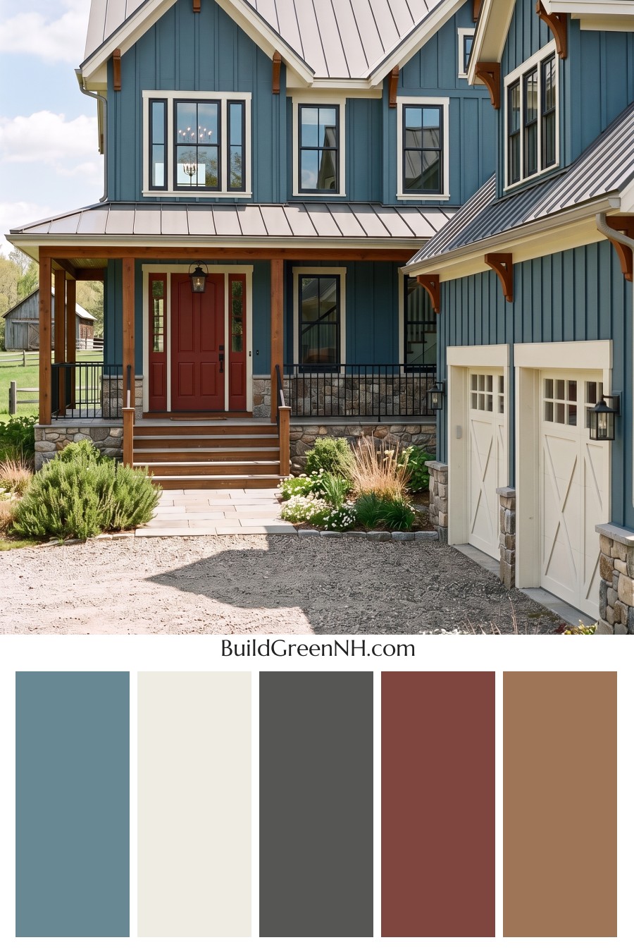
That rusty red front door is a small dose of spice against the muted teal siding. The pairing takes its cue from earthy clay and blue green water, with enough warmth to keep the cool exterior from feeling chilly. Creamy trim softens the contrast around the windows and carries the same welcoming tone onto the garage doors.
Honey brown wood accents bring those warm notes up into the gables, so the red entry doesn’t feel like it arrived at the wrong house. The silver gray roof and mixed gray and tan stone keep the palette grounded, while black window frames and railings add crisp definition. A little bold, but still very much at home.
Pale Blue Joy
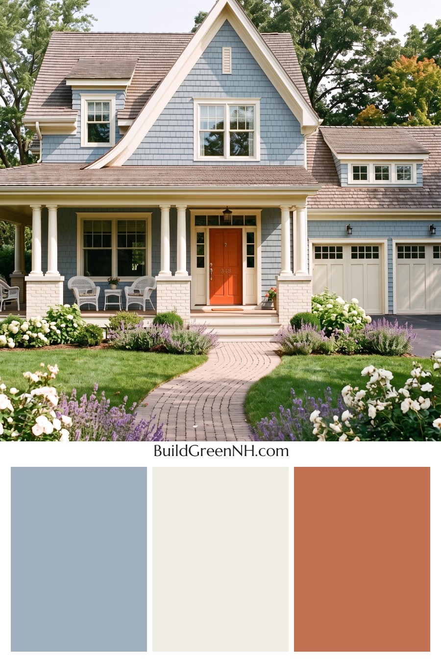
The soft blue siding takes its cue from weathered seaside cottages, with a gray undertone that keeps it from feeling sugary. Creamy white trim outlines the gables, windows, and porch columns, giving the cool blue a warmer companion. A little softer than stark white, and all the better for it.
Warm taupe roofing and muted gray garage doors keep the larger surfaces quiet, leaving that tomato red front door free to be a bit cheeky. Its orange undertone makes a cheerful contrast against the blue without needing matching red accents everywhere. The creamy painted brick repeats the trim color near the ground, tying the whole palette together.
Denim Blue Homecoming
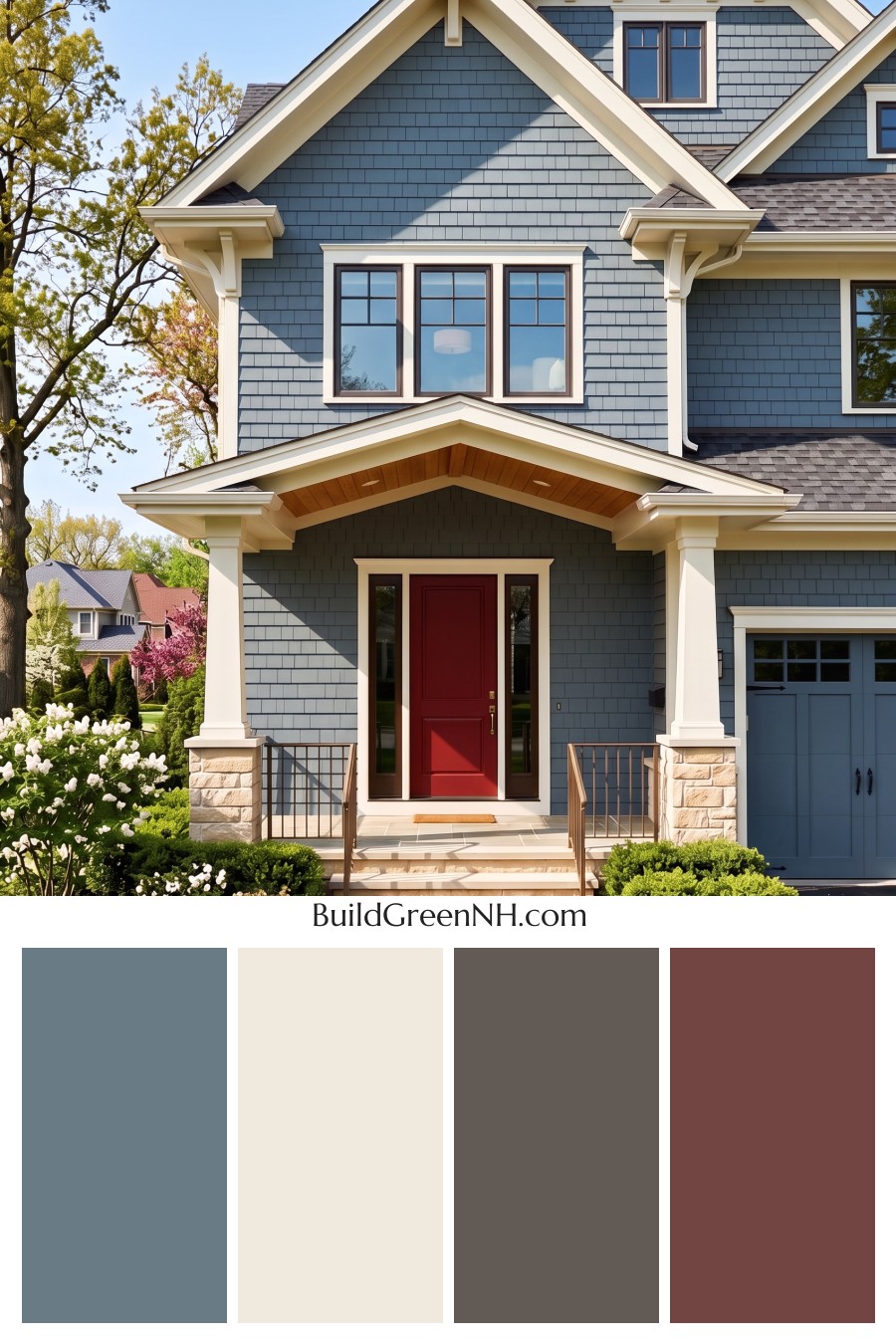
The slate blue siding has a soft gray undertone that keeps it calm rather than nautical, with matching garage doors keeping the palette nicely connected. We paired it with creamy ivory trim, taking inspiration from the cool blues and warm sandy shades of a shoreline. That touch of cream matters, it makes the gables and window surrounds stand out without the sharpness of pure white.
The deep red front door is the little rule breaker here, adding a warm splash of color against all that blue. Honey brown porch boards and pale beige stone carry that warmth outward, while dark brown window frames give the softer colors a clear outline. A charcoal gray roof ties it together without adding another competing color.
Rust Red Resolve
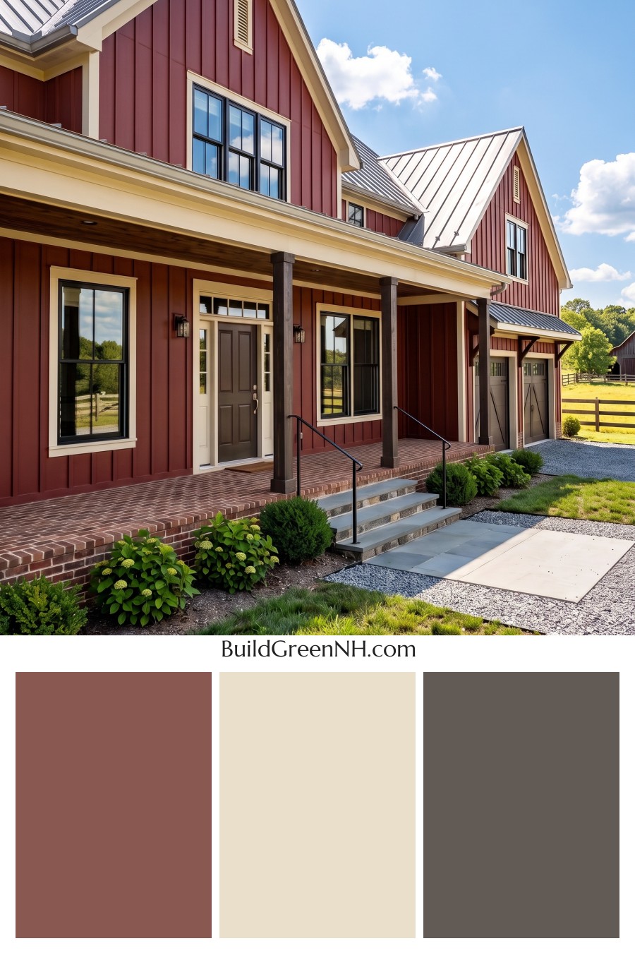
The muted barn red siding takes its cue from traditional farm buildings, with a dusty, earthy undertone that keeps it from feeling too bold. Buttery cream trim outlines the gables and windows, giving the red a softer companion than crisp white. A little country, without going full storybook.
The silver gray roof brings a cooler note, while black window frames and deep brown porch posts add definition to the warm palette. We carried those brown tones into the garage doors to keep the accents connected, then gave the front door a brighter tomato red. Same color family, just the slightly more outgoing relative.
Soft Red Delight
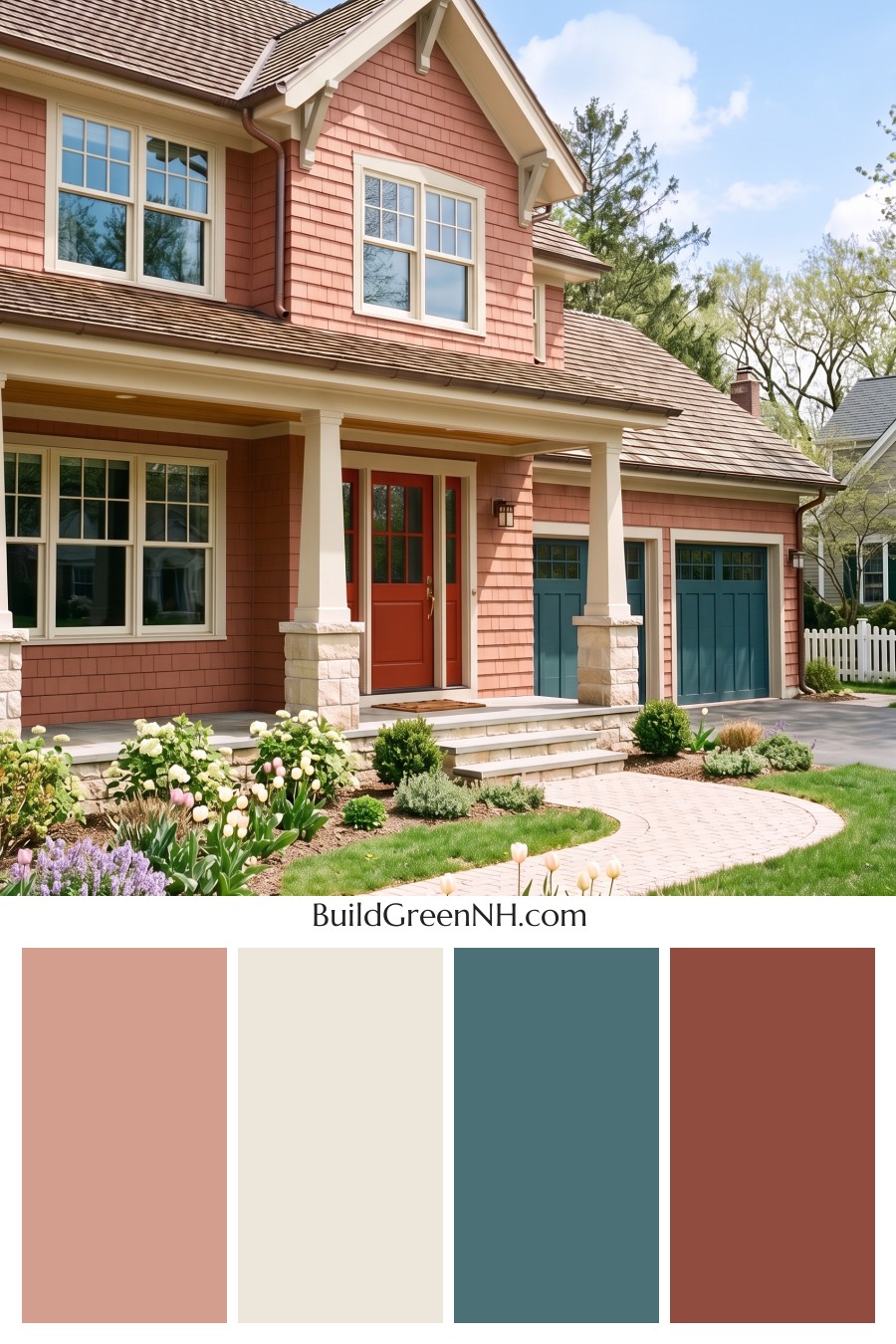
Soft salmon siding gives this house a rosy warmth, with creamy ivory trim keeping the pink from getting too sugary. We took our cue from garden blooms and earthy terracotta, a pairing that feels cheerful without turning candy shop. The warm taupe roof and coppery brown gutters keep those sweeter shades grounded.
Deep teal garage doors and matching gable brackets bring a cool contrast to all that warmth, connecting the larger doors with the smaller details above. Then there’s the orange red front door, a bolder cousin of the siding rather than a completely unrelated splash. A little extra confidence at the entrance, why not.
Deep Red Devotion
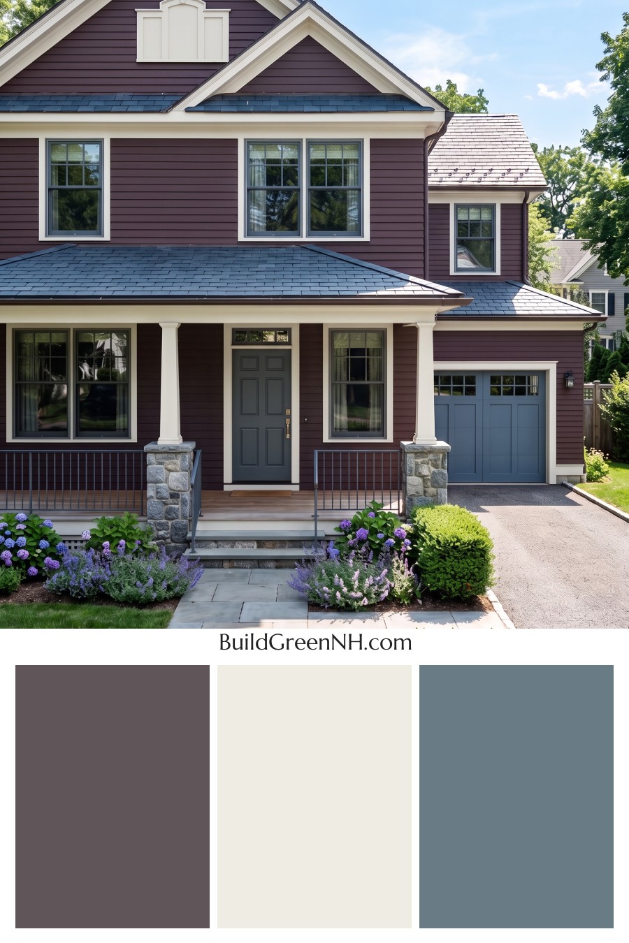
The siding’s dusty plum color takes its cue from late summer berries, with enough brown in the mix to keep it mellow rather than sugary. Creamy ivory trim outlines the windows, porch columns, and gables, giving the rich siding a clean edge. A little cream goes a long way here.
The slate blue garage door and matching gable accent borrow their cool tones from the gray roof and stone column bases, tying those colors together without matching everything exactly. Then there’s the deep red front door, a warmer cousin to the plum siding and a lovely bit of contrast. It’s a colorful combination, sure, but the muted shades keep everyone getting along.
Red Ribbon Welcome
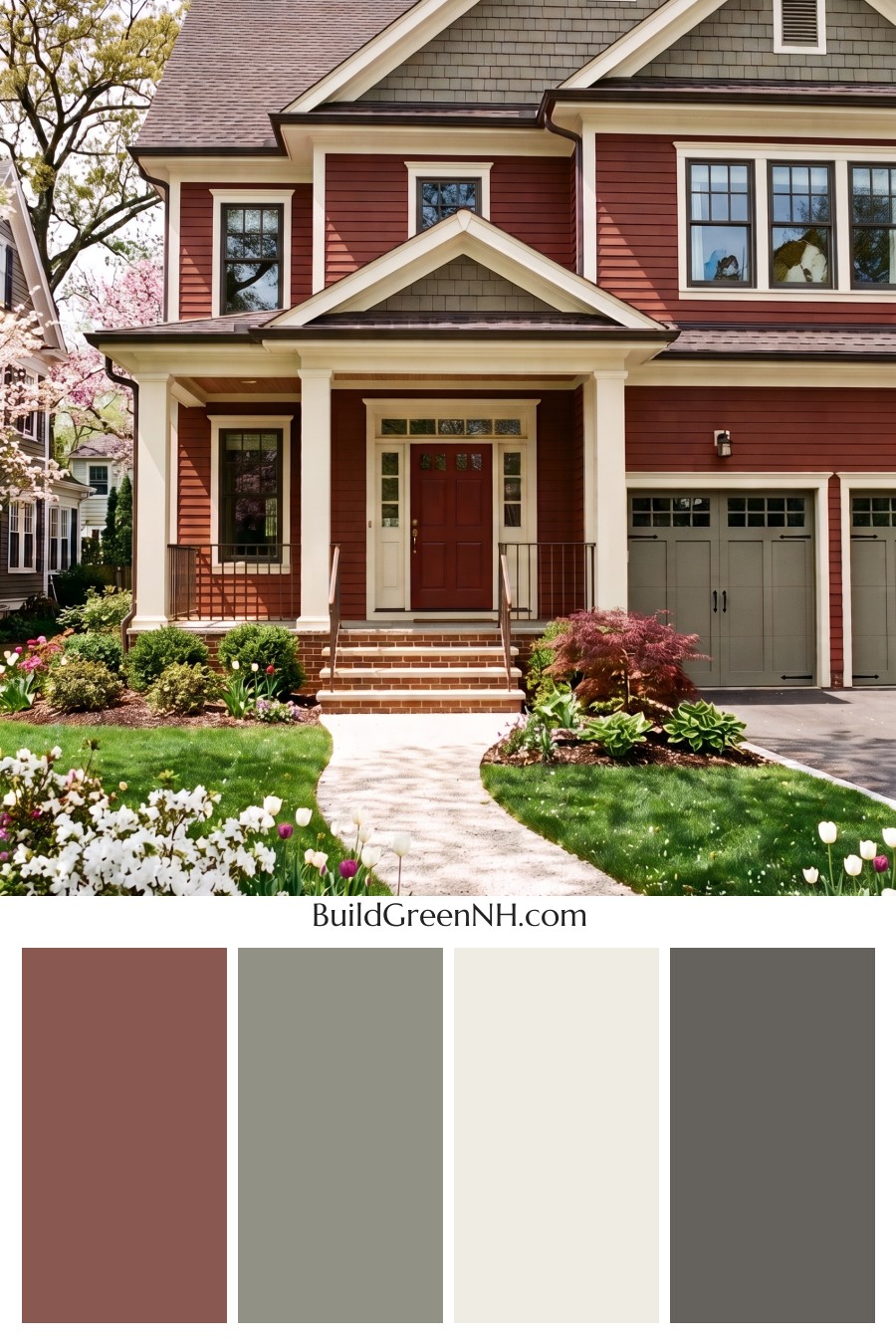
The warm terracotta siding takes its cue from fired clay, with a muted, earthy finish that keeps the red from feeling too bold. Creamy ivory trim outlines the windows, porch columns, and gables, giving the rich wall color a softer companion without the sharpness of pure white.
Sage gray on the gable shingles and garage doors brings in a garden-inspired contrast, and repeating it keeps the garage from feeling like a separate color decision. The deeper rusty red front door adds a little extra warmth right where you want it. Dark brown roof edges and railings finish the palette without adding another color to the guest list.
Tan Glow Ruby Resolve
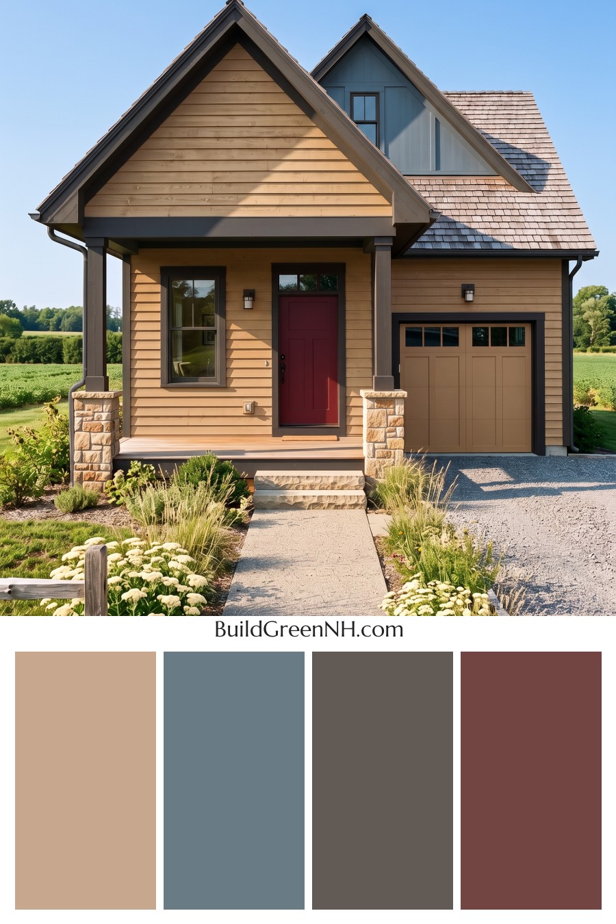
Honey tan siding and golden wood tones give this home a warmth that feels borrowed from an autumn spice cupboard. The muted blue gray gable and matching porch beam add a cooler note, keeping all that gold from getting a little too cozy with itself.
Deep chocolate brown around the windows, entry, and garage gives each opening a clear outline, while the sandy stone bases carry those warm shades down to the ground. Then there’s the burgundy front door, a richer accent that makes the entrance easy to spot without overpowering the softer colors. Not a shy choice, but a good neighbor to the browns.
Umber Calm Crimson Beat
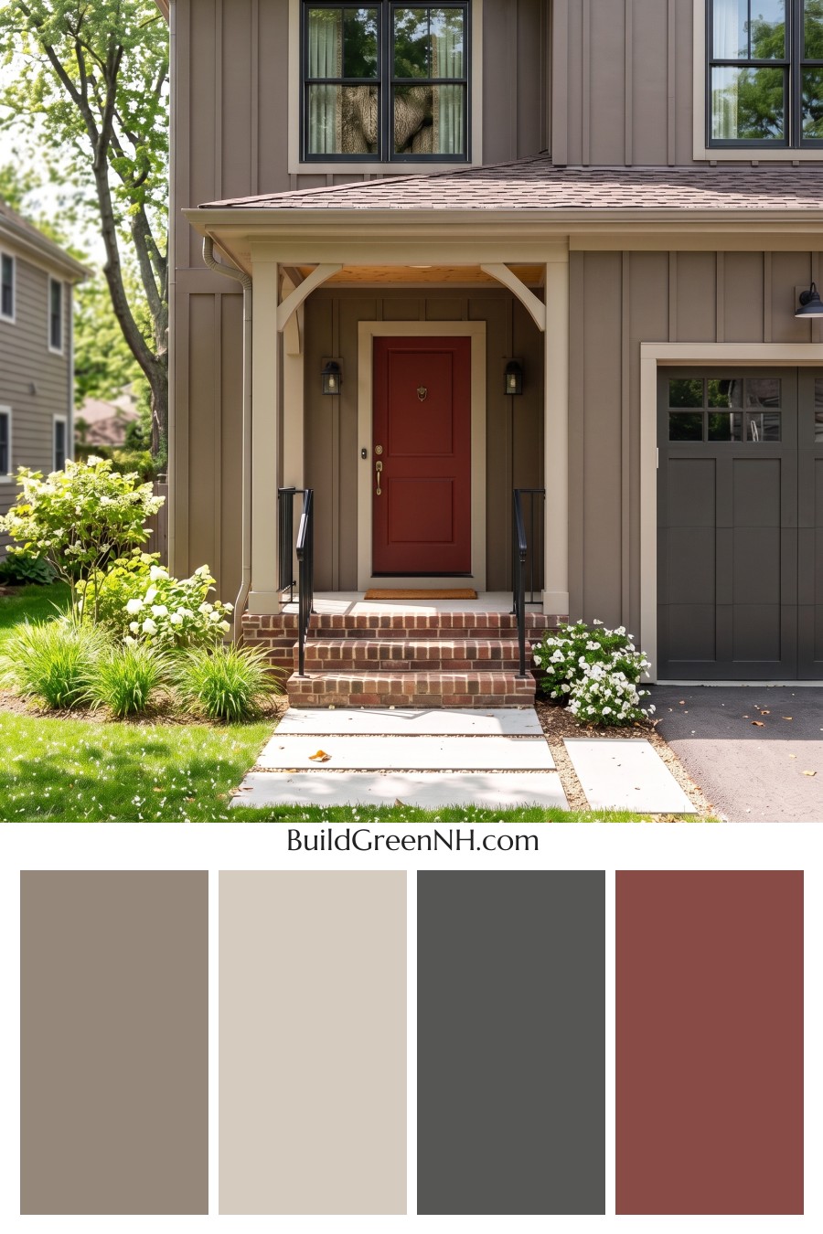
The mushroom brown siding and warm beige trim take their cues from tree bark and weathered stone, giving this house an earthy feel without making everything match. That softer trim matters, too, outlining the windows and porch with a gentler contrast than crisp white would bring.
Then there’s the paprika red front door, because even a quiet palette deserves a little spice. Its warm undertone connects with the brick steps, while the deep brown garage door and shingles keep the larger surfaces understated. Black window frames and railings add a clean, dark accent without competing with that red.
Taupe Poise Scarlet Pulse
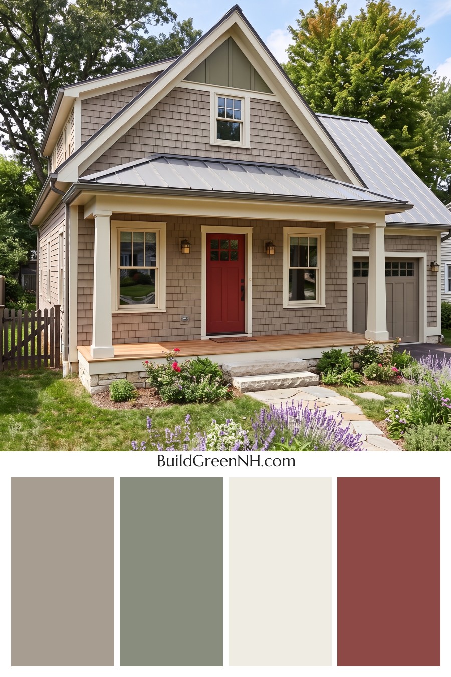
Warm taupe shingles and creamy ivory trim give this house a soft, settled feel, with a muted olive gable borrowing its color from the surrounding trees. The inspiration is garden meets weathered stone, but with a little polish. Ivory around the windows and roof edges keeps those earthy shades distinct without the sharper contrast of pure white.
That cherry red front door is the cheerful exception to all the restraint, and frankly, a good one. The silvery gray roof adds a cooler note, while the garage door stays close to the taupe siding so it doesn’t compete with the entrance. A touch of honey brown across the porch brings warmth back into the mix.
Brown Velvet Red Heart
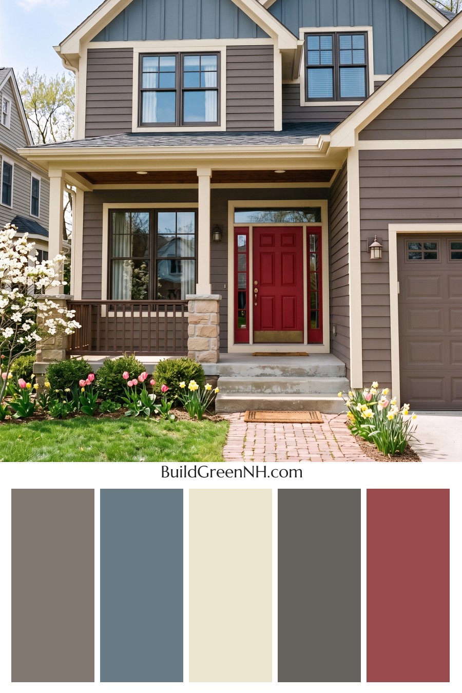
Creamy trim ties the dusty blue gables to the warm taupe siding, keeping the two colors distinct without making them feel disconnected. We took our cue from blue skies and sandy stone, pairing cool color up top with earthy brown below. Softer than bright white, the cream also picks up the pale beige tones in the porch stone.
That deep red front door is the little surprise, and no, it isn’t interested in blending in. Its rich color gives the entrance a clear focal point, while the brown garage door and porch railing stay close to the siding palette. Charcoal window frames add definition without introducing another bold color.
Linen Red Reverie
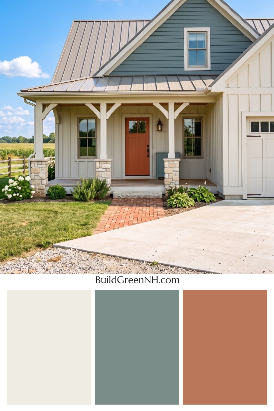
The muted blue green gable has that lovely weathered pottery feel, paired with creamy siding and trim that keep the palette soft rather than stark. We drew on countryside colors here, with warm ivory and a taupe gray roof balancing the cooler green. A little earthy, a little fresh.
That rusty red front door is the cheerful exception to all those quiet shades, and frankly, it’s allowed. Its warm tone picks up the brick walkway, while the cream and sandy beige stone bases tie back to the siding. Dark door hardware and garage accents add just enough contrast without making the softer colors feel washed out.
White Scarlet Spark
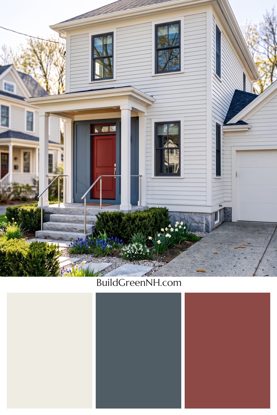
That tomato red front door is the one bold accessory this house needs, no matching shoes required. We paired it with soft white siding and creamy white trim, drawing on the familiar charm of painted coastal homes. The subtle difference between those whites keeps the broad walls and porch details from blending into one flat surface.
Slate blue around the entry gives the red a cooler backdrop, while deeper blue charcoal window frames and garage trim carry that contrast across the exterior. The dark roof ties those cooler shades together. A little honey brown on the porch ceiling adds warmth without giving the red door any competition, which seems only fair.
Cream Ruby Hush
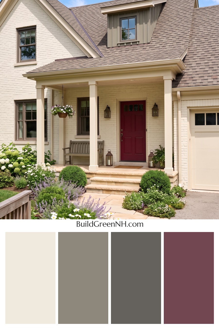
Creamy painted brick and buttery ivory trim give this palette its warmth, with just enough difference to keep the porch columns and roof edges distinct. We took our cue from the sandy tones of the front steps, carrying that softness into the garage door so it feels part of the house rather than an afterthought. No chilly whites here.
The dormer’s muted mushroom gray picks up the roof’s brown and gray tones, while deeper taupe window frames add definition without a harsh black outline. Then there’s that burgundy front door, a rich berry accent inspired by garden colors and given a whole entrance to itself. A little bold, but still perfectly happy among the neutrals.
Ivory Crimson Poise
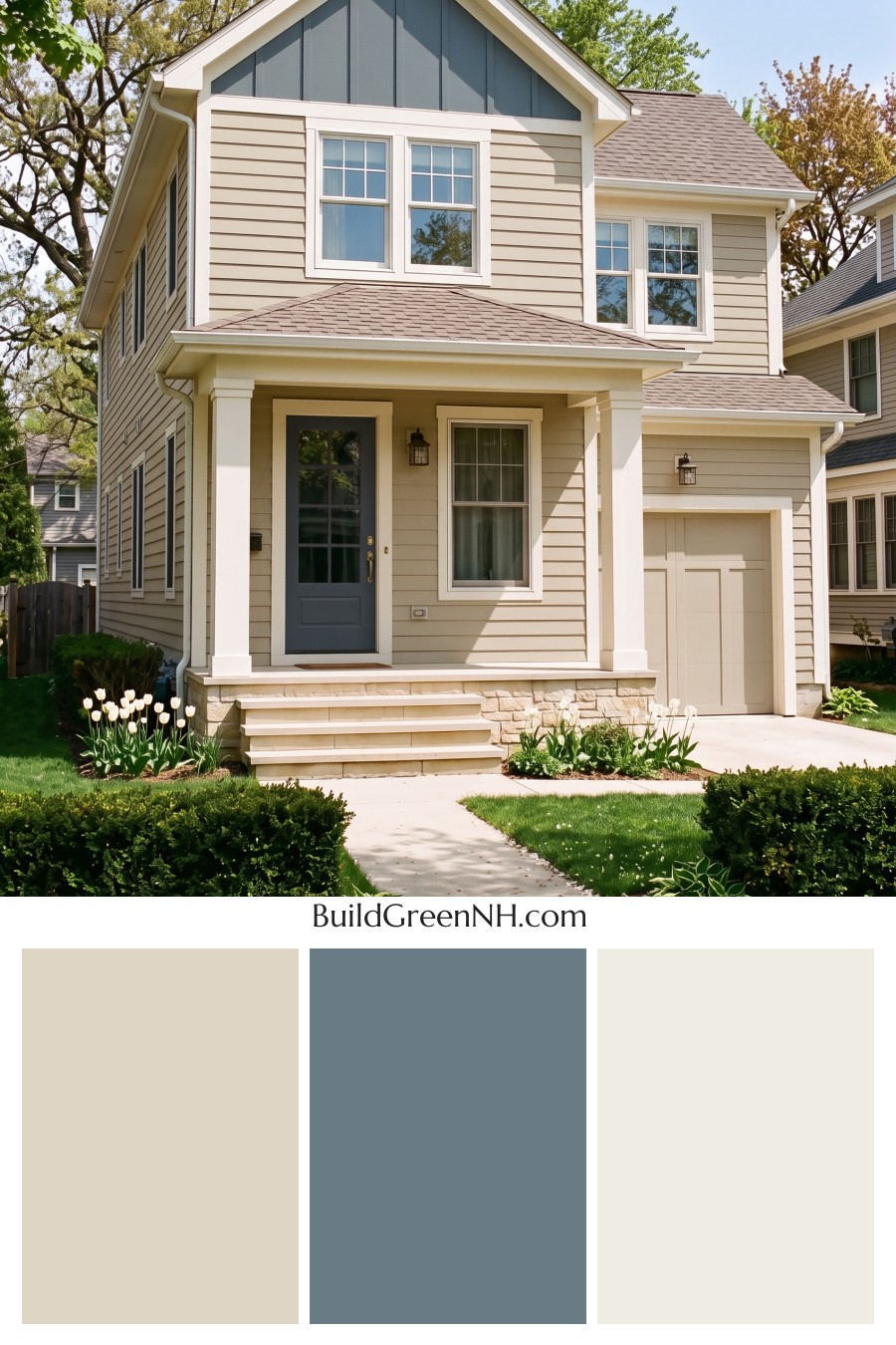
Warm ivory siding and creamy white trim give this house a soft, welcoming feel, with just enough contrast to define the windows and porch columns. We took our cue from warm linen and faded denim, pairing those gentle neutrals with a muted blue gray gable that adds color without taking over.
The cranberry red front door is the cheerful exception, because a quiet palette can still have a little personality. Keeping the garage door close to the siding color lets that red entry stand out, while the taupe gray shingles and sandy stone base tie the warmer and cooler shades together.
Charcoal Sand Serenity
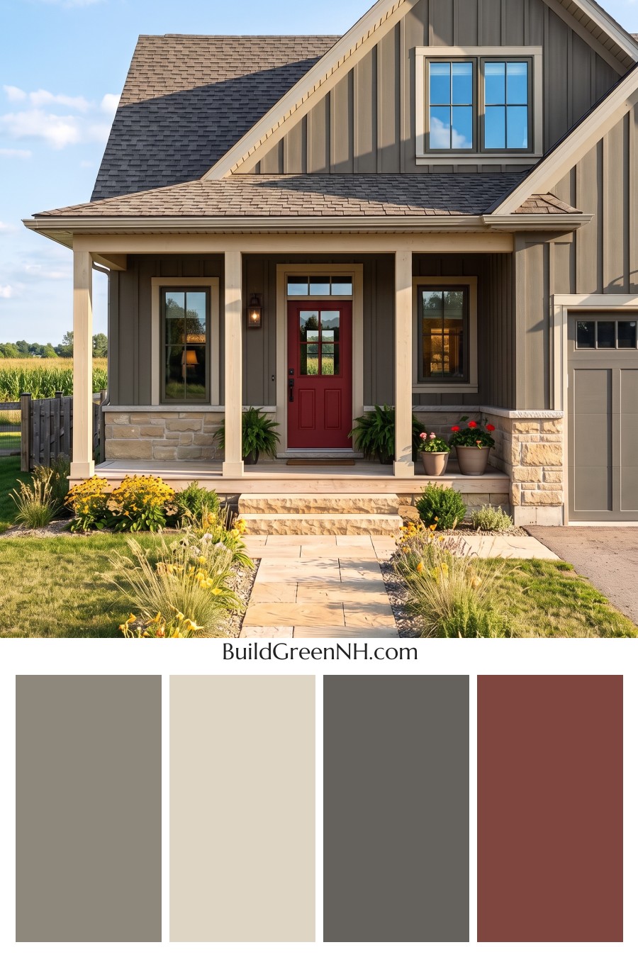
The charcoal gray siding has a soft brown undertone that keeps it from feeling too stark, especially alongside the sandy beige trim and creamy stonework. We drew this palette from weathered stone and dry grasses, borrowing those earthy colors for a finish that feels settled rather than freshly fussed over. The garage door stays close to the siding color, keeping the larger surfaces quietly connected.
That deep red front door is the little rebel here, and a welcome one. Inspired by traditional barn reds, it adds warmth without overpowering the softer neutrals, while dark window frames and gray shingles keep the whole scheme nicely grounded.
Charcoal Copper Confidence
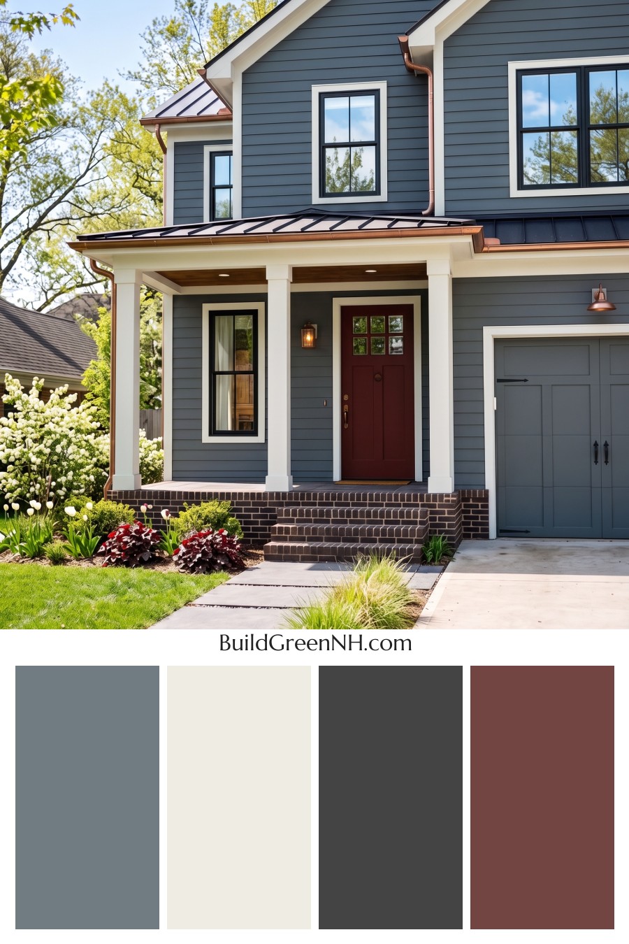
Cool slate gray siding and creamy white trim give this palette its crisp contrast, with near black window frames adding definition. The gray garage door stays close to the siding color, so it doesn’t compete with the entry. There’s a little autumn inspiration here, cool grays paired with warm russet tones.
That deep red front door brings the warmth right where you want it, a welcoming accent without going full fire engine. Copper colored gutters and fixtures carry that warmth around the exterior, while the brown brick steps tie the reds and grays together. And the creamy trim keeps those darker colors from feeling too stern.
Charcoal Sage Reverie
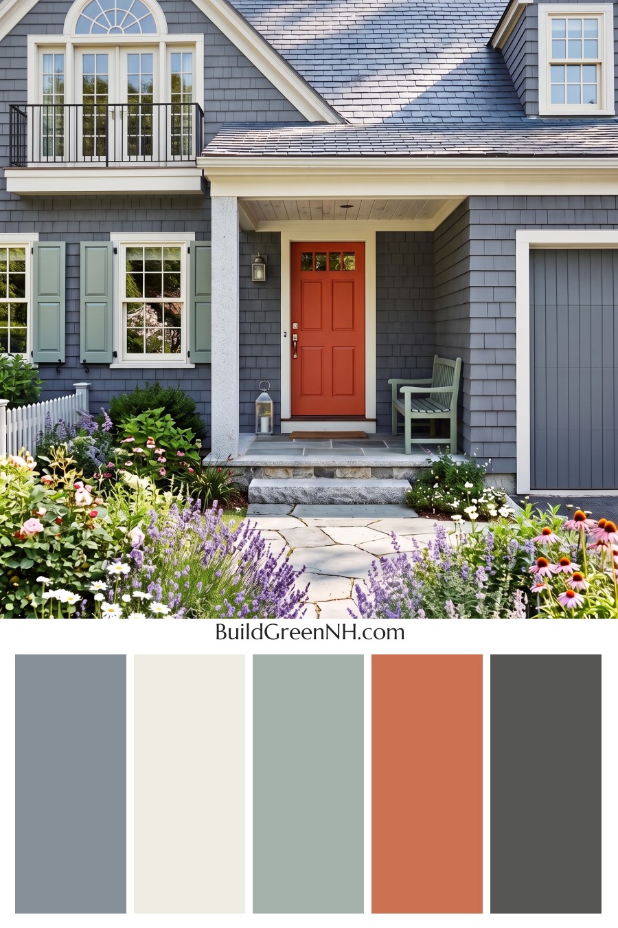
The pale sage shutters give this slate gray exterior a softer side, with a matching porch bench that makes the green feel right at home. We took our cues from garden foliage and weathered coastal colors, pairing the cool siding with creamy white trim so the windows and steep gables stay clearly defined.
Then there’s the red front door, because not every color needs to be shy. Its warm, tomato red finish brings a cheerful contrast to the gray siding, while the gray garage door blends in rather than competing for attention. A black balcony railing adds just enough crisp contrast without crowding this little gathering of colors.
Charcoal Cream Welcome
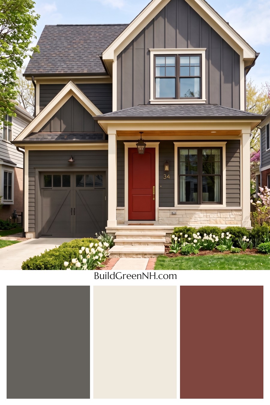
Deep charcoal siding and buttery cream trim give this house a tailored look without getting too buttoned up. Inspired by the pairing of weathered slate and pale limestone, the palette uses warm undertones to keep the gray feeling welcoming, while cream outlines the gables, windows, and garage panels.
The rusty red front door is the little surprise here, adding an earthy splash of color that feels right beside the honey-toned porch ceiling. Dark window frames tie back to the gray roof, and the creamy stone base repeats the trim color, so that red door gets its moment without starting an argument.
Pin this for later:
Want More?
 Tan House Exterior Color Scheme: Earthy Tan Allure
 Green House Exterior Color Scheme (New Trend for 2027): Sage and Greige Grace
 Green House Exterior Color Scheme (New Trend for 2027): Olive Greige Embrace
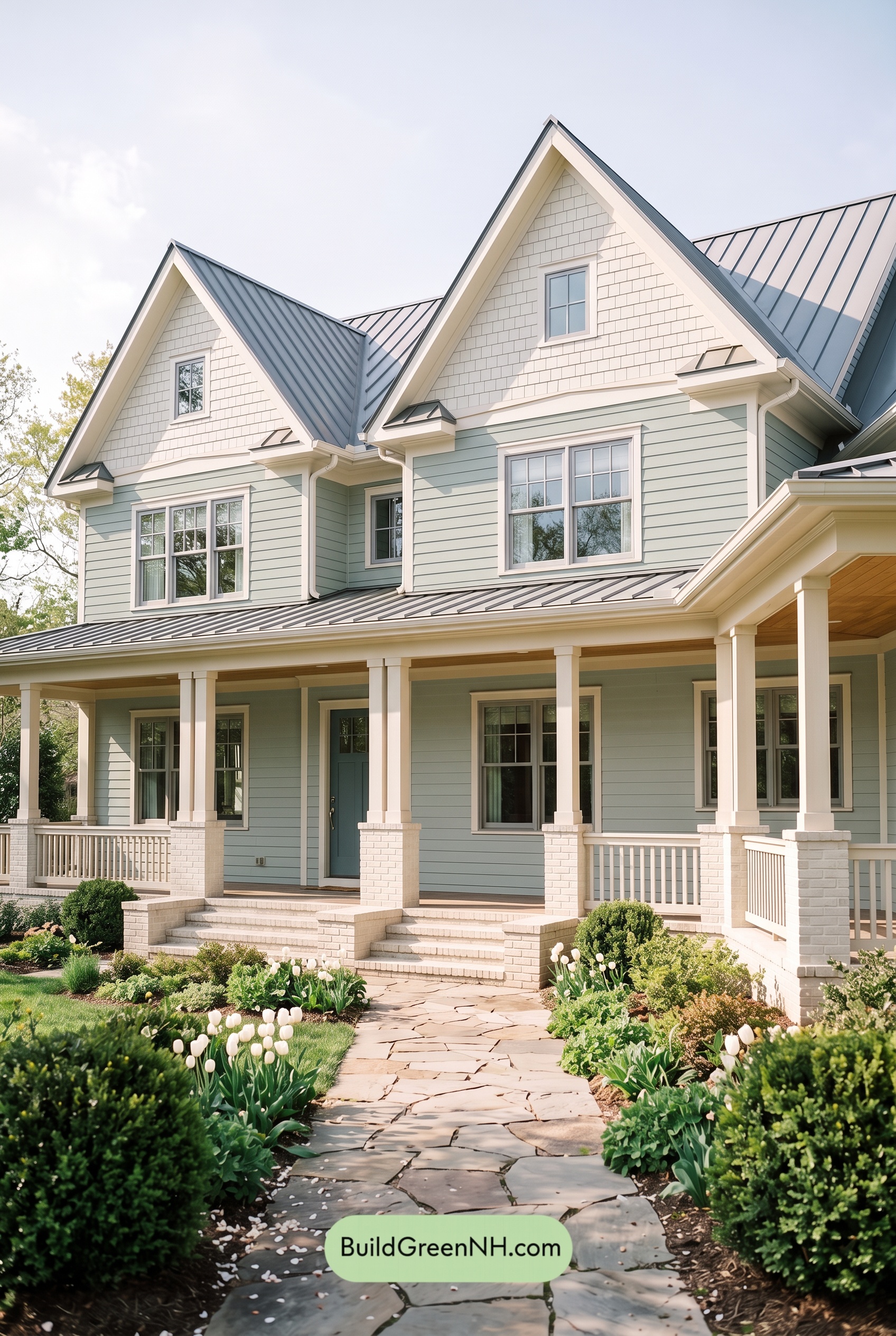 Green House Exterior Color Scheme (New Trend for 2027): Seafoam Greige Poise
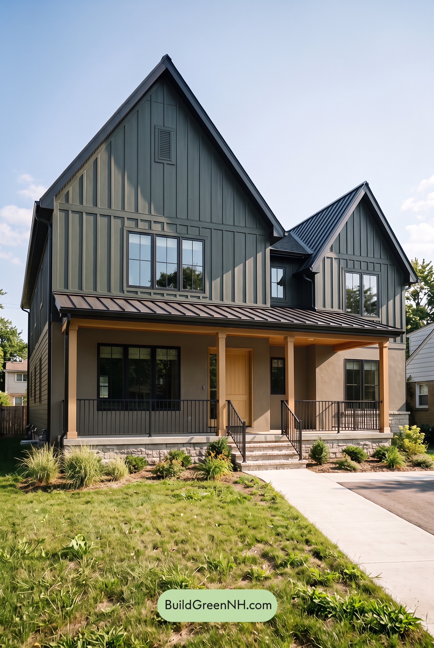 Green House Exterior Color Scheme (New Trend for 2027): Forest Greige Resolve
Table of Contents