Last updated on · ⓘ How we make our floor plans
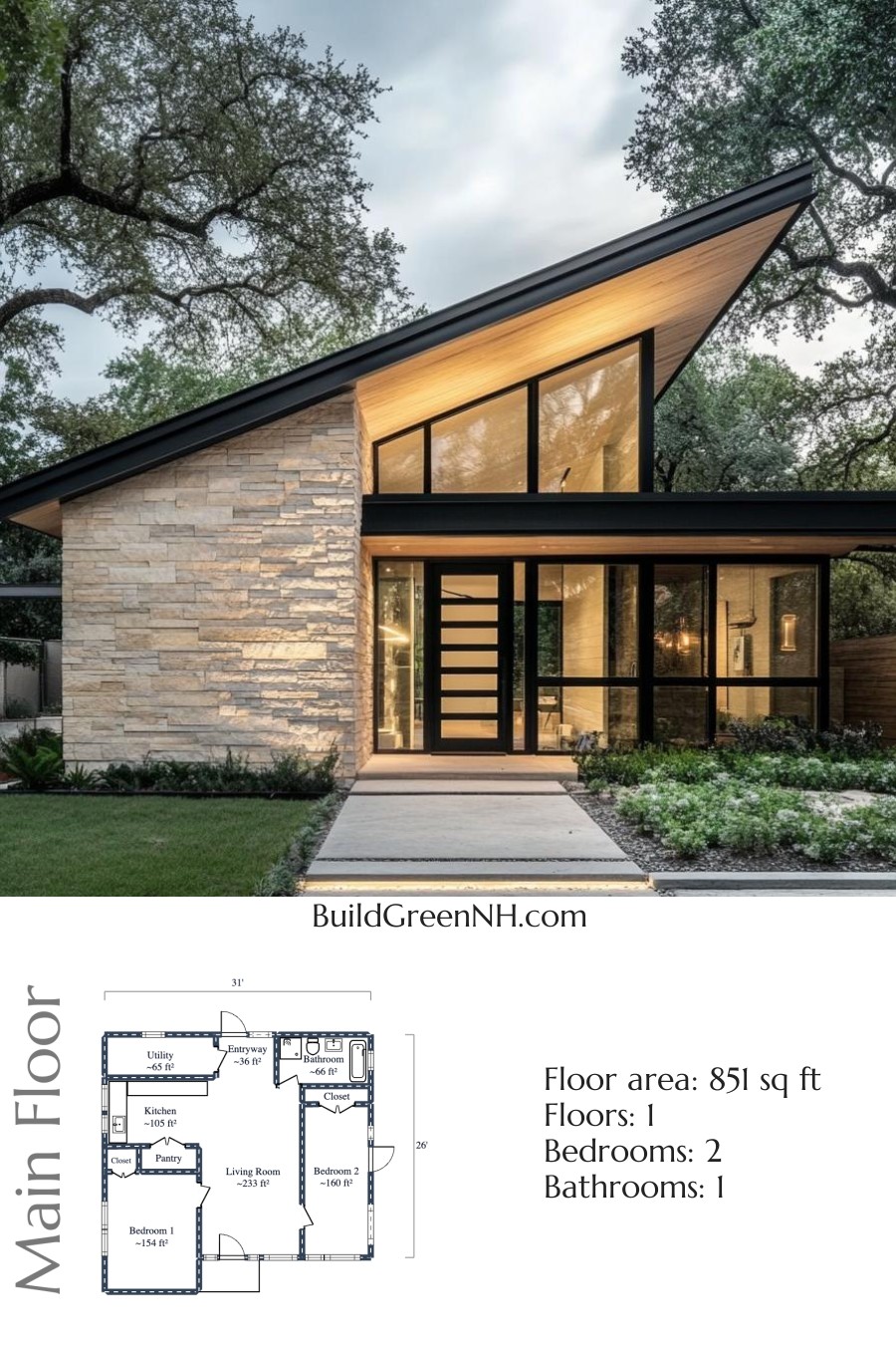
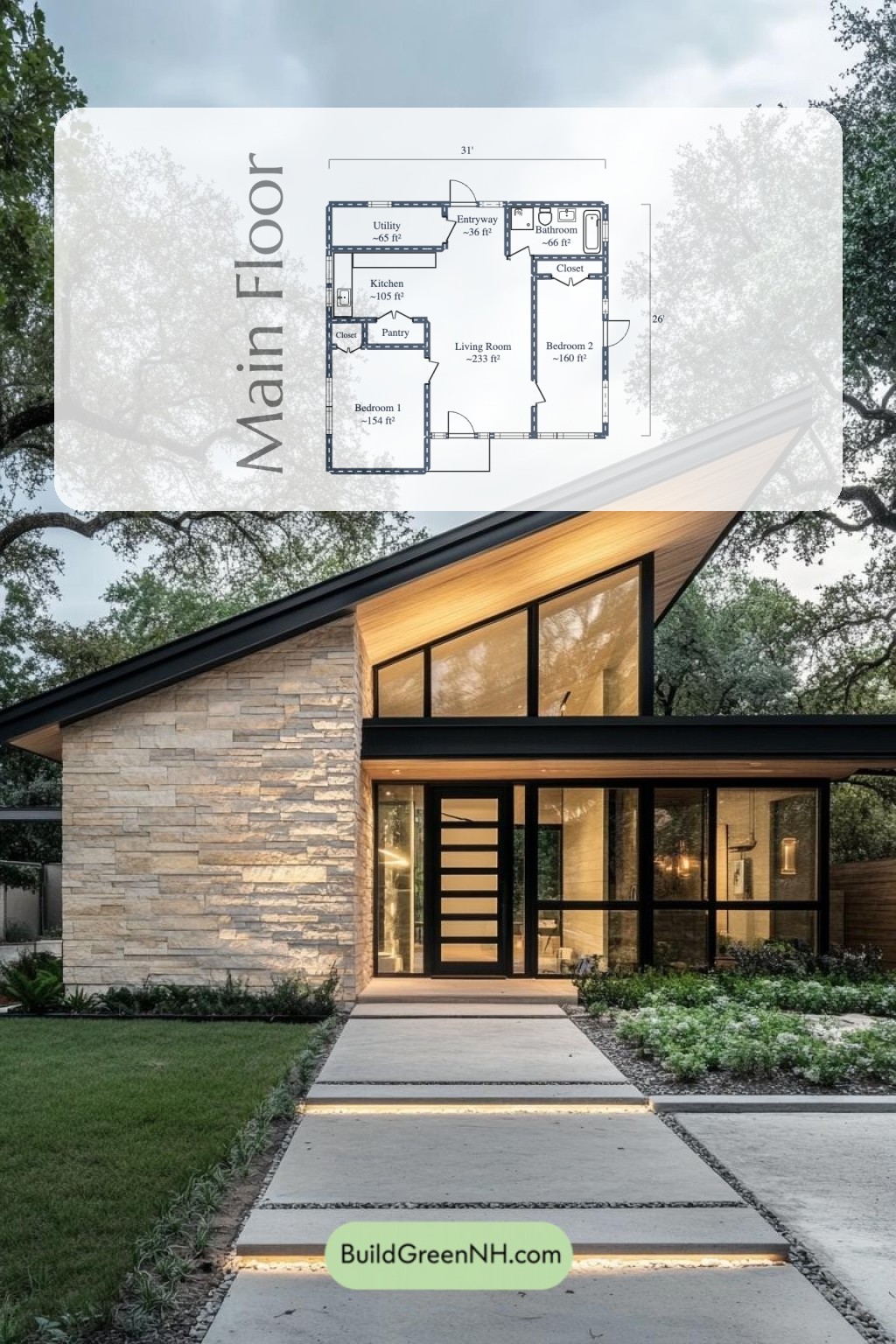
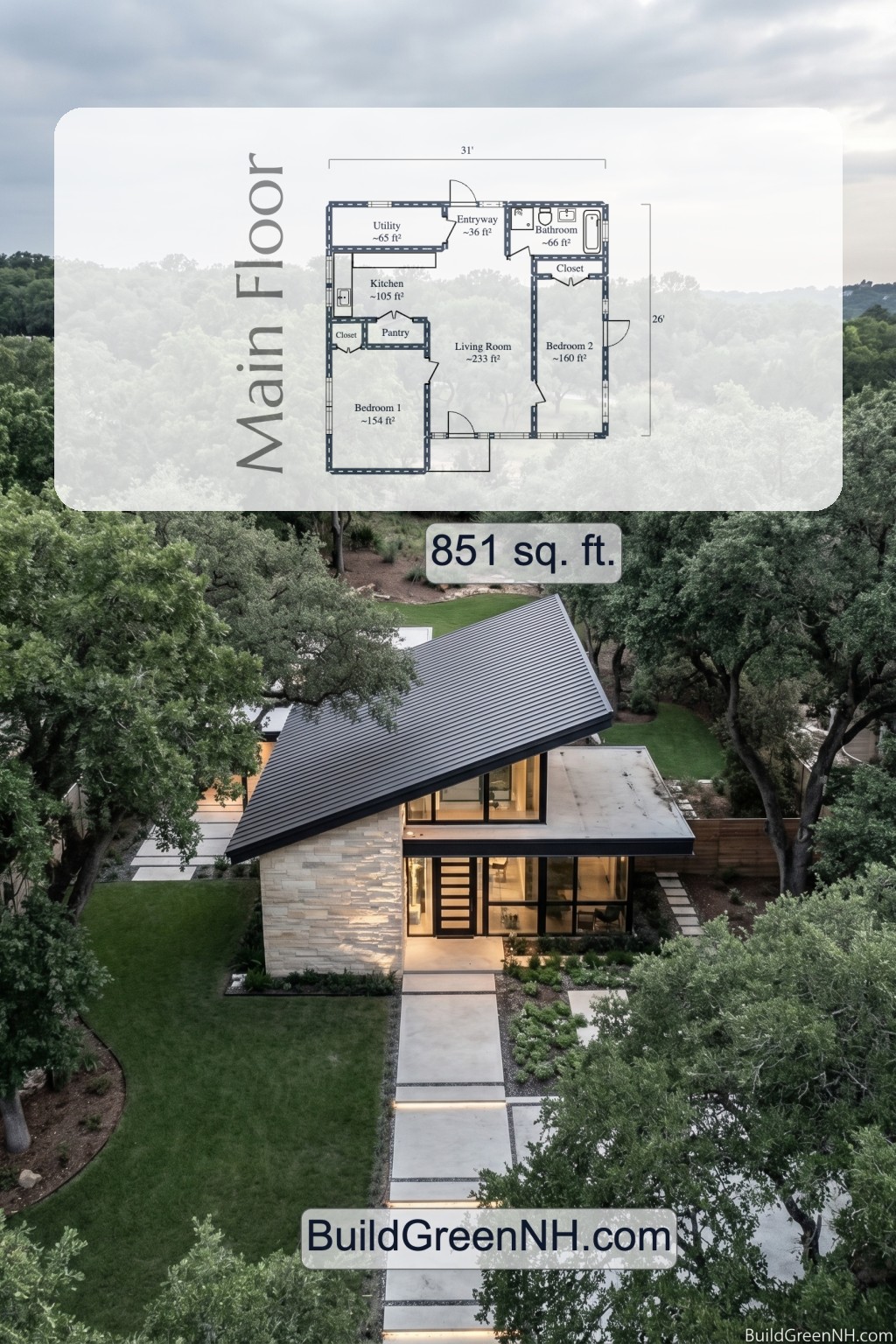
This is a compact modern house design with 851 square feet on one level. It includes two bedrooms, one bathroom, and a central living core. Small footprint. Smart plan. No fussy excess.
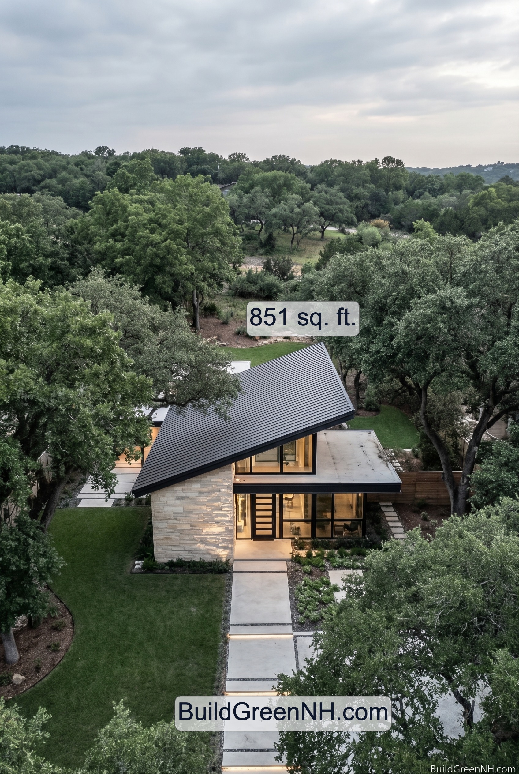
The facade is boldly contemporary. A dramatic asymmetric roof gives the front elevation real flair. Light stone cladding pairs with warm wood soffit accents, dark trim, and wide black-framed glass. The roofing reads as sleek dark metal, crisp and low-profile.
These floor plan drafts are available for download as a printable PDF. Handy for review, printing, and the occasional very serious discussion over where the sofa should go.
- Total area: 851 sq ft
- Bedrooms: 2
- Bathrooms: 1
- Floors: 1
Main Floor
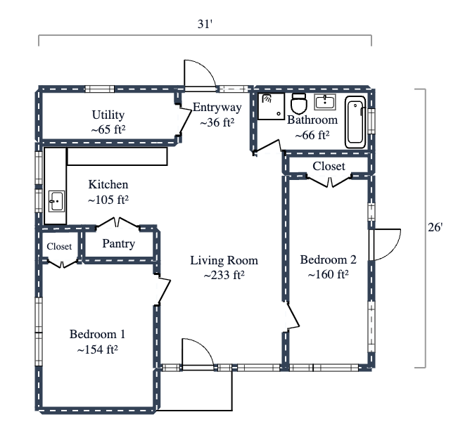
The main floor uses a simple single-level layout with the living room at the center. The two bedrooms sit on opposite sides, which gives the plan a bit more privacy. The kitchen, pantry, utility room, and bathroom are grouped efficiently. Short paths. Easy living. No maze behavior.
- Living Room: 233 sq ft. This is the largest room and the main gathering space.
- Kitchen: 105 sq ft. Positioned beside the pantry and close to the utility room for practical daily flow.
- Pantry: 21 sq ft. Compact and useful. Tiny room, big mission.
- Utility: 65 sq ft. Located near the entry for a functional service zone.
- Entryway: 36 sq ft. A modest arrival space that opens directly into the home.
- Bathroom: 66 sq ft. Centrally placed for convenient access from the main areas.
- Bedroom 1: 154 sq ft. Set on the left side of the plan. Closet storage is also shown nearby.
- Bedroom 2: 160 sq ft. Set on the right side of the plan, with adjacent closet storage shown.
Overall, this floor plan is tidy and efficient. It keeps circulation short and puts every square foot to work. Compact, yes. Boring, absolutely not.
We have more facade options of this design:
Green and White Siding
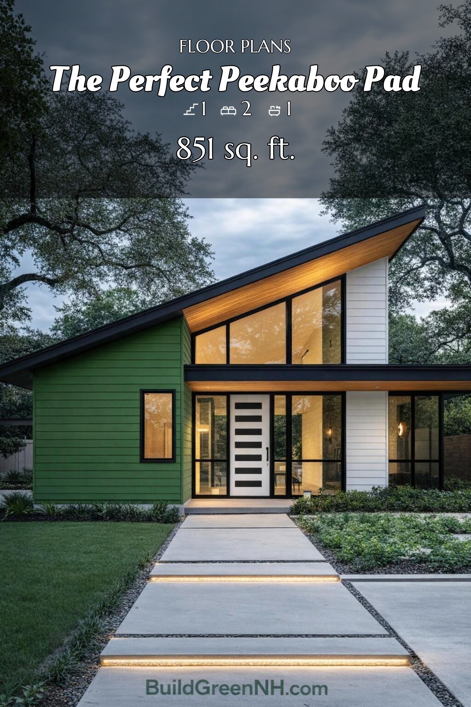
The big shift is the green-and-white siding, and it totally rewires the facade. Deep green horizontal cladding now wraps the left volume, while crisp white boards brighten the taller right section, giving the front elevation a neat two-part rhythm instead of one flat face.
It’s a sharp combo—fresh, graphic, and just smug enough to know it looks good.
That color split makes the architecture pop harder: the sloped roof feels more dramatic, the black-framed glass reads cleaner, and the white entry door snaps into focus like the facade’s exclamation point. Warm wood under the eaves keeps the modern lines from getting too chilly, so the whole front stays sleek without turning into a robot.
Red and White Siding
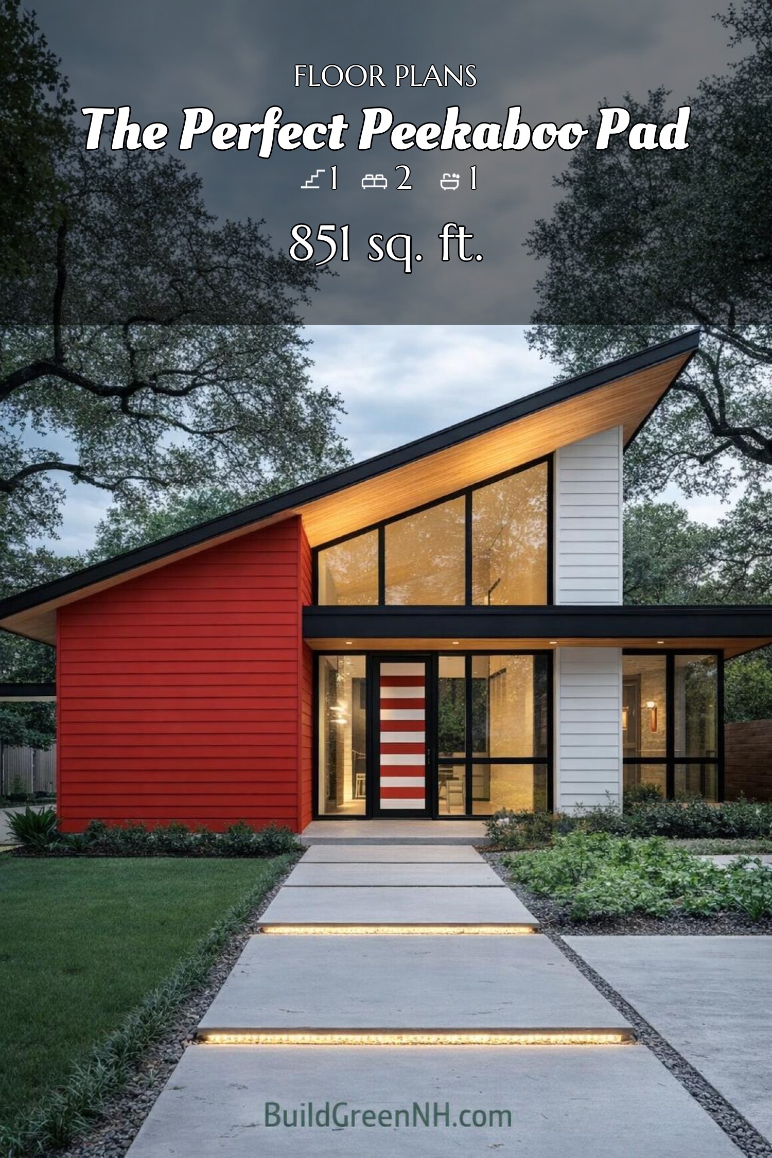
The big change is the siding palette: one volume now wears a bold red skin, while the other shifts to crisp white, giving the facade a punchy, split-personality look—in a good way. That contrast sharpens the asymmetrical form and makes the steep mono-pitch roof feel even more graphic.
The red side adds warmth and a bit of swagger, while the white section keeps the composition light and clean. Paired with the black-framed glazing and dark roof edge, the new colors turn the front elevation into a neat little modern show-off.
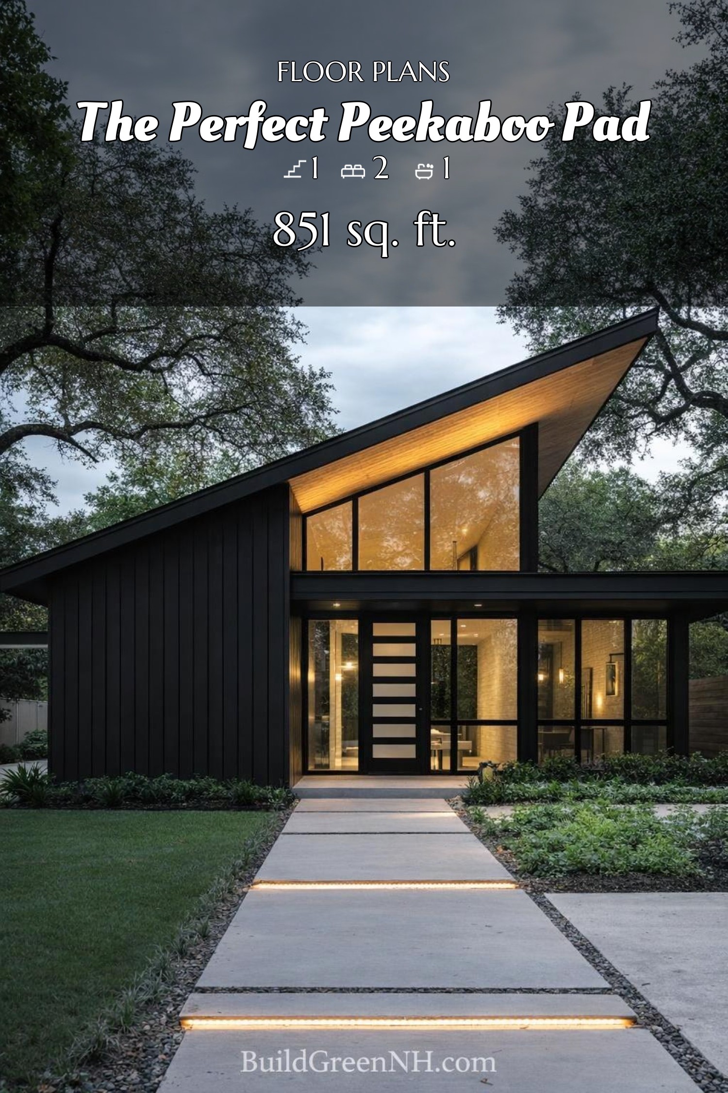
Urbane Bronze Siding
The big change is the siding: it’s now all Urbane Bronze, wrapping the facade in one deep, moody finish. That single-color skin makes the sharp shed roof feel even sleeker and turns the house into a crisp little drama queen in the trees.
With the facade unified in bronze, the black-framed glazing and modern front door read cleaner and bolder. The long triangular window wall pops harder, the horizontal cladding lines feel more deliberate, and the entry composition looks tighter, darker, and very much in its cool-kid era.
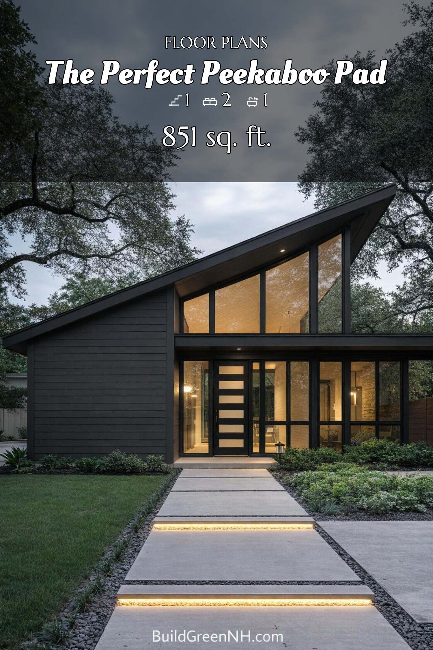
Black Siding
The big change is the siding: it’s now all black, and the facade suddenly feels sharper, moodier, and a bit like it put on a tux. That deep tone turns the vertical cladding into a strong graphic surface, making the dramatic single-slope roof read even cleaner and more sculptural.
With the exterior darkened out, the tall front glazing, slim black frames, and modern entry door stand forward with extra punch. The warm wood soffit and glowing interior now pop harder against the black shell, giving the front elevation a crisp, high-contrast look that feels sleek, bold, and just a little villainous—in a good way.
White Siding
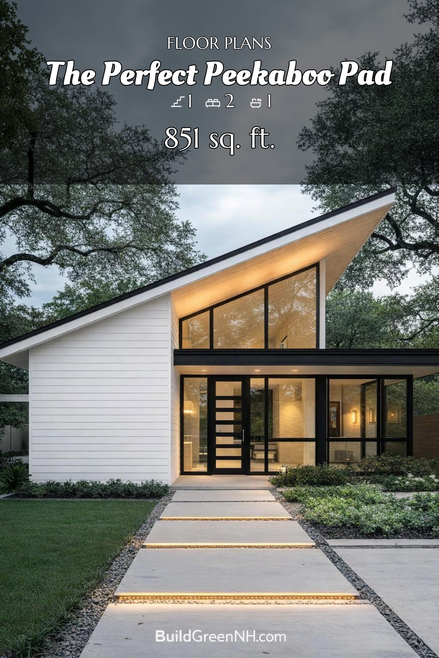
The big change is the siding: it’s now all white, and that single move totally recasts the facade. The horizontal boards make the tall front gable look cleaner, brighter, and more sculpted, almost like the house got dressed in one very sharp outfit.
With the siding stripped back to crisp white, the black window frames, flat porch roof, and angular roofline pop much harder. The contrast gives the glassy front elevation extra snap, while the entry feels even more precise and polished—minimalist, but not asleep at the wheel.
Pin this for later:
Want More?
 531 sq. ft., 1 Bed, 1 Bath, Single Story Small Modern Cottage Floor Plans: Sage Gable Porchcraft
 531 sq. ft., 1 Bed, 1 Bath, Small Modern Cottage Floor Plans: Cedarcrest Farm Cottage
 531 sq. ft., 1 Bed, 1 Bath, Single Floor Cottage House Floor Plans: Gablewood Quiet Cottage
 526 sq. ft., 1 Bed, 1 Bath, Single Story Small House Floor Plans: Pine Edge Microhouse
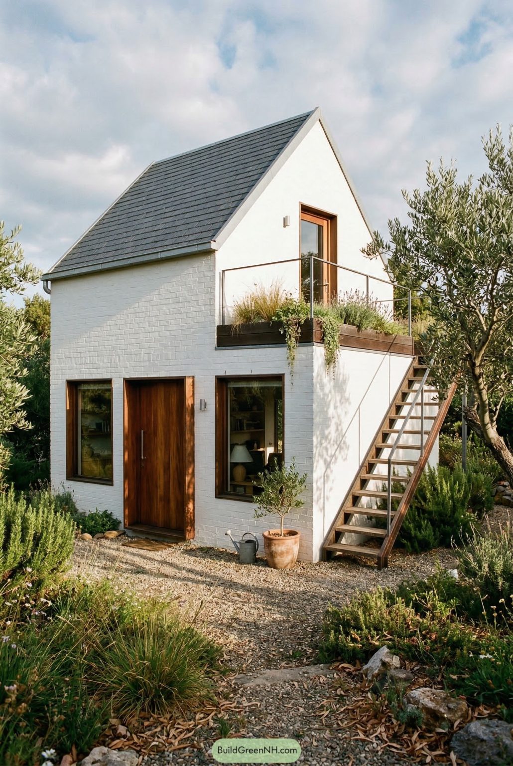 2-Story, 1 Bed, 1.5 Bath, 301 sq. ft. Shed House Floor Plans: Olive Grove Sky Landing
Table of Contents