Last updated on
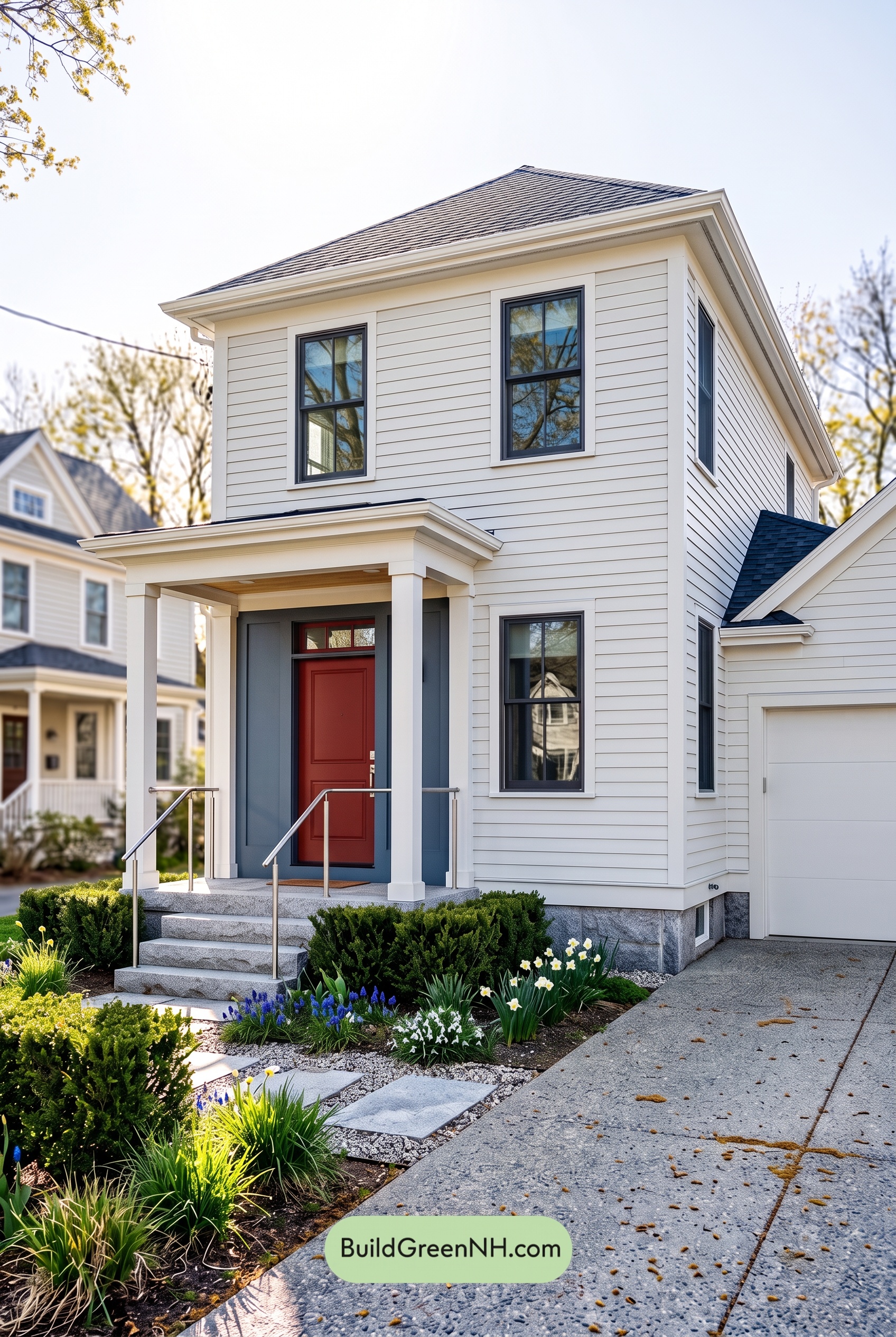

Soft white siding, layered blue accents, and a rich reddish-brown front door give this home a fresh, welcoming look with just the right amount of contrast.
A Soft White Foundation
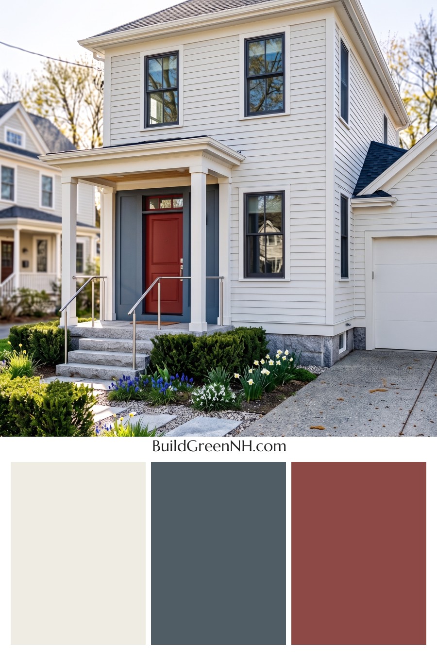
A warm shade of white covers the horizontal siding, giving the tall facade a bright, cohesive appearance. It feels clean without looking stark, allowing the siding’s fine lines and the home’s architectural details to stand out naturally.
Closely matched white trim outlines the windows, corners, and roof edges. The porch columns and garage door continue that light palette, connecting the entry and garage to the main house. Keeping these larger elements similar in shade lets the smaller accents make a stronger impression.
Blue Accents That Add Definition
The window frames introduce a deep, near-black navy blue. Against the pale siding and white surrounds, they create crisp outlines that emphasize the windows’ tall proportions. Repeating that dark shade across both stories brings a pleasing rhythm to the exterior.
A softer, gray-toned blue surrounds the front door, giving the recessed entry its own identity. This broader accent feels calm rather than bold, bridging the airy white siding and the darker window frames. Framed by white columns, the porch becomes a natural focal point.
A Warm Welcome at the Front Door
The front door adds a rich reddish-brown note that warms up the cooler blues. Its earthy depth makes the entrance inviting without competing with the rest of the facade. A warm brown porch ceiling adds another quiet touch of warmth overhead.
That balance is what makes the entry work so well: the blue surround provides a cool backdrop, the white columns keep everything bright, and the door draws the eye straight toward the threshold.
A Grounded, Harmonious Finish
The charcoal-gray roof gives the pale exterior a substantial finishing touch. Its cooler tones relate comfortably to the blue accents, while the gray foundation, steps, and silver-gray railings carry that understated palette down to ground level.
The overall mood is polished but approachable. White supplies freshness, blue adds depth, and reddish brown brings warmth—a restrained combination that gives the house character without overwhelming its simple, elegant lines.
Next, see how this color scheme looks under different lighting simulations throughout the day.
Overcast
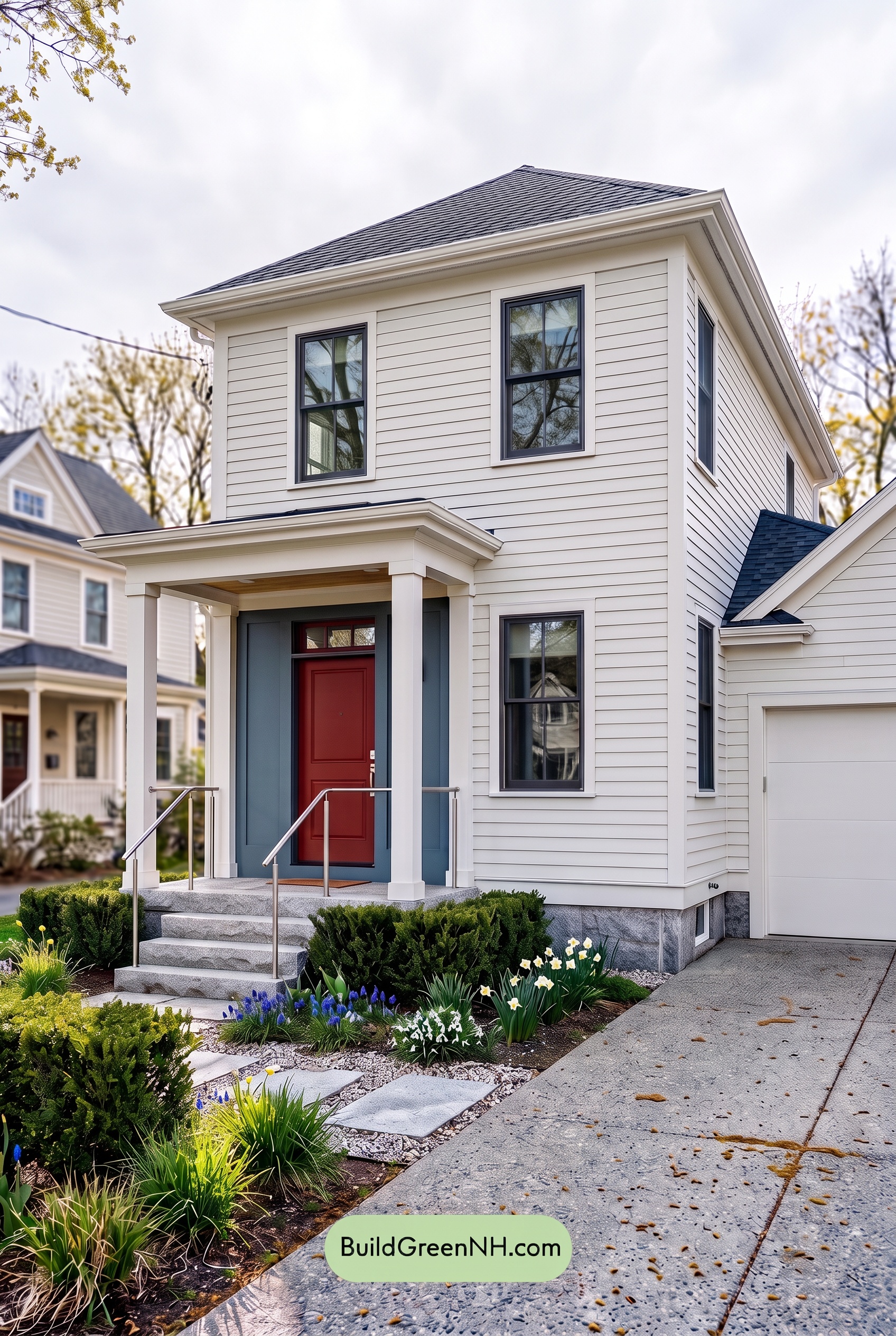
Compared with neutral daylight, overcast light gives this home’s soft whites a cooler, slightly grayer cast, dialing back their creamy warmth. The muted blue appears smokier and less saturated, while the deepest blue shades remain clearly defined against the pale palette. The reddish-brown shade feels more subdued, retaining a welcoming hint of warmth without appearing as bright.
Diffused light softens shadows beneath the eaves and around the entry, making transitions between light and dark feel gentler. Contrast between the whites and blues still gives the exterior definition, but reduced glare and quieter color create a calm, understated mood rather than the crisper, livelier impression of neutral daylight.
Golden Hour
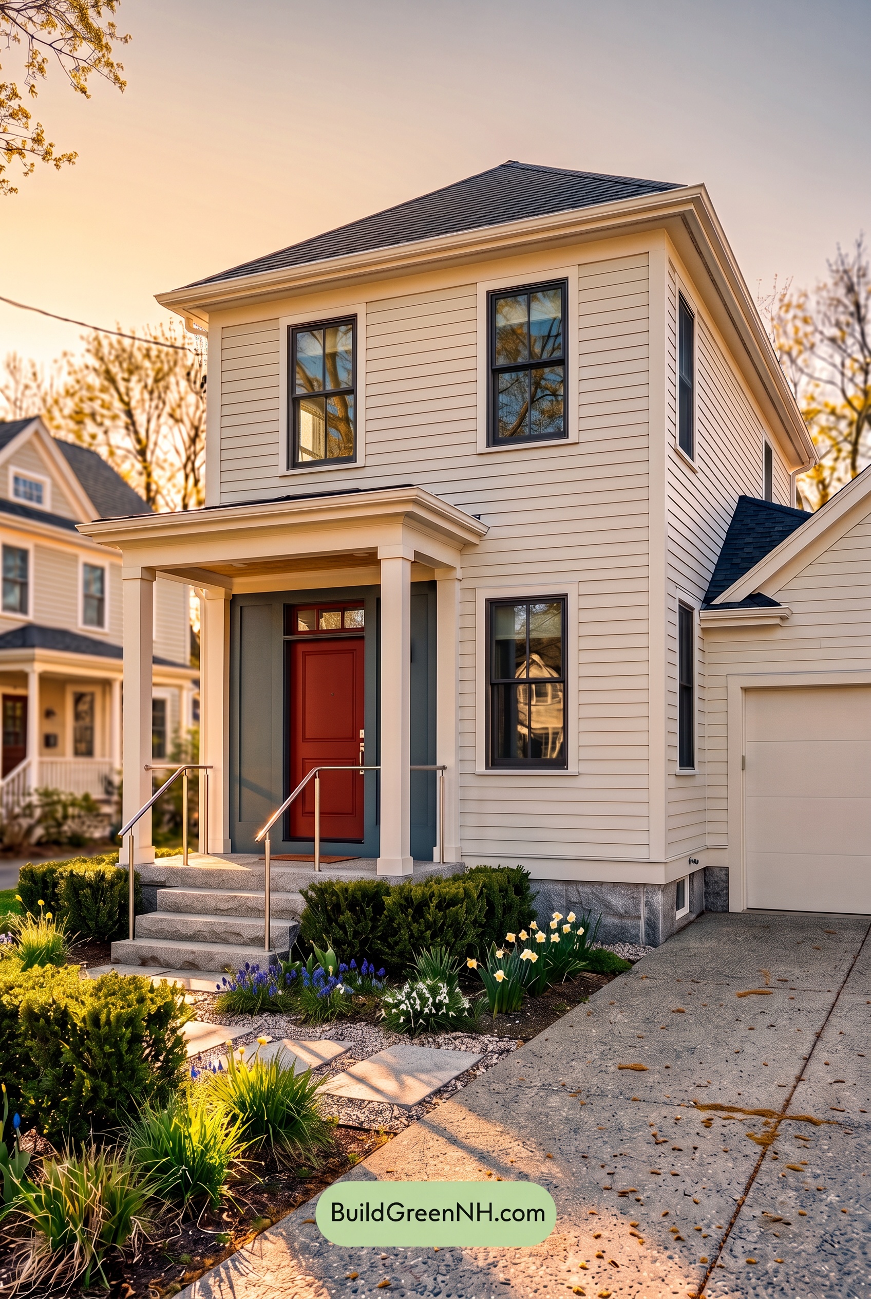
Golden Hour gives the house’s whites a soft, creamy warmth, replacing their crisp neutral-daylight appearance with a gentle yellow glow. Sunlit trim and columns feel warmer, while shaded siding takes on cooler gray undertones. Longer shadows beneath the eaves and porch add depth, making the pale exterior feel more sculpted and inviting.
The blue shades appear more muted where warm light reaches them, yet deepen in the sheltered entry and around the windows. Against the glowing whites, these darker accents create stronger light-dark contrast, even as their blue saturation feels less pronounced than in neutral daylight. The warm brown at the entrance gains a reddish richness, shifting the overall mood from fresh and tailored to cozy and welcoming.
Shade
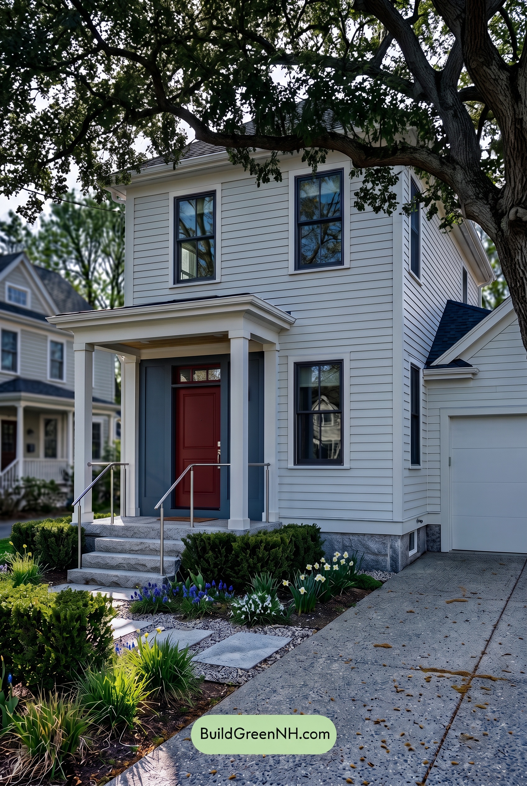
Under the tree’s shade, the white shades lose some of their daylight brightness and take on a soft, cool gray cast. Their warmer undertones become quieter, making the exterior feel calmer and less crisp than it would in neutral daylight. Gentle variations in shadow give the pale surfaces depth without overwhelming their airy character.
The blue shades appear deeper and more muted, with saturation feeling restrained rather than vivid. Shadows beneath the porch and eaves darken them further, while the surrounding whites preserve a clear light–dark contrast. Compared with neutral daylight’s more balanced color, this shaded palette feels cool, sheltered, and quietly dramatic.
Nighttime
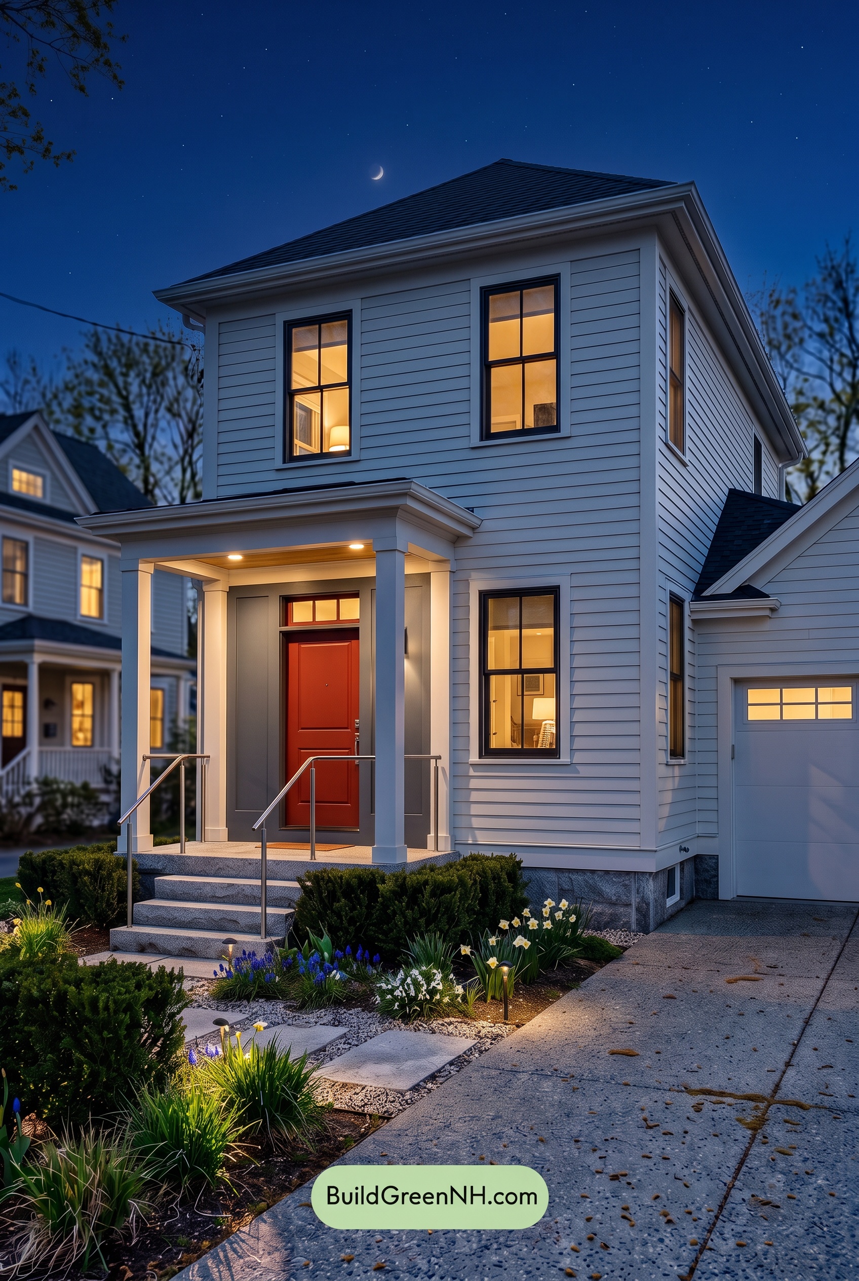
At night, the white shades lose their daylight crispness and take on cool blue-gray undertones, while warm porch lighting turns nearby whites softly creamy. Shadows beneath the eaves and between siding boards deepen, giving the exterior more dimension than it would have in neutral daylight.
The blue shades appear deeper and less visibly saturated, approaching near-black around the windows, while the brown door’s reddish warmth becomes more noticeable beneath the entry lights. Bright whites beside dark accents create stronger local contrast, even as unlit details recede. The overall mood shifts from fresh and airy to quiet and inviting, with the illuminated entrance becoming the natural focal point.
Pin these for later:
Want More?
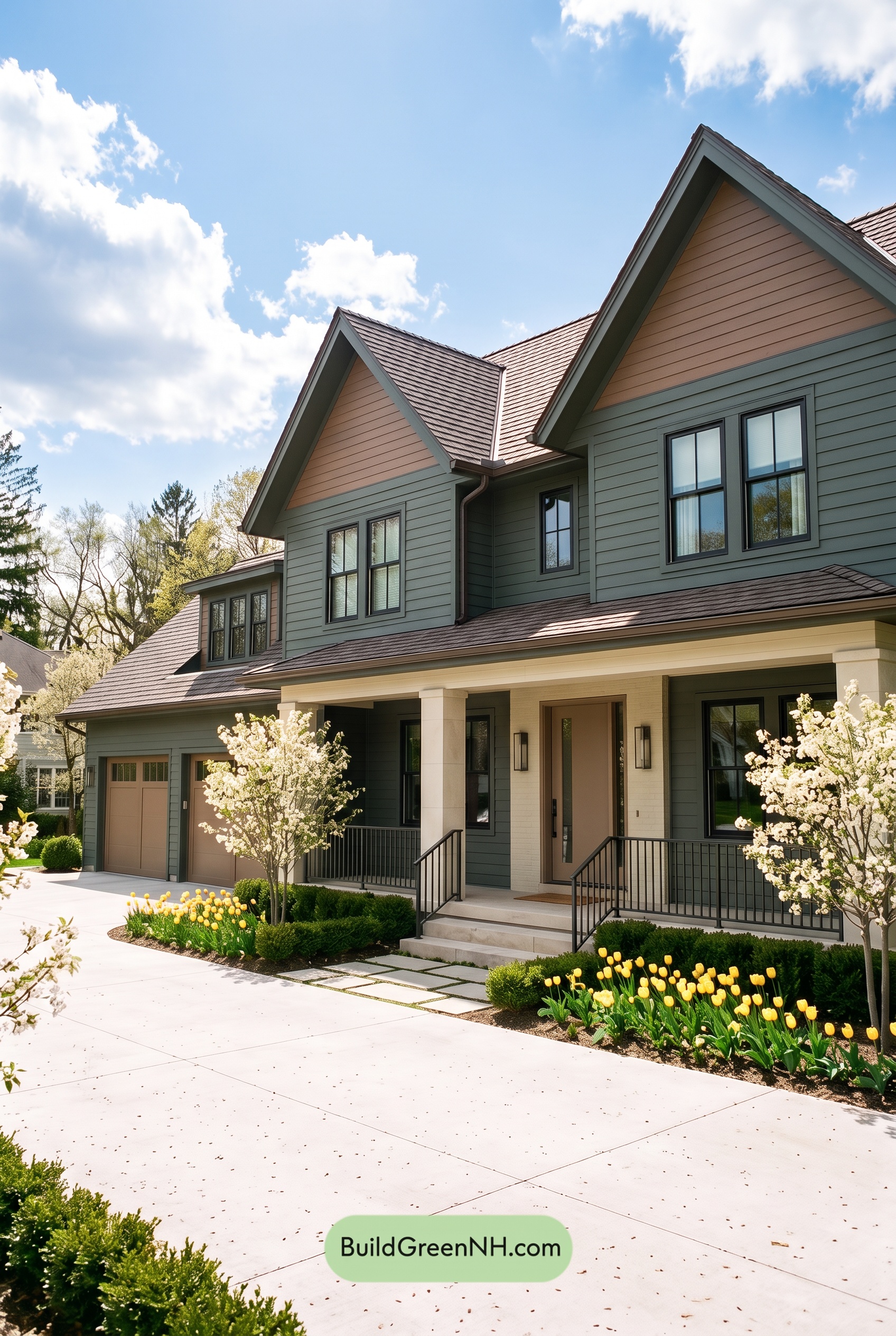 Earthy Green House Exterior Color Scheme: Brown Green Comfort
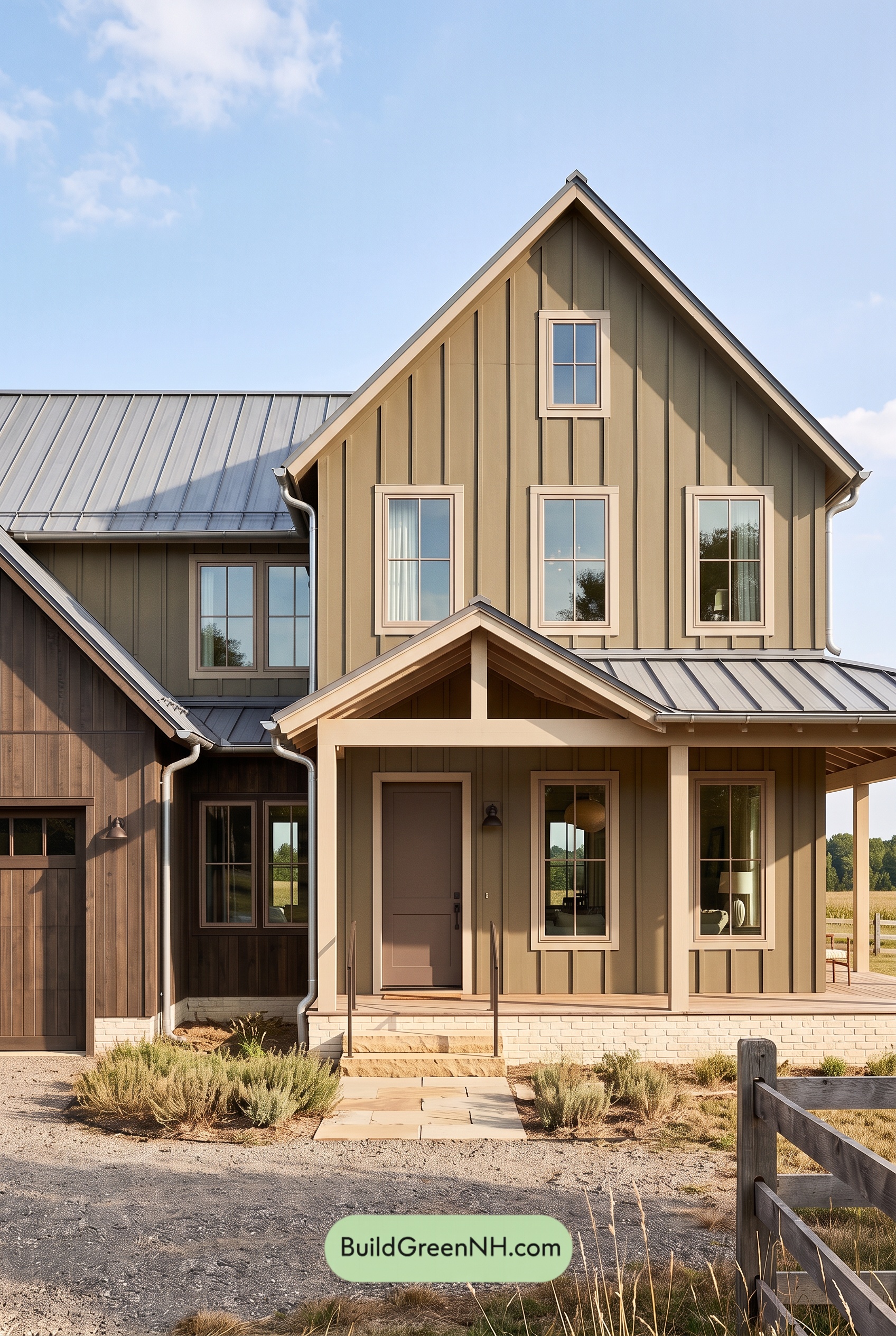 Earthy Green House Exterior Color Scheme: Green and Beige Sanctuary
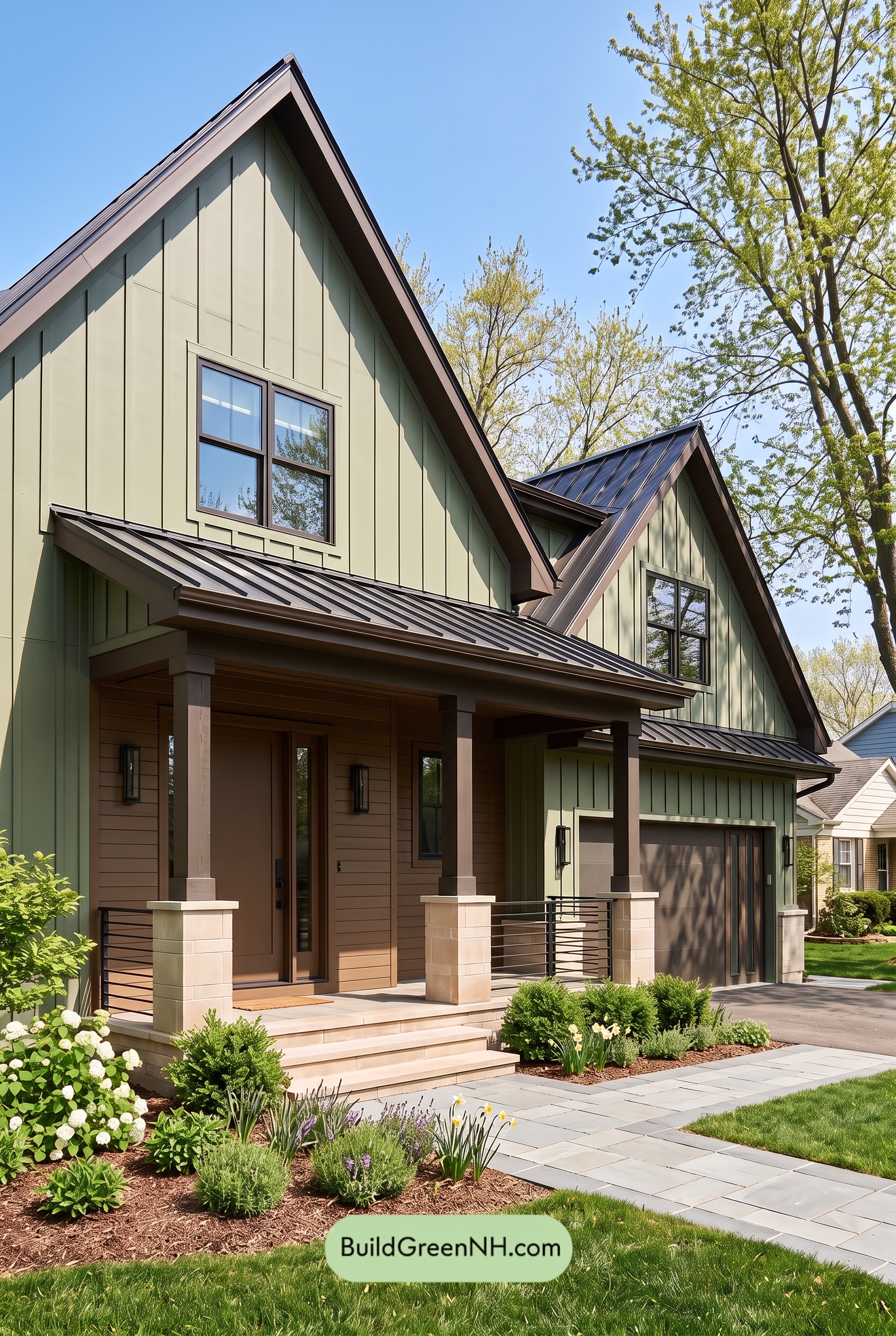 Earthy Green House Exterior Color Scheme: Green Velvet Assurance
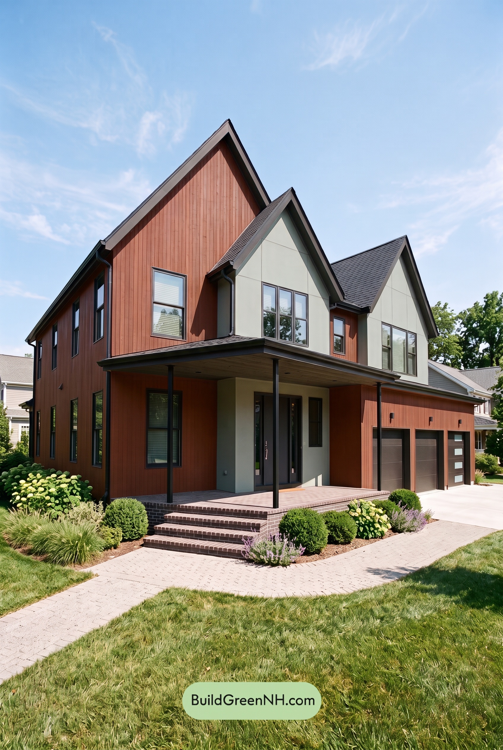 Earthy Green House Exterior Color Scheme: Brown Silken Calm
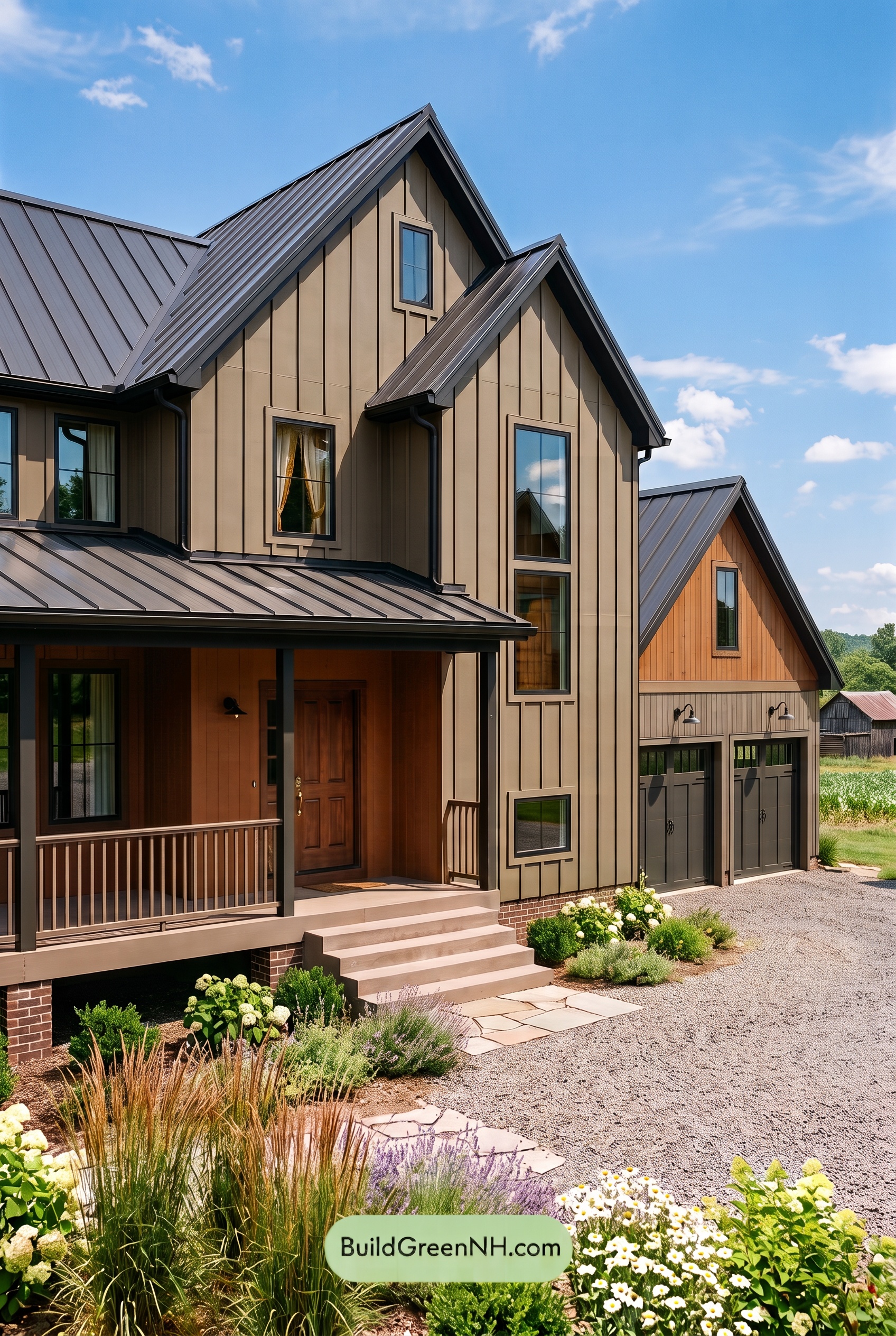 Earthy Green House Exterior Color Scheme: Green Amber Contentment
Table of Contents