Last updated on
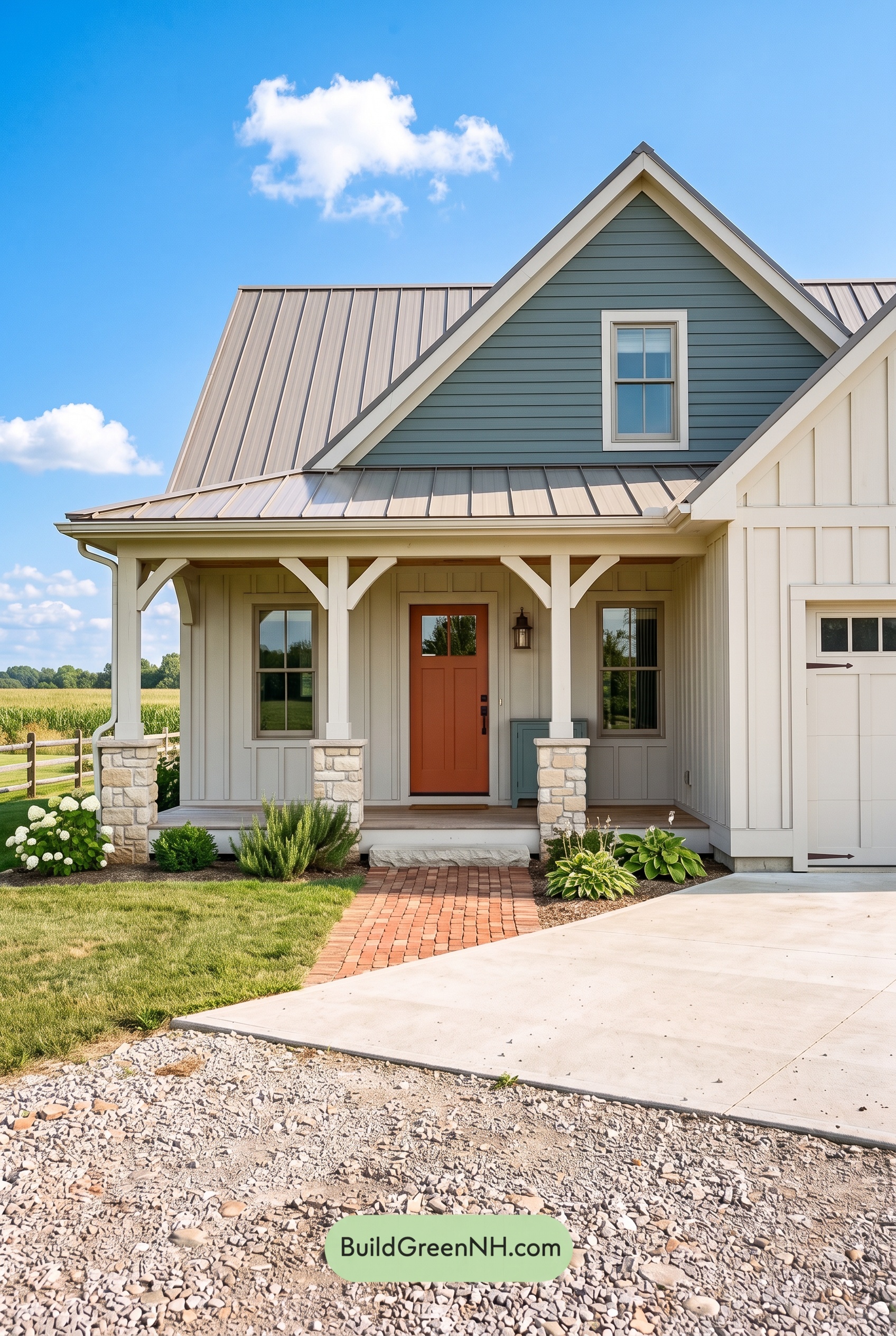

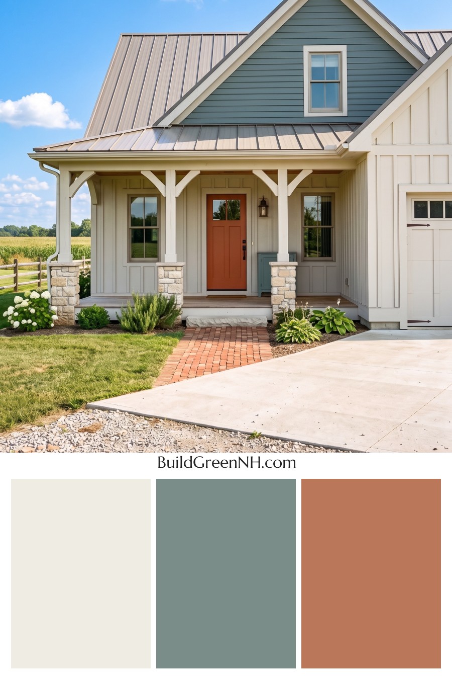
Soft whites, a cool gray gable, and an earthy orange front door give this home its winning balance of fresh simplicity and welcoming warmth.
A Light, Welcoming Foundation
A warm shade of white covers the main exterior, letting the vertical siding add texture without making the facade feel busy. Its gentle cream undertone softens the broad wall surfaces, especially around the sheltered porch. The result feels bright but never stark.
The garage door stays within the same white family, helping it blend into the adjoining walls rather than compete with the entrance. This quiet repetition keeps the larger exterior surfaces feeling connected.
A Cool Gray Gable Adds Depth
Above the porch, the horizontal siding shifts to a medium gray with muted blue-green undertones. That cooler shade gives the front-facing gable a distinct presence and draws attention to the roof’s steep peak. It also provides enough contrast to make the surrounding white trim stand out clearly.
The change in siding direction makes the color contrast even more effective. Vertical white siding feels light and orderly below, while the horizontal gray siding adds a calm, grounded note overhead.
White Details and a Soft Gray Roof
Warm white trim traces the gables, frames the windows, and carries across the porch columns and angled brackets. Repeating this light shade highlights the architectural details without introducing another competing color. In the porch shadows, those whites naturally appear softer and slightly grayer.
The standing-seam roof brings in a light, warm gray, with deeper gray edging defining the roofline. Its subtle warmth connects the cool upper siding to the creamier whites below. Pale beige and soft gray stone at the column bases add another gentle transition, giving the porch a little visual weight.
An Orange Door Makes the Entrance Shine
The front door supplies the scheme’s most expressive accent: a deep, earthy orange with brown undertones. Against the pale siding, it immediately draws the eye toward the entrance. Its warmth also creates a pleasing counterpoint to the cooler gray above.
Nearly black door hardware and a dark porch lantern add small, crisp accents. Meanwhile, the walkway’s muted reddish-orange shades echo the door without matching it exactly. Together, these touches make the home feel thoughtfully coordinated, relaxed, and full of personality—proof that a mostly neutral exterior can still make a memorable first impression.
Next, see how this color scheme looks under different lighting simulations throughout the day.
Overcast
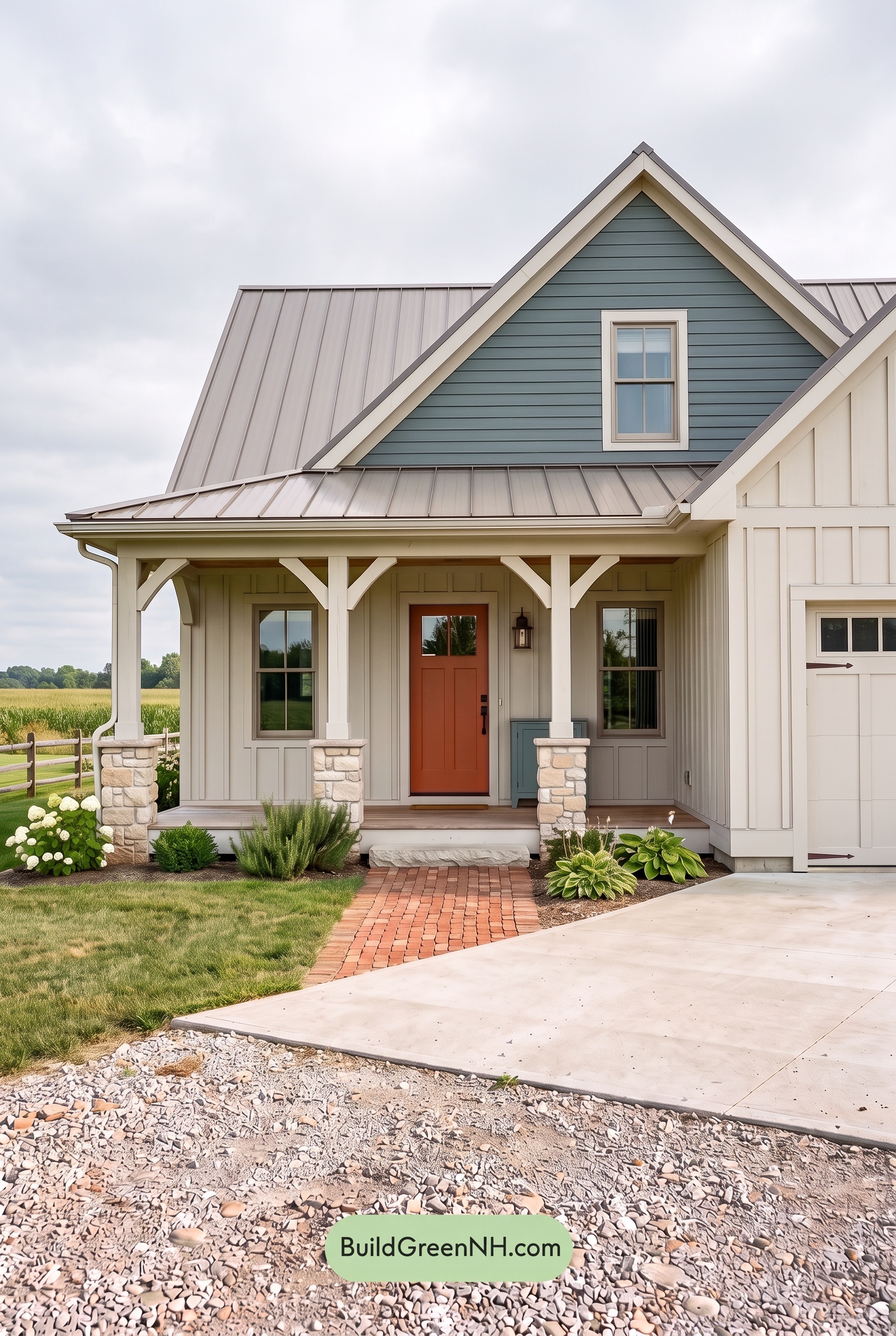
Compared with neutral daylight, overcast light makes the off-white walls and trim feel softer and slightly cooler, with their creamy warmth less pronounced. The upper gray siding takes on a more noticeable blue-gray cast, appearing subdued rather than vivid. Without bright highlights, these pale and midtone shades give the exterior a quieter, more unified look.
Diffused light softens shadows beneath the eaves and around the columns, easing the contrast between projecting details and recessed walls. The deep orange door looks less bright but remains a welcoming focal point against the cooler neutrals. Together, the gentler shadows and restrained saturation shift the mood from crisp and lively to calm and cozy.
Golden Hour
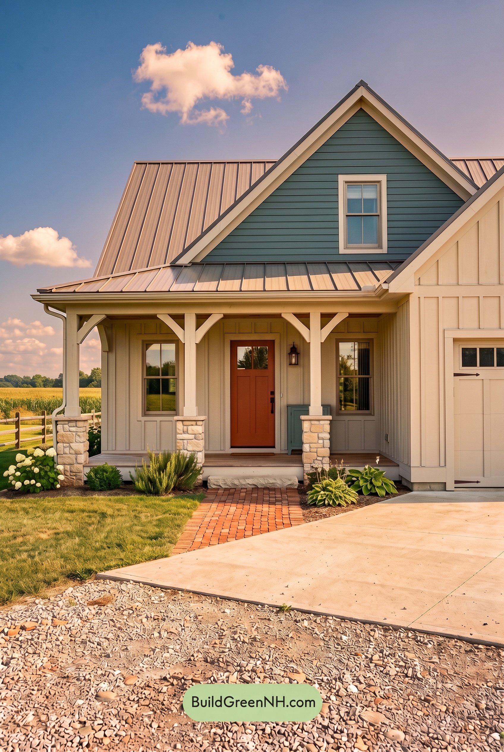
Golden Hour gives the white walls, trim, and columns a creamy warmth, softening the crisp appearance they would have in neutral daylight. The cooler gray shades in the upper gable look deeper beside those glowing pale surfaces, with subtle blue-green tones becoming more noticeable. The orange front door appears richer and more saturated, adding a warm focal point beneath the porch.
Long shadows under the eaves and across the siding create stronger contrasts between illuminated edges and shaded recesses. Sunlit whites lean toward pale yellow, while sheltered areas read as cooler, muted neutrals. Compared with the cleaner, more evenly balanced palette of neutral daylight, the overall effect feels softer, more dimensional, and inviting.
Shade
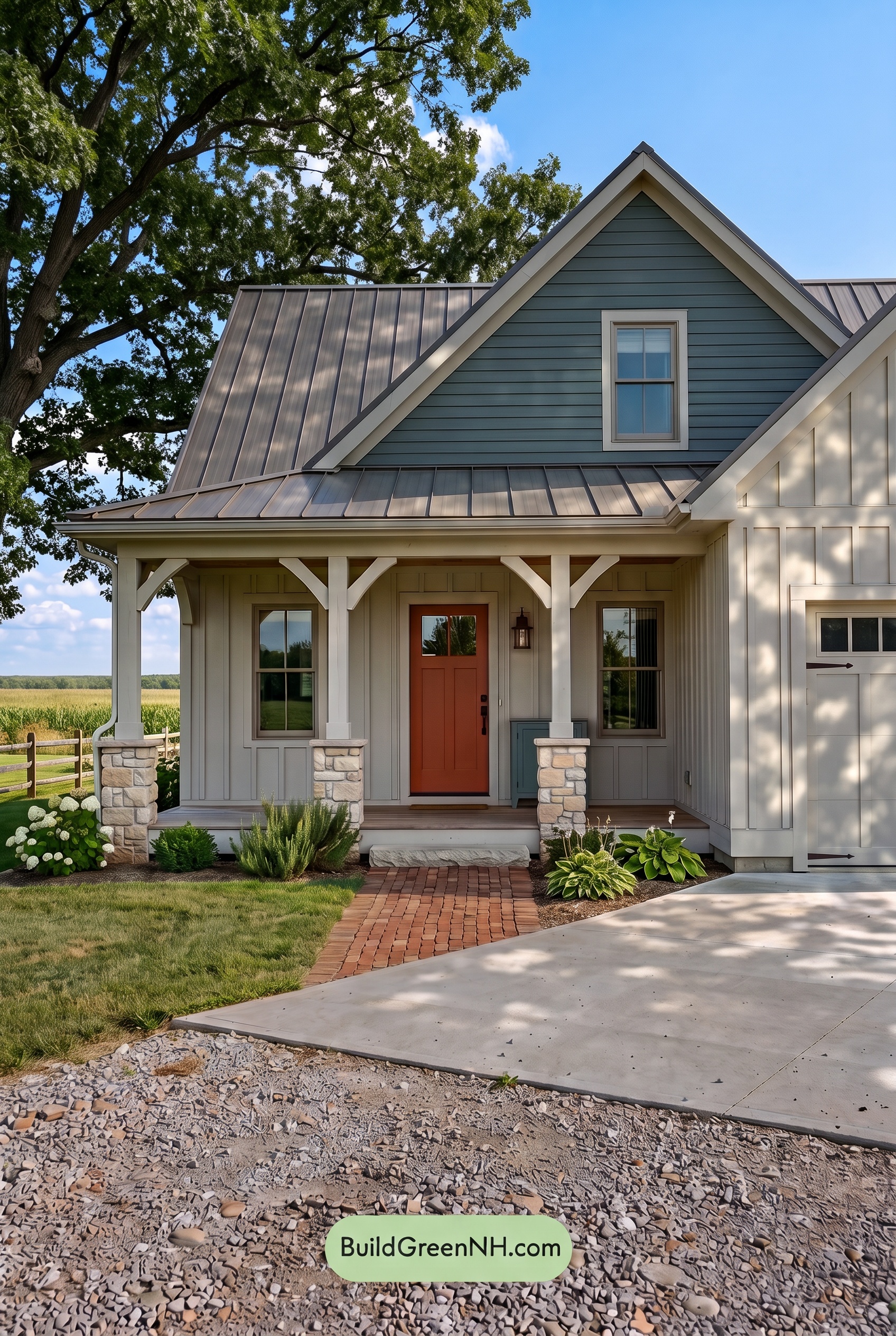
In shade, the white shades look softer and slightly grayer than they would in neutral daylight, with their warmth gently subdued. The gray above deepens, allowing cooler blue undertones to become more noticeable. Shadows beneath the porch and eaves give these pale neutrals extra depth, while the lighter trim remains distinct against the darker upper shade.
The orange shade at the entry feels richer and less brightly saturated, offering a quiet touch of warmth against the cooler neutrals. Dappled shadows create shifting patches of light and dark across the whites, making the overall palette feel more sheltered and tranquil than its brighter, crisper appearance in neutral daylight.
Nighttime
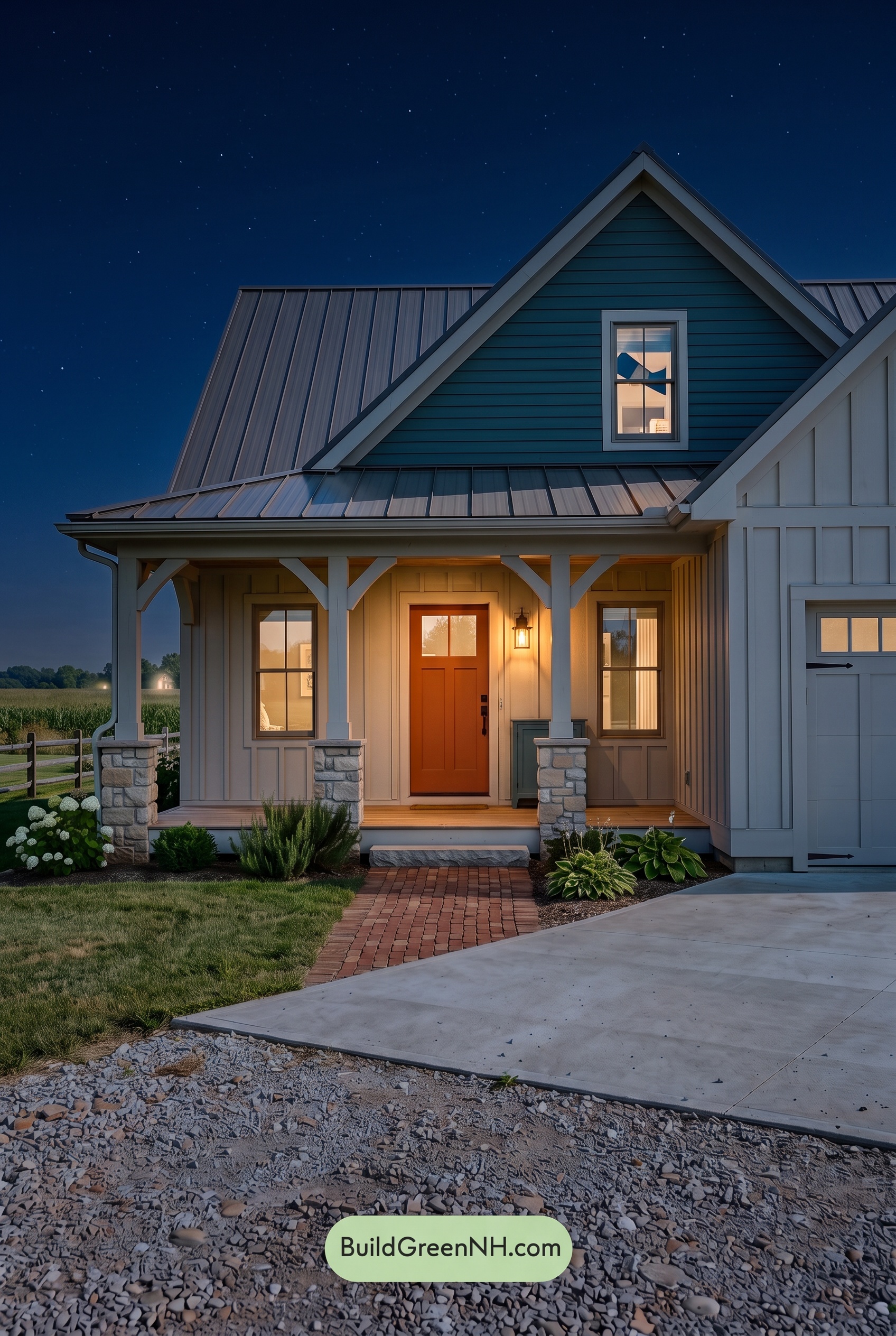
At night, the white shades lose their daylight crispness, appearing softly creamy near the porch light and cool gray in unlit areas. The upper gray takes on a deep blue cast, while shadows beneath the eaves make it feel darker and more subdued than it would in neutral daylight. These shifts give the exterior greater depth and a quieter mood.
The orange shade at the entrance looks richer under the warm light, standing out against the cooler, less saturated surroundings. Illuminated white trim contrasts with deep porch shadows, drawing attention toward the entry. Compared with daylight’s more even appearance, the nighttime palette feels intimate, dramatic, and welcoming.
Pin these for later:
Want More?
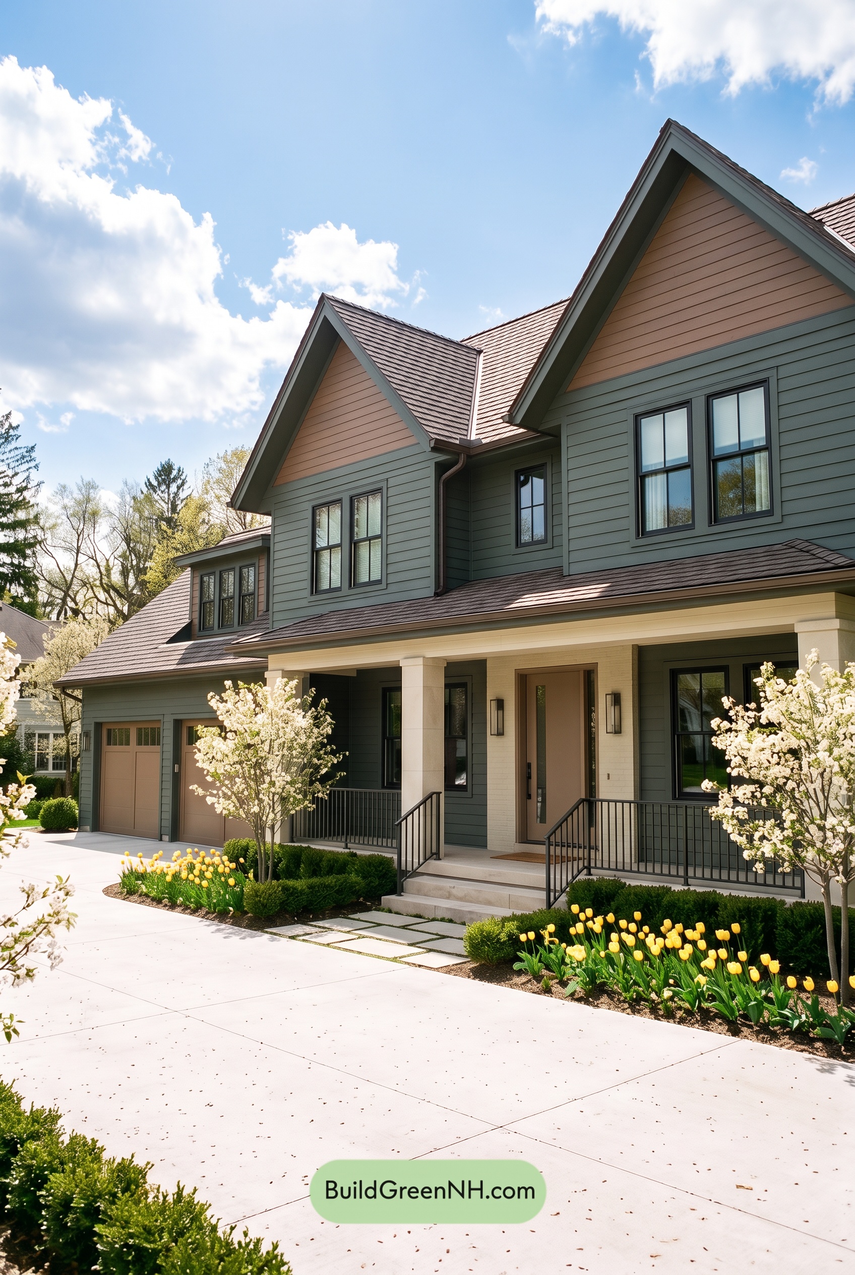 Earthy Green House Exterior Color Scheme: Brown Green Comfort
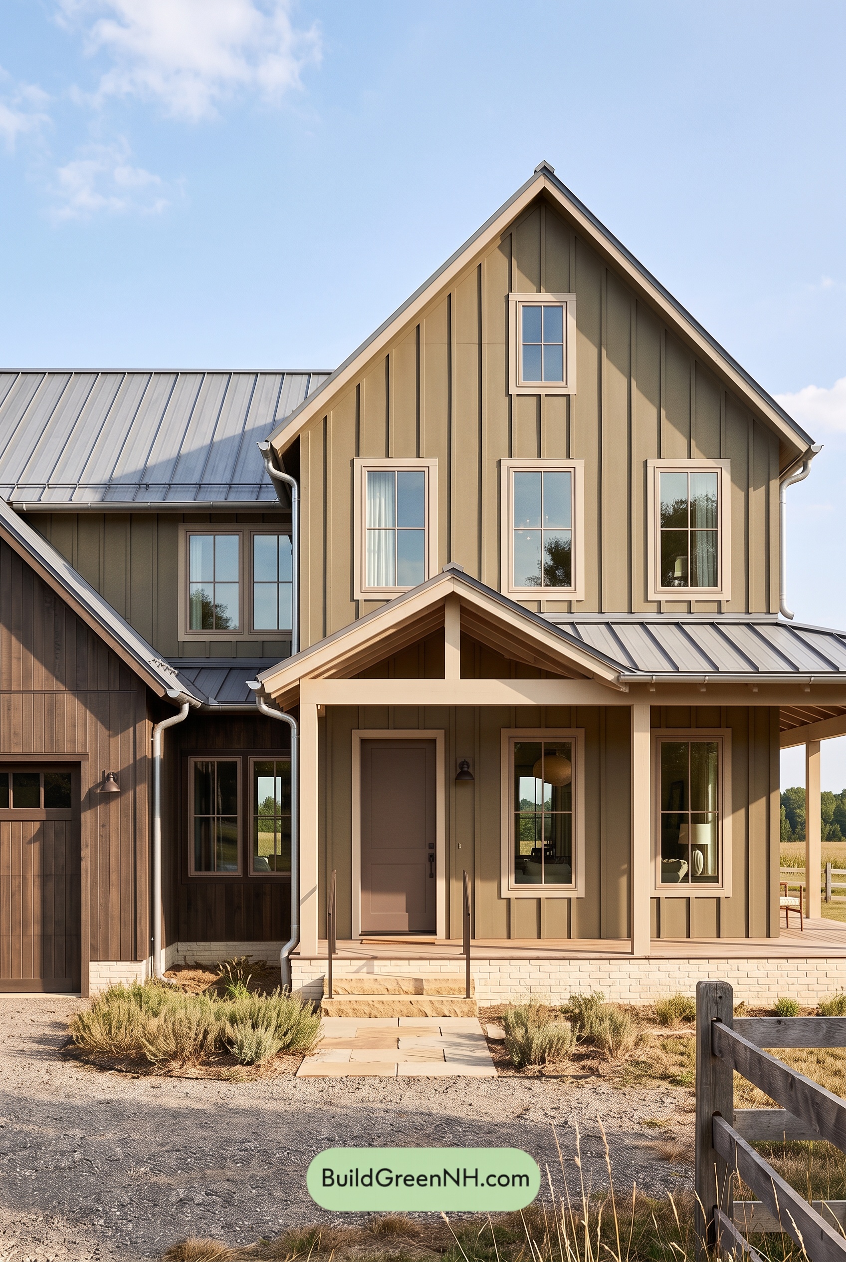 Earthy Green House Exterior Color Scheme: Green and Beige Sanctuary
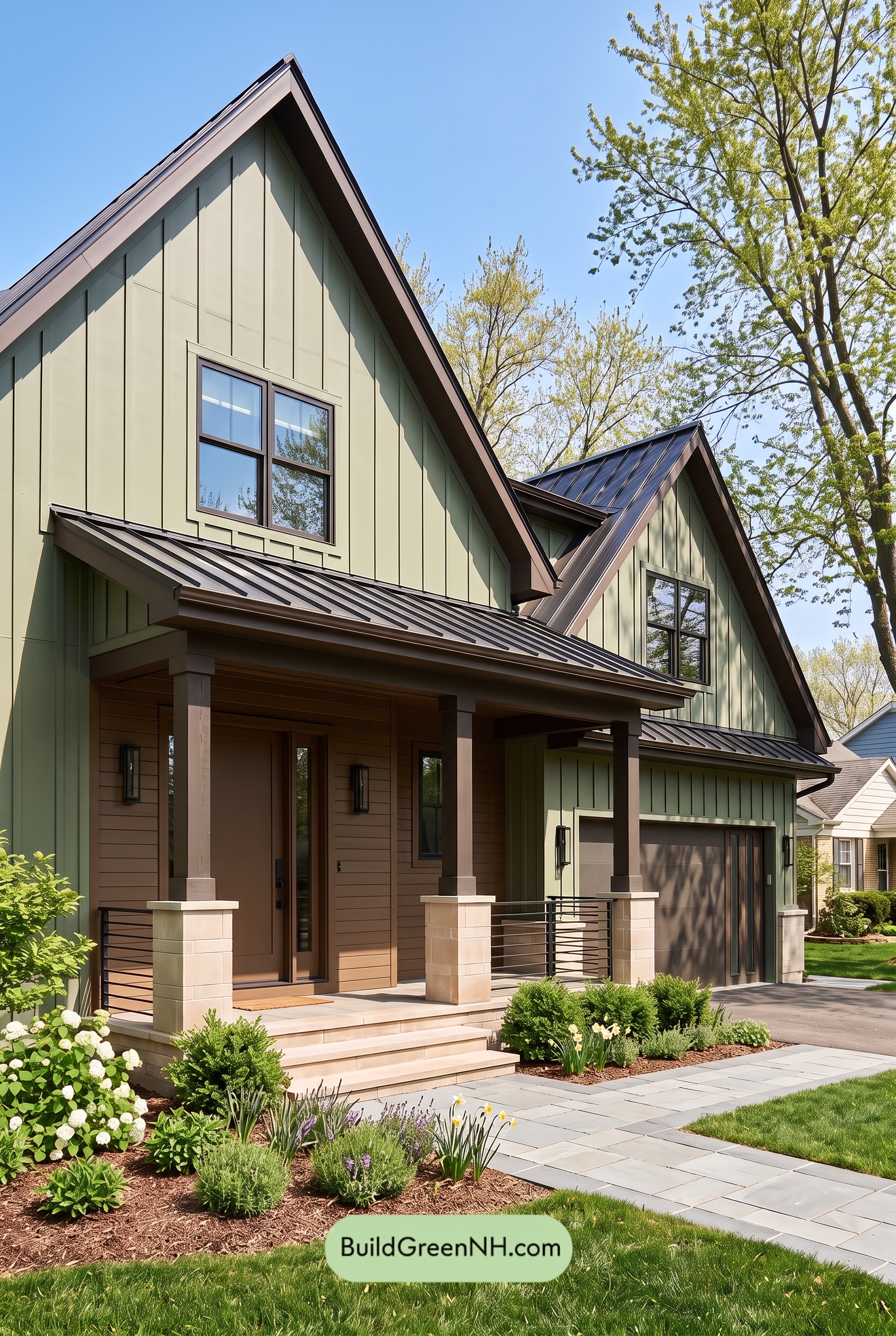 Earthy Green House Exterior Color Scheme: Green Velvet Assurance
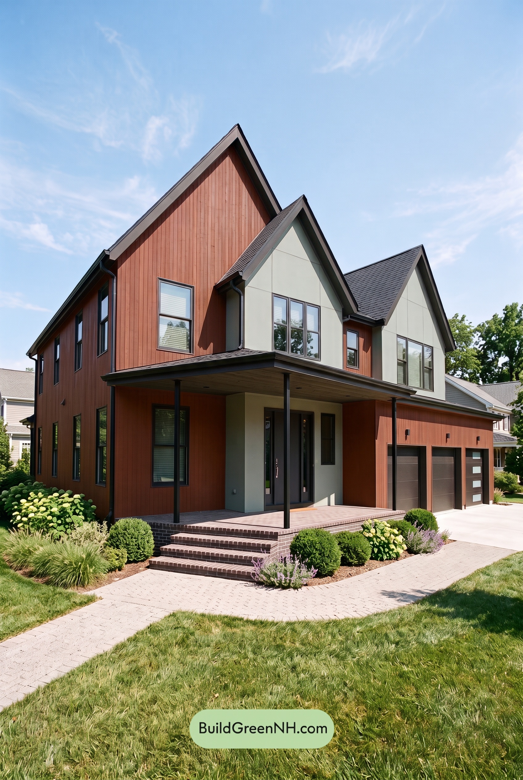 Earthy Green House Exterior Color Scheme: Brown Silken Calm
 Earthy Green House Exterior Color Scheme: Green Amber Contentment
Table of Contents