Last updated on
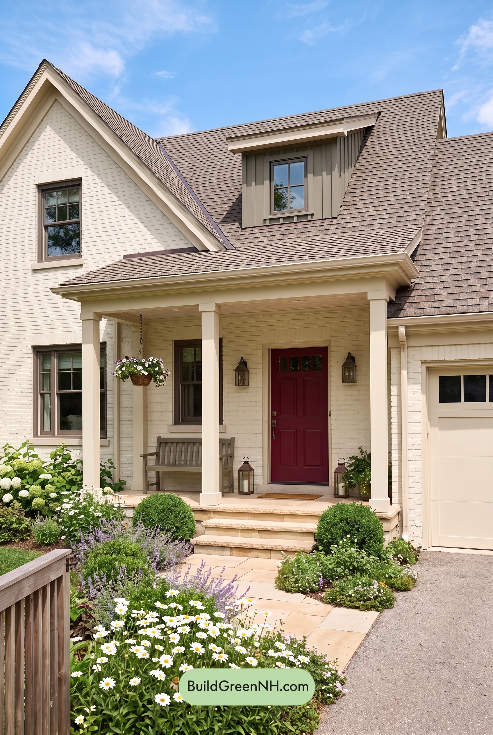

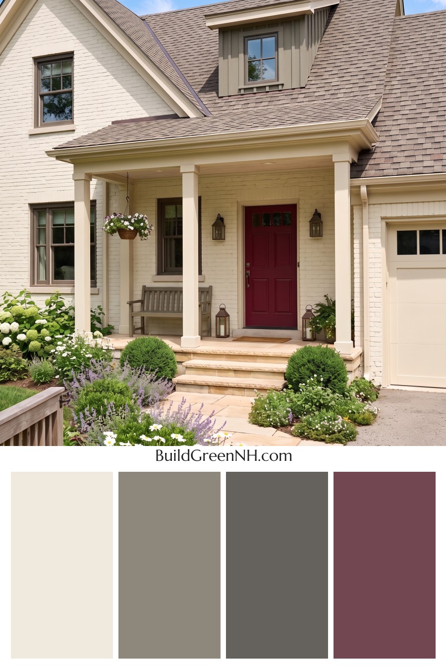
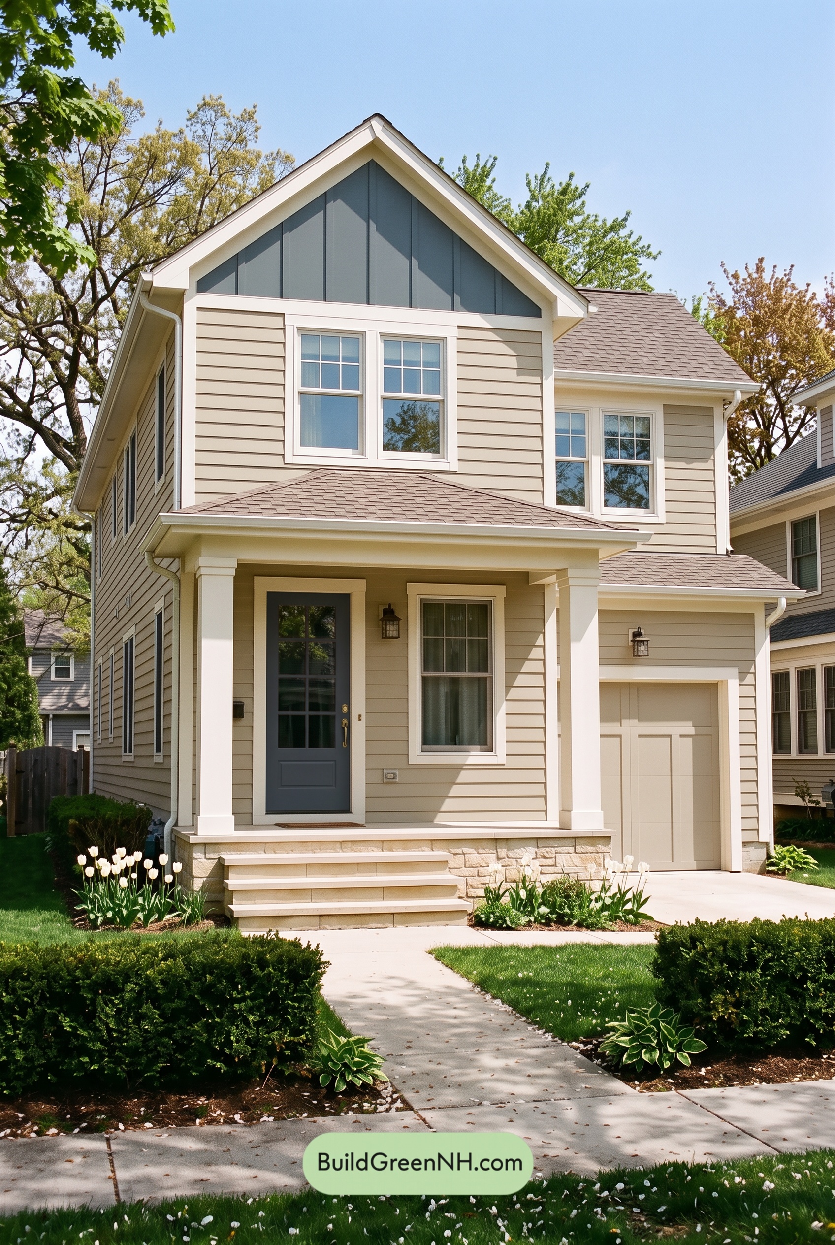
Soft beige, warm gray, and a rich reddish-brown entry give this home its inviting charm, balancing a light, airy exterior with just enough depth to make every architectural detail shine.
A Soft Beige Foundation
A pale, creamy shade of beige covers the main brick walls, bringing warmth to the broad facade while allowing the masonry texture to remain visible. It feels gentle rather than stark—a lovely match for the steep gables and sheltered front porch.
The garage door carries a similar light beige tone, helping it blend into the house instead of competing with the entrance. That repetition keeps the exterior feeling cohesive, even across its different materials and shapes.
Warm Gray Adds Definition
The dormer introduces a deeper, warm gray through its vertical siding. Against the pale walls below, this subtle shift gives the upper story its own character without making it feel disconnected.
Deeper gray window frames provide crisp outlines throughout the facade. Their restrained contrast draws attention to the windows and echoes the dormer, creating a visual link between the main walls and roofline.
Light Trim Frames the Architecture
Light, creamy beige trim traces the gables, eaves, and porch, emphasizing the home’s layered roof shapes. The porch columns repeat that warmth, framing the entry without introducing another competing shade.
Because the trim and walls stay within a closely related color family, the effect is quietly polished. Sunlight and shadow bring out the moldings and column details, doing much of the work that a stronger color contrast might otherwise do.
A Rich Entry and a Grounding Roof
The front door supplies the most concentrated color: a deep reddish brown with a pronounced red undertone. Nestled beneath the pale porch, it becomes a welcoming focal point. Dark brown lanterns add smaller touches of depth nearby.
Above, the shingles blend muted gray and brown shades. Those earthy tones connect the warm beige walls with the gray accents, keeping the large roof surface comfortably integrated into the scheme.
Calm, Collected, and Welcoming
This palette succeeds through balance rather than bold contrast. Light beige opens up the facade, warm gray defines its features, and the deeper entry shade adds personality. Fresh green planting and soft purple flowers sit beautifully alongside these understated neutrals, giving the whole setting an easy, garden-friendly warmth.
Next, see how this color scheme looks under different lighting simulations throughout the day.
Overcast
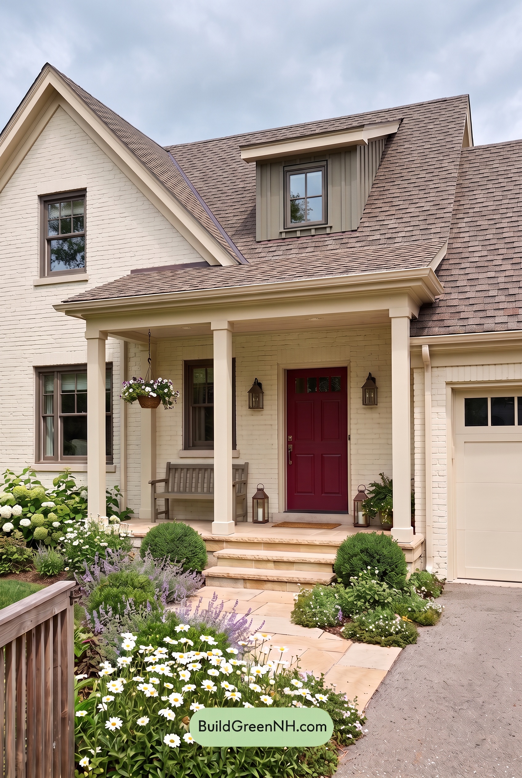
Under overcast skies, the pale beige shades appear slightly cooler and less golden than they would in neutral daylight. Their warmth softens, the midtone grays become more noticeable, and the deeper earthy shades feel subdued rather than vivid. The palette takes on a gently muted quality without losing its welcoming character.
Diffused light softens shadows beneath the rooflines and across the porch, making the lighter shades look more even. Darker grays still provide definition against the pale neutrals, but the transitions feel less crisp. Compared with neutral daylight, the overall mood is quieter and more settled, with subtle shade differences taking the place of stronger light-and-shadow contrast.
Golden Hour
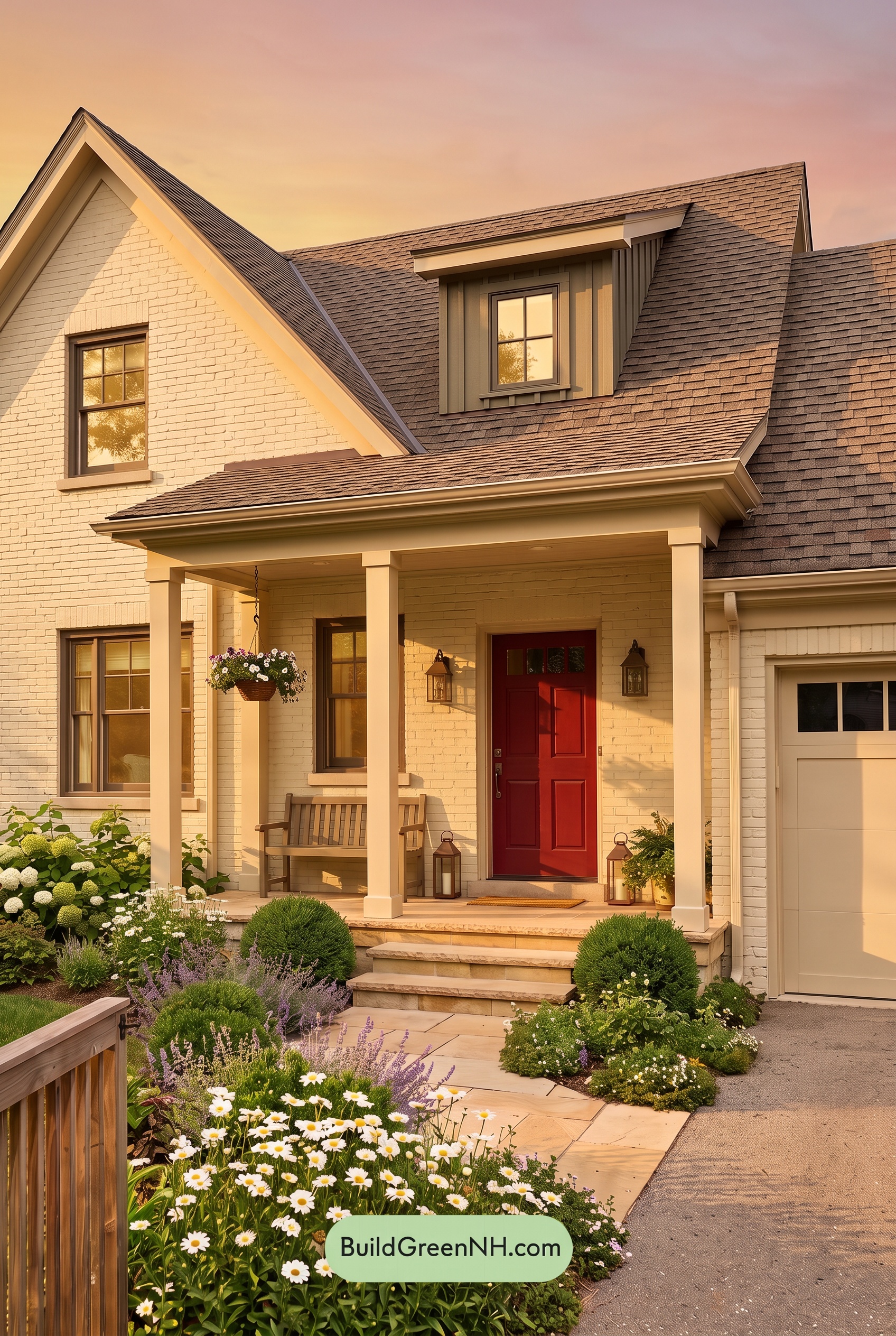
Golden Hour gives the light beige shades a richer, warmer glow than they would have in neutral daylight, drawing out soft yellow undertones across the brick, trim, and columns. The gray shades look less cool in direct sunlight, while the deeper reddish-brown at the entry appears more saturated against the pale exterior.
Long shadows beneath the eaves and across the porch deepen the shaded neutrals, creating stronger light-and-dark contrast even as the palette feels softer and more unified. Compared with the clearer, more balanced appearance of neutral daylight, this warm light gives the house a cozy, welcoming mood and adds depth to its architectural details.
Shade
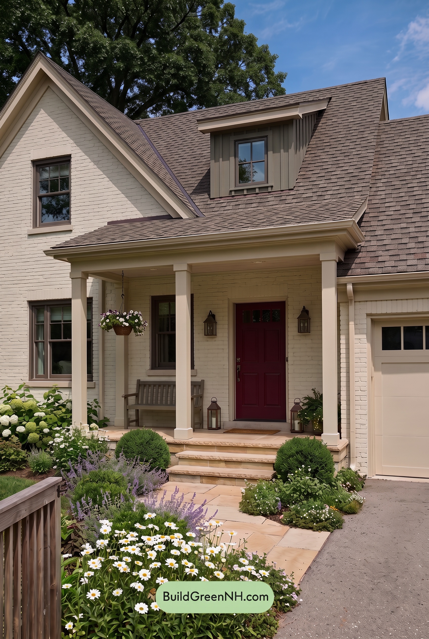
In shade, the pale warm neutrals look quieter and slightly cooler than they would in neutral daylight, with less golden warmth and more noticeable gray undertones. Their already gentle saturation feels further muted, while the deeper gray shades appear darker and more subdued, giving the exterior a calm, understated mood.
Deeper shadows beneath the porch and eaves make the light beige shades stand out against the recessed areas. The darker brown shades lose some of their warmth and read as richer, more enveloping accents. Compared with neutral daylight’s clearer color separation, shade brings the neutrals closer together while preserving a striking light-to-dark contrast around the entry.
Nighttime
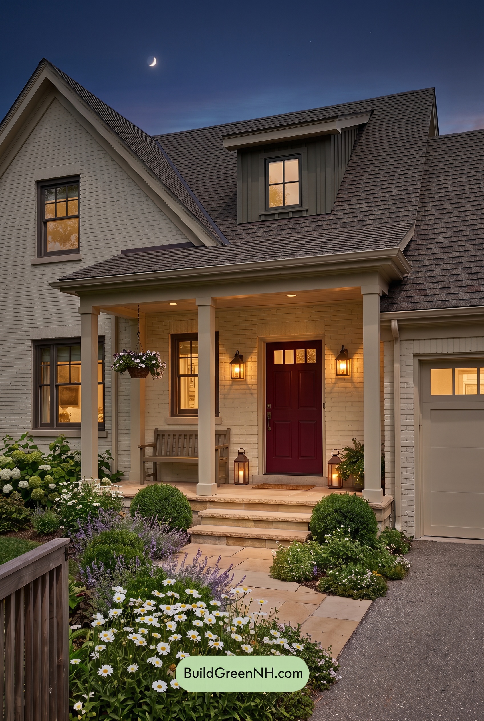
Under nighttime lighting, the light beige walls, trim, and columns shift from the balanced warmth of neutral daylight to softer, golden-tinged shades near the porch lamps. Away from that glow, the same neutrals look cooler and less saturated, while shadows beneath the eaves give them greater depth. The gray dormer and window frames deepen toward charcoal, making the illuminated beige surfaces stand out more clearly.
The deeper brown tones at the entry appear richer beside the warm light, while the beige garage door feels quieter and more muted. Instead of daylight’s evenly revealed palette, nighttime creates pockets of warmth against subdued shadows—a stronger contrast that makes the house feel intimate, sheltered, and welcoming.
Pin these for later:
Want More?
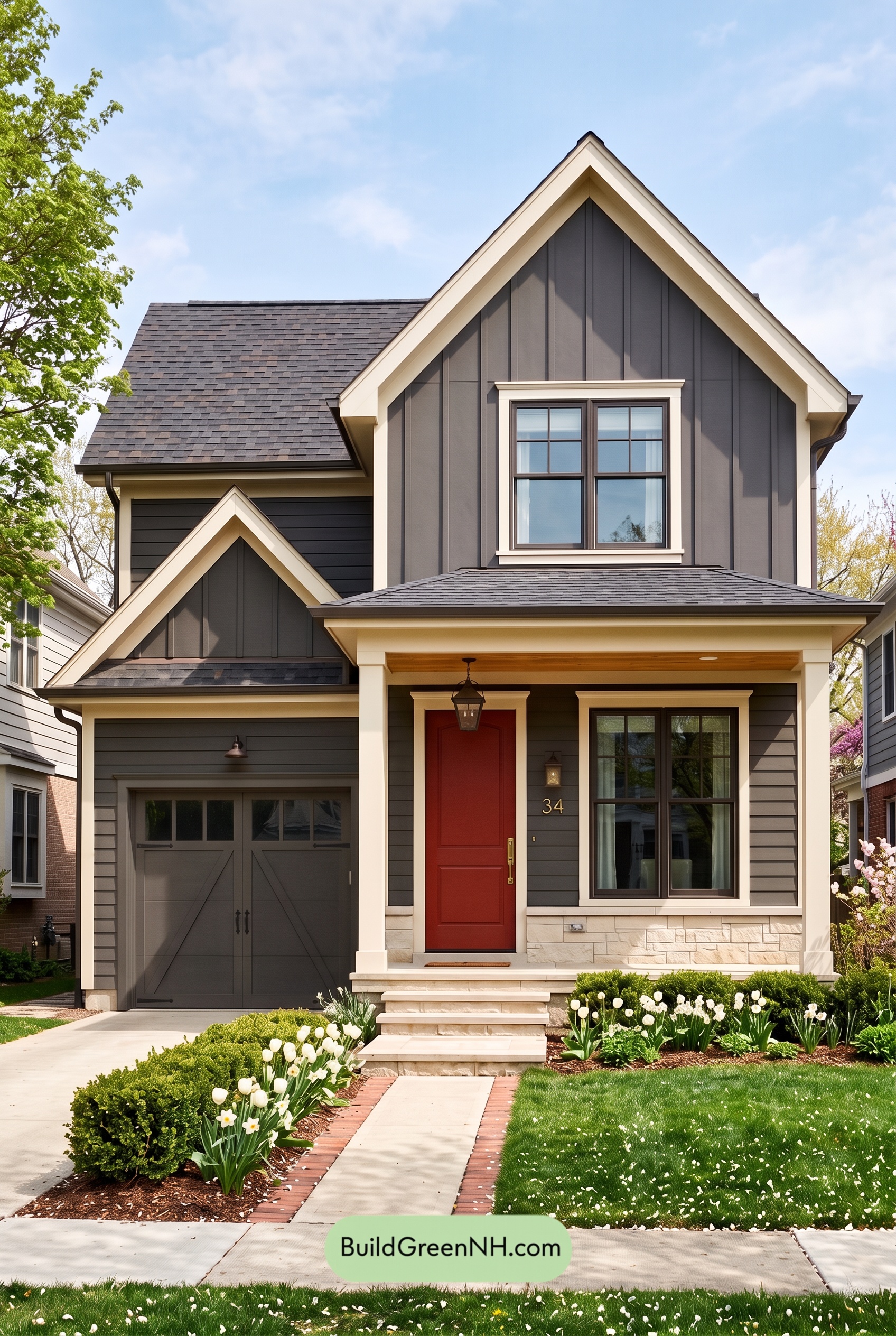 Red Front Door House Paint Color Scheme: Charcoal Cream Welcome
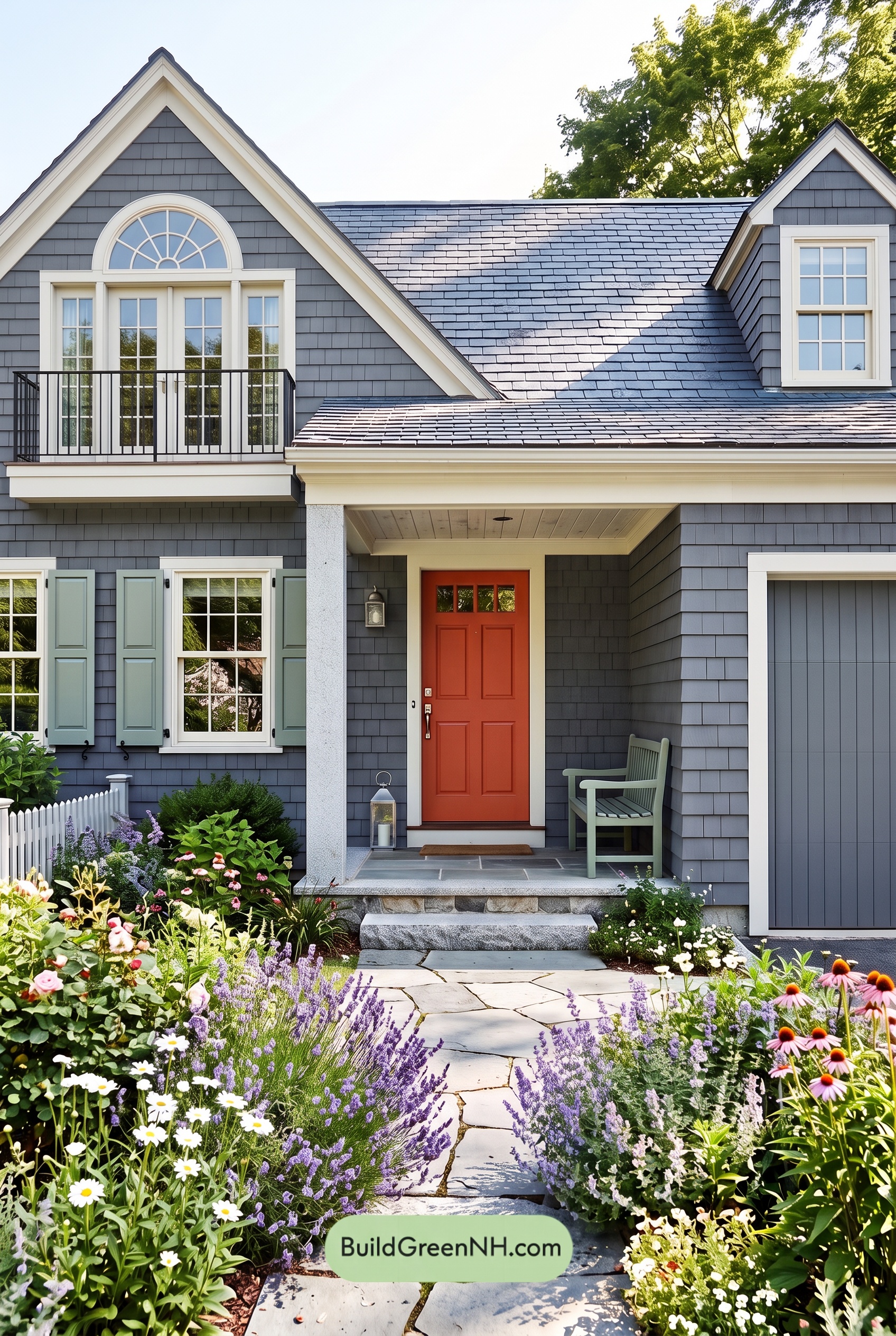 Red Front Door House Paint Color Scheme: Charcoal Sage Reverie
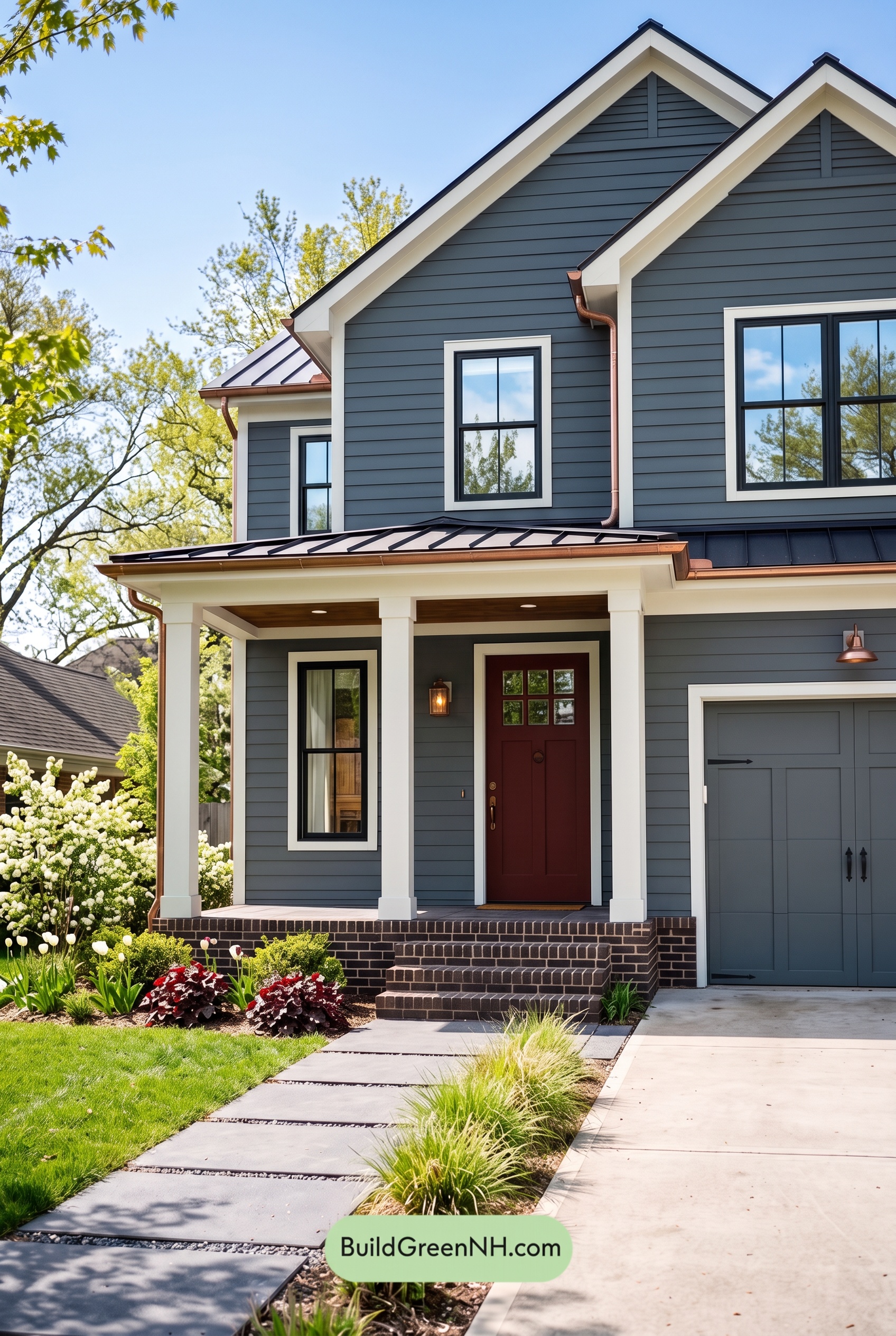 Red Front Door House Paint Color Scheme: Charcoal Copper Confidence
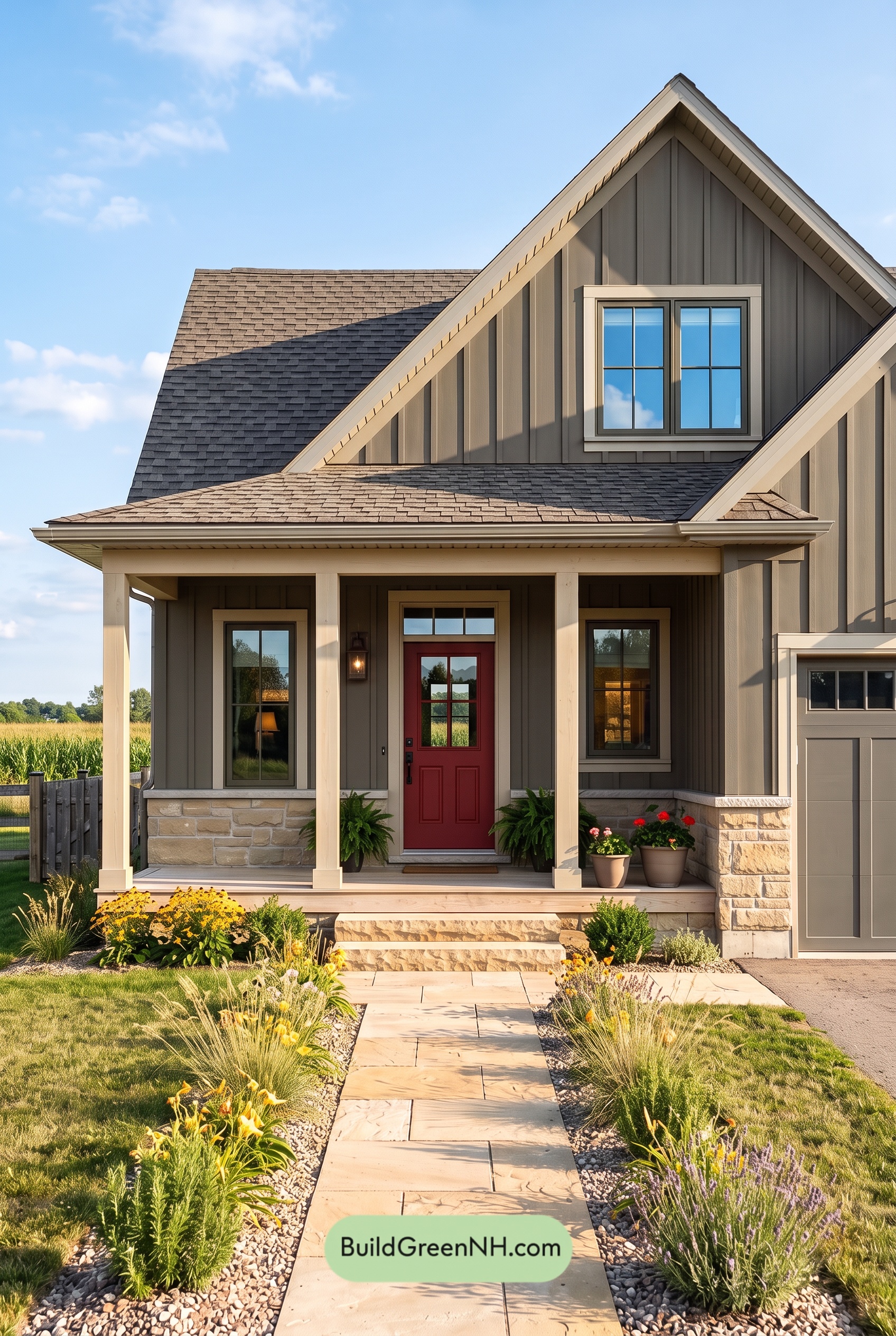 Red Front Door House Paint Color Scheme: Charcoal Sand Serenity
 Red Front Door House Paint Color Scheme: Ivory Crimson Poise
Table of Contents