Last updated on
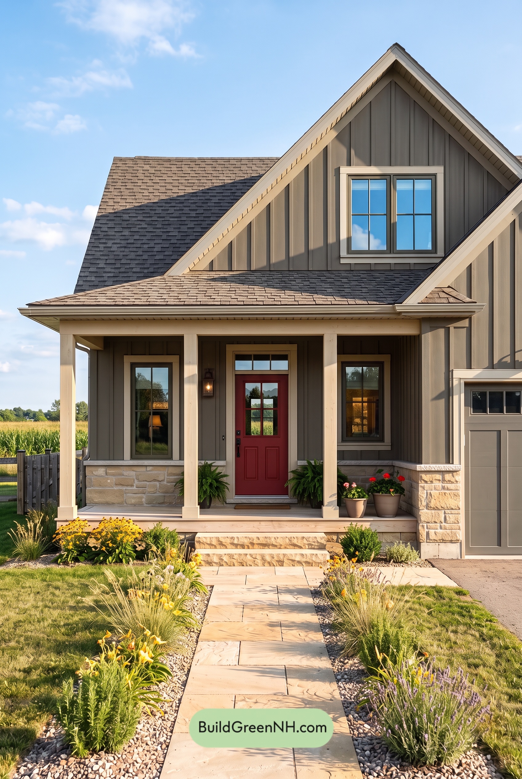

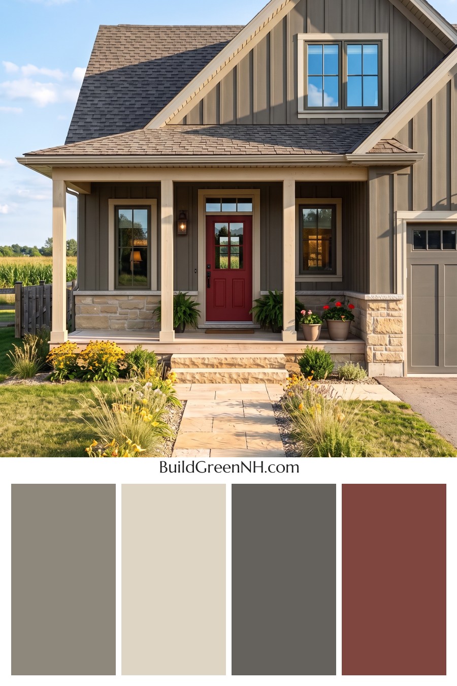
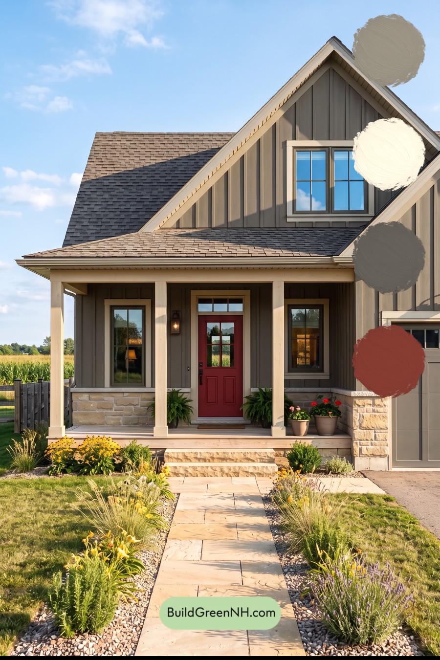
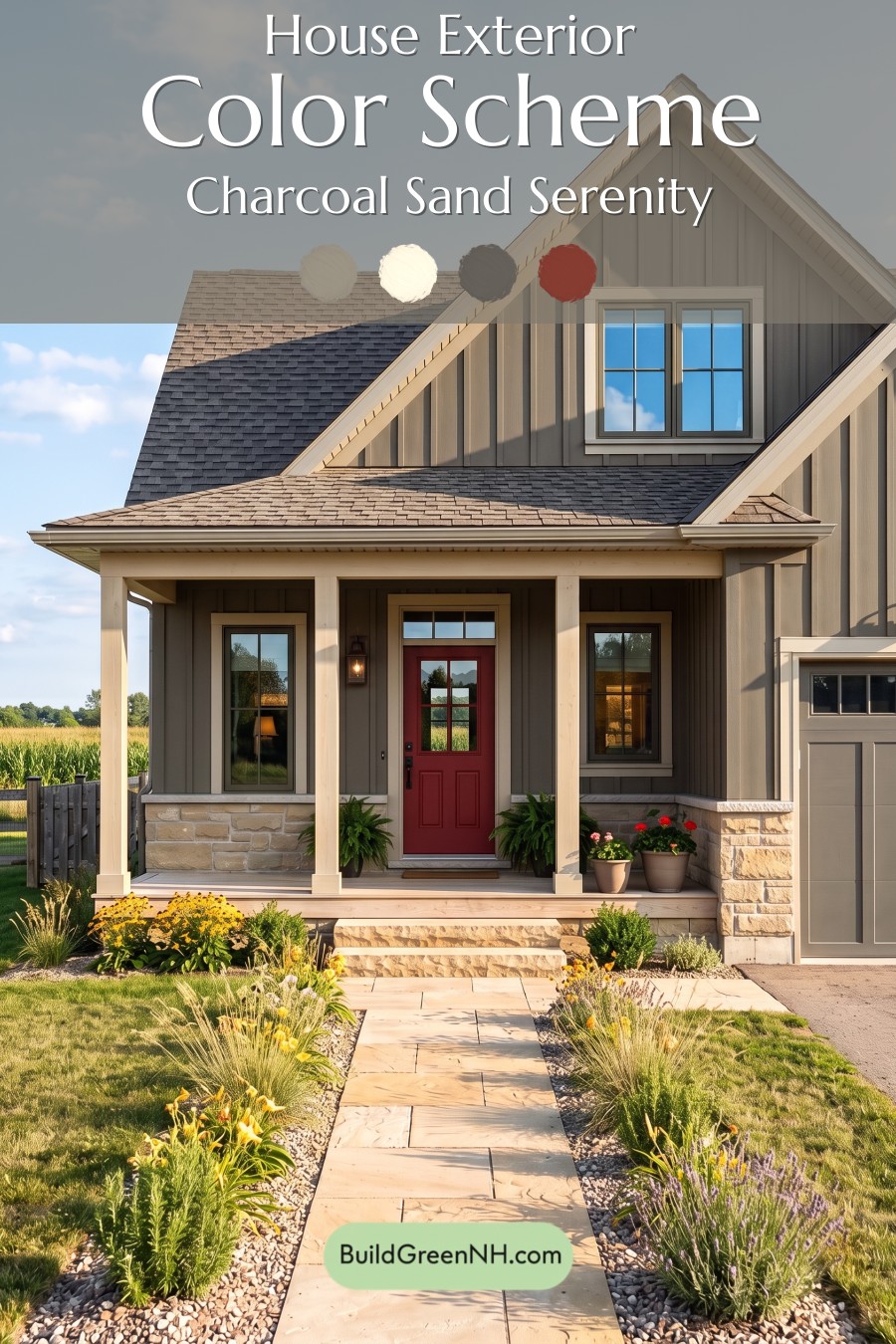
Warm gray siding, soft beige trim, and a rich reddish-brown front door give this home a beautifully balanced exterior that feels polished without losing its welcoming charm.
Warm Gray Gives the Siding Depth
A medium shade of warm gray covers the board-and-batten siding, creating a calm backdrop for the home’s steep gables and generous front porch. Subtle brown undertones keep the gray from feeling cold, especially beside the surrounding greenery.
The vertical battens add another layer of interest. Sunlight brightens their edges while shadows deepen the recessed surfaces, giving the siding dimension without introducing another color.
Soft Beige Brings the Details Forward
Light beige trim outlines the roof peaks, windows, and porch, gently separating each architectural feature from the darker walls. It offers clear definition, but the contrast feels softer than a bright white would.
The porch columns repeat this creamy beige shade, making the covered entry feel lighter and more open. Carrying the same color across the porch beam and roofline also connects the broad horizontal elements with the tall, pointed gables.
A Rich Entry Accent and Quiet Supporting Shades
The front door introduces a deep reddish brown that draws attention beneath the shaded porch. Its warm red undertones provide a lively counterpoint to the restrained gray siding, giving the entrance a distinct focal point.
Deep gray window frames add crisp definition inside the lighter beige surrounds. Meanwhile, the garage door stays within the gray family, allowing its large surface to blend comfortably with the siding rather than compete with the entry.
A Roof and Stone Base That Tie It Together
The shingles combine muted gray and brown shades, bridging the cooler window frames and warmer trim. Their mottled appearance adds texture while keeping the roof visually connected to the rest of the exterior.
At ground level, the stonework mixes sandy beige, pale taupe, and soft gray. These shades echo the painted surfaces and give the porch a grounded finish. Together, the colors create an easygoing, welcoming mood: enough contrast to celebrate the architecture, with enough warmth to make the house feel at home in its garden setting.
Next, see how this color scheme looks under different lighting simulations throughout the day.
Overcast
Under overcast skies, the gray siding appears cooler and more muted than in neutral daylight, with its warm undertones becoming less noticeable. The pale beige trim and columns feel softer and less golden, giving the exterior a quieter, less saturated appearance while retaining a gentle warmth against the gray.
Cloud-filtered light softens shadows along the siding and beneath the eaves, reducing the contrast between bright surfaces and shaded recesses. The lighter trim still outlines the house clearly, but the transitions feel gentler. Compared with neutral daylight, the overall mood becomes calmer and more understated, with the neutral shades feeling especially cohesive.
Golden Hour
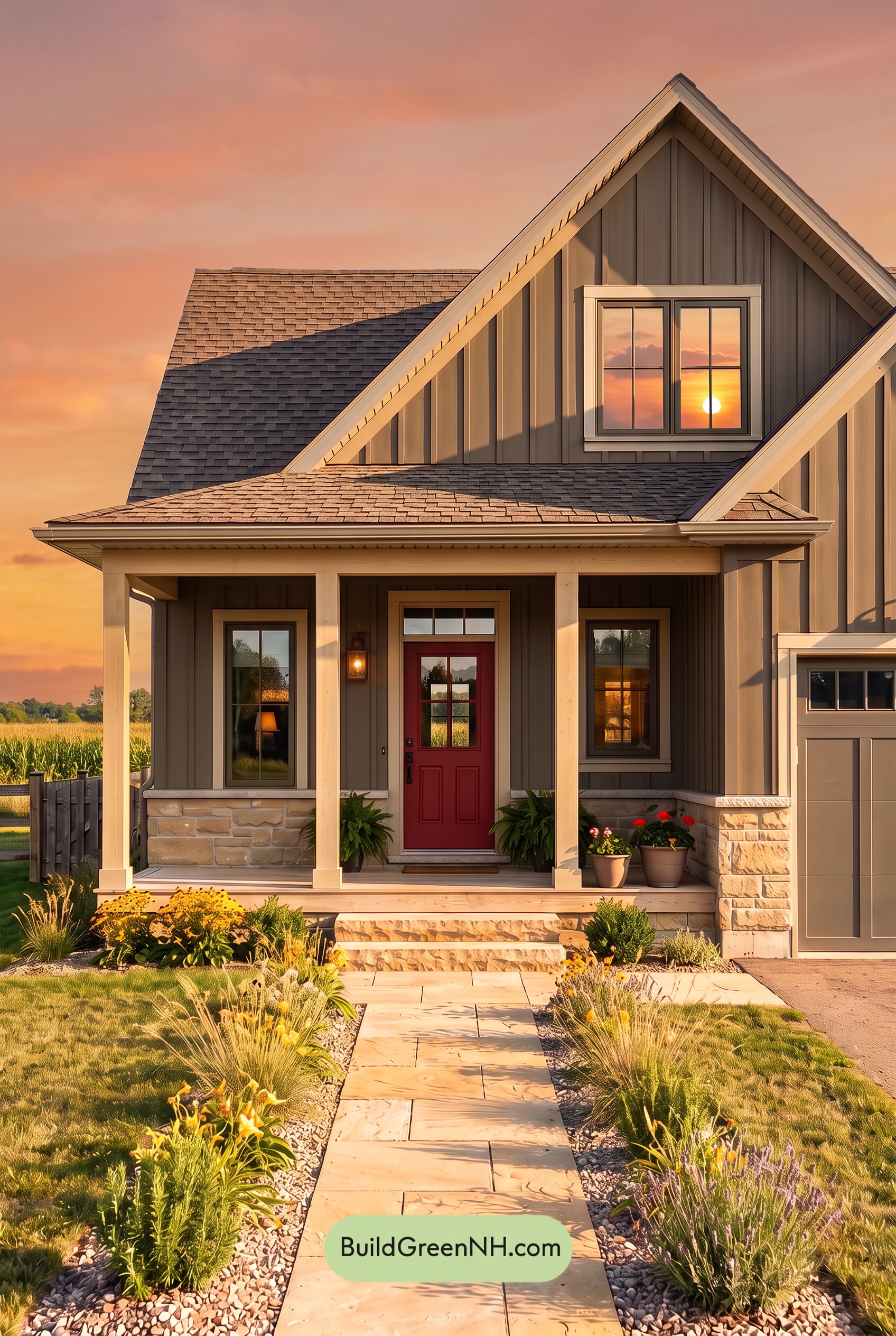
Golden Hour gives the gray siding a warmer, softer appearance, bringing out subtle brown undertones that feel less noticeable in neutral daylight. The pale beige trim and columns take on a gentle yellow glow, making these quiet neutrals appear richer without becoming overly saturated. Sunlit sections feel luminous, while shaded gray areas deepen and retain a cooler cast.
Long, angled shadows beneath the porch and along the siding create stronger contrast, giving the exterior more depth than it would have under even daylight. The darker shades around the windows and entry feel more pronounced against the glowing trim. The overall mood shifts from crisp and understated to warm, relaxed, and inviting.
Shade
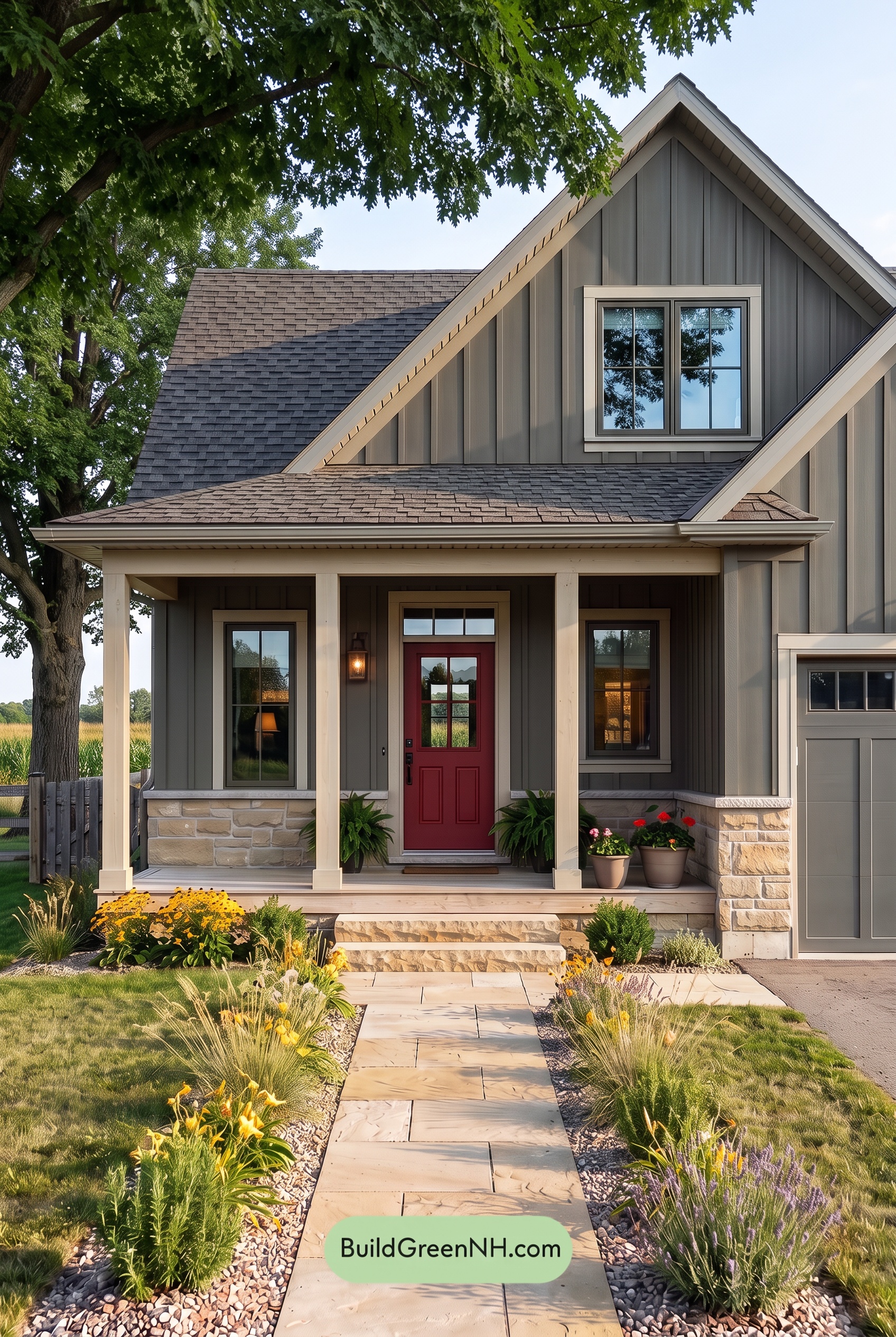
Compared with neutral daylight, shade gives the gray shades a deeper, cooler appearance, with subtle warmth receding and saturation feeling more subdued. The pale beige shades lose some of their golden glow, reading softer and creamier against the darker grays while keeping the exterior from feeling too cool.
Beneath the porch and eaves, deeper shadows draw the gray shades toward charcoal, making the lighter beige accents stand out more clearly. Across the broader shaded surfaces, gentler light softens smaller color variations. The overall mood shifts from crisp and open in neutral daylight to quiet, grounded, and inviting.
Nighttime
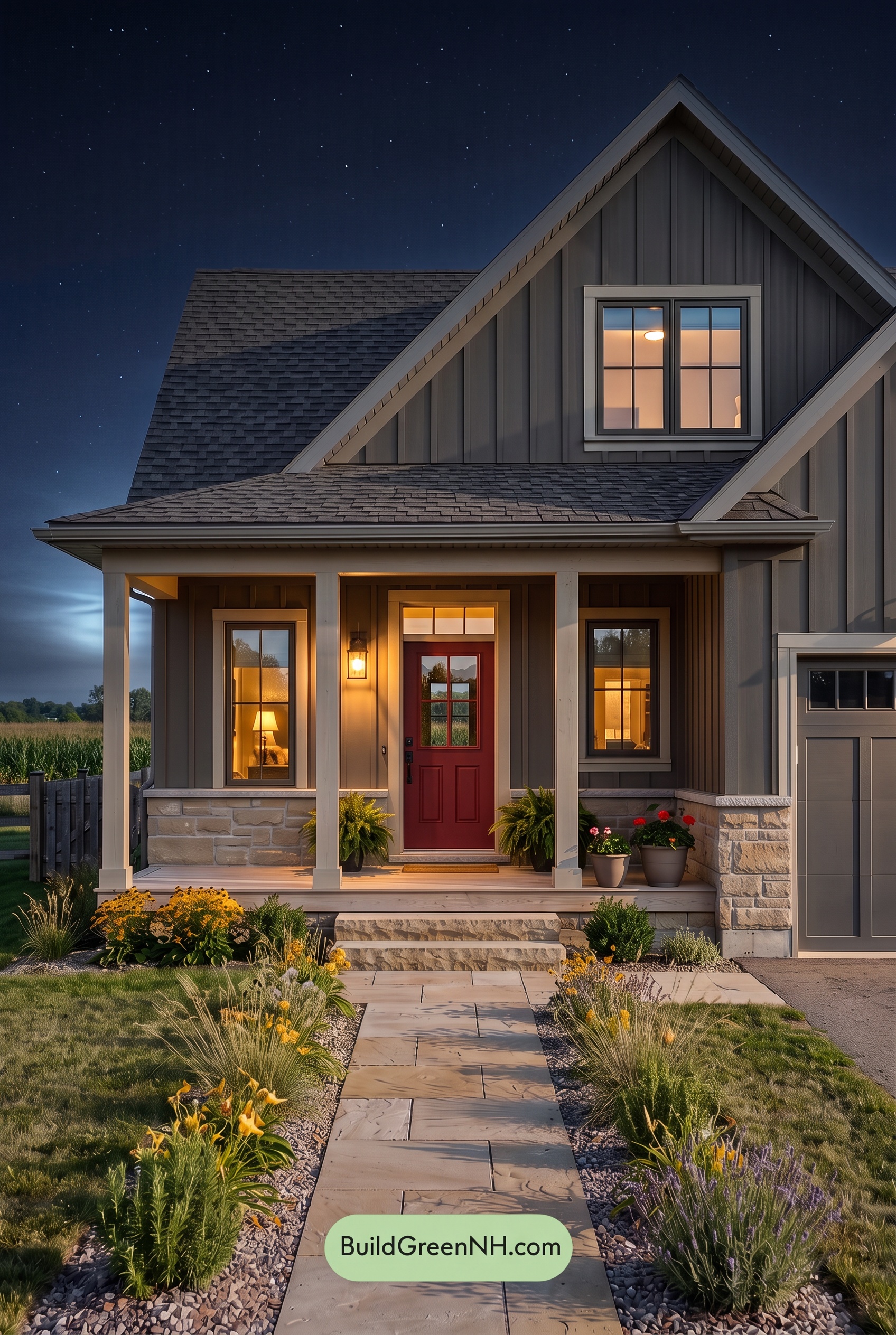
At night, the gray shades deepen and feel more subdued than they would in neutral daylight, with cooler undertones emerging away from the porch light. Shadows beneath the eaves and between the siding’s vertical lines add depth, while the softly lit beige shades take on a warmer, creamier appearance.
Around the entrance, warm lighting makes the reddish-brown shade feel richer and more saturated against the muted neutrals. The contrast between illuminated pale shades and shadowed grays becomes more dramatic, drawing attention toward the doorway. Compared with daylight’s more even color balance, the nighttime palette feels intimate and welcoming, with a cozy glow framed by cooler, quieter shades.
Pin these for later:
Want More?
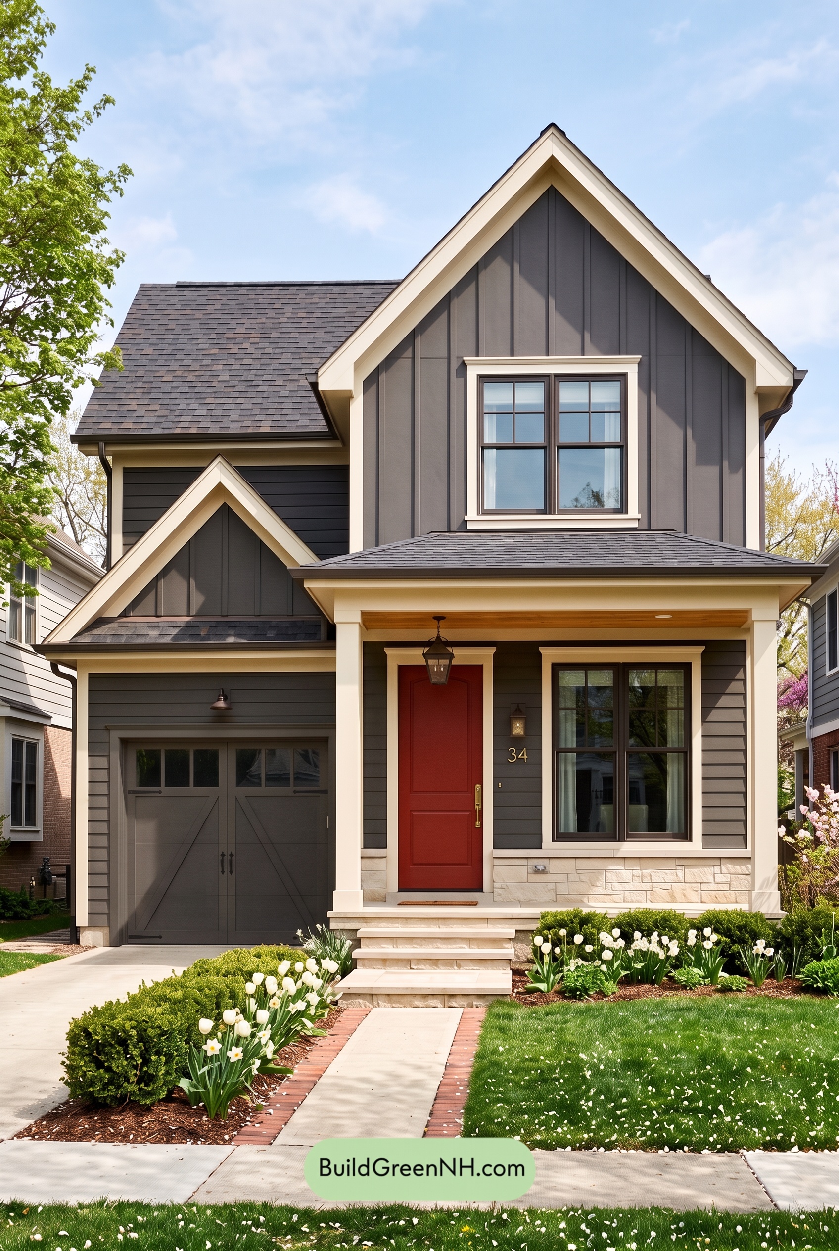 Red Front Door House Paint Color Scheme: Charcoal Cream Welcome
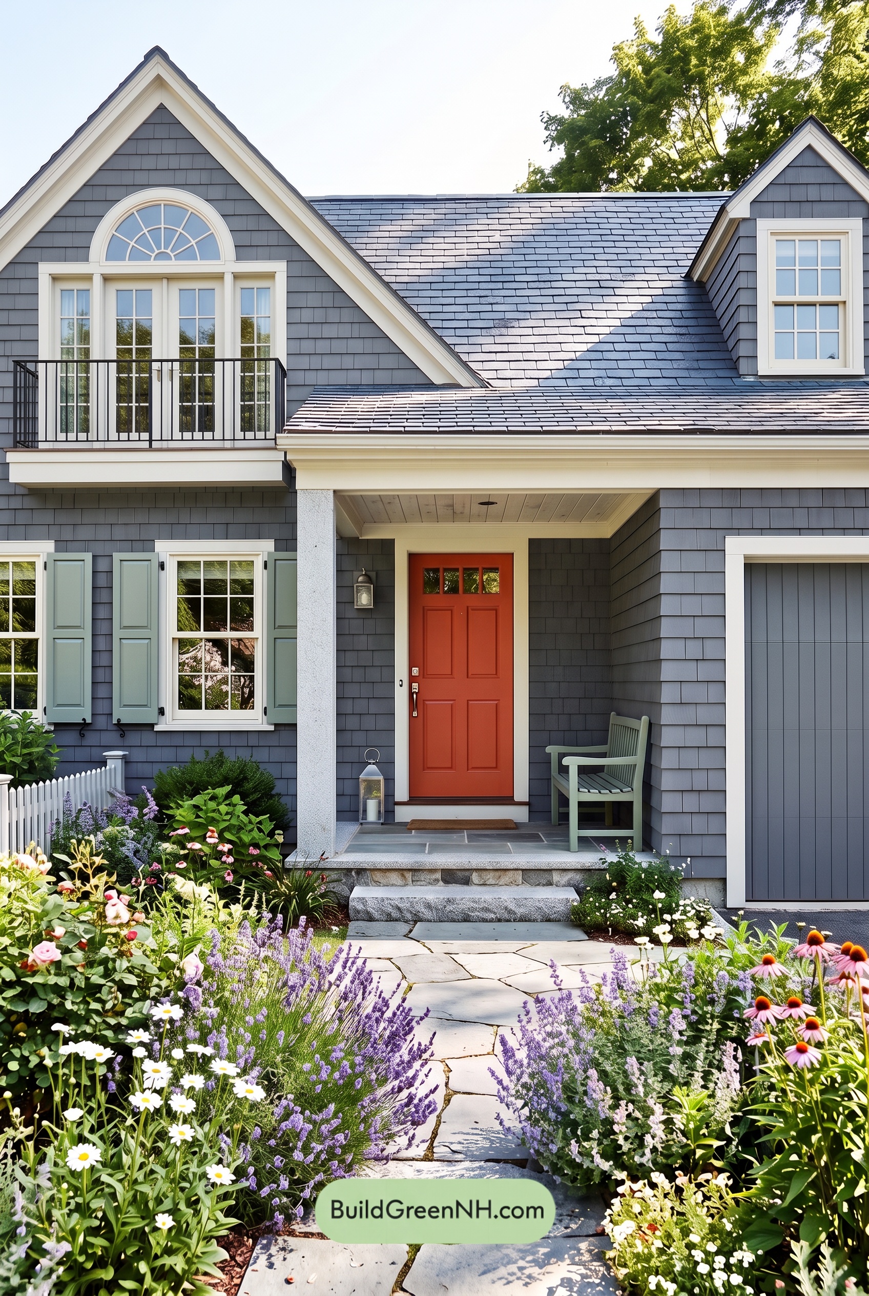 Red Front Door House Paint Color Scheme: Charcoal Sage Reverie
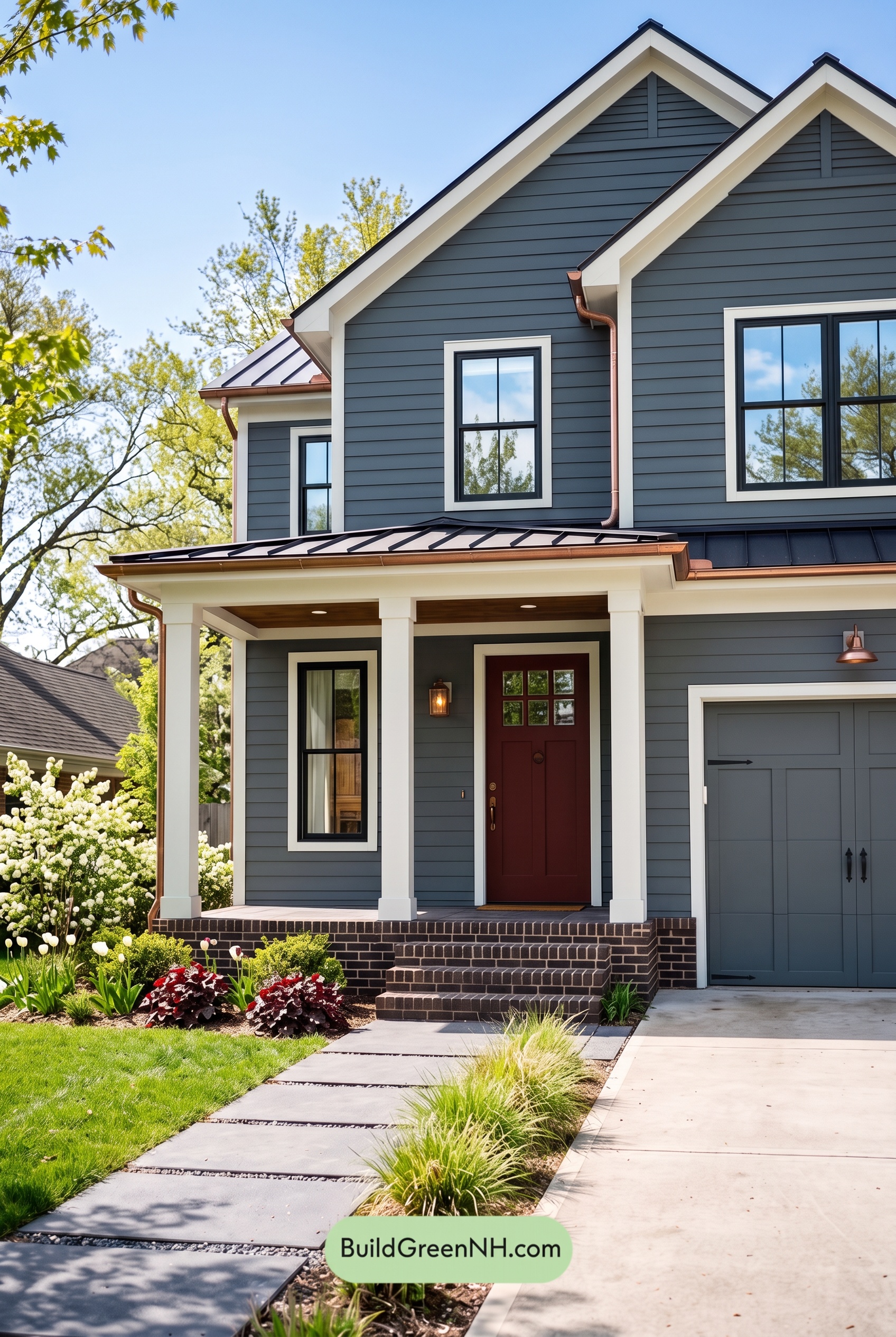 Red Front Door House Paint Color Scheme: Charcoal Copper Confidence
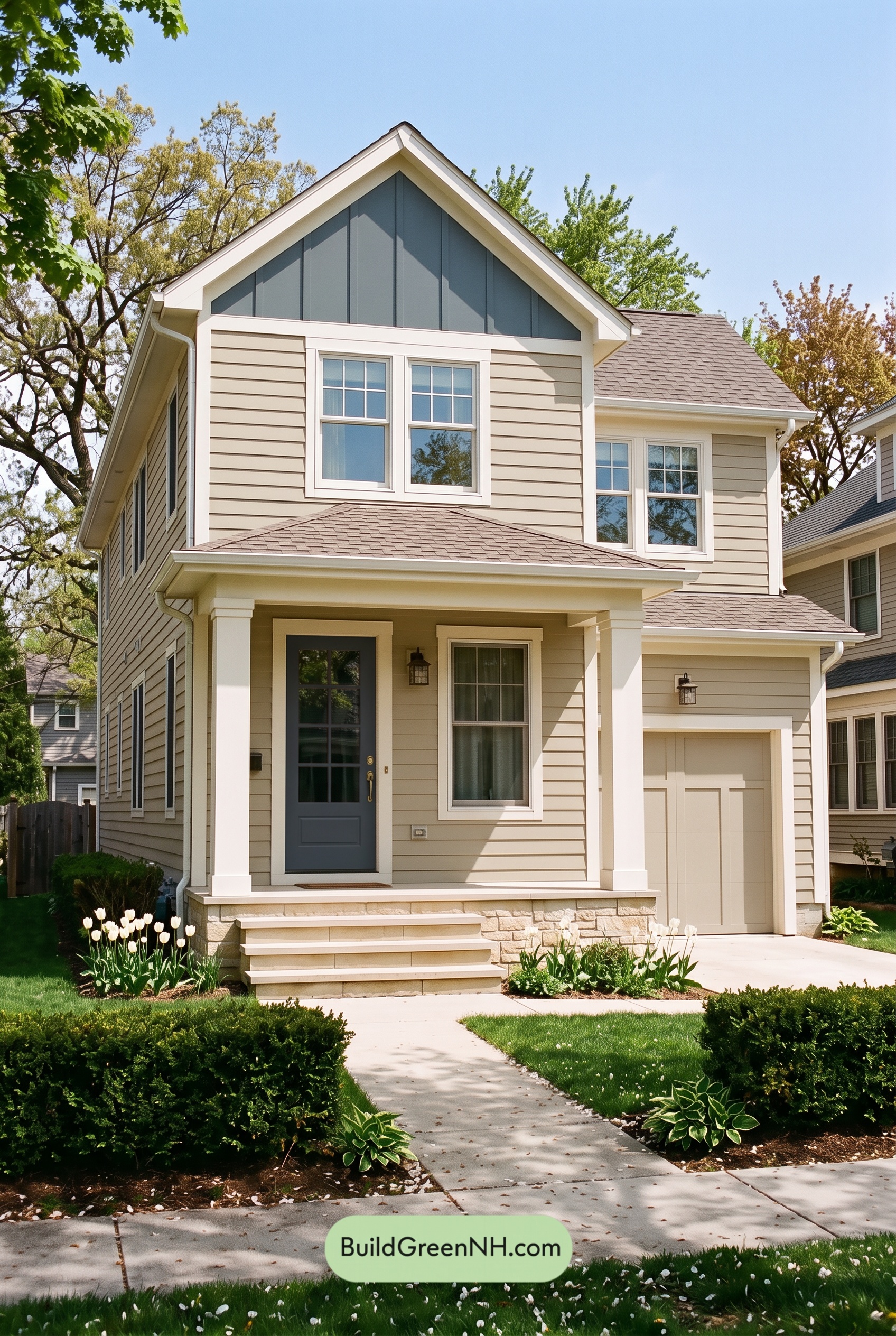 Red Front Door House Paint Color Scheme: Ivory Crimson Poise
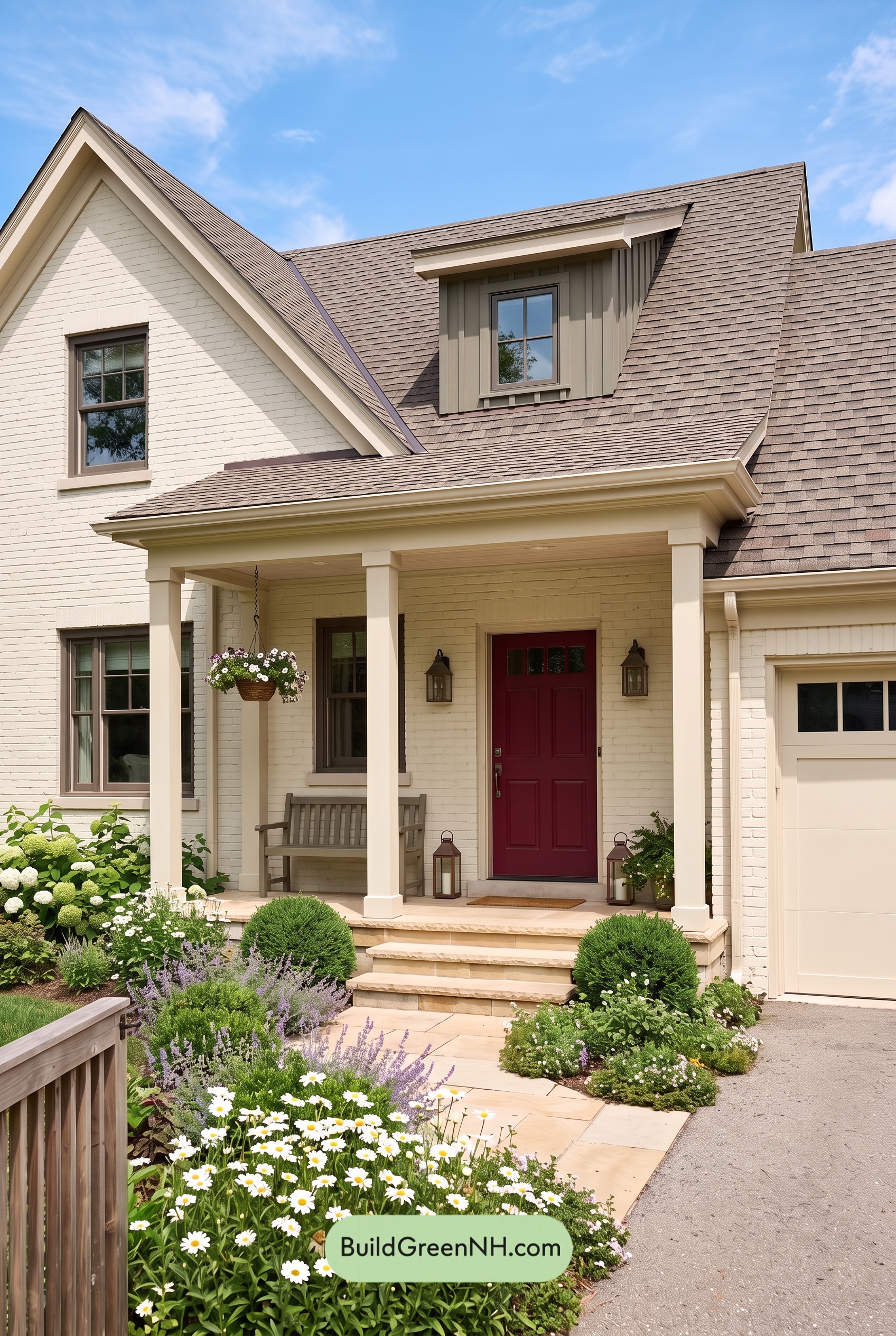 Red Front Door House Paint Color Scheme: Cream Ruby Hush
Table of Contents