Last updated on
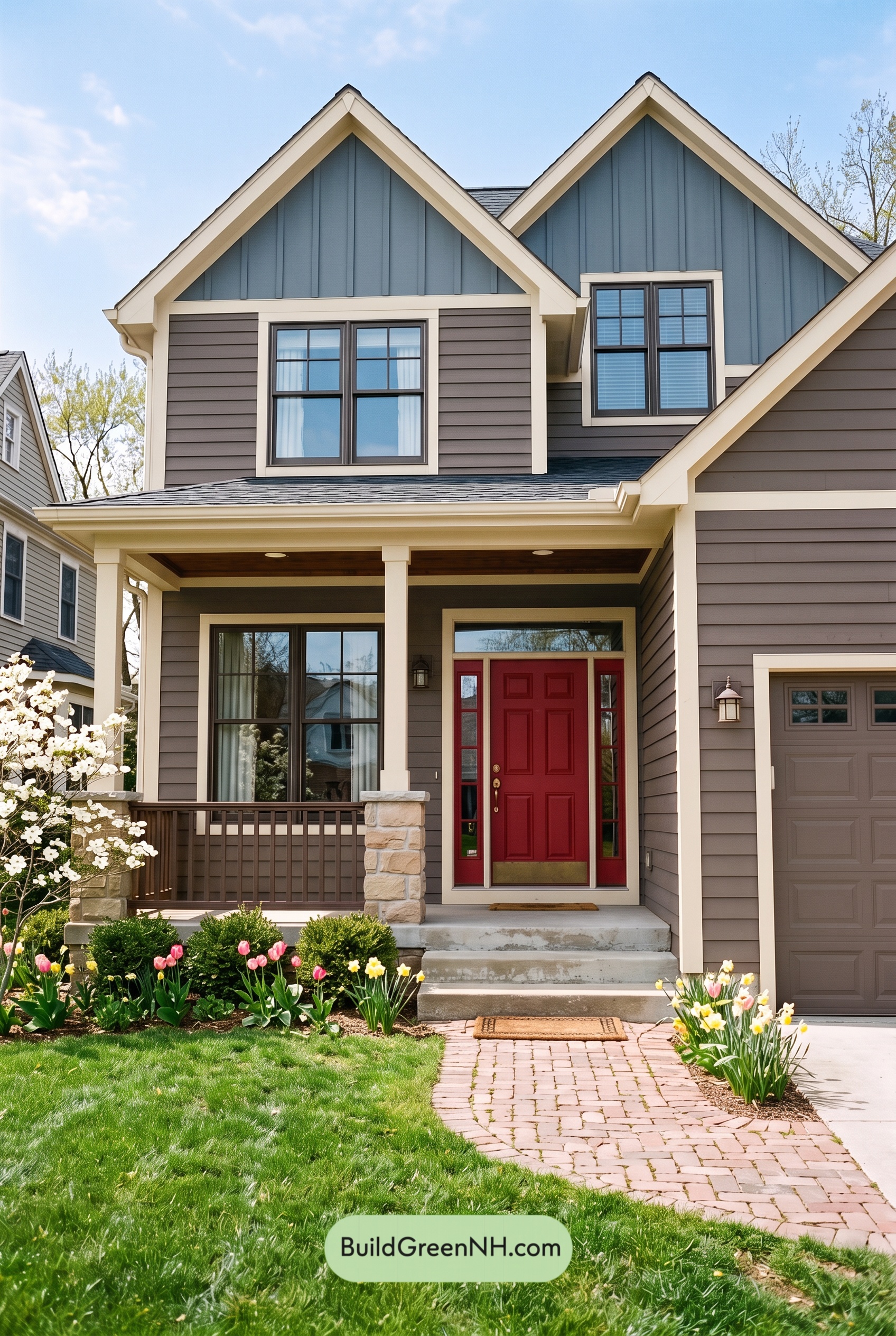

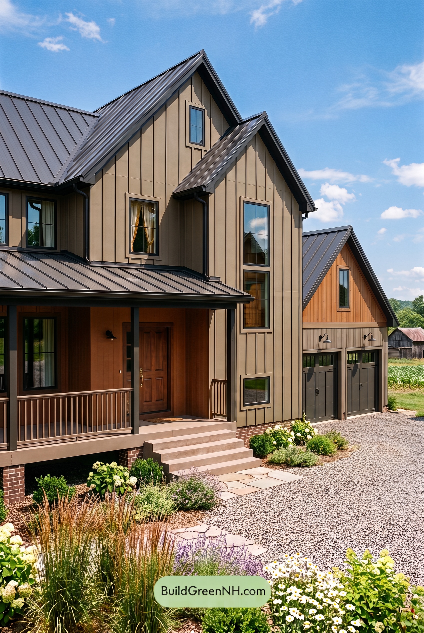
Warm taupe, muted blue, and creamy beige give this home an inviting balance of earthy comfort and crisp architectural detail, while a deep red entry adds a memorable finishing touch.
Earthy Siding with a Cool Contrast
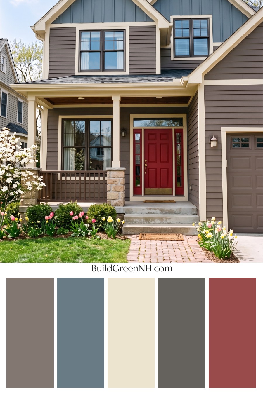
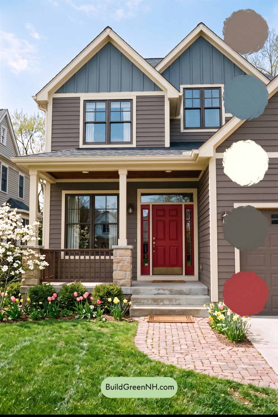
A medium shade of gray-brown covers the horizontal siding, creating a grounded backdrop across the main walls and garage-facing gable. Its soft, taupe-like character brings warmth without feeling heavy, allowing the home’s varied textures and rooflines to stand out.
Above, the vertical siding shifts to a muted blue with gray undertones. This cooler shade draws attention to the tall gables and provides a gentle contrast to the brown below. Because both shades are subdued, the transition feels harmonious rather than abrupt.
Creamy Beige Frames the Architecture
Light, creamy beige traces the roof edges, outlines the windows, and defines the corners of the house. It also carries across the porch beams and columns, connecting the upper story to the sheltered entrance. Against the deeper siding, these pale borders make the architectural lines easy to appreciate.
The warmth of the beige matters. It softens the contrast with the blue and brown, giving the exterior a welcoming character rather than a stark, sharply divided appearance. Pale beige and sandy shades in the stone column bases reinforce that warmth while adding natural variation.
A Rich Entry and a Quiet Garage
The front door and its sidelights introduce a deep, earthy red with brown undertones. Framed in creamy beige, this richer accent gives the entrance a clear sense of importance without competing with the blue gables. It is a small area of stronger color with plenty of impact.
The garage door takes a quieter approach. Its medium taupe-brown shade closely relates to the surrounding siding, helping the broad surface blend into the façade and keeping attention on the porch and front door.
Dark Details Bring Everything Together
Deep charcoal-gray window frames add definition within the lighter surrounds. The porch railings read as a warm brown-gray, providing a similarly dark outline at ground level. Overhead, charcoal-gray roofing completes the palette without introducing another competing hue.
The result feels composed, comfortable, and full of character. Warm browns establish the foundation, softened blue lifts the upper walls, and creamy beige ties the architecture together. With the deeper entry color supplying a welcoming focal point, the scheme offers contrast without losing its sense of calm.
Next, see how this color scheme looks under different lighting simulations throughout the day.
Overcast
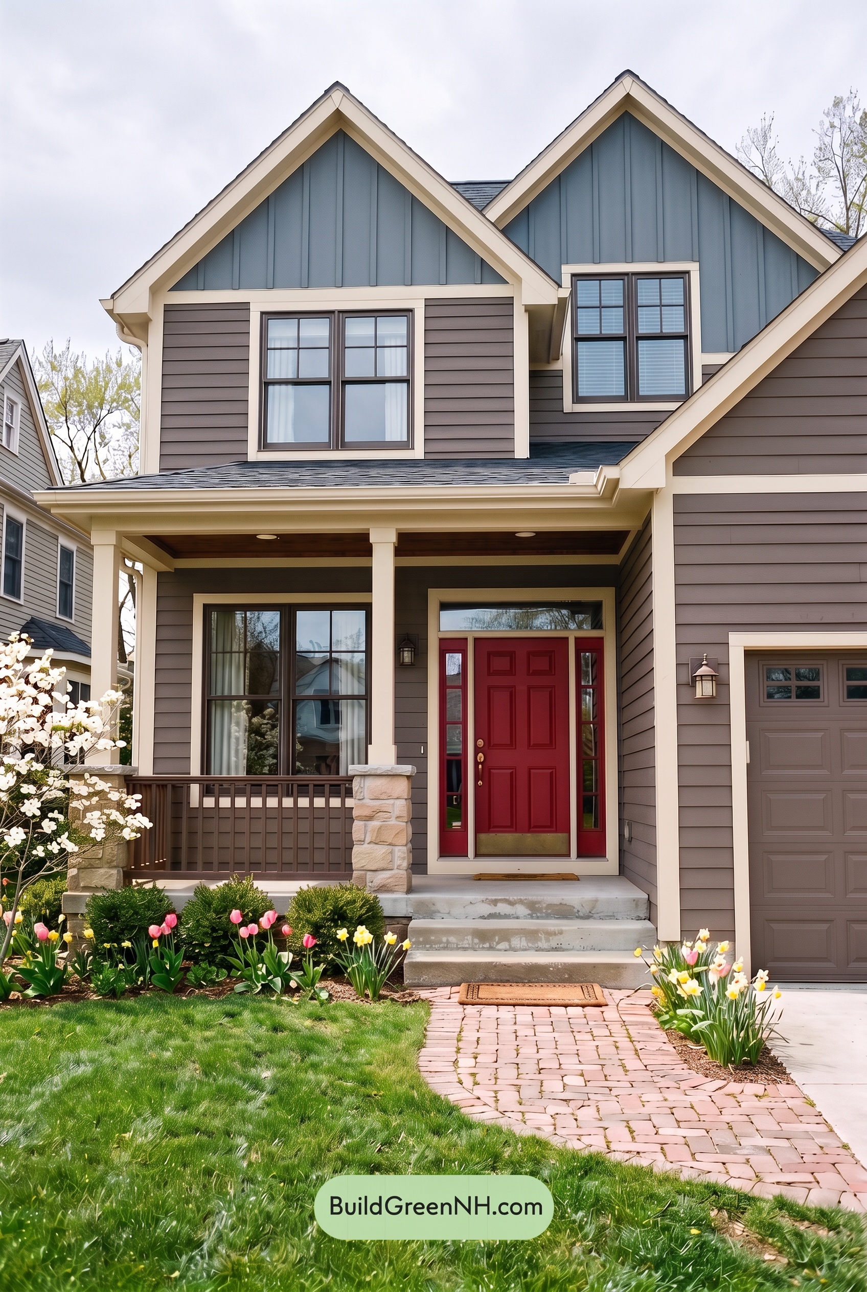
Under overcast skies, the brown siding looks more muted and gray-leaning than it does in neutral daylight, with less warmth coming through. The blue upper walls take on a softer, duskier character, while the pale beige trim feels less golden. This gentler saturation gives the palette a quiet, cohesive feel without losing the distinction between warm neutrals and cool blues.
Diffused light softens shadows beneath the gables and along the siding, reducing the contrast between highlights and shaded areas. The light beige edges still stand out against the deeper brown and blue shades, but less sharply. Dark gray accents feel more understated, shifting the house toward a calm, restful mood.
Golden Hour
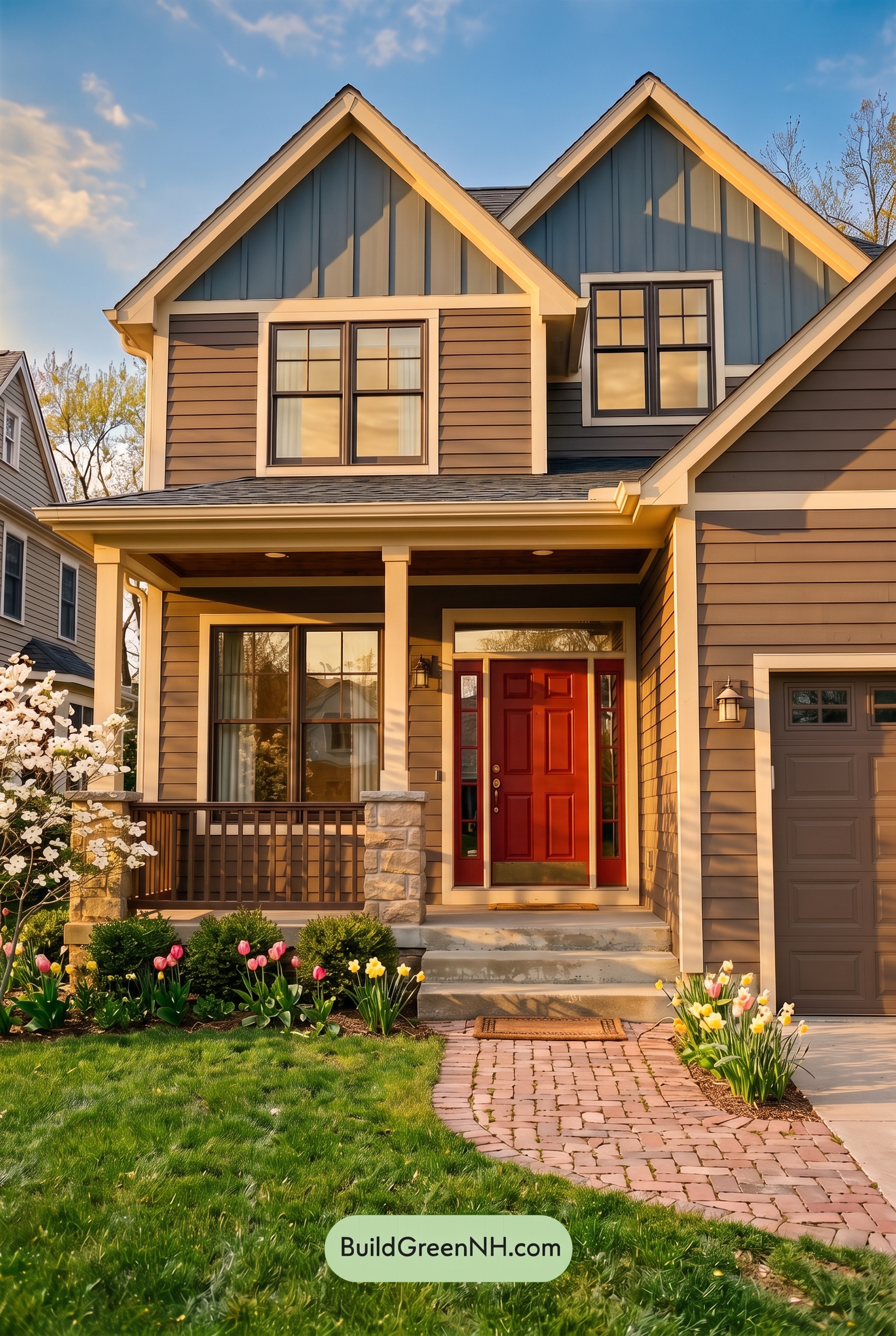
Golden Hour gives the browns a richer, warmer presence than neutral daylight, drawing out reddish undertones and making sunlit areas feel more saturated. The pale beige shades take on a soft yellow glow, while the blue shades look more muted where warm light reaches them and deeper, cooler beneath the gables.
Long, angled shadows sharpen the contrast between glowing edges and shaded recesses, adding depth across the siding and porch. Dark gray accents appear more pronounced against the illuminated neutrals. Compared with the clearer, more evenly balanced palette of neutral daylight, the house feels warmer, cozier, and more dramatic.
Shade
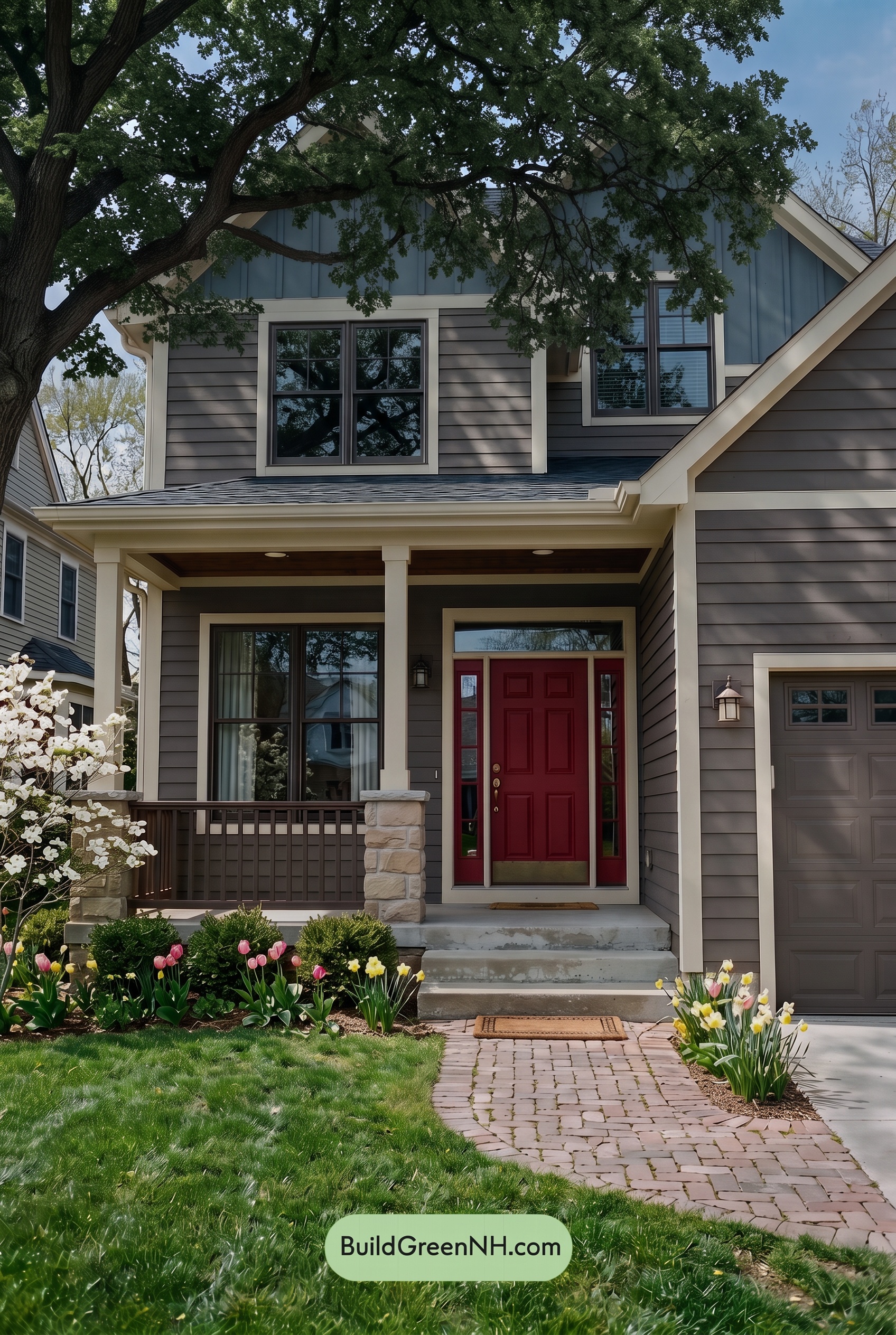
Shade gives this exterior a cooler, quieter character than neutral daylight. The brown shades appear deeper and grayer, with less visible warmth, while the blue shades feel duskier and more muted rather than brightly saturated. The pale beige shades lose some of their golden warmth, offering a softer balance to the darker colors.
Beneath the porch and tree canopy, deeper shadows bring the brown and gray shades closer together, making subtle color differences harder to distinguish. The pale beige still provides clear contrast, gently outlining the darker surfaces. Compared with the more evenly revealed palette of neutral daylight, the shaded exterior feels calm, grounded, and a little more dramatic.
Nighttime
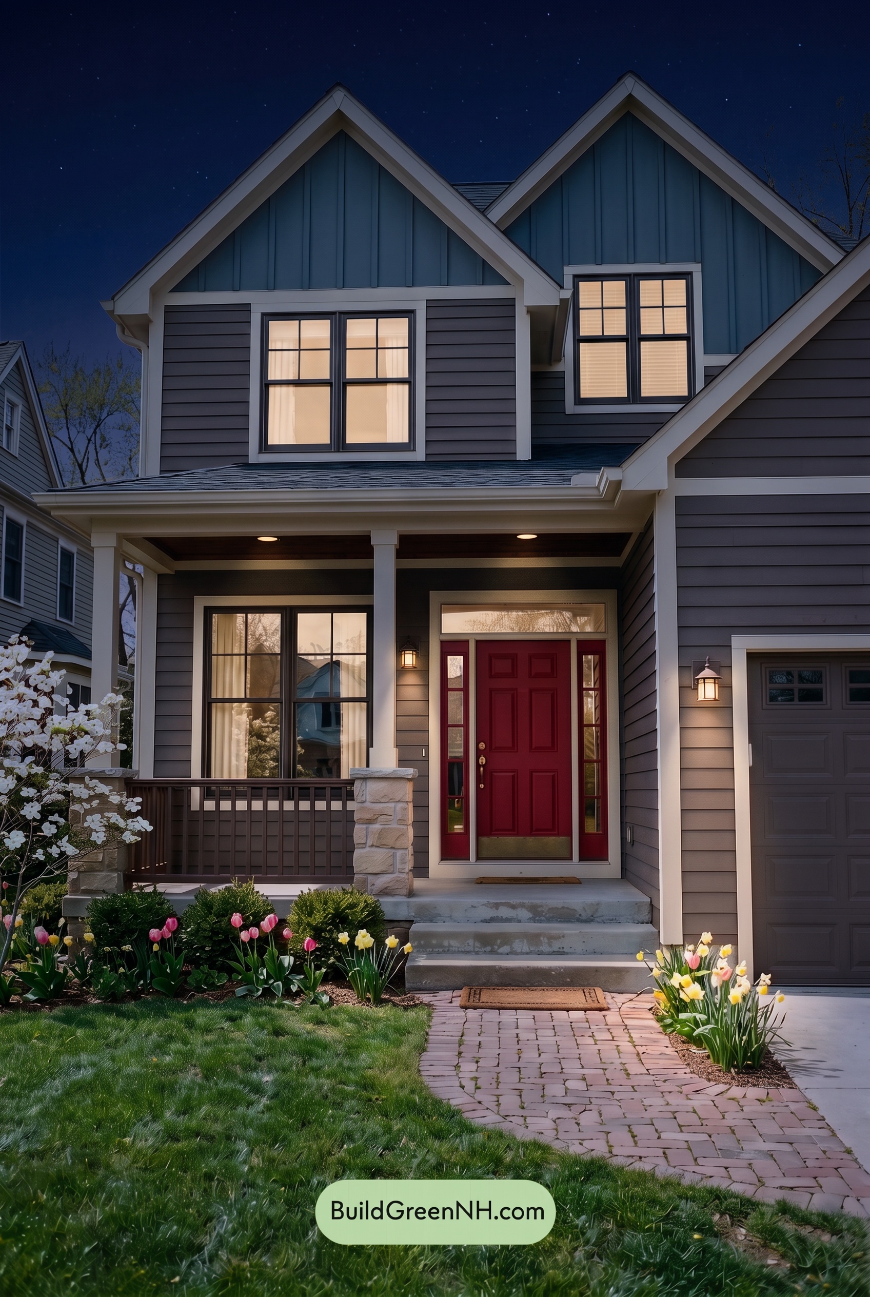
At night, the blue upper walls deepen into a quieter, more muted shade, while the brown-toned siding looks cooler and less saturated away from the lights. Compared with neutral daylight, shadows beneath the eaves and porch soften the distinctions between darker shades, giving the exterior a more subdued, intimate feel.
Warm porch lighting brings a gentle golden cast to nearby browns and makes the light beige trim feel creamier. Those illuminated edges stand out against the shadowed walls, while gray details recede toward charcoal. The contrast shifts from evenly defined daytime colors to pockets of warmth against cool darkness, creating a cozy, welcoming mood.
Pin these for later:
Want More?
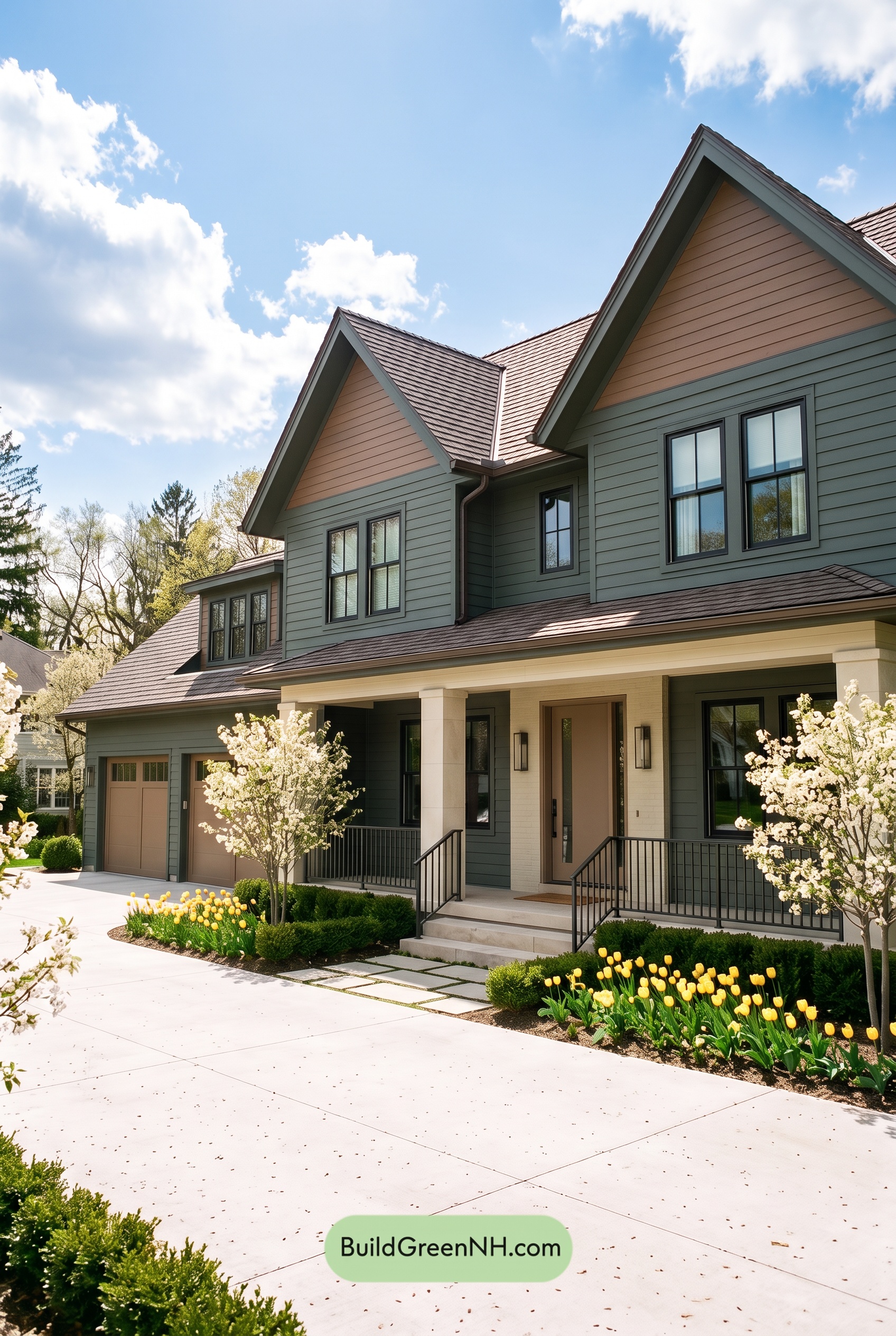 Earthy Green House Exterior Color Scheme: Brown Green Comfort
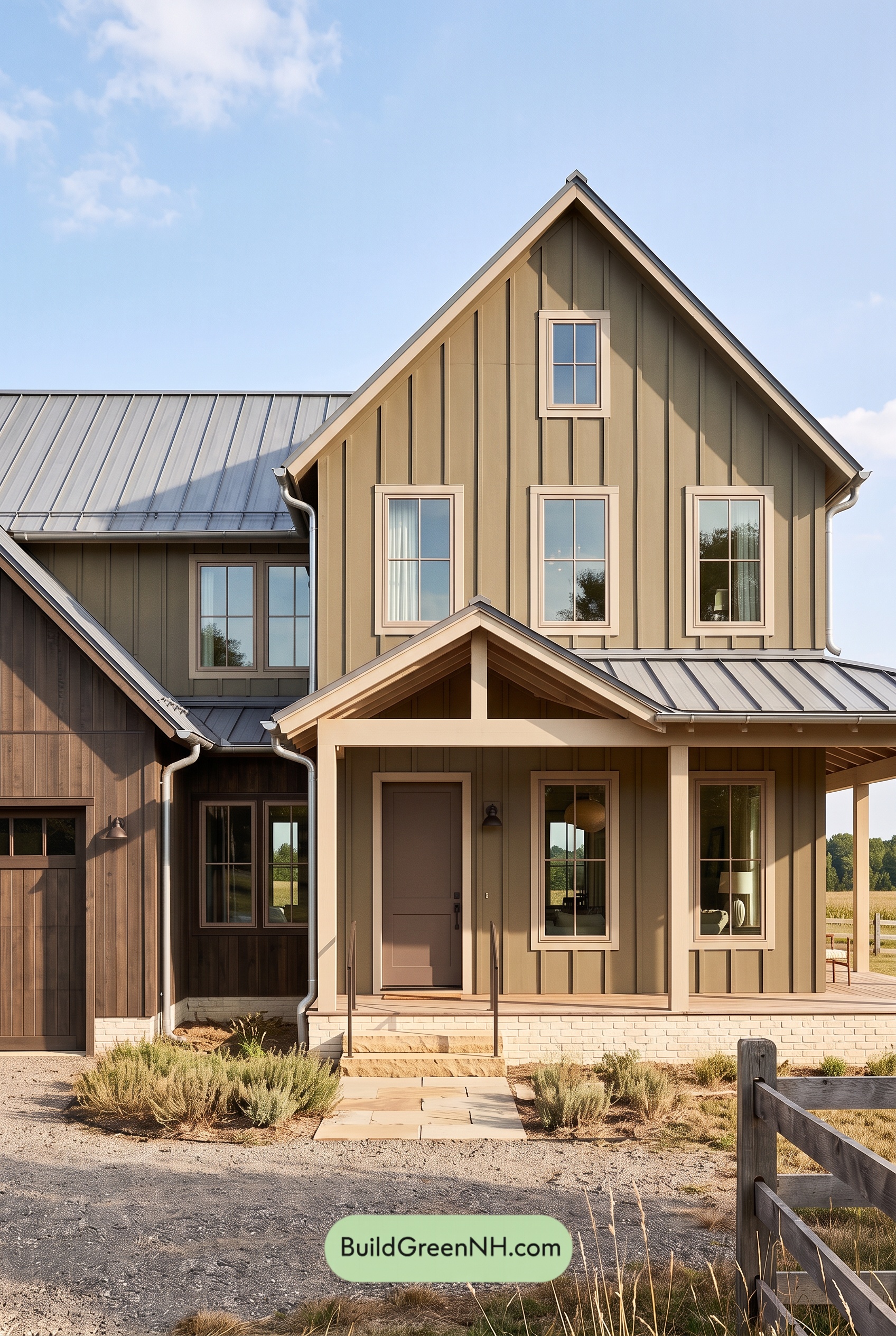 Earthy Green House Exterior Color Scheme: Green and Beige Sanctuary
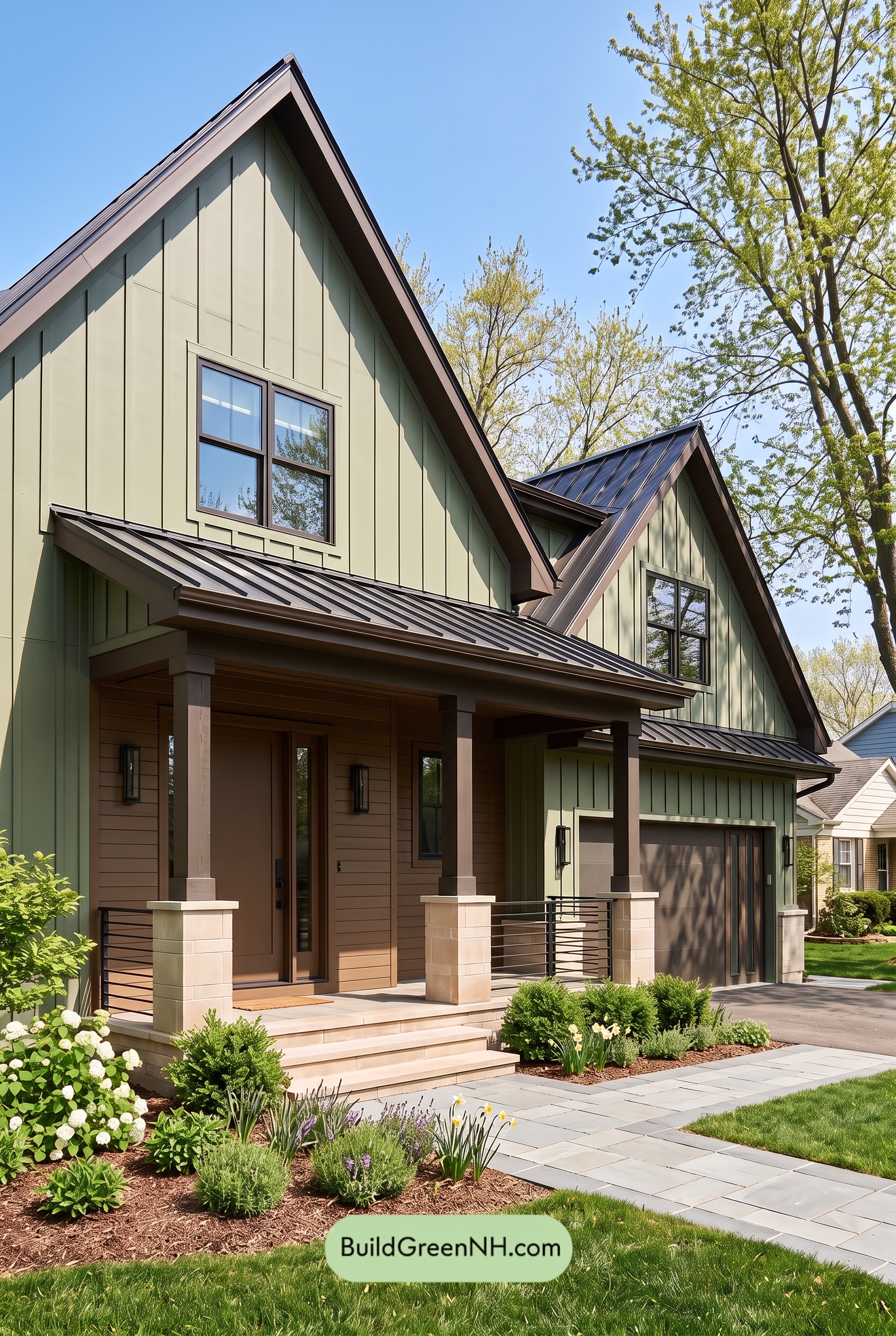 Earthy Green House Exterior Color Scheme: Green Velvet Assurance
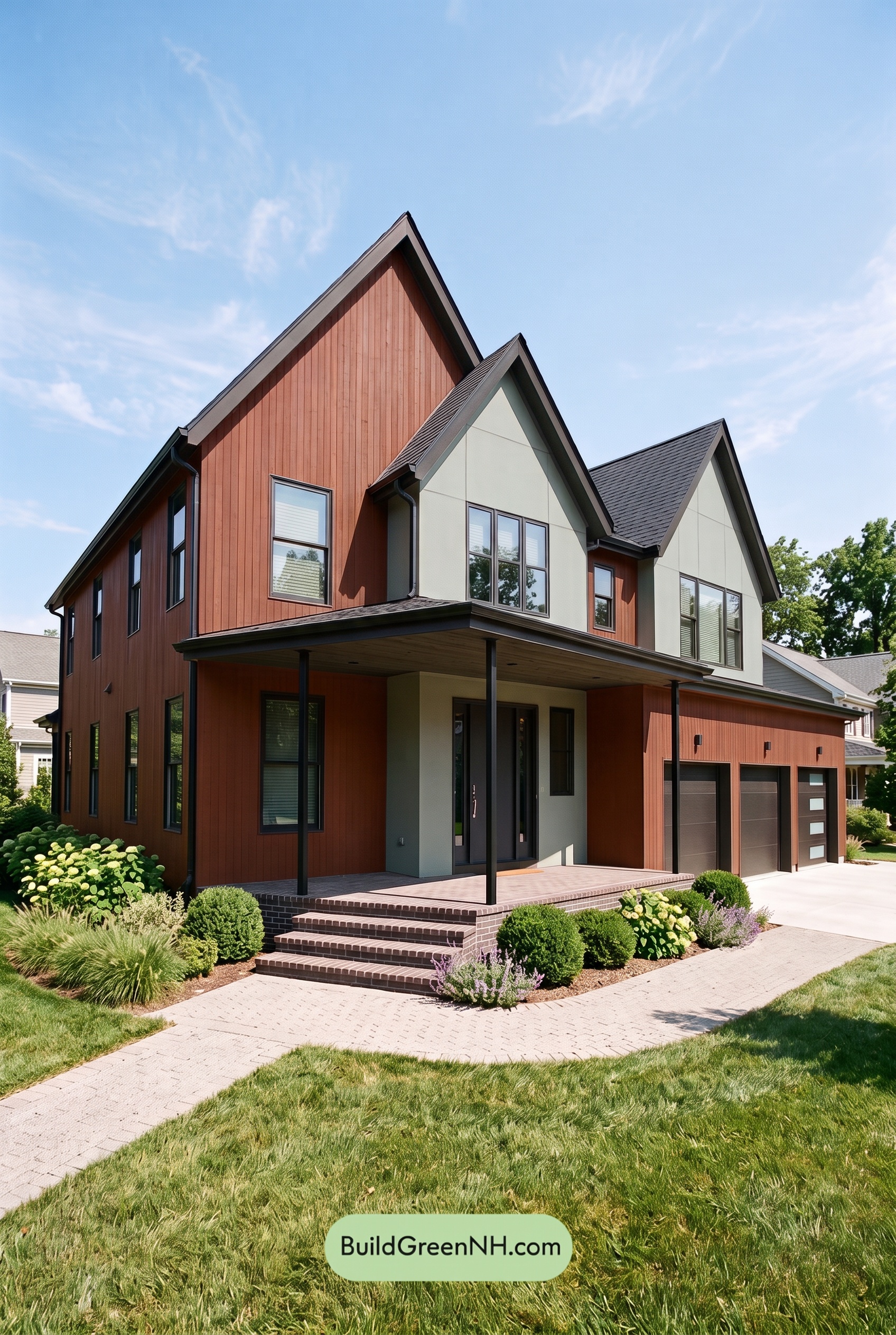 Earthy Green House Exterior Color Scheme: Brown Silken Calm
 Earthy Green House Exterior Color Scheme: Green Amber Contentment
Table of Contents