Last updated on
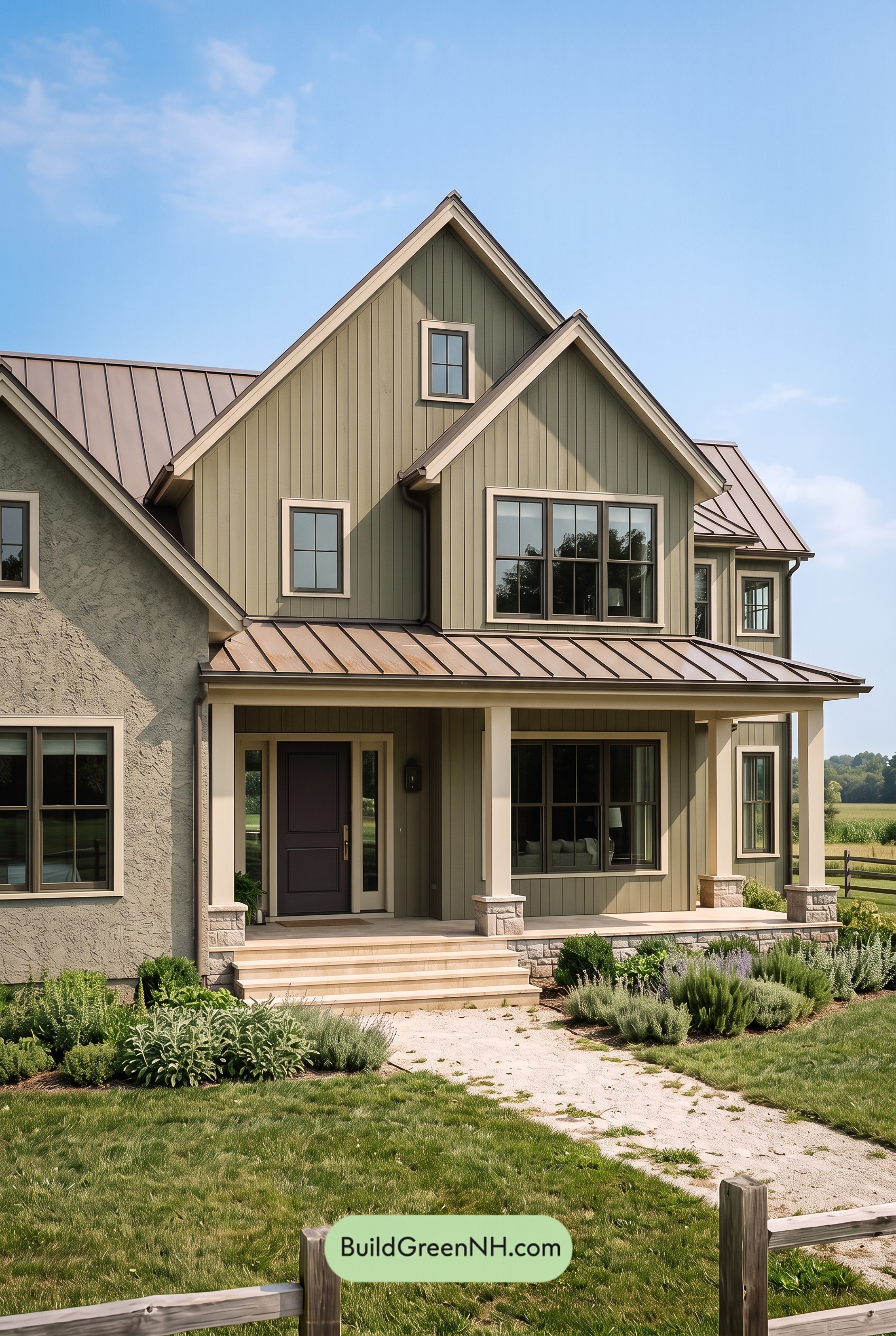

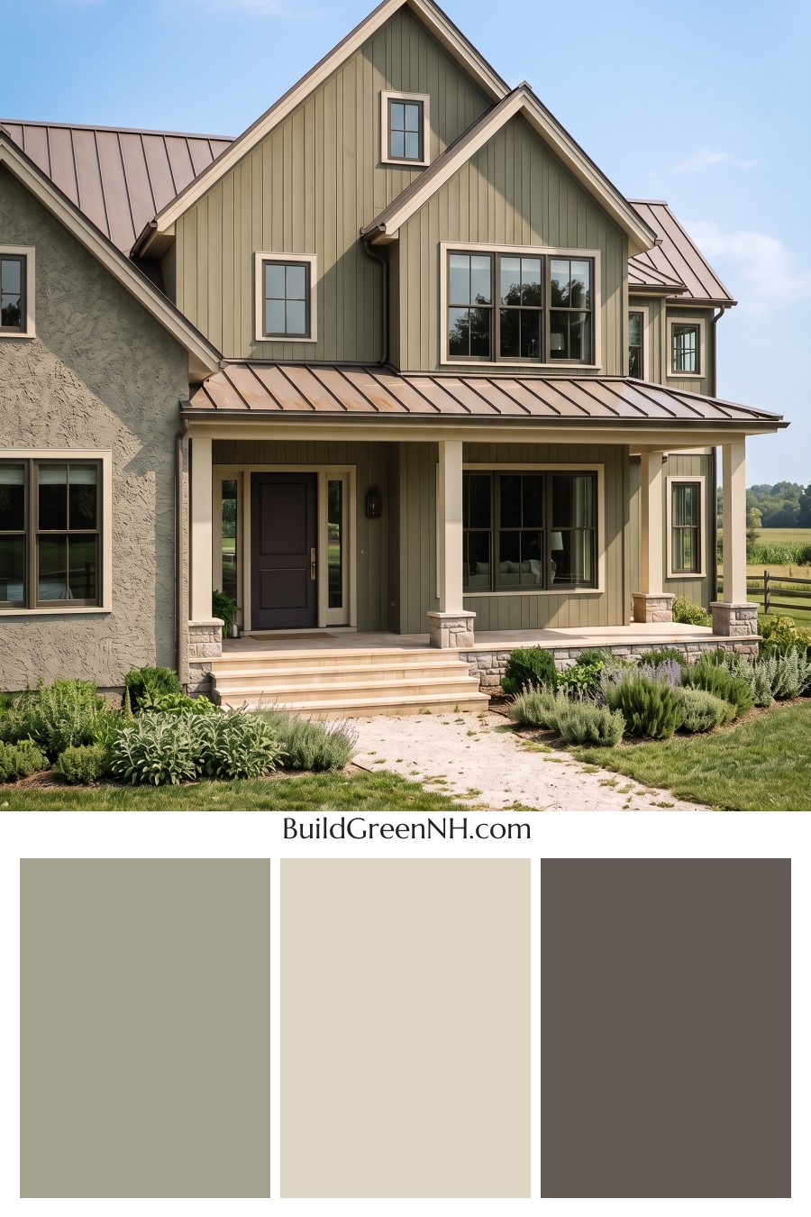
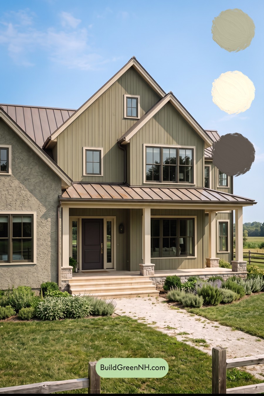
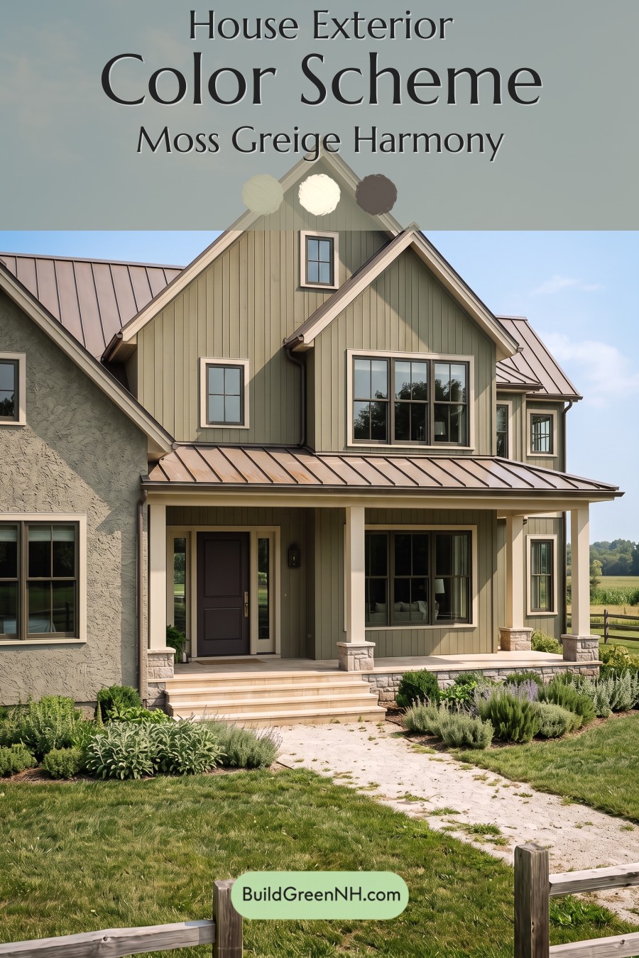
Muted olive green, warm beige, and deep brown give this home its inviting character, balancing countryside softness with beautifully defined architectural details.
Earthy Green That Lets the Architecture Shine
A subdued olive green covers the vertical siding, bringing warmth and depth to the tall gables and sheltered porch. Its gray undertones keep the exterior restful rather than bright, while a gentle yellow undertone connects it to the surrounding lawn and planting beds.
The textured wall on the left reads as a softer gray-green, adding subtle variation without breaking the palette’s continuity. Together, these surfaces show how closely related shades can make different materials feel like parts of one thoughtful design.
Warm Beige Creates a Soft Frame
Light, warm beige outlines the roof peaks, windows, and entry, giving each feature definition without the sharpness of a bright white contrast. Along the steep gables, this lighter shade draws attention to the roofline and keeps the broad green surfaces from feeling heavy.
The porch columns repeat that same gentle beige, creating a welcoming rhythm across the front of the house. Pale beige steps and porch flooring extend the warmth toward the walkway, making the entrance feel open even beneath the shaded roof.
Deep Brown Adds Just Enough Contrast
The dark brown window frames provide a crisp inner outline within the lighter surrounds. This layered contrast is especially effective on the larger windows: the beige highlights their overall shape, while the deeper brown defines the individual panes.
At the entrance, a rich, nearly black brown door gives the eye a natural place to settle. It feels substantial but not severe, thanks to the warm trim beside it and the muted green siding nearby. Dark brown gutters and roof-edge details carry that depth upward.
A Roof That Ties the Palette Together
The standing-seam roof introduces a muted taupe-brown shade with a softly warm cast. It bridges the pale beige trim and darker brown accents, adding another layer of warmth without competing with the green walls. Below, the stone porch bases mix light gray and beige, grounding the lighter columns.
The overall mood is calm, comfortable, and quietly polished. Green connects the house to its landscape, beige brings lightness, and brown supplies definition—a balanced combination that gives the architecture character without overwhelming it.
Next, see how this color scheme looks under different lighting simulations throughout the day.
Overcast
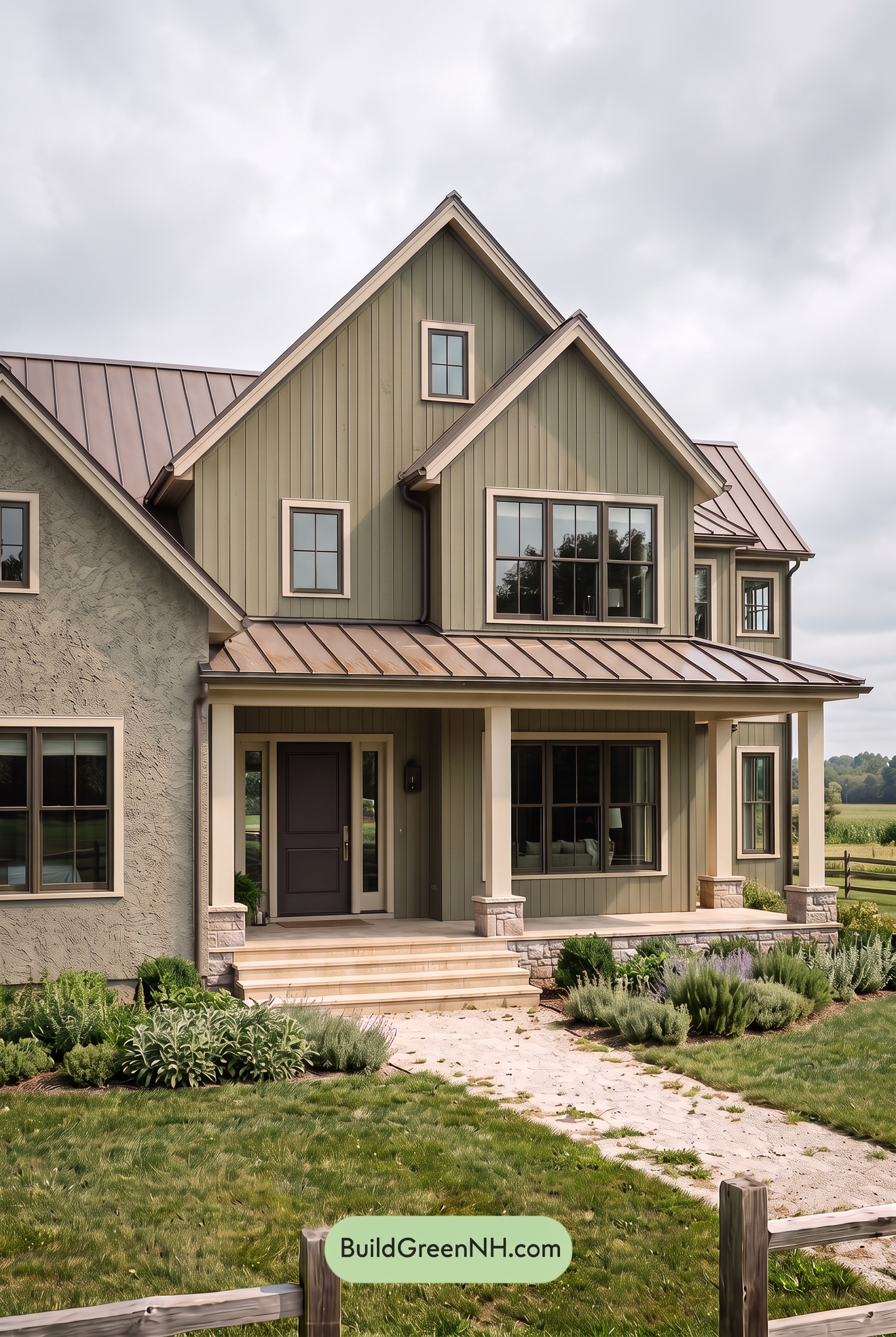
Under overcast skies, the muted green siding can appear cooler and grayer, with less apparent saturation than in neutral daylight. Its earthy warmth recedes, while the light beige trim and columns feel softer and less golden. The deep brown door and window frames retain their richness, but their warmer undertones become quieter.
Diffused light softens shadows beneath the gables and across the porch, reducing harsh light-to-dark contrast and making the green shades look more even. The pale neutrals still frame the darker shades clearly, but the overall effect feels gentler—calm, grounded, and a little more subdued than in neutral daylight.
Golden Hour
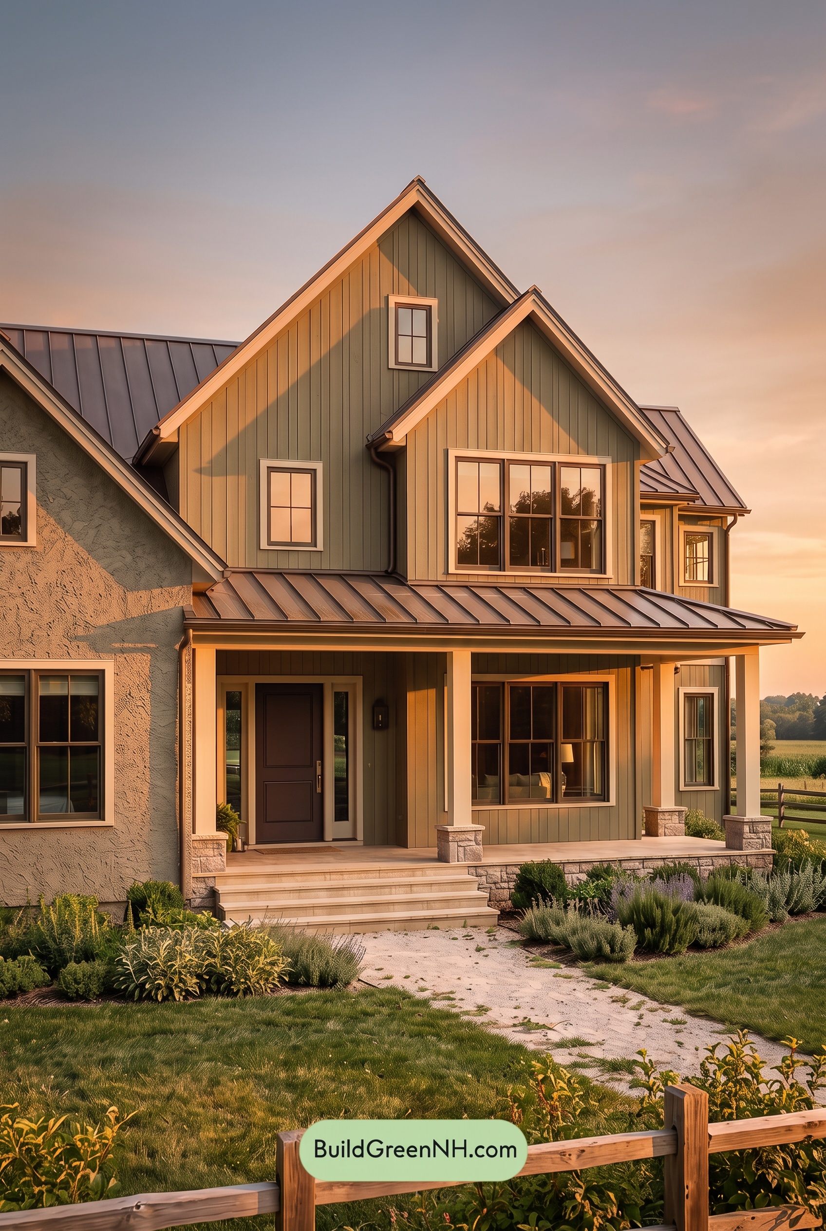
Golden Hour gives the muted green exterior a warmer, earthier character than neutral daylight, drawing out yellow undertones in the sunlit areas. The color feels richer without becoming brighter or more vividly green, while shaded sections settle into deeper, grayer greens. The light beige shades take on a soft golden glow, making the trim and columns feel warmer and less crisp.
Long shadows beneath the gables and porch heighten the contrast between glowing edges and sheltered walls. Deep brown accents appear almost black in shade but reveal warmer undertones where sunlight reaches them. Compared with the more even, balanced colors of neutral daylight, this mix of warm highlights and subdued shadows gives the house a cozy, quietly dramatic mood.
Shade
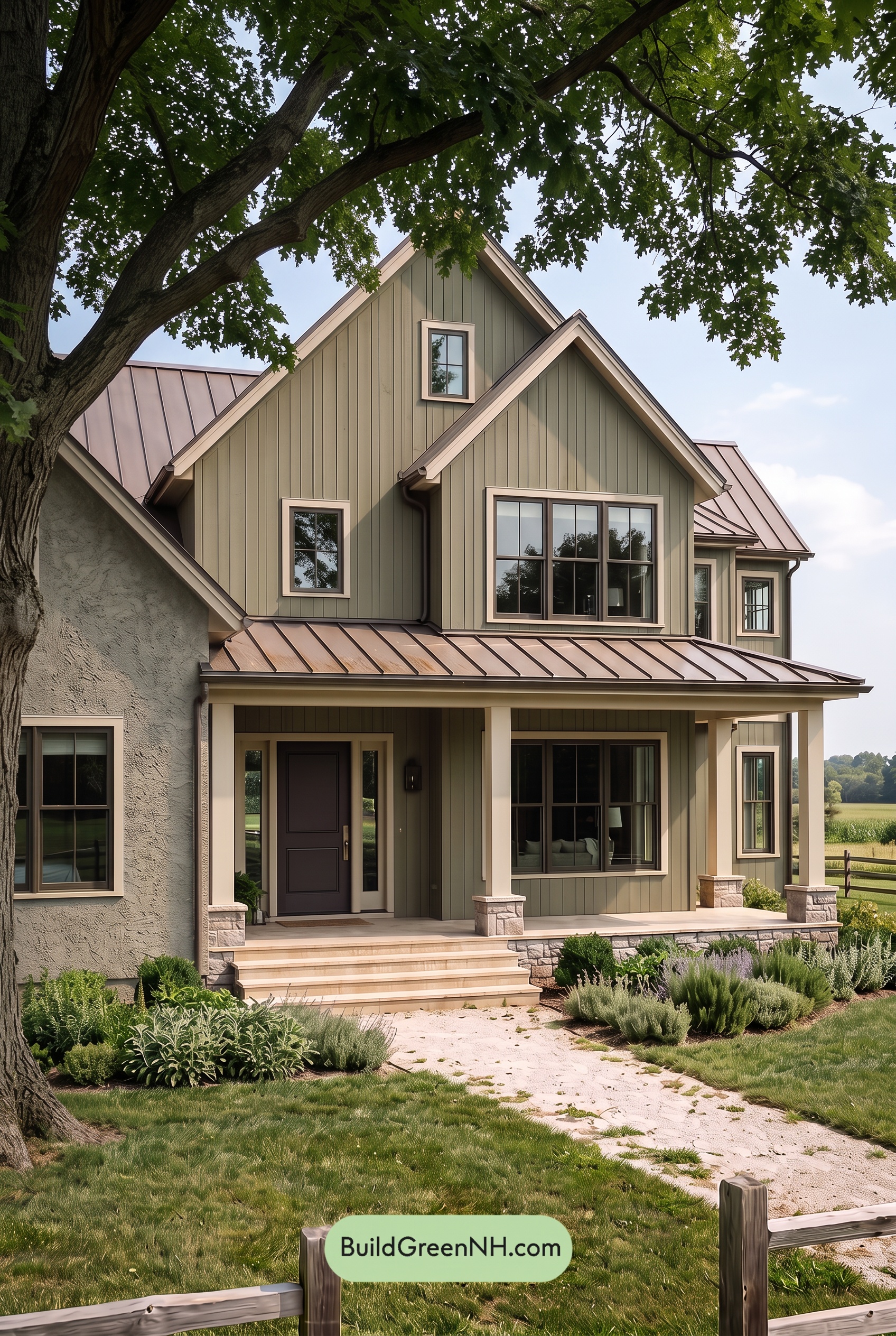
In shade, this muted green feels deeper and grayer than it would in neutral daylight, with quieter saturation and less yellow warmth. The pale beige accents lose some of their golden glow, reading softer and slightly cooler while still providing a light outline against the darker green.
Shadows beneath the porch and rooflines deepen the dark browns, making their warmer undertones less noticeable. The contrast between pale beige and shaded green becomes more pronounced, while subtle differences among the darker shades grow harder to distinguish. Compared with neutral daylight’s clearer color definition, the shaded palette feels hushed, earthy, and comfortably sheltered.
Nighttime
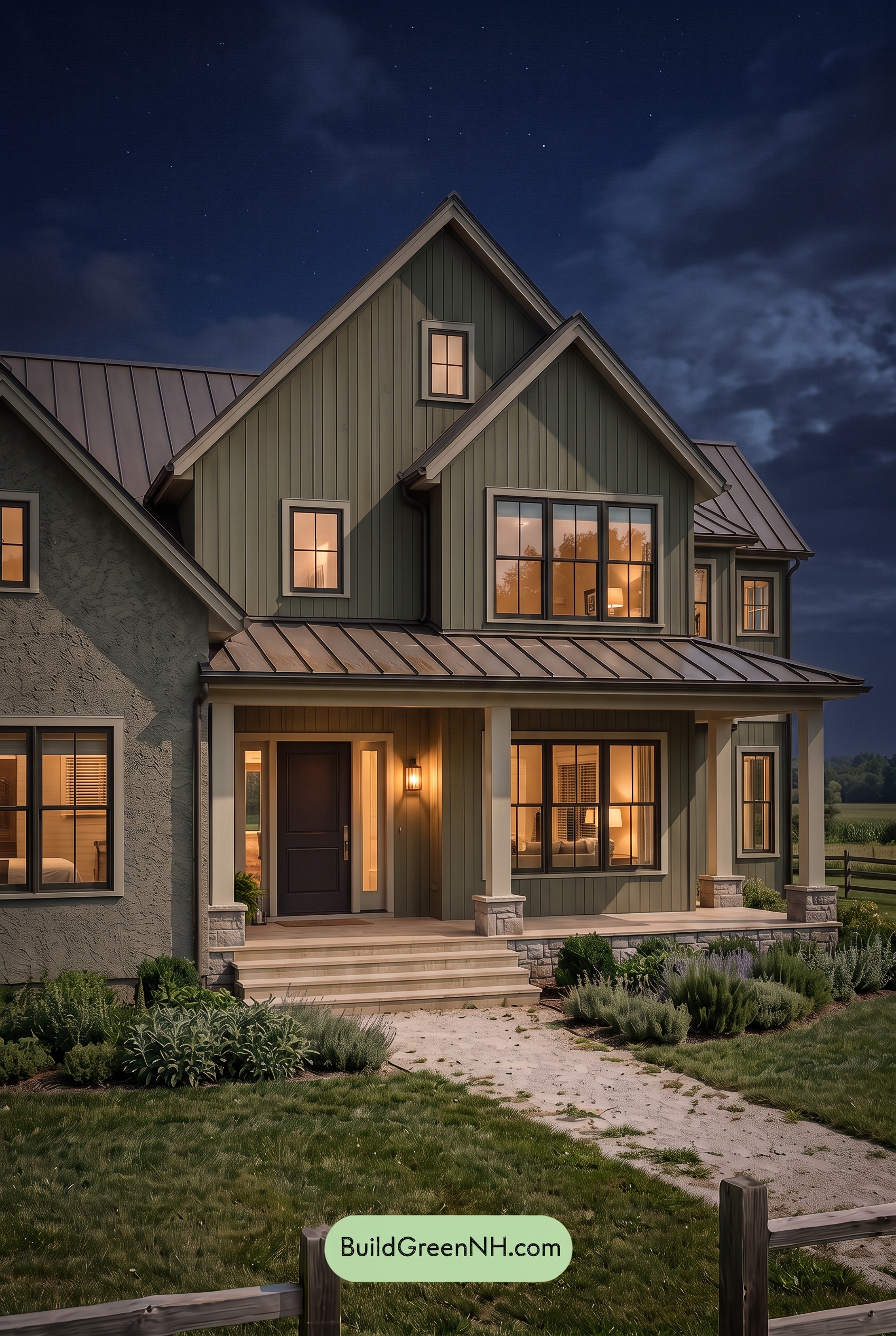
Compared with neutral daylight, nighttime makes the muted greens appear deeper and less saturated, with cooler gray-green shades settling into the shadows beneath the gables. Near the porch light, those same greens take on warmer, yellow-green undertones, while the light beige shades feel softer and creamier in the glow.
The deep browns lose some of their visible warmth in shadow, reading almost black beside the illuminated windows. This sharpens the contrast around the glazing, while the pale neutrals stand out against the darkened greens. Instead of daylight’s more evenly defined palette, the house takes on a cozy, intimate mood, with warm highlights and deep shadows adding drama.
Pin these for later:
Want More?
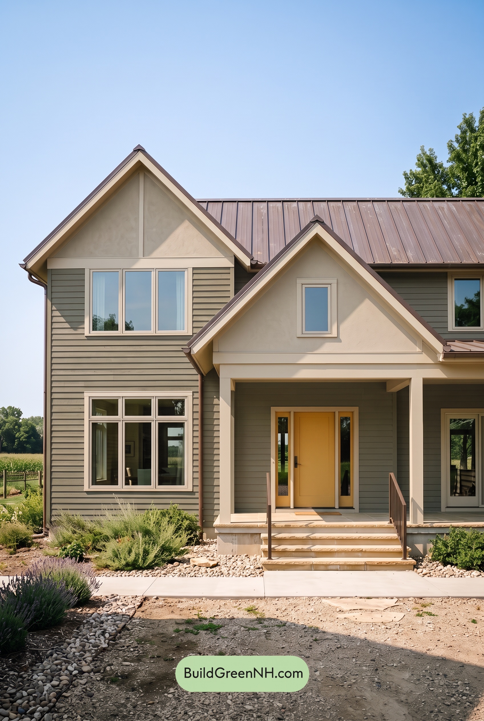 Green House Exterior Color Scheme (New Trend for 2027): Olive Greige Embrace
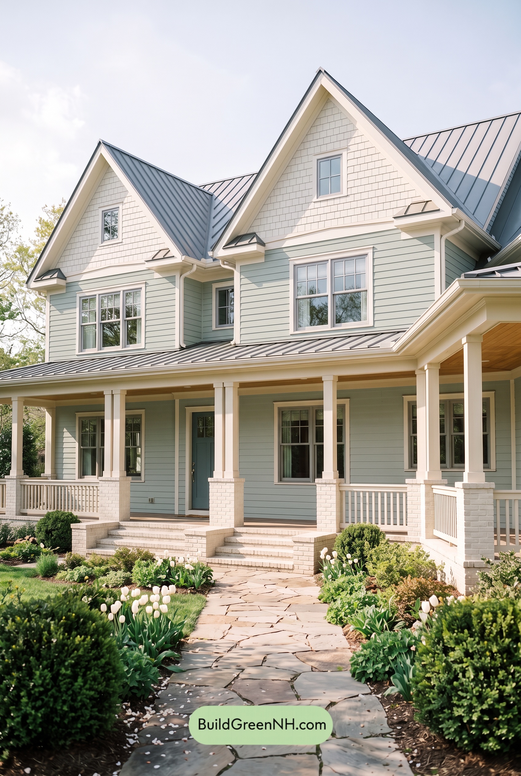 Green House Exterior Color Scheme (New Trend for 2027): Seafoam Greige Poise
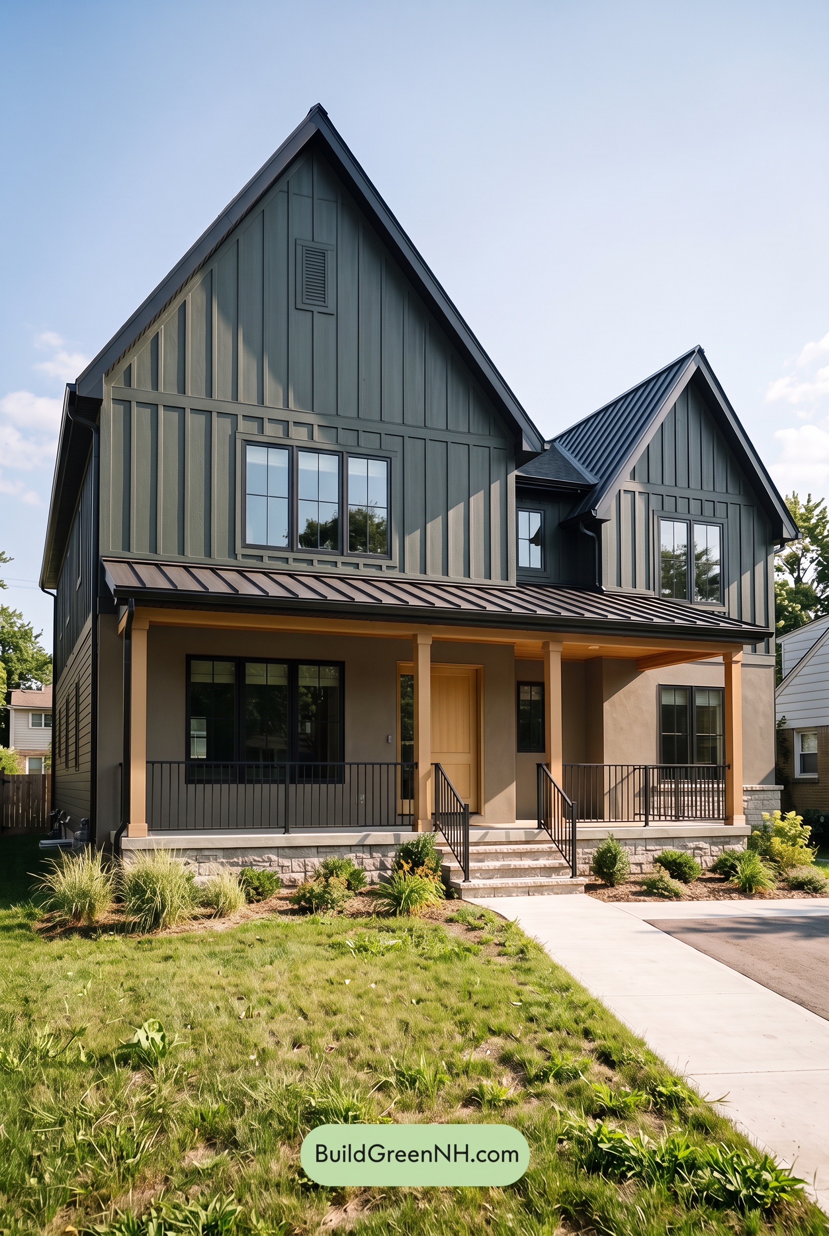 Green House Exterior Color Scheme (New Trend for 2027): Forest Greige Resolve
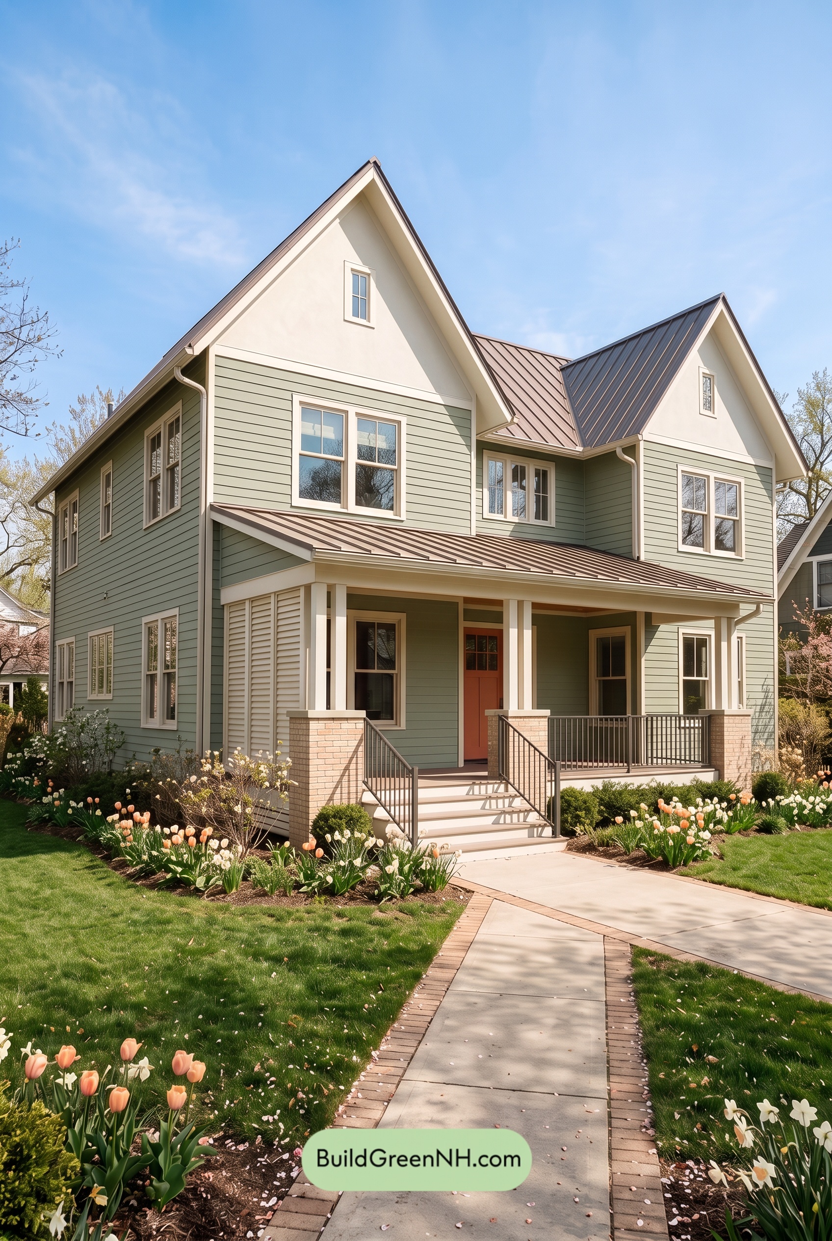 Green House Exterior Color Scheme (New Trend for 2027): Mint Greige Delight
 20 Exterior Paint Color Schemes for Houses with Red Doors
Table of Contents