Last updated on
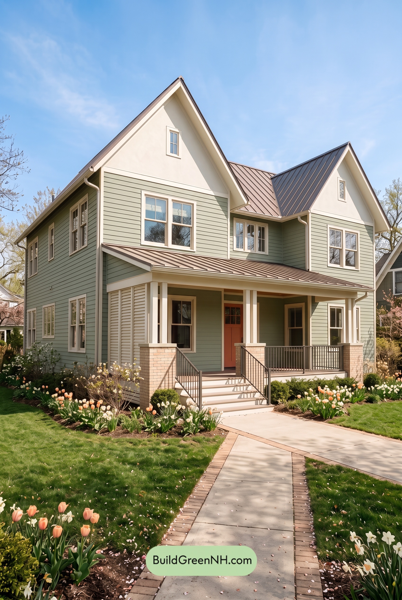

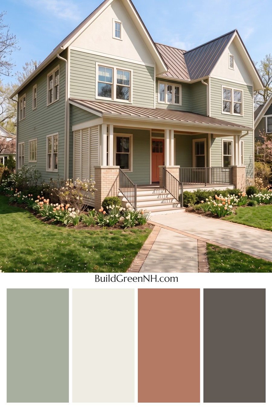
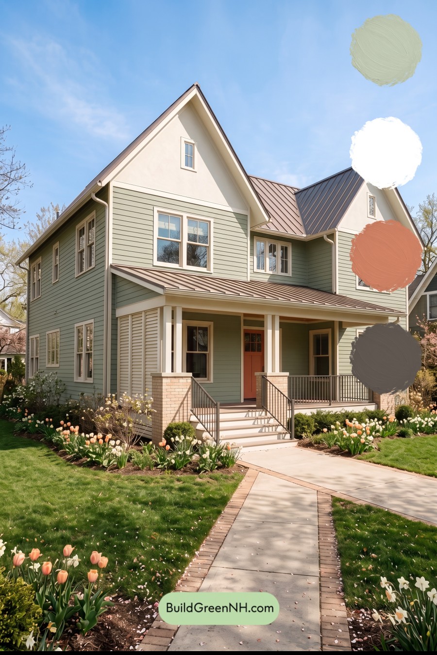
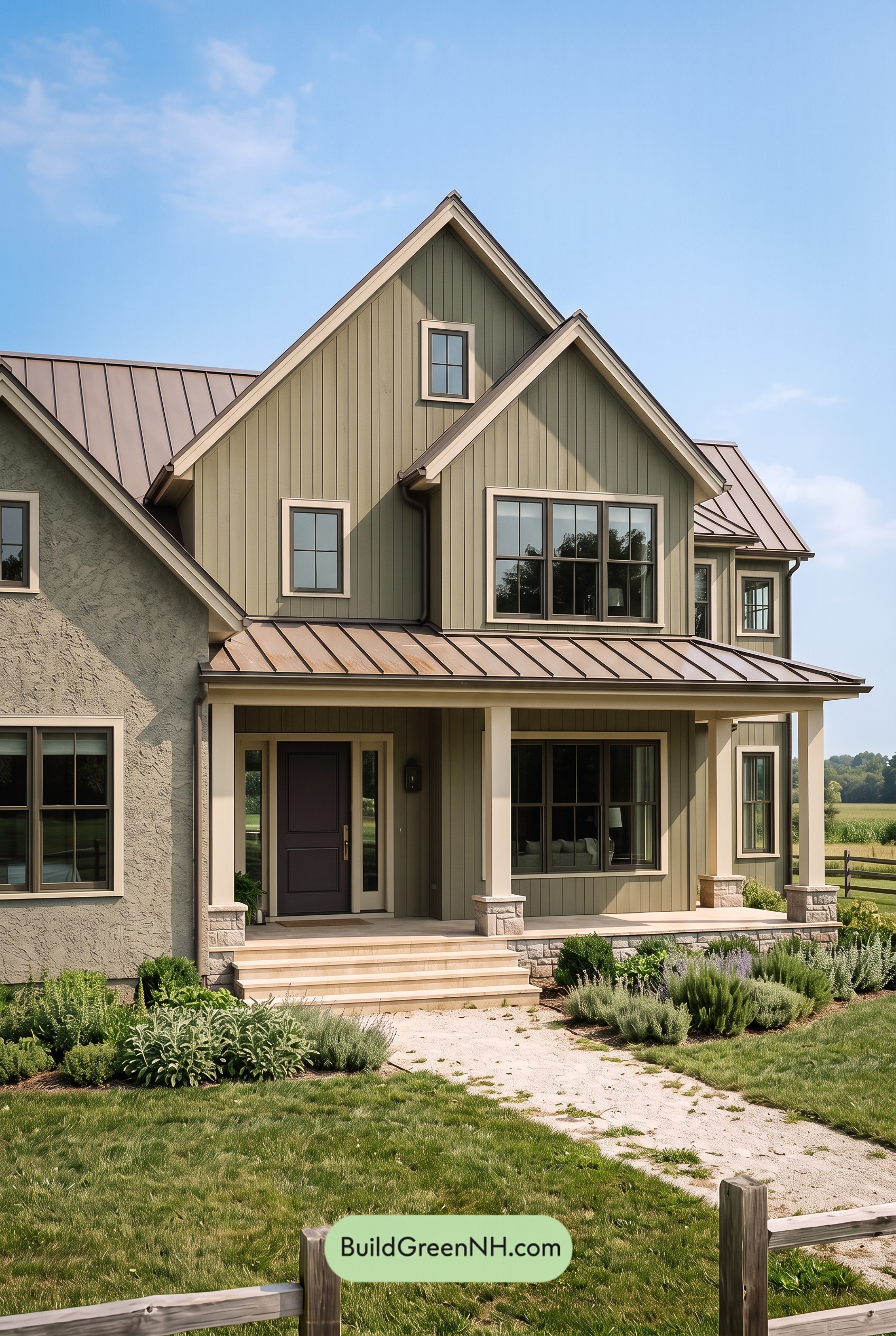
Soft sage green, creamy white, and earthy brown accents give this home its inviting balance of garden-inspired calm and crisp architectural detail.
Soft Green Siding Sets a Relaxed Tone
A muted sage green covers the horizontal siding, giving the house a gentle presence despite its substantial size. Its gray undertones keep the green understated, while its connection to the surrounding foliage makes the exterior feel comfortably rooted in the landscape.
This shade also lets the siding’s horizontal lines remain visible without making them feel busy. In sunlight, the green looks soft and airy; beneath the porch and eaves, it takes on a deeper, more sheltered character.
Creamy White Highlights the Architecture
The upper gable walls shift to a warm, creamy white, creating a light finish above the green siding. That change emphasizes the steep roof peaks and gives the upper facade breathing room.
Matching shades of white continue across the window frames, corner boards, roofline trim, and porch columns. Repeating the same light color connects the different sections of the house, keeping the design cohesive. The contrast is clear but gentle—more welcoming than stark.
Earthy Accents Bring Warmth and Definition
The metal roof introduces a muted brown with gray undertones. Its deeper shade outlines the gables and balances the pale upper walls, while the long porch roof repeats that grounding color closer to the entrance.
Deep brown railings add definition around the porch and steps without competing with the siding. Below the creamy white columns, pale beige brick bases provide a softer transition to the ground. The front door contributes another warm accent, drawing attention into the shaded entry rather than pulling focus from the whole facade.
A Palette That Feels Naturally Welcoming
What makes this scheme work is its measured contrast. The sage green supplies quiet color, the creamy white brings brightness, and the brown and beige accents add warmth and depth. Each shade has a distinct role.
The result feels fresh without being flashy and traditional without looking heavy. Against the garden’s deeper greens and soft blossoms, the house becomes a calm backdrop with plenty of character of its own.
Next, see how this color scheme looks under different lighting simulations throughout the day.
Overcast
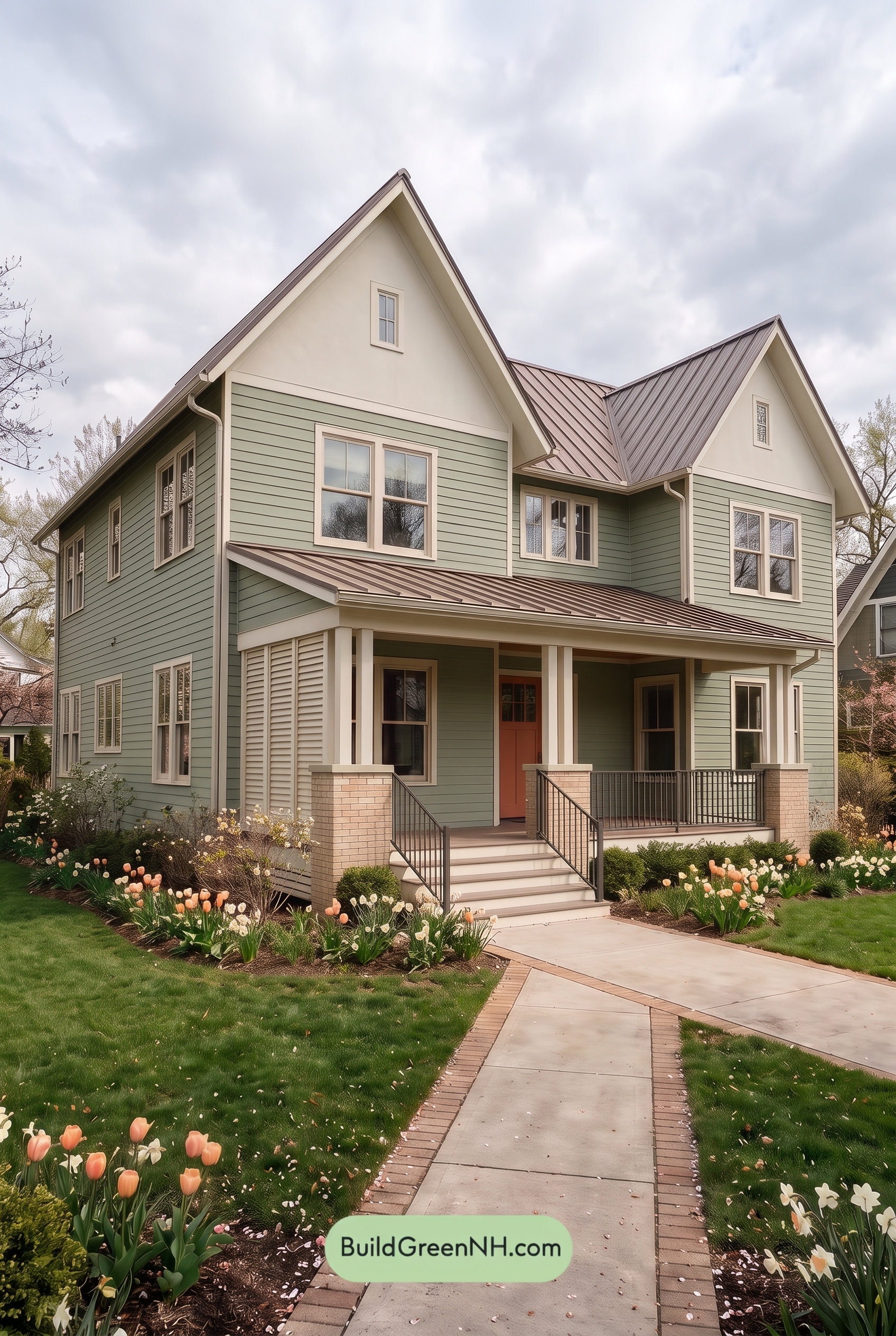
Under overcast skies, this soft green reads a little cooler and grayer than in neutral daylight, with its saturation gently subdued. The warm whites appear less creamy and more restrained, while the warm neutral accents feel softer rather than sunlit and glowing.
Diffused light softens the shadows beneath the eaves and across the siding, easing the contrast between light and shaded surfaces. The pale shades still stand apart from the green, and the deep browns provide definition without feeling quite so sharp. Together, these shifts give the exterior a calm, understated mood compared with its brighter appearance in neutral daylight.
Golden Hour
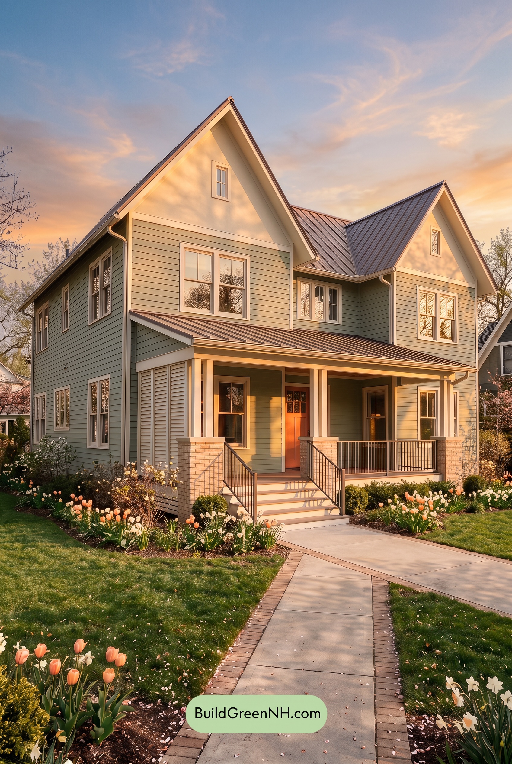
Golden Hour gives the muted greens a warmer, more olive-leaning cast, while shaded areas deepen into cooler gray-greens. Compared with neutral daylight, the sunlit shades look softer and less distinctly green, while the shadowed shades feel richer. The soft whites take on creamy yellow and peach undertones, trading their daytime crispness for a gentle glow.
Long shadows beneath the eaves and across the porch heighten the contrast between luminous pale shades and deeper greens and browns. Beige tones appear warmer and more saturated, adding to the welcoming feel. Where neutral daylight would show a more even, restrained palette, this low light creates a cozy mood with greater depth and a touch of drama.
Shade
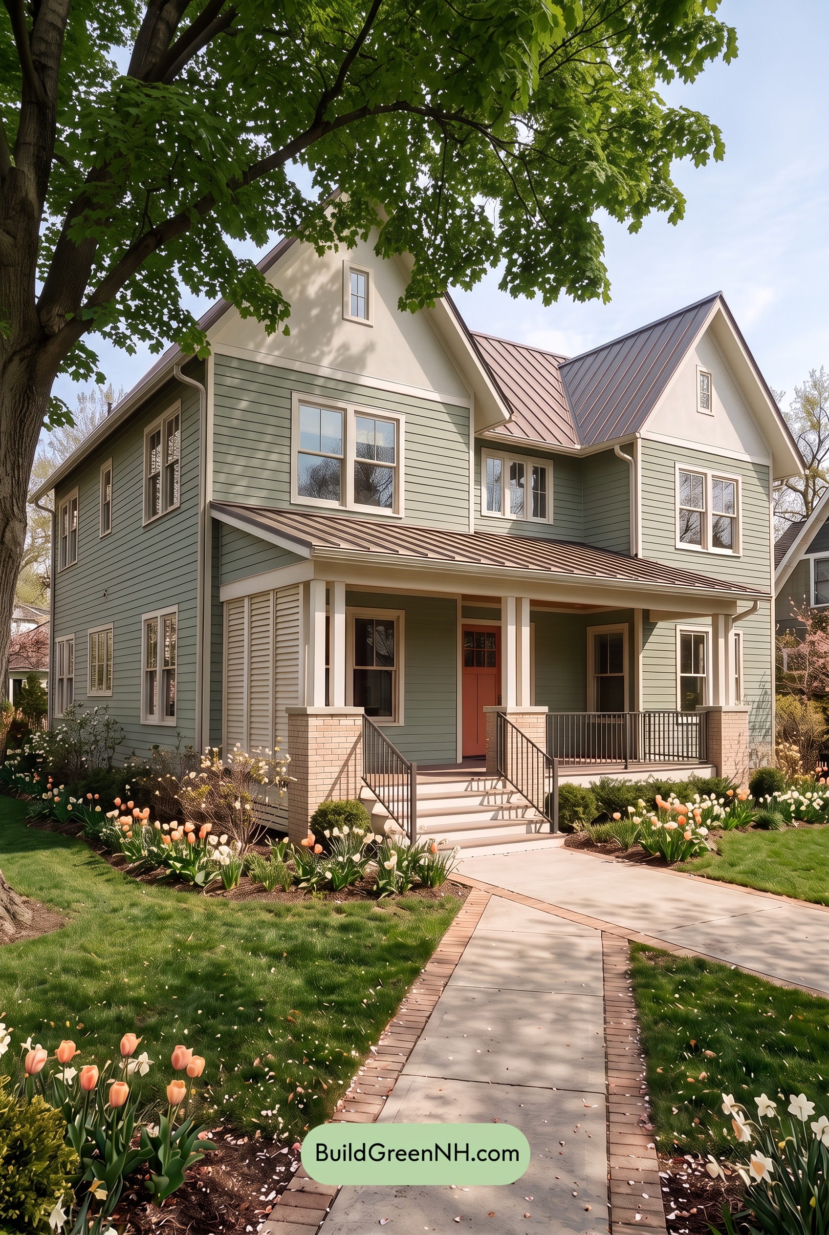
In shade, these muted green shades appear deeper and slightly grayer than they would in neutral daylight, with softer saturation and less visible yellow warmth. The soft whites take on a gentle gray cast, feeling quieter and cooler while still standing out against the greens.
Deeper shadows beneath the porch and eaves make the darker brown shades feel richer, while warm neutrals become more subdued. Contrast remains clear between the pale and deeper shades, but shaded transitions feel gentler. Compared with neutral daylight’s more balanced color, the overall mood becomes calmer, more sheltered, and quietly inviting.
Nighttime
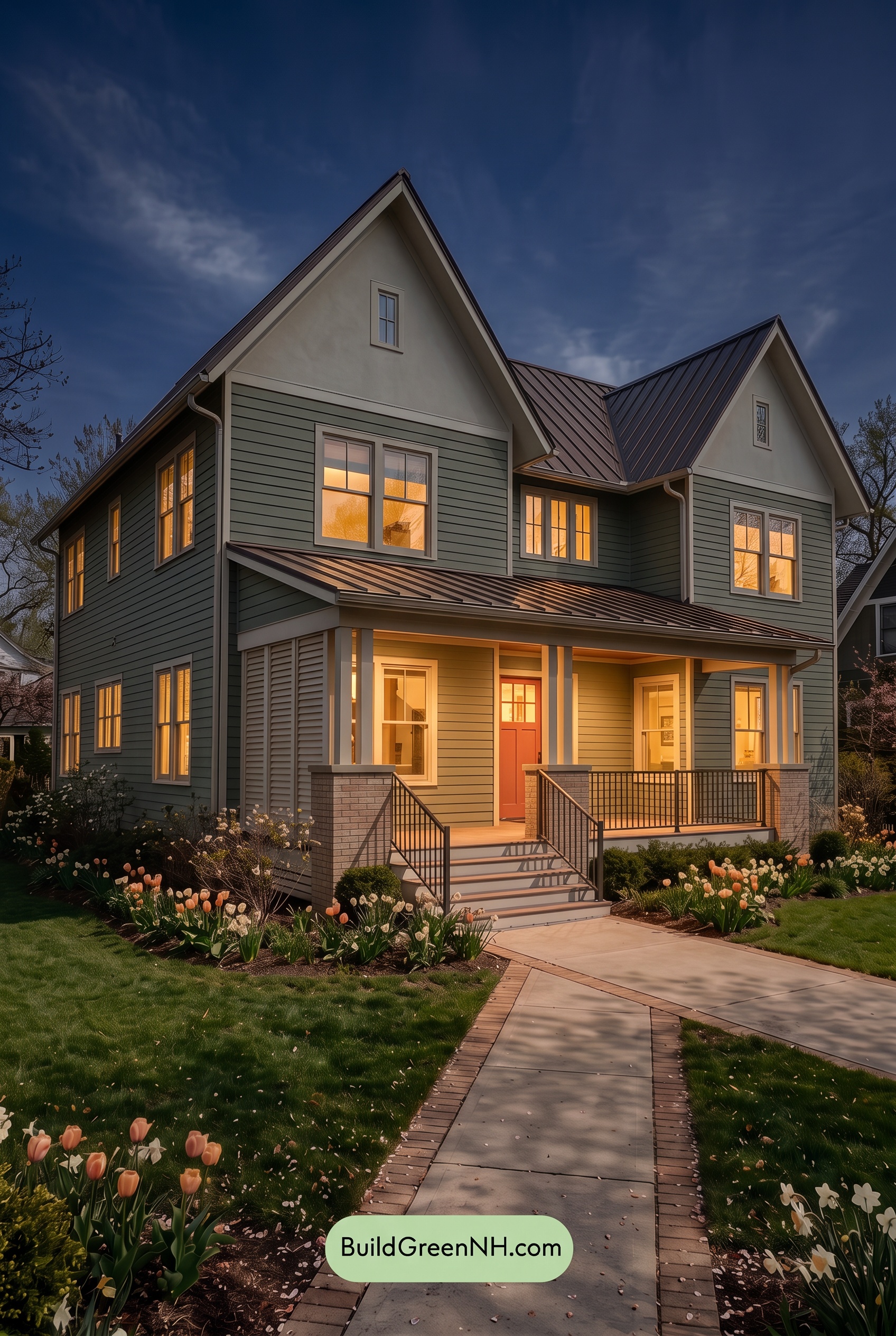
At night, the green siding looks deeper and less saturated than it would in neutral daylight, with cool shadows lending it a gray-green cast. The white upper walls and trim lose their daytime crispness, appearing softly gray away from the lights. Beneath the eaves, stronger shadows deepen the contrast between the pale details and darker siding.
The warm porch lighting shifts nearby greens toward softer, yellow-green shades and gives the whites a creamy glow. Dark brown railings appear nearly black against the illuminated entrance, adding definition. Compared with daylight’s more evenly balanced palette, this mix of cool shadows and warm highlights makes the house feel cozy, sheltered, and quietly dramatic.
Pin these for later:
Want More?
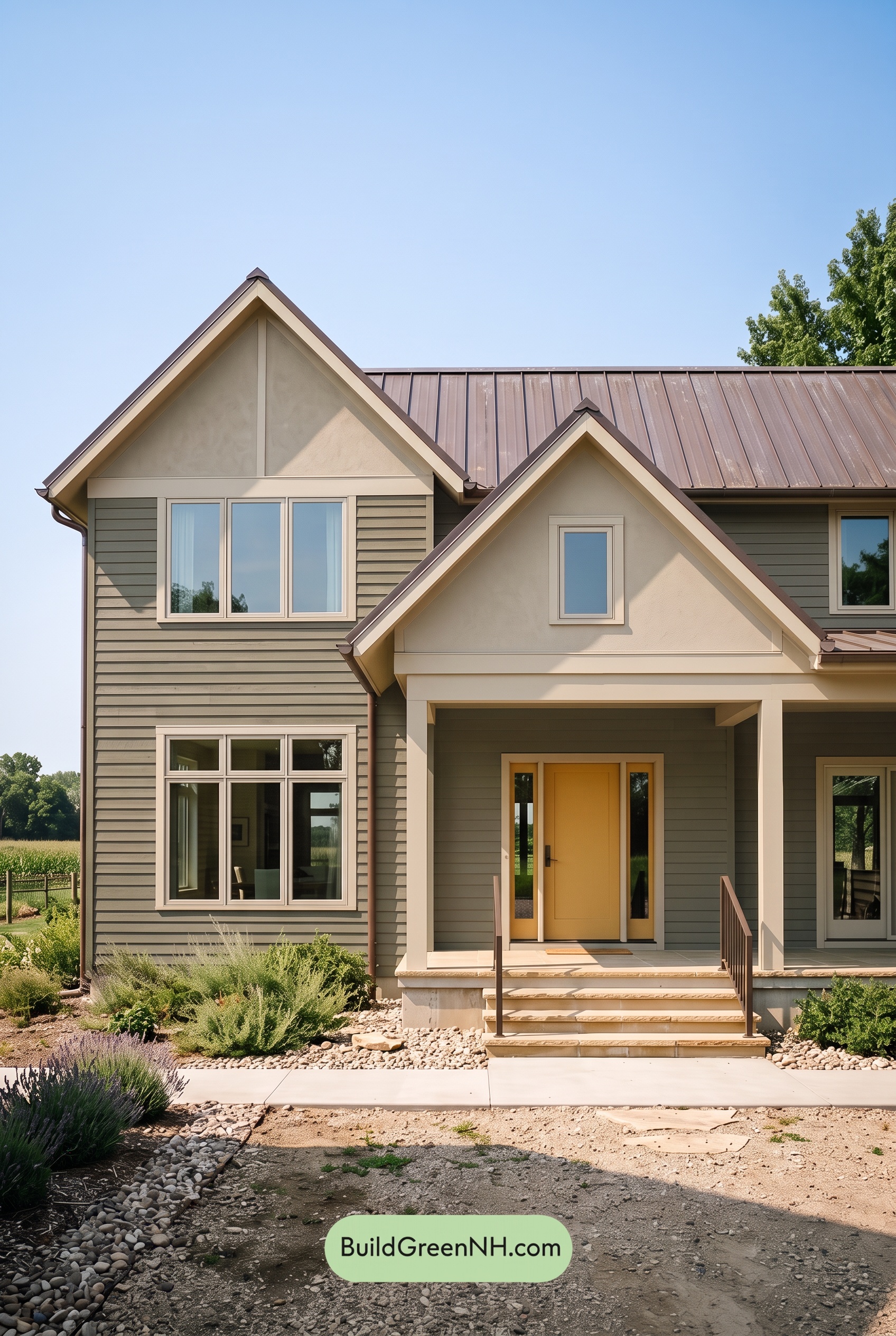 Green House Exterior Color Scheme (New Trend for 2027): Olive Greige Embrace
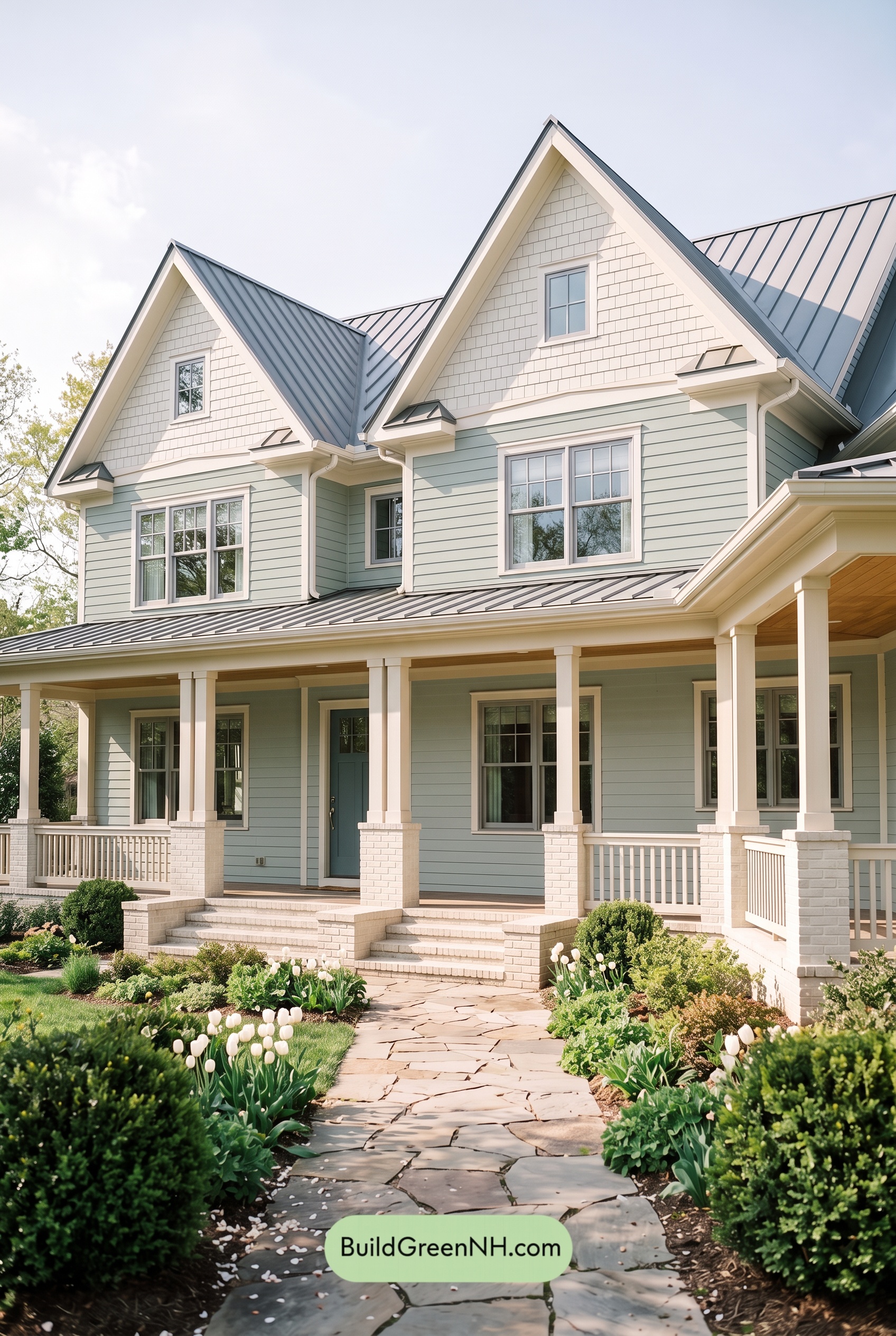 Green House Exterior Color Scheme (New Trend for 2027): Seafoam Greige Poise
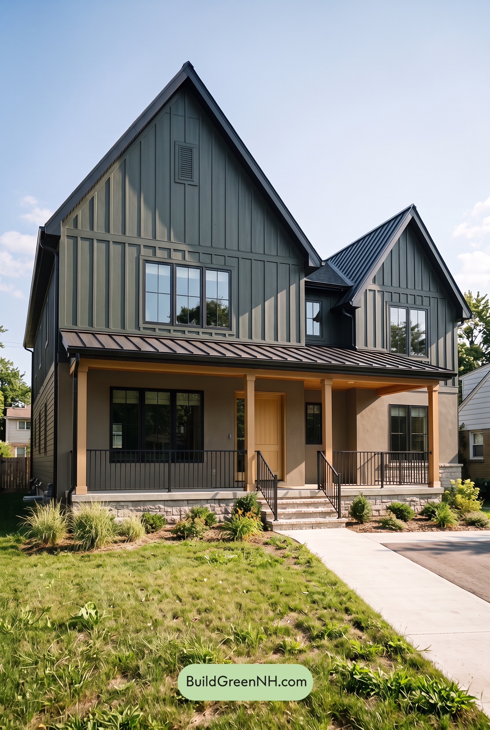 Green House Exterior Color Scheme (New Trend for 2027): Forest Greige Resolve
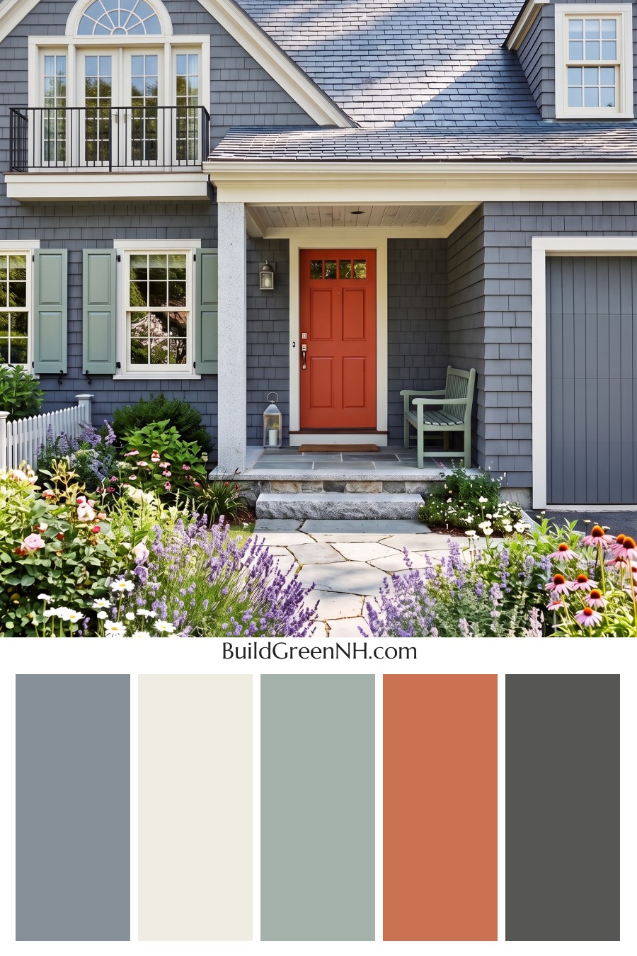 20 Exterior Paint Color Schemes for Houses with Red Doors
 Green House Exterior Color Scheme (New Trend for 2027): Moss Greige Harmony
Table of Contents