Last updated on
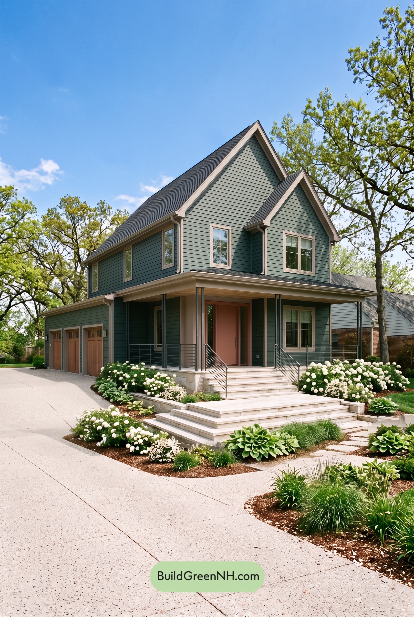

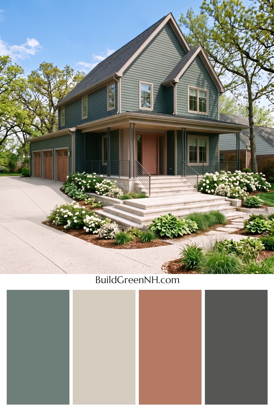
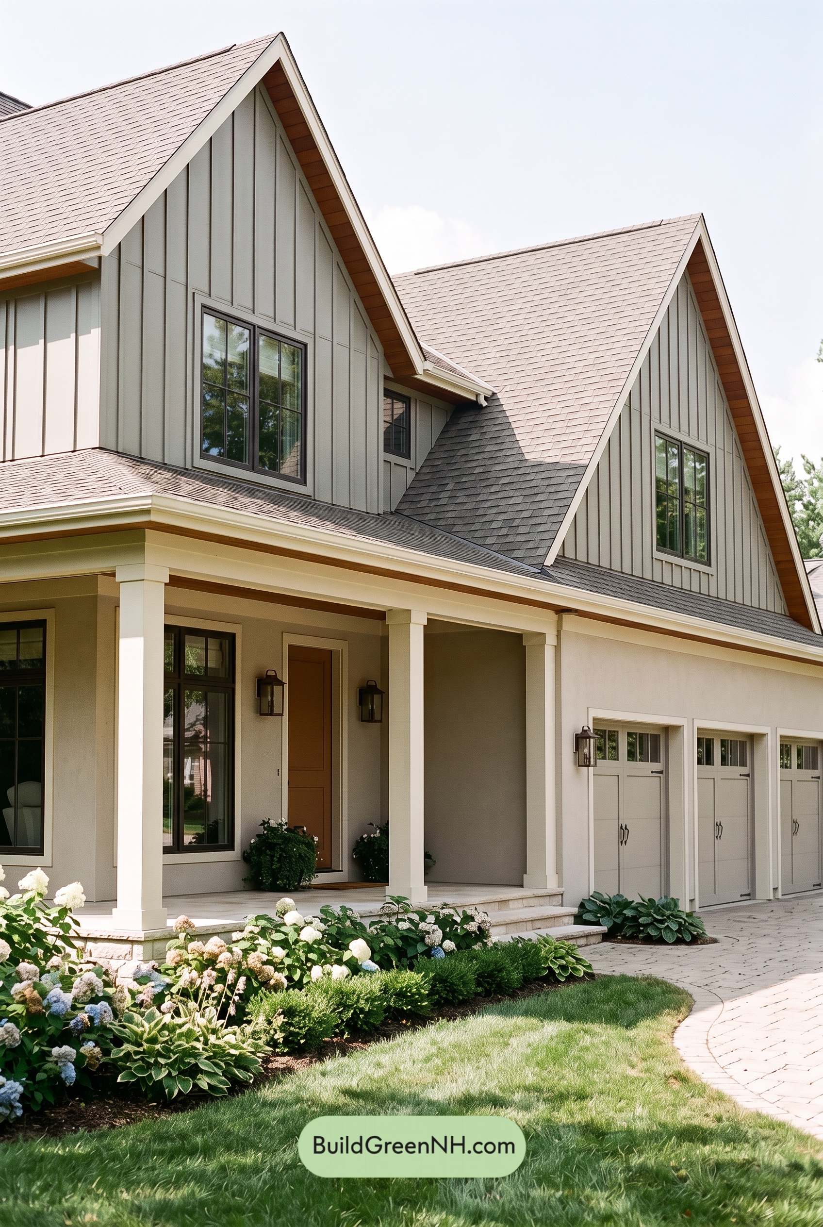
Muted green siding, warm beige details, and deep gray accents give this home a beautifully balanced exterior that feels welcoming while keeping its architectural lines crisp.
A Muted Green That Lets the Architecture Shine
The horizontal siding wears a medium, gray-softened green that brings depth to the broad walls and tall front-facing gables. It has enough color to feel distinctive, but its muted quality keeps the exterior calm rather than attention-seeking. Against the surrounding trees and planting beds, the shade feels especially at home.
Sunlight reveals the softer side of the green across the upper walls, while the sheltered porch areas appear deeper. That natural variation adds dimension without introducing another color or interrupting the continuity of the siding.
Warm Beige Defines the Details
Light, warm beige traces the roof edges, porch fascia, and window surrounds, making the home’s steep peaks and generous porch easy to appreciate. The contrast is clear but gentle. Rather than creating a stark outline, this softer shade gives the green a warm, relaxed companion.
The beige window frames repeat that warmth across both stories. At ground level, the front door and garage doors introduce deeper, brown-leaning beige tones that feel richer than the surrounding trim. Their related shades connect the entry and garage without making either compete with the gables above.
Gray Accents Add Definition
The slim porch columns and horizontal railings bring in deep gray, adding a clean, contemporary counterpoint to the warmer beige details. Their narrow profiles keep the porch visually open, while the darker shade gives its edges definition against the shaded green walls.
Above, the charcoal-gray roof anchors the composition. Its depth balances the substantial siding areas, and its connection to the gray porch accents helps the scheme feel cohesive from roofline to steps. Pale beige-gray tones around the foundation and stairway provide a lighter transition toward the landscape.
Why This Combination Feels So Inviting
The appeal comes from balance: green supplies character, beige adds warmth, and gray lends structure. None needs to dominate every detail. Repeating these shades across the exterior gives the house a coordinated look while allowing its different features to stand out.
The result is quietly polished—traditional enough to suit the prominent gables, yet fresh enough to complement the streamlined porch. It is a thoughtful palette that makes a large home feel grounded, approachable, and connected to its setting.
Next, see how this color scheme looks under different lighting simulations throughout the day.
Overcast
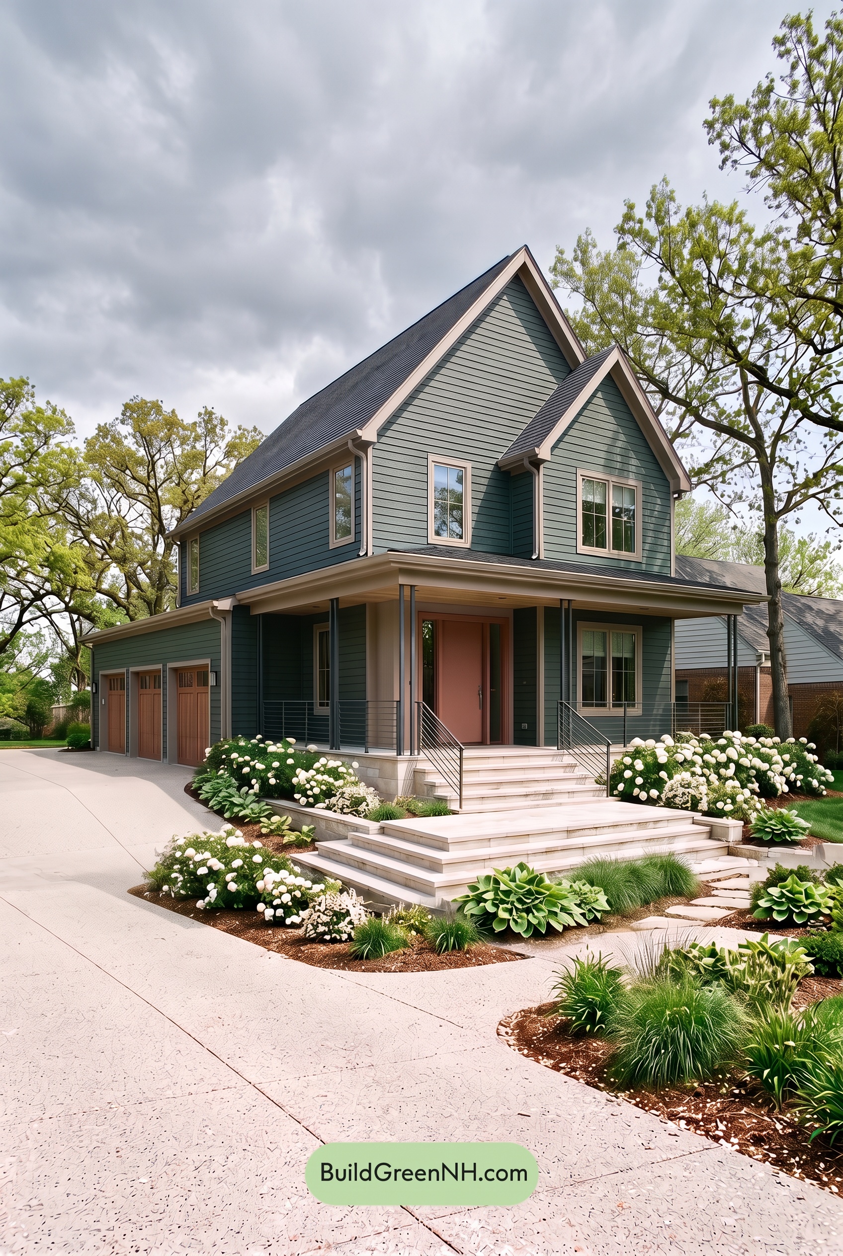
Under overcast skies, this deep green tends to look more muted and slightly cooler than in neutral daylight, with its gray undertones becoming more noticeable. The light beige shades lose some of their sunny warmth, feeling softer and less creamy, while the darker grays take on a quiet, subdued presence.
Diffused light softens shadows beneath the gables and porch, reducing sharp shifts between light and dark across the siding. The pale neutrals still stand out against the deeper green, but the contrast feels gentler rather than crisp. Together, these shifts give the exterior a calm, tucked-in mood instead of the fresher, more lively impression of neutral daylight.
Golden Hour
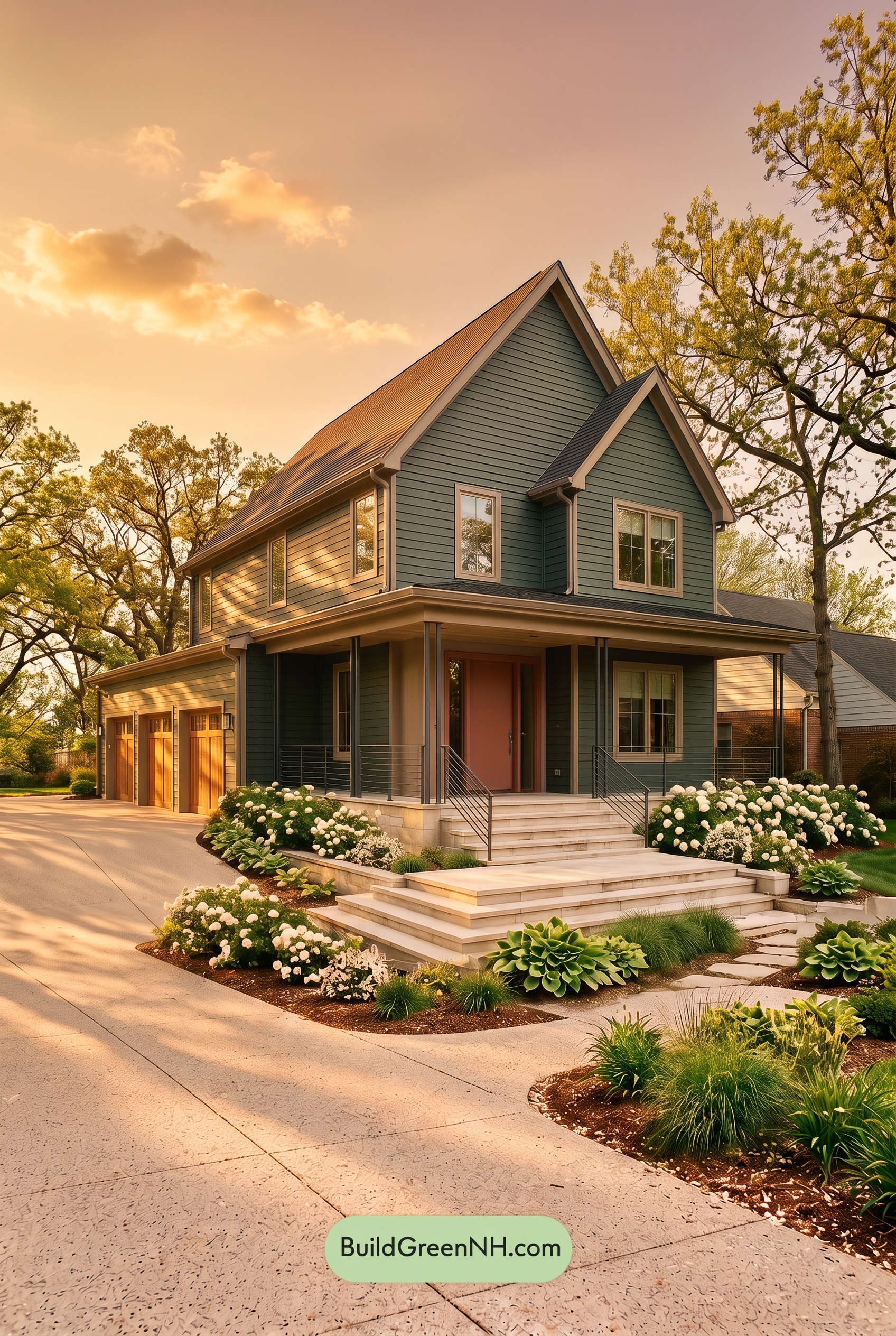
Golden Hour draws warmer, yellow-green undertones out of this muted green, making sunlit areas feel softer and earthier than they would in neutral daylight. In shade, the green appears deeper and more richly saturated, adding depth beneath the rooflines. The light beige shades take on a gentle golden glow, while the grays feel less cool and more connected to the warm neutrals.
Compared with daylight’s more even color balance, the low sun creates stronger contrasts between glowing highlights and deep porch shadows. Yet the shared warmth softens the contrast between color families, giving the whole exterior a quieter harmony. The mood shifts from fresh and composed to cozy, welcoming, and gently dramatic.
Shade
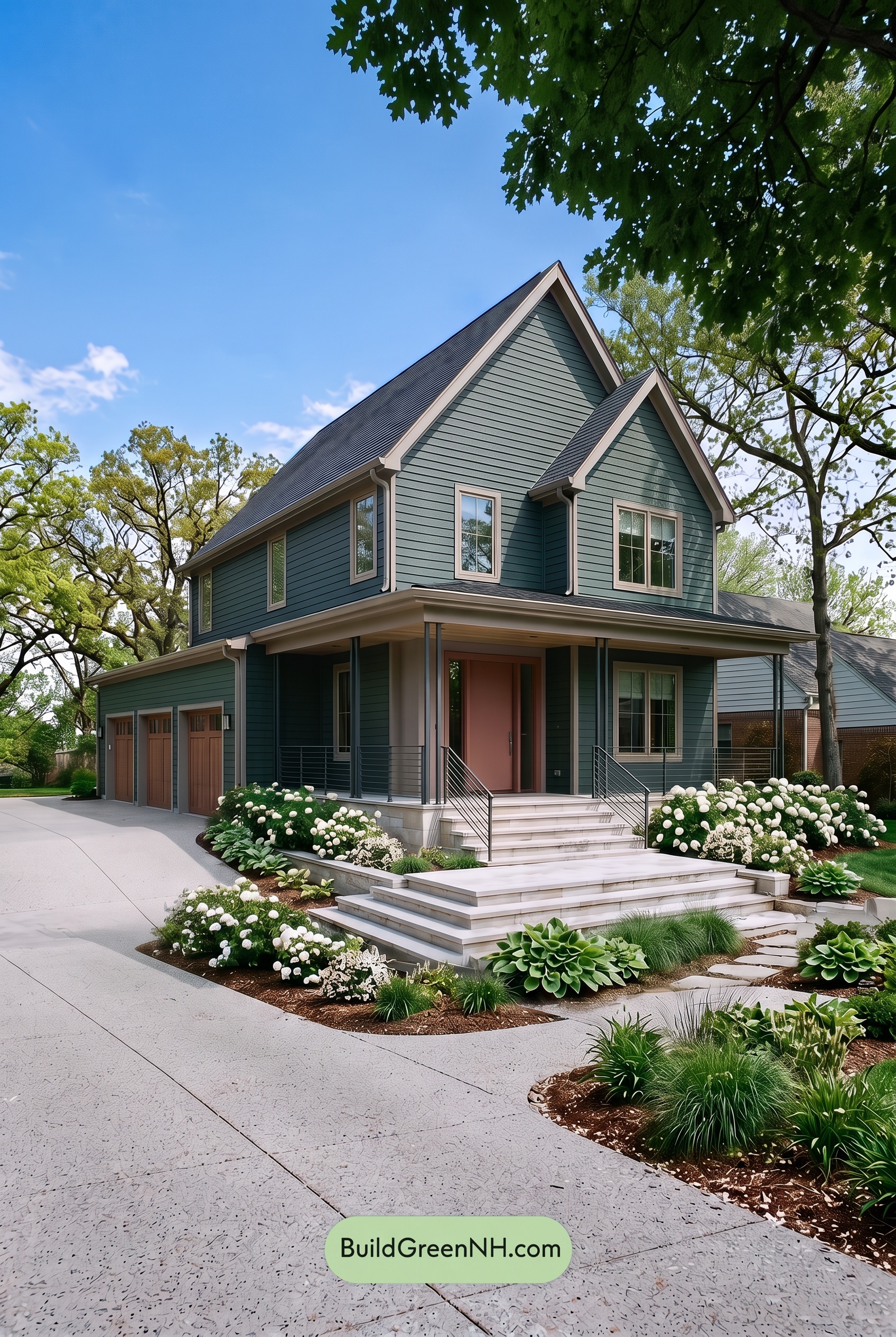
In shade, this green reads deeper and cooler than it would in neutral daylight, with gray undertones becoming more noticeable. Its saturation feels quieter and less lively, especially beneath the porch and eaves, where shadows pull it toward a dark, muted green. The beige shades lose some of their golden warmth, appearing softer and slightly grayer.
The pale beige still stands out against the shaded green, keeping the rooflines and windows clearly defined without a glaring contrast. Meanwhile, the darker grays blend more closely with the porch shadows. Compared with neutral daylight’s more balanced appearance, the shaded palette feels calm, grounded, and a little more dramatic.
Nighttime
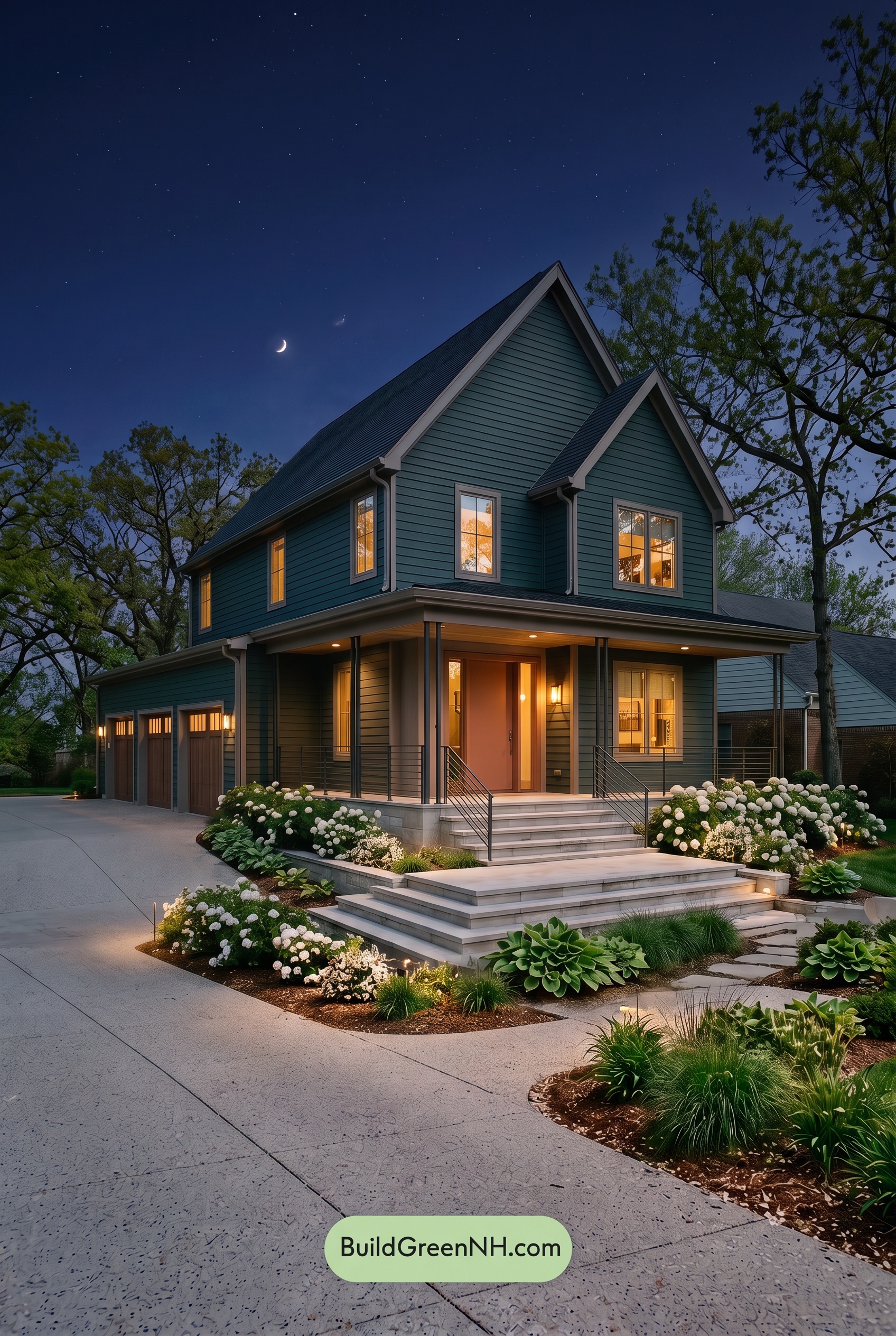
At night, the green siding deepens into a cooler, blue-leaning shade, with its saturation appearing more subdued than it would in neutral daylight. Shadows beneath the eaves and between siding boards add depth, while the pale beige trim remains distinct against the darker walls, outlining the steep rooflines.
Warm porch lighting gives the beige shades around the entrance a softer, golden cast, contrasting with the cooler greens beyond its reach. The gray columns and railings darken in shadow, catching gentle highlights near the lights. Compared with daylight’s more even color balance, this mix of warm highlights and deep shadows makes the exterior feel intimate, dramatic, and welcoming.
Pin these for later:
Want More?
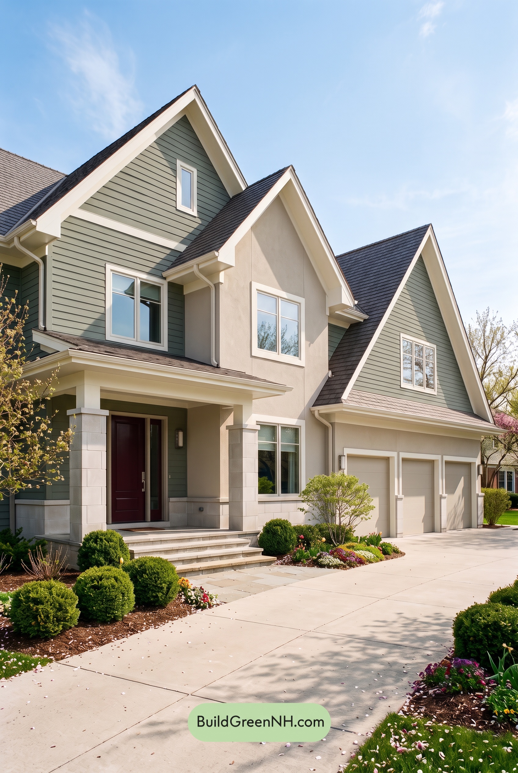 Green House Exterior Color Scheme (New Trend for 2027): Muted Green Burgundy Poise
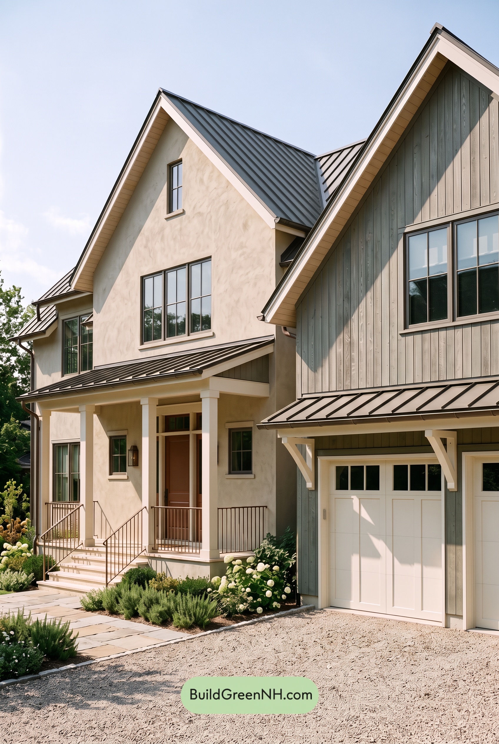 Green House Exterior Color Scheme (New Trend for 2027): Warm Greige Copper Murmur
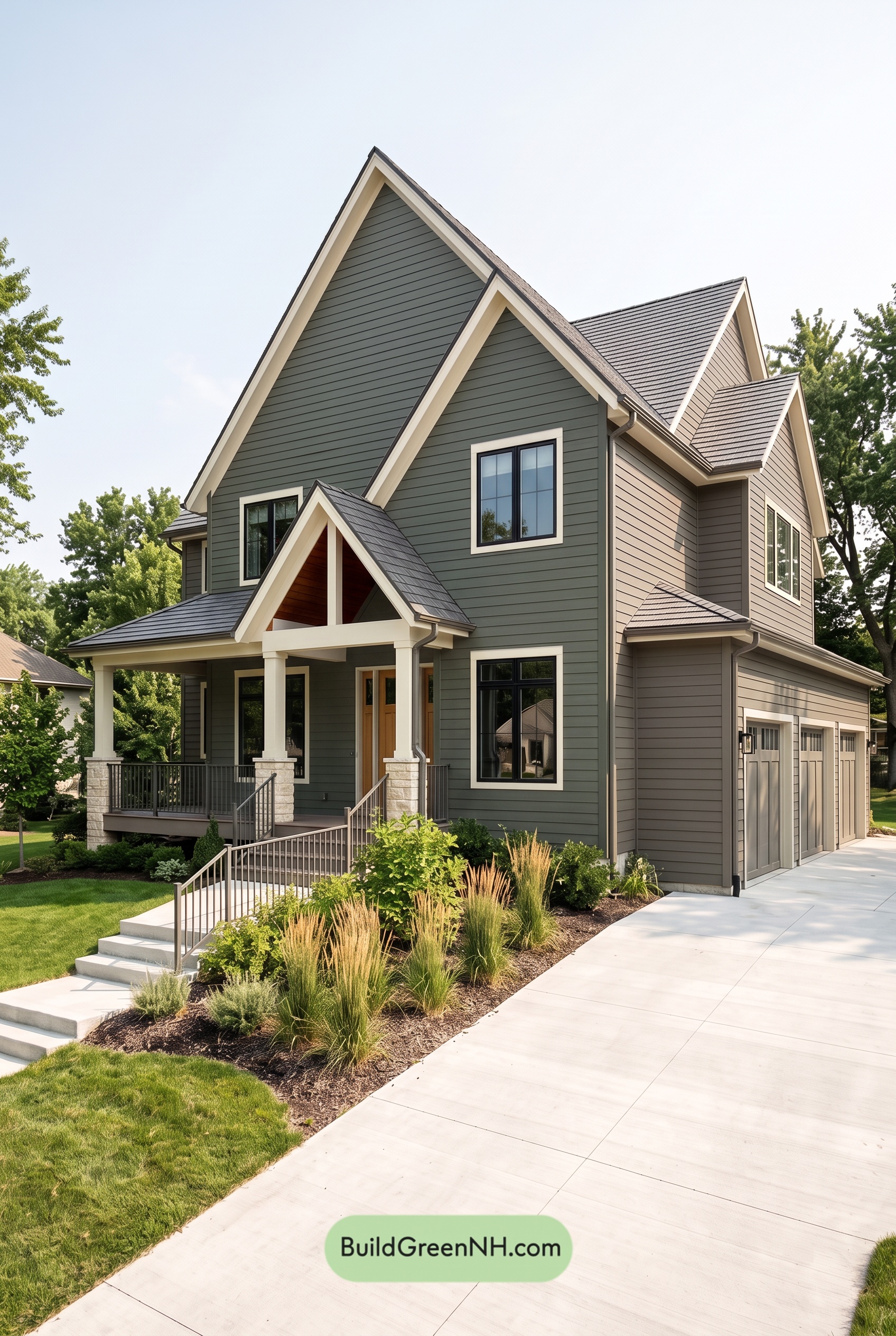 Green House Exterior Color Scheme (New Trend for 2027): Dark Green Cream Cadence
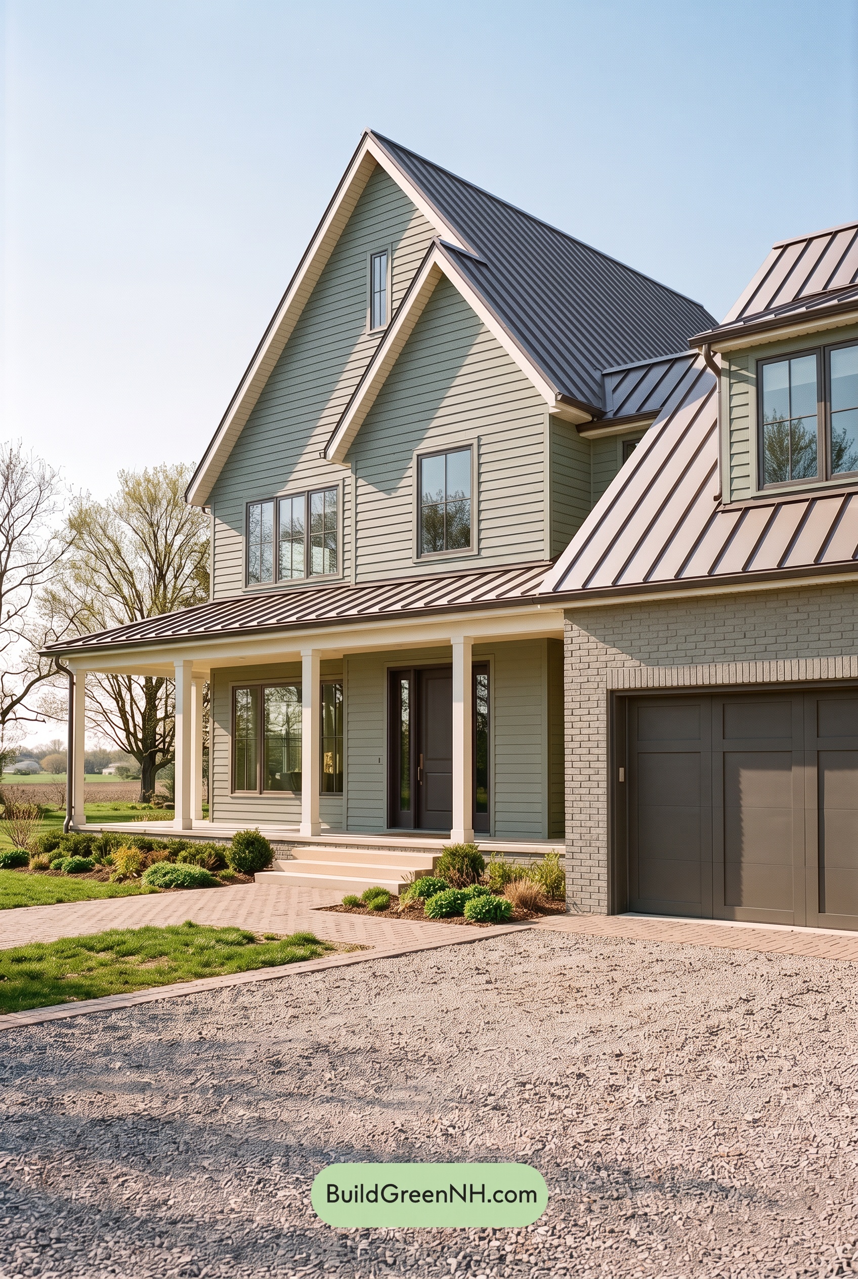 Green House Exterior Color Scheme (New Trend for 2027): Dusty Green Plum Secret
 Green House Exterior Color Scheme (New Trend for 2027): Silver Green Amber Warmth
Table of Contents