Last updated on
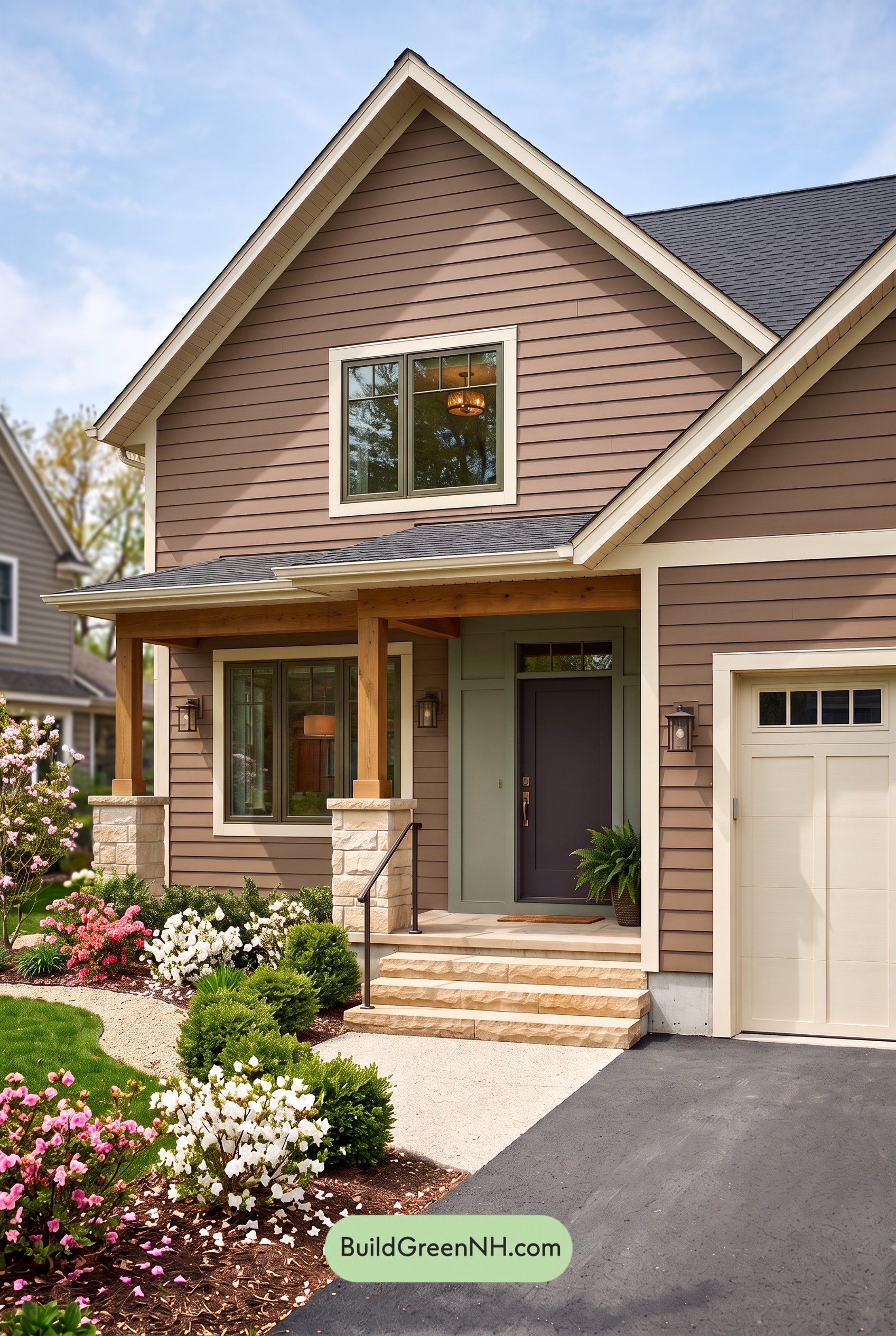

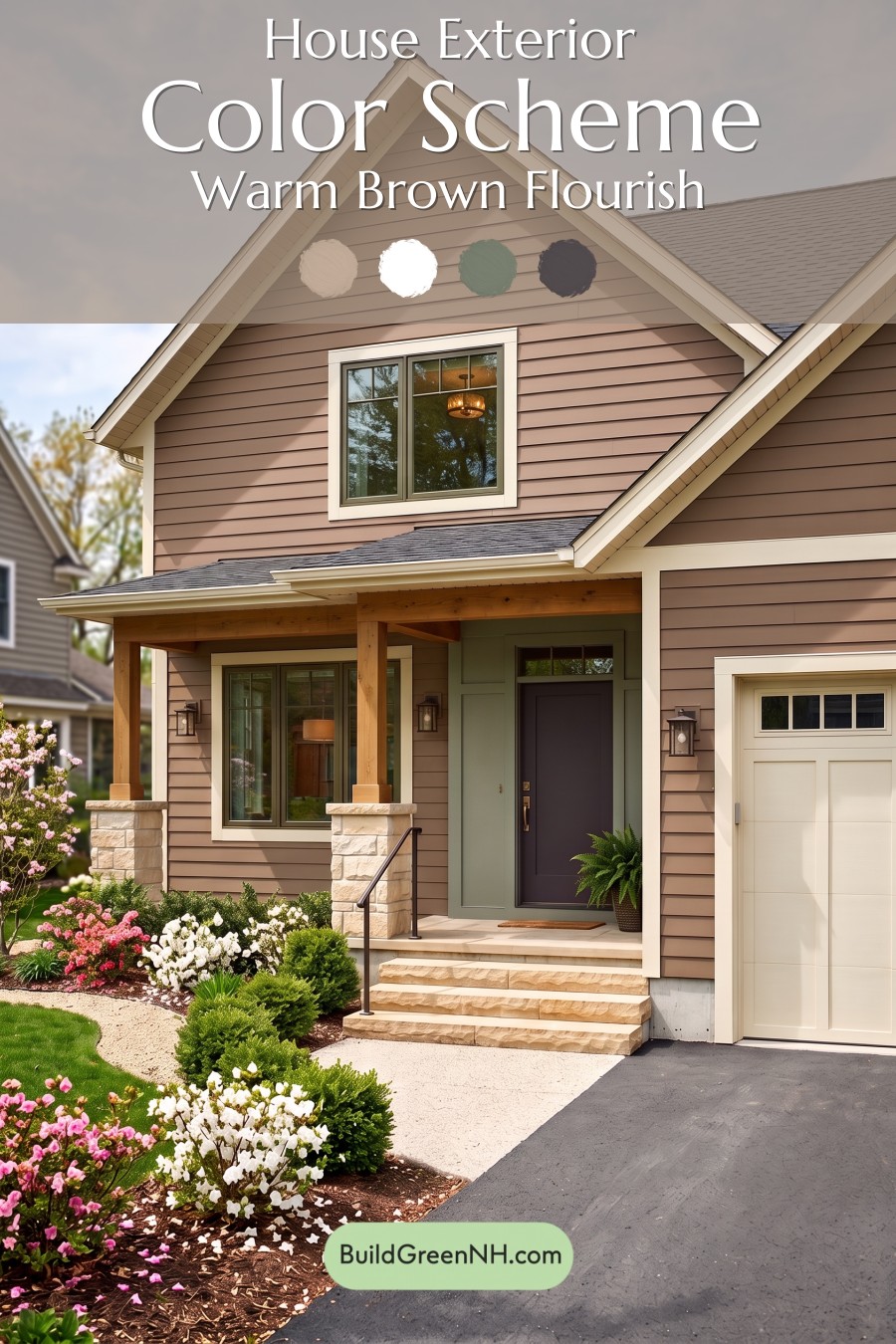
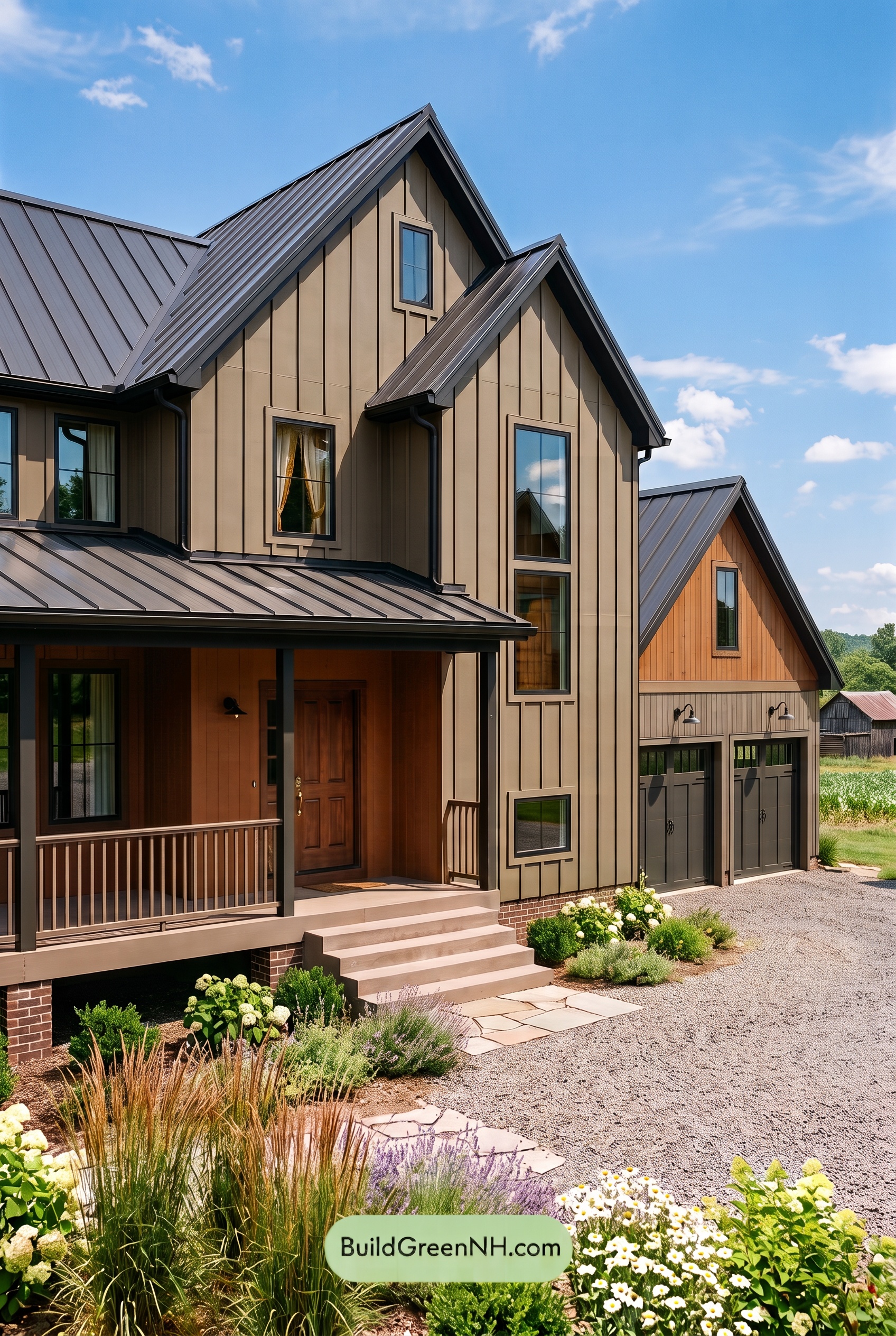
Warm taupe-brown siding, creamy white trim, and layered gray accents give this home an inviting balance of softness, definition, and lasting curb appeal.
A Warm Foundation in Taupe-Brown
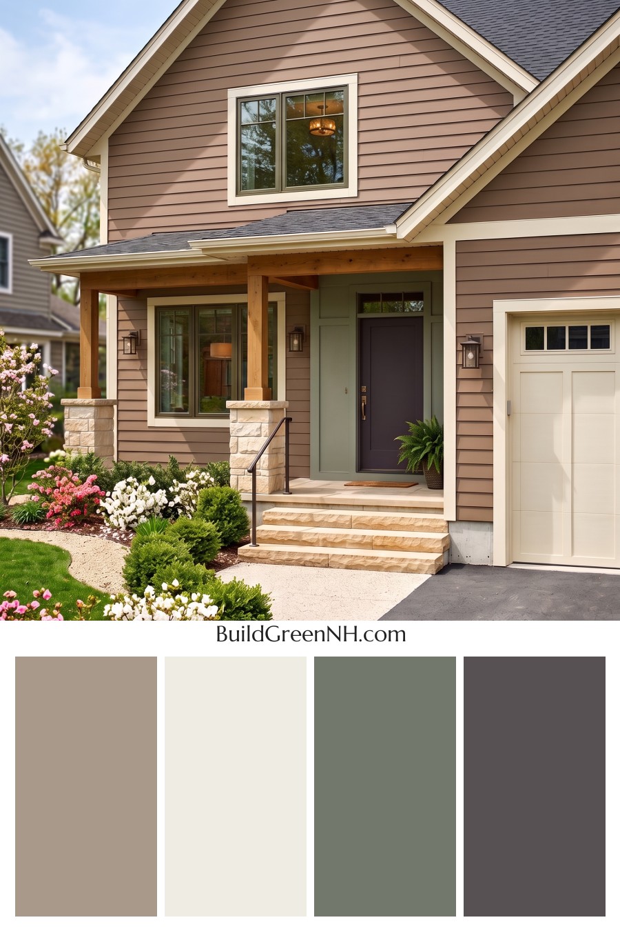
The horizontal siding carries a medium taupe-brown shade with subtle rosy undertones. It brings warmth to the broad wall surfaces without making the exterior feel heavy. Across the tall front gable, the same shade keeps the architecture cohesive while allowing the overlapping siding to add gentle lines of shadow.
This is a welcoming brown rather than a deeply rustic one. Its muted character gives the house a relaxed, polished presence and leaves room for the lighter trim and darker details to stand out.
Creamy White That Defines the Details
A warm, creamy white outlines the roof edges, window surrounds, and garage opening. These pale borders sharpen the house’s shape, especially where the steep gables meet the darker roof. Because the white has a soft warmth, it complements the brown siding without creating a stark contrast.
The garage door repeats that creamy shade across a larger surface. Its recessed panels add interest through shadow rather than extra color, keeping this side of the facade connected to the rest of the home.
Layered Grays Give the Entry Depth
At the entrance, a muted medium gray with green undertones distinguishes the paneled accent wall from the surrounding siding. The shift is subtle but effective: it draws attention toward the porch without interrupting the quiet palette.
The front door deepens the contrast with a dark charcoal gray. Gray window frames provide a narrower layer of definition inside the creamy white surrounds, while the slender dark gray railing echoes the door’s depth. These repeated darker touches help the exterior feel thoughtfully coordinated.
A Balanced Finish from Roof to Porch
The charcoal-gray roof gives the warm siding a cooler counterpoint and visually connects with the darker entry details. Below it, golden-brown porch posts and beams bring natural warmth, while pale beige stone bases and steps soften the transition to the ground.
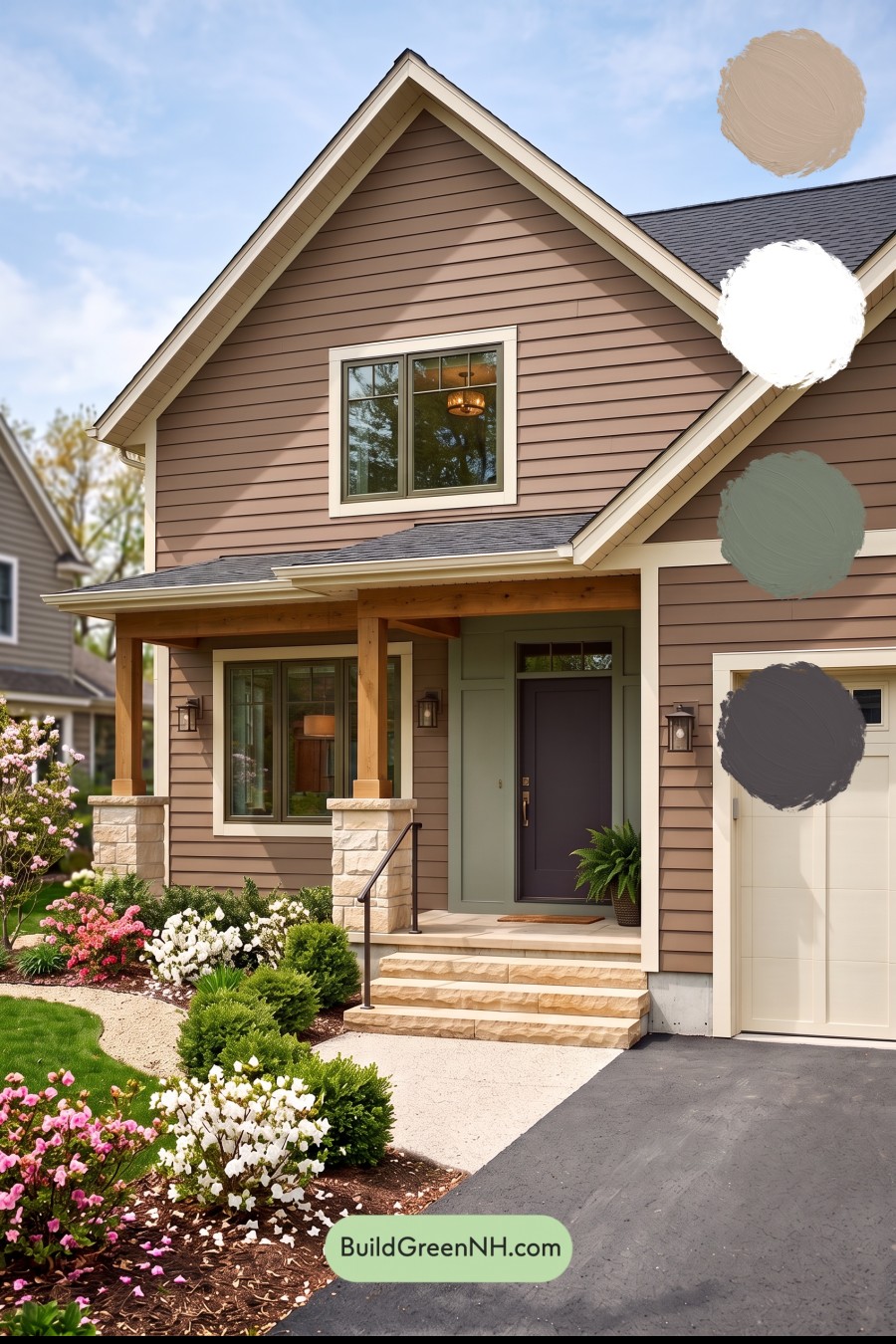
What makes the scheme work is its clear balance: brown supplies warmth, creamy white adds brightness, and gray introduces depth. Together, they create a home that feels comfortable and composed—not overly formal, and never flat. The surrounding green foliage and soft pink and white flowers add a lively finishing touch without competing with the architecture.
Next, see how this color scheme looks under different lighting simulations throughout the day.
Overcast
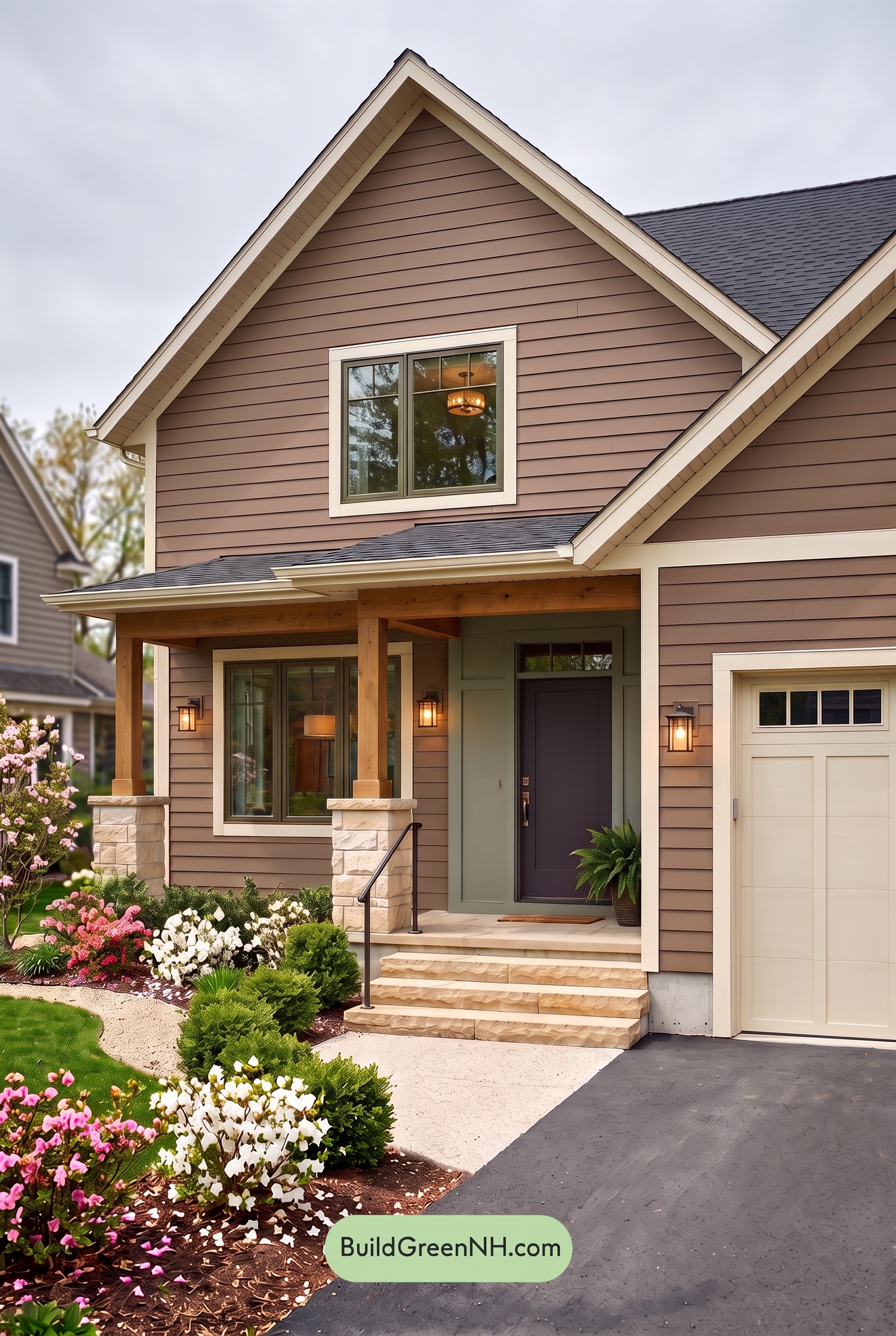
Overcast light gives this brown siding a quieter, less saturated appearance than neutral daylight, softening its reddish warmth and allowing gray undertones to become more noticeable. The warm whites can look slightly cooler and less creamy, while the gray accents settle into a softer, more subdued palette.
With sunlight diffused through clouds, shadows beneath the gables and around the entry become gentler, reducing light-to-dark contrast. Pale whites still frame the brown shades clearly, and the deeper grays keep the entrance defined without feeling as stark. The overall mood shifts from warm and lively toward calm, cohesive, and understated.
Golden Hour
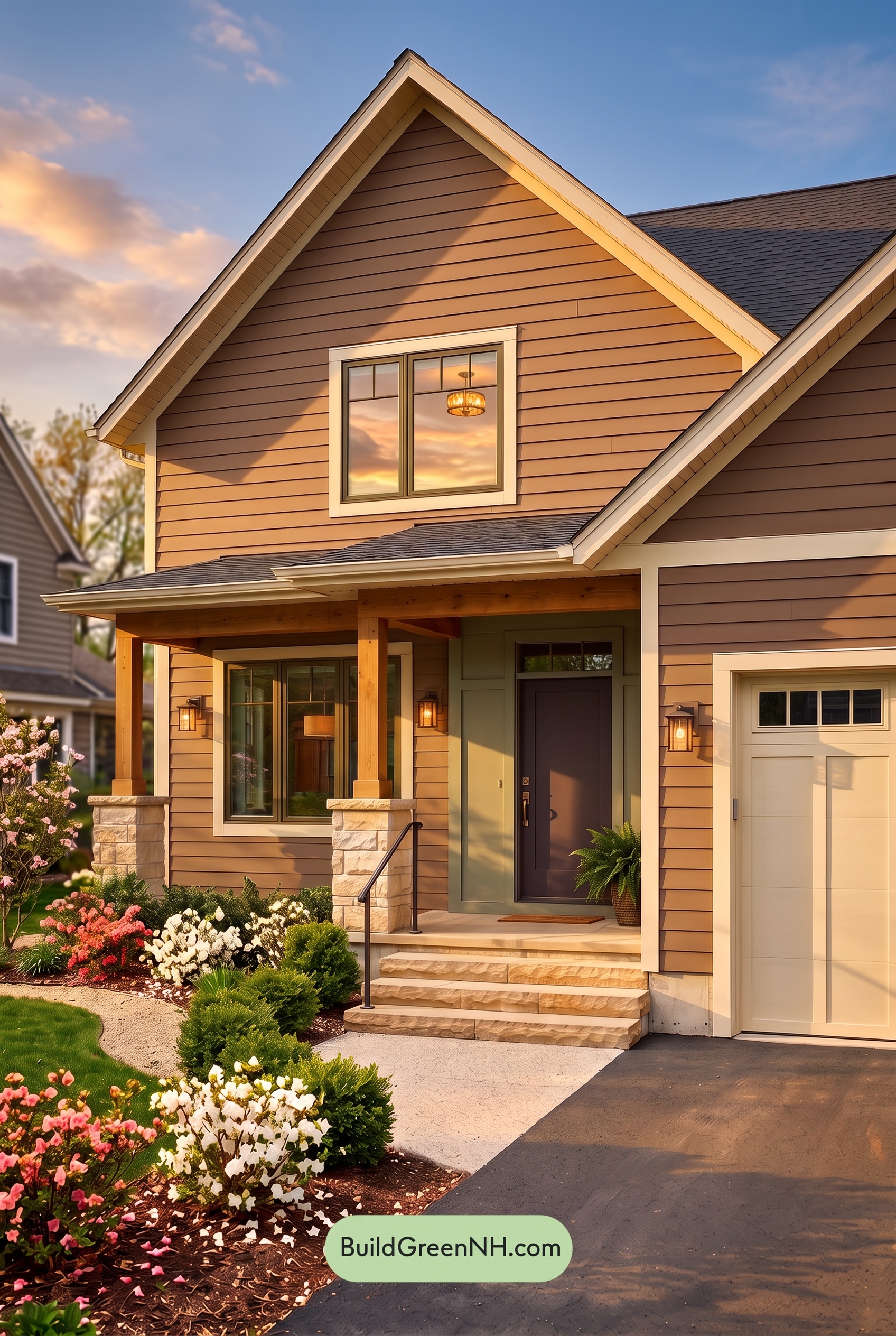
Golden Hour gives the earthy brown shades a richer, more saturated appearance than neutral daylight, bringing out orange undertones across the sunlit siding. The lightest neutrals shift from crisp to softly creamy, while the gray shades appear warmer wherever the low sunlight reaches them.
Long shadows beneath the eaves and around the entry deepen the darker neutrals, creating stronger contrast with the glowing surfaces. Although the pale and earthy shades feel more closely connected by that warmth, the contrast between sunlight and shade becomes more dramatic. Compared with neutral daylight’s balanced appearance, the whole exterior feels cozier and more inviting.
Shade
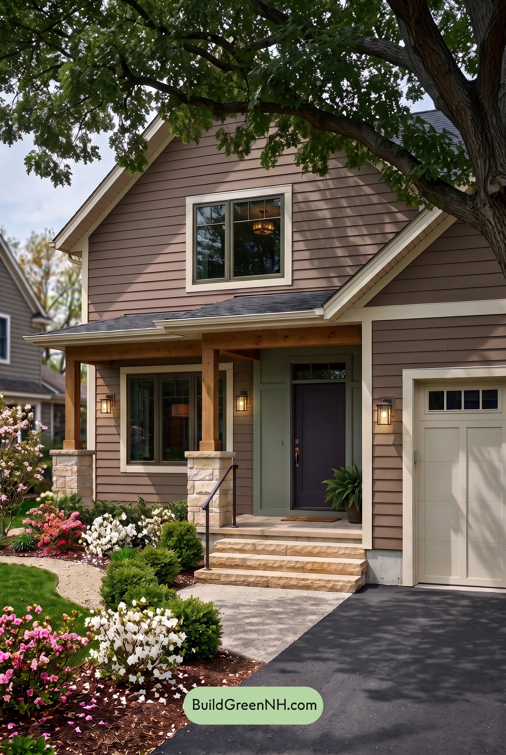
Under the tree’s shade, the soft browns appear deeper and less saturated than they would in neutral daylight, with their warmth gently subdued. The pale, warm neutrals lose some of their creamy glow, while the grays feel cooler and more pronounced. Together, these shifts give the exterior a quieter, more understated character.
Dappled shadows create subtle variations across the brown shades, while deeper shade near the entrance draws the darker grays toward charcoal. The lightest shades still stand out against those darker tones, preserving definition without the brightness of neutral daylight. The overall mood feels sheltered and calm, with softer warmth and a little more depth.
Nighttime
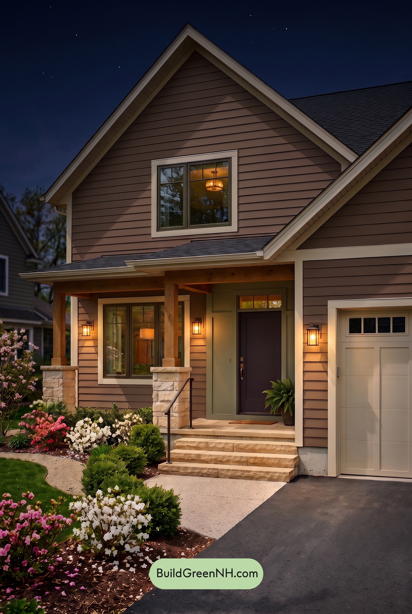
At night, the brown shades deepen and look less saturated in shadow than they would in neutral daylight. Around the lanterns, warm light brings out richer, golden-brown undertones, while the white shades take on a softer, creamier cast. This uneven illumination gives the exterior more depth, with glowing highlights beside dark pockets beneath the eaves.
The gray shades become more subdued, with the darkest areas approaching black and the illuminated areas feeling warmer. Compared with daylight’s more even color definition, nighttime creates stronger contrasts between pale edges and shadowed surfaces. The result feels intimate and welcoming, with the warm pools of light drawing attention toward the entrance.
Pin these for later:
Want More?
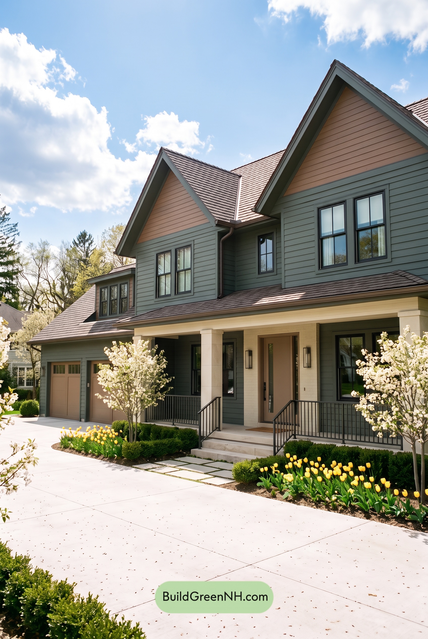 Earthy Green House Exterior Color Scheme: Brown Green Comfort
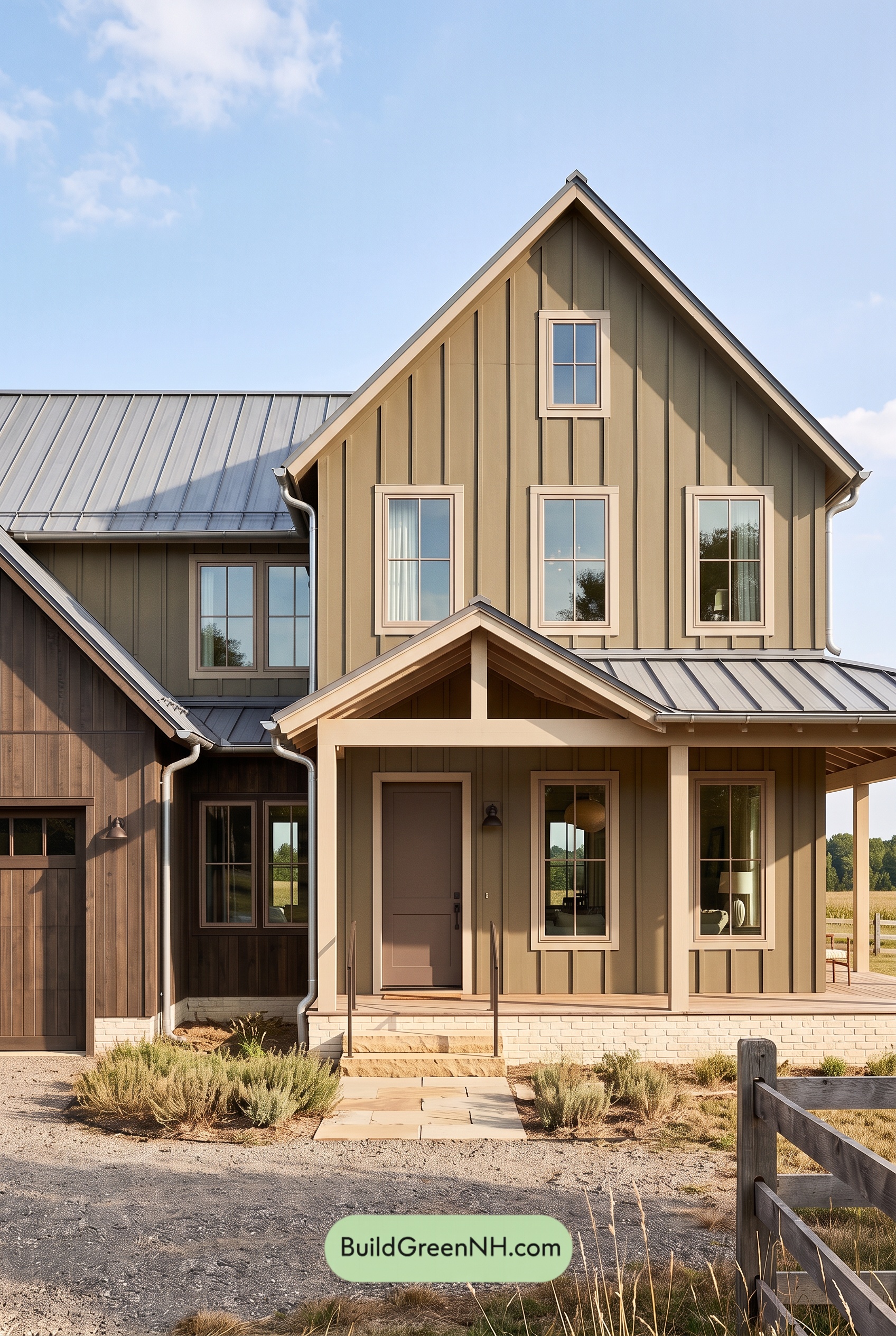 Earthy Green House Exterior Color Scheme: Green and Beige Sanctuary
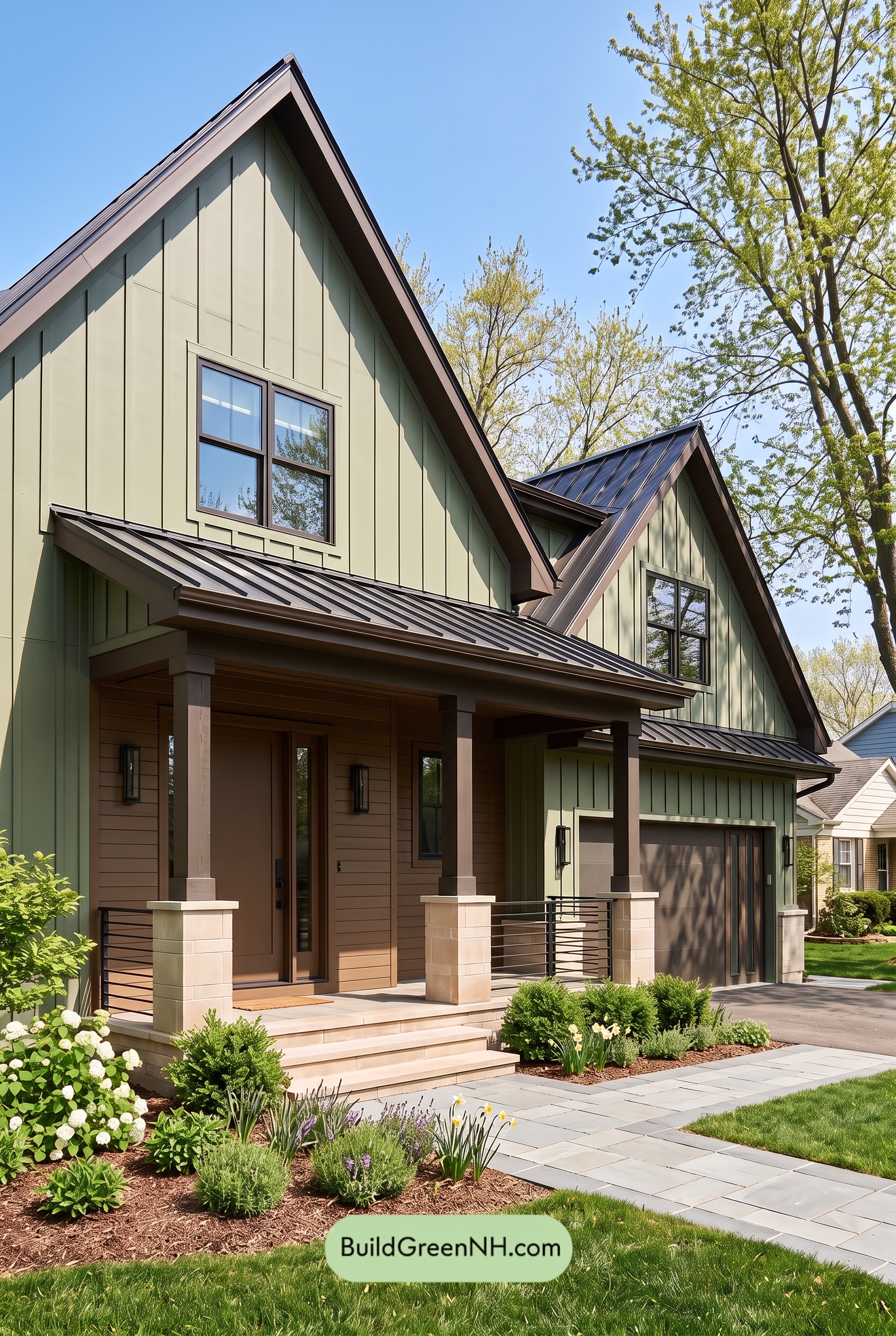 Earthy Green House Exterior Color Scheme: Green Velvet Assurance
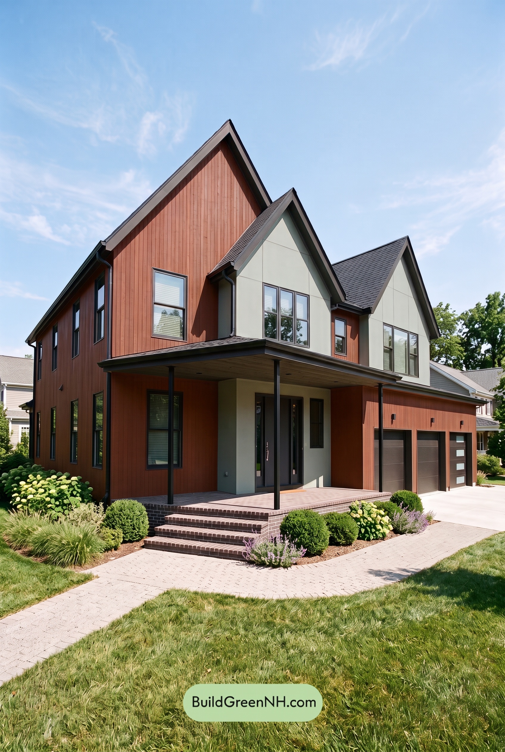 Earthy Green House Exterior Color Scheme: Brown Silken Calm
 Earthy Green House Exterior Color Scheme: Green Amber Contentment
Table of Contents