Last updated on
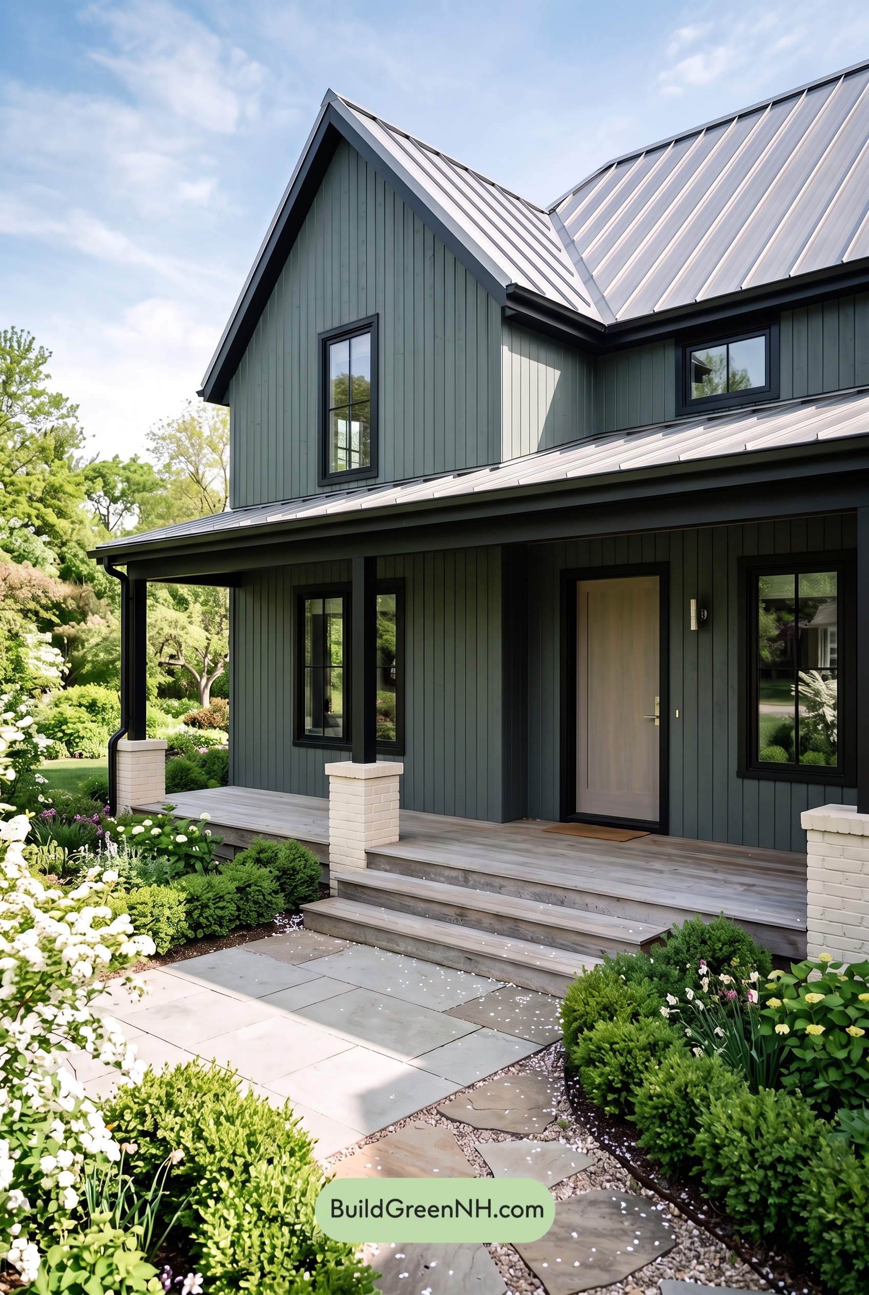

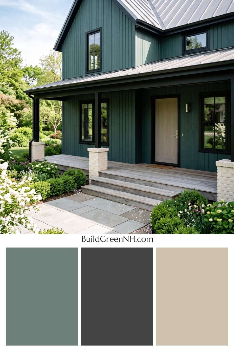
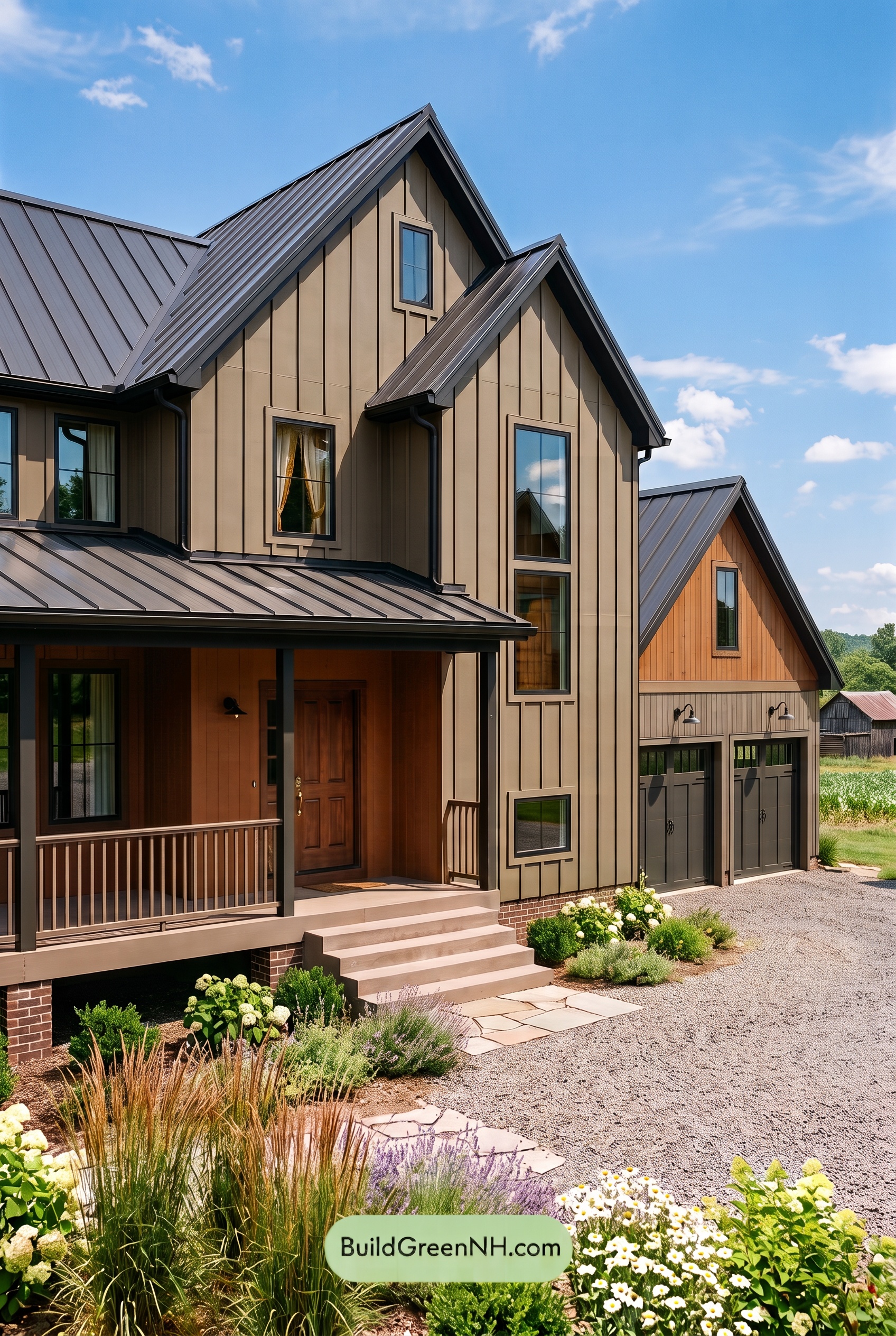
Soft gray siding, deep charcoal accents, and a warm beige front door give this home a beautiful balance of crisp definition and easygoing charm.
Gray Siding with a Softer Side
The vertical siding wears a medium shade of gray with a subtle green undertone, giving the exterior more depth than a straightforward cool gray. It feels calm and grounded, especially alongside the lush planting around the porch.
Sunlight brings out the siding’s softer qualities, while the shaded areas appear deeper and moodier. That variation lets the vertical boards stand out without introducing another contrasting color.
Deep Charcoal Defines the Architecture
Deep charcoal gray outlines the windows, roof edges, and porch structure. These darker details sharpen the home’s silhouette and give the broad areas of siding a clear visual framework. The contrast is strong, but the shared gray family keeps everything connected.
The slender porch columns repeat this dark shade, creating a steady rhythm across the front elevation. Below them, creamy off-white brick bases provide a lighter counterpoint. Their warmth softens the darker posts and keeps the porch from feeling too heavy.
A Warm Welcome at the Front Door
The front door introduces a gentle beige that stands apart from the surrounding grays without demanding attention. Framed by deep charcoal, this lighter, warmer shade naturally draws the eye toward the entrance.
It is a quiet accent with a big role. The beige brings a welcoming note to the shaded porch and echoes the warmth of the pale brick bases, making those lighter elements feel thoughtfully connected.
A Light Roof Keeps the Palette Balanced
The standing-seam roof adds a bright, silvery gray above the deeper siding and trim. Its reflective surface catches the daylight, giving the steep rooflines a lighter presence. A matching roof over the porch carries that balance across the facade.
Soft gray porch flooring and steps ease the transition toward the pale gray paving. Together, these lighter surfaces prevent the darker architectural details from dominating. The overall mood is polished yet relaxed: layered grays supply cohesion, charcoal adds definition, and warm beige makes the entrance feel inviting.
Next, see how this color scheme looks under different lighting simulations throughout the day.
Overcast
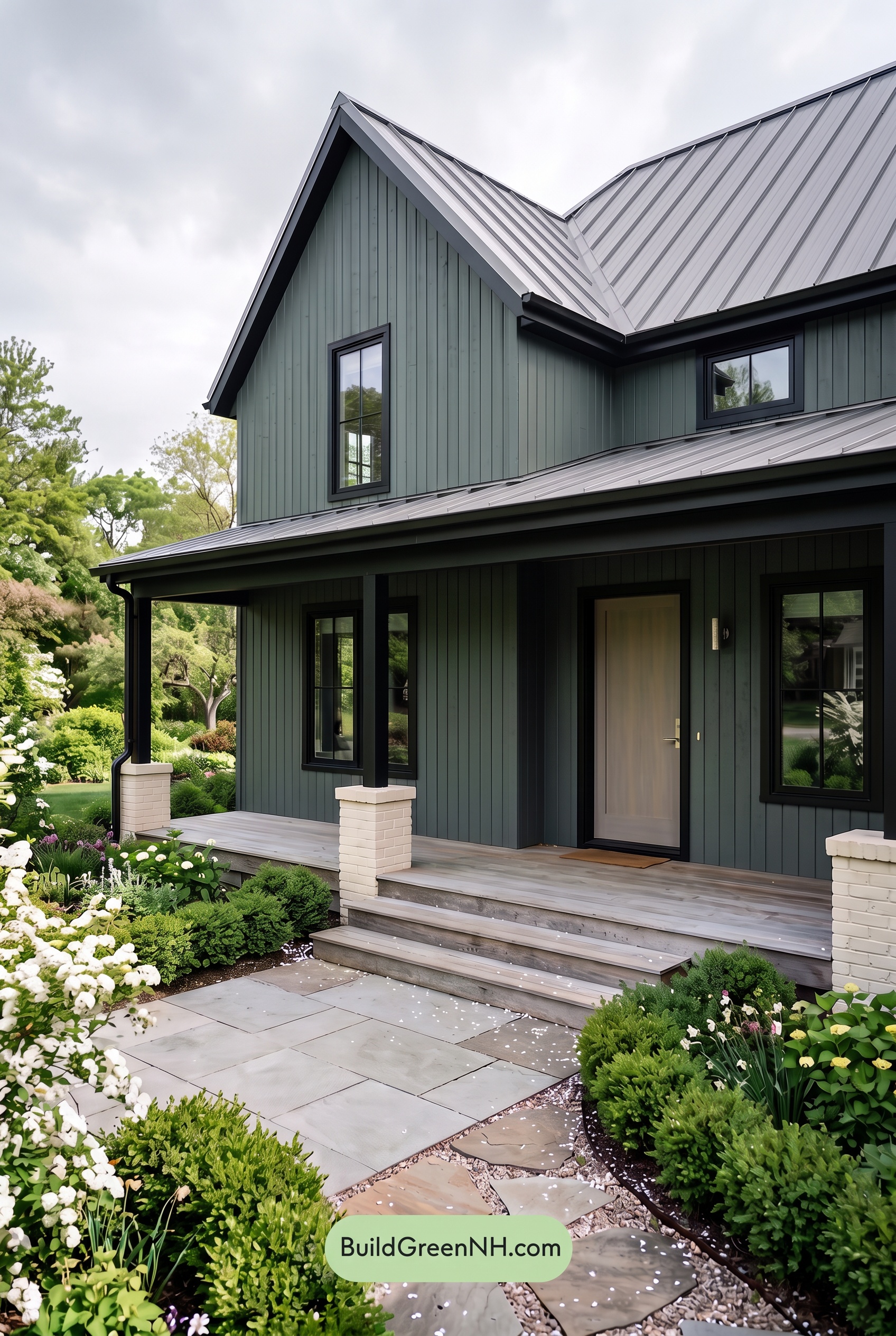
Under overcast skies, the gray siding reads cooler and more muted than it would in neutral daylight, with a subtle green undertone becoming easier to notice. Saturation feels restrained, while the beige front door loses some of its golden warmth and takes on a softer, quieter character.
Diffused light softens shadow edges and reduces contrast across the siding, though the sheltered porch still gives the grays extra depth. The darkest gray trim and window frames remain distinct without looking as sharply outlined, while the lighter beige offers a gentle warm counterpoint. Together, these shifts give the exterior a calm, slightly moody elegance rather than the clearer, more balanced appearance of neutral daylight.
Golden Hour
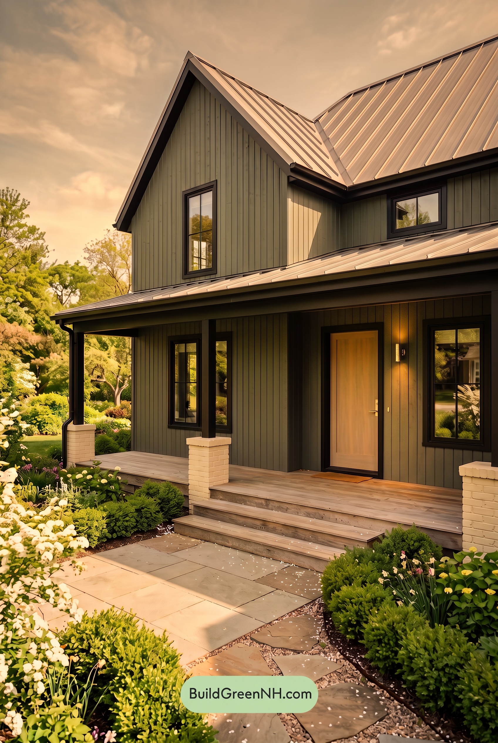
Golden Hour gives this home’s mid-tone grays a warmer, earthier character than they would show in neutral daylight. Sunlit areas take on soft yellow-brown hints, while shaded sections remain muted and appear deeper. The light beige looks richer and more golden, adding a gentle boost in apparent saturation without making the palette feel bold.
Long shadows beneath the roof and across the porch push the darkest grays toward near-black, increasing contrast with the glowing lighter shades. Compared with the more even, restrained appearance of neutral daylight, this mix of warm highlights and deep shadows gives the exterior greater depth—and a cozy, quietly dramatic mood.
Shade
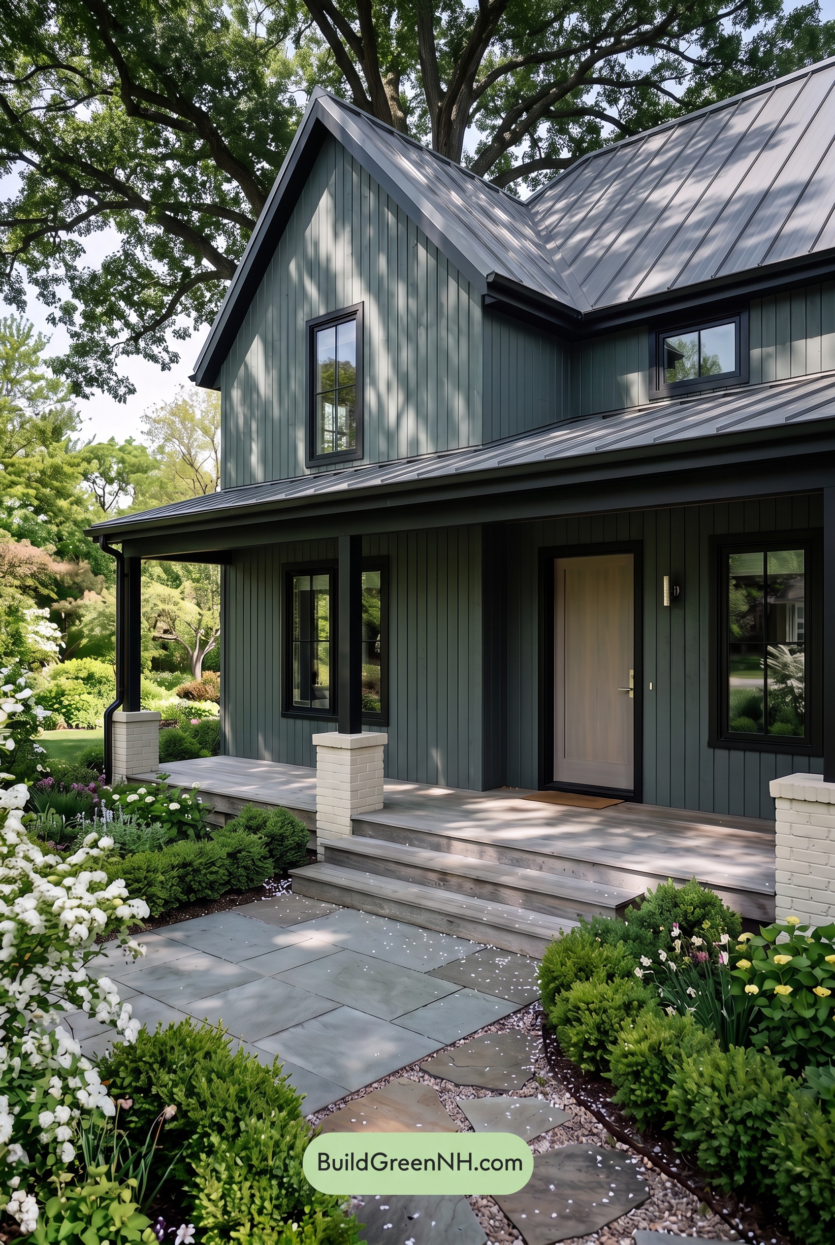
In shade, the gray exterior reads deeper and cooler than it would in neutral daylight, with subtle blue-green undertones becoming more noticeable. The palette feels muted rather than vividly saturated, while leafy shadows create shifting pockets of darker gray across the siding. Beneath the porch, the darkest gray shades begin to blend together, softening the contrast between walls, trim, and columns.
The beige door loses some of its daylight warmth, taking on a softer, more subdued appearance while still offering a gentle contrast to the cooler grays. Brighter patches above the porch keep the facade from feeling flat, giving the shaded palette a quiet, sheltered mood rather than the crisper, more open feeling of neutral daylight.
Nighttime
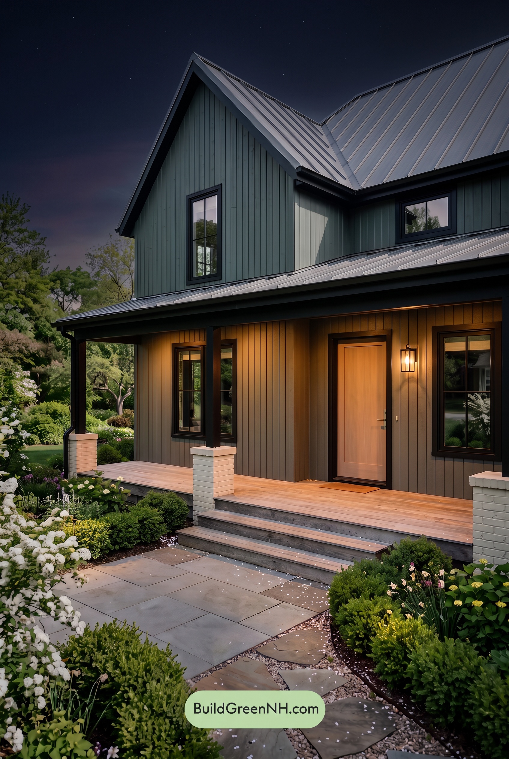
At night, the gray exterior deepens into cooler, blue-gray shades, while subtle color differences become less distinct than in neutral daylight. Shadows beneath the eaves and around the columns pull the darkest grays toward near-black, giving the house a more dramatic silhouette. Away from the porch light, the palette feels muted and quiet.
The warm lighting creates a welcoming counterpoint, lending nearby grays a soft brown cast and making the beige door appear richer, with more noticeable golden warmth. These illuminated areas contrast strongly with the shadowed trim and window frames, turning an evenly balanced daylight palette into a cozy, softly glowing entrance.
Pin these for later:
Want More?
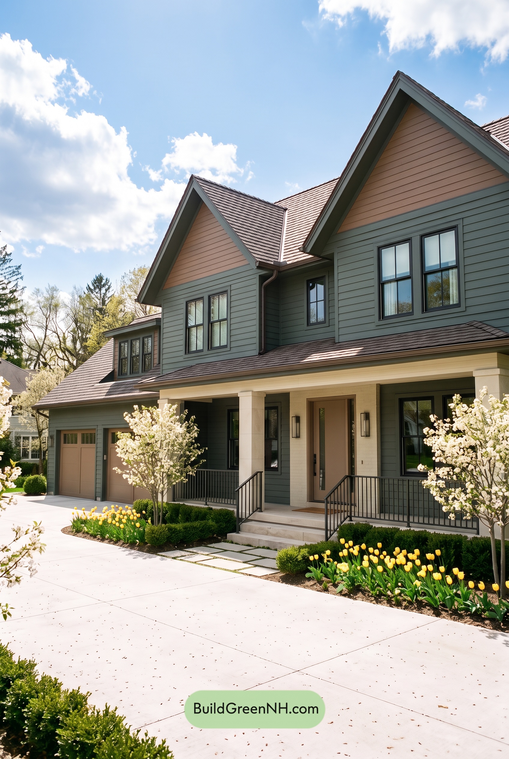 Earthy Green House Exterior Color Scheme: Brown Green Comfort
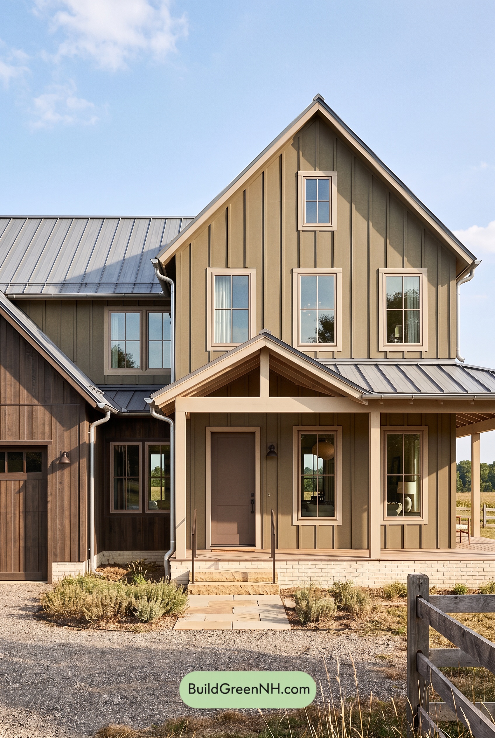 Earthy Green House Exterior Color Scheme: Green and Beige Sanctuary
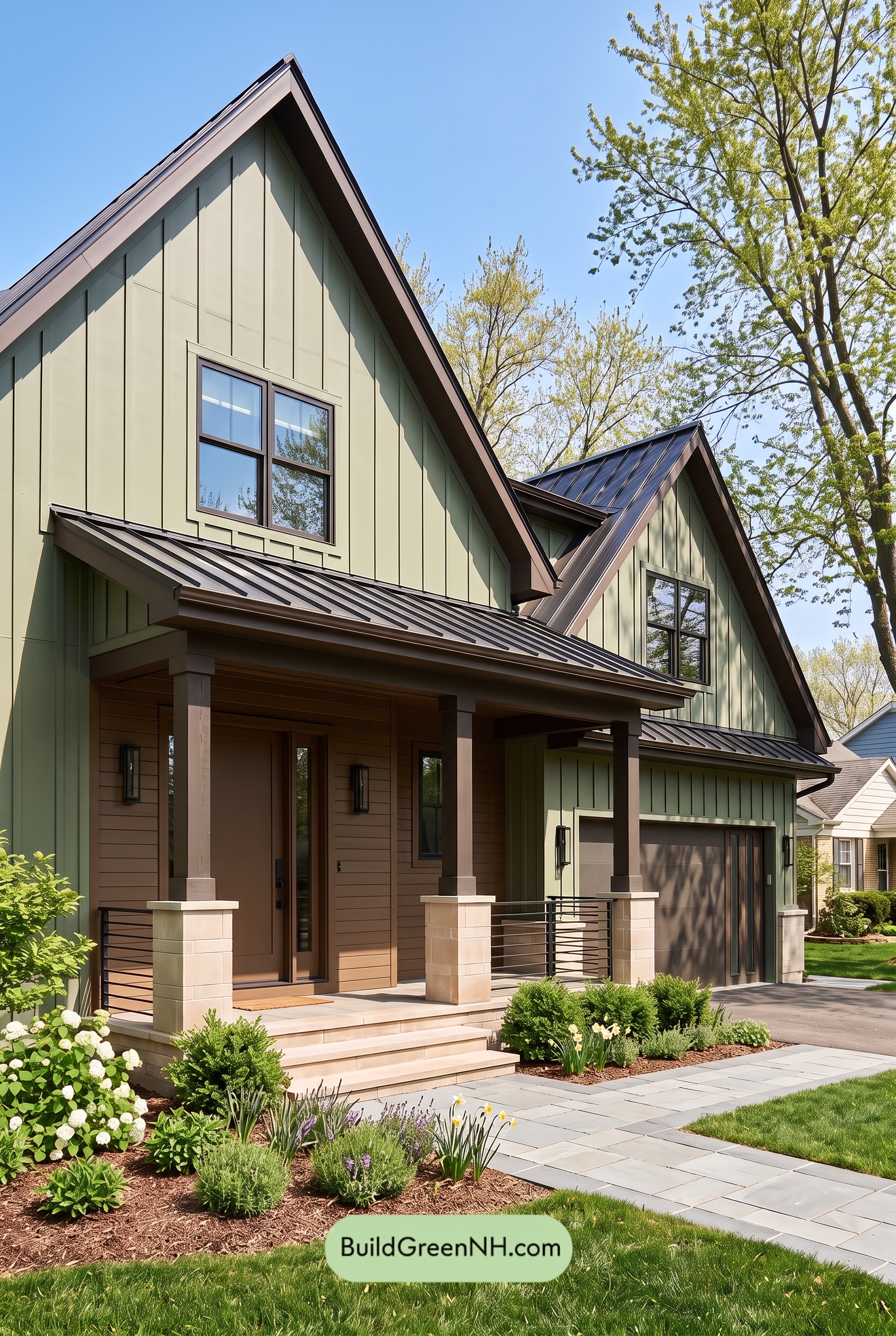 Earthy Green House Exterior Color Scheme: Green Velvet Assurance
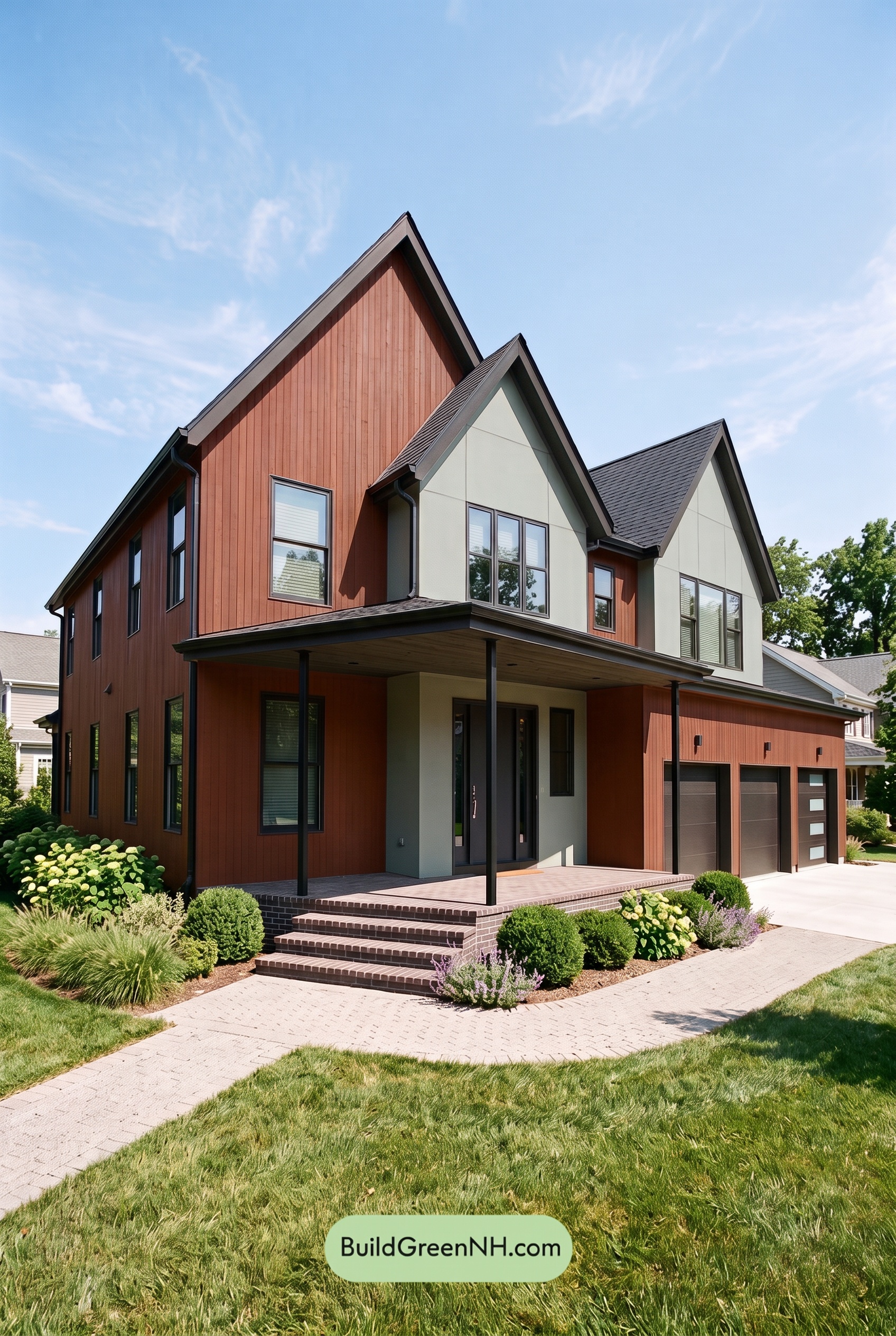 Earthy Green House Exterior Color Scheme: Brown Silken Calm
 Earthy Green House Exterior Color Scheme: Green Amber Contentment
Table of Contents