Last updated on
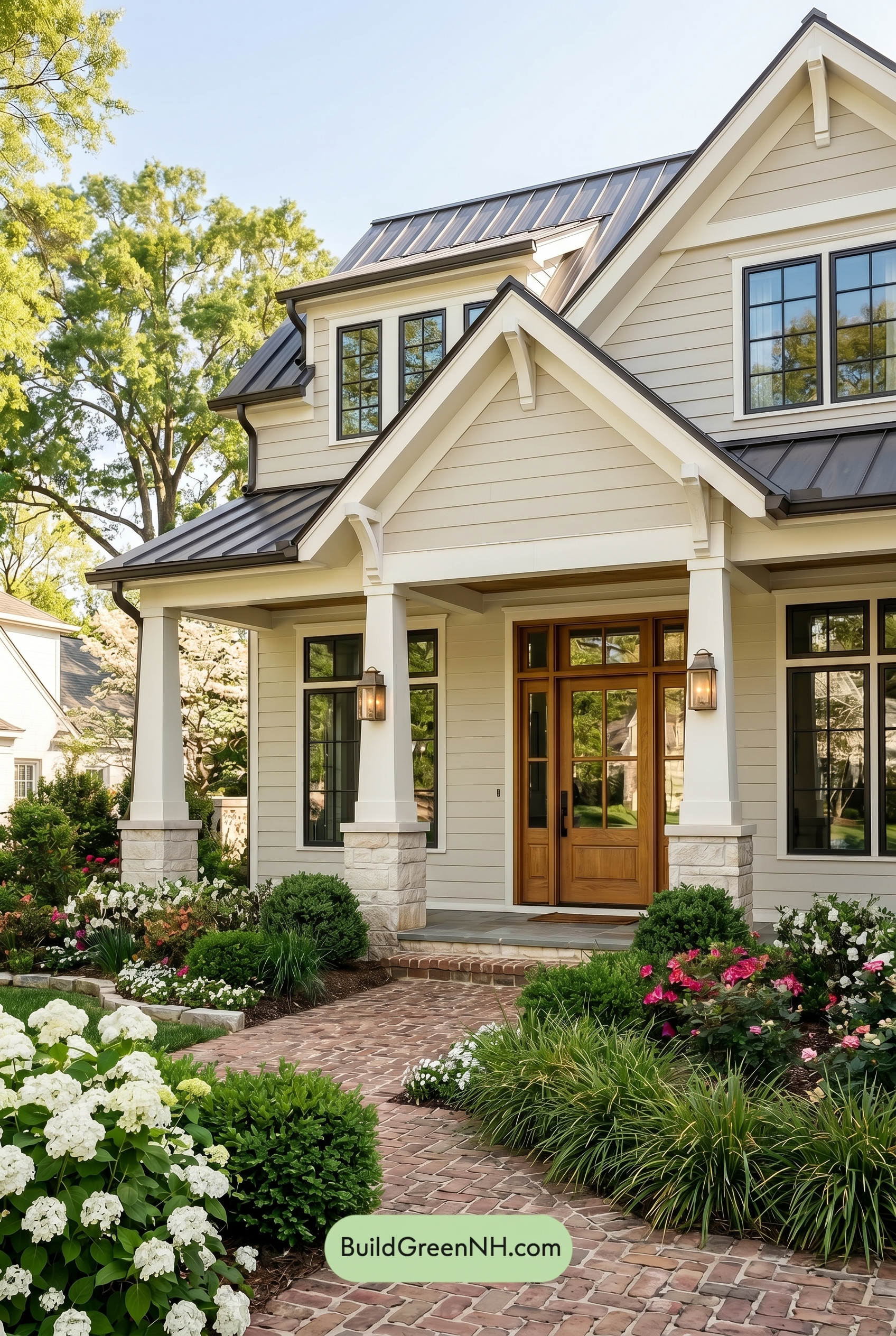

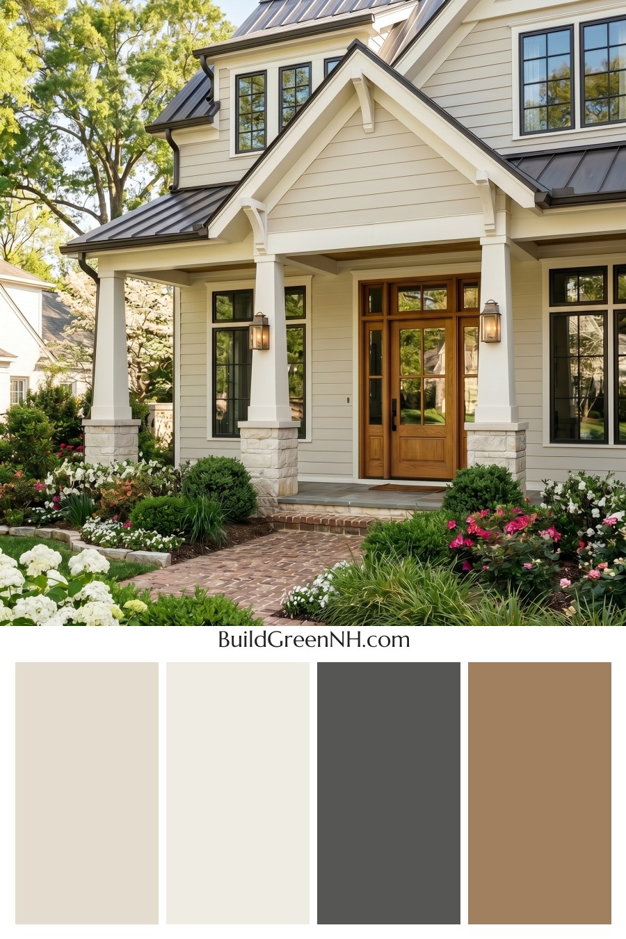
This exterior works beautifully because its warm beige siding, crisp white trim, deep gray details, and rich brown door feel timeless, welcoming, and perfectly balanced.
A Warm Neutral Foundation
The main siding sits in a soft beige family, giving the home a gentle, sunlit quality without feeling too pale or washed out. It brings warmth to the large wall surfaces and helps the house feel settled within the surrounding greenery.
This warm beige shade is especially effective on the horizontal siding because it highlights the home’s layered architecture in a subtle way. The gables, porch areas, and upper walls all feel connected, calm, and cohesive.
Crisp White Trim for Definition
The trim and columns use a clean white family shade that sharpens the entire exterior. Around the rooflines, windows, gables, and porch supports, this bright contrast gives the home a polished, classic look.
The white columns are a standout feature. They make the front entry feel grand and inviting while keeping the overall palette fresh. Against the beige siding, the white trim adds just enough contrast without overpowering the softer warmth of the home.
Cool Gray Accents Add Structure
The window frames and roof details bring in a deep gray family, which grounds the lighter exterior colors beautifully. These cooler gray shades create a tailored edge around the windows and add definition to the roofline.
The dark gray roof gives the palette depth and balance. It keeps the beige and white from feeling too delicate, adding a strong architectural cap that feels refined and substantial.
A Rich Brown Door Warms the Entry
The front door introduces a rich brown family shade that feels natural, warm, and welcoming. It adds character right where the eye wants to land: at the entry.
This brown tone works especially well with the beige siding because both colors share an earthy warmth. Paired with the crisp white surround and deep gray accents, the door becomes a beautiful focal point without feeling loud.
Why the Palette Works
This color scheme succeeds because it balances warmth, contrast, and restraint. The beige siding creates comfort, the white trim adds brightness, the gray accents bring structure, and the brown door adds personality.
The overall mood is graceful and inviting. It feels classic enough to last for years, yet fresh enough to look current. Surrounded by green landscaping and soft garden colors, the exterior feels calm, elegant, and wonderfully at home in its setting.
Next, see how this color scheme looks under different lighting simulations throughout the day.
Overcast
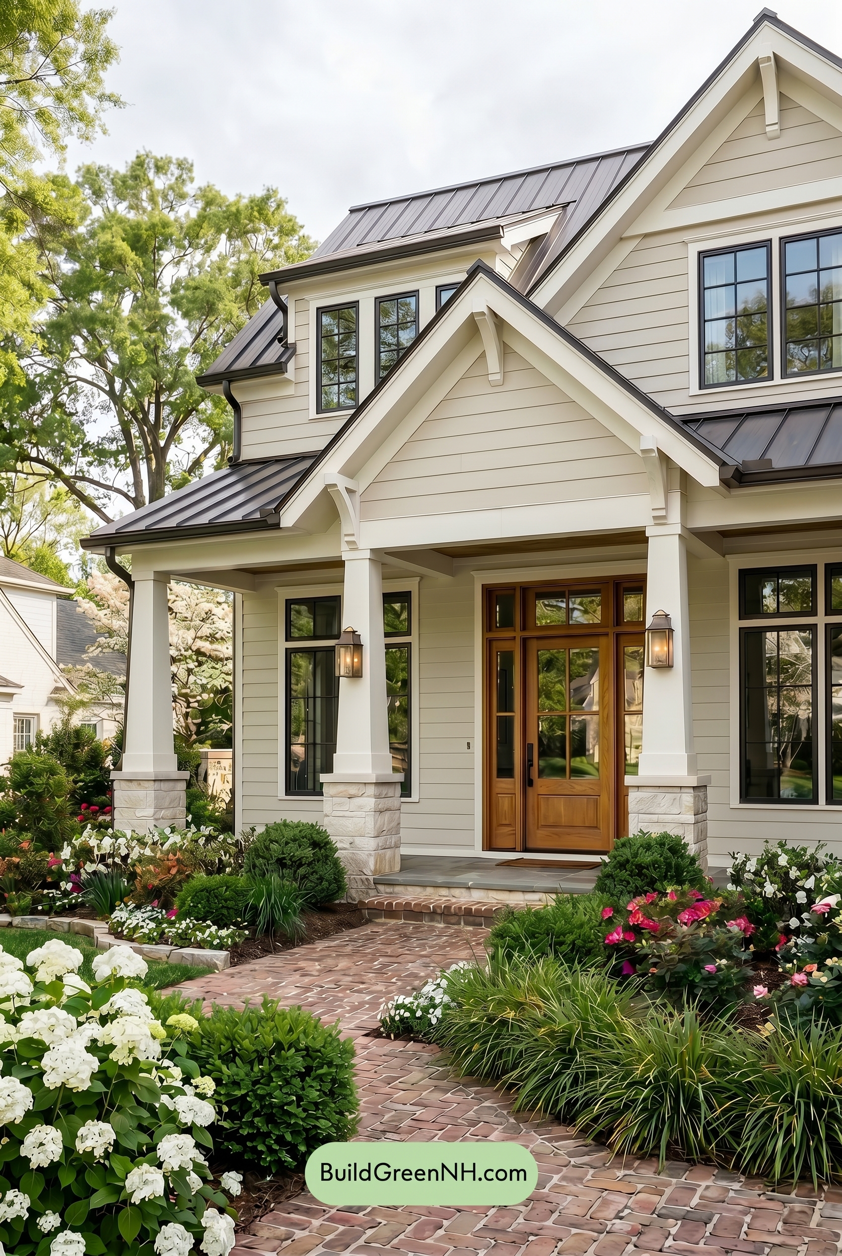
Under overcast light, the beige siding would read a touch cooler and less saturated than it does in neutral daylight, softening its warmth into a calmer, more muted neutral. The white trim and columns would lose some crisp brightness, appearing creamier and more diffused, while shadows under the gables and porch become gentler rather than sharply defined.
The gray window frames would feel slightly deeper against the softened walls, but the overall contrast would be quieter and more even. The brown front door would hold onto the most warmth, though its richness would feel more subdued, giving the whole exterior a relaxed, cozy, and softly elegant mood.
Golden Hour
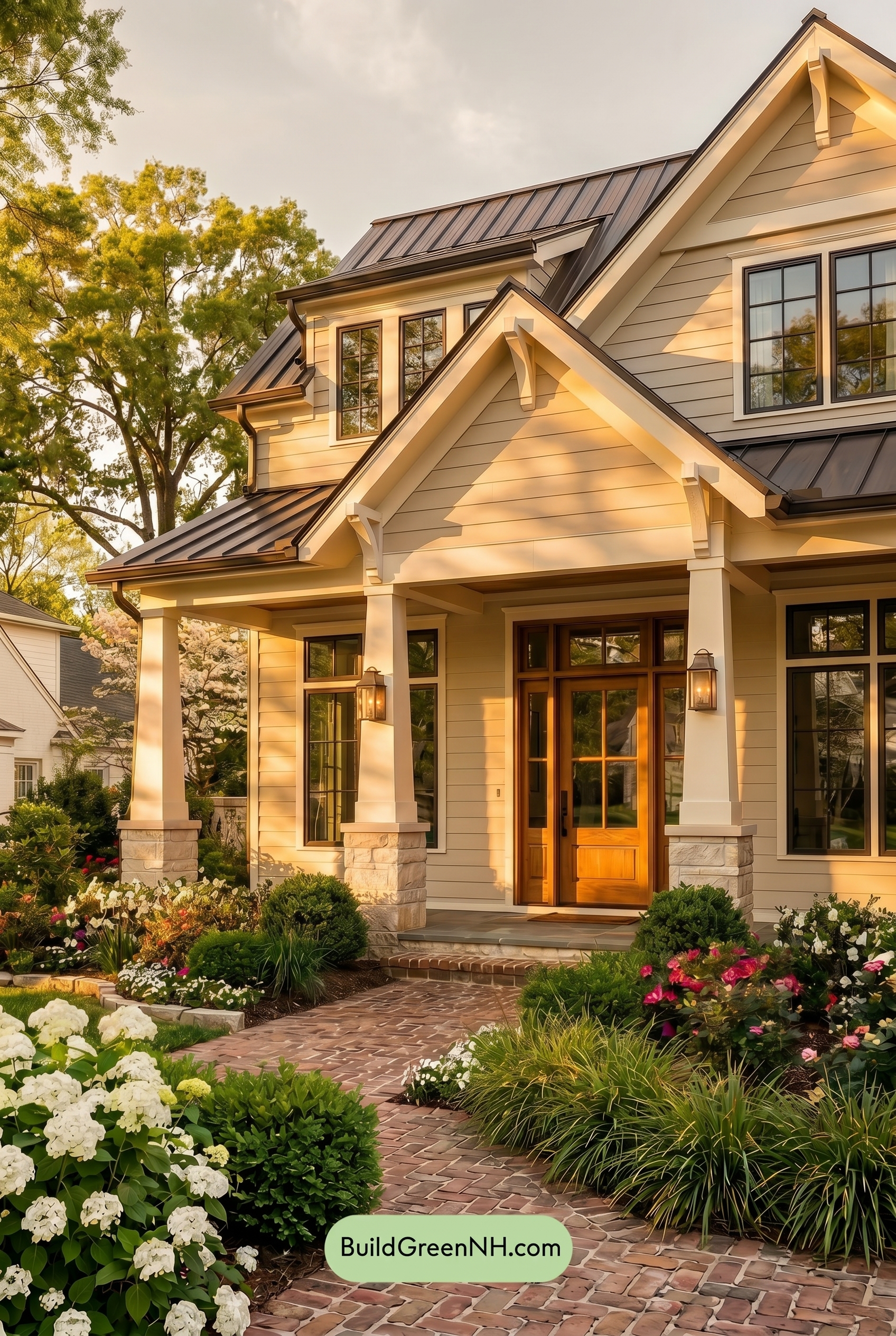
Under Golden Hour, the beige siding shifts from a calm, even neutral into a richer warm beige, with saturation gently boosted by the low sun. The white trim and columns take on a creamy glow rather than the crisper white they would show in neutral daylight, softening the edges and making the façade feel more inviting.
Longer shadows deepen the gray window frames and sharpen contrast around the rooflines, while the brown front door appears warmer and more saturated. Compared with neutral daylight’s flatter, truer read, this light adds depth, warmth, and a relaxed evening mood that makes the whole exterior feel layered and welcoming.
Shade
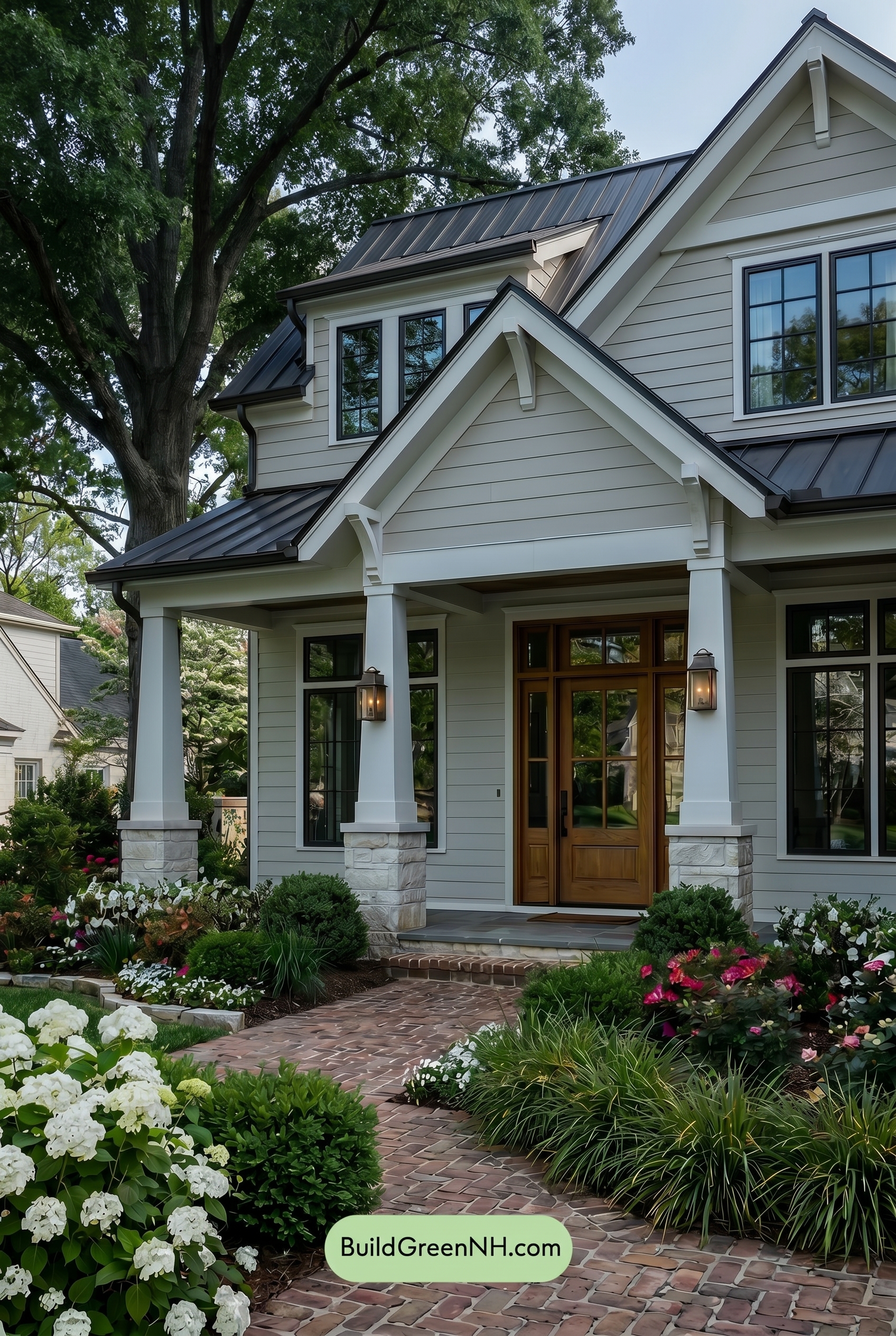
In Shade, the beige siding appears cooler and more subdued than it would in neutral daylight, with its warmth softened and its saturation gently dialed back. The white trim and columns lose some crisp brightness, taking on a quieter, slightly muted look that blends more calmly with the main wall.
Shadows under the eaves and porch deepen the gray window frames and make the brown front door feel richer and more grounded. Overall contrast becomes moodier: the light shades feel softer, the darker shades gain presence, and the whole exterior shifts from bright and fresh to relaxed, sheltered, and refined.
Nighttime
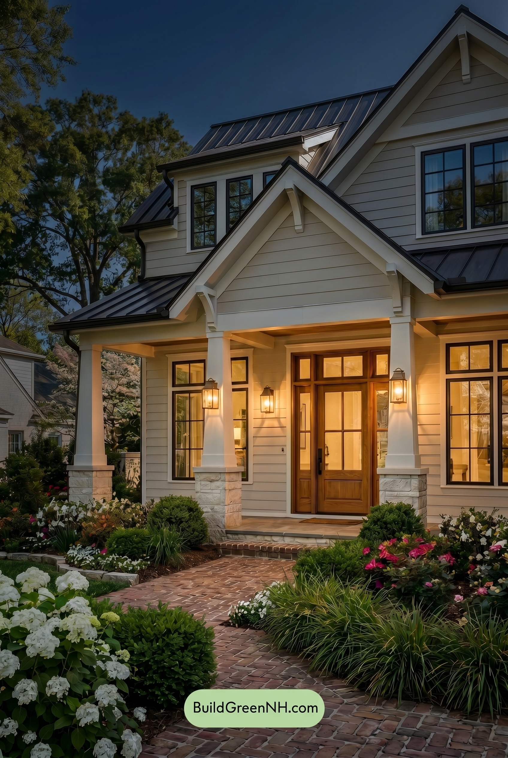
At nighttime, the beige siding shifts from a neutral daylight softness into a warmer, more saturated shade where the porch lighting touches it. The white trim and columns pick up a gentle golden cast, feeling creamier and softer, while areas beyond the light fall into cooler shadows.
The gray window frames appear deeper and more defined after dark, increasing contrast against the lighter trim. The brown front door gains richness and warmth, helping the entry feel cozy, polished, and inviting compared with the clearer, more balanced look it would have in neutral daylight.
Pin these for later:
Want More?
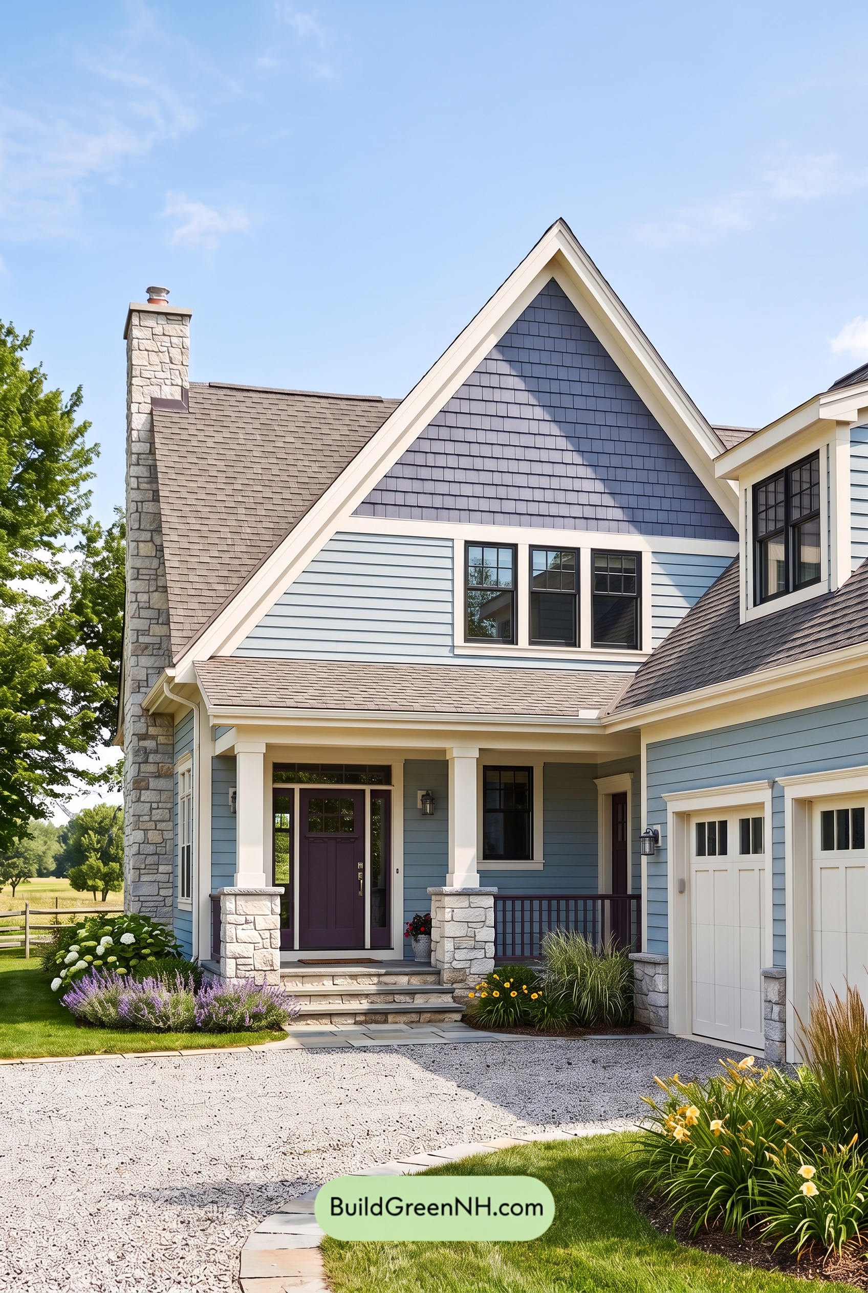
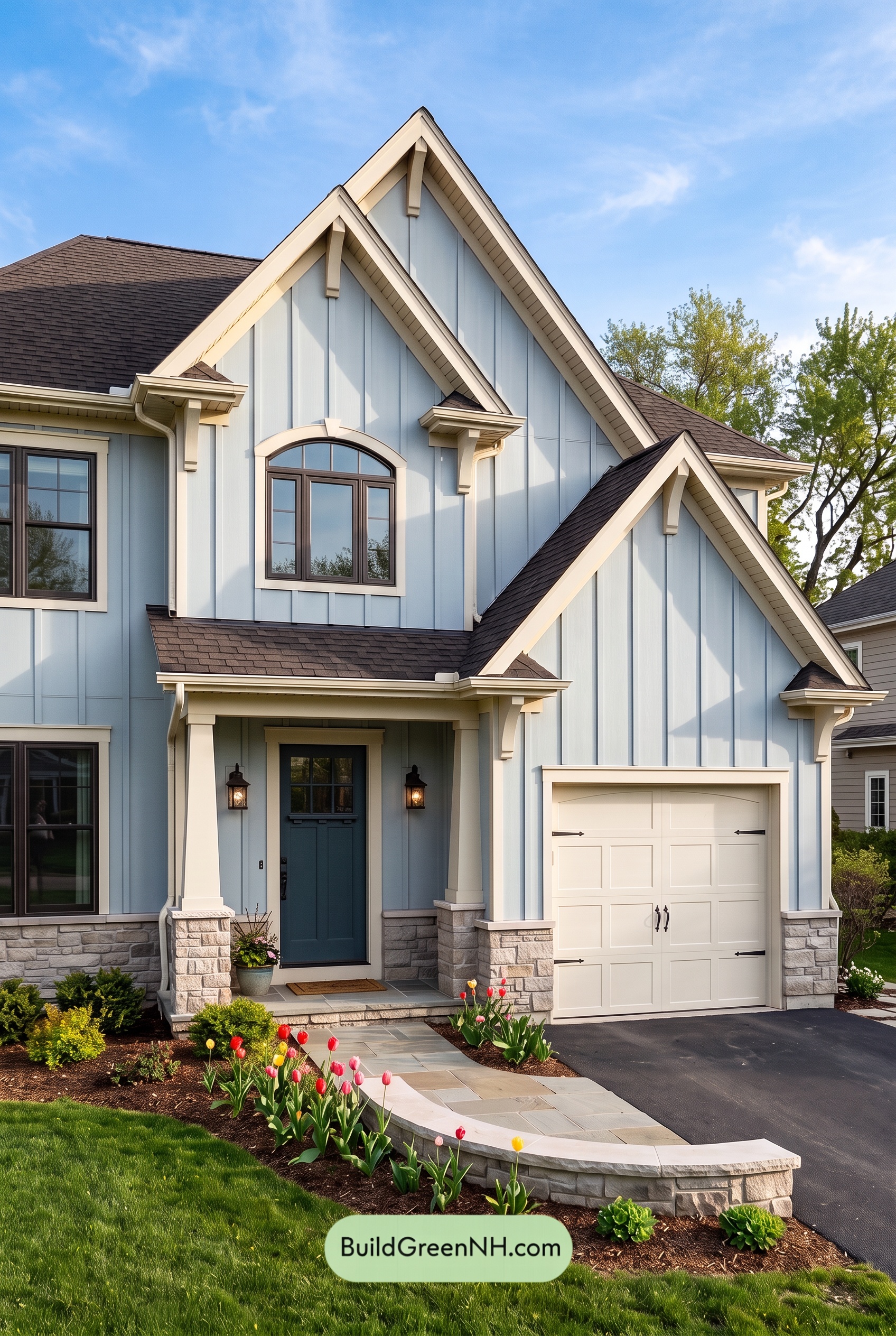 Exterior Color Scheme with Stone Accents: Bluebell Gable Song
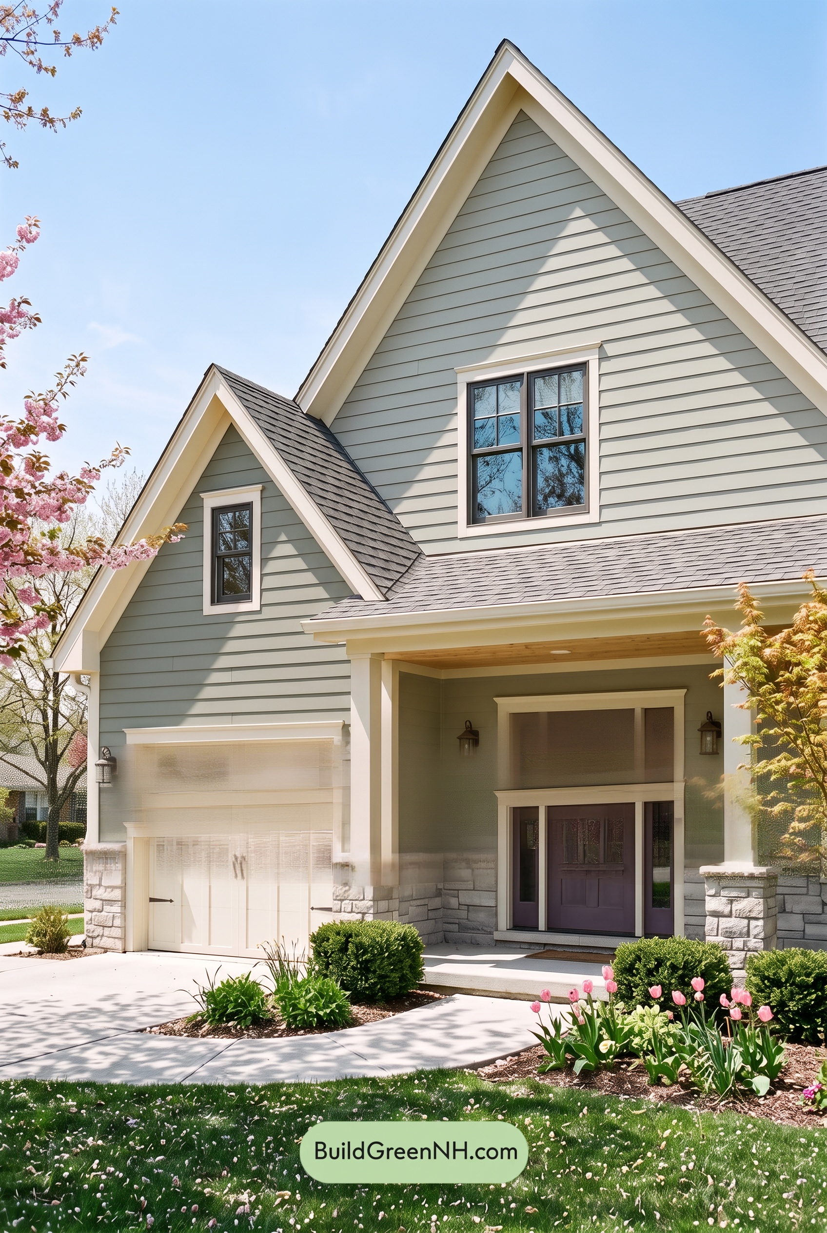
 Exterior Color Scheme with Stone Accents: Meadow Bell Welcome
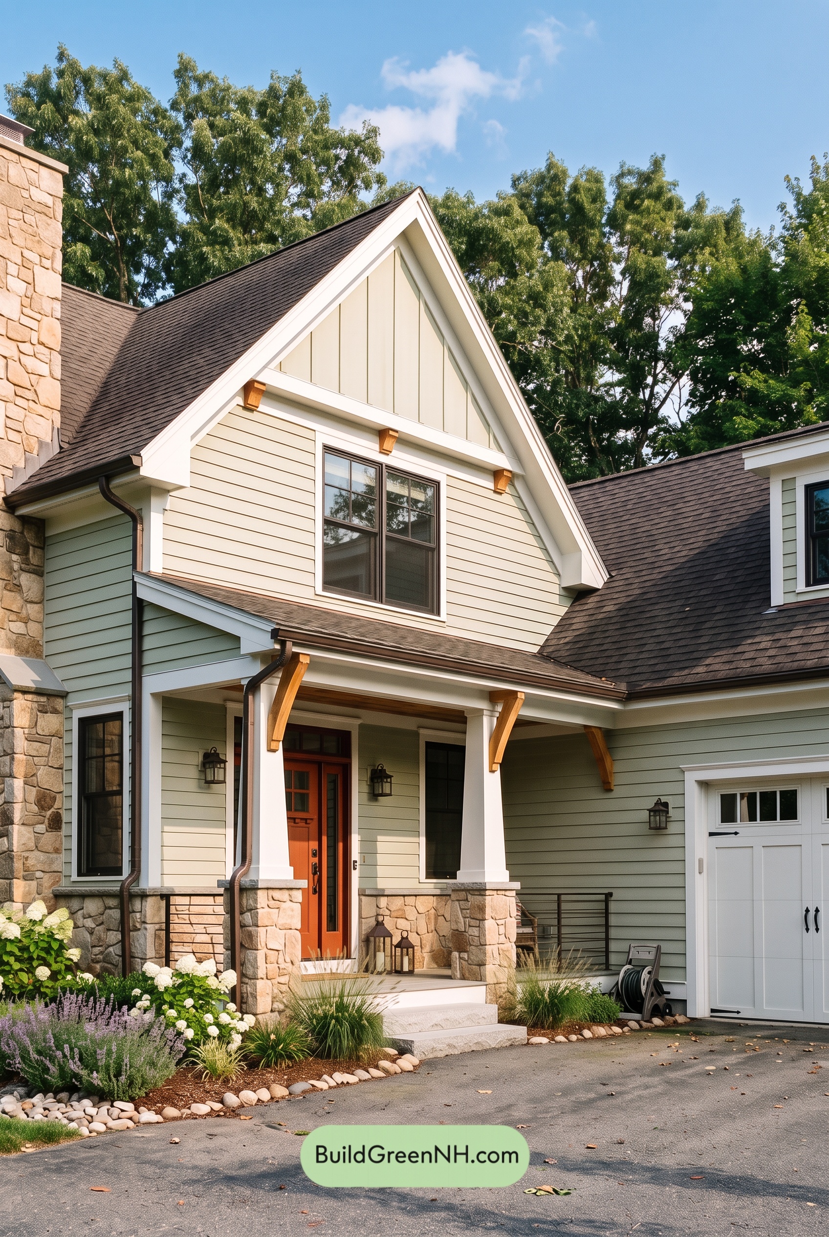
 Exterior Color Scheme with Stone Accents: Willow Quartz Porch
 Exterior Color Scheme with Stone Accents: Celadon Ember Gable
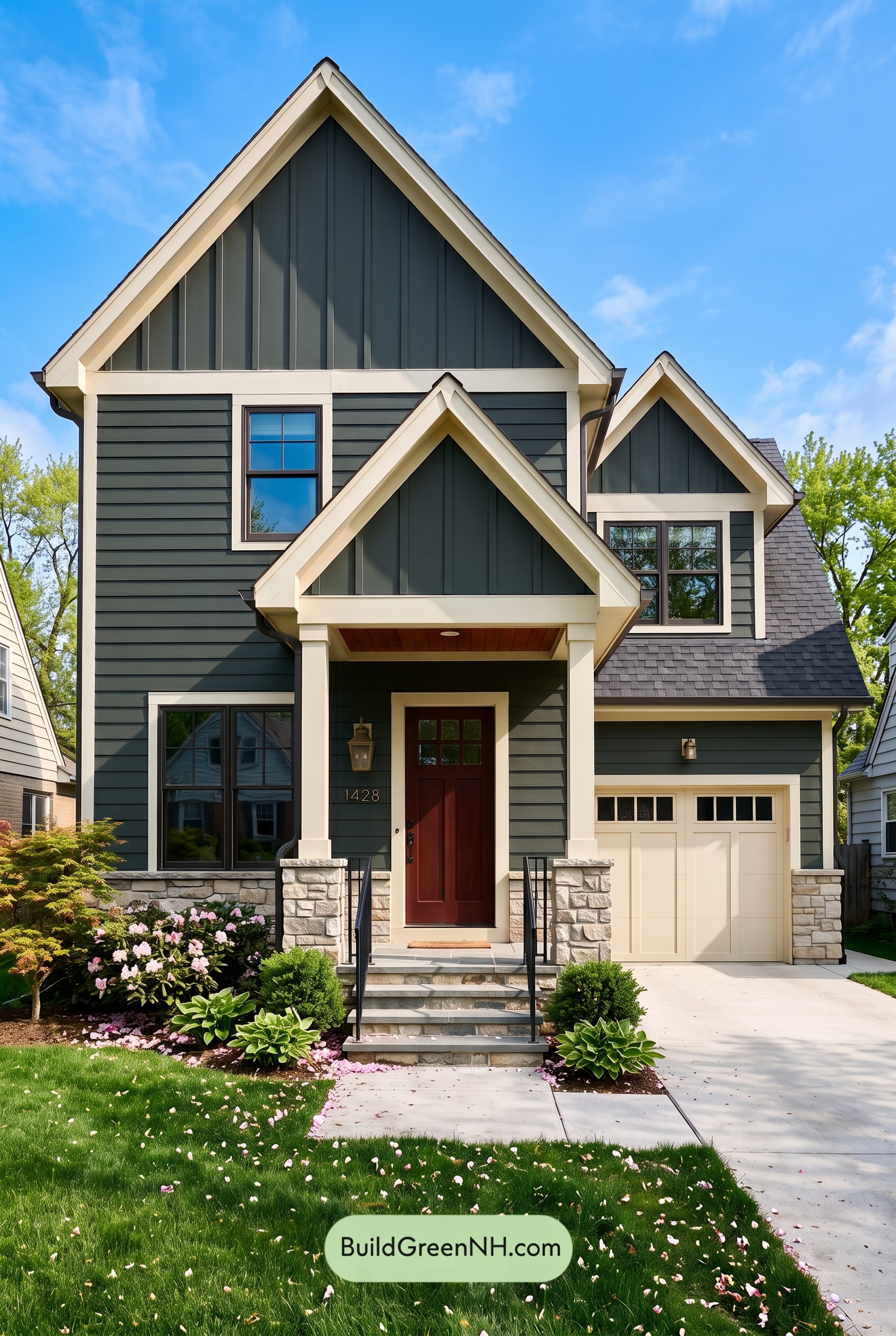 Exterior Color Scheme with Stone Accents: Pine Brass Threshold
Table of Contents