Last updated on
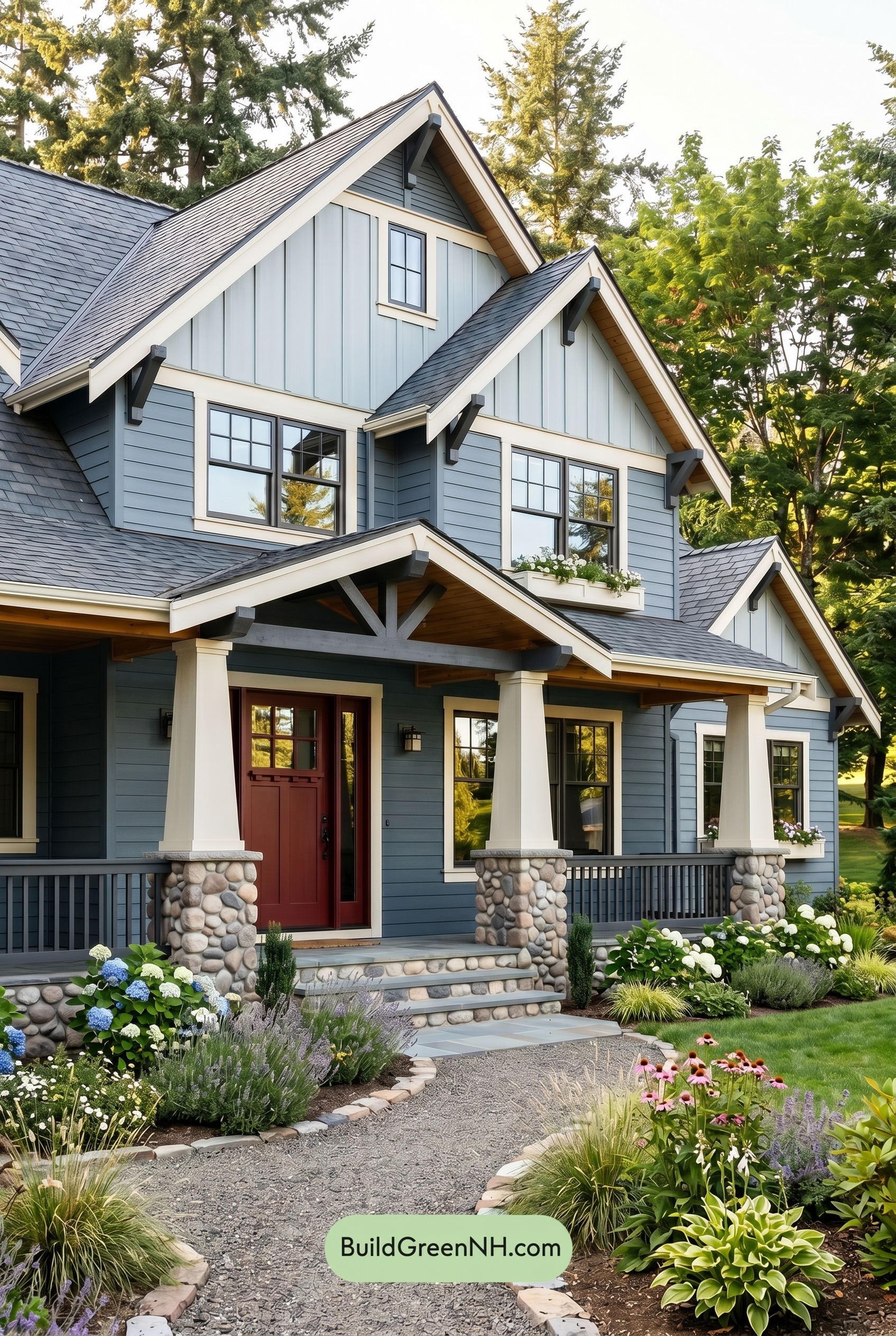

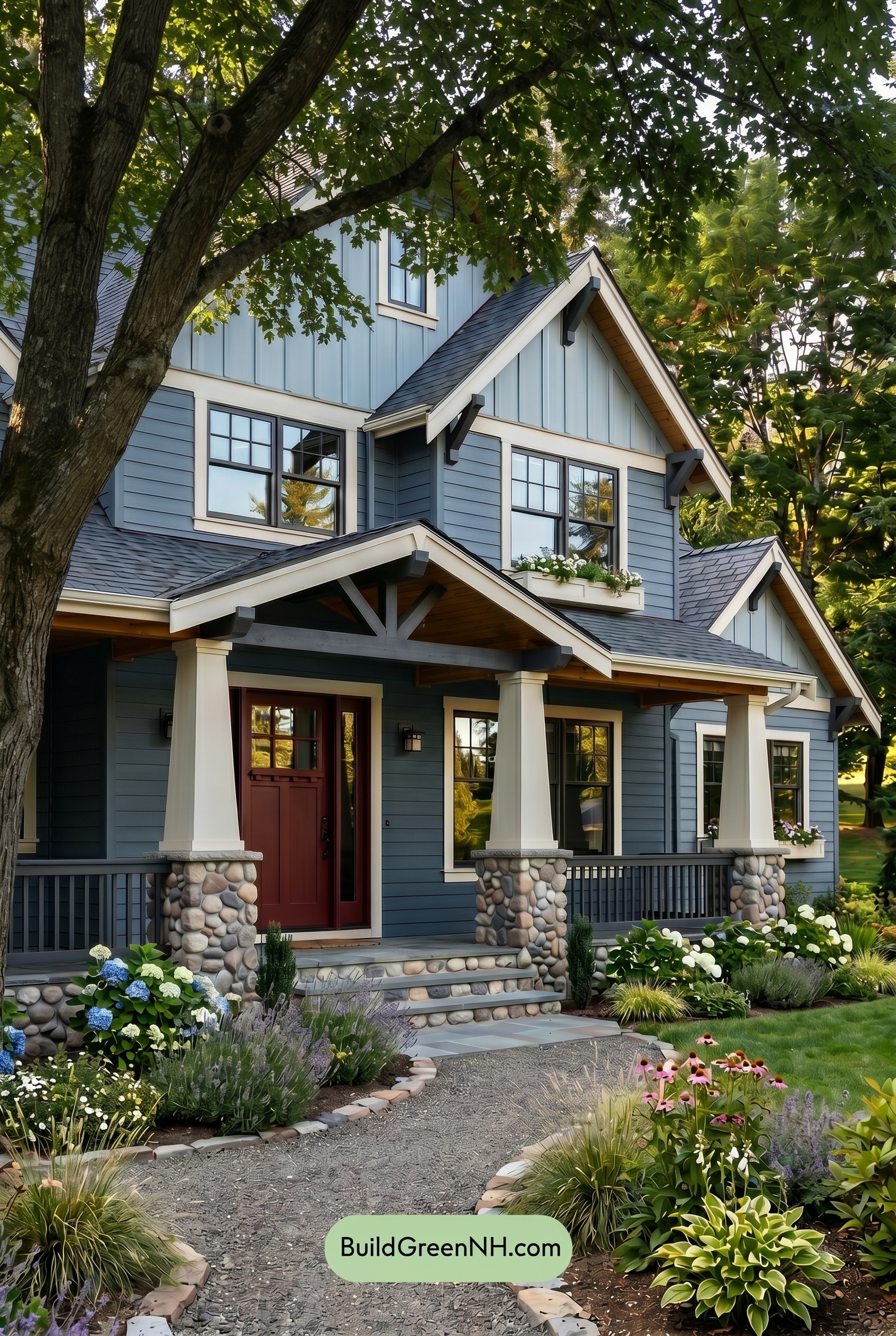
This layered blue exterior feels fresh, grounded, and welcoming because crisp light trim and warm brown accents keep the cool palette beautifully balanced.
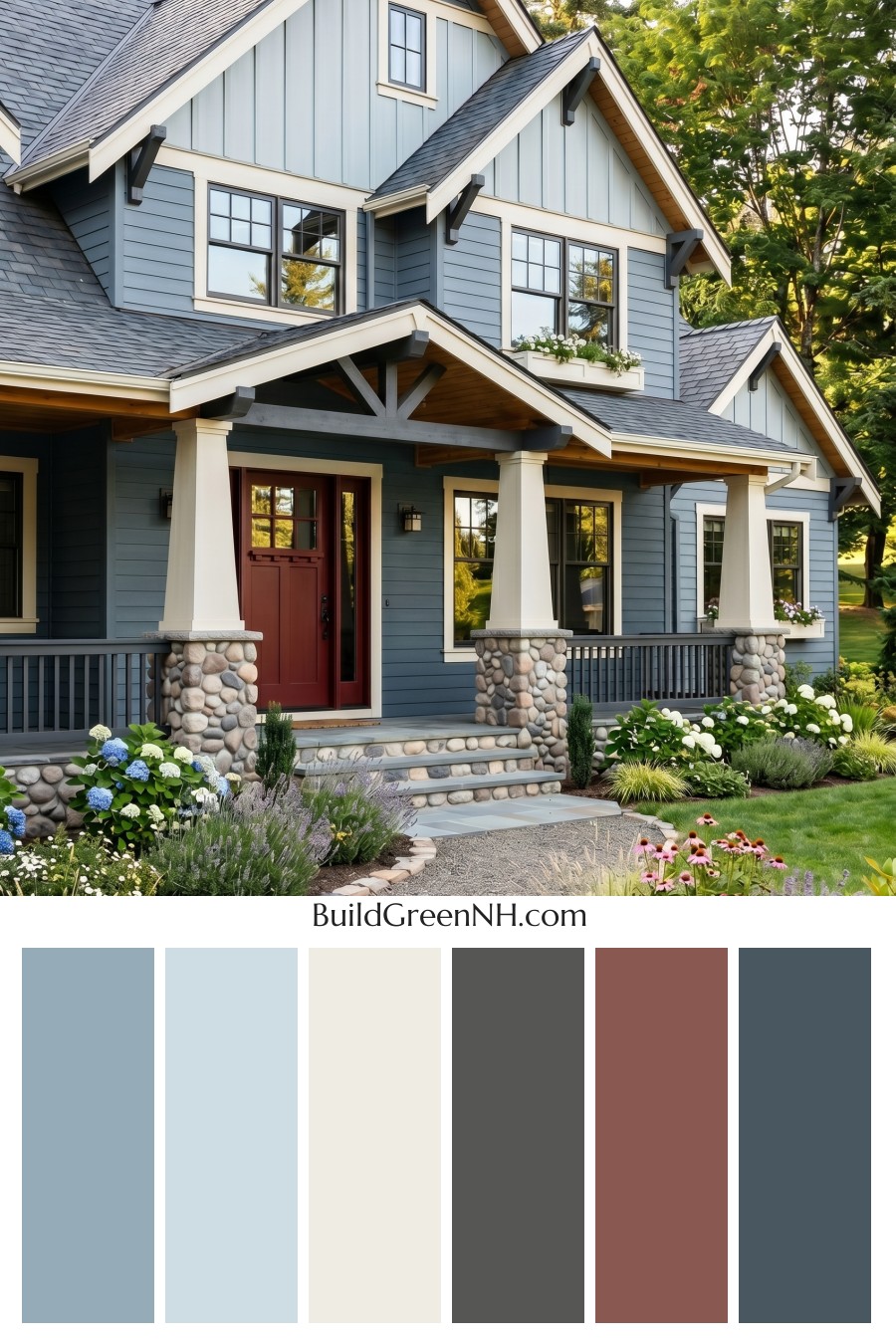
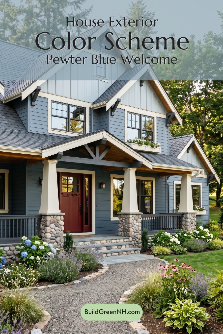
A Blue Palette with Depth
The main siding is dressed in a medium blue shade with a soft gray undertone, giving the home a calm, polished presence. It feels classic without being overly formal, and it works beautifully with the surrounding greenery because the blue sits comfortably between fresh and subdued.
On the upper gables, a lighter blue shade adds dimension and lift. The vertical siding in these areas catches the light differently than the horizontal siding below, making the upper portions feel airy and architectural. This subtle shift within the blue family keeps the exterior from looking flat while still feeling cohesive.
Crisp Trim That Defines the Architecture
The white trim is one of the biggest reasons this scheme looks so sharp. It outlines the rooflines, windows, porch edges, and gable peaks with clean definition. Against the blue siding, the white shade brings brightness and structure, highlighting the home’s layered rooflines and charming details.
The white columns also play an important role. Their light tone gives the front porch a welcoming, substantial look while tying back to the trim around the windows and gables. The result is a crisp frame around the cooler siding colors.
Gray Accents for a Grounded Finish
The gray window frames, railings, roof, and bracket details add a deeper, more grounded note to the palette. These gray shades sit naturally beside the blue siding because they share a cool undertone, creating a smooth transition from wall color to architectural accents.
The dark gray roof anchors the entire exterior. It adds contrast without feeling harsh, and it helps the lighter upper blue and white trim stand out. The gray railings repeat that darker tone at porch level, giving the façade a balanced top-to-bottom rhythm.
A Warm Door That Steals the Spotlight
The front door brings in a warm brown shade that instantly softens the cooler exterior. This touch of warmth is especially effective because it draws the eye right to the entry. It feels inviting, earthy, and just bold enough to make the doorway memorable.
Warm brown tones also appear beneath the porch and roof overhangs, adding a natural, woodsy quality. These accents connect the home to the landscape and keep the blue, white, and gray palette from feeling too cool.
Why the Scheme Works So Well
This exterior succeeds because it uses contrast thoughtfully. The blue siding provides personality, the white trim brings clarity, the gray accents add sophistication, and the warm brown door gives the whole look a welcoming heart.
It is a color scheme that feels tailored but relaxed. The cooler shades make the home feel fresh and serene, while the warmer details and natural stone base add texture and comfort. Altogether, the palette creates a charming exterior that feels both timeless and full of character.
Next, see how this color scheme looks under different lighting simulations throughout the day.
Overcast
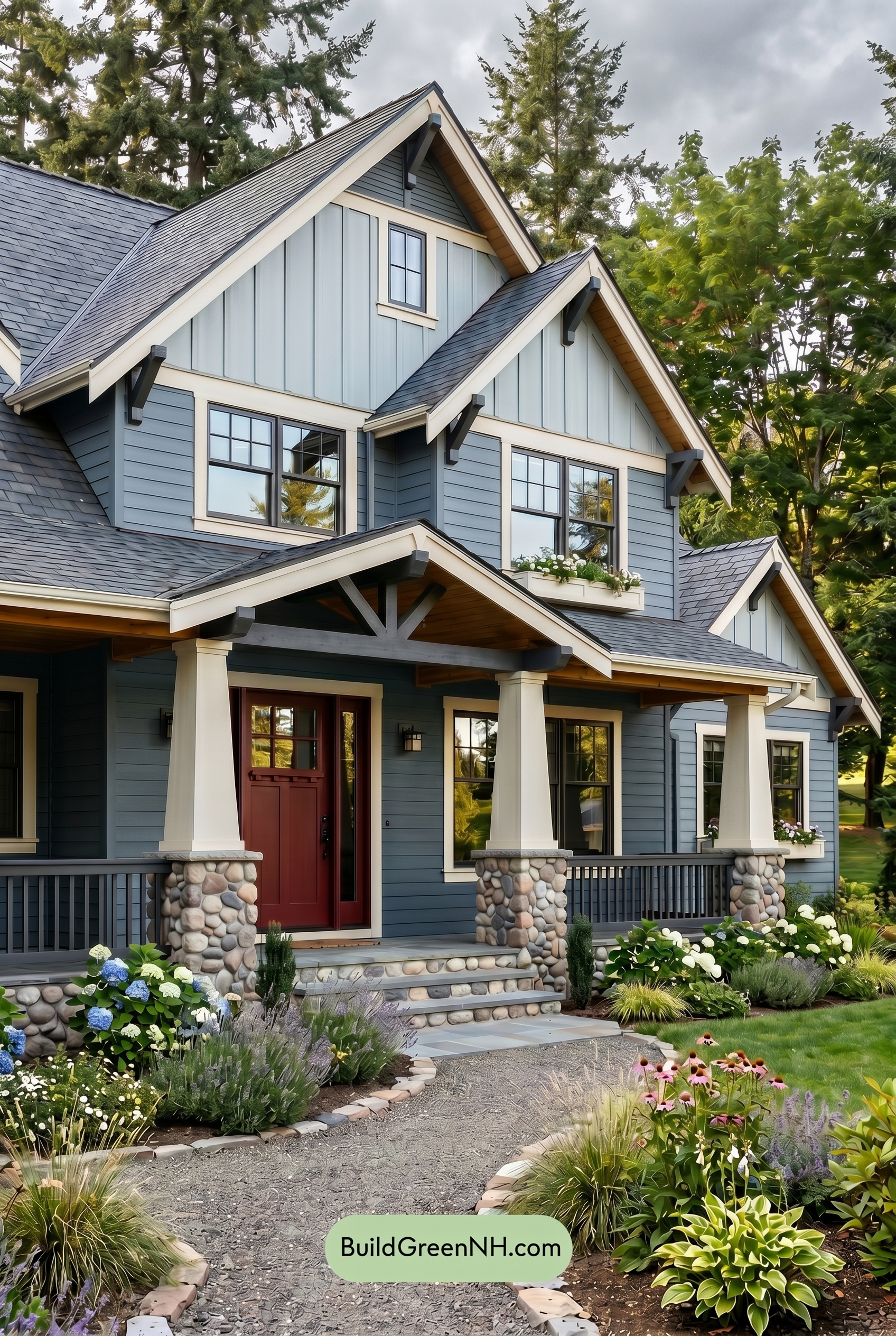
Under overcast light, the blue family on the main and upper walls appears cooler, quieter, and slightly more muted than it would in neutral daylight. Saturation softens, so the lighter blue shades feel misty and airy while the deeper blue areas gain a gentle, shaded depth without looking overly dark.
The white trim and columns lose some of their crisp brightness, becoming softer and less contrasty against the blue siding. Gray window frames and railings blend in more smoothly, shadows become broad and diffused, and the brown front door feels warmer but less intense, giving the whole exterior a calm, cozy, understated mood.
Golden Hour
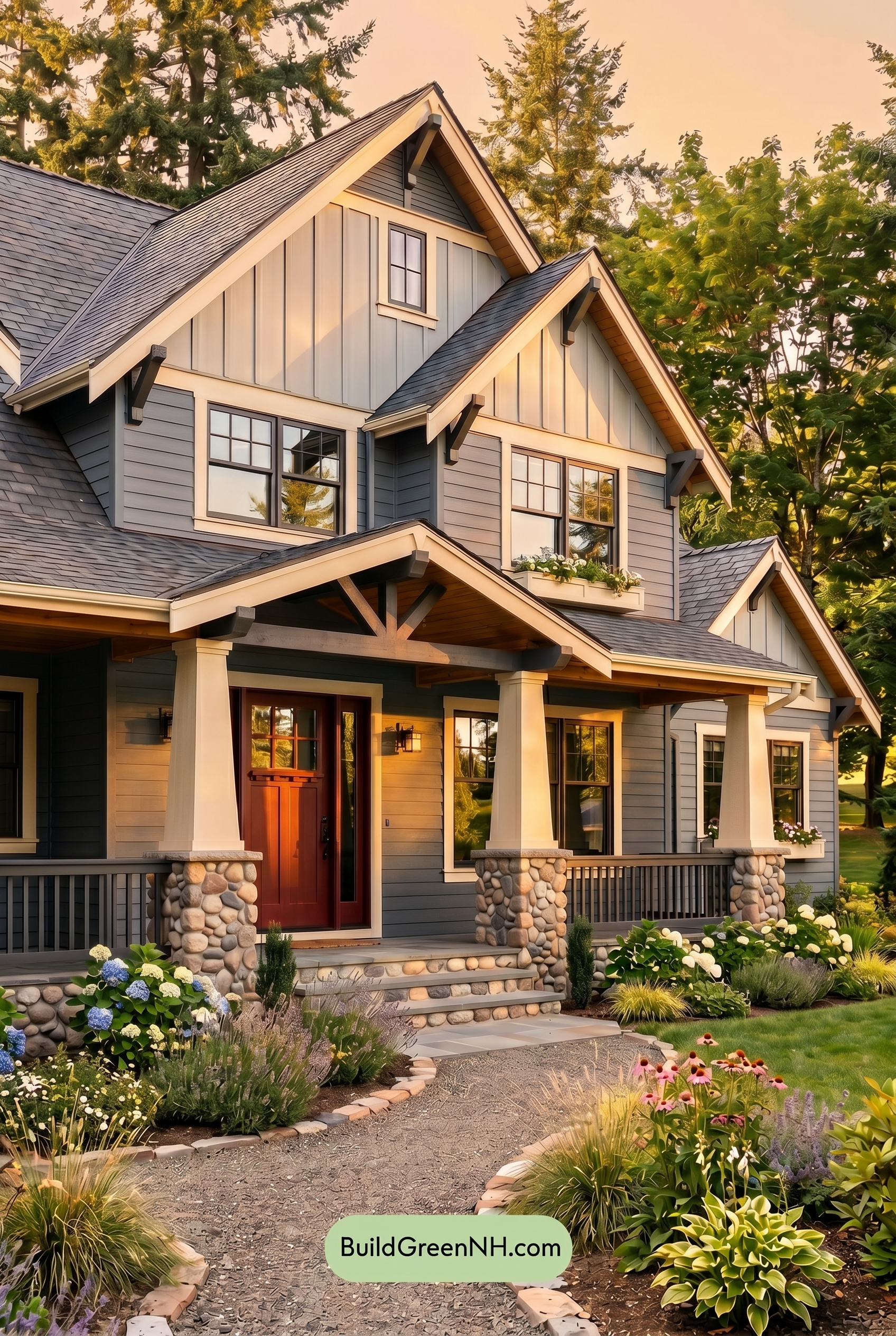
Under Golden Hour, the blue-family siding takes on a warmer, slightly muted cast compared with neutral daylight, so the shade feels less crisp and more relaxed. Its saturation appears richer where the low sun hits, while shaded sections deepen toward a cooler blue-gray, giving the façade more depth and dimension.
The white-family trim and columns glow softer and creamier, increasing contrast against the darker gray-family window frames and railings. The brown-family front door looks warmer and more saturated, and the longer shadows add drama, shifting the mood from clean and balanced in daylight to cozy, layered, and inviting.
Shade
In shade, the blue family on the siding reads deeper and slightly more muted than it would in neutral daylight, with saturation settling into a calmer, cooler shade. Shadows under the eaves and porch add depth, making the gray railings and window frames feel stronger and more defined against the softer blue surfaces.
The white trim and columns lose some of their crisp brightness in shade, shifting toward a gentler, warmer neutral that feels less stark. The brown front door appears richer and cozier, adding warmth to the cooler palette and giving the home a more relaxed, tucked-into-the-trees mood.
Nighttime
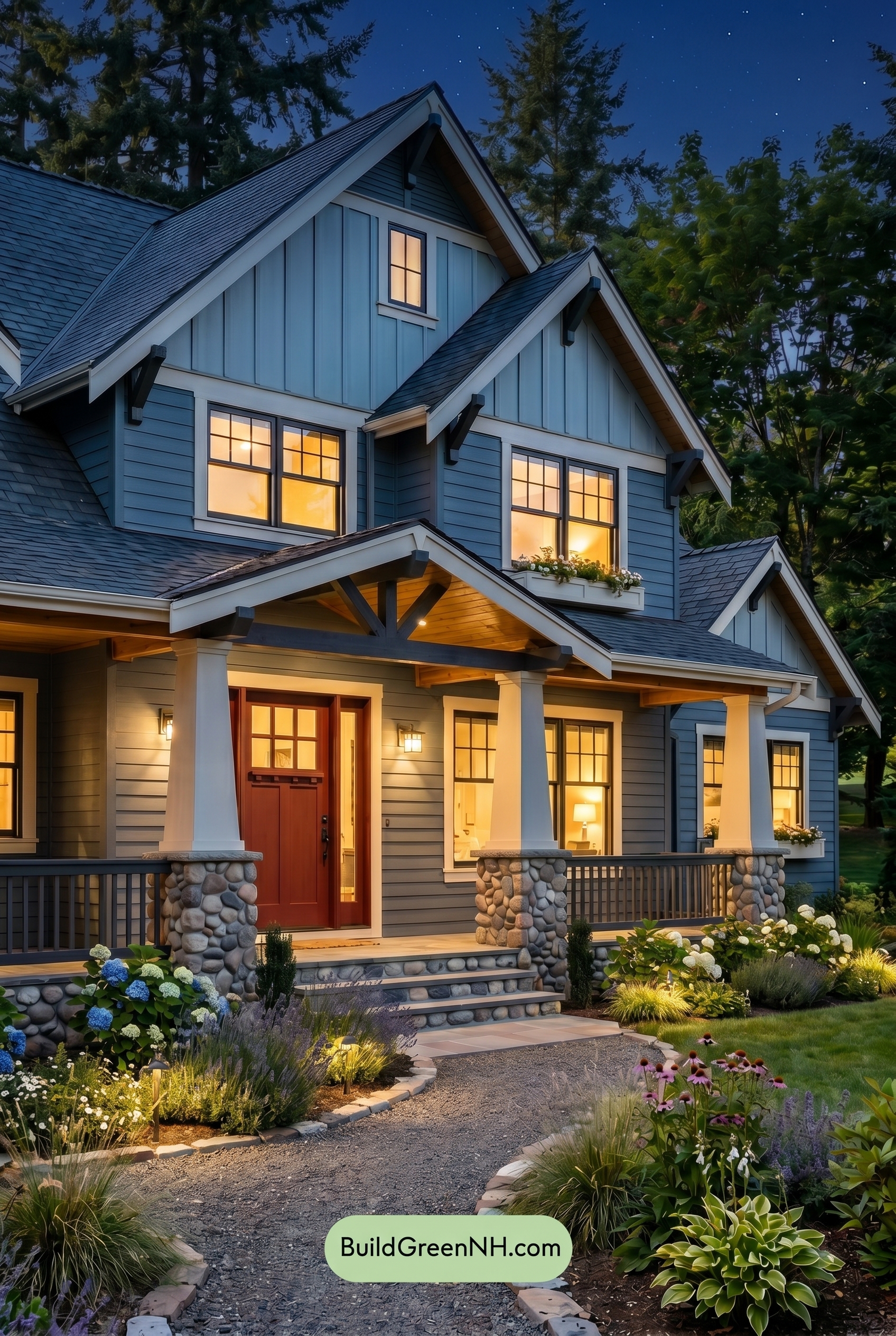
At nighttime, the blue family on the siding deepens and feels more saturated than it would in neutral daylight, shifting from crisp and airy to richer and moodier. Shadows gather under the rooflines and porch, making the gray shades on the frames and railings appear darker and more defined.
Warm interior and porch lighting softens the white trim and columns, giving them a gentle glow instead of a bright daylight contrast. The brown shade on the front door feels warmer and more inviting, while the stronger light-and-shadow contrast creates a cozy, dramatic evening mood.
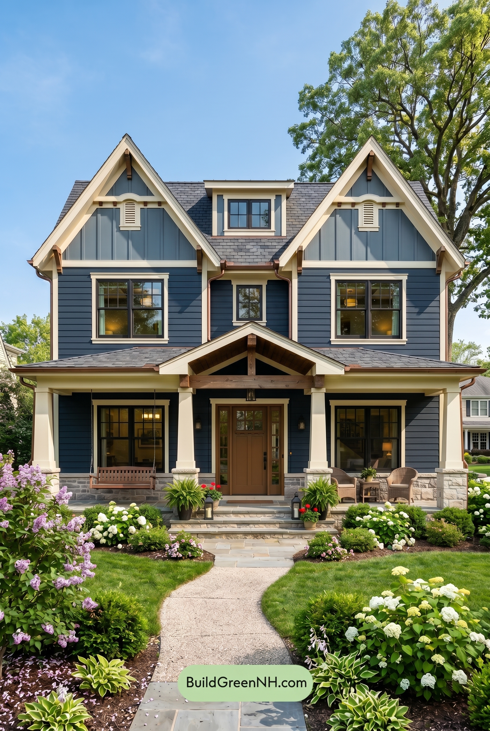
Pin these for later:
Want More?
 Craftsman Blue Exterior Color Scheme: Ink Blue Hearth
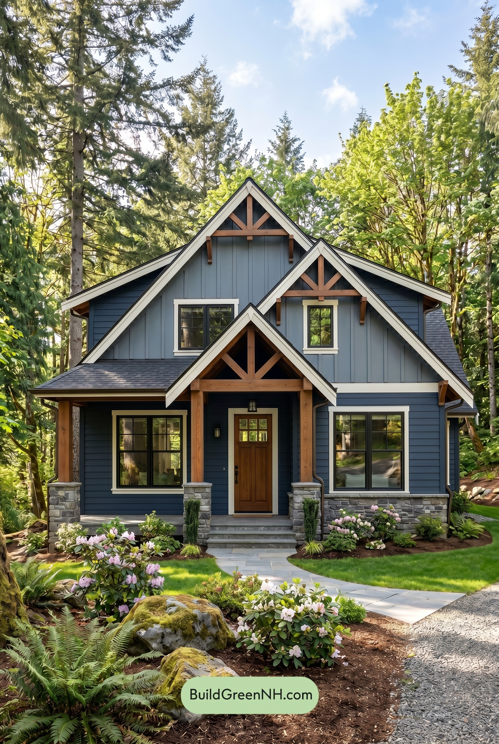 Craftsman Blue Exterior Color Scheme: Navy Cedar Poise
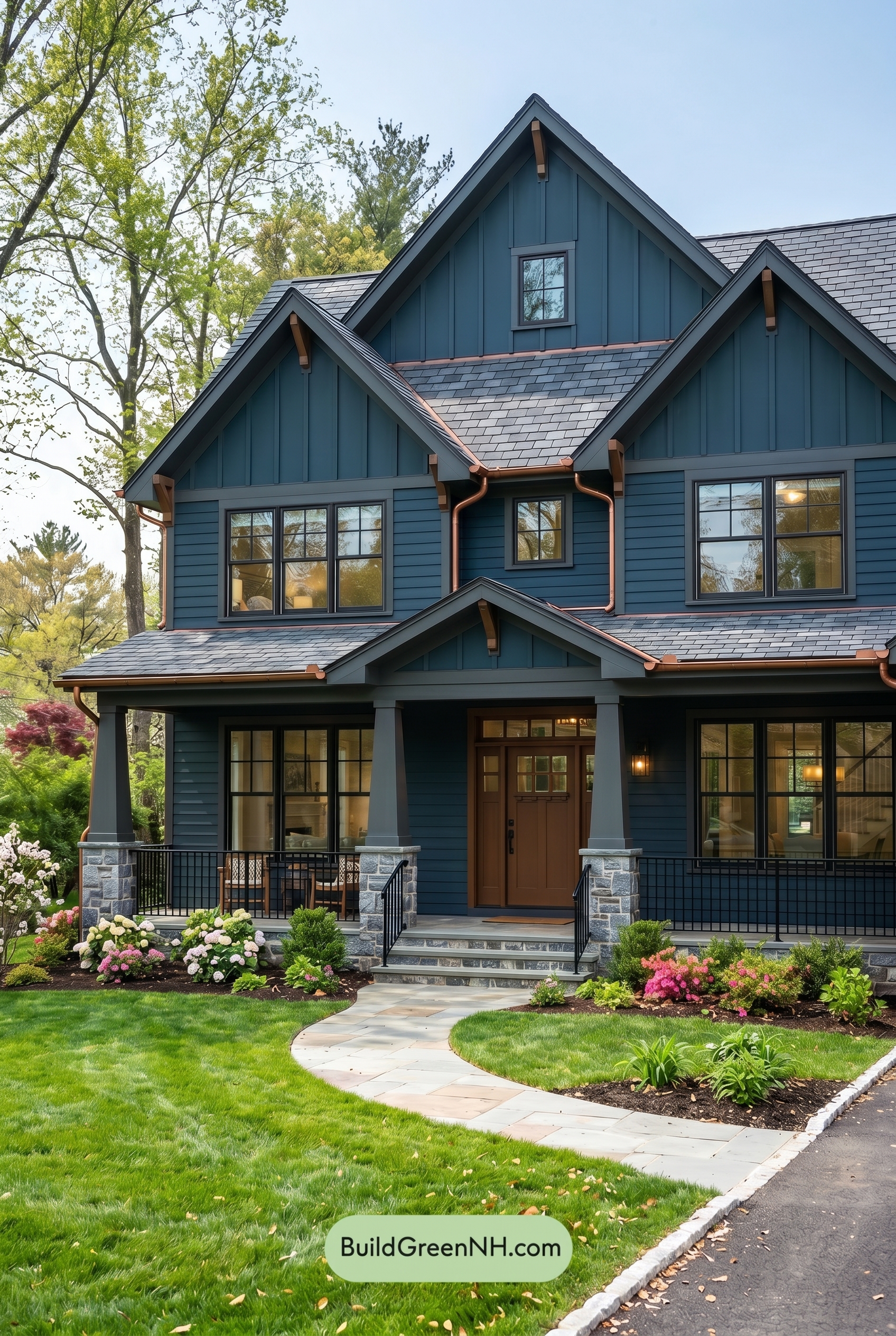 Craftsman Blue Exterior Color Scheme: Midnight Copper Calm
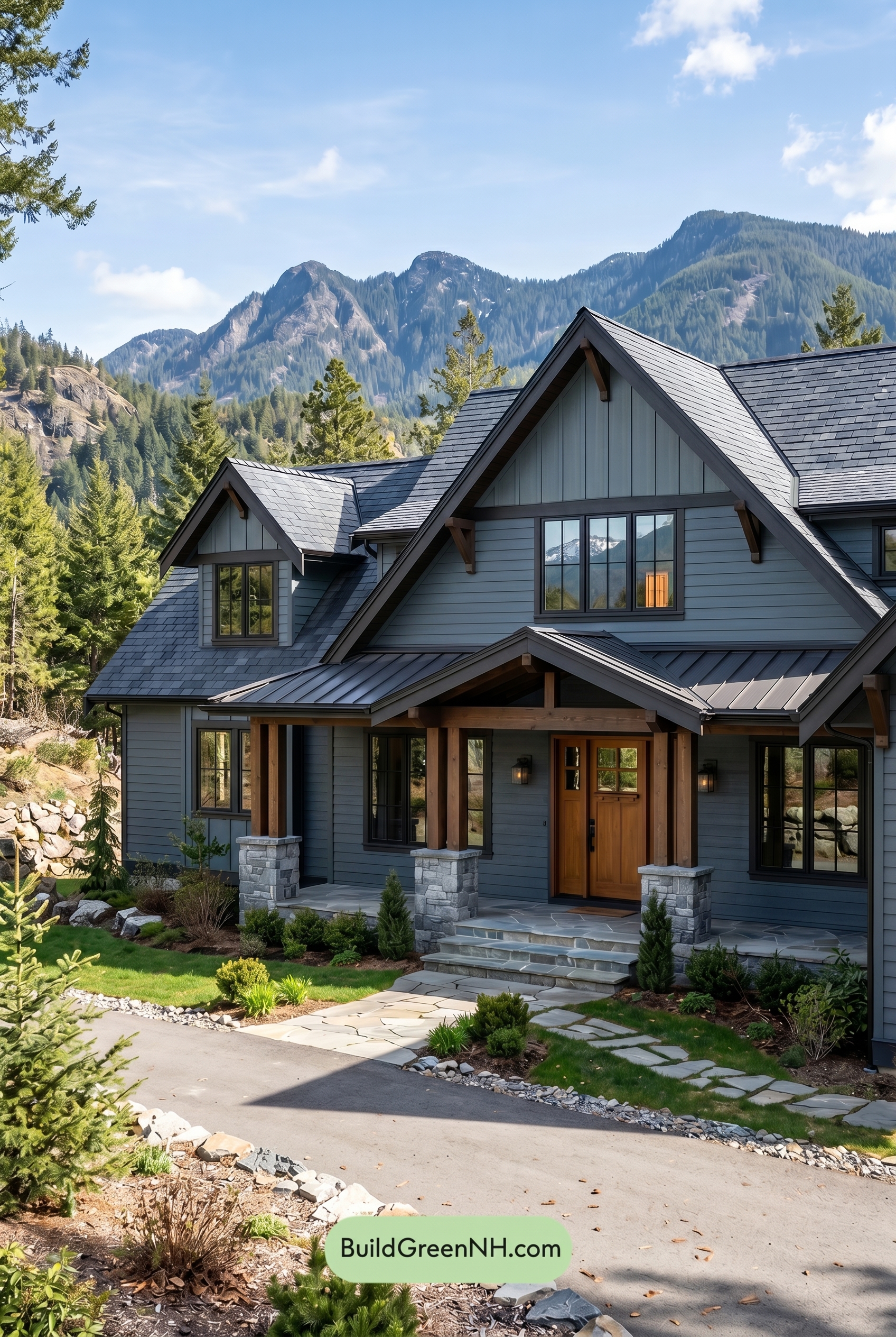 Craftsman Blue Exterior Color Scheme: Storm Slate Warmth
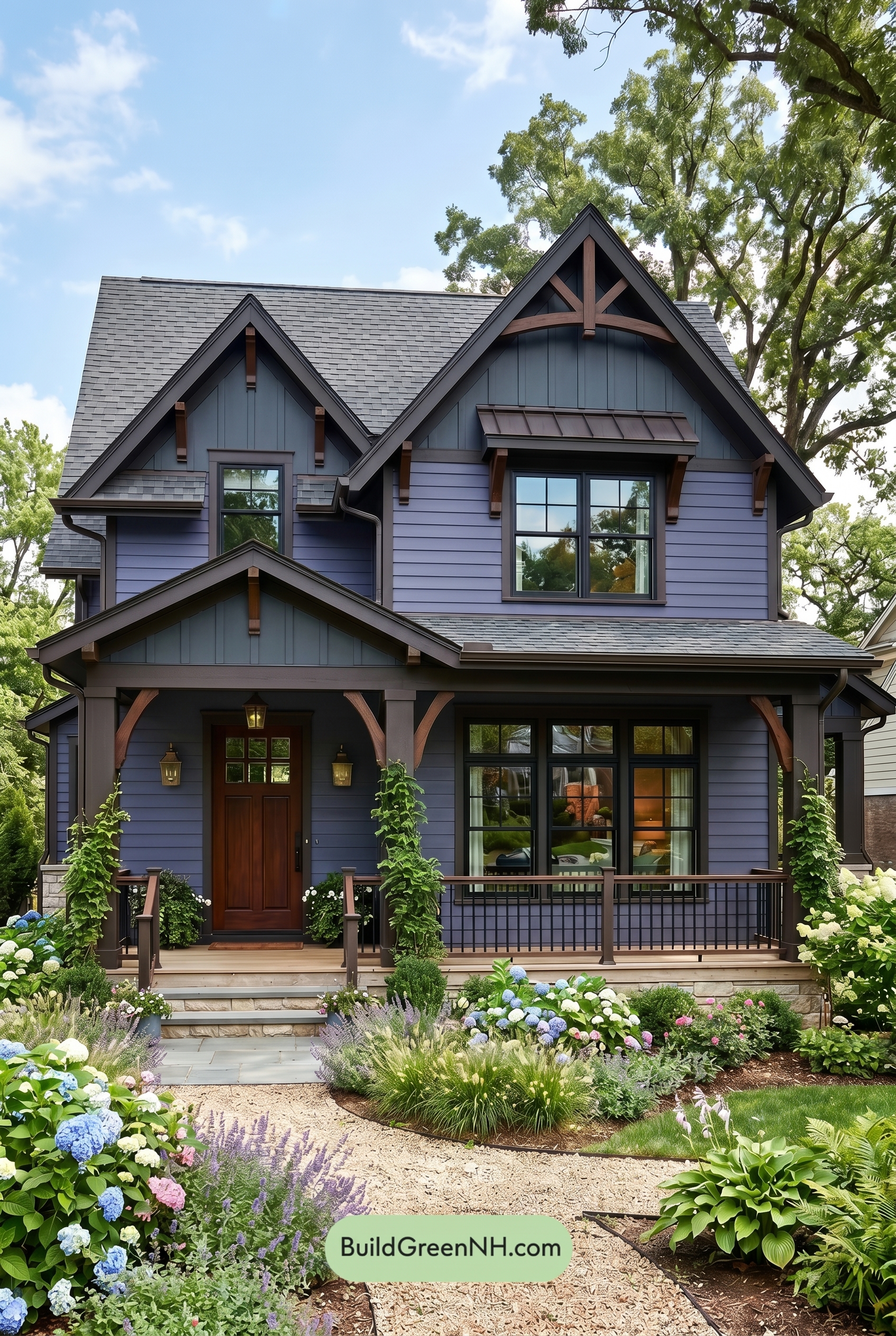 Craftsman Blue Exterior Color Scheme: Indigo Chestnut Glow
Table of Contents