Last updated on
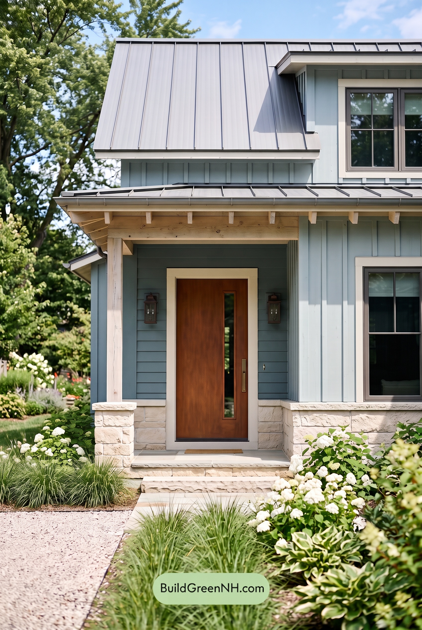

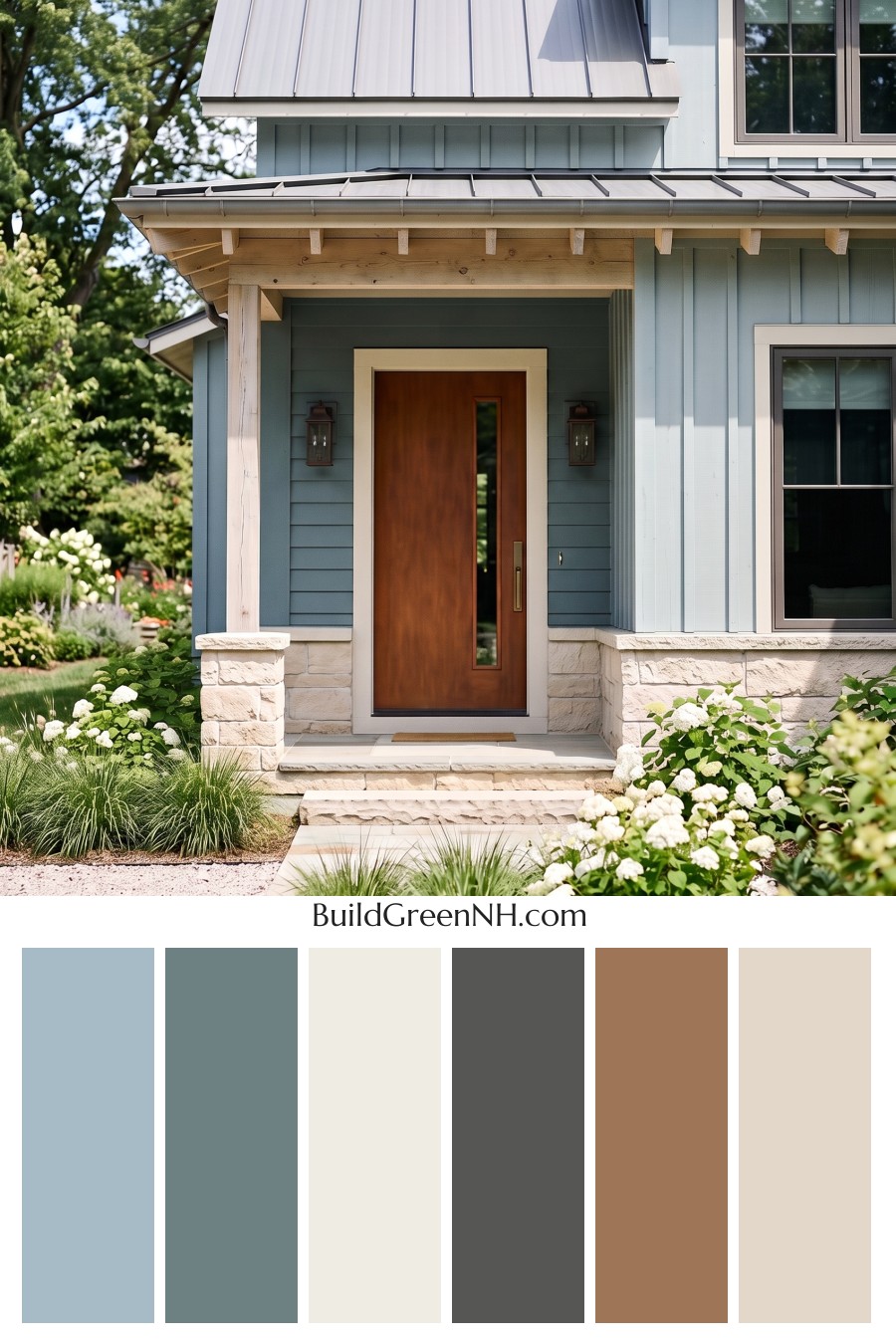
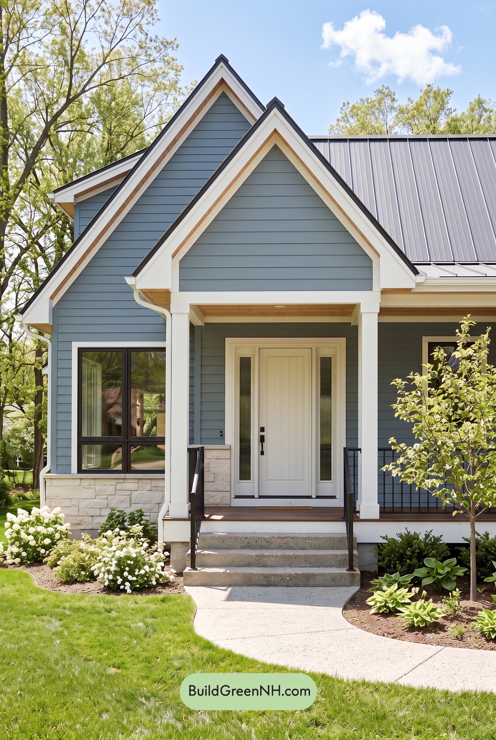
This light blue, crisp white, and warm brown exterior scheme feels fresh, welcoming, and effortlessly polished from curb to front door.
A Calm Blue Foundation
The home’s siding is finished in a soft, airy shade of blue that gives the exterior its serene personality. This cool-toned blue feels especially at home beside the surrounding greenery, creating a look that is relaxed without fading into the background. Horizontal siding adds a slightly deeper blue note around the entry, while the vertical upper-story detailing keeps the façade feeling tall and tailored.
White Details That Brighten Every Edge
Clean white trim provides a bright outline around the windows, rooflines, and entryway. It sharpens the architecture beautifully, defining the siding panels and making the soft blue walls appear even more luminous. The white porch columns continue that fresh, classic look, bringing a sense of structure and welcome to the covered front entry.
Under the porch roof, pale natural-looking wood tones introduce a gentle warmth that softens the crisp contrast between blue and white. This subtle warm neutral detail makes the entrance feel less formal and more inviting.
Grounded Gray and a Welcoming Door
A medium gray metal roof anchors the lighter wall colors with a sleek, modern layer. Its cool gray shade relates naturally to the blue siding while providing enough contrast to give the roofline definition. Dark gray window frames add another refined accent, creating a neat graphic border that helps the windows stand out against the pale trim.
The front door is the scheme’s warm focal point. Its rich medium brown shade brings depth and natural character to the porch, balancing the cooler blues and grays with an instantly welcoming touch. Framed in white, the door becomes a clear destination without overpowering the rest of the façade.
The Overall Effect
This palette blends coastal freshness with modern farmhouse warmth. Soft blue creates calm, white keeps the architecture clean, gray adds sophistication, and the brown entry door makes the whole composition feel grounded and personable. It is a balanced exterior color scheme that looks bright in daylight, elegant in shade, and beautifully connected to its landscaped setting.
Next, see how this color scheme looks under different lighting simulations throughout the day.
Overcast
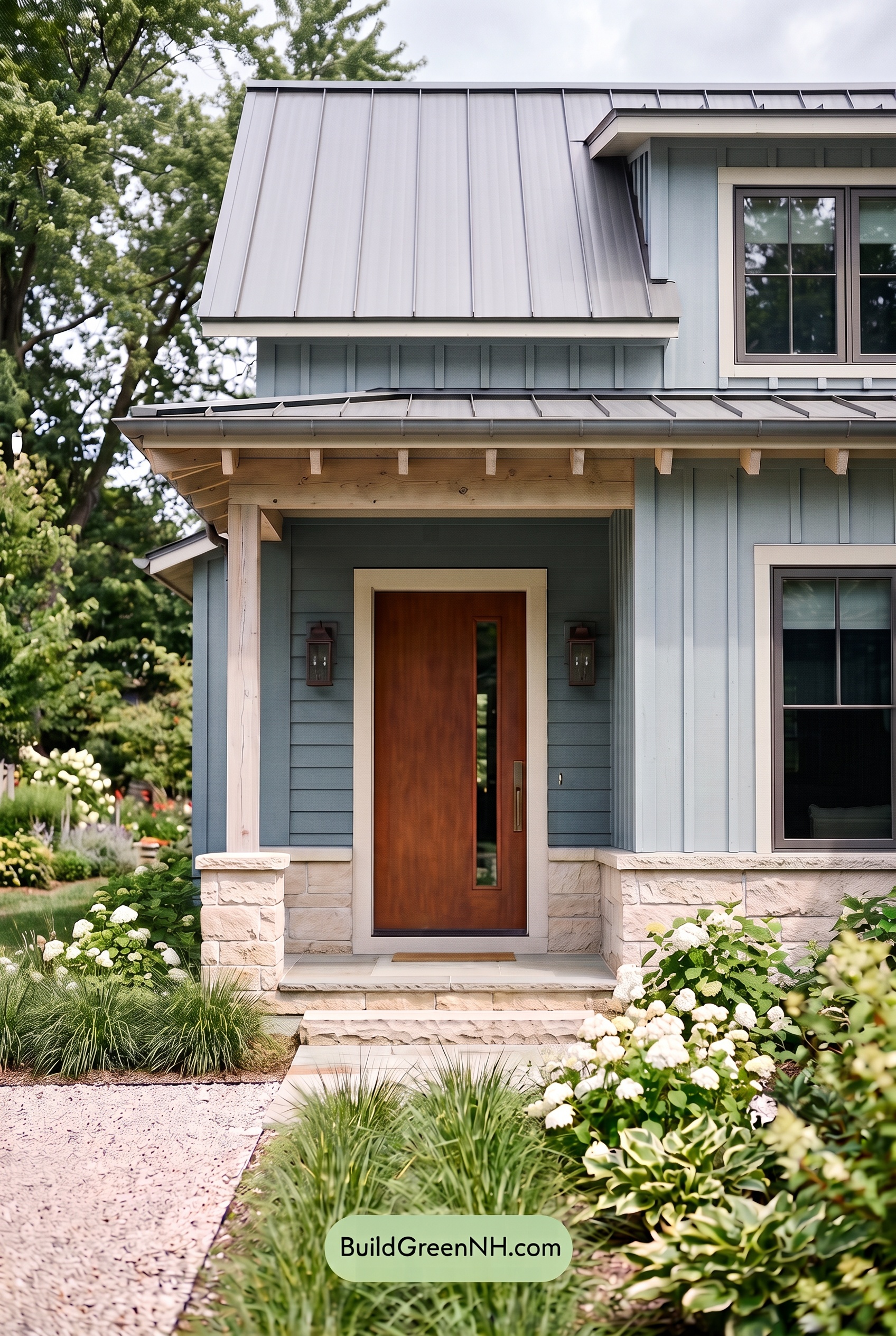
Under overcast skies, the blue siding takes on a softer, slightly grayer cast than it shows in neutral daylight, with its saturation feeling more restrained and serene. The white trim and columns lose some crisp brightness, while the gray window frames blend more quietly into the overall palette. Diffused light reduces sharp shadows, allowing the vertical siding and architectural lines to read with a gentler contrast.
The brown front door becomes a warmer focal point against the cooled blue exterior, although its richness appears more muted without direct sun. Overall, the home shifts from bright and airy to calm and tailored, with an inviting, understated mood created by softened highlights and even, shadow-free illumination.
Golden Hour
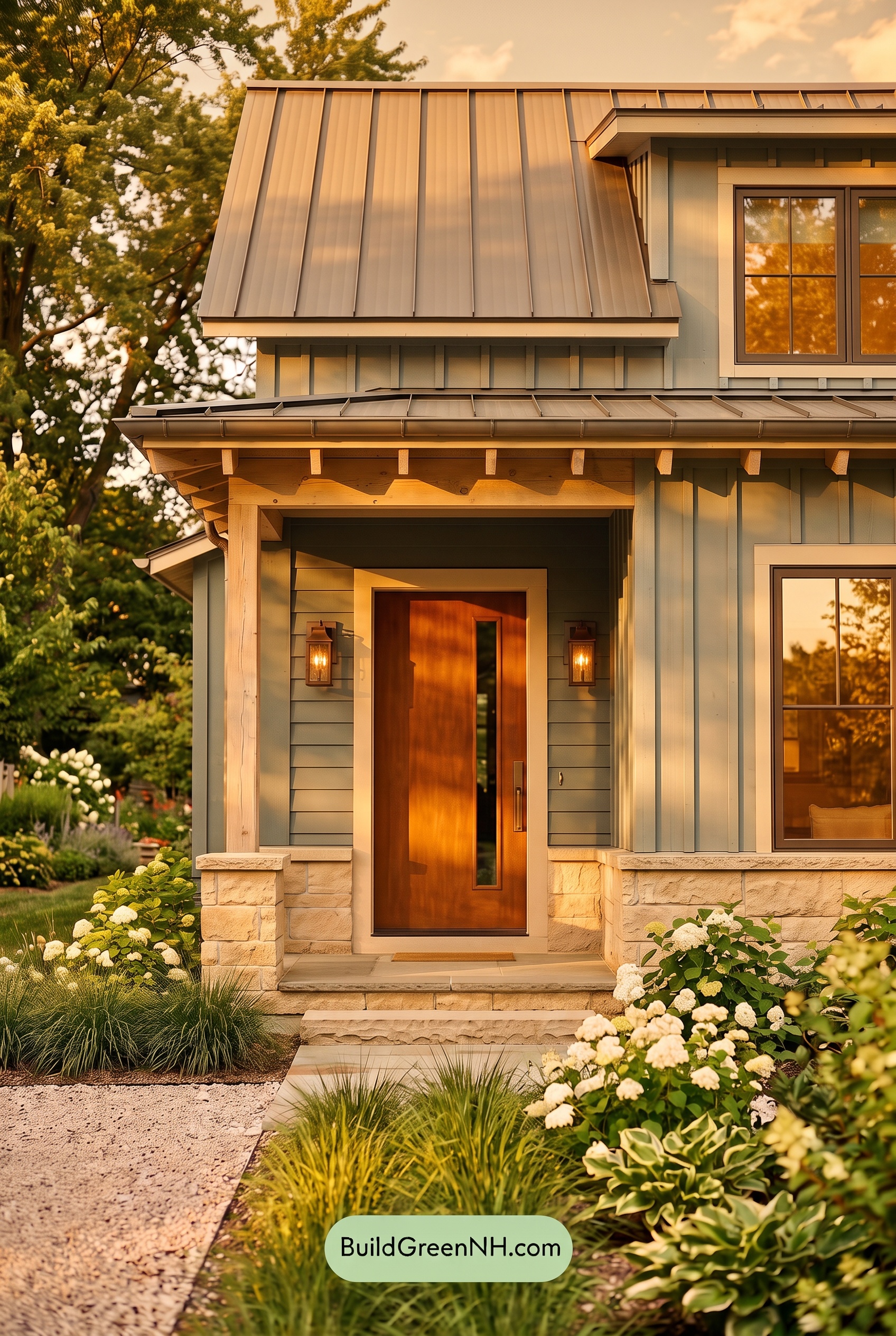
Under neutral daylight, the blue exterior reads crisp and balanced, with clean separation between the pale trim, gray window frames, and warm brown entry. At Golden Hour, the low sun washes the blue shades with a gentle amber cast, softening their coolness and making the overall palette appear richer and more welcoming.
Longer shadows deepen the blue siding beneath the rooflines and around the porch, increasing contrast with the glowing light trim and columns. The brown door becomes more saturated and luminous, while the gray details take on a softer, warmer character—creating a calm, cozy mood that feels more intimate than the bright clarity of midday.
Shade
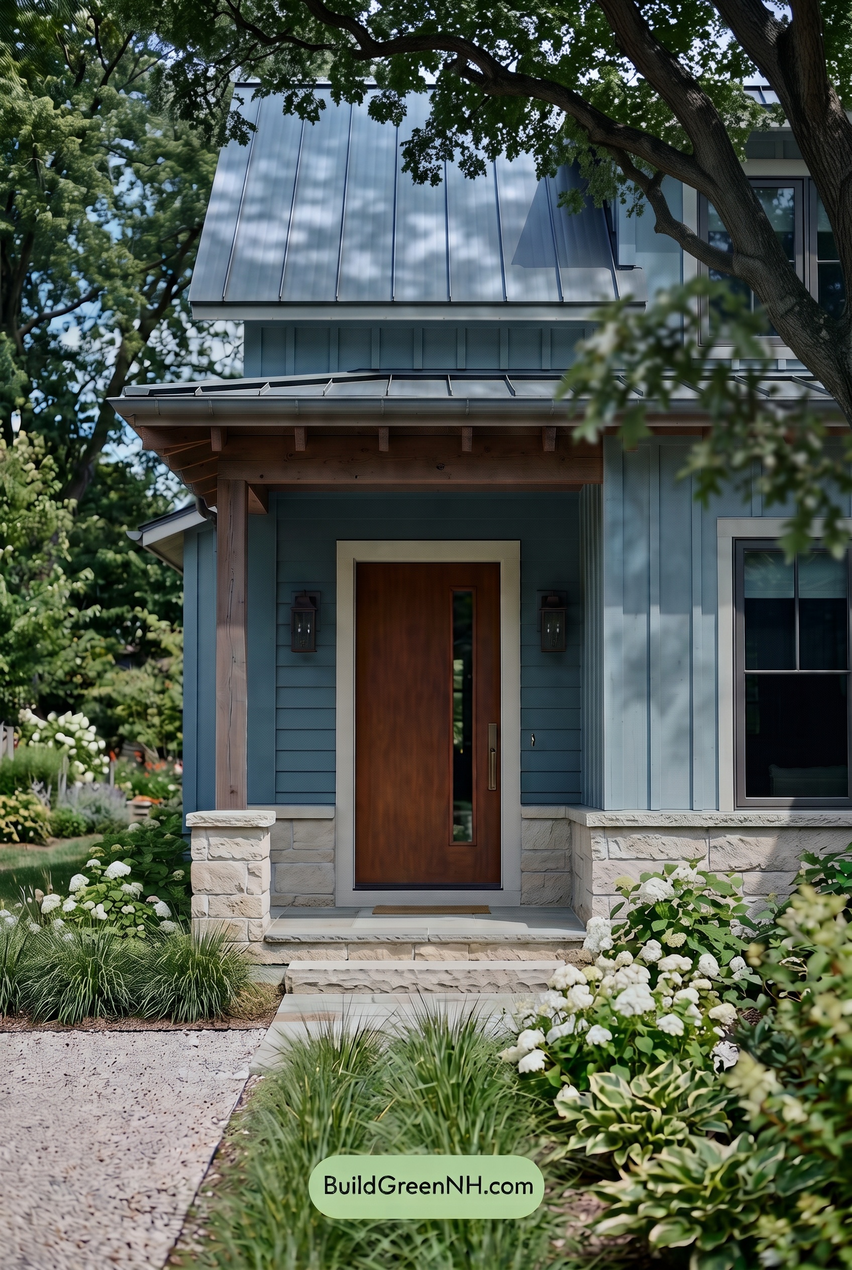
In shade, the blue siding takes on a deeper, quieter character than it would in neutral daylight, with softened saturation and cooler undertones becoming more noticeable. Dappled tree shadows create gentle shifts across the façade, making the blue feel layered rather than flat while the gray details recede into a refined, low-contrast backdrop.
The white trim and columns lose some of their bright crispness in the filtered light, reading softer and slightly cooler against the darker blue planes. Meanwhile, the brown door holds onto its warmth, becoming a welcoming focal point amid the cool exterior shades. The overall effect is calm, sheltered, and thoughtfully understated.
Nighttime
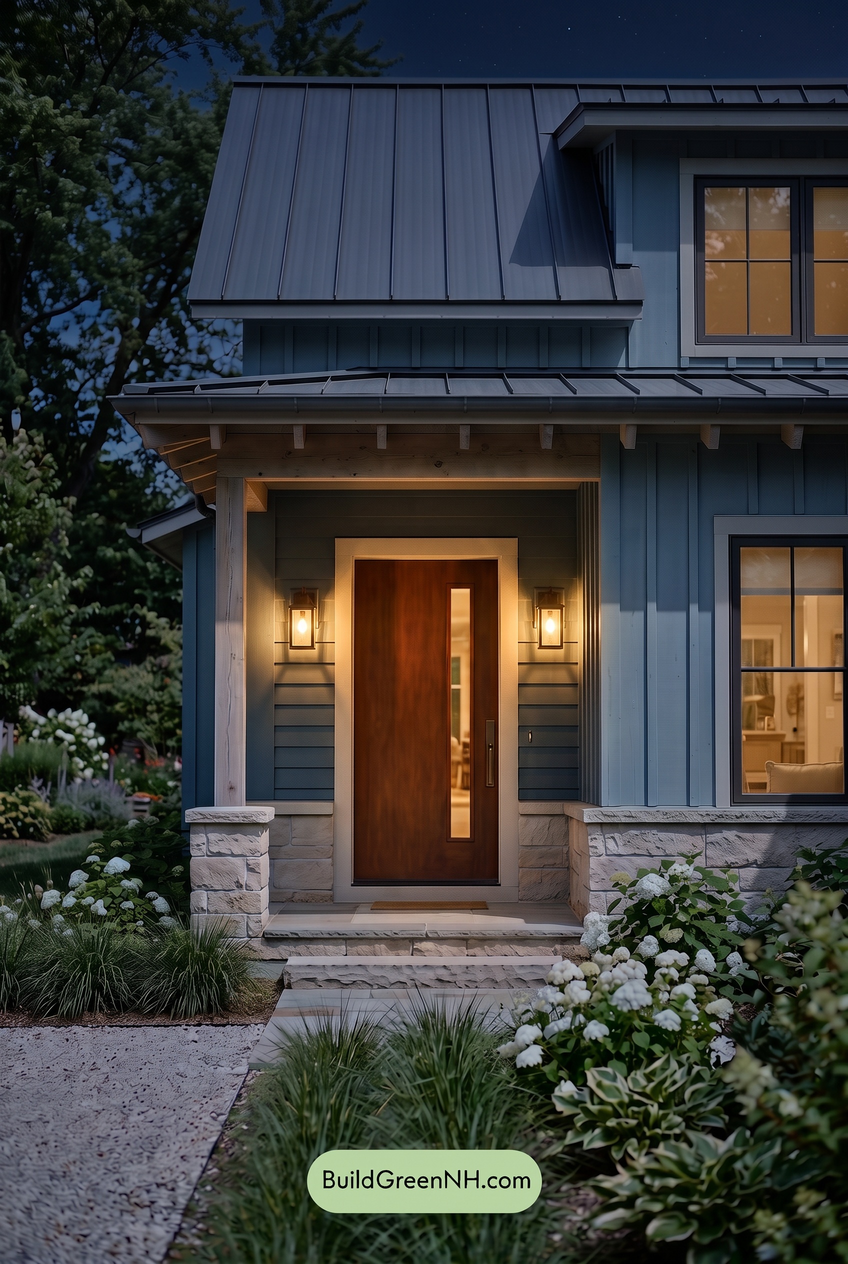
At night, the blue exterior shifts deeper and more muted than it appears in neutral daylight, with its saturation settling into a calm, shadowy character. Gray window frames and white trim lose some of their crisp brightness in the darker areas, while the strongest contrast gathers around the illuminated entry.
Warm lighting brings a gentle glow to the brown door and nearby pale details, making those shades feel richer and more welcoming against the cool blue facade. Deep shadows beneath the roofline add dimension and drama, creating a cozy, refined mood that daylight presents more evenly.
Pin these for later:
Want More?
 Blue House Front Door Color Scheme: Harbor Saffron
 Blue House Front Door Color Scheme: Cobalt Persimmon
 Blue House Front Door Color Scheme: Denim Poppy
 Blue House Front Door Color Scheme: Slate Citron
 Blue House Front Door Color Scheme: Mist Blue Haven
Table of Contents