Last updated on
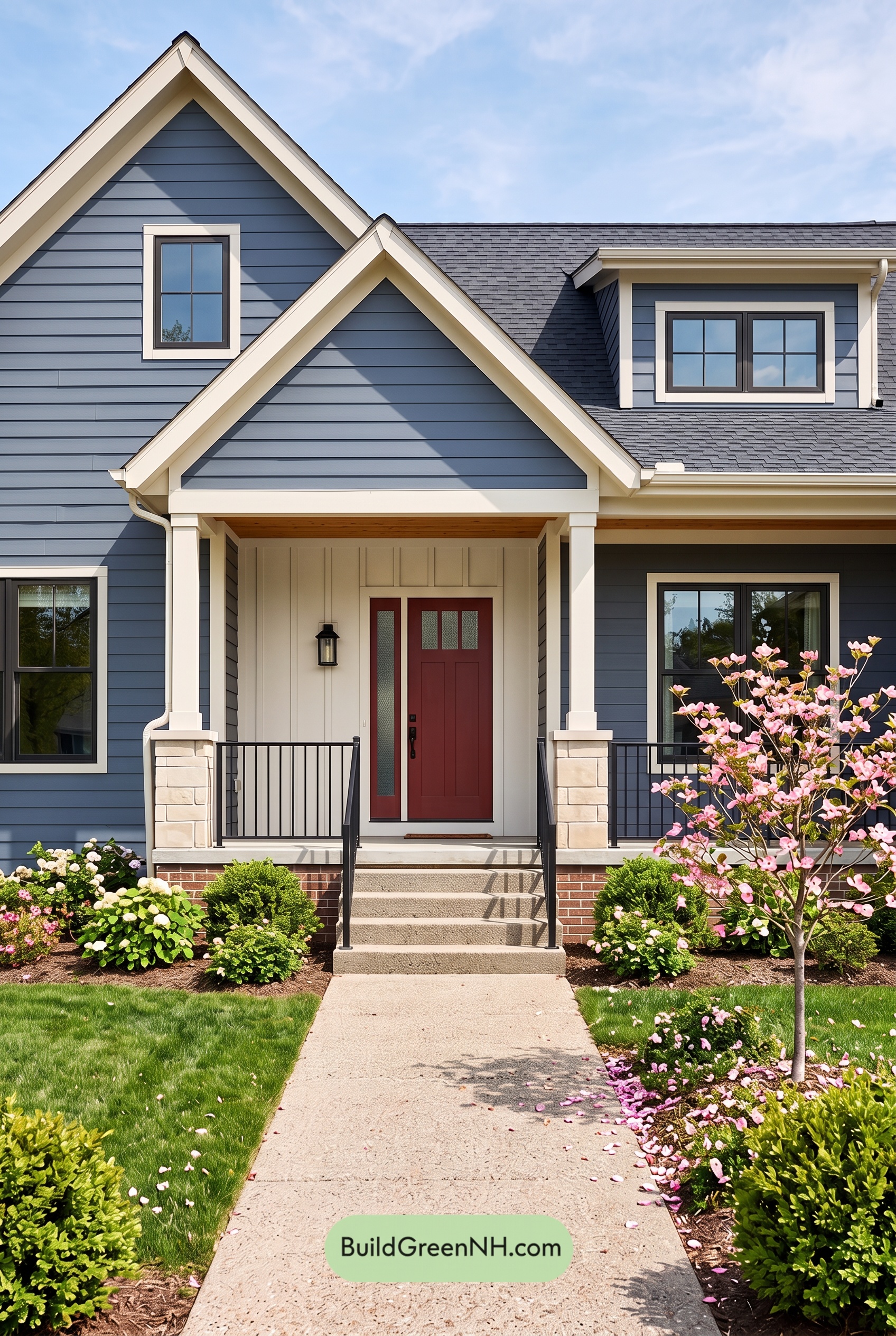

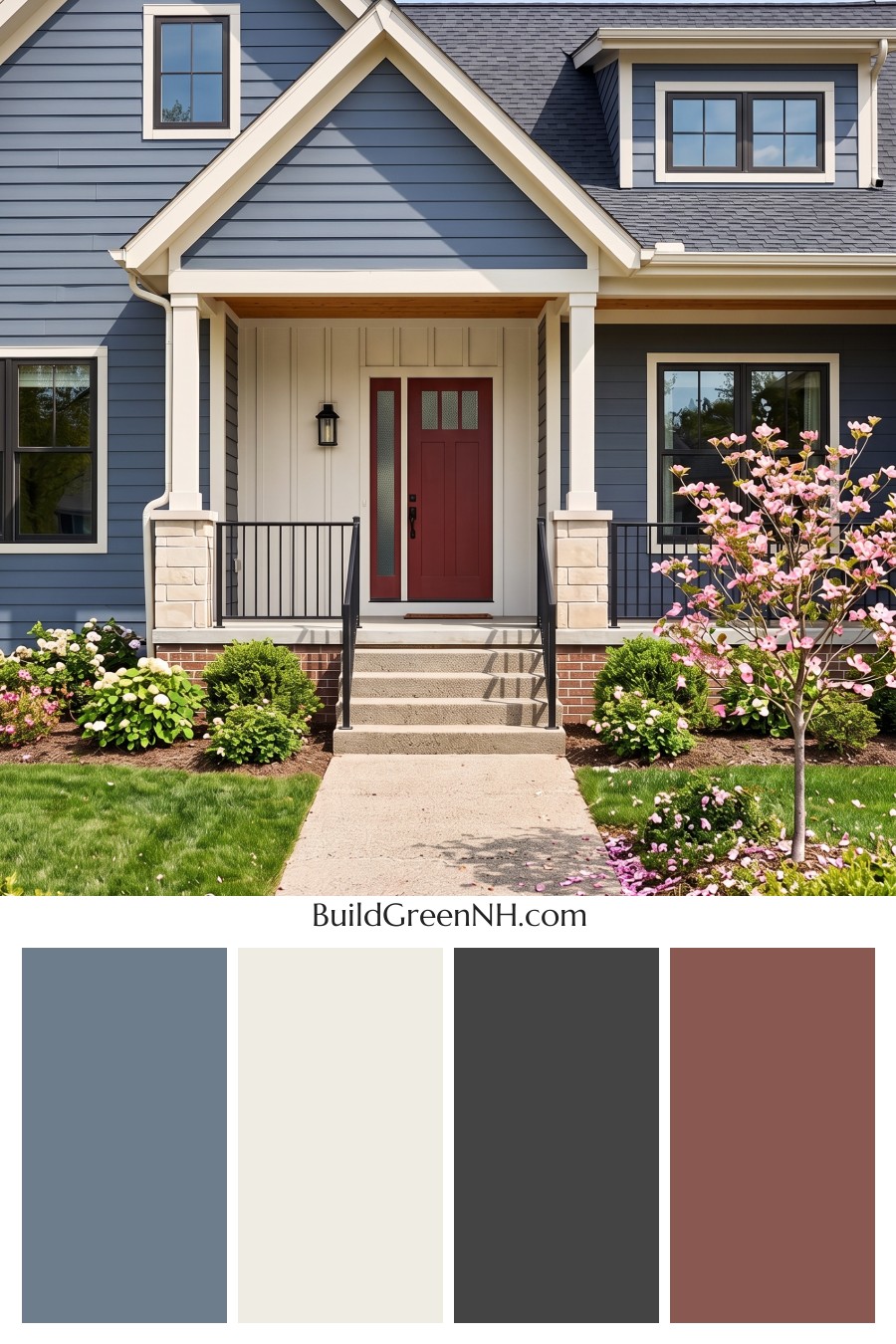
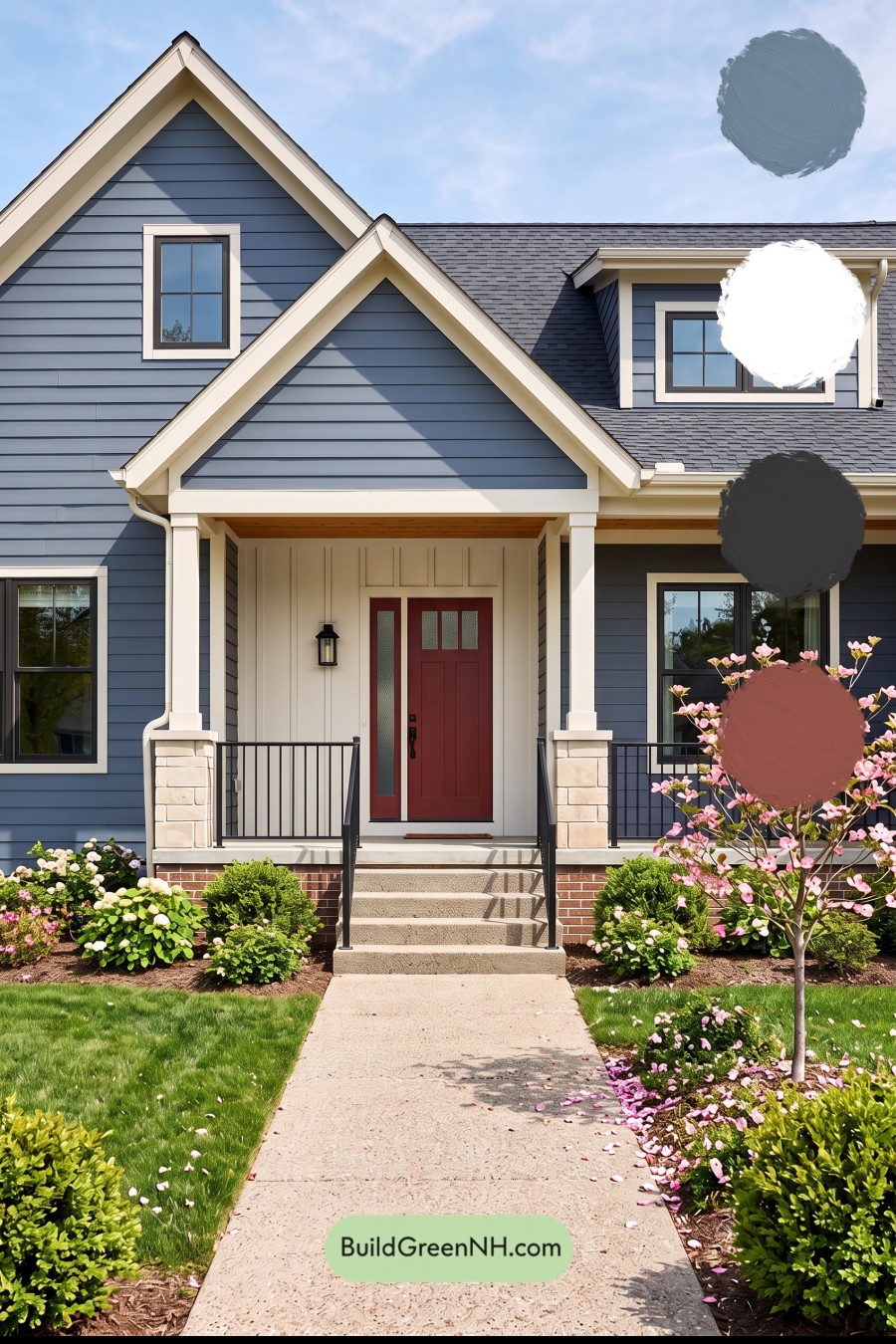
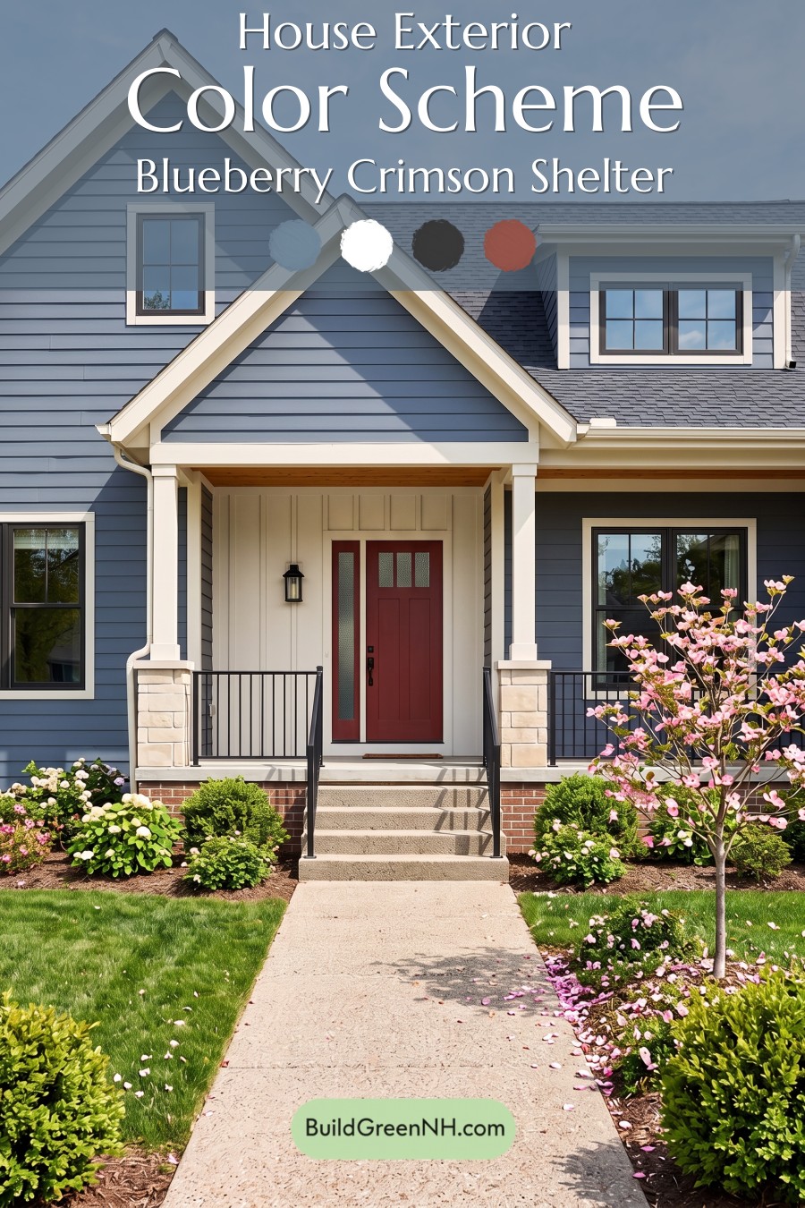
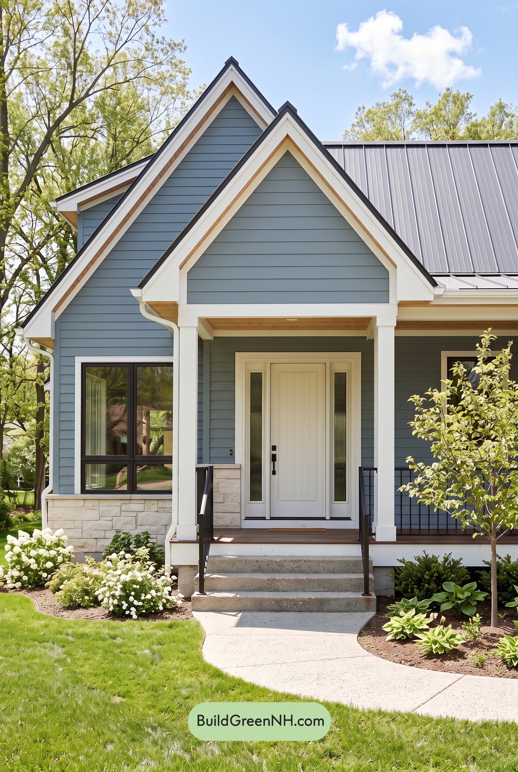
This blue, white, and deep red exterior palette feels polished, welcoming, and wonderfully timeless from the very first glance.
A Calm Blue Foundation
A muted medium blue covers the horizontal siding, giving the home a cool, collected foundation that suits its traditional lines. The shade has enough depth to make the gables and wall planes feel substantial, yet it remains light enough to look fresh in bright daylight. It creates a quietly elegant backdrop for the lighter architectural details.
Bright Trim That Defines Every Detail
Soft warm white trim crisply outlines the rooflines, gables, windows, porch beams, and columns. This lighter shade brings visual clarity to the layered facade, emphasizing the home’s peaks and creating clean contrast against the blue siding. The same warm white appears around the covered entry, where it makes the front porch feel open and inviting.
The accent wall behind the entry continues this warm white treatment, giving the doorway a sheltered, tailored presentation. It is a smart use of a light neutral: rather than competing with the main siding, it highlights the arrival point and adds a gentle sense of depth.
Rich and Grounding Accents
A deep red-brown front door provides the strongest color moment on the exterior. Its warm, saturated character balances the cool blue siding and instantly draws the eye toward the entrance. Framed by the pale porch surround, the door feels especially welcoming without overwhelming the rest of the composition.
Dark gray window frames and railings introduce definition with a clean, modern edge. Their deeper neutral tone echoes the charcoal gray roof, tying the upper and lower portions of the house together. The roof’s layered gray shade is a practical anchor for the palette, giving the lighter trim and cooler siding a grounded finish.
A Balanced, Inviting Mood
This scheme strikes a lovely balance between classic and current. Blue and white establish a serene, coastal-inspired mood, while the deep red-brown door adds warmth and personality. Gray accents keep everything refined, preventing the contrast from feeling overly sweet or formal.
With its cool base, warm highlights, and dark structural accents, the exterior feels composed from every angle. It is a color approach that gives a traditional home fresh curb appeal while still feeling comfortable, familiar, and built to last.
Next, see how this color scheme looks under different lighting simulations throughout the day.
Overcast
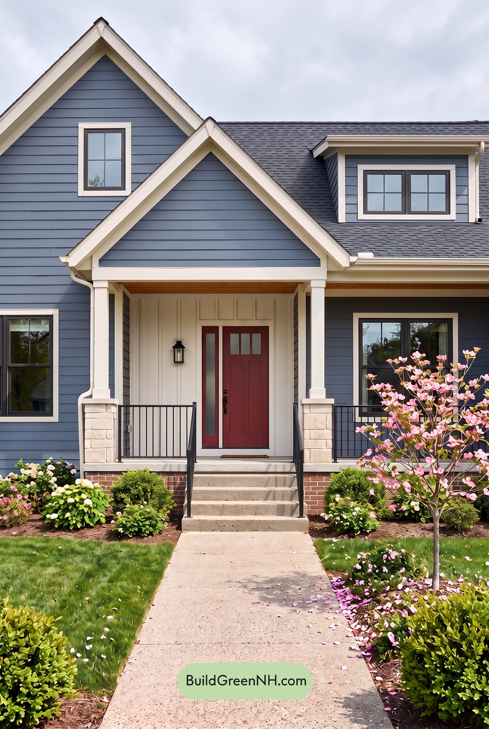
Under overcast skies, the blue siding takes on a slightly deeper, more muted character than it shows in neutral daylight, with its saturation feeling calmer and cooler. The white trim and columns lose some of their sunlit brightness, reading as softer warm neutrals that create a gentler contrast against the blue.
With direct sunshine removed, shadows along the gables, porch, and siding become more even and less sharply defined. The deep brown front door and charcoal-gray details gain visual weight against the softened facade, giving the exterior a polished, quietly dramatic mood rather than a crisp, high-contrast daytime look.
Golden Hour
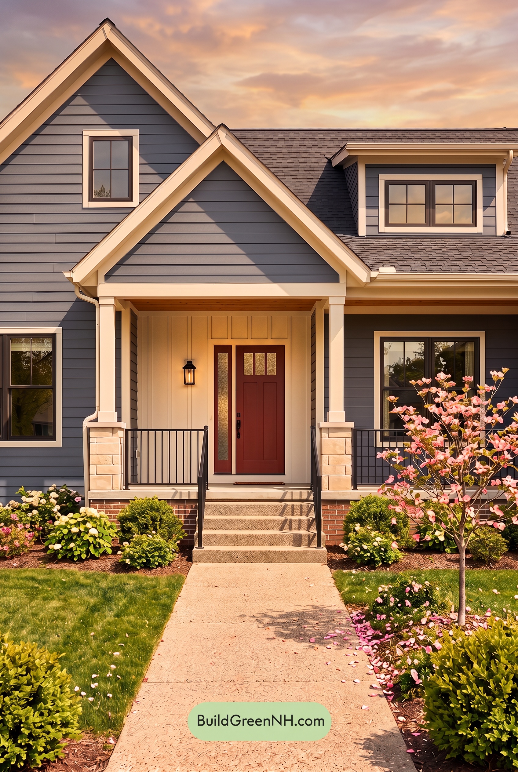
Golden Hour gives the blue siding a gentler, slightly warmer cast than it has in neutral daylight, while its shaded planes deepen into a more muted blue-gray. The white trim and columns glow with a creamy softness, making the façade feel less crisp and more inviting as the low sun enriches the overall saturation.
Longer shadows sharpen the contrast around the gables, windows, and railings, giving the gray details a deeper, more dramatic presence. The brown entry door becomes especially rich and welcoming against the luminous light neutrals, creating a cozy, layered mood that neutral daylight presents with a cooler, more even clarity.
Shade
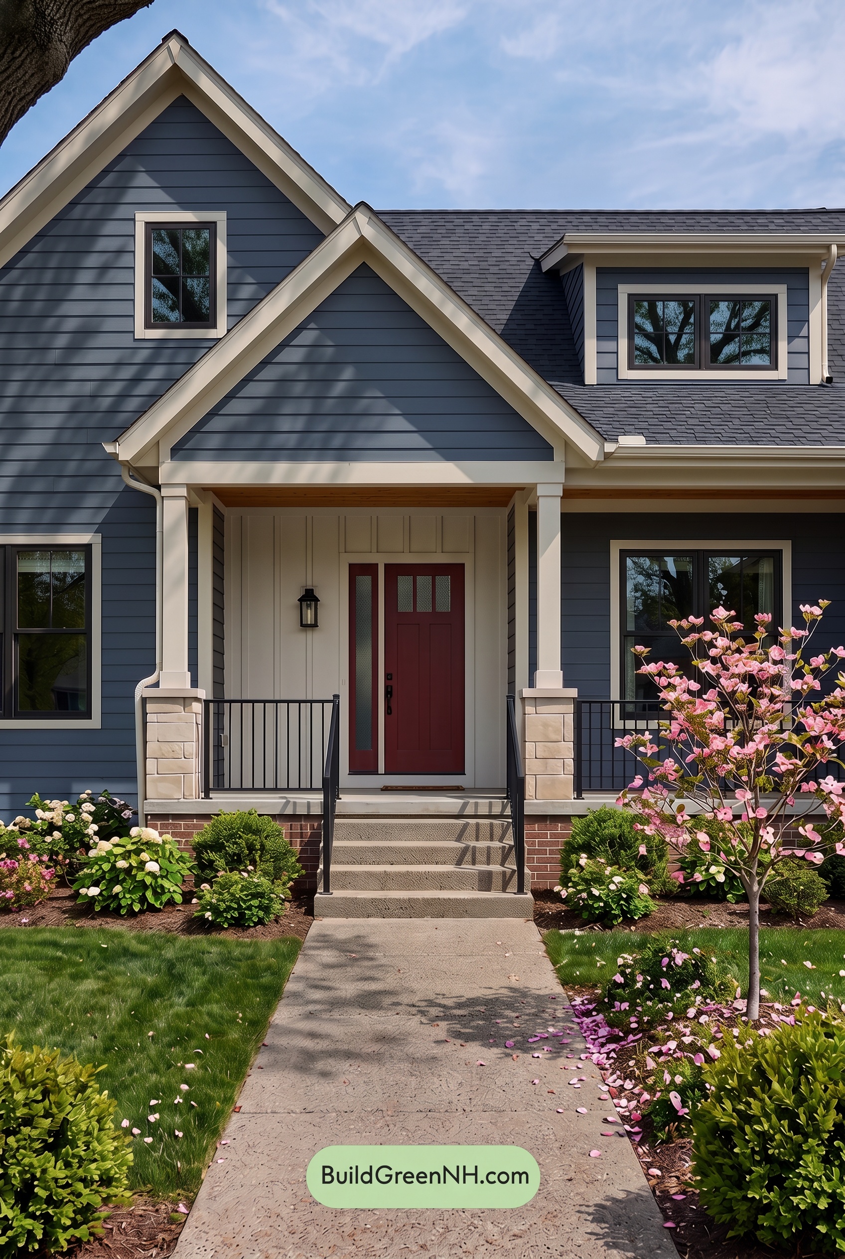
In shade, the blue siding takes on a deeper, quieter character than it shows in neutral daylight, with its saturation appearing more restrained and its cool undertones more pronounced. Tree-cast shadows create layered variations across the façade, giving the horizontal lines added depth while lending the exterior a calm, tailored mood.
The white trim and columns soften toward a gentle warm neutral in lower light, reducing their crisp contrast slightly while still cleanly framing the blue walls. Dark gray window frames and railings recede into the shadows for a more unified look, while the brown entry door gains visual warmth and becomes an inviting focal point against the cooler surrounding shades.
Nighttime
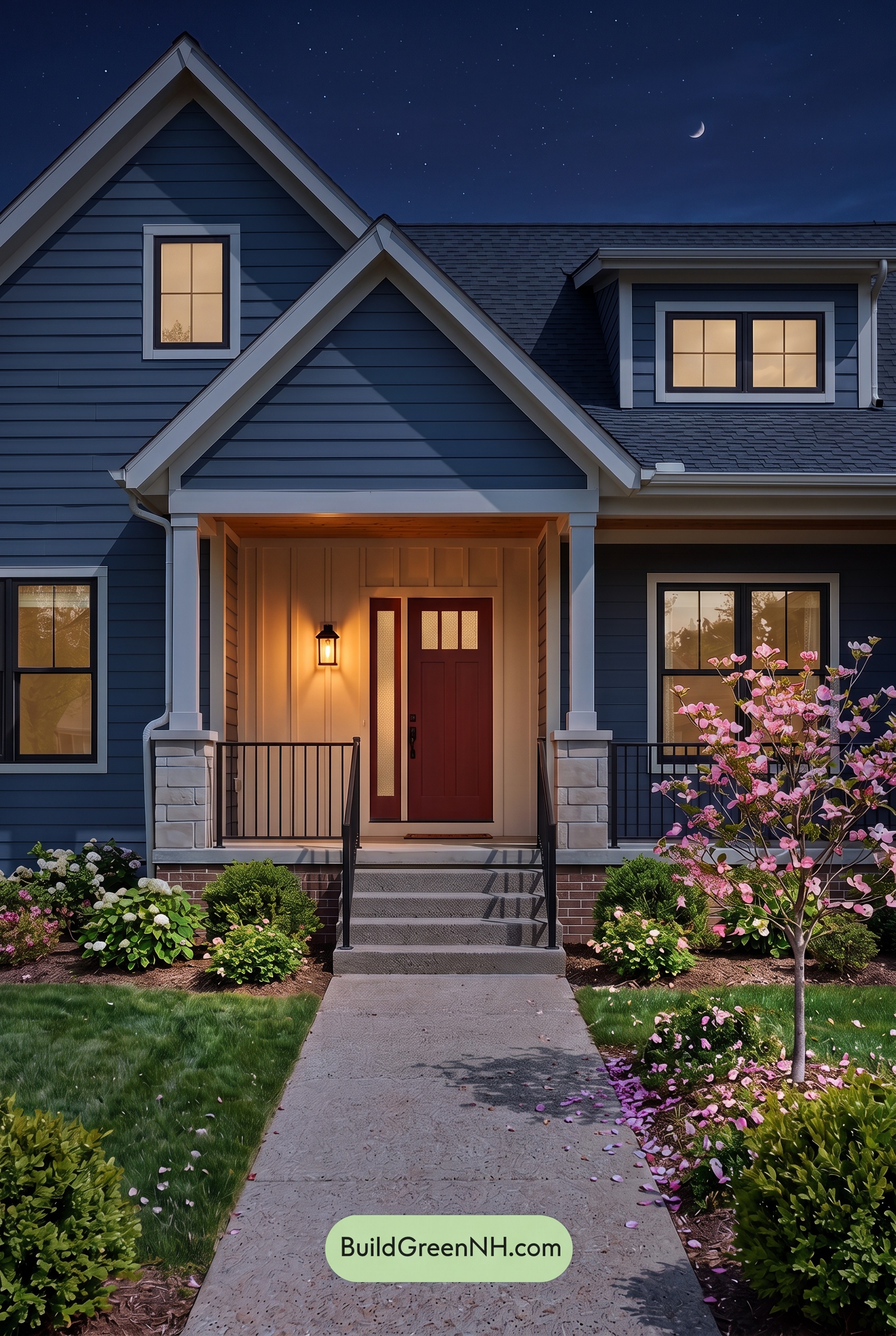
At night, the blue exterior settles into a deeper, more muted shade, with its saturation appearing richer where porch and window light touches it and nearly inky in the recessed areas. Compared with neutral daylight, the white elements lose some crisp brightness, shifting toward softer, cooler-looking neutrals that outline the rooflines and porch with gentle contrast.
Warm light at the entry gives the brown door a fuller, warmer presence and creates a welcoming focal point against the cool blue surroundings. Gray details recede into the shadows, while the stronger light-to-dark contrast adds depth to the façade and gives the home a calm, inviting nighttime mood.
Pin these for later:
Want More?
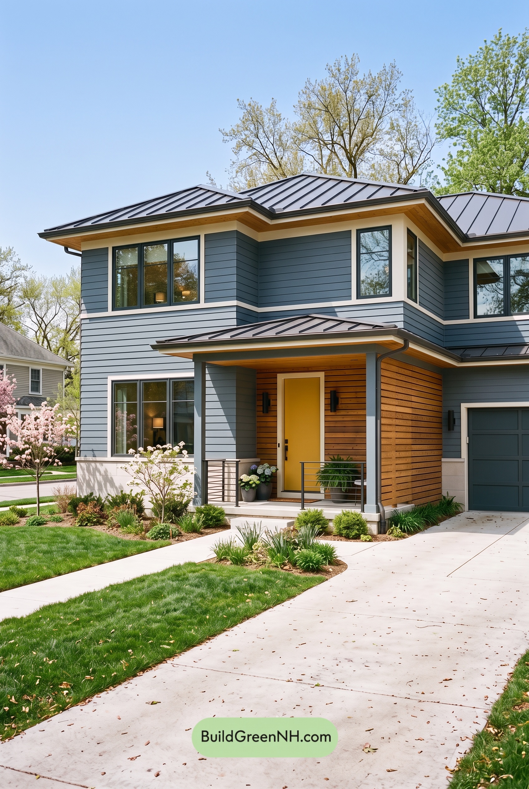 Blue House Front Door Color Scheme: Harbor Saffron
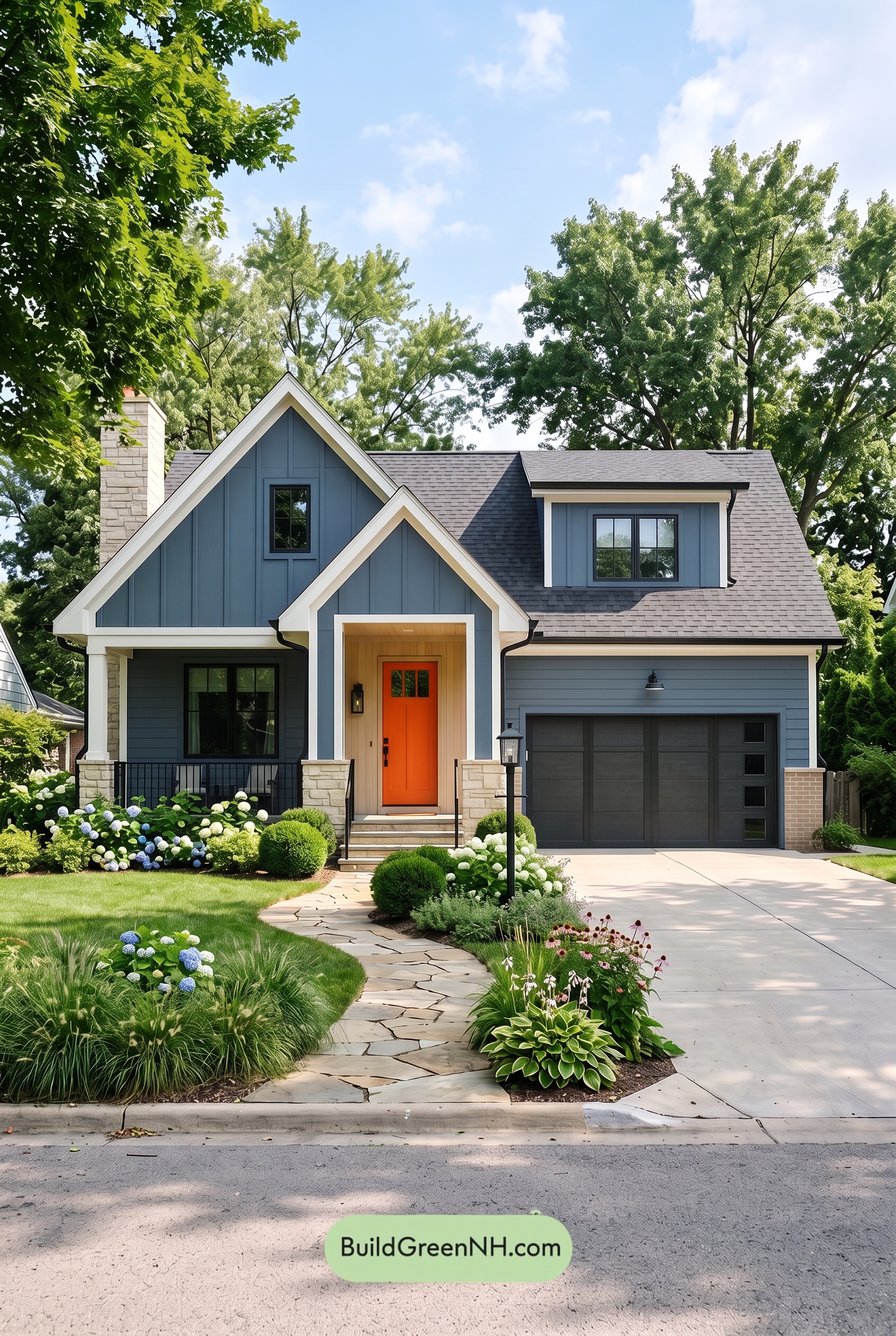 Blue House Front Door Color Scheme: Cobalt Persimmon
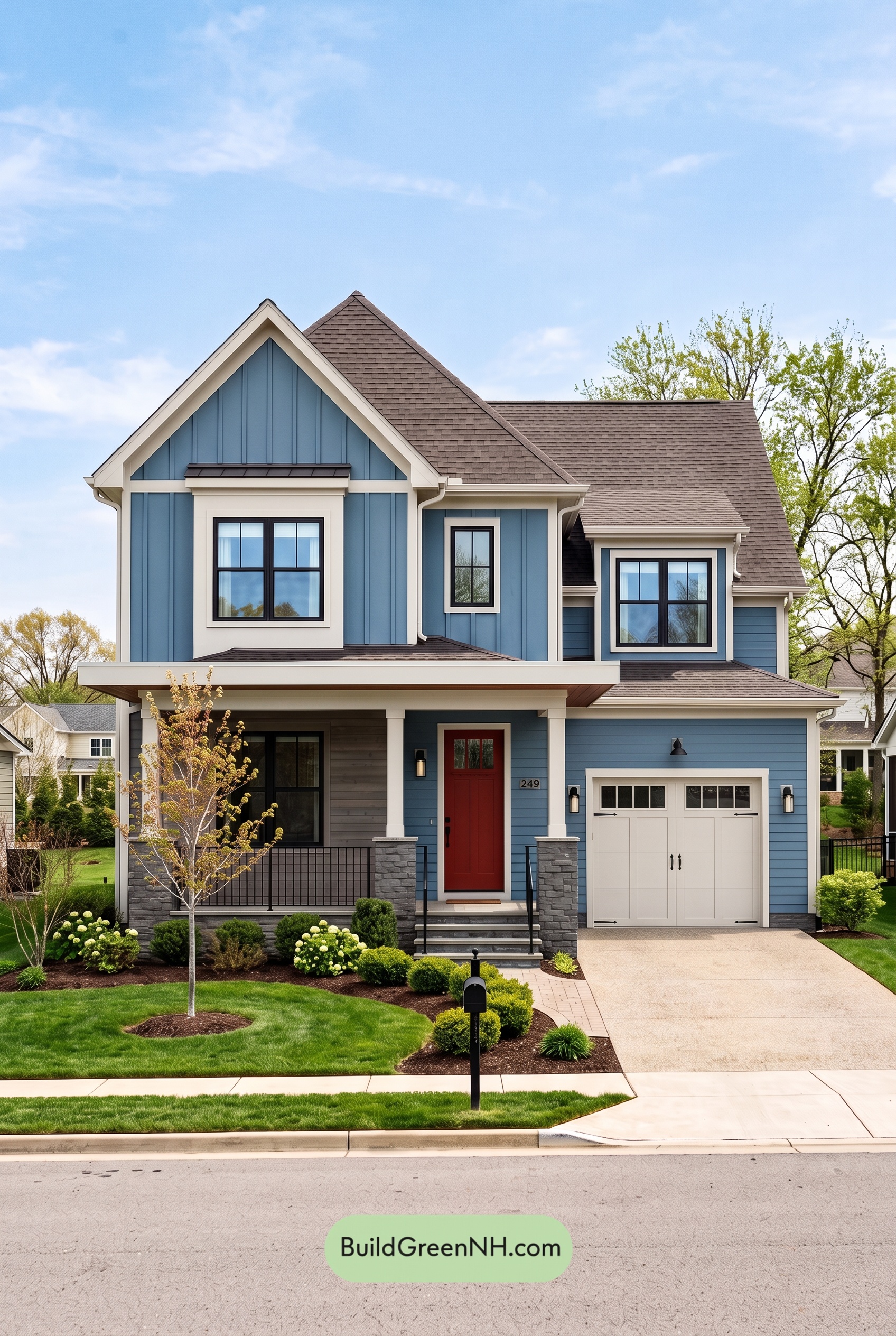 Blue House Front Door Color Scheme: Denim Poppy
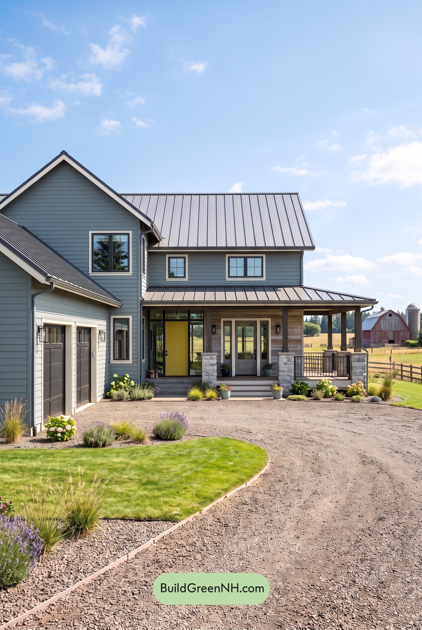 Blue House Front Door Color Scheme: Slate Citron
 Blue House Front Door Color Scheme: Mist Blue Haven
Table of Contents