Last updated on
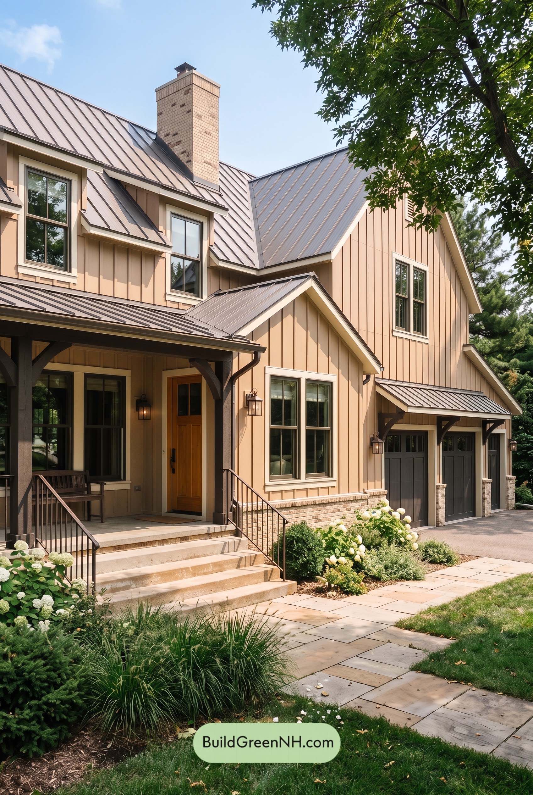

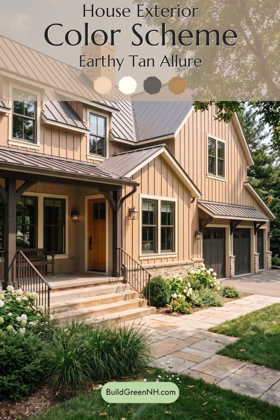
Warm beige siding, pale trim, and deep gray accents give this home its inviting balance of softness, structure, and timeless curb appeal.
A Warm Beige Foundation
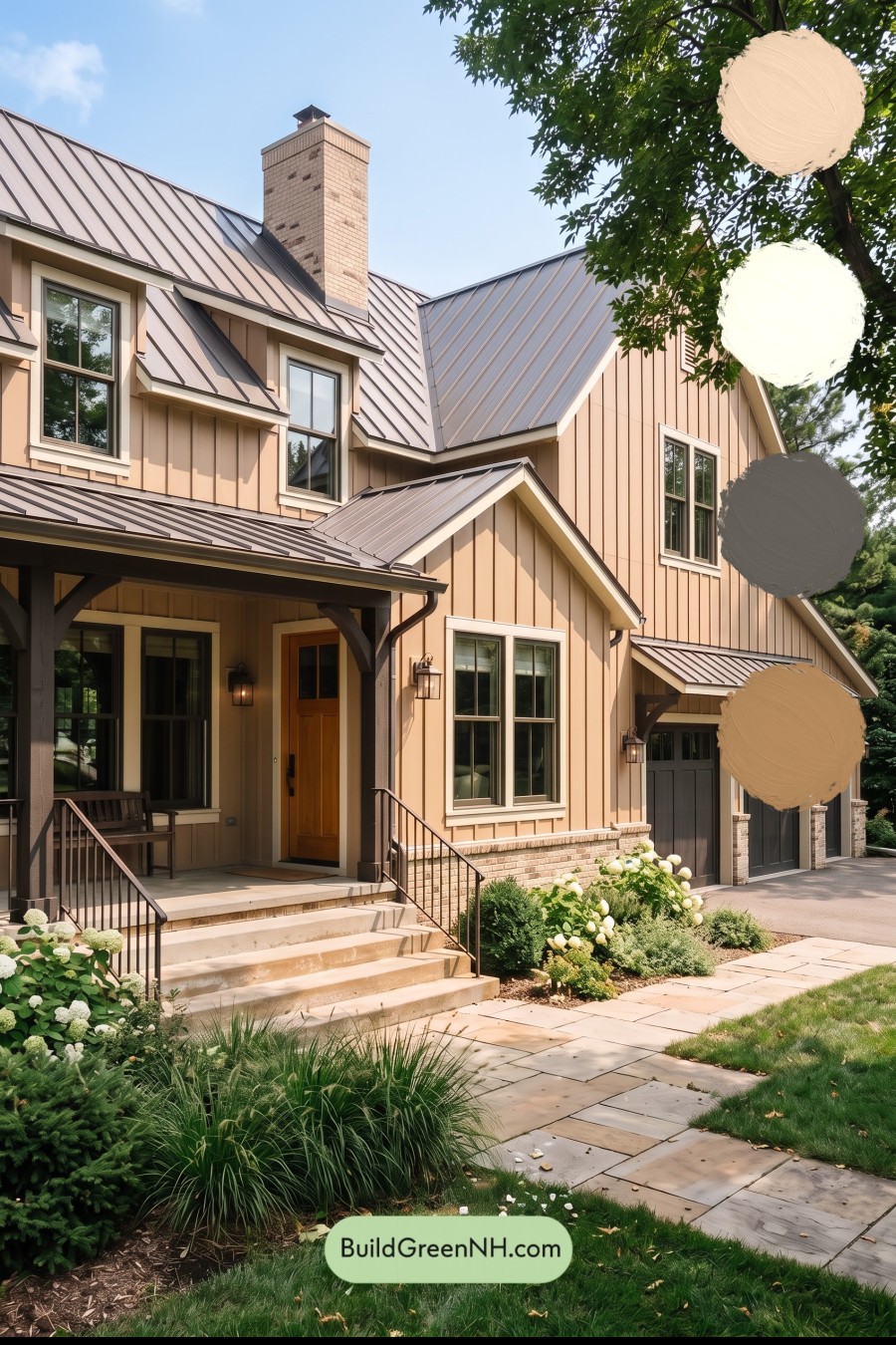
The board-and-batten siding wears a warm, sandy beige with subtle peach undertones. Across the tall gables and broad wall surfaces, this shade feels sunny without becoming overly bright. The vertical boards add gentle shadows, giving a quiet neutral plenty of dimension.
A lighter, creamy beige outlines the windows, doors, and roof edges. Because the trim stays close to the siding’s color family, it defines the architecture without creating a sharp contrast. The result feels cohesive rather than busy, even with several intersecting rooflines.
Deep Gray Details That Add Definition
The gray window frames bring a cooler note to the warm exterior. Their deeper shade draws attention to the glass and gives each opening a crisp outline within its pale surround.
Dark charcoal gray porch columns and brackets provide stronger visual anchors. Similar gray tones continue across the railings and garage doors, connecting the entry with the garage wing. Repeating these darker shades keeps the large facade balanced while allowing the lighter siding to remain dominant.
A Brown Front Door with Welcoming Warmth
The front door introduces a rich, golden brown that stands out naturally against the beige walls and charcoal supports. It is a modest shift in color, but an effective one: the warmer shade draws the eye toward the entrance without needing a bold accent.
Its warmth also keeps the shaded porch from feeling too cool or severe. Surrounded by pale trim, the doorway feels distinct and inviting.
A Roof That Ties the Palette Together
The standing-seam roof appears in a muted gray with soft brown undertones, bridging the warm siding and deeper gray details below. Sunlight brightens its broad planes, while the seams introduce darker lines that echo the home’s vertical siding.
Beige masonry along the foundation and chimney reinforces the warm neutral palette. Together, these related shades create a relaxed, polished exterior: light enough to feel welcoming, dark enough in the right places to give the architecture definition, and beautifully at ease beside the surrounding greens.
Next, see how this color scheme looks under different lighting simulations throughout the day.
Overcast
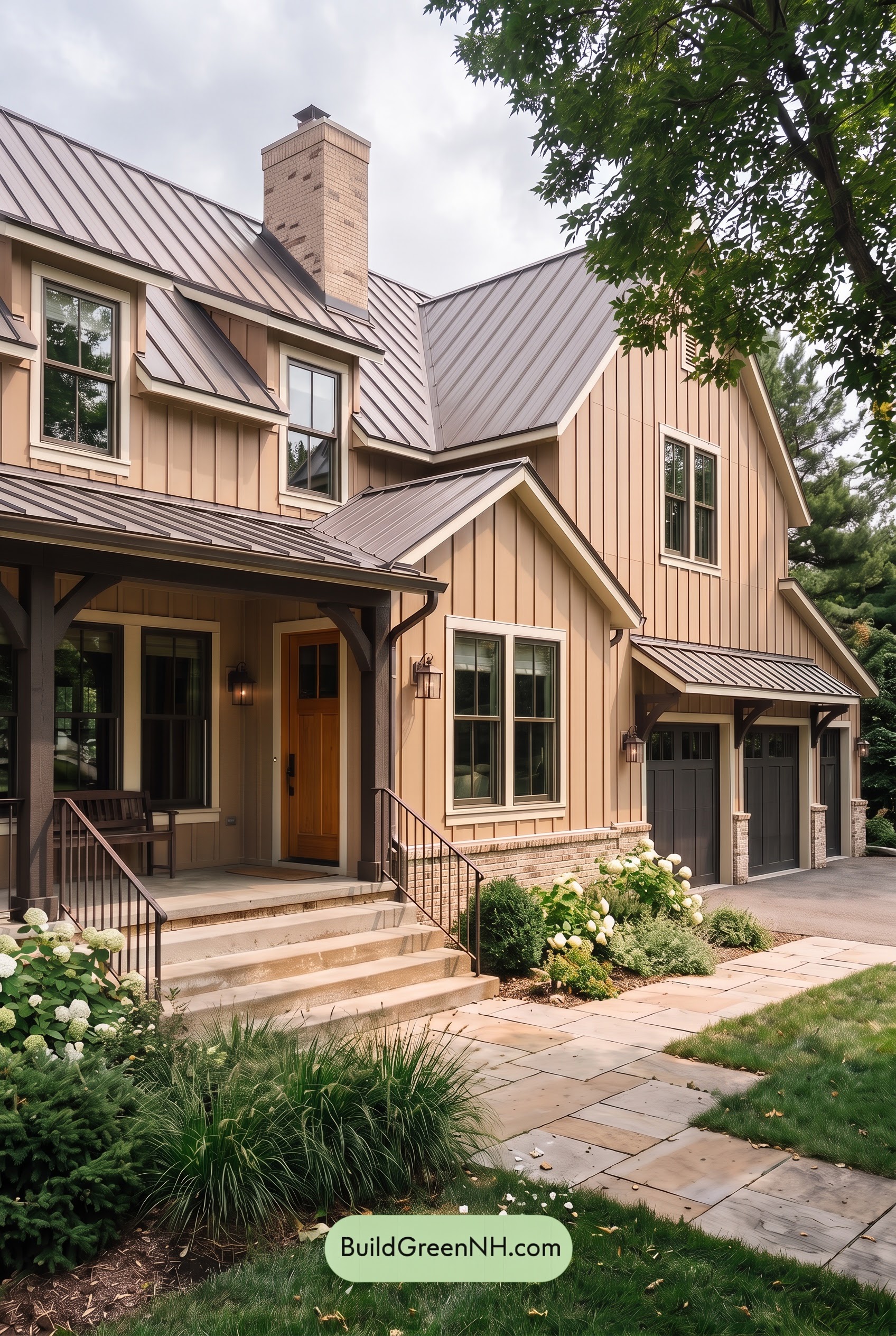
Under overcast skies, the warm beige shades across the siding appear more muted and slightly cooler than in neutral daylight, with their golden undertones taking a quieter role. The lighter beige trim feels softer rather than brightly defined, while the deep grays look more even without strong highlights. The brown at the entry loses a little richness but retains a welcoming warmth.
Cloud-filtered light softens shadows beneath the porch and along the vertical siding, making the transitions between light and dark less dramatic. The deep grays still frame the lighter neutrals clearly, but the overall contrast feels gentler. Compared with neutral daylight, the palette takes on a calmer, more understated mood.
Golden Hour
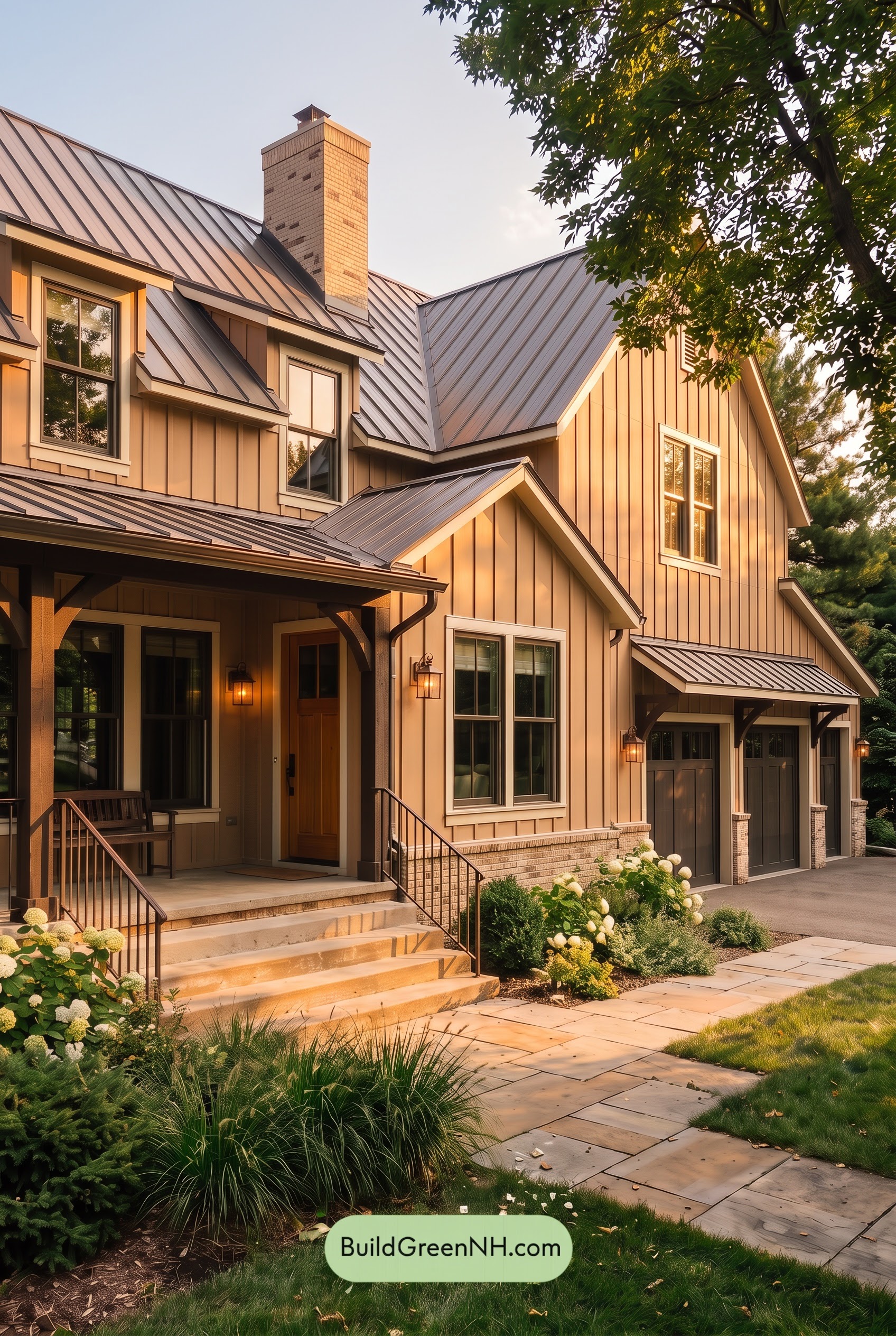
Golden Hour gives the beige siding a richer, more saturated glow, drawing out yellow and soft orange undertones that would feel quieter in neutral daylight. The pale beige trim looks warmer and softer rather than sharply defined, bringing the sunlit gables and window surrounds into a gentle, cohesive palette.
The gray accents pick up a warm brown cast where sunlight reaches them, while shaded sections remain cooler and appear deeper. Long shadows beneath the eaves and across the porch strengthen the contrast between light trim and dark framing, giving the exterior more depth. The brown entry feels richer within the shaded porch, shifting the overall mood from the balanced clarity of neutral daylight to something cozier and more inviting.
Shade
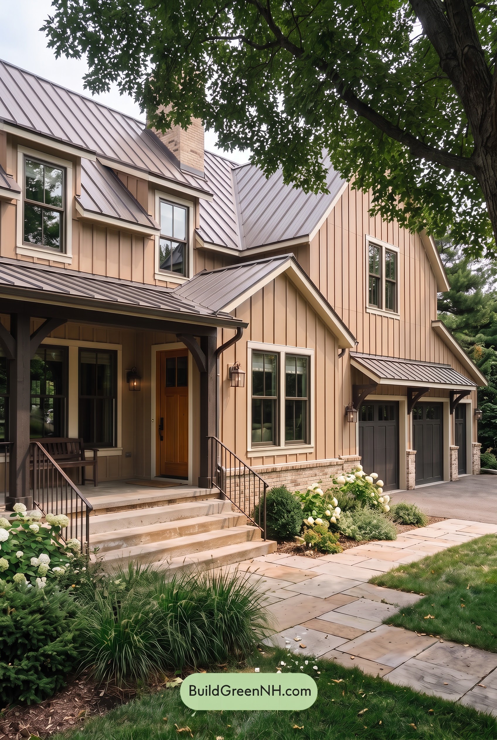
In shade, the beige siding appears a little deeper and less saturated than in neutral daylight, with its warm undertones softened rather than lost. The lighter beige trim feels creamier and less bright, creating a gentler transition around the windows and rooflines. Together, these warm neutrals give the house a quieter, more sheltered mood.
The gray accents read cooler and darker, edging toward charcoal in the deepest porch shadows. While shade softens surface highlights, these dark recesses still create depth against the pale exterior. The brown front door also appears deeper and more subdued, keeping a hint of warmth without the richer glow it would show in neutral daylight.
Nighttime
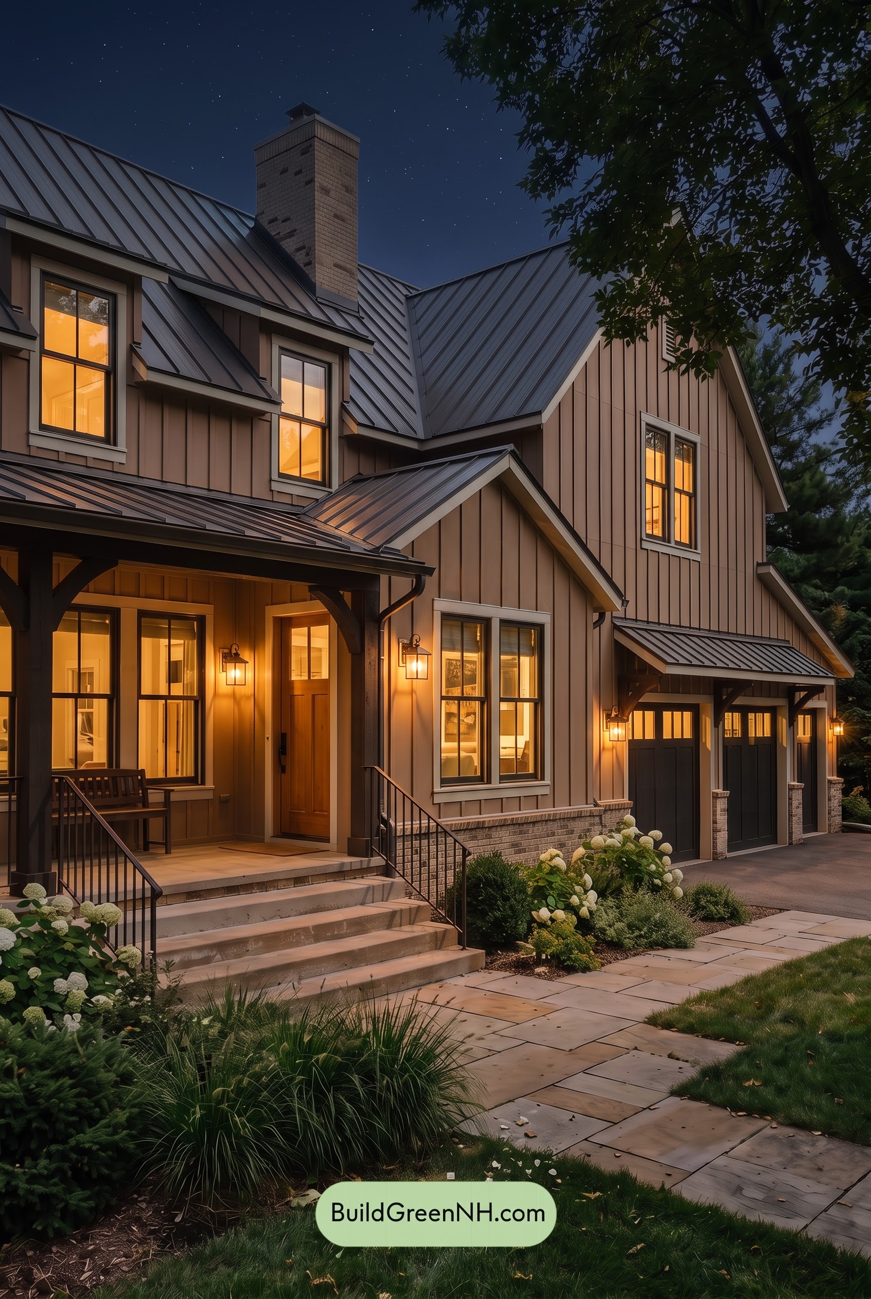
At night, the beige shades look deeper and more subdued than they would in neutral daylight, while the warm lighting lends illuminated areas a richer, golden cast. The lighter beige trim feels softer and creamier rather than crisp, with shadows beneath the eaves emphasizing the contrast between glowing walls and sheltered recesses.
The gray shades deepen toward charcoal, losing some of the subtle variation daylight would reveal. Against these darker accents, the brown front door feels warmer and richer beneath the porch lights. Color appears less saturated away from the fixtures, but more intense nearby, shifting the house from an airy daytime palette to a cozy, quietly dramatic nighttime mood.
Pin these for later:
Want More?
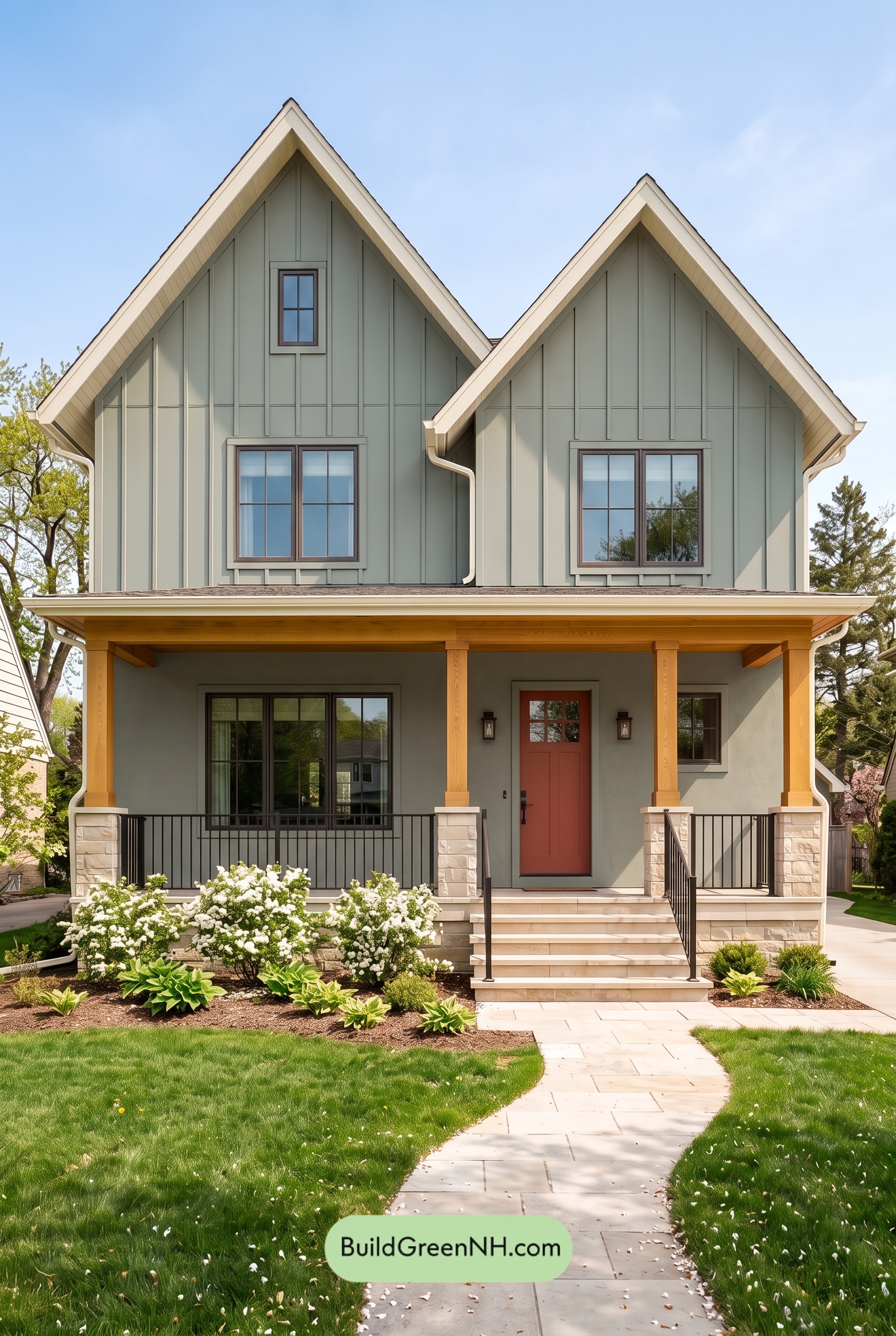 Green House Exterior Color Scheme (New Trend for 2027): Sage and Greige Grace
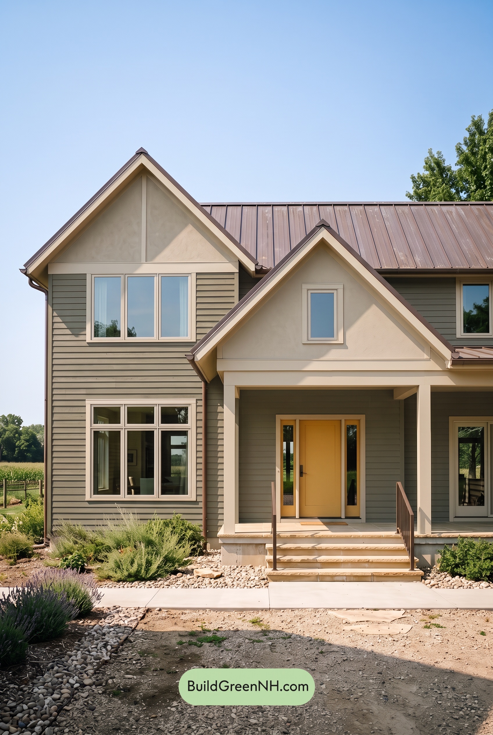 Green House Exterior Color Scheme (New Trend for 2027): Olive Greige Embrace
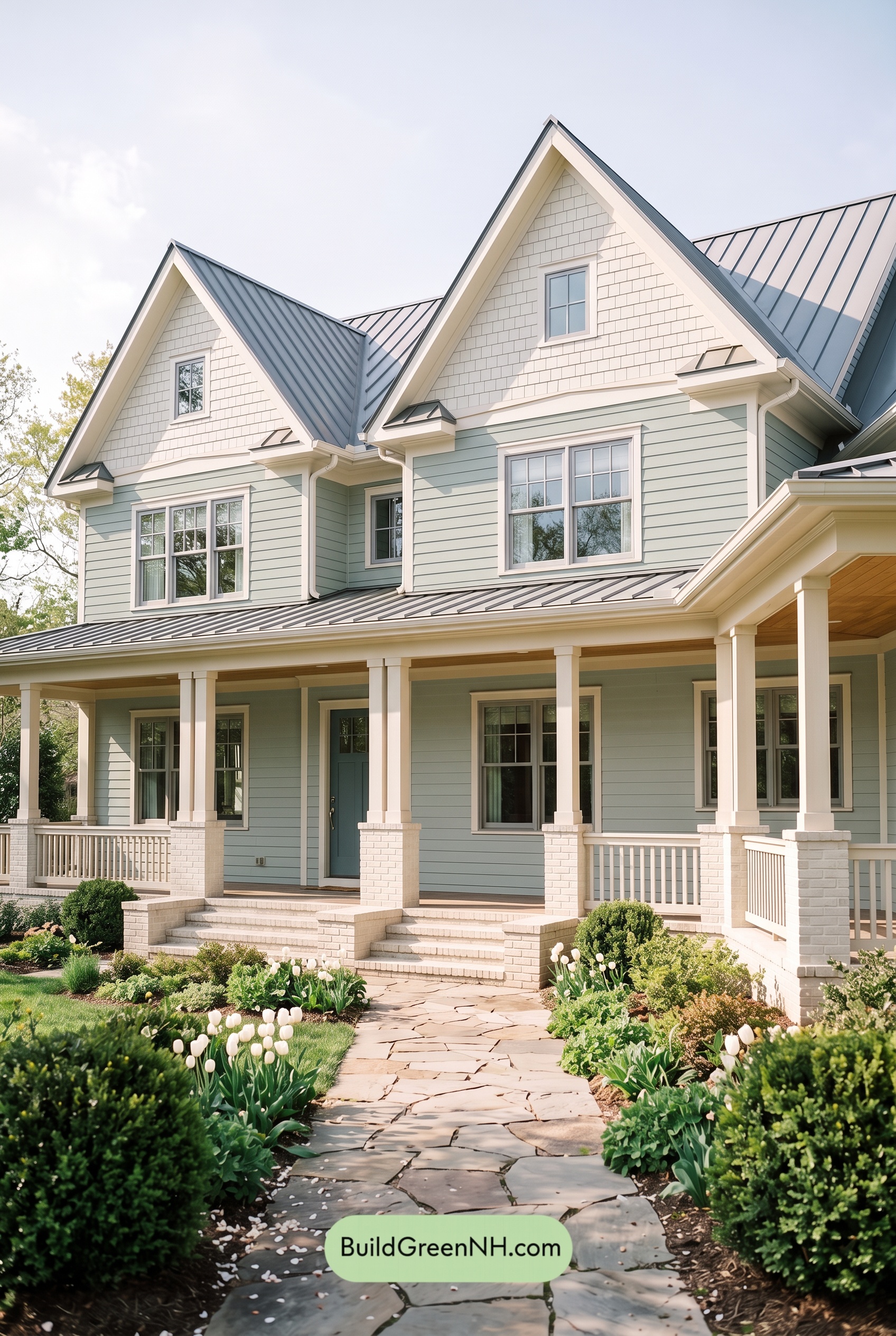 Green House Exterior Color Scheme (New Trend for 2027): Seafoam Greige Poise
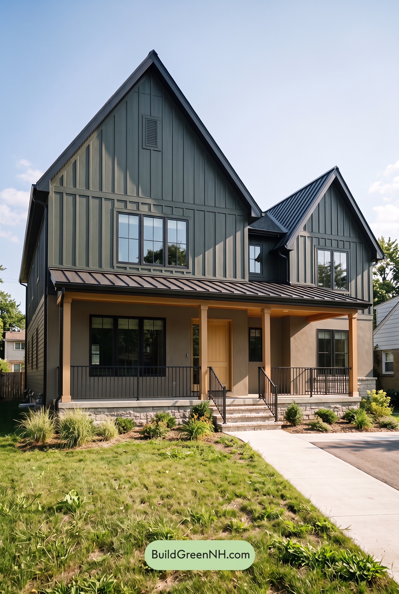 Green House Exterior Color Scheme (New Trend for 2027): Forest Greige Resolve
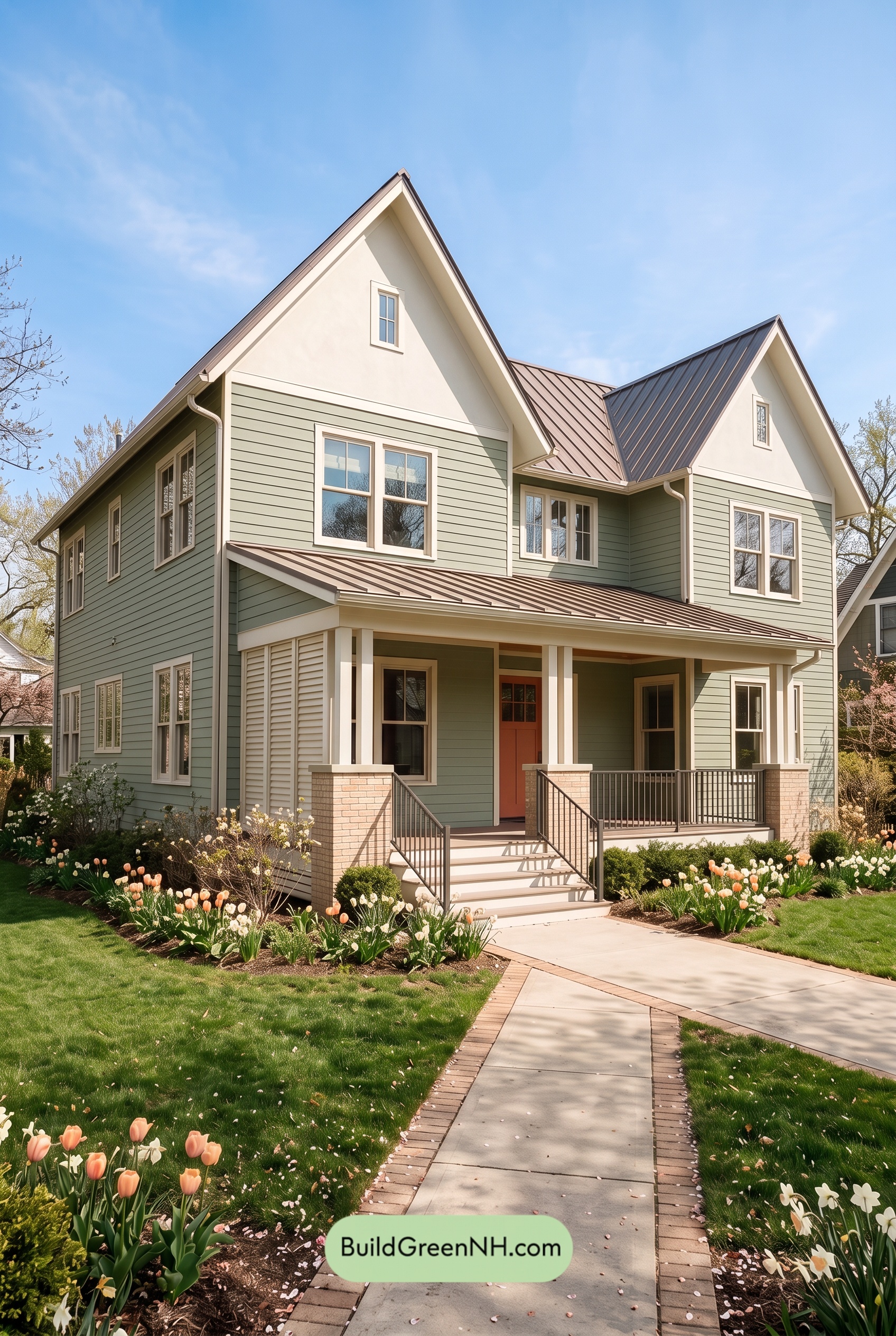 Green House Exterior Color Scheme (New Trend for 2027): Mint Greige Delight
Table of Contents