Last updated on
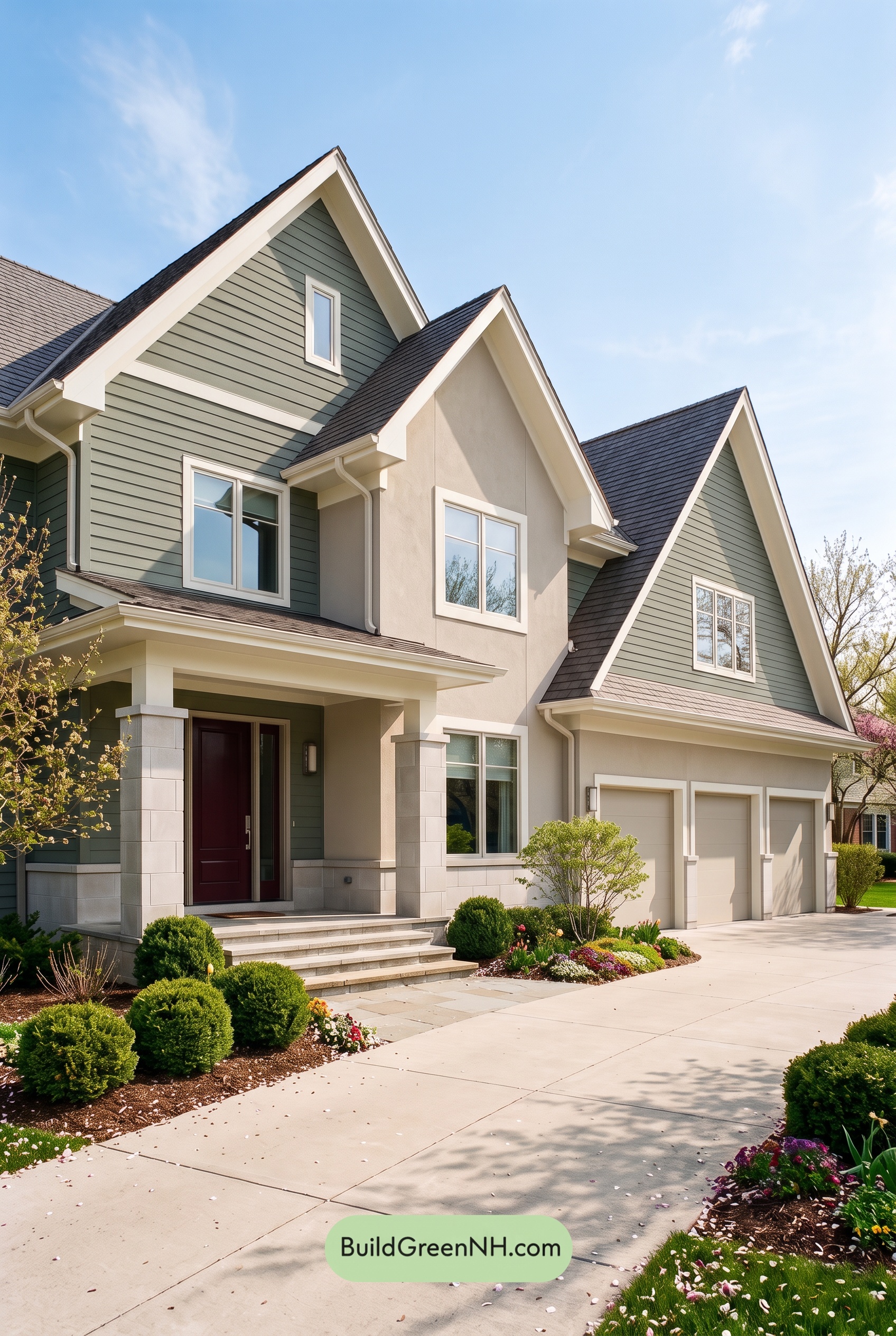

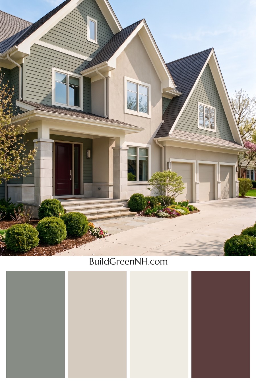
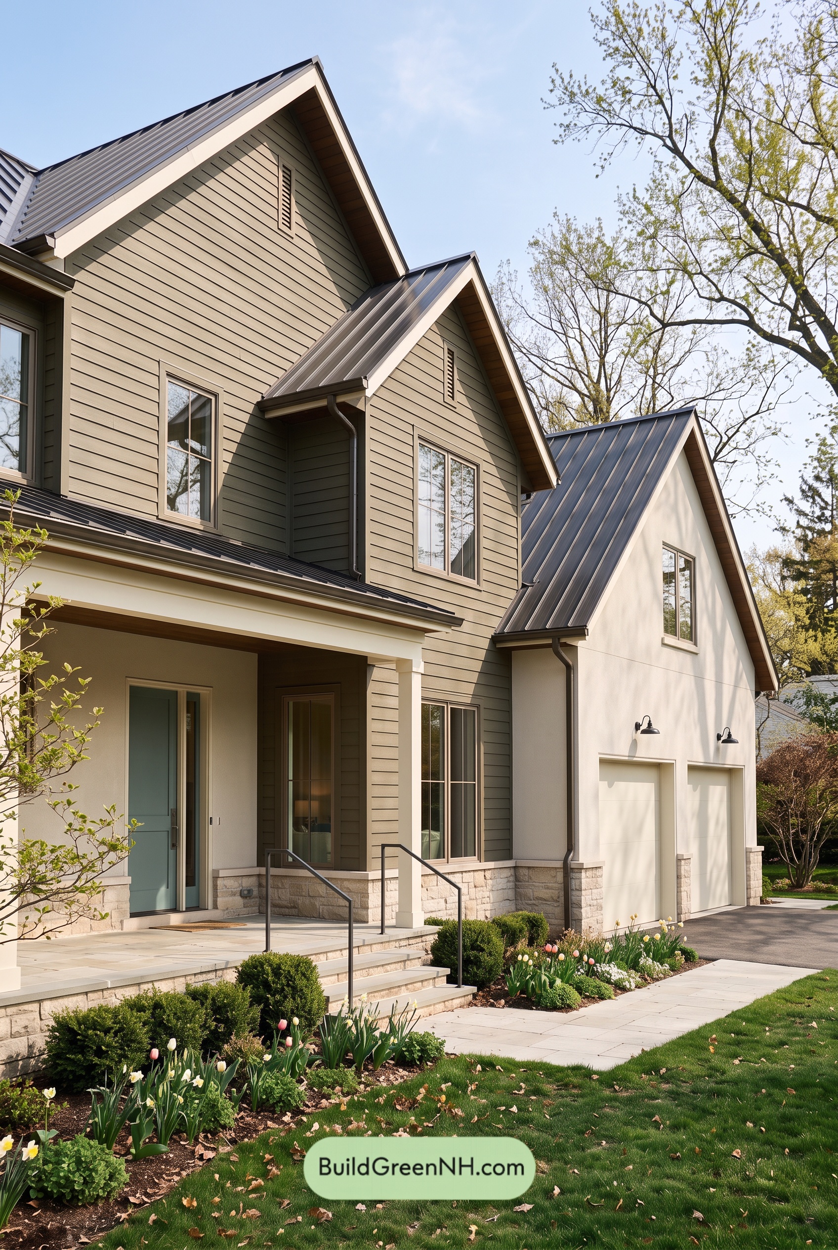
Soft gray siding, warm beige accents, and creamy white trim give this home a beautifully balanced exterior that feels polished without losing its welcoming charm.
Soft Gray with a Hint of Green
The horizontal siding carries a muted, medium gray with gentle green undertones. It gives the broad walls and tall gables enough depth to feel substantial, yet stays soft beside the surrounding greenery. In sunlight, the shade appears lighter and warmer; beneath the porch and eaves, it takes on a deeper, more sheltered character.
Repeating this gray across the outer gables connects the different sections of the house. The architecture has plenty of detail, but the consistent siding color keeps it from feeling busy.
Warm Beige Adds a Gentle Contrast
A light, warm beige distinguishes the central wall section from the gray siding. This shift brings attention to the projecting gable while creating a subtle contrast between the smooth wall surface and the horizontal boards. The two shades are close enough in intensity to sit comfortably together, with beige supplying warmth and gray lending a quieter, cooler balance.
The garage doors echo that pale beige, helping their large surfaces blend into the lower facade rather than dominate it. Nearby pale gray and beige masonry reinforces the same restrained palette.
Creamy White Defines the Details
Creamy white trim traces the steep rooflines, outlines the windows, and brightens the porch. Against the medium gray siding, these lighter edges make the gables especially crisp. Against the beige walls, the contrast is gentler but still gives each window a clear frame.
The white upper portions of the porch columns continue this detailing down toward the entrance, while their pale gray bases connect with the masonry below. Repeating the light trim across the house ties its many angles together.
Deep Accents Ground the Scheme
The front door introduces a deep reddish brown that makes the recessed entry feel warm and inviting. It is a small but effective focal point: richer than the surrounding neutrals, without interrupting their calm mood.
Above, the dark gray roof anchors the lighter walls and emphasizes the white-edged gables. That balance of dark roofing, midtone siding, and pale trim gives the exterior definition without harshness. The result feels composed, comfortable, and closely connected to its garden setting.
Next, see how this color scheme looks under different lighting simulations throughout the day.
Overcast
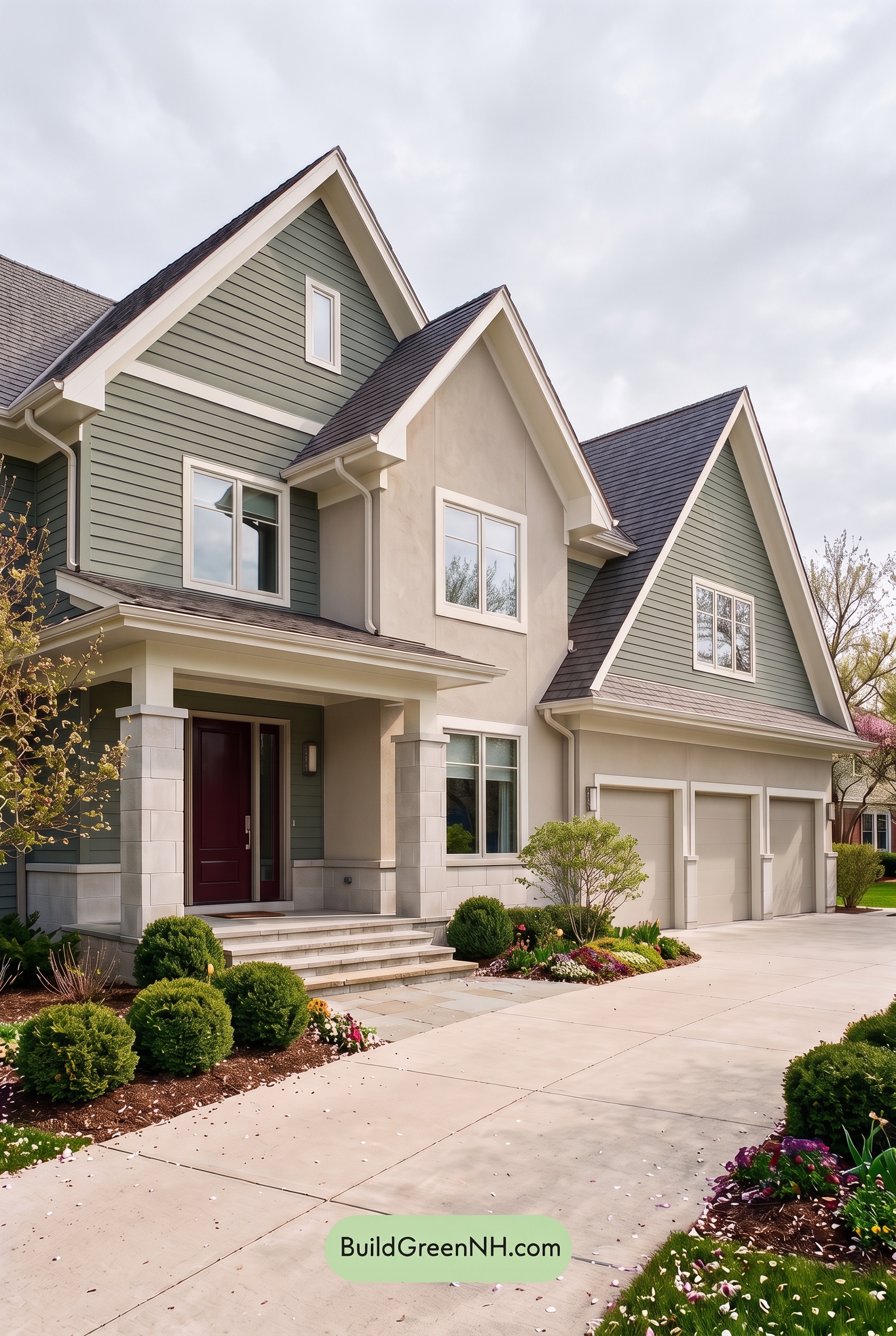
Under overcast skies, the midtone grays can appear cooler and slightly deeper than in neutral daylight, with their subtle green undertones becoming more noticeable. The light beiges lose some golden warmth, while the whites look softer and less luminous. Overall, the shades feel more muted, and the deep brown reads as a quieter, less reddish accent.
Cloud-filtered light softens shadows beneath the gables and around the porch, reducing the dramatic shifts between bright and shaded surfaces. The whites still define the gray and beige areas, but the contrast feels gentler. Compared with neutral daylight, the palette takes on a calmer, more understated mood, with its warm and cool shades sitting comfortably together.
Golden Hour
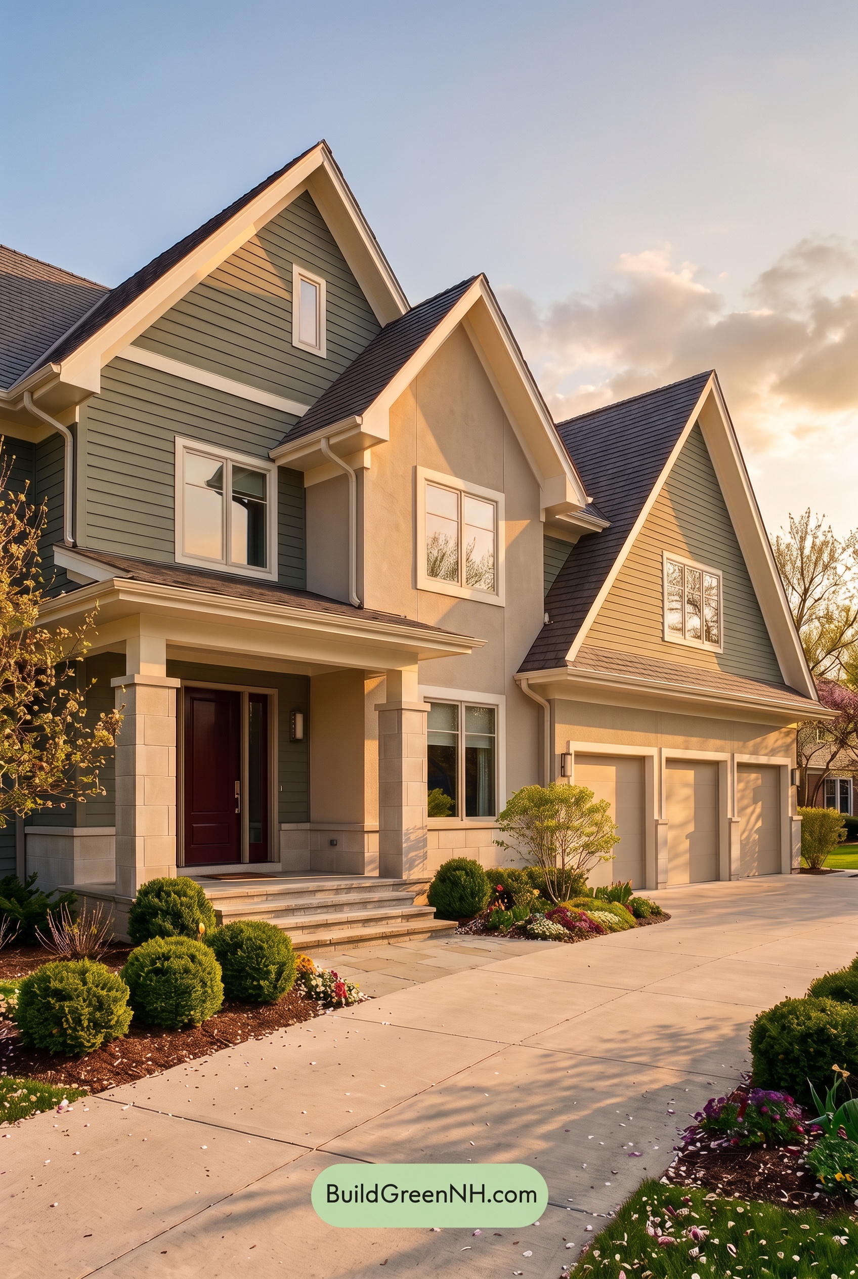
Golden Hour gives the soft grays a warmer, earthier cast, while beige shades appear richer and more golden than they would in neutral daylight. The whites take on a creamy glow rather than looking crisp and cool. Warm undertones feel more saturated, while the grays remain gently muted, bringing the palette closer together for a softer, more welcoming mood.
Long shadows beneath the gables and around the entry deepen the grays and browns, creating stronger light-dark contrast against the glowing pale shades. Although the color differences feel less pronounced in this warm light, the contrast between sunlit and shaded areas becomes more dramatic. Compared with neutral daylight’s clearer color separation, the overall effect is cozy, layered, and quietly elegant.
Shade
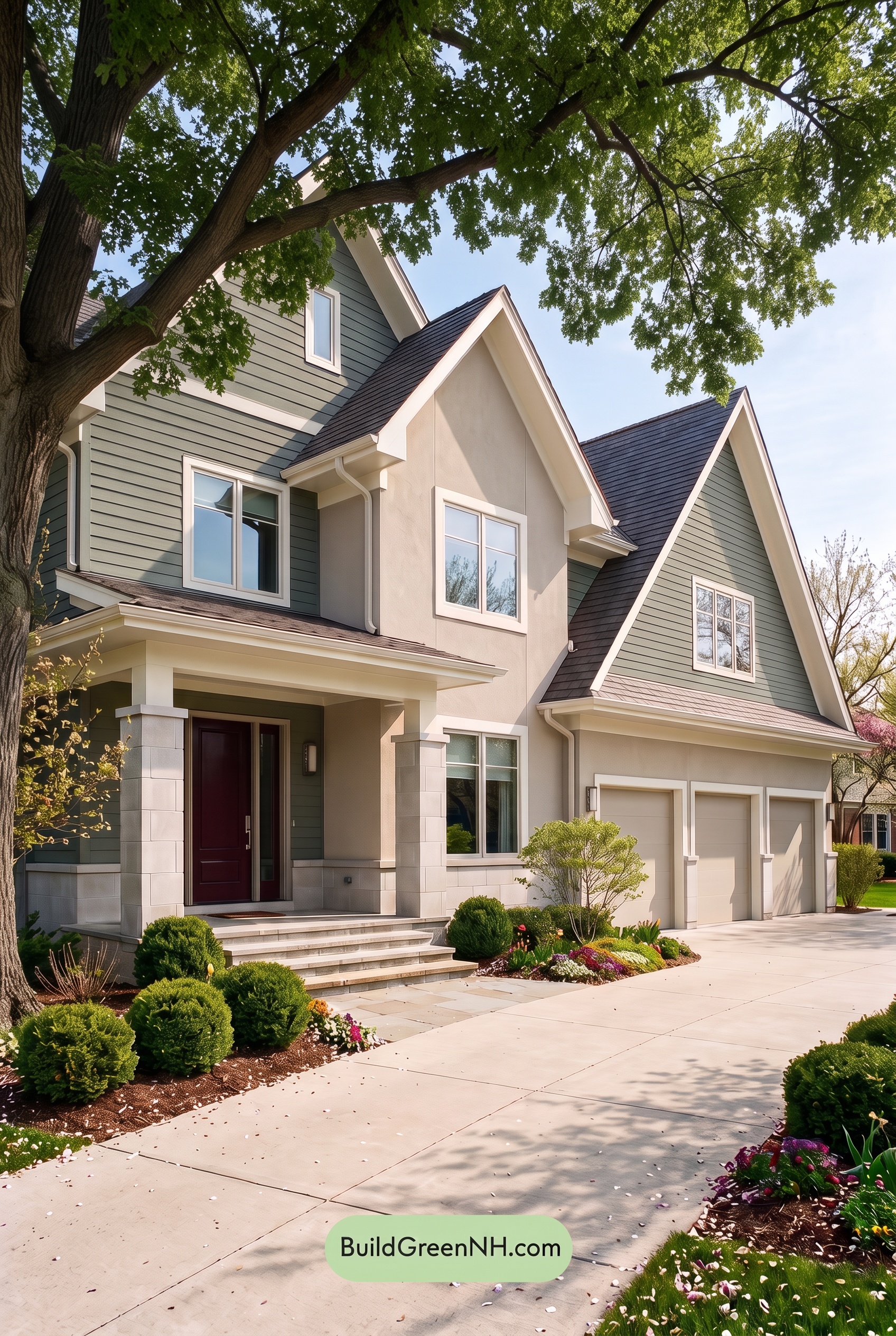
In shade, the gray siding reads deeper and cooler than in neutral daylight, allowing its subtle green undertones to become more noticeable. The beige sections lose some warmth and appear more muted, while the white trim takes on a softer, slightly grayer cast. The overall palette feels less saturated, giving the exterior a quiet, understated character.
Shadows beneath the gables and across the porch deepen these neutral shades, making the brown entry appear darker and its reddish warmth less distinct. The white window frames and columns still stand out against the gray, preserving definition even as the lighter shades become less bright. Compared with neutral daylight, the effect is more subdued and sheltered, with a calm, welcoming mood.
Nighttime
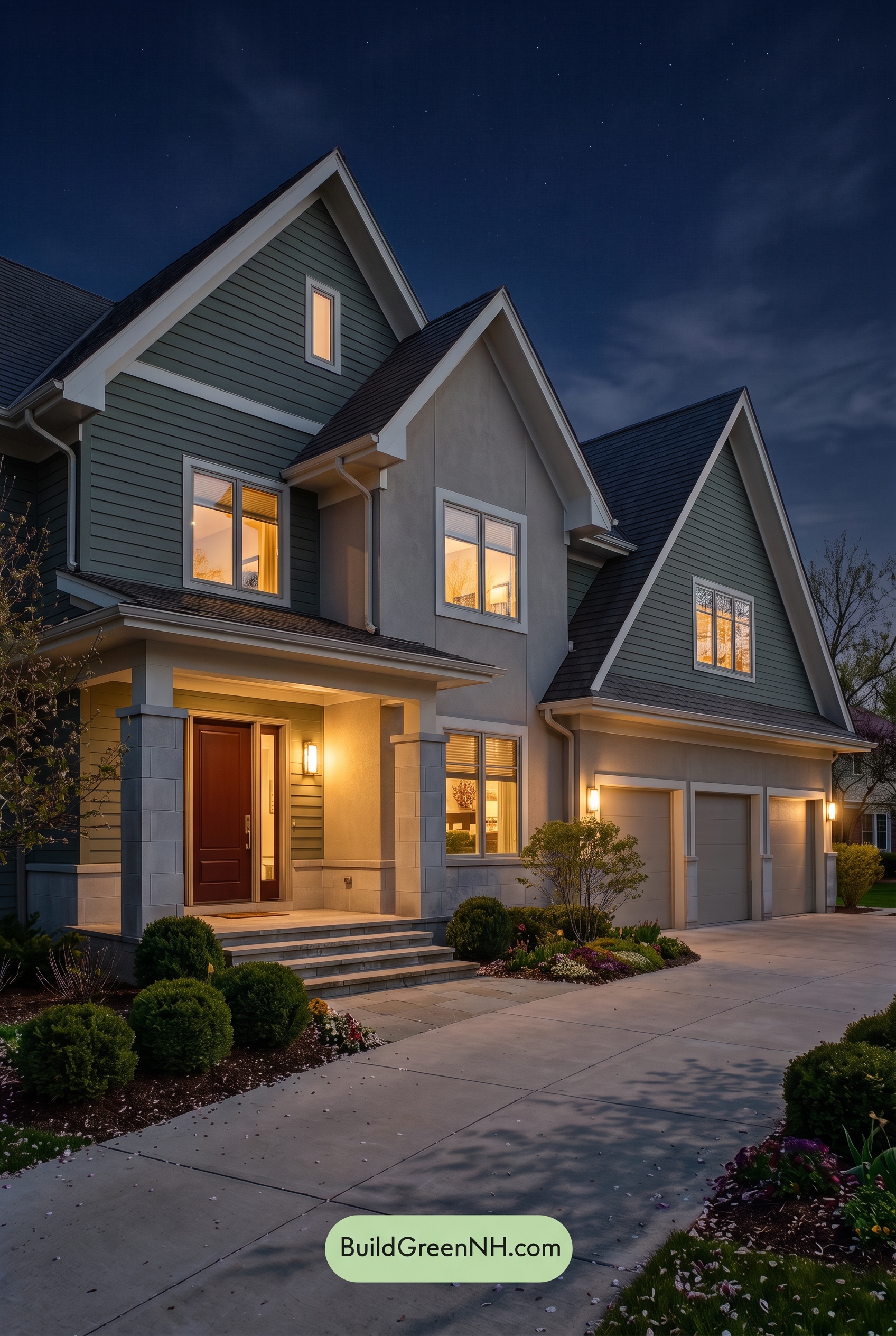
At night, the gray siding looks deeper and cooler than it would in neutral daylight, with subtle green-blue undertones emerging across the upper walls. Colors appear less saturated in the dimmer areas, while warm lighting brings a soft yellow cast to the beige sections and makes the brown entry door feel richer. The warm neutrals look especially inviting beside the cool, shadowed grays.
The white trim and columns shift from crisp daylight whites to creamy shades near the lights and subdued blue-grays in shadow. Deep shade beneath the eaves strengthens the contrast between illuminated edges and darker walls, giving the house more dramatic definition. Compared with the evenly revealed daytime palette, the nighttime effect feels quieter and cozier, with warmth concentrated around the entrance and garage.
Pin these for later:
Want More?
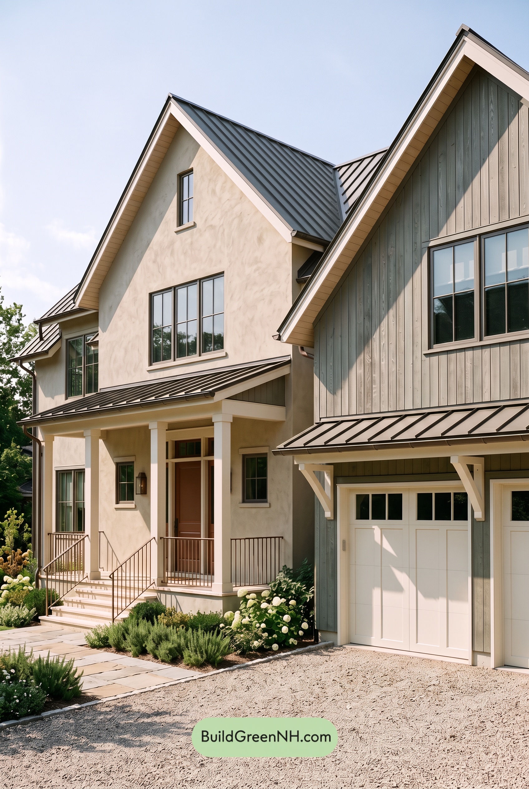 Green House Exterior Color Scheme (New Trend for 2027): Warm Greige Copper Murmur
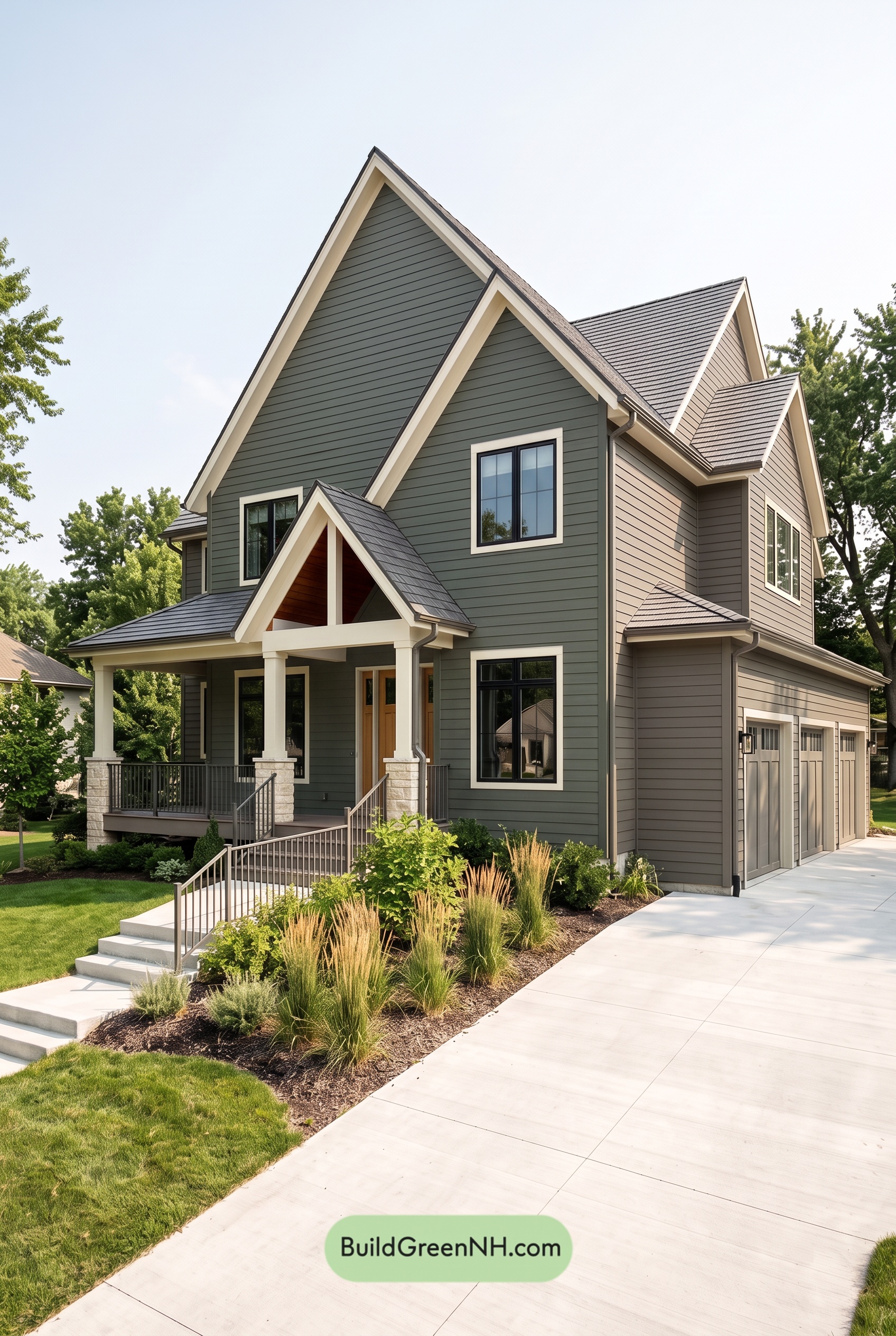 Green House Exterior Color Scheme (New Trend for 2027): Dark Green Cream Cadence
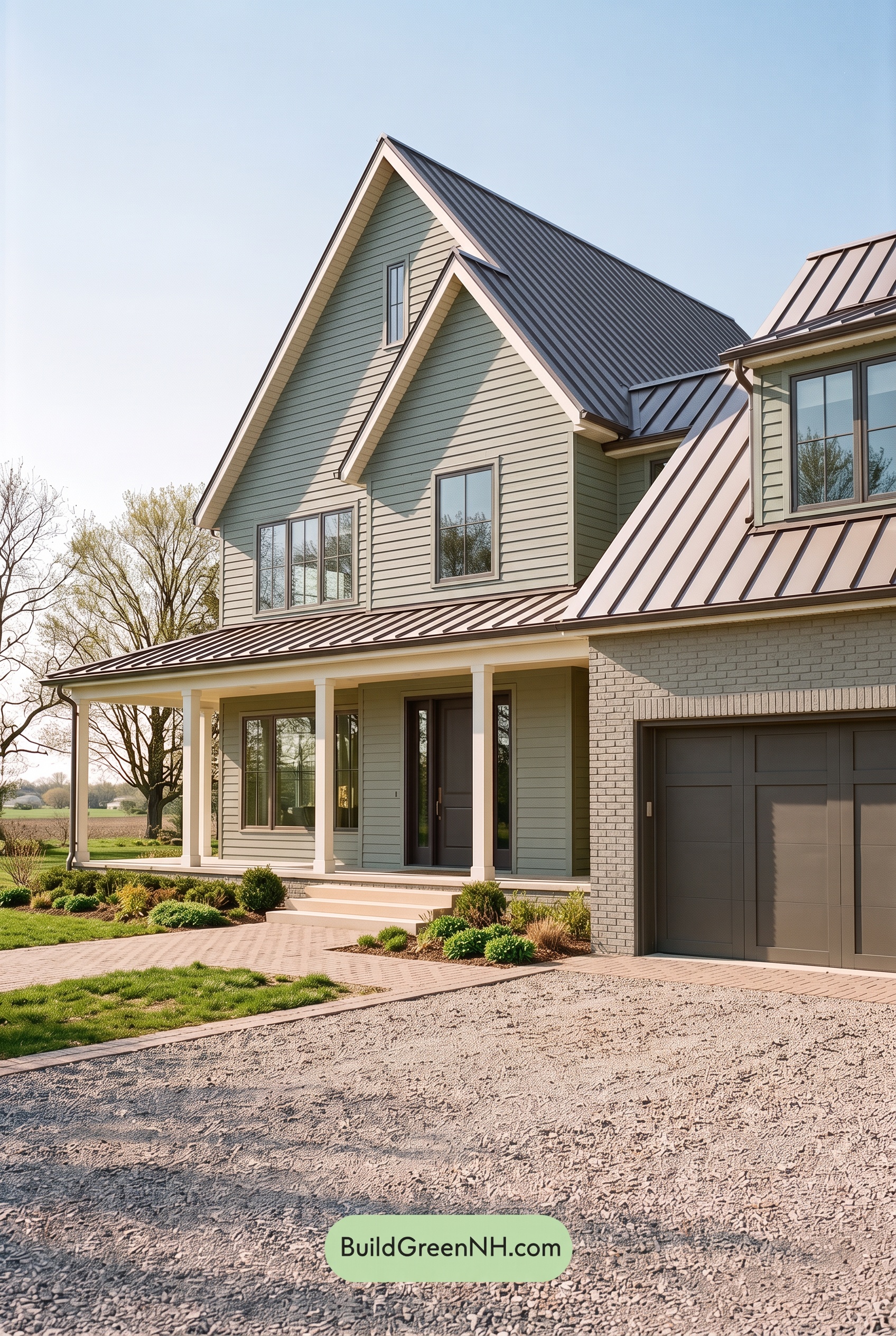 Green House Exterior Color Scheme (New Trend for 2027): Dusty Green Plum Secret
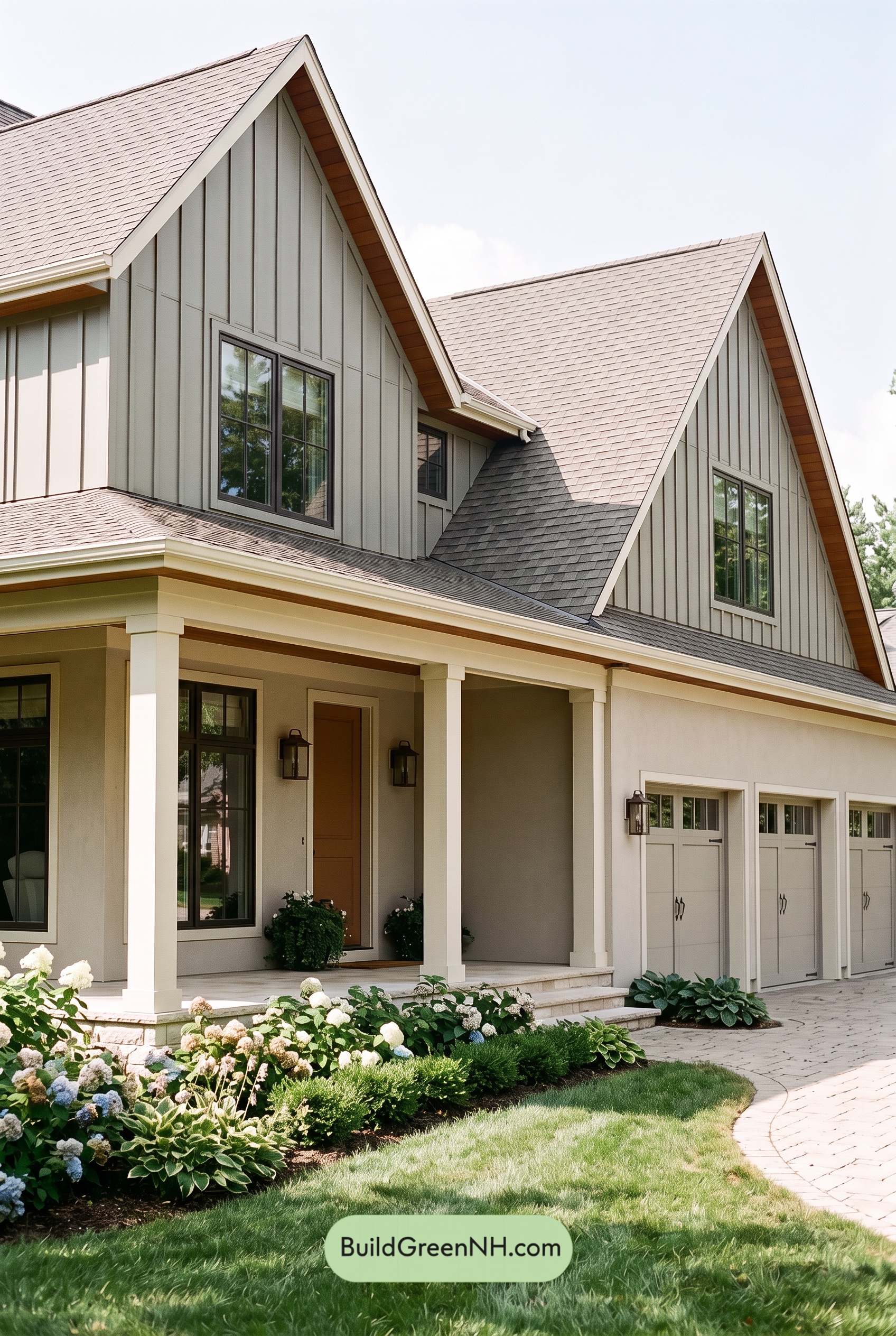 Green House Exterior Color Scheme (New Trend for 2027): Silver Green Amber Warmth
 Green House Exterior Color Scheme (New Trend for 2027): Brown Green Ivory Reverie
Table of Contents