Last updated on
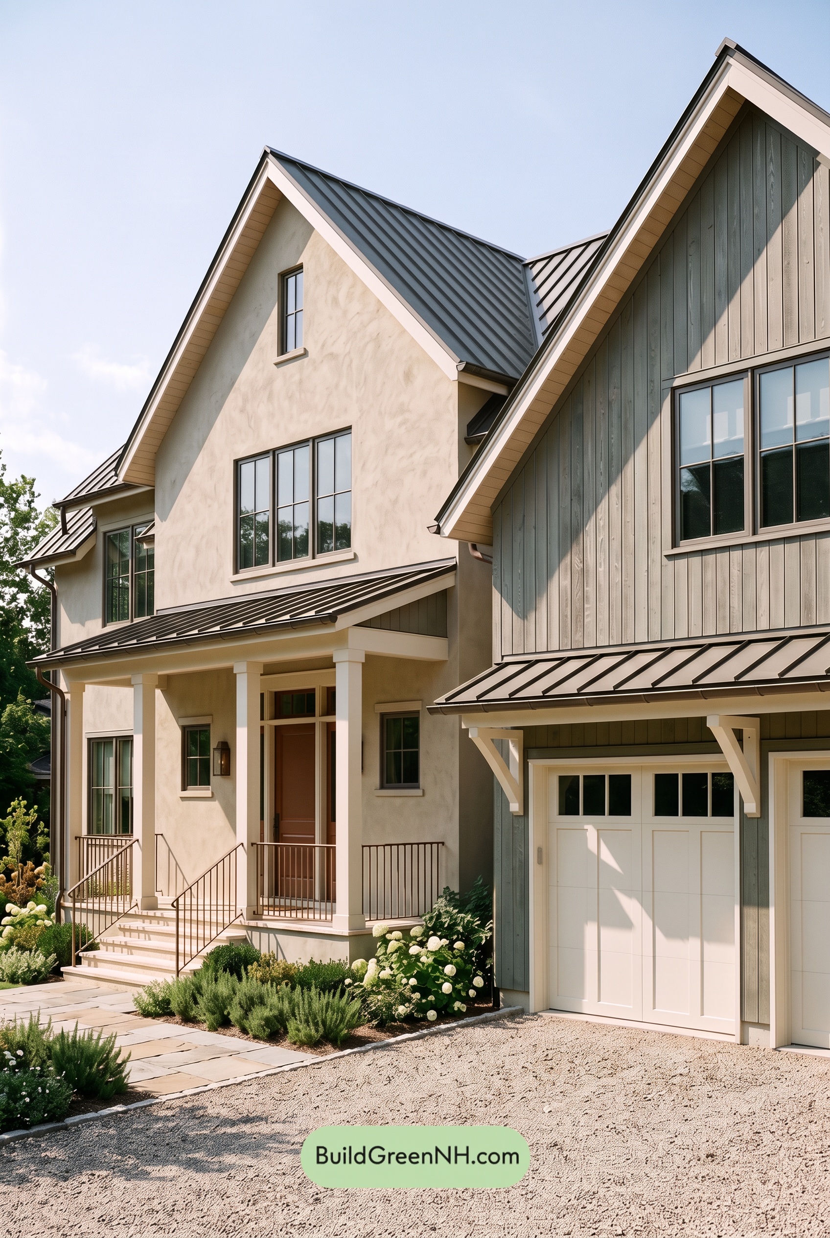

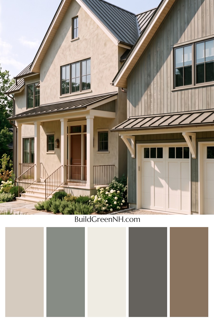
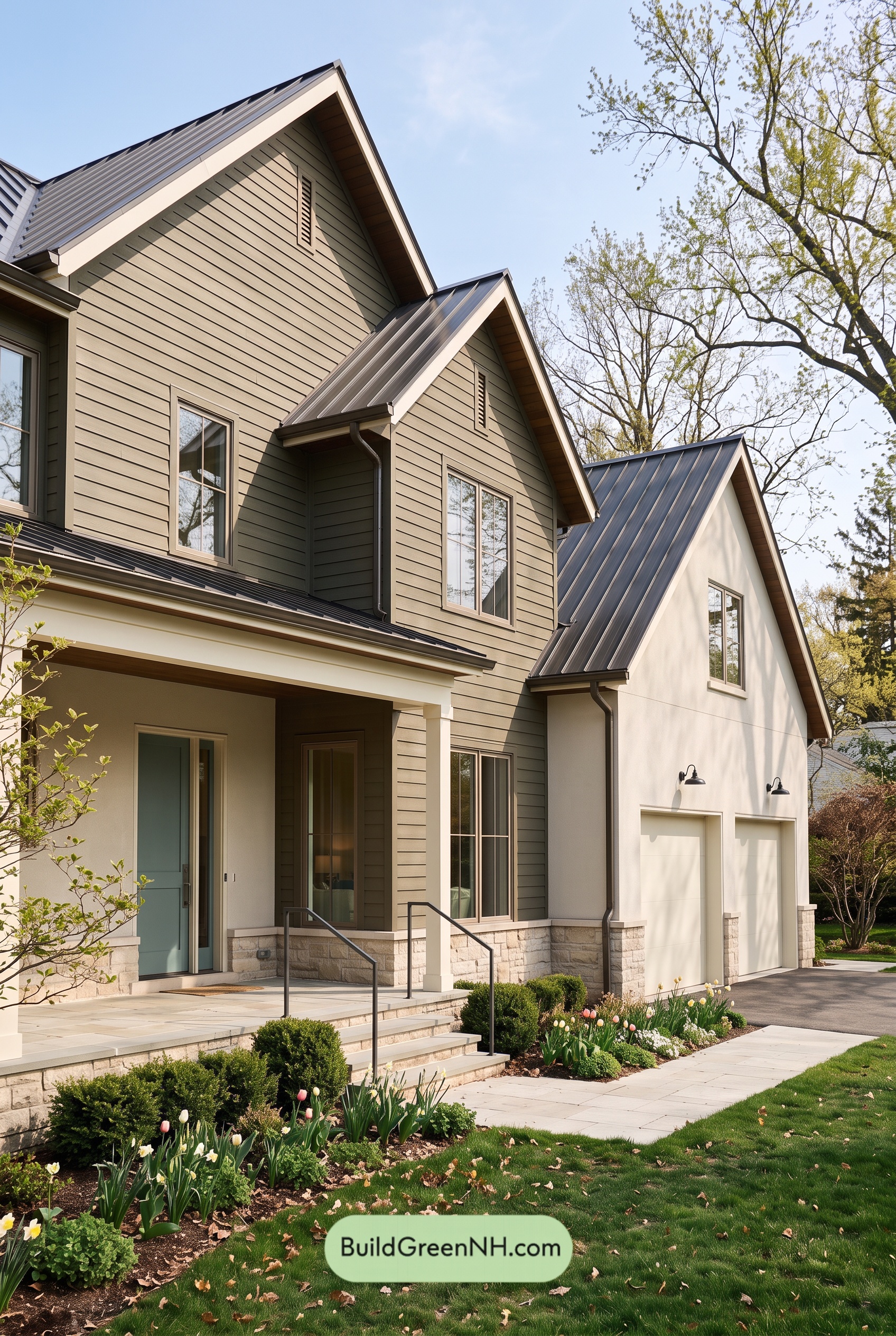
Warm beige, soft gray, and gentle white give this home its inviting balance, pairing the comfort of earthy shades with crisp architectural definition.
A Warm Foundation with Subtle Contrast
A light, warm beige covers the main walls, bringing a welcoming softness to the home’s tall proportions. Across the textured surfaces, sunlight and shadow add depth without requiring a stronger shade. The effect feels relaxed rather than flat.
The vertical siding on the garage wing introduces a medium gray with a subtly warm undertone. This deeper section distinguishes the projecting gable while staying comfortably connected to the beige. It is a quiet contrast, but an important one: the change in shade makes the different exterior materials easier to appreciate.
Soft White That Highlights the Architecture
Warm white trim traces the steep gables and roof edges, giving their strong angles a clean outline. That same light shade continues across the porch columns, overhead beams, and decorative garage brackets, linking details throughout the facade.
The garage doors also wear a soft white. Against the gray siding, their paneled design becomes a feature without needing a bold accent color. Repeating the trim shade here keeps this substantial part of the exterior feeling integrated rather than visually separate.
Deeper Shades Add Definition
The standing-seam roof brings a deep charcoal gray into the palette. Its darker shade gives the pale walls a strong upper boundary, while the smaller porch and garage roof sections repeat that contrast closer to eye level.
Gray window frames provide a gentler transition between the light walls and dark glazing. The slender railings add another layer of deep, warm gray around the porch and steps. These darker details give the exterior definition without making it feel heavy.
At the entrance, a rich brown front door adds concentrated warmth. Framed by light trim and white columns, it creates a welcoming focal point that feels distinct from the larger neutral surfaces.
Why the Palette Feels So Balanced
The appeal comes from proportion: broad areas of beige establish warmth, gray siding adds depth, and white details bring clarity. Darker gray accents supply just enough contrast, while the brown door draws attention to the entry.
Together, these shades feel calm, polished, and approachable. The palette lets the gables, porch, and varied textures stand out—proof that a restrained exterior scheme can still have plenty of character.
Next, see how this color scheme looks under different lighting simulations throughout the day.
Overcast
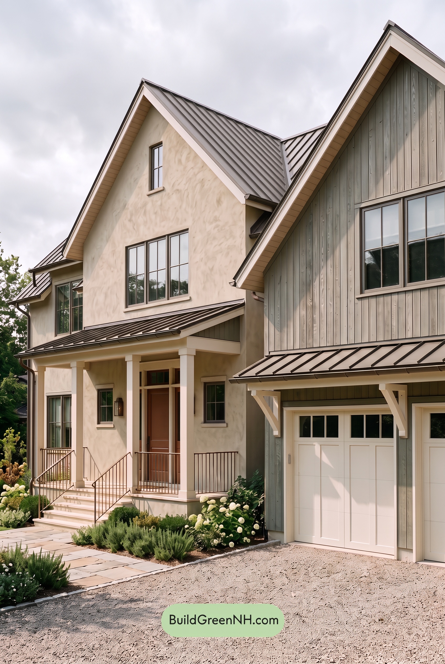
Under overcast skies, the soft beige looks less golden and slightly more muted than in neutral daylight, while the medium grays take on a cooler, quieter character. The whites lose some sparkle, appearing softer rather than brilliant, and the rich brown feels less saturated while still offering a welcoming touch of warmth.
Diffused light softens shadows beneath the gables and across the textured walls, reducing sharp light-to-dark contrast. The gray and white shades remain distinct, but their transitions feel gentler, allowing the warm and cool neutrals to sit more comfortably together. The overall mood shifts toward calm and understated, with less emphasis on bright highlights and dramatic depth.
Golden Hour
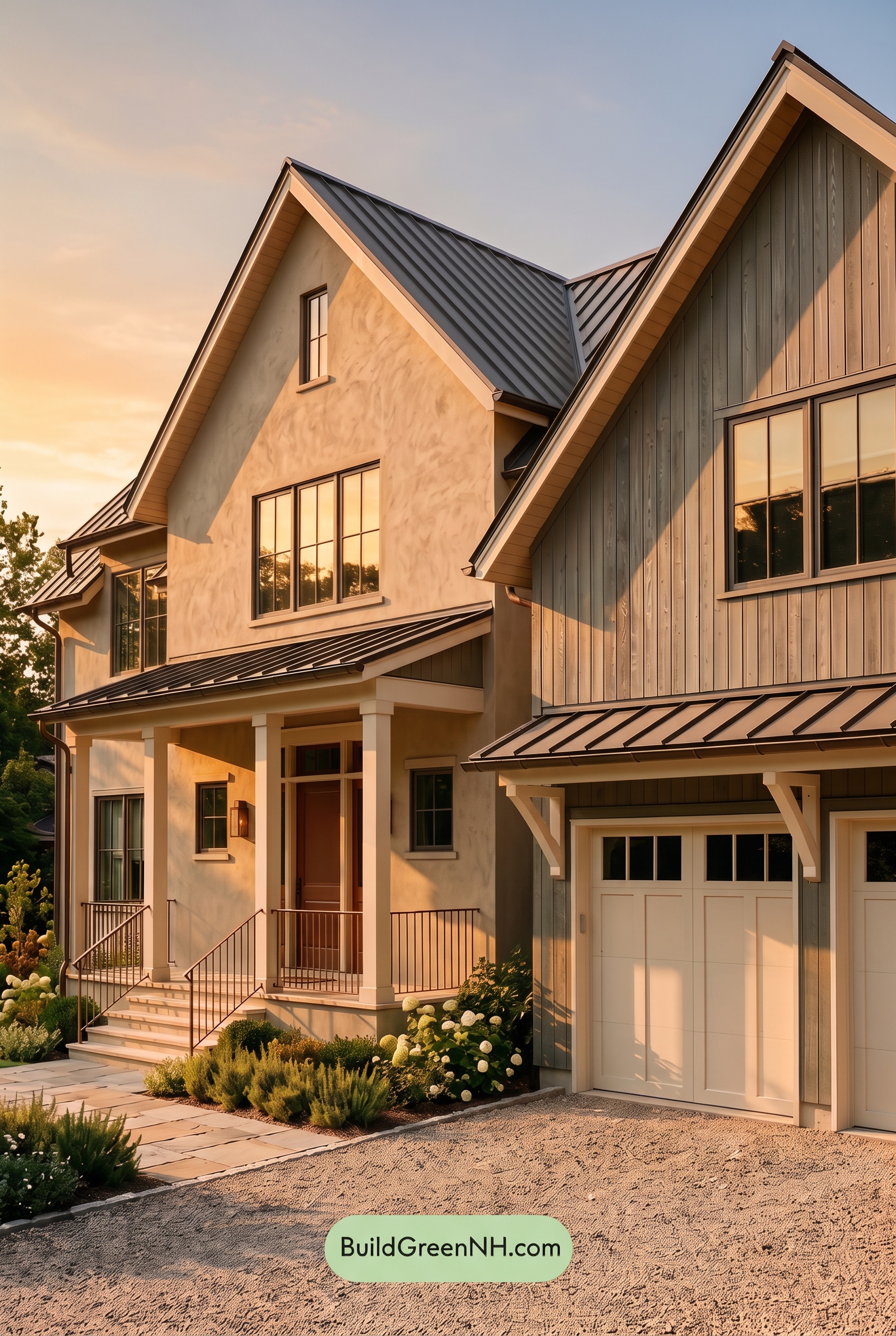
Golden Hour gives the beige shades a richer, more saturated glow than they would have in neutral daylight, drawing out soft yellow and peach undertones. The grays take on a warmer cast where sunlight lands, while shaded areas appear deeper and cooler. Bright whites soften toward creamy shades, and the brown near the entry feels especially rich against the lighter neutrals.
Long, angled shadows beneath the gables and across the porch create stronger light-and-dark contrast, even as the warm light brings the sunlit shades closer together. Compared with the cleaner, more balanced appearance of neutral daylight, this lighting makes the exterior feel softer, more dimensional, and warmly inviting.
Shade
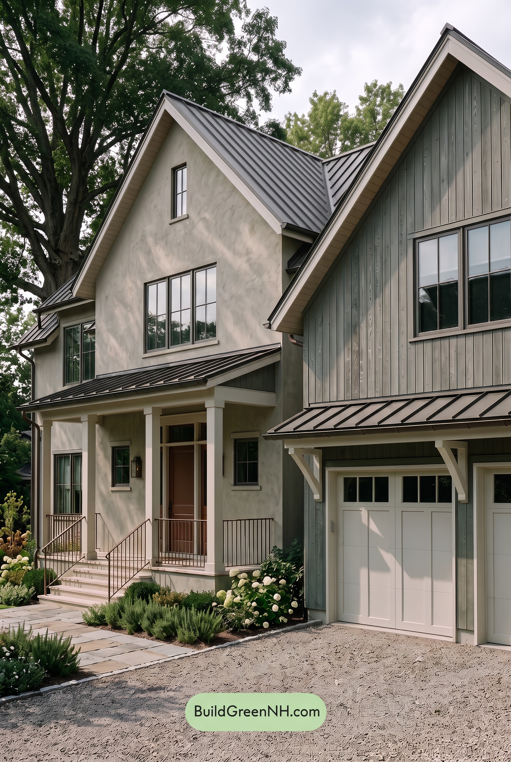
In shade, the light beige feels cooler and less golden than it would in neutral daylight, while the medium grays deepen and take on a faint green-gray cast beneath the trees. Saturation appears more subdued overall: the warm brown looks quieter, and the whites lose some brightness, settling into softer, slightly gray-tinted shades.
Leaf shadows create gentle variations across the pale surfaces, while deeper shade beneath the gables and porch makes the darker neutrals feel richer. The whites still stand out against the grays, but without the crisp brightness of neutral daylight. Together, these shifts give the house a calm, sheltered mood, with warmth that feels understated rather than sunny.
Nighttime
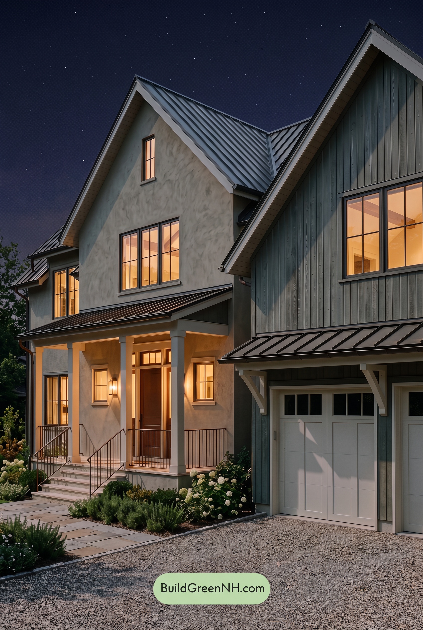
At night, the beige walls look more muted and gray in shadow than they would in neutral daylight, while the porch lighting brings out their softer, golden warmth. The gray siding deepens and takes on a subtle blue cast, making its color feel cooler and less saturated. Near the glowing entry, the brown door appears richer, adding a warm focal point against those subdued shades.
The whites lose their daylight crispness, shifting toward creamy shades near the lights and cooler gray shades beneath the eaves. Deeper shadows strengthen the contrast between the pale trim and darker siding, while some gray details recede into the darkness. The result feels quieter and more intimate than in daylight, with a welcoming glow concentrated around the porch.
Pin these for later:
Want More?
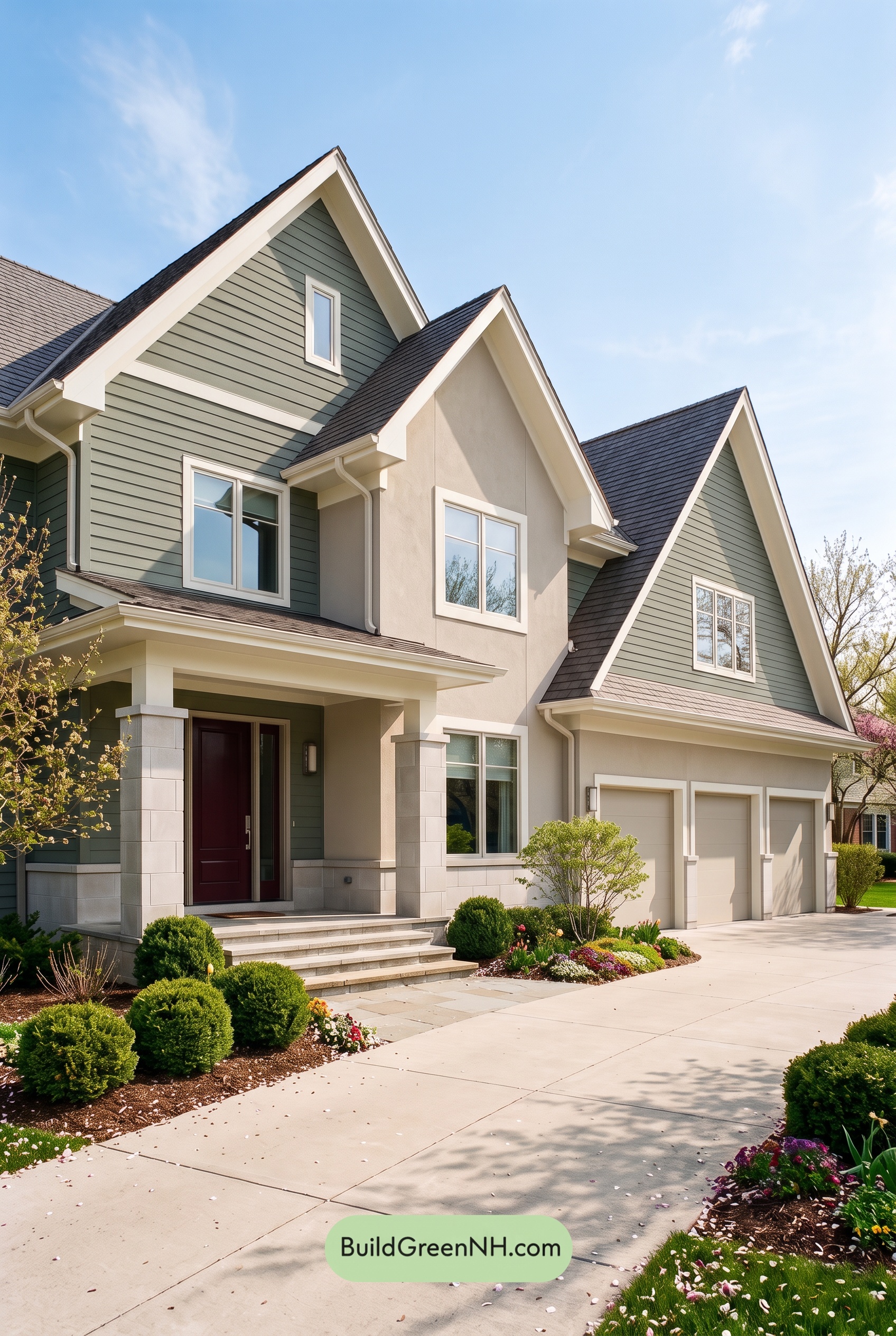 Green House Exterior Color Scheme (New Trend for 2027): Muted Green Burgundy Poise
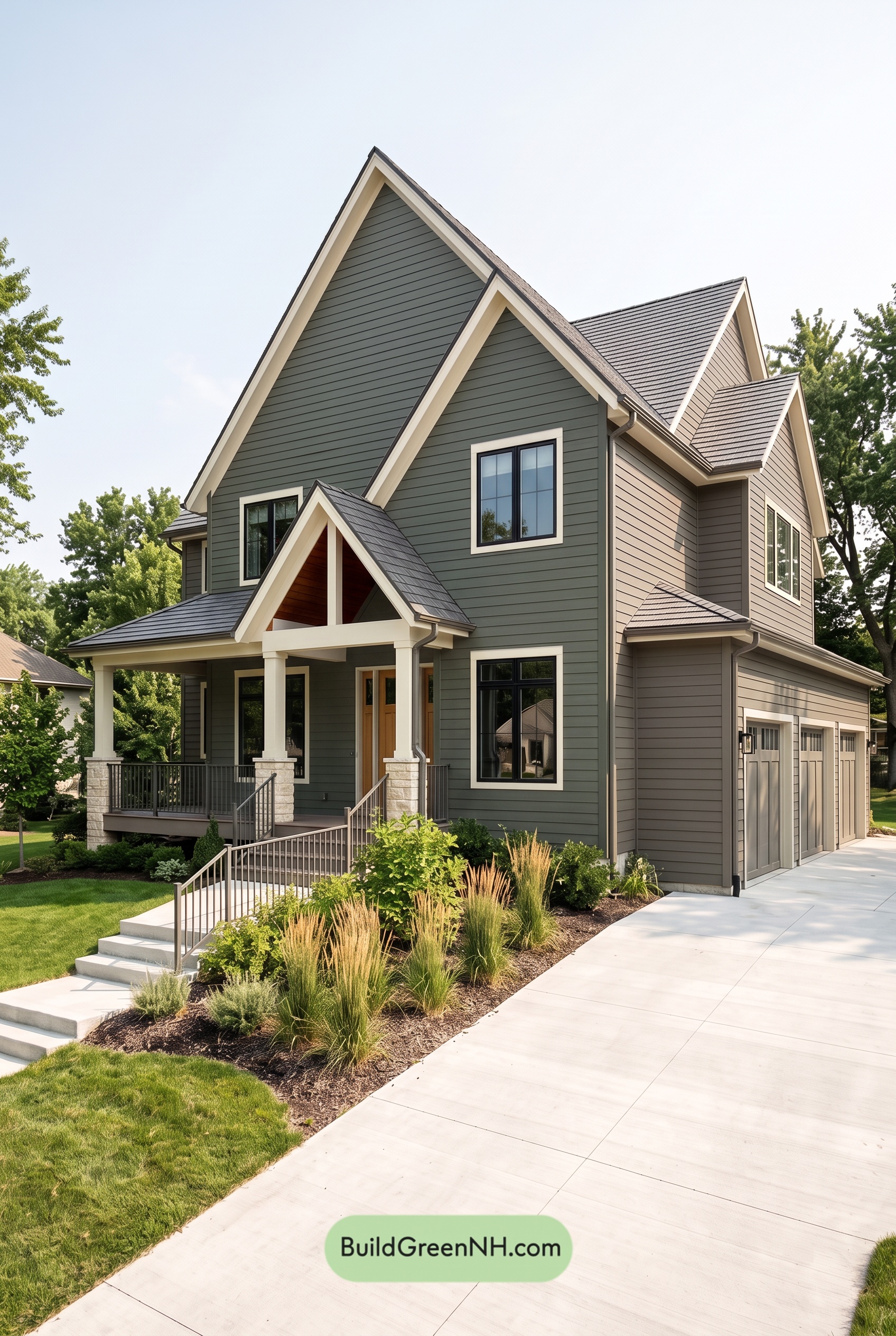 Green House Exterior Color Scheme (New Trend for 2027): Dark Green Cream Cadence
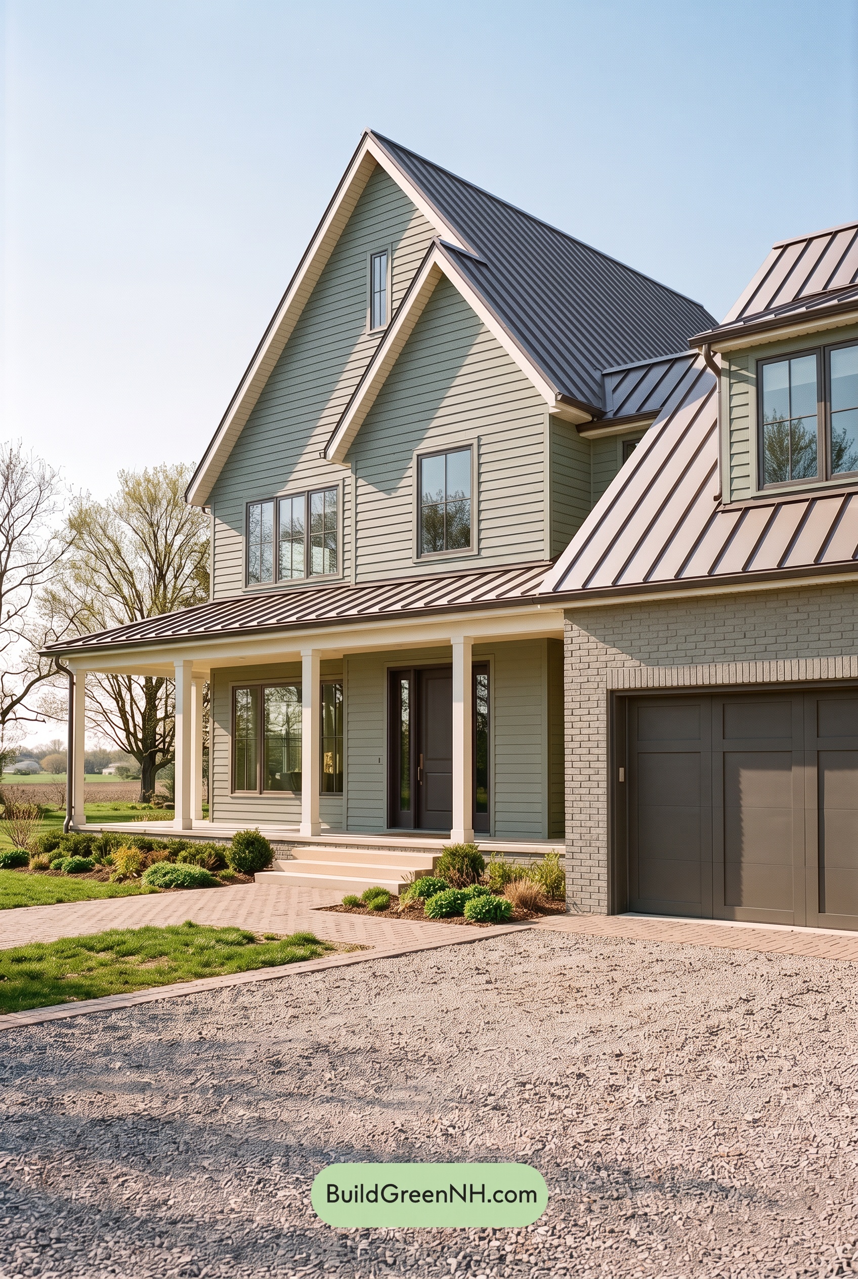 Green House Exterior Color Scheme (New Trend for 2027): Dusty Green Plum Secret
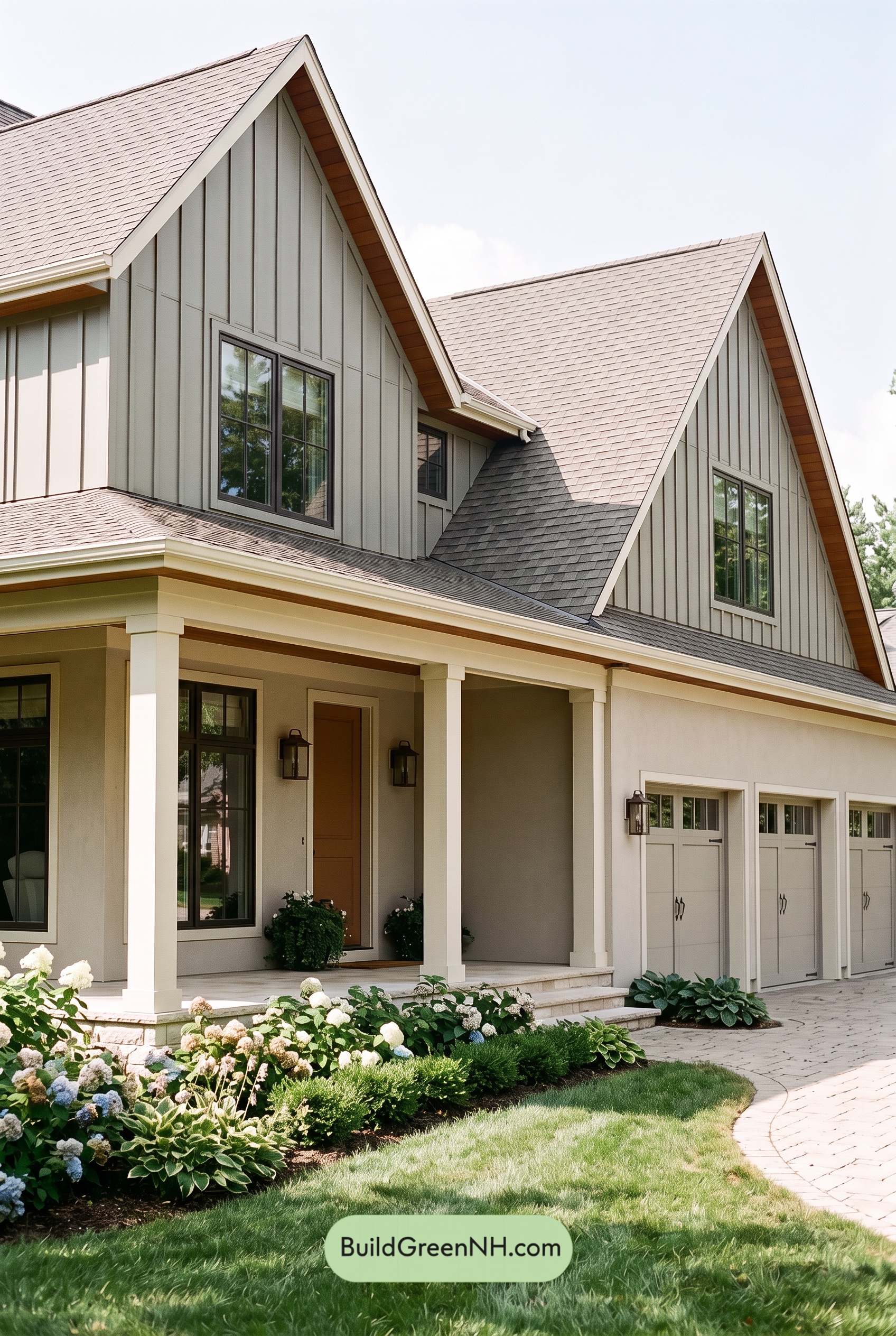 Green House Exterior Color Scheme (New Trend for 2027): Silver Green Amber Warmth
 Green House Exterior Color Scheme (New Trend for 2027): Brown Green Ivory Reverie
Table of Contents