Last updated on
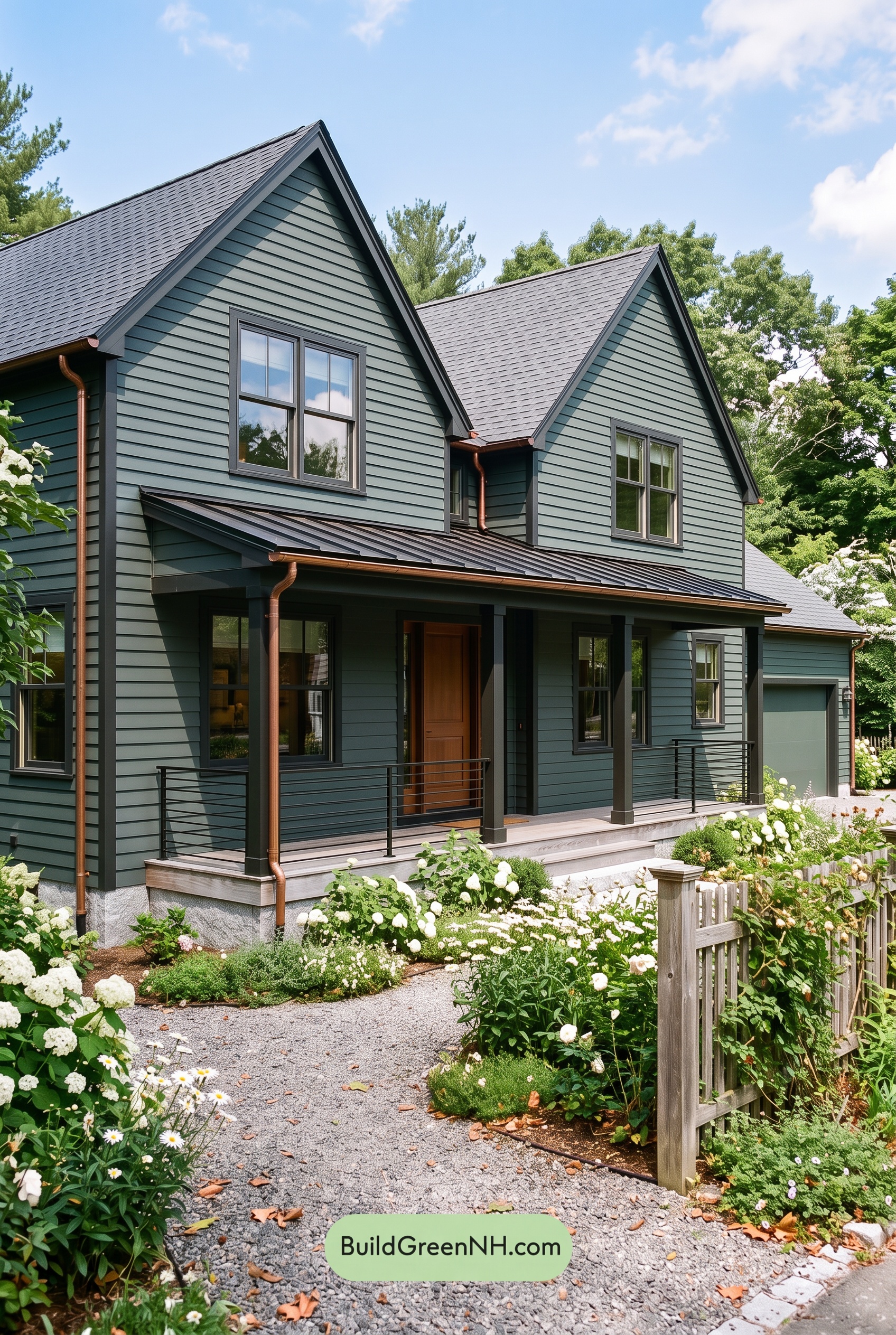

Muted blue siding, deep gray details, and a warm brown front door give this exterior a beautiful balance of quiet sophistication and welcoming charm.
A Soft Blue Foundation with Plenty of Depth
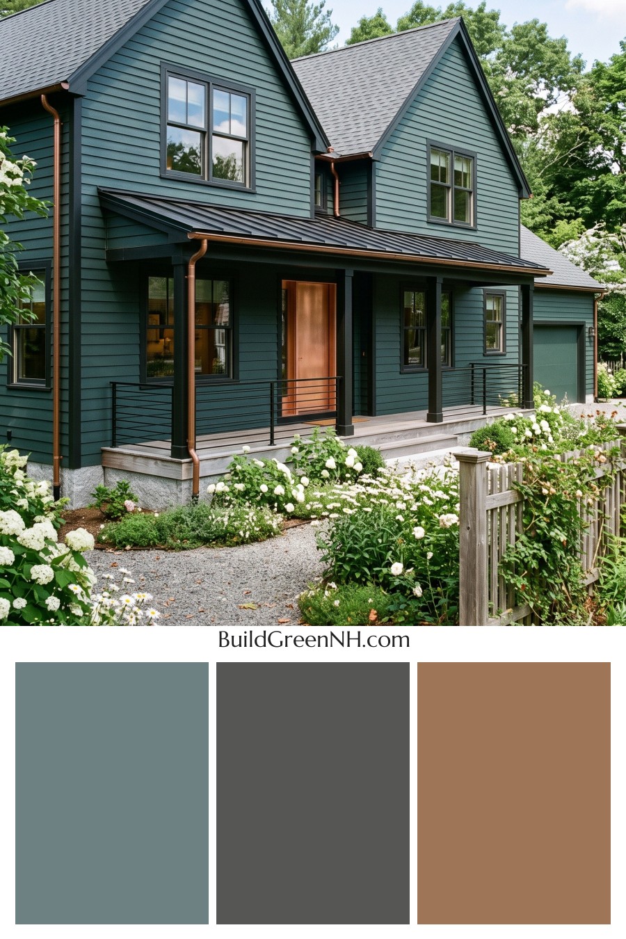
The horizontal siding wears a subdued, gray-toned blue with a subtle green undertone. It feels substantial without becoming overly dark, giving the tall gables and broad walls a calm, cohesive presence. In sunlight, the shade looks softer and lighter; beneath the porch, it takes on a deeper, moodier character.
That gentle variation adds interest without introducing extra colors. The garage door repeats the muted blue family, helping it blend into the side of the house rather than compete with the front entrance.
Gray Details That Define the Architecture
Medium-to-deep gray trim traces the steep rooflines, corners, and windows, lending definition to the blue siding. The contrast is restrained rather than sharp, so the architectural details stand out without looking disconnected from the walls.
The window frames continue this gray palette, while the porch columns and slender railings lean toward a deeper charcoal gray. Those darker accents give the porch a grounded appearance. Their repeated use also ties the entrance, windows, and upper gables together.
Overhead, the gray shingled roof and darker charcoal-gray porch roof complete the cool-toned framework. The different roof textures bring variety while the related shades keep everything coordinated.
Warm Brown Accents Make the Entrance Inviting
The front door offers the clearest shift in temperature. Its rich, warm brown shade stands out against the cooler blue walls and gray surround, naturally drawing attention to the entry. It is a welcoming focal point without being overly bright.
Reddish-brown gutters and downspouts carry smaller touches of warmth around the exterior. Their slim lines echo the door’s earthy character, making that warm accent feel connected to the rest of the house rather than isolated.
A Calm Palette with a Welcoming Finish
Pale gray and soft gray-brown tones along the porch floor and steps lighten the base of the facade. They offer a gentle transition from the deep porch accents to the surrounding garden, where green foliage and creamy white flowers brighten the scene.
The scheme succeeds through balance: blue provides the main character, gray gives the architecture definition, and brown adds warmth where it matters most. The result feels polished yet relaxed—a thoughtful combination that lets both the house and its garden shine.
Next, see how this color scheme looks under different lighting simulations throughout the day.
Overcast
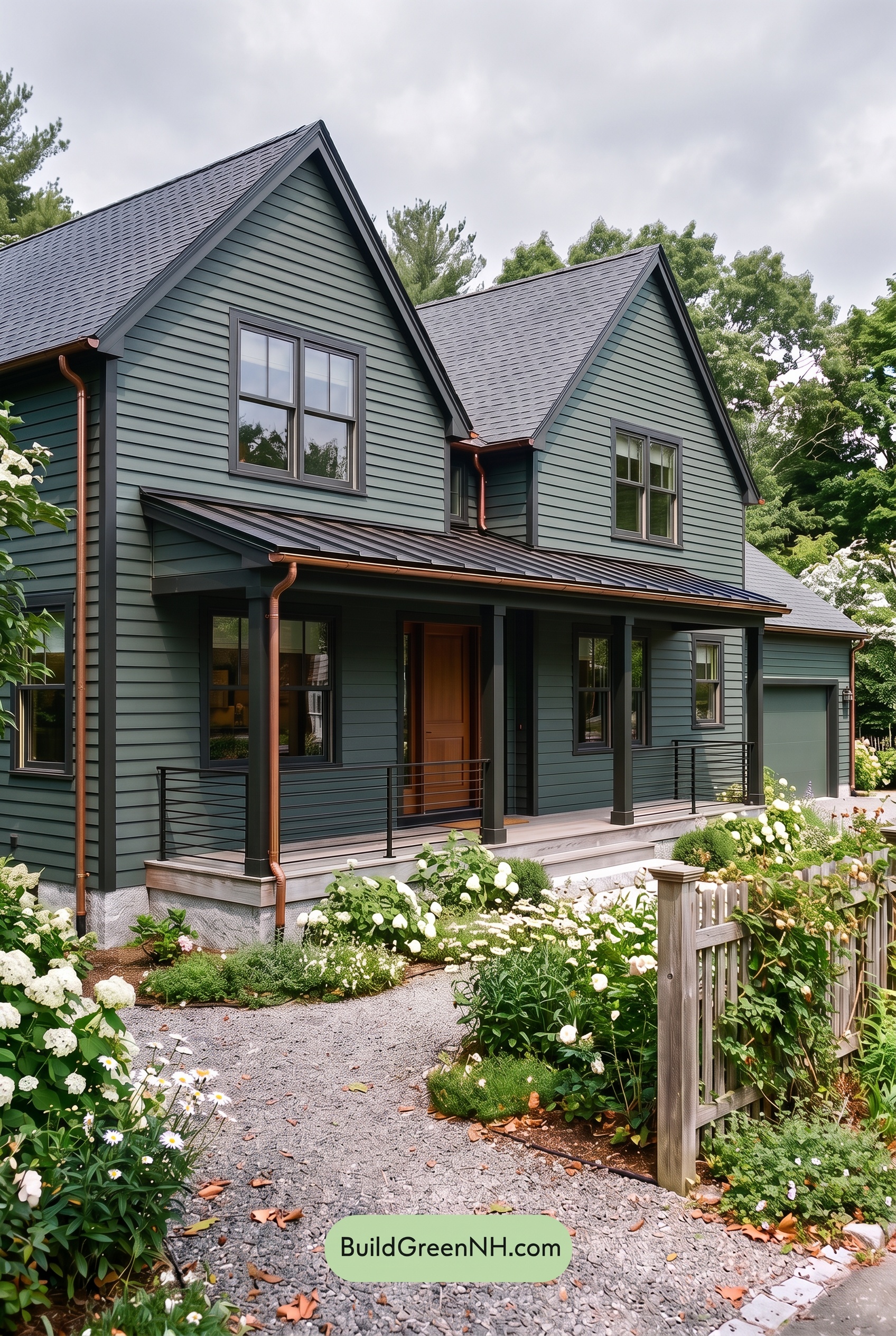
Under overcast skies, the blue siding and garage door read cooler and more muted than in neutral daylight, with gray undertones becoming more noticeable. Their softened saturation gives the broad surfaces a quieter, more uniform appearance. The brown front door loses some of its golden warmth, yet still offers a welcoming contrast to the surrounding cool shades.
Diffused light softens shadows along the siding and beneath the gables, making the shift between lighter blue walls and deeper gray trim feel less dramatic. The dark gray columns, window frames, and railings still define the house, while the sheltered porch retains deeper tones. Overall, the palette feels calm and understated rather than bright and crisp.
Golden Hour
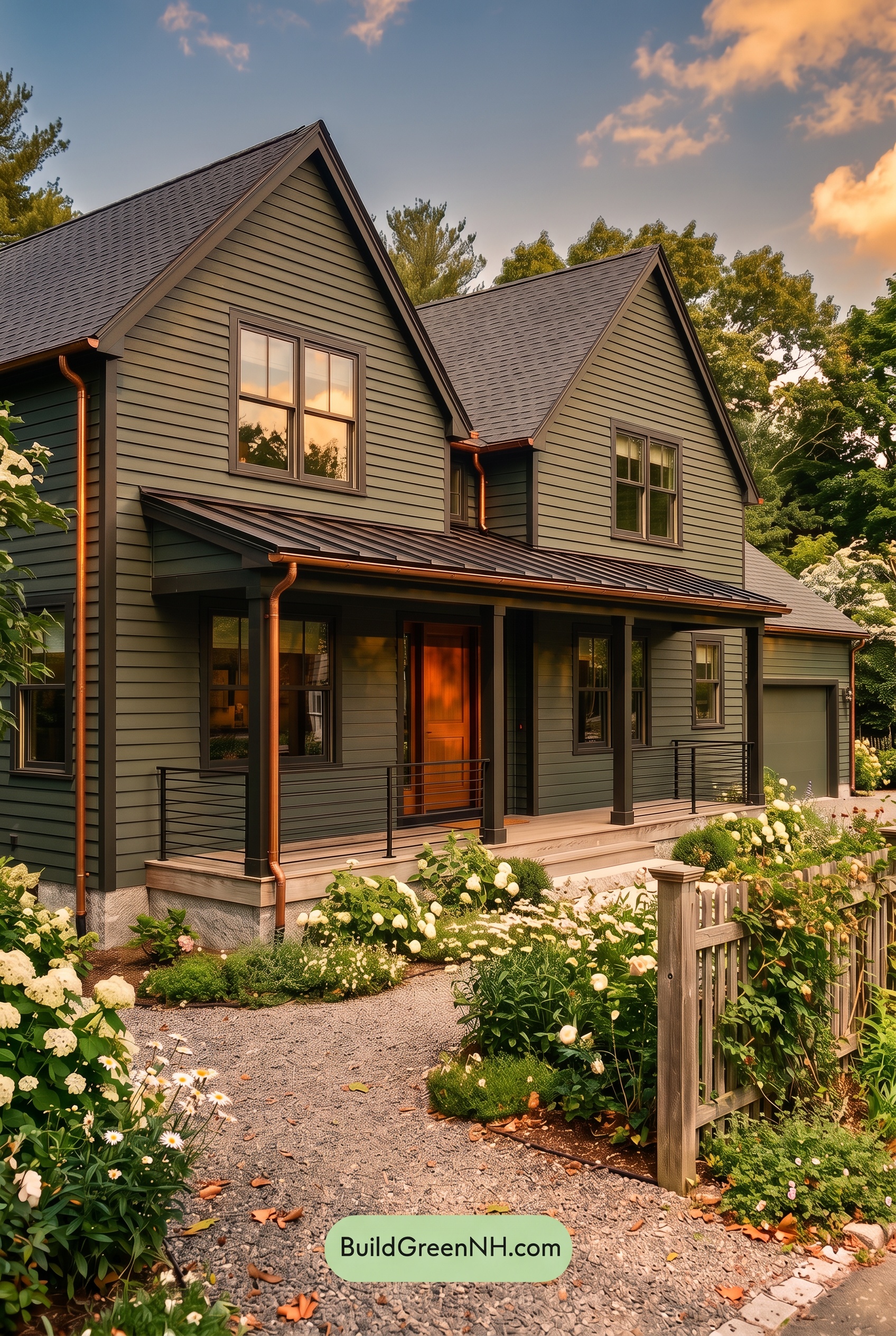
Golden Hour softens the cool blue family across the exterior, making sunlit areas appear more muted and gray-green than they would in neutral daylight. In the shaded siding beneath the porch, those cooler shades deepen, while the gray trim takes on a warmer, brownish cast. The brown at the entry looks richer and more saturated, with glowing orange undertones that draw the eye.
Low, warm light also strengthens the contrast between the illuminated gables and the deep porch shadows, giving the facade more depth. Compared with the clearer, more evenly balanced colors of neutral daylight, the palette feels softer and earthier—even as the shadows become more dramatic. The overall mood shifts from crisp and composed to cozy and inviting.
Shade
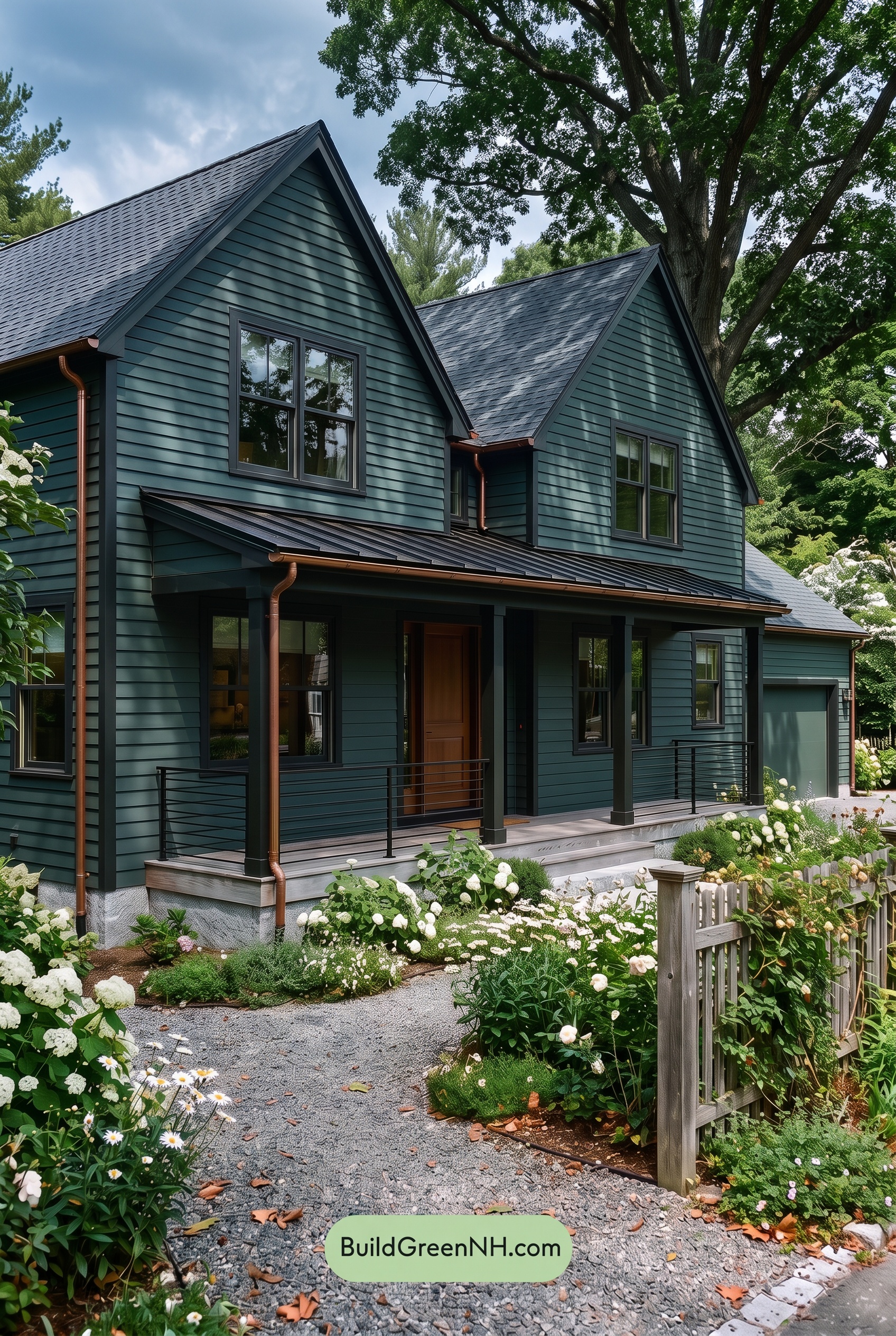
In shade, this blue deepens and takes on a cooler, slightly greener cast compared with neutral daylight. Its saturation feels more restrained, giving the exterior a soft, smoky quality rather than a bright finish. The dark grays settle toward charcoal, while shifting leaf shadows create subtle variations across the blue.
Under the porch, deeper shadows bring the blue and gray shades closer together, softening their contrast. The brown looks less golden than it would in neutral daylight, yet its remaining warmth stands out against the cooler surroundings. Together, these shifts give the house a quieter, more intimate mood—rich in depth without feeling bold.
Nighttime
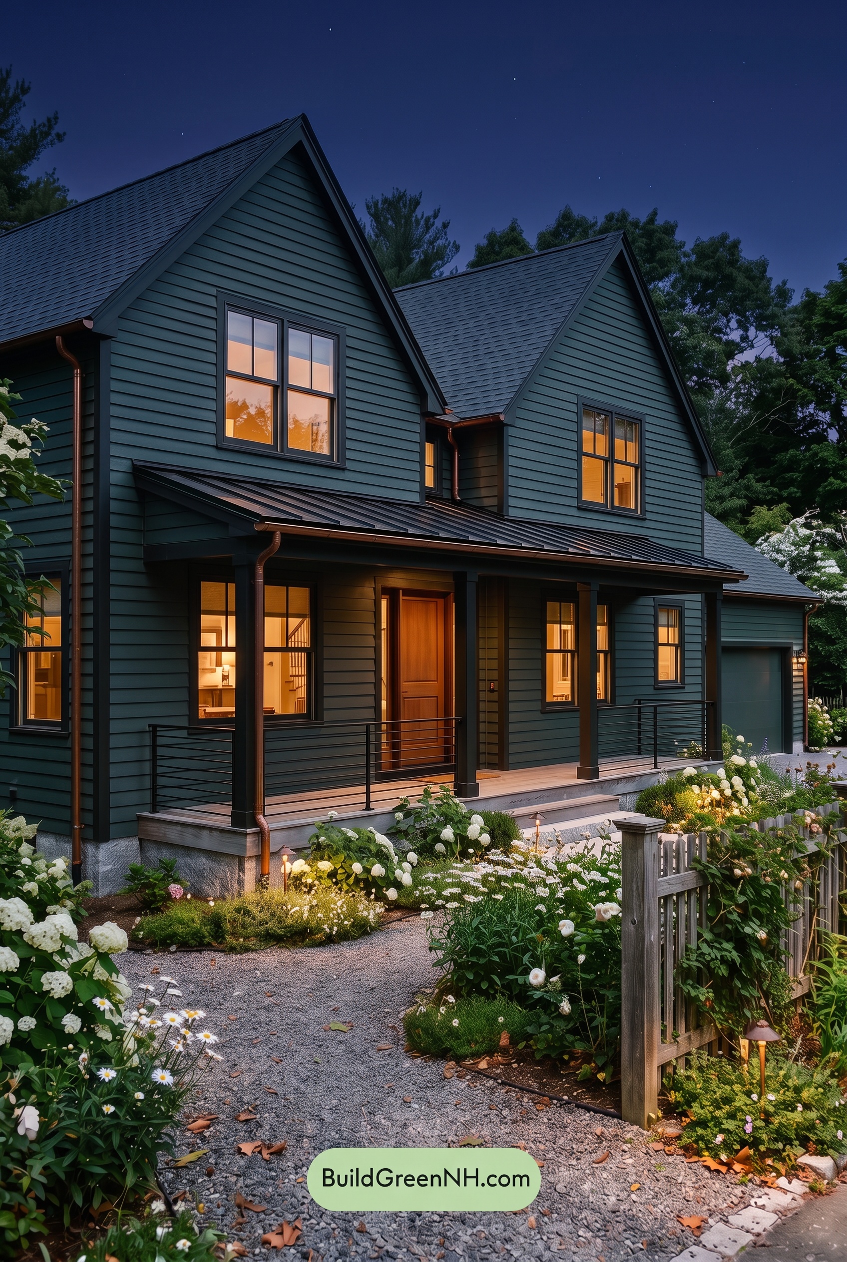
At night, the blue exterior deepens into a moodier shade, with less visible saturation than it would show in neutral daylight. Cool ambient light keeps the upper walls distinctly blue, while shadows beneath the porch and eaves pull them toward darker, grayer tones. The gray trim also darkens, blending into shaded areas rather than outlining every edge as clearly as it would by day.
Warm light near the entrance brings out golden undertones in the brown door and lends nearby grays a softer, warmer cast. Against the subdued blue, these illuminated areas feel especially inviting. Contrast shifts from subtle differences between paint shades to a stronger interplay of light and shadow, giving the house a cozy, intimate mood rather than daylight’s more evenly defined appearance.
Pin these for later:
Want More?
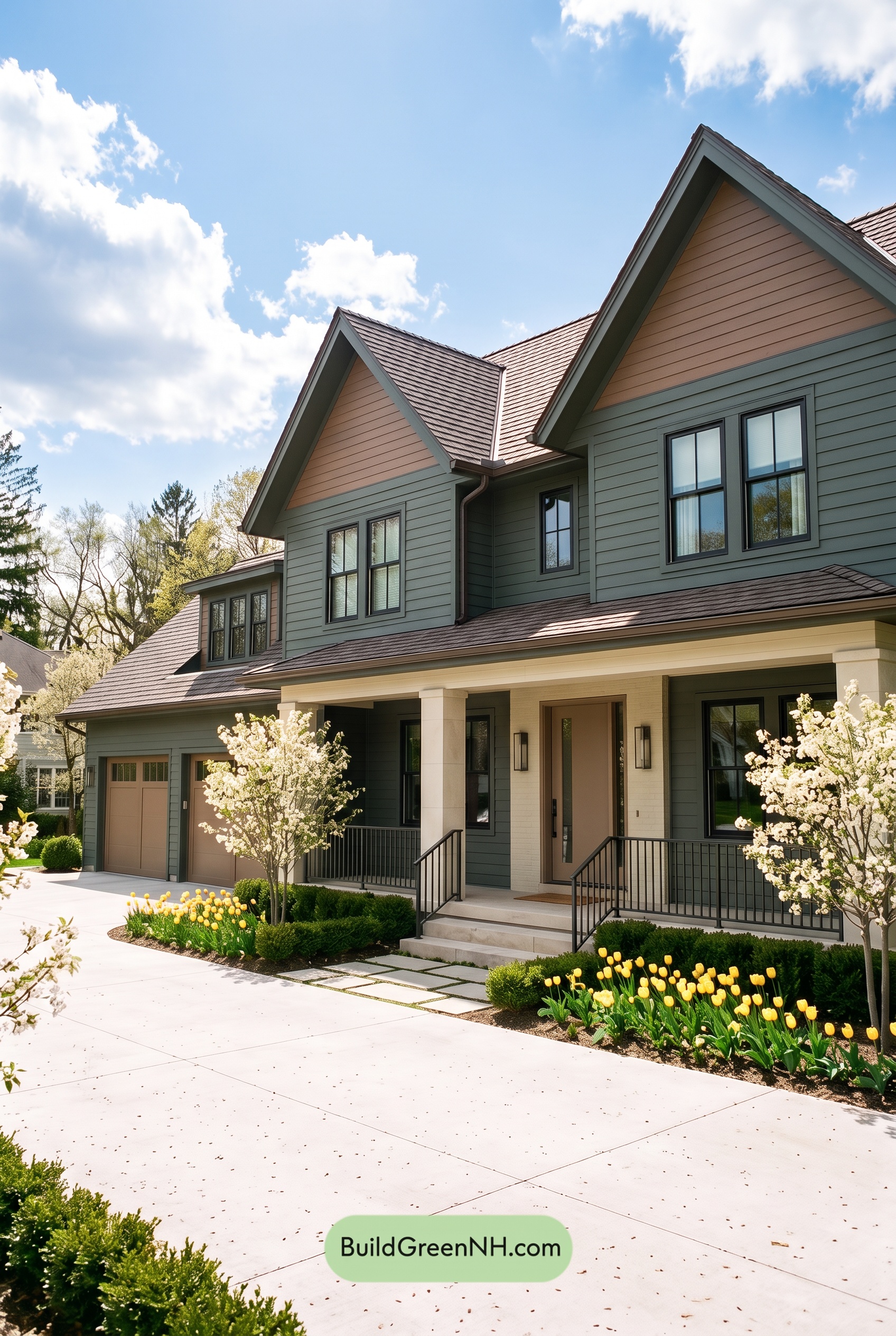 Earthy Green House Exterior Color Scheme: Brown Green Comfort
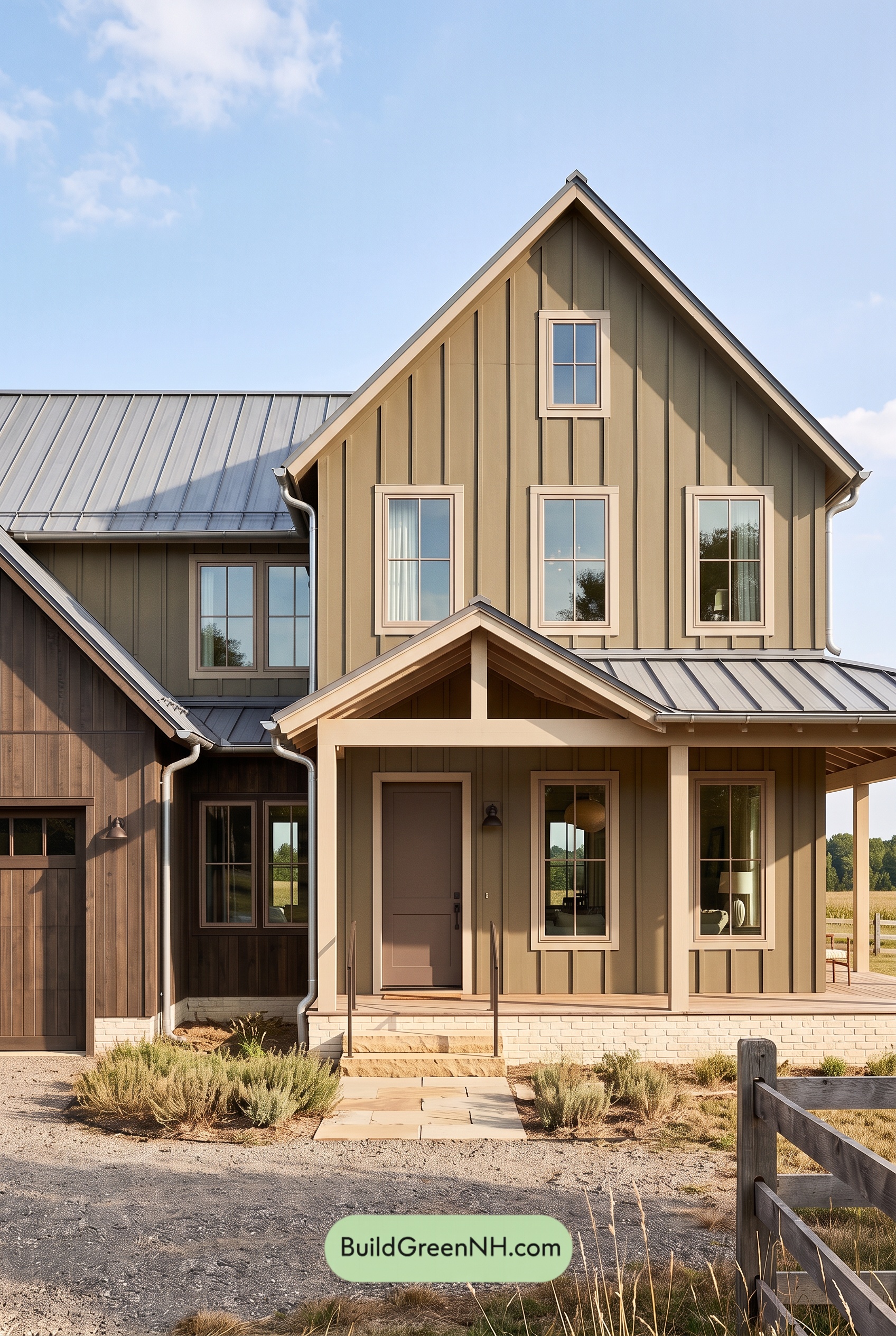 Earthy Green House Exterior Color Scheme: Green and Beige Sanctuary
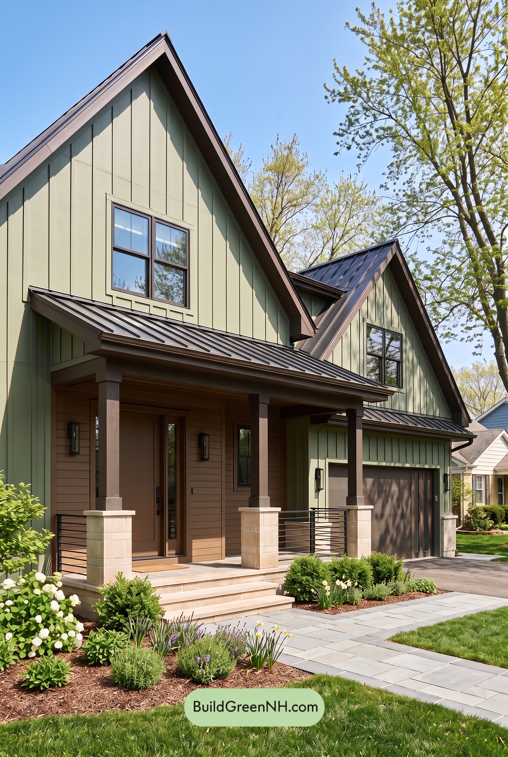 Earthy Green House Exterior Color Scheme: Green Velvet Assurance
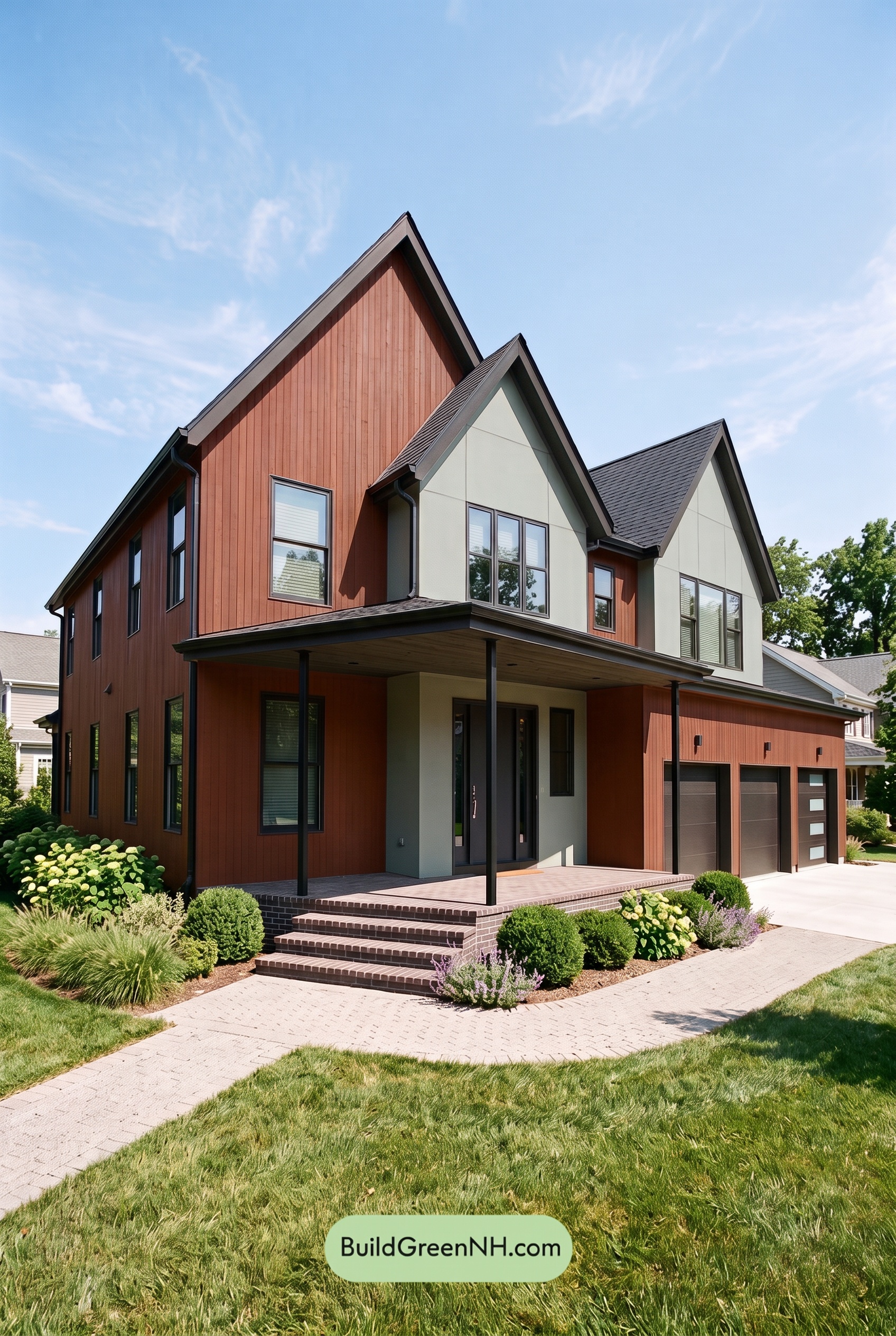 Earthy Green House Exterior Color Scheme: Brown Silken Calm
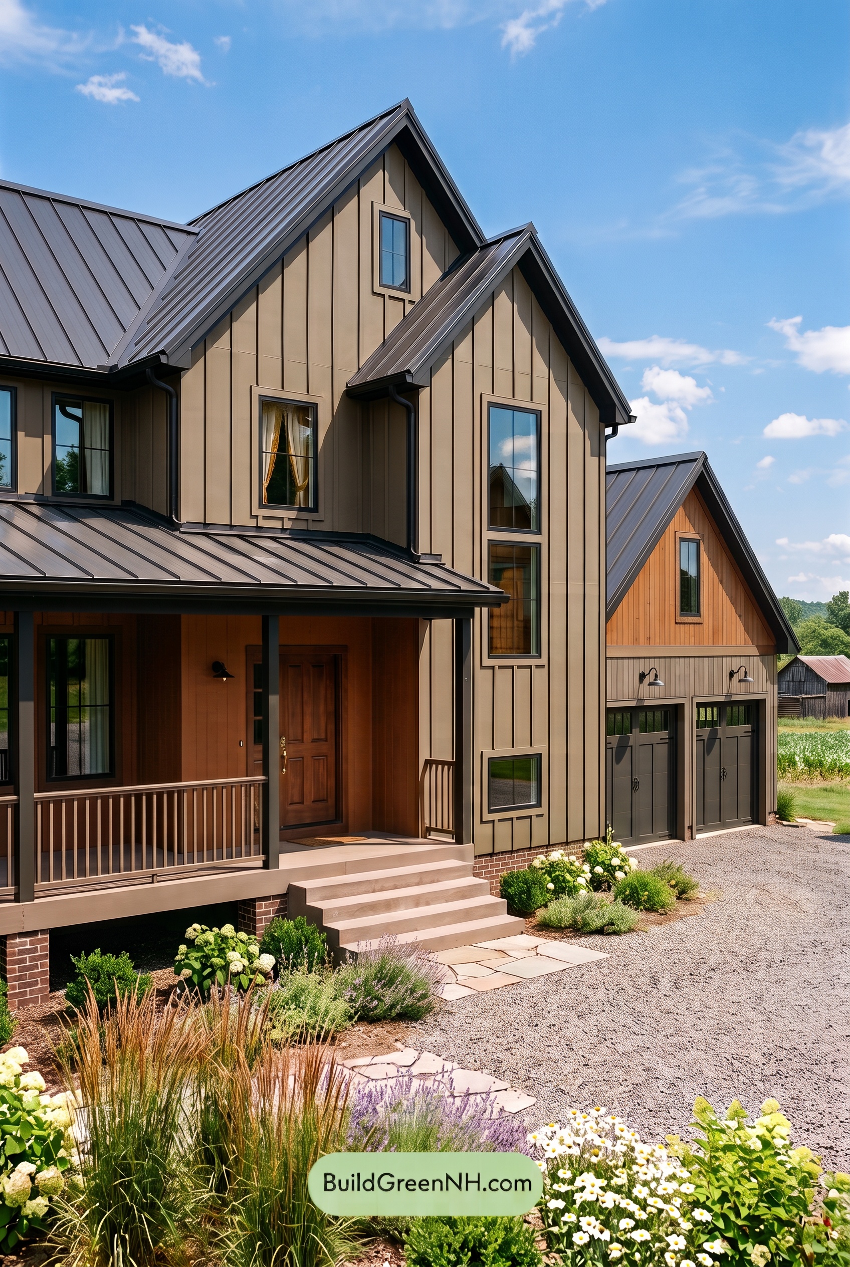 Earthy Green House Exterior Color Scheme: Green Amber Contentment
Table of Contents