Last updated on
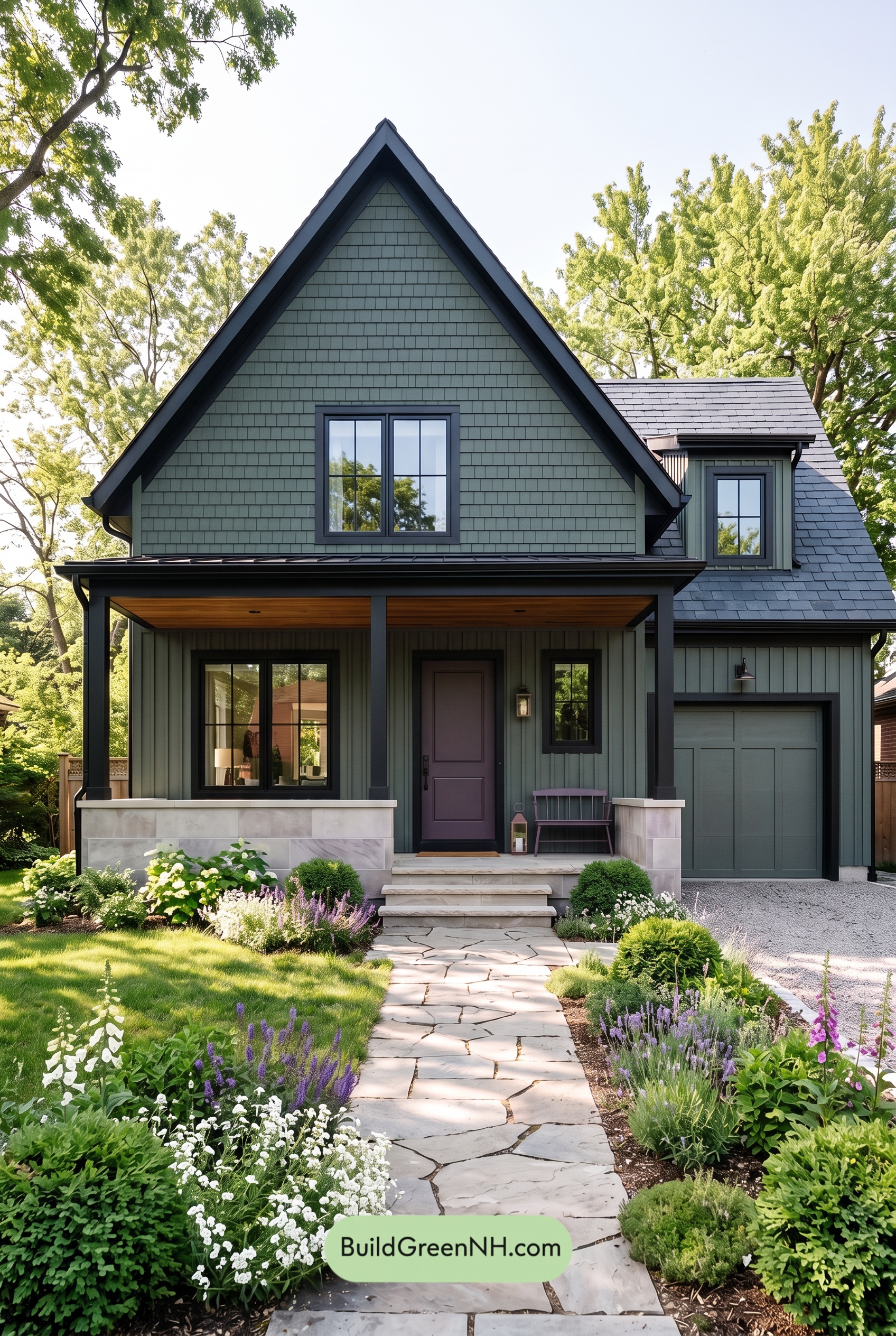

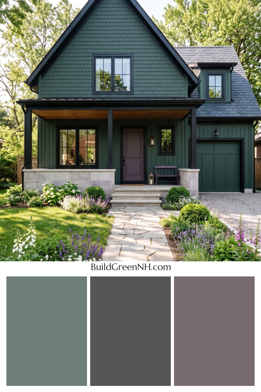
Soft sage green and deep charcoal gray give this home an irresistible balance of garden-inspired calm and crisp architectural character.
A Gentle Green That Connects the Exterior
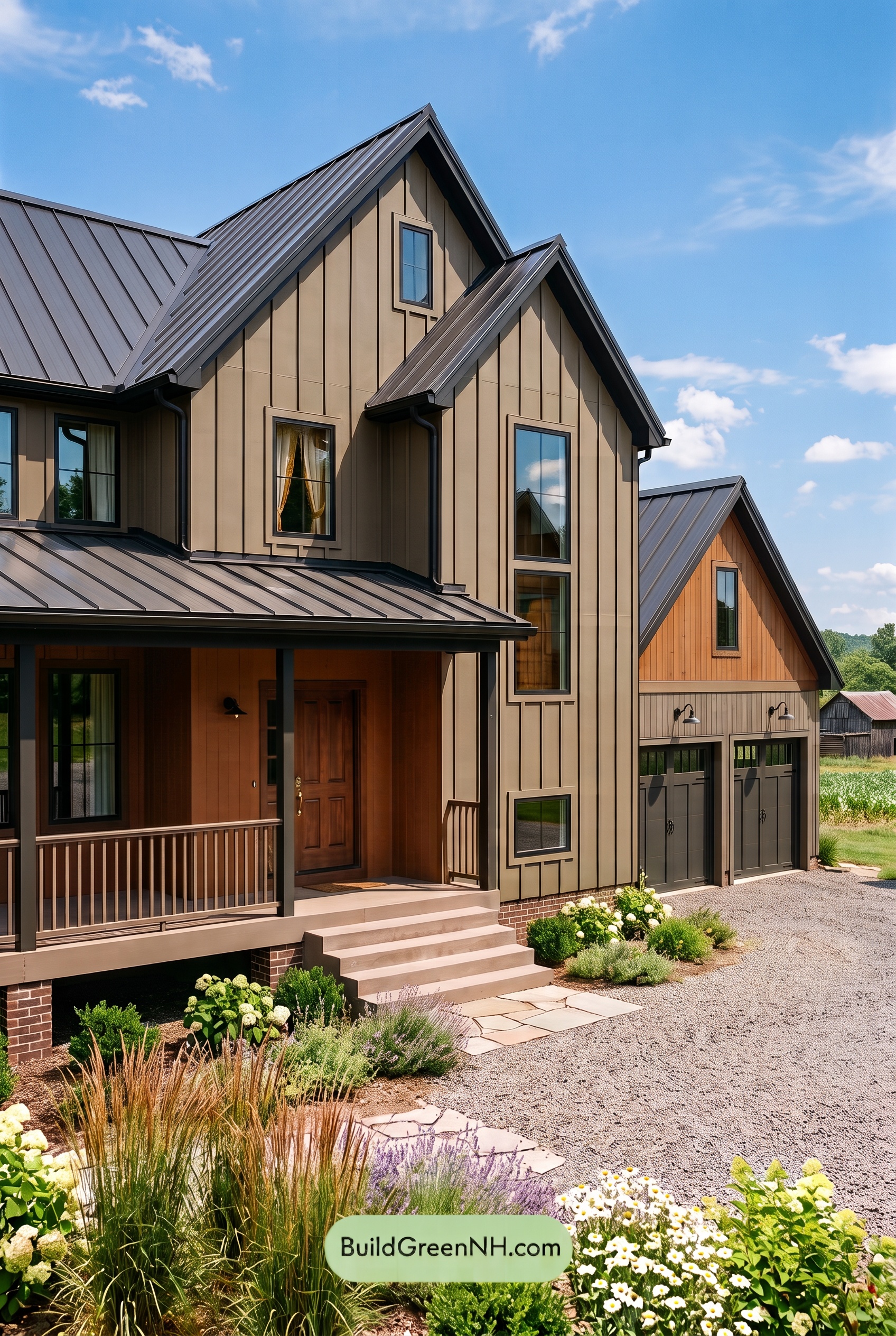
A muted sage green brings the main siding to life without competing with the lush surroundings. Its gray undertones keep the color understated, giving the house a settled, welcoming presence rather than a bright or overly rustic look.
The same green family carries across the shingled front gable, vertical siding, and dormer walls. This repetition unifies the different textures while allowing their patterns to stand out. On the garage door, a similarly subdued green helps the broad surface blend into the facade instead of becoming its focal point.
Dark Gray Details Give the House Definition
Deep charcoal gray traces the steep gable, outlines the windows, and anchors the porch columns. These darker elements give the soft green a strong framework, drawing attention to the roofline and the generous front porch.
The window frames echo that charcoal family for a layered, coordinated effect. Rather than relying on bright trim, the scheme uses depth to create contrast. The result feels tailored and substantial, yet still relaxed enough for a garden setting.
A Quietly Distinctive Entry
The front door introduces a deep, warm gray with a subtle violet undertone. It offers a gentle shift from the cooler charcoal details without interrupting the restrained palette. Tucked beneath the porch, this softer accent gives the entrance its own identity.
Above it, the porch ceiling adds golden-brown warmth. That warm note balances the cool greens and grays, making the shaded entry feel inviting rather than austere. Pale gray and creamy beige tones in the porch masonry and steps brighten the lower facade and provide a light counterpoint to the dark columns.
A Roof That Completes the Palette
The roof’s cool blue-gray shades sit comfortably alongside the green siding, while the darker charcoal porch roof connects with the trim below. Together, they keep the upper portions of the house cohesive without making every surface identical.
What makes this scheme so effective is its measured contrast: muted green supplies softness, dark gray defines the architecture, and lighter neutrals offer breathing room. A little golden-brown warmth completes an exterior that feels polished, peaceful, and naturally at home among the trees.
Next, see how this color scheme looks under different lighting simulations throughout the day.
Overcast
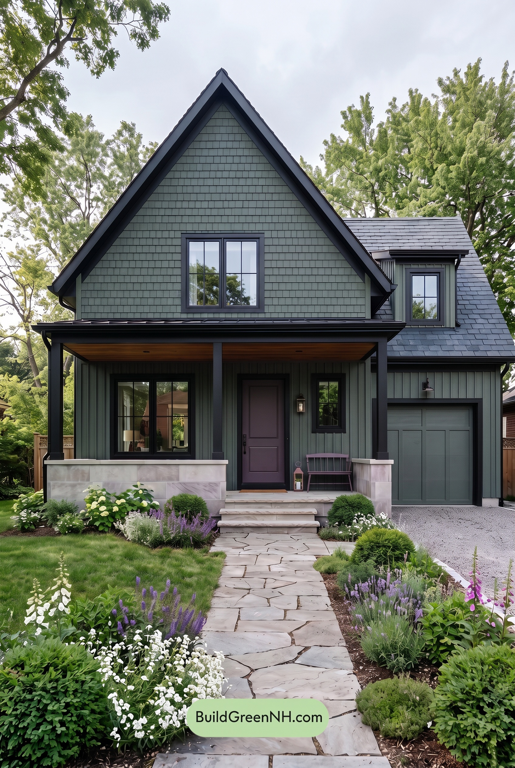
Under overcast skies, the muted greens on the siding and garage door appear cooler and slightly less saturated than in neutral daylight, with their gray undertones becoming more noticeable. Subtle yellow warmth recedes, giving these shades a softer, more subdued character. The deep gray trim and window frames also feel cooler, quietly reinforcing the green rather than sharply outlining it.
Diffused light softens shadows beneath the gables and across the porch, reducing the contrast between exposed and sheltered surfaces. The darker grays still provide definition, but the transitions feel gentler. Compared with neutral daylight, the overall palette takes on a calm, hushed mood—less crisp and lively, more restful and atmospheric.
Golden Hour
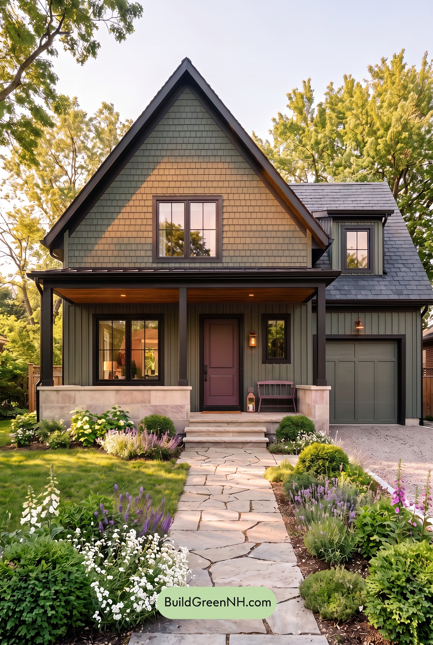
Golden Hour gives the muted greens a warmer, more golden cast, especially across the sunlit front gable. Compared with neutral daylight, which would reveal their cooler, grayer character more evenly, this light brings out yellow undertones while keeping saturation soft and earthy. The shaded siding and garage door appear deeper and cooler, creating subtle variations within the same green family.
The dark gray trim and columns gain a warmer edge where sunlight catches them, while shaded sections read closer to charcoal. Long shadows beneath the eaves and porch heighten the contrast between glowing walls and dark accents. The result feels cozier and more dramatic than the balanced, understated palette you would see in neutral daylight.
Shade
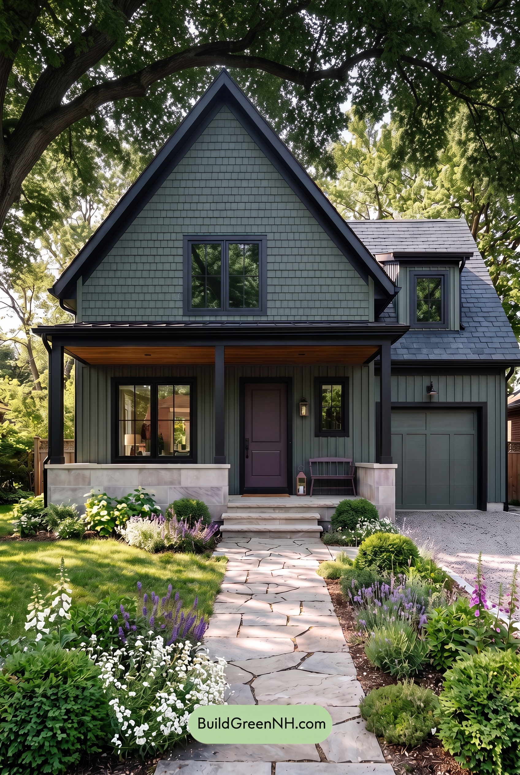
In shade, the muted greens appear deeper and less saturated than they would in neutral daylight, giving the exterior a softer, grayer character. Their yellow warmth recedes, allowing subtle blue-green undertones to become more noticeable. The dark grays also feel cooler, creating a restrained contrast rather than a bright, crisp outline.
Deeper shadows beneath the roof and across the porch bring the green and gray shades closer together, while the more exposed upper walls retain clearer color separation. Compared with neutral daylight, which would reveal more warmth and brighter distinctions, this shaded palette feels quiet, sheltered, and gently moody.
Nighttime
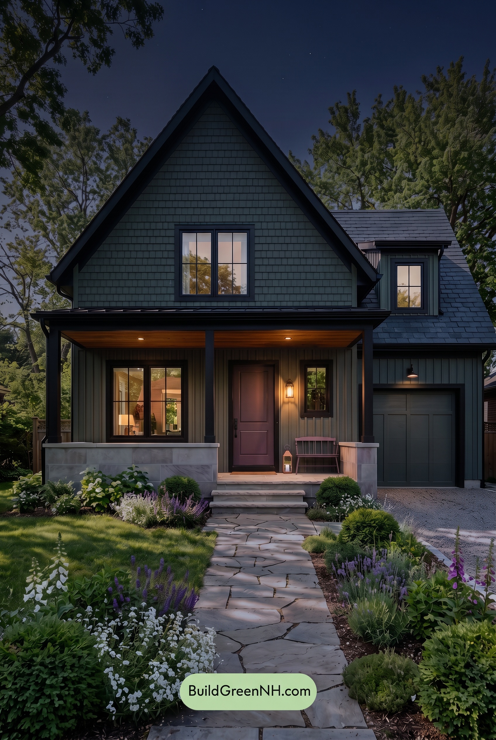
At night, the green shades deepen and appear less saturated than they would in neutral daylight, taking on a cooler, more subdued character. The gray accents darken toward near-black beneath the eaves and around the windows, while deeper shadows soften the distinction between the green and gray surfaces.
Warm porch lighting brings a gentle yellow cast to nearby greens and makes the grays feel softer and warmer. These illuminated patches stand out against the cool, shadowed exterior, creating stronger light-to-dark contrast even as the overall palette becomes quieter. Compared with daylight’s clearer color separation, the nighttime effect feels intimate, sheltered, and quietly dramatic.
Pin these for later:
Want More?
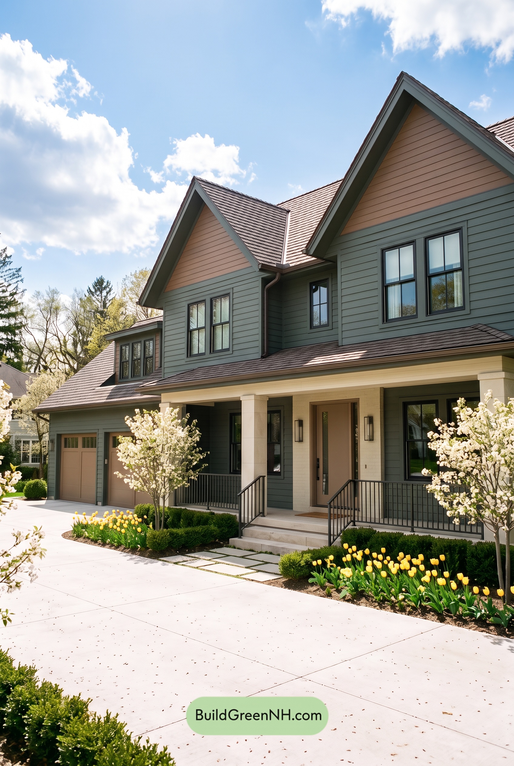 Earthy Green House Exterior Color Scheme: Brown Green Comfort
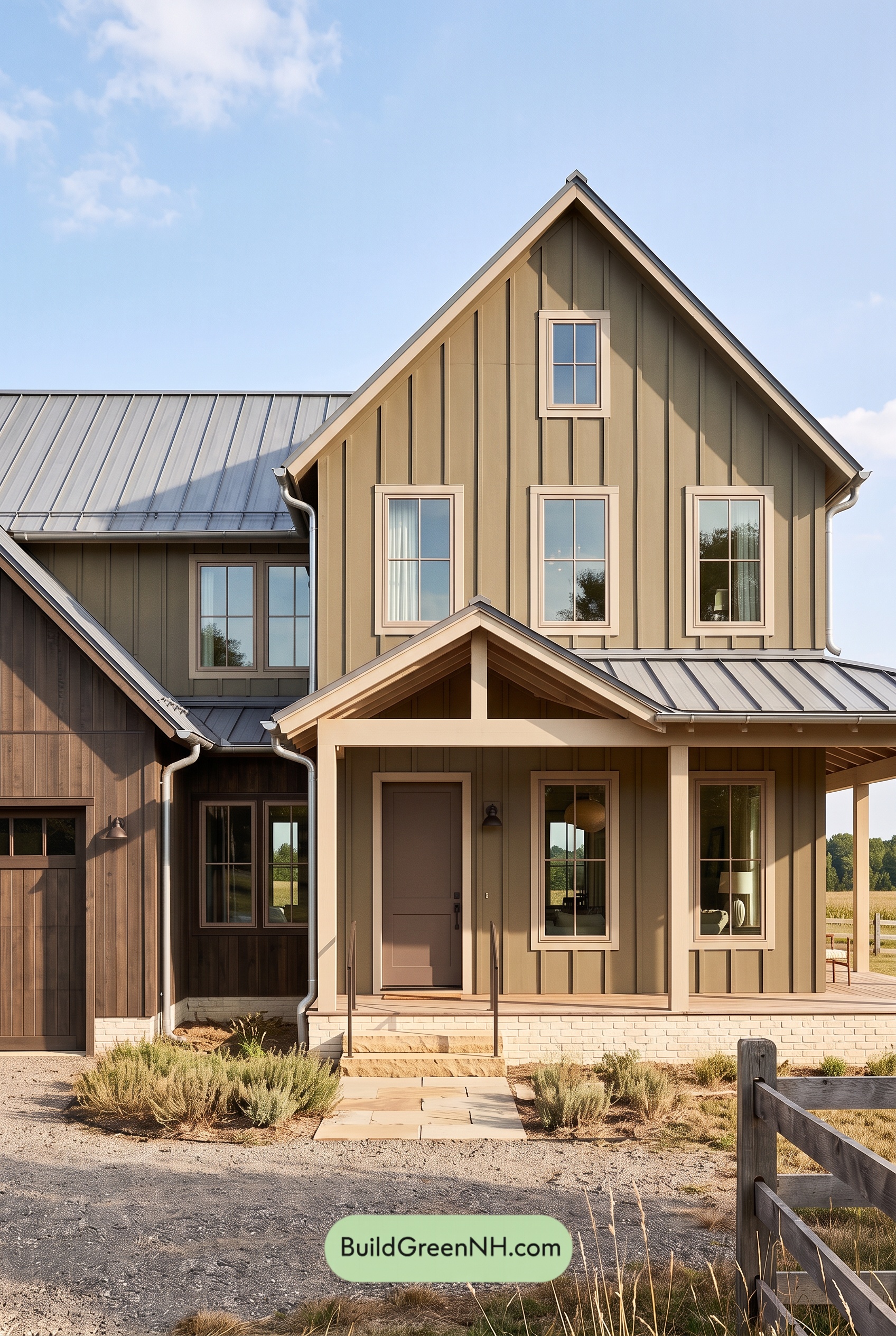 Earthy Green House Exterior Color Scheme: Green and Beige Sanctuary
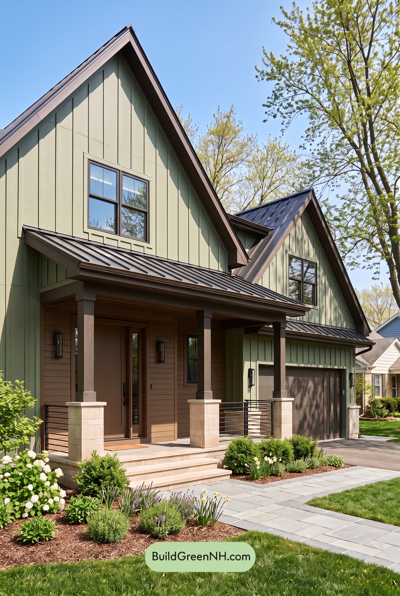 Earthy Green House Exterior Color Scheme: Green Velvet Assurance
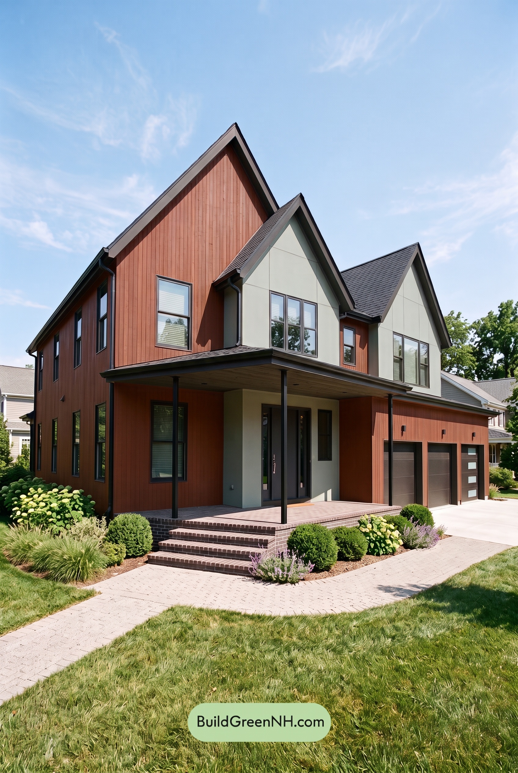 Earthy Green House Exterior Color Scheme: Brown Silken Calm
 Earthy Green House Exterior Color Scheme: Green Amber Contentment
Table of Contents