Last updated on
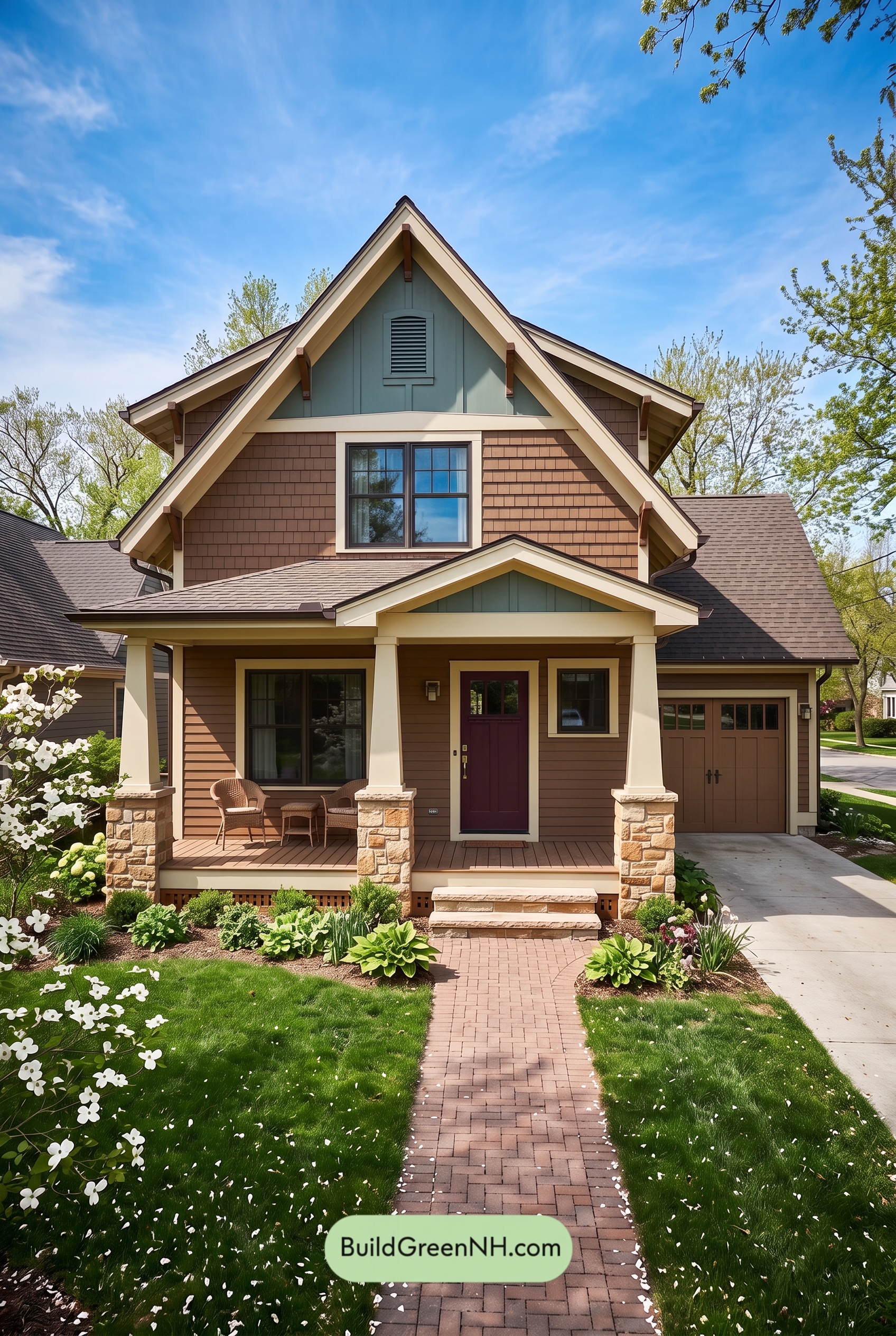

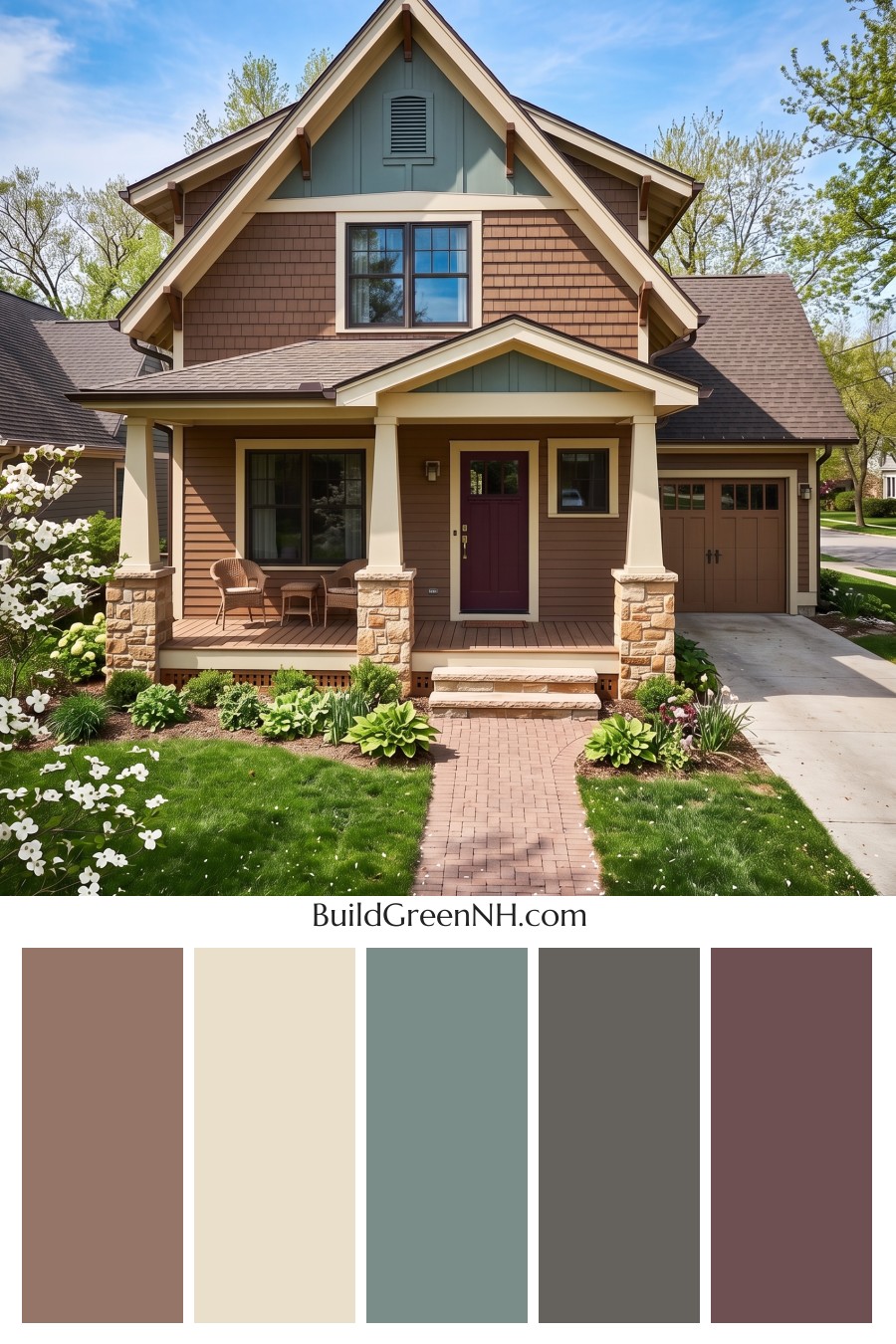
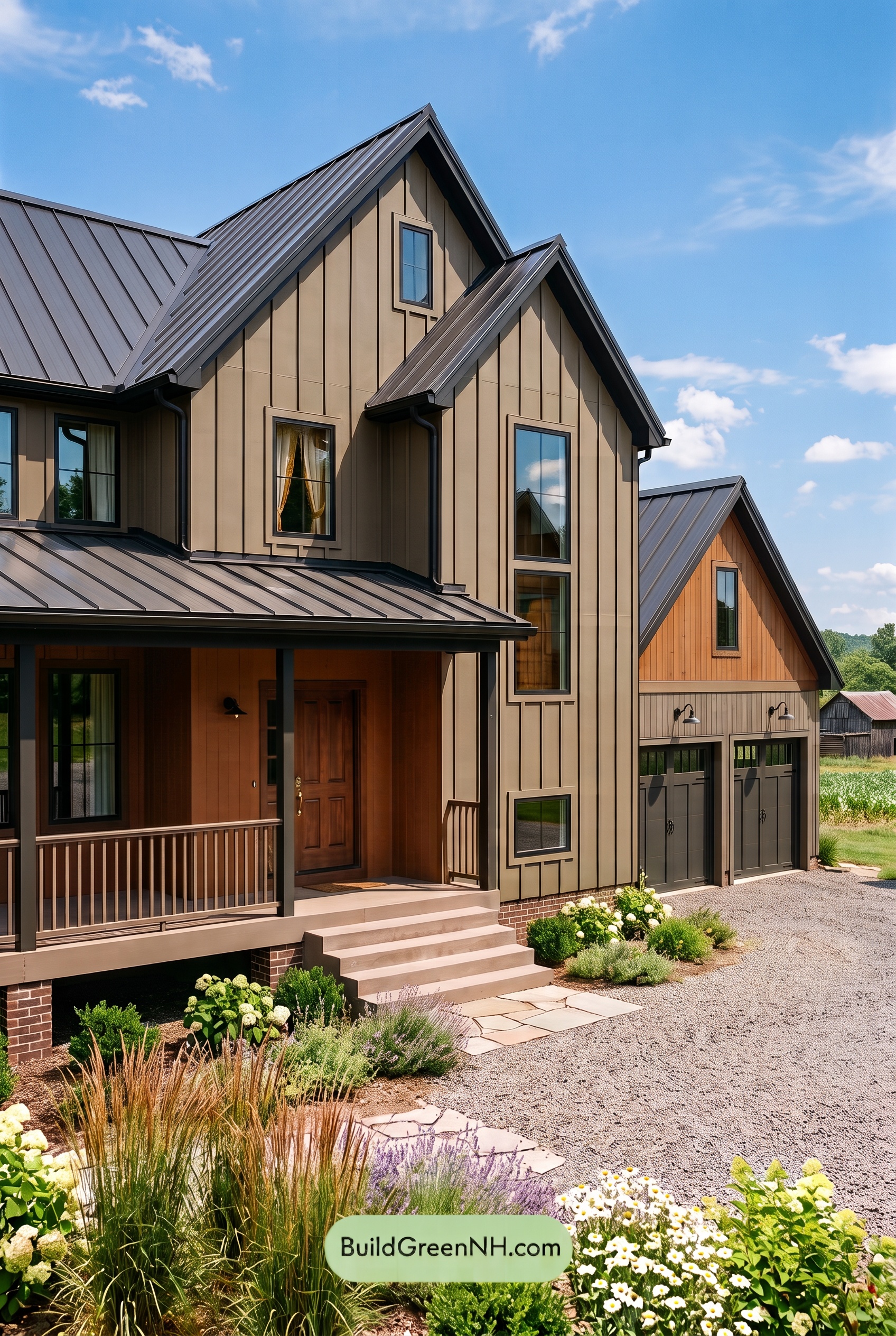
Warm brown siding, soft beige trim, and cool gray accents give this home an inviting balance of earthy comfort and crisp architectural detail.
Warm Brown Siding Sets the Tone
A medium, warm brown wraps the main exterior, creating a welcoming backdrop for the home’s layered rooflines and generous front porch. Across the upper-story shingles, the shade emphasizes the small, repeating shapes; on the lower horizontal siding, it feels calmer and more continuous. Using a similar brown across both textures keeps the facade cohesive without flattening its character.
The result is grounded rather than heavy. There is enough warmth in the siding to complement the landscaping, while its muted quality leaves room for the lighter details to stand out.
Soft Beige Brings the Architecture Forward
Light beige trim traces the steep gables, outlines the windows, and brightens the porch beams. These broad, pale borders make the roof shapes easy to appreciate without introducing a stark contrast. Their warm undertones also sit comfortably beside the brown siding.
The porch columns repeat that soft beige, giving the shaded entry a lighter, more open appearance. Below them, stone bases mix pale beige, sandy brown, and subdued gray, connecting the painted surfaces to the home’s textured foundation details.
Cool Gray Adds a Quiet Change of Pace
The prominent upper gable introduces a medium gray with a subtle green undertone. A matching accent above the porch repeats the effect on a smaller scale, drawing the composition together from top to bottom.
These cooler areas offer relief from the surrounding browns and beiges. Deep gray window frames add sharper definition, giving the glass a clean outline while allowing the broader beige surrounds to remain visually distinct.
Deeper Doors and a Muted Roof Complete the Palette
The front door’s deep reddish brown creates a rich focal point beneath the porch. The garage door takes a quieter approach in a medium warm brown, relating closely to the siding so its larger surface does not dominate the entrance.
Overhead, muted brown-gray shingles bridge the warm walls and cooler accents. Dark brown roof edges and brackets provide smaller notes of depth. Together, these shades feel relaxed and thoughtfully coordinated: light beige reveals the architecture, warm brown supplies comfort, and cool gray keeps the exterior from feeling too uniform.
Next, see how this color scheme looks under different lighting simulations throughout the day.
Overcast
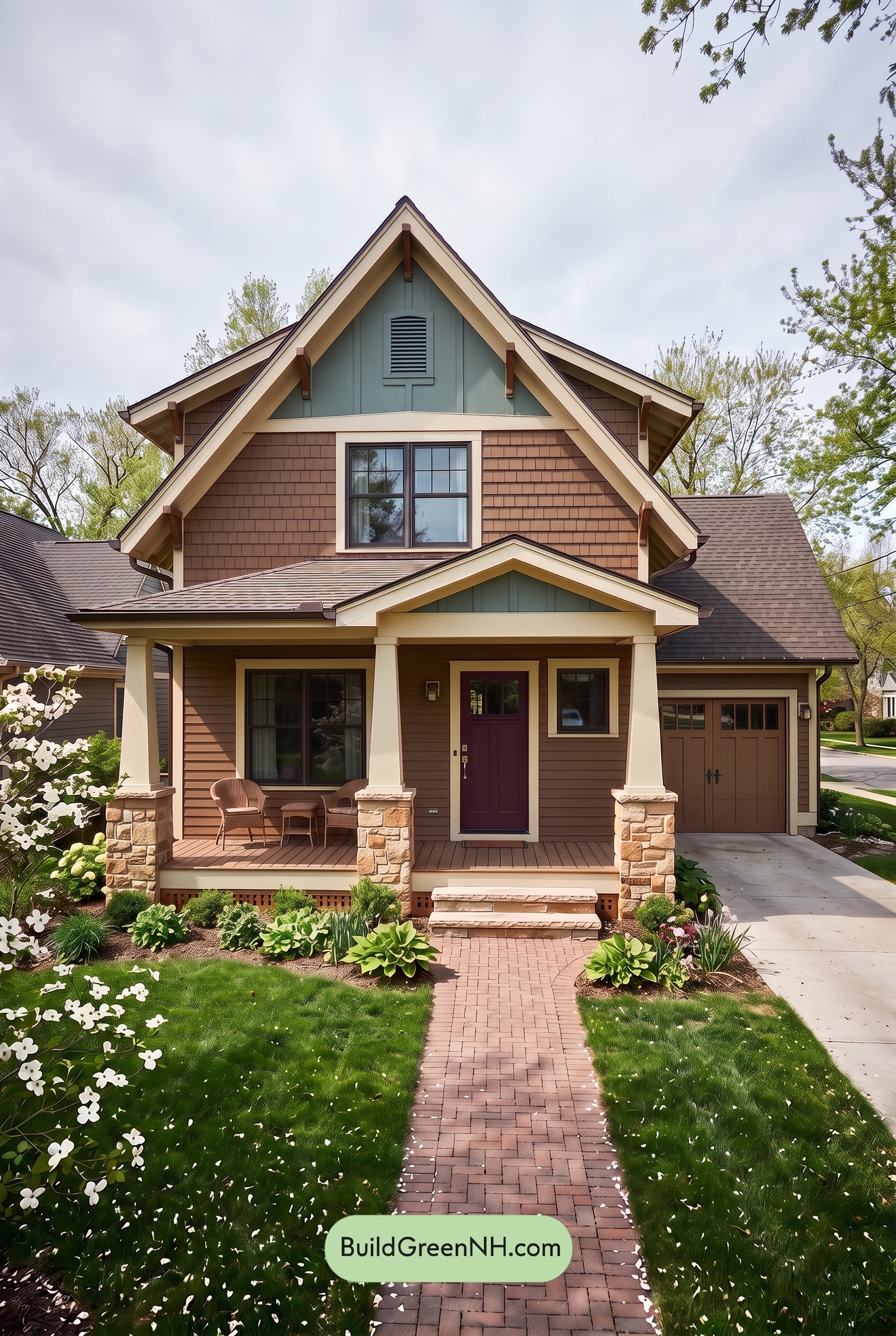
Under overcast skies, the warm browns on this house would tend to look more muted and less reddish than in neutral daylight. The light beige shades would feel softer and less golden, while the gray accents could reveal cooler undertones. Together, these shifts give the palette a quieter, less saturated appearance without losing its earthy warmth.
Diffused light would soften the shadows beneath the gables and across the porch, reducing dramatic contrasts between bright and shaded areas. The pale beige would still stand apart from the deeper browns and grays, but with gentler transitions. The overall mood becomes calm and understated rather than crisp and lively.
Golden Hour
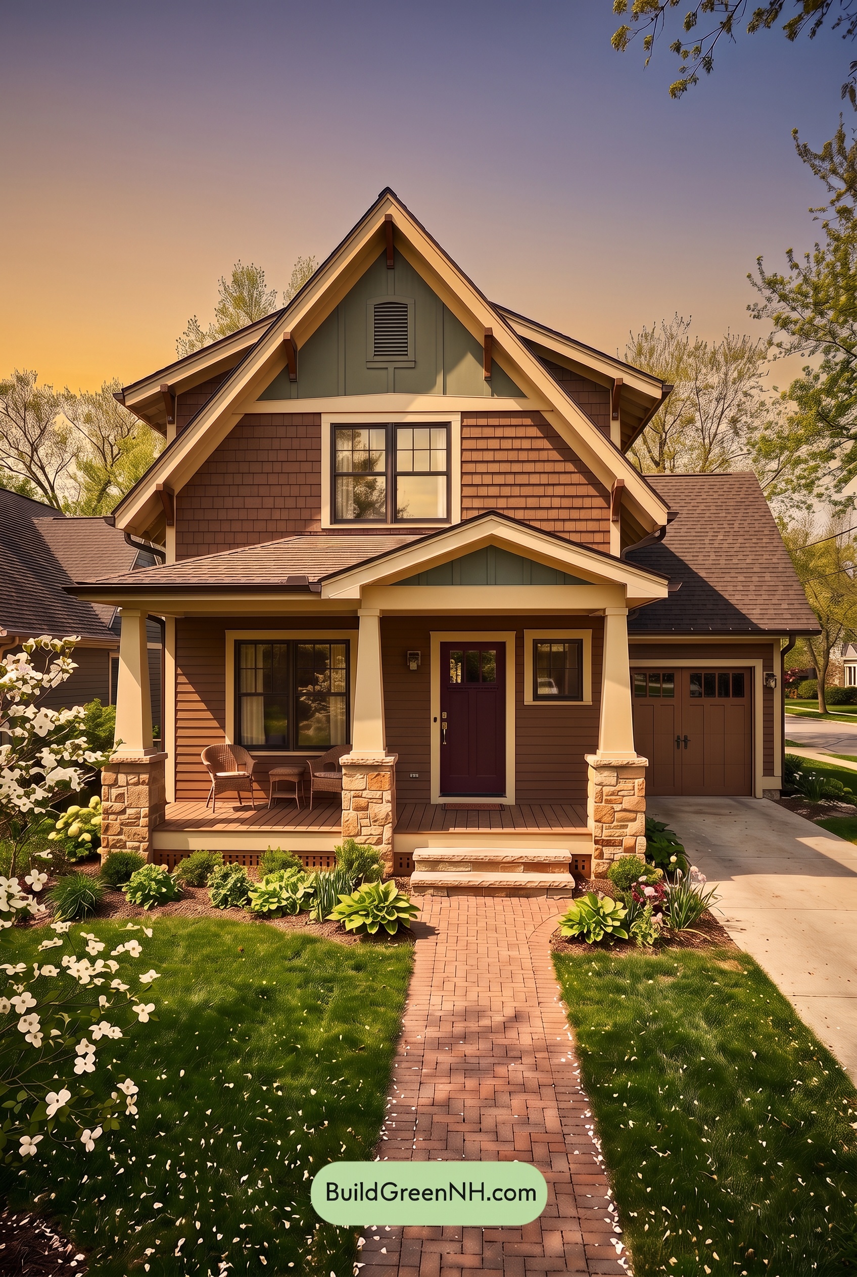
Golden Hour makes the brown shades on this exterior look richer and more saturated, drawing out warm red undertones that feel subtler in neutral daylight. The light beige shades take on a soft yellow glow, while the gray accents appear warmer and less distinctly cool. Together, these shifts give the palette a gentler, more welcoming feel.
Long shadows beneath the gables and across the porch deepen the darker browns and grays, creating stronger contrast with the sunlit beige. The shaded entry feels especially rich and intimate, while the bright roofline stands out. Compared with the more balanced appearance of neutral daylight, the house feels warmer, more dimensional, and quietly dramatic.
Shade
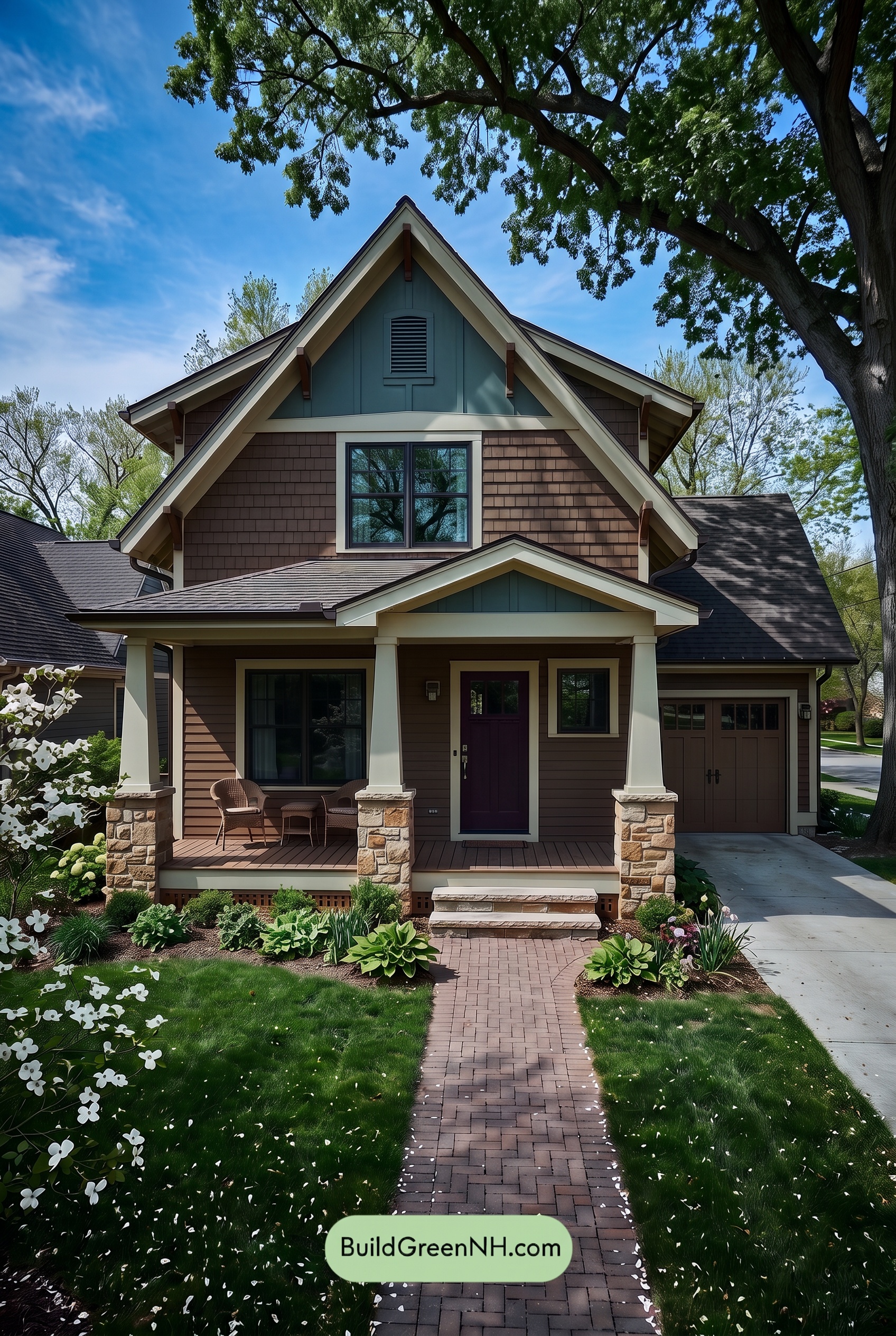
In shade, the brown shades appear deeper and less saturated than they would in neutral daylight, with their reddish warmth becoming more subdued. The pale beige shades feel softer and less golden, while the grays take on a cooler, slightly blue cast. Together, these shifts give the exterior a quieter, more grounded feel.
Deep shadows beneath the gables and porch draw the darker browns and grays closer together, making subtle color differences harder to distinguish. The light beige still provides a clear contrast, keeping the rooflines and entry well defined. Compared with neutral daylight’s more balanced color, this shaded palette feels hushed and sheltered, with pockets of deeper color adding a touch of drama.
Nighttime
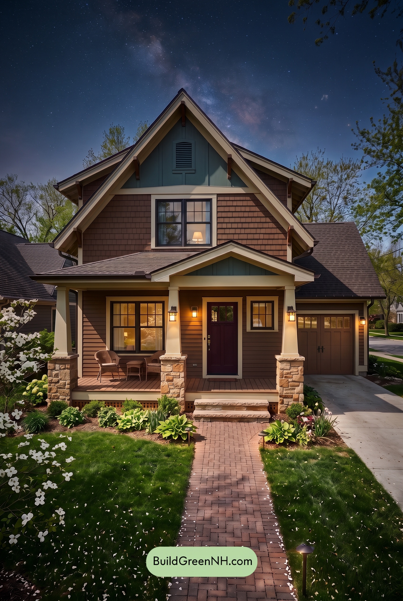
Compared with neutral daylight, nighttime gives the warm brown shades greater depth, bringing out reddish warmth near the porch lights while muting their saturation in shadow. The pale warm neutrals take on a soft yellow glow around the illuminated columns and entry, rather than the more balanced beige appearance they would have by day.
Cooler gray shades recede into deeper, slightly blue-toned shadows, while the dark window frames become less distinct. Beneath the eaves, colors draw closer together; beside the lights, pale neutrals stand out sharply against deeper browns. This mix of softened color and stronger light-dark contrast makes the house feel cozy, sheltered, and quietly dramatic.
Pin these for later:
Want More?
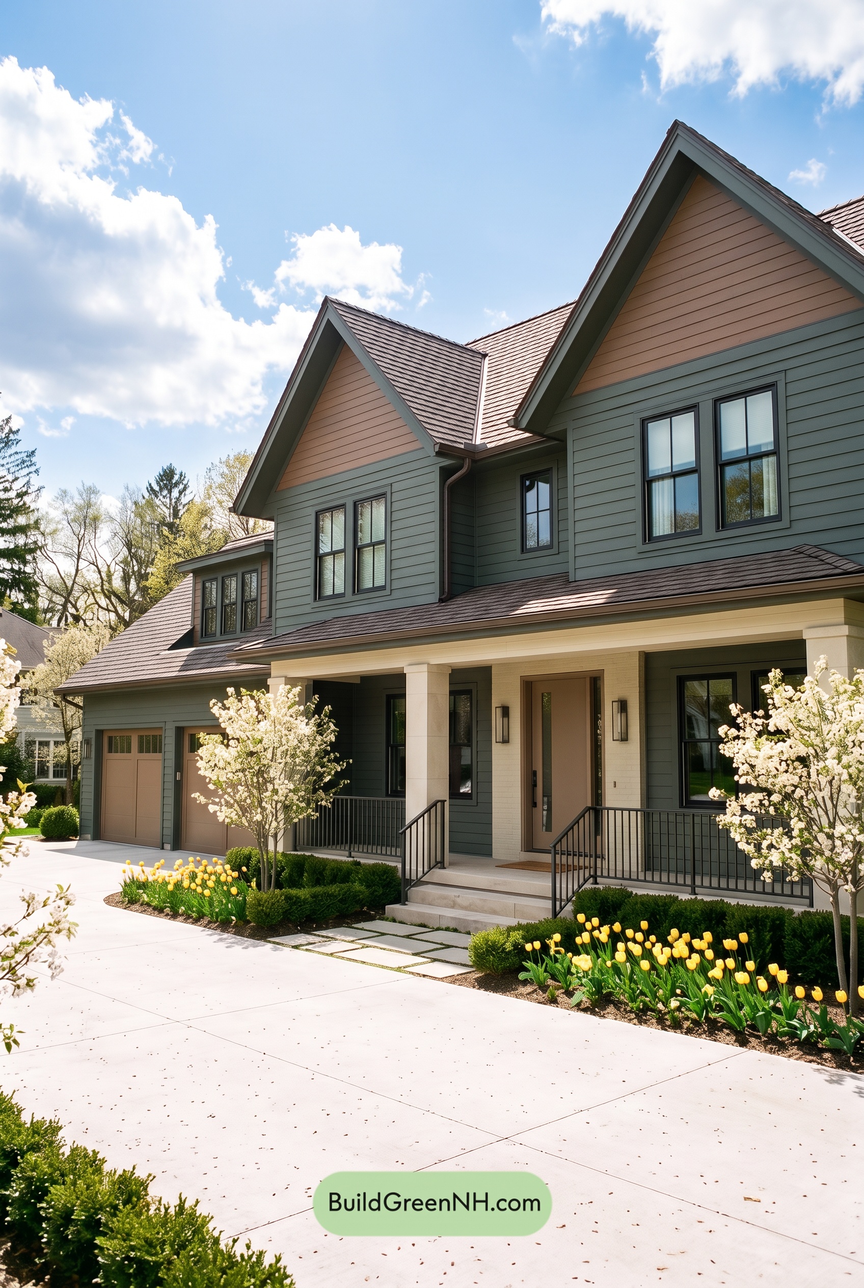 Earthy Green House Exterior Color Scheme: Brown Green Comfort
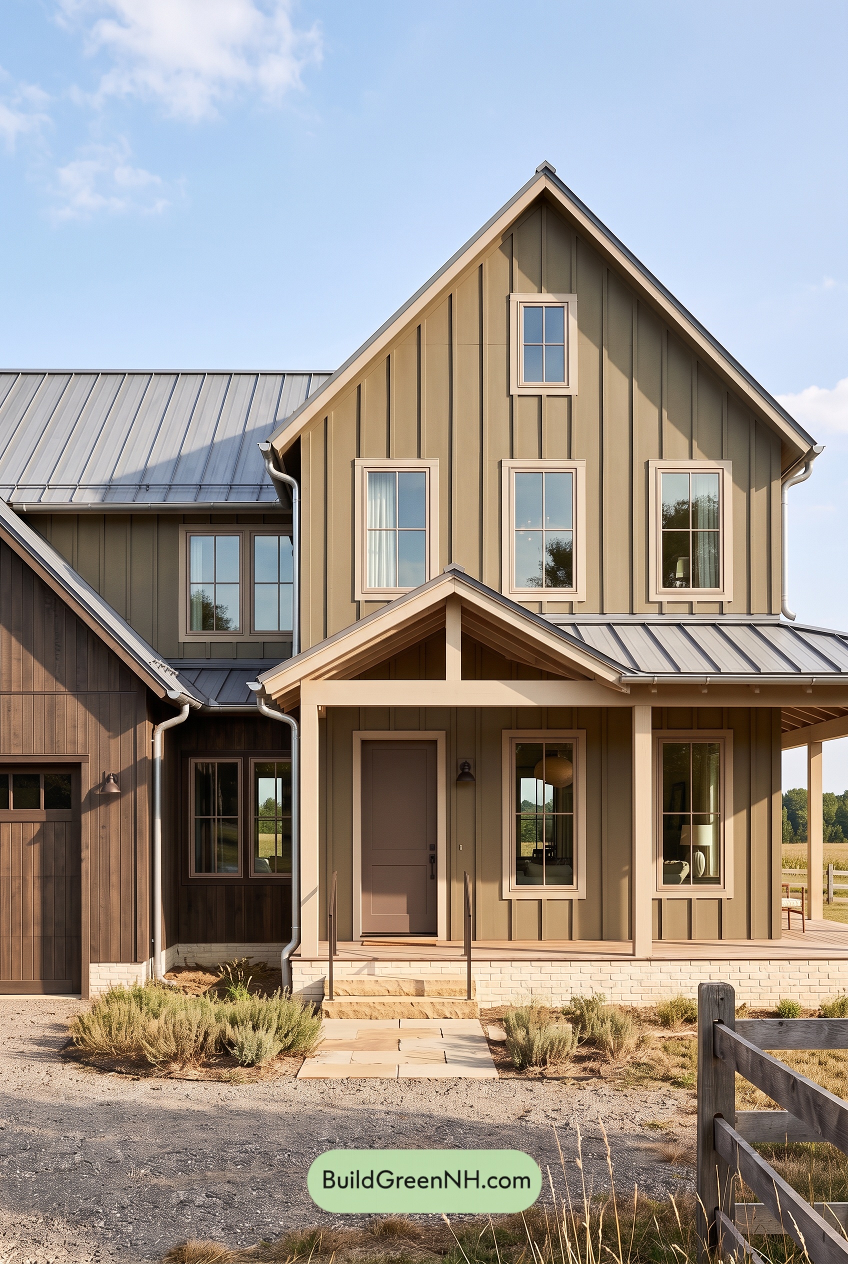 Earthy Green House Exterior Color Scheme: Green and Beige Sanctuary
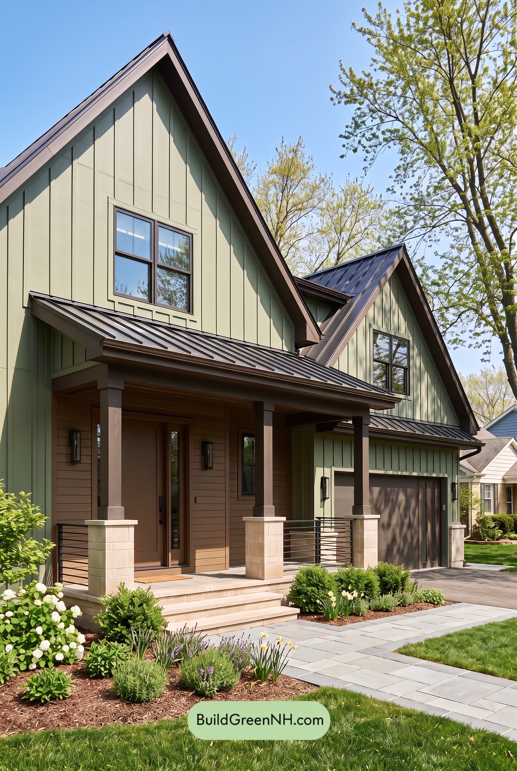 Earthy Green House Exterior Color Scheme: Green Velvet Assurance
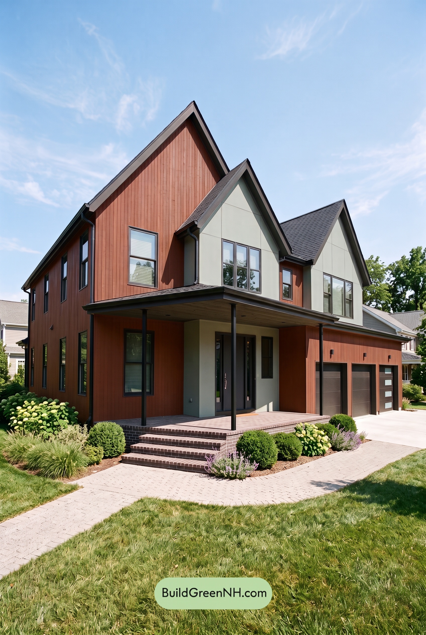 Earthy Green House Exterior Color Scheme: Brown Silken Calm
 Earthy Green House Exterior Color Scheme: Green Amber Contentment
Table of Contents