Last updated on
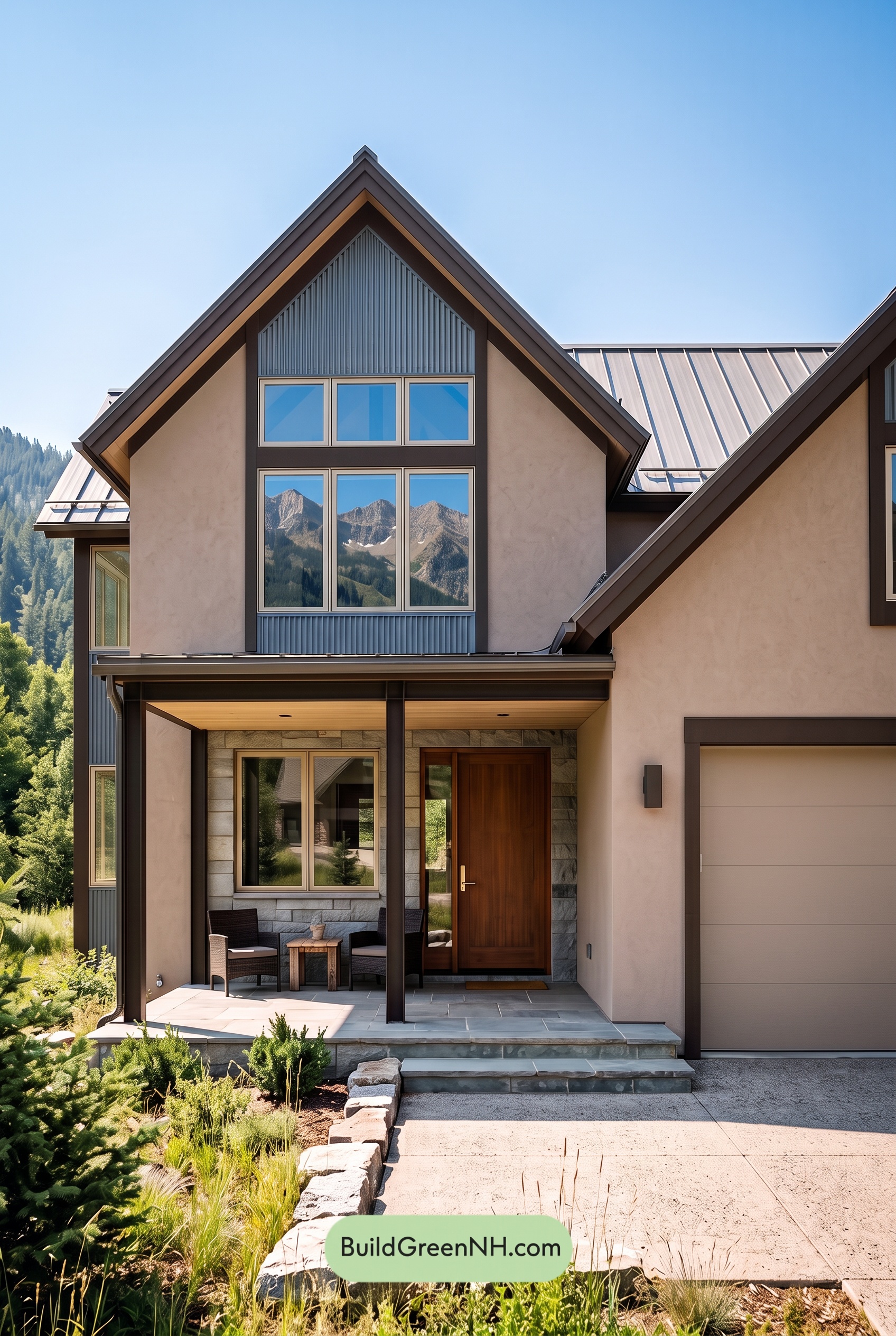

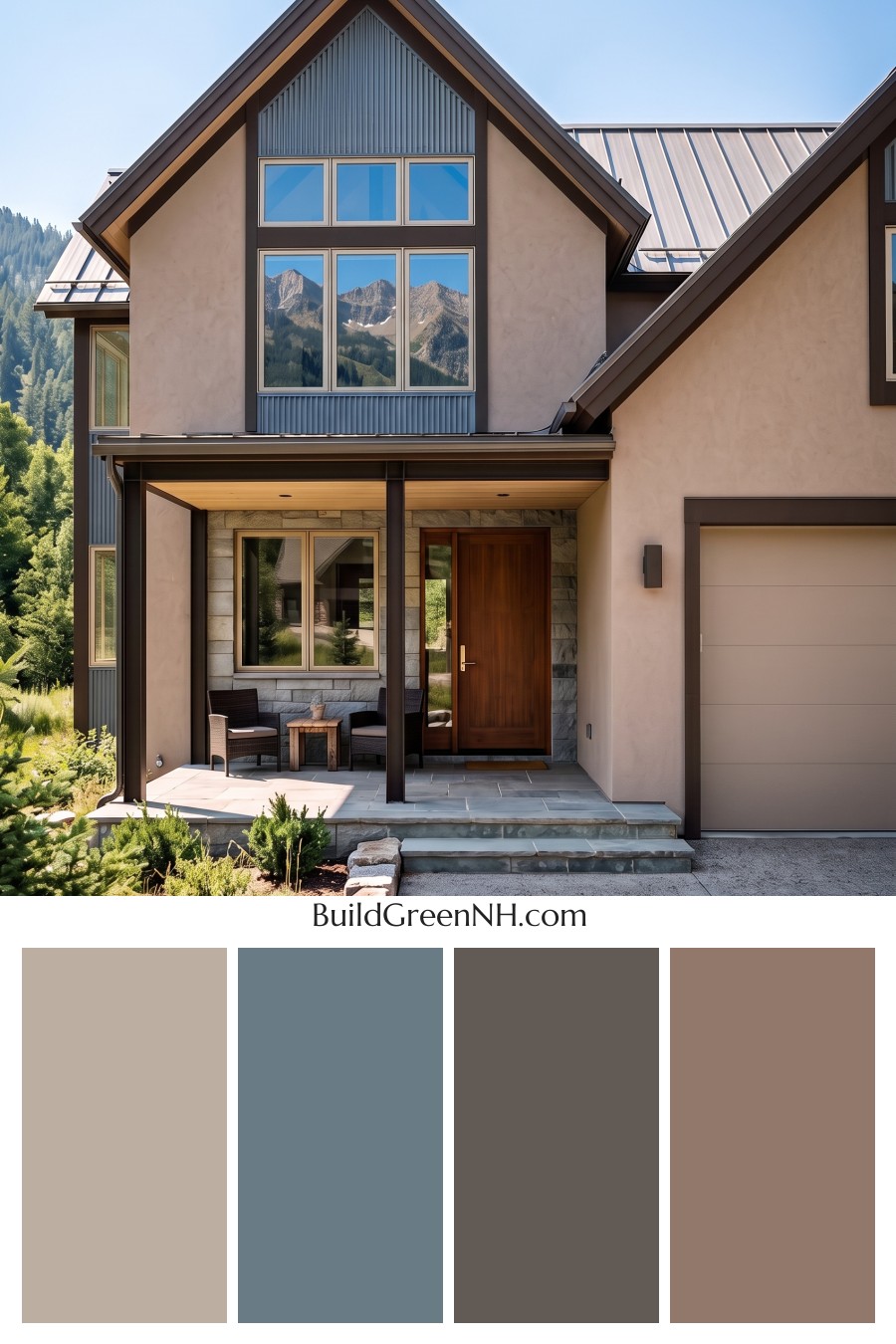
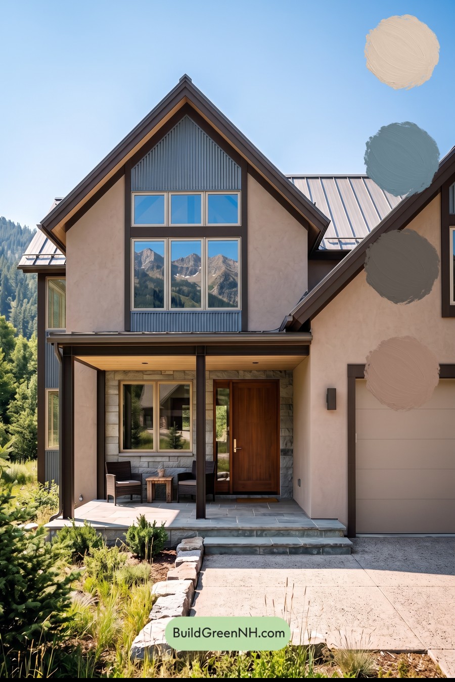
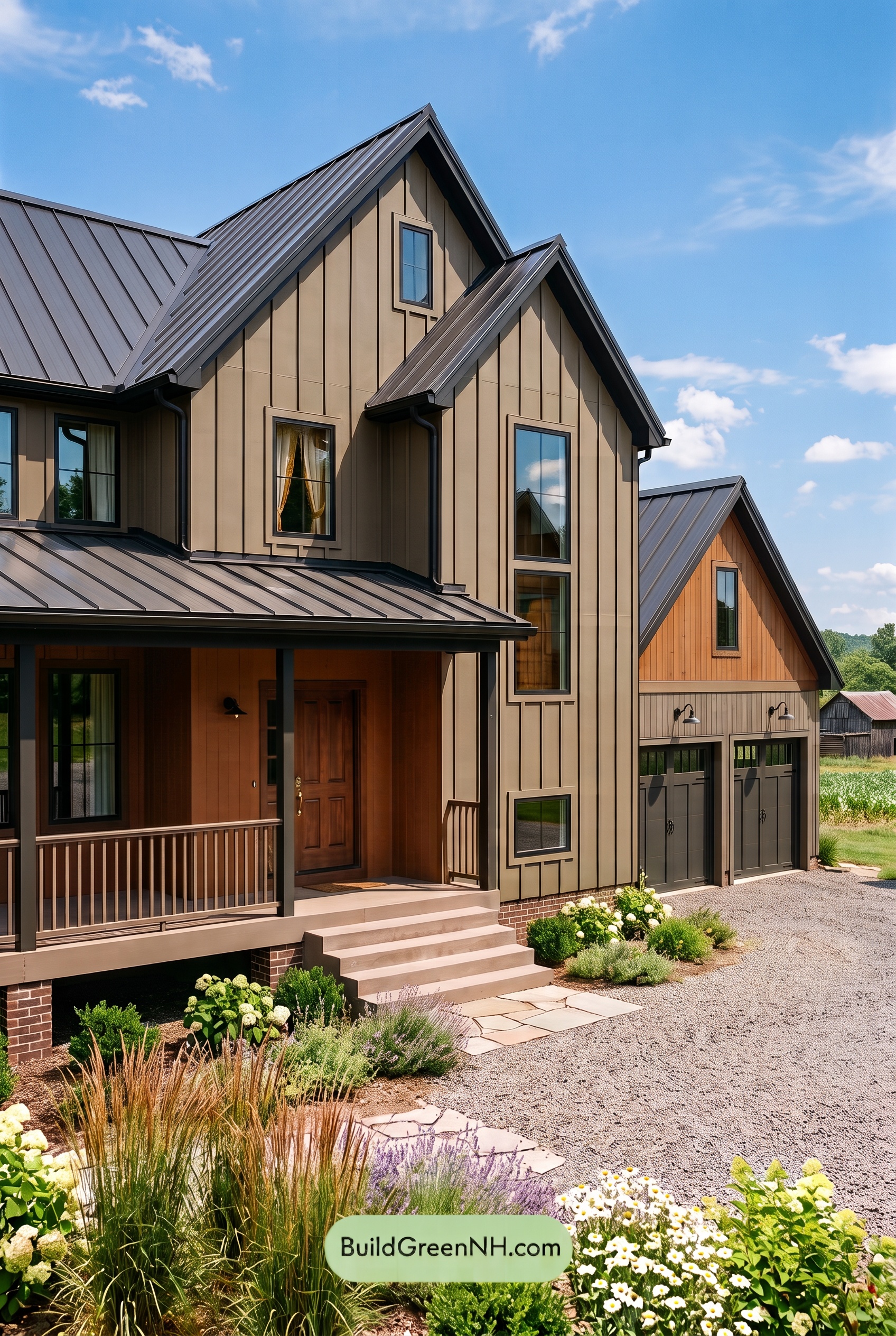
Warm beige, muted blue, and deep brown give this home the best of both worlds: a welcoming exterior with crisp definition and a natural connection to its mountain setting.
Warm Beige Sets a Welcoming Tone
The main walls wear a soft, warm beige that keeps the tall gables and broad exterior surfaces feeling approachable. In sunlight, this shade takes on a gentle glow; beneath the porch, it becomes a quieter backdrop for the richer browns around the entrance.
The garage door stays within the same beige family, helping its large surface blend into the house rather than compete for attention. Light beige window frames repeat that warmth on a smaller scale, tying the glazing back to the walls.
Muted Blue Adds Just Enough Contrast
A subdued, gray-leaning blue brings a refreshing change to the palette. It appears in the vertically ribbed panels beneath the main gable, below the upper windows, and along the left side of the house. These repeated accents draw the eye upward and emphasize the architecture without overwhelming the softer wall color.
The blue feels especially fitting against the surrounding landscape. Its cool undertone balances the beige, while its muted depth keeps the contrast relaxed rather than bold or nautical.
Deep Brown Defines the Architecture
Dark brown trim traces the steep rooflines, surrounds the window groupings, and frames the garage opening. That consistent outline gives the exterior structure and makes each architectural feature easier to appreciate. The slender porch columns carry the same depth down to ground level.
At the entrance, the front door introduces a richer, warmer brown. It stands apart from the darker framing without breaking the palette’s harmony. Lighter golden-brown tones beneath the porch roof and eaves add another welcoming layer, particularly around the shaded seating area.
A Roof and Stonework That Complete the Palette
The metal roof’s light gray tones provide a quiet bridge between the warm walls and cool blue accents. Around the entry, stonework mixes soft gray with touches of beige, while the gray porch paving gives the composition a grounded base.
What makes this scheme work is its balance: beige covers the largest areas, blue supplies restrained interest, and brown provides definition. The result feels polished but comfortable—a contemporary exterior with enough warmth to make the front porch feel like a place to linger.
Next, see how this color scheme looks under different lighting simulations throughout the day.
Overcast
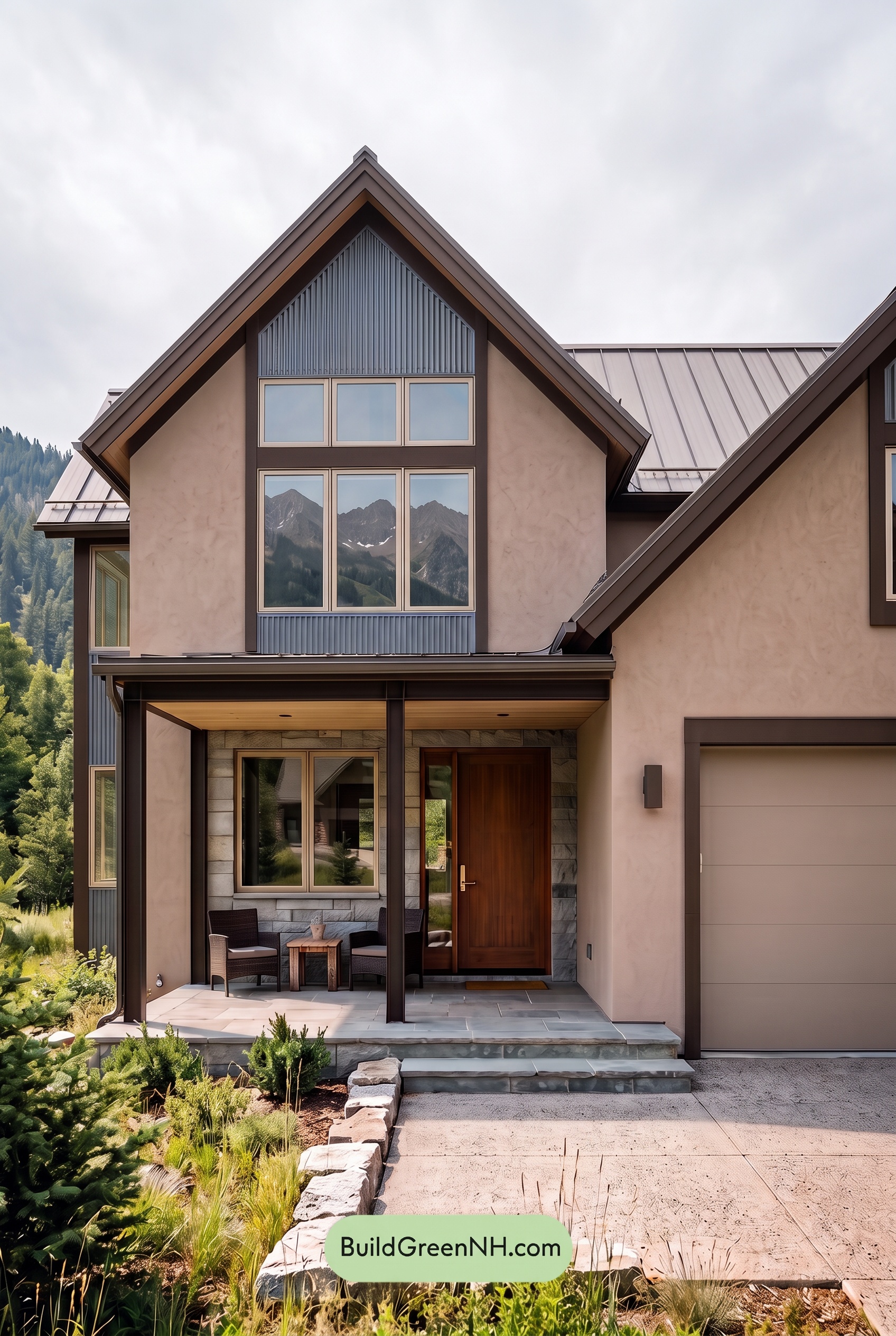
Under overcast skies, the light beige shades tend to look cooler and slightly grayer than in neutral daylight, softening their warm glow. The blue accents take on a quieter, more muted character, with their gray undertones becoming more noticeable. Deep brown details retain their richness, but their reddish warmth feels less pronounced, giving the palette a more restrained balance.
Diffused light softens shadows beneath the rooflines and around the entry, easing the contrast between bright surfaces and shaded recesses. The dark browns still frame the lighter neutrals clearly, but the overall effect feels gentler and less dimensional. Compared with neutral daylight, the house takes on a calm, understated mood.
Golden Hour
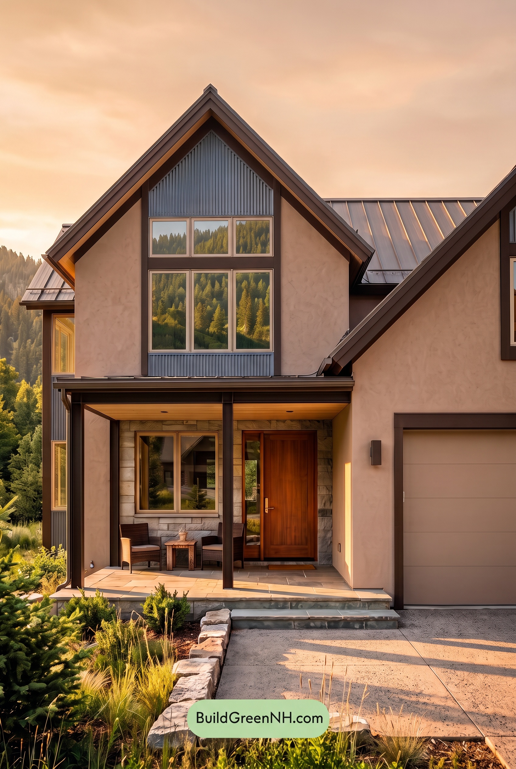
Golden Hour gives the light beige shades a soft, peachy warmth, making them feel richer and less restrained than they would in neutral daylight. The blue shades appear more muted where warm light reaches them, while shaded areas retain a cooler, deeper character. That balance lets the warm neutrals glow without losing the blue’s quiet contrast.
The darker browns gain reddish warmth in the highlights and deepen in shadow, creating a stronger frame around the lighter shades. Long shadows beneath the eaves add depth and heighten light–dark contrast, even as the warm glow softens the overall palette. Compared with neutral daylight’s clearer color separation, the house feels cozier, calmer, and more inviting.
Shade
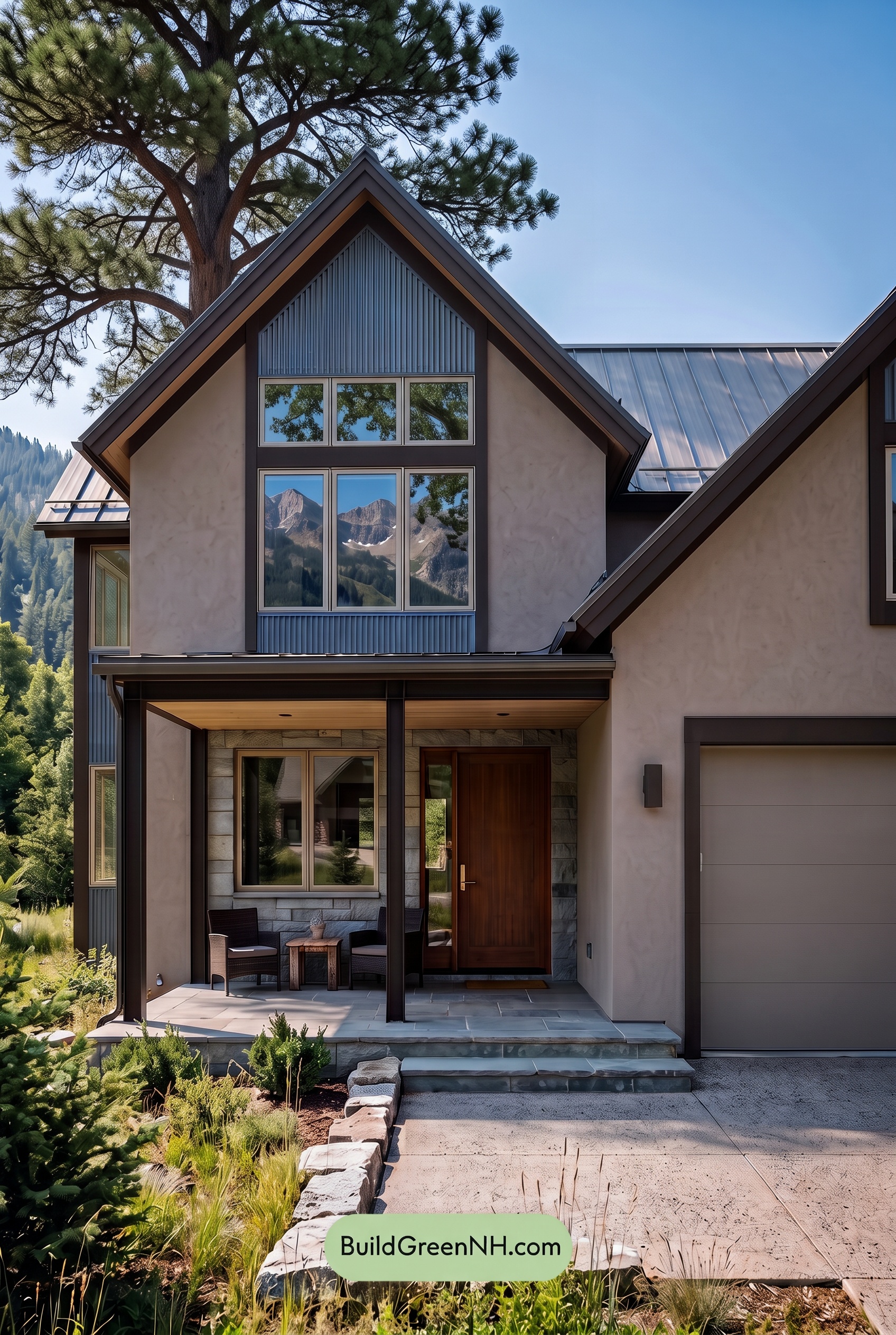
In shade, the beige walls and garage door look cooler and slightly grayer than they would in neutral daylight, with their warmth softened rather than lost. The blue accents deepen but feel less vivid, giving the gables a quieter presence. Without bright light lifting the palette, these shades appear more subdued and closely connected.
Deeper shadows beneath the eaves and porch push the dark browns toward nearly black, strengthening their contrast with the pale beige surfaces. The brown front door retains a gentle warmth, though its richer tones become more restrained. Compared with neutral daylight’s clearer color separation, the shaded exterior feels calm and sheltered, with the blue accents adding a cool counterpoint to the warm neutrals.
Nighttime
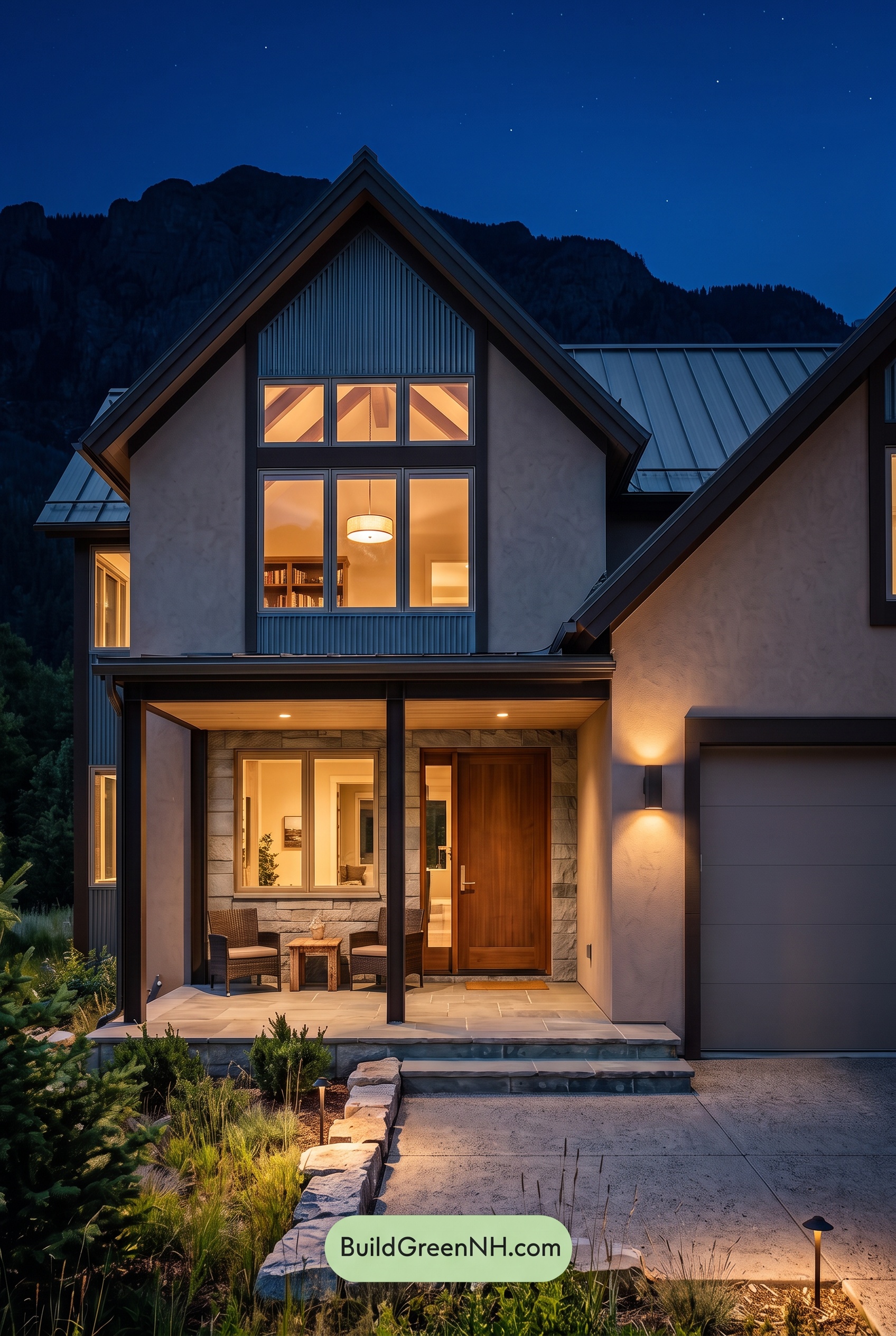
At night, the light beige shades lose their daylight brightness, taking on cooler, grayer undertones away from the fixtures. Near the porch lights and wall sconce, those same warm neutrals look softer and more golden. The blue accents deepen and appear less saturated than in neutral daylight, adding a quiet, moody backdrop to the glowing windows.
Deep shadows beneath the gables push the dark brown shades toward nearly black, sharpening their contrast with the illuminated walls. Around the entrance, warmer light brings out richer, reddish-brown undertones, while the shaded garage looks cooler and more subdued. Compared with daylight’s more even color balance, this mix of warm highlights and cool shadows makes the exterior feel dramatic yet welcoming.
Pin these for later:
Want More?
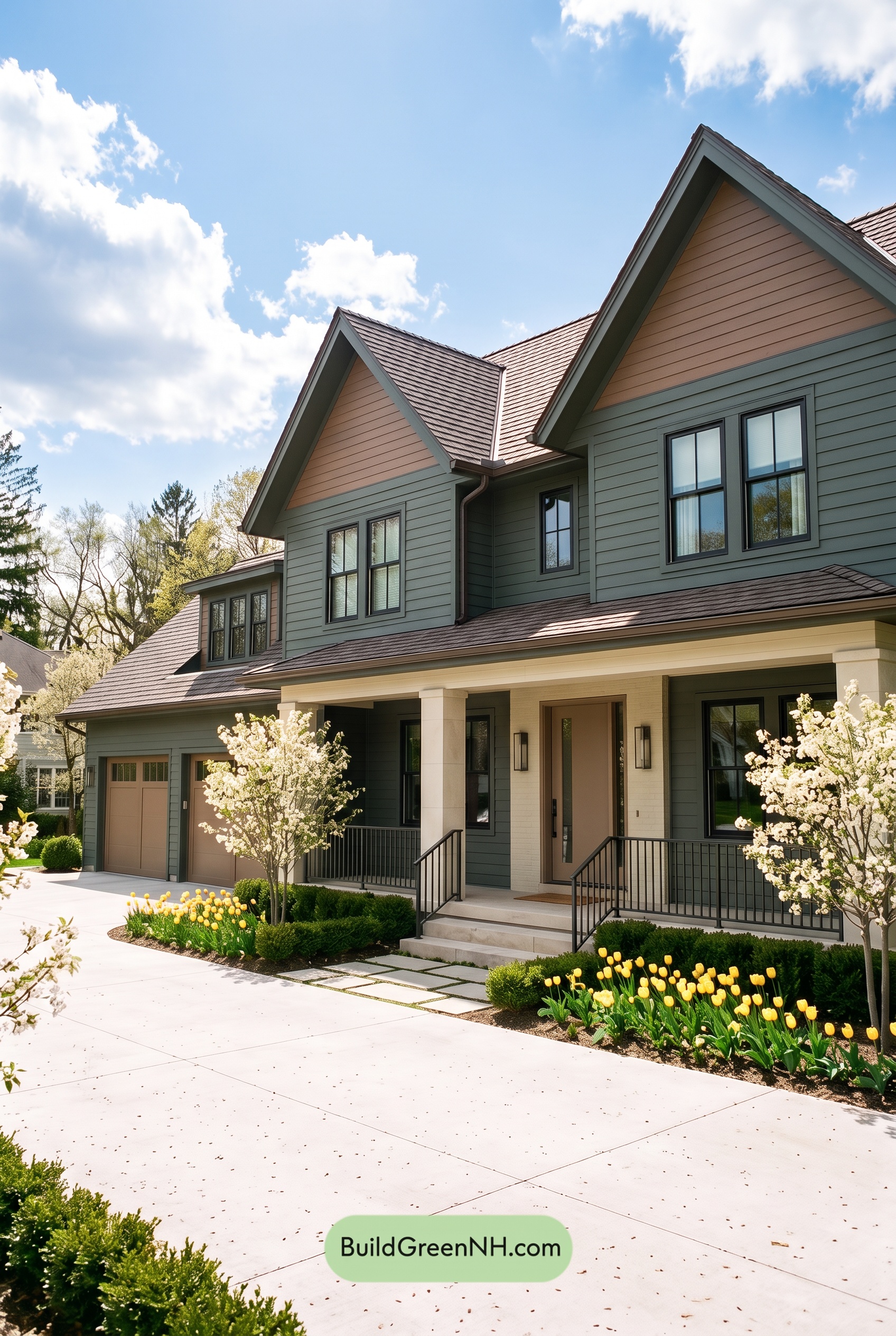 Earthy Green House Exterior Color Scheme: Brown Green Comfort
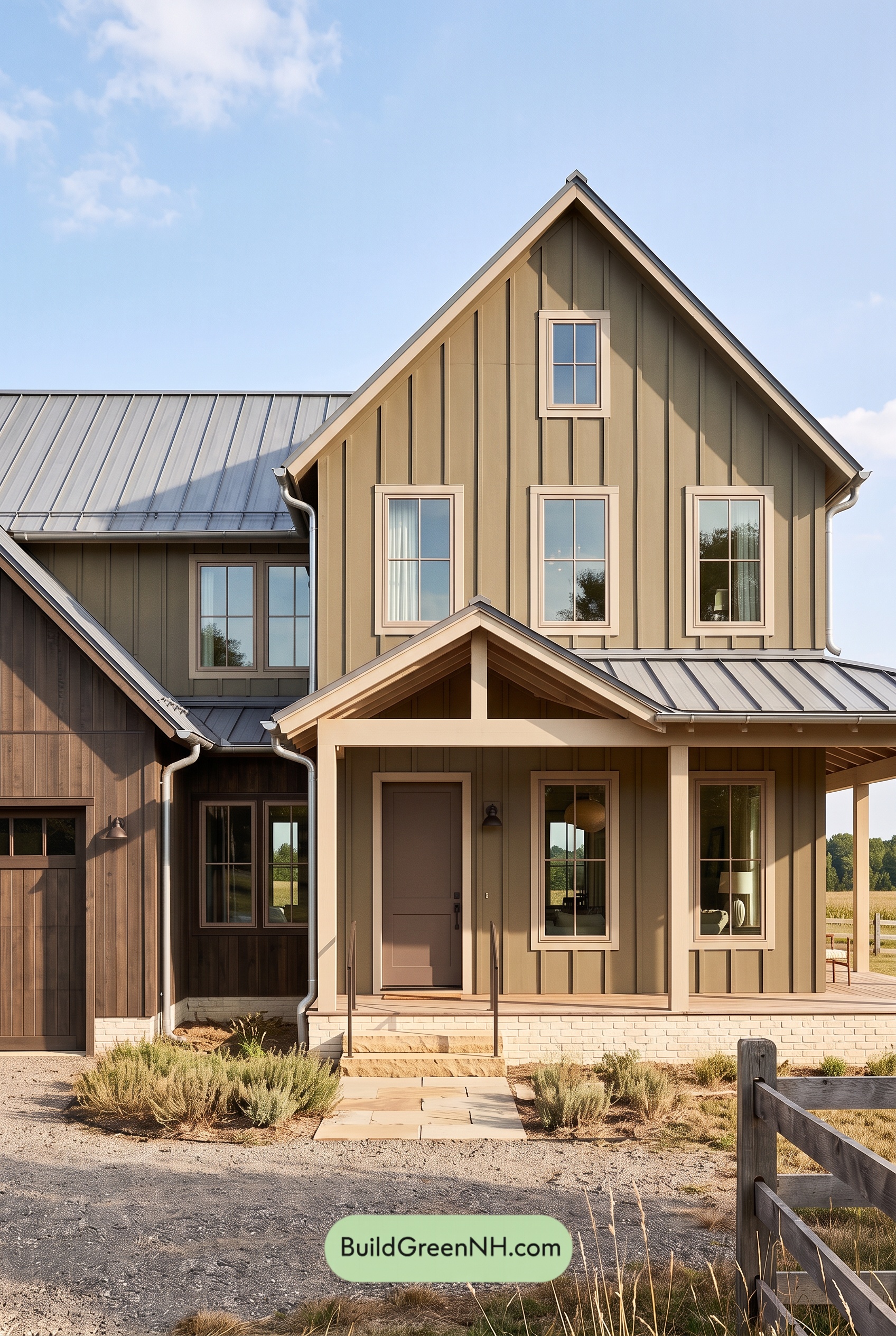 Earthy Green House Exterior Color Scheme: Green and Beige Sanctuary
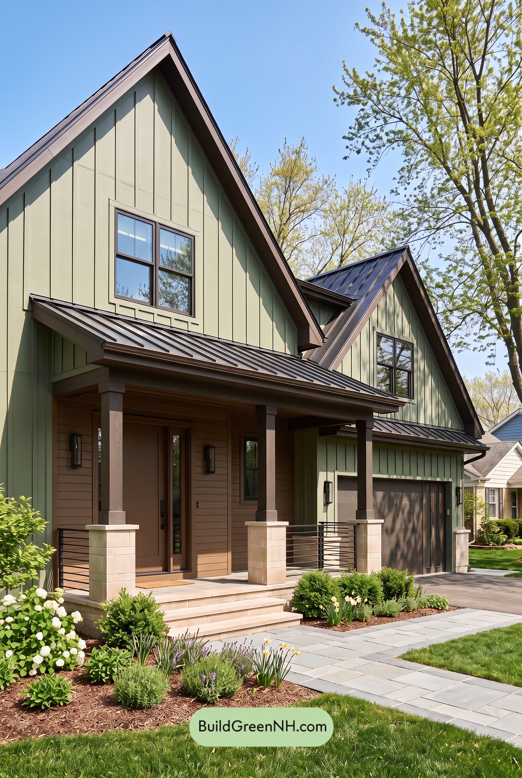 Earthy Green House Exterior Color Scheme: Green Velvet Assurance
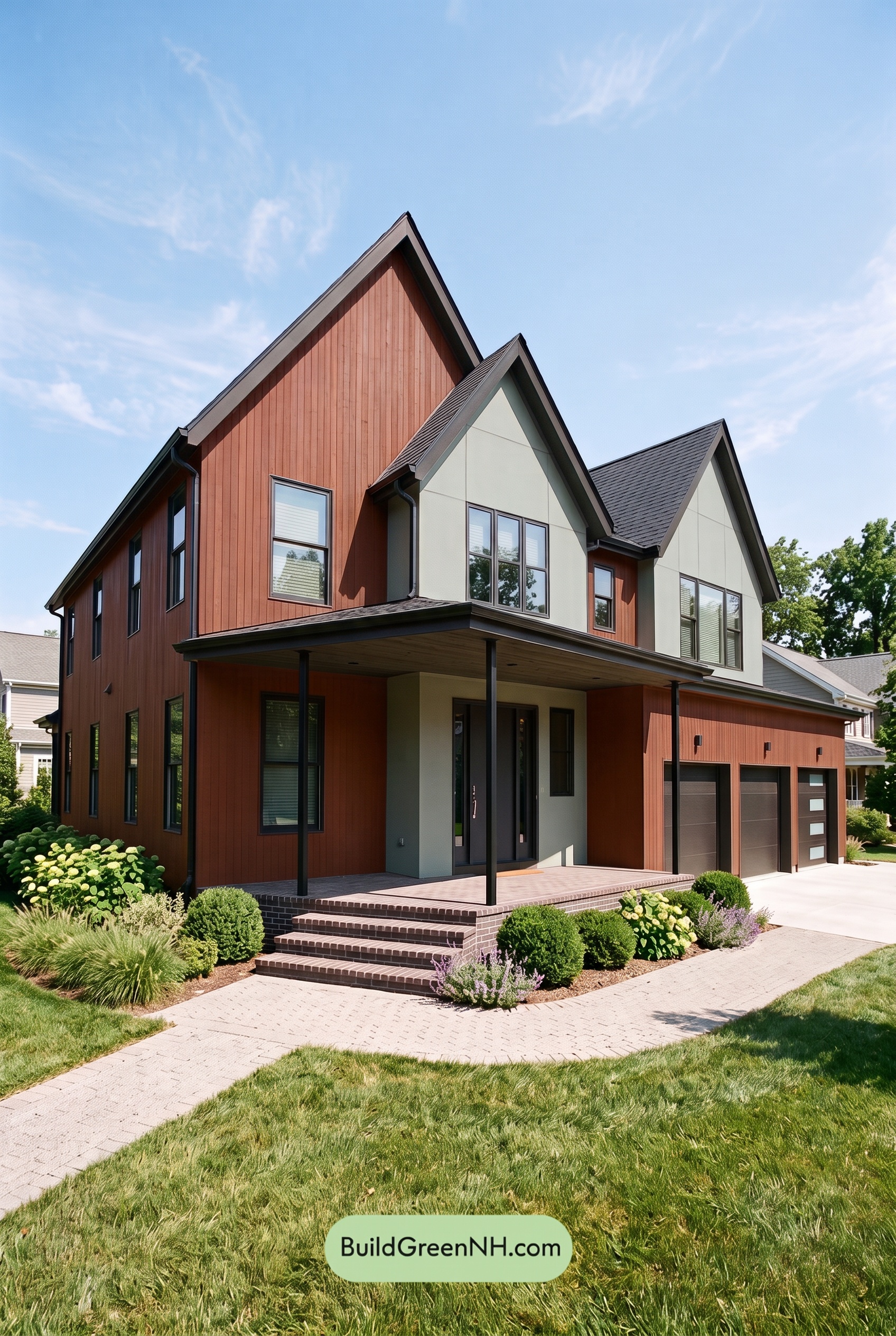 Earthy Green House Exterior Color Scheme: Brown Silken Calm
 Earthy Green House Exterior Color Scheme: Green Amber Contentment
Table of Contents