Last updated on
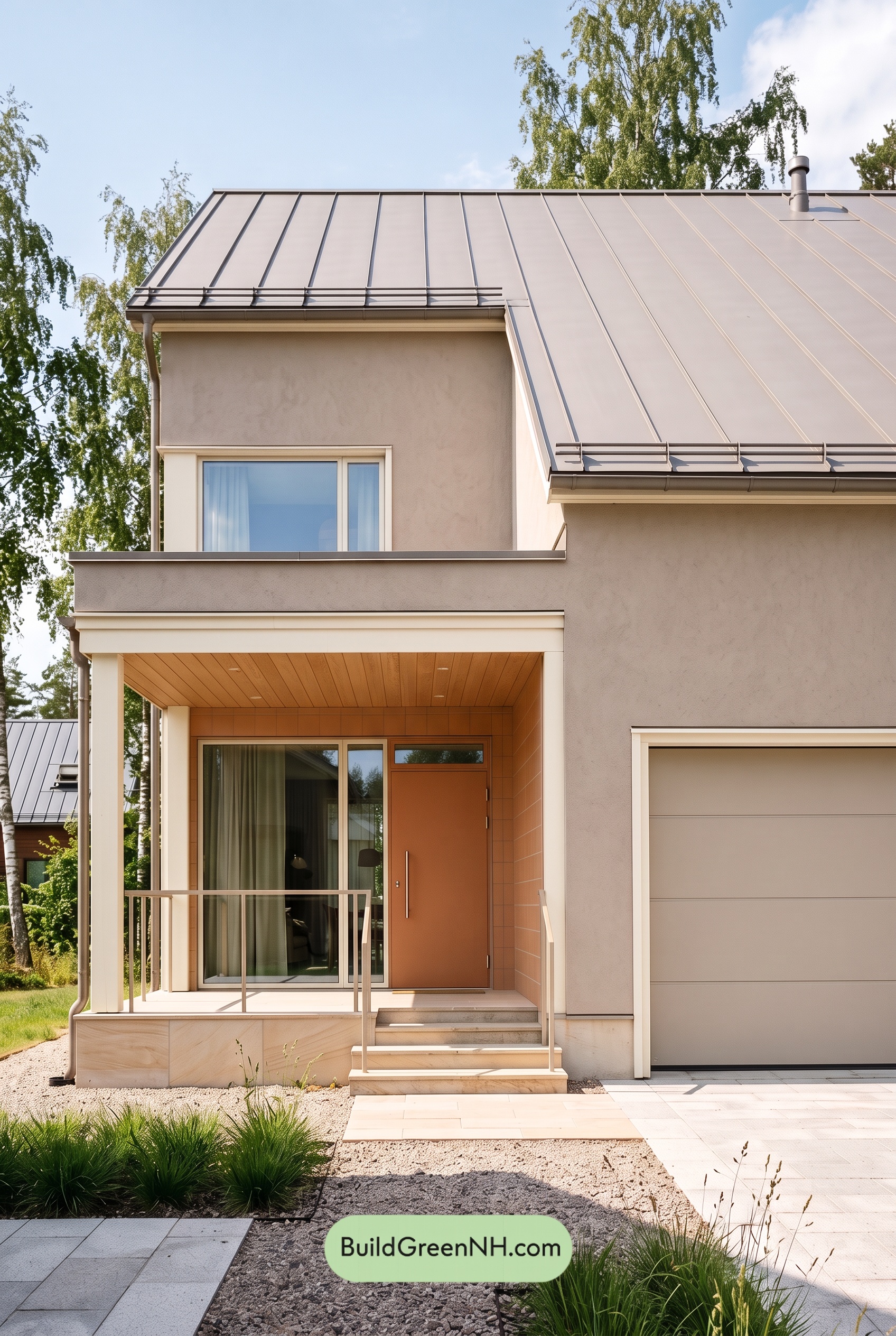

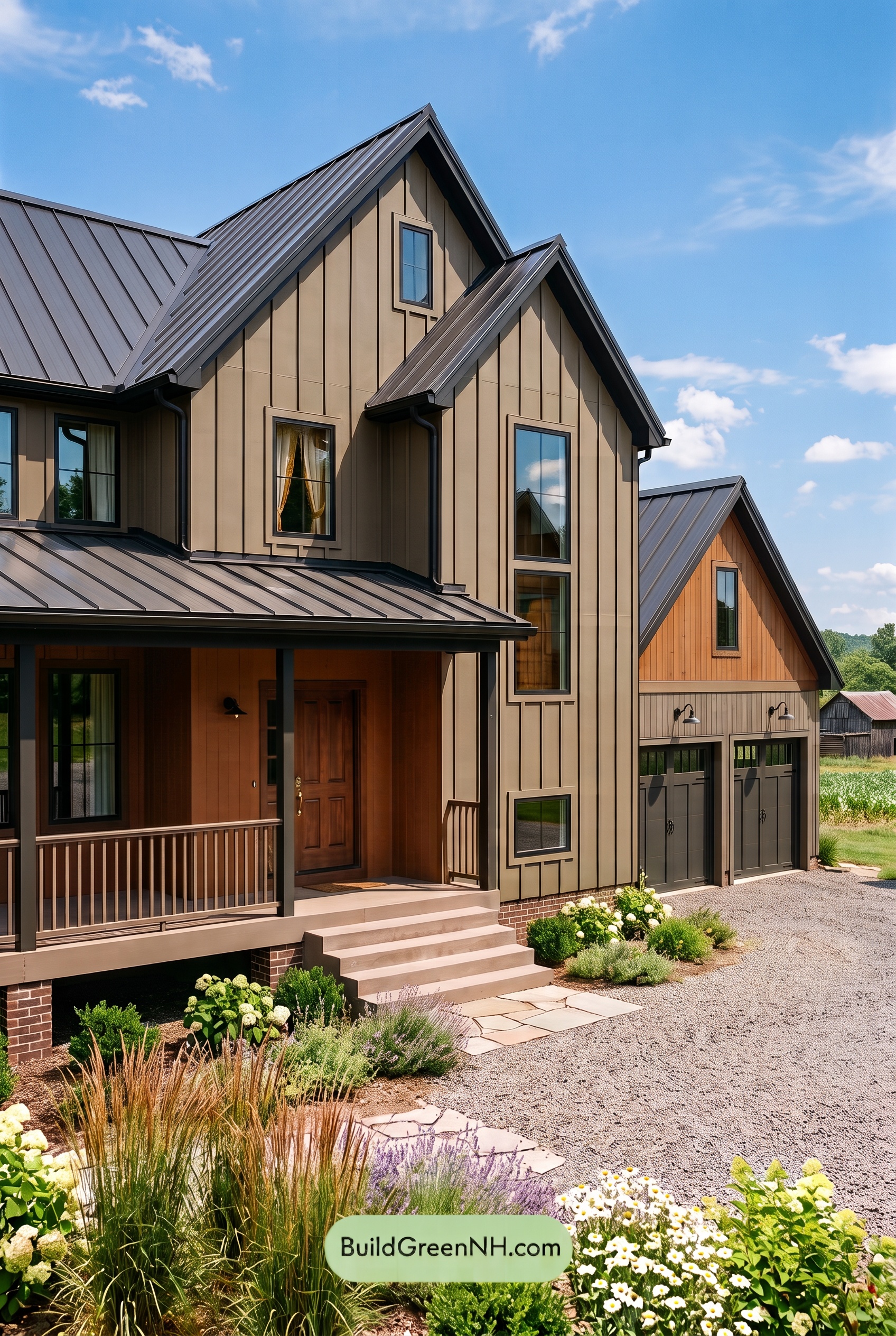
Warm beige, soft white, and earthy orange give this home a welcoming glow while keeping its clean-lined exterior calm and beautifully balanced.
A Warm Beige Foundation
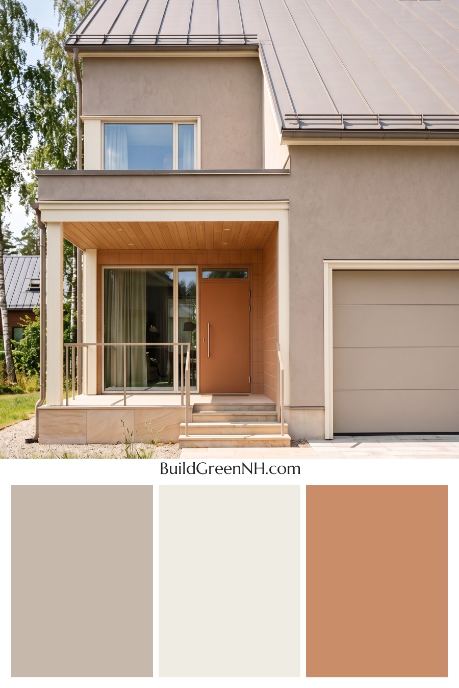
The main walls wear a muted beige with gentle gray undertones, creating a restful backdrop for the home’s angular architecture. It has enough warmth to feel inviting without looking overly golden. Across the broad wall surfaces, this quiet shade lets the roofline, recessed porch, and tall windows stand out naturally.
The garage door stays within the same beige family, helping its large surface blend into the facade rather than compete with the entrance. That subtle repetition makes the exterior feel cohesive, even with several distinct architectural sections.
Soft White Defines the Details
Warm white trim gives the windows, garage opening, and porch edges a clean outline. The window frames continue that light touch, while the white columns brighten the sheltered entry and emphasize its height.
This is gentle contrast rather than a sharp divide. Because the white has a soft warmth, it sits comfortably beside the beige walls. The pale beige railings offer an even quieter transition, defining the porch and steps without adding another strong visual element.
Earthy Orange Makes the Entrance Shine
The front door is the focal point, finished in a deep, muted orange with brown undertones. It brings richness to the entrance without feeling loud. Around it, the accent walls introduce a slightly lighter earthy orange, giving the recessed porch a warm, enveloping character.
Overhead, the porch ceiling carries a golden-orange tone that connects with the door and surrounding walls. Extending this warmth across several surfaces makes the entry feel thoughtfully composed—not simply decorated with a contrasting door. The white columns frame the whole arrangement beautifully.
A Roof That Ties Everything Together
The standing-seam roof reads as a soft, warm gray with taupe undertones. Its restrained shade complements the gray notes in the beige walls, while the darker seams add definition above the lighter facade. Matching gray-brown roof-edge details keep the upper portion visually consistent.
The overall mood is modern, relaxed, and approachable. Beige provides continuity, white brings clarity, and orange supplies the welcoming spark. With pale beige paving and surrounding greenery completing the setting, the house feels connected to its landscape while giving the front entrance just the right amount of attention.
Next, see how this color scheme looks under different lighting simulations throughout the day.
Overcast
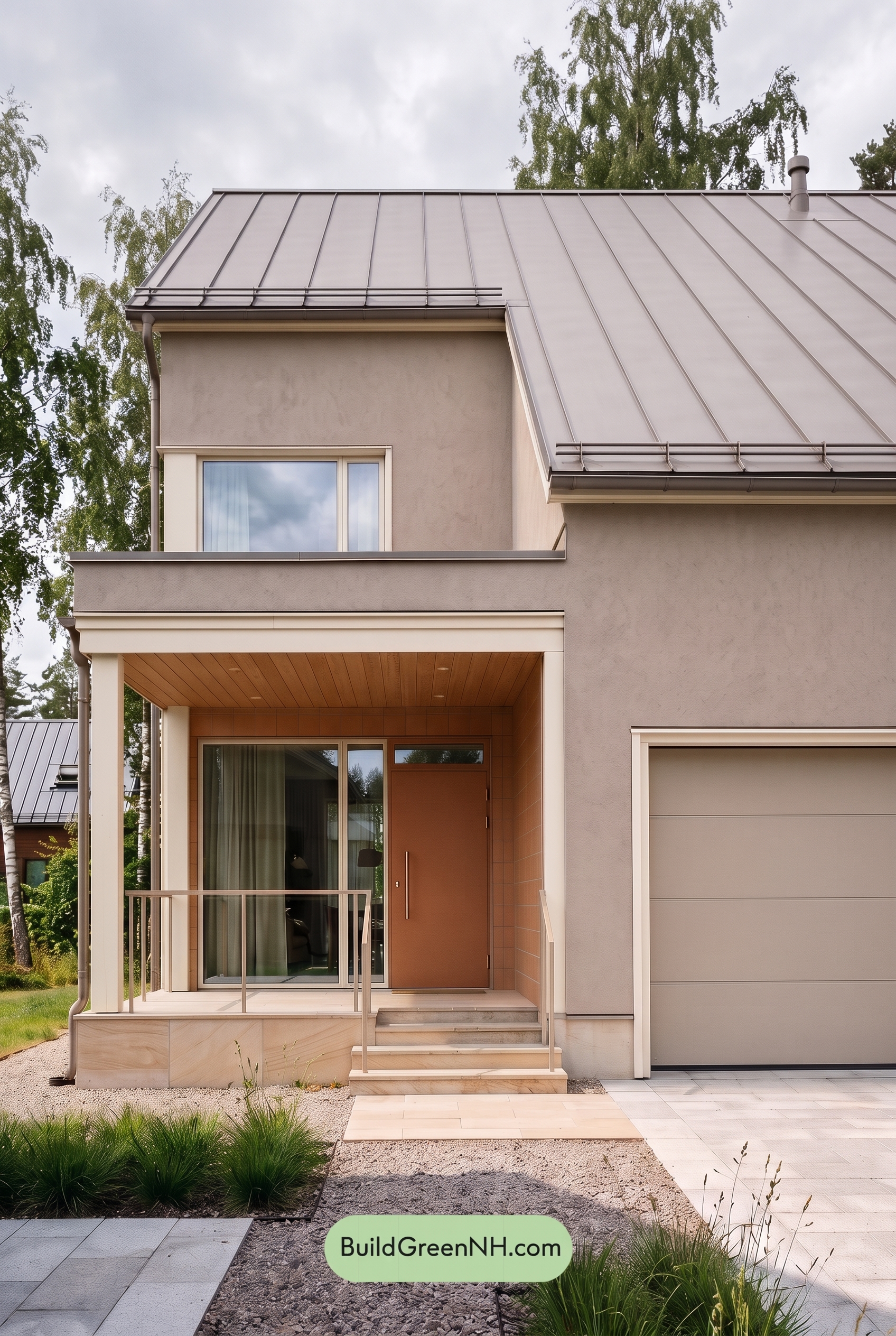
Under overcast skies, the beige shades appear more muted and slightly grayer than in neutral daylight, with their golden warmth gently dialed back. The white shades lose some brightness and feel softer against the surrounding neutrals. Diffused light softens shadows beneath the roofline and around the porch, reducing sharp contrasts and giving the exterior a calm, cohesive mood.
The orange shades around the entrance look earthier and less vivid, trading some sunny warmth for a subdued richness. In the sheltered entry, these shades appear deeper while still providing a welcoming contrast to the pale neutrals. Compared with neutral daylight, the overall palette feels quieter and more understated, with gentle color transitions rather than crisp highlights.
Golden Hour
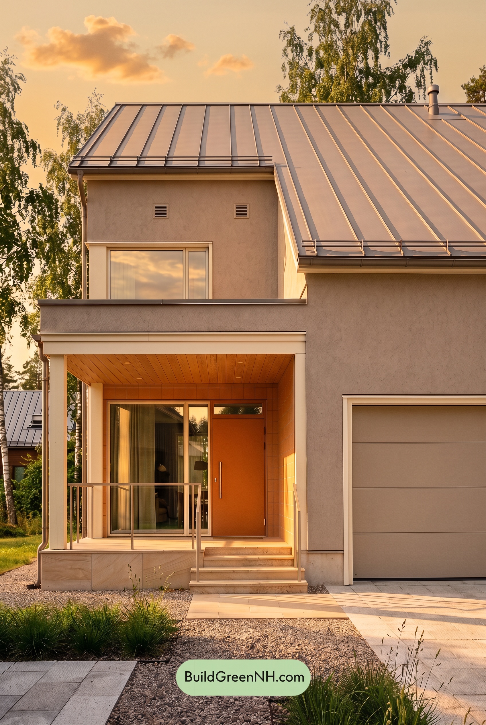
Golden Hour gives the beige walls a warmer, richer appearance, drawing out soft yellow and peach undertones that would feel more subdued in neutral daylight. The whites take on a creamy glow rather than looking crisp, softening their contrast with the surrounding neutrals. Around the entrance, the orange shades appear more saturated and luminous, bringing extra warmth to the recessed space.
Long shadows beneath the roofline and across the porch deepen the shaded neutrals, making sunlit areas feel brighter by comparison. This stronger light-and-shadow contrast adds dimension even as the warmer palette feels more unified. Compared with the cleaner, more restrained impression of neutral daylight, the house feels softer, cozier, and especially inviting.
Shade
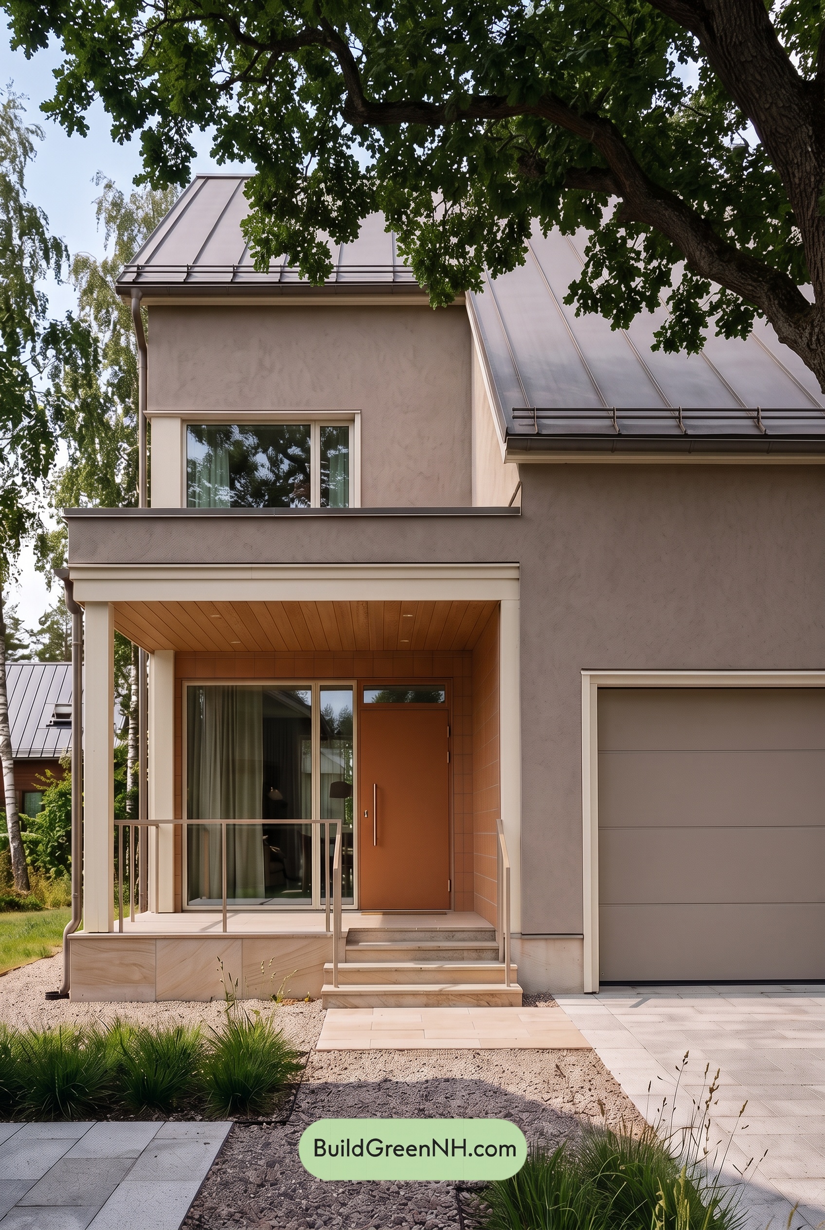
Under the tree canopy’s shade, the beige shades appear deeper and slightly grayer than they would in neutral daylight, with their warmth softened and saturation more subdued. The white shades lose some brightness, creating gentler contrast with the surrounding neutrals. Darker bands beneath the eaves and porch add depth without making the palette feel stark.
The orange shades around the entrance become earthier and less vivid in shade, yet still feel warmly inviting against the cooler-looking beige. Deeper porch shadows give these accents a richer, more sheltered character. Compared with neutral daylight’s clearer color separation, the shaded palette feels quieter, softer, and more intimate.
Nighttime
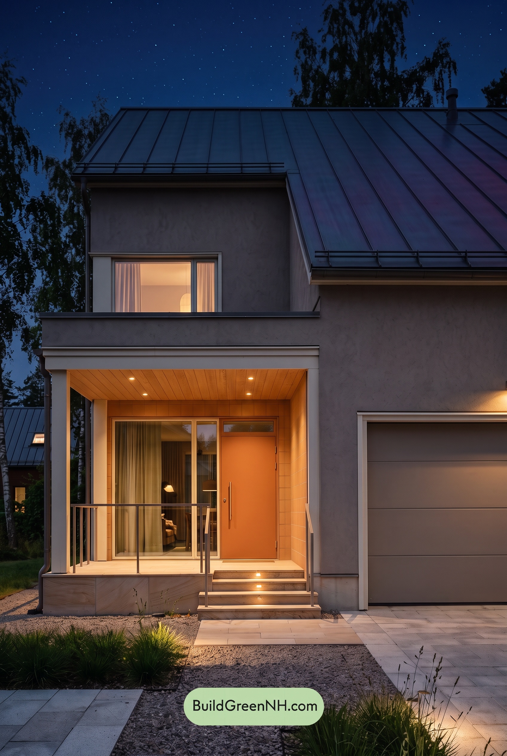
Compared with neutral daylight, nighttime makes the warm neutrals look deeper, grayer, and less saturated, especially across the upper walls and garage. Cool ambient light softens their warmth, while shadows beneath the roofline deepen the contrast. The pale trim shifts toward cool gray in darker areas but takes on a soft, creamy warmth near the porch lights.
Around the entrance, warm lighting makes the orange shades appear richer and more saturated against the subdued neutrals. Pools of light create stronger contrasts than daylight’s more even illumination, drawing attention to the doorway while the shadowed walls recede. The result is a mood that feels intimate and welcoming, with a little nighttime drama.
Pin these for later:
Want More?
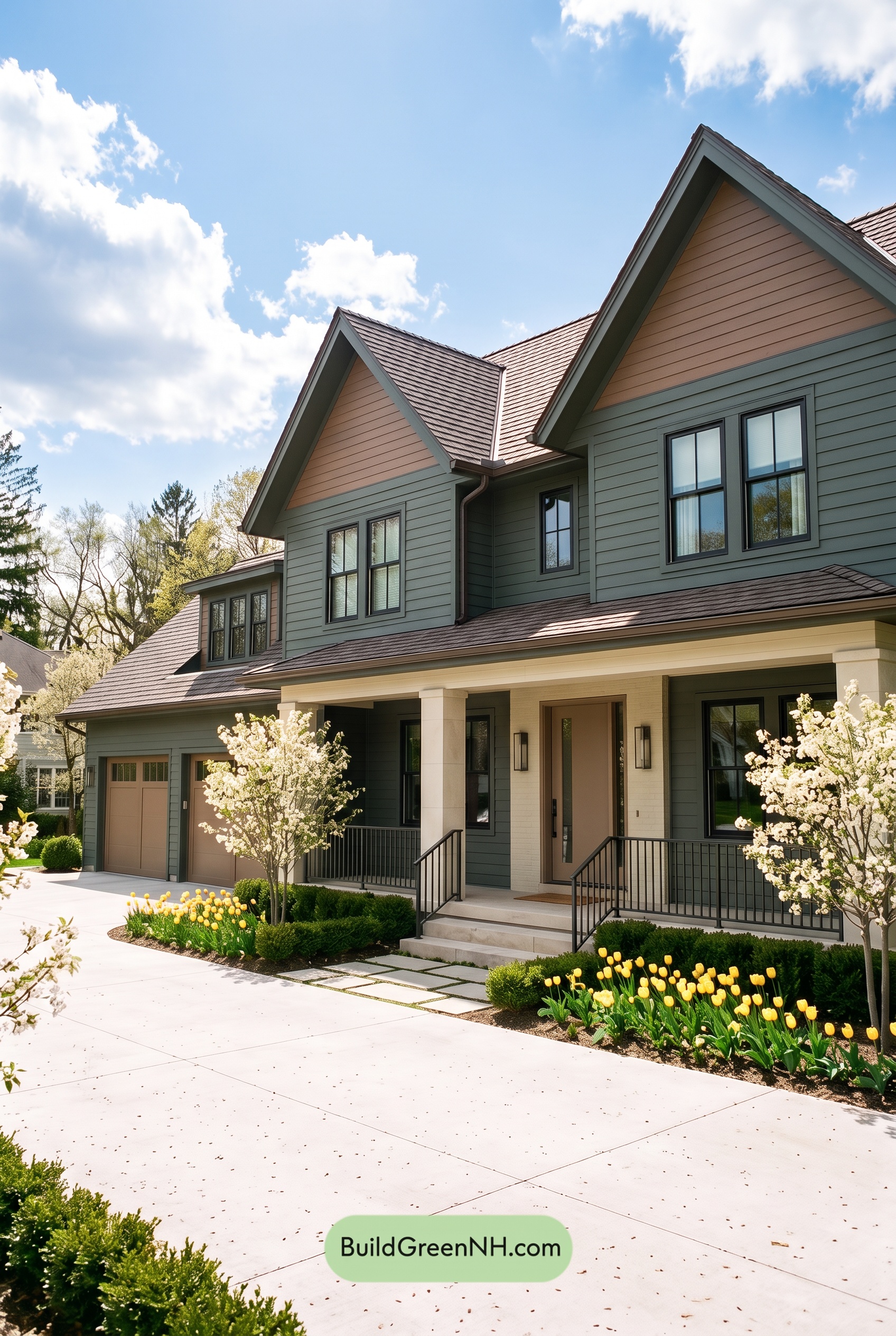 Earthy Green House Exterior Color Scheme: Brown Green Comfort
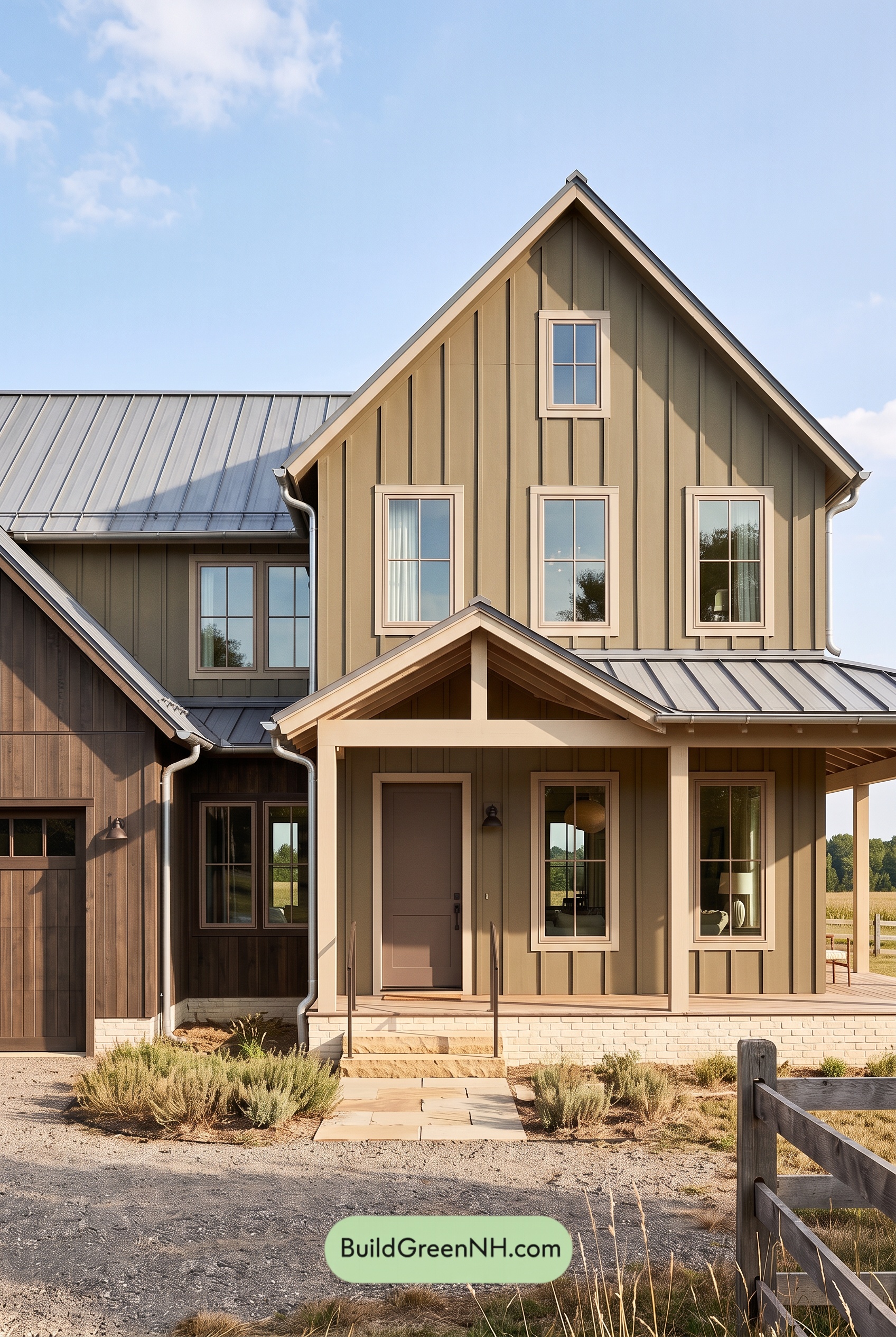 Earthy Green House Exterior Color Scheme: Green and Beige Sanctuary
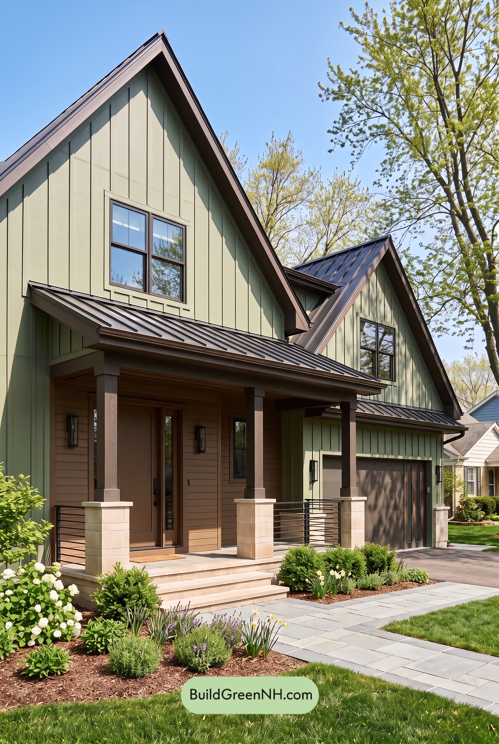 Earthy Green House Exterior Color Scheme: Green Velvet Assurance
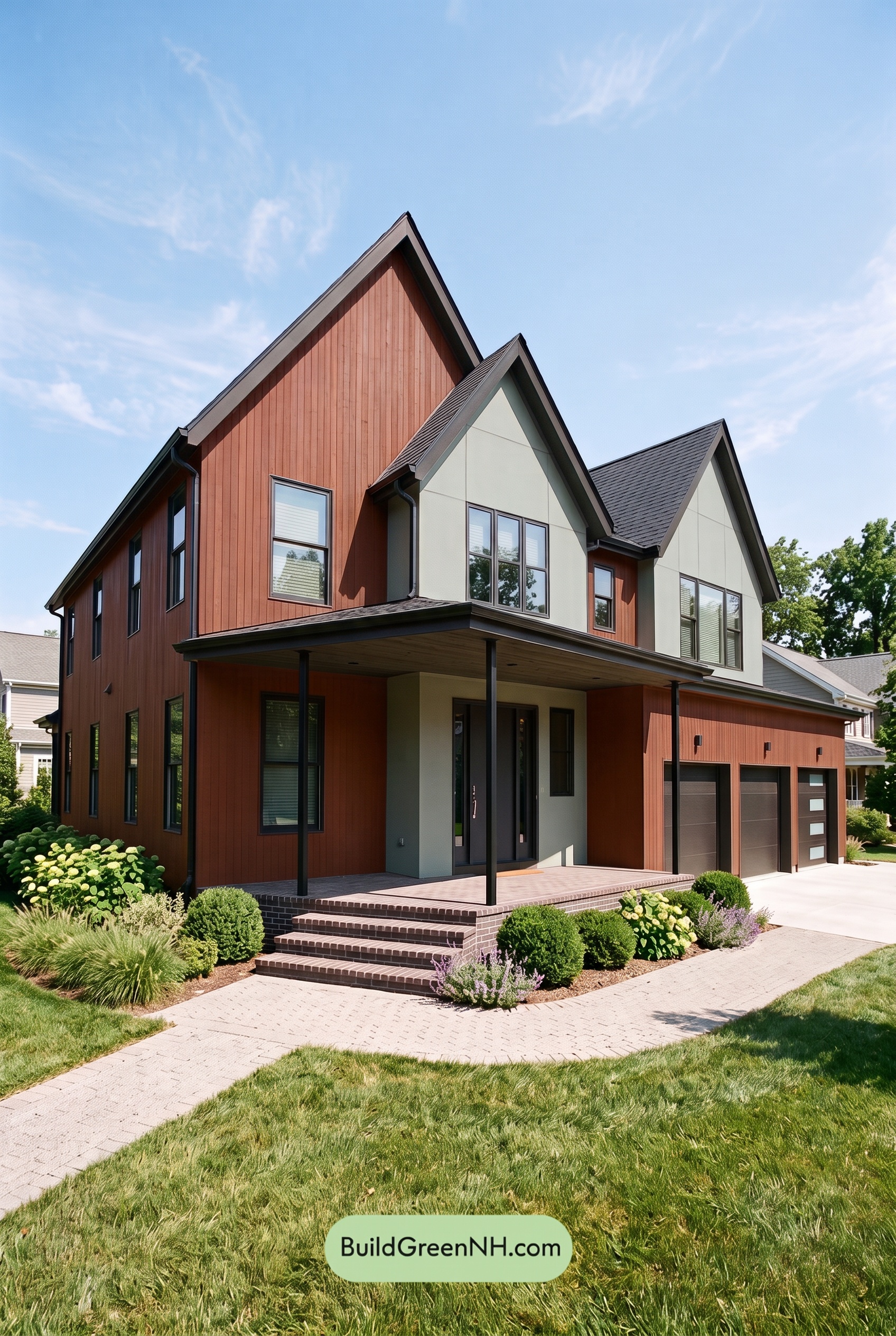 Earthy Green House Exterior Color Scheme: Brown Silken Calm
 Earthy Green House Exterior Color Scheme: Green Amber Contentment
Table of Contents