Last updated on
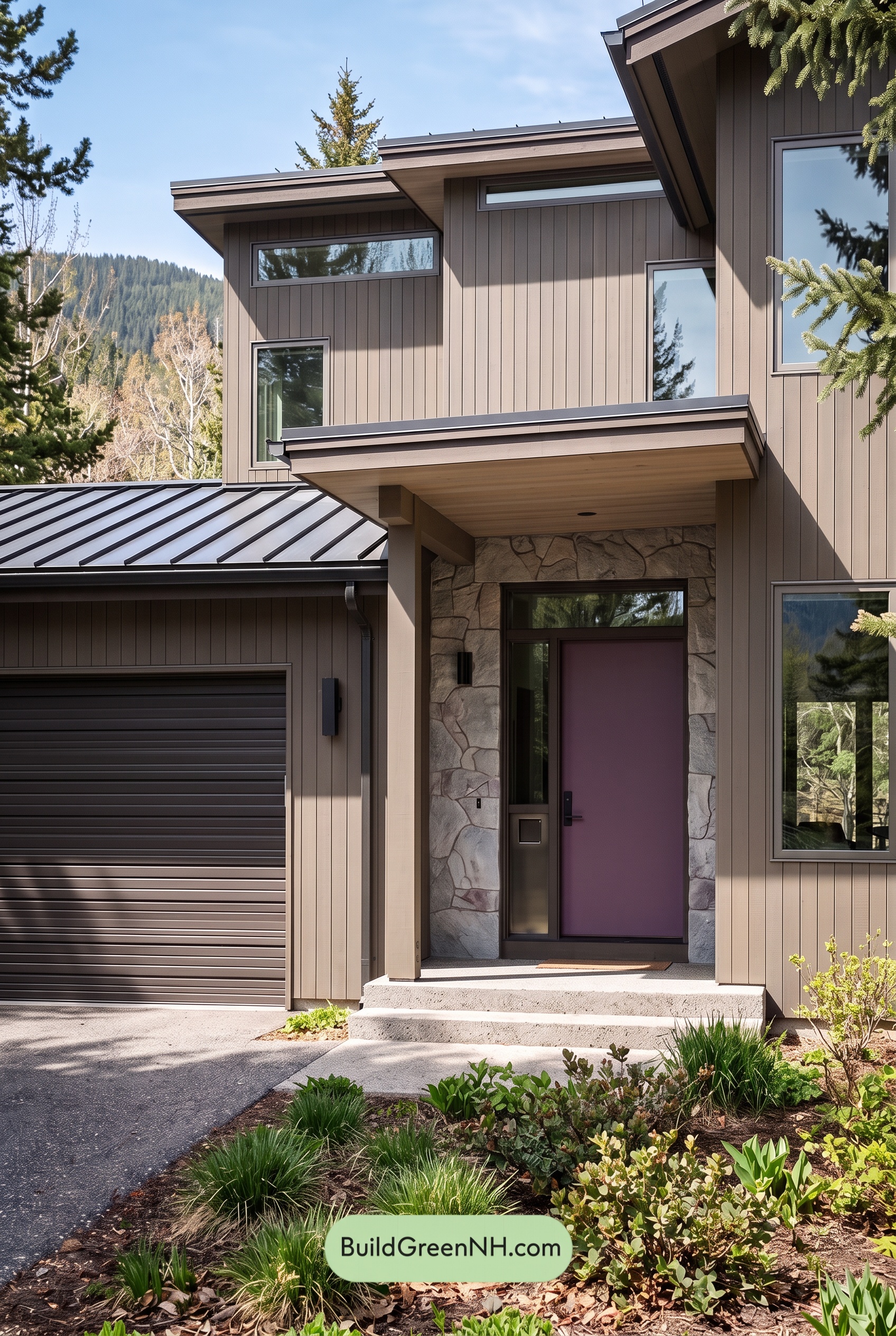

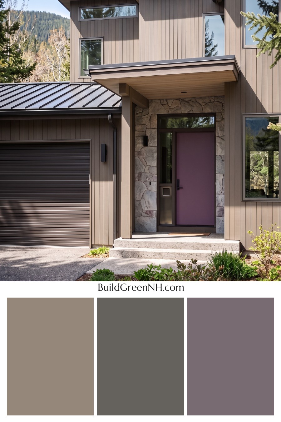
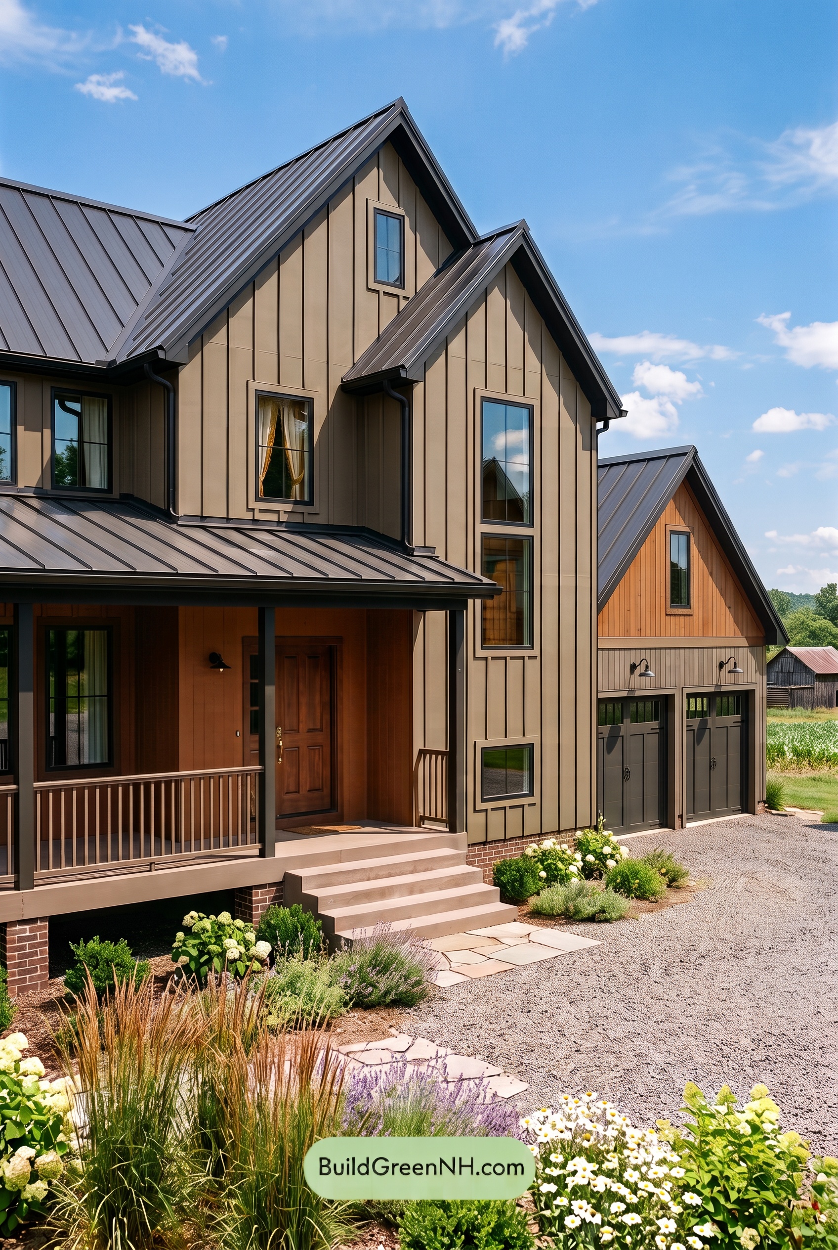
Warm beige, layered grays, and a softly purple-tinged entry give this modern exterior a welcoming balance of earthy comfort and crisp architectural definition.
Warm Beige Softens the Modern Lines
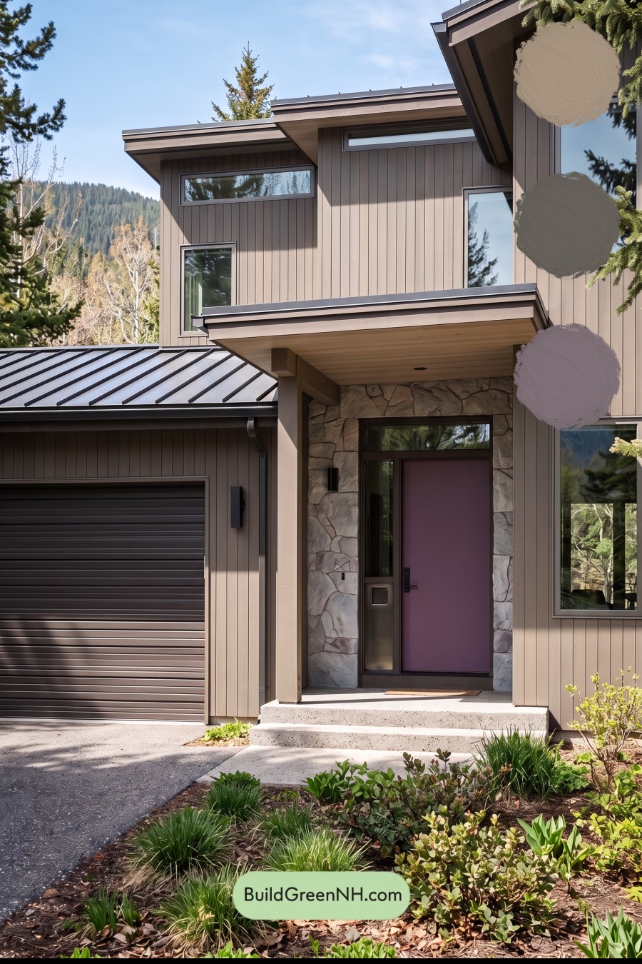
The vertical siding wears a medium beige with taupe undertones, bringing warmth to the home’s angular silhouette. It feels grounded rather than stark, especially against the surrounding greens. Sunlight draws out the warmer beige notes, while the shaded areas take on a deeper, grayer appearance.
Matching beige columns carry that warmth down to the entrance. The sheltered porch ceiling continues the softer palette overhead, making the entry feel inviting beneath its broad, clean-lined canopy.
Layered Grays Give the Exterior Definition
Gray trim outlines the windows and architectural edges without creating a harsh contrast. These shades sit close enough to the siding’s taupe undertones to feel connected, yet provide enough depth to emphasize the tall windows and stepped rooflines.
The garage door introduces a deeper warm gray with subtle brown undertones. Its horizontal panels balance the vertical siding, while its darker shade keeps the broad surface from competing with the entrance. Dark gray gutters and roof edging repeat that depth across the facade.
Above, the standing-seam roof shifts between charcoal gray and lighter silvery gray as it catches the sun. That variation adds interest while staying comfortably within the restrained palette.
A Quietly Distinctive Entrance
The front door adds a muted gray-purple accent—a gentle departure from the surrounding neutrals. Its subdued depth gives the entrance personality without overwhelming the beige siding or gray framing. Near-black hardware and wall lights add small, crisp finishing touches.
Around the doorway, the stonework brings together pale gray, warm beige, and deeper taupe shades. These natural variations bridge the warmer walls and darker accents, giving the entry texture as well as color.
Why the Palette Feels So Cohesive
This scheme succeeds through shared undertones and measured contrast. Beige supplies warmth, gray sharpens the architecture, and the restrained purple undertone at the door creates a focal point. Nothing feels isolated: each shade has a companion elsewhere on the exterior.
The result is modern without feeling cold—an understated, welcoming home whose earthy neutrals sit beautifully beside the surrounding greenery.
Next, see how this color scheme looks under different lighting simulations throughout the day.
Overcast
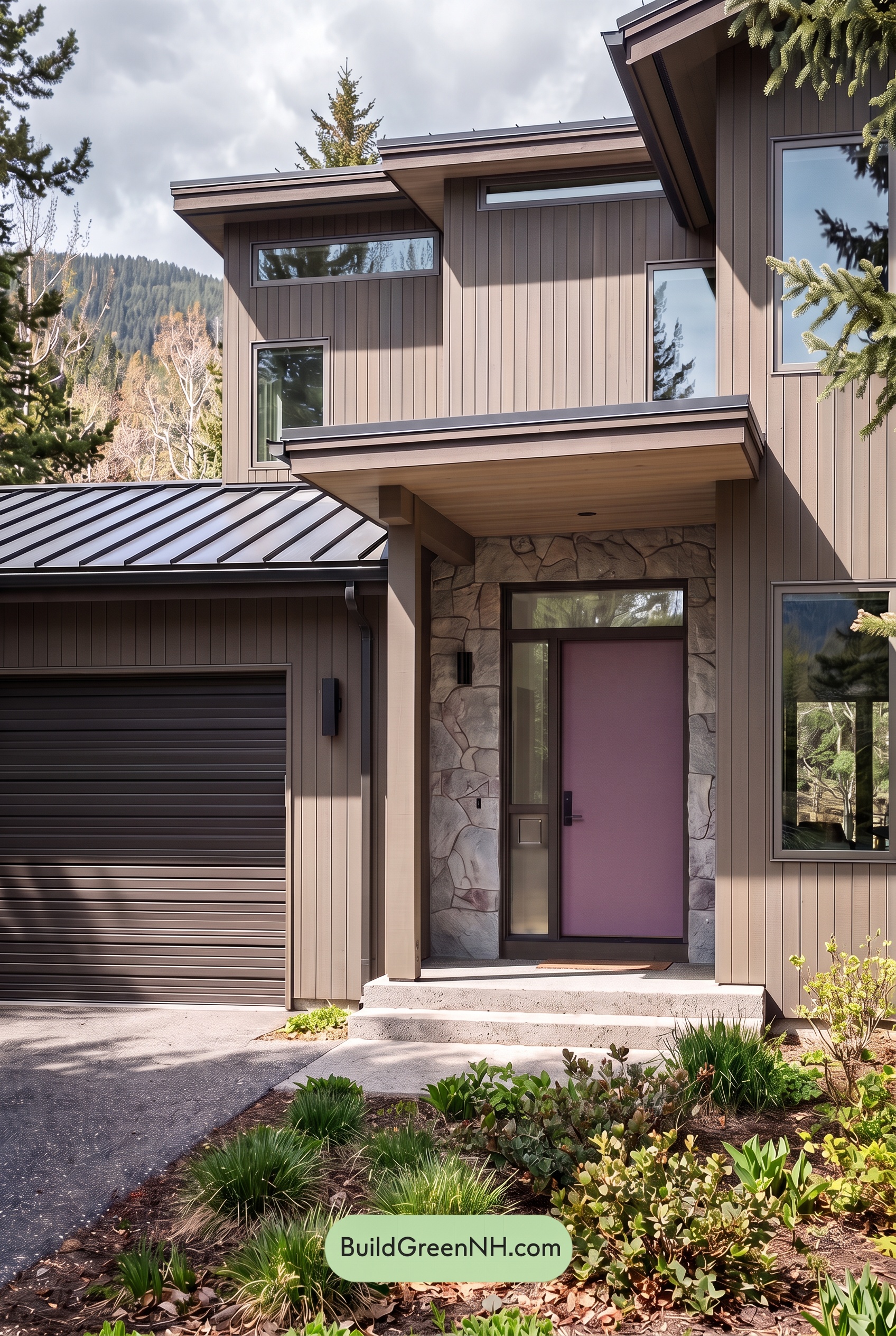
Under overcast skies, the warm beige shades would feel softer and less golden than in neutral daylight, with their subtle gray undertones becoming more noticeable. Saturation would appear gently muted, while the deeper gray shades could read cooler and more subdued, giving the exterior a quieter, more unified palette.
Cloud-filtered light would soften the strong shadows beneath the rooflines and around the entry, reducing the contrast between bright and shaded surfaces. The darker grays would still provide definition against the lighter beige, but with less dramatic separation. The overall mood shifts from crisp and sunlit to calm, understated, and inviting.
Golden Hour
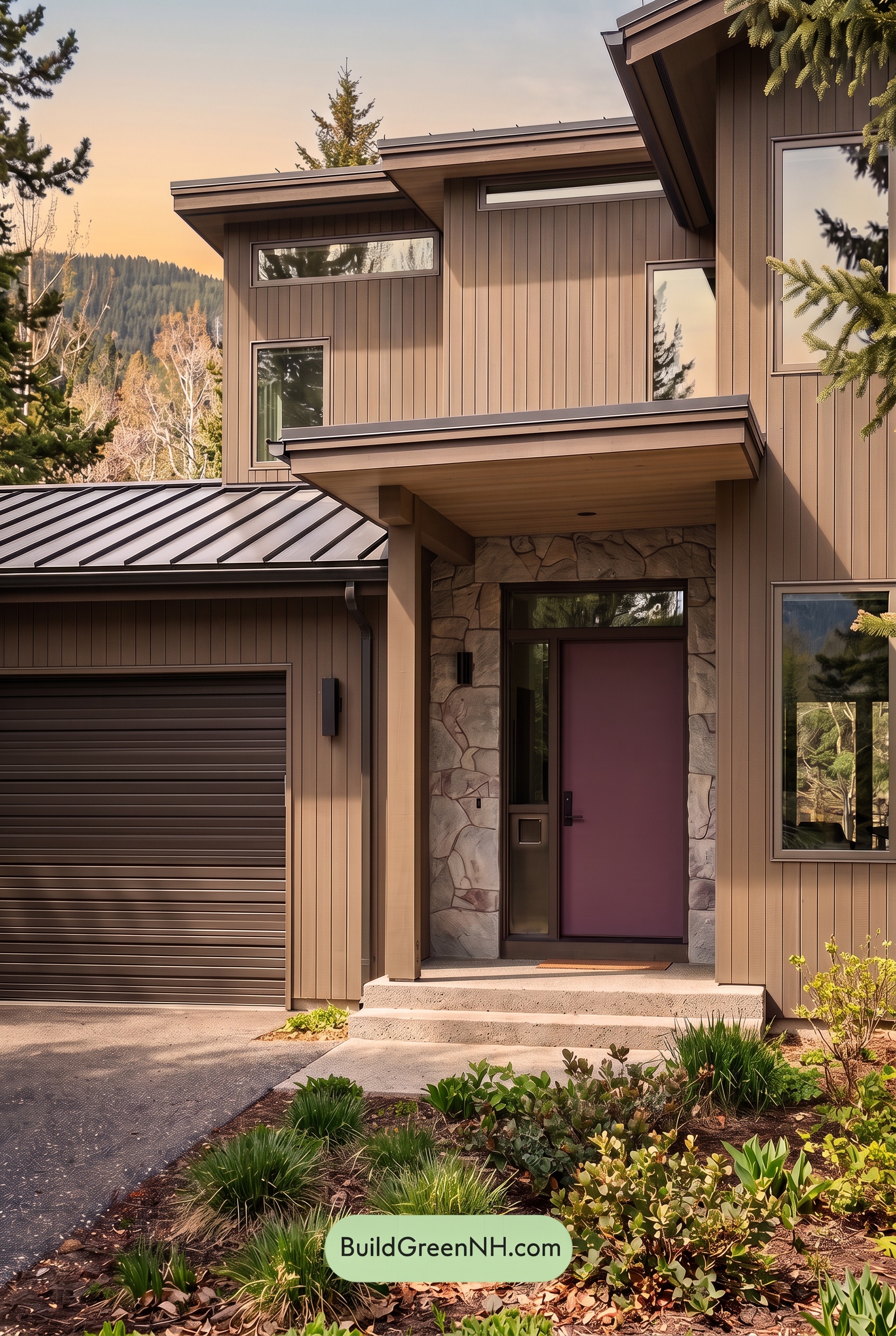
Golden Hour makes the warm neutrals on this exterior look richer and more saturated, bringing out soft yellow and peach undertones that feel quieter in neutral daylight. The darker neutral shades pick up a gentle brown warmth, making the palette feel more connected and inviting rather than crisp and restrained.
Long shadows beneath the rooflines and around the recessed entry deepen the shaded colors, while sunlit sections glow softly. This strengthens the light-and-dark contrast across the siding, even as the shared warmth softens the contrast between color families. Compared with neutral daylight, the overall mood becomes cozier and more dramatic, with greater depth around the windows and entrance.
Shade
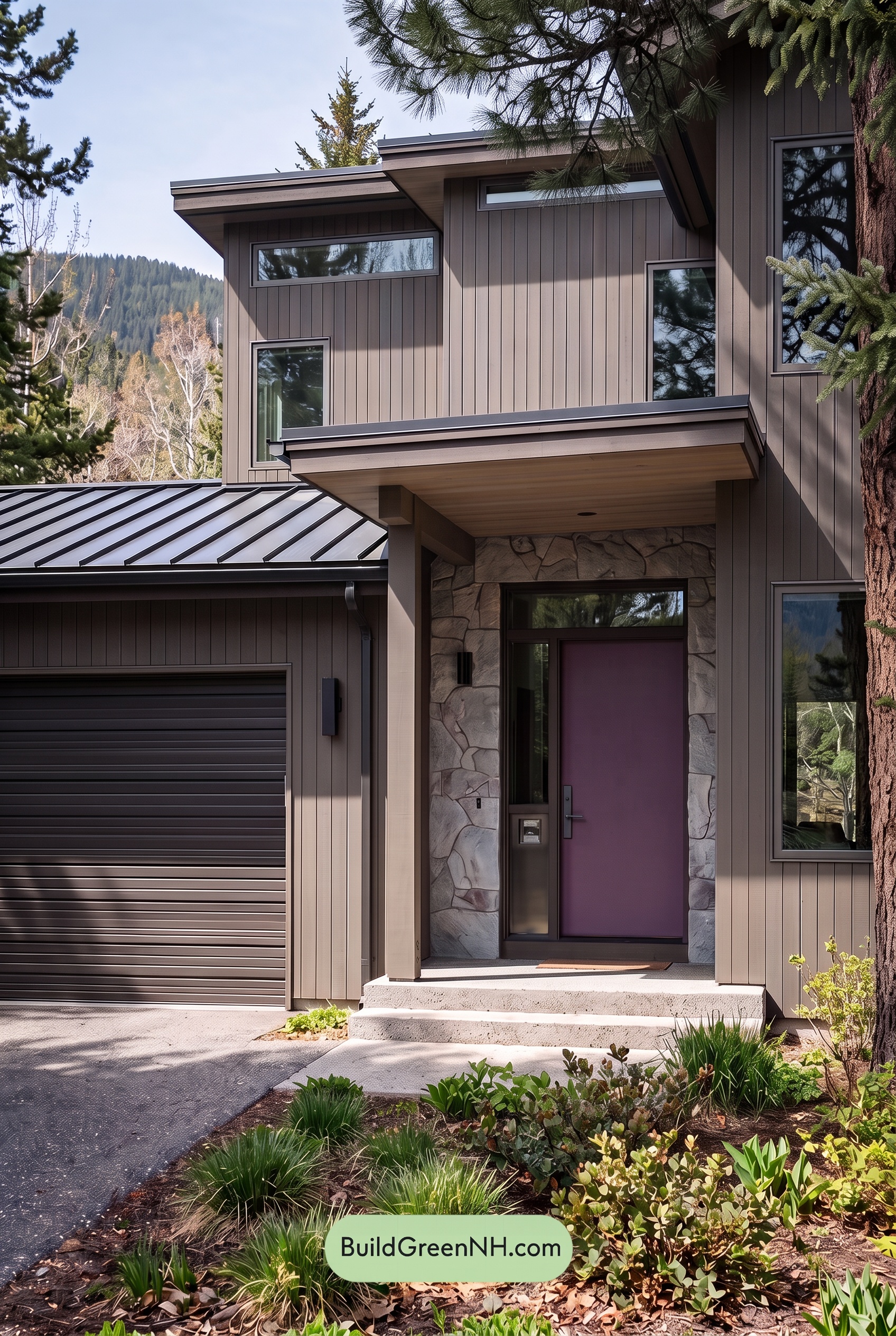
In shade, the beige siding appears deeper and less golden than it would in neutral daylight. Its warmth softens and its saturation feels more muted, allowing cooler gray undertones to become more noticeable. The gray trim and window frames also look darker, giving the exterior a quieter, more restrained character.
Beneath the broad eaves and around the recessed entry, deeper shadows make the gray shades feel especially rich. Although the shaded beige and gray draw closer together in tone, these darker pockets add localized contrast against the lighter walls and columns. The overall mood shifts from bright and welcoming in neutral daylight to calm, sheltered, and subtly dramatic.
Nighttime
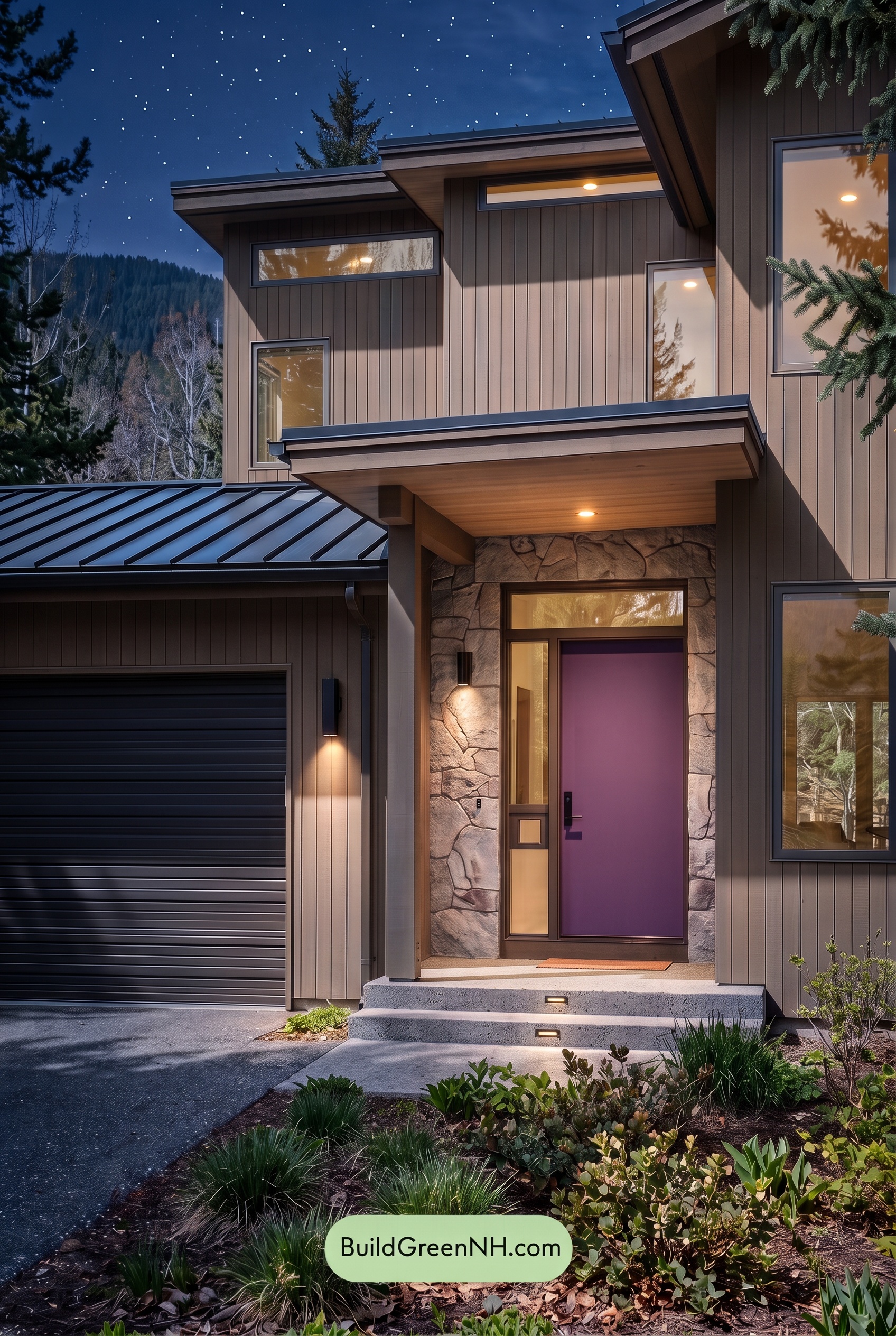
At night, the beige shades appear deeper and less saturated than they would in neutral daylight. Warm lighting near the entrance brings out soft golden undertones, while unlit areas shift toward cooler, grayer neutrals. The gray shades around the windows and garage deepen toward charcoal, giving the exterior a more dramatic outline.
Shadows beneath the broad eaves soften subtle color differences but strengthen the contrast between illuminated surfaces and dark recesses. Where daylight would reveal the palette more evenly, nighttime creates pockets of warmth against a subdued backdrop. The result feels intimate and welcoming, with the softly glowing entrance becoming the natural focal point.
Pin these for later:
Want More?
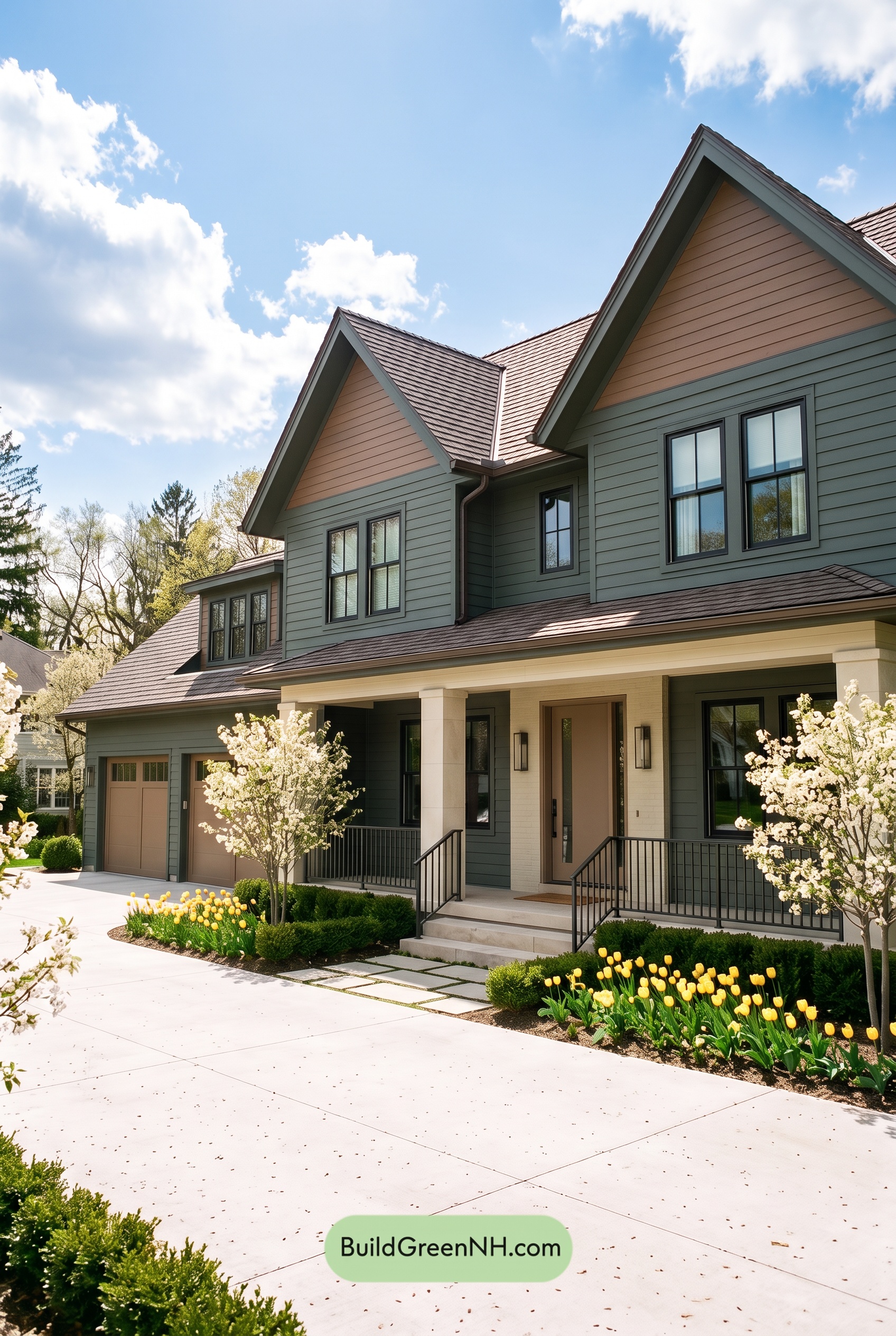 Earthy Green House Exterior Color Scheme: Brown Green Comfort
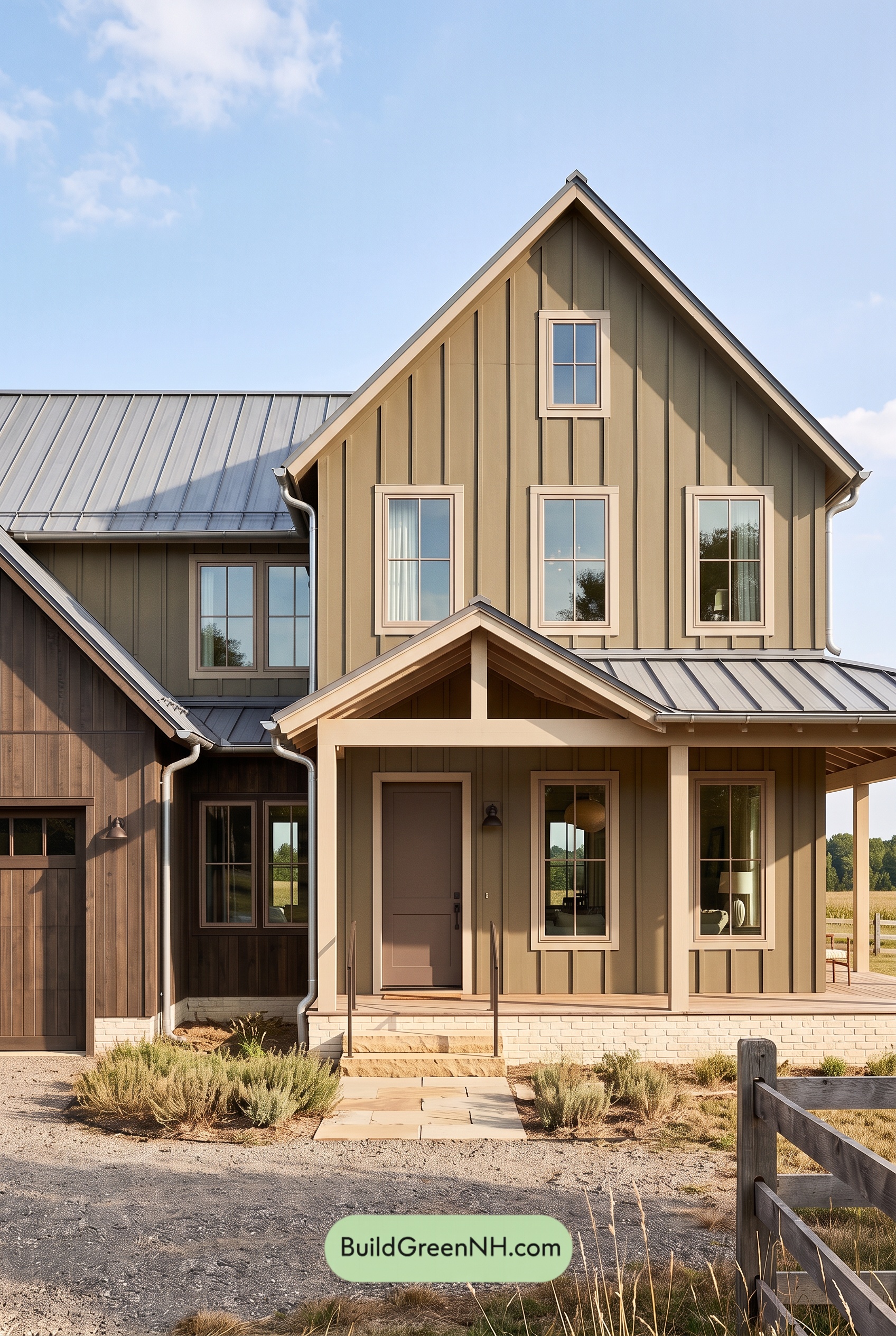 Earthy Green House Exterior Color Scheme: Green and Beige Sanctuary
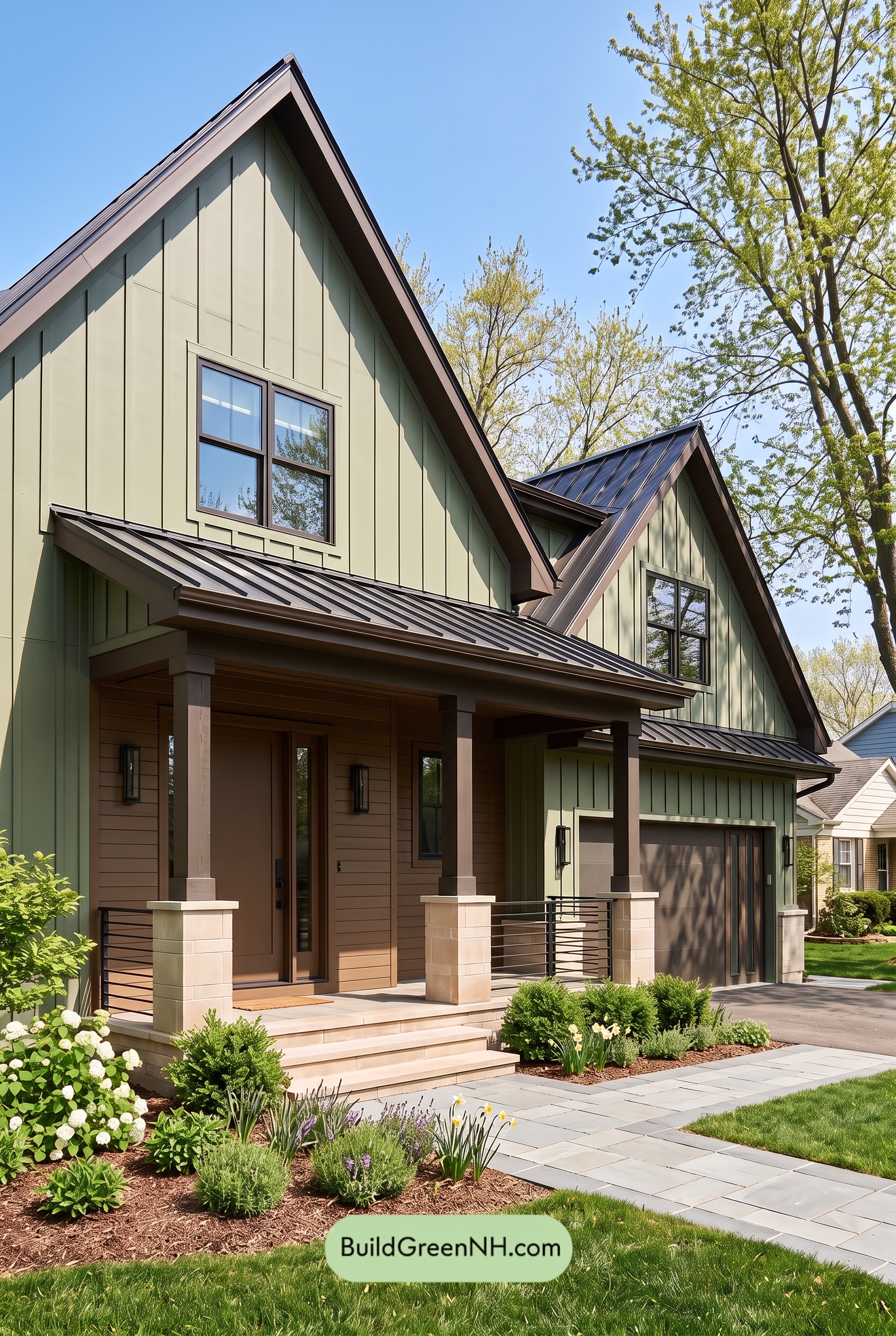 Earthy Green House Exterior Color Scheme: Green Velvet Assurance
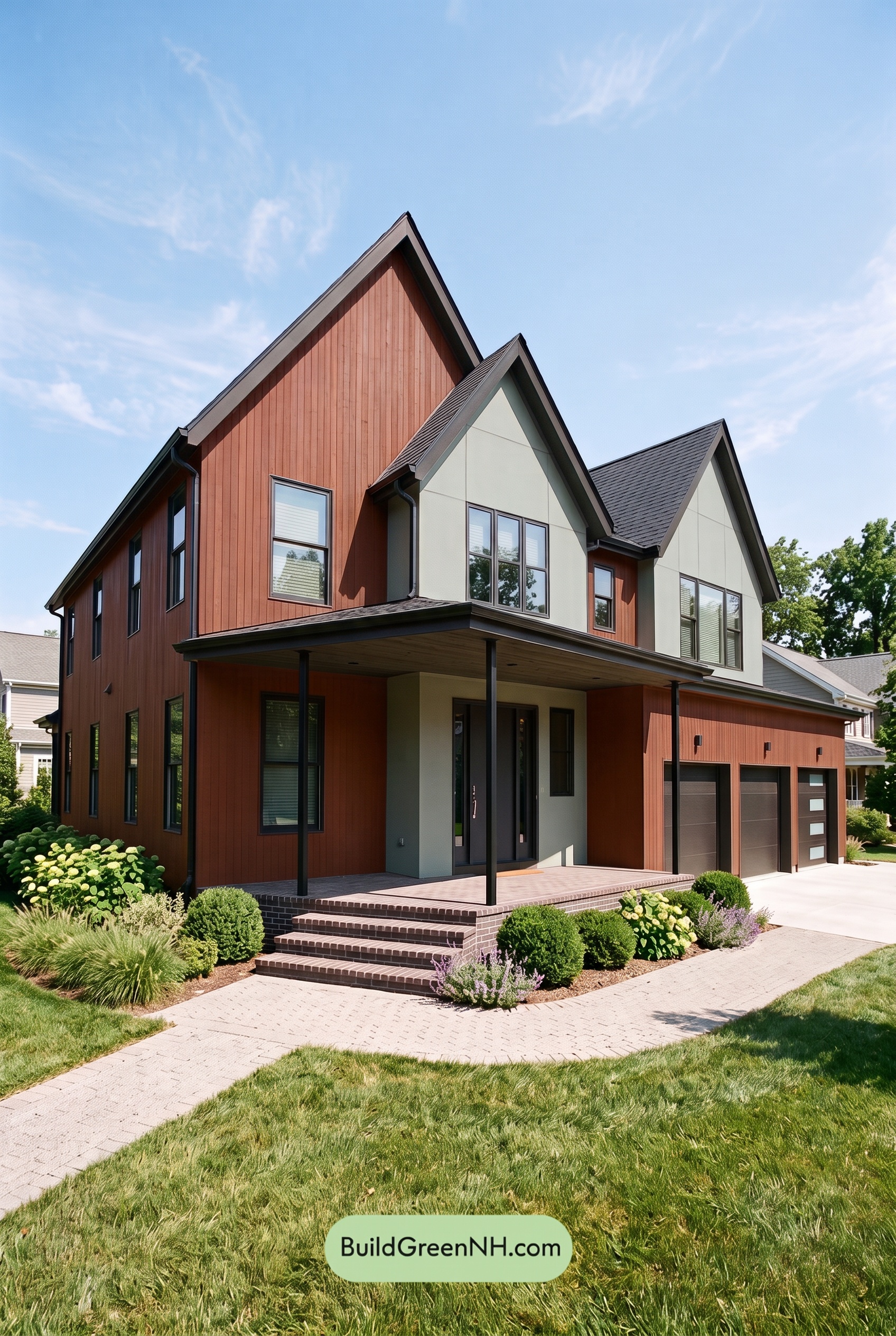 Earthy Green House Exterior Color Scheme: Brown Silken Calm
 Earthy Green House Exterior Color Scheme: Green Amber Contentment
Table of Contents