Last updated on
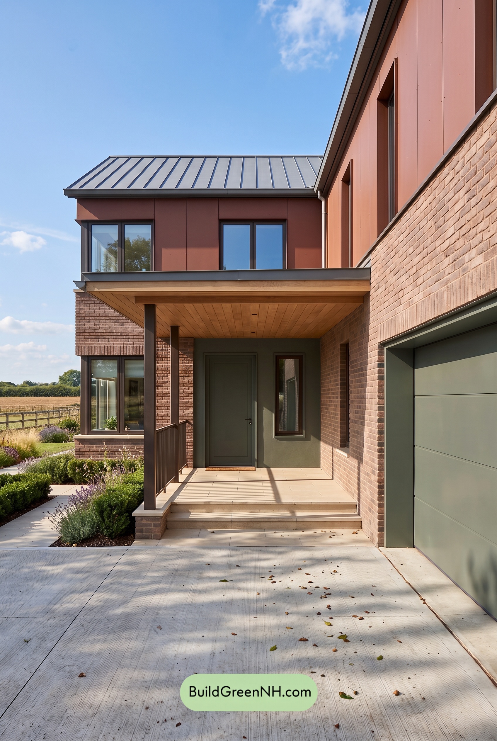

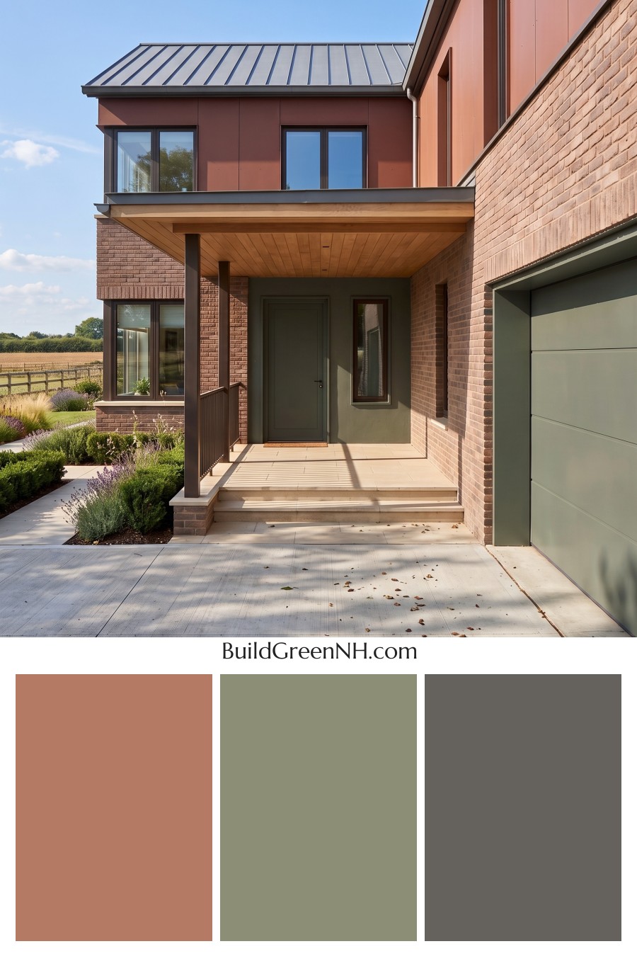
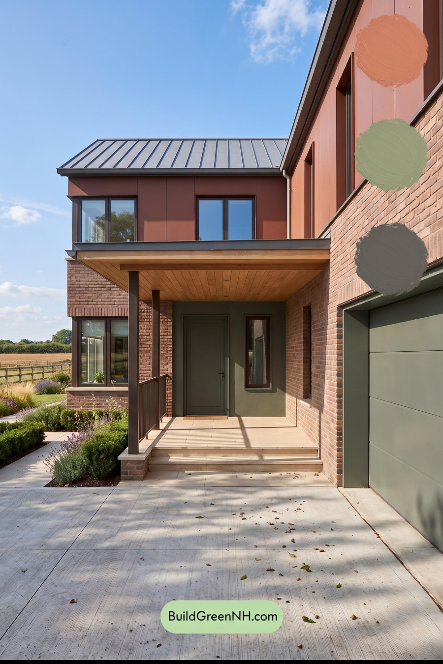
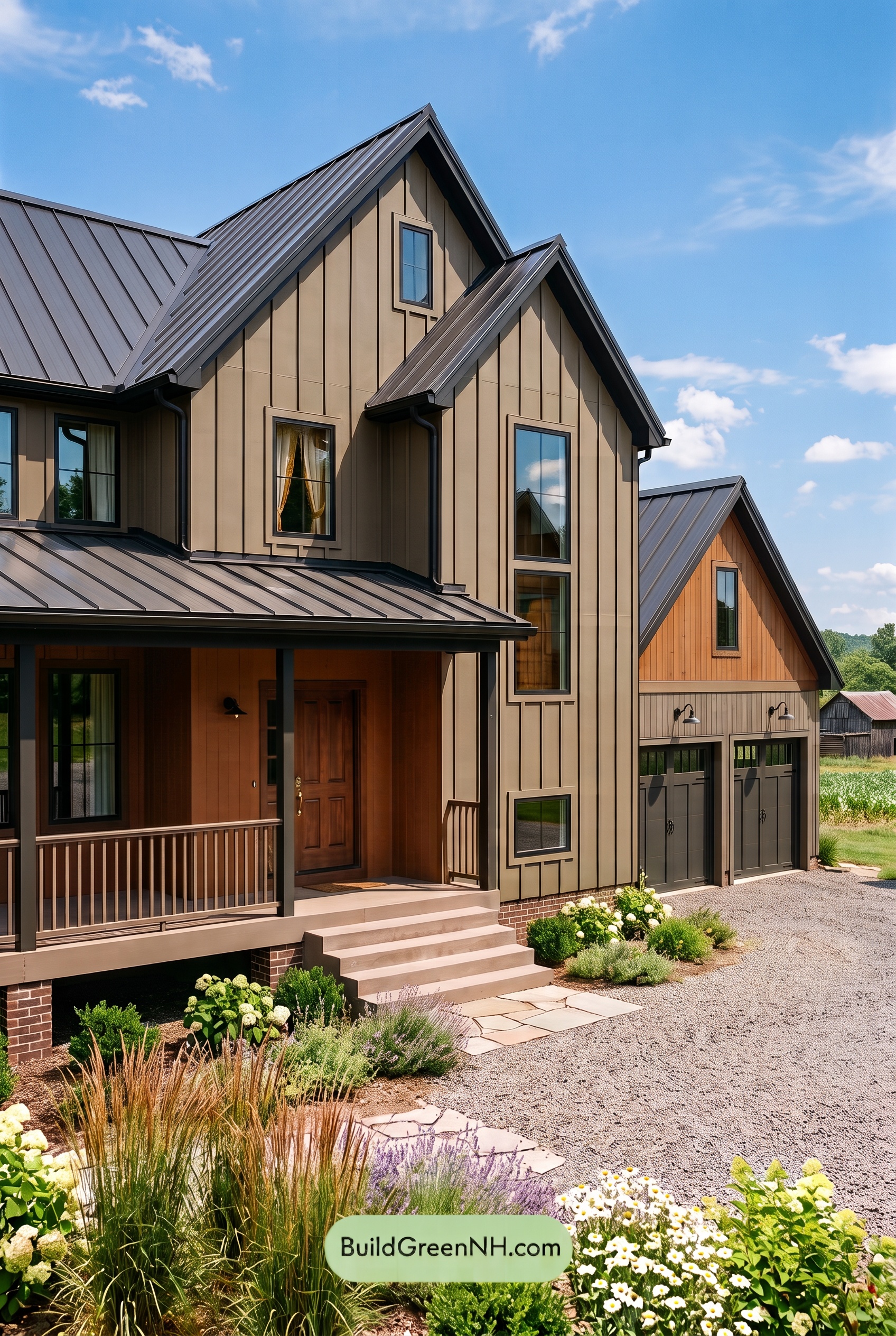
Warm, rosy beige, muted green, and deep gray give this exterior a beautiful balance of earthy comfort and crisp, contemporary style.
Warm Siding Sets an Inviting Tone
The upper siding introduces a rosy shade of beige with pronounced pink-brown undertones, giving the house warmth without overwhelming its clean architectural lines. Its broad, simple panels let the color make an impression while keeping the exterior feeling uncluttered.
Below, the brickwork carries related shades of soft brown and dusty pink. That connection helps the different materials feel cohesive rather than competing for attention. Subtle variations across the brick add texture and keep the large wall surfaces visually interesting.
Muted Green Gives the Entry a Calm Focus
A subdued gray-green wraps the recessed entrance, creating a gentle contrast with the warmer surrounding walls. The front door stays within that green family, appearing deeper beneath the porch shade. It feels welcoming, but never overly bright.
The garage door repeats a similar muted green on a much larger surface. This repetition matters: it connects the garage to the entrance and makes it feel like part of the overall design. The green also relates naturally to the planting around the house, easing the transition between architecture and garden.
Deep Gray Defines the Details
Dark gray window frames sharpen the openings against the warmer siding and brick. Related gray shades continue across the trim, porch columns, and railings, giving the exterior a consistent outline. These darker details bring definition without the starkness of a stronger contrast.
Above, the metal roof introduces a lighter, cooler gray. Its sunlit surface keeps the roof from feeling heavy, while the darker roof-edge trim connects it to the windows and porch structure below.
A Warm Welcome Beneath the Porch
The porch ceiling adds golden-brown warmth, balancing the cooler green and gray nearby. Pale beige steps and paving brighten the approach and give the shaded entrance a lighter base.
What makes this scheme work is its restraint. Warm shades provide character, muted green brings calm, and gray keeps the lines crisp. Together, they create a home that feels modern and composed, yet comfortably connected to its surroundings.
Next, see how this color scheme looks under different lighting simulations throughout the day.
Overcast
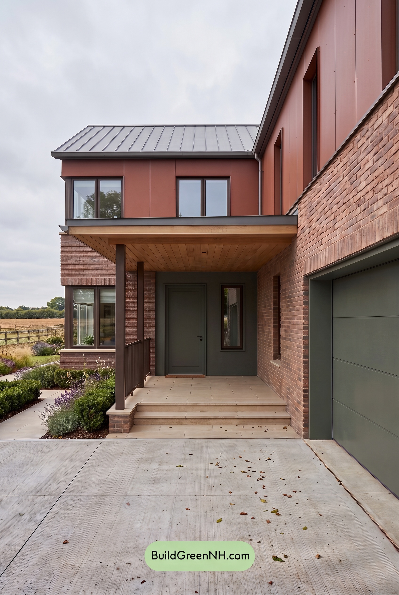
Compared with neutral daylight, overcast skies give this exterior a softer, more muted character. The warm neutrals feel less golden, while the deeper greens appear grayer and less saturated. Gray accents take on a cooler cast, bringing the palette closer together without losing the distinction between lighter and darker shades.
Diffused light softens shadow edges and reduces bright highlights, making the color transitions feel gentler. Beneath the porch, the greens still read deeper than those on more exposed surfaces, but the shift is gradual rather than stark. The overall mood becomes calm and understated, with warmth lingering quietly against the cooler shades.
Golden Hour
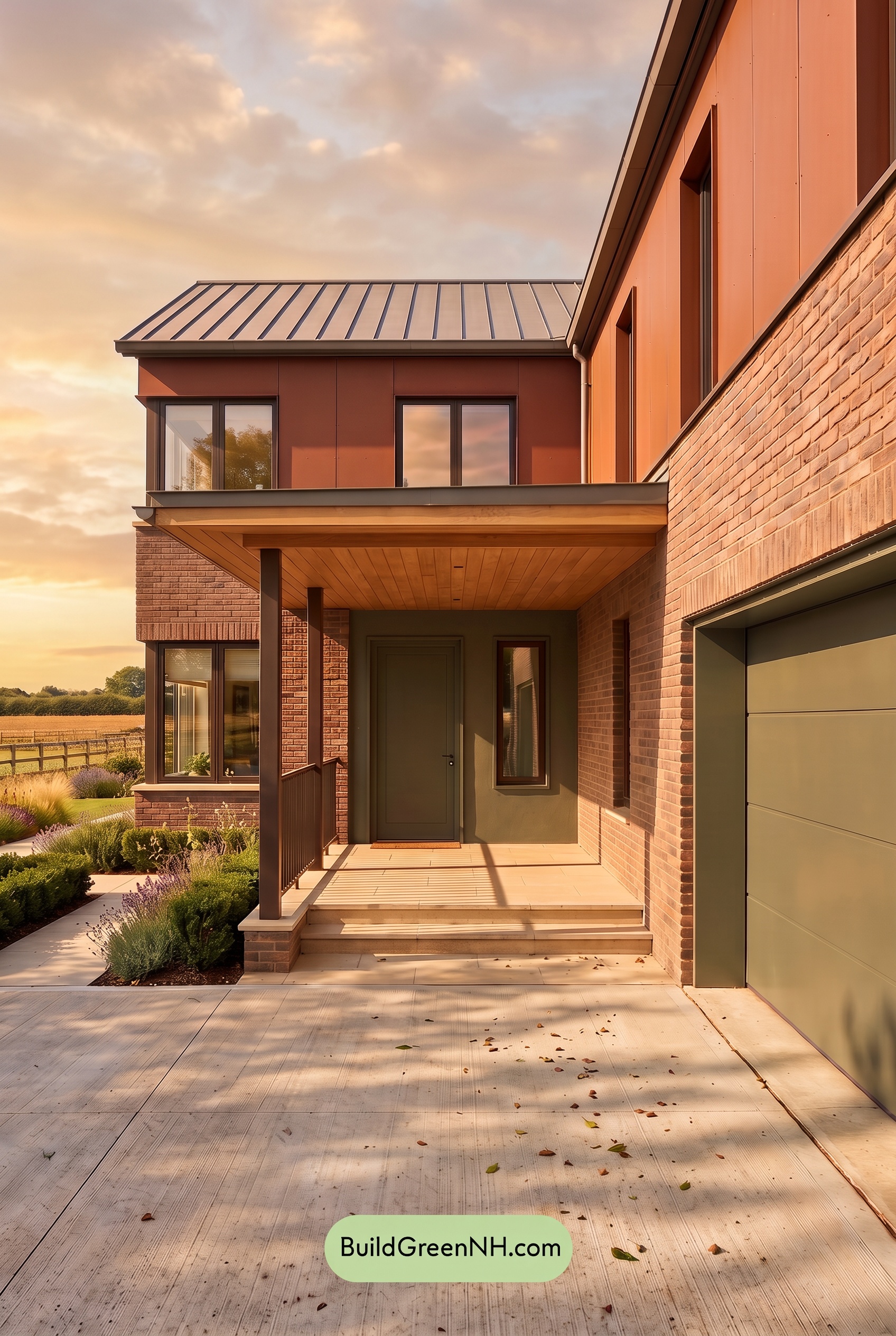
Golden Hour gives the upper warm neutrals a richer, peach-tinted glow, making them appear more saturated than they would in neutral daylight. The muted greens take on stronger yellow undertones in the sun, while the shaded entry reads deeper and more subdued. Instead of showing each shade evenly, the warm light brings out an earthier, softer side of the palette.
The gray accents pick up brown undertones where sunlight catches them, but look darker and cooler beneath the porch and around the windows. Long shadows heighten the contrast between glowing walls and sheltered recesses, adding depth to the exterior. Compared with the clearer, more balanced appearance of neutral daylight, the overall mood feels warmer, quieter, and more inviting.
Shade
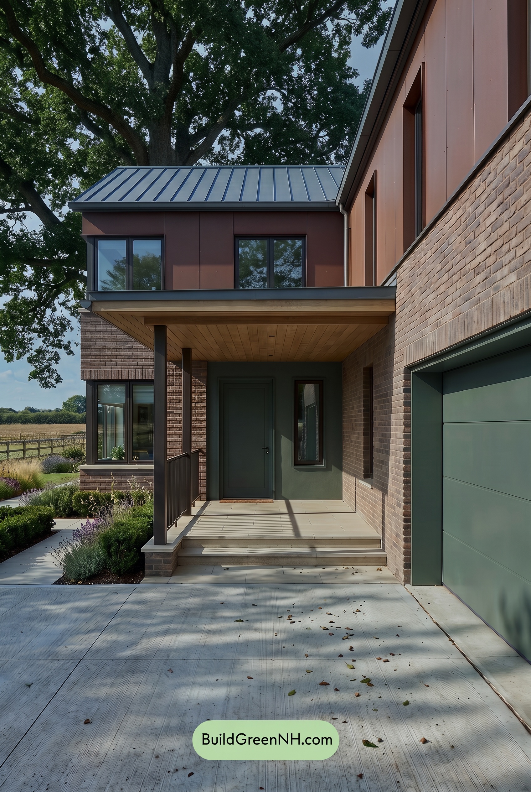
In shade, the warm neutrals feel softer and less golden than they would in neutral daylight, with subtle gray undertones becoming more noticeable. The greens appear deeper and more muted, trading some visible saturation for a cooler, quieter character. Across the broader surfaces, these shifts bring the color families closer together for a calm, cohesive look.
Deeper shadows beneath the porch make the green shades appear darker, while the more exposed green retains greater color definition. The dark grays also feel heavier in these recesses, blending with nearby shadows rather than outlining every detail. Compared with neutral daylight’s clearer color separation, the shaded palette feels more subdued, sheltered, and intimate.
Nighttime
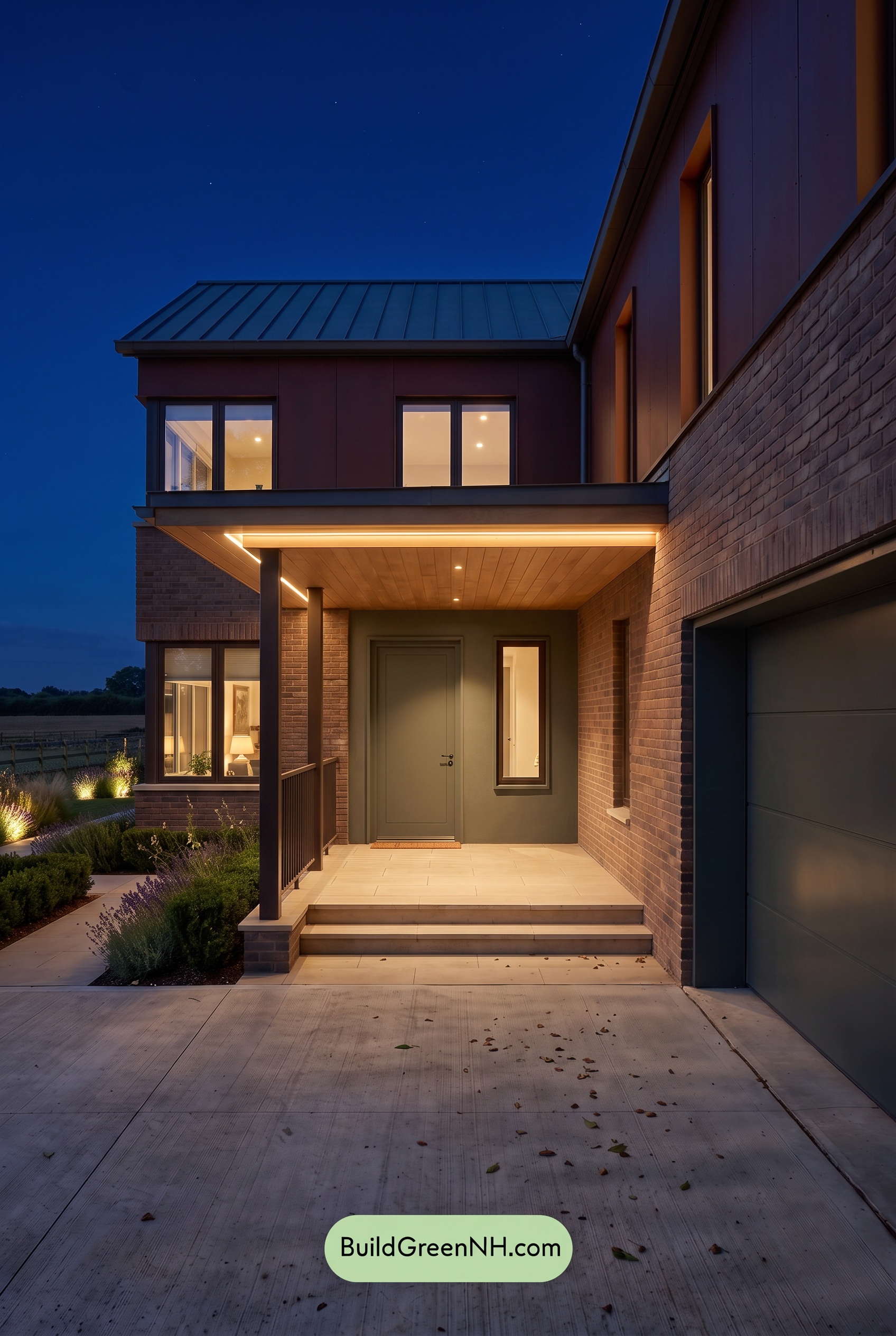
Compared with neutral daylight, nighttime makes the warm neutrals appear deeper and more muted, with cool shadows giving the upper walls a subtle violet-gray cast. Beneath the porch lighting, the green shades feel warmer and earthier, while the shaded garage takes on a darker, less saturated appearance.
The gray accents shift, too: near the lights, they pick up soft golden warmth; farther away, they read as cool, nearly charcoal outlines. Deep shadows beneath the roof and around the windows heighten the contrast with the glowing entrance. The result feels more intimate and dramatic than in daylight, with the softly illuminated greens creating a welcoming focal point.
Pin these for later:
Want More?
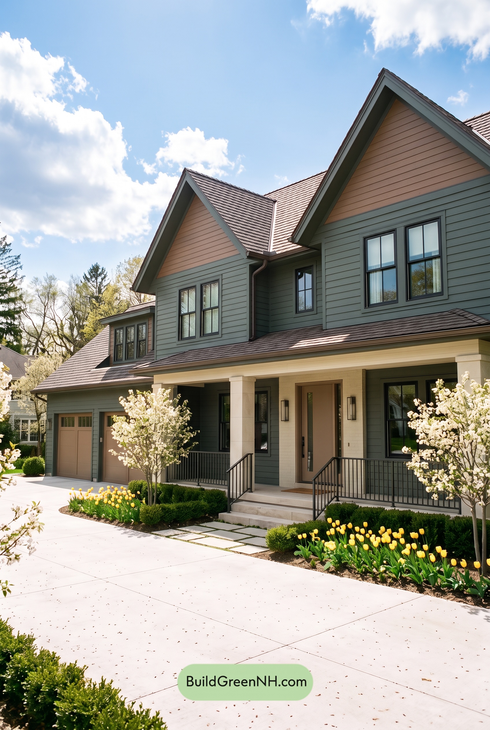 Earthy Green House Exterior Color Scheme: Brown Green Comfort
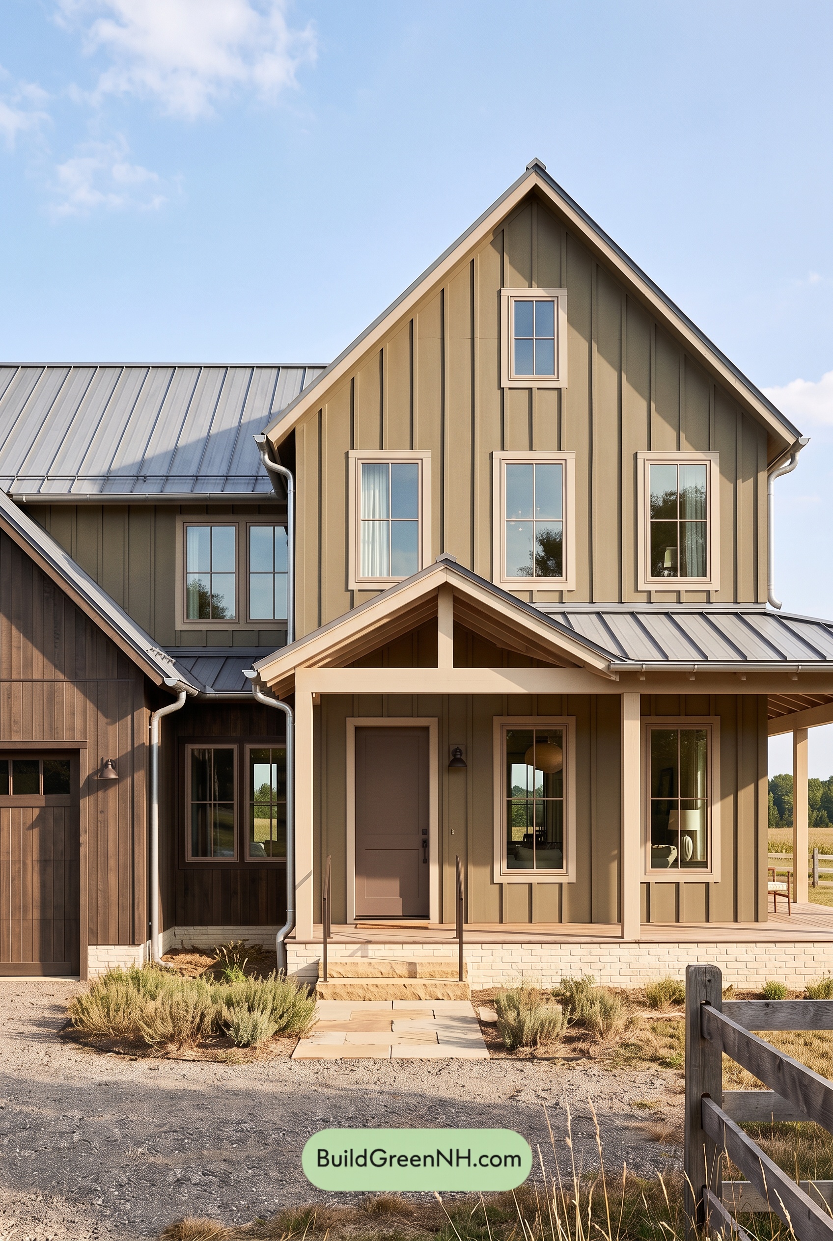 Earthy Green House Exterior Color Scheme: Green and Beige Sanctuary
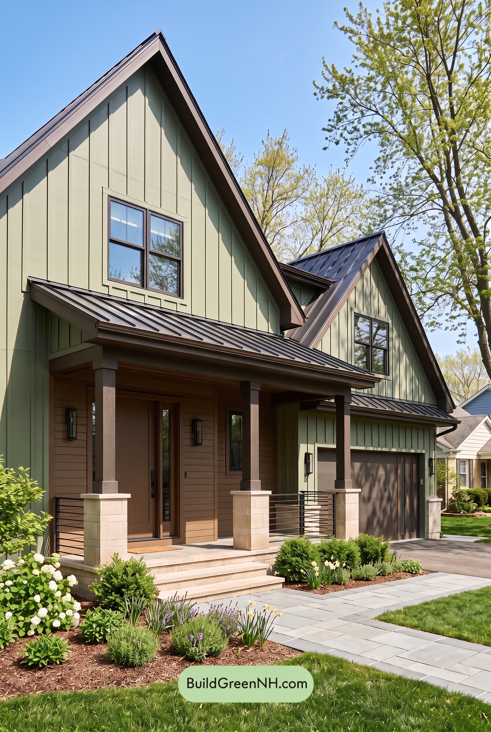 Earthy Green House Exterior Color Scheme: Green Velvet Assurance
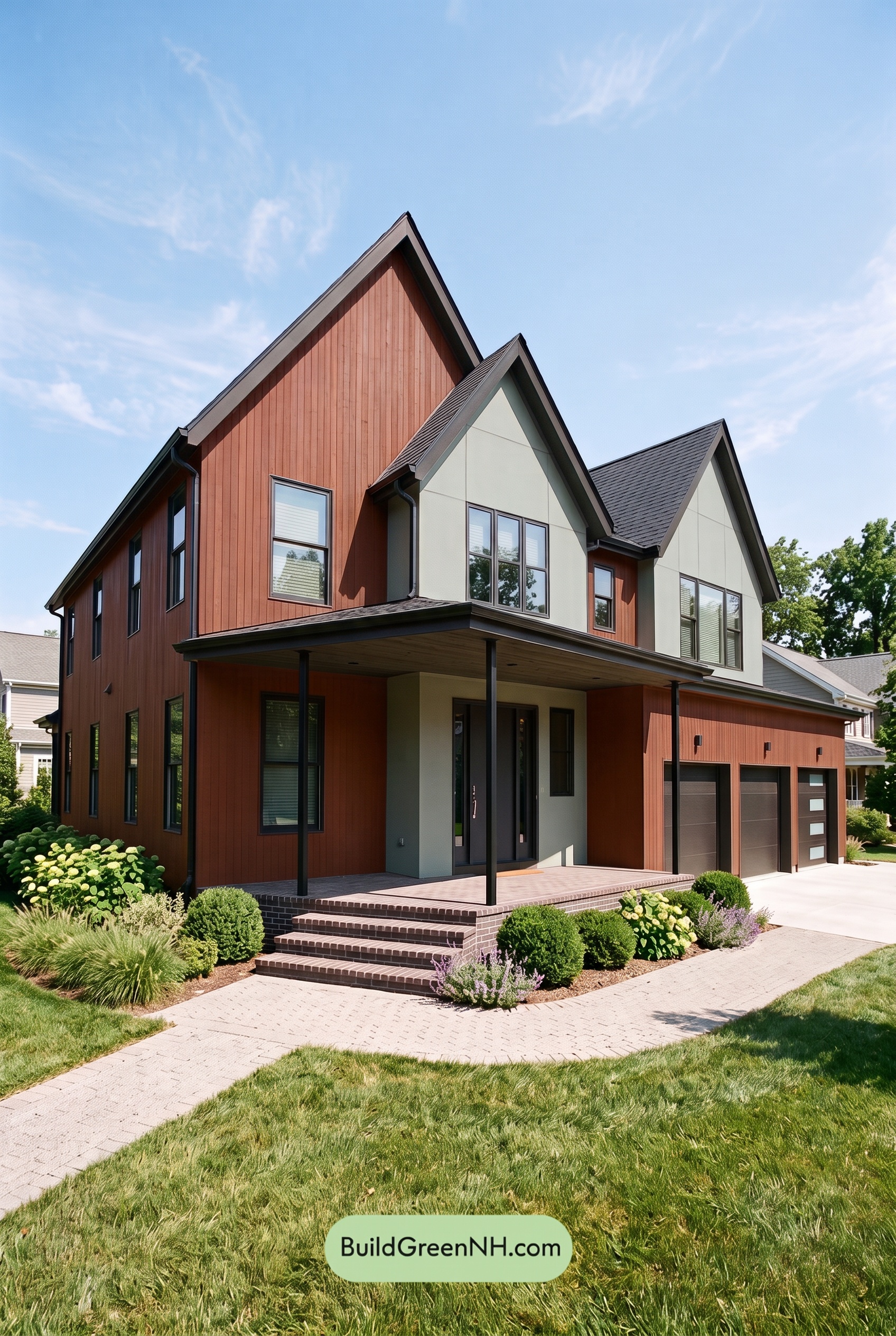 Earthy Green House Exterior Color Scheme: Brown Silken Calm
 Earthy Green House Exterior Color Scheme: Green Amber Contentment
Table of Contents