Last updated on
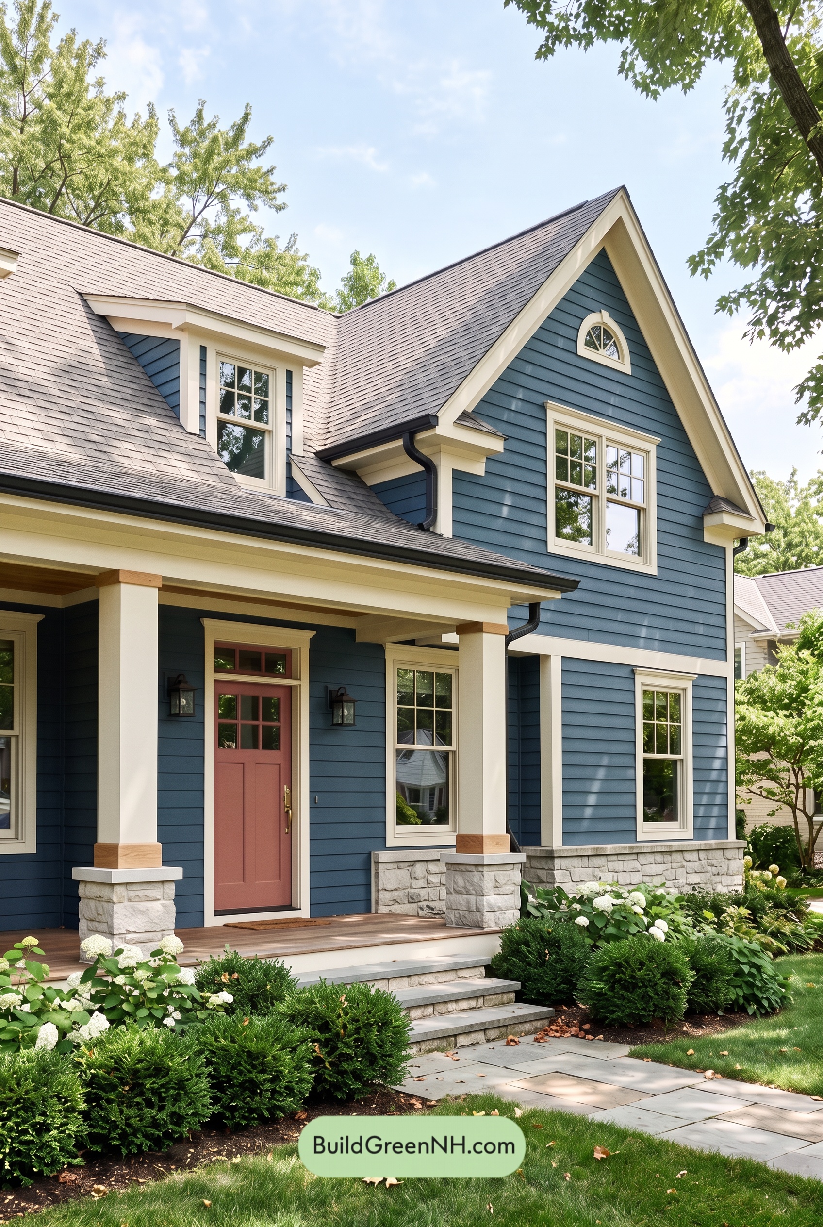

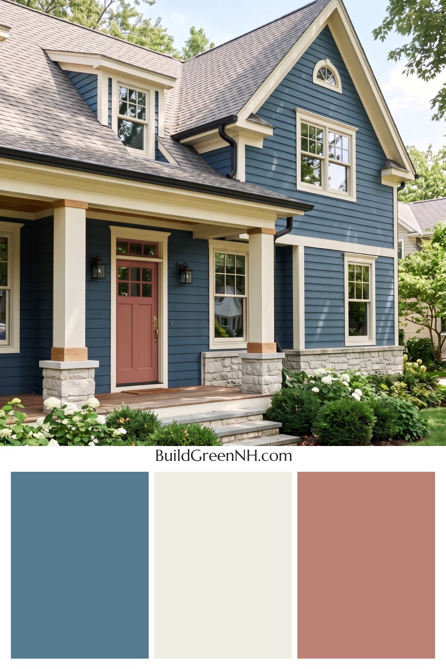
This exterior color scheme feels timeless yet full of personality, pairing a rich blue backdrop with crisp light trim and a welcoming rosy front door.
A Calm, Confident Blue Foundation
The deep blue siding gives the home a polished, grounded presence. Its cool undertone feels especially at home beneath the leafy landscape, while the horizontal boards create subtle movement across the tall front façade. This is a substantial shade that makes the architecture feel refined without appearing too formal.
The blue continues through the gables and around the entry, creating a cohesive envelope that lets the house’s classic rooflines take center stage. It also provides beautiful contrast against the surrounding greenery and pale stone foundation.
Crisp Light Trim Defines the Details
A soft warm white is used generously on the window frames, roofline trim, porch beams, and columns. This bright shade sharpens every architectural edge, from the steep gables to the small arched upper window. The result is clean and tailored, but never stark.
The light trim is particularly effective around the tall windows, where it creates a fresh frame against the darker siding. On the porch, the same shade gives the columns a sturdy, welcoming appearance and visually lightens the sheltered entry.
A Rosy Door With Instant Charm
The front door introduces a muted rosy pink accent that immediately makes the entry memorable. It is a warm, inviting contrast to the cool blue siding, adding a touch of softness and personality without overwhelming the exterior.
Because the door is set beneath the light porch trim, its gentle pink tone becomes a natural focal point. It draws visitors toward the entrance and gives the otherwise classic palette a cheerful, lived-in warmth.
Grounded Accents From Roof to Foundation
A weathered medium-gray roof anchors the upper portion of the home and complements the blue siding with an understated neutral note. Dark charcoal gutters and exterior light fixtures add definition at the roof edges and entry, creating small moments of contrast that keep the look from feeling overly sweet.
Below, the pale gray stone base echoes the roof’s neutral character while bringing welcome texture to the porch and foundation. Warm natural wood-toned details at the column bases and porch floor add another layer of softness, bridging the cool siding, light trim, and surrounding landscape.
The Overall Mood
This is a balanced exterior palette: crisp, cozy, and quietly distinctive. The deep blue feels dependable, the warm white trim feels fresh, and the rosy door delivers a friendly surprise. Together, these shades give the house a classic neighborhood charm with enough color confidence to stand out beautifully.
Next, see how this color scheme looks under different lighting simulations throughout the day.
Overcast
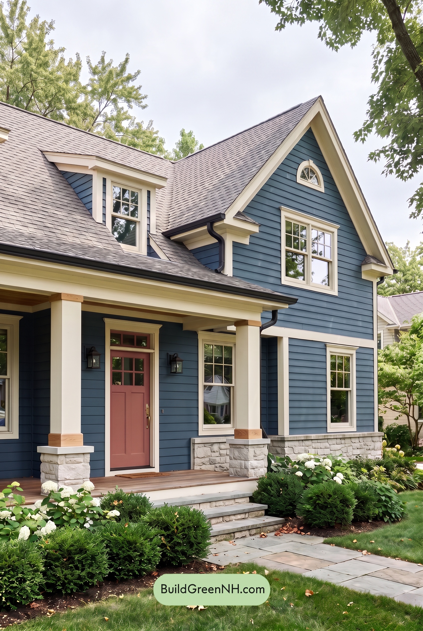
Under overcast skies, the blue siding takes on a deeper, quieter character, with its saturation appearing more even and its cooler undertones more noticeable than in neutral daylight. Without direct sun, the siding’s horizontal texture is defined by soft, gentle shadowing rather than sharp highlights, creating a calm, tailored look.
The white trim, window frames, and columns lose some of their sunny warmth and appear softer against the blue, slightly reducing contrast while keeping the architecture crisp. The pink entry door becomes a muted, welcoming accent rather than a bright focal point, giving the entire exterior a refined, cozy mood.
Golden Hour
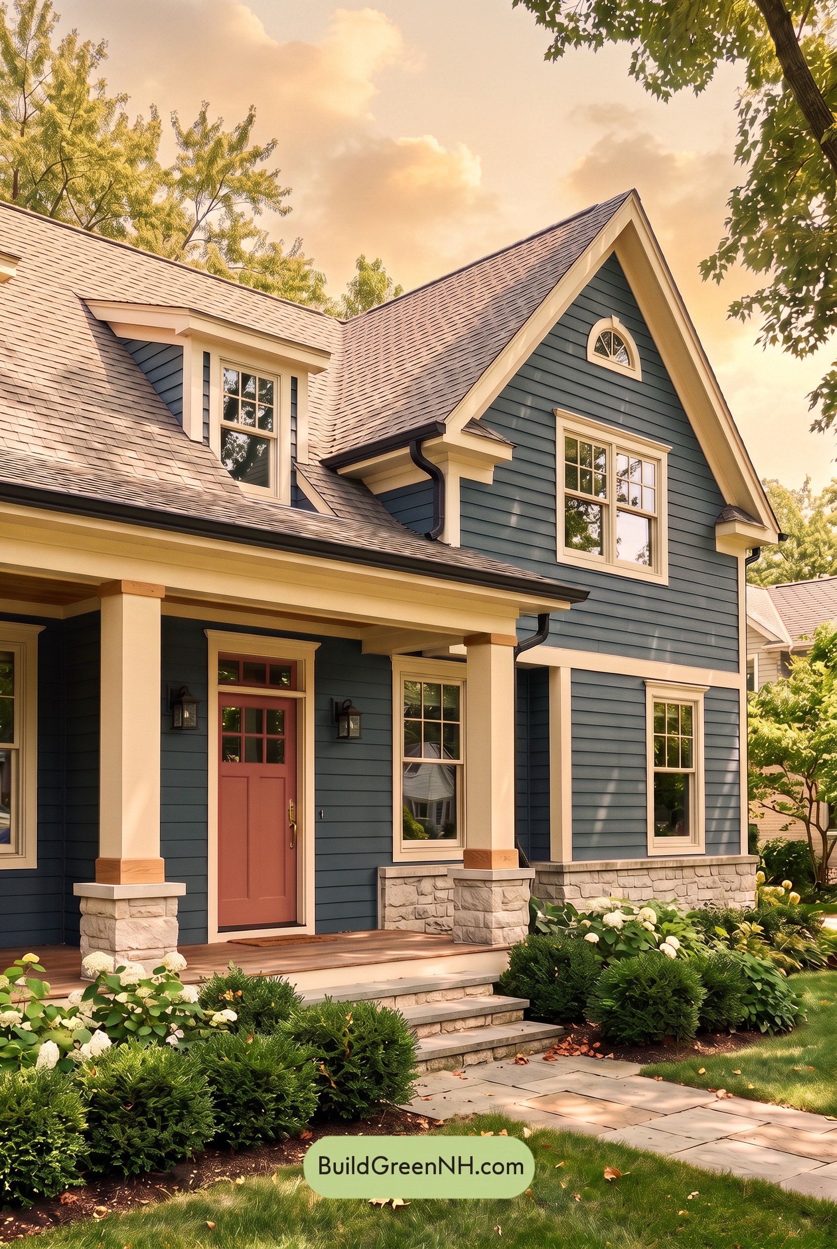
Under neutral daylight, the blue siding reads crisp and balanced, while the white trim creates a clean, bright frame around the architecture. At Golden Hour, the low amber light softens that contrast: the blue takes on a deeper, slightly muted character, and the white elements shift toward a creamy warmth.
The pink front door gains a richer, more inviting saturation in the warm glow, becoming a gentle focal point against the cooler blue field. Lengthening shadows settle into the siding and beneath the porch, adding depth and definition while giving the whole exterior a relaxed, welcoming evening mood.
Shade
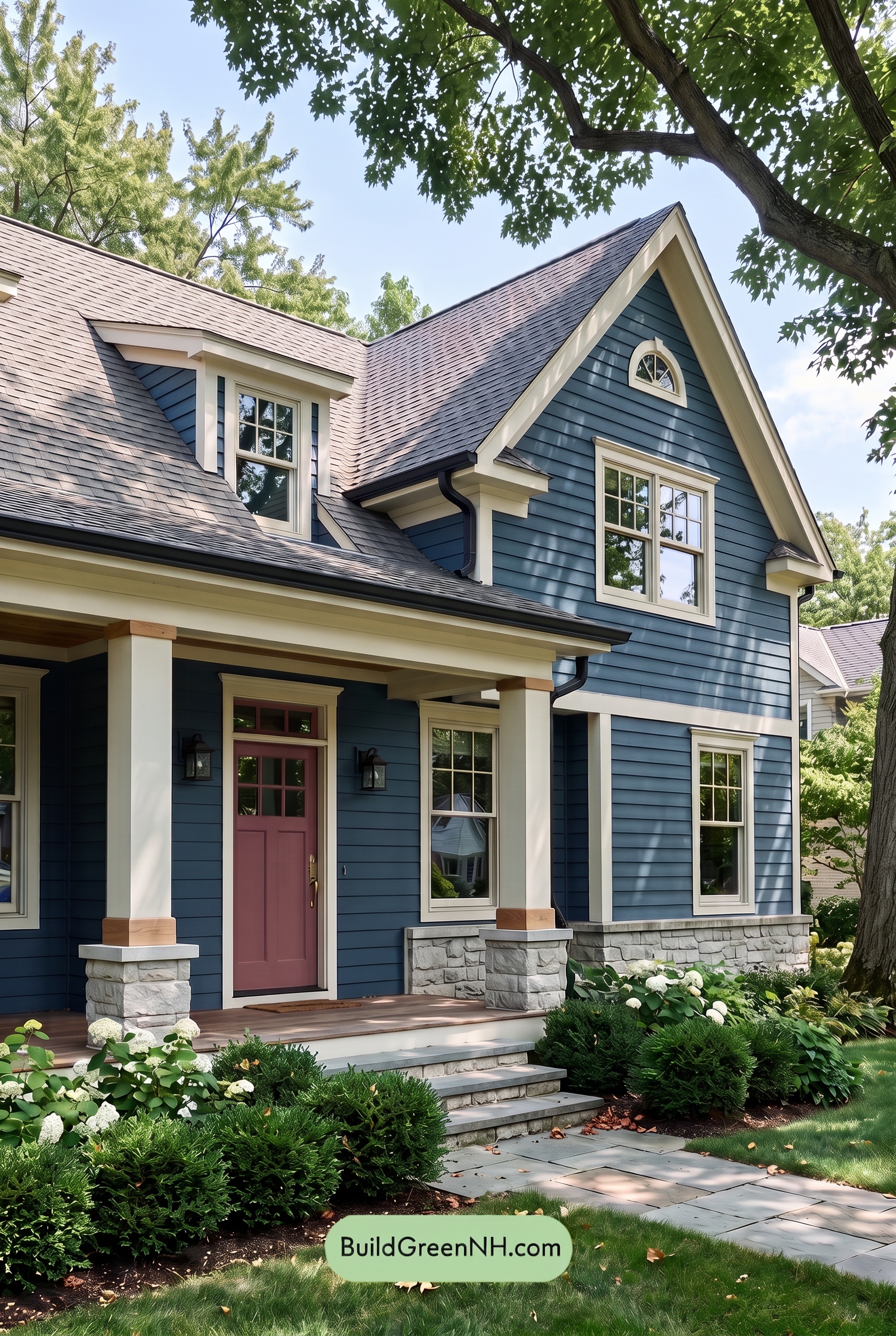
In shade, the blue siding takes on a deeper, more muted character than it shows in neutral daylight, with lower saturation and a cooler, quieter presence. The white trim and columns soften from crisp brightness to a gentler pale neutral, while shaded recesses beneath the roofline and porch create richer tonal layers across the facade.
The pink front door becomes a more subdued accent in this filtered light, reading less vivid but still warmly welcoming against the darkened blue. With the brightest highlights reduced, contrast feels more refined and the overall palette shifts toward a calm, sheltered mood—especially where dappled shadows move across the siding and architectural details.
Nighttime
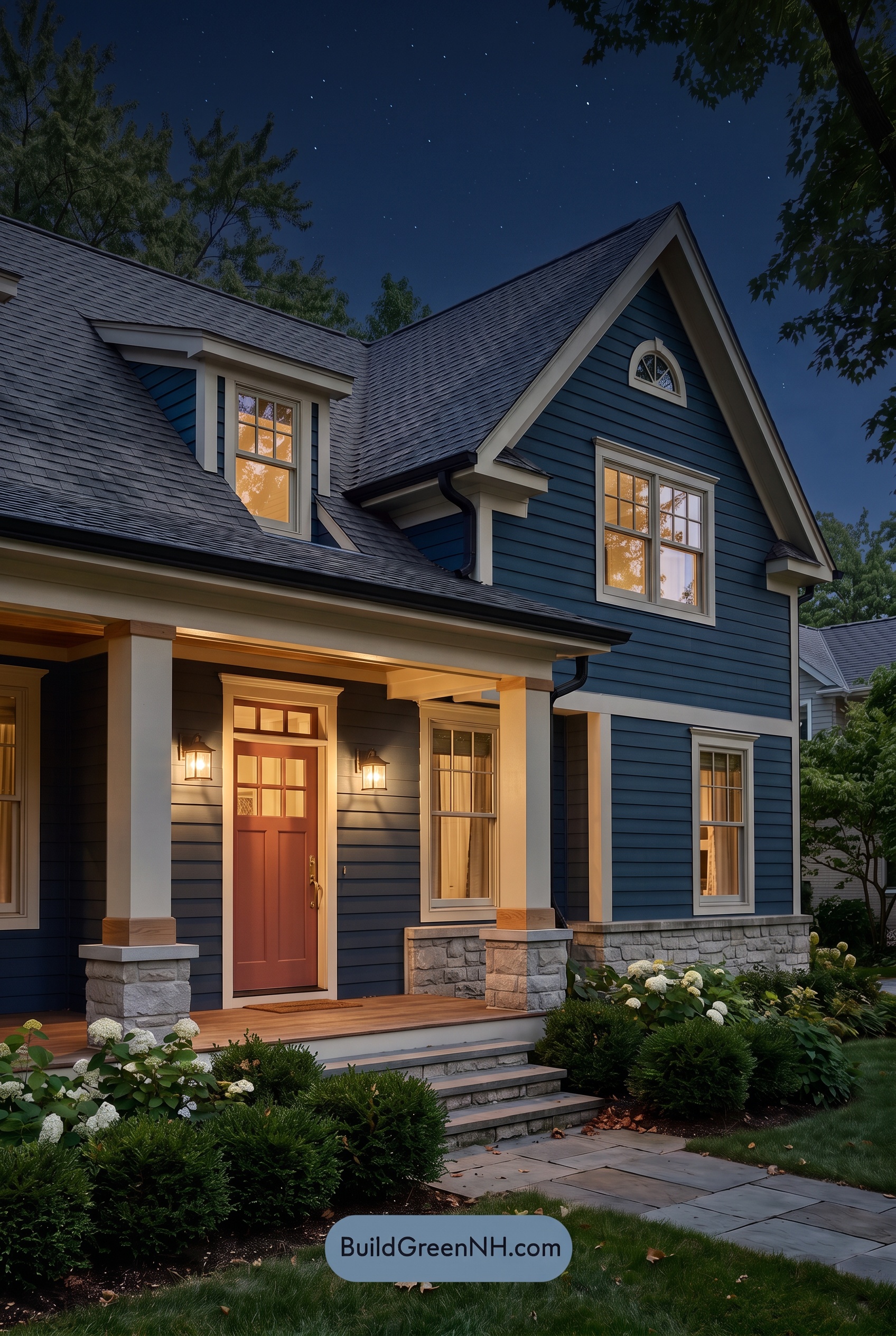
At night, the blue siding settles into a deeper, more dramatic shade than it shows in neutral daylight, with shadows emphasizing the horizontal texture and adding richness to the façade. The white trim and columns lose some of their crisp daytime brightness, reading softer and slightly warmer where porch and window light reaches them, while still creating clean contrast against the darkened walls.
Warm lighting around the entry shifts the pink front door toward a cozier, more muted expression, making it feel especially welcoming against the cool blue exterior. The result is a layered nighttime mood: cool, shadowy blues recede gracefully, warm highlights draw attention to the entrance, and the light-and-dark contrast gives the home an inviting sense of depth.
Pin these for later:
Want More?
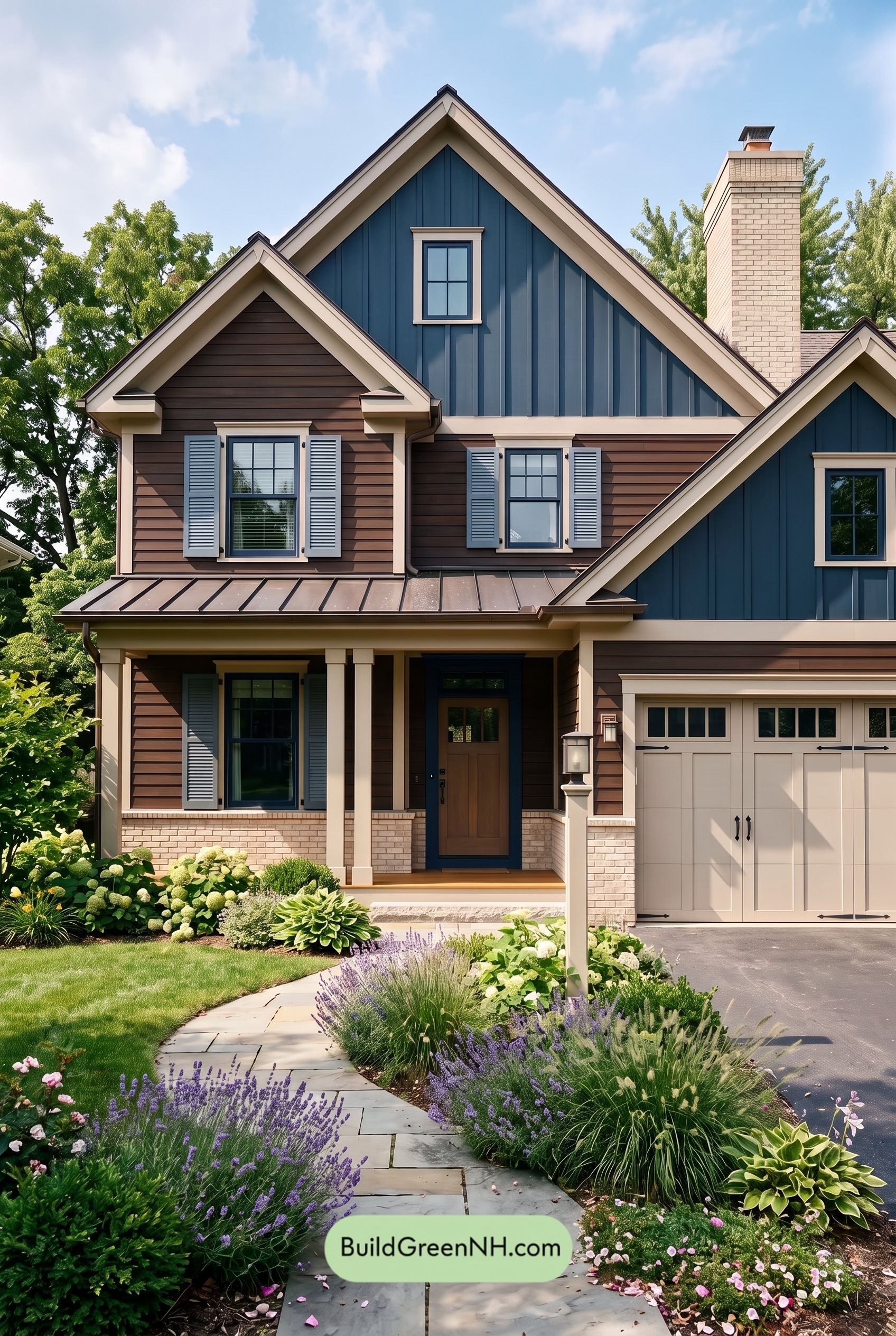 Dark Brown House Exterior Color Scheme: Inkwood Lantern
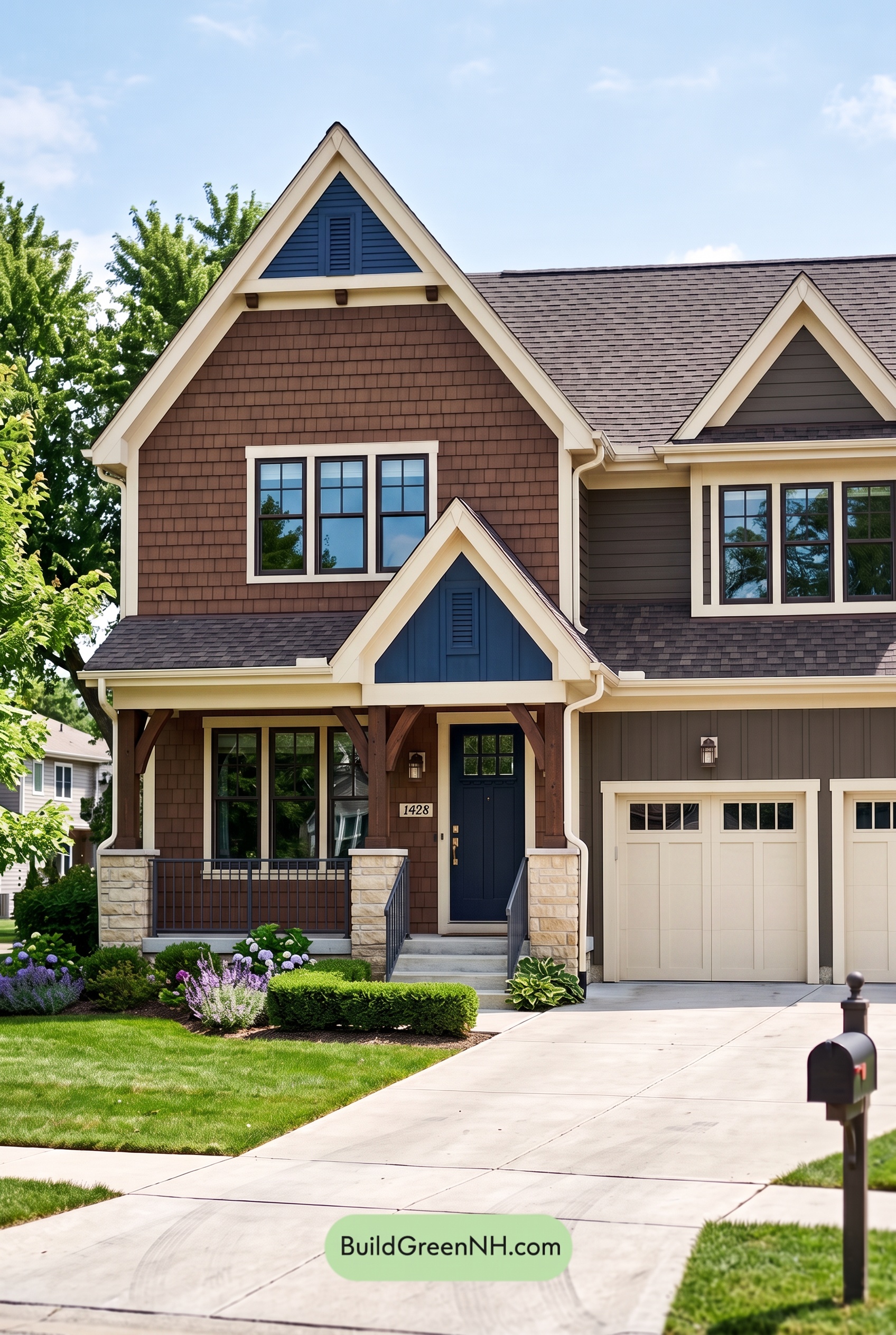 Dark Brown House Exterior Color Scheme: Bluebell Timberline
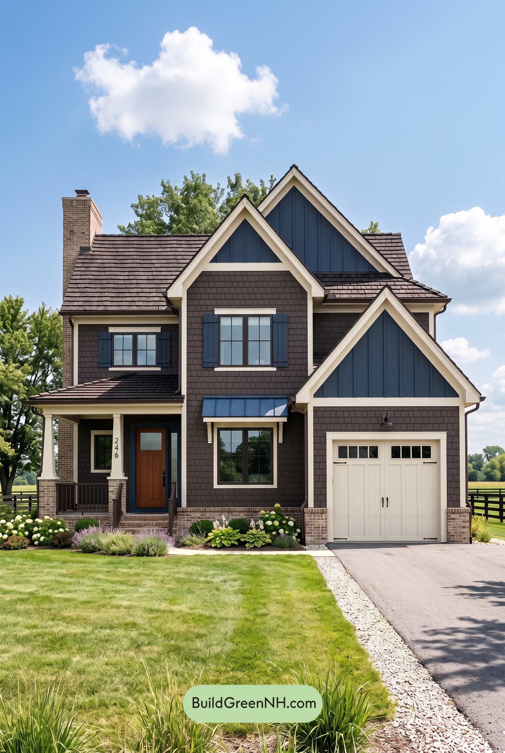 Dark Brown House Exterior Color Scheme: Sapphire Homestead
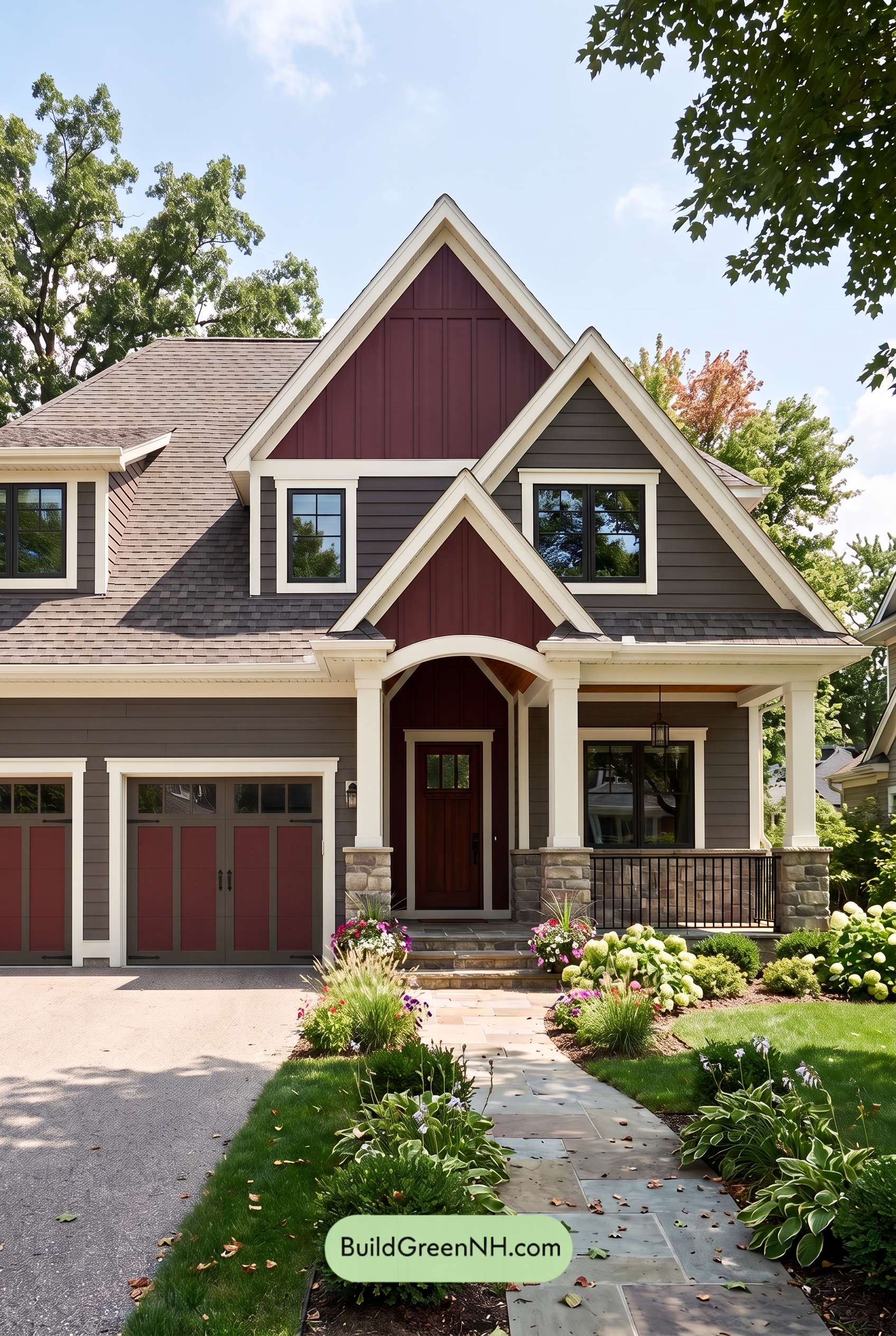 Dark Brown House Exterior Color Scheme: Hearthglow Arrival
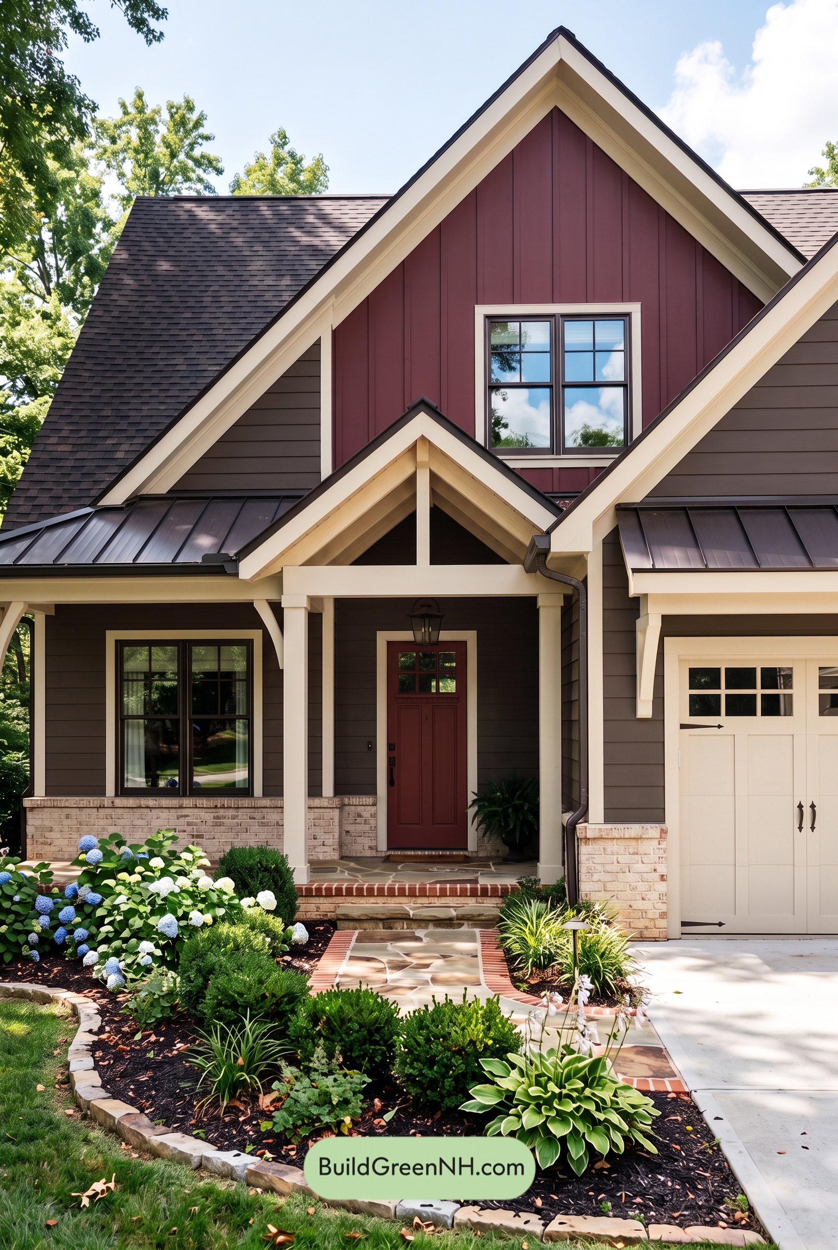 Dark Brown House Exterior Color Scheme: Embercrest Welcome
Table of Contents