Last updated on
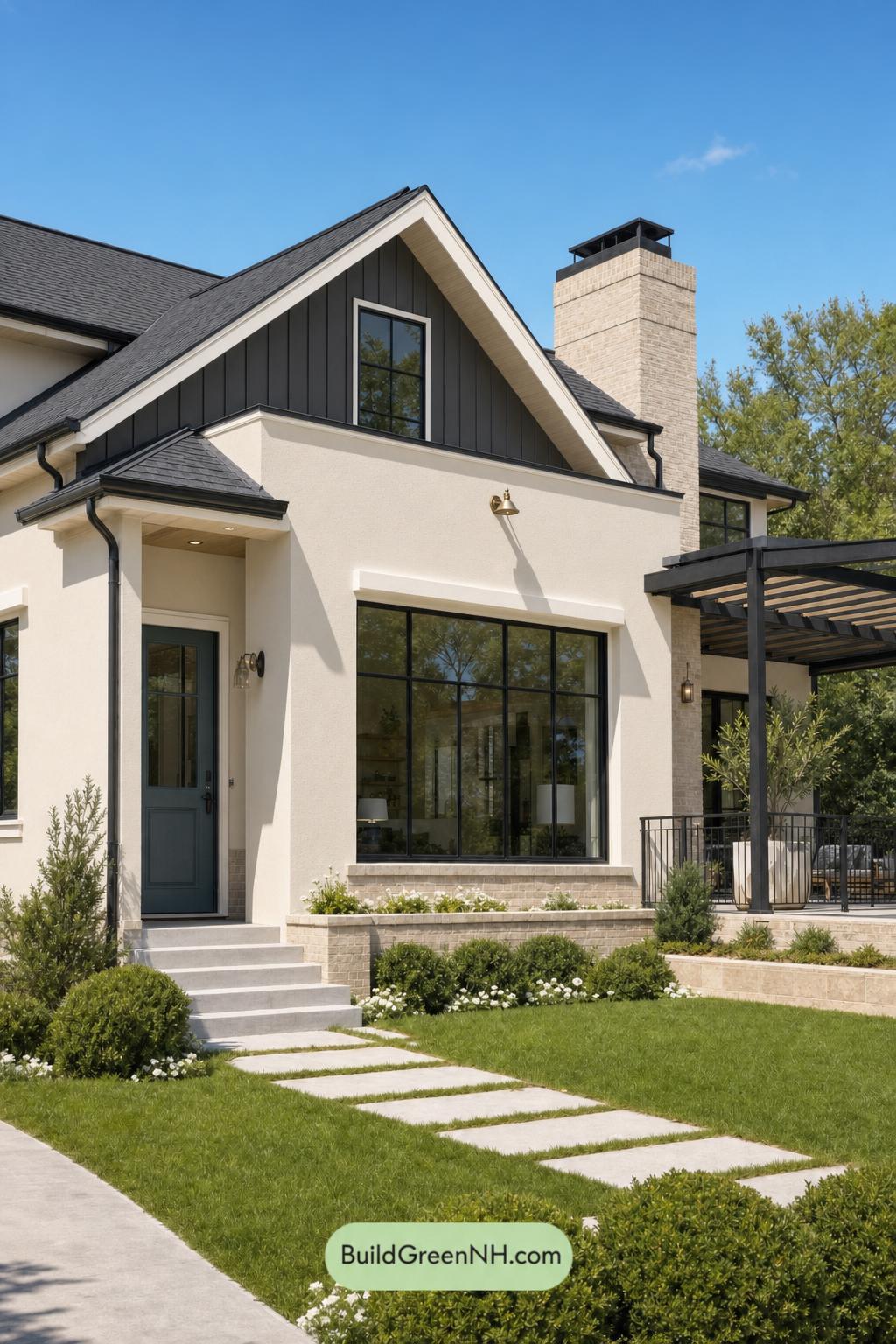

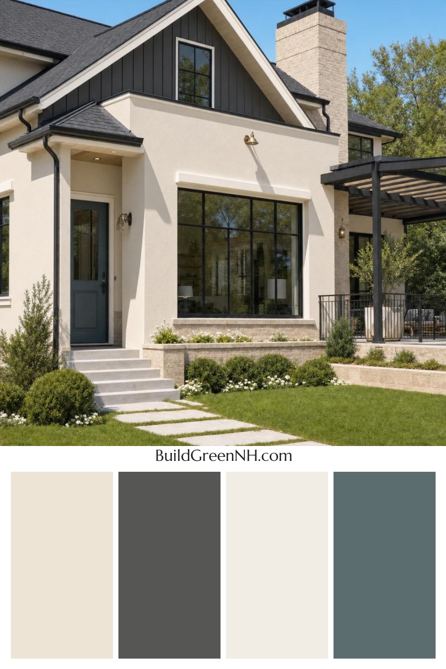
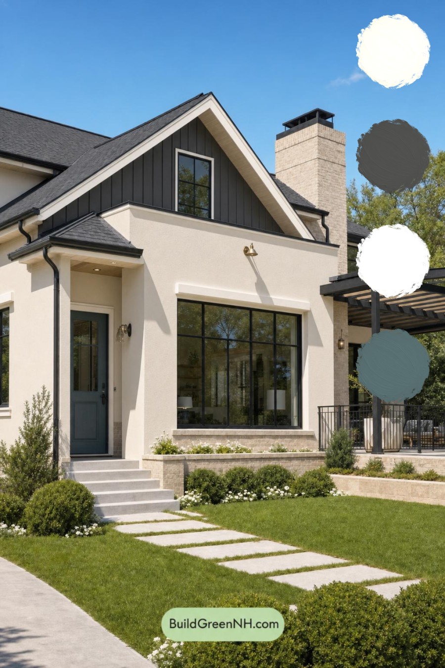
This exterior color scheme feels instantly polished because its warm neutrals, deep gray details, and blue-toned entry create a welcoming look with crisp architectural definition.
Warm Walls Create a Soft Foundation
The main exterior is finished in a light, warm beige shade that gives the home an airy, inviting presence. This gentle neutral brightens the large wall surfaces without feeling stark, allowing the home’s clean lines and varied textures to stand out naturally.
A related beige shade carries through the trim, including the window surrounds, eaves, and roofline details. Keeping these elements within the same warm family creates a seamless, tailored effect while adding just enough contrast to define the edges of the facade.
Deep Gray Adds Modern Structure
The upper dormer is dressed in a rich, deep gray shade, bringing visual weight to the gable and drawing the eye upward. Its vertical siding adds texture, while the dark tone gives the traditional roof form a sharper, more contemporary attitude.
Deep gray window frames, gutters, railings, and the outdoor structure repeat that same confident accent throughout the exterior. These details form a strong graphic outline against the lighter walls, making the windows feel expansive and giving the porch area a refined, grounded presence.
The roof continues the dark gray story, tying the dormer and exterior accents together. Rather than competing with the facade, this nearly black gray shade acts as a quiet anchor for the entire composition.
A Blue-Toned Door Makes the Entry Memorable
The front door introduces a muted, dark blue shade that feels both distinctive and understated. It brings cool depth to the entry without overpowering the neutral palette, offering a welcoming focal point framed by the warm beige walls and dark gray details.
This blue-toned accent is especially effective because it sits between the softness of the main wall color and the strength of the surrounding gray elements. The result is an entry that feels intentional, calm, and easy to notice from the street.
A Balanced and Timeless Exterior Palette
Overall, the combination of warm beige, deep gray, and subdued blue creates a sophisticated balance of warmth and contrast. The lighter surfaces keep the home open and approachable, while the darker details add definition and a modern edge.
It is a color scheme that feels current without relying on fleeting trends: elegant in bright daylight, richly dimensional in shade, and beautifully complemented by surrounding greenery.
Next, see how this color scheme looks under different lighting simulations throughout the day.
Overcast
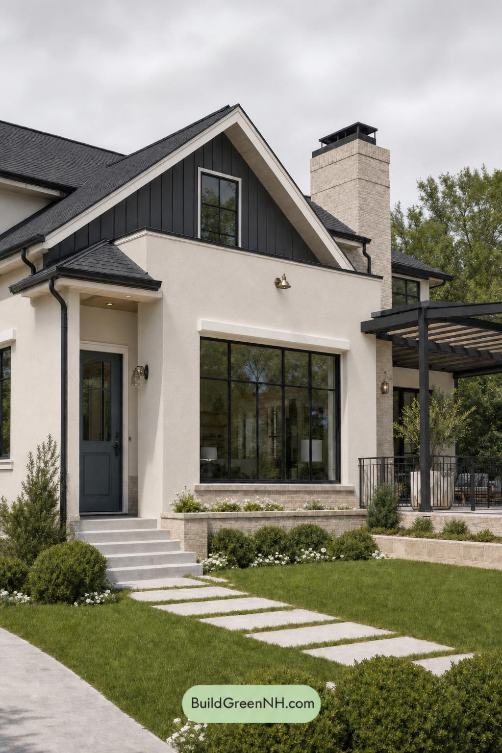
Under overcast skies, the beige exterior takes on a softer, quieter character than it shows in neutral daylight. Its warmth is gently muted, while the gray dormer, columns, railings, and window frames read deeper and more even without sharp sunlit highlights. Shadows soften across the façade, reducing dramatic contrast and giving the architecture a smooth, cohesive appearance.
The blue front door becomes a richer focal point against the subdued neutrals, though its saturation feels slightly tempered by the diffuse light. With less glare and fewer hard-edged shadows, the darker gray details feel refined rather than stark, creating a calm, polished mood that feels inviting and grounded.
Golden Hour
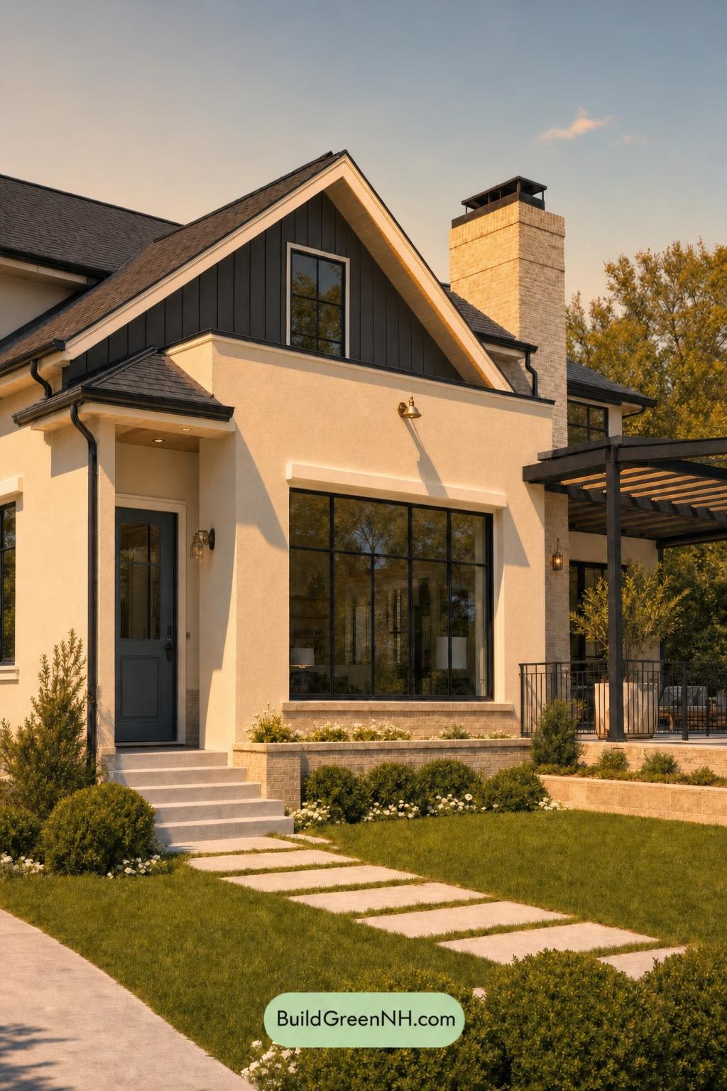
Golden Hour wraps the beige exterior in a richer, honeyed glow, making its warmth feel softer and more inviting than it does in neutral daylight. The gray sections and trim take on a gentler, slightly warmer cast, while the blue door appears deeper and more saturated against the sunlit walls.
As the light lowers, long shadows bring stronger contrast to the siding, columns, railings, and rooflines. Dark gray details become more dramatic, yet the overall palette feels cohesive and relaxed, creating a welcoming evening mood with more depth than the flatter, clearer look of neutral daylight.
Shade
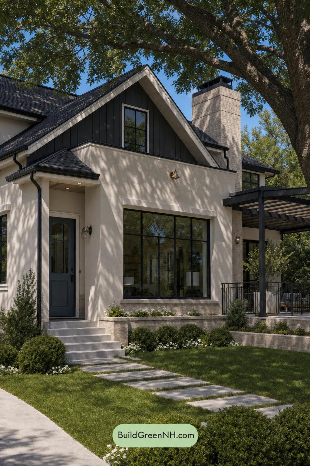
In shade, the light beige exterior takes on a quieter, softer character than it has in neutral daylight, with its warmth appearing more restrained and gently muted. Leaf-cast shadows create shifting layers across the walls, making the pale surfaces feel more textured while lowering their apparent brightness.
The deep gray gable, window frames, railings, and columns become richer and more unified in the reduced light, increasing their contrast against the softened warm neutrals. The blue front door also deepens and feels less vivid, lending the entry a calm, tailored mood that suits the cool, sheltered setting.
Nighttime
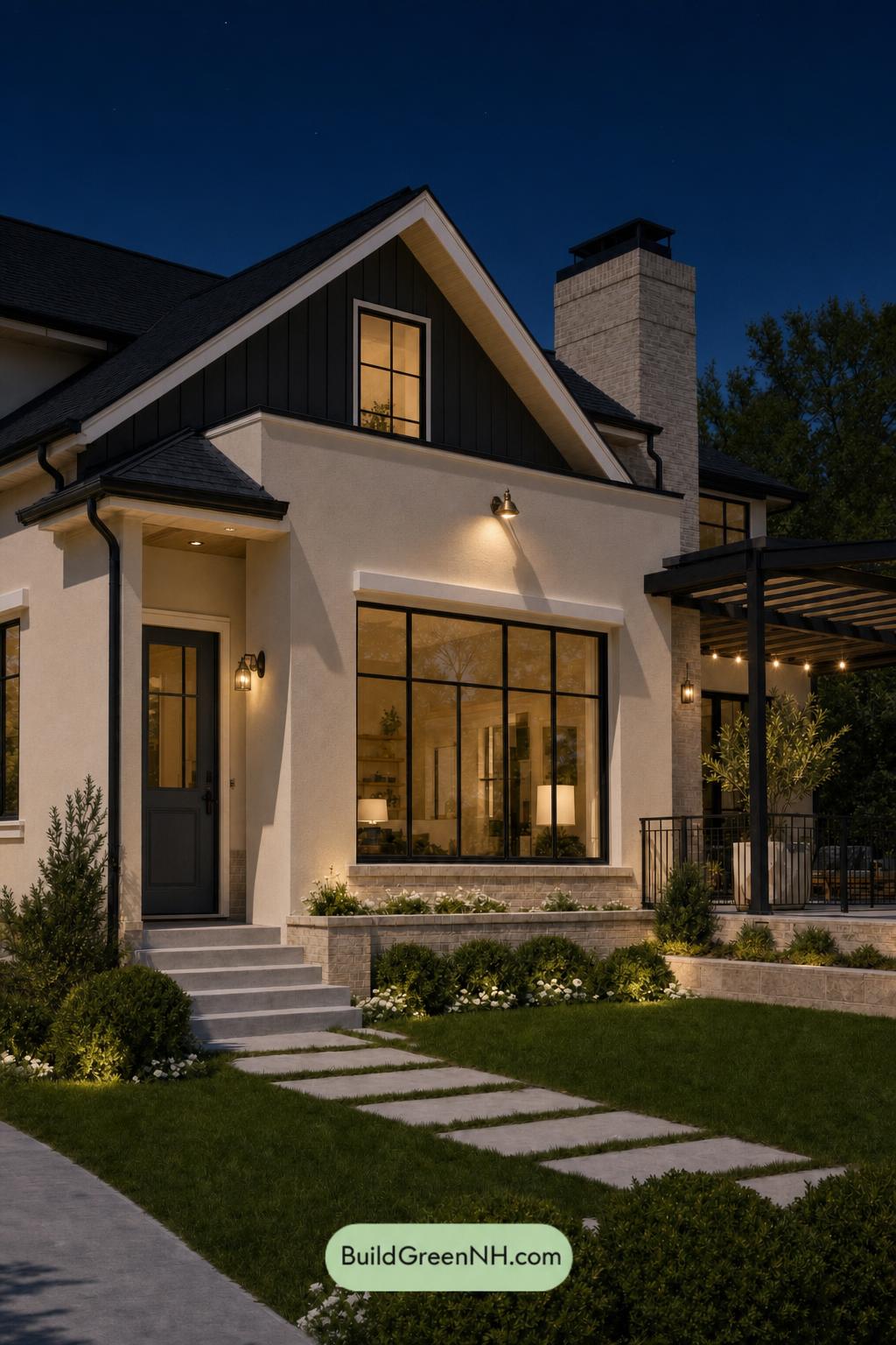
At nighttime, the beige exterior shifts from its balanced daylight appearance to a softer, warmer shade under the glow of the exterior fixtures and interior windows. This warmer illumination gently lowers saturation across the facade, while the gray dormer, window frames, columns, and railings recede into deeper, nearly charcoal shadows for a more dramatic contrast.
The blue front door appears darker and more subdued after sunset, becoming a quiet focal point rather than a bright accent. Pools of warm light bring out the welcoming texture of the lighter walls and trim, while the surrounding dark gray details create crisp outlines and a calm, polished evening mood.
Pin these for later:
Want More?
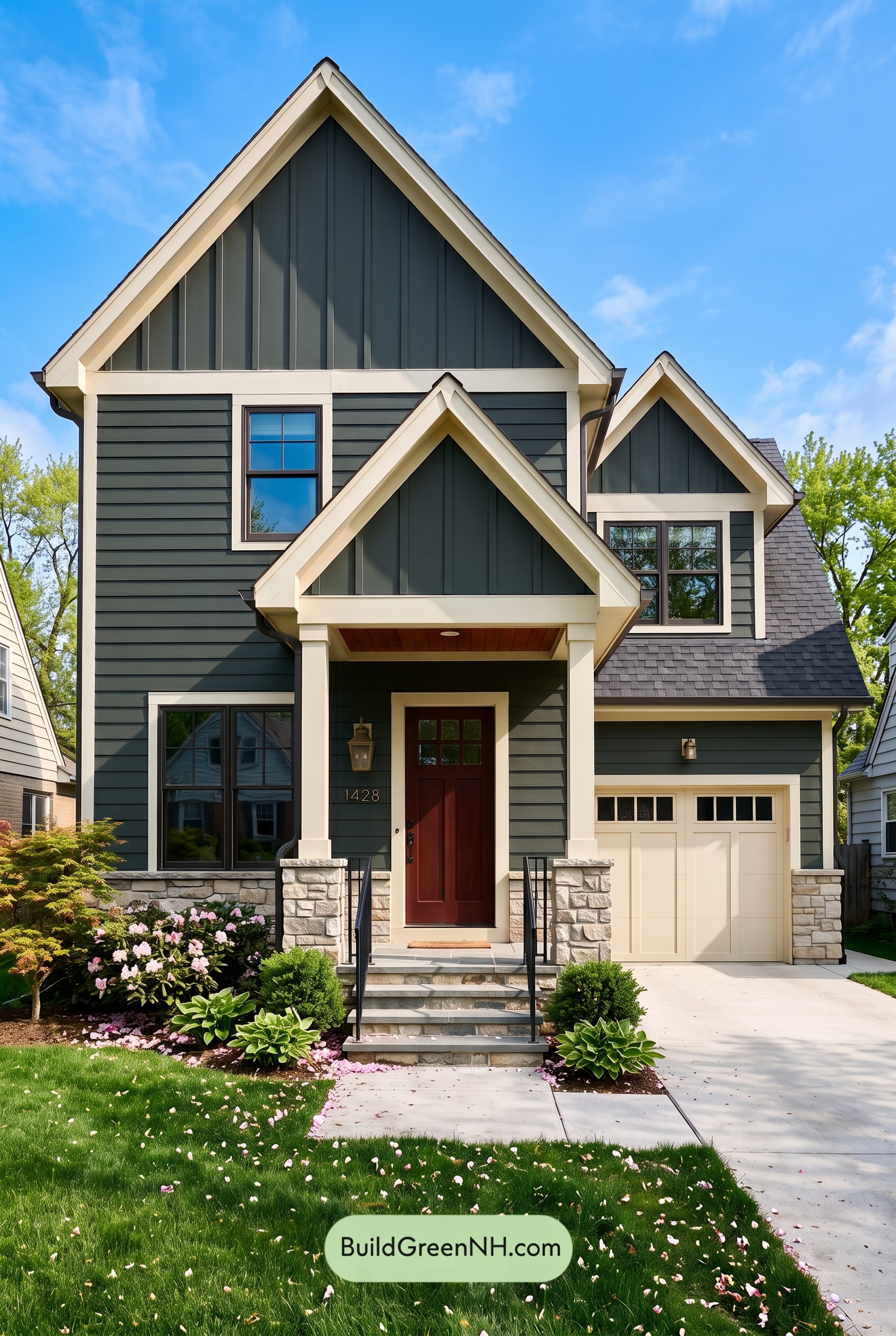 Exterior Color Scheme with Stone Accents: Pine Brass Threshold
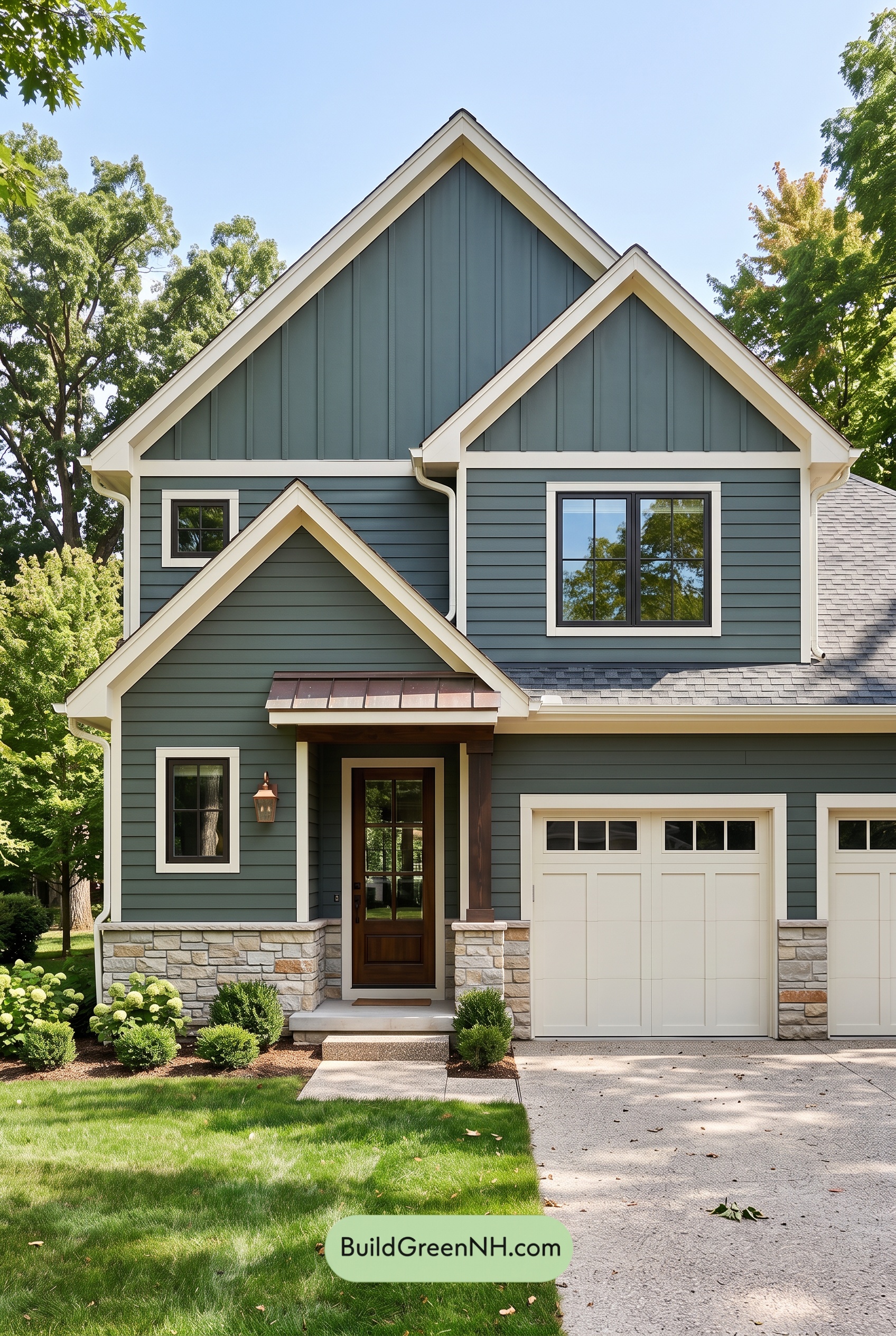 Exterior Color Scheme with Stone Accents: Evergreen Copper Welcome
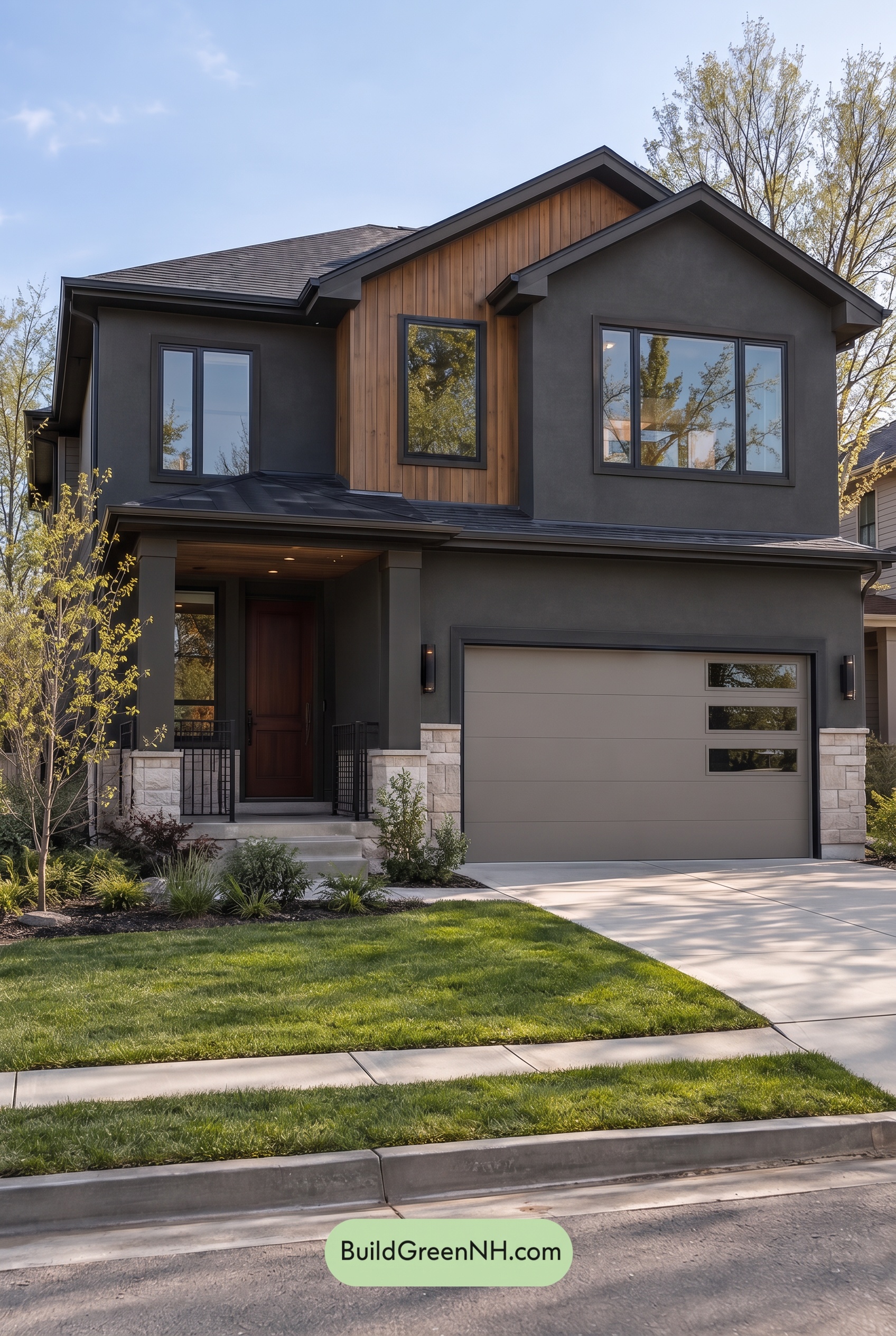 Dark Stucco House Exterior Color Scheme: Cedar Ember Calm
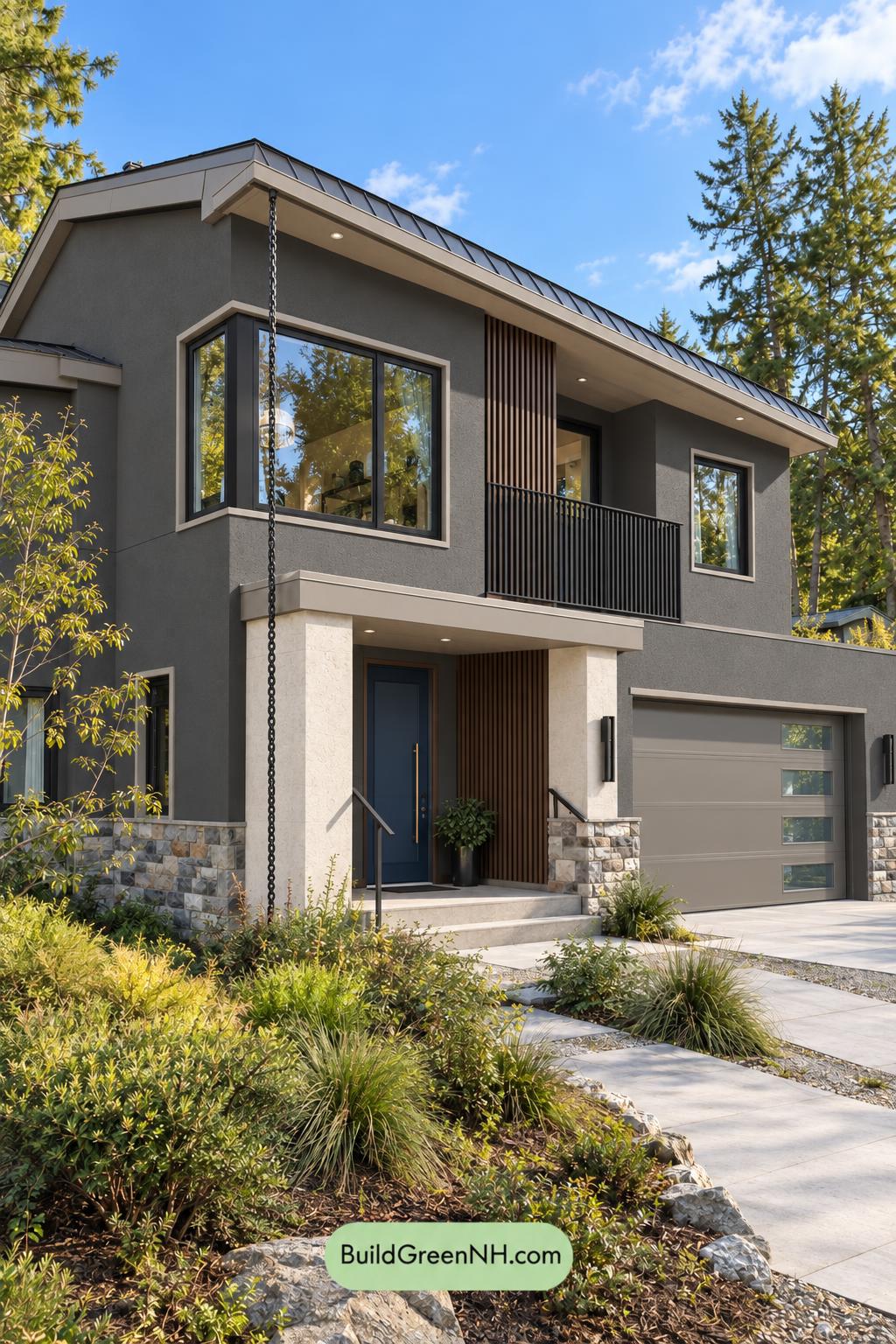 Dark Stucco House Exterior Color Scheme: Silver Pine Shelter
 Dark Stucco House Exterior Color Scheme: Copper Orchard House
Table of Contents