Last updated on
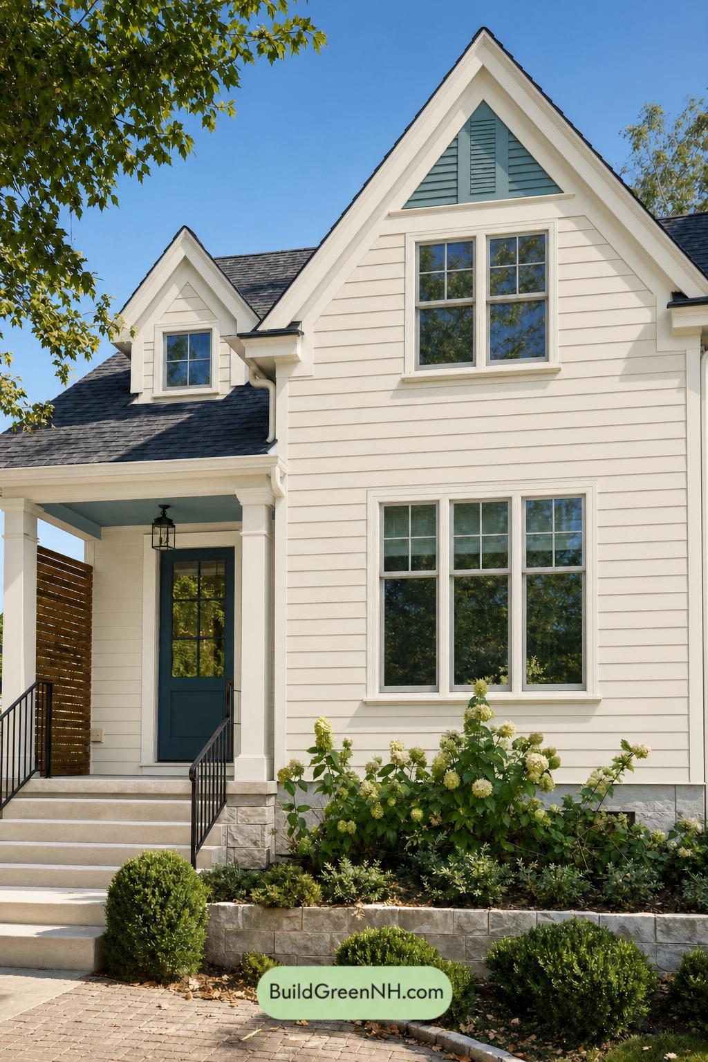

This inviting exterior succeeds because its soft neutral backdrop, crisp light trim, and cool blue accents create a timeless look with unmistakable personality.
A Soft, Polished Foundation
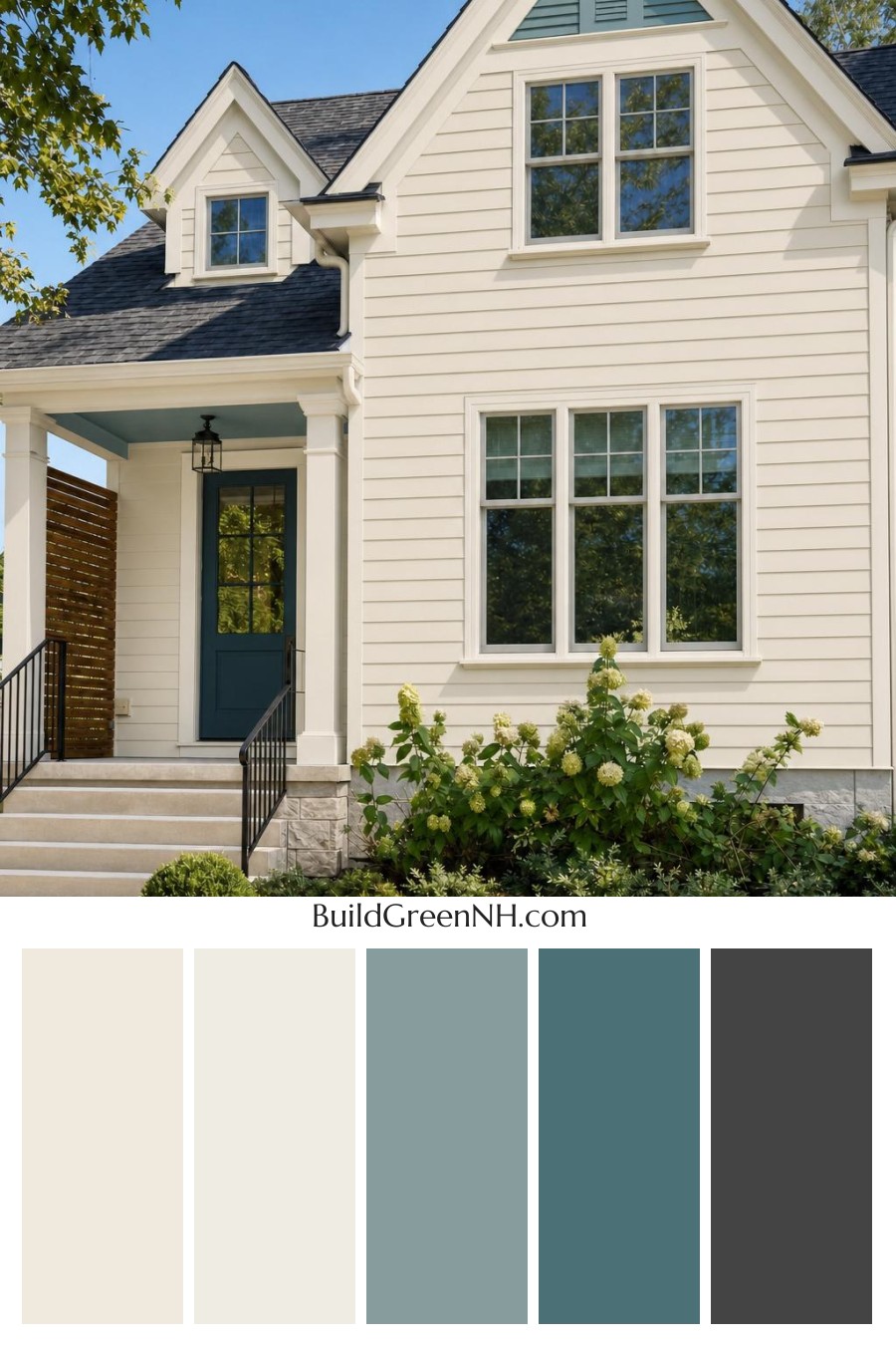
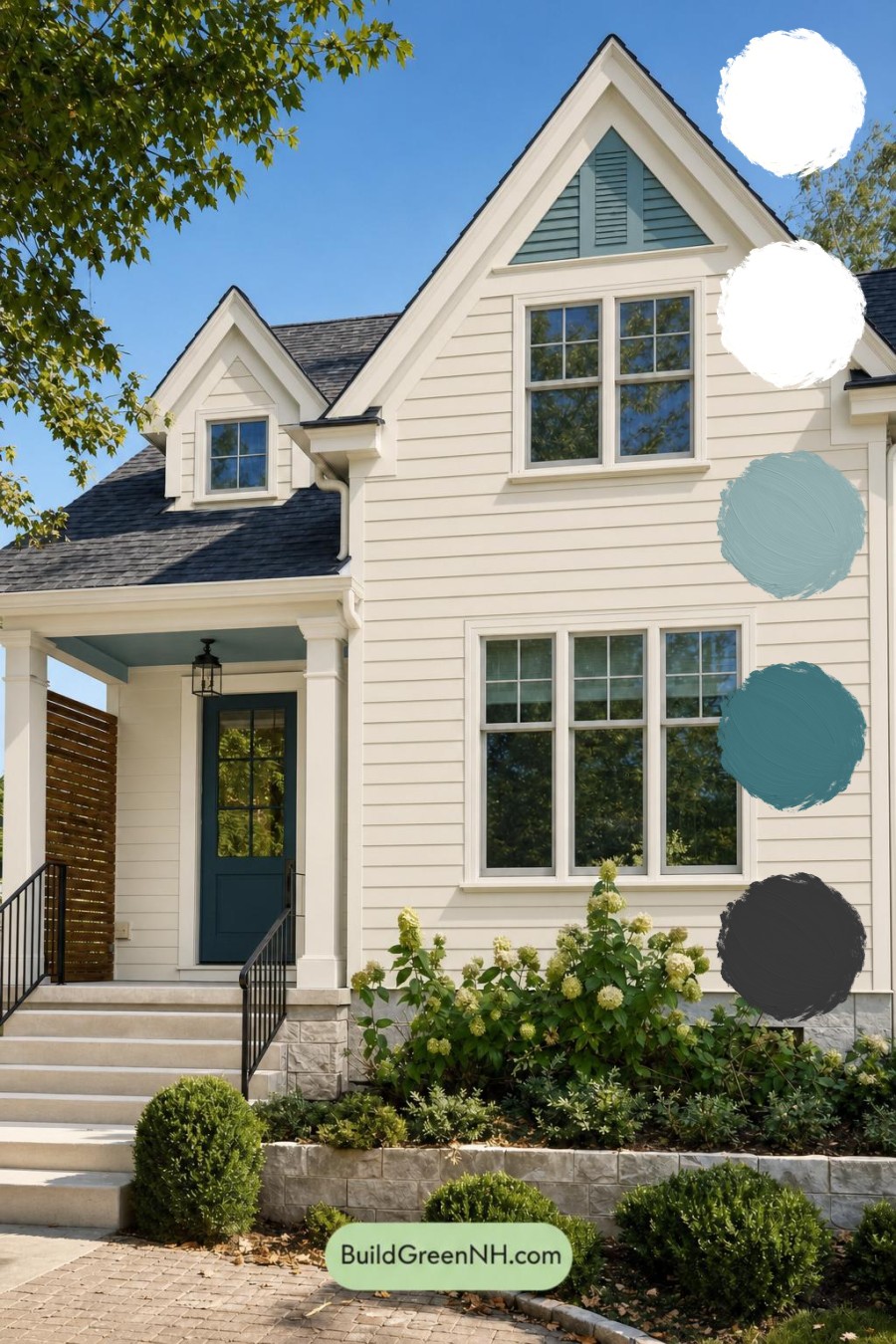
The horizontal siding is finished in a gentle warm beige that gives the home an easy, welcoming presence. This light neutral shade brightens the tall façade without feeling stark, and it allows the home’s layered gables, broad windows, and architectural lines to stand out gracefully.
Light creamy white trim frames the windows, outlines the rooflines, and wraps the porch columns in clean definition. The contrast is subtle rather than severe, creating a tailored finish that feels fresh, classic, and beautifully maintained.
Cool Blue Details With Character
A muted blue-green shade fills the upper gable accent, adding a calm burst of color high on the façade. It draws the eye toward the peak of the home and gives the traditional architecture a slightly coastal, relaxed character.
The front door repeats that cool blue family in a much deeper shade. Against the pale siding and light porch trim, it becomes an elegant focal point that gives the entry real depth. The blue-painted porch ceiling offers another quiet layer of color, making the covered entry feel especially welcoming.
Grounding Contrast and Warm Texture
The dark charcoal roof anchors the entire composition. Its deep tone gives the light siding and trim a stronger outline while connecting naturally to the dark window details and black-gray railings. These railings bring a slim, modern edge to the front steps without competing with the home’s traditional charm.
A warm medium-brown privacy screen introduces natural richness beside the entry. Paired with the soft beige, creamy white, cool blue, and charcoal tones, this wood accent keeps the palette from feeling overly formal and adds a relaxed, lived-in warmth.
The Overall Mood
This color scheme feels calm, refined, and distinctly inviting. Warm neutrals provide the foundation, pale trim delivers brightness, and the layered blue shades lend personality without overwhelming the exterior. Dark roof and railing details supply just enough contrast to make every element feel intentional.
Surrounded by greenery and pale stonework, the palette feels especially at home in a leafy setting. It is a balanced approach that is polished enough for classic architecture yet fresh enough to feel current for years to come.
Next, see how this color scheme looks under different lighting simulations throughout the day.
Overcast
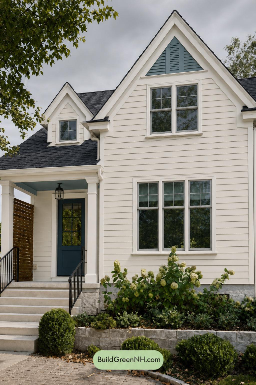
Under overcast skies, the light neutral siding takes on a softer, quieter character than it has in neutral daylight, with its warmth gently muted and its undertones appearing more balanced. The pale trim looks less bright but more refined, while the lack of direct sun smooths harsh shadows across the siding and architectural details.
The blue accents deepen slightly and feel more subdued, creating a composed contrast against the softened warm neutrals. Gray railings appear cooler and more defined, while the overall lower saturation and even lighting give the exterior a calm, polished mood with gentle rather than dramatic contrast.
Golden Hour
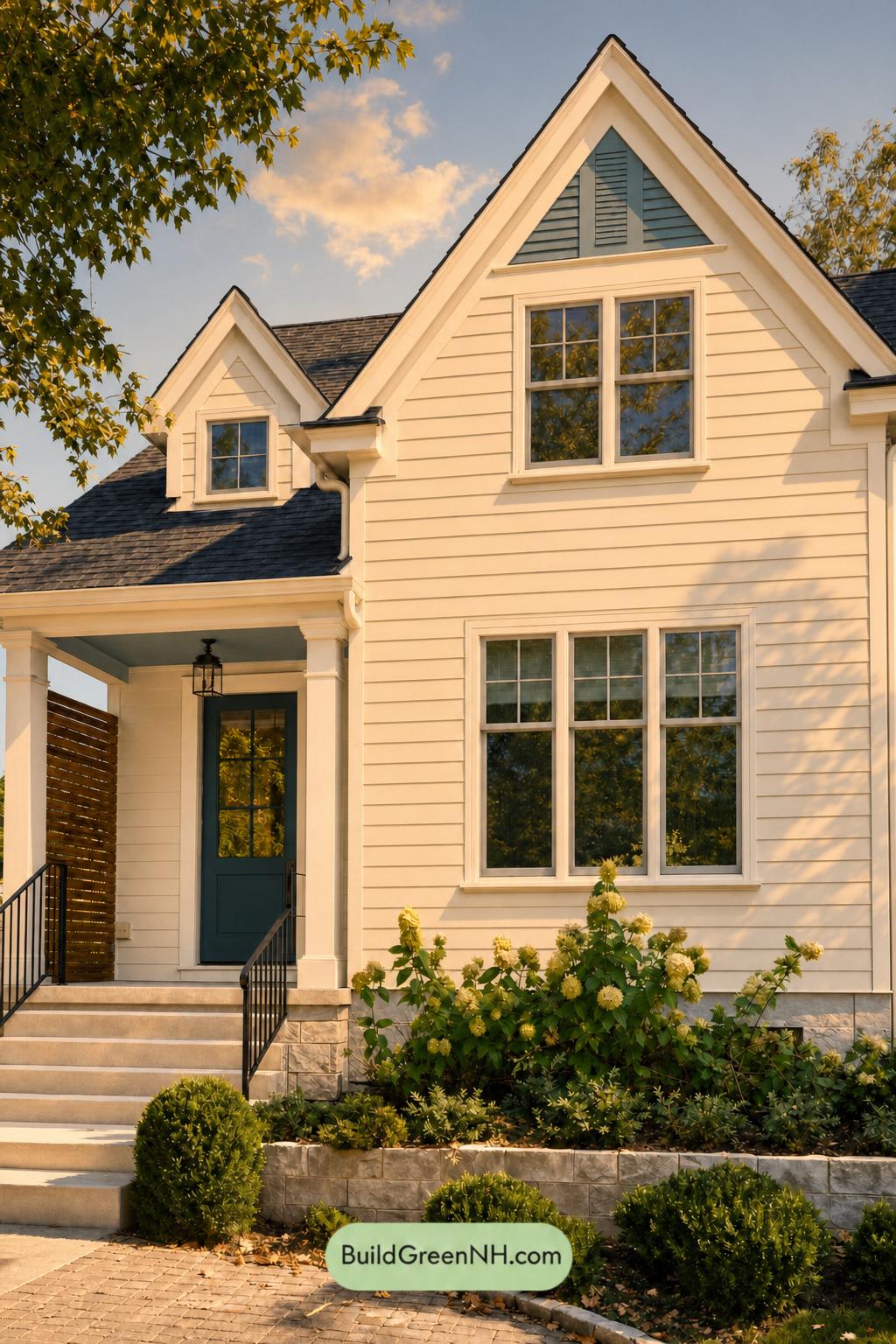
Under Golden Hour, the beige siding takes on a richer, creamier warmth than it shows in neutral daylight, making the façade feel softer and more inviting. The white trim shifts toward a gentle ivory impression, while the blue accents and front door appear deeper and slightly more muted, creating a handsome contrast against the sunlit walls.
Longer shadows sharpen the home’s architectural lines, adding depth beneath the gables, porch, and railings. The gray railings read darker and more grounding in this low light, while the overall palette gains a relaxed, glowing mood that feels warmer and more dimensional than the crisp, even look of midday.
Shade
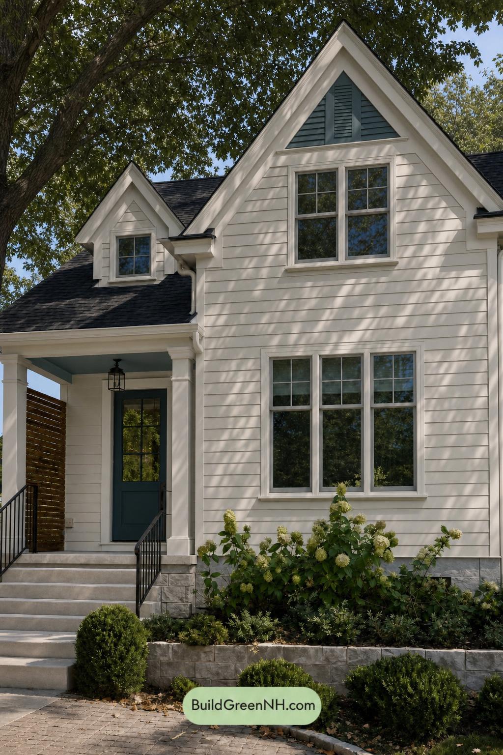
In shade, the light beige siding takes on a softer, slightly cooler cast than it would in neutral daylight, with less visible saturation and a more hushed presence. The white trim feels gentler rather than crisp-bright, while the shifting leaf shadows add depth across the facade and emphasize the home’s layered siding and gabled details.
The deep blue accents become moodier and more substantial in shaded areas, creating a richer contrast against the softened warm neutrals. Gray railings recede into the shadows with a quieter, more grounded look, giving the exterior an inviting, sheltered atmosphere rather than the sharper contrast seen in open daylight.
Nighttime
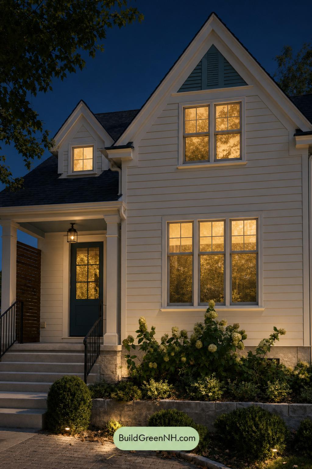
At night, the beige siding takes on a softer, richer warmth under the glow from the windows and landscape lighting, while areas beyond the light fall into deeper, quieter shadow. In contrast to neutral daylight, the white trim reads less crisp and more creamy, gently framing the rooflines and windows rather than sharply outlining them.
The blue accents deepen toward a moodier, more muted shade, creating stronger contrast against the illuminated warm neutrals. Dark gray railings recede into the shadows, adding definition without competing for attention, while the overall mix of warm pools of light and cool dark surroundings gives the exterior a calm, inviting presence.
Pin these for later:
Want More?
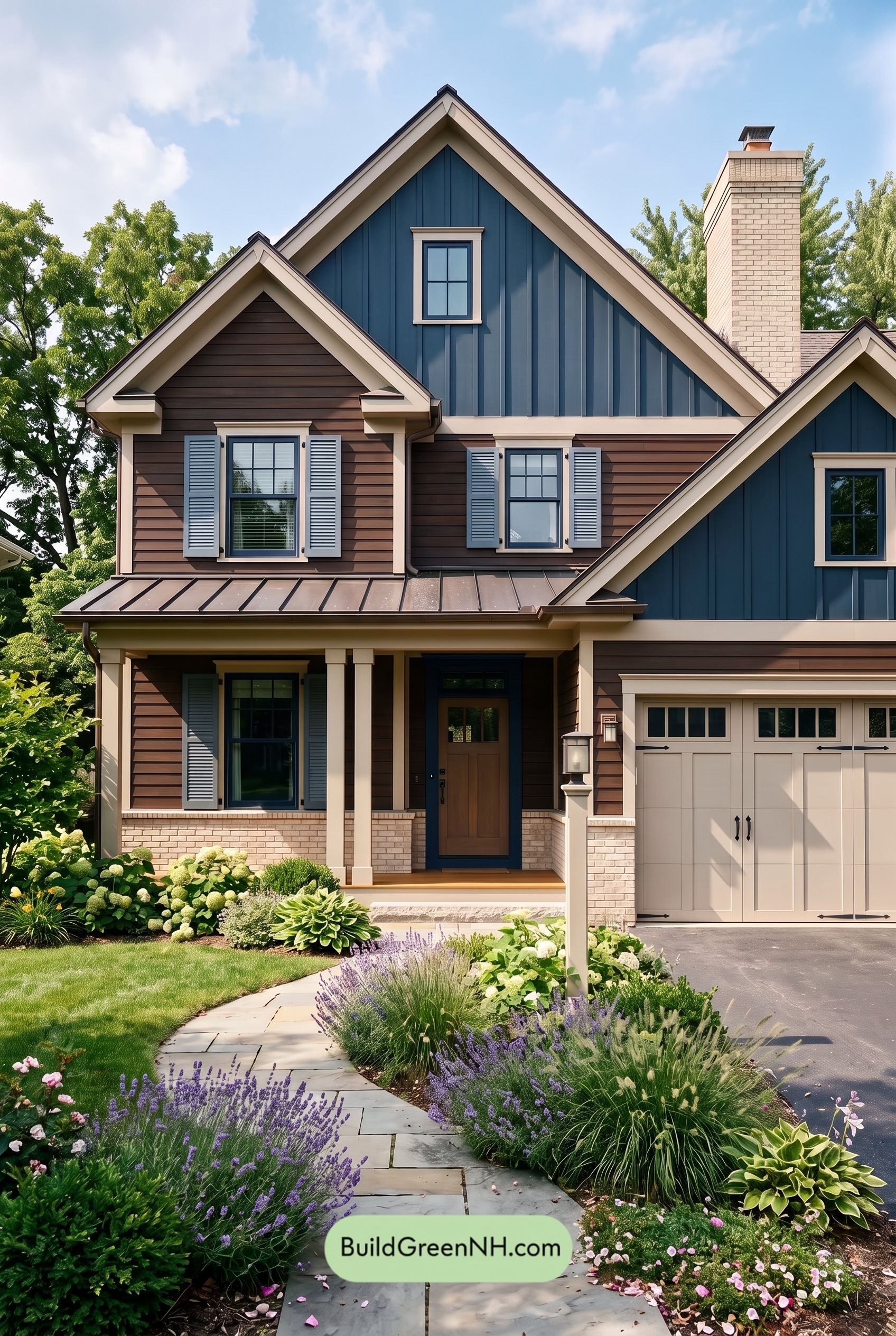 Dark Brown House Exterior Color Scheme: Inkwood Lantern
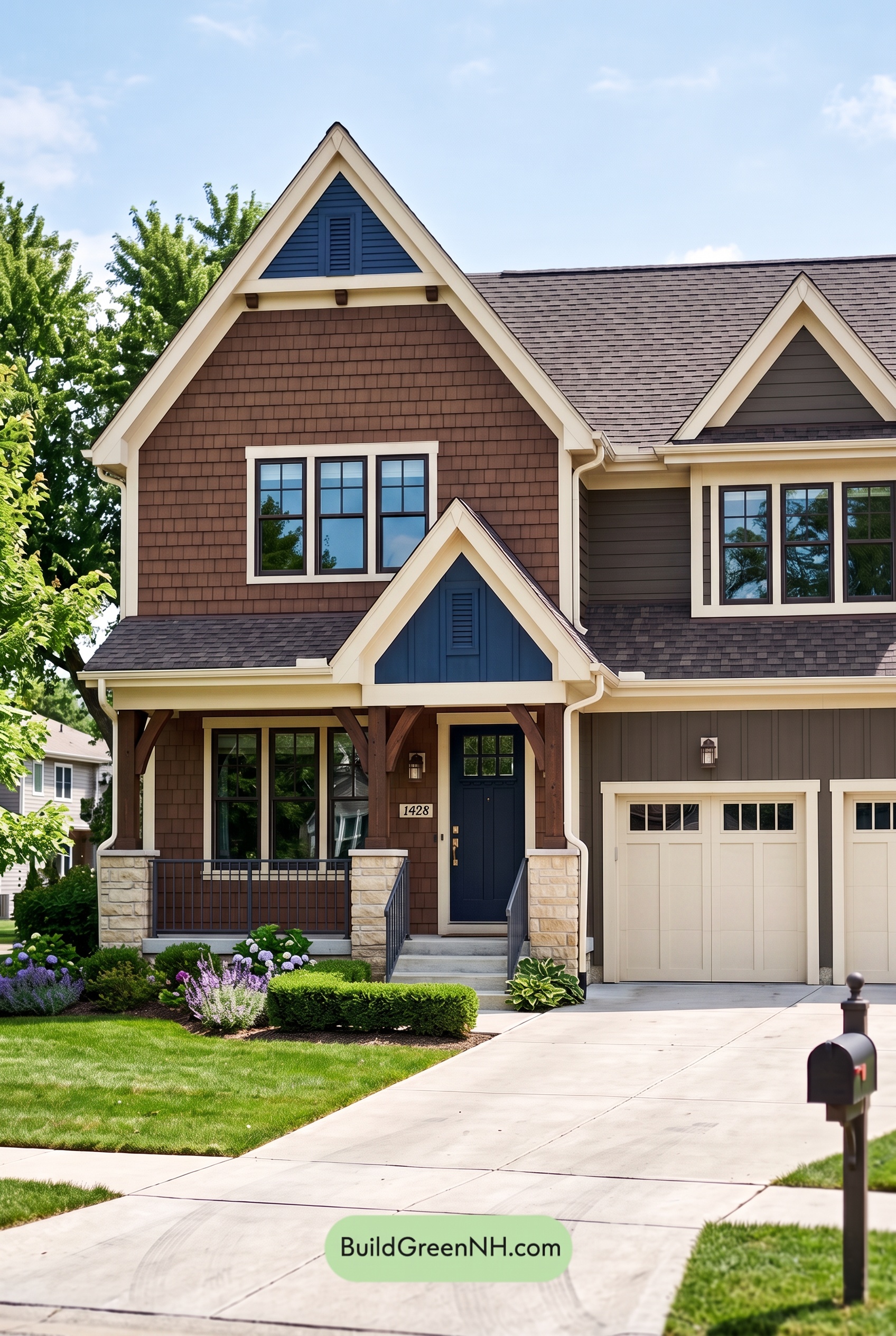 Dark Brown House Exterior Color Scheme: Bluebell Timberline
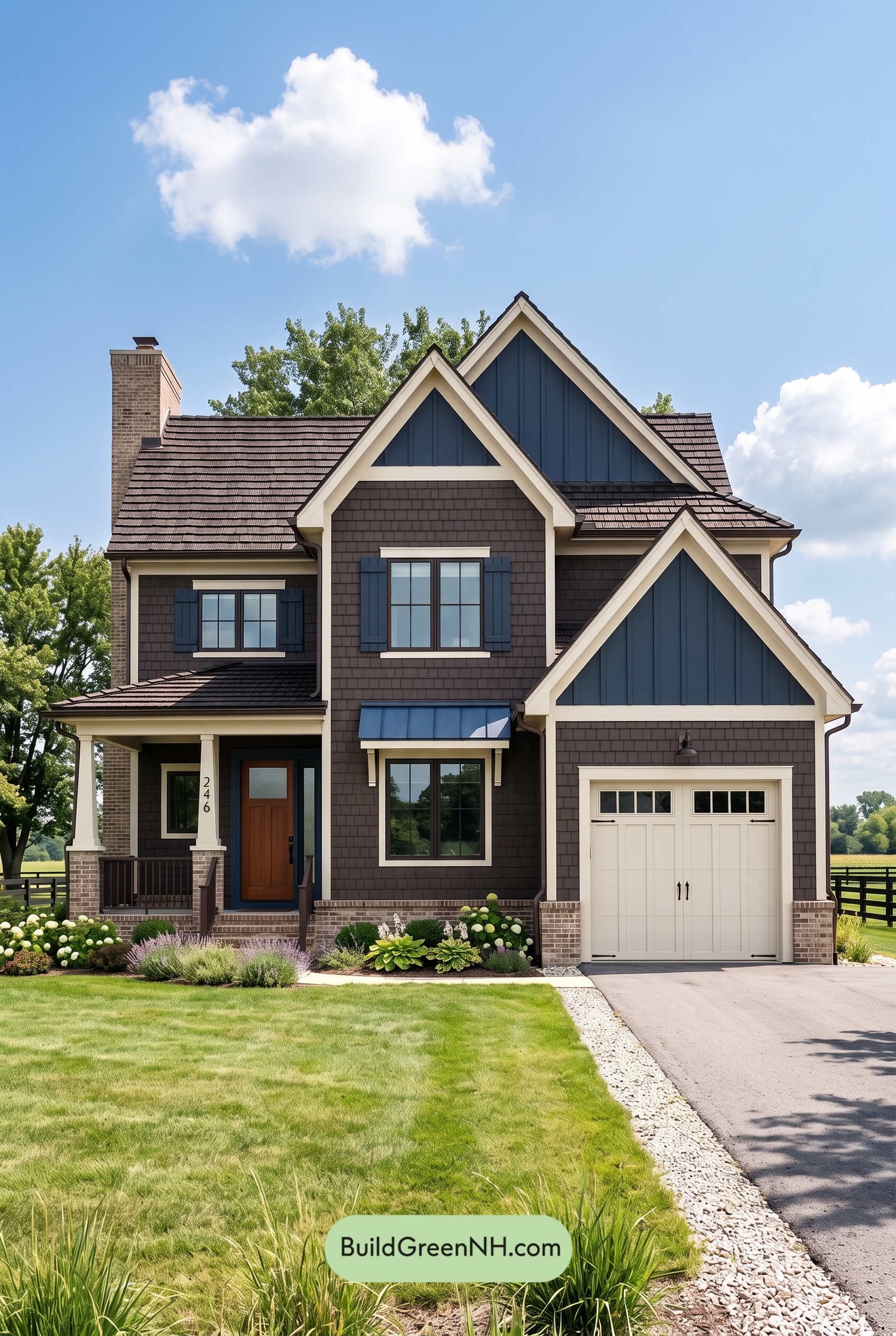 Dark Brown House Exterior Color Scheme: Sapphire Homestead
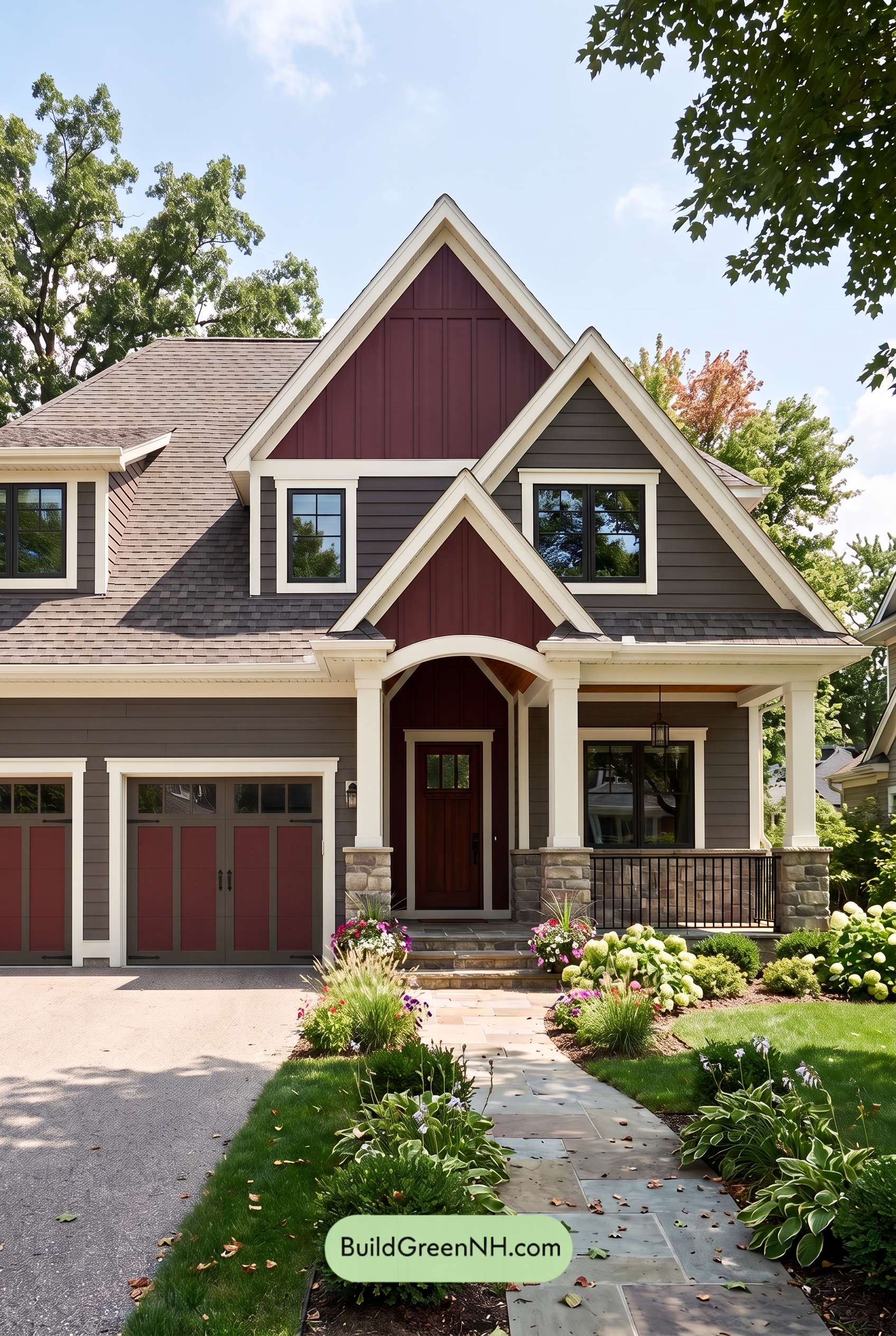 Dark Brown House Exterior Color Scheme: Hearthglow Arrival
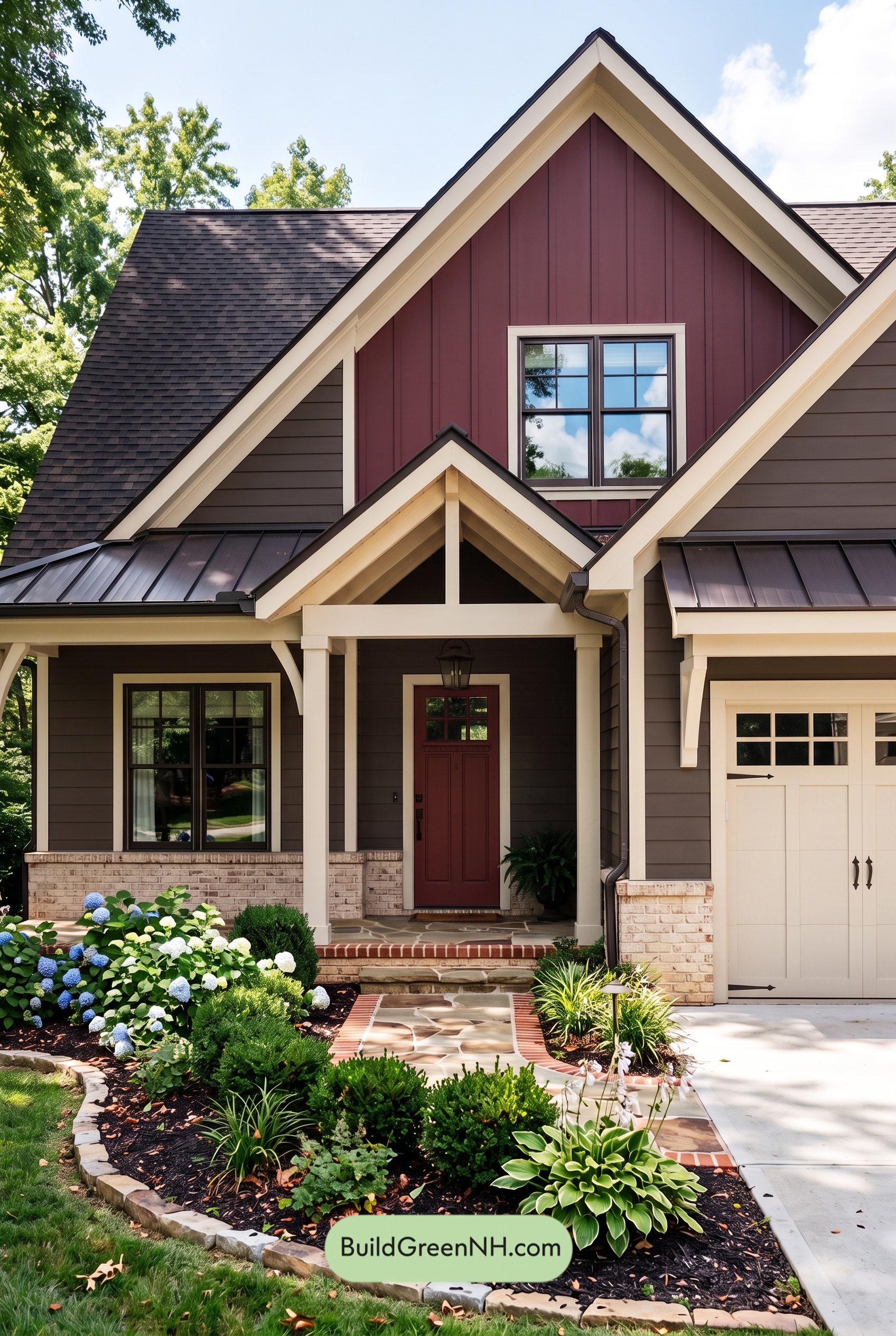 Dark Brown House Exterior Color Scheme: Embercrest Welcome
Table of Contents