Last updated on
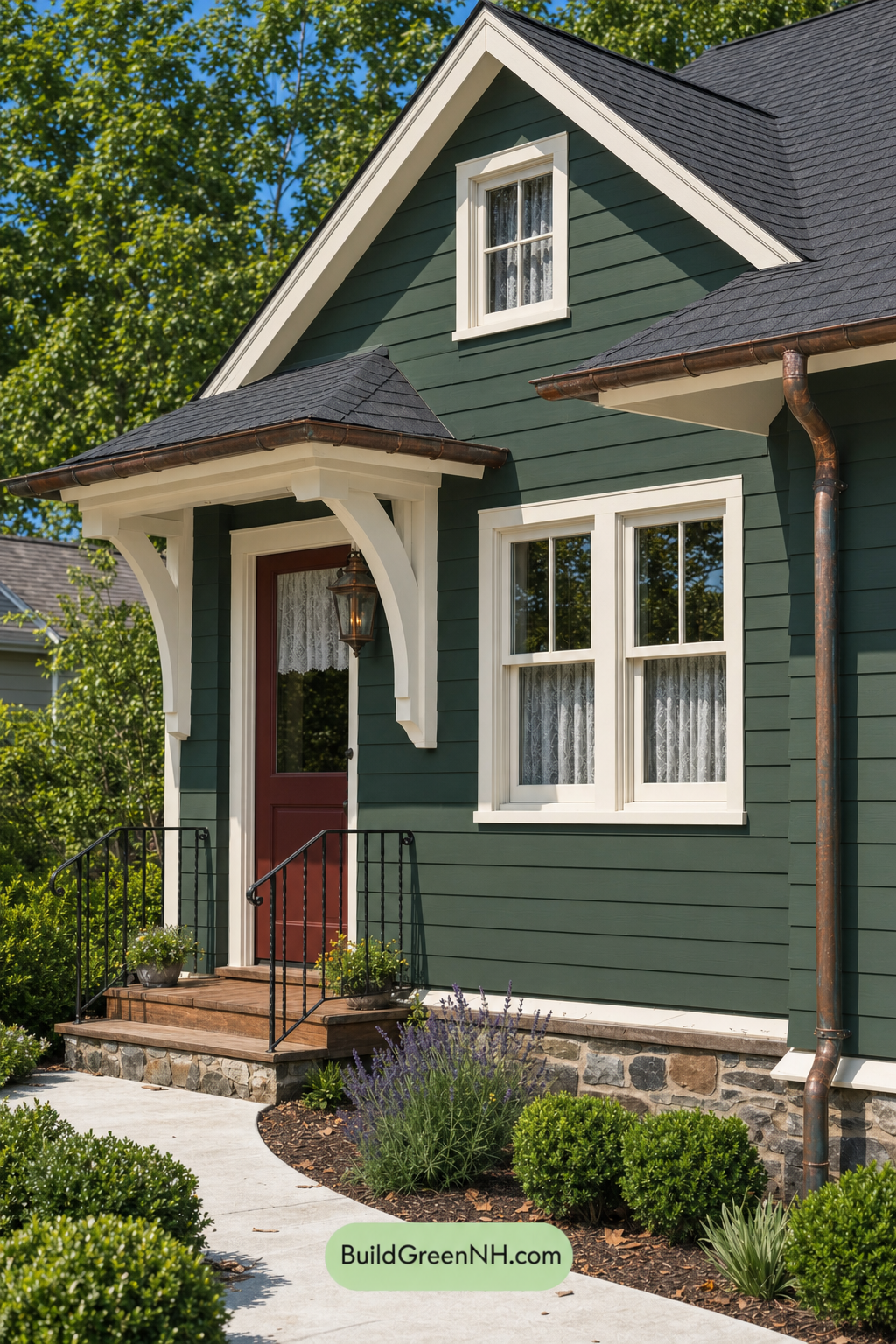

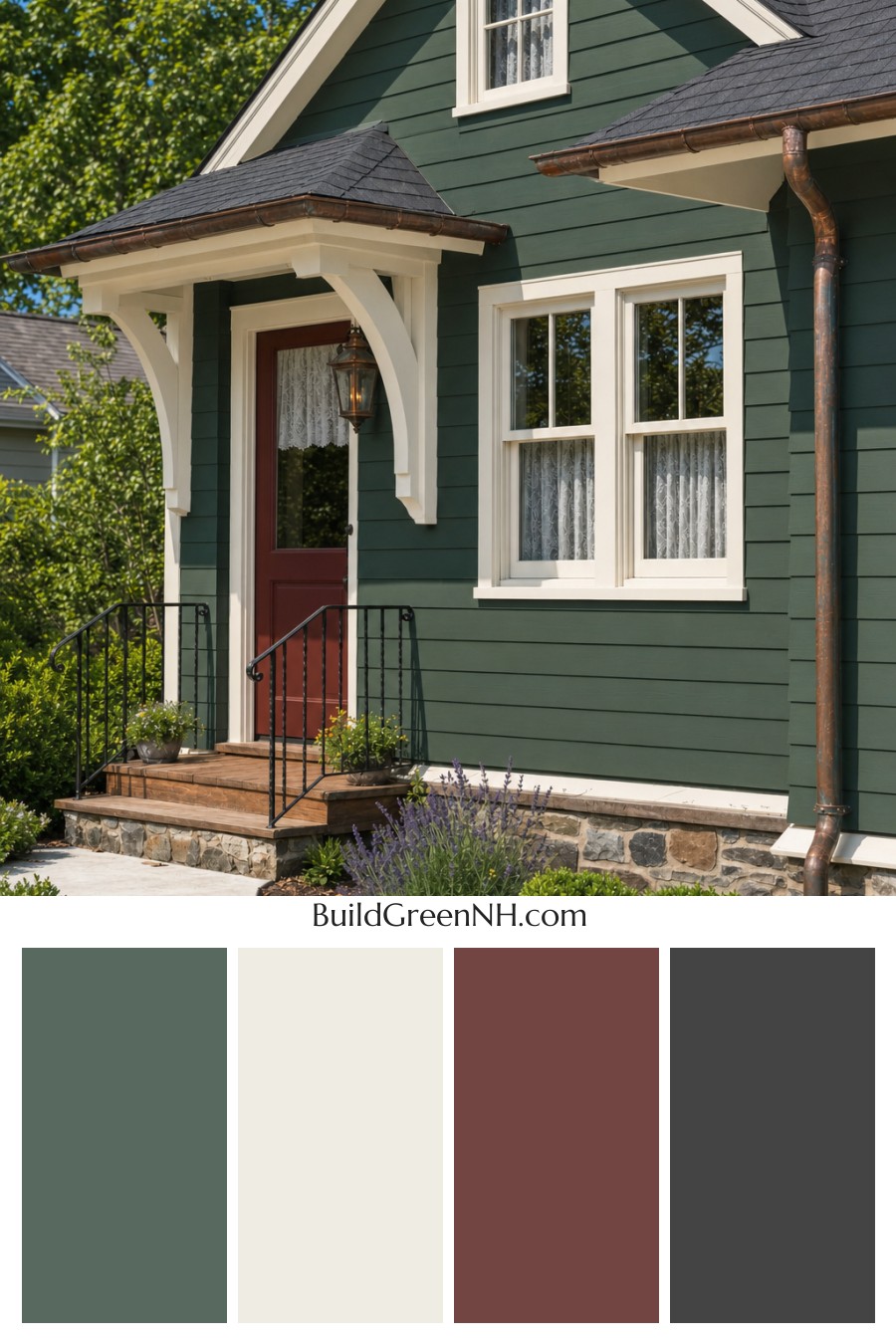
This exterior color scheme feels instantly inviting because its deep green siding, warm white trim, and earthy brown accents balance cottage charm with crisp, timeless contrast.
A Rich Green That Grounds the Home
The main siding is wrapped in a deep, muted shade of green, giving the house a calm and rooted presence. It feels natural without disappearing into the landscaping, which is exactly why it works so beautifully here. Against the surrounding trees and garden beds, the green reads as thoughtful and classic rather than overly bold.
The horizontal siding also benefits from this darker shade. Sunlight creates soft shadows across each board, adding depth and texture while keeping the overall look polished.
Warm White Trim Adds Fresh Contrast
The trim, window frames, porch columns, and gable details are finished in a warm white shade that brightens the entire exterior. This lighter color outlines the architecture clearly, drawing attention to the charming rooflines, window proportions, and welcoming front entry.
Because the white leans warm rather than stark, it softens the contrast with the deep green siding. The result is crisp, but not cold. It gives the home a cheerful cottage quality while still feeling refined.
Earthy Brown Accents Bring Warmth
The front door introduces a rich brown shade that adds warmth at the center of the facade. It feels grounded, welcoming, and slightly rustic, especially paired with the wood tones of the porch floor and steps.
Other brown-toned details, including the metalwork along the roofline, echo that warmth in a subtle way. These accents keep the palette from feeling too formal and help connect the home to the stone base and natural landscaping.
Gray Details Keep the Look Balanced
The roof uses a dark gray shade that provides a steady, understated cap to the house. It complements the green siding without competing with it, while also adding a sense of structure and durability.
The railings appear in a deep gray shade, giving the porch just enough contrast without becoming the main focus. This darker accent is practical and visually grounding, especially against the warm white columns and brown-toned porch.
Why the Palette Works So Well
This scheme succeeds because every color has a clear role. The green siding sets the mood, the warm white trim sharpens the architecture, the brown accents invite you toward the entry, and the gray elements quietly anchor the design.
Overall, the home feels cozy, traditional, and connected to its landscape. It is a great example of how a nature-inspired exterior palette can still look fresh, clean, and full of personality.
Next, see how this color scheme looks under different lighting simulations throughout the day.
Overcast
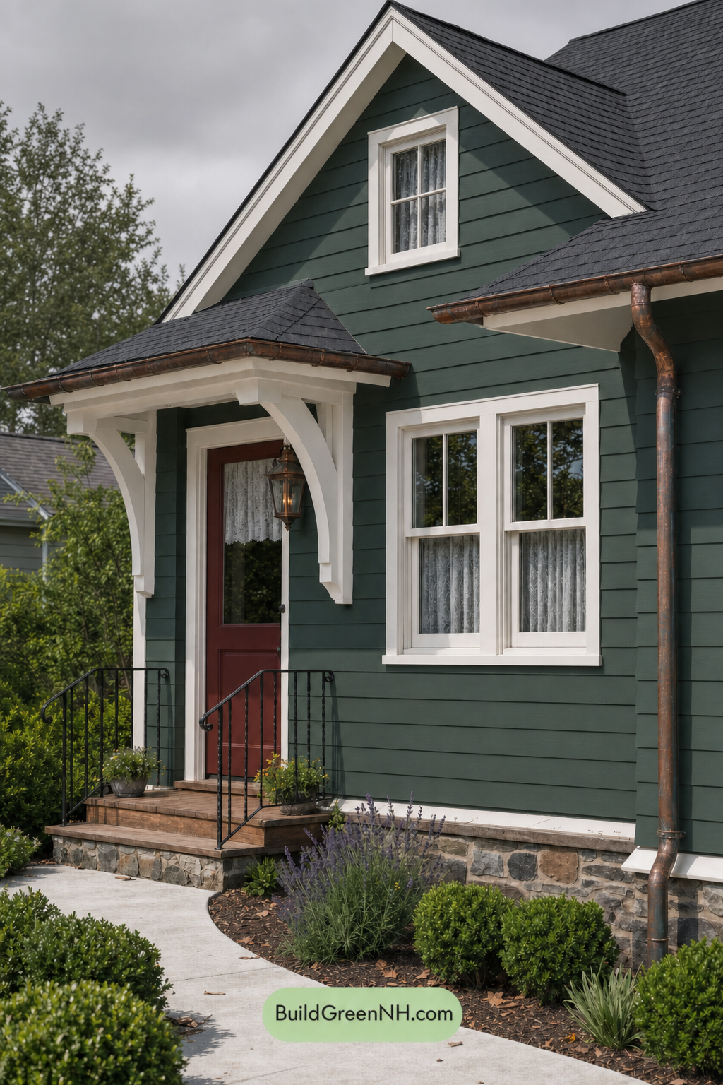
Under overcast light, the green siding takes on a deeper, cooler character than it would in neutral daylight, with its saturation softened and its warmth slightly dialed back. The white trim and columns lose some crisp brightness, appearing gentler and more muted, which reduces the sharp contrast around the windows and roofline.
Shadows become broader and softer, so the siding’s texture feels more even and less dramatic. The brown front door reads richer but less warm, while the gray railings blend more quietly into the scene, giving the whole exterior a calm, grounded, and slightly moody feel.
Golden Hour
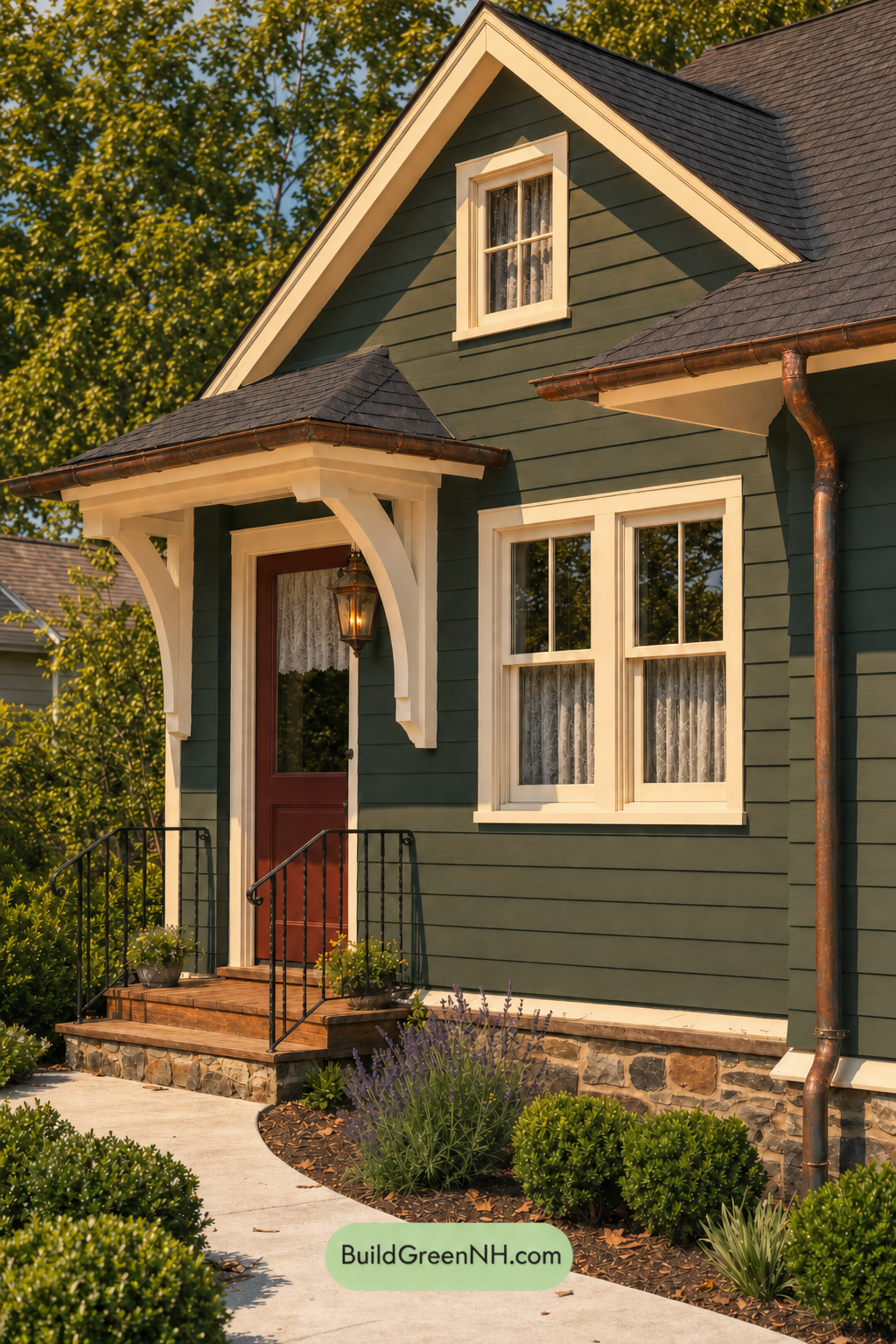
Under Golden Hour light, the green siding takes on a deeper, more saturated character than it would in neutral daylight, with a gentle warm cast that makes the shade feel richer and more grounded. The white trim, window frames, and columns shift from crisp and bright to softly creamy, reducing glare while giving the edges a welcoming glow.
Longer shadows add drama across the gables and siding, increasing contrast between sunlit trim and shaded green walls. The brown front door appears warmer and richer, while the gray railings read slightly darker and more defined, creating a cozy, layered mood that feels more intimate than the cleaner balance of neutral daylight.
Shade
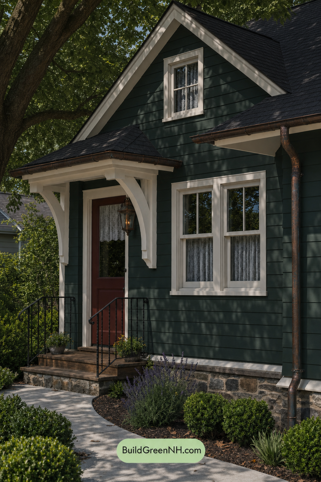
In shade, the green siding appears deeper and more saturated than it would in neutral daylight, taking on a cooler, richer character. The white trim and window frames lose some crisp brightness, shifting softer and creamier where shadows pass across them, which makes the contrast feel gentler but still defined.
The brown front door warms the entry with a grounded, inviting note, while the gray railings recede slightly in the lower light. Dappled shadows add movement across the façade, giving the palette a calm, wooded mood with a more intimate and sheltered feel than the clearer, brighter balance of neutral daylight.
Nighttime
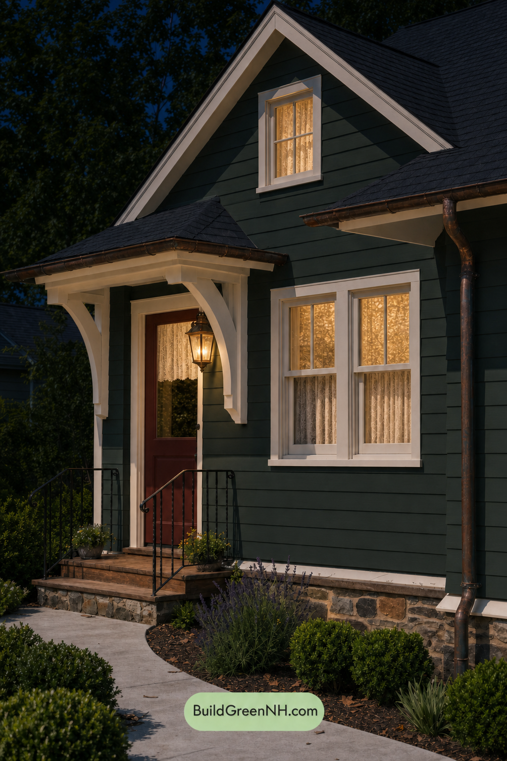
At nighttime, the green siding loses some of the crispness it has in neutral daylight and reads deeper, cooler, and more saturated. Shadows gather under the eaves and along the horizontal lines, giving the walls a richer, more layered look while increasing contrast across the façade.
The white trim, window frames, and columns shift warmer under the porch and interior lighting, feeling softer and creamier against the darkened green. The brown front door appears deeper and cozier, while the gray railings recede into shadow, creating a mood that feels intimate, welcoming, and more dramatic than it would in daylight.
Pin these for later:
Want More?
 Exterior Color Scheme with Stone Accents: Pine Brass Threshold
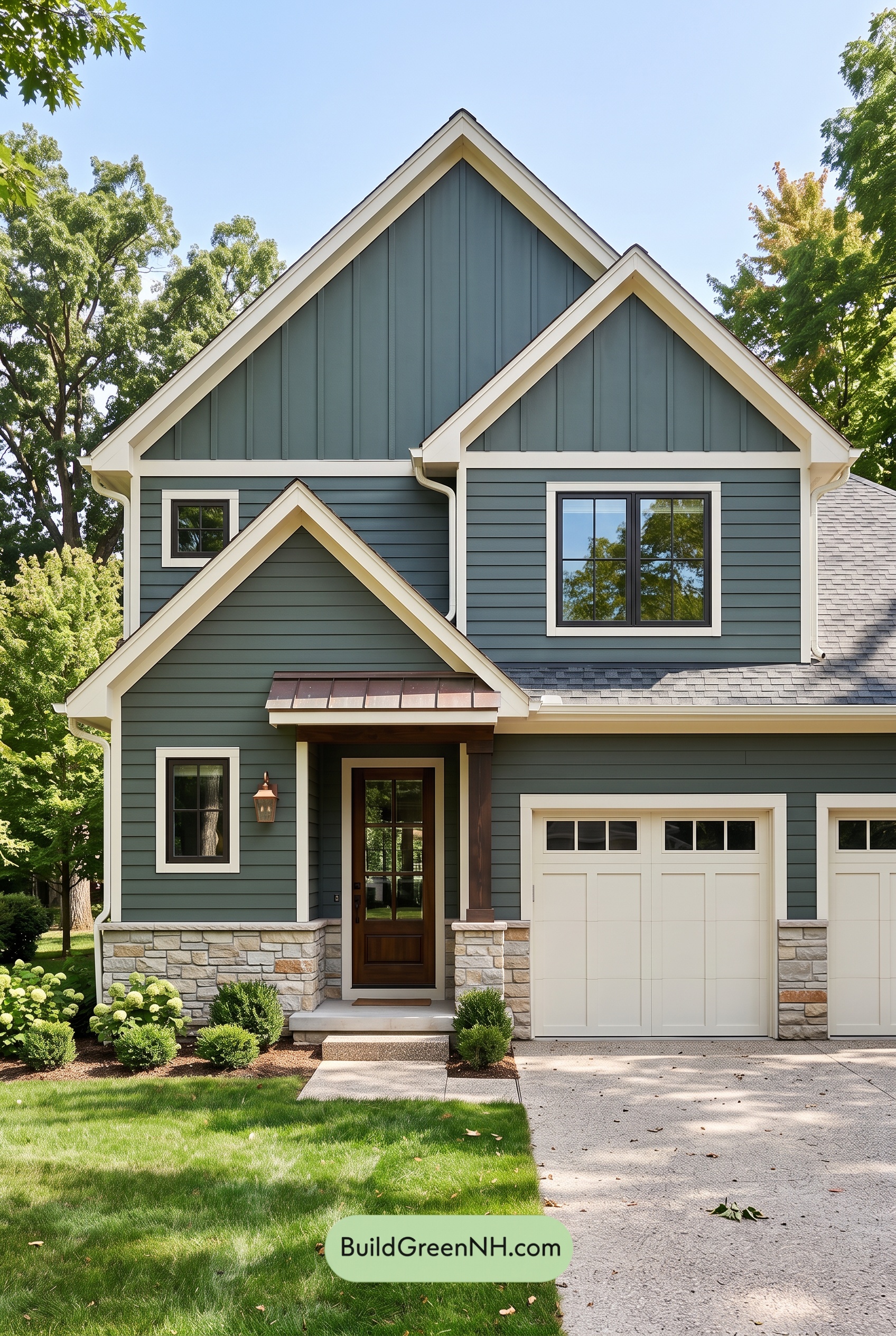 Exterior Color Scheme with Stone Accents: Evergreen Copper Welcome
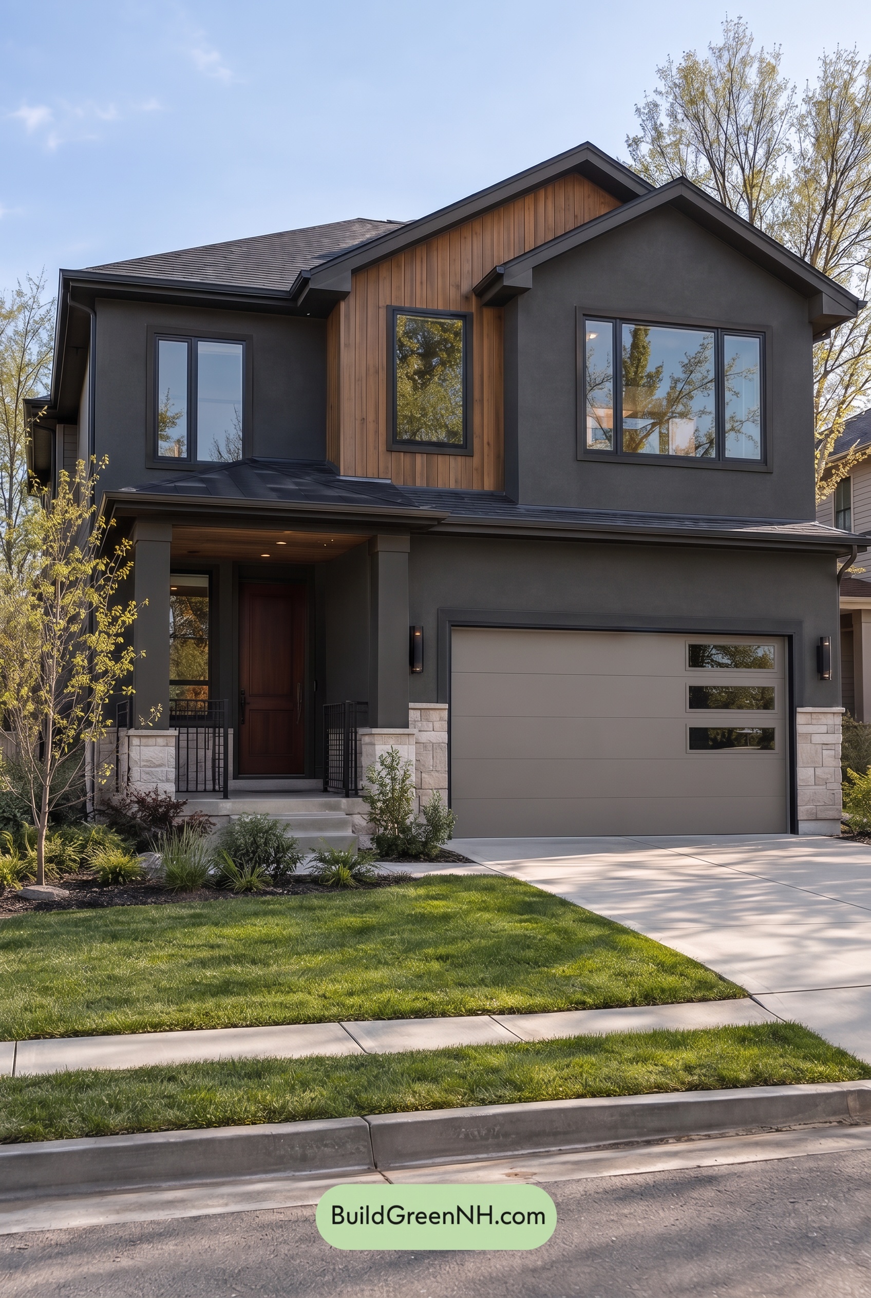 Dark Stucco House Exterior Color Scheme: Cedar Ember Calm
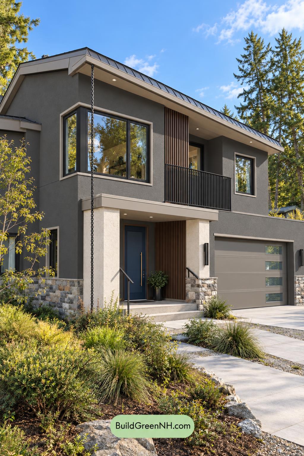 Dark Stucco House Exterior Color Scheme: Silver Pine Shelter
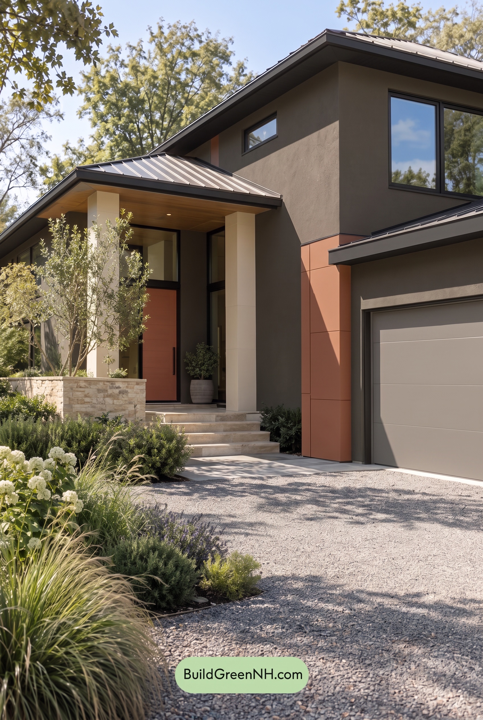 Dark Stucco House Exterior Color Scheme: Copper Orchard House
Table of Contents