Last updated on
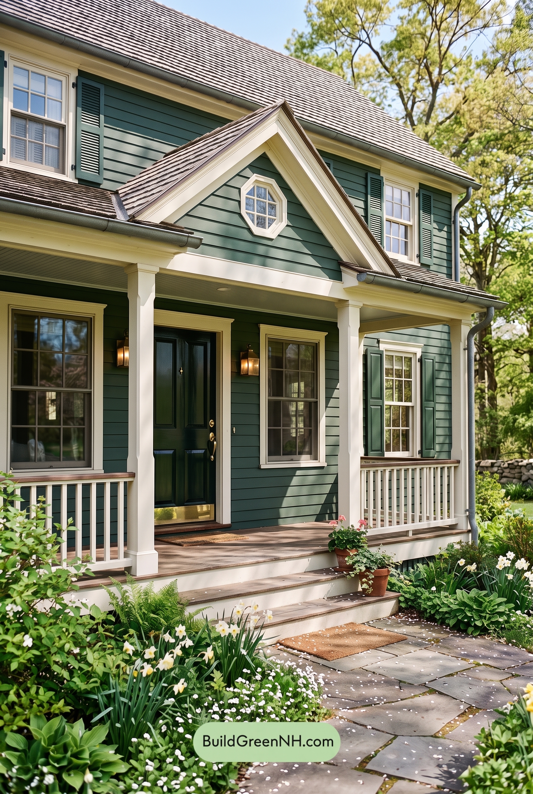

This green-and-white exterior feels timeless, fresh, and beautifully rooted in its garden setting.
A Classic Green Siding Choice
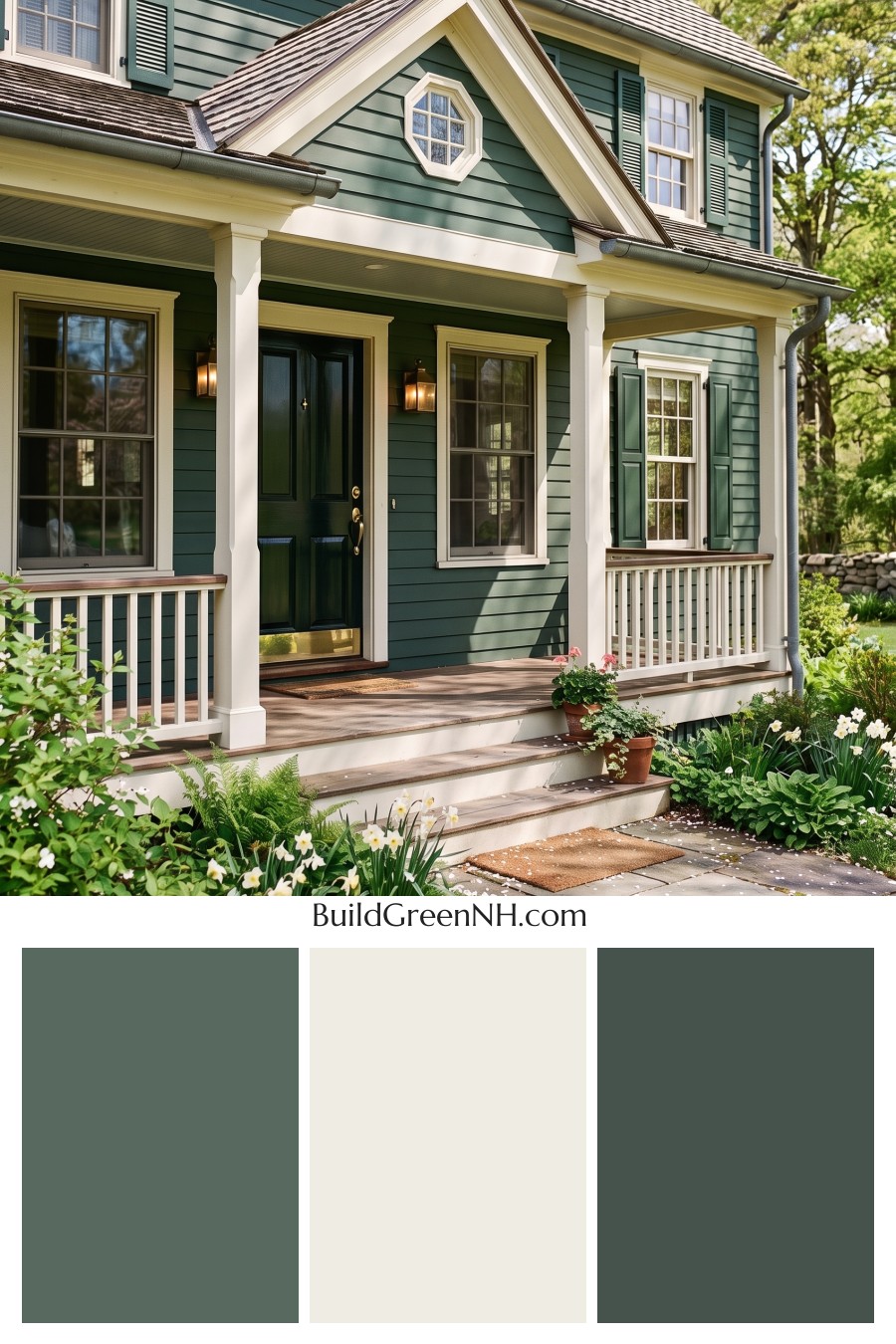
The main siding is dressed in a rich, muted shade of green that gives the home a grounded, welcoming presence. It has enough depth to feel substantial, but it still reads soft and natural against the surrounding trees and garden beds.
Because the siding runs horizontally across the façade, this green shade helps emphasize the home’s traditional lines. It feels calm, established, and quietly elegant without looking too formal.
Crisp White Trim That Brightens Everything
The trim, window frames, columns, and railings all sit in the white family, creating a clean contrast against the deeper green siding. This warm white shade outlines the architecture beautifully, from the porch posts to the gable details and window casings.
That contrast is what makes the exterior feel so polished. The white trim keeps the green from becoming too heavy, while the green gives the white details something rich and natural to stand against.
Layered Green Accents
The shutters and front door continue the green story, but in a deeper, more saturated shade. This creates a layered look rather than a flat one. The shutters frame the windows with definition, while the front door feels classic and inviting.
Using a darker green for these accents is a smart move. It adds depth and character while keeping the palette cohesive and restrained.
A Roof That Grounds the Palette
The roof appears in a weathered brown-gray shade, which works beautifully with the green siding. Its earthy tone adds warmth and texture, helping the house feel connected to the stone path, wood porch floor, and natural landscape.
Instead of competing with the exterior colors, the roof quietly supports them. It gives the whole home a settled, traditional feel.
The Overall Mood
This color scheme feels refined, garden-friendly, and deeply inviting. The green shades bring a sense of calm and connection to nature, while the white details add freshness and architectural clarity.
It is a wonderful example of a classic exterior palette done well: simple, balanced, and full of charm. The result is a home that feels both graceful and comfortable, with just the right amount of contrast to make every detail shine.
Next, see how this color scheme looks under different lighting simulations throughout the day.
Overcast
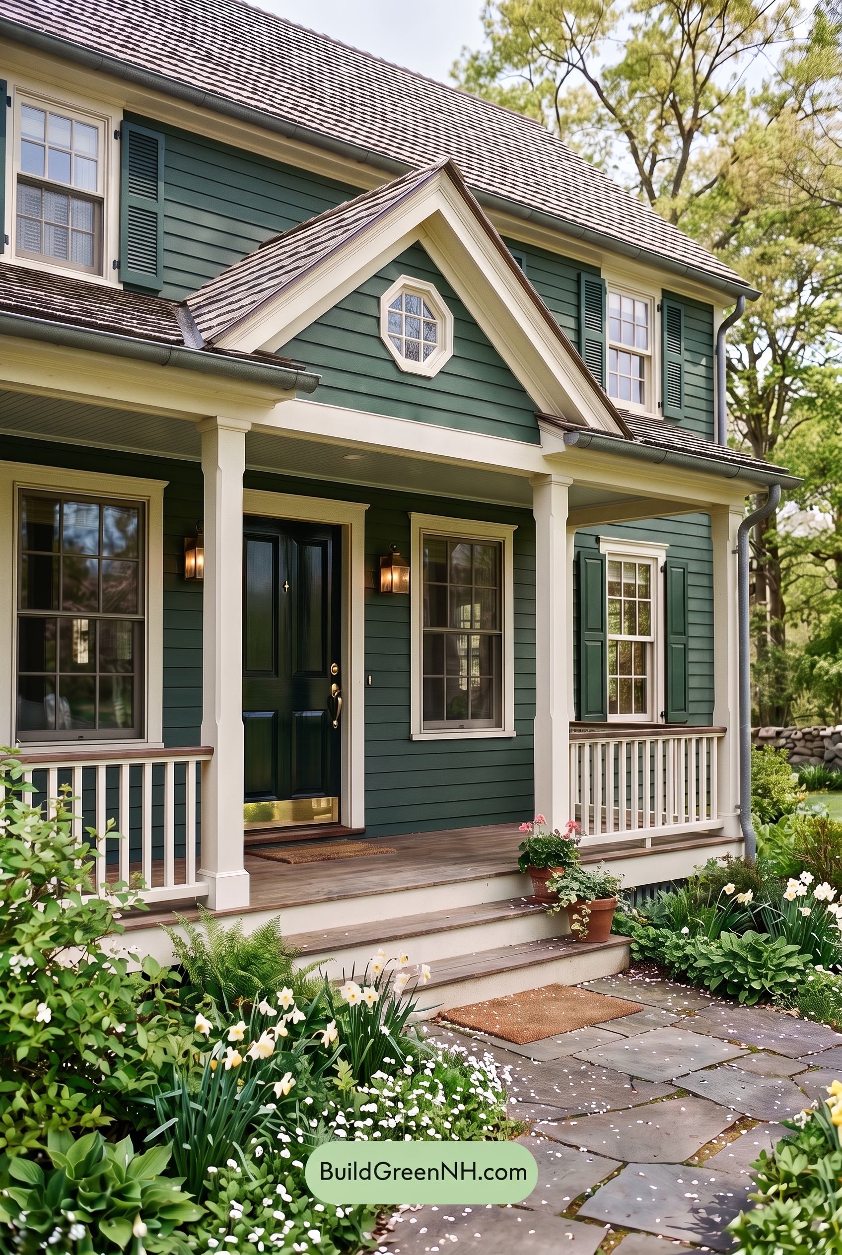
Under Overcast light, the green family on the siding, shutters, and front door appears calmer and slightly deeper than it would in neutral daylight. Saturation softens a bit, and any natural warmth in the green is cooled, giving the exterior a more muted, grounded character.
The white trim, columns, window frames, and railings lose some of their bright crispness, shifting toward a softer, quieter shade. Shadows become broader and gentler, so contrast feels less sharp, creating a relaxed, cozy mood rather than the brighter, more defined look of neutral daylight.
Golden Hour
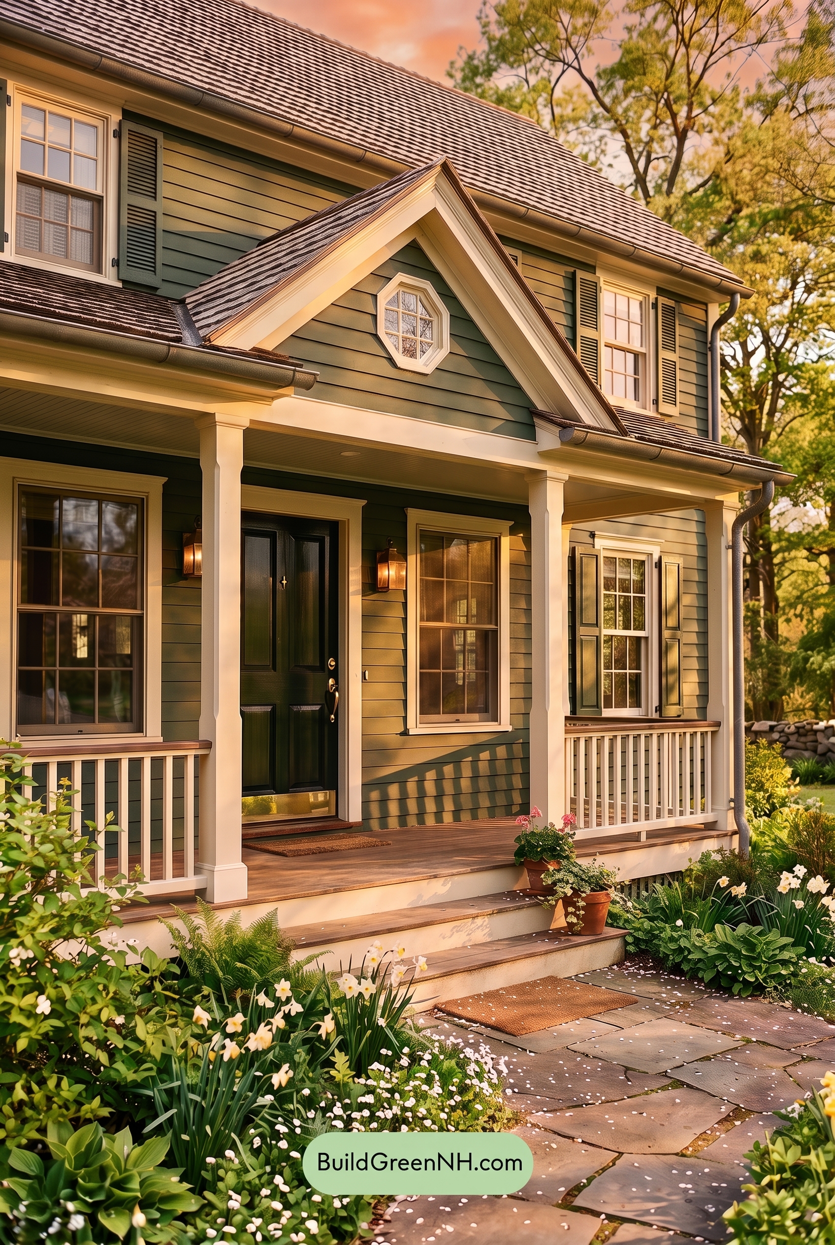
Under Golden Hour light, the green family on the siding, shutters, and front door feels richer and more saturated than it would in neutral daylight. The warm cast softens cooler undertones, giving the greens a mellow, inviting depth while making the white trim, columns, railings, and window frames appear warmer and creamier.
Longer shadows add stronger contrast across the clapboard and porch details, so the darker green shades look moodier and more dimensional. Compared with the clearer, flatter balance of neutral daylight, this lighting creates a cozy, welcoming mood with softer highlights and a gently dramatic exterior presence.
Shade
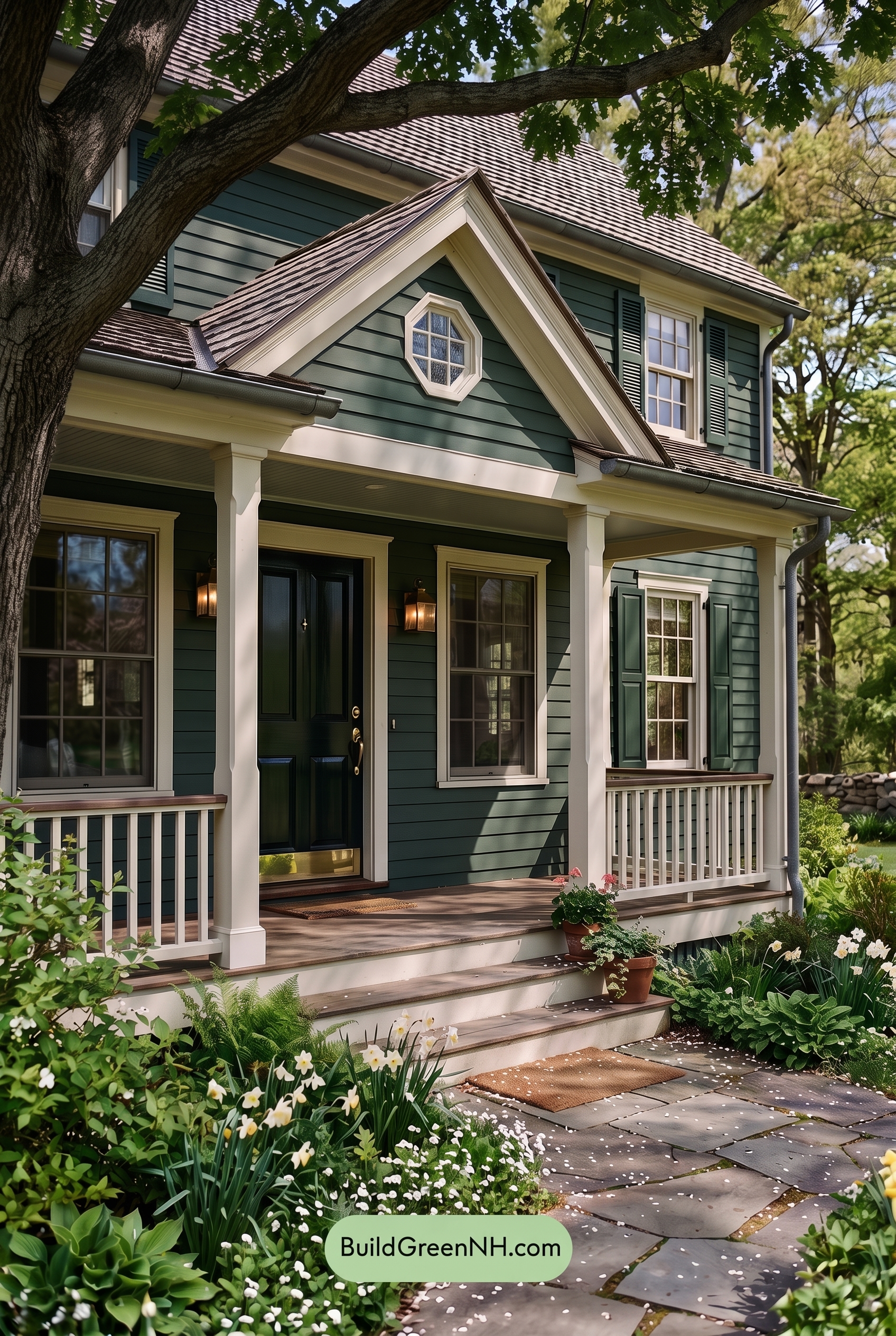
In Shade, the green family on the siding, shutters, and front door reads deeper and more saturated than it would in neutral daylight. The cooler, filtered light pulls down the warmth, giving these green shades a richer, calmer character while the tree shadows add layered depth across the facade.
The white family on the trim, columns, window frames, and railings feels softer and slightly muted in Shade, with less bright contrast than in clear daylight. Instead of crisp and sunny, the overall mood becomes more sheltered, refined, and woodland-inspired, with gentle contrast between the deep greens and softened whites.
Nighttime
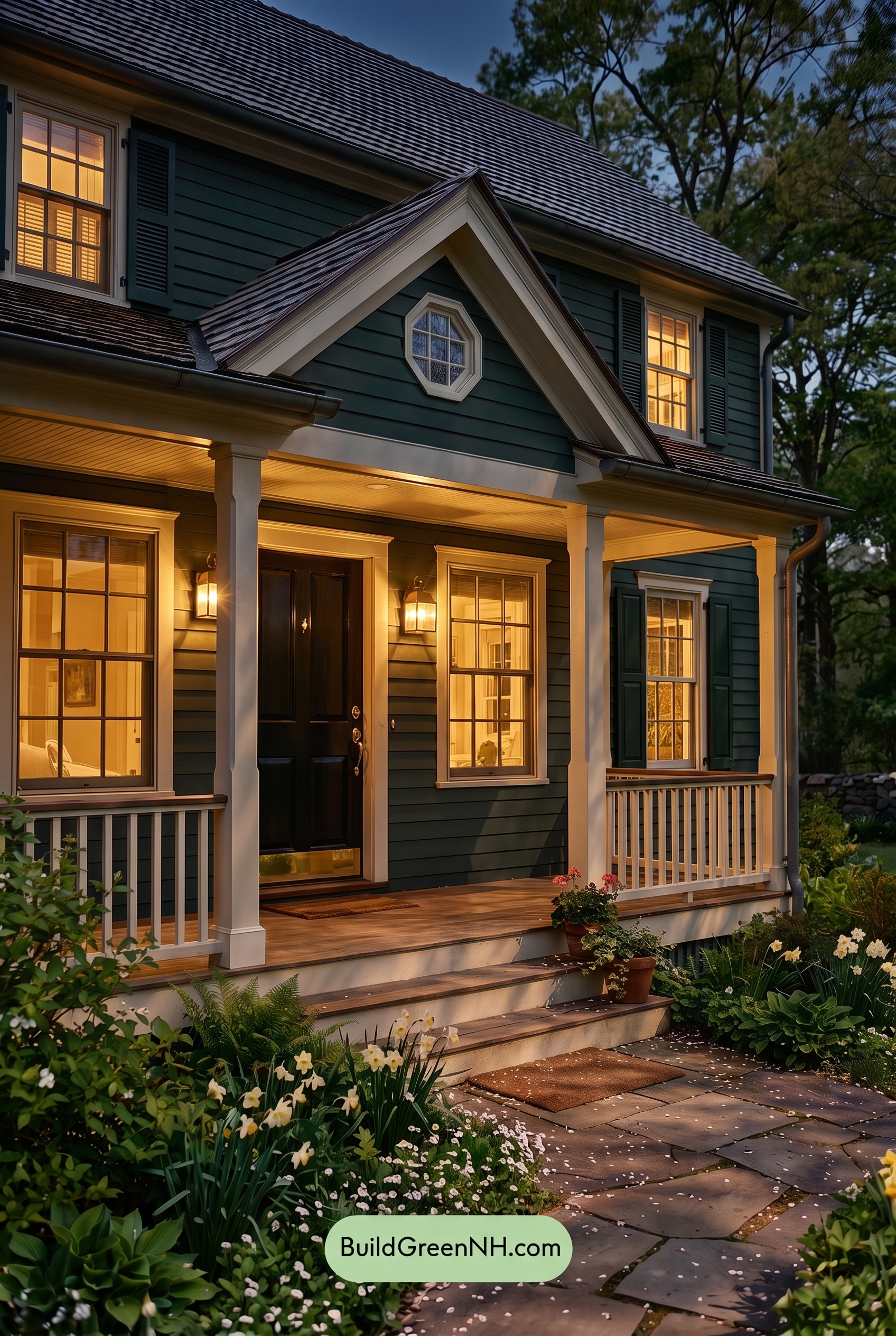
At nighttime, the green family on the siding and shutters appears deeper and more saturated than it would in neutral daylight, with shaded areas pulling the color toward a richer, moodier shade. The warm glow from the windows and porch lighting adds softness, making nearby green surfaces feel slightly warmer while the unlit sections become cooler and more subdued.
The white family trim, columns, and railings take on a gentle warmth under the lights, shifting from crisp daylight contrast to a softer, welcoming brightness. Stronger shadows under the rooflines and porch details heighten contrast, giving the exterior a cozy, dramatic mood with added depth and character.
Pin these for later:
Want More?
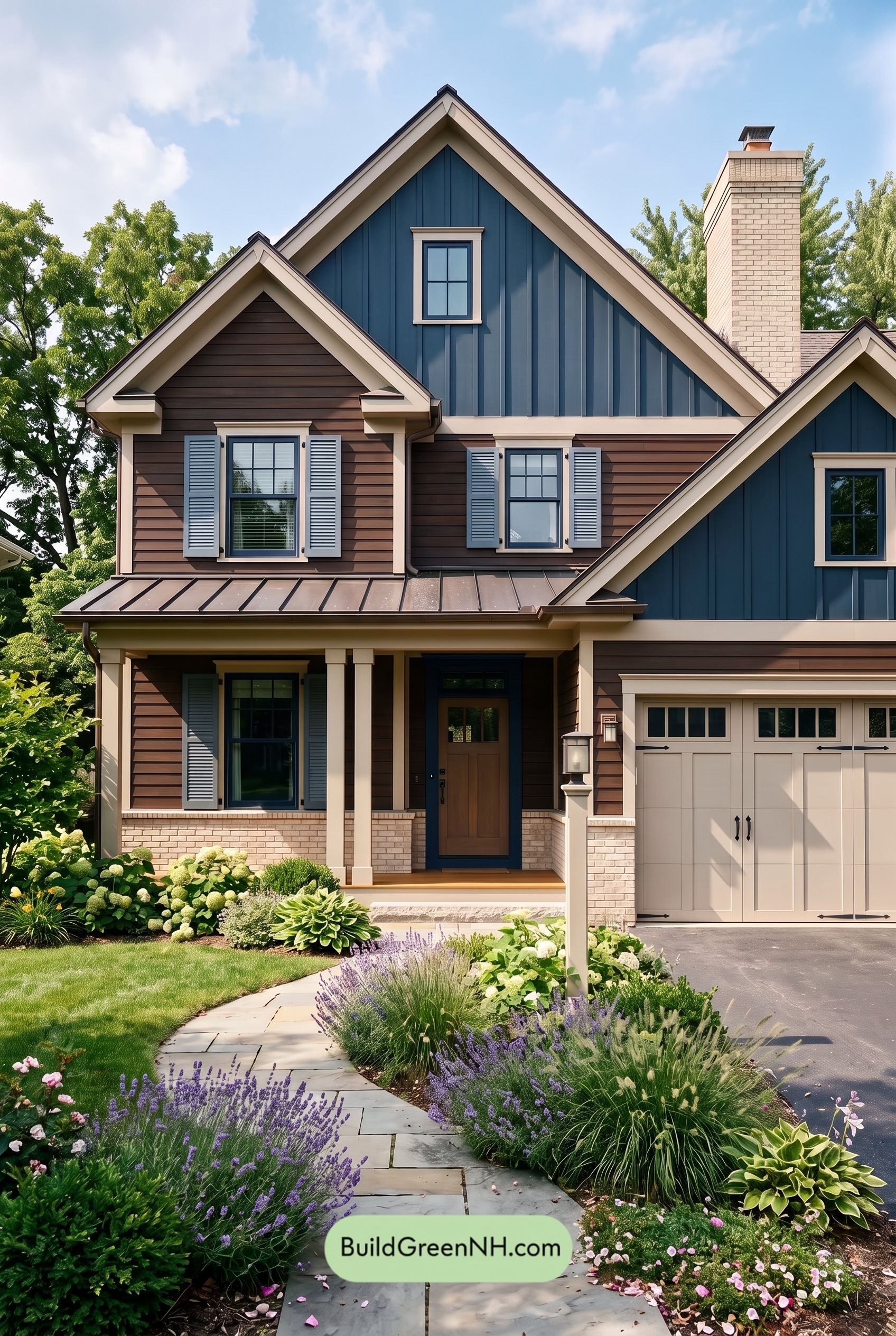 Dark Brown House Exterior Color Scheme: Inkwood Lantern
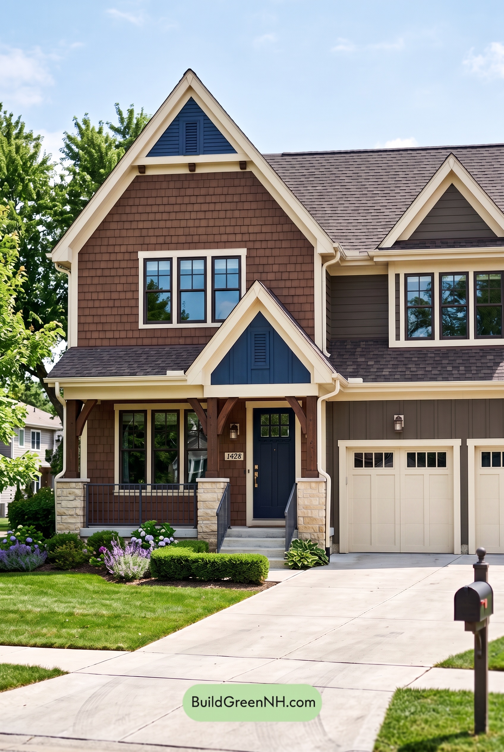 Dark Brown House Exterior Color Scheme: Bluebell Timberline
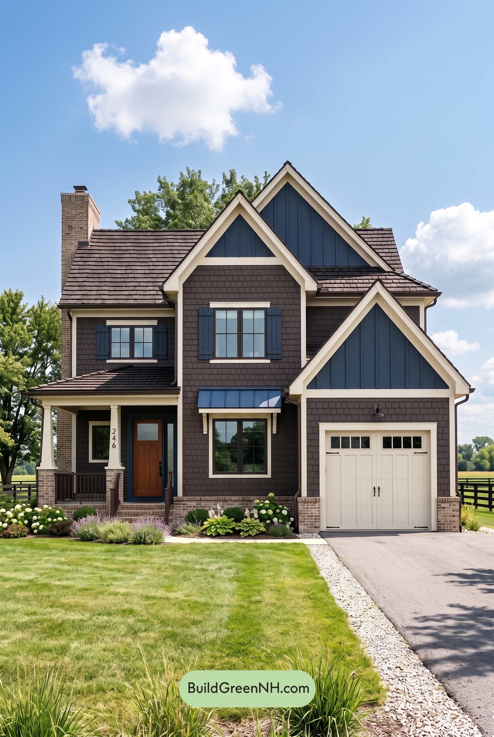 Dark Brown House Exterior Color Scheme: Sapphire Homestead
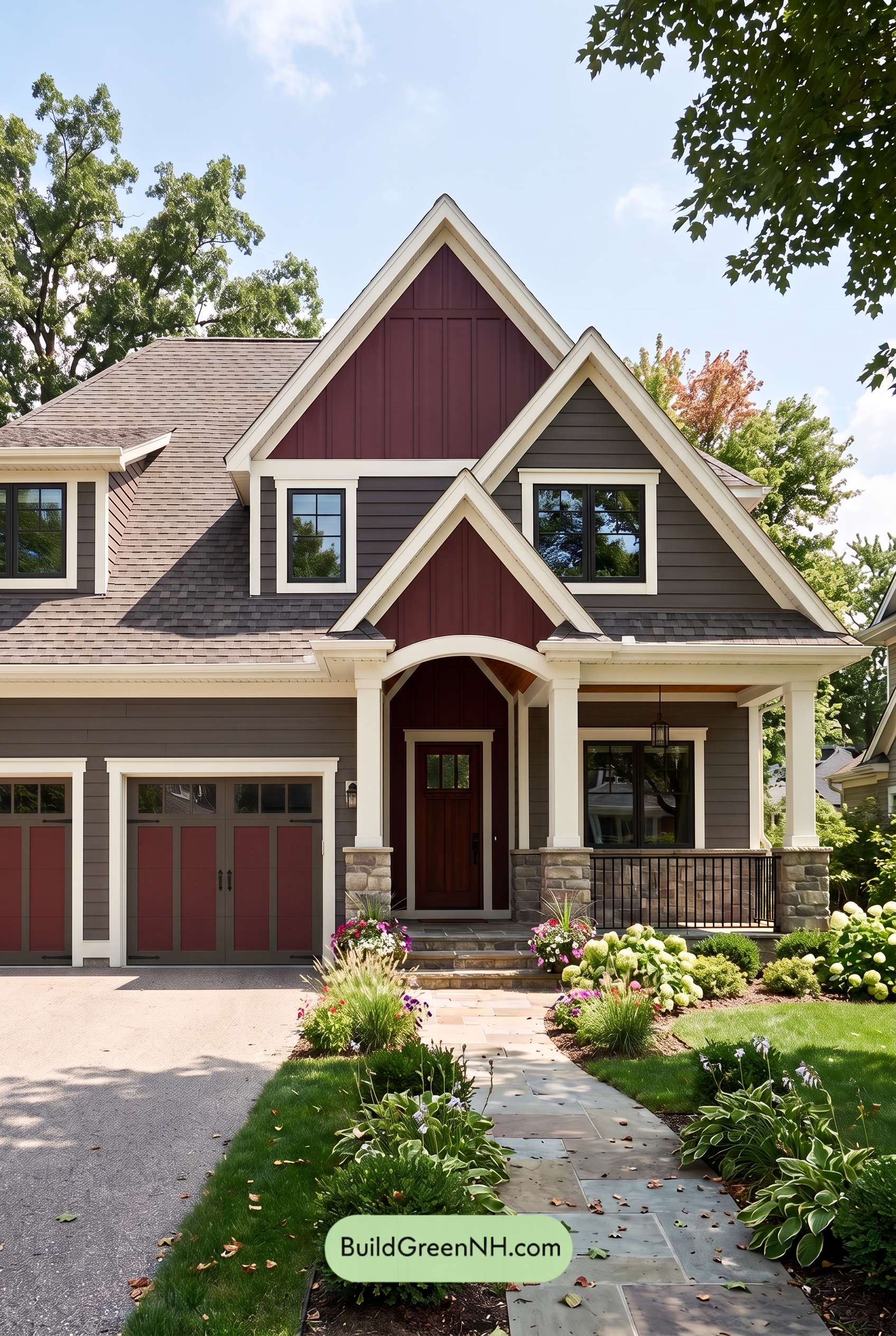 Dark Brown House Exterior Color Scheme: Hearthglow Arrival
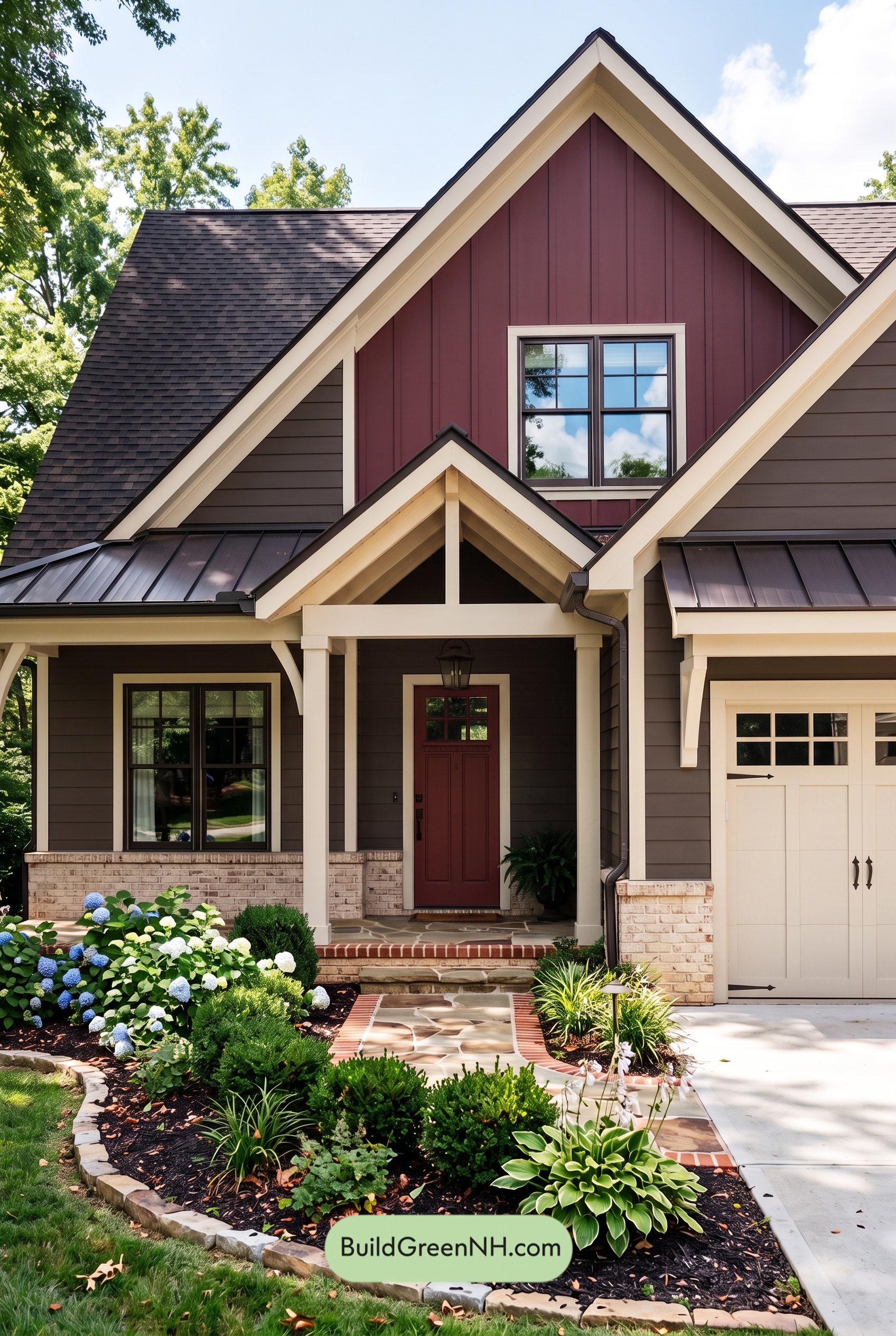 Dark Brown House Exterior Color Scheme: Embercrest Welcome
Table of Contents