Last updated on
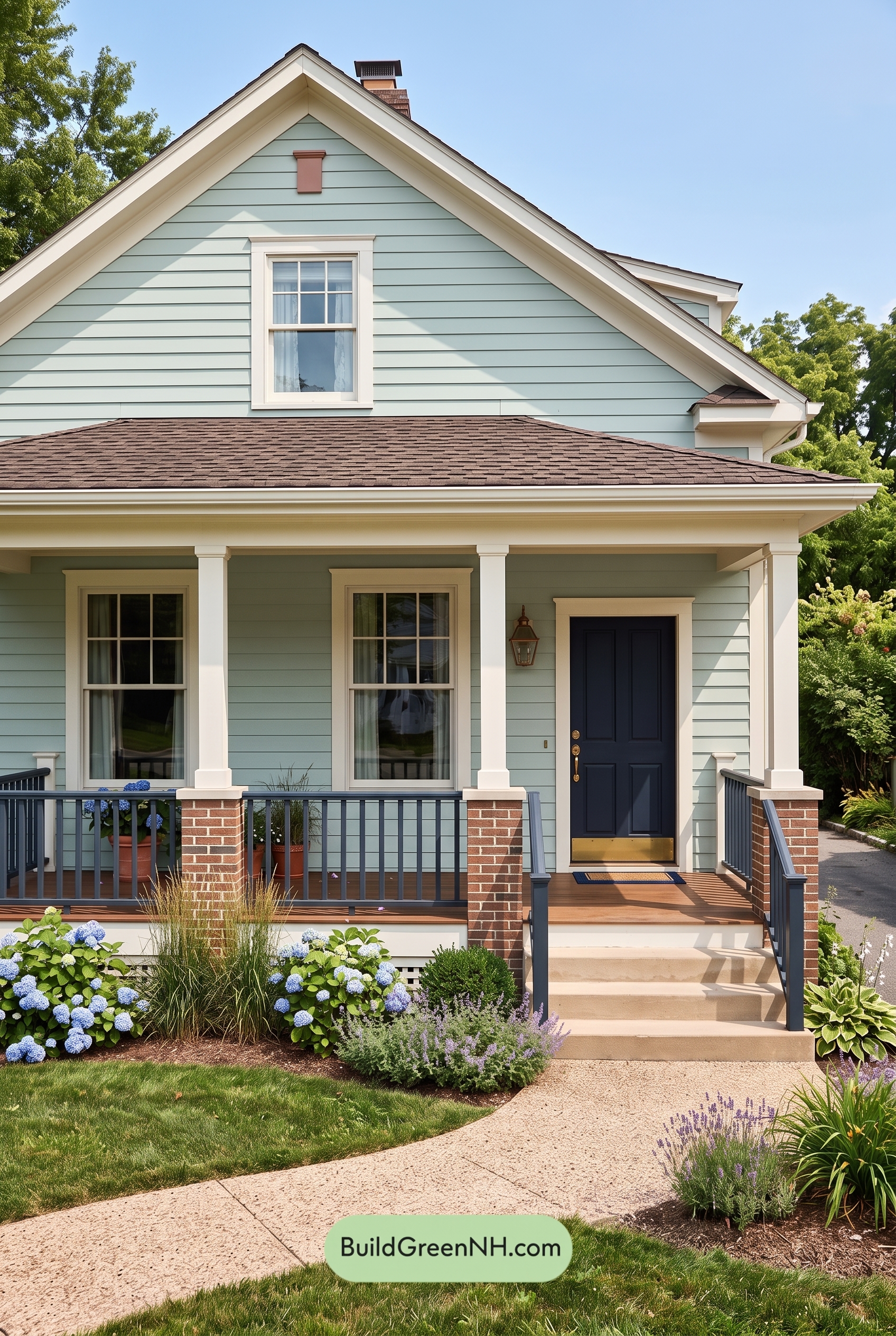

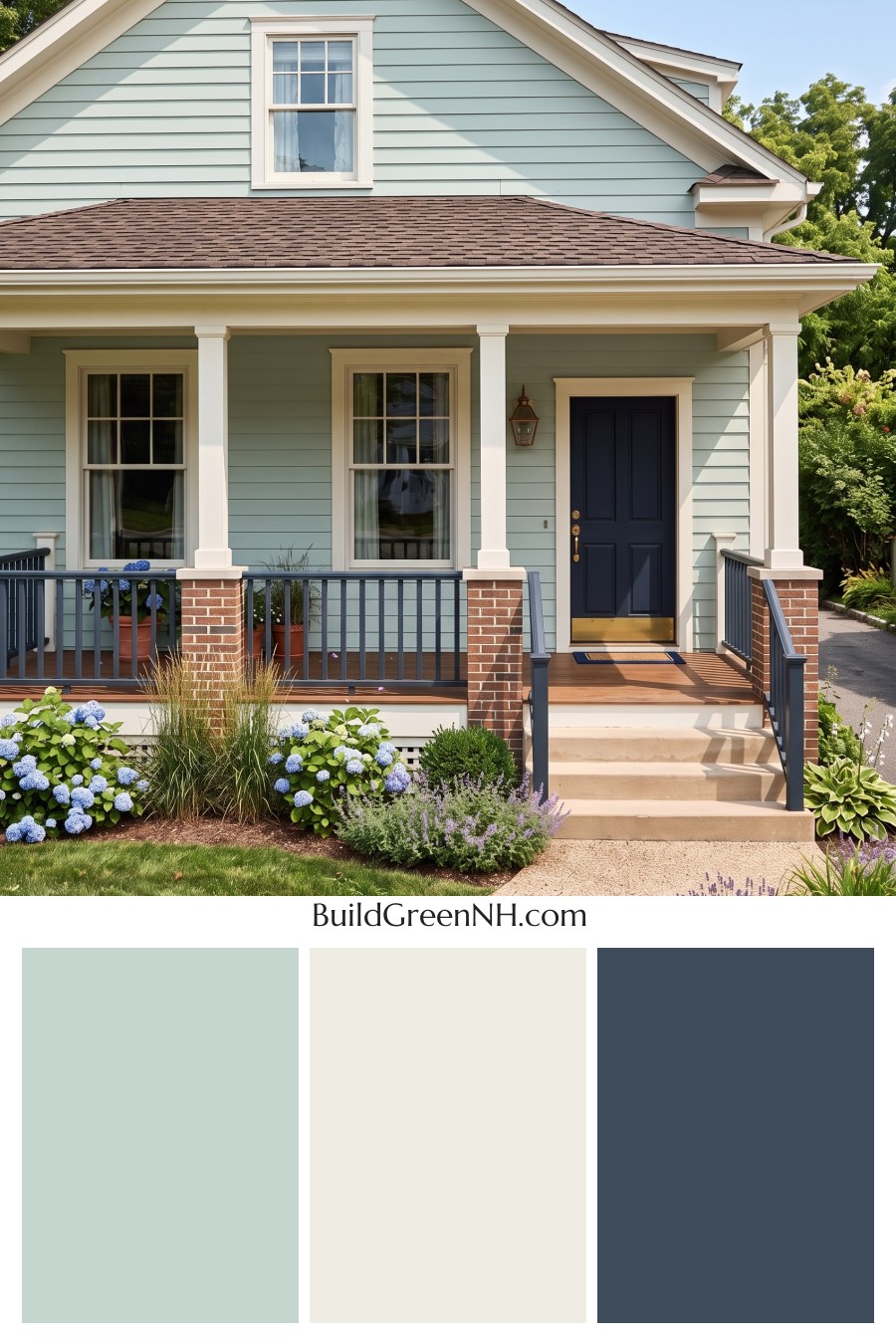
This exterior works so beautifully because its soft green siding, clean white trim, and deep blue accents strike a perfect balance between cottage charm and polished curb appeal.
A Fresh Green Foundation
The main siding is a gentle green shade with a cool, calming quality. It gives the home a relaxed, garden-inspired feel while still looking refined and intentional. Because the green is soft rather than overly bright, it feels welcoming in the sunlight and settles nicely against the surrounding trees and landscaping.
The horizontal siding also helps the color feel airy and classic. This shade of green brings personality to the exterior without overwhelming the architecture, making the house feel cheerful, fresh, and easy to love.
Crisp White Trim That Frames Everything
The white trim is doing a lot of beautiful work here. Around the windows, rooflines, porch columns, and door surround, the bright white shade creates clean definition and a polished finish. It sharpens the edges of the home and keeps the soft green siding from feeling too muted.
The white columns are especially important. They add structure and a traditional touch to the porch, while the white window frames make each opening feel bright and inviting. Together, these white elements give the exterior a timeless, well-kept look.
Deep Blue Accents with Character
The front door brings in a rich, deep blue shade that gives the whole palette a confident focal point. Against the softer green siding and white trim, the blue feels grounded and elegant. It draws the eye right to the entry and makes the porch feel more intentional.
The railings repeat that blue family in a slightly softened, muted shade, which helps the door feel connected to the rest of the exterior. This repetition is smart: it keeps the accent color from feeling isolated and adds a tailored rhythm across the porch.
Warm Supporting Tones
The roof introduces a warm brown shade that adds depth above the lighter body of the house. It works well with the green siding because both colors have an earthy, natural quality. The red-brown brick porch bases add another layer of warmth, giving the home a sturdy, welcoming foundation.
Small golden accents at the door add just enough brightness without competing with the main palette. They bring a touch of warmth to the deep blue entry and help the front door feel special.
The Overall Mood
This color scheme feels fresh, friendly, and classic. The soft green gives the home a peaceful personality, the white trim keeps everything crisp, and the deep blue accents add just the right amount of contrast. It is colorful, but not loud. Traditional, but not plain.
What makes the combination so successful is the balance between cool and warm shades. The green and blue feel calm and coastal-inspired, while the white trim, brown roof, brick, and warm porch tones keep the exterior grounded and inviting.
Why It Works So Well
This palette is a great example of using color with restraint. The main green shade covers the largest surfaces, the white trim highlights the architecture, and the blue accents create memorable focal points. Each color has a clear role, so the finished look feels cohesive and charming.
For anyone drawn to a welcoming exterior with personality, this combination is a lovely inspiration: soft green for character, crisp white for structure, and deep blue for a beautiful finishing touch.
Next, see how this color scheme looks under different lighting simulations throughout the day.
Overcast
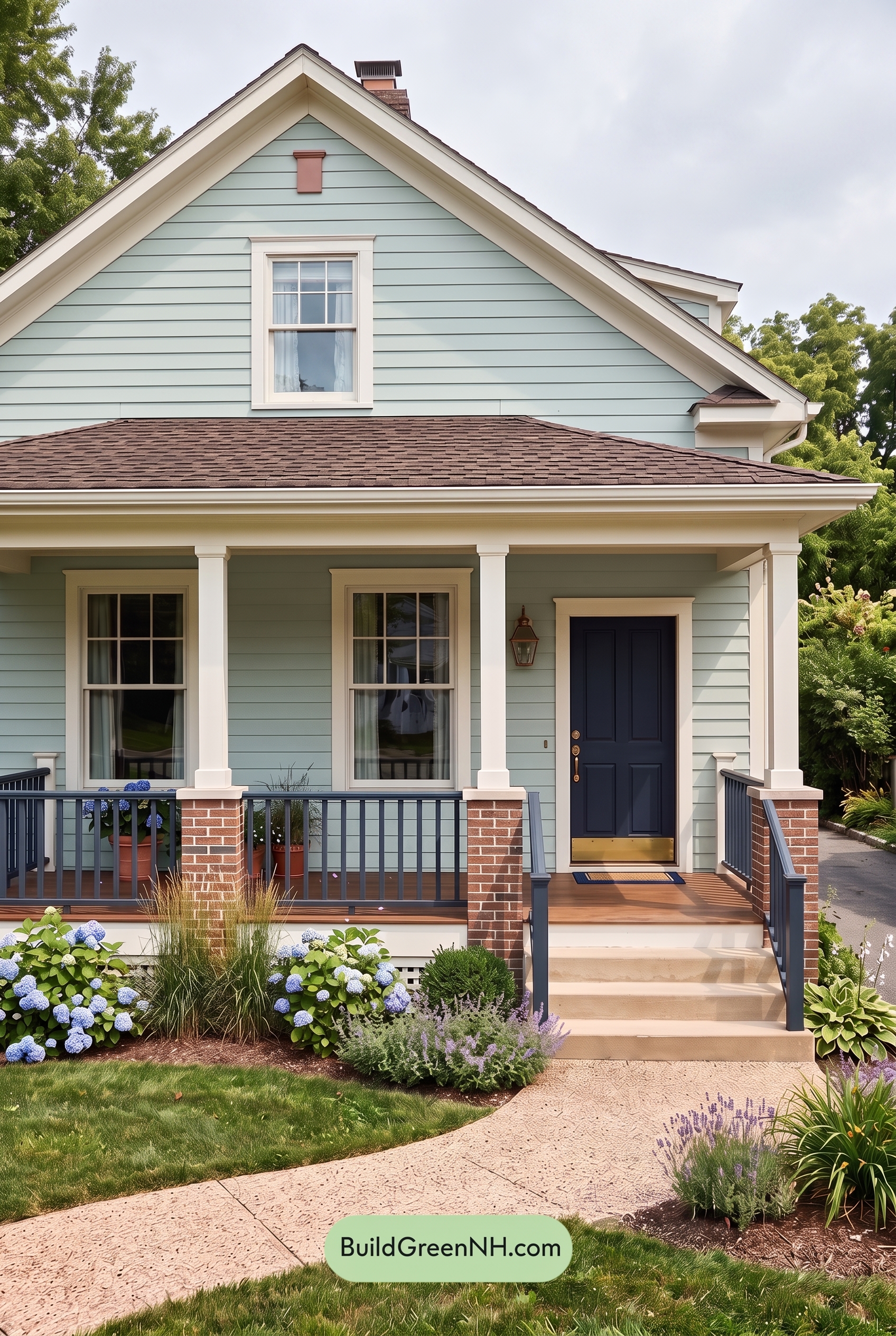
Under overcast light, the green family on the main walls appears more muted and slightly cooler than it would in neutral daylight, with its saturation softened by the diffused sky. The white family on the trim, window frames, and columns loses some of its crisp brightness, reading gentler and less warm, while shadows become broader and quieter rather than sharp.
The blue family on the front door and railings tends to deepen in overcast conditions, feeling steadier and more grounded with less glare. Overall contrast drops, giving the exterior a calmer, more cohesive mood compared to the brighter, warmer, more dimensional look of neutral daylight.
Golden Hour
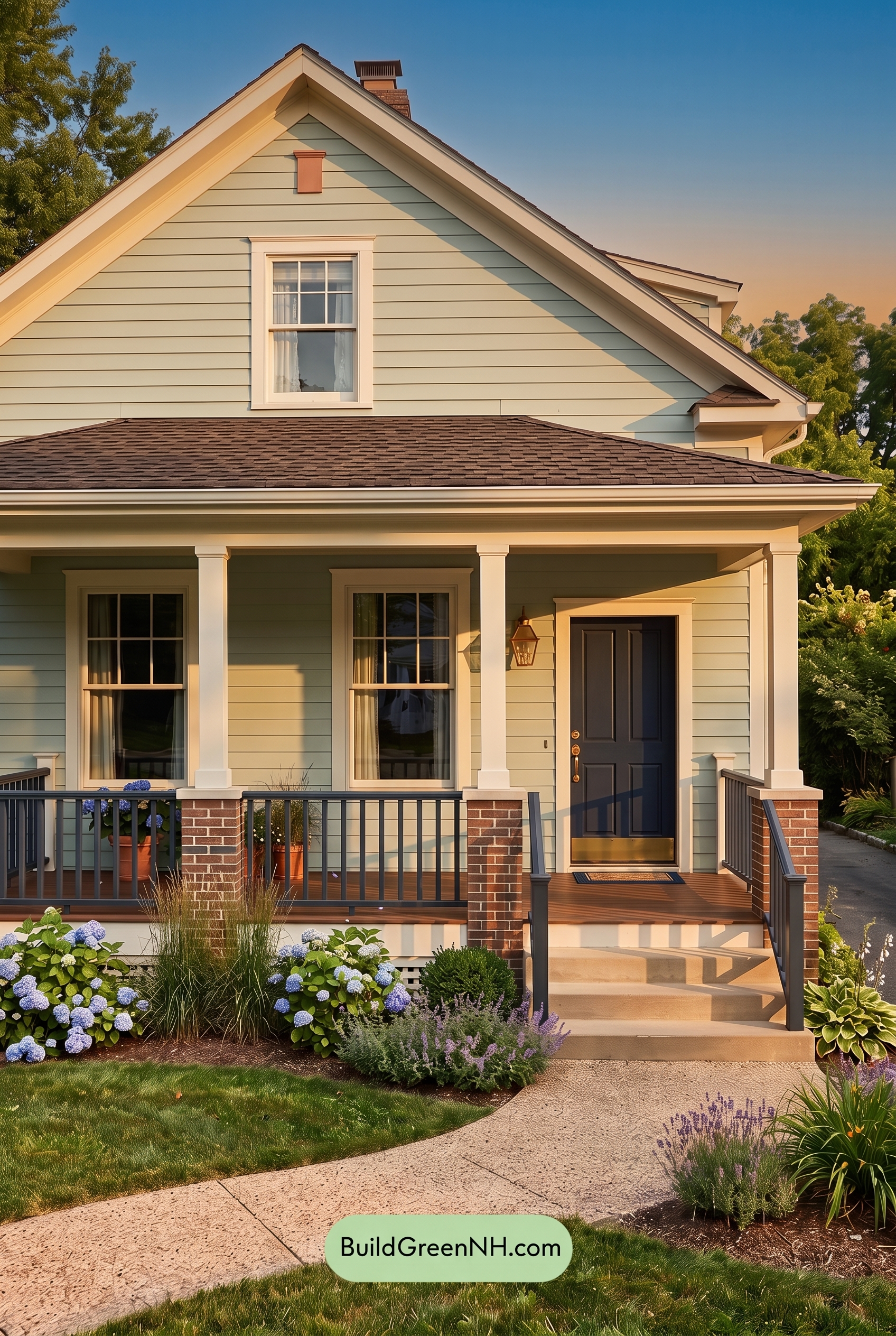
Under Golden Hour light, the green siding feels warmer and a bit more saturated than it would in neutral daylight, taking on a soft yellow-green glow. The white trim, columns, and window frames shift away from crisp white toward a creamier shade, making the exterior feel gentler and more inviting.
The low sun also stretches shadows across the siding, increasing contrast and giving the blue front door and railings a deeper, moodier presence. Compared with flatter daylight, the whole palette feels richer, warmer, and more relaxed, with a cozy evening softness that highlights the home’s details.
Shade
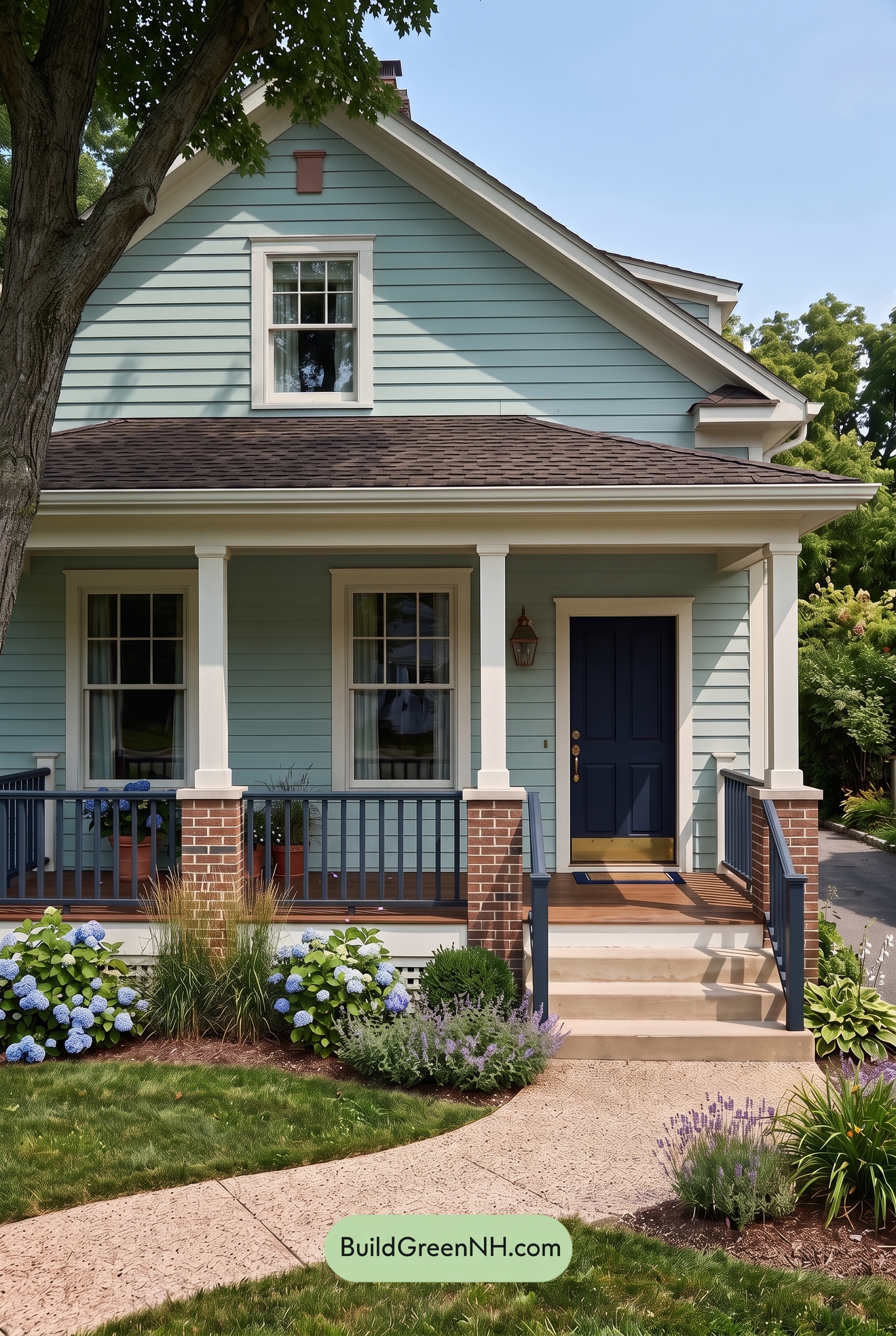
In shade, this shade of green looks calmer and slightly cooler than it would in neutral daylight, with its saturation softening and the warm undertones becoming more muted. Shadows from the porch and nearby trees deepen the siding in places, creating a gentle, layered look rather than a bright, even wash of color.
The white trim shifts from crisp and bright to softer and creamier, reducing the contrast just enough to feel relaxed. Meanwhile, the blue on the door and railings appears deeper and more grounded, giving the exterior a quieter, moodier charm while still keeping the overall palette fresh and welcoming.
Nighttime
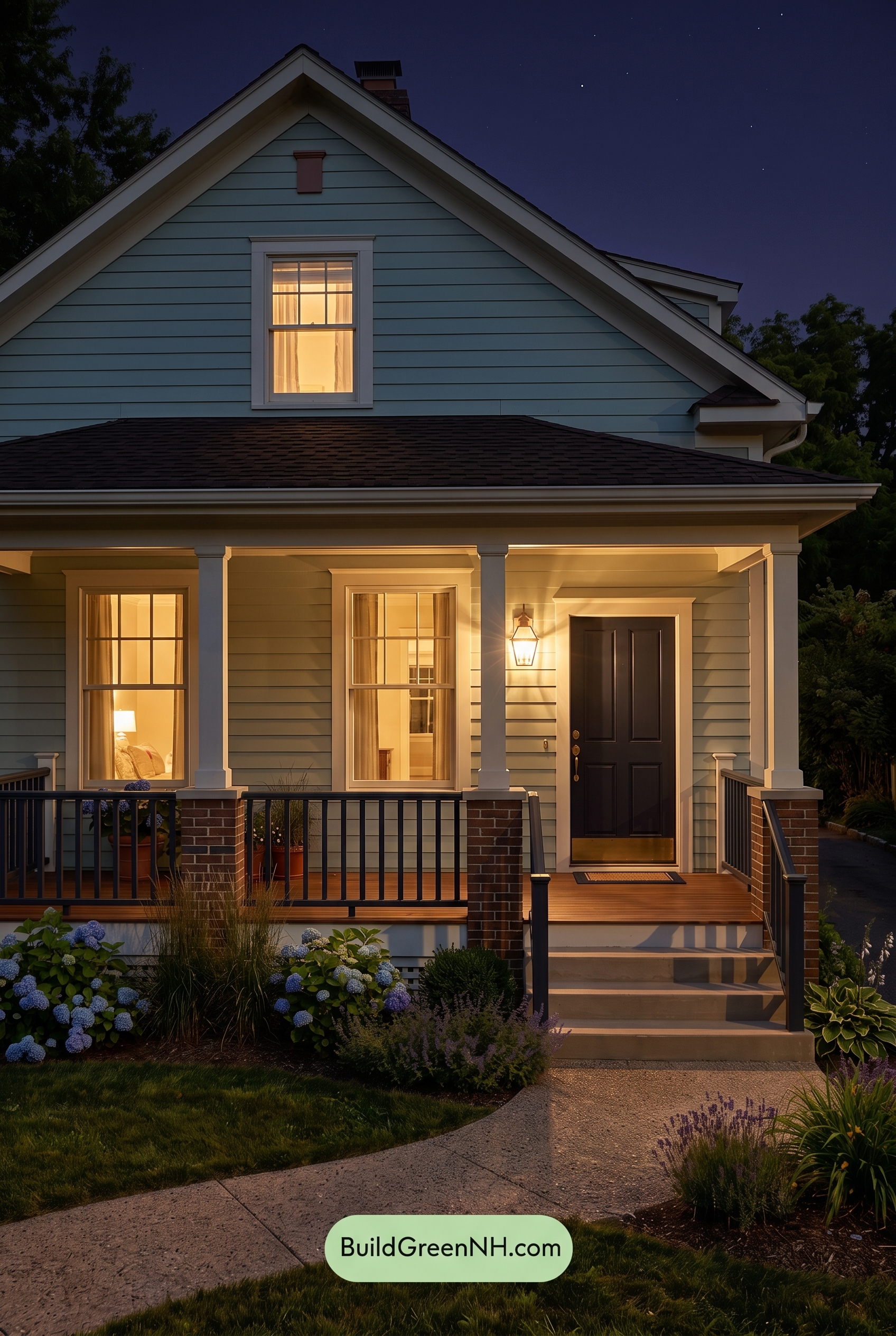
At night, this shade of green feels deeper and more saturated than it would in neutral daylight, especially up near the gable where cooler shadows pull it toward a duskier tone. Around the porch lights, the same green shifts warmer and softer, creating a gentle glow that makes the siding feel more inviting.
The white trim, columns, and window frames pick up golden warmth, reading creamier in lit areas and grayer in shadow, which increases contrast across the façade. The blue family on the door and railings becomes darker and moodier, adding a grounded, elegant note against the brighter trim and the cozy nighttime glow.
Pin these for later:
Want More?
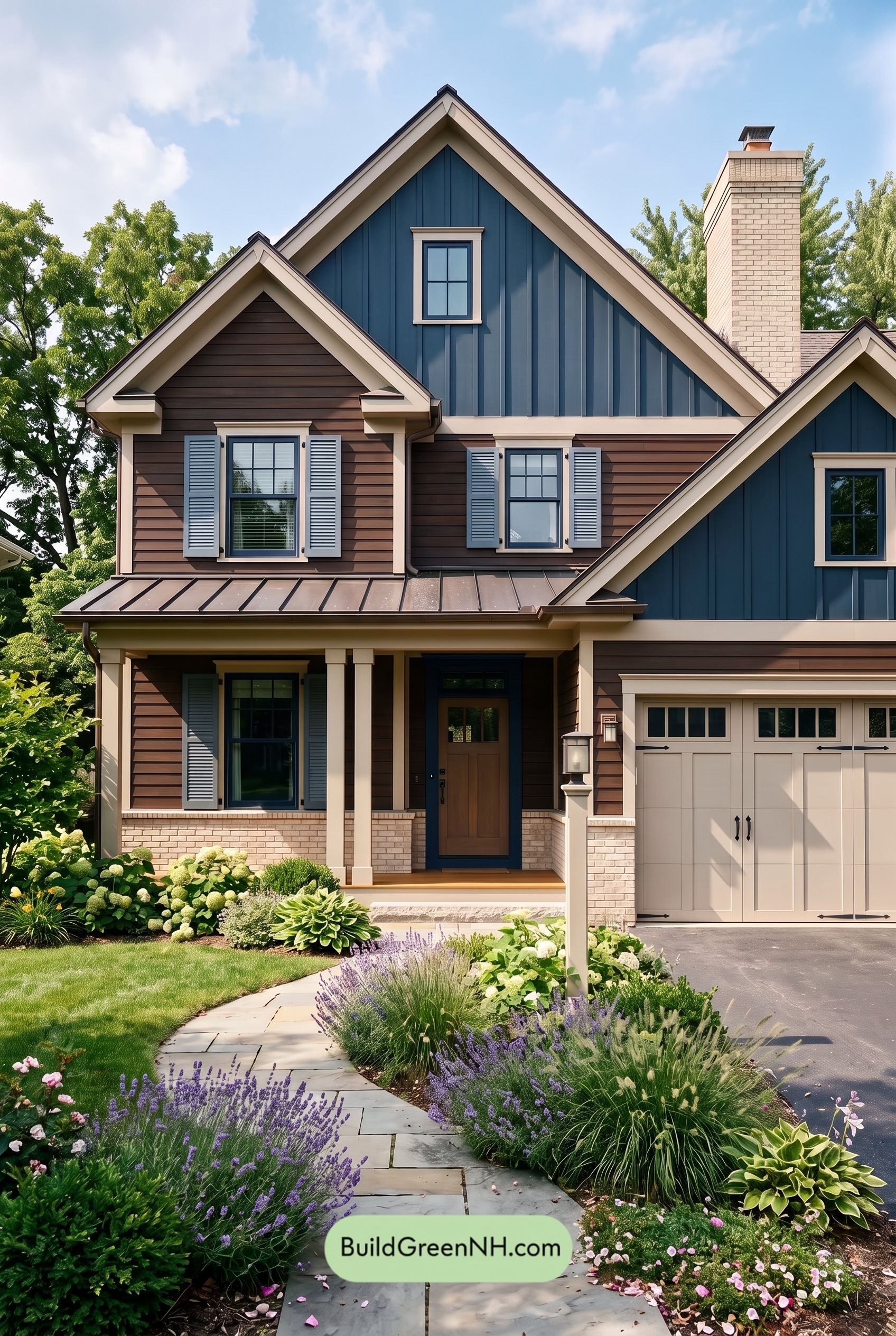 Dark Brown House Exterior Color Scheme: Inkwood Lantern
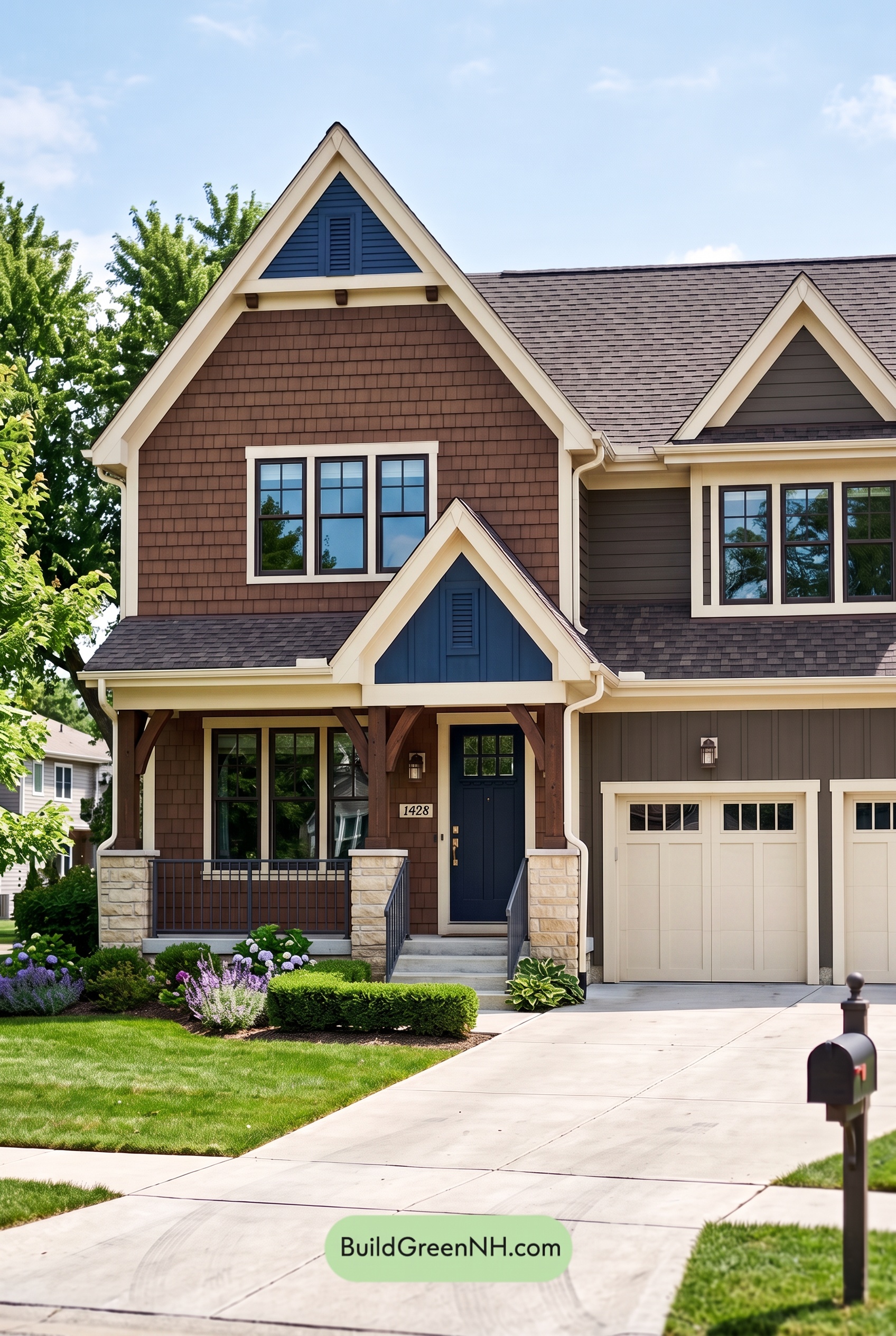 Dark Brown House Exterior Color Scheme: Bluebell Timberline
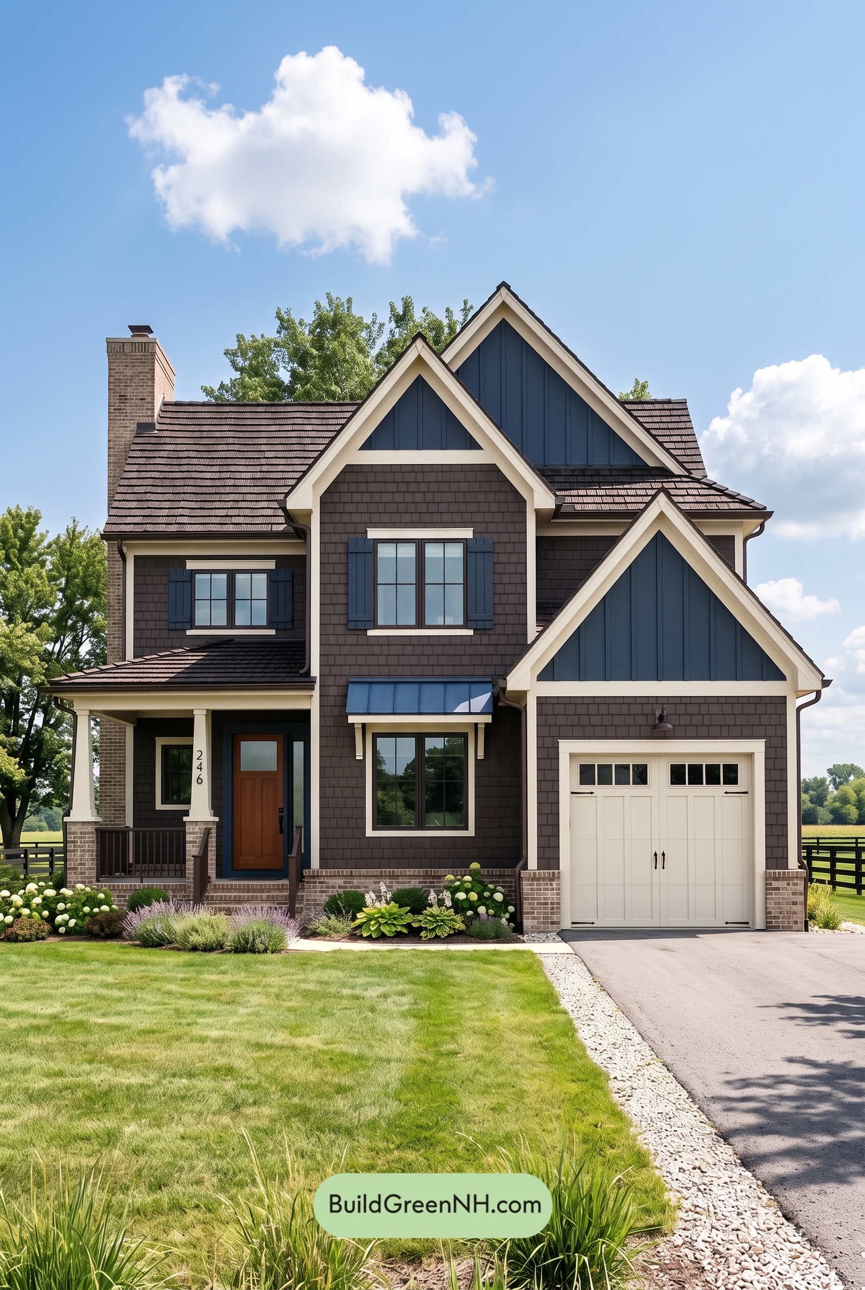 Dark Brown House Exterior Color Scheme: Sapphire Homestead
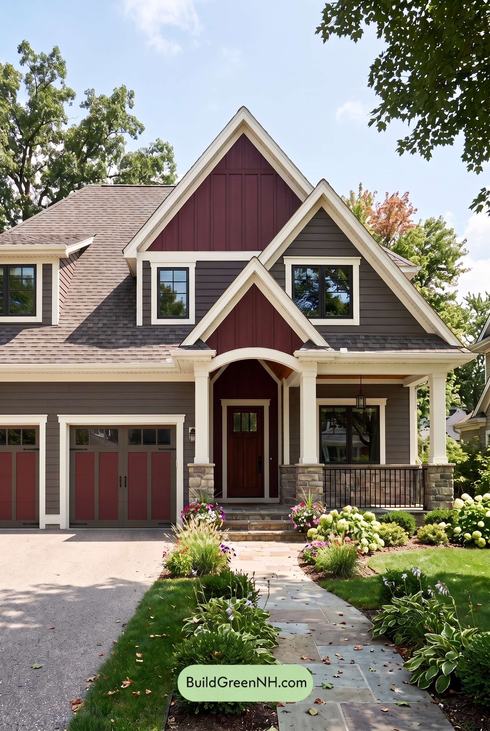 Dark Brown House Exterior Color Scheme: Hearthglow Arrival
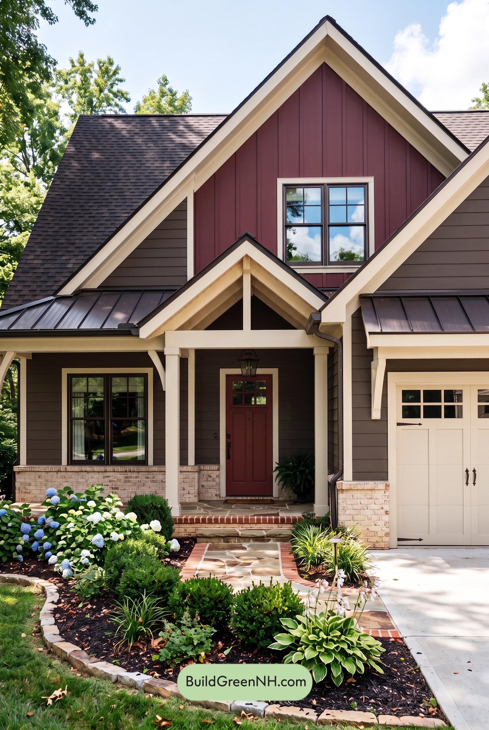 Dark Brown House Exterior Color Scheme: Embercrest Welcome
Table of Contents