Last updated on
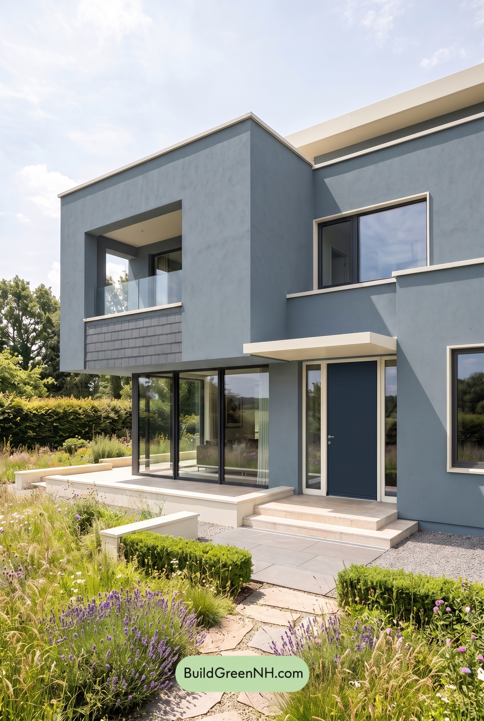

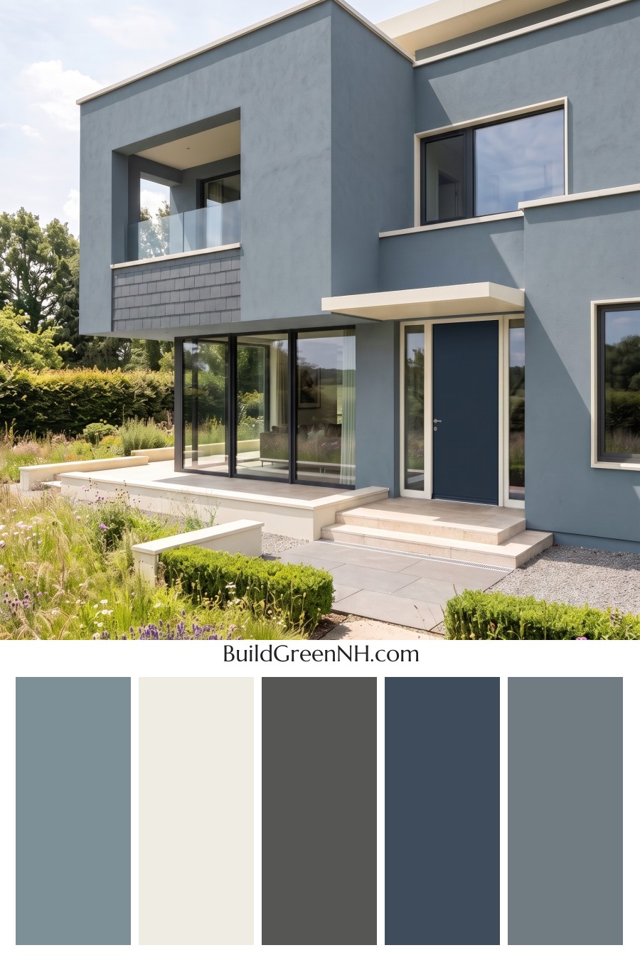
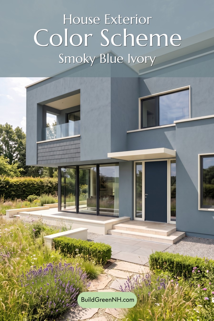
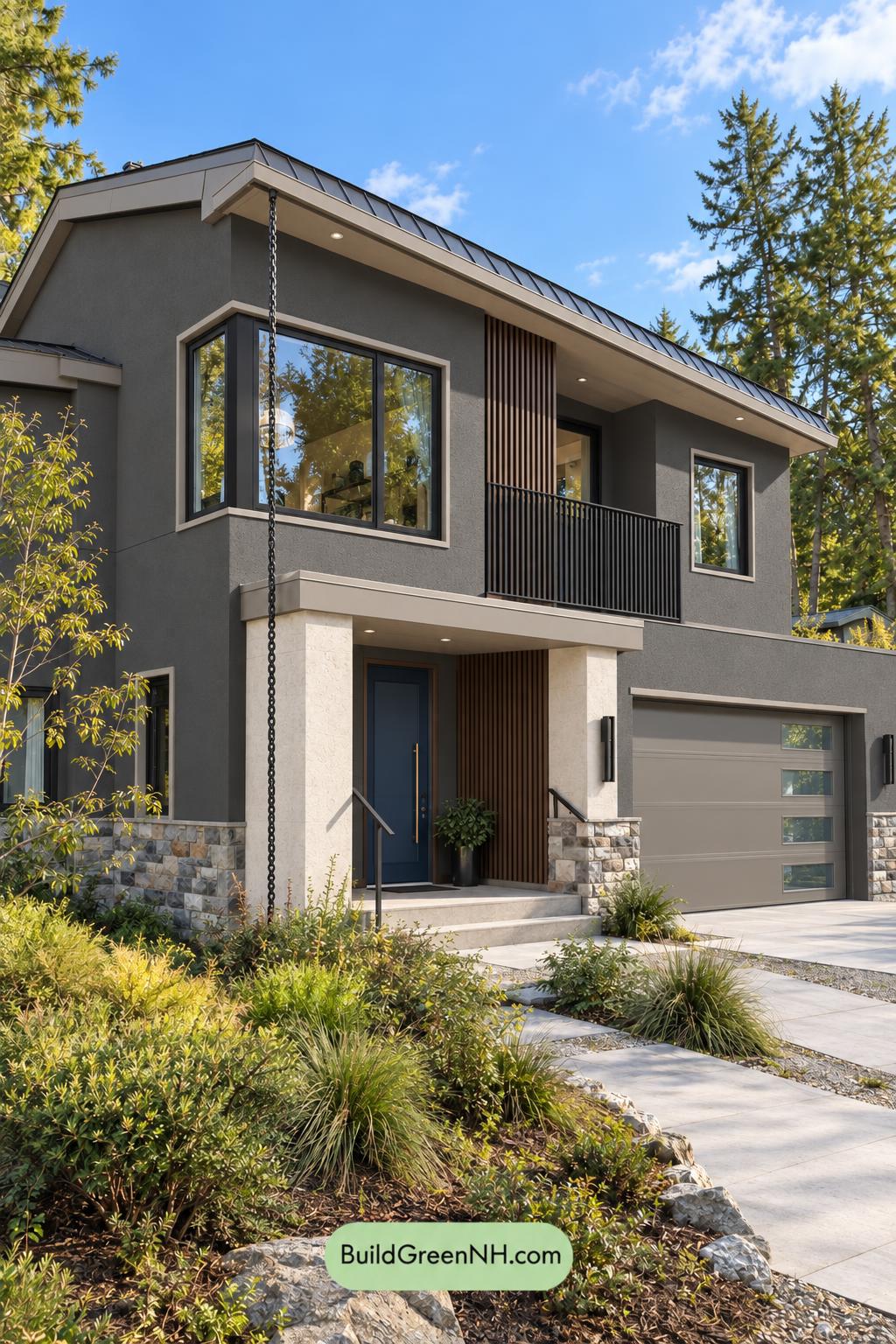
This exterior color scheme is so great because its cool blue body, crisp white trim, and grounded gray accents make the modern architecture feel calm, clean, and beautifully intentional.
A Cool Blue Main Exterior with Modern Presence
The main siding is wrapped in a muted shade from the blue family, giving the home a serene but confident personality. It is not overly bright or playful; instead, it leans soft and architectural, which suits the clean lines and large geometric forms beautifully.
Because this blue shade has a slightly softened quality, it changes nicely with the light. In full sun, it feels airy and fresh. In shadow, it becomes deeper and more sculptural, helping the flat planes and recessed areas stand out.
Crisp White Trim That Sharpens the Design
The trim, roofline edges, balcony ledges, and overhang details use a clean shade from the white family. This is what gives the house its polished, gallery-like finish. The white trim outlines the modern shapes without feeling fussy or traditional.
Against the blue siding, the white elements create just enough contrast to make every edge feel precise. Around the windows and roofline, this light trim also adds brightness, keeping the exterior from feeling too heavy.
Gray Accents Add Depth and Balance
Gray-family accents appear in the window frames and select wall sections, bringing a grounded, contemporary layer to the palette. The darker gray window frames define the glass beautifully, creating a sleek rhythm across the facade.
A gray wall section near the balcony and lower exterior adds texture and visual weight. This helps balance the softer blue siding, especially on a home with tall walls, broad surfaces, and strong modern geometry.
A Deep Blue Front Door with Quiet Drama
The front door continues the blue-family story, but in a deeper, richer shade. This is a smart move because it creates a focal point without introducing a competing color. The entry feels connected to the rest of the exterior, yet still more dramatic and inviting.
Paired with the surrounding white trim and nearby glass, the door feels crisp and tailored. It gives the entry a refined look, almost like the finishing note in a well-composed palette.
Why the Palette Works So Well
This scheme succeeds because it keeps the color families limited and purposeful. The blue siding sets the mood, the white trim brings clarity, and the gray accents add structure. Nothing feels random.
The overall effect is peaceful, modern, and upscale. It also works beautifully with the surrounding greenery, because the cool exterior shades let the landscaping feel lush and natural while the house remains calm and composed.
For a contemporary home, this is a wonderfully balanced approach: soft enough to feel welcoming, crisp enough to look high-end, and layered enough to keep the exterior visually interesting from every angle.
Next, see how this color scheme looks under different lighting simulations throughout the day.
Overcast
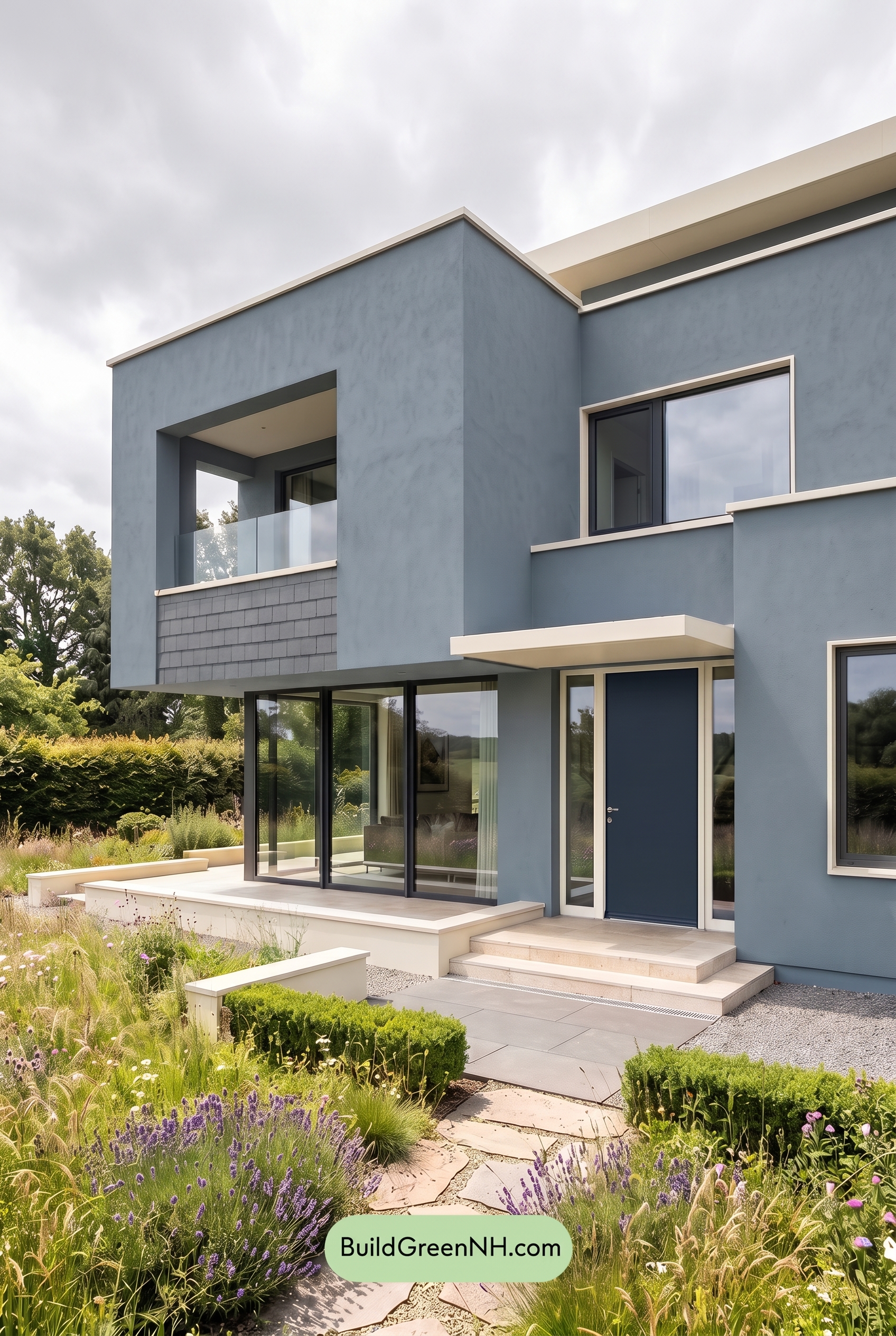
Under overcast light, the blue family on the main walls appears calmer and slightly less saturated than it would in neutral daylight, with a cooler, mistier cast. The deeper blue shade on the front door feels more grounded and subdued, while the gray family accents blend more softly into the overall palette.
Because clouds diffuse the light, shadows become gentler and contrast drops, so the white family trim looks less crisp but more relaxed. The whole exterior takes on a quiet, modern mood, with softened edges, reduced warmth, and a more even, serene color balance.
Golden Hour
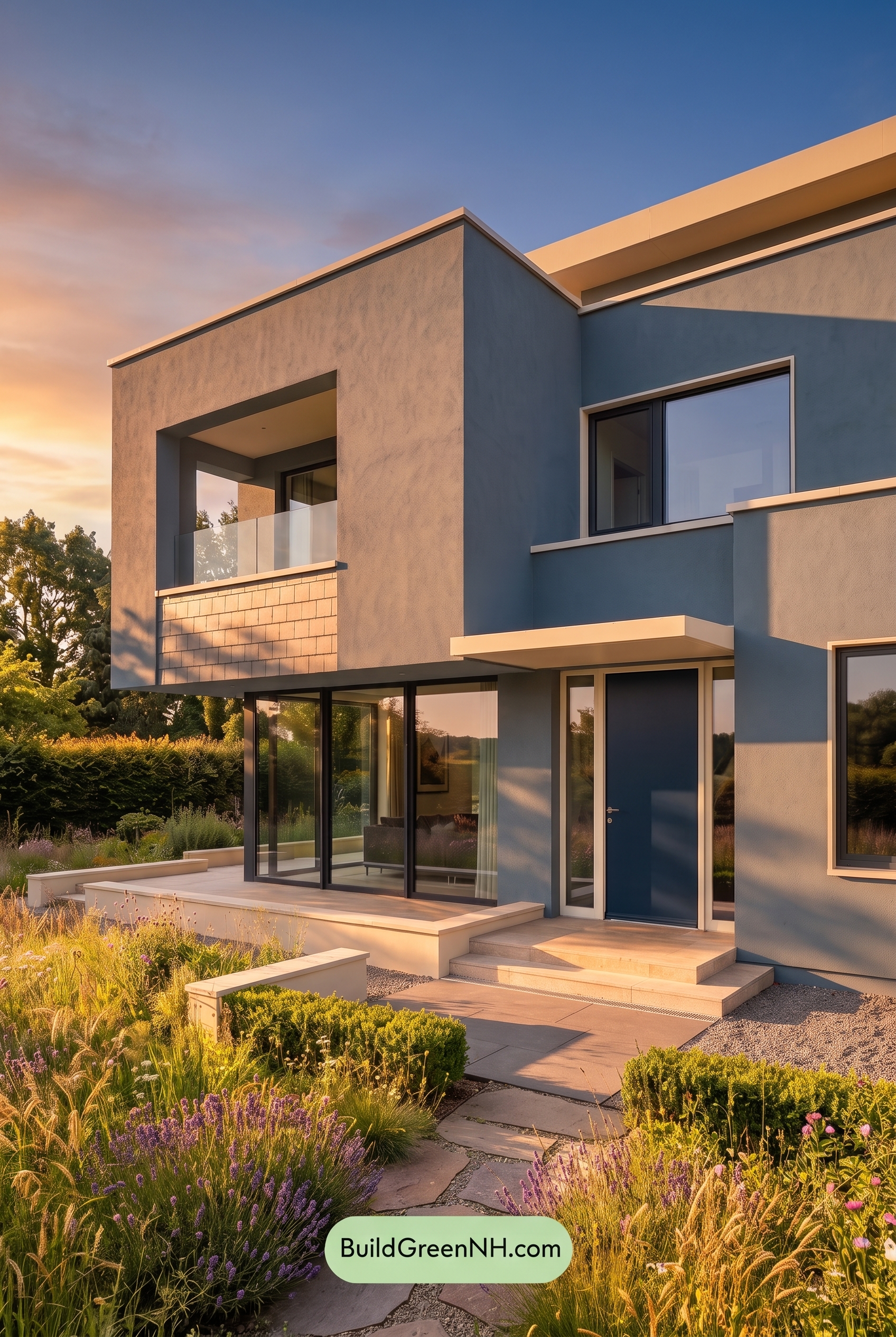
In Golden Hour light, the blue family on the main walls and front door gains a richer, warmer cast, feeling more saturated than it would in neutral daylight. The white trim shifts softer and creamier, while the gray window frames and wall sections pick up a gentle warmth that keeps the modern lines from feeling too cool.
Longer shadows deepen the blue and gray shaded areas, creating stronger contrast against the sunlit trim and edges. Compared with the flatter clarity of neutral daylight, the whole palette feels more dimensional, relaxed, and inviting, with a warm glow that adds depth and mood to the exterior.
Shade
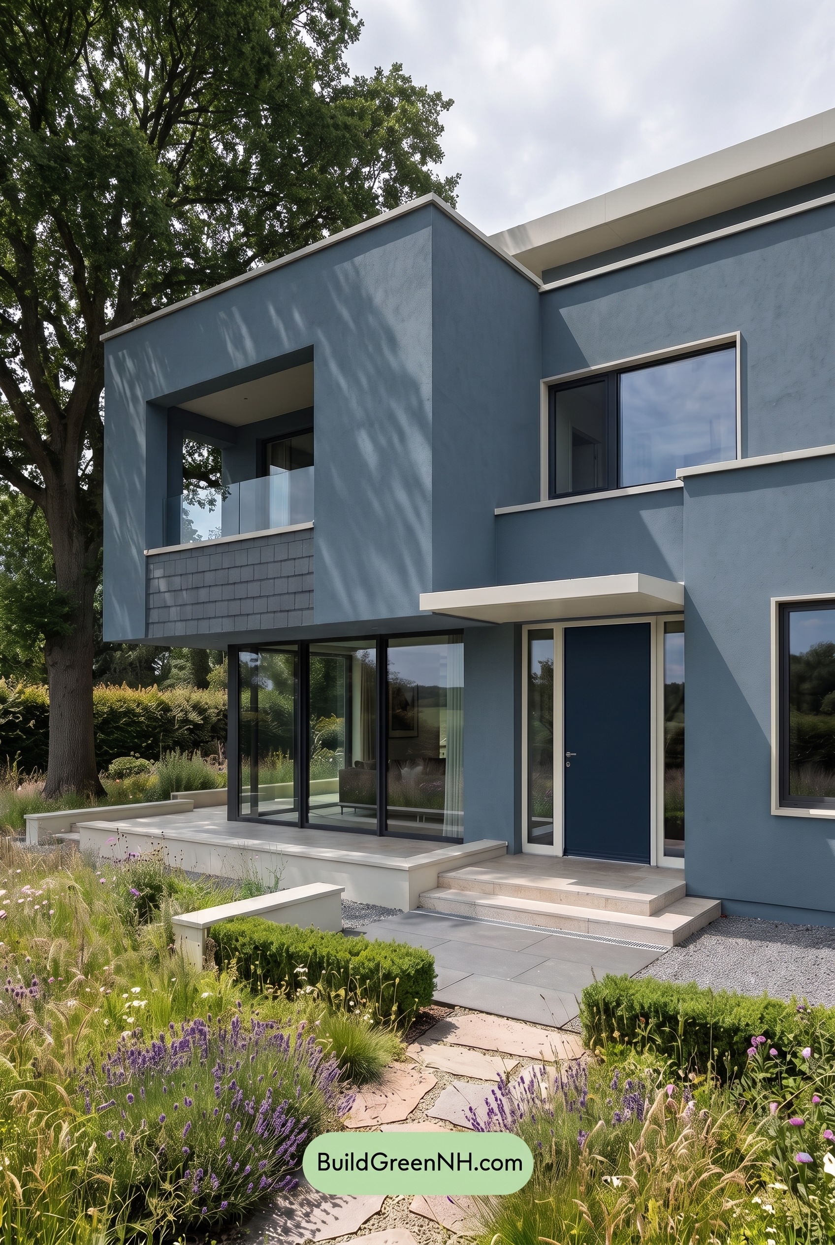
In shade, this shade of blue deepens and feels more saturated than it would in neutral daylight, shifting the exterior toward a cooler, calmer mood. The warm notes recede, so the blue family reads softer and more muted, while the gray family becomes slightly heavier and more grounded.
The white family trim loses some of its bright daylight crispness, but it still creates clean contrast against the deeper blue walls and darker gray window frames. Shadows from the surrounding trees add movement and depth, giving the modern facade a quieter, more layered look.
Nighttime
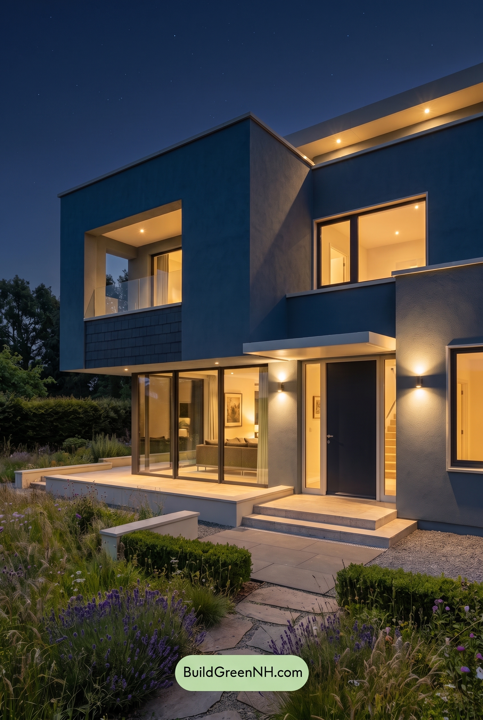
At nighttime, the blue family on the main walls becomes deeper and more saturated than it would in neutral daylight, shifting toward a richer, moodier shade. The warm glow from the windows and exterior lights adds a gentle golden cast, making nearby gray sections feel softer and slightly warmer while leaving unlit areas cooler and more shadowed.
The white trim picks up the strongest contrast after dark, appearing crisp where it catches light and subdued where shadows fall. Gray window frames and the blue front door read darker and more dramatic, giving the home a sleek, layered mood with sharper edges and a cozier warmth than the cleaner, flatter look of daylight.
Pin these for later:
Want More?
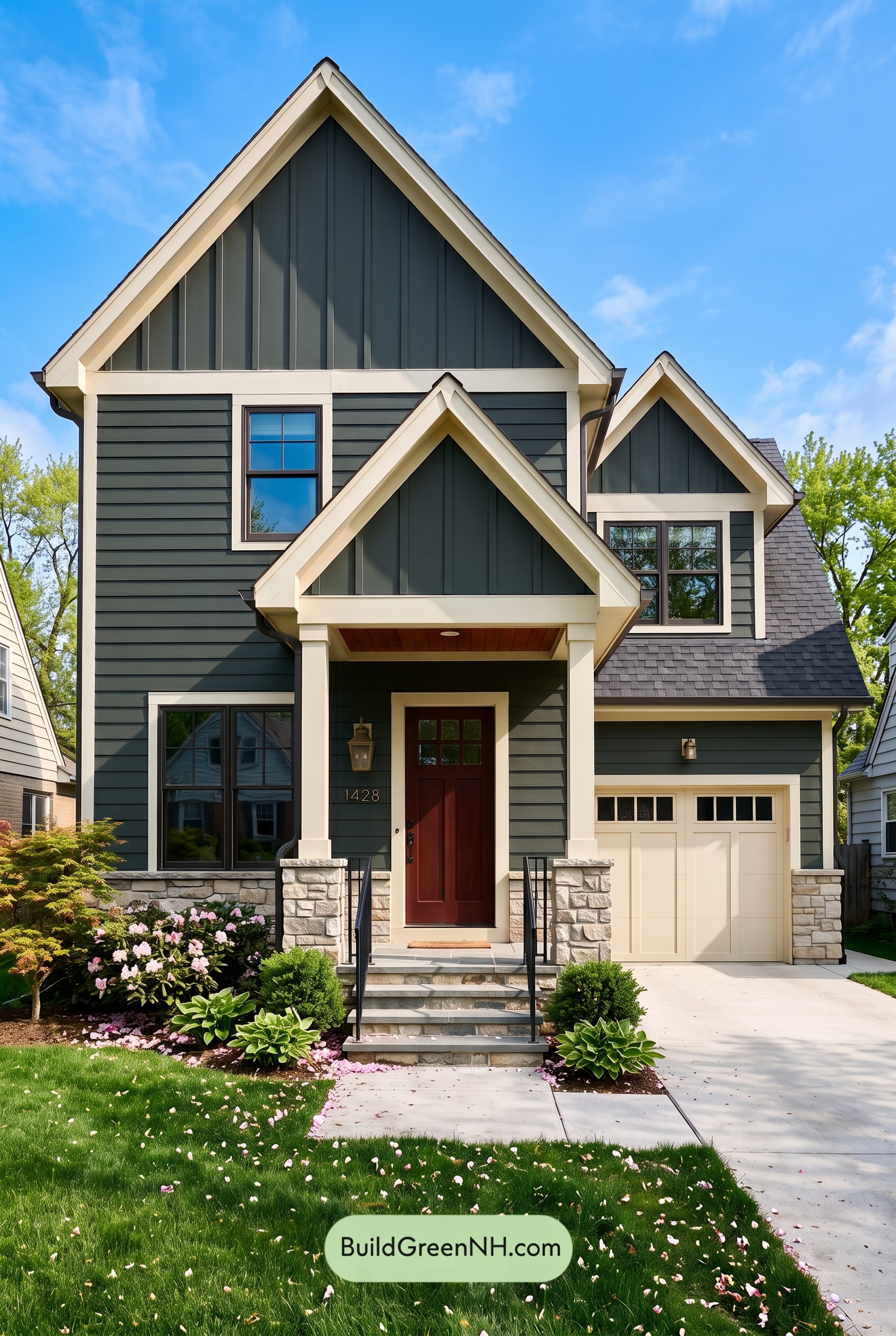 Exterior Color Scheme with Stone Accents: Pine Brass Threshold
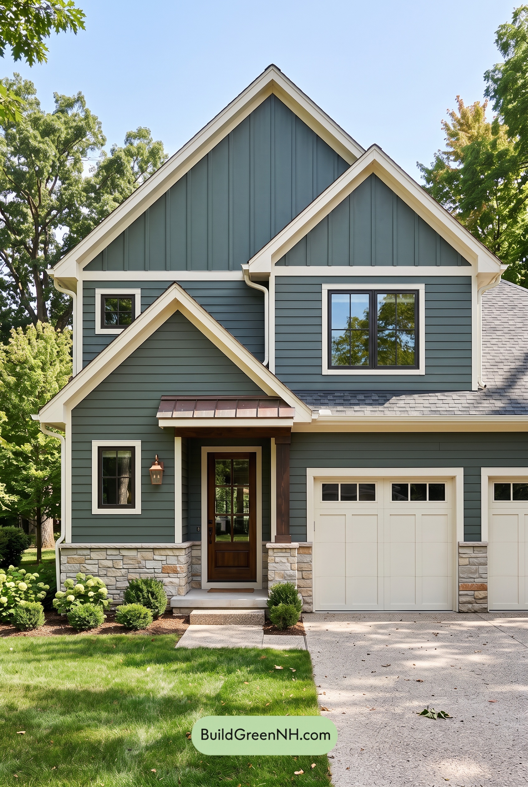 Exterior Color Scheme with Stone Accents: Evergreen Copper Welcome
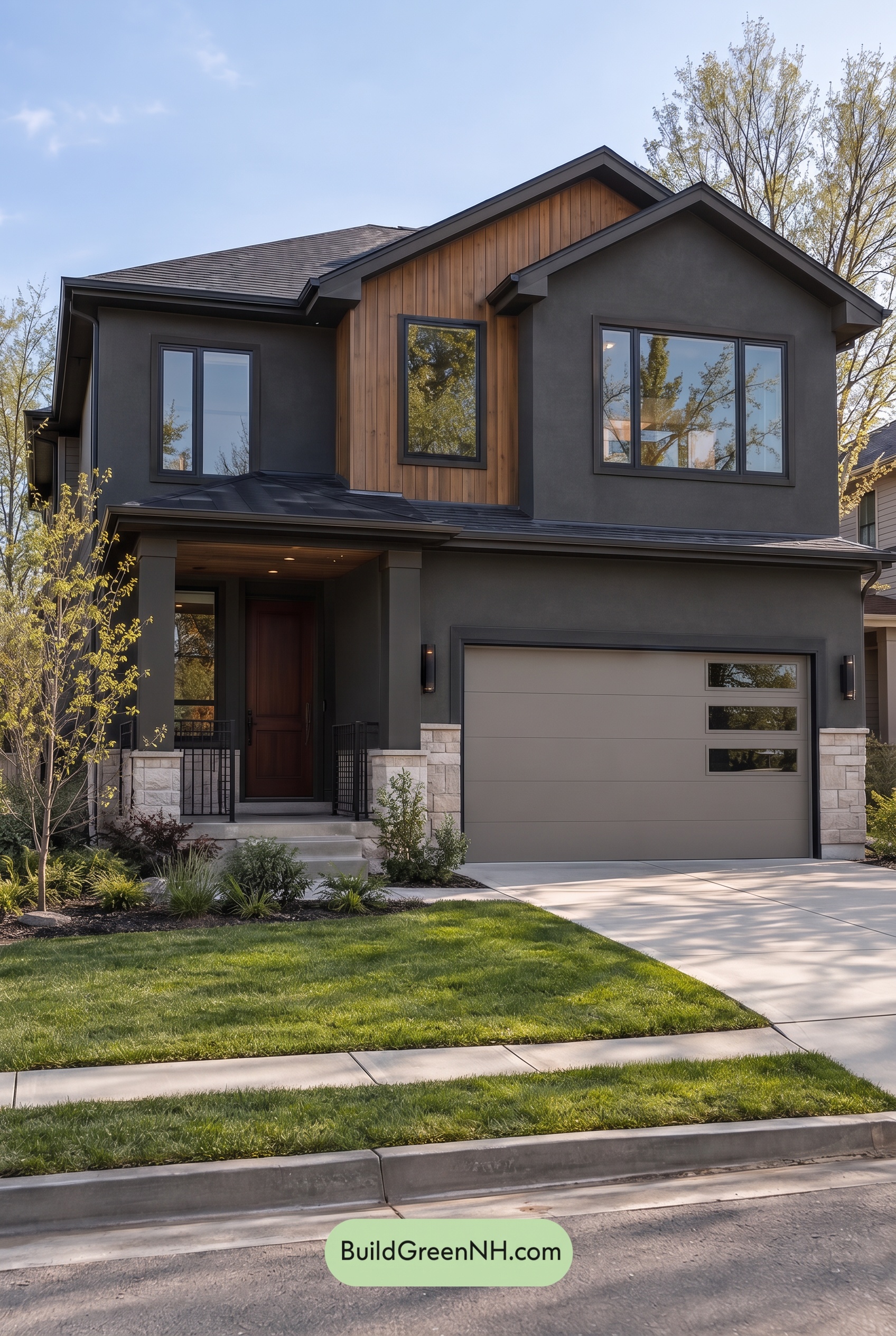 Dark Stucco House Exterior Color Scheme: Cedar Ember Calm
 Dark Stucco House Exterior Color Scheme: Silver Pine Shelter
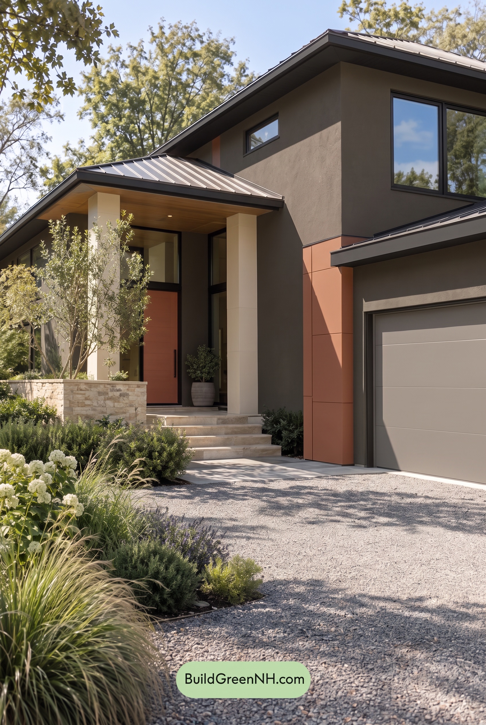 Dark Stucco House Exterior Color Scheme: Copper Orchard House
Table of Contents