Last updated on
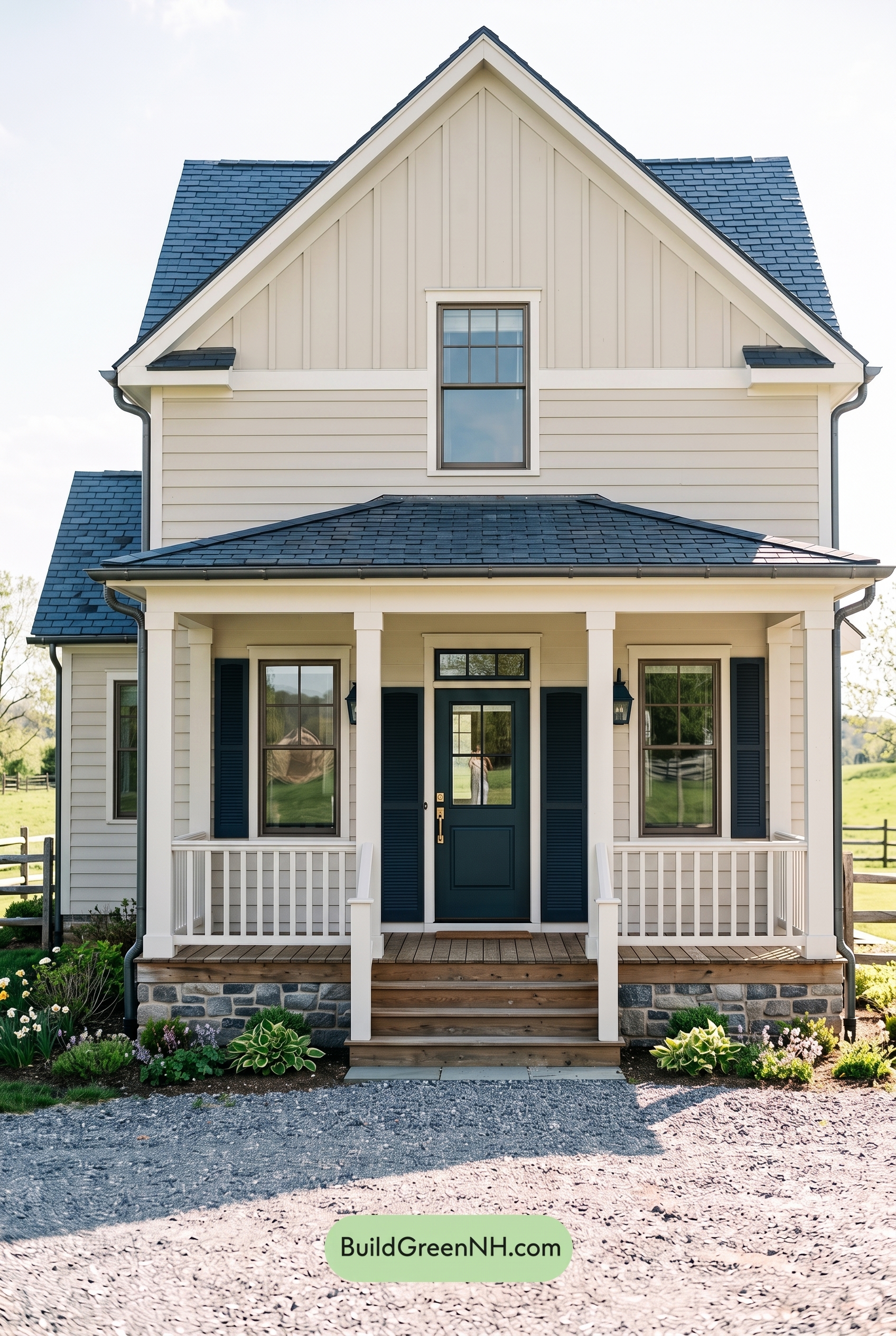

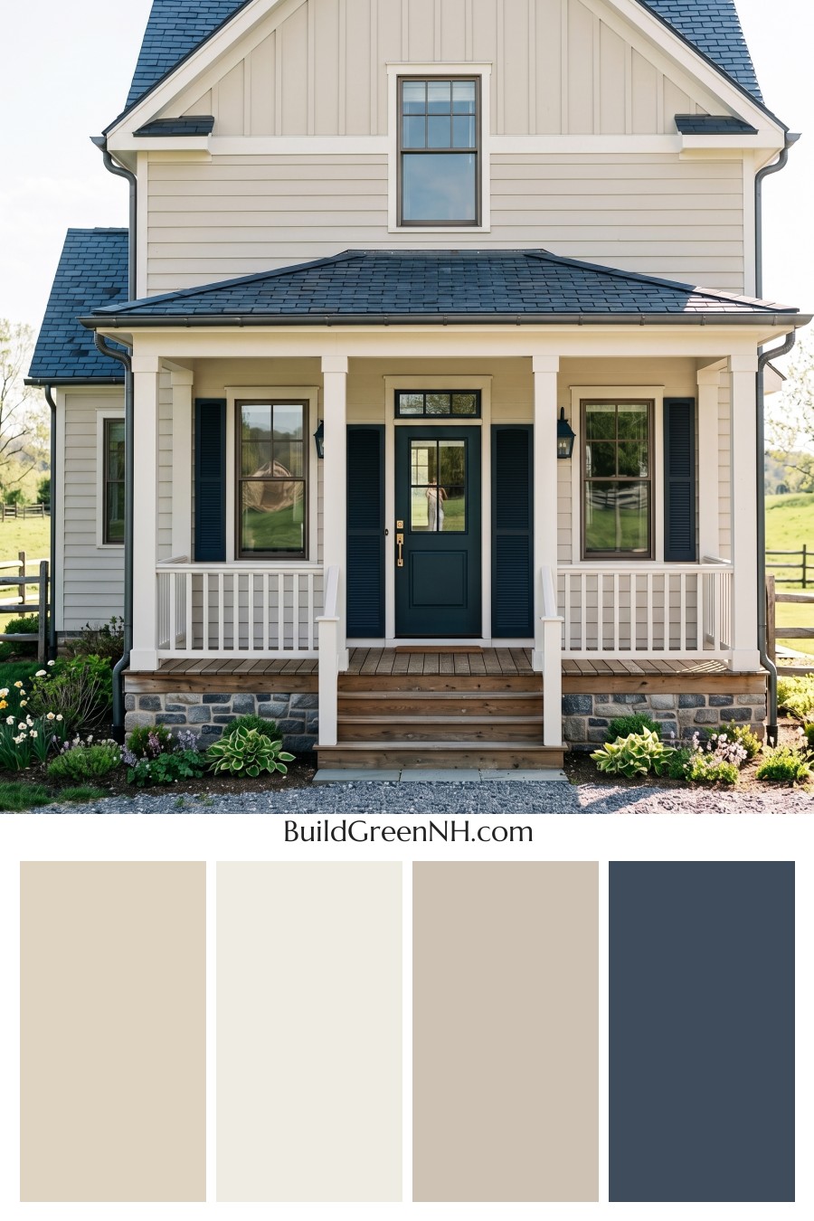
This beige, white, and deep blue exterior feels timeless because it balances farmhouse warmth with crisp contrast and a confident front-door focal point.
A Warm, Welcoming Beige Foundation
The main siding is wrapped in a warm shade of beige that gives the home an easy, inviting presence. It feels soft rather than stark, which works beautifully with the traditional porch, tall windows, and relaxed country setting.
On the upper gable, a similar beige shade continues the calm palette while the vertical siding adds texture and height. Because the upper and lower walls stay within the same gentle color family, the house feels cohesive from the porch all the way up to the roofline.
Crisp White Trim for Fresh Definition
Clean white trim is the quiet hero of this exterior. It outlines the gables, windows, porch roof, columns, and railings with a bright, polished finish that keeps the beige siding from feeling too muted.
The white columns and railings make the front porch feel airy and classic. They also create a lovely contrast against the warm wall color, giving the architecture more depth and making the entry feel especially crisp.
Deep Blue Accents with Classic Character
The shutters and front door introduce a deep shade of blue that adds personality without overwhelming the home. This blue accent feels refined and grounded, bringing just enough drama to the soft beige and white backdrop.
Using the same blue family on both the shutters and the door creates a strong visual rhythm across the front elevation. The door becomes the natural focal point, while the shutters help frame the windows and repeat the accent color in a balanced way.
A Roof That Ties the Palette Together
The dark blue-gray roof adds a strong cap to the design and pairs beautifully with the deeper blue accents below. Its cooler tone gives the house structure and contrast, while still feeling connected to the shutters and front door.
Against the warm beige siding, the darker roof color adds a tailored finish. It helps the home feel substantial, polished, and slightly more modern while preserving its farmhouse charm.
Why the Scheme Works So Well
This palette succeeds because it uses contrast thoughtfully. The beige siding brings warmth, the white trim adds clarity, and the deep blue accents create focus. Nothing feels accidental; every color has a purpose.
The overall mood is fresh, welcoming, and timeless. It is the kind of exterior color scheme that feels classic from the road, charming up close, and easy to love through every season.
Next, see how this color scheme looks under different lighting simulations throughout the day.
Overcast
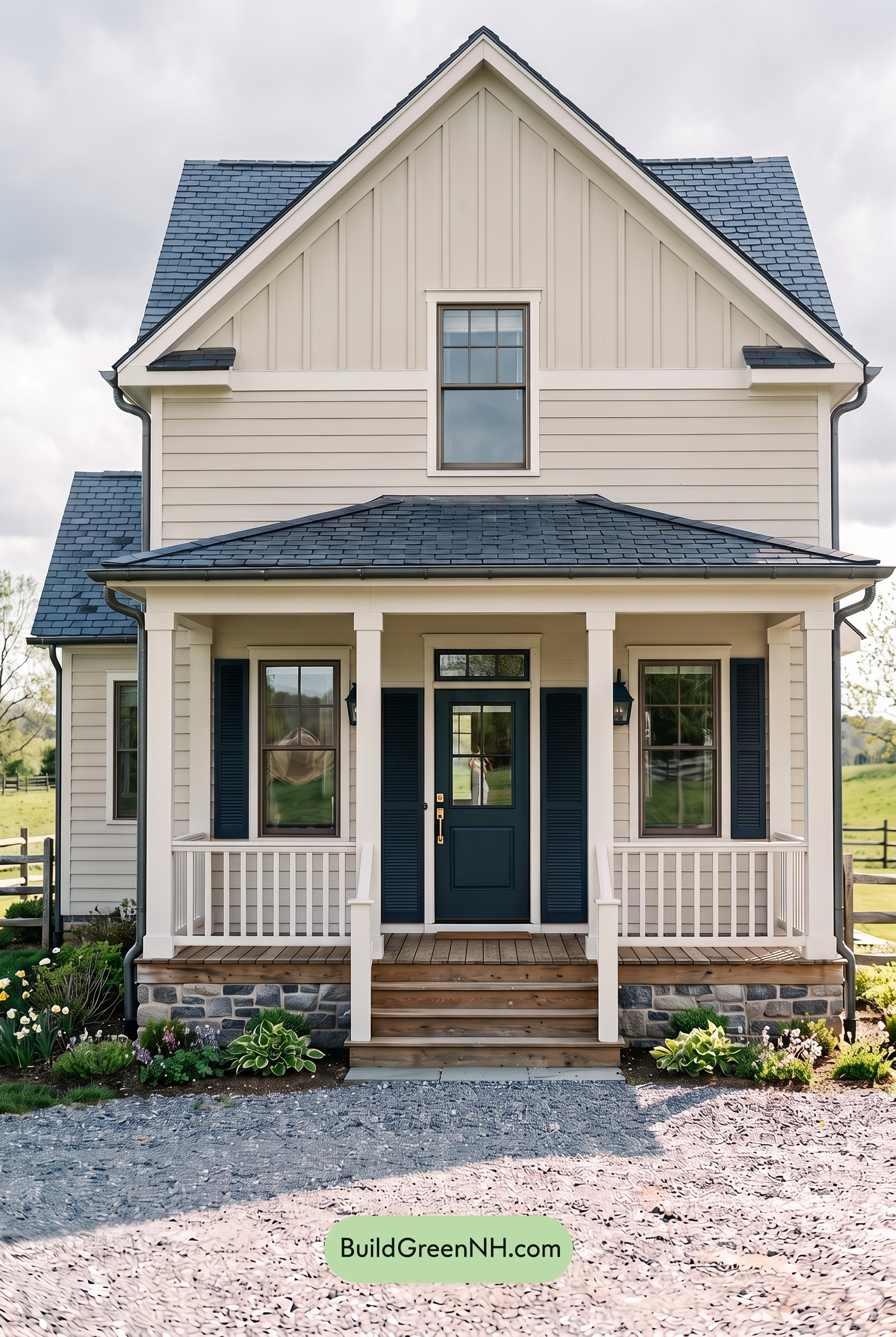
Under overcast light, the beige siding loses a bit of its sunny warmth and reads softer, cooler, and more muted than it would in neutral daylight. The white trim and railings appear less crisp but more even, with fewer bright highlights, while shadows under the porch and rooflines become broader and gentler instead of sharply defined.
The blue shutters and front door deepen slightly, feeling more saturated and grounded against the softened neutrals. With contrast reduced overall, the house takes on a calmer, more collected mood—less bright and lively than in neutral daylight, but pleasantly refined and cozy.
Golden Hour
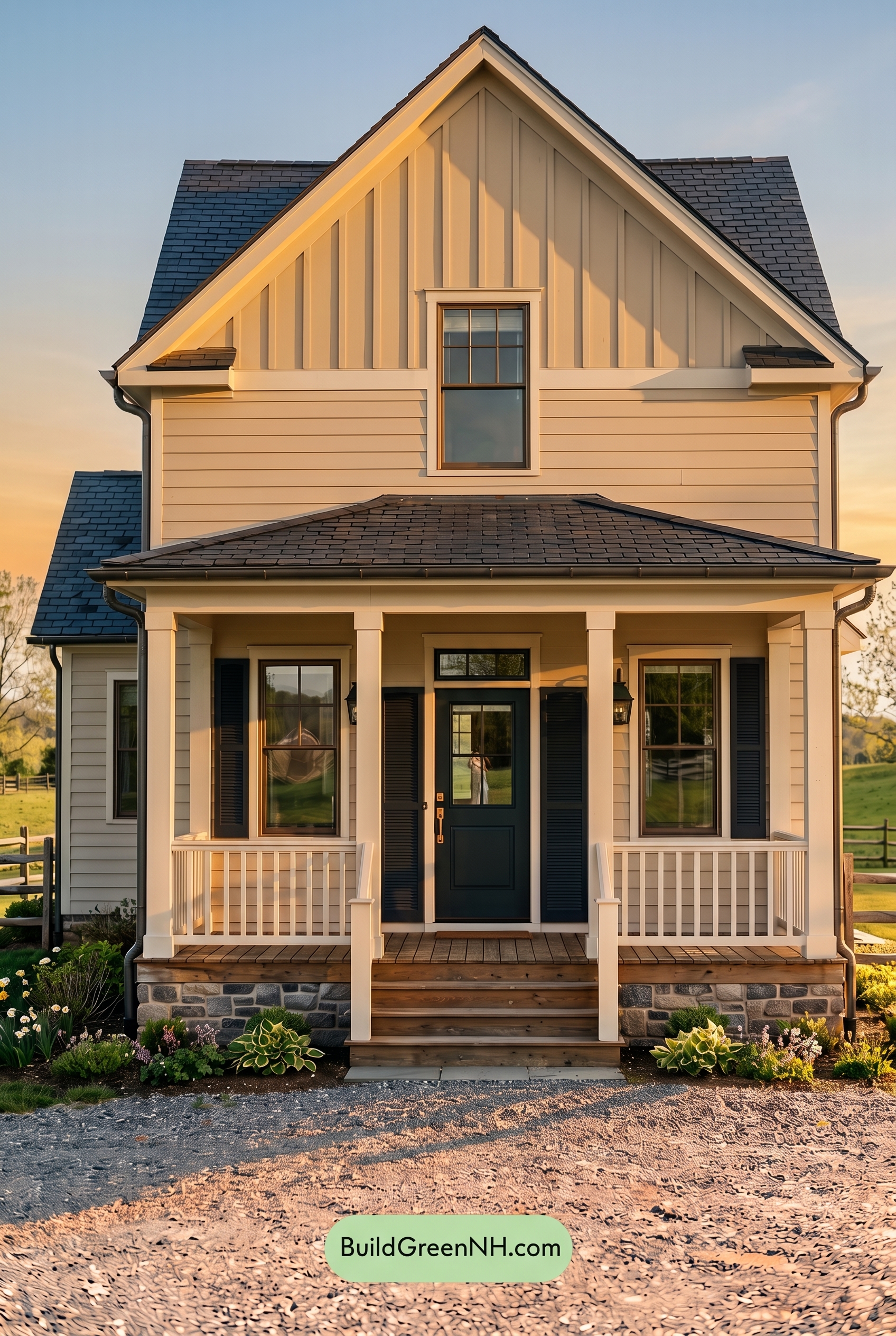
Golden Hour gives the beige siding a richer, sun-warmed glow compared to neutral daylight, making the warm neutral shades feel softer, creamier, and slightly more saturated. The white trim, columns, and railings pick up a gentle golden cast, reducing their crispness while adding a welcoming warmth.
The blue shutters and front door appear deeper and more dramatic in the low-angle light, especially where shadows collect around the porch and window details. Compared with flatter daylight, the stronger shadows boost contrast, define the architectural lines, and create a cozy, relaxed mood with a polished evening feel.
Shade
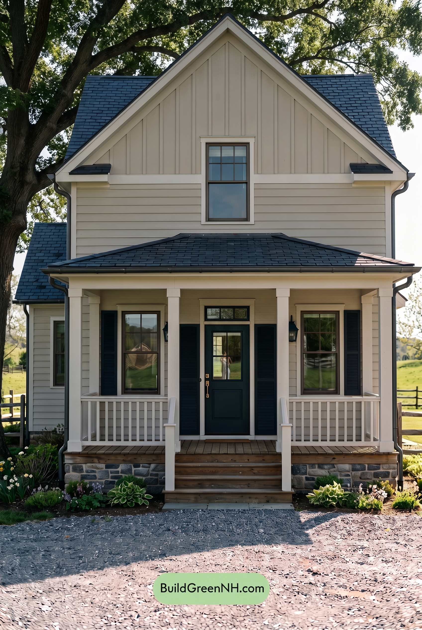
In shade, the beige siding and upper wall lose some of the golden warmth they would show in neutral daylight, settling into a softer, cooler neutral. The white trim, columns, and railings appear less crisp and more subdued, while the shadows gently flatten the contrast across the siding and porch details.
The blue shutters and front door gain depth in shaded light, looking richer and more saturated against the quieter beige and white families. Overall, the palette shifts from bright and fresh to calm and grounded, with a cooler, more relaxed mood and a touch of added drama where the darker blue shades meet the softened neutrals.
Nighttime
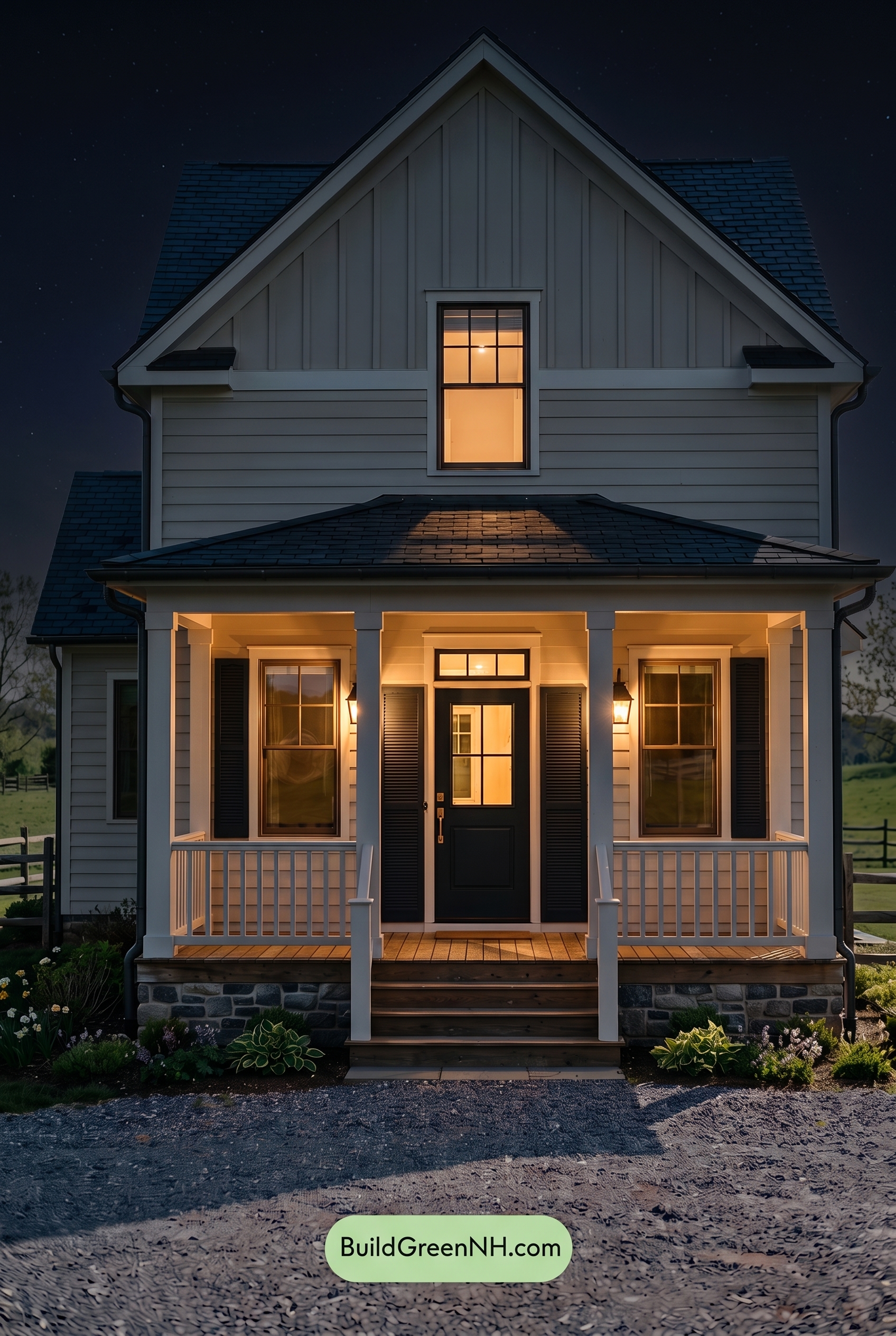
At nighttime, the beige family on the siding shifts away from its more neutral daylight appearance and feels warmer where the porch lights touch it, with a softer, creamier glow. In the unlit upper areas, those same beige shades lose some saturation and read cooler and more muted, while deeper shadows settle into the grooves and rooflines.
The white trim, columns, and railings gain stronger contrast after dark, catching the warm light and standing out crisply against the dimmer walls. The blue family on the shutters and front door deepens dramatically, appearing richer and more grounded, giving the home a cozier, more dramatic mood than it has in balanced daylight.
Pin these for later:
Want More?
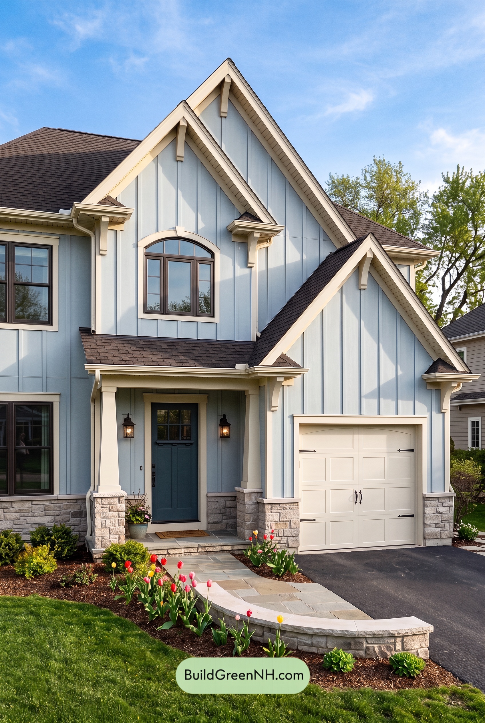 Exterior Color Scheme with Stone Accents: Bluebell Gable Song
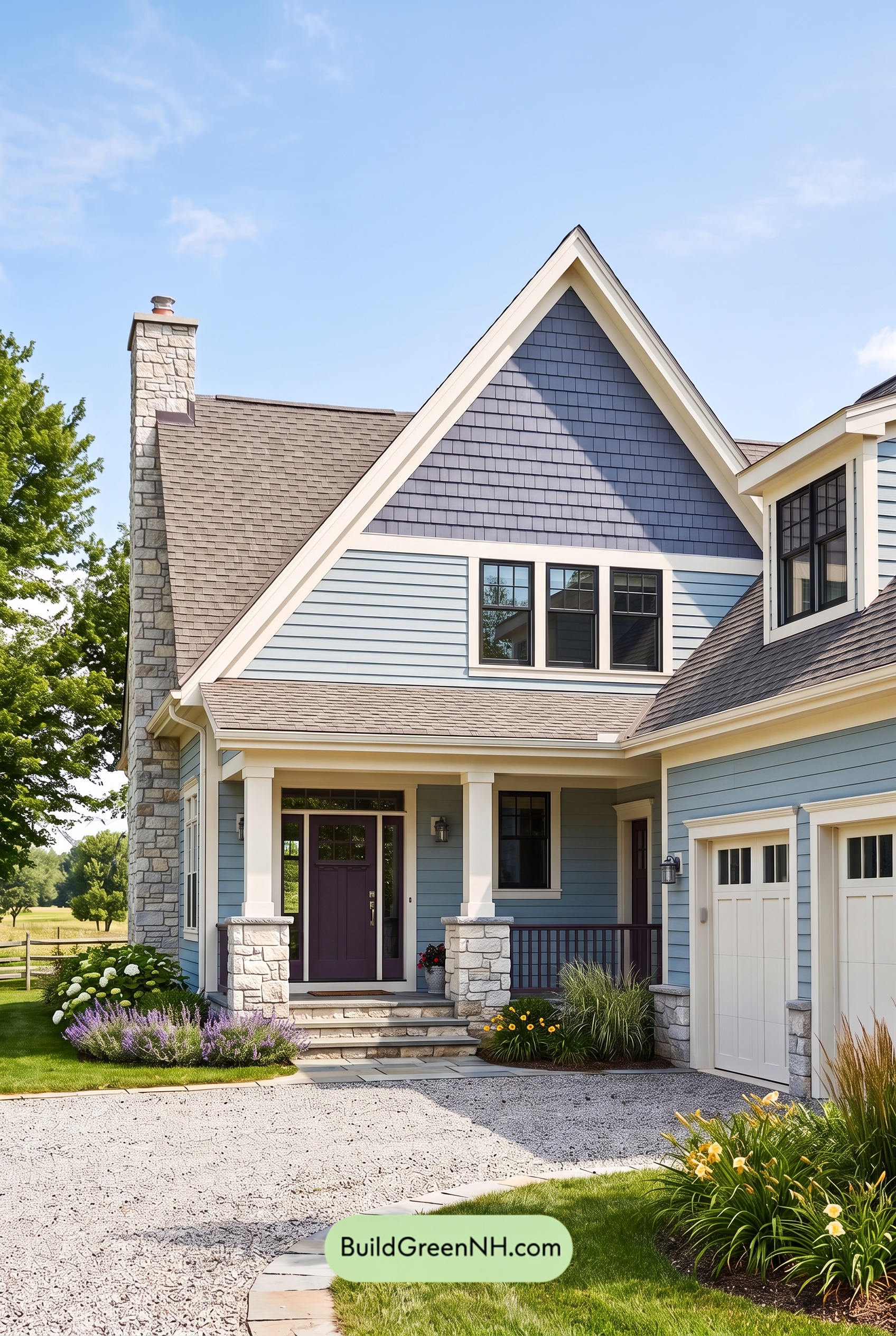 Exterior Color Scheme with Stone Accents: Meadow Bell Welcome
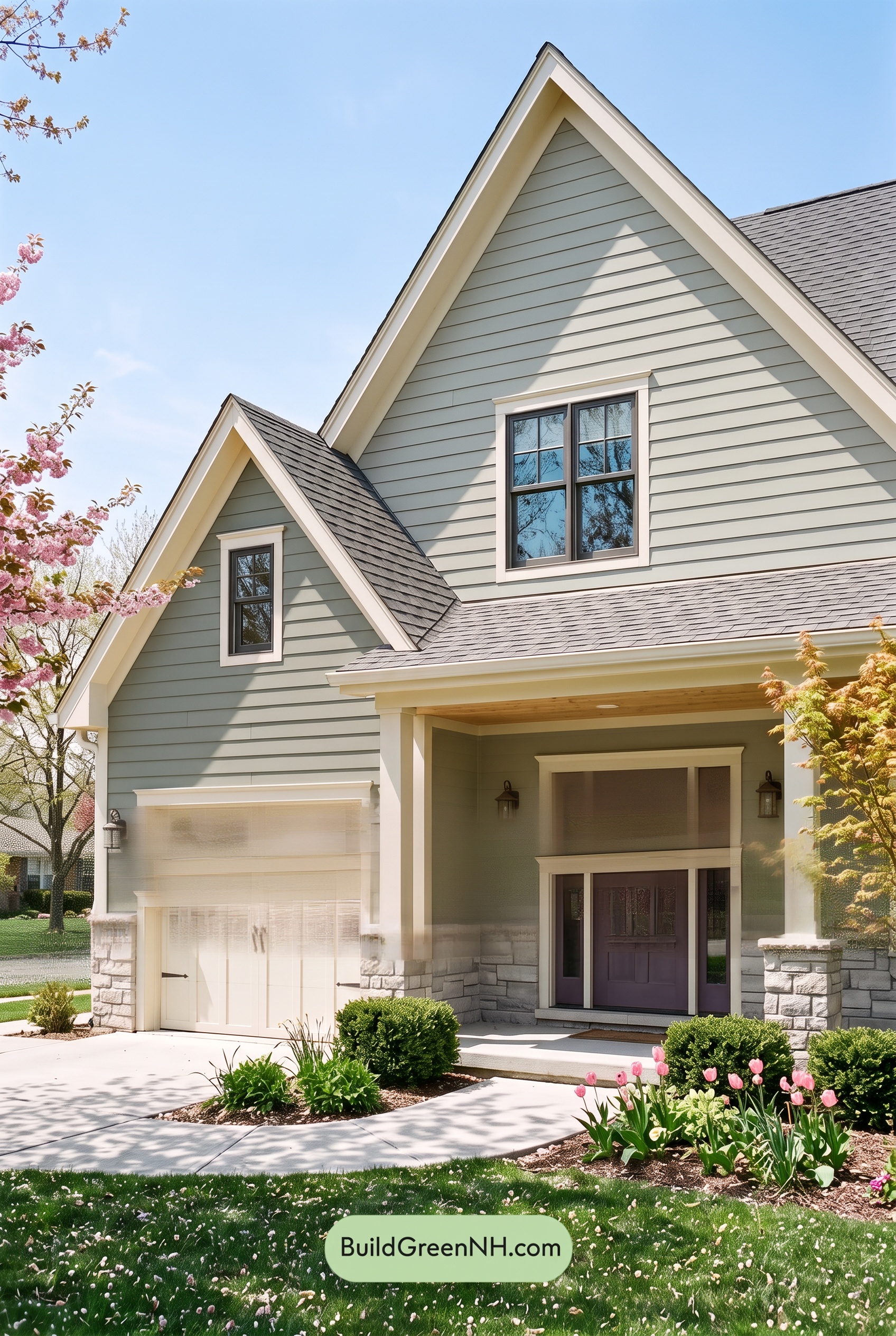 Exterior Color Scheme with Stone Accents: Willow Quartz Porch
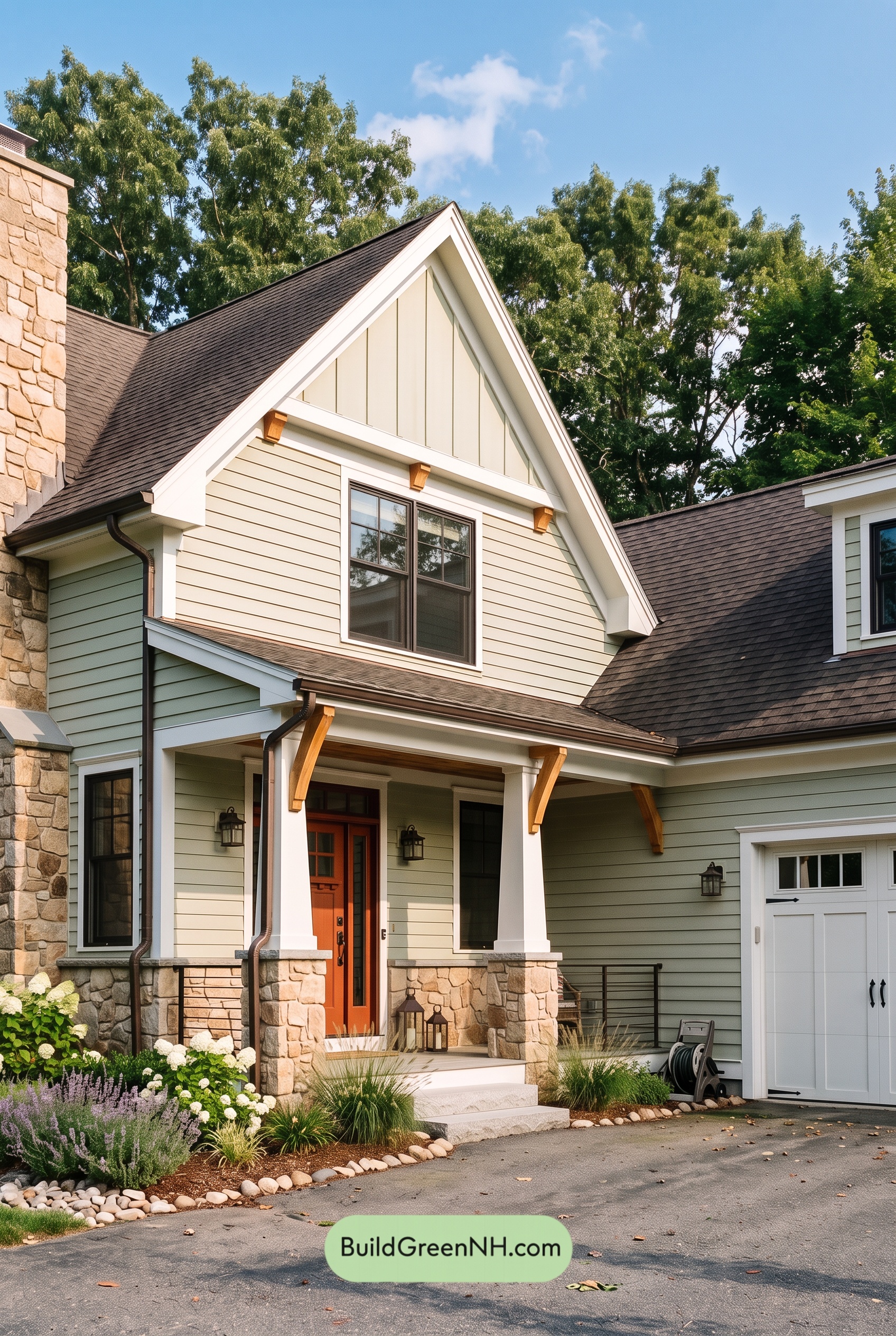 Exterior Color Scheme with Stone Accents: Celadon Ember Gable
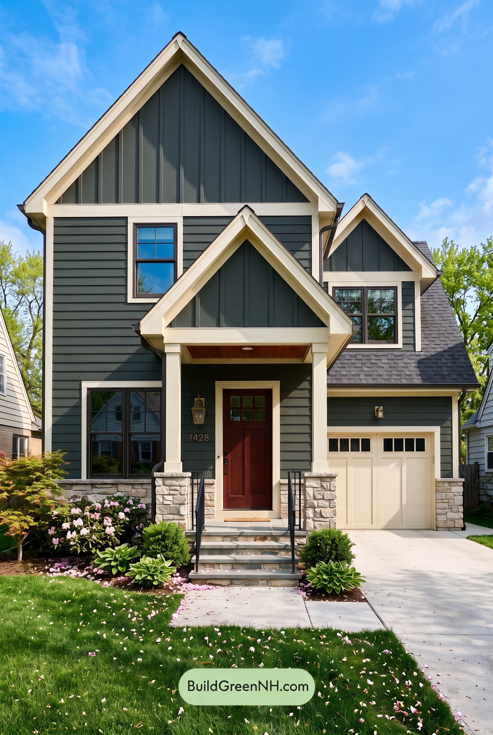 Exterior Color Scheme with Stone Accents: Pine Brass Threshold
Table of Contents