Last updated on
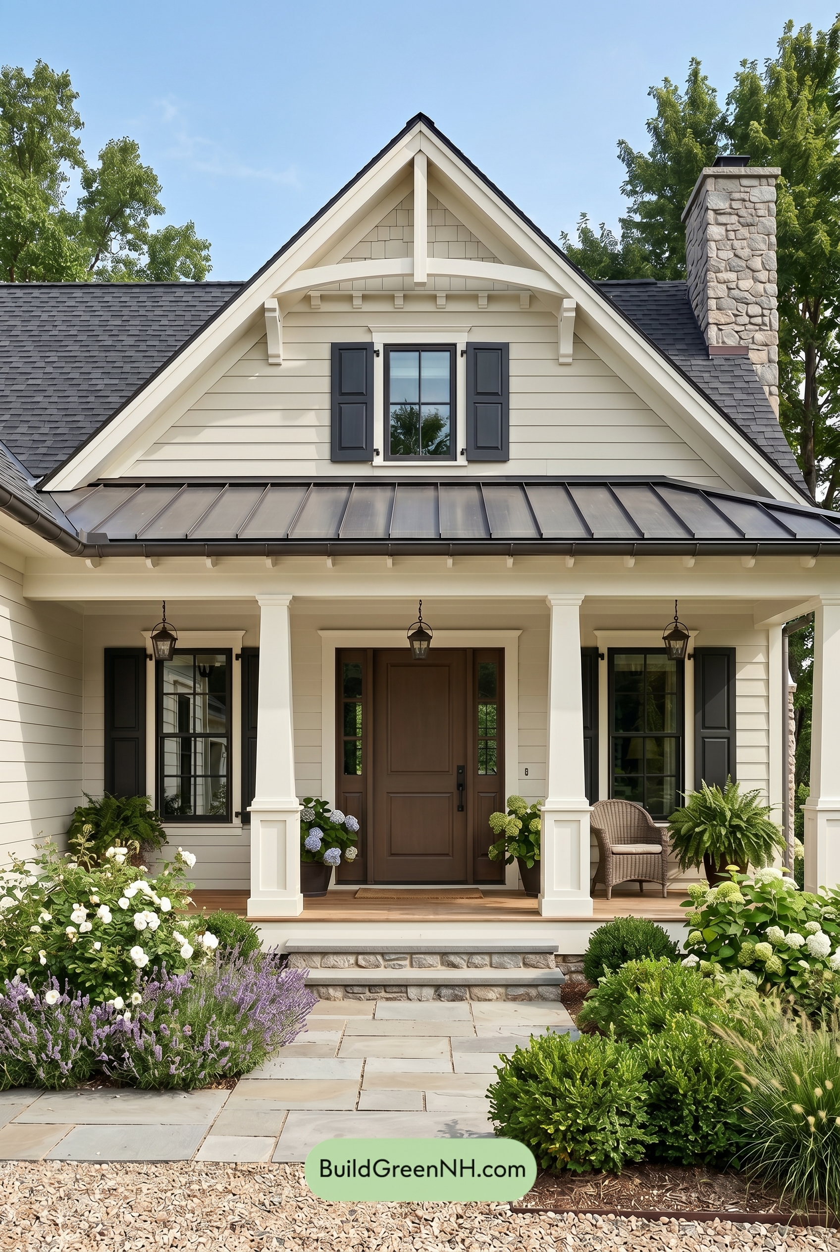

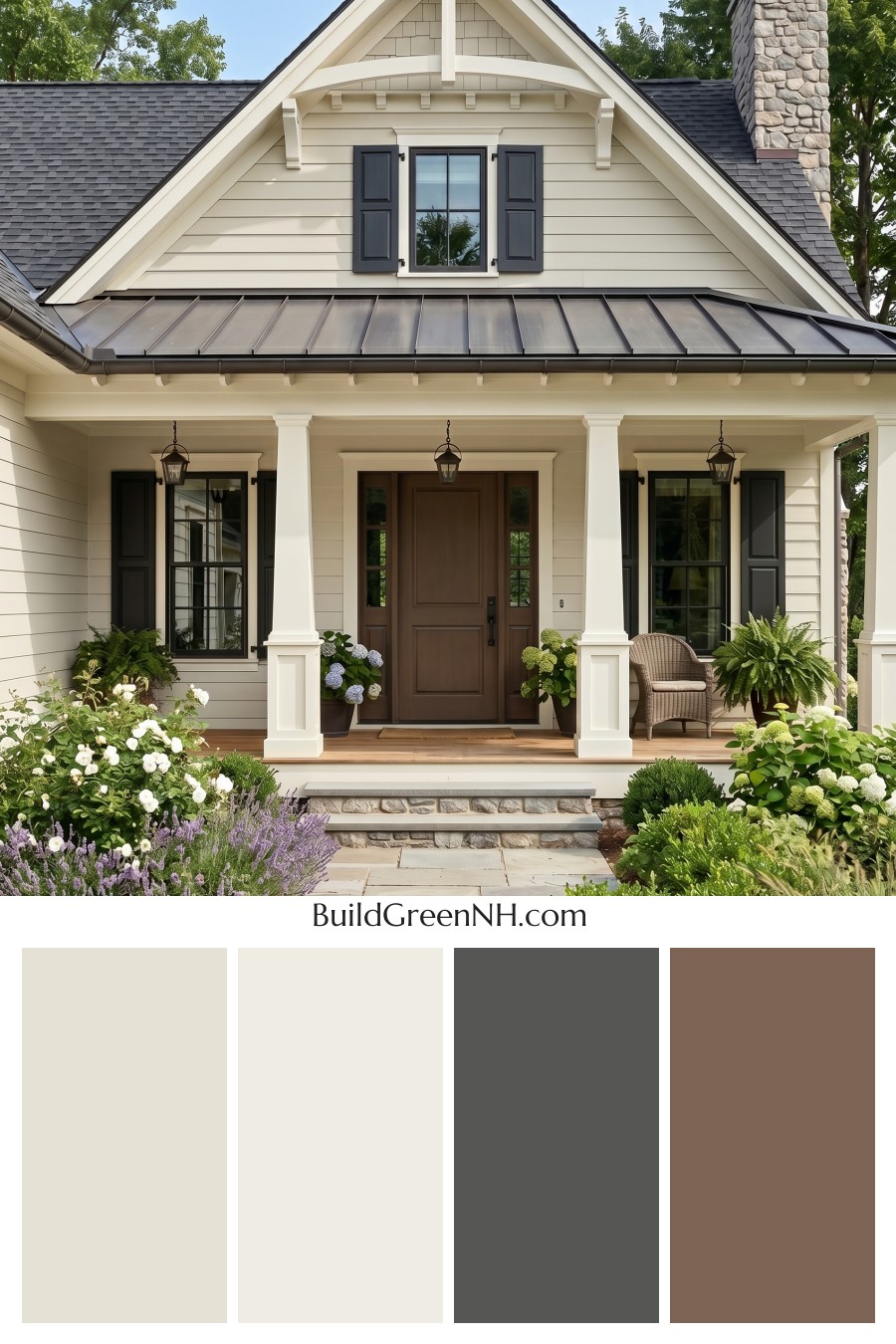
This exterior works beautifully because its warm beige siding, crisp white trim, smoky gray accents, and rich brown door create a layered look that feels classic, welcoming, and comfortably refined.
A Warm Beige Foundation
The main siding uses a soft shade from the beige family, giving the home an easy, approachable warmth. It feels light without being stark, and it gives the front elevation a calm backdrop that lets the architecture stand out.
The upper gable continues in the same beige family, which keeps the facade cohesive from the porch level to the roofline. Because the gable has a different siding texture, the repeated shade still feels interesting rather than flat.
Crisp White Trim for Structure
The white trim is one of the strongest design moves on this exterior. It frames the roof peaks, window surrounds, porch beams, and decorative brackets with a clean, polished finish.
The columns also stay in the white family, which makes the porch feel bright and gracious. Against the warm beige siding, this white shade adds just enough contrast to highlight the home’s traditional lines without feeling too sharp.
Gray Accents Add Depth
The window frames and shutters bring in a deep shade from the gray family, adding definition and a little drama. These darker accents ground the lighter siding and trim, especially around the windows where contrast matters most.
The gray shutters feel tailored and classic. They also connect beautifully with the dark gray roof, helping the upper and lower parts of the exterior feel visually tied together.
A Rich Brown Front Door
The front door introduces a warm brown shade that feels natural, substantial, and inviting. It creates a welcoming focal point at the center of the porch and balances the cooler gray accents around the windows.
This brown tone works especially well with the beige siding because both colors share an earthy warmth. The result is friendly and grounded, with just enough contrast to make the entry feel special.
How the Palette Comes Together
This color scheme succeeds because it balances warmth, brightness, and depth. The beige siding softens the overall look, the white trim adds crispness, the gray details bring sophistication, and the brown door gives the home a sense of hospitality.
The dark gray roof completes the palette by adding a strong cap to the design. It keeps the lighter body colors from feeling too delicate and gives the home a confident, timeless presence.
The Overall Mood
The mood is relaxed, elegant, and quietly traditional. Nothing feels overly trendy or loud. Instead, the exterior leans into a classic mix of warm neutrals and deep accents that will age gracefully.
Surrounded by greenery and natural stone, these shades feel especially at home. The palette has a fresh garden-friendly quality, making the house feel settled, cared for, and warmly inviting from the very first glance.
Next, see how this color scheme looks under different lighting simulations throughout the day.
Overcast
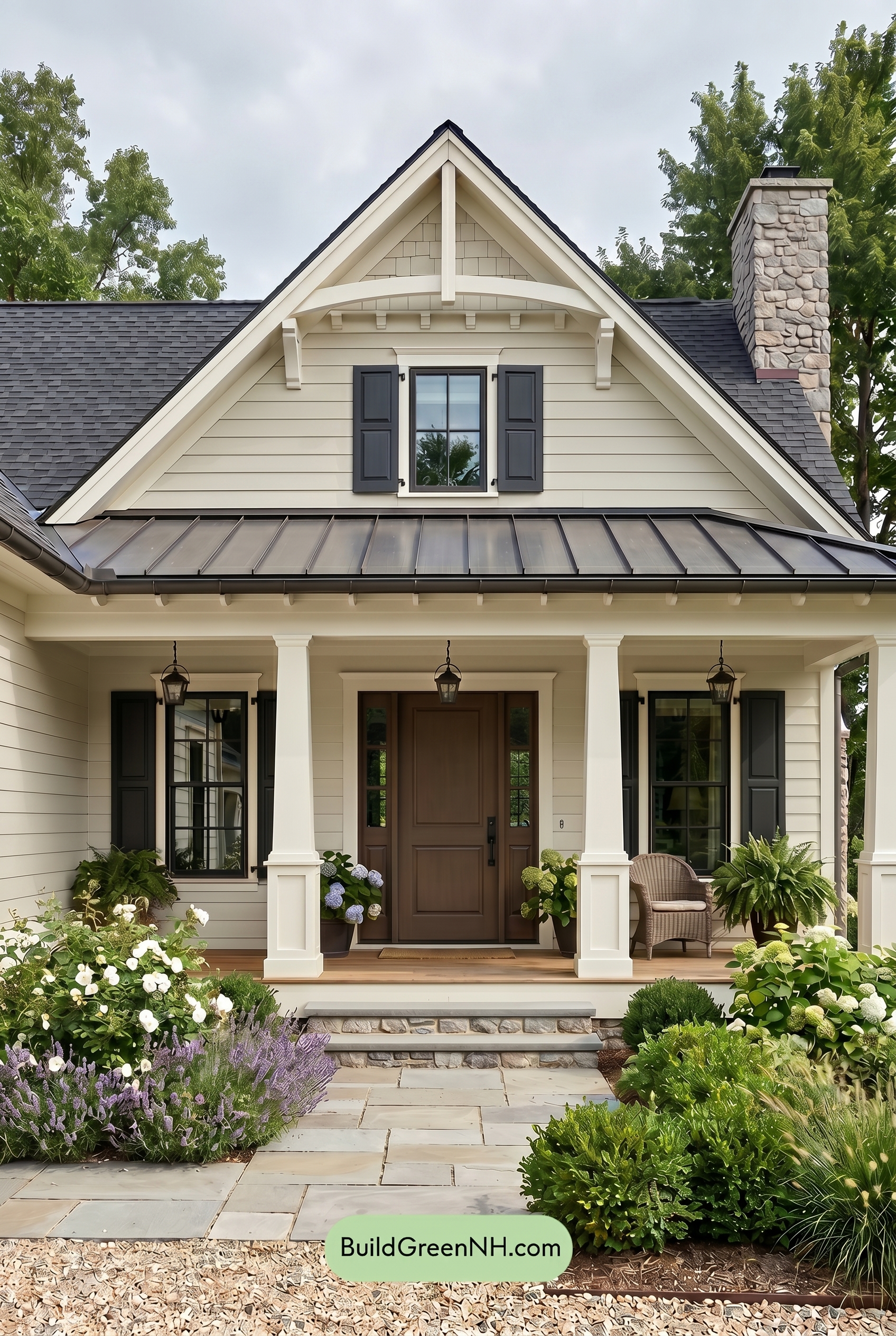
Under overcast light, the beige siding and upper wall lose a bit of saturation and warmth compared with neutral daylight, reading softer and slightly cooler. The white trim and columns appear less crisp, shifting from bright highlights to a gentler, creamier presence.
The gray shutters and window frames feel deeper and more grounded as direct glare disappears, while the brown front door looks calmer and less golden. With shadows diffused and contrast lowered, the whole exterior takes on a quiet, refined mood rather than the sharper, sunnier definition seen in neutral daylight.
Golden Hour
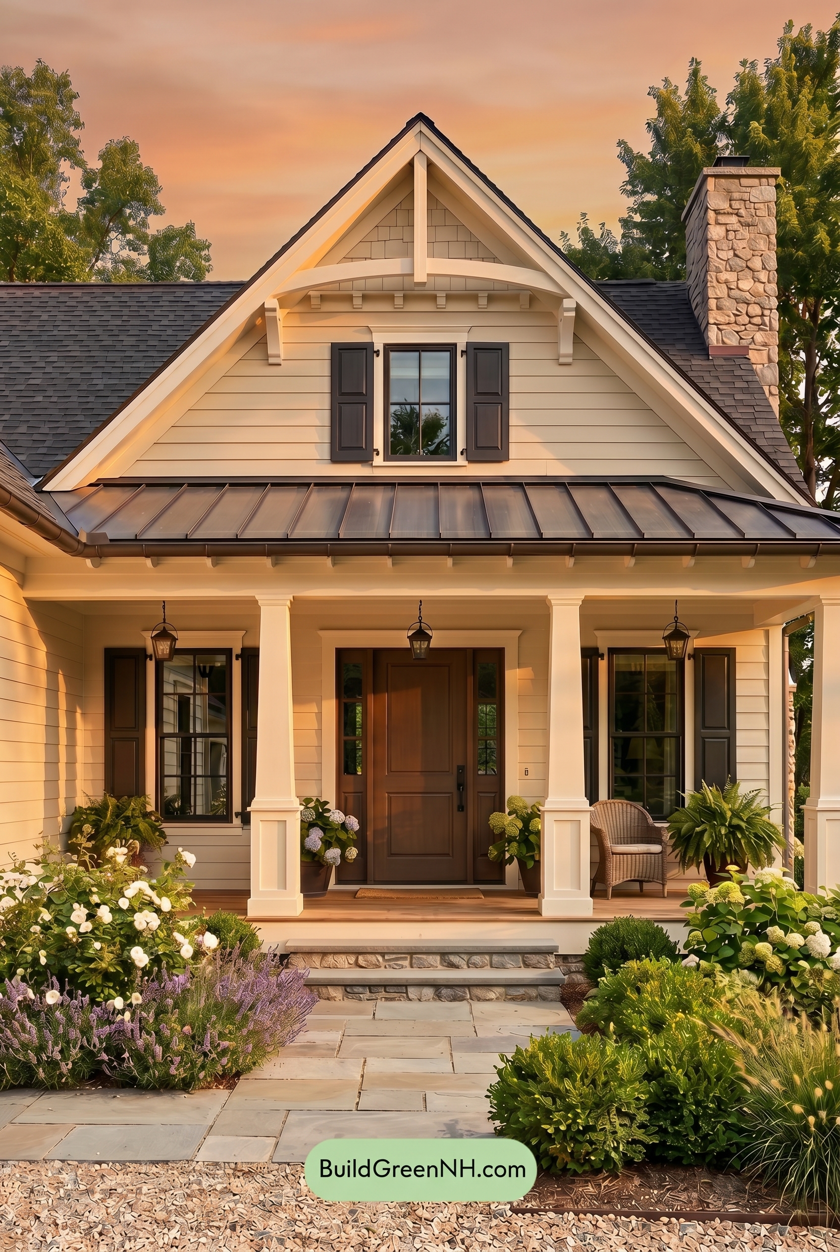
Under Golden Hour, the beige siding shifts from a balanced neutral into a warmer, more saturated shade, giving the façade a softer and more inviting glow than it would have in neutral daylight. The white trim and columns pick up gentle warmth too, so they feel less crisp and more mellow while still defining the rooflines and porch details.
The gray shutters and window frames appear deeper in the long evening shadows, increasing contrast against the warmed-up walls, while the brown front door looks richer and more grounded. Compared to flatter daylight, the stronger shadow play adds depth, dimension, and a calm, cozy mood across the exterior.
Shade
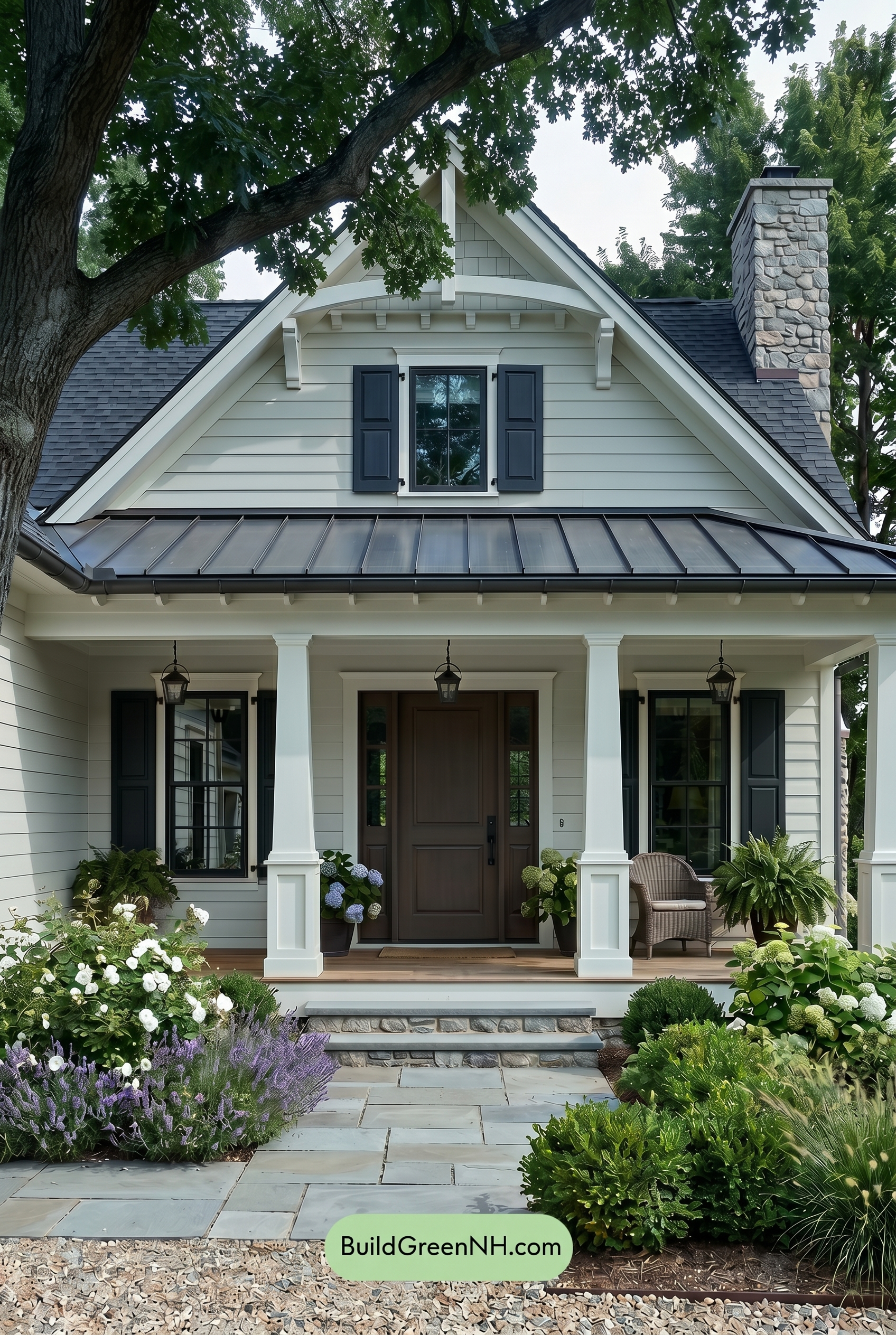
In shade, the beige family on the walls looks cooler and more muted than it would in neutral daylight, with less warmth and softer saturation. The white trim and columns lose some of their bright snap, reading gentler and slightly shadowed rather than crisp and glowing.
The gray shutters and window frames deepen noticeably in the shade, creating stronger contrast against the lighter siding, while the brown front door feels richer and more grounded. Overall, the shadows give the palette a calm, tucked-away mood with cooler contrast and a more refined, subdued finish.
Nighttime
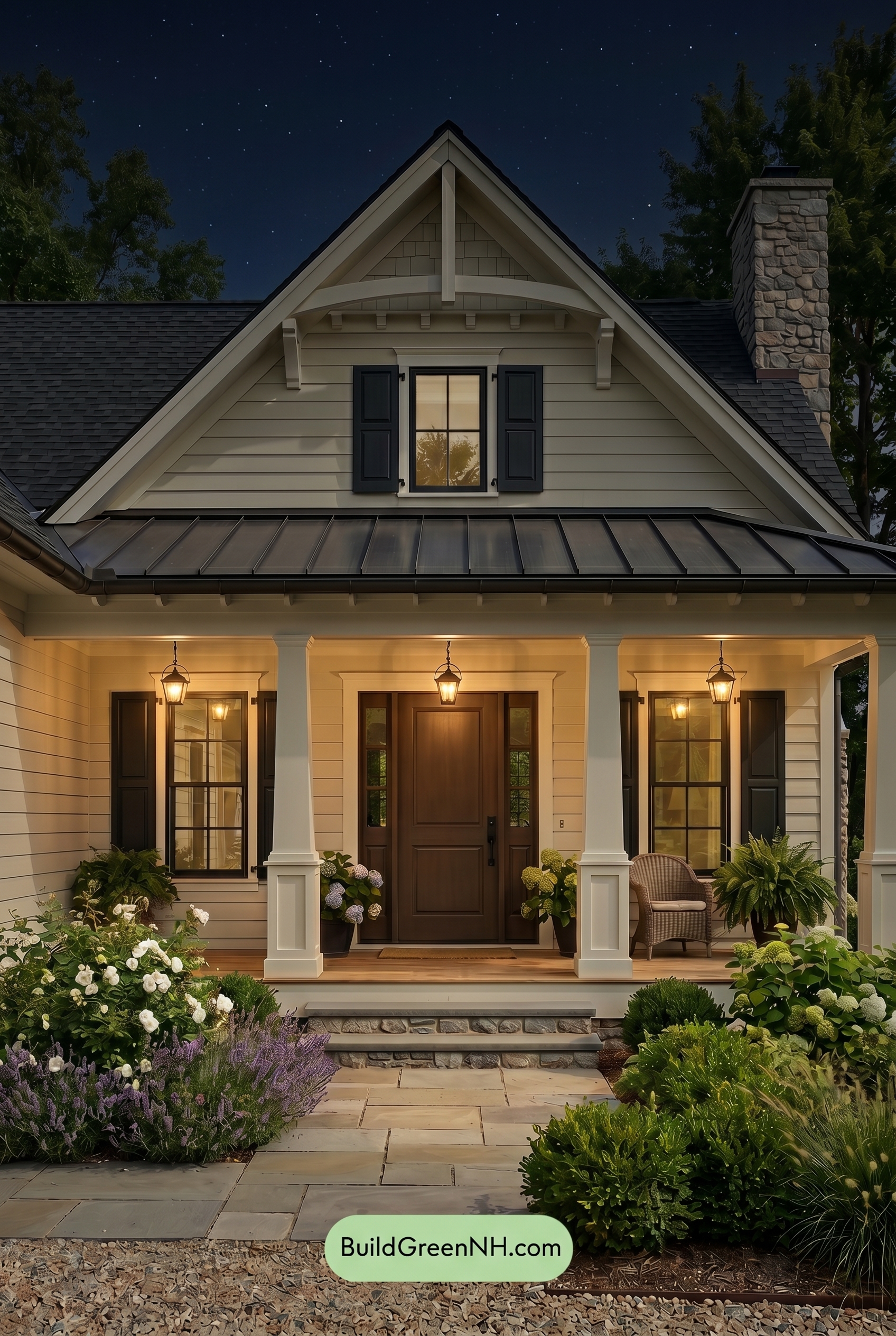
At night, the beige siding shifts away from its more even daylight look and takes on a softer, warmer glow where the porch lights touch it. Its saturation feels slightly richer near the entry, while the upper areas recede into muted shadow, creating a gentle contrast between illuminated walls and darker rooflines.
The white trim and columns appear creamier under the warm lighting, making them feel less crisp than in neutral daylight but more inviting. Gray shutters and window frames deepen dramatically, adding sharper contrast, while the brown front door looks warmer and more grounded, giving the whole exterior a cozy, elegant nighttime mood.
Pin these for later:
Want More?
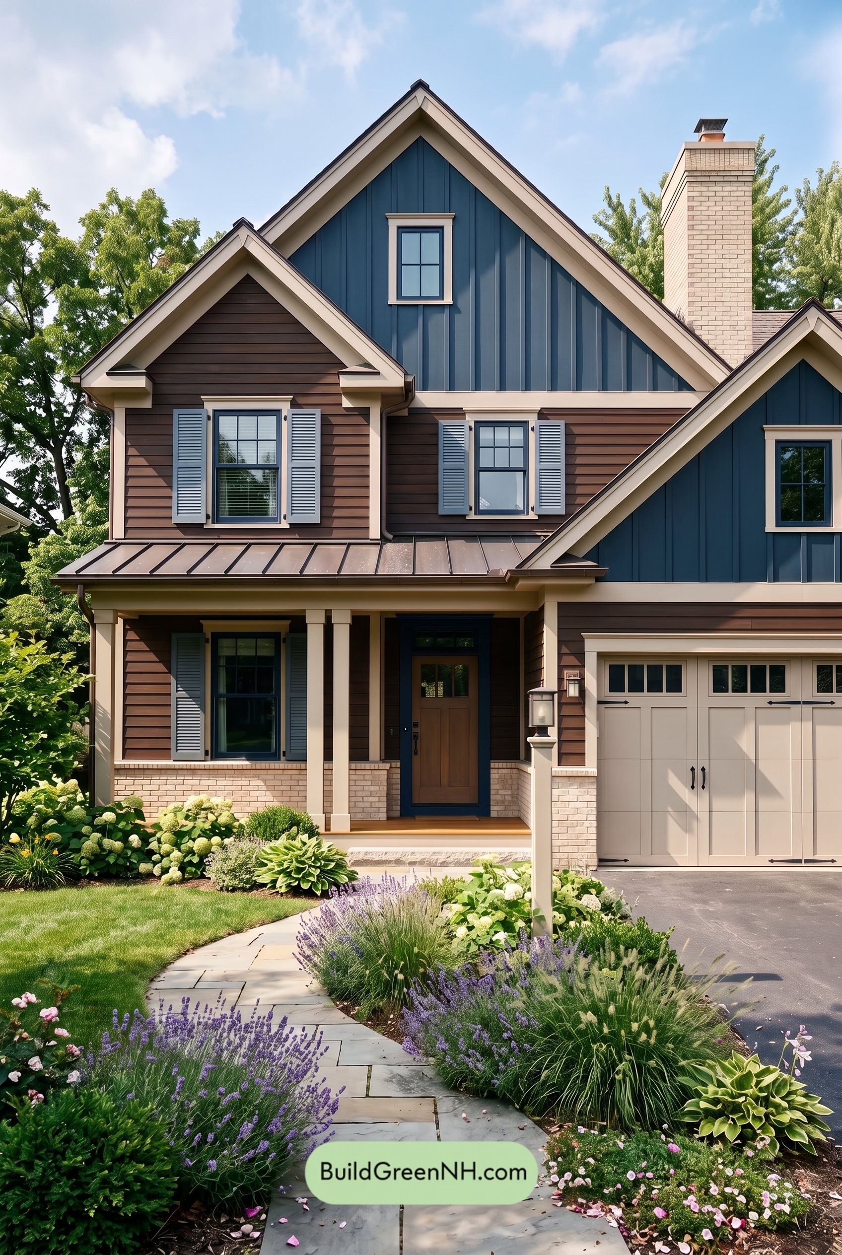 Dark Brown House Exterior Color Scheme: Inkwood Lantern
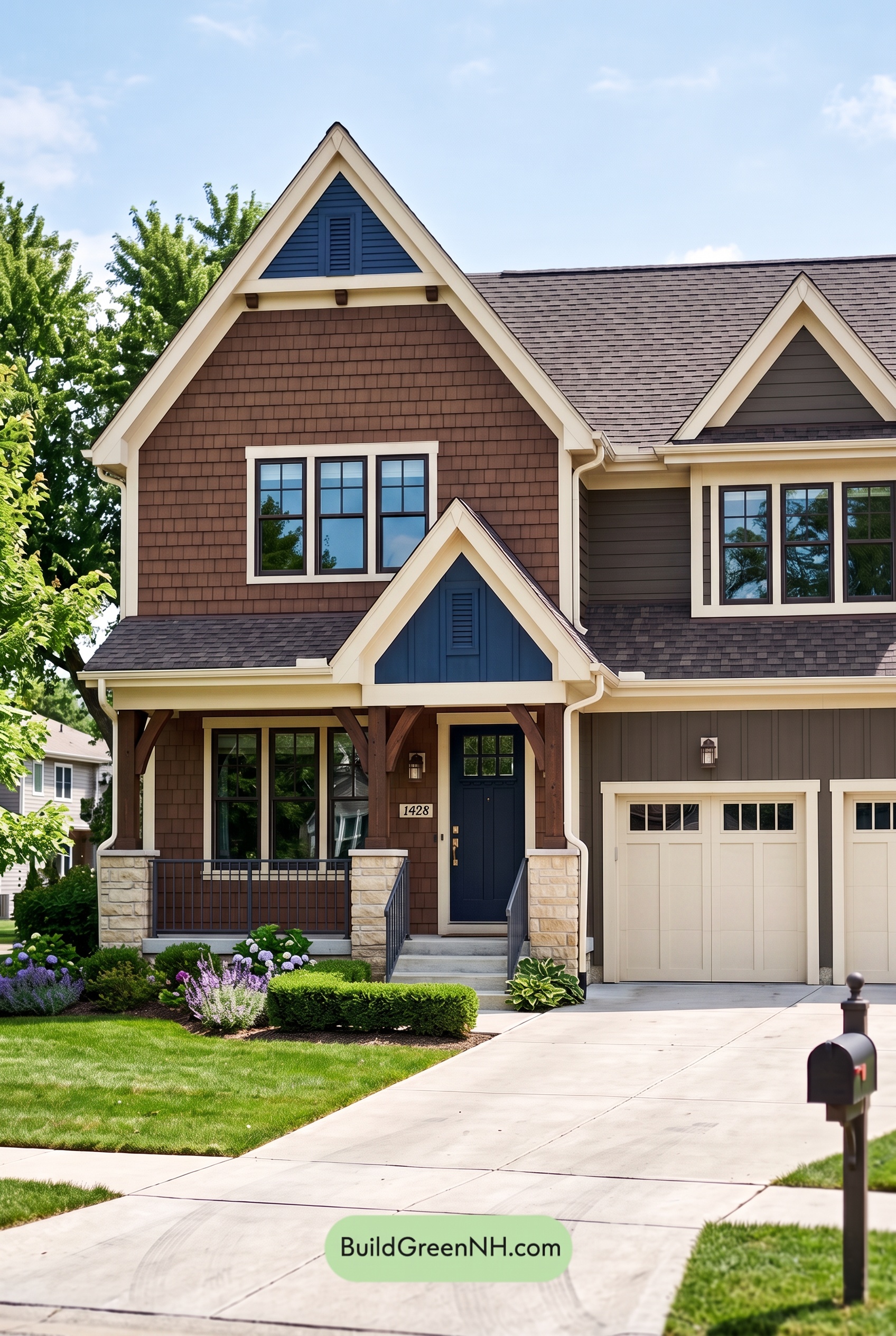 Dark Brown House Exterior Color Scheme: Bluebell Timberline
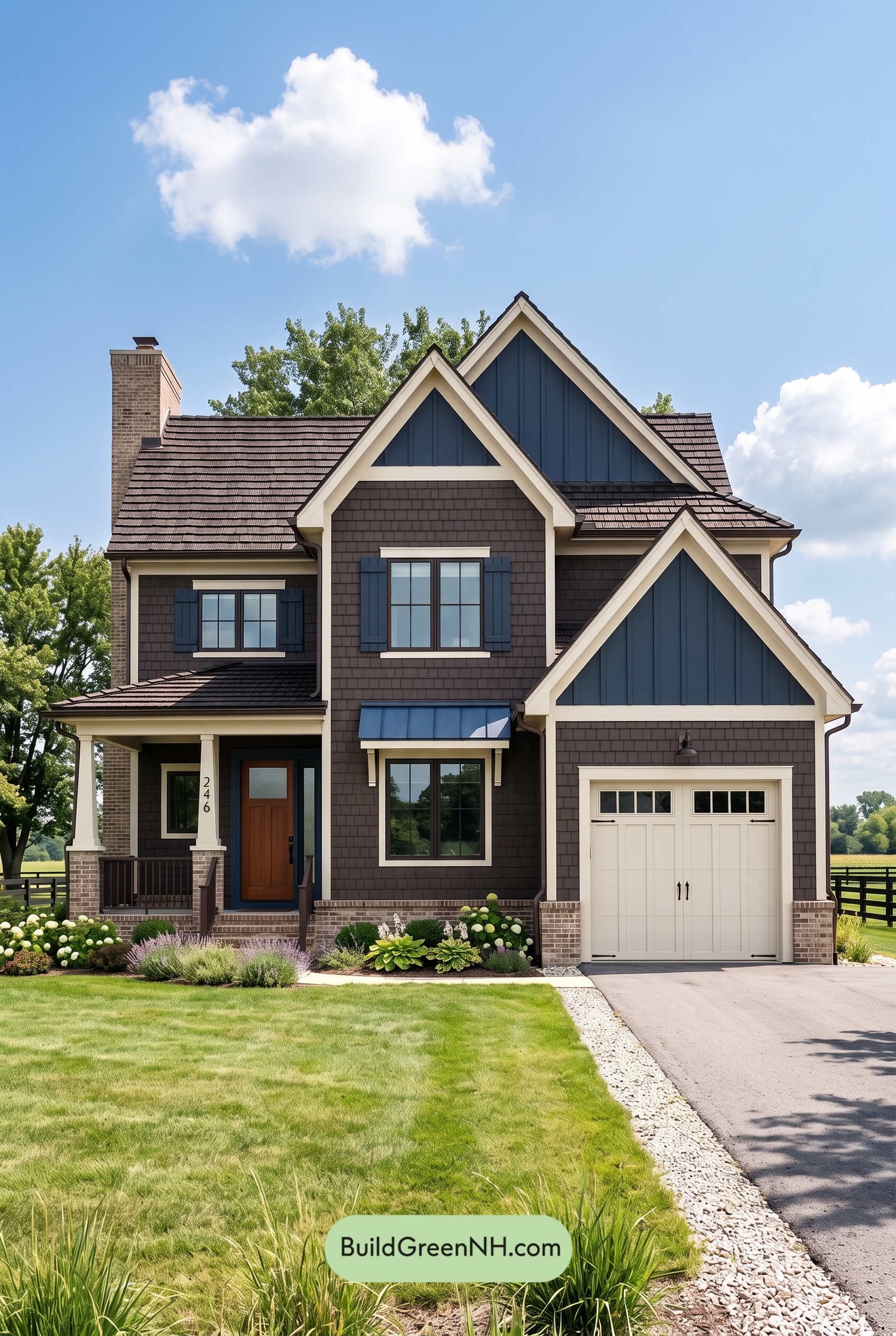 Dark Brown House Exterior Color Scheme: Sapphire Homestead
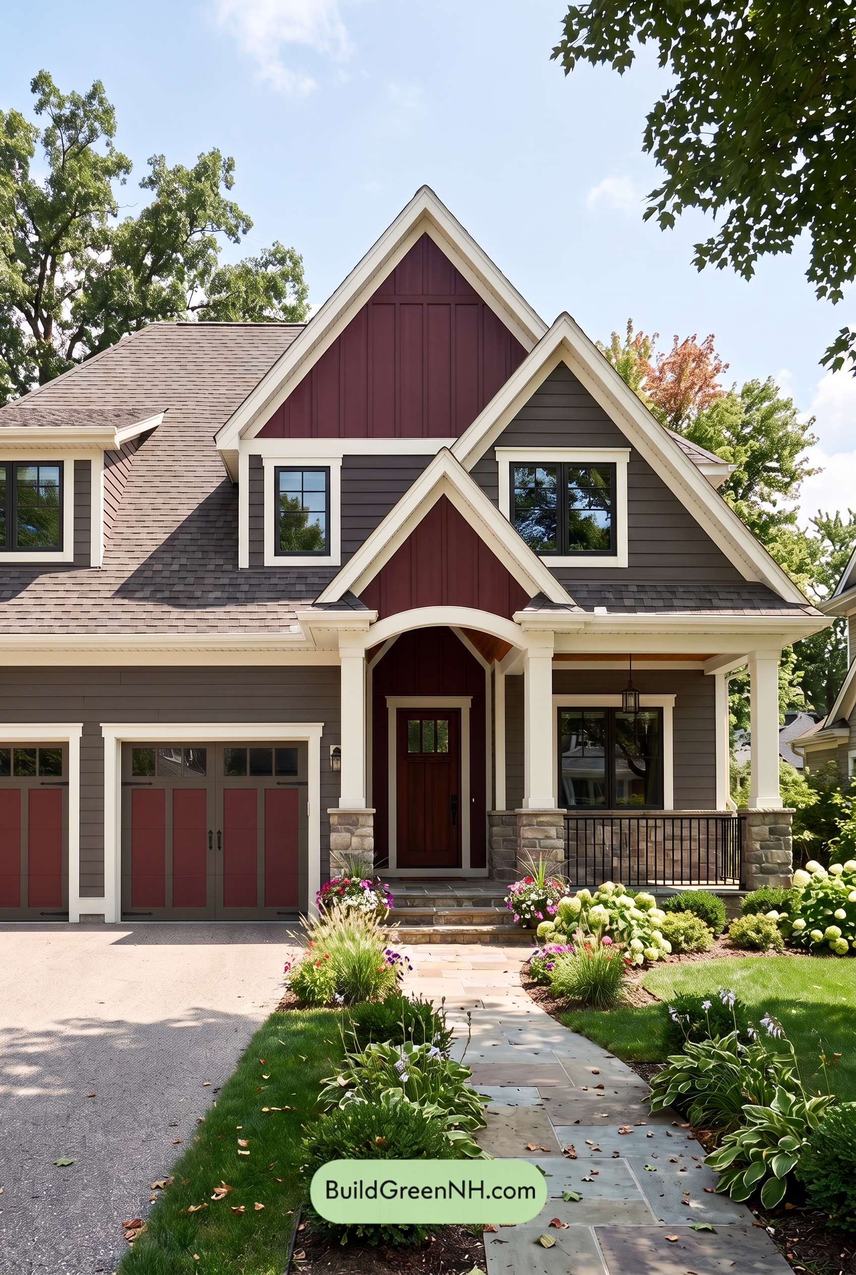 Dark Brown House Exterior Color Scheme: Hearthglow Arrival
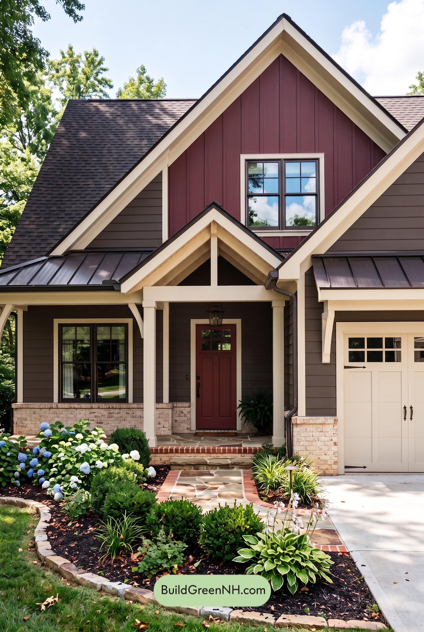 Dark Brown House Exterior Color Scheme: Embercrest Welcome
Table of Contents