Last updated on
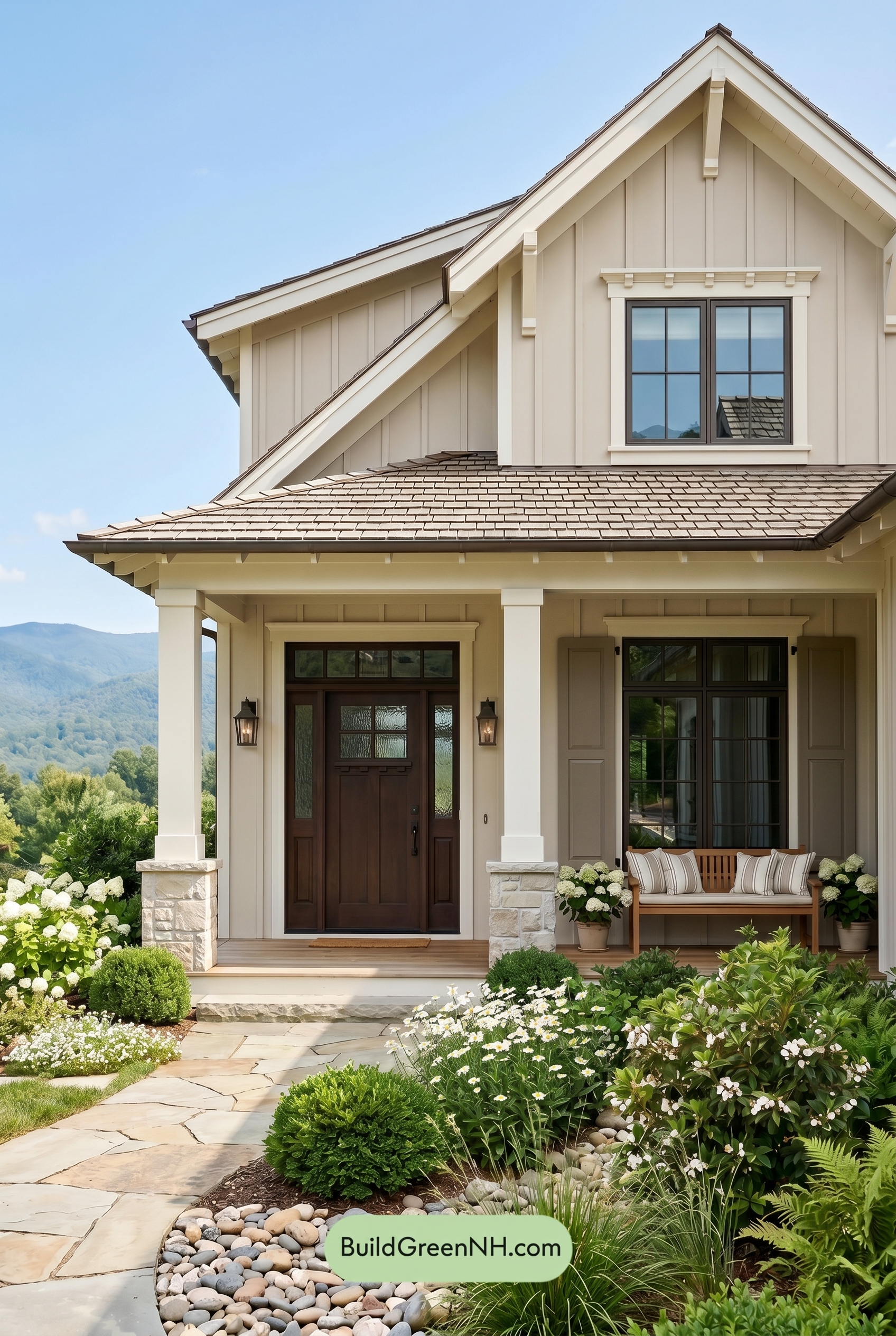

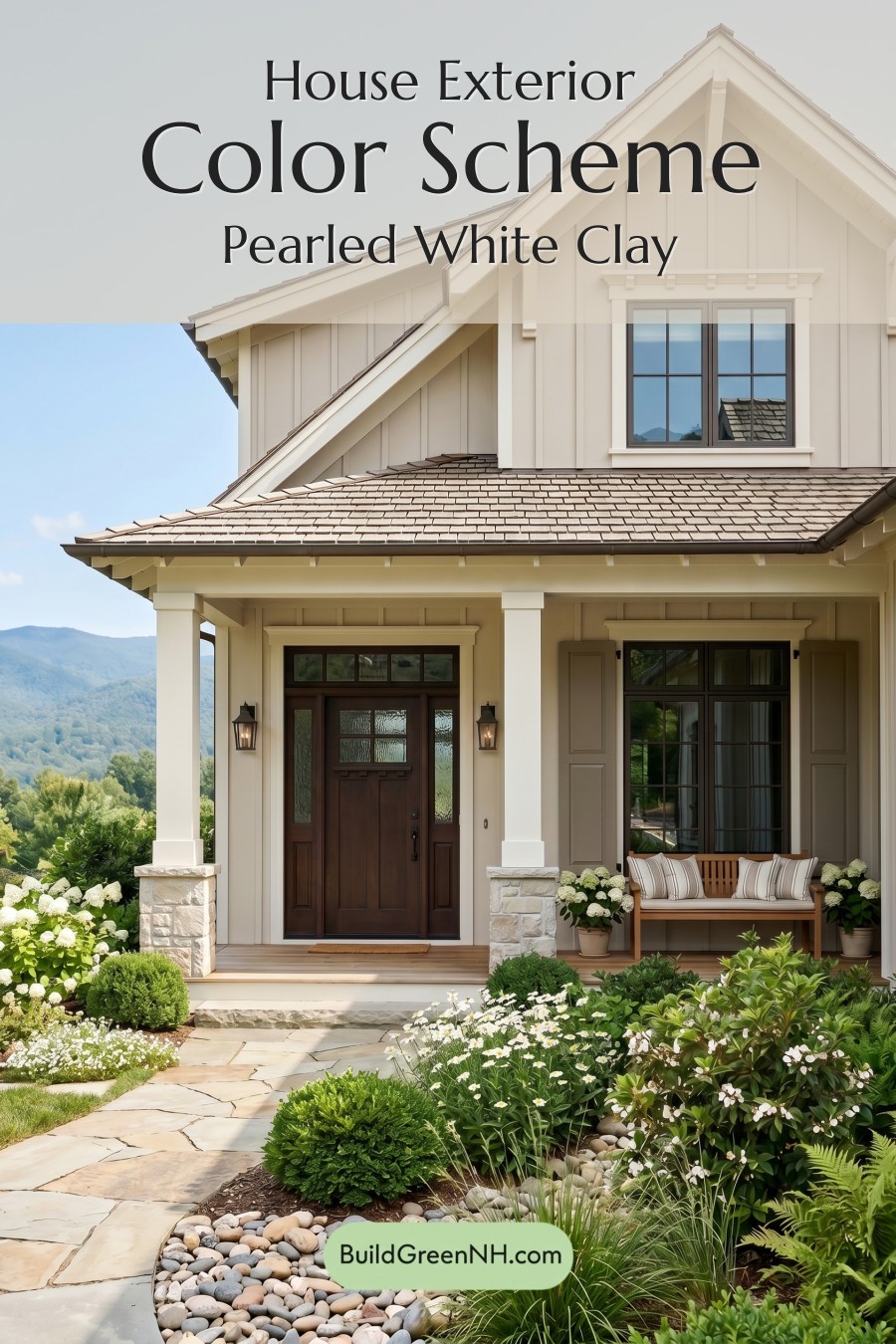
This warm beige-and-white exterior works beautifully because it feels polished, welcoming, and perfectly at home in its natural setting.
A Soft, Warm Foundation
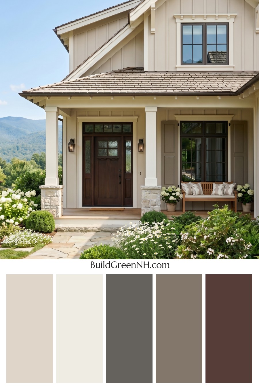
The main siding is a gentle shade from the beige family, giving the house a calm and inviting presence. It has enough warmth to feel cozy, but it stays light enough to keep the exterior fresh and airy. On the vertical siding, this soft beige also highlights the home’s architectural lines without making the façade feel busy.
Crisp Trim That Frames the Architecture
The trim, fascia, porch ceiling details, and columns are finished in a clean shade from the white family. This lighter contrast sharpens the rooflines, window surrounds, and porch structure, giving the home a refined, tailored look. The white columns especially add a classic farmhouse-inspired feel while keeping the entry bright and open.
Grounding Brown Accents
The front door brings in a rich brown shade that adds depth and warmth at the entry. It pairs beautifully with the brown shutters, creating a grounded rhythm across the lower level of the home. These deeper accents keep the light beige and white palette from feeling too delicate, adding just the right amount of substance.
Subtle Gray Window Frames
The window frames lean into the gray family, offering a quiet modern touch. This muted gray works as a bridge between the creamy white trim, the warm beige siding, and the darker roof tones. It gives the windows definition without competing with the softer exterior colors.
A Roof That Ties Everything Together
The roof appears in a muted blend of brown and gray shades, which helps connect the home to the natural stone, pathway, and surrounding landscape. Its earthy tone complements the brown door and shutters while balancing the brightness of the white trim.
The Overall Mood
This color scheme feels relaxed, elegant, and timeless. The warm beige siding creates softness, the white trim adds clarity, and the brown accents bring a welcoming, natural richness. Together, the palette feels especially suited to a lush garden setting, where greenery and pale blooms make the warm neutrals look even more beautiful.
Next, see how this color scheme looks under different lighting simulations throughout the day.
Overcast
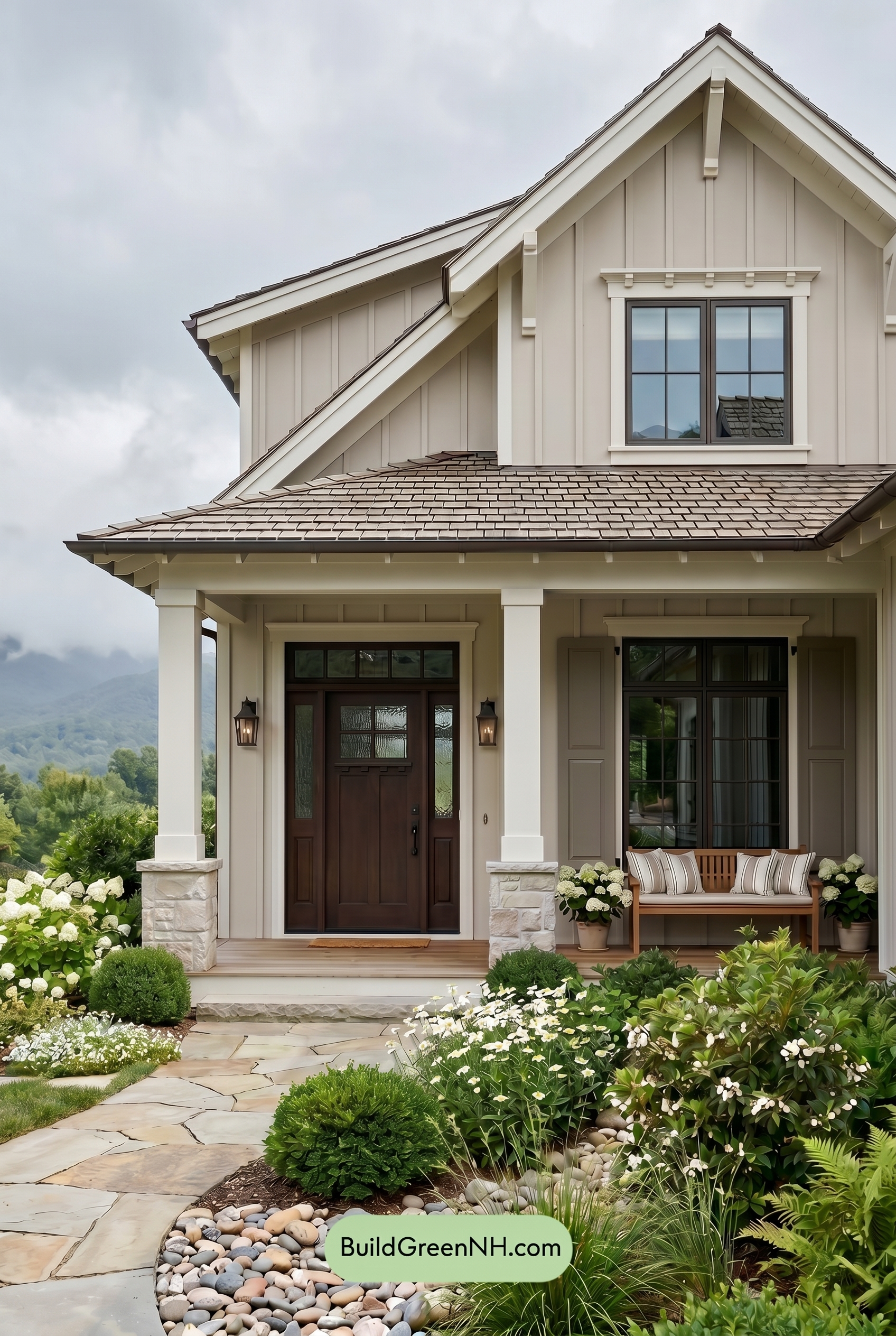
Under overcast light, the beige siding loses a bit of saturation and warmth compared to neutral daylight, reading softer and slightly cooler. The white trim and columns feel less bright and crisp, with gentler edges as shadows become broad and diffused rather than sharp.
The brown shutters and front door deepen subtly, adding grounded contrast against the muted warm neutrals, while the gray window frames appear calmer and more blended. Overall, the palette shifts from fresh and sunlit to quiet, cozy, and refined.
Golden Hour
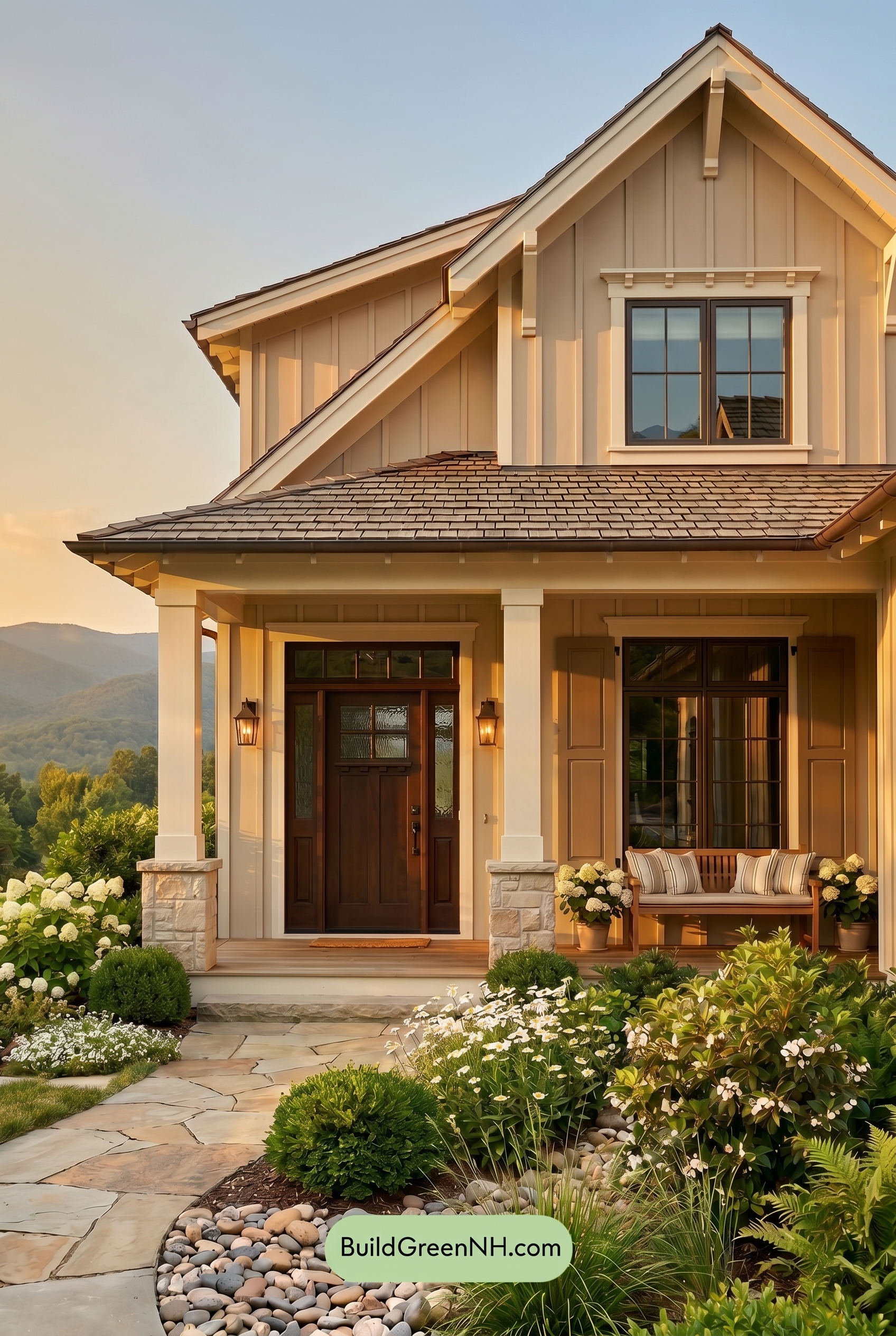
Under Golden Hour light, the beige siding takes on a richer, honeyed warmth that feels more saturated than it would in neutral daylight. The white trim and columns soften from crisp and bright to creamy and glowing, reducing starkness while still outlining the architecture beautifully.
The gray window frames appear deeper in the longer shadows, while the brown shutters and front door gain extra warmth and depth. Compared with neutral daylight, contrast becomes more dramatic, shadows stretch across the facade, and the whole palette shifts into a cozier, more inviting mood.
Shade
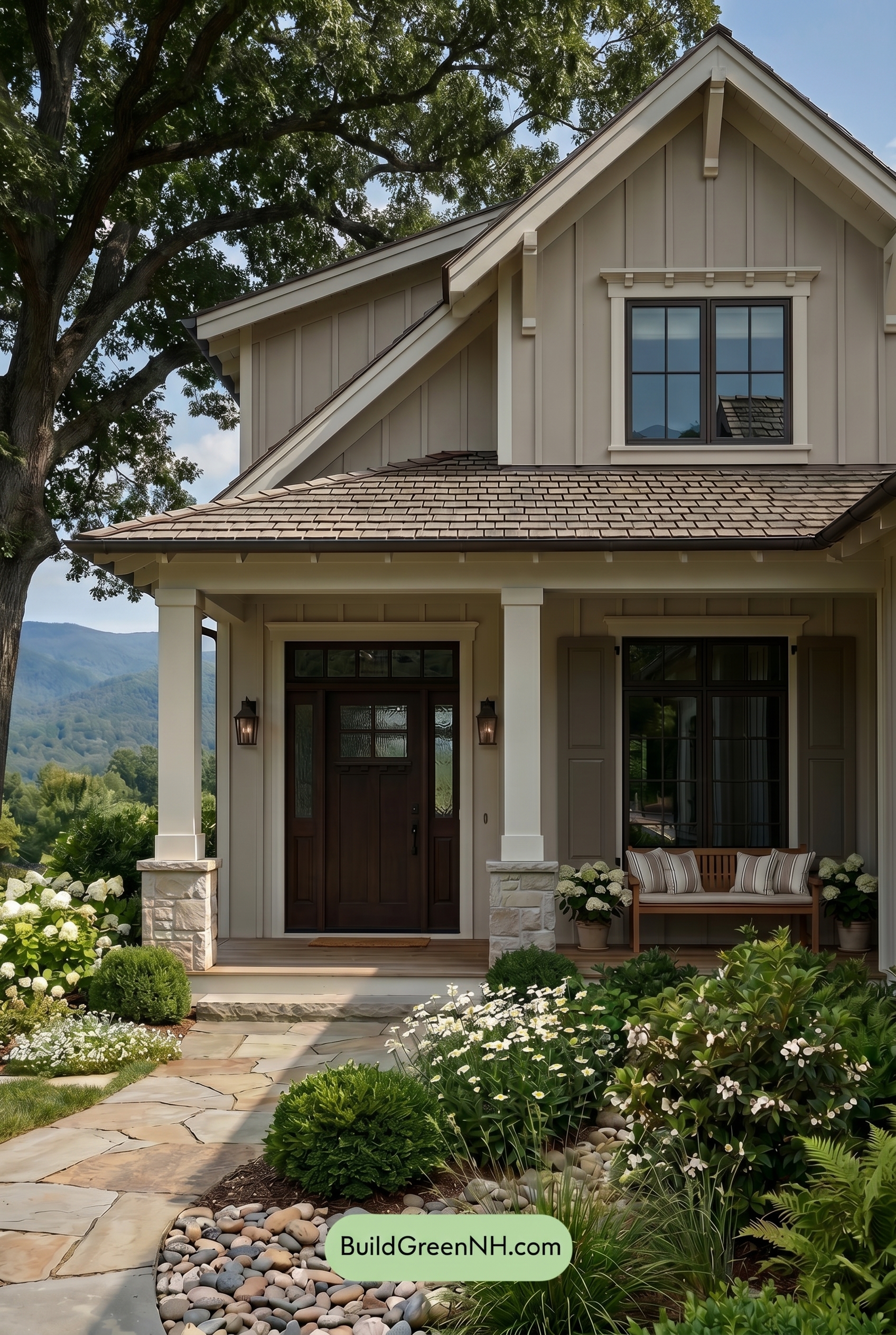
In Shade, the beige siding becomes more subdued than it would in neutral daylight, with its warmth softening into a calmer, slightly cooler neutral. The white trim and columns lose a bit of brightness, so the contrast feels gentler, while deeper shadows under the rooflines add definition to the board-and-batten texture.
The brown shutters and front door appear richer and more saturated in the shade, giving the entry a grounded, cozy feel. Gray window frames also read deeper and cooler, shifting the overall mood from bright and open to quiet, layered, and warmly sheltered.
Nighttime
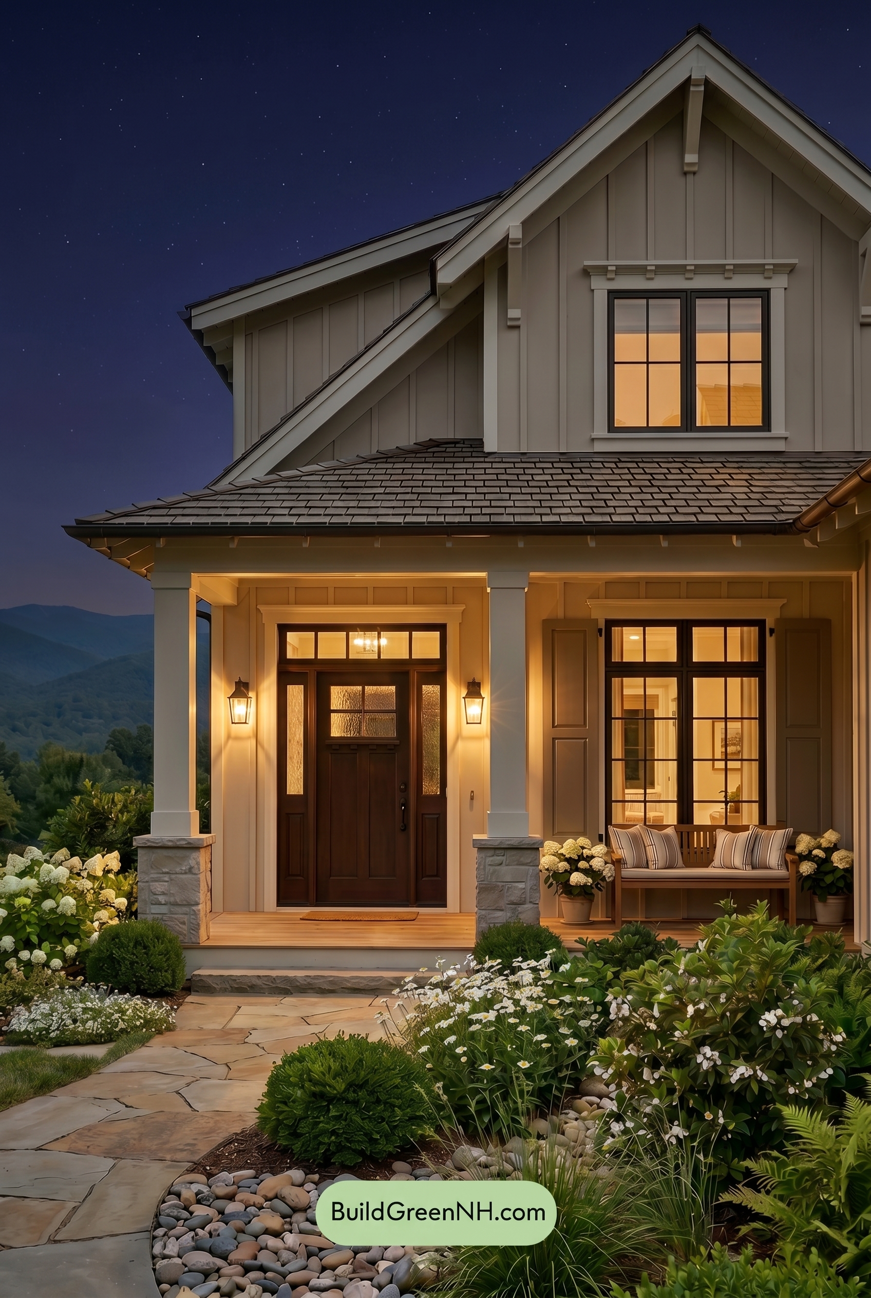
At nighttime, the beige siding appears deeper and more saturated than it would in neutral daylight, shifting from a soft, even neutral into a richer, shadowed shade. The warm glow from the windows and porch lights adds golden warmth, making the white trim and columns feel creamier while increasing contrast against the darker roofline and shaded upper walls.
The gray window frames and brown accents take on a stronger, moodier presence after dark, with shadows sharpening the architectural lines. Compared to daylight, the overall palette feels less crisp and more intimate, with warm neutrals softened by light and darker shades adding depth, calm, and a welcoming evening mood.
Pin these for later:
Want More?
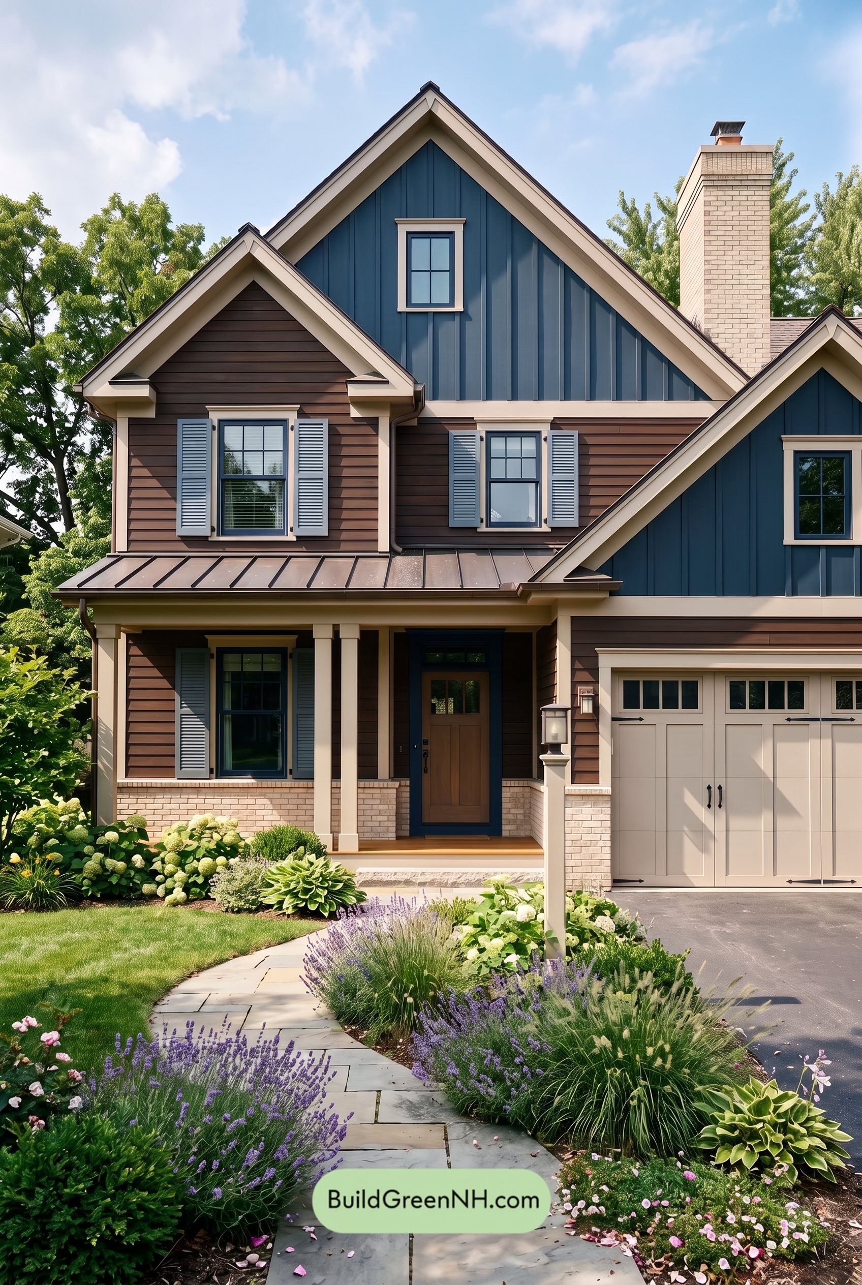 Dark Brown House Exterior Color Scheme: Inkwood Lantern
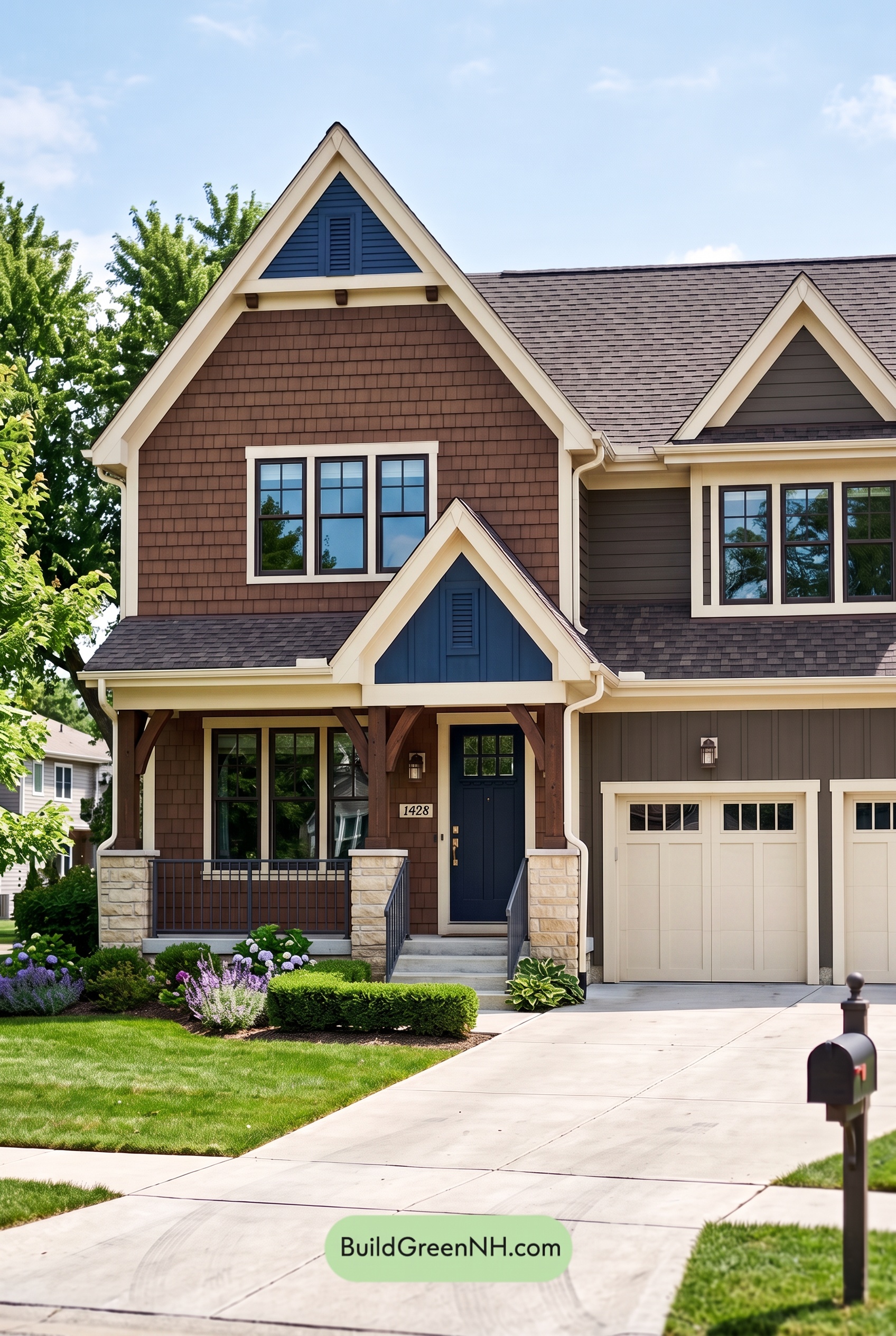 Dark Brown House Exterior Color Scheme: Bluebell Timberline
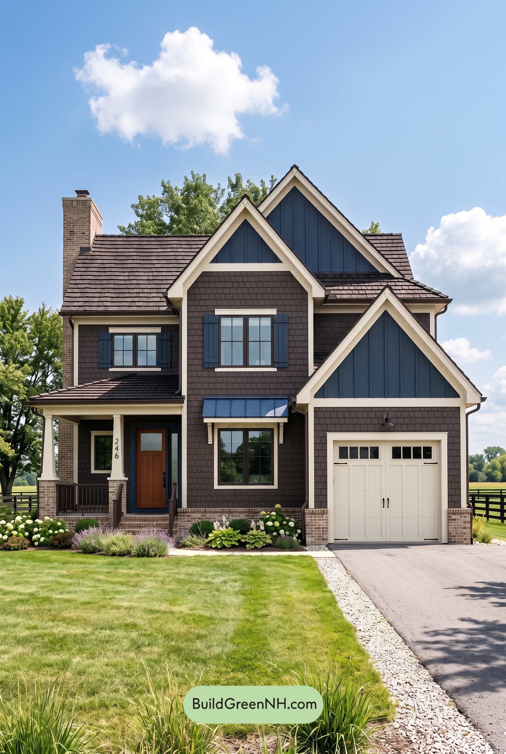 Dark Brown House Exterior Color Scheme: Sapphire Homestead
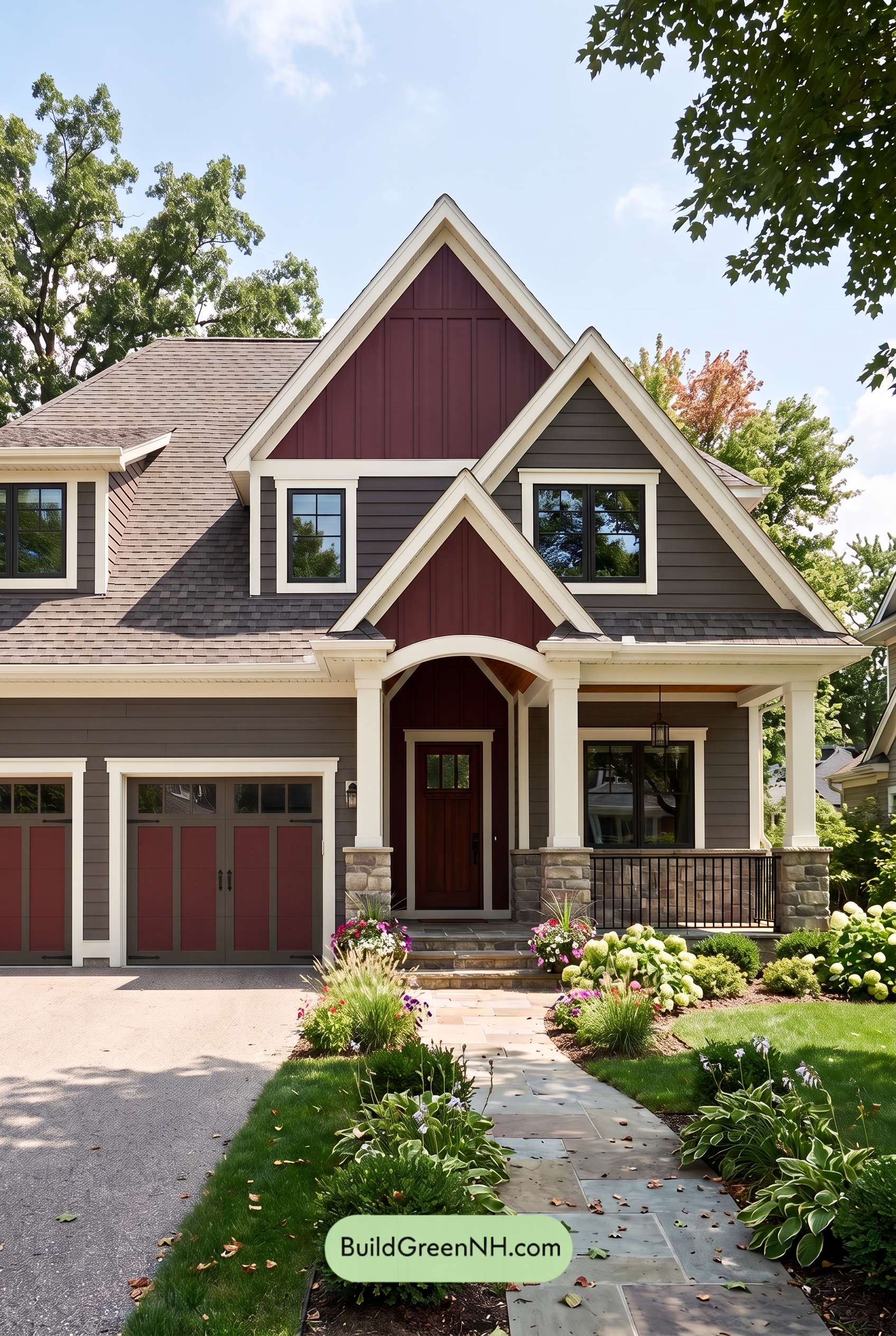 Dark Brown House Exterior Color Scheme: Hearthglow Arrival
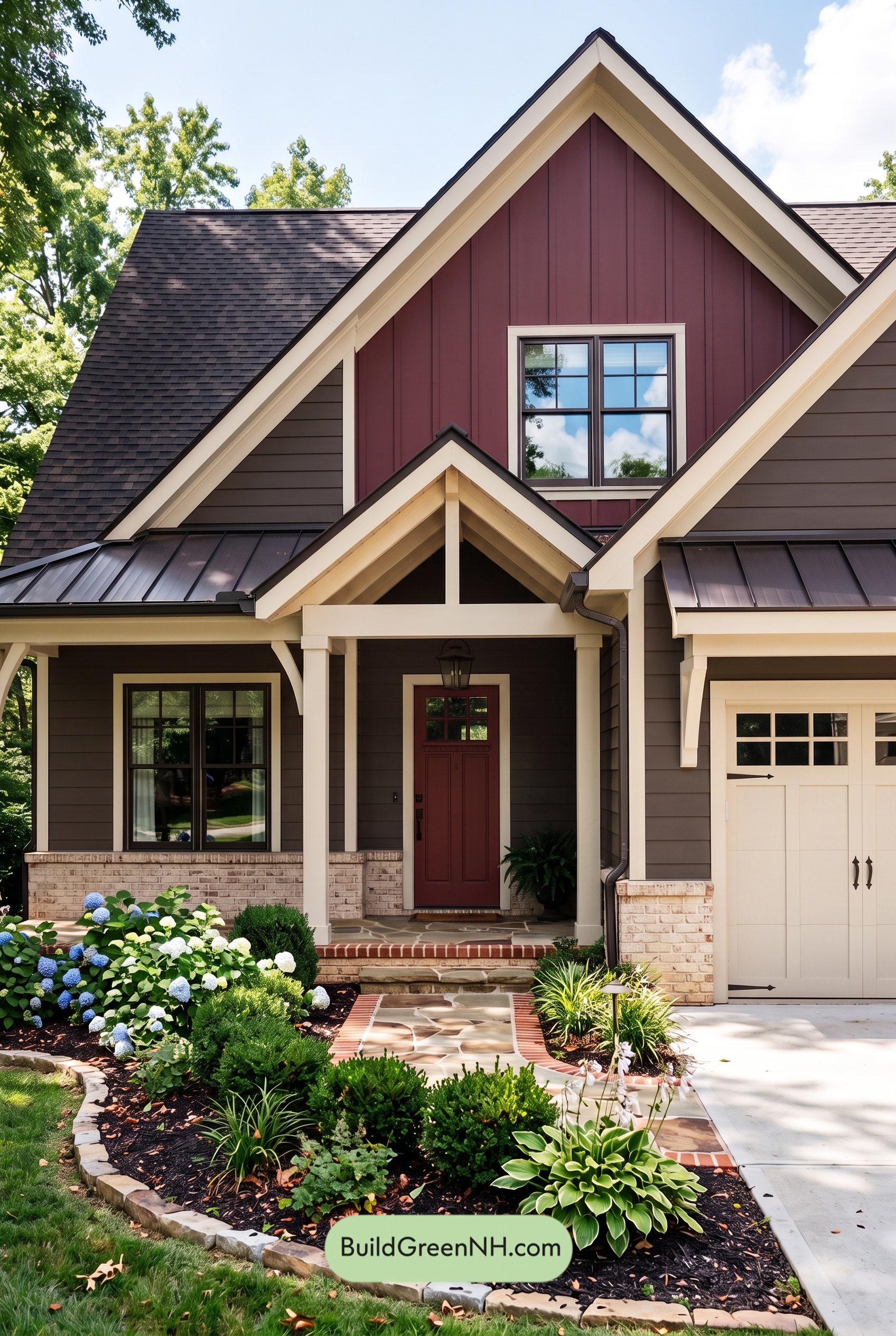 Dark Brown House Exterior Color Scheme: Embercrest Welcome
Table of Contents