Last updated on
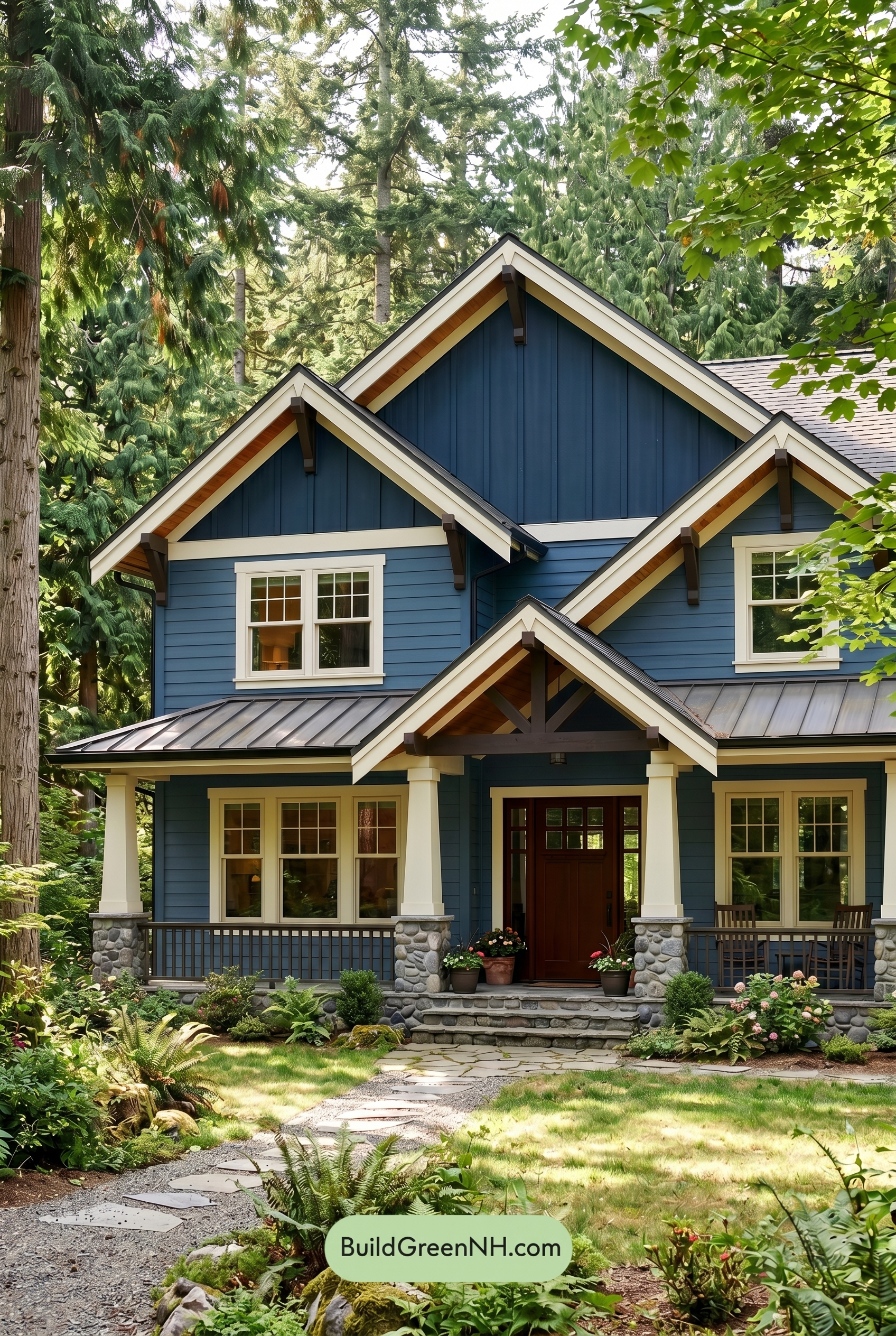

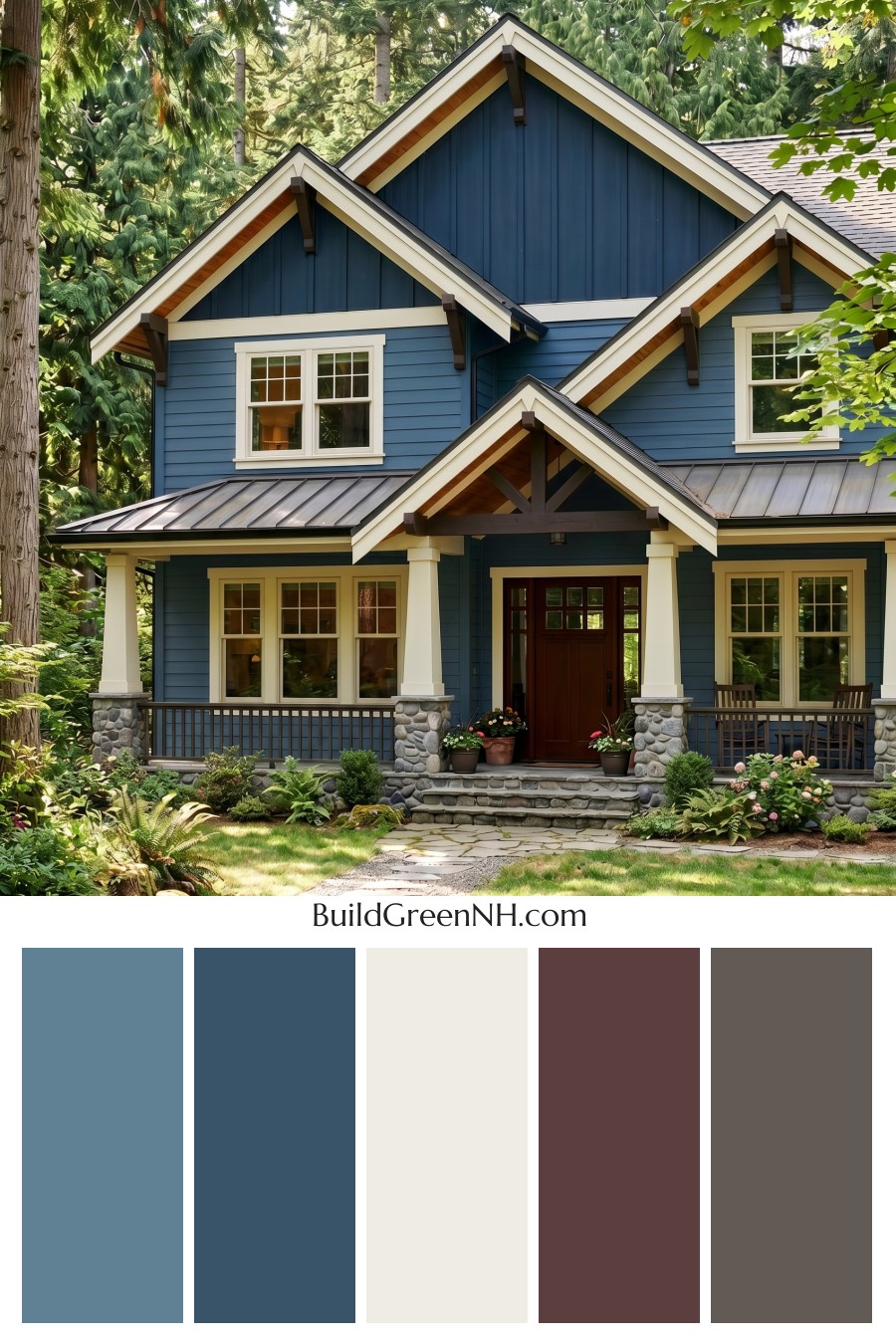
This exterior color scheme works beautifully because its rich blue siding, crisp light trim, and warm brown accents feel both refined and perfectly at home among the trees.
A Rich Blue Foundation
The main siding is wrapped in a deep blue shade that gives the house a grounded, welcoming presence. On the lower walls, the blue reads slightly softer and more relaxed, while the upper gables use a darker blue tone that adds depth and definition.
That subtle shift between the horizontal siding and the vertical upper wall sections keeps the exterior from feeling flat. It creates movement across the façade and highlights the home’s strong rooflines and layered architecture.
Crisp Light Trim for Contrast
The trim, window frames, and columns are finished in a warm white shade that brightens the entire exterior. Against the blue siding, this light trim feels clean and classic without becoming too stark.
The white family is used especially well around the windows and gable edges, where it outlines the structure and draws attention to the home’s craftsmanship. The columns add another bright vertical element, making the porch feel open and inviting.
Warm Brown Accents Add Character
The front door brings in a rich brown shade that adds warmth right at the entry. It feels natural, substantial, and friendly, balancing the cooler blue tones on the siding.
Brown accents also appear in the railings, brackets, and exposed underside details, giving the home a handcrafted look. These touches keep the palette from feeling overly formal and help it connect beautifully with the surrounding landscape.
The Roof and Stone Ground the Palette
A dark gray roof adds a quiet, practical layer to the scheme. It sits comfortably between the deep blue siding and the natural gray stonework below, helping the house feel balanced from top to bottom.
The stone base introduces soft gray and earthy neutral shades that make the exterior feel rooted in place. This is especially effective in a wooded setting, where natural textures and muted tones are already part of the view.
The Overall Mood
The mood is polished, cozy, and nature-inspired. The blue family gives the house confidence, the warm white trim keeps it fresh, and the brown details add just enough rustic charm.
What makes this palette so appealing is its balance of cool and warm shades. The blue feels calm and elegant, while the brown and soft white elements bring warmth, contrast, and approachability. It is a color scheme that feels timeless without being predictable.
Why the Colors Work So Well Together
This exterior succeeds because each color has a clear role. The blue siding provides the main personality, the light trim sharpens the architecture, the brown accents create warmth, and the dark roof quietly anchors everything.
Together, the shades create a home that feels tailored yet relaxed. It stands out among the greenery, but it does not fight the setting. Instead, it feels like it belongs there.
Next, see how this color scheme looks under different lighting simulations throughout the day.
Overcast
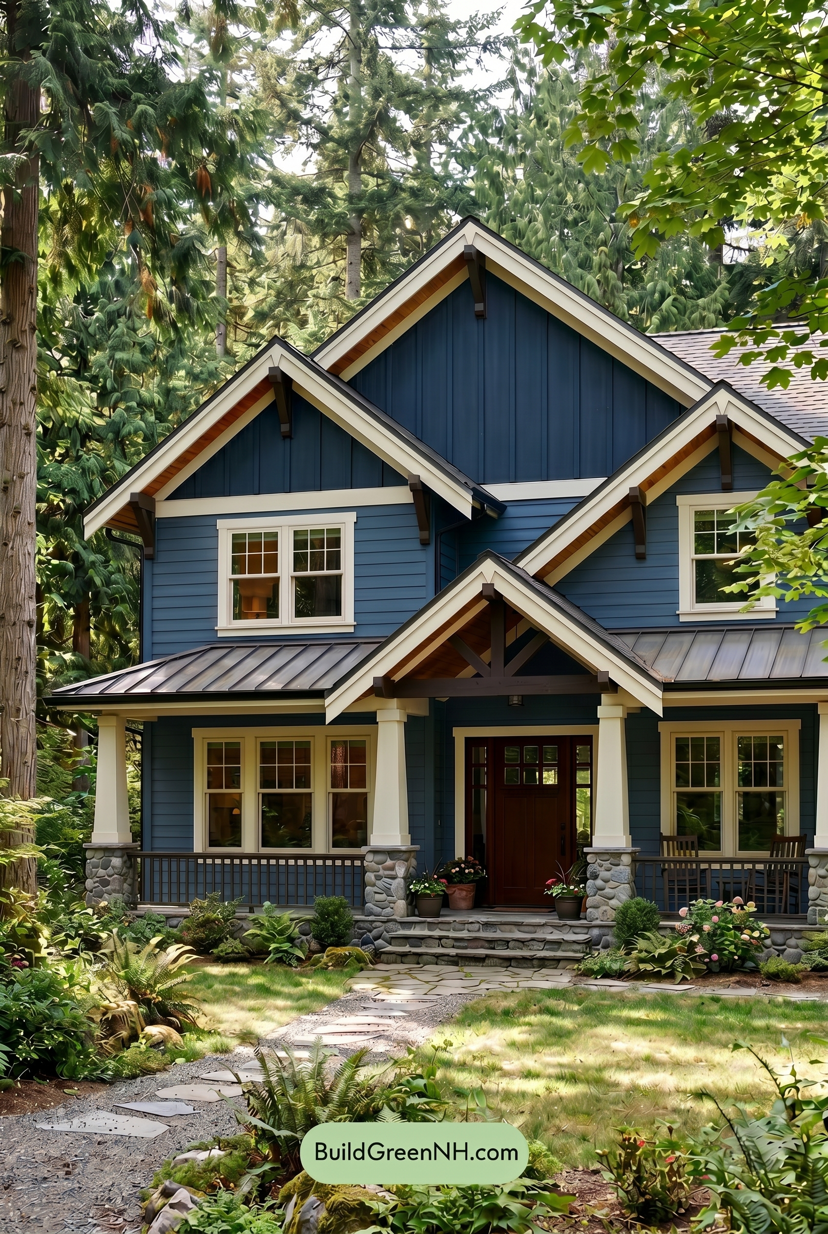
Under overcast lighting, the blue siding and upper wall read a little deeper and calmer than they would in neutral daylight, with saturation softened and a slight cool cast settling over the surface. The white trim, window frames, and columns lose some of their bright snap, appearing gentler and more muted, which reduces the crisp contrast around the gables and windows.
The brown front door and railings feel less warm and less golden under cloud cover, shifting toward a richer, quieter shade. With softer shadows and lower contrast, the whole exterior takes on a more relaxed, sheltered mood, emphasizing the layered blue and warm neutral families without the sharper highlights of clear daylight.
Golden Hour
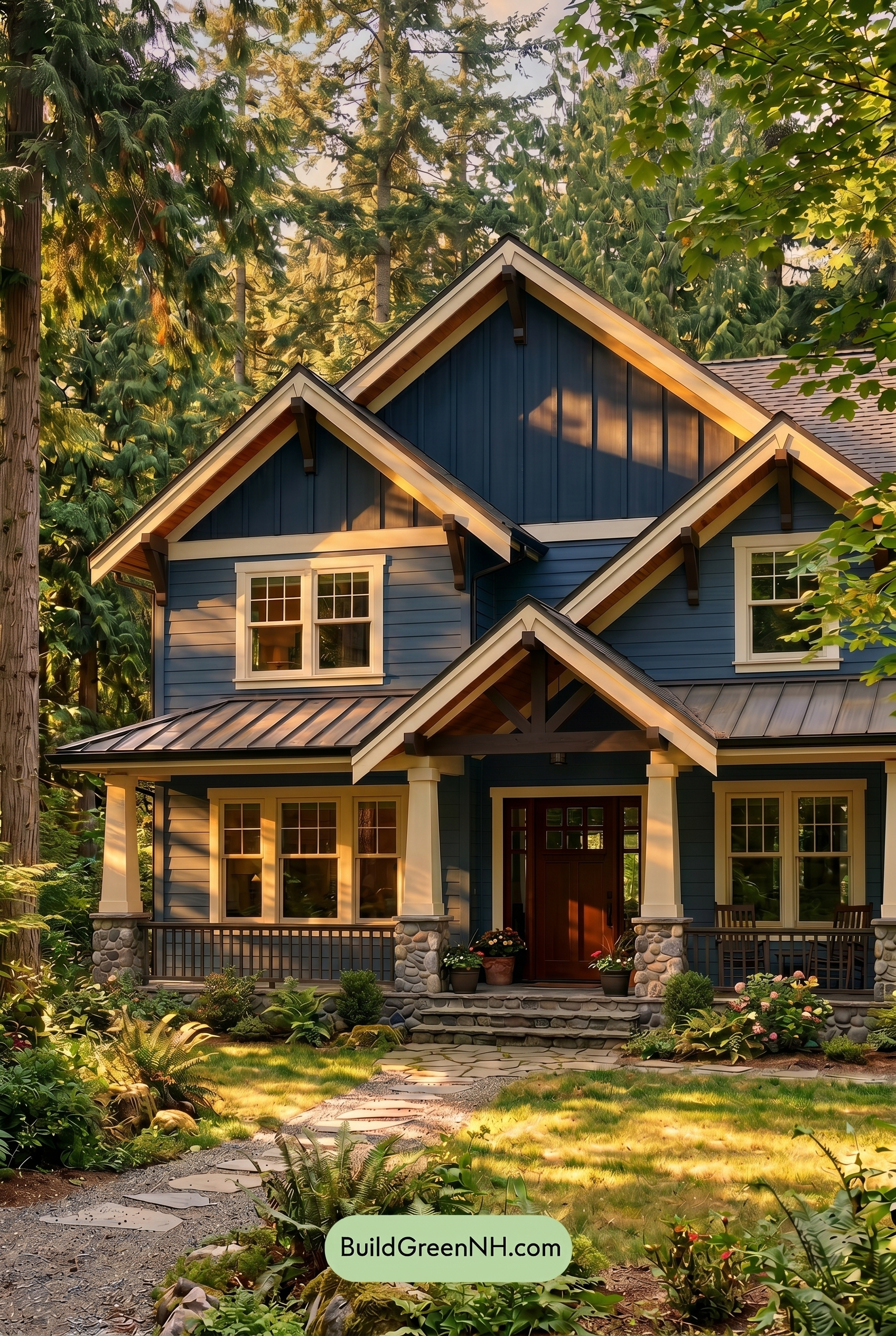
Under neutral daylight, the blue siding would read cleaner and more even, with the white trim feeling crisp and the brown door and railings appearing steadier. In Golden Hour, the same blue family gains warmth and saturation where the low sun hits, while shaded sections deepen toward a moodier blue-gray, creating richer contrast across the gables and siding.
The white family shifts softer and warmer, glowing along the trim, window frames, and columns instead of feeling stark. Brown shades on the door, railings, and exposed details look more burnished and inviting, while long shadows sharpen the architecture and give the whole exterior a cozy, woodland mood.
Shade
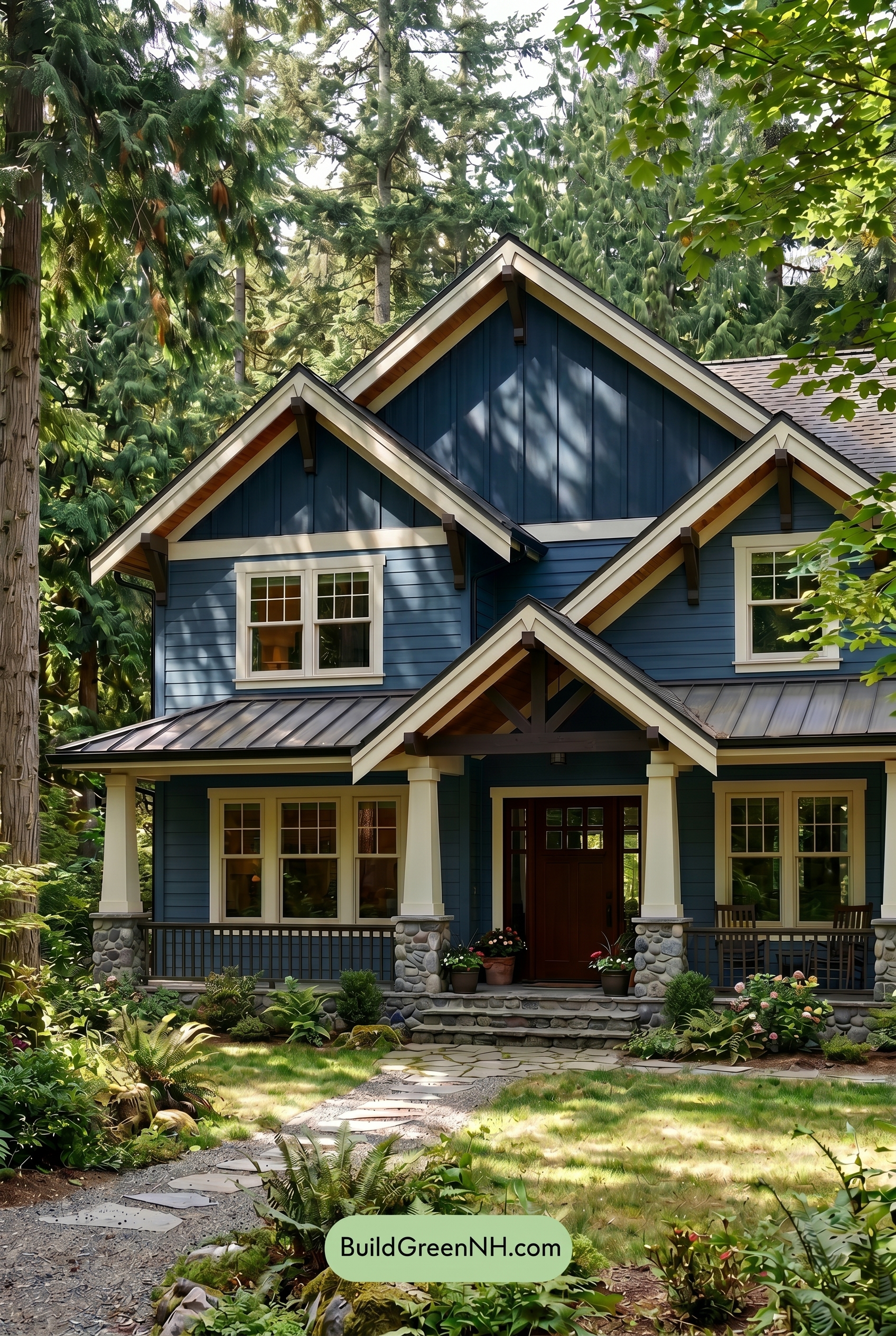
In shade, this shade of blue deepens and feels more saturated than it would in neutral daylight, shifting from crisp and airy to rich and woodland-inspired. The shadows soften the brightness across the siding, creating a calmer mood while the darker blue areas gain depth and a slightly cooler character.
The white family trim, window frames, and columns lose some of their sharp brightness in shade, appearing creamier and gentler, which reduces contrast just enough to feel inviting. Meanwhile, the brown family door and railings look warmer and more grounded, adding a cozy balance against the cooler blue exterior.
Nighttime
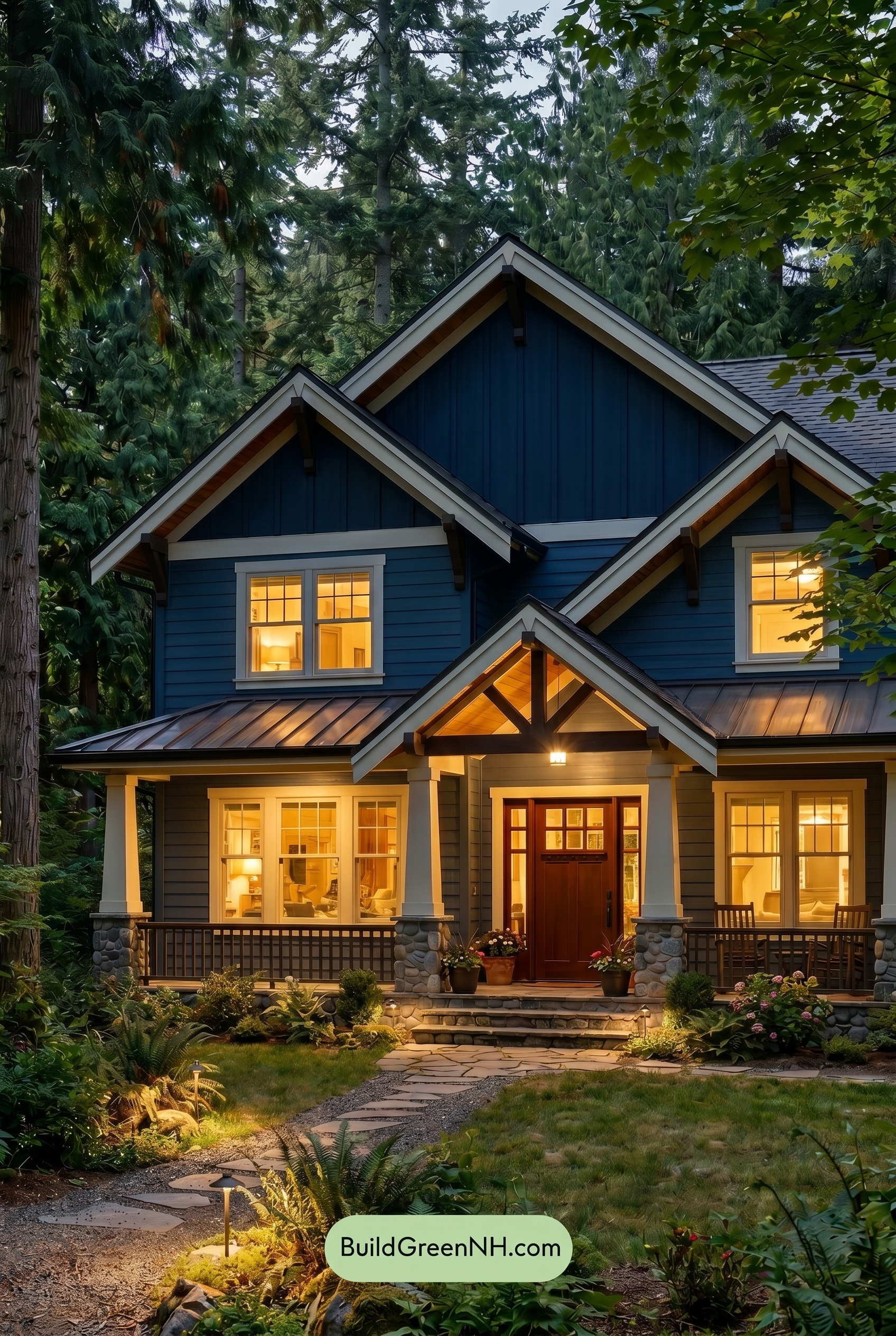
At nighttime, the blue family on the main and upper walls deepens noticeably, gaining a richer, more saturated character than it would in neutral daylight. Shadows under the gables and rooflines push the darker blue shades toward a moodier, more dramatic look, while the white family trim stands out with sharper contrast along the peaks, windows, and columns.
The warm glow from the windows and entry softens the white shades, making them feel creamier and more inviting, while the brown family on the door and railings appears warmer and richer. Compared to daylight’s clearer, cooler balance, the nighttime palette feels cozier, more layered, and quietly dramatic.
Pin these for later:
Want More?
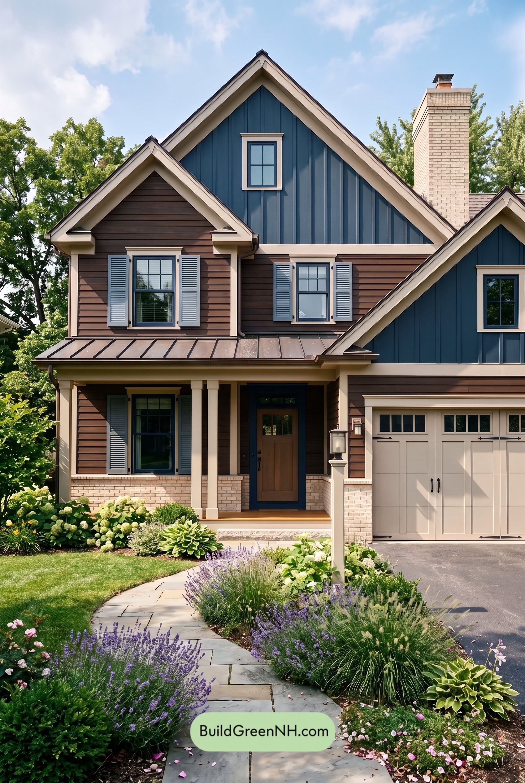 Dark Brown House Exterior Color Scheme: Inkwood Lantern
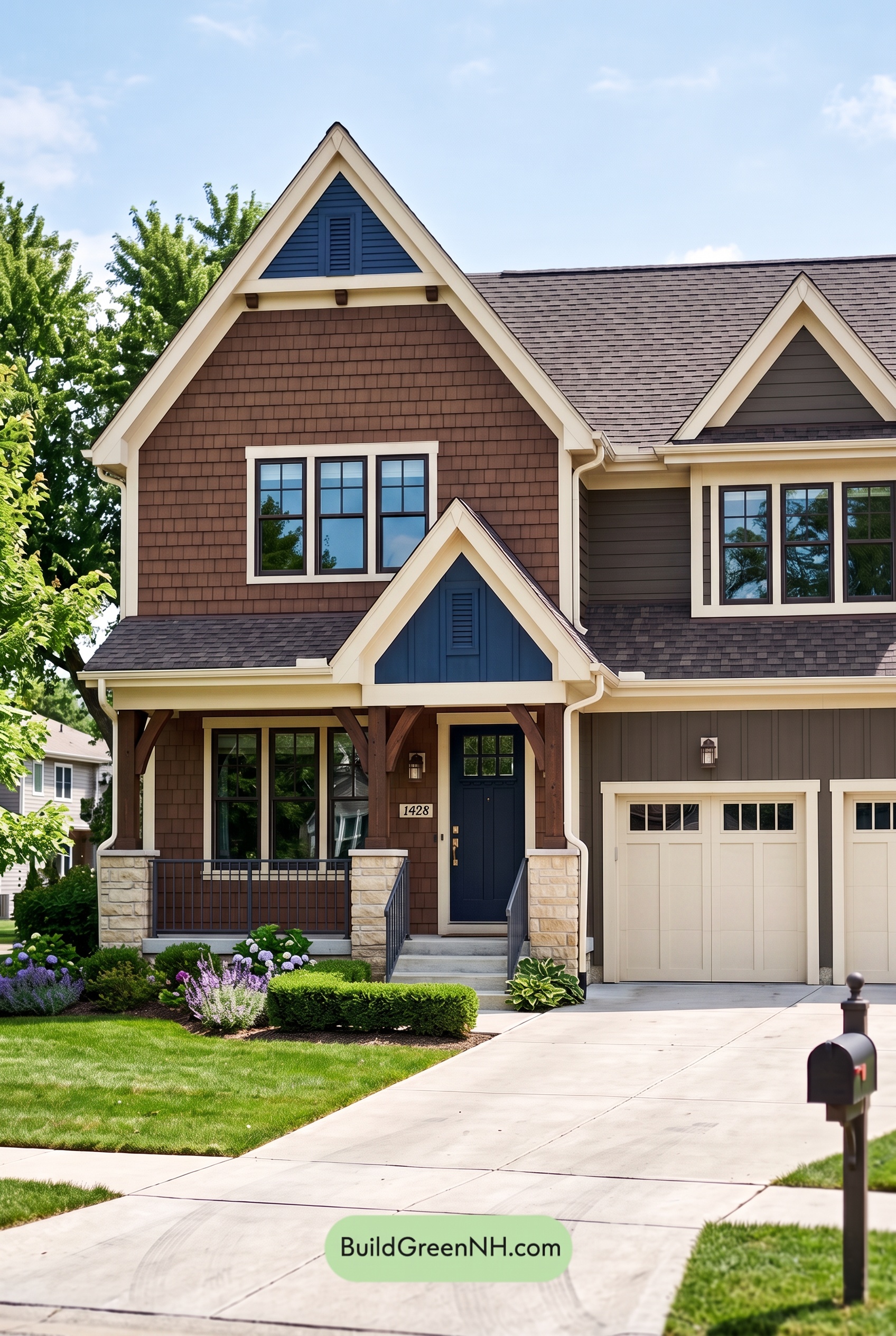 Dark Brown House Exterior Color Scheme: Bluebell Timberline
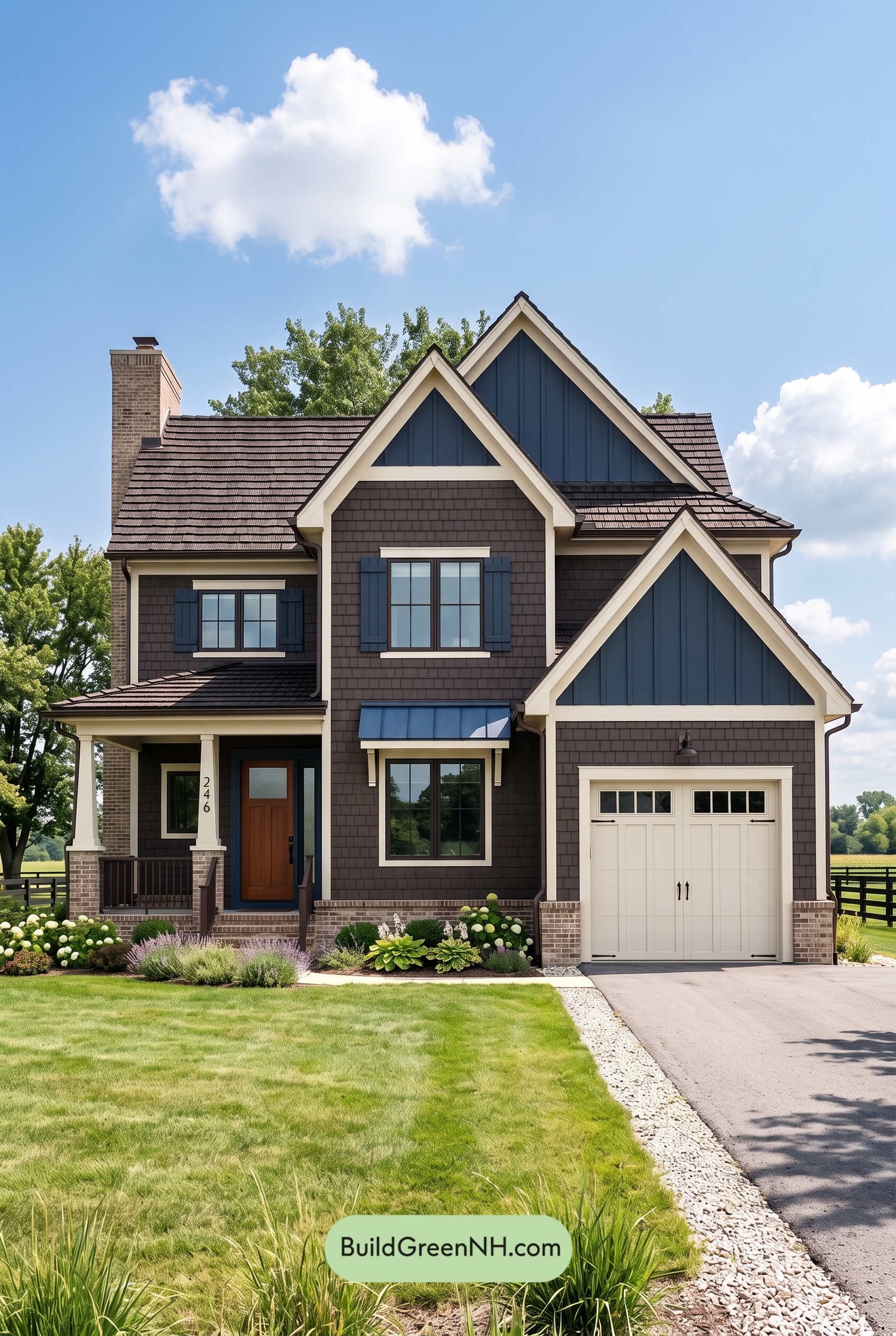 Dark Brown House Exterior Color Scheme: Sapphire Homestead
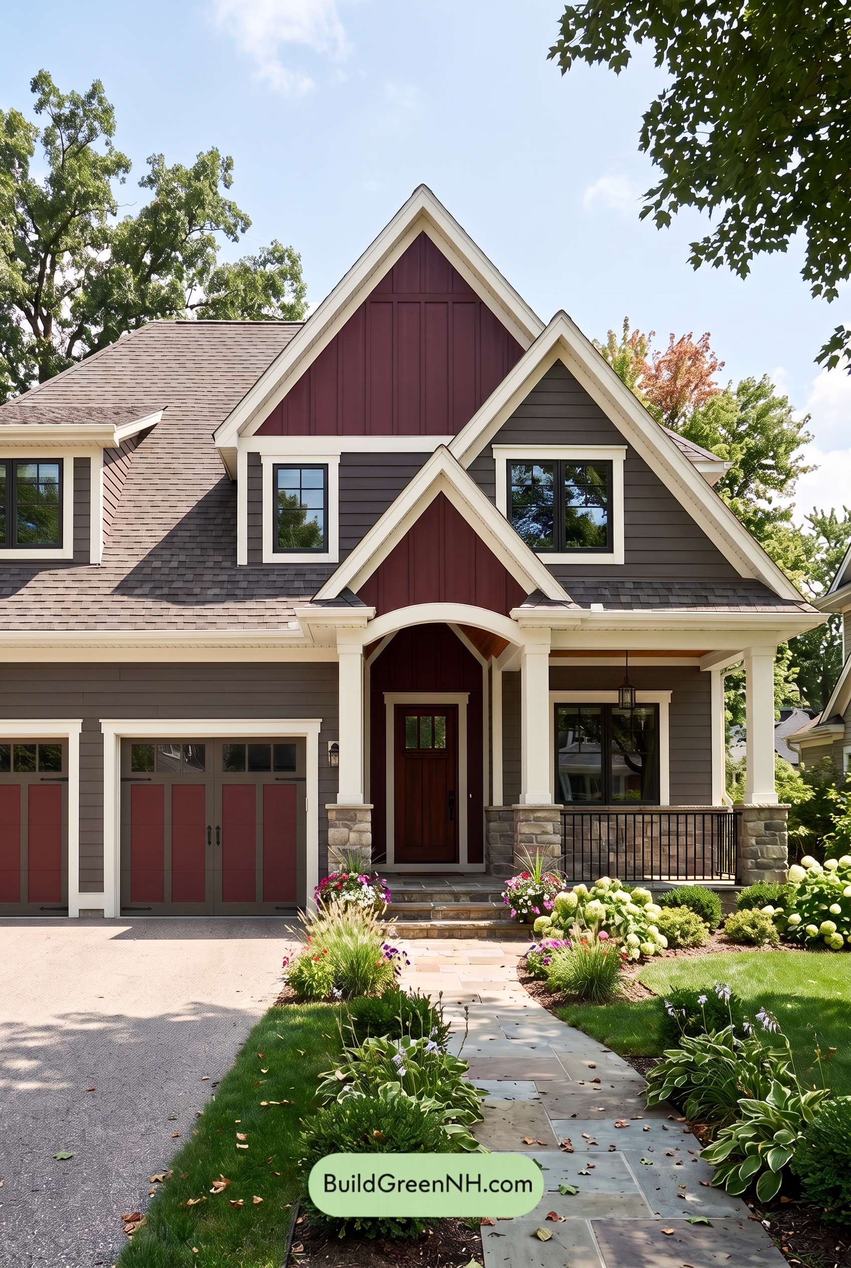 Dark Brown House Exterior Color Scheme: Hearthglow Arrival
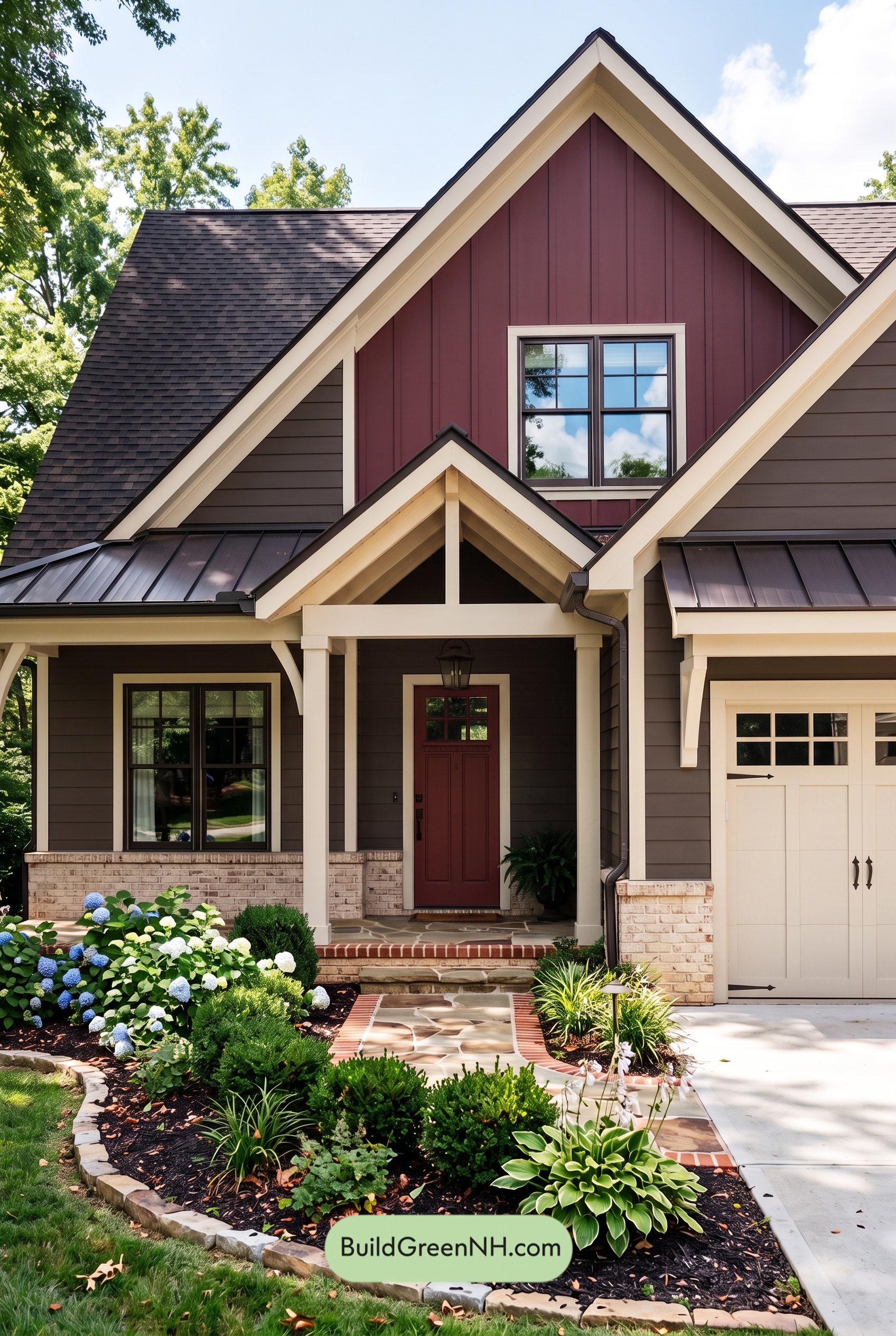 Dark Brown House Exterior Color Scheme: Embercrest Welcome
Table of Contents