Last updated on
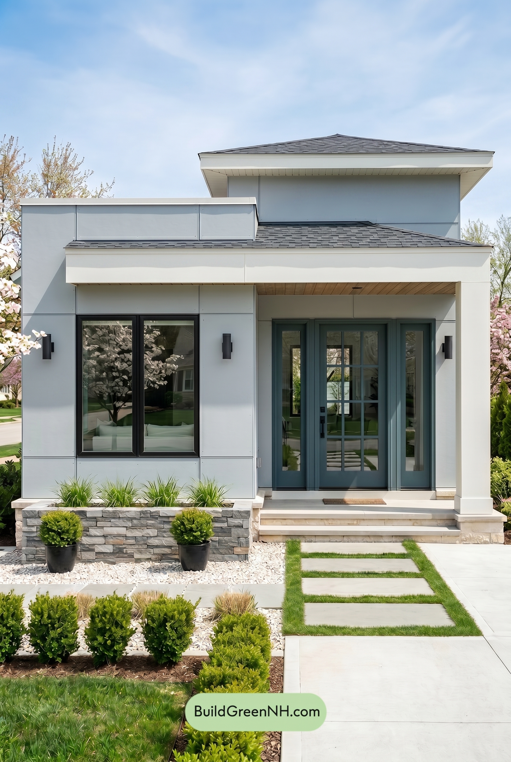

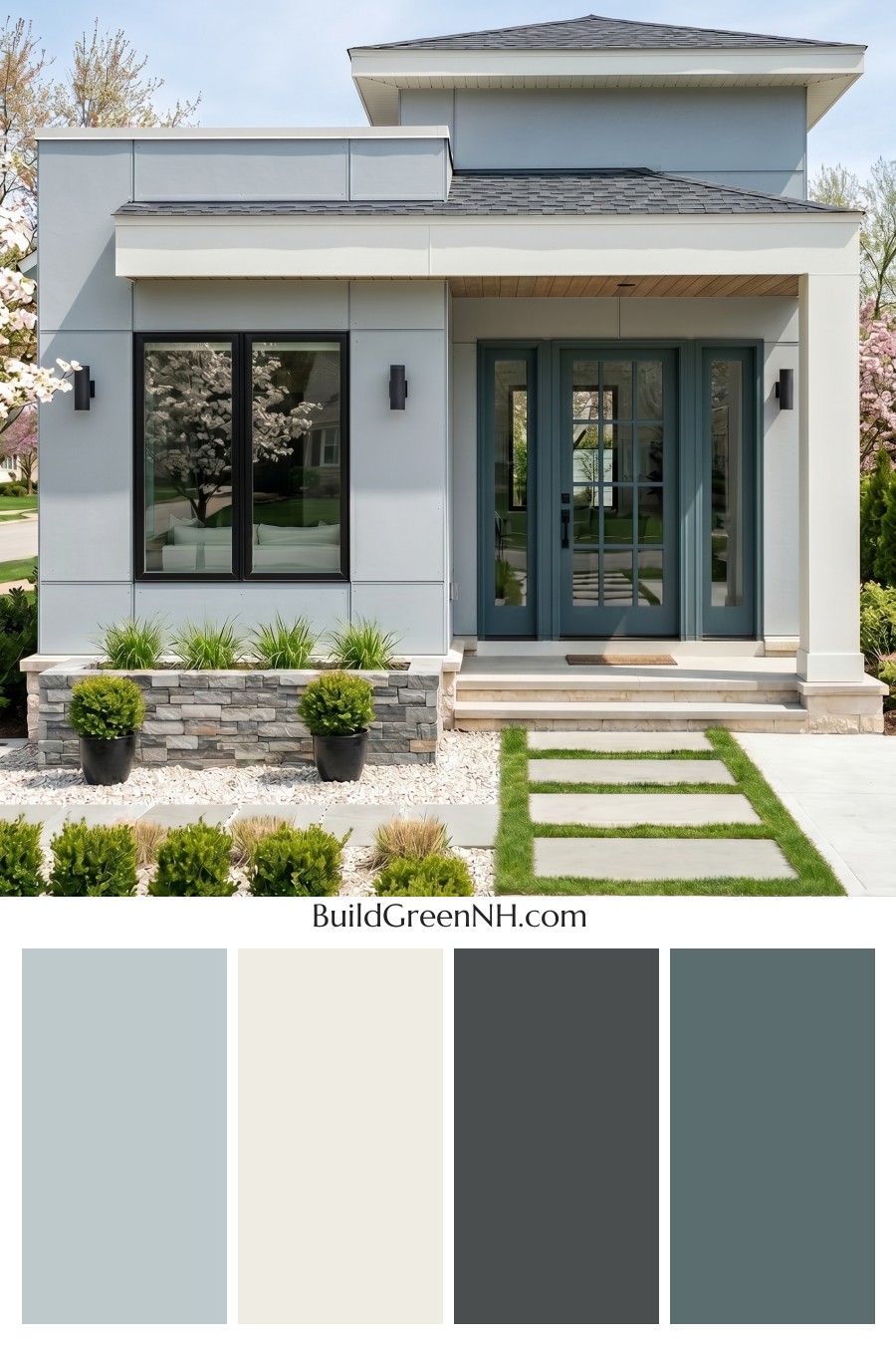
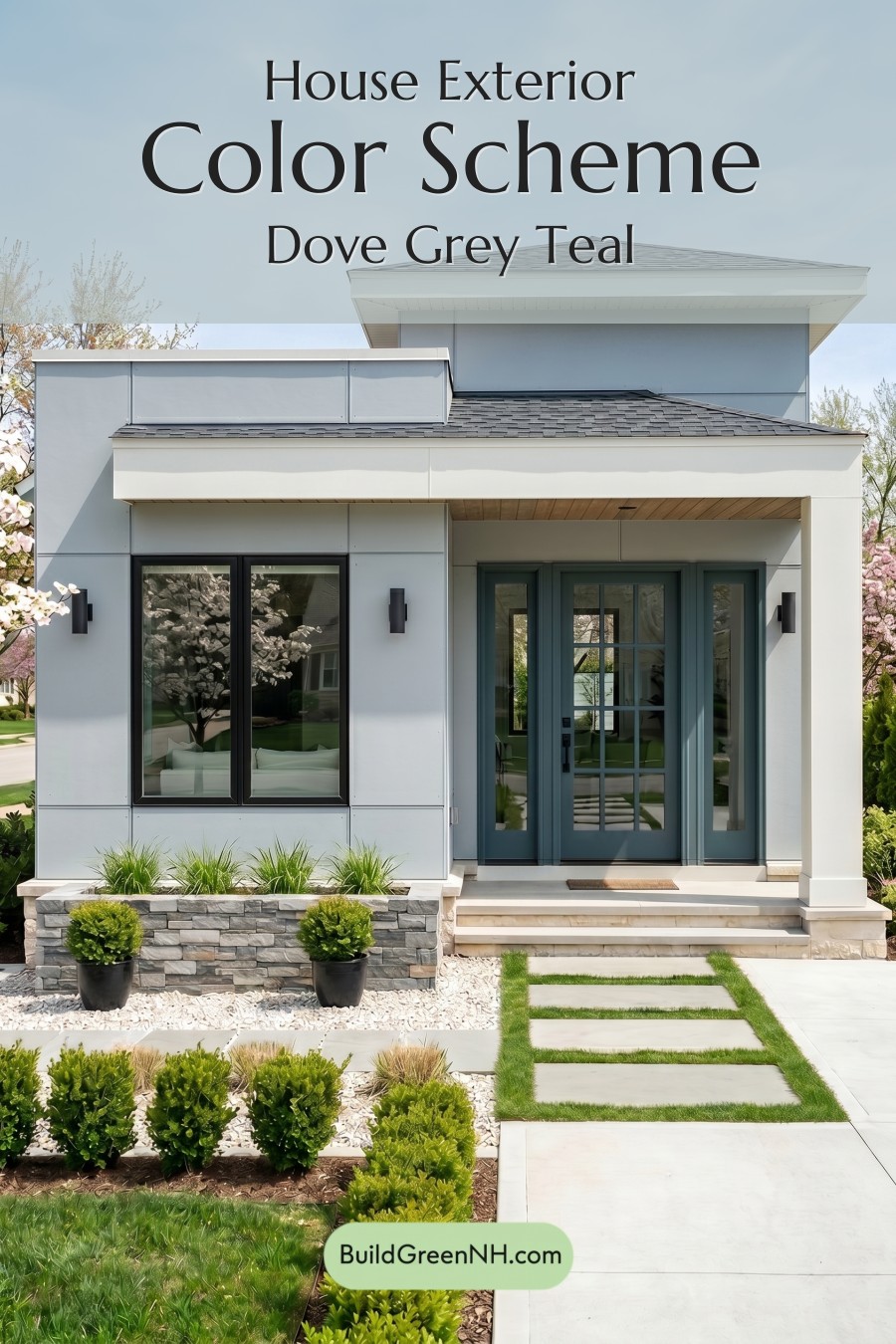
This crisp gray, white, and blue exterior feels fresh and polished because it balances cool modern surfaces with a welcoming pop of color at the entry.
A Clean, Contemporary Base
The main siding is dressed in a light gray shade that gives the home a sleek, architectural look without feeling cold. Because the gray is soft and airy, it works beautifully across the broad wall panels, allowing the clean lines and layered facade to stand out.
White trim adds structure in all the right places. It frames the roofline, highlights the overhangs, and gives the porch columns a bright, crisp presence. This white shade keeps the exterior feeling fresh and helps separate each level of the home with subtle definition.
The Front Door as the Focal Point
The front door brings in a muted blue shade that instantly makes the entry feel more inviting. It is colorful enough to create personality, but still restrained enough to suit the modern architecture. Paired with the surrounding gray siding and white trim, the blue feels calm, tailored, and quietly confident.
The gray window frames deepen the palette and add contrast against the lighter siding. Their darker tone grounds the facade, especially around the large glass openings, while slim exterior accents in a similar deep gray family reinforce the modern feel.
How the Roof and Details Tie It Together
The roof uses a layered medium-to-deep gray shade that connects naturally with the siding and window frames. This creates a cohesive top-to-bottom flow, rather than making the roof feel like a separate element. The result is balanced and intentional.
A warm natural shade beneath the porch overhang adds just enough softness to the cooler palette. It keeps the entry from feeling too stark and brings a gentle organic note that pairs nicely with the stone, greenery, and clean walkway.
The Overall Mood
This color scheme feels modern, calm, and upscale. The light gray siding provides sophistication, the white trim adds brightness, and the muted blue door gives the home a memorable focal point. Together, the shades create a polished exterior that feels both refined and approachable.
Next, see how this color scheme looks under different lighting simulations throughout the day.
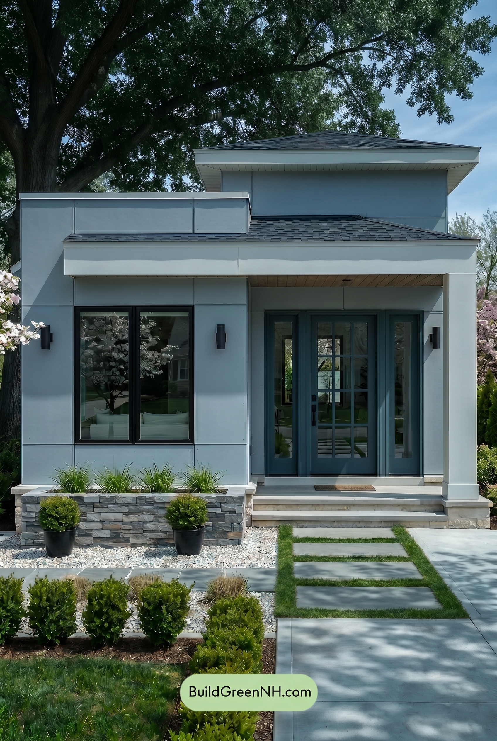
Overcast
Under overcast lighting, the gray wall shade appears softer and slightly cooler than it would in neutral daylight, with its saturation gently muted. The white trim and columns lose some crisp brightness, reading more creamy and subdued, while shadows under the roofline spread out softly instead of forming sharp edges.
The blue front door deepens a touch in the flatter light, feeling calmer and more grounded against the softened gray and white families. With reduced contrast and less warmth overall, the exterior takes on a quieter, more refined mood than it would under clear neutral daylight.
Golden Hour
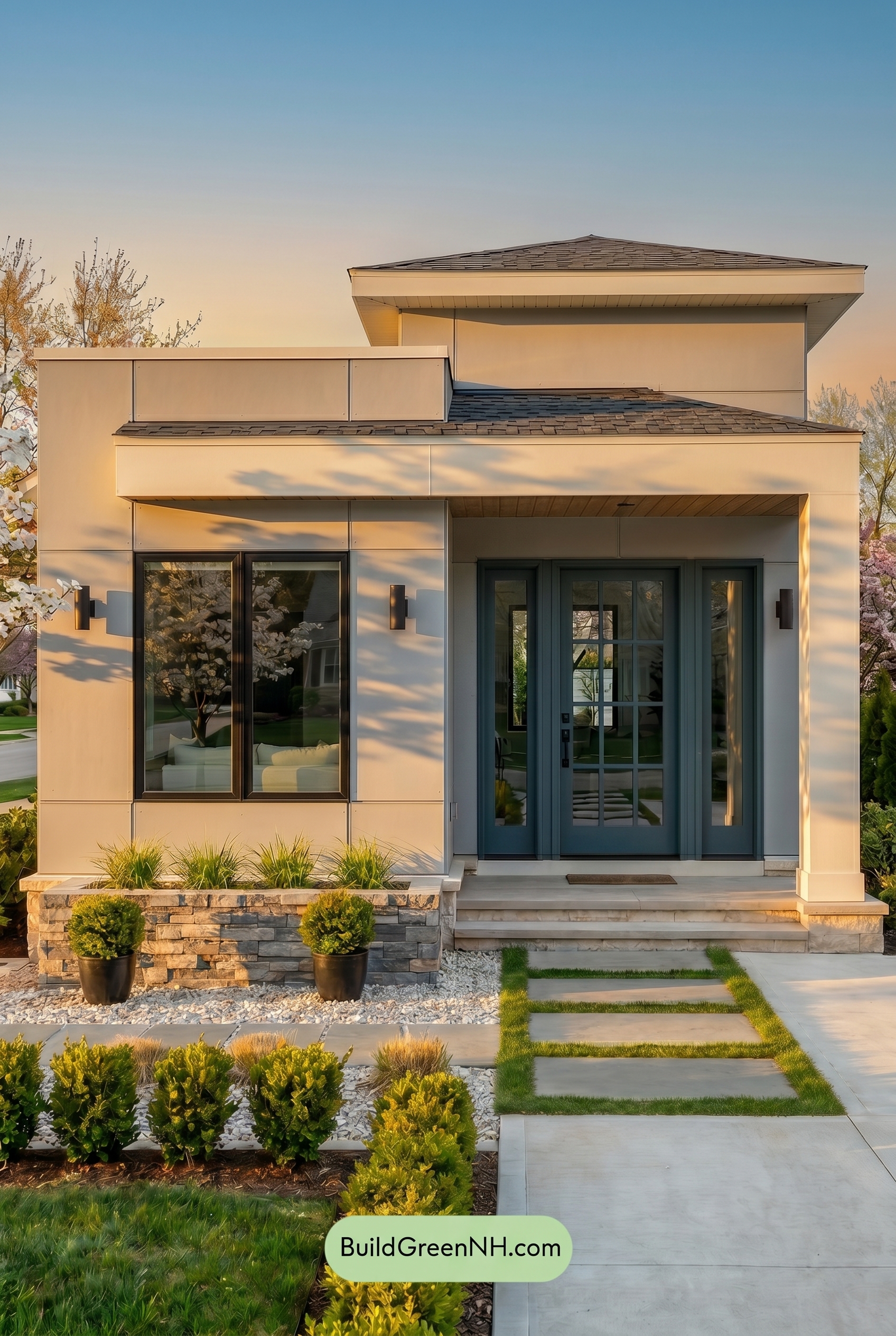
Golden Hour gives the gray exterior a warmer, softer cast than neutral daylight, making it feel less crisp and more inviting. The white trim and columns pick up a gentle creamy glow, while the gray window frames appear slightly deeper as the low light increases contrast around the glass.
The blue front door becomes richer and moodier in the longer shadows, with its saturation feeling more pronounced against the warmed-up neutrals. Compared with neutral daylight, the whole palette shifts from clean and modern to cozy and atmospheric, with soft golden highlights and deeper shadowed areas adding depth.
Shade
Under shade, the gray siding takes on a cooler, more saturated cast than it would in neutral daylight, shifting from crisp and balanced to softer and slightly deeper. The white trim and columns lose some brightness, feeling calmer and more muted, while the shadowed overhangs create stronger pockets of contrast across the façade.
The blue front door deepens noticeably in the shade, giving the entry a quieter, more grounded presence. Overall, the palette feels less sunlit and sharp, with a cooler mood and gentler warmth that makes the modern lines appear sleek, serene, and tucked into the landscape.
Nighttime
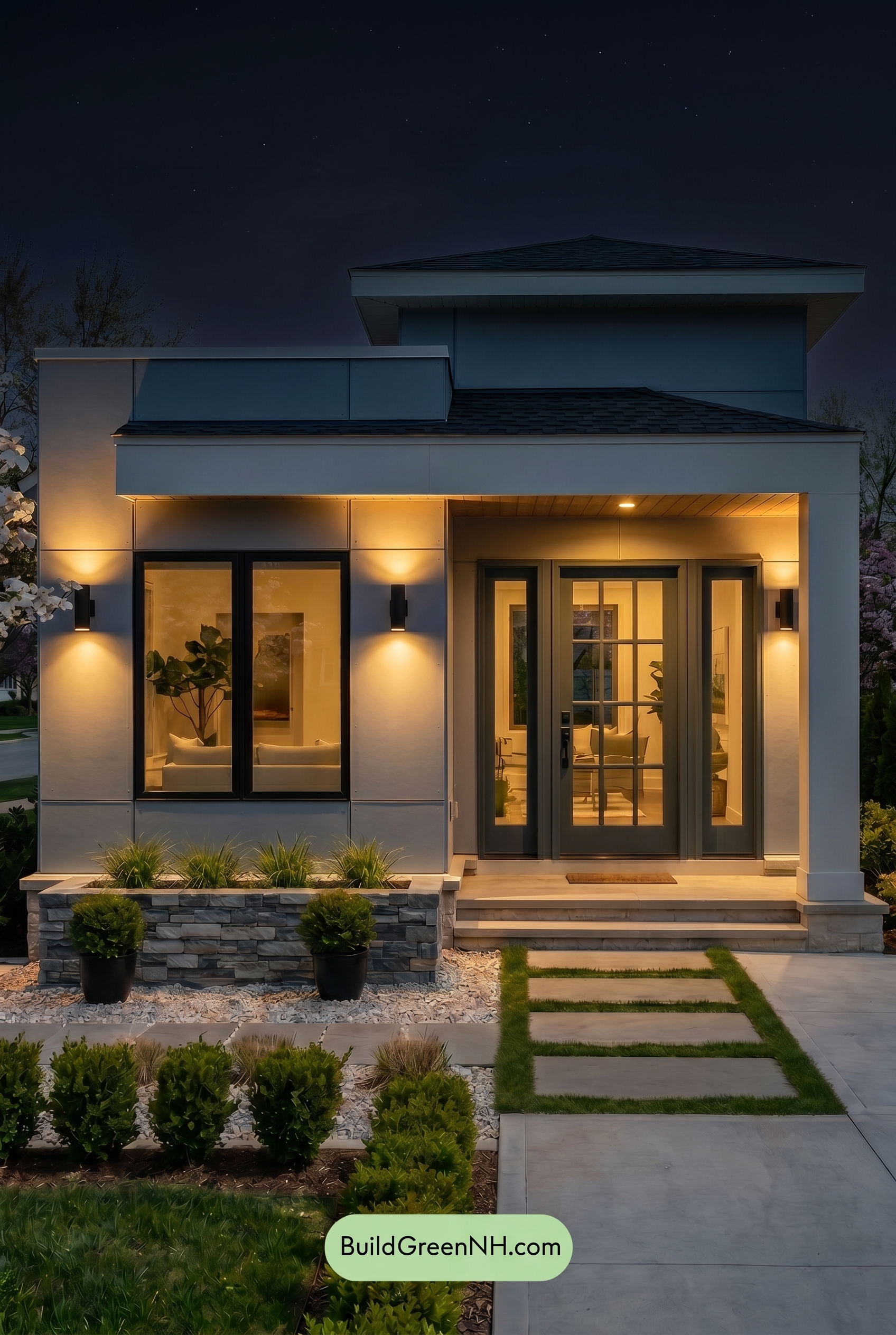
At nighttime, the gray family on the main walls appears deeper and slightly cooler than it would in neutral daylight, with saturation softening in the darker upper areas. Warm exterior lighting adds a gentle glow near the entry and lower walls, making the white trim and columns feel creamier and more welcoming.
Shadows become stronger after dark, increasing contrast around the gray window frames and architectural edges. The blue shade on the front door reads richer and moodier, while the overall palette shifts from clean and balanced in daylight to warm, dramatic, and quietly refined at night.
Pin these for later
Want More?
 Green Farmhouse Exterior Color Scheme: Fern White Hearth
 Green Farmhouse Exterior Color Scheme: Pine White Gleam
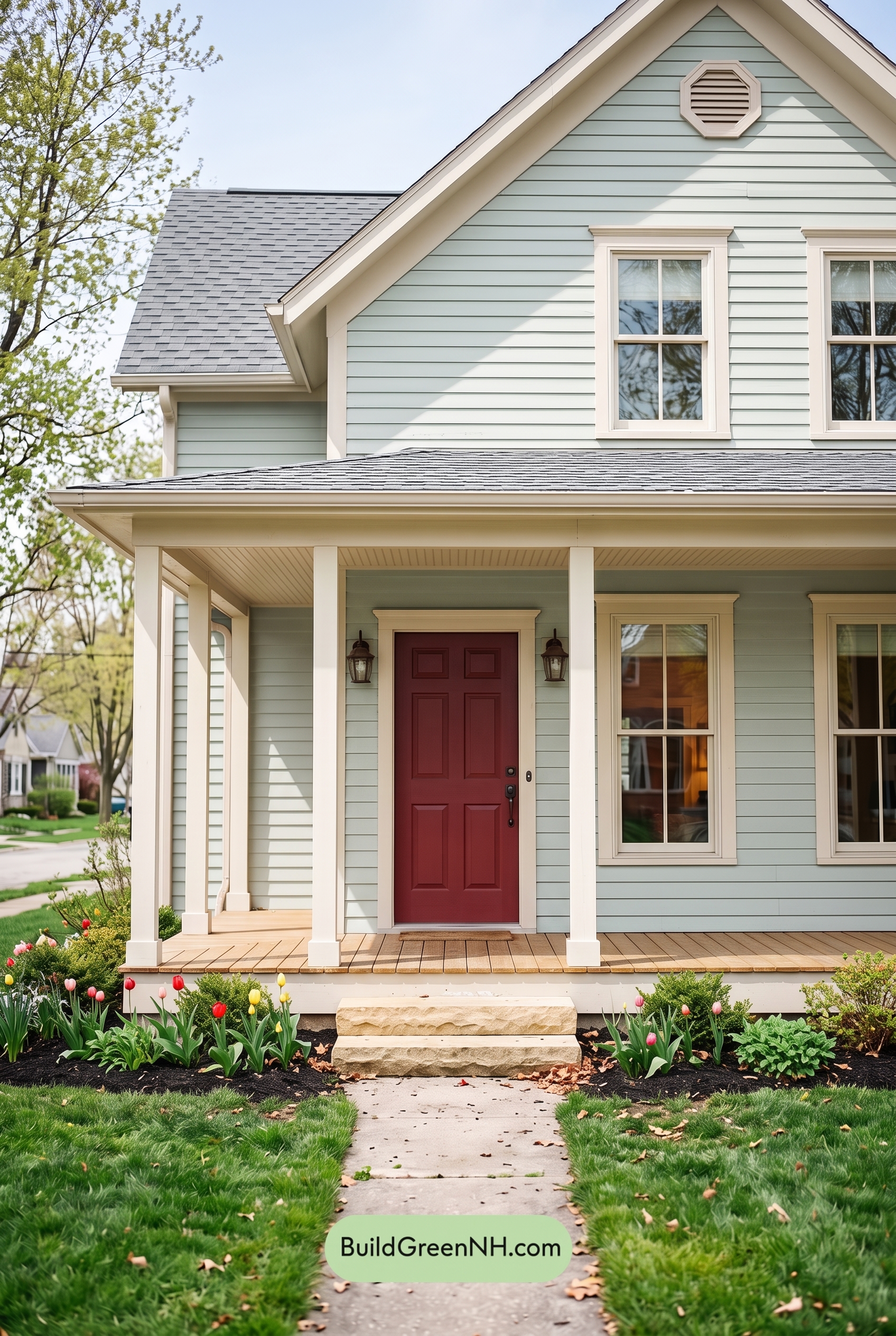 Green Farmhouse Exterior Color Scheme: Mint Cream Welcome
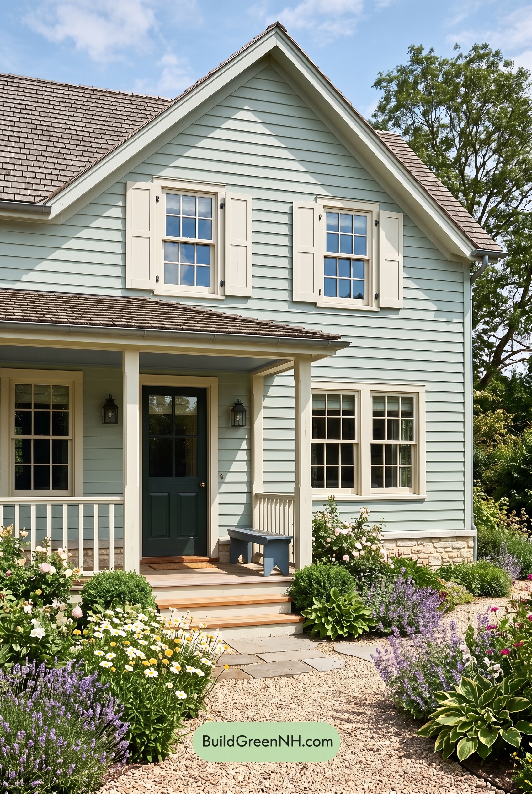 Green Farmhouse Exterior Color Scheme: Celadon Ivory Calm
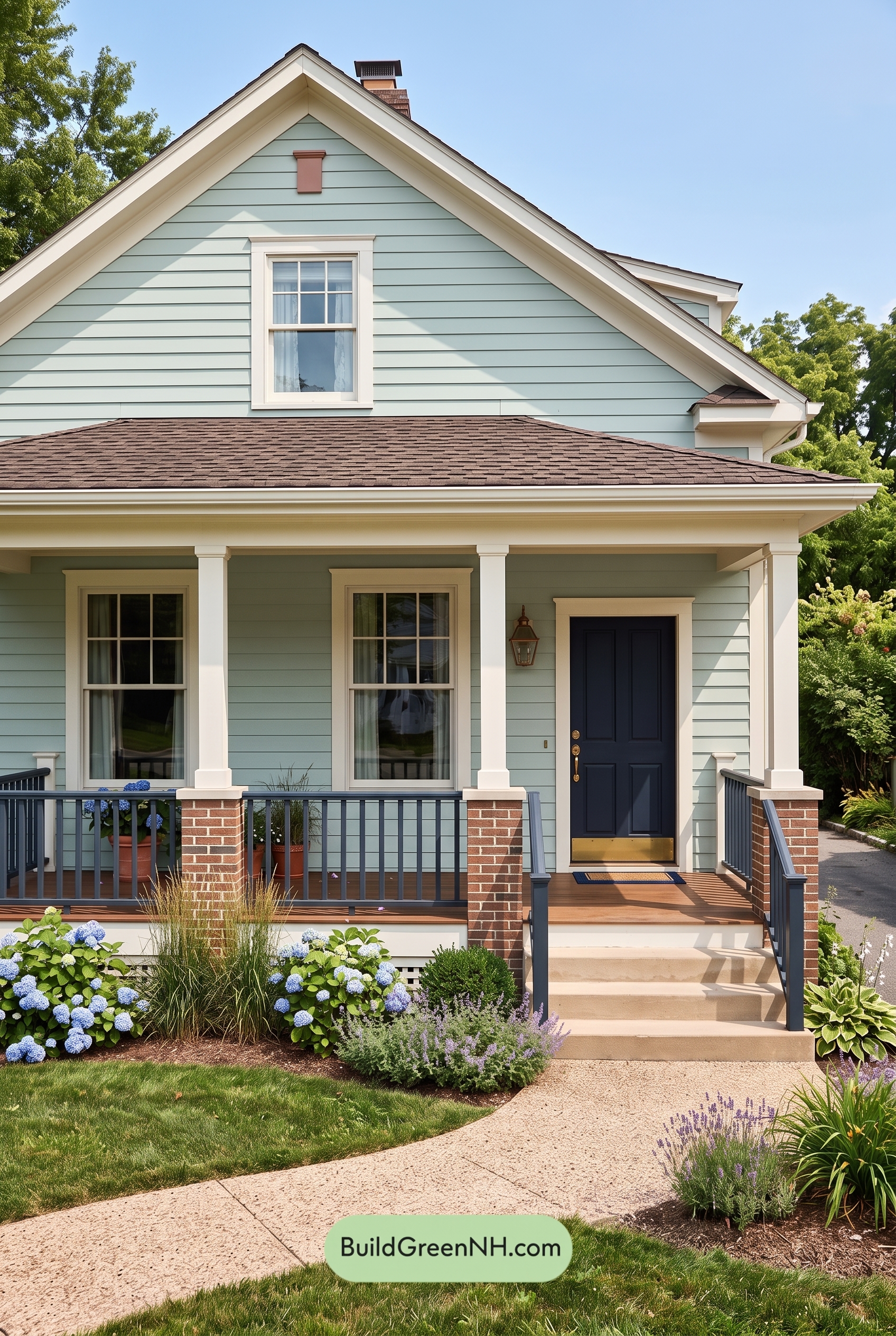 Green Farmhouse Exterior Color Scheme: Seafoam Linen Porch
Table of Contents