Last updated on
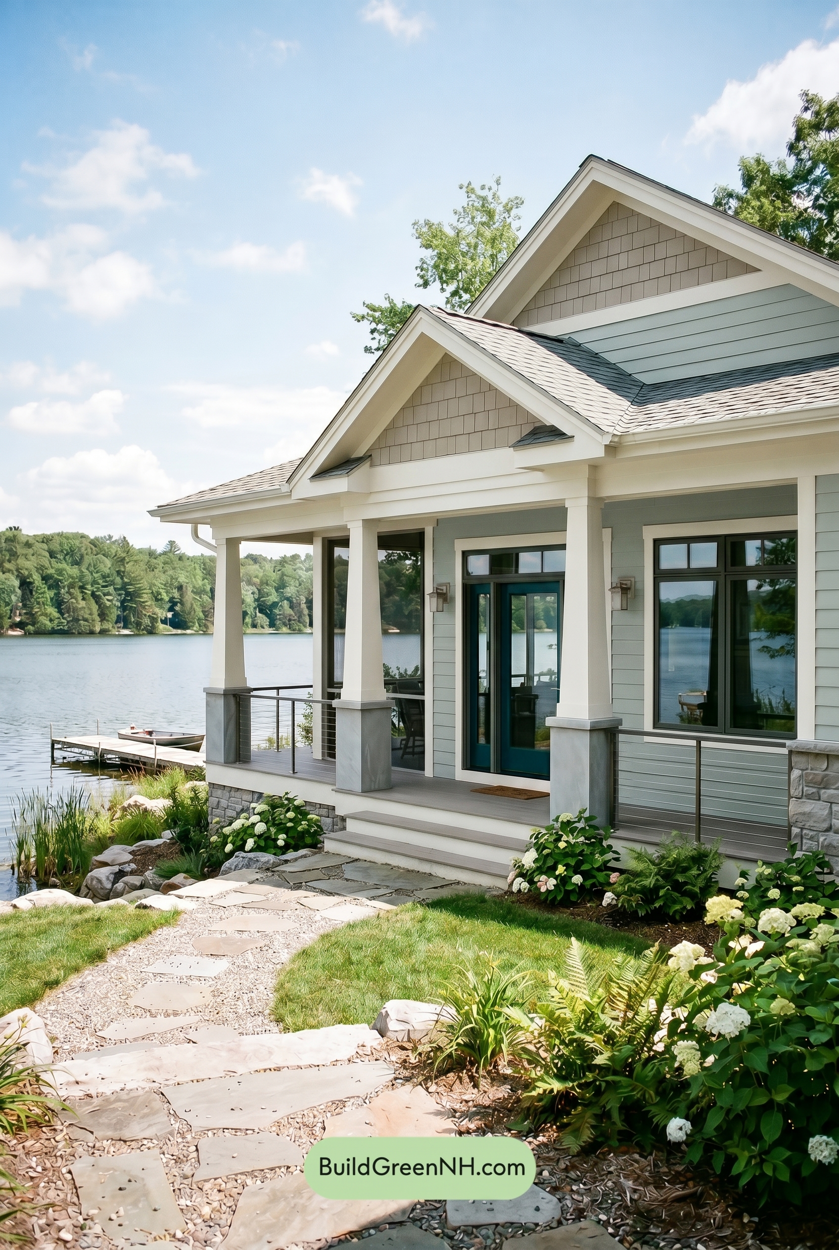

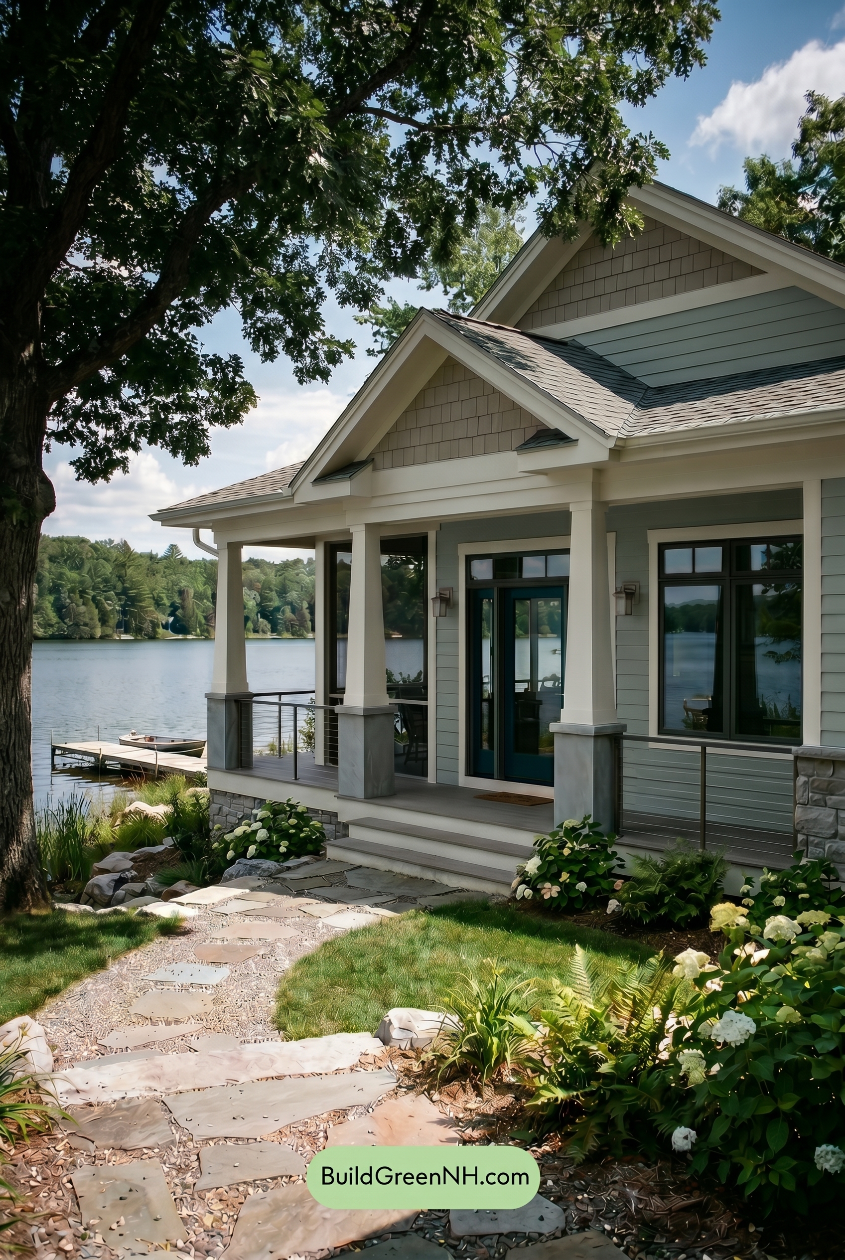
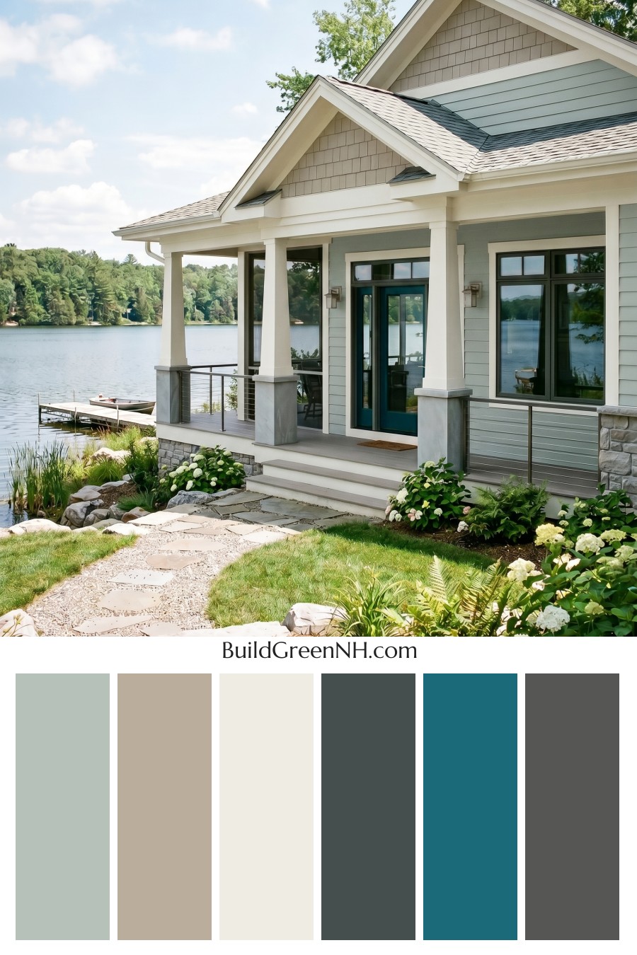
This lakeside palette feels effortlessly polished because soft grays, crisp whites, and deep blue accents create a calm, tailored exterior that looks right at home by the water.
A Soft Gray Base with Quiet Character
The main siding is dressed in a light gray shade that feels fresh, airy, and relaxed. It gives the house a gentle presence without competing with the surrounding landscape or the wide views beyond the porch.
On the upper gable sections, a slightly deeper gray adds texture and dimension. This subtle shift keeps the exterior from feeling flat, while still staying within the same soothing color family.
Crisp White Trim for Clean Definition
The white trim is one of the strongest features of this scheme. It outlines the rooflines, windows, porch openings, and gables with a bright, clean finish that makes the architecture feel sharp and well composed.
The white columns continue that crisp look across the porch, giving the home a classic, welcoming feel. Against the gray siding, the white details create just enough contrast to feel refined without becoming too formal.
Blue Accents That Add Depth
The front door brings in a rich blue shade that instantly becomes the focal point. It feels grounded and inviting, offering a beautiful contrast to the softer gray and white surfaces around it.
The window frames also use a deep blue family, tying the entryway into the rest of the facade. This repetition makes the color choice feel intentional rather than isolated, and it adds a sophisticated edge to the otherwise breezy palette.
Gray Railings and Roof Tones Keep It Balanced
The porch railings stay in the gray family, which helps them blend quietly into the overall design. Instead of drawing too much attention, they support the architecture and let the white columns and blue accents stand out.
The roof appears in a layered gray shade that complements both the siding and the upper gable areas. Its deeper tone adds weight to the top of the home, creating a balanced look from roofline to foundation.
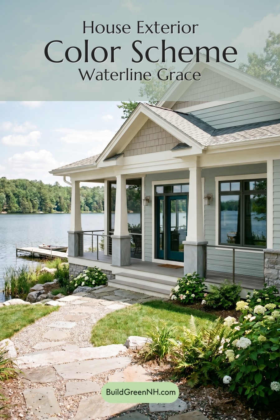
The Overall Mood
This color scheme feels calm, coastal, and beautifully collected. The soft gray siding gives the home a peaceful foundation, the white trim adds brightness and structure, and the blue accents bring just the right amount of personality.
What makes the palette especially successful is its restraint. Every shade has a role, and nothing feels overdone. The result is a graceful exterior that feels timeless, fresh, and perfectly suited to a relaxed waterfront setting.
Next, see how this color scheme looks under different lighting simulations throughout the day.
Overcast
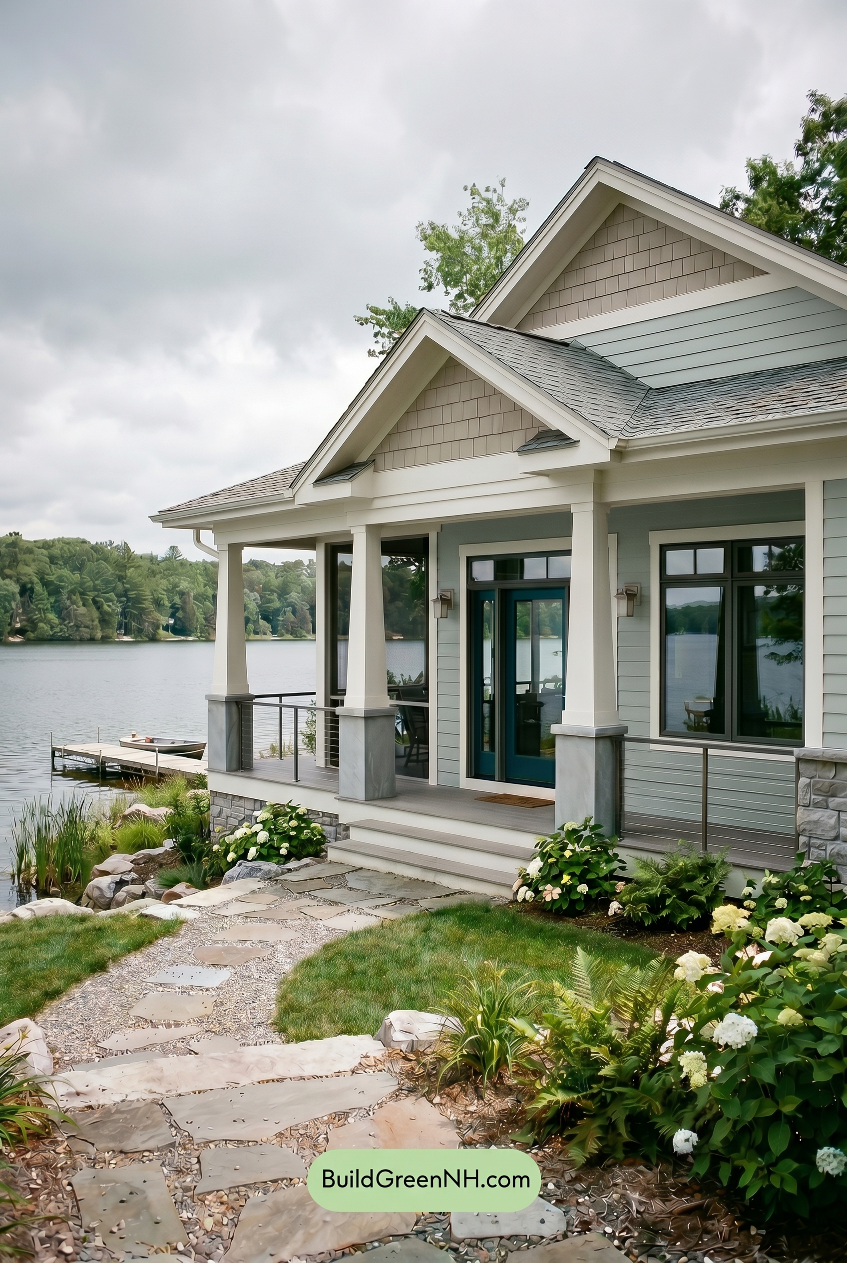
Under overcast light, the gray siding loses a touch of saturation and reads cooler and more misty than it would in neutral daylight. The warm undertones in the lighter trim and columns feel softened, while shadows become broader and gentler, reducing the crisp contrast along the porch, rooflines, and railings.
The blue family on the door and window frames deepens slightly, appearing calmer and more grounded against the muted gray exterior. Overall, the palette shifts from bright and defined to serene and coastal, with a quieter mood and a soft, even finish across the whole facade.
Golden Hour
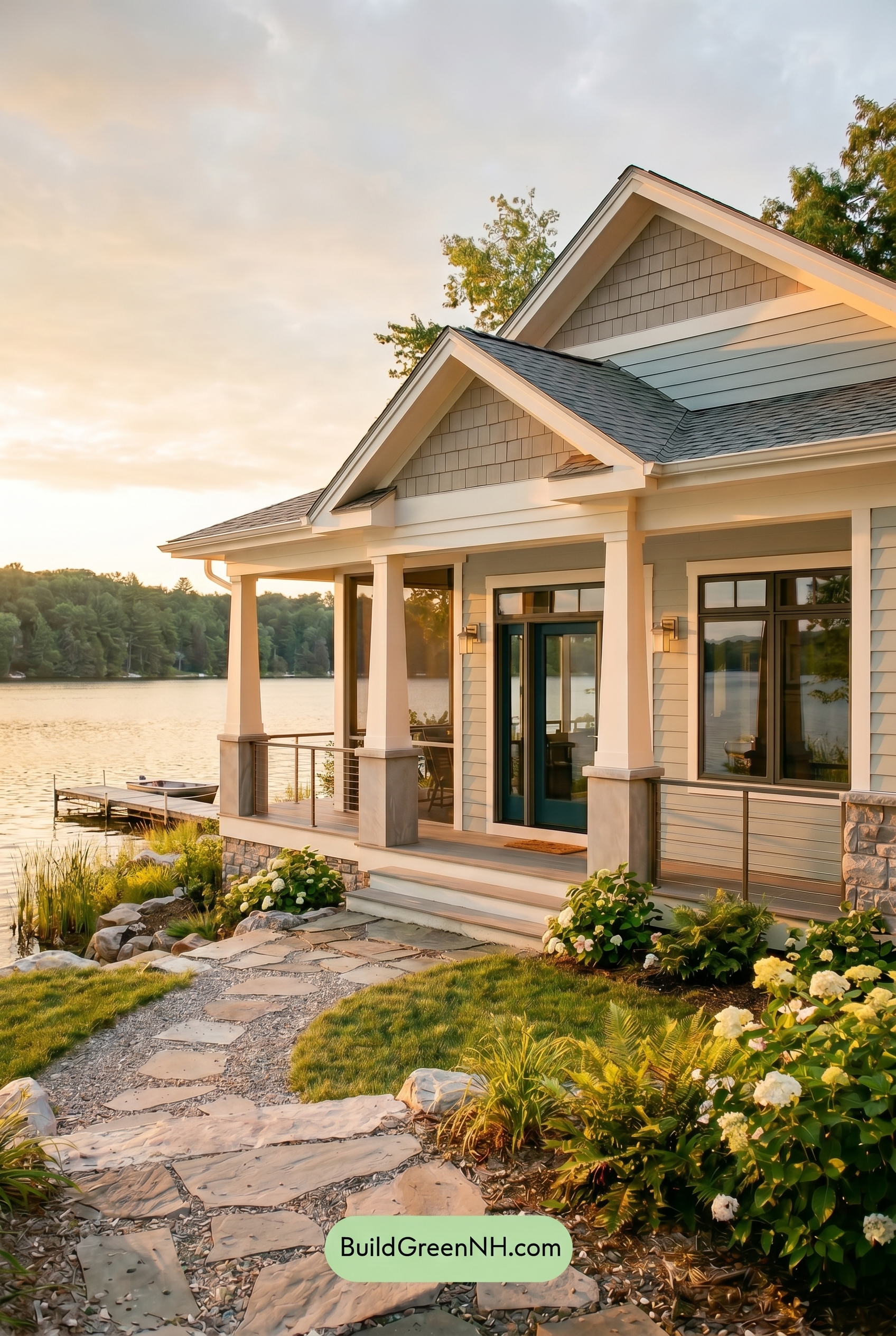
Under Golden Hour light, the gray siding shifts warmer and softer than it would in neutral daylight, taking on a gentle sunlit glow that makes the shade feel less cool and more inviting. The white trim and columns appear creamier and slightly more saturated, while shadows under the rooflines deepen, adding richer contrast and definition.
The blue front door and window frames gain a moodier presence in the low-angle light, with this shade of blue appearing deeper against the warmed-up neutrals. Overall, the palette feels calmer, cozier, and more dimensional than it would at midday, when the colors would read cleaner, flatter, and more evenly balanced.
Shade
In Shade, the gray siding shifts cooler and a touch deeper than it would in neutral daylight, with its saturation feeling more muted and restful. The white trim and columns lose some of their bright snap, taking on a softer, creamier cast where reflected warmth lingers under the porch.
The blue family on the door and window frames appears richer and moodier in the shaded areas, creating stronger contrast against the softened whites and subdued grays. Overall, the palette feels calmer and more sheltered, with deeper shadows adding dimension while dialing down the crispness of neutral daylight.
Nighttime
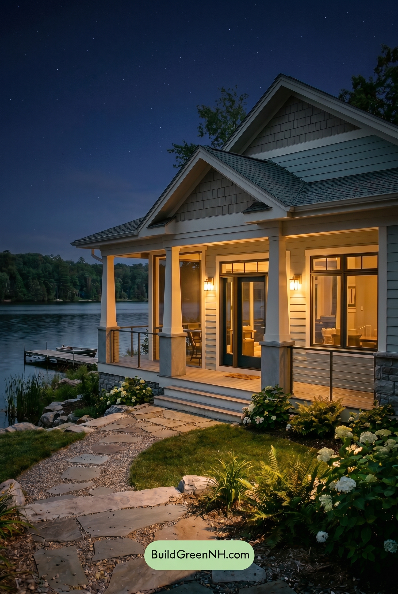
At night, the gray family on the main and upper walls reads deeper and more saturated than it would in neutral daylight, with shadows adding a cooler, moodier cast. The white trim and columns pick up the warmth from the porch lighting, so they feel softer and creamier rather than crisp and bright.
The blue family on the door and window frames becomes richer and more dramatic after dark, standing out against the warmed whites and darkened grays. Stronger shadows under the rooflines and around the railings increase contrast, giving the whole exterior a cozy, elegant, lakeside glow.
Pin these for later
Want More?
 Green Farmhouse Exterior Color Scheme: Fern White Hearth
 Green Farmhouse Exterior Color Scheme: Pine White Gleam
 Green Farmhouse Exterior Color Scheme: Mint Cream Welcome
 Green Farmhouse Exterior Color Scheme: Celadon Ivory Calm
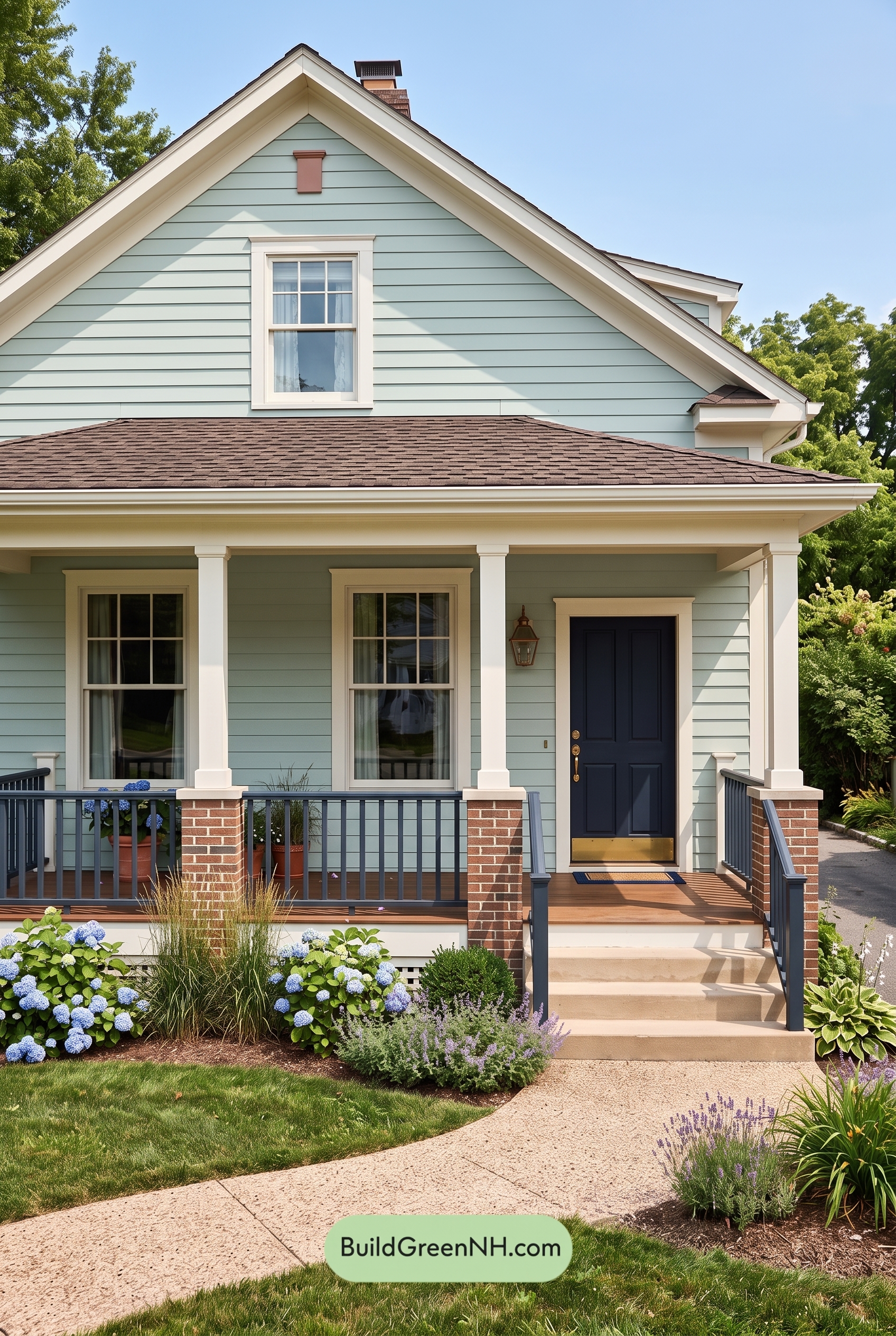 Green Farmhouse Exterior Color Scheme: Seafoam Linen Porch
Table of Contents