Last updated on
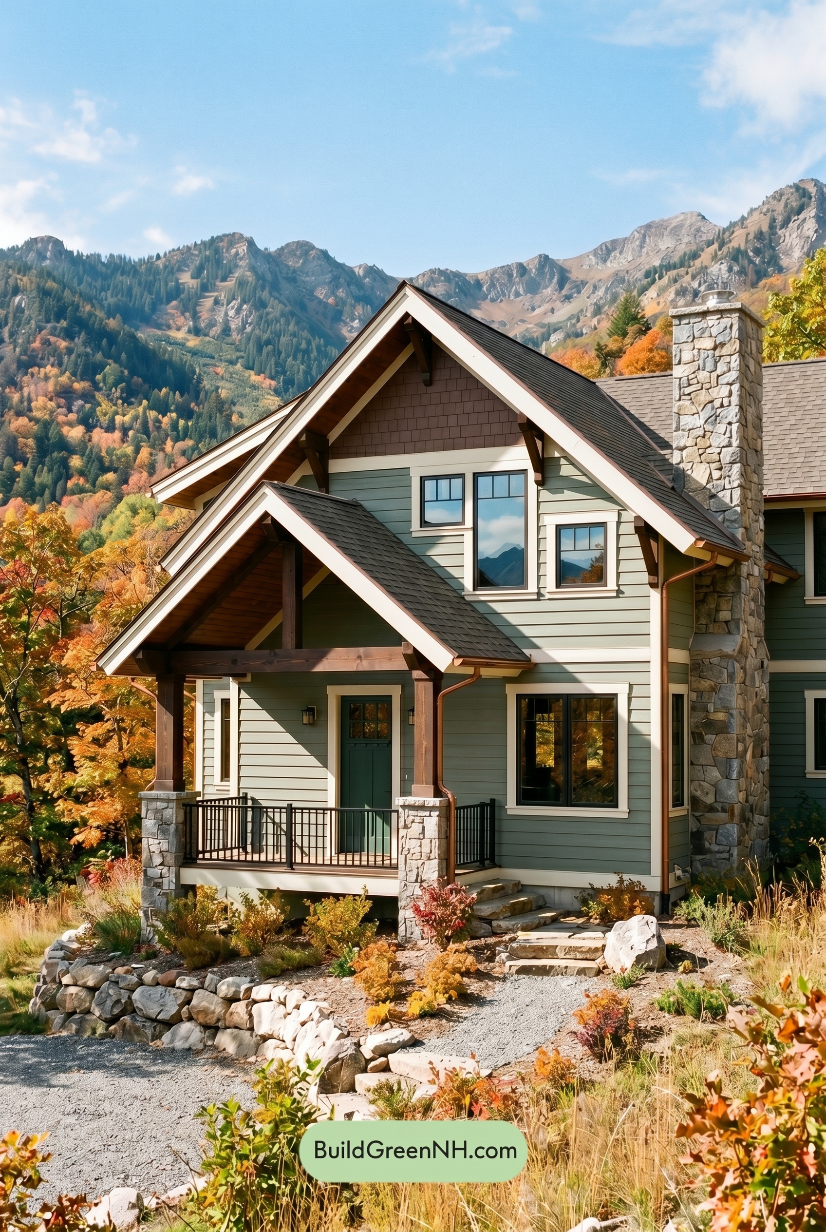

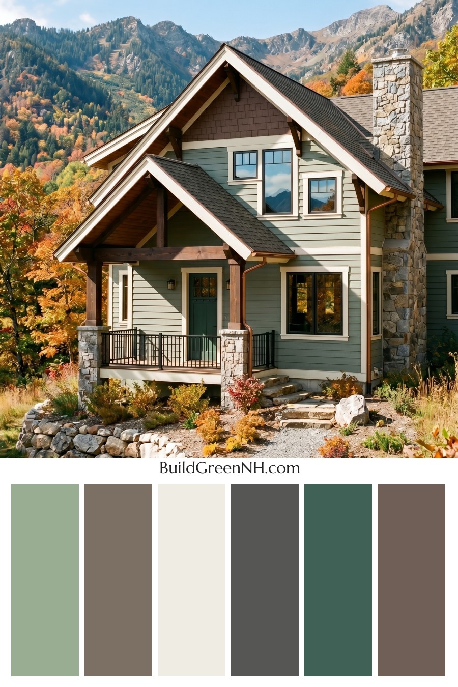
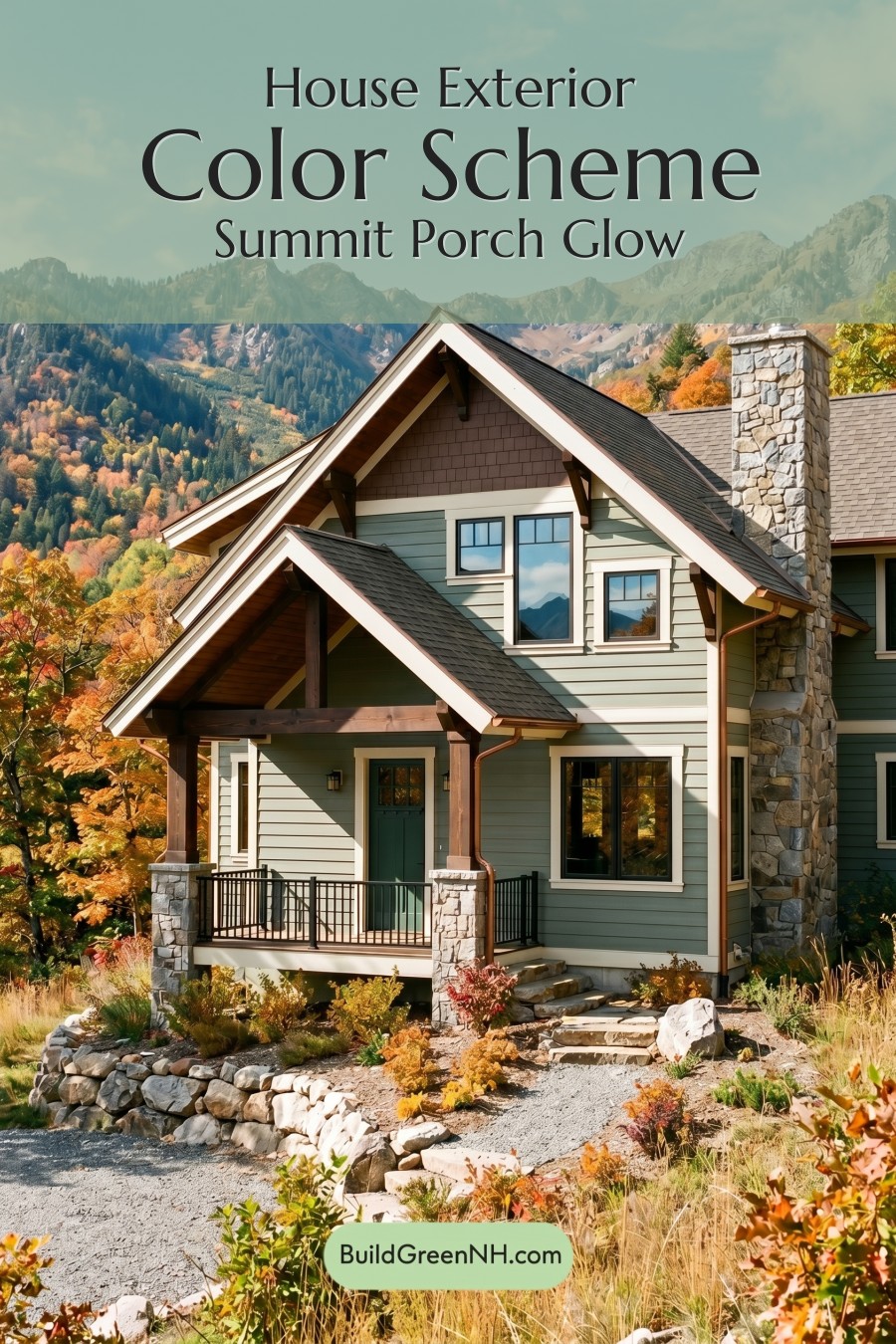
This nature-inspired mix of muted green, warm brown, crisp white, and grounded gray gives the home a mountain-lodge look that feels polished, welcoming, and perfectly at home in its setting.
A Soft Green Base That Blends Into the Landscape
The main siding is dressed in a gentle green shade, giving the house a calm, organic presence. It feels fresh without being bright, and it works beautifully against the trees, stone, and mountain backdrop. This green family choice is especially effective because it softens the scale of the home while still giving the exterior personality.
The front door stays within the green family but appears slightly deeper, creating a subtle focal point at the entry. It is not a loud contrast, yet it still draws the eye in a quiet, welcoming way.
Warm Brown Details Add Lodge Character
The upper gable introduces a warm brown shade that gives the home depth and a handcrafted feel. This brown family accent is a smart move because it breaks up the green siding and adds visual weight near the roofline.
The porch columns and exposed structural details continue the brown family, making the home feel sturdy, rustic, and connected to natural wood tones. These deeper brown accents bring warmth to the palette and keep the exterior from feeling too cool.
White Trim Keeps Everything Crisp
The trim is finished in a clean white shade that outlines the windows, roof edges, and architectural transitions. This white family color gives the home sharp definition and helps the green and brown areas feel intentional rather than blended together.
Because the trim is bright but not overwhelming, it adds freshness without stealing attention from the earthy palette. It also highlights the charming layered rooflines and gives the exterior a refined, finished look.
Gray Accents Ground the Design
The window frames and railings lean into the gray family, adding a grounded, modern edge. These darker gray elements create contrast against the lighter trim and soft green siding, helping the windows feel more substantial.
The roof also sits in a deep gray shade, which anchors the entire composition. Paired with the gray railings and natural stonework, it gives the home a strong, balanced cap without feeling heavy.
Why the Palette Works So Well
This color scheme succeeds because every shade feels connected to the setting. The green siding echoes the surrounding forest, the brown accents pick up the warmth of wood and autumn foliage, the white trim brings clarity, and the gray details tie into the stone and roof.
The overall mood is cozy, elevated, and outdoorsy. It has the comfort of a mountain retreat, but the crisp trim and thoughtful contrast keep it looking polished. Nothing feels random. Each color has a job, and together they create a welcoming exterior with plenty of charm and lasting curb appeal.
Next, see how this color scheme looks under different lighting simulations throughout the day.
Overcast
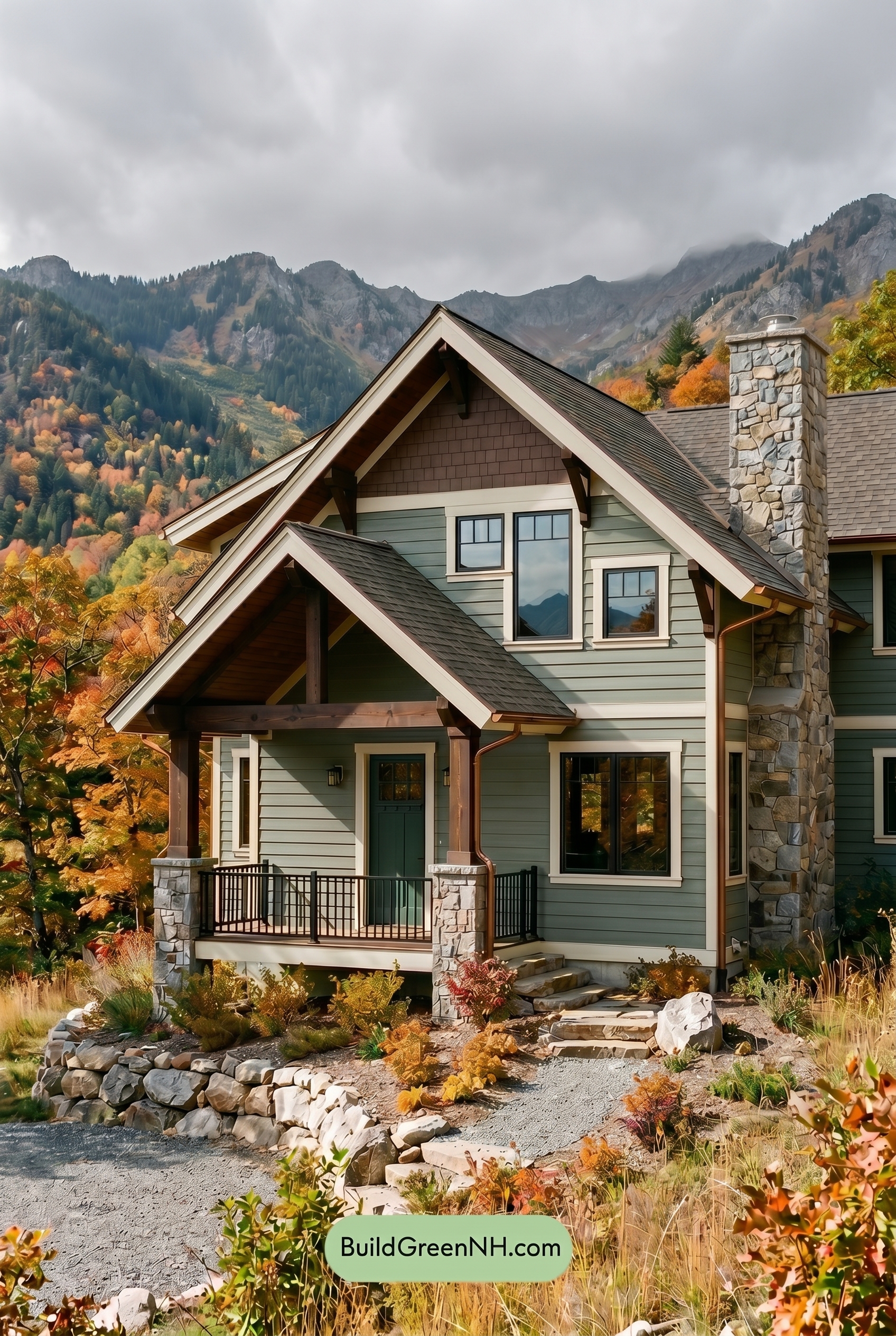
Under overcast light, the green siding and front door would appear cooler and slightly more muted than in neutral daylight, with their saturation softened into a calmer, misty shade. The brown upper wall and columns would lose a touch of warmth, feeling more subdued and earthy rather than sun-warmed.
Shadows become broader and gentler, so the contrast between the white trim, gray frames, railings, and deeper wall colors feels less crisp. The overall mood shifts from bright and dimensional to quiet, cozy, and grounded, letting the layered green, brown, white, and gray families blend in a more relaxed way.
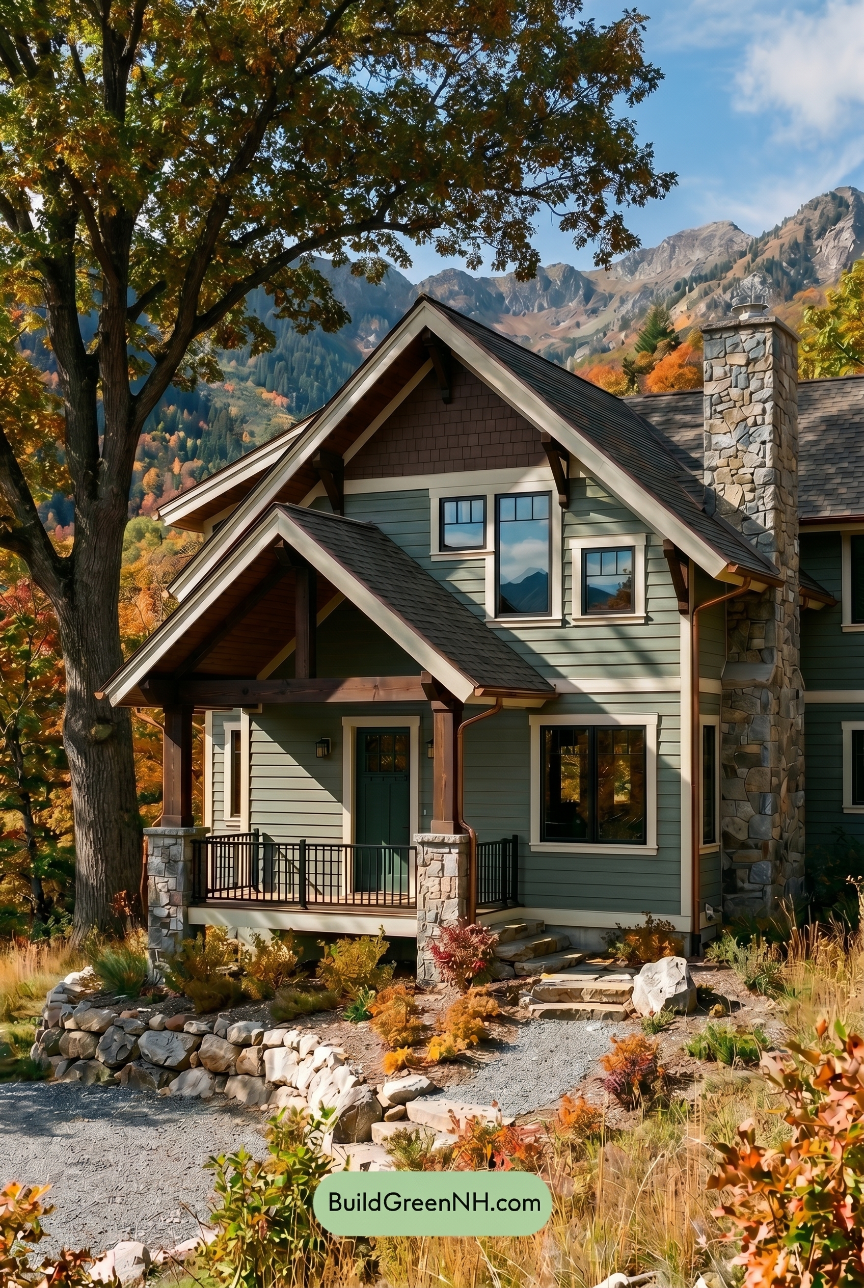
Golden Hour
In Golden Hour light, the green siding looks warmer and more saturated than it would in neutral daylight, shifting from crisp and grounded to soft, earthy, and inviting. The brown upper gable and columns pick up extra richness, while the white trim glows with a creamy warmth instead of reading stark or cool.
Longer shadows deepen the green front door and tucked-away siding, creating stronger contrast against the bright trim and sunlit wall sections. The gray window frames and railings feel slightly warmer and less sharp, giving the whole exterior a cozier, more dramatic mood than the clearer, flatter balance of midday light.
Shade
In shade, the green family on the main walls reads deeper and cooler than it would in neutral daylight, with a quieter, more muted saturation. The front door’s green shade gains a richer, tucked-away feel, while the brown family on the upper wall and columns loses a bit of sunlit warmth and settles into a softer, earthier mood.
The white family trim appears less crisp and bright in shade, which gently lowers contrast against the siding, while the gray family window frames and railings feel more pronounced in the darker shadows. Overall, shade gives the exterior a calmer, more woodland-inspired character, with softer warmth, stronger shadow depth, and a cozier sense of contrast.
Nighttime
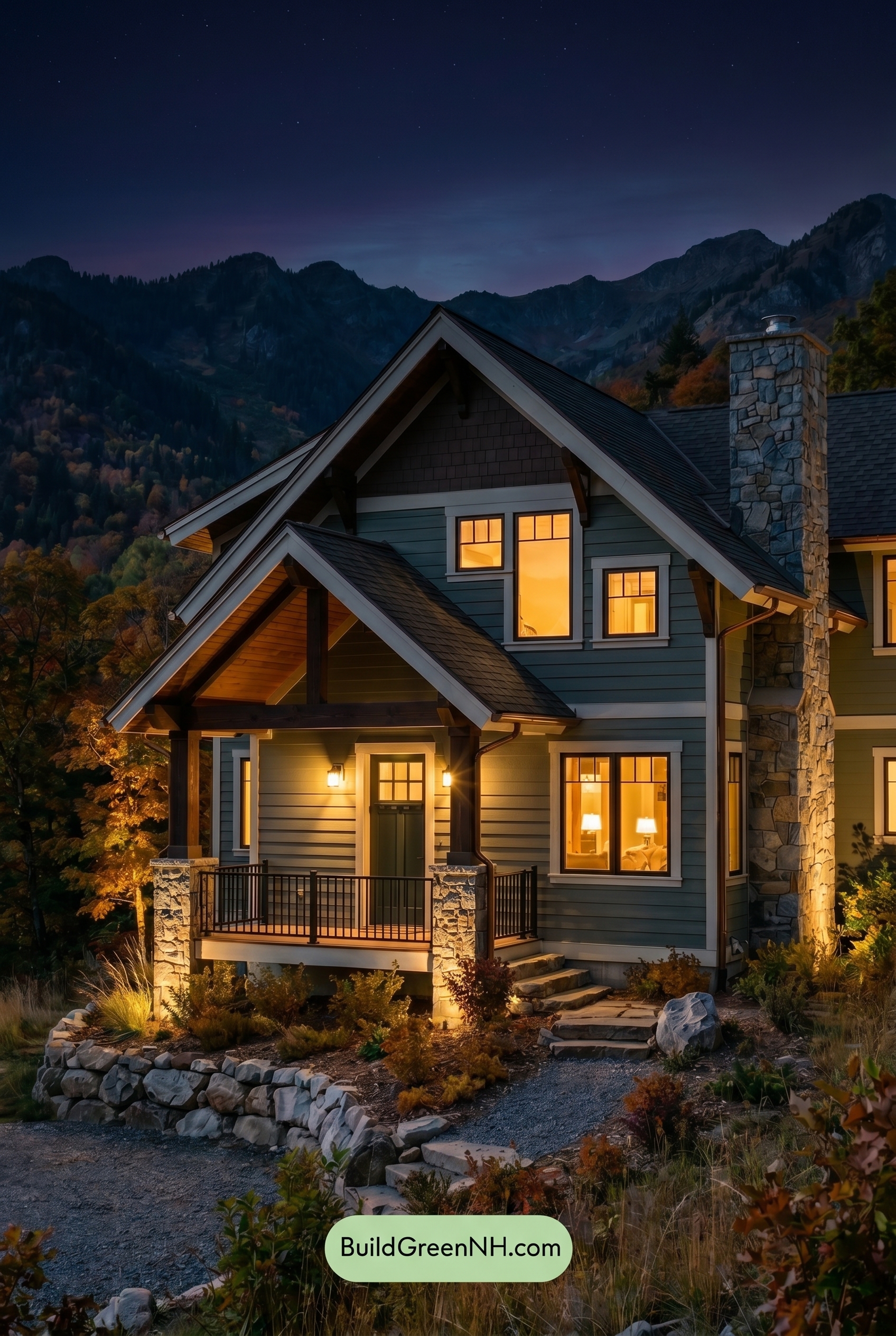
Under nighttime lighting, this shade of green deepens and gains saturation in the shadowed areas, while warm light near the windows and entry softens it with a gentle glow. Compared with neutral daylight, the brown shades on the upper wall and columns feel richer and more sheltered, with shadows adding depth under the rooflines.
The white trim becomes a sharper highlight after dark, creating stronger contrast against the darker green and brown families. Gray window frames and railings recede into cooler shadow, giving the exterior a quieter, more dramatic mood that feels welcoming around the warm-lit openings.
Pin these for later
Want More?
 Green Farmhouse Exterior Color Scheme: Fern White Hearth
 Green Farmhouse Exterior Color Scheme: Pine White Gleam
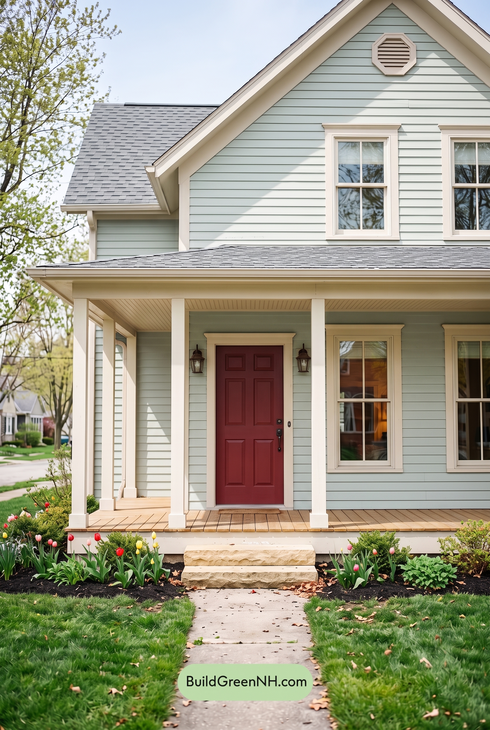 Green Farmhouse Exterior Color Scheme: Mint Cream Welcome
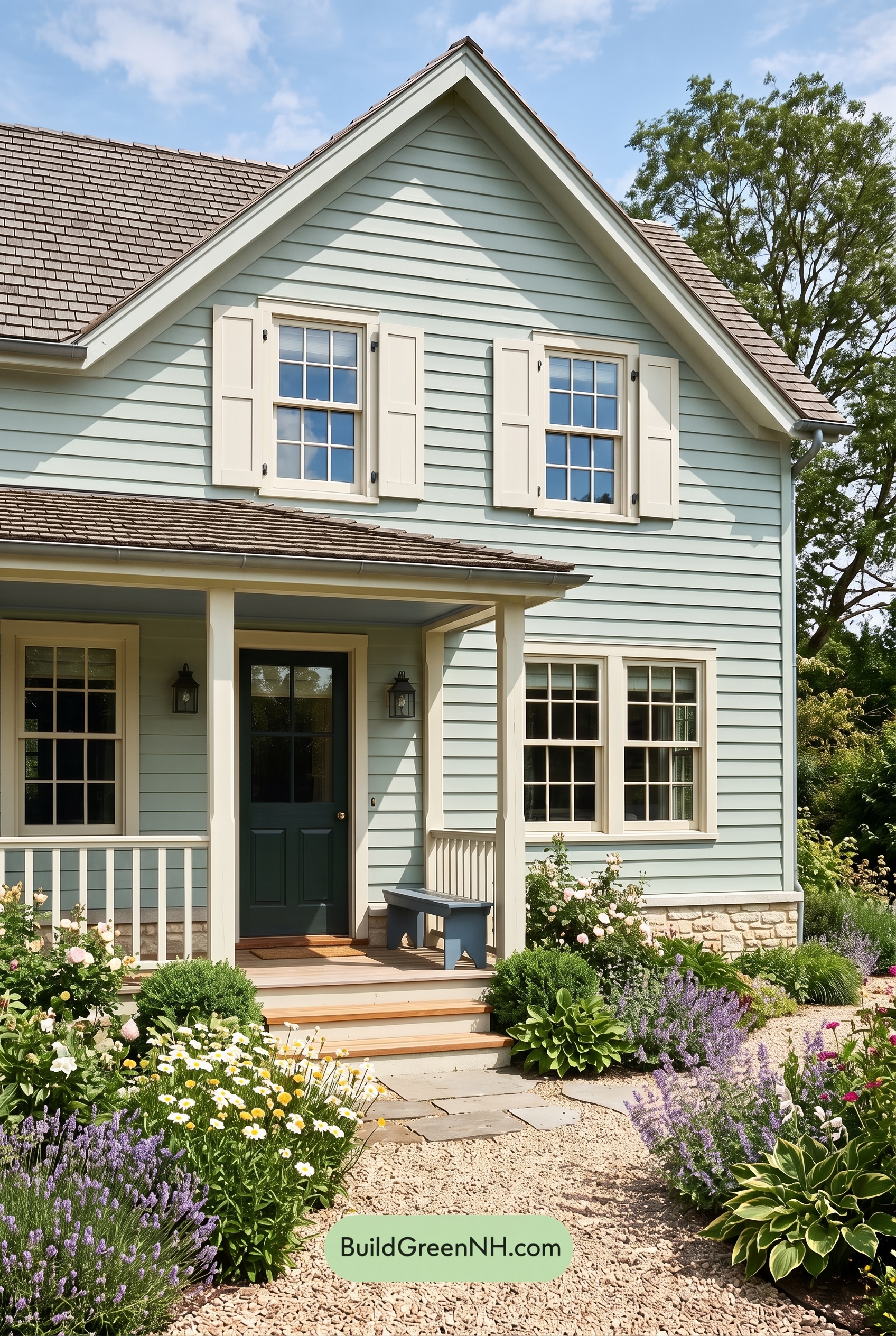 Green Farmhouse Exterior Color Scheme: Celadon Ivory Calm
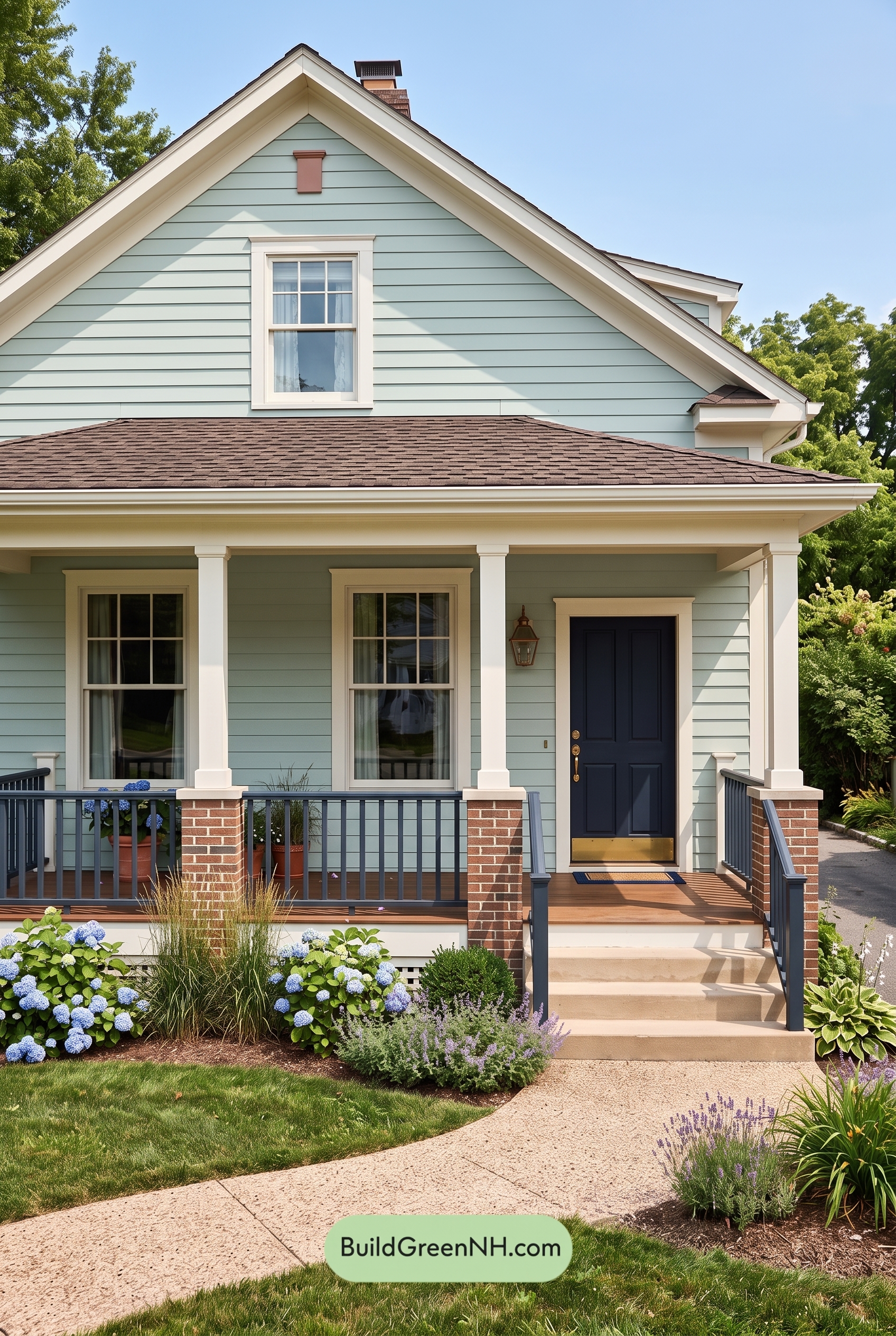 Green Farmhouse Exterior Color Scheme: Seafoam Linen Porch
Table of Contents